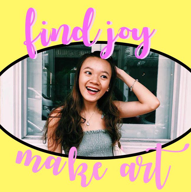

Presented by: Clara, Daphne and Teri


Presented by: Clara, Daphne and Teri
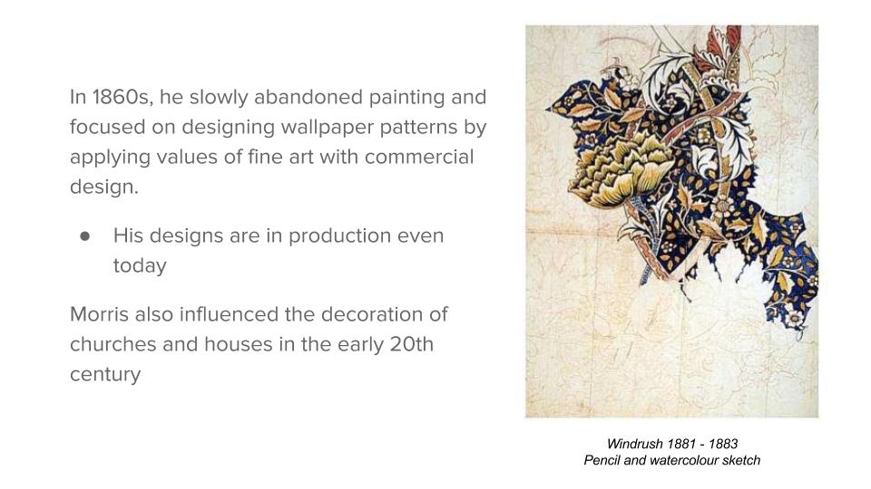
Final Product presented on 16 October 2017
Before going head-on in approaching the project, I did some research!
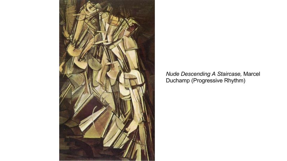
Also, view my work process here!
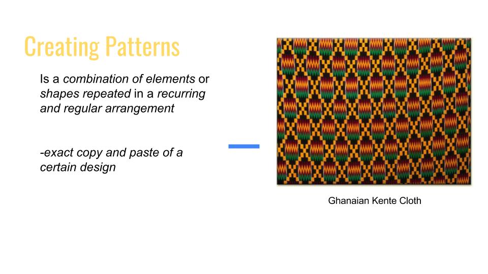
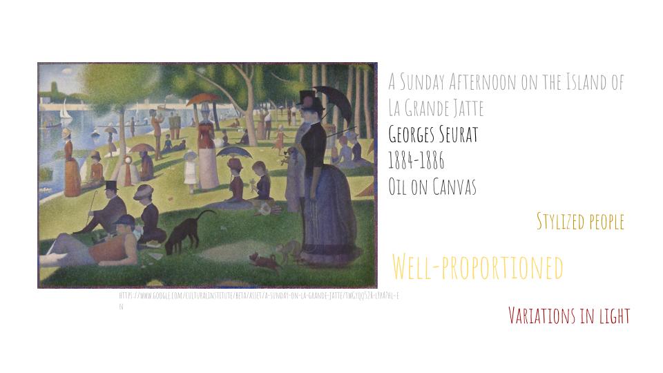
“Fantasy”
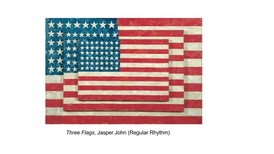
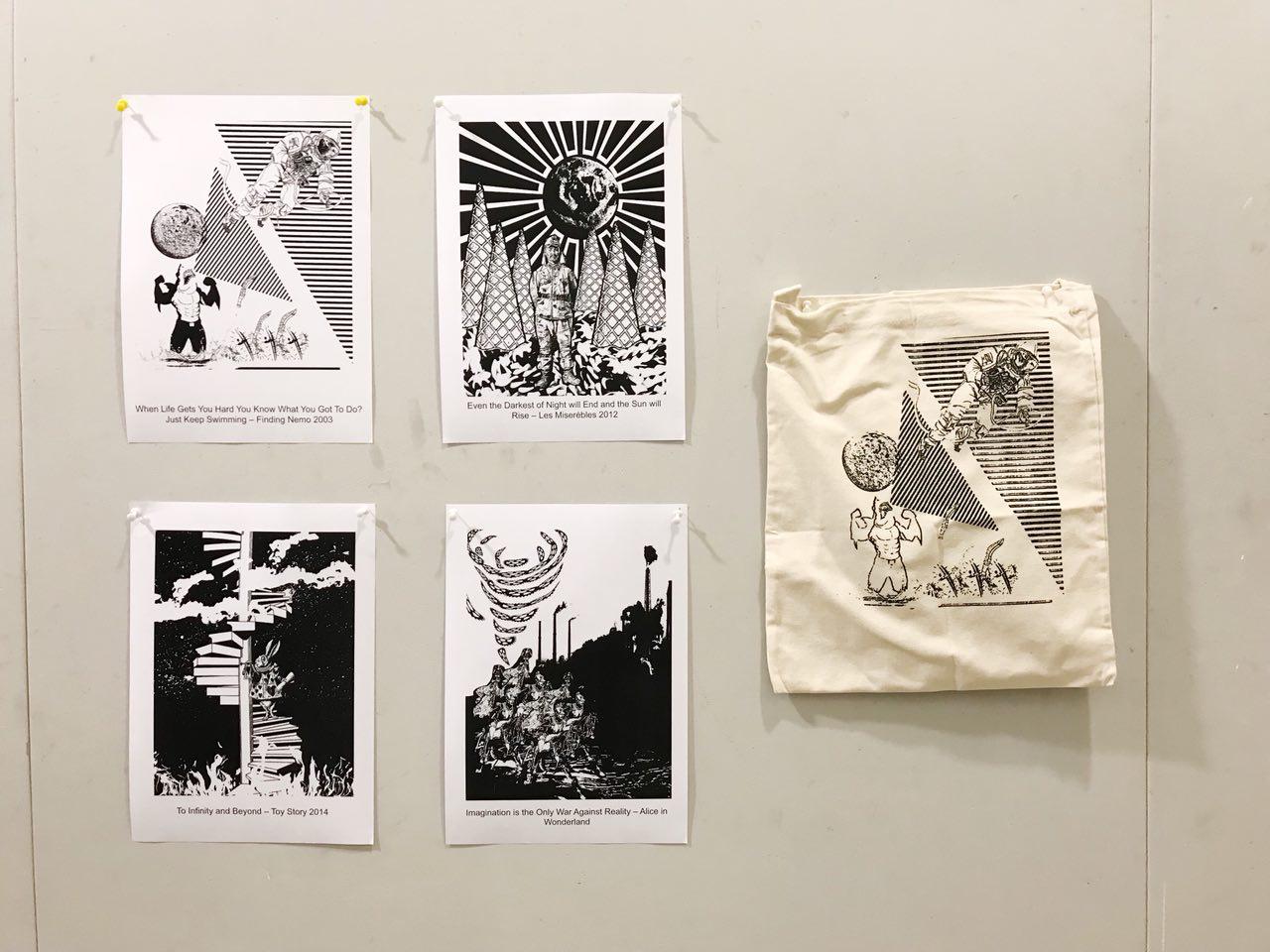
Final Product (As printed on a tote bag)

totebag; exposed & silkscreened in class
“When Life Gets Hard You Know What You Got To Do? Just Keep Swimming” — Finding Nemo 2009
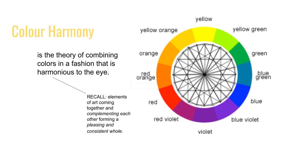
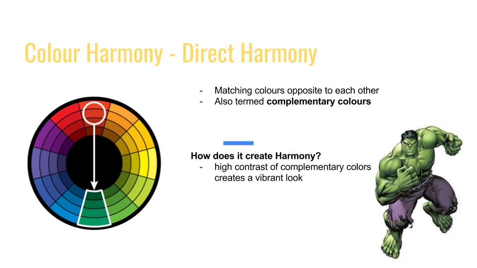
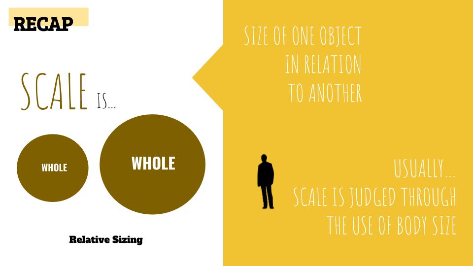
Main Idea
The idea behind this piece is to bring out the irony in the way we face challenges in life.
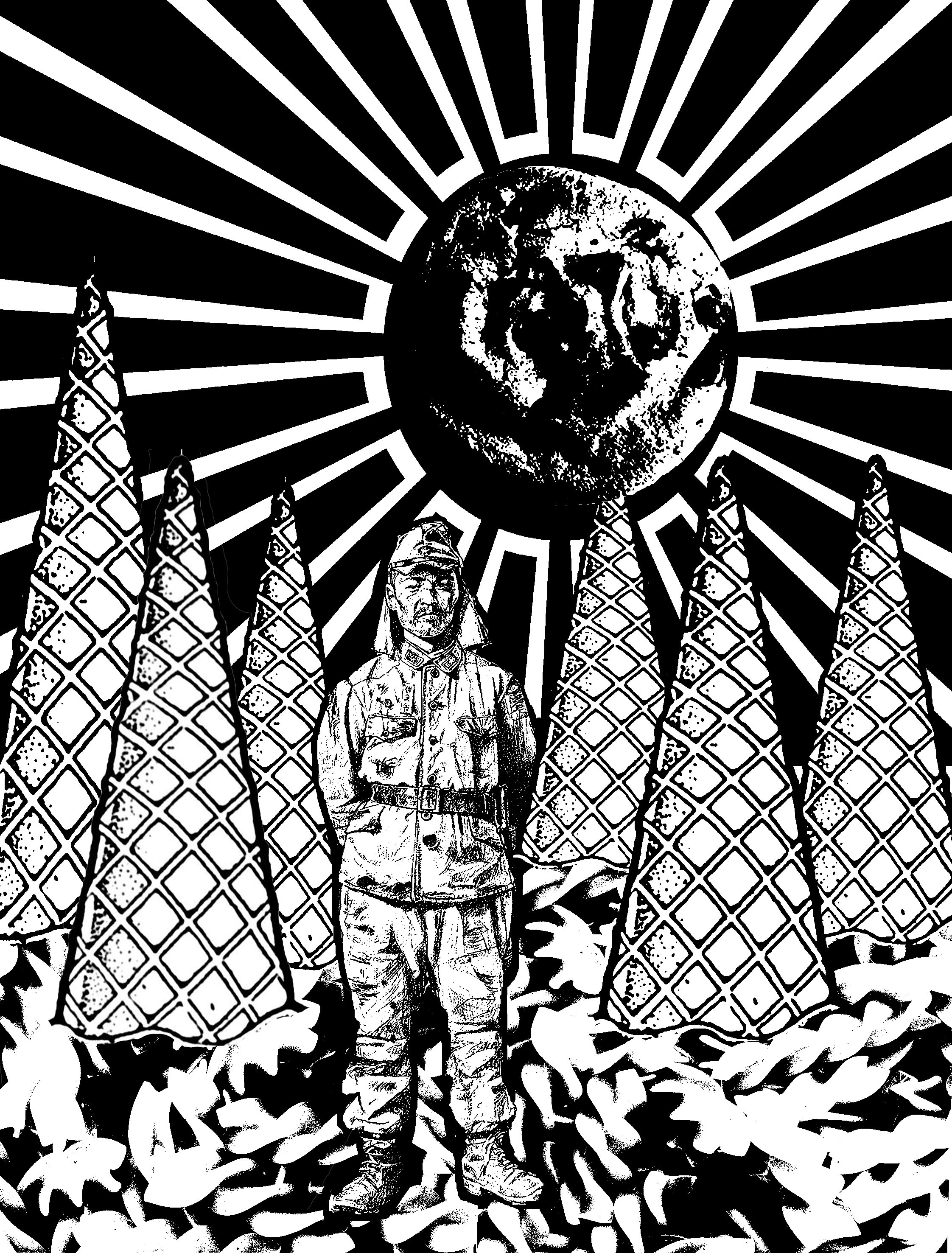
“Even the Darkest Night will End and the Sun will Rise” — Les Misérables 2012
Main Idea
This design is based off a true story about a World War II Japanese soldier, Hiroo Onoda, who was ordered to not just fight, but also to stay alive. He was assigned to fight in a forested area in Western Philippines. He escaped capture and stayed in the forest for 29 years even after the war ended. He survived through stealing food from the farmers or look for random food in the jungle. (View his full story here)
I had initially taken the quote very literally and after a consult, Joy told me about Onoda’s story. I thought this quote could resonate with how he was feeling while being trapped in the jungle and tie in well with his story as well.
Surrealism
Thereafter, I decided to tap on the phrase “You Are What You Eat” for this composition. By using food to depict the forest brings out the idea of Fantasy. Just like Onoda’s hunt for food everyday, unpredictable, I decided to use random food I can think of to add to the composition, as well as the size and shape of it.
Ice cream cones are used to depict the dense vegetation in the forest and the fusilli noodle depicts the forest bed, since fusilli pasta are always served flat on the plate.
Notice the Japanese flag at the background is used to relate the composition literally back to the quote itself. The off-centre placement of the flag is to capture the movement of the moon setting or the sun rising. I overlayed a cookie in the circle of the flag to further blur out the interpretation of the background. Is it a Japanese flag, a sun rising, a moon setting? Or all of the above?
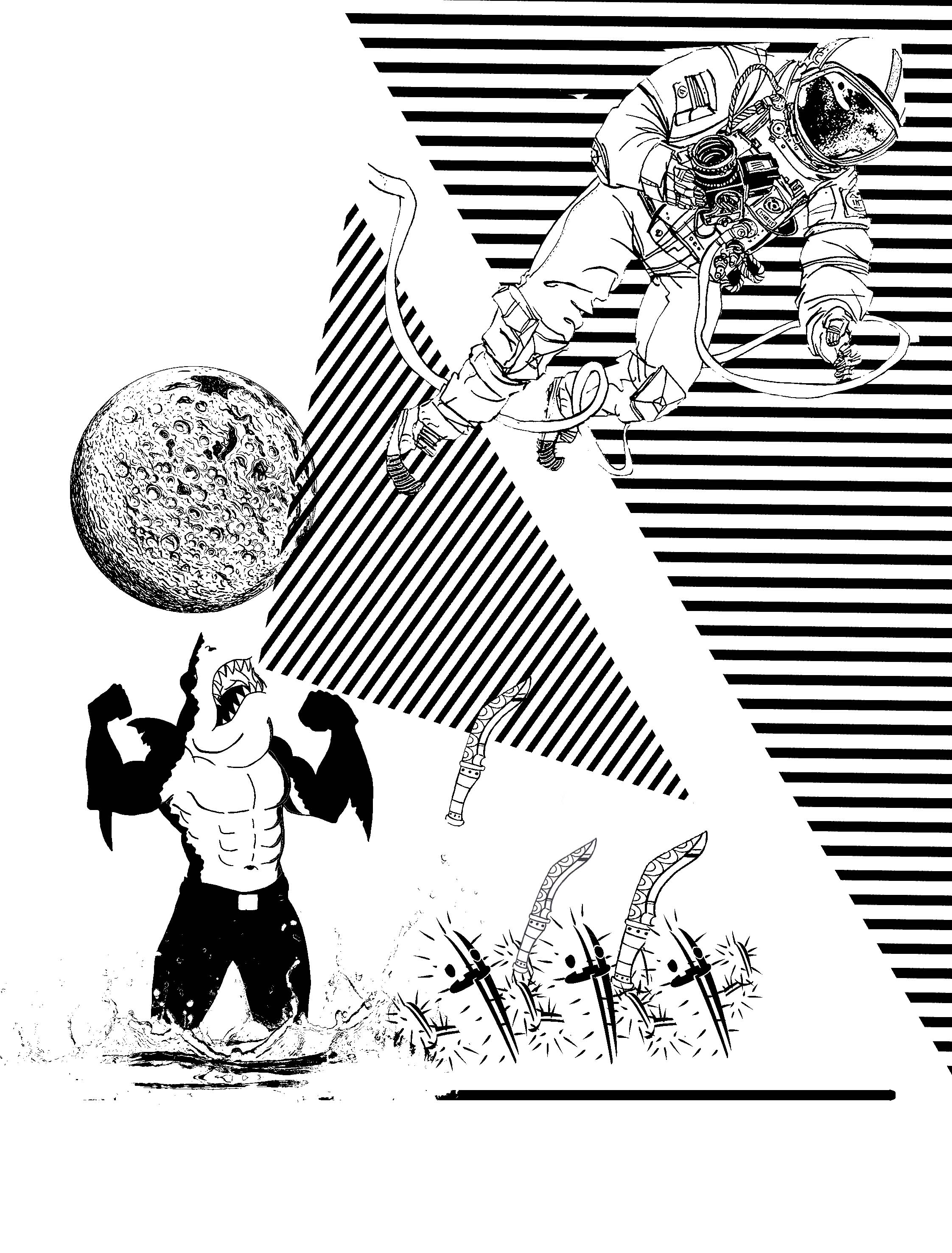
“To Infinity and Beyond” — Toys Story 2011
Main Idea
This piece challenges the idea of doing good or what is convenient.
The White Rabbit from Alice in Wonderland is incorporated into this composition to borrow his character to further help the audience understand this piece better, or resonate with them better.
The stairs that seems to be limitless brings out the idea of infinity in the quote. How I wanted to further work on the word “infinity” is to use the idea of Heaven and Hell, two extreme opposites.
This piece strive question its audience, do good or do what’s convenient?
Surrealism
The idea of heaven and hell cannot be represented, except by tapping on the common stereotypes that hell can be associated with extreme heat, and heaven with the sky. Hence, I tap on that as an apparent way of portraying both complete opposite elements in one composition.
In Alice in Wonderland, the White Rabbit is someone who is constantly afraid of offending people and he is often put in a dilemmatic position as to whether he should help Alice out in Wonderland and risk offending the Queen or leave the poor girl alone in a foreign place. Tapping on this character of his, I thought he will be a perfect subject matter for this composition as we talk about doing good or doing what is convenient. He could choose to help, and take a step closer to heaven, or be indifferent and take a step closer to hell.
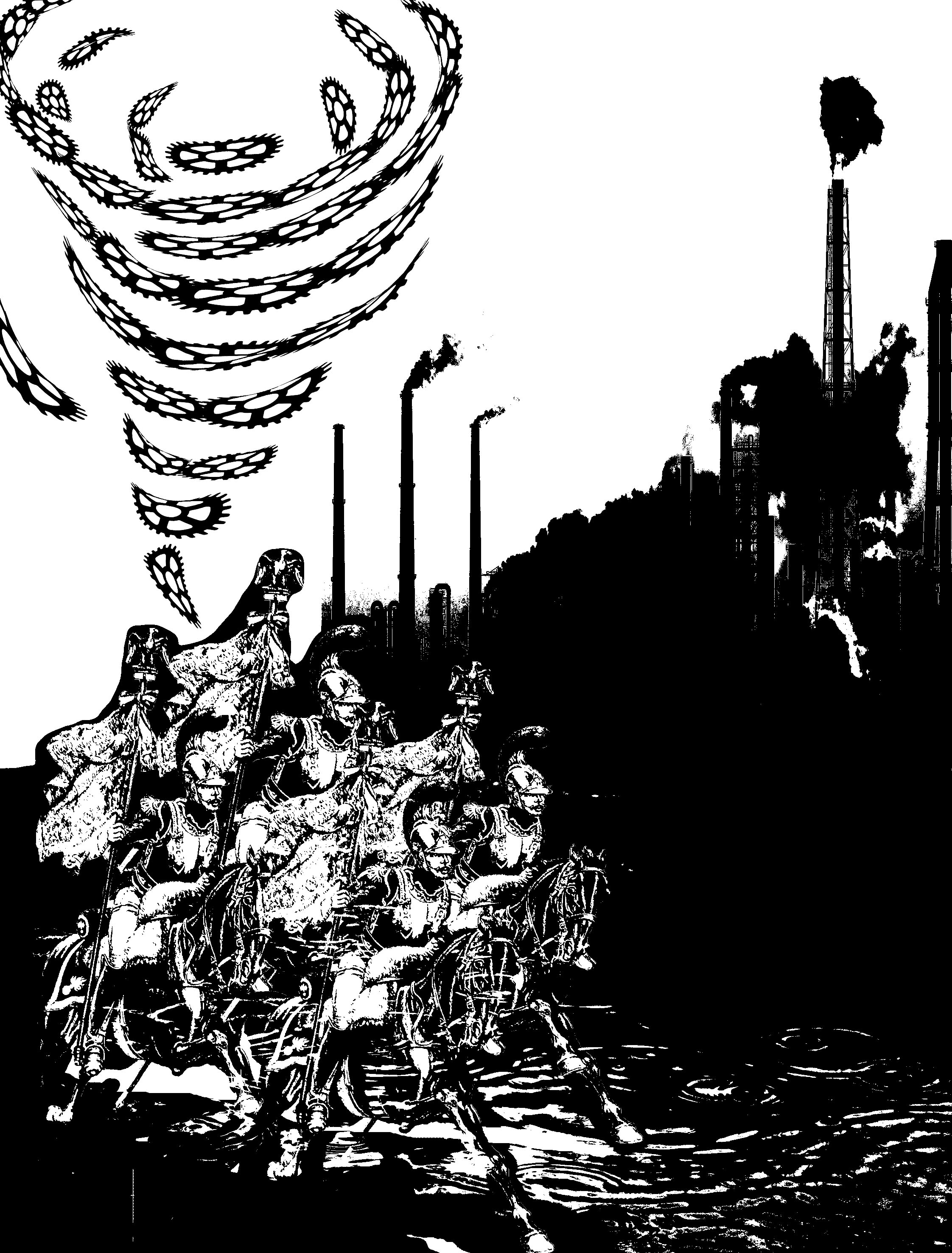
“Imagination is the War Against Reality” — Alice in Wonderland
Main Idea
As I approach this quote, I first brainstormed what the “war” of reality is? Global Warming and Climate Change then came into my mind (perhaps it is because I was a geography student? HAHA)
Playing with the past and the present, I portrayed comrades, used to fight war in ancient time, saving the reality today.
Surrealism
The comrades from ancient times coming to “save” today’s day might be more accurate than you think it is.
Deeper meaning…
They are riding on horses and not automobiles that we use today, eliminating the release of harmful gases to the atmosphere. Moreover, their military weapon does not consist of chemical weapons, guns or rifles, depicting a very manual mode of fighting the war of today.
Overall, I approached this project afraid because I was very unfamiliar with the concept of surrealism and having to study and produce relevant works was a challenge for me. Even so, I really liked the idea of using movie quotes and then giving them our own taste to it! Also, although it was also my first time silkscreening, I thoroughly enjoyed it and despite the long and tedious process, it was one filled with anticipation as we go one step closer to printing our designs onto the tote bags.
Here is a full PDF of my final works!
Approaching Project 2: Forrest Gump, we will have to select 4 movies quotes to create a visual narrative that expresses watch of the quote only using symbols, pictograms, dingbats, icons and engravings. With the help of Photoshop, the final project should be in black and white half-toned. At the end of it, we will even get a silkscreen print on our tote bag!
Before all that fun happens, there needs to be some work done…
Here are some of my research done!
Art Movement: Dadaism
Dadaism was an artistic and literary art movement of the European avant-garde in the early 20th century that flourished in Paris but first began in Zurich, Switzerland. It was influenced by other art movements like Cubism, Futurism, Constructivism and Expressionism. Developed in reaction to World War I, it is to reject logic, reason and aestheticism of modern capitalist society.
Dadaism is the first conceptual art movement where the focus of the artworks is not on its aesthetics, but how it was created to challenge, to generate difficult questions about the society, and the purpose of the work and what it implies and bring across to the mass. The main intent of the members of Dadaism is to boldly reject all norms of the bourgeois culture.
Some famous artists to note are Marcel Duchamp, Salvador Dali, André Breton, etc.
Some famous works include:
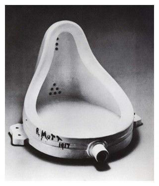
titled: Fountain, Marcel Duchamp | taken from: https://www.artyfactory.com/art_appreciation/art_movements/dadaism.htm

titled: L.H.O.O.Q., Marcel Duchamp | taken from: https://www.artyfactory.com/art_appreciation/art_movements/dadaism.htm
Art Movement: Surrealism
Born mostly out of Dadaism, Surrealism is an art and cultural movement that began in the early 1920s started by Andre Breton (who was a major member of the Dada community), and is best known for its visual artworks and writings. Many surrealist artists painted illogically with photographic precision. Surrealist are imaginative and drive away from rationalism and literary realism in hopes of revealing the contradictions in the everyday world and spur on revolution.
Some famous artists to note are Pablo Picasso, Rene Margitta,
Some famous works include;
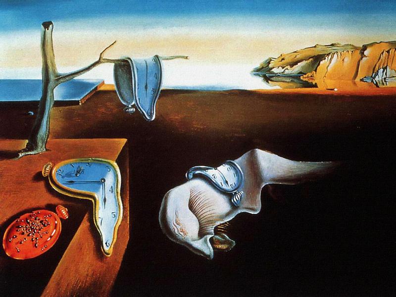
titled: The Persistence of Memory, Salvador Dali | taken from: https://art9b.wikispaces.com/surrealism+%28+The+Persistence+of+Memory+Salvador+Dali%29
Contrast between Surrealism and Dadism
Their emergence – Dadaism emerged during the period of World War I , while Surrealism emerged during a period of peace and prosperity.
Where they flourished – Dada artists where scattered across Europe while Surrealist artist were self-contained in Paris.
View on life – To Dada artists, life has no meaning, no reason, no purpose, and no logic. For Surrealist artists, life has meaning; one has to find its logic by unlocking visual and verbal codes secreted in the chambers of the unconscious mind where one finds Freud’s “uncanny.” Hence, Dada artists were more pessimistic while Surrealist artists tend to be more onward looking.
Dada photomontage may have used the technique of putting one randomly found image next to another, but the intent was to undermine meaning. Surrealism seeks new meaning, another meaning, an unexpected meaning, a sur-real meaning, but always, Surrealism wants live to mean something.
Style of expression – Both Dadaism and Surrealism sought to create works “automatically” without the conscious control of oneself.
Art Movement – Russian Constructivism
Russian Constructivism is the last and most influential modern art movement originated from Russian in the 20th century. It is inspired by Cubism, Suprematism and Futurism, which sought to abolish the traditional artistic concern with composition, and replace it with ‘construction. In its essence, this art movement sought to move working place from the studios to the factories. Russian Constructivism also work with the characteristics of many materials such as glass, wood, in construction to experiment and deploy different materials to demonstrate a certain idea. (usually that of the experiences in modern life).
Some famous artists to note are Alexander Rodchenko, El Lissitzky, Lyubov Popova, etc.
Some famous works include;
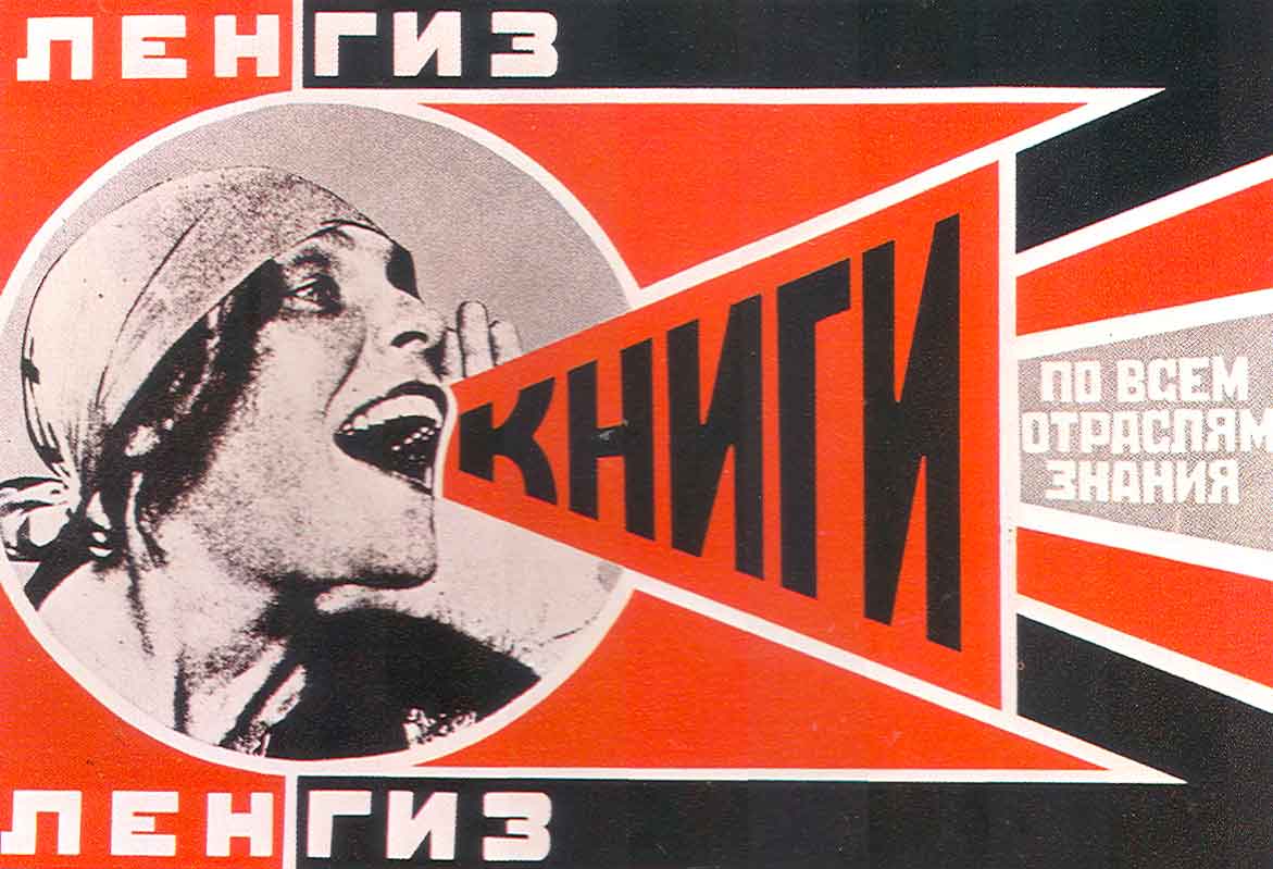
titled: Books, Alexander Rodchenko | taken from:http://analogue76.com/blog/entry/the_russian_constructivists

Beat the Whites with the Red Wedge, El Lissitzky | taken from: http://analogue76.com/blog/entry/the_russian_constructivists
Artist Research
André Breton
Andre Breton was a major member in the Dada society and a founder of Surrealism. He was into unconventional ways of creating art and had united a group of disparate artists to join him.
He wrote the Surrealist Manifesto to declare that Surrealism is all about “pure psychic automatism” that later deeply affected future art movements like Abstract Expressionism.
One of Breton’s greatest belief is that art is an anti-war protest, of which he postulated in World War I, which regain potency during and after World War II. While he was doing so, the other expressionist artists were creating art in response to the rage regarding the war itself.
References:
Art History Unstuffed – Contrast Between Dadaism and Surrealism
As I approach this project further, I decided to do research on a few relevant artists that were mentioned in class to gain a little inspiration as well as experimenting with the materials I have on hand to build small models. This post will include my processes, research then the final products itself with its practical uses. Do look at my previous post on my initial brainstorming here.
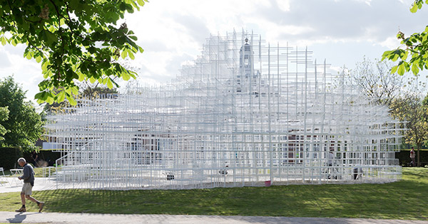
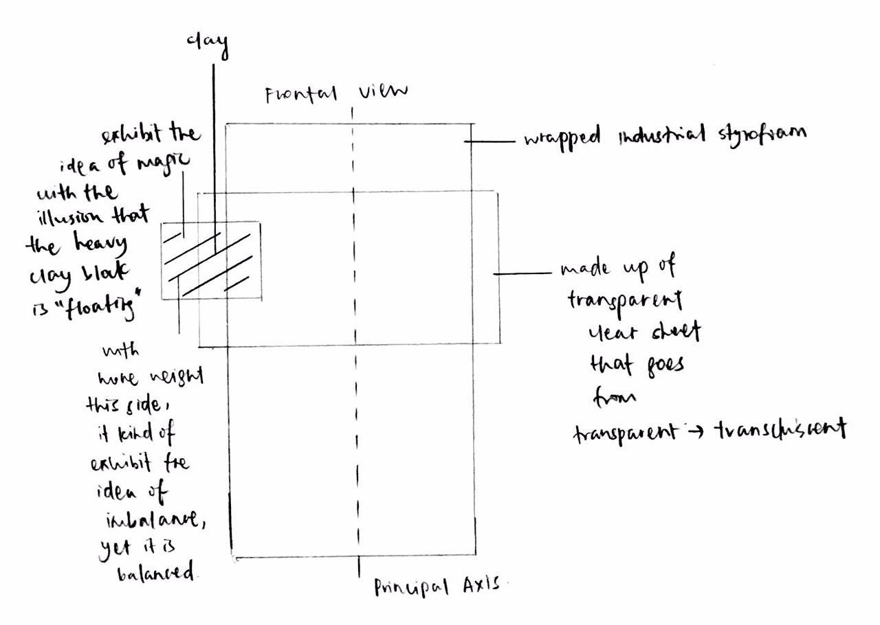
The Magical (P/T)ower
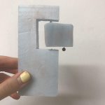
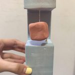
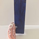
These were the initial idea, as I wanted to make a certain object seem like it is “floating”. Model 1 was my subsequent idea, yet I thought it was not convincing enough due to the material used for the “floating” object. I decided to work with clay to give off the idea of weight even more.
Subsequently, Model 2 was birthed as I worked with a larger and stable styrofoam box. The string was supposed to be deemed “transparent” to bring out the initial idea more.
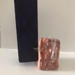
Final Product:
*Note:
Dominant: White Styrofoam
Sub-dominant: Clear Plastic Sheet Box
Sub-ordinate: Cube Clay
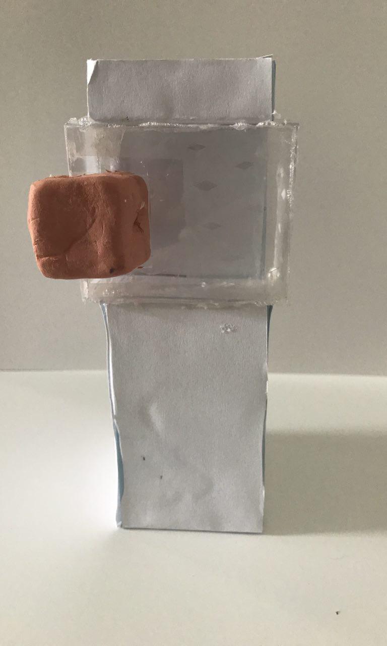
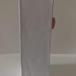
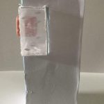
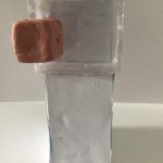
Thereafter, clear plastic sheet were made into a steady box to sustain the weight of the clay. The dominant is made white to place more emphasis on the “floating” clay, bringing out the idea of Magic.
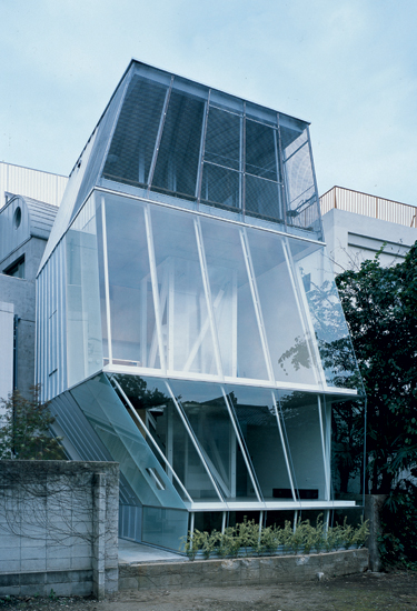
Inspiration from Soe Fujimoto’s work:
Serpentine Gallery Pavilion | taken from: http://www.nesite.com/en/sou-fujimoto-award-2013-marcus-prize/
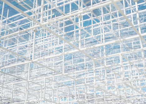
Serpentine Gallery Pavilion in detail | taken from: http://www.nesite.com/en/sou-fujimoto-award-2013-marcus-prize/
About:
Soe Fujimoto created this cloud-liked pavilion that seem to ascend to the sky with his very clever use of white grid-liked structures that was placed outside the lawn of Serpentine Gallery Pavilion as he tries to combine nature and man-made structures.
How he tap on transparency inspired me to inculcate clear materials like acrylic or clear plastic sheets into my models to accentuate the idea of Magic. Also, I liked his use of white in this architecture as it indeed gave the illusion that the structure is ascending towards the sky, hence seem to be cloud-liked. Therefore, for The Magical (P/T)ower, I made the dominate white to place more focus on the clay material, very much like how Soe Fujimoto wanted to place emphasis on nature rather than the architecture.
Practical Uses:
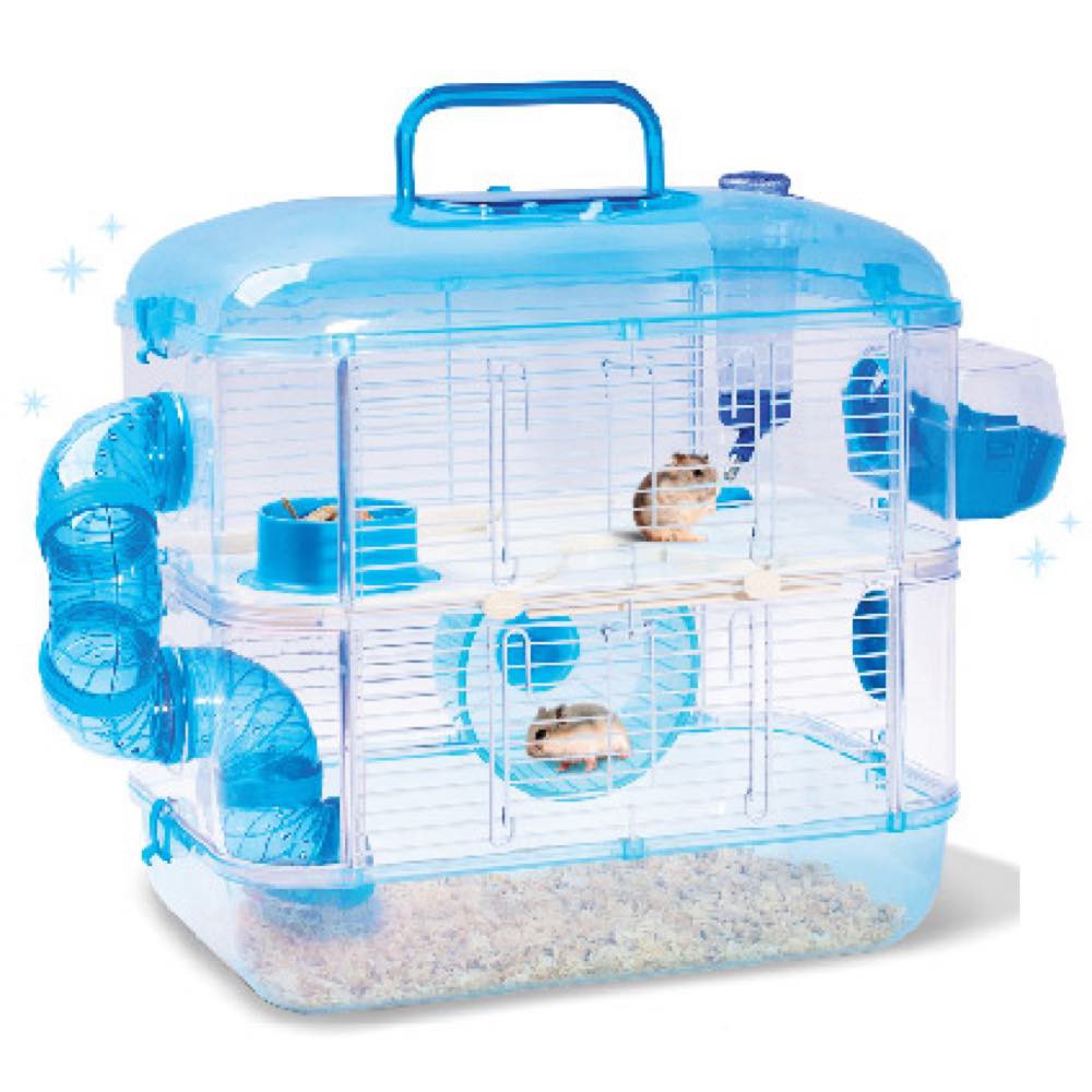
Hamster Cage | taken from: https://www.kohepets.com.sg/jolly-pet-crystal-castle-double-deck-hamster-cage
The clear plastic transparent section is the living area for the hamsters and the clay section can be the sleeping area for the hamsters or the running wheel for them to exercise.
2. Airport Control Tower

Airport Control Tower | taken from: https://www.britannica.com/technology/air-traffic-control
When elevated to a certain hight, The Magical (P/T)ower can be built in a large-scale to be a airport control tower. The sub-dominant transparent and translucent section can be the watch area and the sub-ordinate clay section can be an area to store important machineries and signal devices.
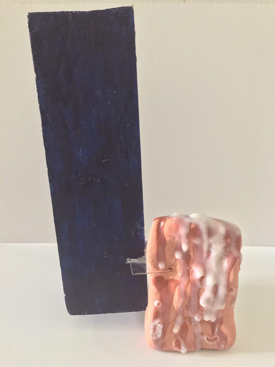
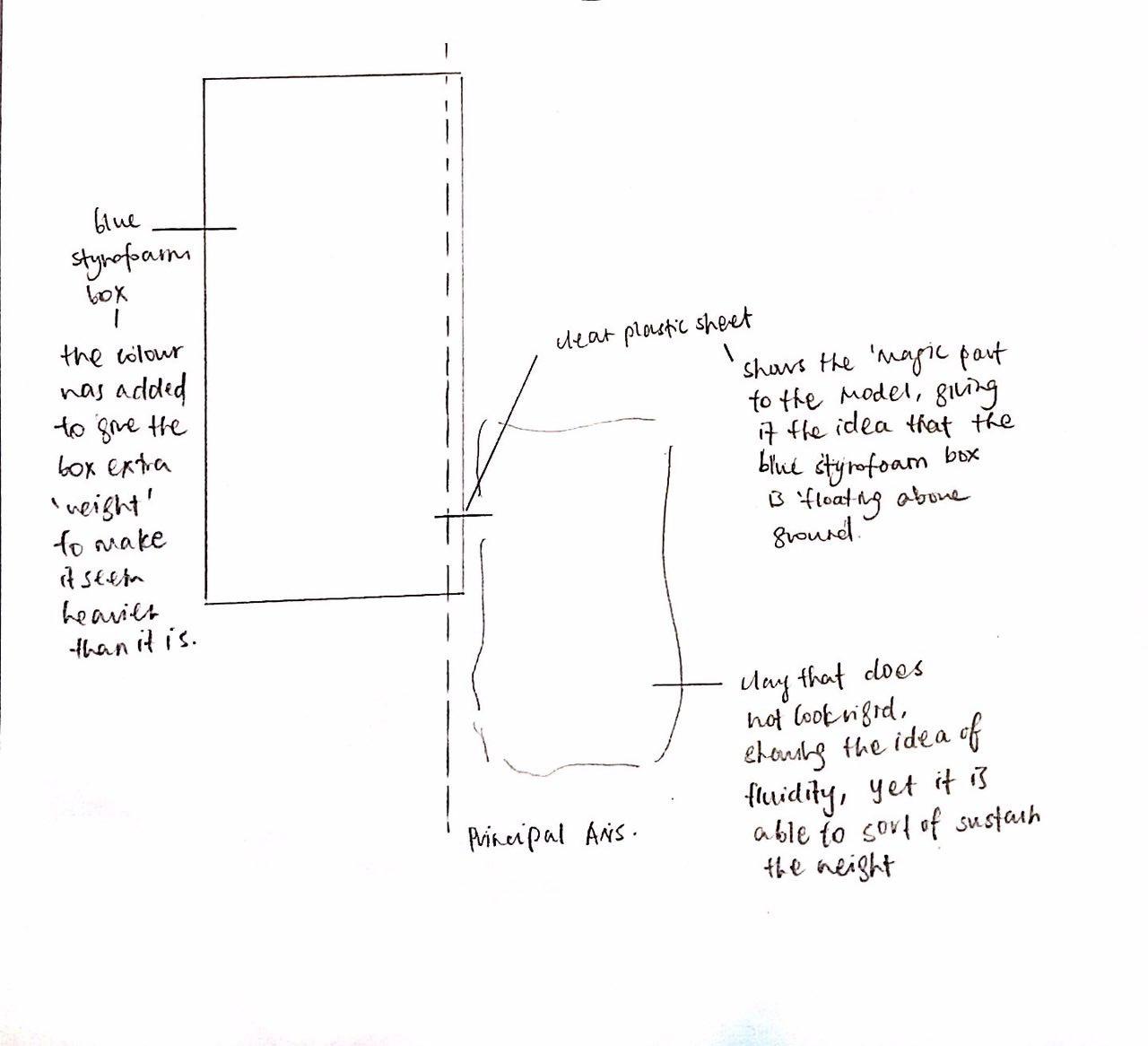
The Balancing Trio
*Note:
Dominant: Royal Blue Styrofoam
Sub-dominant: Clay
Sub-ordinate: Clear Plastic Sheet
Meanwhile, I also researched on Kasuyo Sejima’s works it inspired me to create The Balancing Trio. The idea of models hovering above ground has been in my head as I approached Magic, as well as the idea of illogical balance.
Hence, I wanted by dominant to be the one hovering above the ground and have the sub-dominant to be the one on the ground, making the sub-ordinate the one connect the both together.
The dominant is actually an industrial styrofoam, however, it itself did was not able to convince the idea of weight. Hence, I coloured the dominate royal blue.
The sub-dominant is made out of clay, hence is able to stabilise the entire structure. However, I remove the idea of rigidness from the clay by giving it a fluid structure to bring out the idea of it being wobbly and unable to sustain the whole structure, but it did. To emphasis that point, I added wax to the clay to enhance the idea of fluidity in the sub-dominant, as if it is melting away, unstable and unable to hold the structure.

A clear small piece of plastic was used as the sub-ordinate to hold both the dominant and sub-dominant in place.
Inspiration from Kazuyo Sejima’s work:
The idea of using the void to bring out the word, Magic, more was inspired by Kazuyo Sejima’s works with her use of voids in her architectures.
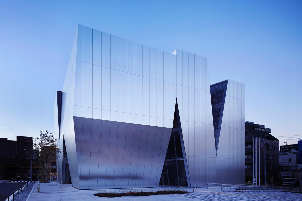
The Sumida Hokusai Museum | taken from: http://www.cladglobal.com/news.cfm?codeid=329796
About:
This is The Sumida Hokusai Museum done by architect Kazuyo Sejima. Although the voids in this particular architecture is not of main focus but the material, I thought her use of voids brings something distinct to this building.
Something similar is this piece also by Kazuyo Sejima, the voids used in the bottom left and top left of the building gave it a unique character that I wanted to try on for my model.
taken from: http://www.phaidon.com/agenda/architecture/picture-galleries/2010/april/08/pritzker-prize-laureate-2010-sanaa/
Practical Uses:

taken from: https://www.omgfidget.com/products/omg-fidget-spinners-free-shipping
Not just with its similar structures, I thought the idea of The Balancing Trio also works with the fidget spinner.
2. GPS Satellite
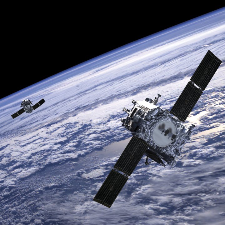
GPS Satellite | taken from:http://fortune.com/2015/08/04/globalstar-gps-satellite-network-hackers/
With the two flaps that sticks out at the side of The Balancing Trio, I thought this structure can be used to build a similar looking satellite as well.
Conclusion:
Overall, I enjoyed working and experimenting with what I can do with the blue foams and other materials to create the models. At first, I struggled with trying to see the magic in my models, however, with the help of research and experimenting with the different ideas I can work with, I found it easier to tackle this project. Having first hand experience with construction my model, I thought it was rather exciting and seeing my concept turning into concrete structures gave me a sense of satisfaction. I hope to produce higher quality structures in the upcoming 3D projects, I think that is one thing I need to work on. While constructing The Magical (P/T)ower, I glued the plastic sheets together, however, I felt that with improper planning, the glue got a little messier than I thought it would be and had a lot to clean. However, I thought that my experimentations with initially the boxes then with styrofoam really helped be to better construct my final models.
This is my take on my trip down to Holland Village on a Wednesday evening at 5pm.
With the regular heat and humidity of Singapore’s climate, one would kill for a taste of an ice cold beverage on a midday here. As drillings and hammering sounds, the “clinks” and the “clanks”, were boisterously sounded, the peace disruptions and not forgetting the unforgiving climate do drive people indoors. Hanging around Holland Village on a late afternoon is not such a great idea after all. Its famous bars and fancy restaurants were just preparing to start their day of business. Yet, a bustling and happening corner stood right out to me. The superfood company, The Project Acai, was packed. Queues that run from cashier to the entrance would usually be detested. However, the atmosphere in the air and the vibe indeed drew people in, especially when its interior is air-conditioned. Hopping onto the bandwagon, I went to grab myself a cup of superfood and scurried to a nearby vacant seat. Pop music, music to my ears, healthy snack in my mouth, views of people pretty much like myself, I feel like I fit in, perfectly.
Yippies and yuppies, they are everywhere I see. The aged, I hardly notice. With charming and well-dressed attendants behind the counter preparing delicious cups of healthy food, no wonder this place is a home ground for the youths. Young couples, still in high school, in their Monday to Friday outfit, each having a cup of Acai in their hands, are seen spending time together. I could see why this place is a magnet to these people, very much like myself. Electronic dance music (EDM), top 100 songs in the hit chart were playing at the background on shuffle. I hardly not recognise the next song that came up. Fairy lights hanging from one light bulb to another, created a fantasy-liked backdrop for friends to relax and chat for as long as they would while eating healthily. Of course, in this tech savvy age, rarely will one start devouring before taking an Instagram worthy photo of the aesthetically attractive cup of Acai that is filled with a rainbow of colours created by the wide variety of fruits in its bowl. Did I mention that one cup of Acai goodness is not cheap too?
The rowdy group of friends seated just adjacent to me slowly became the bane of my existence. Each with a personality, I can see why they are such close buds even after all these years. Taking a break from work nearby the area, The Project Acai has become one of their favourite place to drop-by in the midst of their hectic schedules. Ladies in formal office wear of knee length dresses, make-up half faded out due to the day’s work, and killer heels that seemed to lightly bruised their veiny feet, this pitstop is not a want. Guys in suits, and gelled up hair, smart looking with a hint of dark eye rings, the past few nights must have been a long nighter. Possibly the end of a major project, that day must have been a shorter day for them to enjoy a sweet treat. “Let’s get out of here to get a puff”, as she signals the group with a slight head tilt. Very soon, they were seen heading towards the back ally for the stick that first brought them all together.
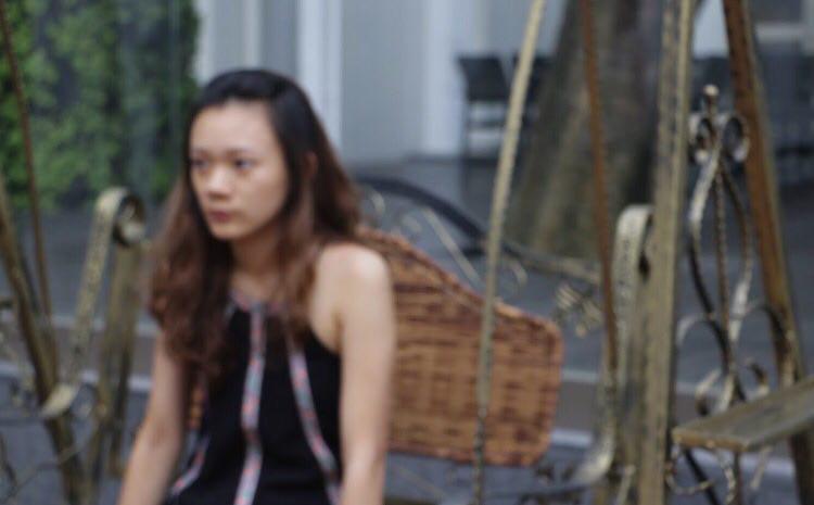
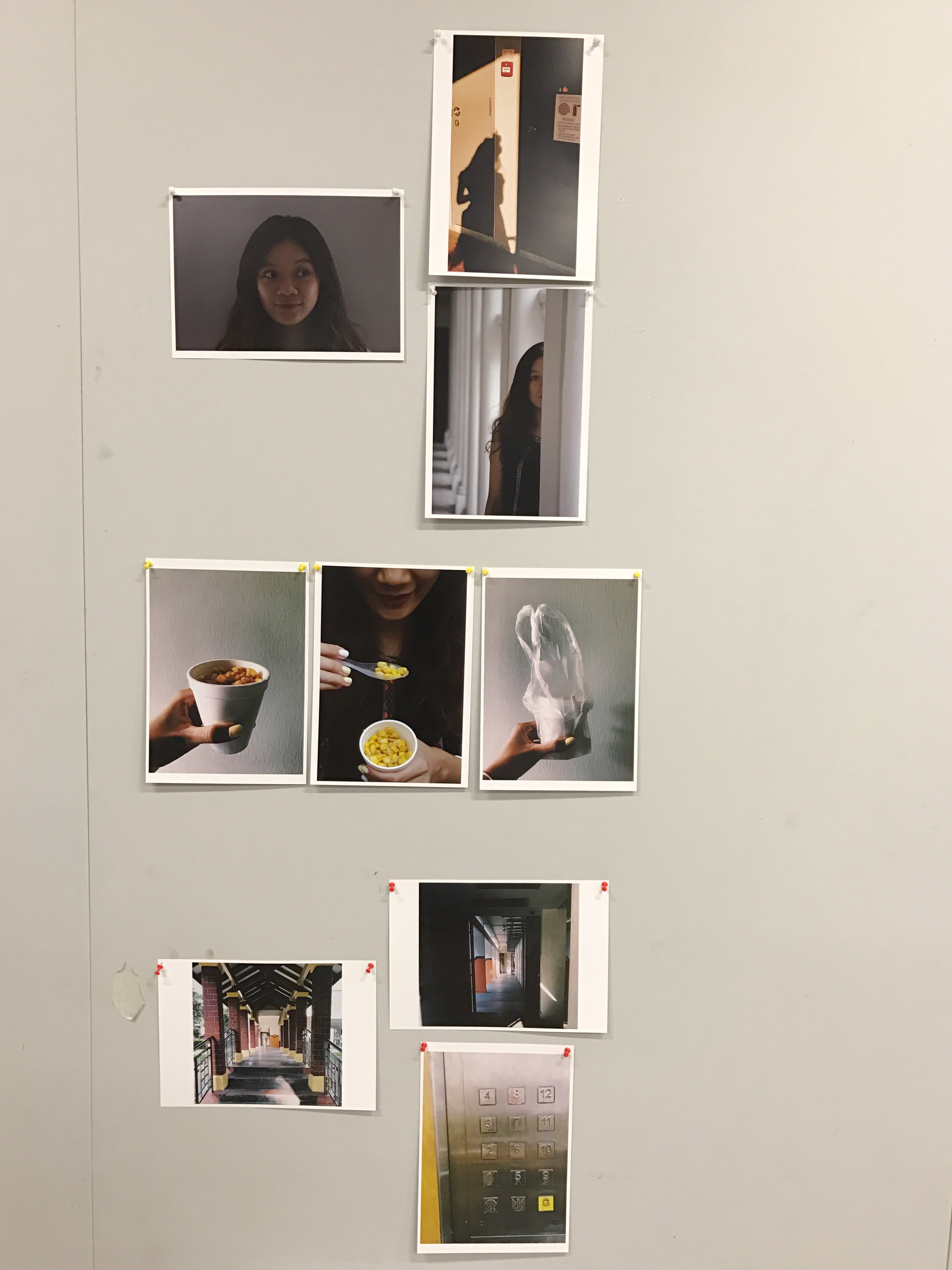
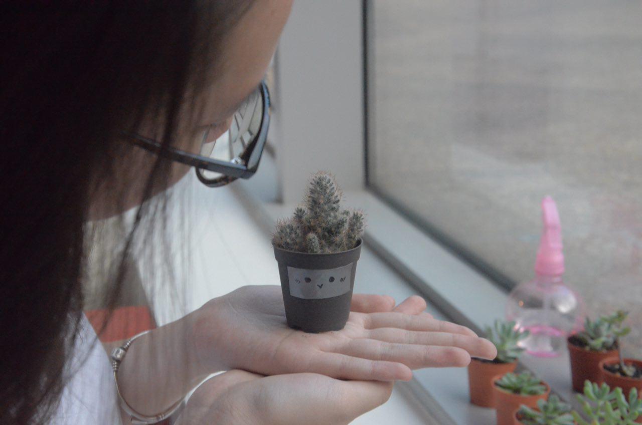
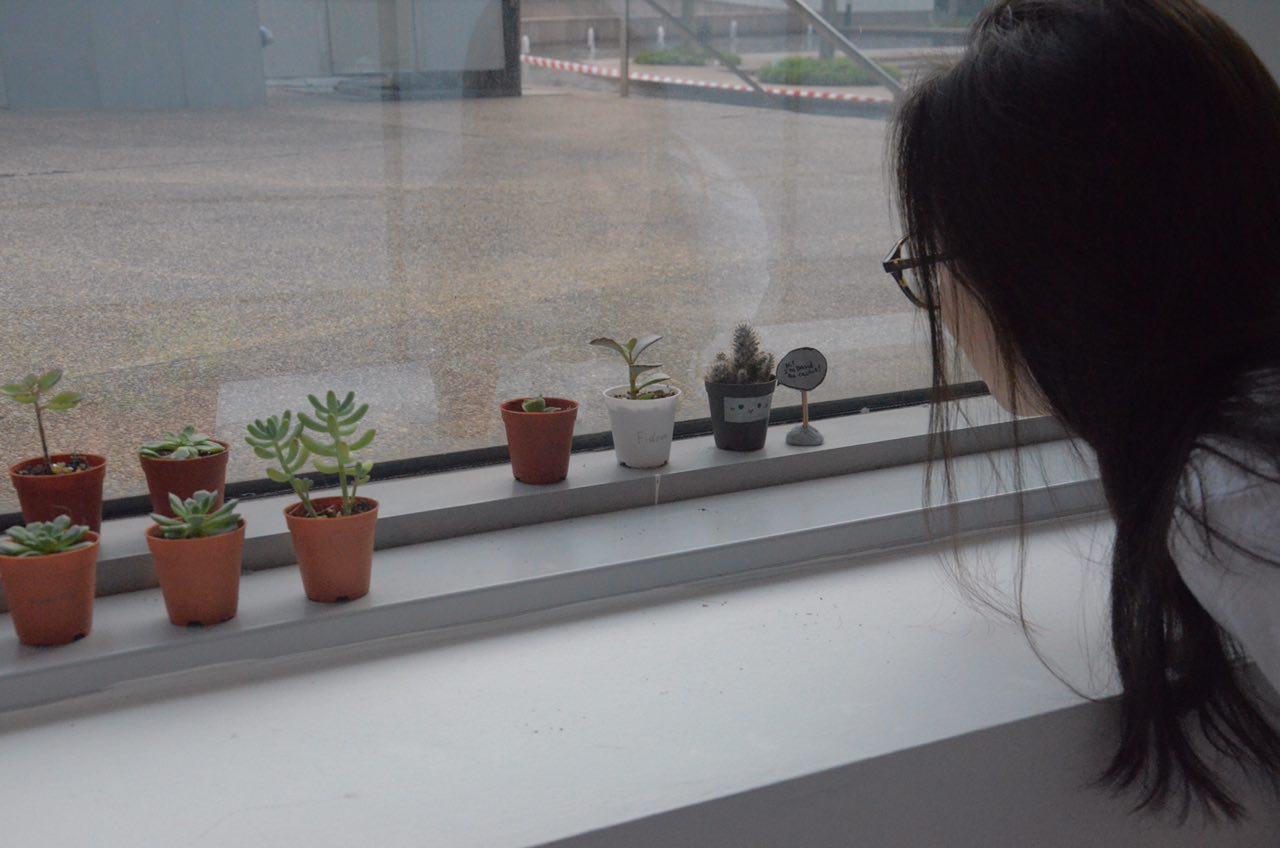
For this exercise, we are to take photos of our partners experimenting with scale and framing of our photos. My model for this project is Teri  and here are some shots of her taken by me!
Location: Basement of ADM building at the cubicles section. We saw tiny pots of succulents and cactus and we started taking pictures at that corner.
Things noted down while taking the shots:-
-Trying to bring out a certain reality about our model.
-How to use scale and framing angles to convey the reality you want to show about our model.
-The micro-expressions of our model.
This is a close-up shot of Teri interacting with David the cactus. Working with the rule of thirds, I tried to position the image such that Teri can be seen interacting with David the cactus. She is seen in the first one-third of the frame, David the cactus is seen in the middle second-third of the frame and the other succulents are seen in the last one-third of the frame.
I thought a top-down angle of this shot can show how Teri loves plants and how she cares for them. Her tender gaze at David the cactus can be seen subtly through this angle, showing her love and interest for plants.
2. Medium Long Shot / Eye-level shot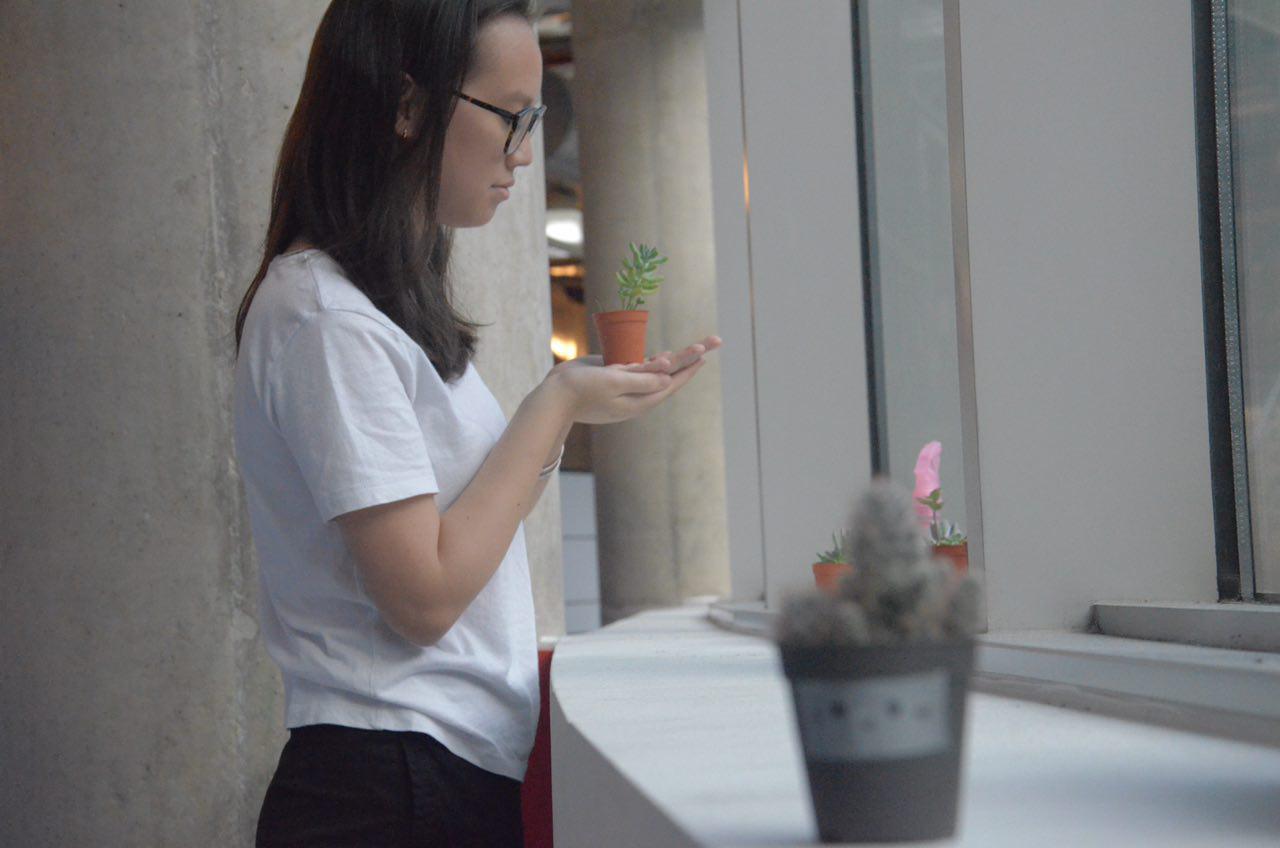
Taken from a distance, David the cactus is seen in shallow-focus while Teri and a succulent is seen in deep-focus. I thought this angle is great to capture Teri’s body language when she handles the pots of plants around her. Also, this angle very perfectly showed the humanly comparison of Teri’s size versus the size of the potted plants. This portrayed Teri as a “motherly” figure to the plants.
3. Medium Shot / Relatively high angle

As Teri is seen blending forward to have a closer look at the tiny plants, I quickly took a shot. I thought this frame very strategically got her reflection in the middle of the picture. Hence, even though it is only a reflection, it will still gain attention from its audience. This picture brings out Teri’s curiosity about the succulents in ADM.
Final Product presented on 4 September 2017
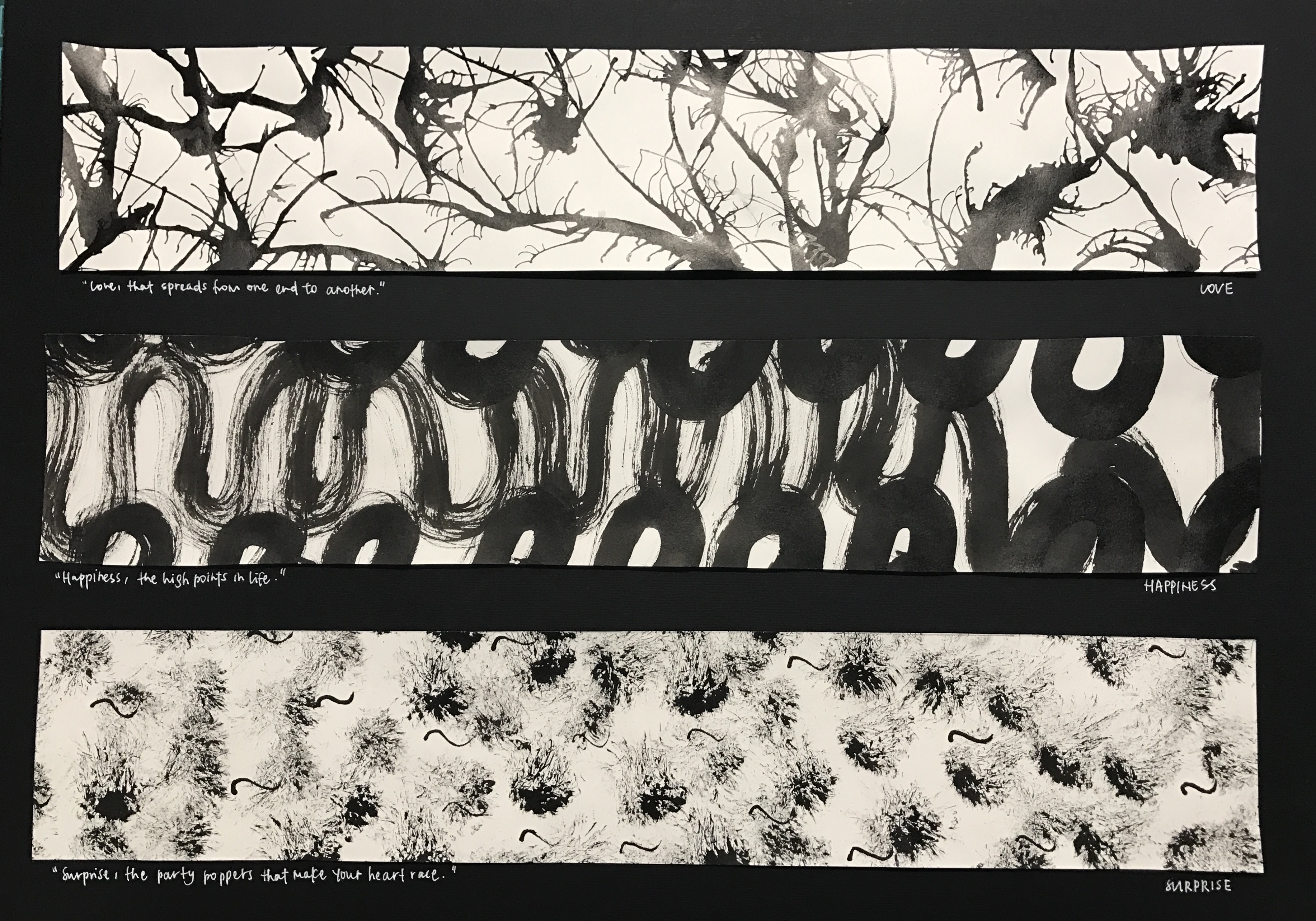

How I decided to approach this project is by first brainstorming about how each emotions resonates with me, and subsequently working with different mark-making techniques to fit the qualities of each emotions to bring out its entity. My brainstorming process can be viewed here. I decided to categorise the emotions according to positive and negative emotions.
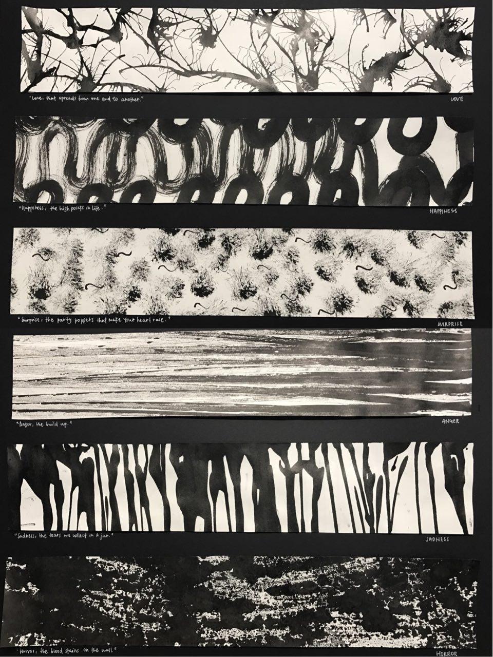
Top to bottom:
1.love
Love, that spreads from one end to another
thought process:
Love spreads from one person to another. Be it from your family members or from the people around you, love spreads in an outward motion. Also, we love because we are first loved. The feeling of being loved is similar to having tiny explosions inside of you, the tiny butterflies you feel, the warm and hearty feeling. The organic and fluid shape created shows a gradual outward motion with hard-edges. As the shapes intertwine, it shows the actions 0f love transmitted from one to another.
methodology:
The first panel was created by putting large amounts of ink on the paper and then using a straw to blow the ink in an outward direction, not fearing that they will connect with each other.
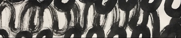
2.happiness
Happiness, the high points in life
thought process:
Happiness are the high points in life. There are high points in life when there are low points in life, hence the flowy nature of the second panel created. Life can be seen just like what is created in the panel, much like a roller-coaster. The soft-edges seen are like the times when we are overwhelmed by the tough moments in life when we find it hard to find happiness in life. However, when we try to find happiness in life, we can always find them. This was created on a huge sheet of paper to recreate the large motion of being happy since it is associated with being free-styled and liberal.
methodology:
Using a brush to create large motion of swirls across a huge sheet of paper and cropping out the section that I wanted.
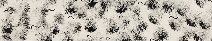
3.surprise
Surprise, the party poppers that make your heart race
thought process:
Surprise is interpreted as good surprise. Good kind of surprises are much like birthday surprises or farewell surprises. In parties, party poppers are very commonly seen, hence it is the main subject in the third panel. The motion of the creation of the third panel also brings out the surprise factor. As a semi-dry brush is jammed onto the paper to create the effect, it gives a sudden fast motion, describing the nature of a surprise. Also, the effect created very perfectly described intensity of shock across time. As time passes, the intensity of shock gradually decreases, therefore, as it goes further away from the middle, the ink lightens, bringing out the element of surprise. Initially, I thought the party popper effect was not clearly brought out, so I added tiny swirls across the paper to mimic the strings that come out of party poppers to add more essence to the panel, and I thought it worked quite well as I do not mistake them as fireworks or explosives.
methodology:
Dabbing semi-dry brush onto the paper, then creating swirls using the back of a brush.
4.anger
Anger, the build up
Anger would most of the time be an accumulation of different events that ultimately build up to the ultimate event of being angry. The gradient seen on the paper also describes the intensity of anger very well. When the limit is met and one is angry, the initial emotion will be fury and hence, it coincides with the darker regions on the panel. Across time, one will be cooled down and that will coincide with the lighter regions on the panel.
methodology:
The forth panel was created by putting ink on my mini toy car and running it across the paper to create the straight strips of ink.
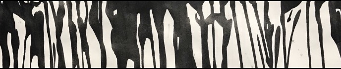
5.sadness
Sadness, the tears we collect in a jar
The first thing that came to my mind when I think about sadness is tears and the act of crying. Also, we tend to be sad over things that are significant and intimate to us, hence the phrase “we collect in a jar”, since they are something we hold close to our hearts, we will keep them in a secret place. Therefore, the fifth panel is made up of fluid, tears-liked figures mimic the tears that flow down your cheeks when you cry.
methodology:
This panel was created by running black ink down the paper, creating the dripping down effect and cropping the top section of the paper out.
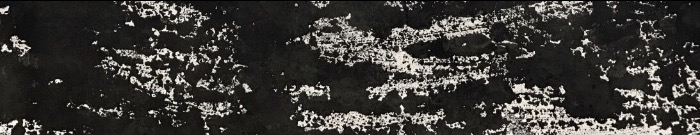
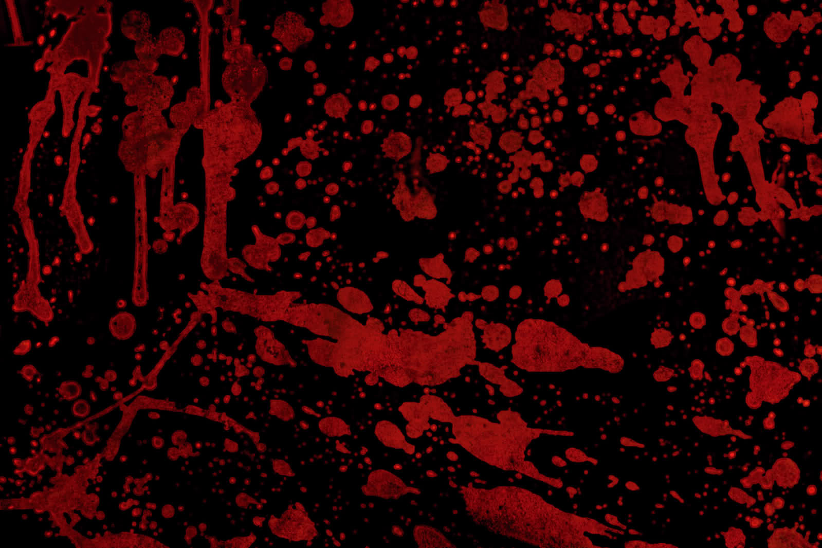
6.horror
Horror, the bloodstains on the wall

taken from: http://www.widewalls.ch/andy-warhol-piss-paintings/
I was very inspired by Andy Warhol’s oxidation painting effect as I thought they give off a gory and scary feeling to its audience. It is as if we cannot fully make sense of what is in front of us, but we sort of know its something unpleasant. Working towards that direction, I experimented with a few methods by imprinting ink from different surfaces onto the paper. I worked with different kinds of plastic bags, and tiny ones usually for food storage and found out that I prefer the effect of a zip-lock bag much better due to its smooth texture. As if blood was smeared across the glass wall, the gory effect it gave really resembles that of horror movies I usually watch.
taken from: http://historiadelavidadeblaze.blogspot.sg/2015/07/t2-carmesi.html
methodology:
Putting large amount of ink on a zip-lock bag and transferring the ink onto paper and cropping the parts out.
———————————————————-
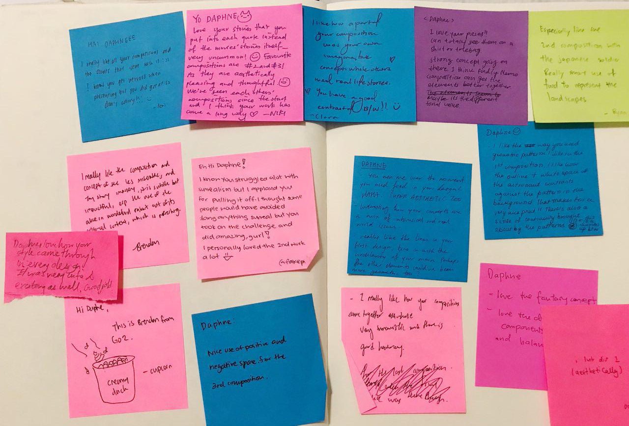
Critique:

I like the directional element to the work, how the work can be categorised as horizontal, vertical, etc. It brings out a strong visual unity…
I came to realise that how I had categorised my emotions gave a “directional element” to the entire project. Like how anger contrasted with sadness, which then contrasted each emotions even more. I thought that was a good observation by my classmate that I had unintentionally displayed in my work.
I like your idea of using quotes!
As I approached this project, I thought emotions can be hard to express sometimes, hence the word “mixed-feelings”. Truth is sometimes we cannot comprehend or understand how we feel in a certain occasion or event. I thought the quotes really put things into a certain context or situation which can bring out the idea of each emotions even more, enhancing the understanding of each emotion further.
Conclusion:
Overall, I really enjoyed creating each emotions because they truly resonated well with me. Also, looking at how my friends created their prints was really interesting as well as I have classmates who experimented with oil and also capturing the contact print of a ball hitting the ground and et cetera. Even so, I enjoyed experimenting with different objects that I can find at home to create these prints as a final product and am overall encouraged by my lecturer, Joy, and my classmates’ comments and feedbacks for project 1. Although I would have hoped to be riskier with the objects I used, but never really got to try. Despite that, I thought this has been a great opportunity for me as during the process, I constantly found myself on a look out for objects with interesting texture and how I can use them for mark-making. As we close this project, I hope to further try out different mark-making techniques and hope to work with the linoleum and the pressing machine in future!


Some test shots taken for Project 1: Picture Story — Curating Self


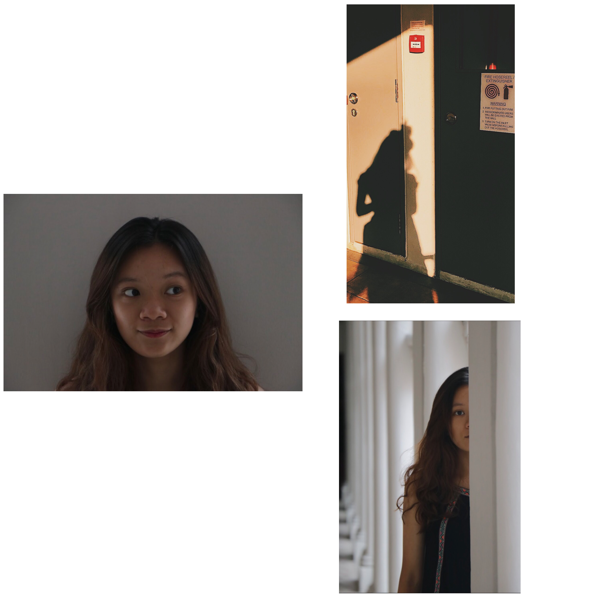
1.
This image under Task 1: Me is inspired by Lee Friedlander and his style of photography. The way he subtly inserts shadows or reflections of himself in his images urges me to experiment with taking my shadows and reflections.

taken from: http://www.atgetphotography.com/The-Photographers/Lee-Friedlander.html
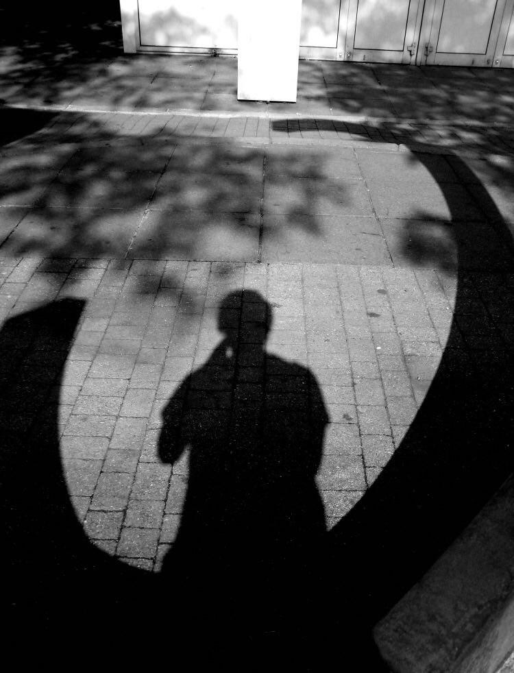
taken from:https://joshuabwakley.wordpress.com/tag/lee-friedlander/
2.
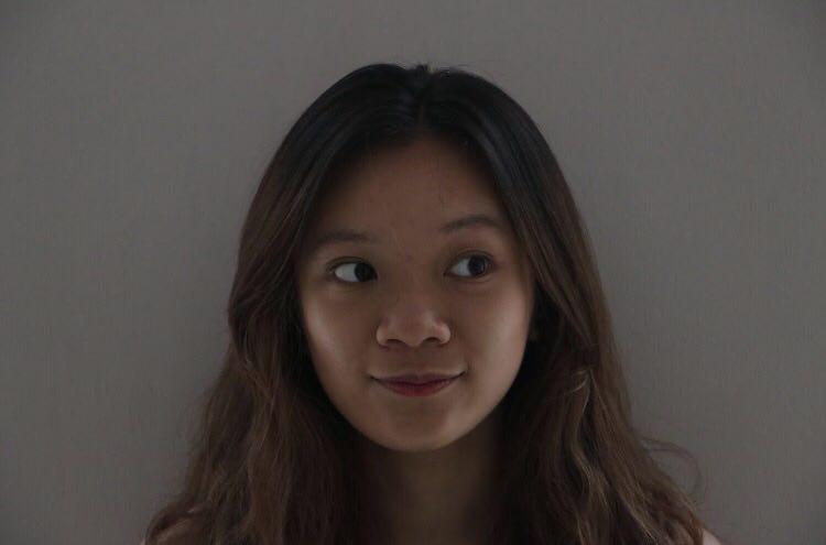
This image is also from Task 1: Me and I got inspired by Shirin Neshat’s portraits to do an up close picture of myself, except to add a little twist to it by showing a more fun side of myself rather than a serious side, which Shirin Neshat usually does.
taken from: http://signsjournal.org/shirin-neshat/
hMy Presentation on 31 August overview
Task 1: Me
Pictures used:
Sequence on presentation day
Write up:
As viewed in a somewhat circular motion, the first image that should catch your eyes first should be the only landscape photo, followed by the other 2 portraits.
This series shows the outer and the inner me as a whole.
Shot at eye-level, this picture of my close up face, as seen from shoulders up portrayed a very open truth about me as everyone will view or first notice on the outside. Having my face in the centre of the picture shows no hidden part of me. Just like what is shown, I am someone bubbly, cheerful, all smiles, positive. And if people know me well enough, I can sometimes be quirky!
As you continue to know me in a deeper level, we continue the series in a clockwise direction. This shot is taken in an eye-level, mid-shot. I can be someone who does not share my life that openly to the people around me and would not be an open book. The warm hue in the second picture depicts me in my comfort zone, taken during a golden hour. The bun was kept in the picture as seen in the shadow to still keep the elements of me that most people will know on the outside, positive, bright, quirky. However, a silhouette shot gave a sense of mystery in who I actually am on the inside. Yes, people do know me, but there will be a part of me that they will try to pry open but fail to succeed.
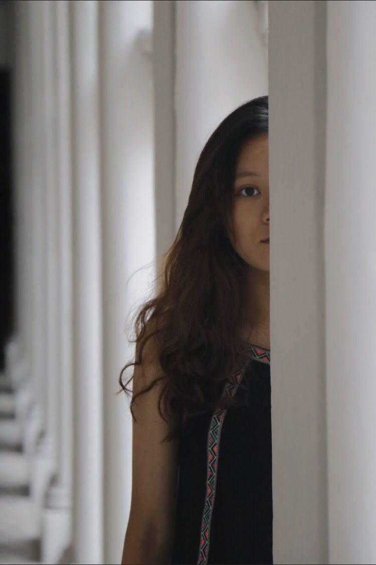
Moving along, the third picture is taken strategically to only include half of my face in the focal point. As I am staring right into the camera, it shows that the outer me is also the real me, no jokes, no kid. Yet, the inner me is another side that will not yet be shown. Also, there are times when I am alone, things might not always be that happy and positive for me, hence the expression. I am not exactly a social butterfly because I crave my alone time to think, reflect and feed my soul.
Task 2: Object
Sequence on presentation day
Write up:
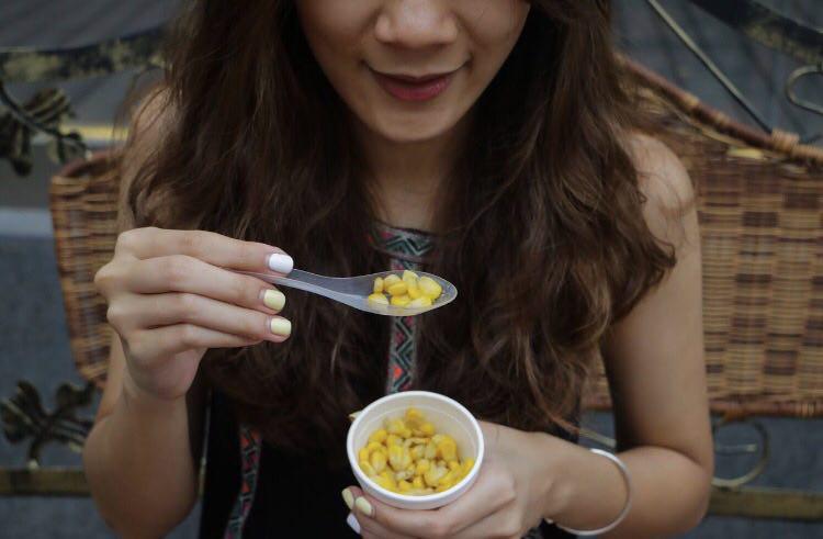
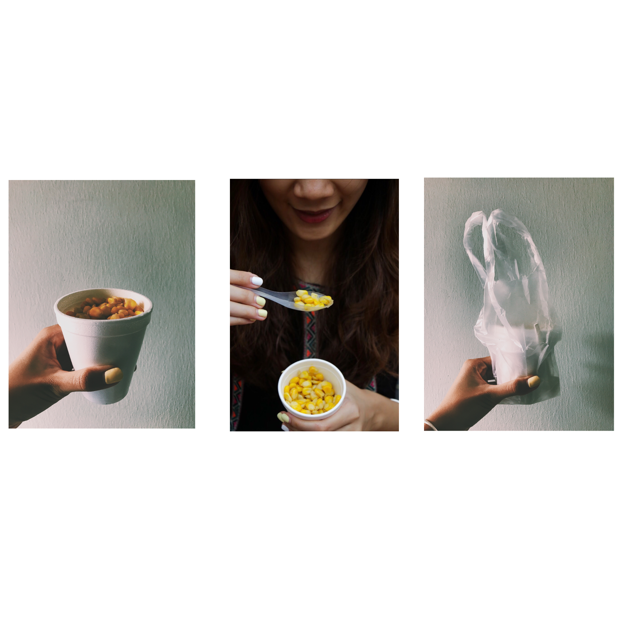
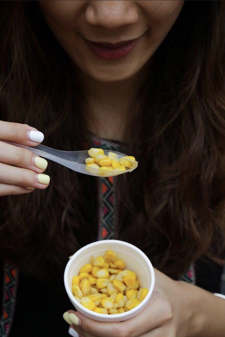
The attention should be put on the middle picture in this series that depicts how I truly enjoy eating corn. In fact, I can eat it for any meal, I will not complain. Taken in a top down angle (high angle), close-up shot, it can clearly show the act of me consuming the cup of corn, using the rule of third.
It is significant to me not because it is my favourite food, but also because it reminds me of the people whom I love and also love me.
So a little back story, the number one snack my parents always get for me is a cup corn be it in Pasar Malam or when we are overseas and it continued till today. It has slowly become my favourite food. Even thinking and talking about it now makes me salivate! I receive it out of the love they have for me. And as it slowly becomes my favourite food, yellow also slowly became one of my favourite colours. Like its colour, it makes me happy and positive and I think this can explain my positive front as a person as well.
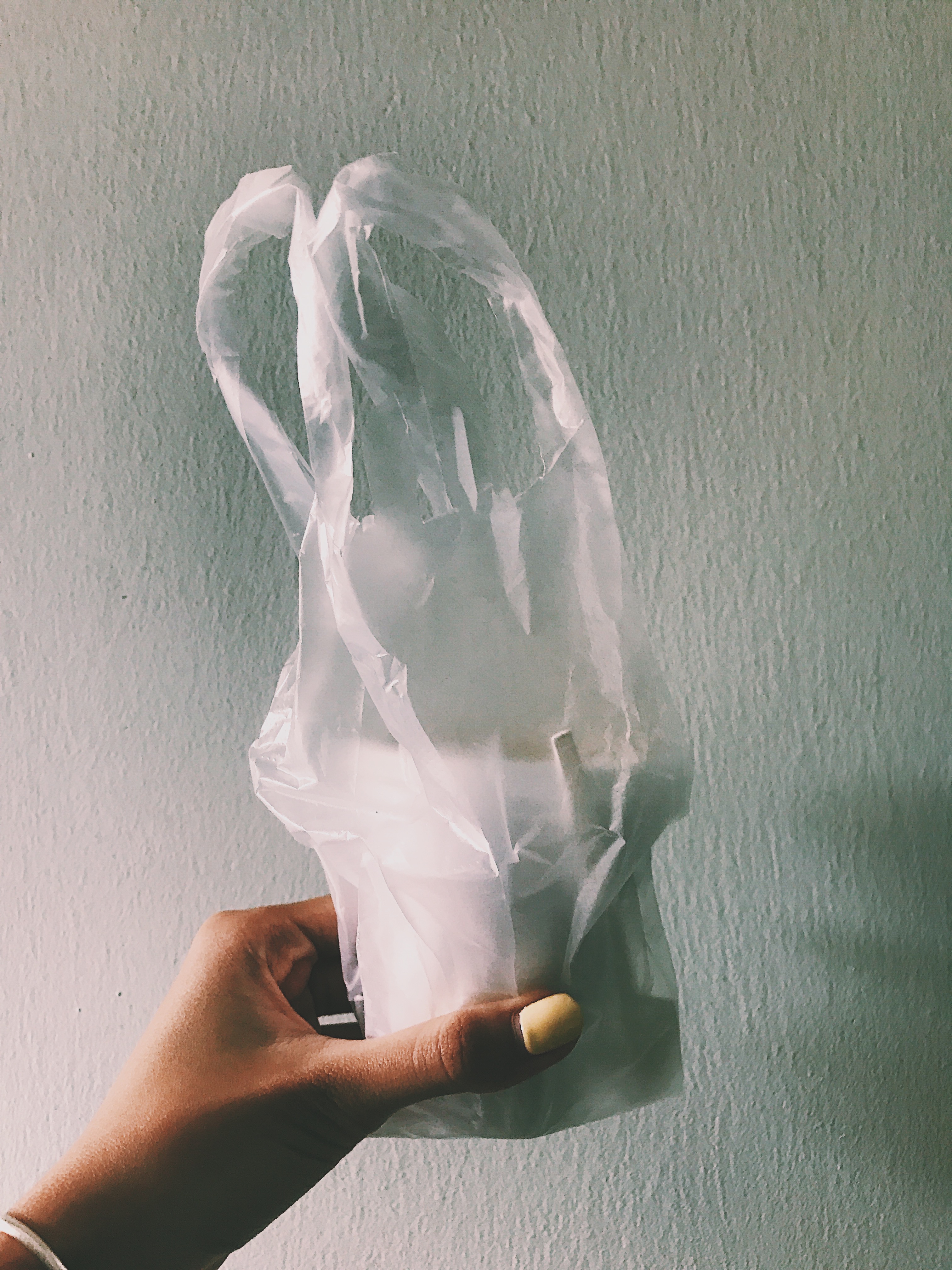
Why I choose to include the picture with the packaging and the plastic bag is because I often receive it this way, in this packaging whenever someone buys a cup of corn for me. It is how I see and receive it.
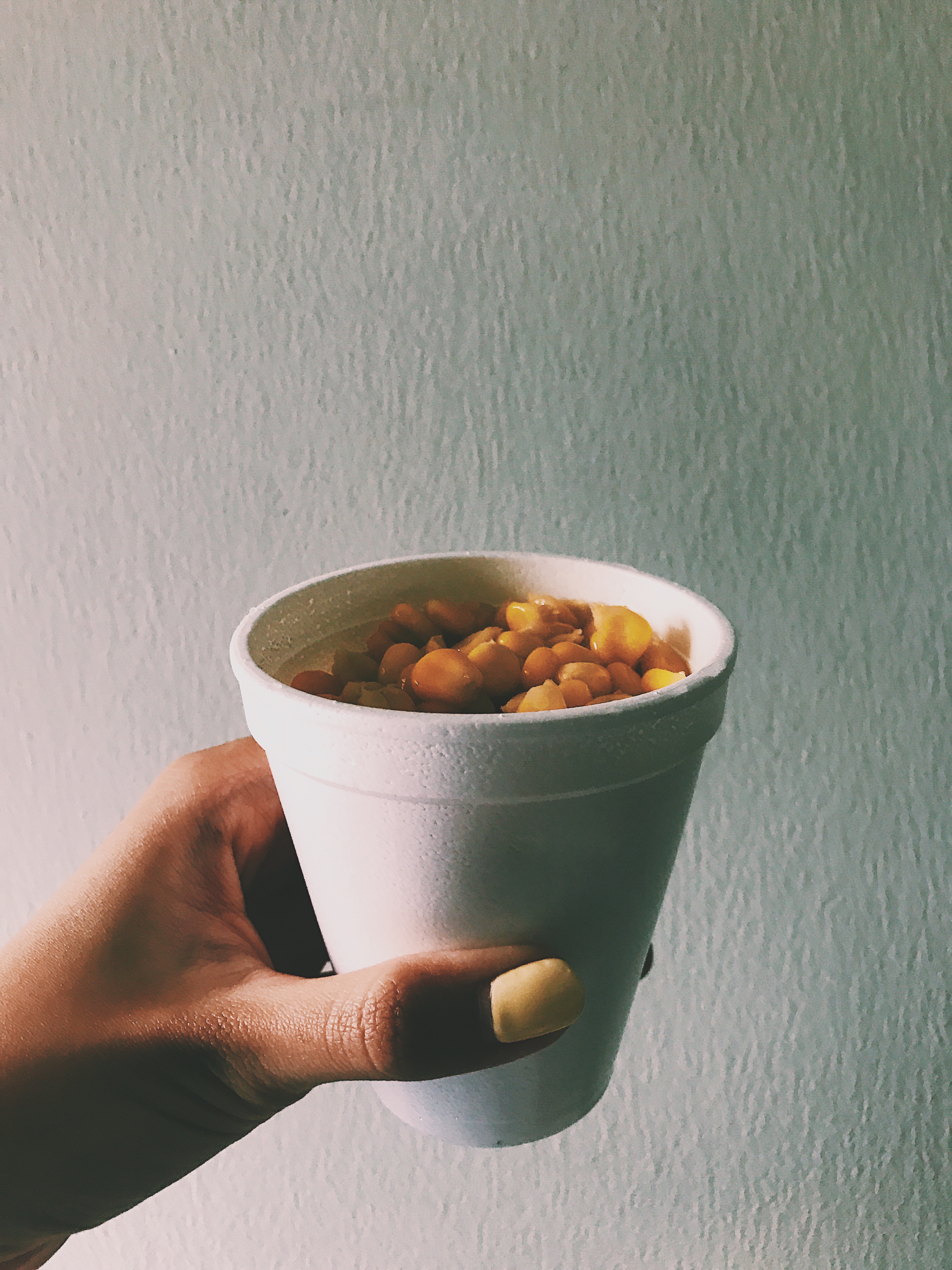
As for the picture of the full cup of corn, this is the sight that will never fail to make my day as I get ready to eat it.
The two shadowed background for the first and third image strives to tone down the lighting in the surrounding to put more emphasis on the brightly coloured corn in the cup. Also, it directs the audience attention first to the process of me eating the cup of corn, which was the effect I wanted.
Task 3: Place
Sequence on presentation day

Write up:
The place I chose is my neighbourhood, my void deck. I have lived in Ang Mo Kio for as long as I can remember and it is a place where my family members always gather during special occasions as I have many relatives living around me in Ang Mo Kio as well. It is significant to me because it means “home” to me, a place I am very familiar with, a place I know at the back of my hand. This series of shots are taken at eye-level to show accurately the exact site I would see as I am on my way home.
This series shows my usual route home. It aims to guide its audience how it is like for me to go home, a place of comfort, love, familiarity.

This stairway guides me home, and is where my family members will meet whenever we retrieve the car or want to get a drink from the mama shop nearby.
The second picture has dark hues of colour, yet shows a bright vanishing point shows how it is like for me when I finally get closer to home, to comfort. The day might be long, tiring, but I know once I walk this stretch, it means home gets closer and closer, comfort gets closer and closer. The vanishing point created in the frame gave the result I wanted as the diagonal lines of the concrete floor and the ceiling directs the audience’s attention to the direction where I am heading, very much like I am taking my audience on a journey back to my home. However, this shot is taken with a slight tilt to mimic the motion of me walking back home. This effect shows a much clearer idea of how I am bringing my audience through the pathway home and gave the effect of me walking towards home.
The last picture shows a top-down angle of what my view will be like when home is closer than it is. The level I stay on, and the sight of familiarity. The level eight is where I live on.
Conclusion:
Overall, the journey of curating the three series has allowed me to reflect on what are significant to me in life and discovering my identity in the process. Besides, I got to experiment with different angles, framing and shots and realise how each image, when carefully thought through, can each tell a story. In a nutshell, it was a very fun process in creating the images and using them to tell a story about me.
I hope you had fun viewing them and got to know me a little better thought the images I have created!
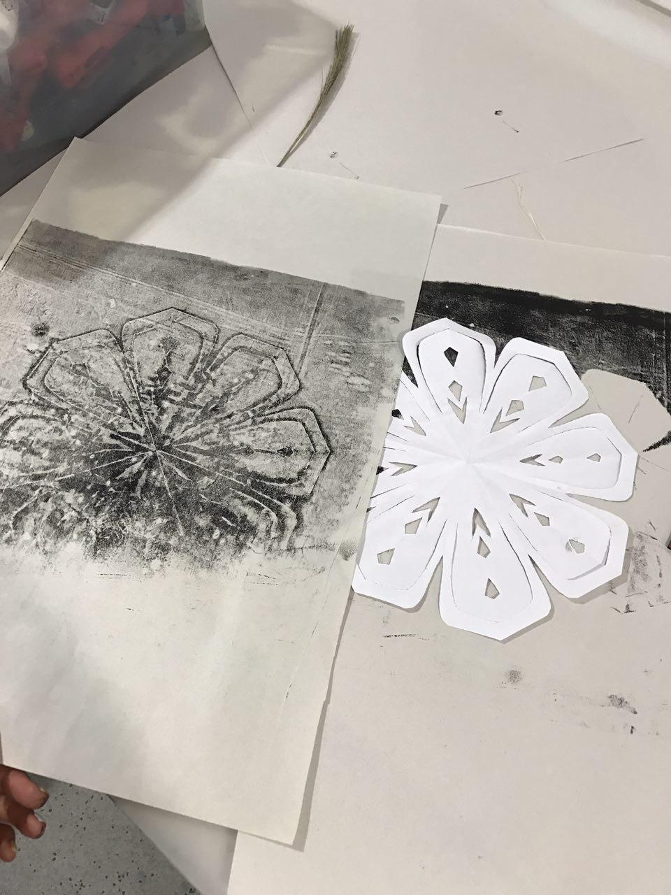
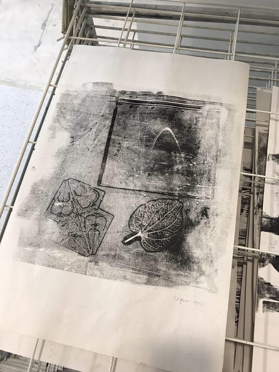
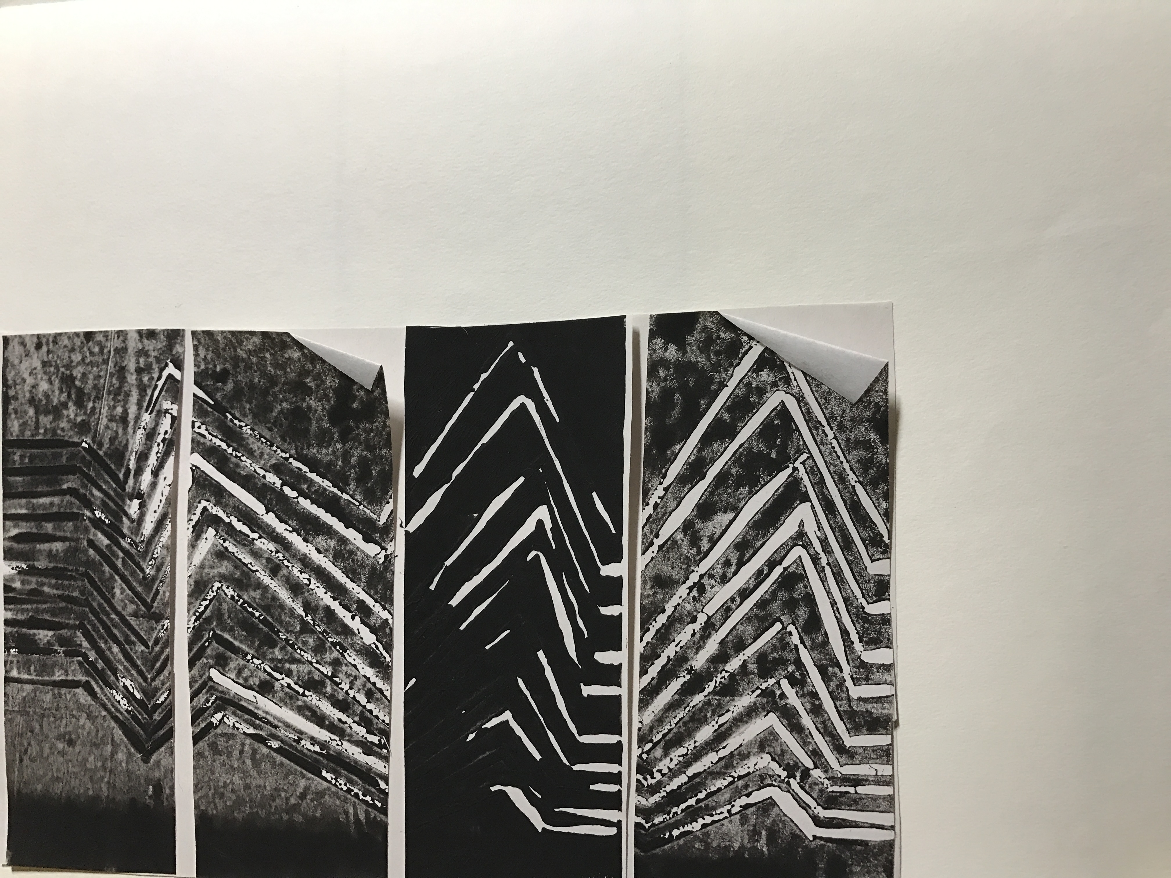
After the first lesson of introduction to make-making, we were required to bring along with us some textured items from home to try out mono-printing in the studio.
Before approaching Week 2, I brainstormed and experimented with a few mark-making techniques and the different results that I will get from it to evoke some sort of emotions.
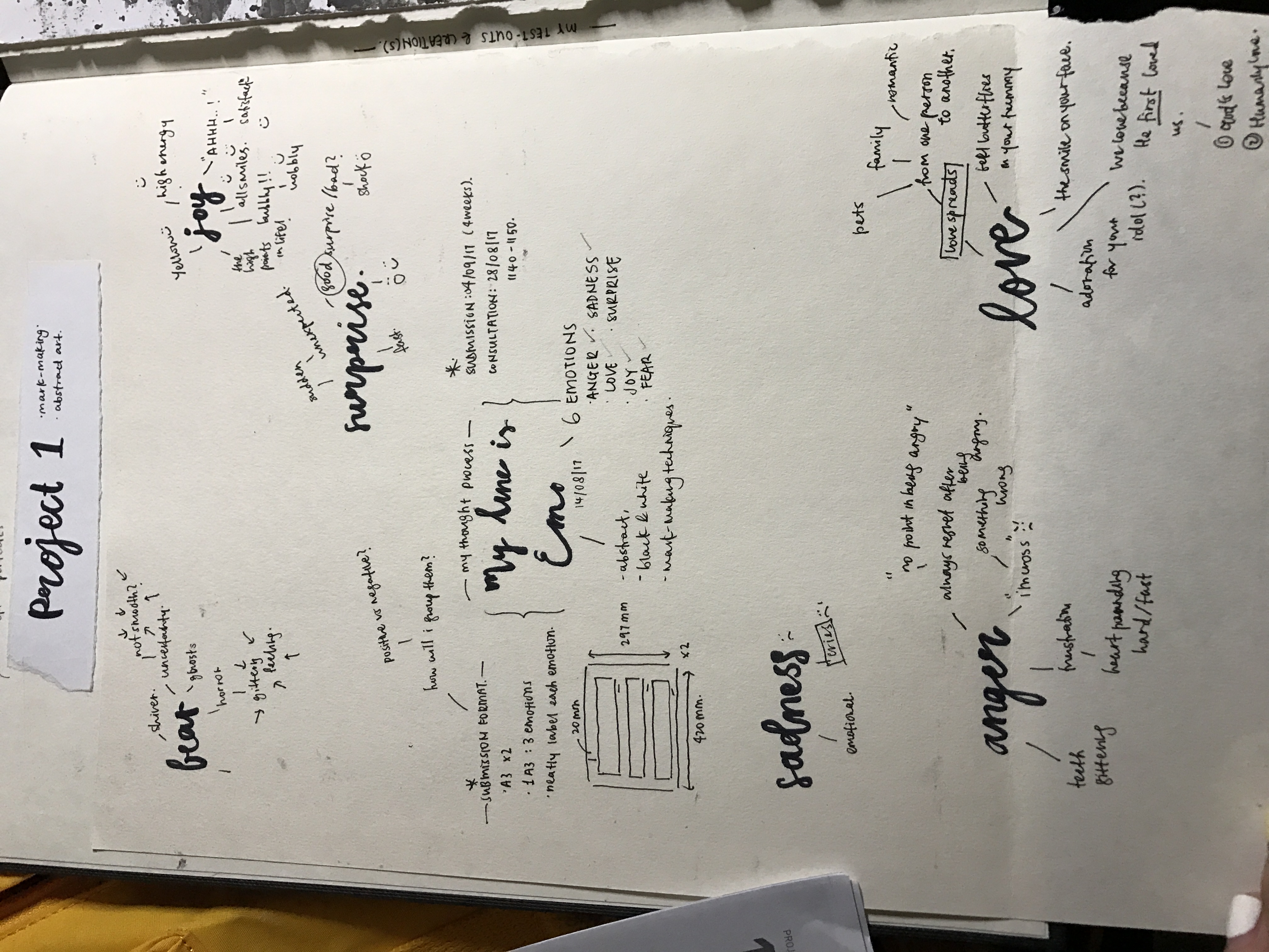
A page of my Visual Journal on my thought process upon approaching Project 1: My Line Is Emo
fear
-jittery feeling/ shiver
-uncertainty
happiness / joy
-all smiles (too literal)
-the high points in life
-high energy
-free, liberal
-yellow (cannot, because only black & white)
surprise
-sudden, unexpected
-good/ bad surprise? good. (e.g.: parties?)
sadness
-TEARS
-crying
Anger
-tensed
-being crossed
-accumulated events
love
-love spreads
-family, friends
-we love cause we are first loved
-some sort of adoration (?)
Here are some of my formal experiments (informal ones include spontaneous try outs which might have unsatisfactory results that are not worthy of documentation):
1.
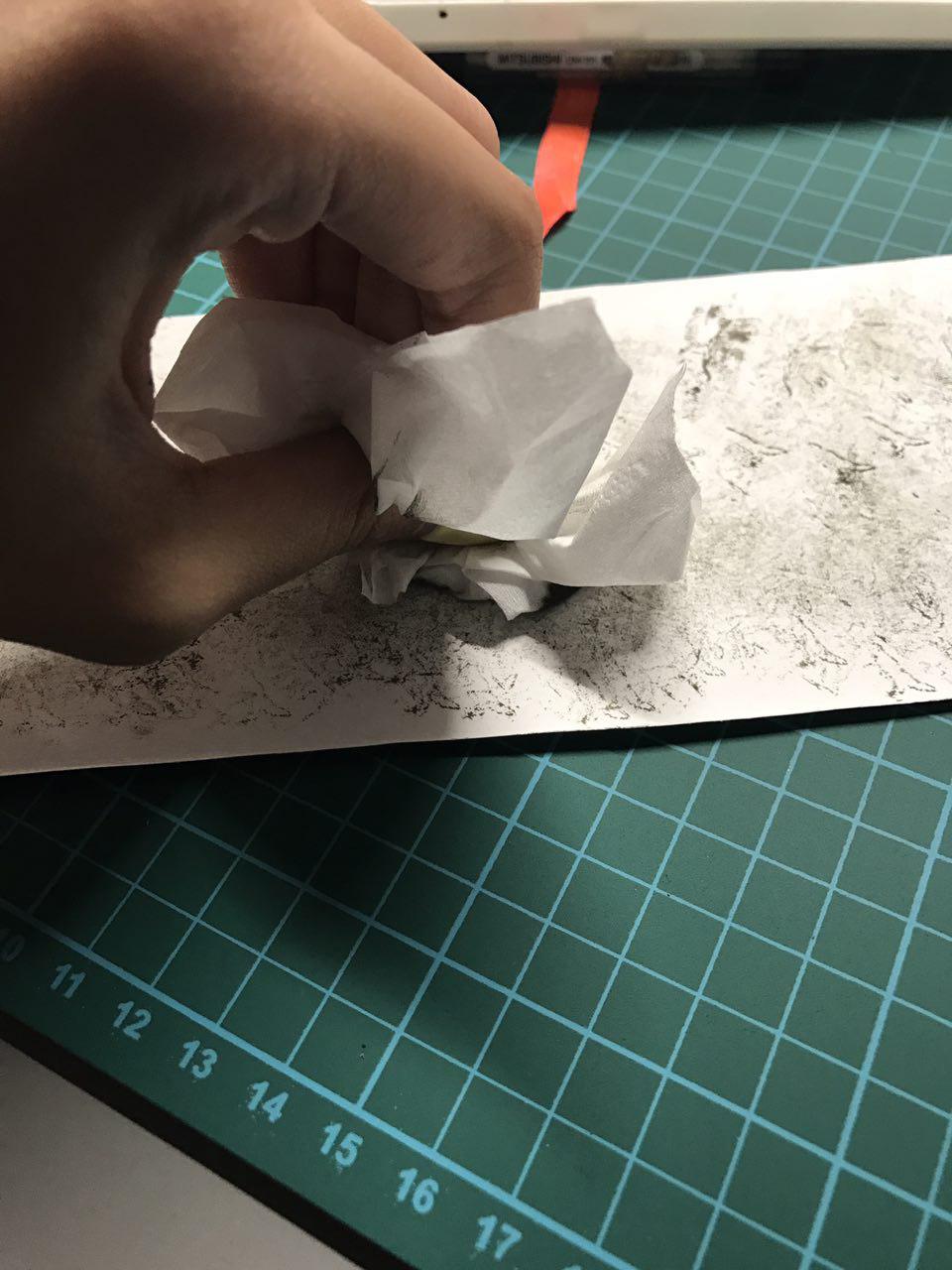
Dabbing crashed tissue on paper with as little ink as possible
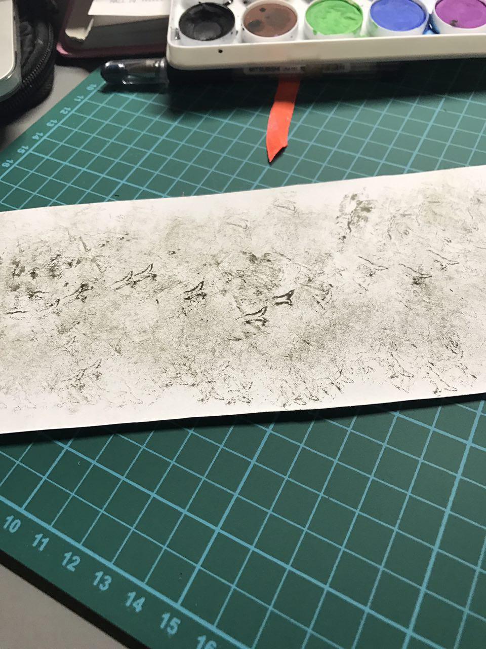
End result
thoughts:
I thought that the result was rather ideal, I had tested out with it before and I realise that the result with more ink was not as desirable as it does not bring out the texture of the crashed tissue as much compared to with little ink.
The end result gave a very smokey feeling, somewhat mysterious which might evoke insecurity as it feels like some parts are hidden yet you see a figure through the ink, but you cannot quite figure out what it is. It then also evoke confusion.
2. Ink Dripping Method
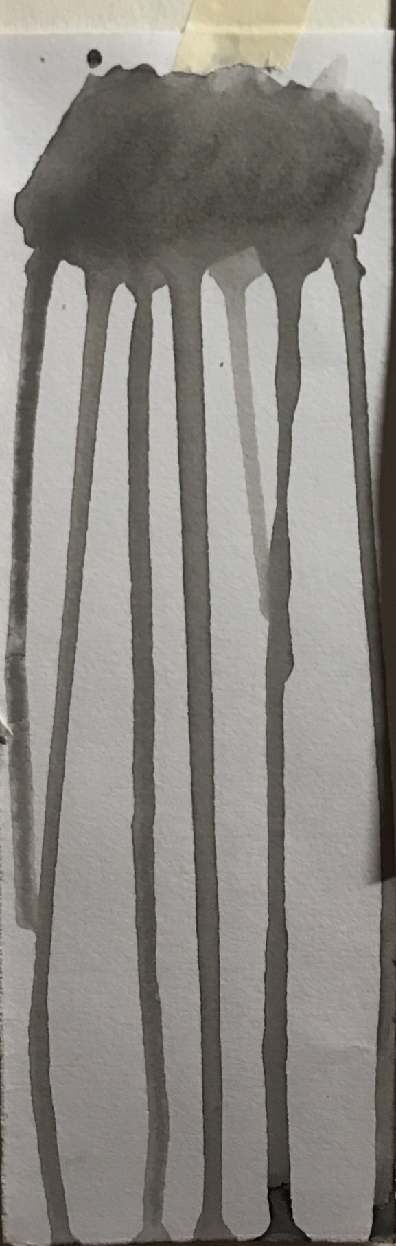 thoughts:
Sadness, the tears we collect in a jar.
I thought sadness was the most apparent for me as I approach this method of mark-making. As seen on my Visual Journal, the first thing that comes to my mind on sadness is act of crying. I thought the result I got evoked the motion of tears flowing down really well.
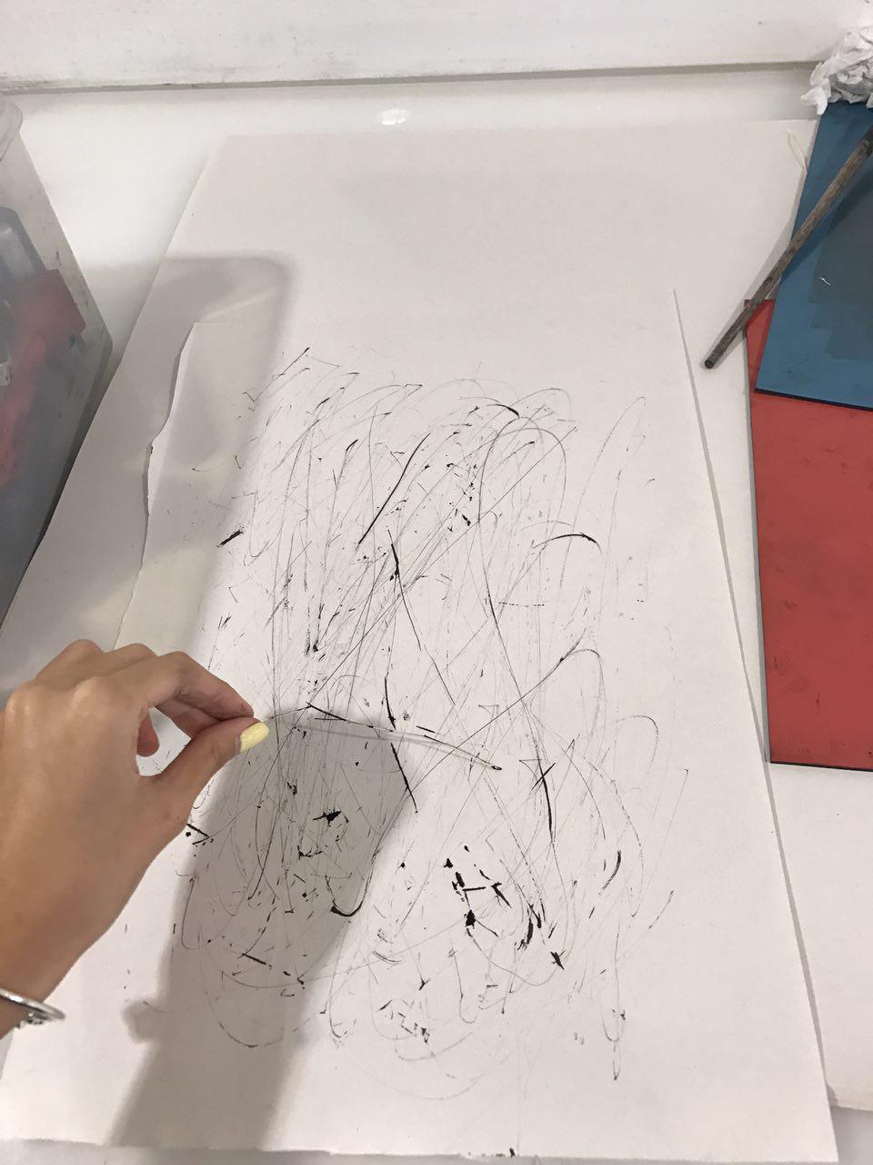
3. Pencil Rolling Method

thoughts:
Fear, the jittery feeling you get
The pencil rolling technique on paper gave an unexpected result for me. After experimenting with it, I really appreciated the effect it gave. It felt like the jittery feeling you get when you’re afraid, hence evoking fear. Moreover, I felt that the pencil rolling technique gave an uneven touch as I roll my fingers across the paper that gave a very unique sensation to my fingers. As I roll my fingers faster, each pause gave a mini jerk to my fingers, resembling the heart-pounding effect when one is afraid or in fear. Even though I did not use this method for my final product in the end, I still really liked the effect it brought out.
4. The Ink blowing method

thoughts:
Love that spreads from one end to another
The ink blowing method involved me placing large amount of paint saturated with water on different parts of the paper and then using a straw to blow on the ink spots, causing them to flow in an outward motion. I thought this method of mark-making very correctly depicts how love is showed in the society. As one demonstrate love to another, it spreads like wildfire from one to another, very much similar to hate.
5. The Plastic Ink Pressing method
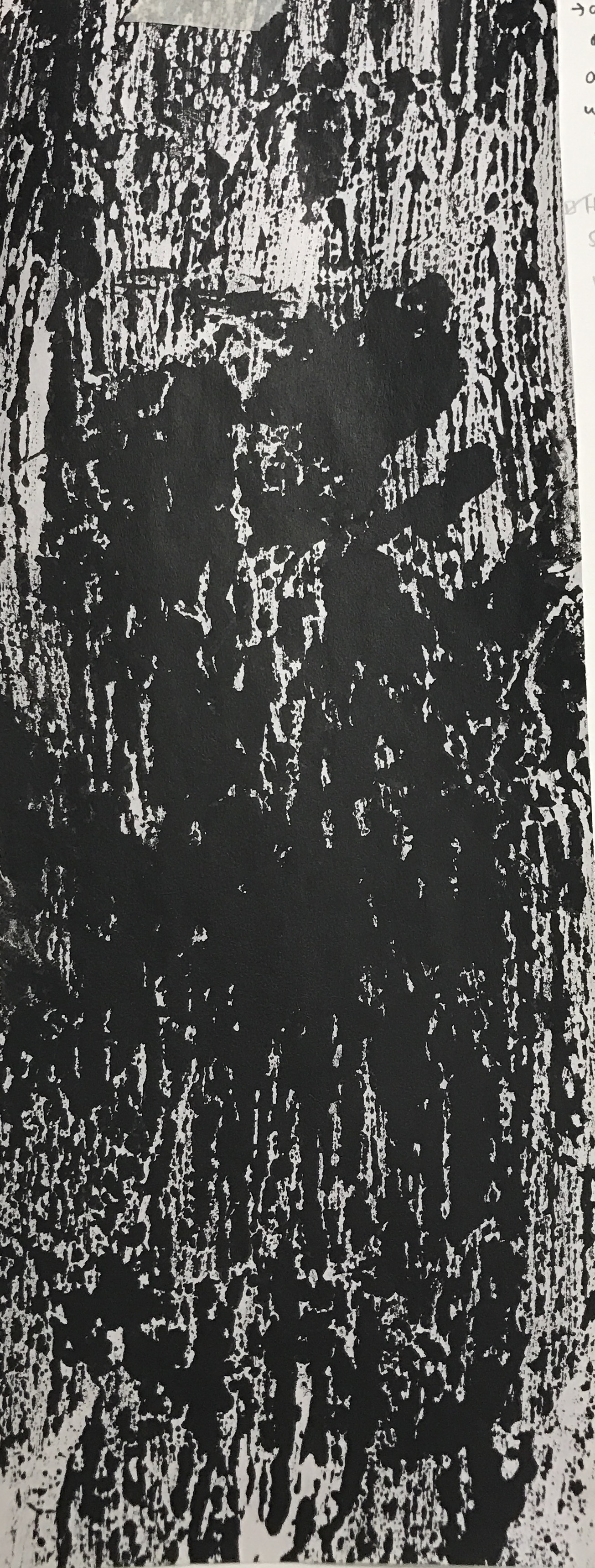
thoughts:
Horror, the bloodstains on the wall
This mark-making method is one that I have already experimented with, except often with many colours. This time round trying it with only black ink gave me a very eerie feeling, very much like horror.
I gave the method further thoughts and felt that the plastic sheet did very much resemble a glass wall, and the ink resembles blood stains. One method I want to experiment with is putting ink on my five fingers and then getting paint on the plastic sheet and then transferring them onto the paper itself. This will very much resemble the real act of a murderer, hands filled with blood and then smearing the glass wall.
6. The Semi-dry Paintbrush method
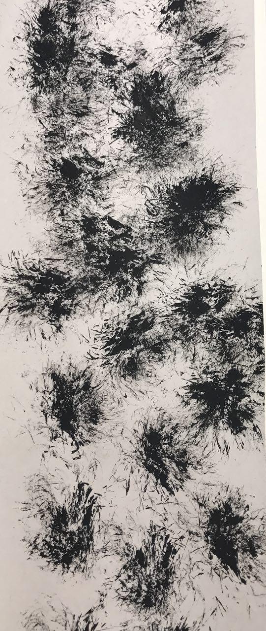

Surprise, the party poppers that make your heart race
thoughts:
Surprise is an emotion I found very hard to create. I would interpret it as a “good” kind of surprise.
After experimenting with the creation of prints similar to that of party popper, I decided to add a little twist to it! ADDING TINY SWIRLS to mimic strong from party popper!
Some experiments done in class
Some of the items that I brought included:
-Leaves
-Tissues
-Self-made doilies
-Air-tight bags
-Twigs


 self-taken
self-taken
self-taken, inspired by Julie Mehretu
