Discovering Anger as a State of Mind Through Social Broadcasting with Annie Abraham’s Angry Women

Anger as a State of Mind

Anger, an expression, an emotion, a state of mind, the heat the rises from your gut, that irritates and exemplifies when another one adds an irrelevant comment. The frowns, the screams that are associated with the deep emotion is the expression of anger. Perhaps a slow-boiling ball of fire slowly eating you up on the inside. Annie Abraham’s Angry Women has demonstrated through the Third Space, the emotions and expressions associated to the feeling of anger.

About Annie Abraham’s Angry Women

Annie Abraham’s Angry Women consists of 5 webcam videos of women expressing their feeling of anger. Each video is unique in its own ways. Take 1 & 2 is a mixture of female and male, take 3 & 4 is one where there were 24 women of different nationalities of which they get to express their anger in their mother tongues with a limit of 12 minutes, and for Take 1 & 2 the 12 women were to express their anger in an unlimited amount of time, and stops until there was no anger left in the women. In Take 5, the 9 women were able to act, getting as close to their anger as possible.

On the Third Space vs In Real Physical Life

…to be present in this universe of alone togetherness. -Annie Abraham

A remark she made on Take 3 & 4, the women who expressed their anger were without any accompaniment in in their physical space, but with accompaniment on the Third Space. The women were alone, but when they meet on webcam, the Third Space, with a click of a mouse and connectivity, they instantaneously became together. Very much similar to websites like Omegle, the platform connected these people who did not know each other beforehand to meet on the platform for the performance. I reckon it would have been much tougher if the women were to be called to express their anger in real physical life.

Having not met each other beforehand, being task to express your anger (an emotion that exposes vulnerability) to a group of people you have not met before is tough. I think there might be two responds; some women might be more reserved while some might be able to openly unleash their anger. This might be because the other women on the other end of the screen do not know who they really are. Expressing their anger through social broadcasting, they are offered a assumption of acceptance as the women are still on the line on the webcam, each taking turns to express their anger. Perhaps the stark difference shown in the way people express their anger through the webcam and in real life is that the “bad feelings become less toxic when released” on the Third Space as written in Sherry Turkle’s Alone Together. “Each takes as its premise the notion that you can deal with feelings without dealing directly with a person” that might be related to the emotions that you are feeling. Using another medium to express the anger rather than facing it head-on can be another method of anger expression today. Or perhaps people are just more irritable in this century that anger management have to be tweaked.

Anger to Women

The subject used for the online performance stood out to me. The emphasis on women rather than men.It was researched that women and men feel anger in different ways. Women often describe their anger using words like “hurt”, but not men. Also, women’s anger after often a build-up of events. In fact, men and women lack the control over their anger as compared to the other emotional state like anxiety and fear.

Looking at Annie Abraham’s Angry/ Colère, similar to the Please Change Beliefs by Jenny Holzer, she was able to receive responses from the public about anything regarding the topic of anger. It was interesting reading the responses on the site, the rage within people. One stood out to me.

Anger is eating me, from the inside, all my life, because of loneliness and lack of attention because it is still stupid in some ways, anger is a form of stupidity and this is a limitation in consciousness. Expand our consciousness in realizing that we are all connected to anger dissolve in ourselves and in the world. Experiencing this is the highest form of art for me. Anger is studidity, and i think we are not here to be stupid. – Anonymous

Being aware of the state of anger is a limitation to the responder who felt that it is merely something in you that is eating you up slowly inside. Knowing anger is not healthy or good for you. Angry Women allowed for the anger that women are experiencing to be shared and released through the Third Space via a webcam. The solution to the awareness of anger could be to vent it all out, touching on the state of mind of being angry rather than the situation that caused their anger.

Anger as a Universal Language

But for me it was quite hard now to watch the take in French in which I almost couldn´t understand anything. So, I realised, that for me (from a spectator´s view) the content of what we are saying is not irrelevant and that understanding some bits and fragments of our talking is important.. -Martina Ruhsam

The frowns, the screams, the fists, even though they were tasked to express their anger in their mother tongues, the frustration can be felt nonetheless. There might be a language barrier, yet the anger expressed is a universal language to all. With the instilled visual literacy in all of us, we could interpret the actions of the women to associate them with anger expressed.

At the end of their expression of anger, I am taken aback by how the women were liberated with joy and how they responded by woo-ing and having smiles on their faces. Perhaps the real solution to it is to directly approach the state of mind, rather than the situation itself, being angry.

Conclusions

I am not a performer, I use performance to do research.
I am not a researcher, I use research in my performance pieces.
I am a performer who uses research as a medium.
I am a performer researching encounters. – Annie Abraham

Annie Abraham’s Angry Women has just opened our eyes to the human reaction to exposing our vulnerabilities through social broadcasting and the state of mind of being angry She successfully explored and “study human behaviour without interfering in it.” Looking it in a bigger picture, all the women in the videos had help one another in a certain way to “be there for them” to vent their anger.

..it’s the effort of a group of people solving a problem collectively. -Annie Abraham

Indeed.

Additional Readings and References:

Anger, the Mismanaged Emotion

Anger / Colère

Disentangling the Entanglements

Trapped to Reveal – On webcam mediated communication and collaboration.

Visual Literacy in Teaching and Learning: A Literature Perspective

Alone Together by Sherry Turkle
i aM My desktoP: tHIs whAT i cAll OrGanizeD meSs

This is a screenshot of my desktop – observe the mess (and the multiple screenshots)

In my defence, I have everything I need on my desktop itself, notes, reminders (on the memo pads) and screenshots I need for my OSS posts for other modules. Everything is readily accessible and I do not have to go back and forth my finder to search for the applications. Likewise, this shows that I am always ready for whatever I am doing, bringing with me more things than I actually need. I always find myself having more things than I actually need in my bag. (waterbottle, jacket, tissues, etc)

Everything is put against a pale yellow (my favourite colour) background to allow me to stay focused. I know how and when to be focused and when to have fun. So when it is time to focus, I know what gets me in the mood to be doing work.

The many Google Chromes at the bottom right is for different things that I am doing or researching. One on OSS and school research, the other is on YouTube and my personal stuff! I often categorize my things. Similar to my phone, I group my applications based on their functions. At home, my dresses are placed together, my T-shirts and shorts are placed together. Hence, I am a person who will categorize my things.


Face to Facebook, Former Day Catfish

Face to Facebook,

Face to Facebook is an online installation piece put together by stealing 1 million Facebook profiles and compiling them all in a unofficial and custom-made dating page. Thereafter, many reacted to the dating website.

The creators of Face to Facebook collected profiles through a special custom software. They then studied and then customized a face recognition algorithm which is programmed to group the faces of the profiles to their supposed personality and traits, categorizing the profiles on the dating website.

On the surface, what the creators of Face to Facebook merely did was to compile the information found on the users’ Facebook profiles into another site. (which technically is not infringing on the privacy of the Facebook users, since the same information can be found on their Facebook profiles as well) However, compiling them on a dating page then changes the game. I am humoured by what the creators of Face to Facebook have done. They have made a point about the information we put online and has changed our perspectives of social media.

Our mission was to give all these virtual identities a new shared place to expose themselves freely, breaking Facebook’s constraints and boring social rules. So we established a new website (lovely-faces.com) giving them justice and granting them the possibility of soon being face to face with anybody who is attracted by their facial expression and related data.

-Creators of Face to Facebook

No doubt, the information on the dating website itself are distorted information, especially when the ignorant Facebook users are not actively looking for love on Facebook.Yet what I found interesting about it is that they come from harmless intentions, trying to prove a point on the type of information Facebook users put online in the increasingly connected world.

The things that happen on Facebook are really pretty meaningless. Not that they can’t have meaning, but simply that they don’t. Or, at least, they don’t until we get our collective hands on them. – D.E. Wittkower

In all honesty, we would not be bothered by a stranger’s Facebook we stumbled upon unless they are or friends, or people we have mutual friends with. Echoing what D.E. Wittkower has said, information we put on our social media are just extra information about our lives, very much like TMI (To Much Information) in current day teenage slang. Why then do we actively keep up with our social media accounts today? Are we merely updating our lives or trying to prove ourselves to others?

Parallel with Current Day Context – terming it Catfishing

In more recent news, as we shift from Facebook to Instagram and Snapchat in today’s context, information found on social media are still being stolen and used on dating websites and applications like Tinder. Catfish, is a coined term for it.

Catfishing which means to lure (someone) into a relationship by adopting a fictional online persona. This often means stealing someone else information online and putting them on another website with certain augmented information.

On example is in October 2017 when Benjamin Kheng, a Singaporean singer from the band The Sam Williow, discovered that there is a Tinder account created for him in Australia that he did not know about. The account used his images, but used abbreviation of his real name. The hacker who created the account used it talk to many girls on Tinder, giving a false image of the user of the profile the girls were talking to.

This ties in well with Face to Facebook and what the creators did to the Facebook profiles they found. Although there was not an ill intention to the created account on the dating website, but it has cautioned us on the information we decide to put online.

He compares our individual lives to those of cheese mites seen bustling about through a microscope. They all seem terribly busy with lots of activity, but as soon as we take our eye away from the magnifying scope, we see what it all amounts to: not much to post a status update about. He says that it’s the same with our lives as well—“It is only in the microscope that our life looks so big.” The microscope we have is this “I” that undergoes our experiences. It makes us focus in on our dinner in a way that we don’t focus on anyone else’s. It makes us care about our friends’ trivial status updates too. – D.E. Wittkower

In our world, social media has become such a huge part of our lives. We are all caught up with our phones, on social media. This has also resulted in FOMO (fear of missing out), an anxiety that an exciting or interesting event may currently be happening elsewhere, often aroused by posts seen on social media. Are we too caught up in being in the hype and sometimes lost our ability to find joy within our lives?

Current day, it is difficult to find ourselves connected to the people close to use in distance. With technology, we would rather be connected with people far from us through social media. We should they put down our phones, quit updating our Instagram stories, and step out to smell the flowers, smile at our neighbours, creating friendship much closer to us.

Additional Readings:

Face tol Facebook

Face to Facebook – Hacking Monopolism Trilogy

Hacking Monopolism Trilogy


Daphne – An Image Making Through Type [Research & Process]

About Assignment 1

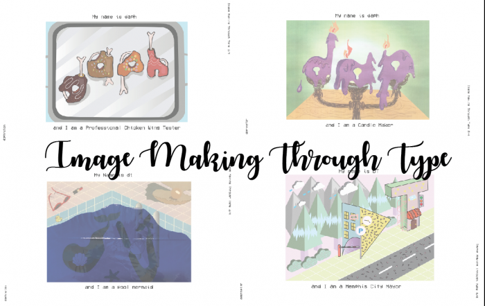
For assignment 1 for Graphic Form, we are to create typographic images related to our imaginary occupations. The use of typeface, style, size and the use of upper and lower case should be carefully thought through.

Concept Behind My Pieces

The pieces I created are expressions that hints at who I am. Each piece has a truth about me.

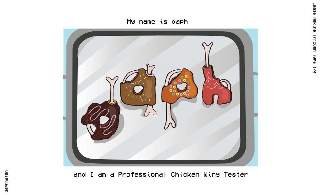
ONE – PROFESSIONAL CHICKEN WING TESTER

She is not fond of meat, but she likes chicken wings

And hence I am a Professional Chicken Wing Tester

ONE – RESEARCH

“Inside” print by Wesley Bird

When I came across Wesley Bird’s “Inside” print, I thought it was really adorable how he incorporated the bones, flesh and skin into his type! I especially love how he illustrated the bones.

“Rotten Food” illustrated by Alex Solis

As for the texture of the chicken wing itself, I was unsure which kind of texture I should go for. The grilled, bbq, or crispy. Then I came across Alex Solis’ “Rotten Food” series for reference for the texture and the shadow of the surface of the meat and the bones.

She likes donuts, since young.

I had initially wanted to be a donut tester too, but the idea was put away because there were many type that are of donuts. Below is just one out of the many examples.

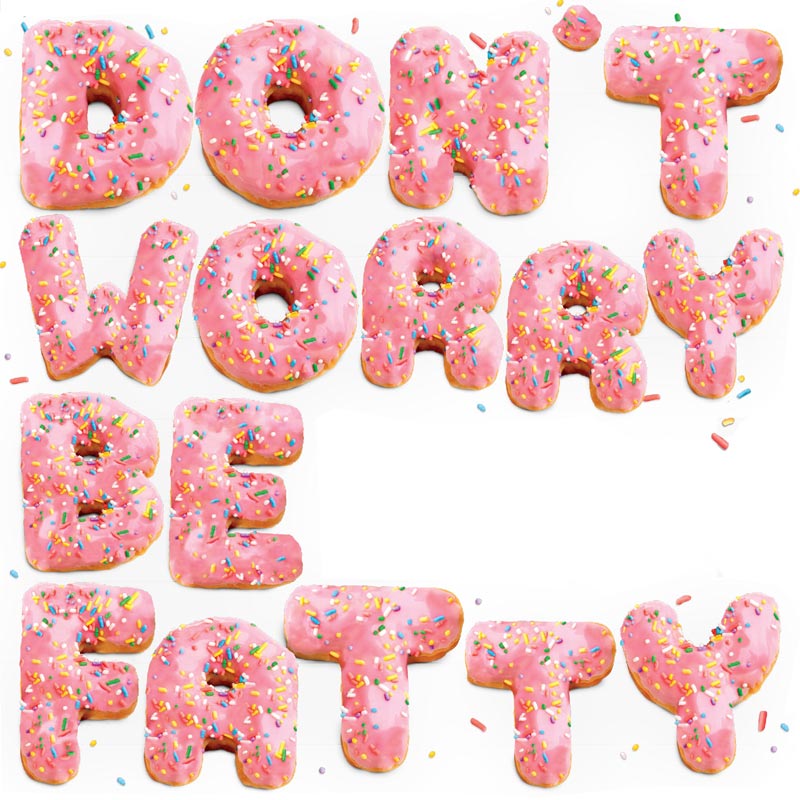
Time Out Magazine: Don’t Worry Be Fatty by Tom Hislop

Houston Donut Glossary | taken from Pinterest

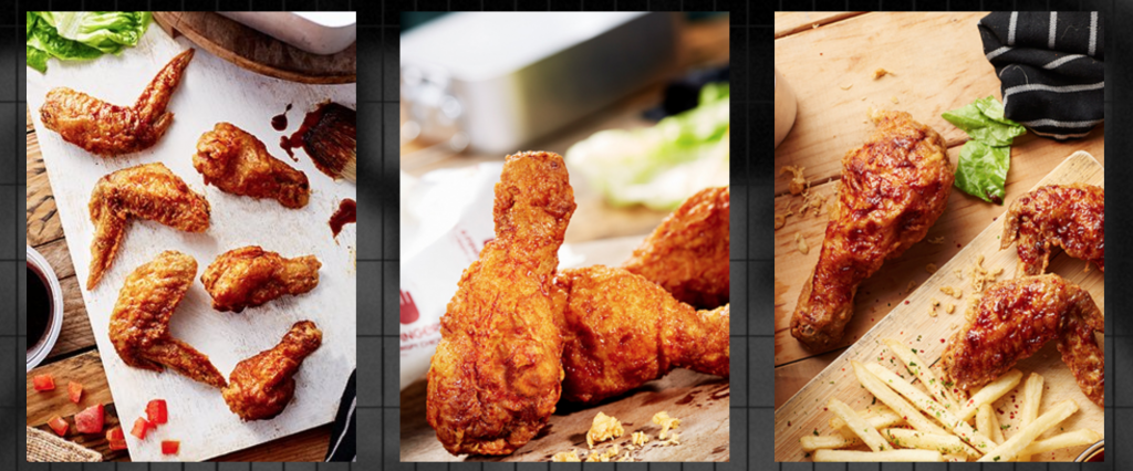
Although I put away the idea of a donut tester, I decided to incorporate it in my Professional Chicken Wing Tester type. As a Professional Tester and critic, they will usually be asked to taste new products. Hence, I decided to incorporate donut toppings onto the Chicken Wings, very similar to honey glazed chicken wings.

taken from: 4 Fingers Website | http://www.4fingers.com/Menu-Signature-Crispy-Chicken

I also went to 4 Finger’s Website to reference the types of chicken wings that they have.

ONE – PROCESS

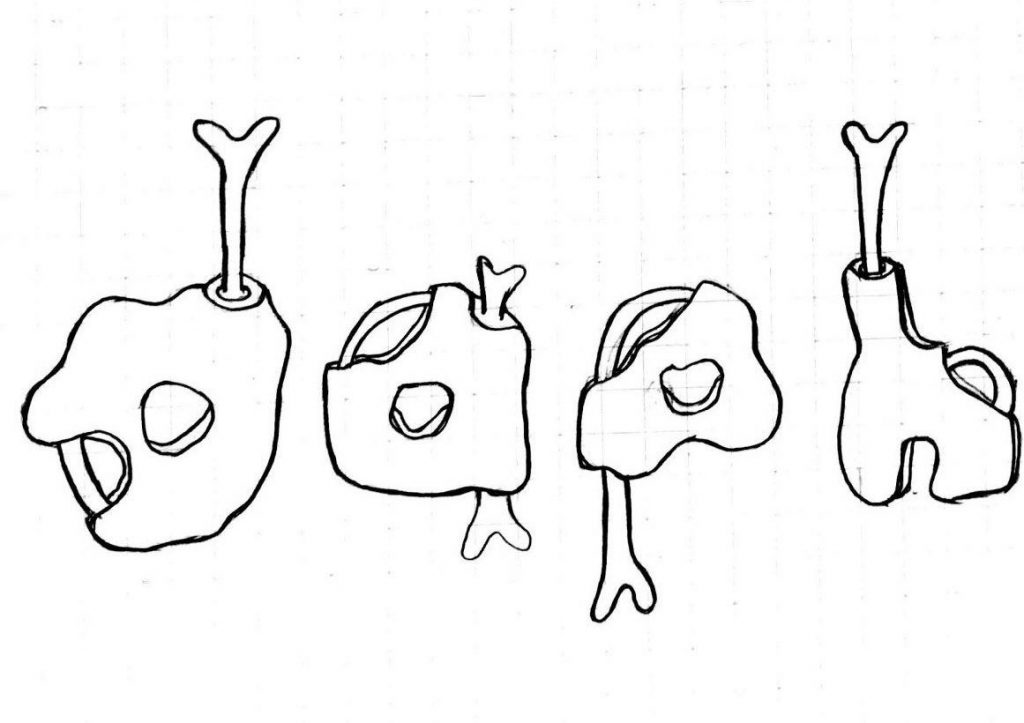
I started out by sketching out the idea of it on my sketch book.

Self-drawn on sketch book

I scanned it onto Illustrator and added colours digitally.

The first few phases of the piece were my initials made up of similar Chicken Wing type with the same colours and textures. Also, it was without the use of shadow which made it look very flat.

I then researched a little about lighting conditions and added the highlights and shadows we learnt from Illustrator class.

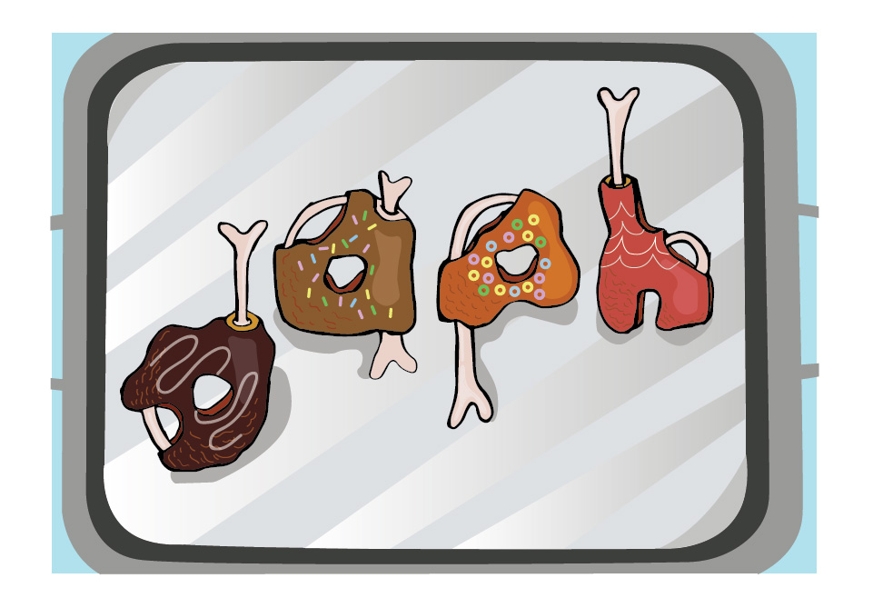
Professional Chicken Wing Tester Final

Composition

Professional Chicken Wing Tester has the type placed in a way that it guides the eye from bottom to up, from the “d” to the “h”, creating a more interesting vision guide than if I had placed them merely straight on the platter.

Colours

For the colours, I used conventional donut topping colours, like the shade of chocolate, and the rainbow sprinkles and fruitloops. As for the colour of the “body” of the chicken wings itself, the colours used are analogous (red(“h”), orange(“a”, “p”) and dark purple(“d”)). The colours of the platter is merely shades of grey used.

Semiotics

Using the idea of the chicken wing and the toppings on donuts, I borrowed the bones and the texture of the chicken wings and the iconic element of the donut toppings which are the sprinkles and the sugar icing that goes on top of it.

Type shape, size choice

I choose the lower case because all alphabets has a tail I can work with to insert the bone, giving the type more consistency. The alphabets have an organic shape because the shape of a chicken wing is not always the same.

TWO – CANDLE MAKER

She likes fragrances. Candles, perfumes…

Hence, I am a Candle Maker.

TWO – RESEARCH


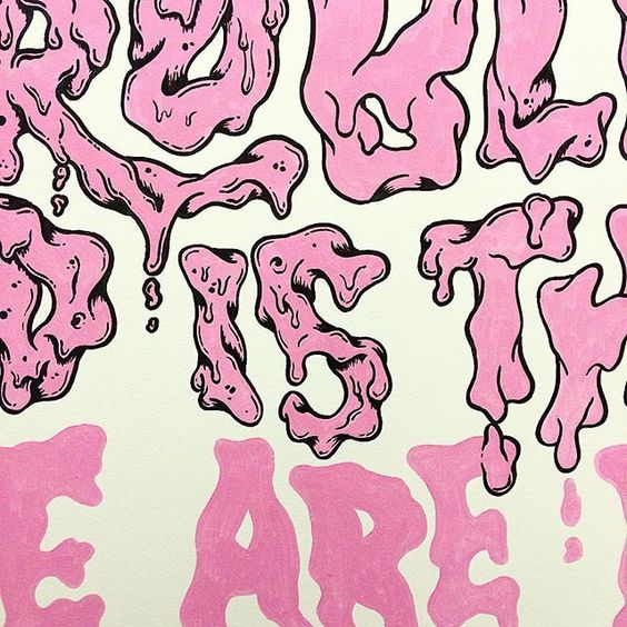
I stumbled upon this melting effect on type on Pinterest which I thought was what I want to go for for my Candle Maker type.

Type by Andreas Pedersen | taken from: https://www.instagram.com/andycloned/

TWO – PROCESS

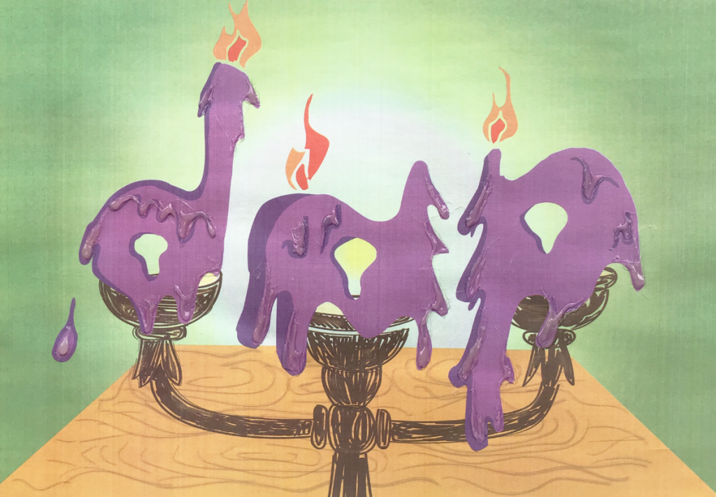
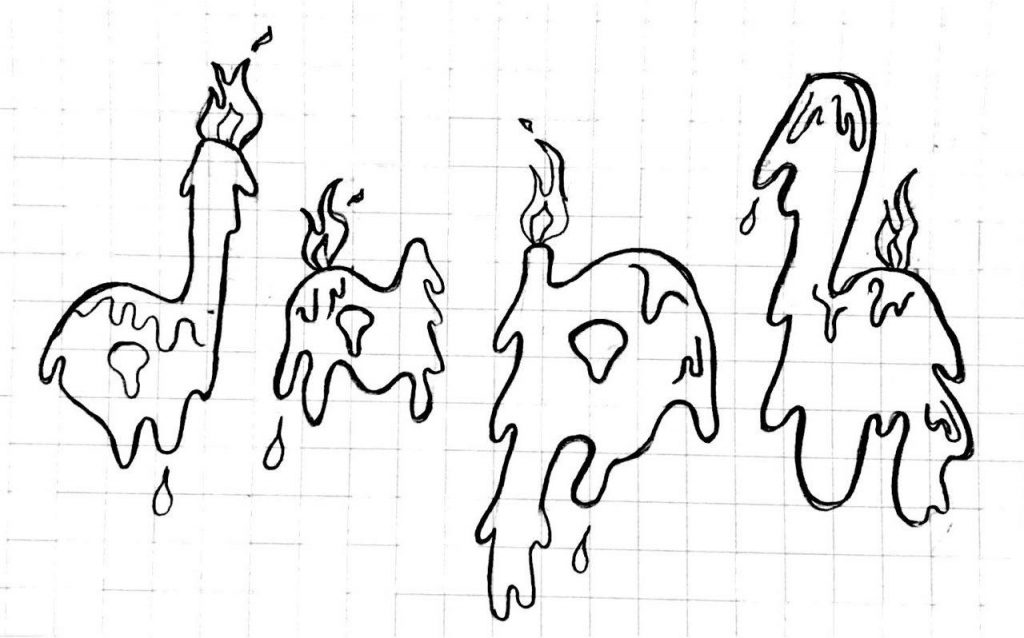
To add an additional touch to my take on the occupation, I added flames and droplets of wax on my type to make it more suggestive of the occupation.

Hand-drawn on sketchbook

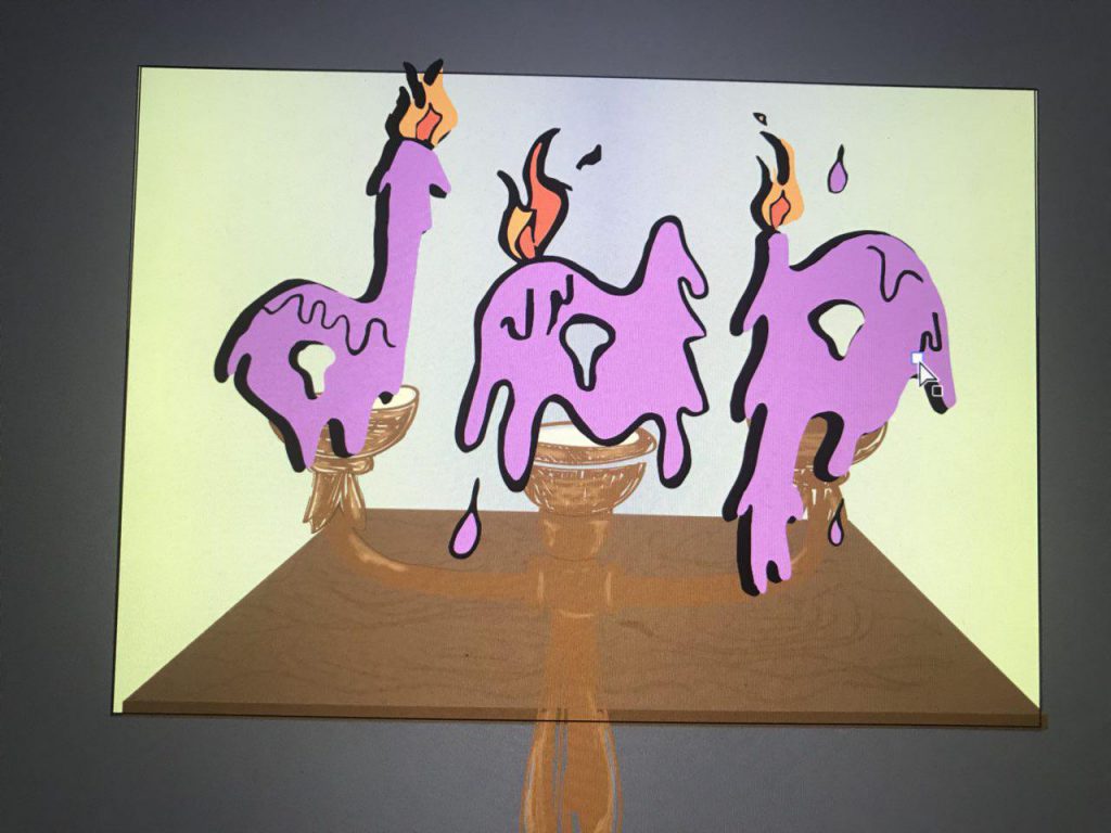
Besides, the initial design had hard outlines which after consultation, I decided to line the type with a darker shade than a harsh black outline.

This is a snapshot of one of the initial stages

Also, to add an additional touch to it, I used a hot glue gun to give the final product a “melting” illusion and texture to the graphic. Below is a video of it!

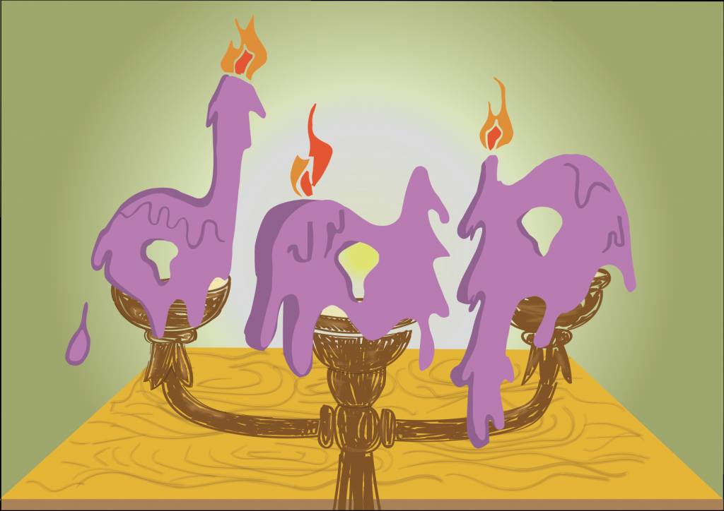
The digital final piece is attached below:

Digital Final Piece for Candle Maker

Candle Maker Final (with hot glue texture and illusion)

Composition

The type “dap” is used instead of “daph” due to the number of candles the traditional candle maker can hold. The alphabets are places straight, side by side due to the placing and the nature of the candle holder. The play on the wax dripping gives the piece a slight touch to the otherwise boring line-up side by side alphabets.

Colour

The colours used are square (purple, green, orange and blue). The background goes dimmer away from the alphabets to give it an illusion that the type is placed in a dark room and the candles are lighting the place up.

Semiotics

I borrowed the element of wax dripping as a candle is lit to the texture of the alphabets. The flame from the candle makes up the flame seen at the top of the type.

Type shape, size choice

The alphabets has a non-rigid shape, mimicking the actual candle, which shape and size will change as it is lit.

THREE – POOL MERMAID

Her favourite Disney princess is Arial.

Hence, I am a pool mermaid.

THREE – RESEARCH


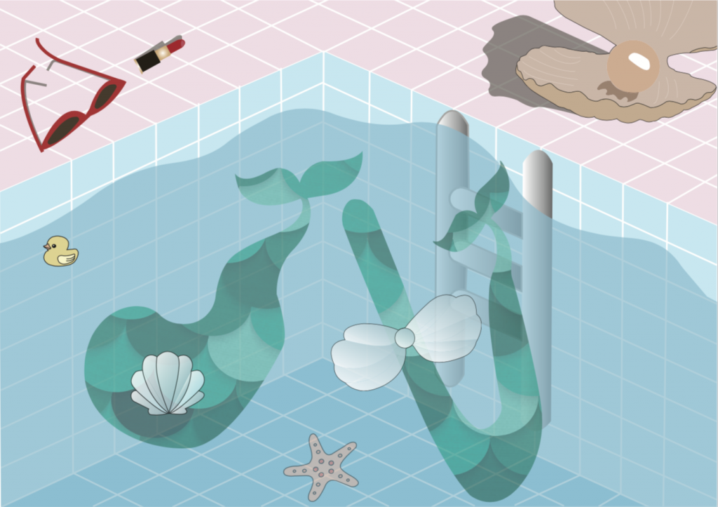
I thought being a mermaid will be too ordinary so I decided to spice things up and put things better into context, a mermaid in a pool.

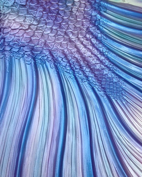
Graphic of a mermaid tail | taken from: https://www.etsy.com/listing/541800432/mermaid-tail-svg-mermaid-svg-mermaid?utm_source=Pinterest&utm_medium=PageTools&utm_campaign=Share&utm_term=so.lp.d2.v1&share_time=1516587659000

Mermaid tail | taken from: https://www.instagram.com/p/8wfUazNk4E/


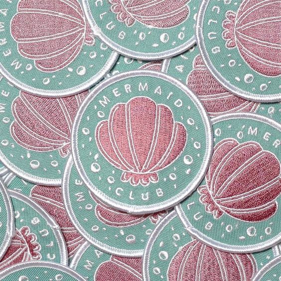
Shell | taken from: https://www.instagram.com/p/BSE_WmbDLWO/

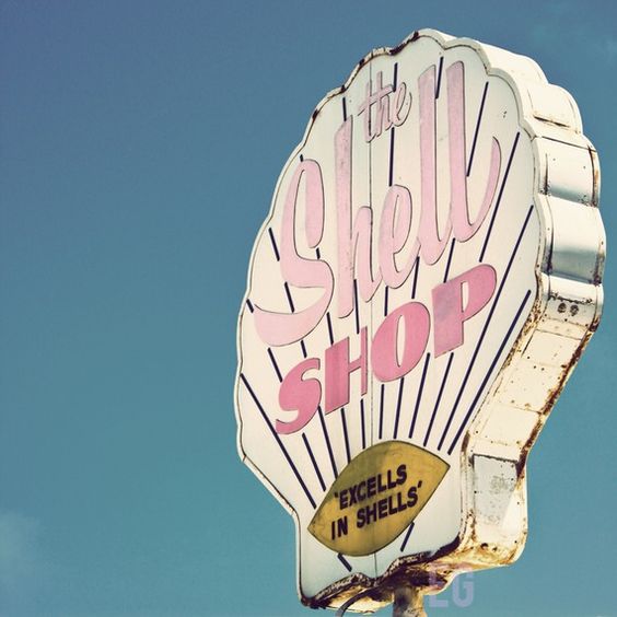
Font usage and colour usage | taken from: https://www.etsy.com/listing/56809840/shell-shop-8×8-print?ref=v1_other_2

taken from: https://www.behance.net/gallery/38674217/The-Architectural-Sculpture-in-Warsaw

background research and emphasis on the shadow and highlights used | taken from: https://www.etsy.com/listing/56809840/shell-shop-8×8-print?ref=v1_other_2

THREE – PROCESS

Initial stages

This was the initial stage of this piece. With the use of opacity on Illustrator to bring out the water in the swimming pool.

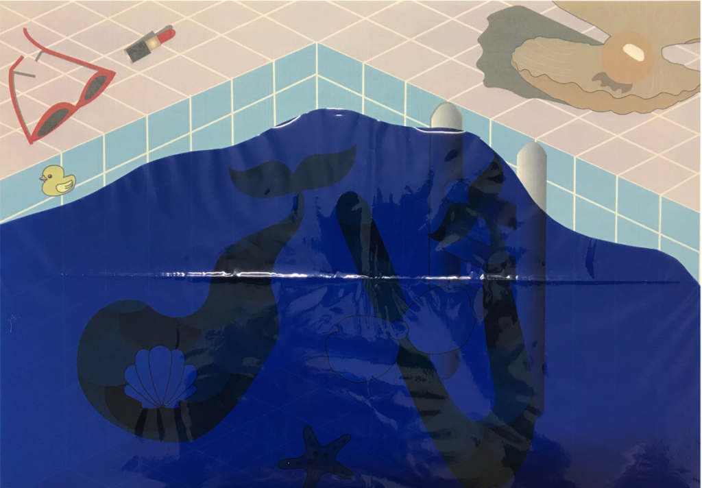
After much considerations to want to improve on this piece, I decided to use a transparent coloured sheet as the water to give it more visual appeal. Though I acknowledge that the colour of the coloured sheet might be a little too dark, but these sheets only come in certain shades of colour, which left me to not much choices. Because of that I decided to not conceal the transparent sheet, but make the piece removable from the plastic sheet to see the details. IMG_0811

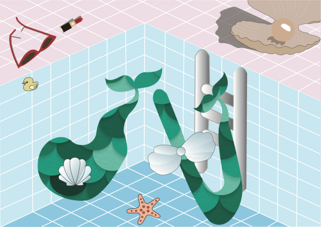
Digital Final piece

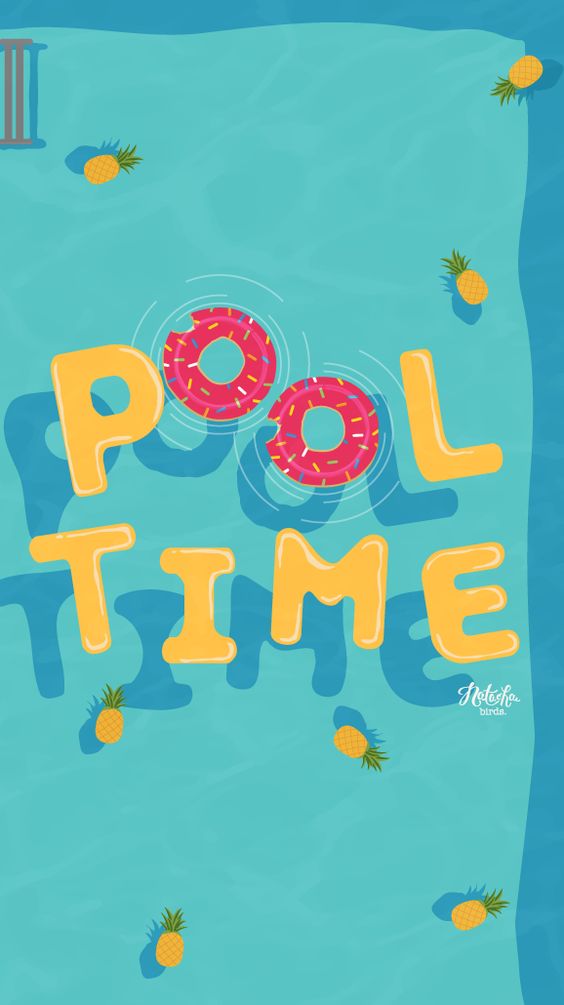
Pool Mermaid Final

Due to lighting and the fault in printing, the colours might differ.

Composition

The alphabets are placed in the lower two-third of the paper and the grid lines of the swimming pool leads our eyes to the corner in the middle where the alphabets “d” and “t” are.

Colour

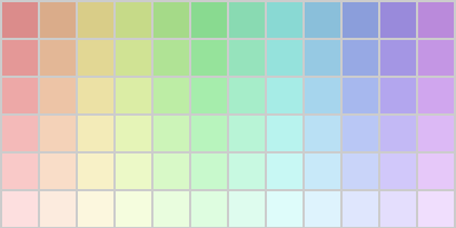
A pastel colour palette was used for this piece.

Pastel Colour Palette

I chose this colour palette because I thought that the colours fit will with the theme underwater and mermaid. The colour choice is triadic of red, blue and green.

Semiotics

The alphabets are fluid, mimicking the nature of water. The mermaid tail is also used to hint at the occupation of a mermaid. Also, the lipstick and sunglasses hints that the figure has a human nature, yet at the left hand side of the piece, the clam suntanning mat hints at a not so human nature of the mermaid.

Type shape, size choice

The alphabets are fluid with organic sides.

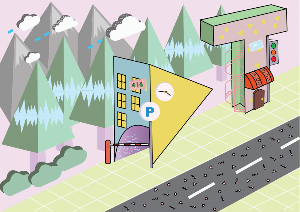
FOUR – MEMPHIS CITY MAYOR

She is currently into memphis designs.

Hence, I am a Memphis city mayor.

FOUR – RESEARCH

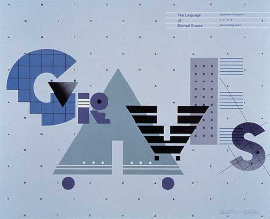
taken from: https://www.britannica.com/biography/William-Longhauser

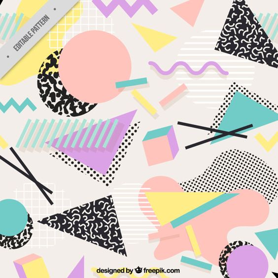
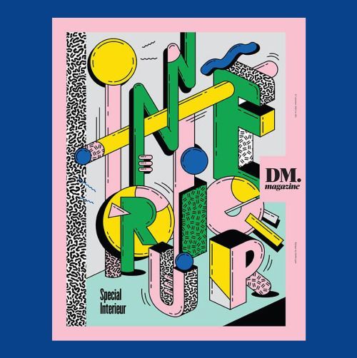
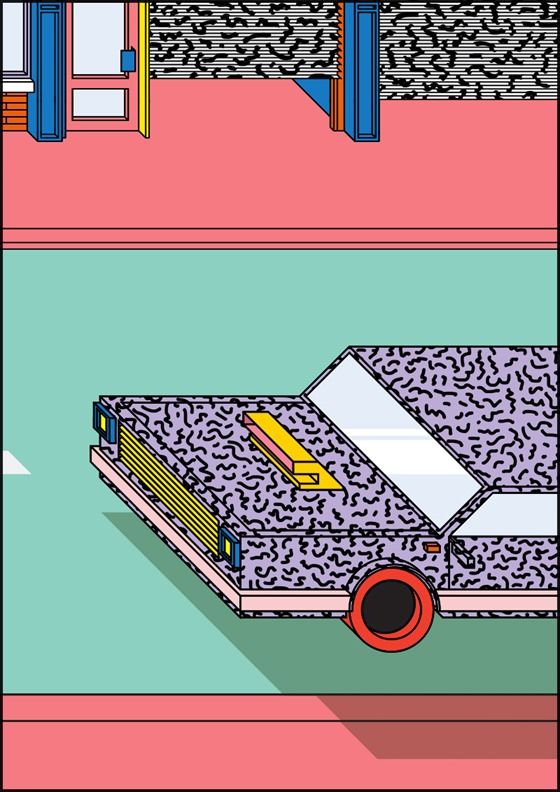
The artist reference is Peter Judson and I am in love with his Memphis graphic designs. I looked at many of his art works on his website.

taken from: http://www.beatpie.com/2014/04/sunday-blip.html

taken from: http://peterjudson.com/iai7zfzs05nmtxpj3g3k53cb59myha


taken from: http://peterjudson.com/2016/5/23/tribute

taken from: https://designshack.net/articles/graphics/designing-with-an-80s-trend-memphis-design-101/

FOUR – PROCESS

I wanted my alphabets to be blockish although the Memphis font type uses block or bubble fonts because the previous 3 pieces are rather fluid in nature.

Initial stages

The buildings looked a little empty and not as apparent that it is a Memphis City. Hence, I decided to add more random patterns to the alphabets.

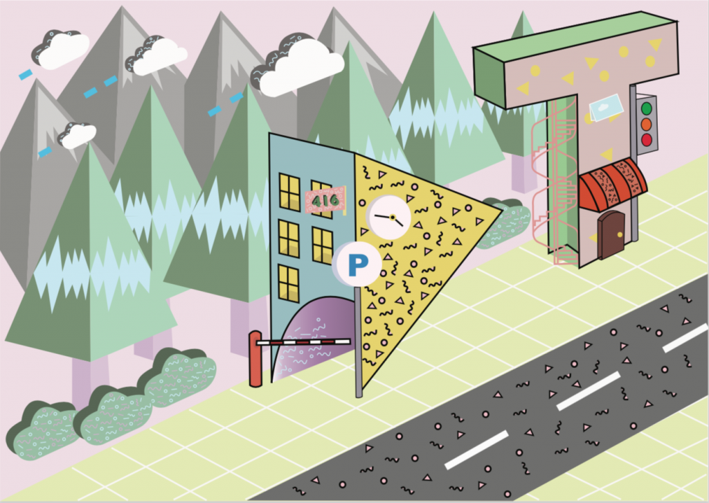
Memphis City Mayor Final

Composition

The “D” and “T” are placed in the two-third of the piece, making use of the rule of third. The perspective guides the eye of the viewers, with the add of the concrete floor and the grids, as well as the line-up by the trees and mountains at the back. This piece has a clear background and foreground.

Colours

Similar to Pool Mermaid, the pastel colour palette was used for this piece and the use of millennial pink (research). Analogous colours of yellow, green and blue are used to a large extent.

Pastel Colour Palette

Semiotics

I went to research on the characteristics of memphis designs to give myself a better picture of what the style of this piece will be. (research) Also, a city has residential buildings, cafes, stores, streets, hence I gave the alphabets characteristics of a residential building for “D”, with the carpark gantry and the parking sign in an ordinary carpark of a HDB in Singapore. Also, older shop houses in Singapore has the iconic spiral stairs outside of the building, with I had incorporated in “T” as well as a traffic light.

Type shape, size choices

The buildings are placed roughly the same size as the trees and the mountains, the play of scale used in this piece for the alphabets.


OVERALL CHALLENGES AND TAKE AWAYS

I have explored various possibilities for my occupations and went back and forth, changing them to make them more imaginary than they are. Also, I thought creating jobs that are related to me will spice things up a little, rather than randomly choosing them. This way, I can better interpret them. I had many difficulties making sure my pieces spoke to the audience about the occupation at first glance. For all pieces, it went through consultations with my friends around me. Also, it was tough to incorporate elements of the occupation onto the alphabets itself, especially the one for Memphis City Mayor and Pool Mermaid. For the both aforementioned, I leeched onto the background to emphasize on the occupation, which I thought worked.

I enjoyed the process of illustrating them, and considering the colours I wanted to work with. Of which the last two consist of colours from the pastel palette which I am fond of. I thought through the way I wanted to place the alphabets in such a way that it matches the background and still gave an interesting visual. Overall, it was a fulfilling process and one of the projects that I really love. Thank you for viewing!

Do view my final products here!

The Eternal Frame by Ant Farm: How “Based on a True Story” is Indeed Powerful

Ant Farm, an extraordinary collective

Ant Farm is a group of radical practitioners, whose forte is in architecture, graphic arts and environment design founded by two architects, Chip Lord and Doug Michels, in San Francisco in 1968. Although they had dissolved in 1978, their works still continue to impact, teach and continue to inspire many today. The group that once saw themselves as underground architects/ artists, hence their collective name as Ant Farm, to be part of the counterculture, goes beyond social norms and expectations.

We wanted to be an architecture group that was more like a rock band. We were telling Sharon [a friend] that we would be doing underground architecture, like underground newspapers and underground movies, and she said, ‘Oh, you mean like an Ant Farm?’ and that’s all it took. It was very Ant Farm. The founding of the name was indicative of how Ant Farm worked: the right idea comes, everybody acknowledges it is the right idea and instantly adopts it.

— Doug Michels

Described by Gene Youngblood as “an autonomous reality community”, Ant Farm was going against the current, “working against the generation of (their) parents”.

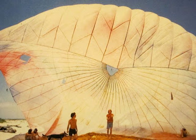
The group were well-known for their inflatable architecture designs, though some did not go pass the conceptual stage. The Dream Cloud, one of their established projects, aimed at “creating temporary environment at the beach” where they explored the boundaries that architecture can go beyond the “physical multi-media environment”, as Chip Lord said in an interview with Randall Packer.

“Dream Cloud” during “AstroDaze” Freeport Beach, Texas, 1969 | taken from: http://mondo-blogo.blogspot.sg/2010/12/ant-farm-sex-drugs-rock-roll-cars.html

The Eternal Frame, Reenactment of the Assassination, otherwise known as “based on a true story”

During the 1968, where the assassination of Martin Luther King and Robert F. Kennedy shocked the world, the Ant Farm was of no exception. The revolution in the air drive the group to expand beyond just fictional narrative moving images, but incorporated a remarkable event in history that impacted the US, the assassination of Robert F. Kennedy.

The filming process involved the live performance and re-enactment of the actual happening of the assassination at Dealey Plaza, Dallas, Texas seen in the famous Zapruder film.

“The intent of this work was to examine and demystify the notion of the presidency, particularly Kennedy, as image archetype….”

— Doug Hall, 1984

The Eternal Frame pushes the boundary of the tense topic of the assassination through the re-enactment. Many might have heard about the event on the news or through the word of mouth, but the making of The Eternal Frame puts into perspective and into people’s minds the “true” happenings of the actual assassination.

“As photographers recorded images of places, objects, and people unmediated (it was thought) by the artist’s style, scholars believed that they could write history, in Leopold von Ranke’s essential phrase, “as it really was”.

-Rowman & Littlefiled, 1998

The Eternal Frame might just have merged history and film-making, documenting history through the lens of a camera, impacting people emotionally with the scenes that might have taken place in the actual setting of the assassination at Dealey Plaza.

This historical moment is captured in a much different way, bringing to light the digital representation and interpretation in the case the assassination of Robert F. Kennedy. The gory scenes of the blood filled gun shot and the collapse of Robert F. Kennedy can be put into perspective, despite its accurracy.

Putting my shoes in a regular patron of moving images much like The Eternal Frame, the “based on a true story” label moves away from the fictional narratives in the market, breaking boundaries will change my perspective of the film. It hints at the actual happening of the event in the past, bringing more emotions and more impacts, instilling the eternal frames captured through the lens of the camera into our minds.

Additional Readings

Spatial Agency – Ant Farm

Head to “Ant Farm”for a creepy-crawly good time

The Eternal Frame

Based on a True Story: Latin American History at the Movies