Nathan Yong (Singaporean)

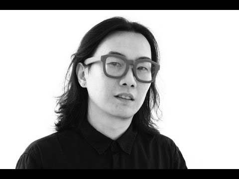
“Furniture designer Nathan Yong is well-known for his trail-blazing career, and has been credited for advancing furniture design and furniture retail standards in Singapore. Having wanted to be a designer since the age of 15, he chose to pursue industrial design at Temasek Polytechnic as he was interested in the forms of products. Today, Nathan has a growing international profile with his products are sold globally.”
Furniture designer Nathan Yong is well-known for his trail-blazing career, and has been credited with nothing less than advancing furniture design and furniture retail standards in Singapore. Having wanted to be a designer since the age of 15, he chose to pursue industrial design at Temasek Polytechnic as he was interested in the forms of products. His aim at the time was ‘to be as famous as Philip Starck’.
Instead, he went on to forge his own path by establishing the furniture brand Air in 1999, at a time when there were very few local producers of modern furniture in Singapore. In 2006, armed with a Master in Design from the University of New South Wales, Nathan set up the subsidiary Air Design Group, of which he is the Principal Designer.
With an established and growing international profile, Nathan’s designs have been sold in Germany, Denmark, Morocco and the United States. He has also collaborated with renowned designer Toshiyuki Kita (designer of the SHARP Aquos® TV and the Wink Chair by Cassina) and multidisciplinary designers Voon Wong and Benson Saw from the United Kingdom to produce design-conscious furniture that aims to be affordable for all.
For Nathan, the journey to success has had its highs and lows. When the respected French furniture company Ligne Roset bought three of Nathan’s designs, its headquarters received a letter from its Singapore outlet asking them not to engage a Singapore designer because it would not be good business for the Singapore market. Nathan found the incident discouraging, ‘Here we were trying to break into the international market with our efforts, and there was someone from Singapore stopping us from putting Singapore on the global design map.’ At the same time, he recalls with pleasure and amusement the opening of Air Division’s first franchise in Jakarta, Indonesia. ‘I remember I was in a cab in Jakarta and saw an old man on a trishaw with trash and among that trash were Air Division wrappers and cartons. I found that image endearing.’
Nathan’s success lies in his design philosophy. Good design, according to Nathan, is a combination of three factors. To begin with, the intention of the client and the designer must be to improve on the existing situation. ‘Design is important,’ he says, ‘but only if it improves our living conditions, not just physically but also spiritually.’ The designer must also take into account factors such as the social, cultural, historical, artistic, technological and material aspects that form the design context. Most of all, Nathan believes in being ‘honest in the design approach, and in keeping it simple’.
This design philosophy has been the key to Nathan’s success. His relentless pursuit of simplicity and honesty in design has made him one of Singapore’s top designers, and has garnered him numerous awards both locally and at the international level, for instance the Red Dot Award. In 2006, the Break stool garnered a Silver Award at MINES International Design Intelligence and a Bronze Award at the Singapore Furniture Industries Council Furniture Design Award. In the same year, Nathan was also shortlisted as being among the 20 best designers in the DesignSingapore Council 20/20 series, by peer review.
Nathan’s influences are too numerous to name, but among those who have made an impression on him are the past great masters of the Bauhaus, Poul Kjaeholm, Charles and Ray Eames, Mies van der Rohe and Le Corbusier, as well as the more current Dieter Rams, Jasper Morrison, Konstantin Grcic, Naoto Fukasawa and Eugenio Perazza. He draws his inspiration from his surroundings and from the simple acts of daily life, such as a walk in the market or fixing his bicycle. Inspiration is like a lottery, he says, in which winning depends on a number of parts falling into place. As he notes wryly, ‘Sometimes it doesn’t happen.’
At the start of each new project, Nathan’s creative process includes taking into consideration numerous crucial aspects such as ‘function, materials, technology, cost, arts, form, proportion, engineering, markets, time, social, culture and wonderment, in order of importance according to the design brief’. He then changes the arrangement ‘until the result is an amalgamation of intelligence – intelligence from the distillation of informed choices’.
Nathan Yong is an exemplar to young design entrepreneurs with his winning blend of design integrity and commercial success. Success has not fazed him, and he views his accomplishments with his trademark unfussiness. When asked what sets him apart from other designers, he replies, with breathtaking simplicity, ‘I am me.’
Pann Lim (Singaporean)

“Pann Lim is the creative director of Kinetic Design and Advertising. He graduated with a Diploma in Design and Advertising from Temasek Polytechnic in 1998. Pann’s portfolio of work is a hybrid of visual design, interactive design and advertising. He works on these disciplines independently. To him, there is no distinction between these disciplines, as they are all tools of communication.”
Pann Lim is the creative director of Kinetic Design and Advertising. He graduated with a Diploma in Design and Advertising from Temasek Polytechnic in 1998, where he was inspired by mentors such as Lim Chong Jin, Hon, James Na and Iskandar Jalil. He started work at DDB Singapore and Batey Ads. In 2001, Pann was invited to start up a creative agency, Kinetic, with Carolyn Teo, Roy Poh, Adrian Tan, Sean Lam and Benjy Choo.
Pann’s portfolio of work is a hybrid of visual design, interactive design and advertising. He works on these disciplines independently. To him, there is no distinction between these disciplines, as they are all tools of communication.
He believes that design and advertising start with an idea. He has devoted his time to creating ideas that have won him over 300 industry awards including a D&AD Silver nomination and a Silver for Cannes Lions International Festival of Creativity in 2012. He was awarded Singapore’s Most Influential Creative Director by the Institute of Advertising Singapore in 2012. He is currently ranked tenth in Australasia by campaign Brief.
Pann is also involved in nurturing newcomers, as a way of fulfilling social responsibilities. He is a founding member of The Design Society, a Singapore- registered non-profit organisation, which aims to educate, proliferate and archive graphic design in Singapore. He has been actively involved in teaching and mentoring for prestigious awards such as Noise and Crowbar. He was chairman for the Crowbar Awards 2011 and head of Jury (activation) for Creative Circle Awards 2012.
In 2011, he started Holycrap.sg with his wife and two children, an art collective focusing on the arts. To date, they have had two successful exhibitions featuring the artworks of his children. Pann spends most weekends with them, working on projects, as well as exhibitions. He maintains that their works are not for sale, because he wants them to enjoy the process and not be caught up with the commercial benefits of the endeavour.
Pann handles projects by understanding the brief, ironing out the facts, needs, budgets, deadlines and objectives of the clients versus the needs and objectives of the agency. He works with like-minded partners, who believe that every project should serve the best interest of the client without compromising the creative integrity of the agency. For Pann, design is most meaningful when it makes sense and makes one happy. Every project is different, but needs to be based on the insights to the problems or situation. The agency operates like a family, with a strong culture of kinship. It is a healthy eco-system, where the best scheme is adopted via a voting system. This way, everyone who works hard gets a chance to be recognised and gets to do good work. To him, everyone needs to learn to deal with disappointments in life positively. His best life lesson is to constantly learn from others in order to accelerate one’s own learning. To him, learning is a life-long affair.
Alfie Leong (Singaporean)

“Singaporean fashion designer Alfie Leong, is the founder of fashion label mu and A.W.O.L. He is noted for his signature draping, unique cut and attention to detail. He won the Singapore Fashion Designers Contest in 1995; and subsequently received a scholarship for Raffles LaSalle International School of Design.”
Singaporean fashion designer Alfie Leong, is the founder of fashion label mu and A.W.O.L. He is noted for his signature draping, unique cut and attention to detail. He won the Singapore Fashion Designers Contest in 1995; and subsequently received a scholarship for Raffles LaSalle International School of Design. He graduated in 1998. Over the years, Leong has represented Singapore at the Beijing Fashion Week and the Smirnoff International Fashion Awards. In 2001, he made the top 20 list of international designers at the Enkamania International Competition. At home, Alfie has made waves during the Singapore Fashion Week, the Mercedes Benz Fashion Festival, and the Singapore Fashion Festival. He has also collaborated with Swatch as well as homegrown street wear brand 77th Street.
In 1999, Alfie started his own label and by 2004 set up The Little Voice Pte Ltd, to create unconventional designs to inspire customers who want to express themselves. The two private labels of the company, mu and A.W.O.L., aim to blur the boundary between creativity and practicality. The designs of mu are unique yet affordable. The label offers constructed designs that are a fusion between east and west. A.W.O.L., an abbreviation for “all walk of lives”, embodies an originality and refinement that are complementary to the life of the modern women. It is achieved through unconventional construction, emphasis on details and the use of luxurious and sophisticated fabric. His practice gives him the opportunity to fuse the diverse world of inspirations and cultures that motivates him.
When designing, Alfie considers form, materials, technology as well as saleability. The creations fundamentally need to be wearable. His design process usually starts with draping. He establishes a fixed point in the human posture, typically a staple point under the armpit, where comfort is essential. Once that staple point is established, he starts to challenge the silhouette. He consciously creates new silhouettes and accentuates the form. Alfie is very unassuming about it, but the strength of his works is in his ability to apply functional details with impeccable finish. It is a skill that is honed and backed by 20 years of practice.
For Alfie, sharing industry experiences with other fashion designers is very important. He recalls experiences of bringing local designs outside of Singapore which were often not smooth sailing, sometimes even fraught with setbacks. Helping each other in the industry and bringing related industries together are important.
His belief motivated him to start Workshop Element, a label that hosts a community of designers. It seeks outlets and opportunities for local designers to showcase their works in a curated space. The first edition of Workshop Element, launched in 2012, was a pop-up store. It presented an ensemble of 19 brands and 16 designers and curators. The venture was driven by a passion to give back, inspire and inculcate values that have served him well over the years.
Jessica Walsh (United States)

Jessica Walsh is a designer & art director working as a partner at NYC based design firm Sagmeister & Walsh. She lectures about design at creative conferences and universities internationally. She teaches design & typography at The School of Visual Arts in NYC. Her work has won numerous awards from most major design competitions including Type Director’s Club, Art Directors Club, SPD, Print, New York Festivals, D&AD, TDC Tokyo, and Graphis, among many others.
Clients include: Museum of Modern Art, The Jewish Museum, Institute of Contemporary Art Philadelphia, Barneys, The New York Times, Levis, Adobe, and The School of Visual Arts.
Reynold Ruffins (United States)

Reynold Ruffins’ present paintings and drawings are preceded by a career as an illustrator and designer. He is a graduate of The Cooper Union and a recipient of it’s most prestigious honor, The Augustus St. Gaudens Award for outstanding professional achievement in arts. The Cooper Union Presidential Citation was also presented to Ruffins for his work and prominence in his profession.
Professor Emeritus, Queens College CUNY, Ruffins has also taught at the School of Visual Arts, The Parsons-New School of Design and was a Visiting Adjunct Professor at Syracuse University. He is a founding member of the famed Push Pin Studio and also had his own design studio with Simms Taback. Ruffins commissions for an array of clients including IBM, AT&T, Coca-Cola, CBS, Pfizer, The New York Times, Scribners, Random House, Time Life, Fortune, Gourmet Magazine and the U.S. Post Office have garnered many awards, from the New York Art Directors Club and The Society of Illustrators (Silver Medal).
Teamed with Whoopie Goldberg and jazz musician Herbie Hancock, Ruffins’ brilliant illustrations produced a highly praised video for children. He has illustrated over fifteen children’s books. The American Library Association presented him with its Coretta Scott King Award.
Ruffins’ work has been acclaimed in trade and design publications, among them: 200 Years of American Illustration, A History of Graphic Design, The Push Pin Graphic, African American Art, Graphis and How Magazine. His work is internationally recognized in group show exhibitions at The Louvre in Paris, Milan, Bologna and Tokyo.


