My partner for the first project Inanimate Portrait is Desmond!
Before starting on the project, we conversed and got to know a little bit more about ourselves and our experiences.
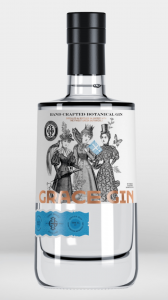
Some things that stood out to me is that our favourite go-to alcoholic beverage is Gin and Tonic. I usually have it on my nights out but for Desmond, it was a little different. Since he stays in hall, he has a bottle of Gin in his fridge for some nights when he feel like having a drink. Hence, I thought, a bottle of Gin has to be part of his portrait.
Apart from that, we spoke about our aspirations. For Desmond, all geared up in an Adidas T-shirt and sneakers told me that he would love to work for Nike, the renowned sportsbrand someday. I laughed and pointed out that he is in a whole gear of Adidas and he told me that he only gears himself up in one brand per day, so no Adidas T-shirt with a pair of Nike runners, ever, and I caught him on his “off-day”. That exchange spoke out to me and Nike has to be the second element.
Talking about hobbies and interests, I asked him about calligraphy since I briefly remembered he does lettering on his free time when we worked together in Year 2. He still does it sometimes although lesser due to his busy schedule. Besides, he would invest heavily into his tools, that includes his pens and ink. He commented that one of his most expensive investment he made to this hobby of his is purchasing a $300 over dollars calligraphy pen. Yet he says that having good tools shows in his works and is overall a good investment since he will use them for years. Third element it is!
With all the exchange, the impression I have of Desmond is that he is very much a traditionalist and there is an old soul within him. When composing his piece, I decided to include that element in.
Process
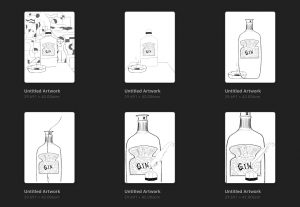
I knew straight up that I wanted to first start on the bottle of Gin and Tonic. As I was researching on labels of alcohol bottles, I found many with vintage illustrations.

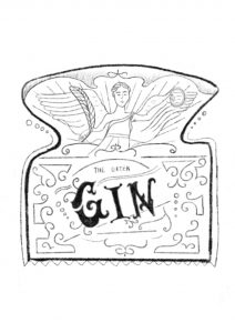
In thought, I realise that the logo of Nike is inspired by the side-view of the wings of the goddess, Nike. I thought about tweaking the Nike label brand a little and decided to illustrated the Nike goddess in Greek mythology instead of using merely the iconic tick. With that, I started researching on the characteristics of the Nike goddess. Through Britannica, I found out that Nike is the goddess of Victory and is often seen with a palm branch, wreath. Also, Nike is always wingless unless portrayed alone.

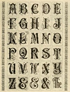
Also, the lettering “Gin” was also inspired by Desmond’s lettering hobby. I further looked at traditional, vintage letterings to create the final “Gin”.

taken from: https://www.etsy.com/sg-en/listing/184033049/printable-alphabets-with-ornamental
For the consult, I had many issues with the composition.

I showed my classmates a few and that was when I decided to also include a patterned background that’s Bauhaus styled since I thought that portrays the traditionalist style pretty well. Initially I thought the background was also fighting for attention, since the pieces are to be in black and white, I decided to turn down the opacity by a tad bit.
Reference
Nike the Goddess
