
For our final project for 4D Foundation, we were to explore time & space.
Certain points to note are – rhythm, movement, causality, & duration of the piece which will be mentioned in the later part of the post.
Before diving straight into my final product, do view my process and research!
Conceptualising..
Approaching the last project, I wanted to explore out of conventional mediums and create a more poetic piece. Besides, with the rise of film camera apps like Gudak, I wanted to challenge myself to embrace the fact that I will not be able to preview the images I take, and see beauty in them. This project also embraces the Japanese aesthetic of Wabi-sabi that speaks about imperfections and the acceptance of them. (More explanation can be seen in my final proposal in my process & research post!)
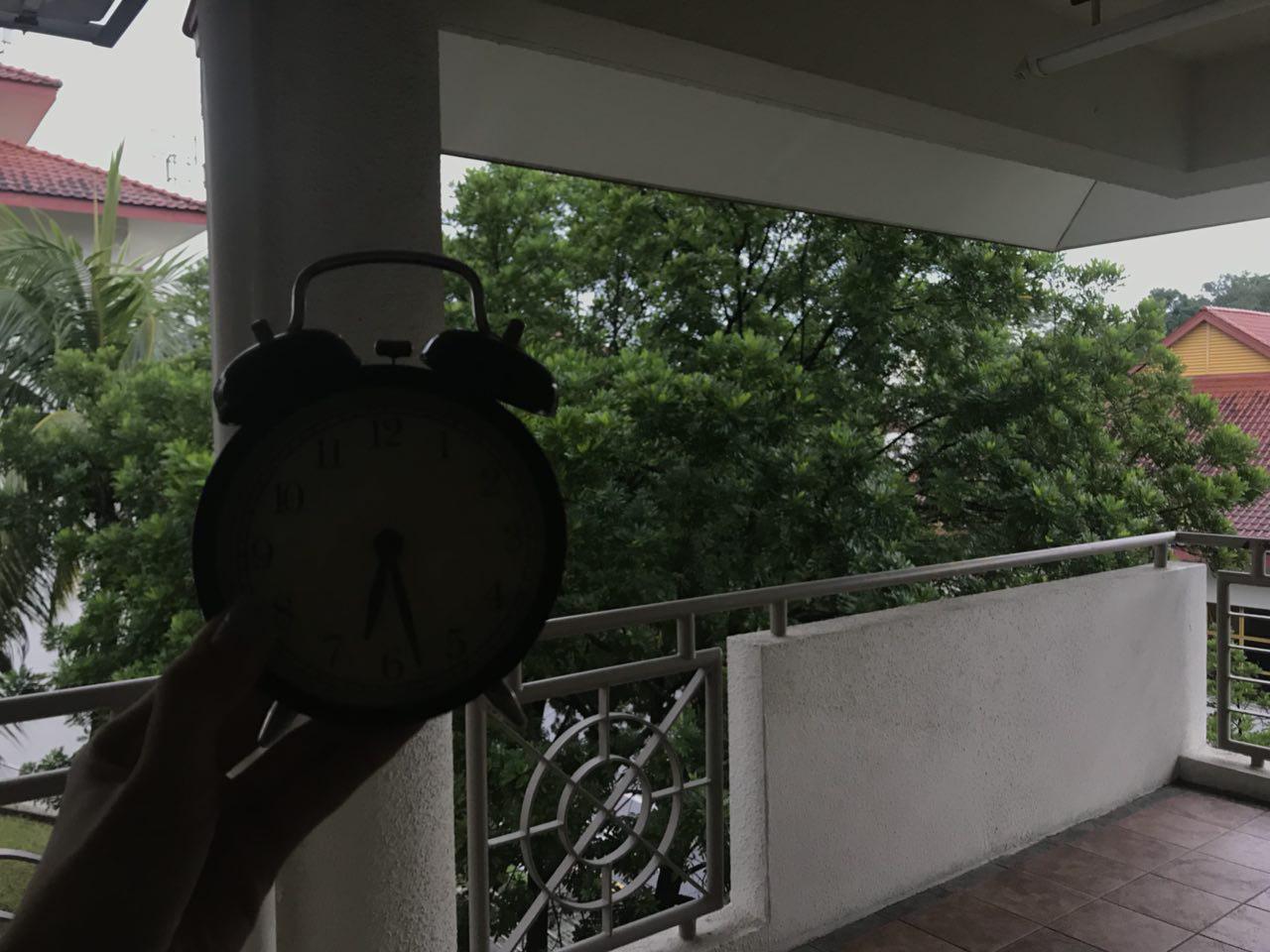
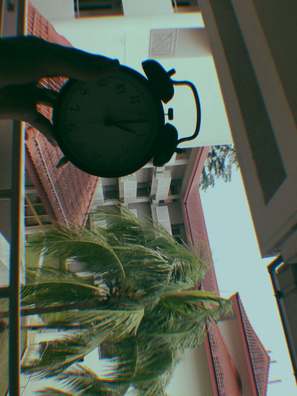
Therefore, for Project 4, I used the film camera, more specifically the Olympus Mju II, a pass-me-down automated film camera. It is not a conventional medium at this age, and the effect of the film camera gives a vintage and venerable feel. This style also brings out the passage of time much better than a conventional camera (phone camera, dslr) in my opinion.
Also, what tells time better than time itself, right?
Comparison: iPhone Camera vs Gudak Film app (no edits)
on iPhone cam
on Gudak app
The feeling both evoke is rather different although both are of the same composition and have the same subject matter.
The warm tone of the outcomes of film camera are more stimulating and evokes a mood or feeling.
The outcome of the iPhone camera is much cooler than the one in film.
To better illustrate my point in the difference between the two methods of photography, I have included two images below.

picture in warm tone | taken from: https://iphonephotographyschool.com/color-temperature/
picture in cool tone | taken from: https://iphonephotographyschool.com/color-temperature/
To me it felt like I cannot fully explain the differences in words. So try comparing the mood, thoughts and feelings you have for the above two pieces.
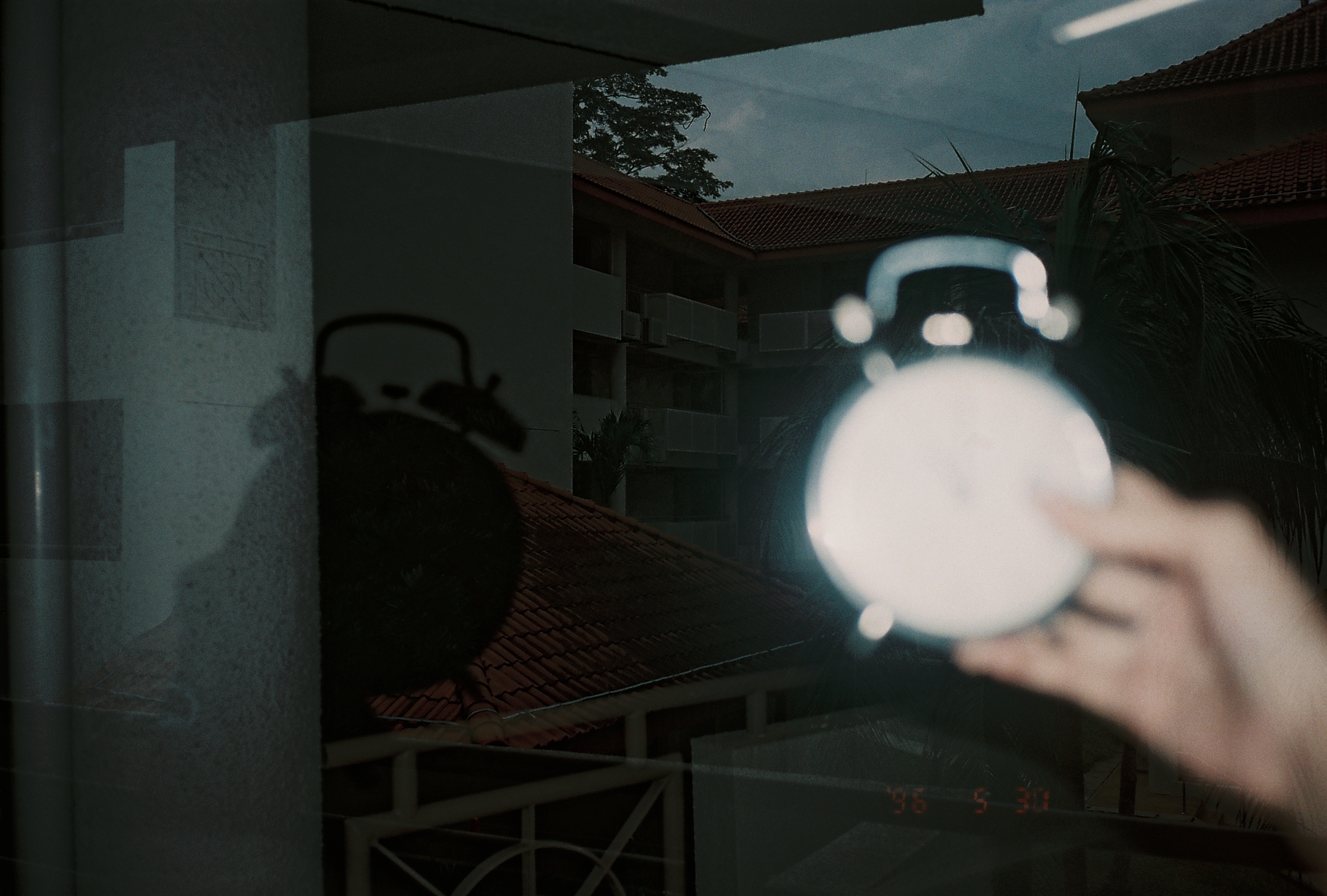
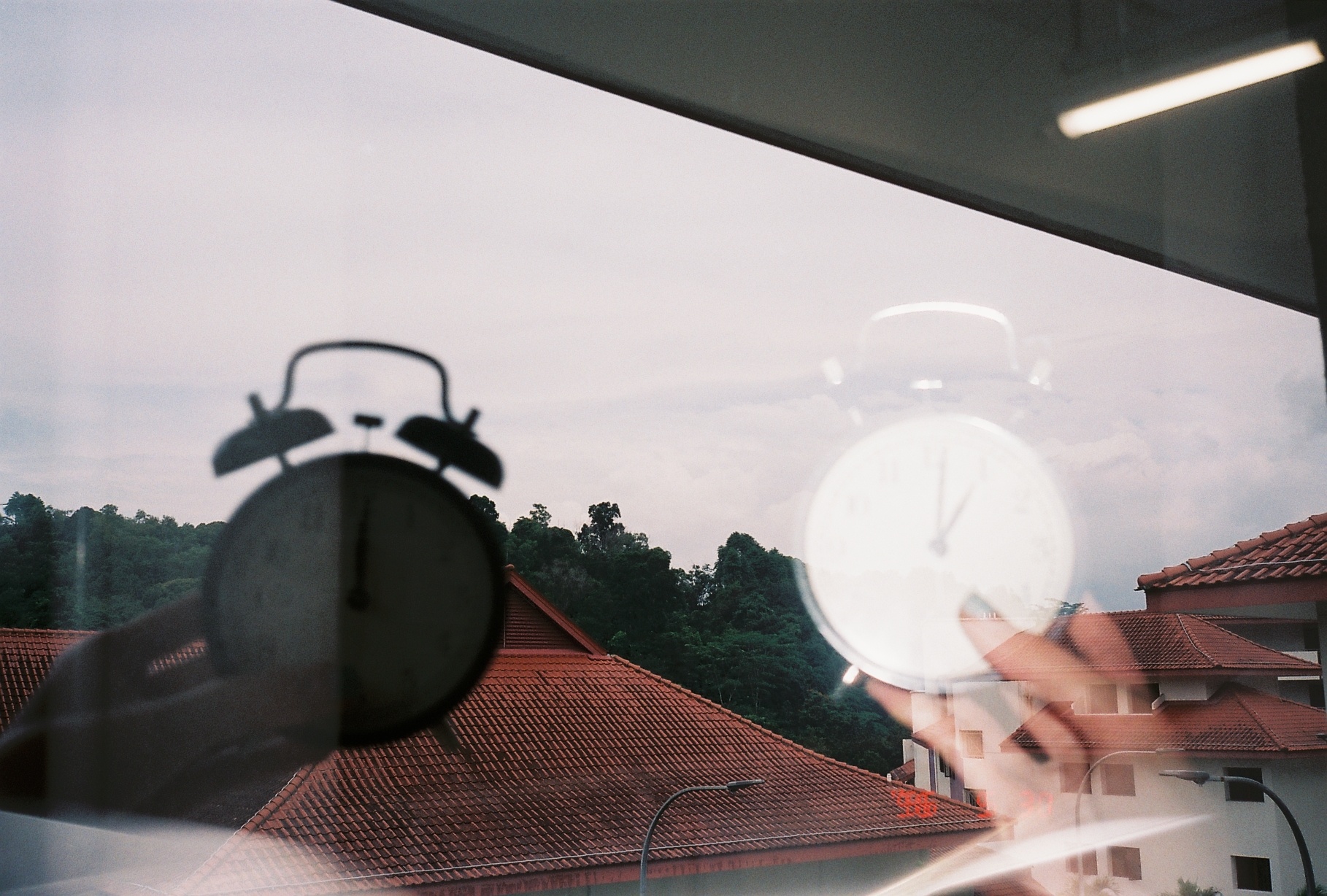
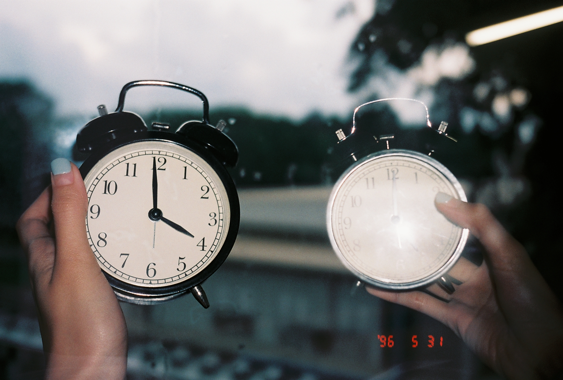
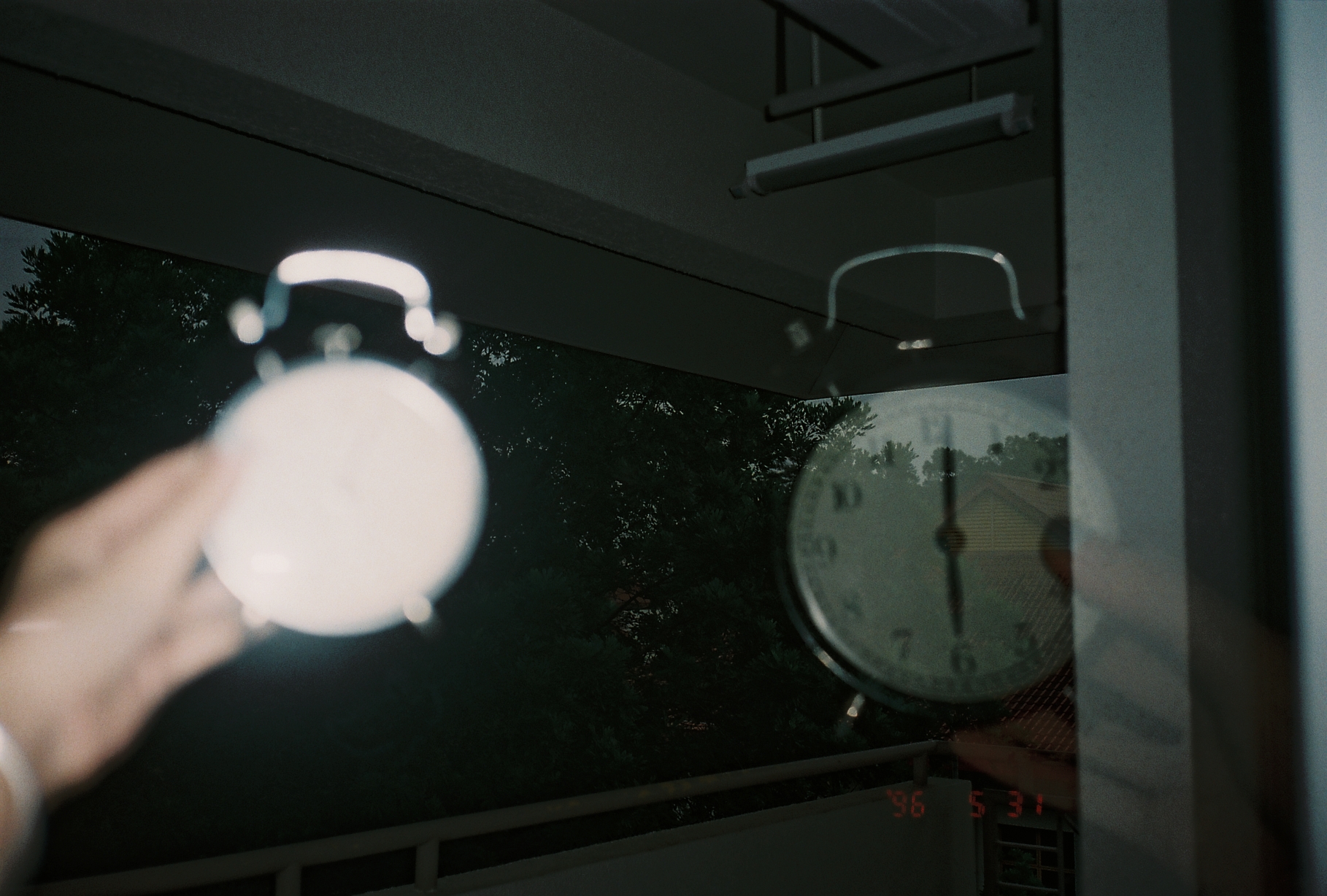
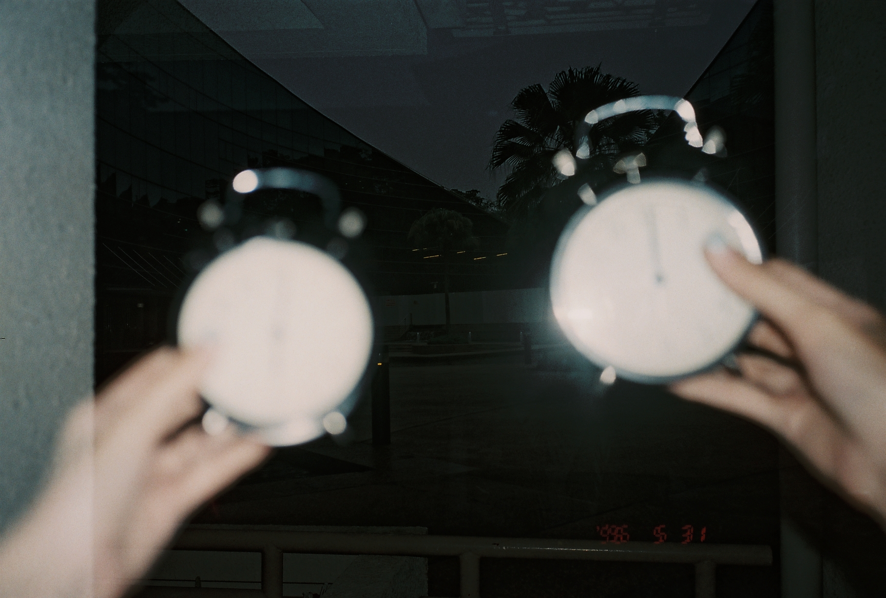
fINAL pRODUCT
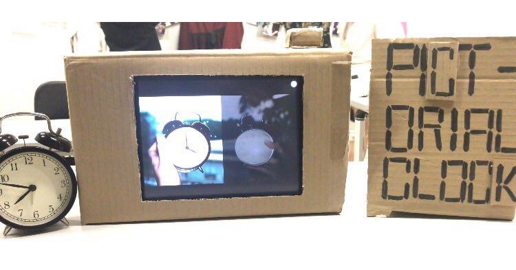
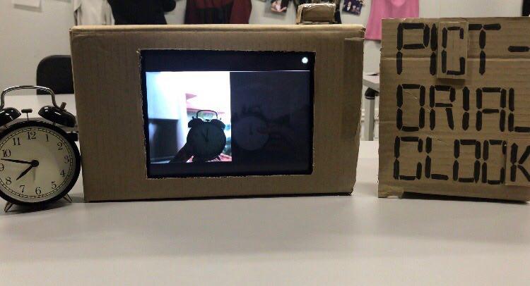
The clock was placed right next to the Pictorial Clock to show a vast difference in the speed of the actual clock and the Pictorial Clock.
How Rhythm is seen in the piece?
Rhythm: regularised repeating of movement or sound
Rhythm was seen in the regular interval of each image of 3 seconds. It can also be seen in the regular interval of the images itself of an hour.
The regular rhythm in this piece brings a calming effect, looking at the passage of time. This piece brings out the nostalgic effect of the film camera and the tranquility in the movement of time, compressed into the Pictorial Clock.
I made it such that
How Movement is seen in the piece?
Movement is the shift or variation in the location of an object, light or sound.
Movement can be seen in the variation of the background/ the environment, the amount of light and the placement of the clock in the images.
Since all the images were taken in a day itself, some images are taken in a different environment than the rest, since mostly are taken outside by dorm room. As you can see, some taken outside hive, some taken at adm, some taken on the way back to hall.
In terms of eye movement, the focus should be on the Pictorial Clock and in rare moments on the analogue clock beside. A bulk of the time the eye is in stillness.
How causality was seen in the piece?
Causality is the principle that everything has a cause and effect.
Pictorial Clock is a non-narrative piece, yet there is a clear account of connected events. For example, in order to have night, there is first day or vice versa.
It is also expected, since it works similarly to a regular clock that the audiences know.
What is the duration of the piece?
Duration is the overall length of time a work - or a portion of a work lasts.
Since this piece is looped, the technical duration of the piece is infinite.
Yet because it is an installation, the duration of this piece differs from viewer to viewer. It can be as short as a glance (say a few seconds).
How Should the Pictorial Clock Be Viewed?
The left side of the Pictorial Clock shows day time (when the day is bright), while the right side shows night time (when the day is dark).
It can be viewed from any part of the video, since there is no start and end to time.
A three minutes interval is placed for every image, each image showing an hour difference. The Pictorial Clock is an example of edited time, since each hour is not 3 seconds long..
Edited Time is time that has been cut up and rearranged.
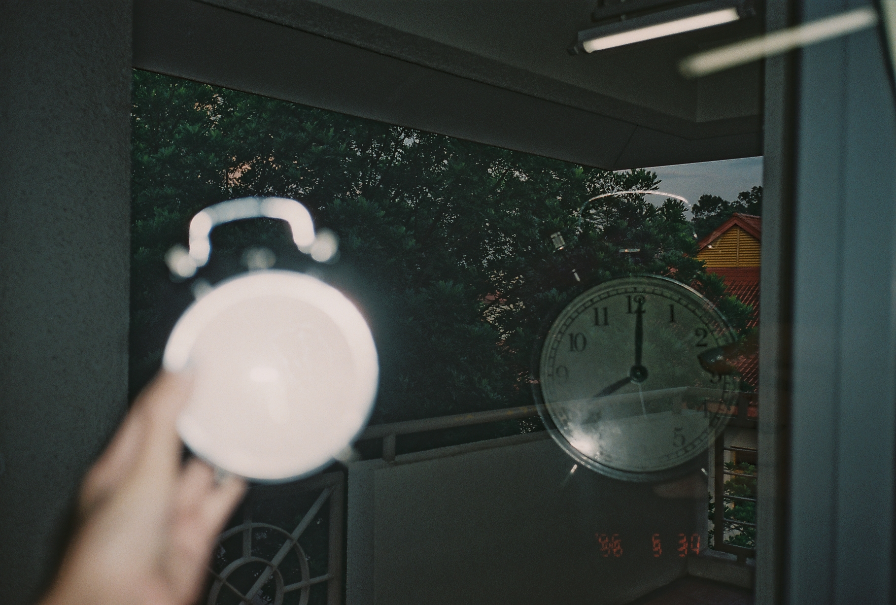
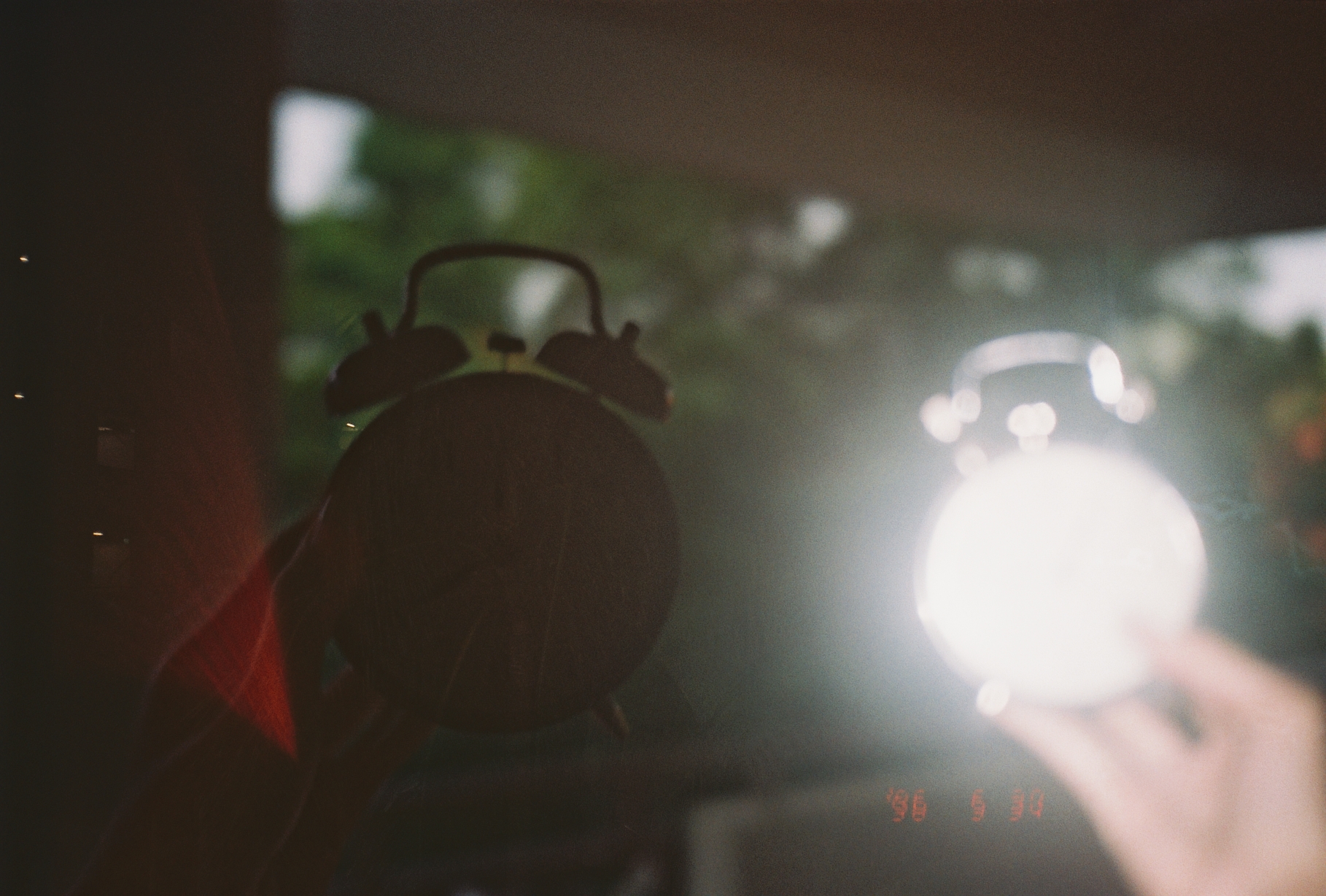
Actual Images Taken (raw images)
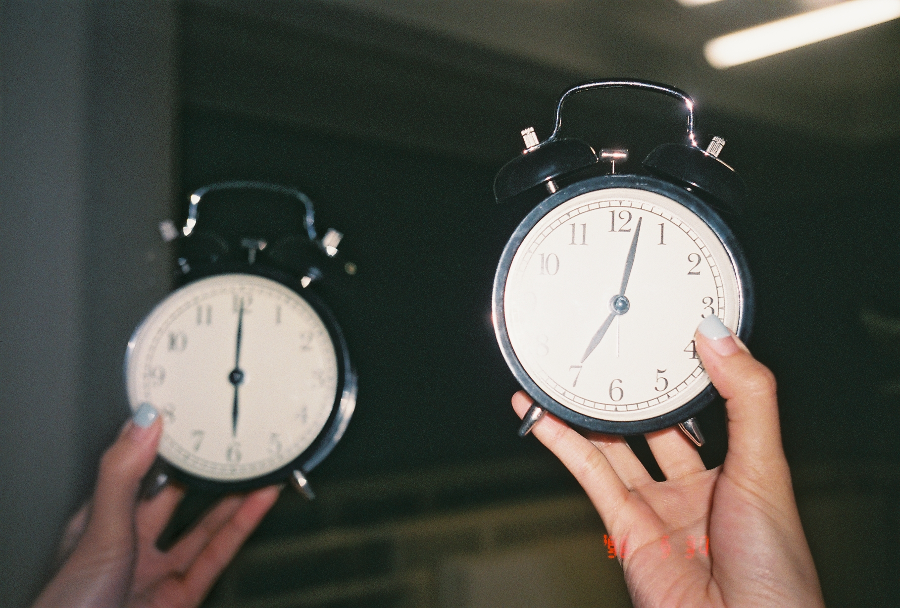
6am and 7pm
7am and 8pm
8am and 9pm

9am and 10pm
10am and 11pm

11am and 12am
12pm and 1am

1pm and 2am

2pm and 3am

3pm and 4am
4pm and 5am
5pm and 6am
6pm and 7am
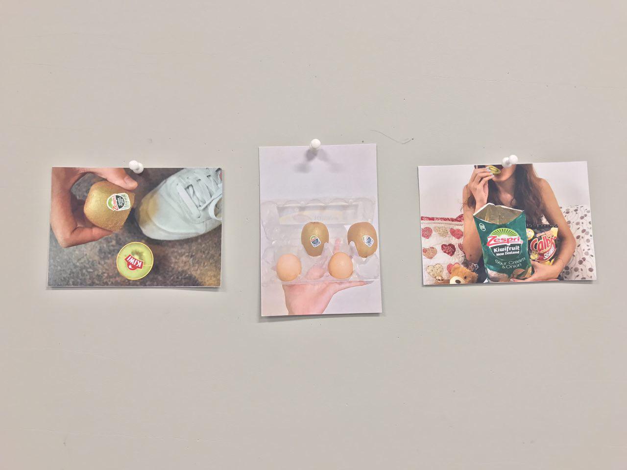
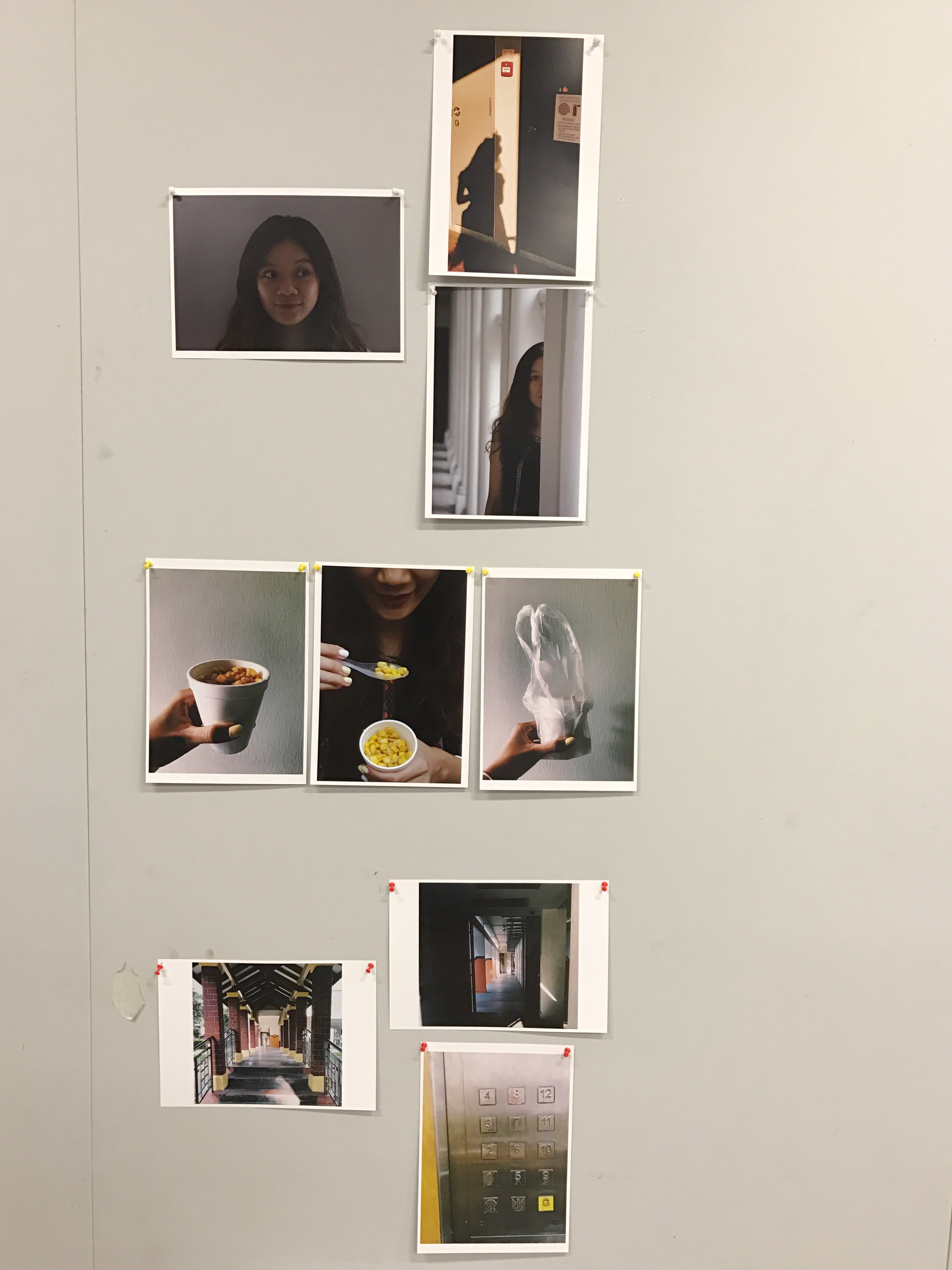
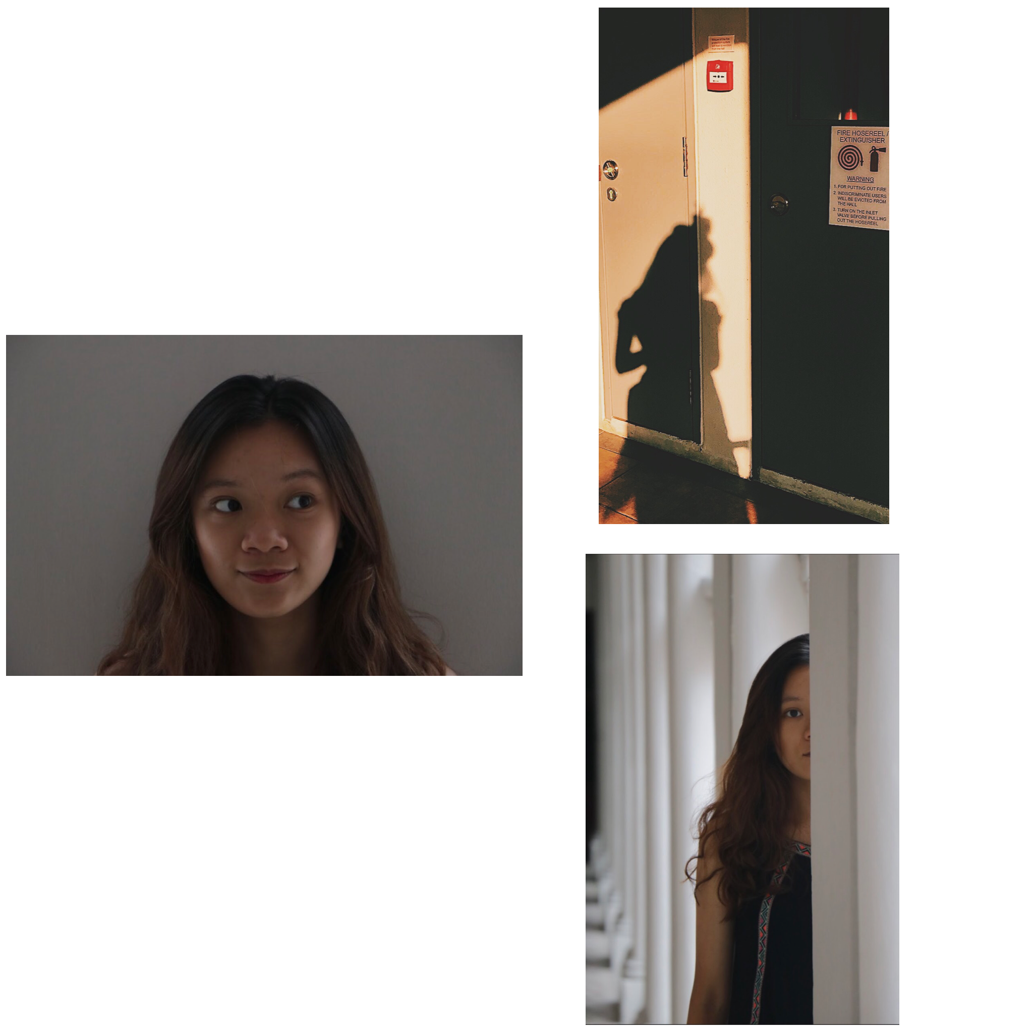
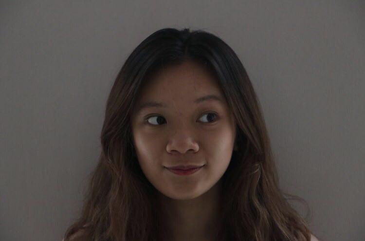
Some Pictures


