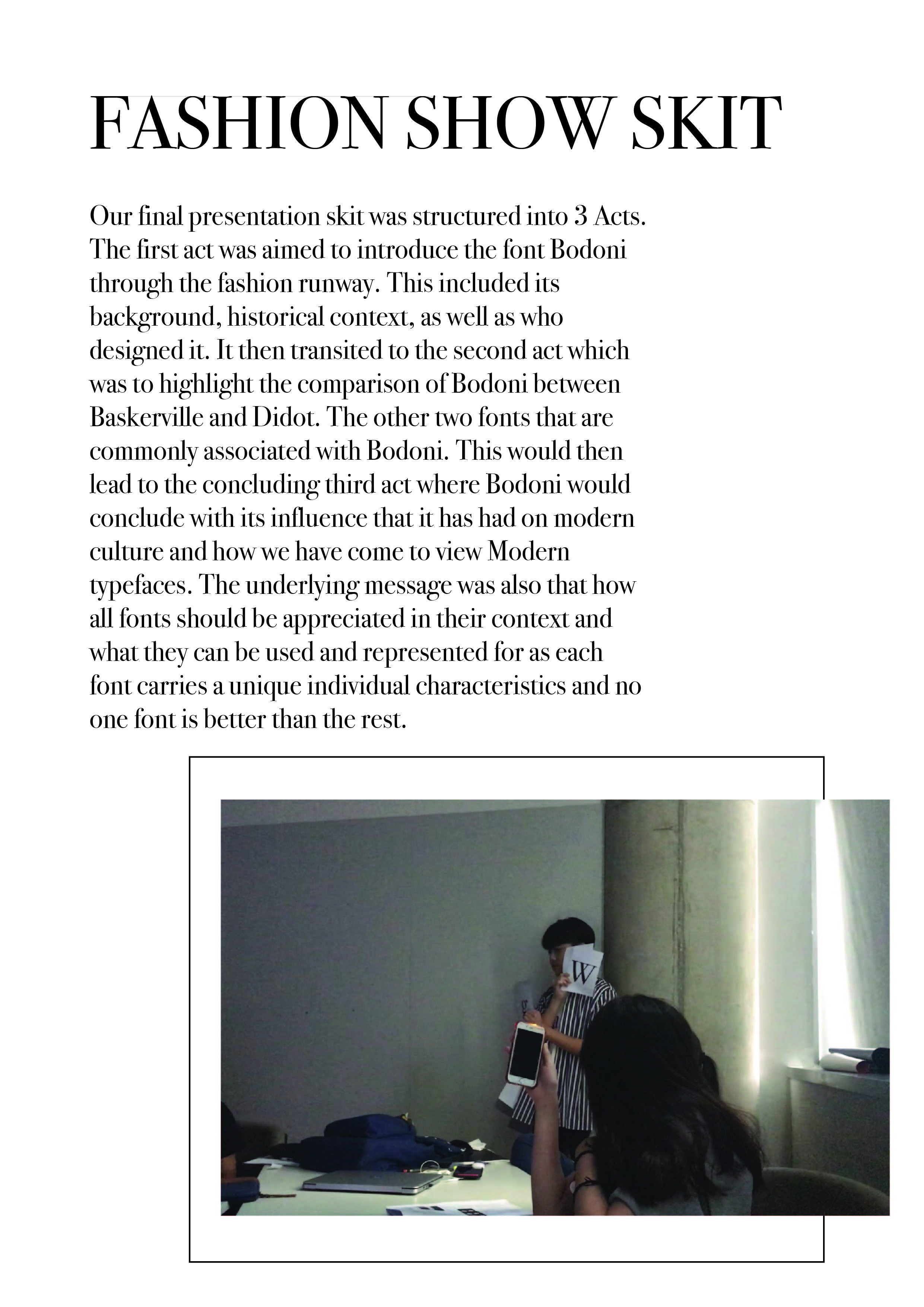
My self-care event (you’re not invited) (Final + Process)

What is self-care?
– the practice of taking action to preserve or improve one’s own health.
“autonomy in self-care and insulin administration”
  • the practice of taking an active role in protecting one’s own well-being and happiness, in particular during periods of stress.

Hence, this event is all about designing something of a person, to create a totally customised experience.

It is an event filled with a compilation of narcissism when you’re first and you can do whatever you like. A themed event that might not always make sense but as long as you like it.

A poster regarding the event:


A towel for a dip at the pool, but totally exclusive to the event

Some custom tableware to be used during the all-me event


And last but not least, some chocolates, because who doesn’t like chocolates?

Process

Varoom Magazine – The Fantasy Issue Process

Research and Mindmaping 


Initial Stages of Ideation

The initial stages of ideation was to involve food into unconventional objects or living things. As I was beginning to sketch and formulate a direction for this project, I found myself doodling food and animals and girls. Therefore, you can see the Siew Mai Cats, the Frida Kahlo ice-cream and girls in the prawn rolls! (Funny how they are all my favourite snacks!)

After consultation, I was advised by Lisa to dive in deeper into the meaning of Fantasy and what does it mean for me? Given a few references below,

After viewing how Brian Pollett portrayed his idea of the after effects of drugs and the relationship between drugs and art (pixels), I decided to start on a blank canvas and relook at the meaning of Fantasy in my own interpretation.

After brainstorming, I realise that I am intrigued with the idea of botany, serpents and girls all at once. Growing up as a Christian, my religion exposed me to the idea of the good and the evil – gaining inspiration from the garden of eden and the forbidden fruit. As an old scripture that explains the curses then made to men and women, I wonder about the unexplained and the explained. What is an extension of the real world (of logic), is magic or imagination just part of the science of illusion? But, things left unexplained are totally fine! This gave birth to my interpretation of Varoom Fantasy Edition

References:

Artist Takes 20 Different Drugs And Creates 20 Illustrations To Show Drug Effects


Inanimate Portrait — DESMOND

My partner for the first project Inanimate Portrait is Desmond!

Before starting on the project, we conversed and got to know a little bit more about ourselves and our experiences.

Some things that stood out to me is that our favourite go-to alcoholic beverage is Gin and Tonic. I usually have it on my nights out but for Desmond, it was a little different. Since he stays in hall, he has a bottle of Gin in his fridge for some nights when he feel like having a drink. Hence, I thought, a bottle of Gin has to be part of his portrait.

Apart from that, we spoke about our aspirations. For Desmond, all geared up in an Adidas T-shirt and sneakers told me that he would love to work for Nike, the renowned sportsbrand someday. I laughed and pointed out that he is in a whole gear of Adidas and he told me that he only gears himself up in one brand per day, so no Adidas T-shirt with a pair of Nike runners, ever, and I caught him on his “off-day”. That exchange spoke out to me and Nike has to be the second element.

Talking about hobbies and interests, I asked him about calligraphy since I briefly remembered he does lettering on his free time when we worked together in Year 2. He still does it sometimes although lesser due to his busy schedule. Besides, he would invest heavily into his tools, that includes his pens and ink. He commented that one of his most expensive investment he made to this hobby of his is purchasing a $300 over dollars calligraphy pen. Yet he says that having good tools shows in his works and is overall a good investment since he will use them for years. Third element it is!

With all the exchange, the impression I have of Desmond is that he is very much a traditionalist and there is an old soul within him. When composing his piece, I decided to include that element in.

Process

I knew straight up that I wanted to first start on the bottle of Gin and Tonic. As I was researching on labels of alcohol bottles, I found many with vintage illustrations.

In thought, I realise that the logo of Nike is inspired by the side-view of the wings of the goddess, Nike. I thought about tweaking the Nike label brand a little and decided to illustrated the Nike goddess in Greek mythology instead of using merely the iconic tick. With that, I started researching on the characteristics of the Nike goddess. Through Britannica, I found out that Nike is the goddess of Victory and is often seen with a palm branch, wreath. Also, Nike is always wingless unless portrayed alone.

Also, the lettering “Gin” was also inspired by Desmond’s lettering hobby. I further looked at traditional, vintage letterings to create the final “Gin”.


taken from: https://www.etsy.com/sg-en/listing/184033049/printable-alphabets-with-ornamental

For the consult, I had many issues with the composition.

I showed my classmates a few and that was when I decided to also include a patterned background that’s Bauhaus styled since I thought that portrays the traditionalist style pretty well. Initially I thought the background was also fighting for attention, since the pieces are to be in black and white, I decided to turn down the opacity by a tad bit.

Reference

Nike the Goddess

Inanimate Portrait — DAPHNE

Working on my own inanimate portrait, I decided to look at what interests me now and what I love to look at. It was then I realise I enjoy looking at illustrations of tarot cards especially when it looks like it is the “hype” thing now as people would pay ten over dollars to have a reading done by a random stranger online.

After looking at tarot cards for hours in a bookstore, I spoke to the store person about it as she saw me looking at them for the longest time. She explained that the tarot cards are actually based on the interpretation of the tarot card reader depending on the energy and the illustrations he/she gets from the card. Hence, tarot cards can be seen re-illustrated and reinterpreted by different tarot readers. It is a subjective reading up for interpretation and discussion.

Process

Riding on that, I decided to look at some cards that I often see myself looking at. They are The Empress, The Sun, Temperance.

illustrations on traditional tarot cards

traditional tarot – the temperance card

traditional tarot – the sun card

traditional tarot – the empress card

These are the elements I came up with for the different cards.

the temperance card

the empress card

the sun card


TYPOGRAPHY I – BODONI PRESENTATION PROCESS DOCUMENTATION

VIEW SKIT HERE

INDIVIDUAL REFLECTIONS


JOSEPH 


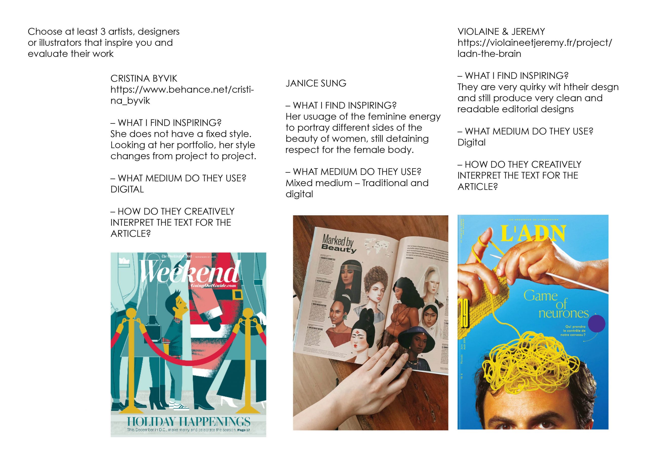
I learned a lot about bodoni through this presentation project alongside with my teammates. I didn’t know that Bodoni existed due to the evolution of Baskerville and then Didot and then Bodoni, and the fashion skit idea thought out by Jonathan really portrays all the informations that can be input into a storyline with all the facts we can gather from this 3 fonts by doing a comparison kind of concept to our presentation. All of us gets to research and have a better understanding not only 1 font but on all the 3 fonts! We now get to know where is the origins of Bodoni comes from and with the similar traits with the other 2 fonts why is Bodoni the better usage in display images rather than the other 2 fonts. We also get to know and understand more about the history on each font and understand how did the shape and characteristics of the character came from. Each font having a special type of stroke and shape which are different from one another but looks pretty similar and i always get confused by which font is which. Overall, we had a really good time spending on researching and getting a lot of informations on the 3 type fonts from this project!

_________________________________________________________

NAOMI


Through this project, I learnt that no two fonts are completely the same regardless of how similar they may look and if you look hard enough, there are many tell tale signs of those differences. Not to mention vast histories to accompany them. One issue I had in the research phase was that different sources occasionally had different information, such as the year Bodoni was created – some sources said 1788 while others said 1798. Then, going into this project, other difficulties we had included coming up with a concept for our presentation and once we did, the script – as we wanted to incorporate our character personalities into the skit while still keeping it educational and in line with our concept. We also had quite a bit of difficulty thinking of what to do for audience engagement as we weren’t too sure on whether it had to be educational, i.e. having them answer our questions, or just having them be a part of our skit like flashing their lights, was enough. In the end, we decided to combine both by having them answer their questions using our transparency sheets and their phone flashlights. Through all those difficulties and minor issues that cropped up during our presentation itself, I realised the importance of rehearsing our presentation and while we did have rehearsals, it’ll be good to have more in the future so that we’d be more prepared to face any issues that may occur and also to make sure we’re confident during the actual presentation. Overall, it was still a fun and enriching experience as it’s the first time I had to do a presentation with this sort of narrative and interactive factor, and I have definitely learned a lot from the various problems we faced.


_________________________________________________________


JONATHAN


I think this assignment has been one that is extremely challenging but very rewarding at the same time. It would be easy to simply create a presentation on a typeface and simply dump information to our peers on every information that we’ve managed to researched. But having to come out with a creative presentation that would help our friends better understand and appreciate the font better, this took one step further as it required us as a team and myself as an individual to understand the culture and historical significance of the font and at the same time try to express it out through the presentation in creative ways. And that was definitely a challenged. As a student doing design without much typography background, I often selected fonts based on its aesthetics or what seems to fit in the moment or in the design. What this assignment have taught me was that every typeface carries certain influence that can be a form of leverage to enhance the final outcome of the design. While in this assignment, it was through the use of Bodoni and Modern type classification as a “fashion, elegant” typeface for use to express these qualities in a presentation. The same ideas can be expressed through my work as well.


The group work element as always is not easy but coming together with friends to complete a project together and spurring each other on and seeing everyone contributing is very heartening as well. There were hiccups along the way during the preparation and process but at the end of the day I think it did help us learn better to work in a team setting for the future with other projects.


_________________________________________________________


DAPHNE


This presentation allowed me to look more into the history and context of the font my group has chosen – Bodoni.

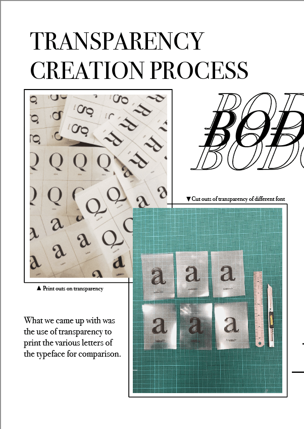
As a group, we were able to go in-depth in research about the modern type mainly the Bodoni typeface, Didot and Baskerville as we used these three to compare and contrast. Because they are highly similar in nature, our short skit highlighted the minor differences and taught the class how to differentiate the three modern typefaces. Using the type anatomy taught in class, we were able to be precise in our description such as the differences in the tail of the uppercase “Q” and the upturn tail of uppercase “R”.

Adding to the short skit, as a group, we came out with the transparency that our classmates can keep to remember the small differences between the seemingly similar typefaces. It also serves as a momento for our class to remember our Fashion show skit.

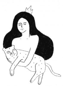
As for the skit, as a group, we had to come up with relatable elements to place into our script as we portrayed Bodoni, Didot and Baskerville as high fashion models. Besides that, the play of puns were used such as “font-tastic” lightens the mood of the presentation yet makes it memorable and easily absorbed which is one of our intentions of using a short skit for our presentation.

Overall, preparing and executing the skit was enjoyable as we got to apply what we learnt in class and make a twist to the otherwise dry content of learning the Bodoni typeface.


Programming – An End of Sem Project

C O N C E P T U A L I S A T I O N

Our team wanted to create an installation that involves creating an immersive space for audiences to enter into. We created the idea of a third dimension in our space where audiences have to make new discover with every step that they take, exploring the new dimension.

Taking inspiration from the piano stairs, where the whole experience encouraged people to take the stairs instead of the escalator, we thought this ties in well with our entire concept.

P R O C E S S

Diving into our first week, we first did up a mock up using the mousePress(); function to mimic the movements of the audiences in our space. We created the coloured grids using the Illustrator, then input the RGB code into Processing for each grid. Initially we worked with a 5×5 grid, but reduced it to a 3×3 grid due to the mismatch of dimensions of the Kinect and the projector.

Next, we figure out the codes to activate the use of the Kinect then input them into Processing. Meanwhile, we secure the usage of the Truss Room for the project and did a site test. Measuring the dimensions accurately and testing out the top-down projection was an important process since our project relies heavily on it the on-site experience that we cannot determine merely on our screens.

Apart from that, we recorded each piano note we used on the keyboard using the Zoom and input them into Processing using Minim.

S U M M A R Y

Proposal: The_Muse Proposal

Mock up Code: Mockup Code


SPACEVENTURE – A mid sem programming project

A B O U T

SPACEVENTURE is a one-player game that aims to shoot down the enemy spaceship and try to survive the battle. With every spaceship shot, player will gain one point.

s c r e e n s h o t s

GAME START PAGE

GAME PLAY PAGE

GAME PLAY WITH SCORE

t h o u g h t s

SPACEVENTURE is the first game I did up with the help of Corey using processing. With no prior knowledge on what coding or programming is, the concepts taught in class was helpful to help me code the fundamentals of the game. I learnt the use of a minim, and was able to use that for SPACEVENTURE. Also, got to upload an image for my player as an astronaut that I created on Illustrator.

Overall, although I struggled a lot, especially with the array list, it was fulfilling to create this game from scratch on my own. Coding Train’s tutorials have been a huge help apart from Corey and opensource codes as well!