Visual Communication I – Project 2 – Greater Than Design (Research and Development)

For Project 2, we were to create a poster for the Singapore Design Week 2019. We went on a trip down to the Singapore Design Centre to look around and get some inspirations.

C O N C E P T

My slogan is “>esign” or “Greater than Design” that aims to portray the art scene of Singapore as more than what it already is. As people put more attention and value on deign in Singapore, the Design week is a celebration of that phenomenon and a vast change in perspective. Of which I used a rising sun that portrays the “new light” people have on the topic of design and the art scene with a splash of memphis elements portraying a celebration.

I N I T I A L  P H A S E S

As mentioned in my previous post on my visual research, I had some slogans in mind, namely “>esign” (greater than design), “Springing into >esign” (springing into greater design”.

1.

Initial phases of 1 was inspired by the moodboard I put together as seen on the previous post.

That includes fluid shapes that plays with opacity. I thought these effects gives off a mysterious impression, a foggy channel forward. Linking it back to my concept of >esign, it might show an onward lookingness, with the use of vibrant colours and inorganic shapes.

2

Initial phase of 2 for “Springing into >esign” looked more like an invitation rather than a poster and it looks more personal than for commercial uses. Hence, I decided to scrape the entire design.

3

Design 3 is a brunch out from design 1. I added memphis elements to create a sense of playfulness and a black background to portray a vague future. However, it was seen as having little relation to help to reinforce the concept and the “>” looks vague.

—-

Relooking at my concept, i thought settling on a specific art movement will streamline the thought process in coming up with my design.

RetroFuturism

a trend in the creative arts that shows the influence of depictions of the future produced in the early era.

If “futurism” is called a “science bent on anticipating what will come, retrofuturim is the remembering of that anticipation.

Since “Greater than Design” has the element of forward-looking and yearning for the future, I thought RetroFuturism art movement is in line with my concept, hence I decided to adopt it.

4

Design 4 was born, using inspiration from the retro-futurism art movement to try to bring out my concept more. I played with gaussian blur to blend out harsh lines and to give a glowing effect.

Some feedbacks I got was that the black block of information feels harsh and sudden. Additionally, the I font chose seem really stiff. Also, more movement can be introduced to further bring out my concept, playing more with “>”.

5 (Final)

With much diversion at the start and feedbacks, design 5 was submitted. I chose a more fluid font in the end, trying to blend the “>” sign more as a vague “D” to poke people to wonder about the slogan and the sign itself.

C o n c l u s i o n

Concluding this project, I got to consider more about the elements I put on a single page that will blow up in size (looks much smaller on my screen). The hierarchy of elements, what you want your audiences to see first? What to see next? Will your audience view your information (fine prints?) Many to points to consider. Also, how the elements you use on the page communicates your concept.

I got to experiment the aforementioned points through this project. I thought with the given amount of time, I had solved most of the problem areas with the design. It was a tough ride, but looking at the A2 final product placed along the corridor was somewhat a bittersweet moment!


Artist Research

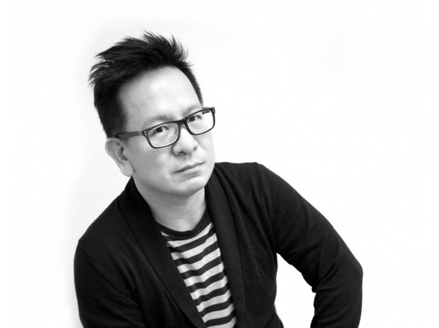
Nathan Yong (Singaporean)

“Furniture designer Nathan Yong is well-known for his trail-blazing career, and has been credited for advancing furniture design and furniture retail standards in Singapore. Having wanted to be a designer since the age of 15, he chose to pursue industrial design at Temasek Polytechnic as he was interested in the forms of products. Today, Nathan has a growing international profile with his products are sold globally.”

Furniture designer Nathan Yong is well-known for his trail-blazing career, and has been credited with nothing less than advancing furniture design and furniture retail standards in Singapore. Having wanted to be a designer since the age of 15, he chose to pursue industrial design at Temasek Polytechnic as he was interested in the forms of products. His aim at the time was ‘to be as famous as Philip Starck’.

Instead, he went on to forge his own path by establishing the furniture brand Air in 1999, at a time when there were very few local producers of modern furniture in Singapore. In 2006, armed with a Master in Design from the University of New South Wales, Nathan set up the subsidiary Air Design Group, of which he is the Principal Designer.

With an established and growing international profile, Nathan’s designs have been sold in Germany, Denmark, Morocco and the United States. He has also collaborated with renowned designer Toshiyuki Kita (designer of the SHARP Aquos® TV and the Wink Chair by Cassina) and multidisciplinary designers Voon Wong and Benson Saw from the United Kingdom to produce design-conscious furniture that aims to be affordable for all.

For Nathan, the journey to success has had its highs and lows. When the respected French furniture company Ligne Roset bought three of Nathan’s designs, its headquarters received a letter from its Singapore outlet asking them not to engage a Singapore designer because it would not be good business for the Singapore market. Nathan found the incident discouraging, ‘Here we were trying to break into the international market with our efforts, and there was someone from Singapore stopping us from putting Singapore on the global design map.’ At the same time, he recalls with pleasure and amusement the opening of Air Division’s first franchise in Jakarta, Indonesia. ‘I remember I was in a cab in Jakarta and saw an old man on a trishaw with trash and among that trash were Air Division wrappers and cartons. I found that image endearing.’

Nathan’s success lies in his design philosophy. Good design, according to Nathan, is a combination of three factors. To begin with, the intention of the client and the designer must be to improve on the existing situation. ‘Design is important,’ he says, ‘but only if it improves our living conditions, not just physically but also spiritually.’ The designer must also take into account factors such as the social, cultural, historical, artistic, technological and material aspects that form the design context. Most of all, Nathan believes in being ‘honest in the design approach, and in keeping it simple’.

This design philosophy has been the key to Nathan’s success. His relentless pursuit of simplicity and honesty in design has made him one of Singapore’s top designers, and has garnered him numerous awards both locally and at the international level, for instance the Red Dot Award. In 2006, the Break stool garnered a Silver Award at MINES International Design Intelligence and a Bronze Award at the Singapore Furniture Industries Council Furniture Design Award. In the same year, Nathan was also shortlisted as being among the 20 best designers in the DesignSingapore Council 20/20 series, by peer review.

Nathan’s influences are too numerous to name, but among those who have made an impression on him are the past great masters of the Bauhaus, Poul Kjaeholm, Charles and Ray Eames, Mies van der Rohe and Le Corbusier, as well as the more current Dieter Rams, Jasper Morrison, Konstantin Grcic, Naoto Fukasawa and Eugenio Perazza. He draws his inspiration from his surroundings and from the simple acts of daily life, such as a walk in the market or fixing his bicycle. Inspiration is like a lottery, he says, in which winning depends on a number of parts falling into place. As he notes wryly, ‘Sometimes it doesn’t happen.’

At the start of each new project, Nathan’s creative process includes taking into consideration numerous crucial aspects such as ‘function, materials, technology, cost, arts, form, proportion, engineering, markets, time, social, culture and wonderment, in order of importance according to the design brief’. He then changes the arrangement ‘until the result is an amalgamation of intelligence – intelligence from the distillation of informed choices’.

Nathan Yong is an exemplar to young design entrepreneurs with his winning blend of design integrity and commercial success. Success has not fazed him, and he views his accomplishments with his trademark unfussiness. When asked what sets him apart from other designers, he replies, with breathtaking simplicity, ‘I am me.’


Pann Lim (Singaporean)

“Pann Lim is the creative director of Kinetic Design and Advertising. He graduated with a Diploma in Design and Advertising from Temasek Polytechnic in 1998. Pann’s portfolio of work is a hybrid of visual design, interactive design and advertising. He works on these disciplines independently. To him, there is no distinction between these disciplines, as they are all tools of communication.”

Pann Lim is the creative director of Kinetic Design and Advertising. He graduated with a Diploma in Design and Advertising from Temasek Polytechnic in 1998, where he was inspired by mentors such as Lim Chong Jin, Hon, James Na and Iskandar Jalil. He started work at DDB Singapore and Batey Ads. In 2001, Pann was invited to start up a creative agency, Kinetic, with Carolyn Teo, Roy Poh, Adrian Tan, Sean Lam and Benjy Choo.

Pann’s portfolio of work is a hybrid of visual design, interactive design and advertising. He works on these disciplines independently. To him, there is no distinction between these disciplines, as they are all tools of communication.

He believes that design and advertising start with an idea. He has devoted his time to creating ideas that have won him over 300 industry awards including a D&AD Silver nomination and a Silver for Cannes Lions International Festival of Creativity in 2012. He was awarded Singapore’s Most Influential Creative Director by the Institute of Advertising Singapore in 2012. He is currently ranked tenth in Australasia by campaign Brief.

Pann is also involved in nurturing newcomers, as a way of fulfilling social responsibilities. He is a founding member of The Design Society, a Singapore- registered non-profit organisation, which aims to educate, proliferate and archive graphic design in Singapore. He has been actively involved in teaching and mentoring for prestigious awards such as Noise and Crowbar. He was chairman for the Crowbar Awards 2011 and head of Jury (activation) for Creative Circle Awards 2012.

In 2011, he started Holycrap.sg with his wife and two children, an art collective focusing on the arts. To date, they have had two successful exhibitions featuring the artworks of his children. Pann spends most weekends with them, working on projects, as well as exhibitions. He maintains that their works are not for sale, because he wants them to enjoy the process and not be caught up with the commercial benefits of the endeavour.

Pann handles projects by understanding the brief, ironing out the facts, needs, budgets, deadlines and objectives of the clients versus the needs and objectives of the agency. He works with like-minded partners, who believe that every project should serve the best interest of the client without compromising the creative integrity of the agency. For Pann, design is most meaningful when it makes sense and makes one happy. Every project is different, but needs to be based on the insights to the problems or situation. The agency operates like a family, with a strong culture of kinship. It is a healthy eco-system, where the best scheme is adopted via a voting system. This way, everyone who works hard gets a chance to be recognised and gets to do good work. To him, everyone needs to learn to deal with disappointments in life positively. His best life lesson is to constantly learn from others in order to accelerate one’s own learning. To him, learning is a life-long affair.


Alfie Leong (Singaporean)

“Singaporean fashion designer Alfie Leong, is the founder of fashion label mu and A.W.O.L. He is noted for his signature draping, unique cut and attention to detail. He won the Singapore Fashion Designers Contest in 1995; and subsequently received a scholarship for Raffles LaSalle International School of Design.”

Singaporean fashion designer Alfie Leong, is the founder of fashion label mu and A.W.O.L. He is noted for his signature draping, unique cut and attention to detail. He won the Singapore Fashion Designers Contest in 1995; and subsequently received a scholarship for Raffles LaSalle International School of Design. He graduated in 1998. Over the years, Leong has represented Singapore at the Beijing Fashion Week and the Smirnoff International Fashion Awards. In 2001, he made the top 20 list of international designers at the Enkamania International Competition. At home, Alfie has made waves during the Singapore Fashion Week, the Mercedes Benz Fashion Festival, and the Singapore Fashion Festival. He has also collaborated with Swatch as well as homegrown street wear brand 77th Street.

In 1999, Alfie started his own label and by 2004 set up The Little Voice Pte Ltd, to create unconventional designs to inspire customers who want to express themselves. The two private labels of the company, mu and A.W.O.L., aim to blur the boundary between creativity and practicality. The designs of mu are unique yet affordable. The label offers constructed designs that are a fusion between east and west. A.W.O.L., an abbreviation for “all walk of lives”, embodies an originality and refinement that are complementary to the life of the modern women. It is achieved through unconventional construction, emphasis on details and the use of luxurious and sophisticated fabric. His practice gives him the opportunity to fuse the diverse world of inspirations and cultures that motivates him.

When designing, Alfie considers form, materials, technology as well as saleability. The creations fundamentally need to be wearable. His design process usually starts with draping. He establishes a fixed point in the human posture, typically a staple point under the armpit, where comfort is essential. Once that staple point is established, he starts to challenge the silhouette. He consciously creates new silhouettes and accentuates the form. Alfie is very unassuming about it, but the strength of his works is in his ability to apply functional details with impeccable finish. It is a skill that is honed and backed by 20 years of practice.

For Alfie, sharing industry experiences with other fashion designers is very important. He recalls experiences of bringing local designs outside of Singapore which were often not smooth sailing, sometimes even fraught with setbacks. Helping each other in the industry and bringing related industries together are important.

His belief motivated him to start Workshop Element, a label that hosts a community of designers. It seeks outlets and opportunities for local designers to showcase their works in a curated space. The first edition of Workshop Element, launched in 2012, was a pop-up store. It presented an ensemble of 19 brands and 16 designers and curators. The venture was driven by a passion to give back, inspire and inculcate values that have served him well over the years.


Jessica Walsh (United States)

Jessica Walsh is a designer & art director working as a partner at NYC based design firm Sagmeister & Walsh. She lectures about design at creative conferences and universities internationally. She teaches design & typography at The School of Visual Arts in NYC. Her work has won numerous awards from most major design competitions including Type Director’s Club, Art Directors Club, SPD, Print, New York Festivals, D&AD, TDC Tokyo, and Graphis, among many others.

Clients include: Museum of Modern Art, The Jewish Museum, Institute of Contemporary Art Philadelphia, Barneys, The New York Times, Levis, Adobe, and The School of Visual Arts.


Reynold Ruffins (United States)

Reynold Ruffins’ present paintings and drawings are preceded by a career as an illustrator and designer. He is a graduate of The Cooper Union and a recipient of it’s most prestigious honor, The Augustus St. Gaudens Award for outstanding professional achievement in arts. The Cooper Union Presidential Citation was also presented to Ruffins for his work and prominence in his profession.

Professor Emeritus, Queens College CUNY, Ruffins has also taught at the School of Visual Arts, The Parsons-New School of Design and was a Visiting Adjunct Professor at Syracuse University. He is a founding member of the famed Push Pin Studio and also had his own design studio with Simms Taback. Ruffins commissions for an array of clients including IBM, AT&T, Coca-Cola, CBS, Pfizer, The New York Times, Scribners, Random House, Time Life, Fortune, Gourmet Magazine and the U.S. Post Office have garnered many awards, from the New York Art Directors Club and The Society of Illustrators (Silver Medal).

Teamed with Whoopie Goldberg and jazz musician Herbie Hancock, Ruffins’ brilliant illustrations produced a highly praised video for children. He has illustrated over fifteen children’s books. The American Library Association presented him with its Coretta Scott King Award.

Ruffins’ work has been acclaimed in trade and design publications, among them: 200 Years of American Illustration, A History of Graphic Design, The Push Pin Graphic, African American Art, Graphis and How Magazine. His work is internationally recognized in group show exhibitions at The Louvre in Paris, Milan, Bologna and Tokyo.


VISUAL COMMUNICATION I – Proj 2 – visual research

TASK 1A – VISUAL RESEARCH

1.

Analysis

What is the poster communicating?

-Promoting an upcoming iLight Festival happening at Marina Bay.

What emotions does the design elicit?

-The colours elicit excitement and adventure.

What makes the poster captivating (Discuss the use and effect of imagery, text, texture, colour)

-the use of simple lines to create the skyline of Marina Bay in different colours on a black background.

How did the poster generate visual interest and facilitate readability / legibility?

-the use of different colours to create a visual element of the Marina Bay.

How do you feel about the approach and execution?

-has a near interpretation of how the event will look like.

2.

What is the poster communicating?

-Promoting an upcoming iLight Festival happening at Marina Bay.

What emotions does the design elicit?

-The colours elicit excitement and adventure.

What makes the poster captivating (Discuss the use and effect of imagery, text, texture, colour)

-the use of simple lines to create the skyline of Marina Bay in different colours.

How did the poster generate visual interest and facilitate readability / legibility?

-the use of different colours to create a visual element of the Marina Bay.

How do you feel about the approach and execution?

-has a near interpretation of how the event will look like.

TASK 1B – DEVELOPMENT OF SLOGAN & MOODBOARD

>esign for Tomorrow (Greater Design for Tomorrow)

DESIGN (Design SG) / DEIN + SG = DESIGN


ESIGN (Greater, Design, Singapore) // Springing into >Esign (Springing into Greater Design)

>esign (Greater than Design)

Reference:

The Annual Design Week is Back with Over 100 Events

Singapore Design Week – About 

Bring Design to the Masses (The Straits Times)


Summer Internship 2018

TAG INITIATIVE

Title: Branding Intern

Job scope: Create a brand identity for Tag Initiative and its children company. Daily tasks include revamping the brand of Tag Initiative and starting a website.

Third Space Fallacy, A Statement

As read in the prelude to our final project, Third Space Fallacy, uses social media to broadcast a certain friendship conflict that two girls have, Daphne (me) and Bella. Of which, polls put up on our Instagram stories will decide the next cause of actions. To disguise this project that we were planning for the final project, we decided to create another Instagram account @abracadabrrun that will decide the narrative for Bella’s death.

Inspiration

The inspiration for this piece is our realization as a team how social media can affect our first space decisions and actions. On a more extreme note, the case of the death of Megan Meier because of social media, that further motivated us to create a a friendship drama narrative broadcasted on social media to observe how our followers would react and respond.

Also, we realized how emotionally connected netizens are to their social media accounts. During one meet up with the team, Bella said, “it is as if everyone has a mobile phone, an addition to themselves”. It is true, our mobile phones always need to be within sight, occasionally checking our social media platforms for updates once in a while. Besides, Bella also shared with us during team talk about a comment that Randall Packer left, that spoke to her:-

“Very interesting how you expressed your thoughts on interaction in such personal terms: how we engage emotionally in the third space. This has been one of the key ideas we have discussed this semester, how meaningful interaction can be achieved despite geographical separation. Wasn’t this proved when you elected not to interact in the chat for Annie Abrahams’ performance, and found yourself removed and disconnected. This implies that is direct interaction that creates the quality of engagement in any form of interactive art. Perhaps it would be interesting and helpful to your thesis to applied this to Blast Theory’s work: how the players and performers engage in something dynamic, arresting, and challenging in both physical and virtual spaces. ”

– Comment on Are We in LOVE with the Connectedness? Randall Packer

We decided as a team that apart from achieving our project objectives, we, as a team wanted this piece to be a statement addressing the potential of the Internet.

Execution

The team has agreed to activate Bella and I in the conflict that will be put online. Both of us used our own personal Instagram accounts, @um_brella and @d/aphnepotata. To create a narrative (if people question us about our friendship), we planned to create a fib of Bella and my past. We met in secondary school in a writing competition and had been really close friends since. Then we came to the same university, but problems in our friendship arise.

Our first postings:-

First post by @um_brella

Second post by @um_brella

First post on @d/aphnepotata in response to @um_brella

Indirectly talking about a specific someone is a common sight on social media. When “indirecting” someone, it is often posted up on social media platforms that the person is following you on, and you speak about the situation or the “beef” you have with the other person but not mention or tag them on the post. The objective is for the other person to get the message or the hint through that, without directly telling them. This is what is done between Bella and I on Instagram. The people who follow the both of us by this time have gotten the hint.

Posed by @um_brella, highlighting the fact that @d/aphnepotata did not reply her after many messages.

A post put up by @d/aphnepotata, stating the fact that a certain someone (@um_brella) has been spam calling her, seeking for her attention and she is annoyed.

A poll posted on @um_brella with the conversation between Bella and I up on the Instagram story.

Bella had purposefully not do a clean job in censoring who the sender was, and revealed part of the name “Daphne”.

Apart from using our personal account to post the drama online, we also created another Instagram account, making polls for people to take, forcing them to make uninformed choices through the polls, that will ultimately be the narrative for Bella’s death.


@Abeacadabrrun on Instagram.


This account is filled with short poems that might suggest a certain quest that is taking place for our team’s “final project”, but instead it is used to decide the ending of our actual project’s narrative.

Polls done on @abracadabrrun that was featured on the trailer deciding the narrative of Bella’s death, of which the truth behind her death was revealed.

Polls done on @abracadabrrun that was featured on the trailer deciding the narrative of Bella’s death – of which she chose to die in a black outfit.

Polls done on @abracadabrrun that was featured on the trailer deciding the narrative of Bella’s death – of which Bella chooses death, to leave the entire situation.

Polls done on @abracadabrrun that was featured on the trailer deciding the narrative of Bella’s death – of which 0000 is the time Bella will take her own life.

Thereafter, Bella posted this on her account @um_brella indirecting it to @d/aphnepotata on the entire situation, hinting that she will take her own life.

Translate: It doesnt matter if I die today or tomorrow as long as you can witness it.

Thereafter, Bella left social media for 18 hours to make her death as real as possible. Not answering any calls or messages.

Because of that, meals had to be sent to her at her dormitory, to avoid her being in the public.

Responses

Throughout the entire process, Bella and I had received many comments, messages. The bolded ones are the responses we received regarding each Instagram stories that we have each posted.


Bella  Daphne 
Omg I cannot take this anymore, am i just a push over…. (emo post)

4 Replies

  • Angry 1
  • Curious 2
  • Comfort 1

Should i confront her (vote)

So it’s okie to just make use of ur friend? WTF can I do with her/this toxic friendship?

  • Make it clear 22
  • Just let it go 20

6 Replies

  • Comfort 4
  • Giving positive suggestions 1
  • Curious 1
Sees post

Rants about how sensitive she is

Complains about this friend.

Responses

-wondering who i am talking about x2

-Jokes- “sorry I offended you”

Maybe they just need some ice cream in their life

Confront her on Insta about the blue ticks (emo post)

8 Replies

  • Show Empathy 2
  • Curious 2
  • Angry 2
  • Giving positive suggestions 1
  • Sad 1

Confront her on Insta about the blue ticks and insta story (emo post)

2 Replies

  • Got the name right 1
  • Ask me to move on 1

Am I sensitive?

  • Stop overreacting
  • She should respond
Call out and rant about Girl A for spam calling her many times.

Responses

-A lot of people are very interested to know who it is. The regular “omg who isit” message.

Some made a joke out of it.: “wow you have a stalker”,

“wow time to get a restraining order”,

“Nani, thats some insane calling”,

“ITS TIME TO REMOVE THAT HEART HAHAH u savage”,

“omg what? Does she follow you? I think she should get the hint already”

Really concerned: “Aiyo everything ok?”, x2

Would you rather lose a friend or fight with a friend.

  • Yes
  • no
Should I just find her in school? (vote)

  • Thats rude
  • Go ahead
Wolf wearing a sheep coat


screenshot of friends concern

Thank You for your concern, i feel so much better now.

Again freaking clingy sia (spam call log)

Should I block her (vote)

  • Yes
  • No

Bella and I had to be proactive on posting Instagram stories about how troubled both we were about each other. Because of that, many people in ADM have already caught the hint that it was Bella and I who are “fighting ” indirectly on social media.

Some had mentioned and asked us personally about the entire situation and had comforted us about it.

Many actually believed what they had seen online, and bought it. Hence, the performance had to be brought offline as well, in the first space when we were each questioned about the entire situation that we had put up online.

Making of the Trailer

Initially, we had wanted to remake a news station on YouTube inspired by the InCentral.

InCentral is a channel on YouTube that updates its subscribers about dramas happening online between celebrities and happenings that are juicy and interesting.

Behind the scenes of Let’s Talk the Talk

We named the channel Let’s Talk the Talk and filmed a whole news about the happening between Bella and I.

The script used for Let’s Talk the Talk – SCRIPT-Lets Talk the Talk

Influence of The Blast Theory

Blast Theory is a pioneering artist group creating interactive art to explore social and political questions, placing audience members at the centre of our work. -Blast Theory

We were inspired by the Blast Theory’s quote “explore social and political question”, of which we touched on how news received on social media are treated seriously by many netizens. Even for Bella’s death, she cannot literally die in the first space, but she sure can die in the third space. By going inactive and unresponsive, her death on the third space can be staged, allowing people to really believe it.

Also, touching on death is a controversial topic, yet it is very real that we can fake a death on the third space, similar to what my team did for Bella. This then helped us explore fake news that very much came as a package with the rise of social media.

Initially we had wanted to put up a death note by the parents of Bella to inform her followers about her death, but scraped it and replaced it with a scene in the trailer of her cutting herself. This approach has brought out a much poetic way of expressing her death, which we thought was a better way of addressing death, a sensitive topic.

Scene of Bella cutting herself in the trailer.

Fake news is fabricated or false news. Because of the speed that social media can deliver to its users, fake news on social media can be found.

The claim and counter claim that spread out around ‘fake news’ like an amorphous cloud of meta-fakery, as reams of additional ‘information’ — some of it equally polarizing but a lot of it more subtle in its attempts to mislead (e.g. the publicly unseen ‘on background’ info routinely sent to reporters to try to invisible shape coverage in a tech firm’s favor) — are applied in equal and opposite directions in the interests of obfuscation; using speech and/or misinformation as a form of censorship to fog the lens of public opinion. -Natasha Lomus

Our project touched on the issues and flaws of social media, riding on its speed to spread fake news and touched on the idea of a staged death on the third space.

This process is collaborative, between Bella and I with our followers on our accounts. They are able to interact directly with us through direct messages to comfort us, provide suggestions, take our polls, on the third space. This entire narrative is then brought to the first space when people around us ask us in real life about the entire situation.

Third Space Fallacy, as its name suggests rode on the emotional attachment people have to social media to create an entire narrative of friendship problems and the resulting death on this platform. It is as its name suggests, a mistaken belief happening on social media. Our aim, discussed, was for viewers who knew Bella and I to at least partially believe the entire narrative.

Upon finalizing the project when our trailer was being played in class, many were shocked yet they saw the entire narrative coming into place on social media. Even so, most were in between believing and not believing it.

In a nutshell

It was quite an experience when the entire performance was brought to to the first space in the span of one week. We had realized the power of social media. Both Bella and I ended it by posting a note to our followers online.

Both Bella and I had “emotionally cheated” on our followers as many bought our act and were concerned for the both of us in that one week, the tough thing was to ride on the entire narrative when they approach us checking up on us in the first space.

But we had some encouraging message about the entire performance put online!

As a team, we hope that we had highlighted the power of social media and the amount of time and emotions we had invested in it. As technology advances, our human interaction also advance with it, bringing it online. We hope as a collective, that we had brought a statement to all our viewers and audiences.

References

Blast Theory

Fake News is an Existential Crisis for Social Media

Locale Part II: Process + Zin(e)spiration


About Assignment 2

In Locale assignment 2, we are to visit a neighbourhood and create our very own zine!!!!

A “zine” is a self-published, non-commercial, independent publication, a DIY magazine-like thing.

Because you do it yourself it can be pretty much anything you want it to be, favorite bands, personal stories, subcultures, or collections (that’s the joy of zines!).(*screams* really excited) To embark on an exploration around a local neighbourhood! Find out what makes the neighbourhood unique and what are some of the interesting features in the area. The aim is also to develop one’s investigative research skills and present information in a visually engaging manner. To introduce inspiration and serendipity into creative development. To explore experimental formats and understand alternative layouts and grid formats. To learn more about binding methods and ways of putting together a self-made digital publication.

Concept Behind My Pieces

After exploring and discovering Chinese Garden (as seen in Locale Part I), the concept behind my zine is highlighting the contrast of Chinese Garden in a much subtle way through short proses, and photographs that might highlight each type of contrast in each spread.

1st Spread: Highlighting the contrast of the living and non-living “animals”.

2nd Spread: Highlighting the past and present objects, architecture that we can observe.

3rd Spread: Highlighting the complementary colour scheme of red and green.

Site Visit & Photographs

from my iPhone 7 and camera

Mood Board

images from pinterest

I looked through Pinterest many times and collated a few images or covers and layouts that I really like and the colour scheme that I am going for (green, blue, red).

Inspirations and Research on Layout and Presentation

taken from: http://ceoul.tumblr.com/post/124438211816/gridologie-just-finished-this-one-santa-monica

Texture & White Spaces

I particularly like the memphis texture that the artist has included to the white spaces, yet giving it enough breathing spaces for the reader.

Texts

I like the adventurous approach to the texts. The warp effect gave it a sense of flow and rhythm to the otherwise static page.

Colours

Enjoy the colour consistency throughout the page. Analogous colour of pinkish tone and purple makes this page really soothing to read.

taken from: https://78.media.tumblr.com/tumblr_mcusdfv0tG1qctmo8o1_1280.jpg

Sense of Hierarchy

There is a sense of hierarchy in this page. The biggest is the picture of the shore, then the headline “surfetur” then the smallest is the rectangular box “LORDAG 28/11”.

Colour

Complementary colours used (blue and orange).

Texture

Used the squiggly to create a sense of texture.

taken from: https://i.pinimg.com/originals/1d/6a/af/1d6aafef758f12c866fbfc00b2f96266.jpg

Theme Continuation

I like how there is a conversation between the hands at the top and bottom of the page.

Collage

The collage of small elements gave the page a little three-dimensional effect.

Texture

The lightning bolt and the star gave the page a quirky texture, something of strong statement and gave interest to the page aside from texts and images.

Balance

There is balance in both sides of the page. Although it is heavily highlighted by the black borders, the right side is balanced out by the busy elements going on on the left. The orange texts and the eye on the picture on the right creates another minor visual balance, everything else is muted in colour (black, white, light beige)

taken from: https://www.behance.net/gallery/53249095/Analog-Reflections

taken from: https://www.behance.net/gallery/53249095/Analog-Reflections

Really like the entire vibe of the zine, minimal, few texts and the pictures speak the message.

taken from: https://www.behance.net/gallery/58335321/The-Chelsea-Hotel-zine

Like the photos edited, very uniform throughout this zine. Something I want for my zine too!

Fonts Used

Yorktown is used for headers

Yorktown

and Minion Pro used for the proses.

Minion Pro upper and lower case

Designing Process

My designing process came a long way. Started from the bottom and now we’re here! hahhaha

But my final design really looked a lot different from the start!

Initial Phases

that evolved slowly…

then this happened after a talk with Brendan over how troubled I am about my zine at 3 am in the morning at NTU Starbucks… this happened after a few hours…

the rest is history!
BUT here’s my work from bleed to bleed

Adding Videos

Also, I decided to add moving images to enhance the visuals from the zine to the audience. I thought that to fully be able to grasp the environment of the place, merely pictures will not suffice. Besides, my first visit there was filled with boomerangs, as seen in my research presentation, so I thought for my subsequent visit, I take videos too! Special shoutout to Jun Meng , a film student who went to site visit with me and got some footages with me! Enjoyed it thoroughly! Here are our fruits from the labour which I had included in the zine using QR codes!

takeaways!!!

Initially I was super excited for this project!! To design a zine is my first, plus I really enjoy writing, so I thought I can really combine both together into my first ever publication. Then as the process continues, it got harder and harder especially when my layout was not fixed, and had to go back and forth with merely sketches which was when I feel like I am lagging behind everyone.

That was when I realize talking to your friends about it is really important especially when you have a mind block and you don’t know where or how to carry on!!!! special shoutout to Teri, Sihui, Niki, Brendan, JJ, Gloria, JunMeng. (hope i did not miss anyone)

And people around are really there to help you, when you have the ideas, ask for opinions, don’t shy away. Just get the critiques, you will learn and be better from there!

Also, during this project, I tried many new things in terms of layout, stared at InDesign for hours and hours and I can still be on similar layouts, but Pinterest is your good friend! (but don’t plagarize!) get inspired, use the elements you like and make them your own! Look out for the vibes you’re going for and work from there. It is similar to finding your style first then choosing the clothes! (cuz then you will have selected designs to choose from! easier)

overall it was quite an experience! to start from a blank inDesign

to something you can call your own!!

It was hell of a ride! BUt it was one of the greatest ride!!

Thank you for viewing!

View my final product here and Part I here!

Locale Part I: Research Presentation (Infographic Style)


Freeze Frame + My Explorations

  • I procrastinated going to the location for a long time.
  • When I finally decided to go there, it was during the weekends, in the end although it is very near to NTU, 2/3 times I went there from home in the central area:-(
  • Throughout the entire journey there, what’s going through my mind was “okay, I’m on my way there, I’m really on my way there!!!” The ride was painful.

  • At the entrance of Chinese Garden, I was greeted by the chinese guardian lions or the stone lions at the entrance of chinese garden.
  • A funny sight I got to witness was that birds seem to like to land on top of the stone lions, each taking turns.
  • And to me, when a bird lands on the stone lion, they look like they are of one entity of stone and flesh.

  • Thereafter, I was greeted by the pagoda!!!!

  • It is 7 storeys high, and I went to research after I got home and found out that it is inspired by the Ling Nan Temple in Nanjing, China.
  • Also, in the past, the pagoda was used to store human bones by the Buddhist.

  • I was marvelled by the interior architecture of the place
  • the chinese patterns, the spiral staircase and the grid windows

  • While I was in there I also spotted someone taking a nap there
  • And thereafter, I saw a handful of people taking naps at the little corners of the chinese garden

  • Walking around, I realize that the main colour scheme of the Chinese Garden is red and green.
  • Interestingly, there are complementary colours.
  • The red mainly from the ancient architectures and the green from the dense vegetation there.

  • I then walked into the Bonsai Garden and saw HDB emerging through the vegetation from afar, as if they were peeking at me.
  • I realized that at the Chinese Garden, I can observe past and present architecture (past: the pagodas, present: mrt tracks & HBD flats)

  • Walking in the Bonsai Garden, I saw many pots of bonsais and as I inch in closer to have a look, I realized that they look like trees on mountains
  • Seems like tiny humans can live on it, making a small ecosystem there.

  • Strolling through Chinese Garden on a hot day, I also witness the shadows casted on different surfaces : on the walls, on the pavements.

  • I always seem to walk in the shade, and the shadows of the trees look like guiding paves that leads my way.

  • I walked out of the Bonsai Garden and saw a cat and decided to observe it for awhile

  • I took a few boomerangs and pictures of it because I was inspired by the Cat zine that Shirley showed us in class.
  • It started to walk around the area and I followed it thinking “are we on a scavenger hunt?”
  • It just seem to laze around, outside the Bonsai Garden, could it actually be the living fortune cat?!?!

  • Nope! then it brought me to the bikes that were left outside the entrance of the Bonsai Garden … hmm

  • And talking about bikes, I realize I saw many bikes around, in solo, in pairs, as a group, left in the middle of the pavement in Chinese Garden
  • I thought they look better with someone’s arse on them (hahaha)
  • They destroy the scenery of the place
  • So… bikes? yikes!

  • Afterall, what stood out to me about Chinese Garden is the contrast of the place
  • Contrast: non-living thing and living thing (the stone lion and the bird, the living fortune cat), past and present (the HBD flats and the ancient architectures) and the colour scheme (red and green)

Thank you for viewing! :~)

Communication Through Social Broadcasting, A Preface

Computers, Changing the Way Art is Viewed

… if the first computer was the abacus, the ultimate computer will be the sublime aesthetic device: a parapsychological instrument for the direct projection of thoughts and emotions. -Gene Youngblood

Yes, it is obvious that in today’s world, technology and the “screens” have taken over the world instead of the evil ones… or is the former the evil ones?

A group of us got the privilege to attend the international Art of the Network Practice Online symposium over the course of 3 days, of which I had attended day 1: Keynote by Maria X and internet performance by Annie Abraham, who we got to work with for a previous internet performance with her in class, and day 3: Internet performance by Jon Cates and his collaborators.

But the chisel, brush, and canvas are passive media whereas the computer is an active participant in the creative process -Gene Youngblood

While the traditional mediums are submissive to the creation of work, the computer remains on par with the creators of art. Though there was a fixed linear way of the interaction of art in the past (and still occurring), whereby the audience only gets to interact with it after it is done up in the studio, this audience interaction with the art piece and the creation of art can now occur concurrently. That being said, the computer remains the one that will perform under instructions and rules, codes and hypertext markup language. Annie Abrahams’ Online En-semble -Entanglement Training shows how a performance can be put up on the Third Space, and how audience interaction and the creation of art can now occur concurrently.

Annie Abrahams’ Online En-semble – Entanglement Training

In Annie Abrahams’ Online En-semble – Entanglement Training, entanglement is accepted, embraced and celebrated. A performance that needs the collaboration and the compromise of the collaborators, this performance shows clearly how it cannot be done without DIWO and the Third Space, concepts that are greatly emphasized. As the subject matter of the online performance, latency, something that is hard to take control of, takes over instead of being suppressed. Latency being understood as “the wait time introduced by the signal travelling the geographical distance as well as over the various pieces of communications equipment.”

The collaborators took turns to report their latency and saying “excellent”.

Her collaborators come from different countries who possess different cultural backgrounds, where they are connected on the Third Space through Adobe Connect itself on Thursday night, 29 April 2017. In the online performance, latency was observed. The collaborators had to accept the disruption, act upon it and make do with the imperfection. The protocol was to have the collaborators take turns to report their latency in their connection. Also, her protocols were simple for the performance, that allowed for the free-play and the authenticity of her collaborators.

The collaborators were in-sync as they showed their hands on their webcams.

What the mass then realize was that it was tough for them to be in the Third Space all at the same time, despite seemingly being connected to one another through the visuals. They embraced the glitches, the lag-time, creating a new paradigm dismissing the events where disruptions and wait are detested. Just like the Japanese philosophy of Wabi-sabi, Online En-semble: Entanglement Training captured the beauty of disorientations, turn it a hundred and eighty degrees, creating a mesmerizing choreographed internet piece. Although there was a point in the symposium that Annie Abrahams microphone was not working the way she wanted it to, I thought it gave a perfect touch to the piece, aptly applying to the very objective of Online En-semble: Entanglement Training, the ultimate test of the entanglement training itself. Rather than considering it as a katakana, it was taken in as part of the piece. Annie Abrahams successfully took the minor keys of the internet and composed an internet piece with a perfect harmony, a harmony of disorientations.

It is internet performers like Annie Abrahams who revolutionize the way art is – how art is portrayed across to its audiences and how art is perceived by its audience. Moving drastically from brick and mortar museums and art studios, art can also be observed just at the comfort of our homes, performed on the Third Space for its netizens.

Jon Cates’ IGAIES – How the Boundaries of Communication is Pushed

Jon Cates’ IGAIES (intimate glitches among internet errors) then further touches on how Internet Art can communicate through a performance our very society that touches our senses that challenges, pushes the boundaries of a performance art.

It first started out with a few performers showed on screen with filters over their faces, with their faces still visible to the online audiences.

XXXtraPrincess with filters on their faces.

I thought this has very successfully bring across the notion of our digital identities, our online personas, illustrated with the different filters. We can be who we want to be online. At the beginning of the performance, classical music was played at the background, as if signalling the very start of the performance and how we used the internet when it first start to bloom, creating the global village, a notion brought forth by McLuhan.

As the performance progresses, the imageries became more mysterious and left the online audiences wanting to know more. This is especially so when the online audiences can see a jar of leeches on the table, yet not know what is going to happen.

Leeches seen on the table

This is an example of a part where the online audiences are left more unsure than the physical audiences at Chicago itself.

Leeches seen on Roberto Sifuentes

What really shocked us was when the leeches are placed on Roberto Sifuentes, a near-death experience.

Leeches can be seen as good and bad. Good in the way that it can cleanse the body by sucking out the toxic in the blood and bad in the way that it gains out of the the body it hangs onto. Perhaps, it is both. The same way how the internet has impacted the world. How it sucks the living out of us, that we live for the “gram”, or “do it for the gram” which shows how netizens are living for the things they put on their social media. And on the other hand, the saving grace, or the realization of our overdosage of it. “Everyone dies cause of technology”, perhaps its a question of when.

It is fascinating how IGAIES brought to light the dark side of media. Of which, the venue of the performance, Chicago, had a huge role to play, “the birthplace of dirty dark media”. Dark Media, a term coined by Eugene Thacker describes a side of media that “have, as their aim, the mediation of that which is unavailable or inaccessible to the senses, and thus that which we are normally “in the dark” about”. Breaking its boundaries of what is deemed as acceptable and what is not, triggering the human sensory, our sight and hearing. It is of no doubt how art has continued to bring to light the situation of the society.

Communication, Taking an Unconventional Route

Another remarkable way that communication has moved away from its conventional method is a piece called Me and My Shadow highlighted by MariaX.

Me and My Shadow

The idea of shadow communication stood out to me. Instead of merely using words and/or the webcam to speak as a form of communication, body language is in the limelight for this installation by Joseph Hyde.

The life-size projection used the shadows of the participants to communicate and bring people together namely in London, Paris, Istanbul and Brussels. People were able to communicate in real time by their shadows. These people although located in different geographical locations, they are brought together in a virtual space, the Third Space.

Immersive and shows how technology can push the boundaries of communication is indeed the highlight of this piece. And how the other parties view you on the other hand voice down to how do you perceive yourself and how do you plan to portray yourself through the shadows. An interesting approach in communicating, letting go of the words and languages, but solely by our bodies.

Evolution of Media, Traditional to New Media

Moving away from traditional media, new media has changed interaction from a main source to its audiences to a peer-to-peer interaction system where audiences gets a say in affecting the transmission of information rather than a more top-down approach. The chat system throughout the symposium itself is an apt example of how the audiences get to interact with one another without directly interfering with the Internet performance itself. This further proves McLuhan’s idea where “the medium is the message”. The way the performance impacts its audiences is dependent on the medium in which it is used to convey the performance to its audiences. Take day 3 Jon Cates’ IGAIES for example. There were two types of audiences. One the physical audiences who got to view the the performance in real life and the online audiences who viewed IGAIES through Adobe Connect.

The chat box where online audiences get to interact with one another, discussing about the symposium without interrupting the speaker.

When wireless is perfectly applied the whole earth will be converted into a huge brain, which in fact it is, all things being particles of a real and rhythmic whole. We shall be able to communicate with one another instantly, irrespective of distance. Not only this, but through television and telephony we shall see and hear one another as perfectly as though we were face to face, despite intervening distances of thousands of miles; and the instruments through which we shall be able to do his will be amazingly simple compared with our present telephone. A man will be able to carry one in his vest pocket.” – Nicolas Tesla

Migrating as a village from physical to the virtual world, this village has accepted more people, more diversity than the old one – the global village. As we advance as a community, I wonder how Internet Art will continue to evolve in the future. This is merely a preface, my fellow netizens.

Additional Readings and References

Latency

Expanded Cinema

Marshall McLuhan Predicts The Global Village

Online En-semble: Entanglement Training, Annie Abrahams

The Third Space Network: Art of the Networked Practice – Program

Urban Dictionary – Do it For the Gram

Me and My Shadow – Joseph Hyde

The Language of New Media