Diving right into Project 3 right after Project 2 ended, let’s begin the cycle by doing some research before real work is done!
In Project 3, colour is the main element, using the different colours to “visually manipulate the aesthetics to produce a desired outcome”.
Colours

Colours have 3 attributes; hue, saturation and value.
Hue: an element in the colour wheel. Example, there are mustard yellow, and lemon yellow, but they belong in the same colour family — yellow, a hue.
Saturation: refers to the “intensity” and “brilliance of a colour.
Value: refers to the lightness and darkness of a colour.
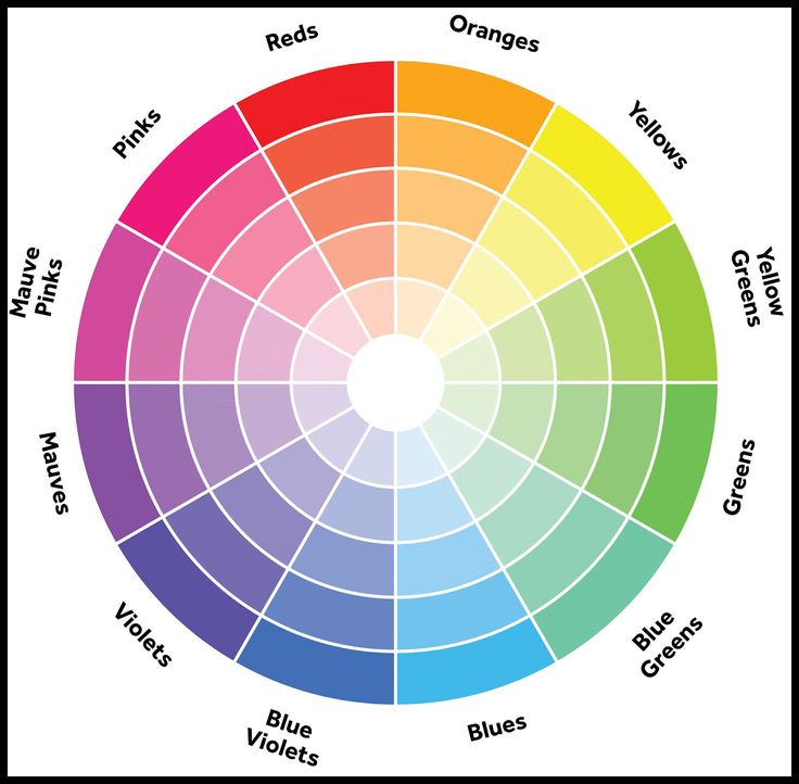
taken from: https://i.pinimg.com/736x/2e/29/ac/2e29acf8021888c2b99d528380518653–complementary-color-wheel-complimentary-colors.jpg
Monochromes Harmony
Is a basic colour scheme, using one hue and using variations within the particular hue.
Generally create works that are balanced, visually pleasing.
Analogous Harmony
Analogous colour schemes use colors that are next to each other on the color wheel.

taken from: http://www.tigercolor.com/color-lab/color-theory/color-harmonies.htm
Analogous harmony warm and cool
Warm colours: orange, red, yellow and its combinations
Cool colours: blue, green and light purple and its combinations.
Complementary hues
Colors that are opposite each other on the color wheel are considered to be complementary colours.
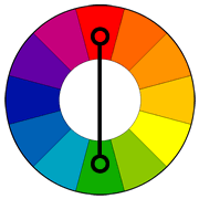
taken from: http://www.tigercolor.com/color-lab/color-theory/color-harmonies.htm
Split Complementary
The split complementary color scheme is a variation of the complementary color scheme.
This colour scheme has a strong contrast as the complementary colour scheme, with less tension.
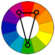
taken from: http://www.tigercolor.com/color-lab/color-theory/color-harmonies.htm
Reference:
http://www.tigercolor.com/color-lab/color-theory/color-harmonies.htm
https://www.thespruce.com/understanding-warm-and-cool-colors-1976480
You must be logged in to post a comment.