
Typography I


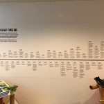
TYPOGRAPHY I – BODONI PRESENTATION PROCESS DOCUMENTATION


VIEW SKIT HERE
INDIVIDUAL REFLECTIONS
JOSEPH
I learned a lot about bodoni through this presentation project alongside with my teammates. I didn’t know that Bodoni existed due to the evolution of Baskerville and then Didot and then Bodoni, and the fashion skit idea thought out by Jonathan really portrays all the informations that can be input into a storyline with all the facts we can gather from this 3 fonts by doing a comparison kind of concept to our presentation. All of us gets to research and have a better understanding not only 1 font but on all the 3 fonts! We now get to know where is the origins of Bodoni comes from and with the similar traits with the other 2 fonts why is Bodoni the better usage in display images rather than the other 2 fonts. We also get to know and understand more about the history on each font and understand how did the shape and characteristics of the character came from. Each font having a special type of stroke and shape which are different from one another but looks pretty similar and i always get confused by which font is which. Overall, we had a really good time spending on researching and getting a lot of informations on the 3 type fonts from this project!
_________________________________________________________
NAOMI
Through this project, I learnt that no two fonts are completely the same regardless of how similar they may look and if you look hard enough, there are many tell tale signs of those differences. Not to mention vast histories to accompany them. One issue I had in the research phase was that different sources occasionally had different information, such as the year Bodoni was created – some sources said 1788 while others said 1798. Then, going into this project, other difficulties we had included coming up with a concept for our presentation and once we did, the script – as we wanted to incorporate our character personalities into the skit while still keeping it educational and in line with our concept. We also had quite a bit of difficulty thinking of what to do for audience engagement as we weren’t too sure on whether it had to be educational, i.e. having them answer our questions, or just having them be a part of our skit like flashing their lights, was enough. In the end, we decided to combine both by having them answer their questions using our transparency sheets and their phone flashlights. Through all those difficulties and minor issues that cropped up during our presentation itself, I realised the importance of rehearsing our presentation and while we did have rehearsals, it’ll be good to have more in the future so that we’d be more prepared to face any issues that may occur and also to make sure we’re confident during the actual presentation. Overall, it was still a fun and enriching experience as it’s the first time I had to do a presentation with this sort of narrative and interactive factor, and I have definitely learned a lot from the various problems we faced.
_________________________________________________________
JONATHAN
I think this assignment has been one that is extremely challenging but very rewarding at the same time. It would be easy to simply create a presentation on a typeface and simply dump information to our peers on every information that we’ve managed to researched. But having to come out with a creative presentation that would help our friends better understand and appreciate the font better, this took one step further as it required us as a team and myself as an individual to understand the culture and historical significance of the font and at the same time try to express it out through the presentation in creative ways. And that was definitely a challenged. As a student doing design without much typography background, I often selected fonts based on its aesthetics or what seems to fit in the moment or in the design. What this assignment have taught me was that every typeface carries certain influence that can be a form of leverage to enhance the final outcome of the design. While in this assignment, it was through the use of Bodoni and Modern type classification as a “fashion, elegant” typeface for use to express these qualities in a presentation. The same ideas can be expressed through my work as well.
The group work element as always is not easy but coming together with friends to complete a project together and spurring each other on and seeing everyone contributing is very heartening as well. There were hiccups along the way during the preparation and process but at the end of the day I think it did help us learn better to work in a team setting for the future with other projects.
_________________________________________________________
DAPHNE
This presentation allowed me to look more into the history and context of the font my group has chosen – Bodoni.
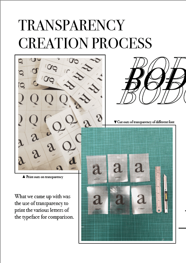
As a group, we were able to go in-depth in research about the modern type mainly the Bodoni typeface, Didot and Baskerville as we used these three to compare and contrast. Because they are highly similar in nature, our short skit highlighted the minor differences and taught the class how to differentiate the three modern typefaces. Using the type anatomy taught in class, we were able to be precise in our description such as the differences in the tail of the uppercase “Q” and the upturn tail of uppercase “R”.
Adding to the short skit, as a group, we came out with the transparency that our classmates can keep to remember the small differences between the seemingly similar typefaces. It also serves as a momento for our class to remember our Fashion show skit.
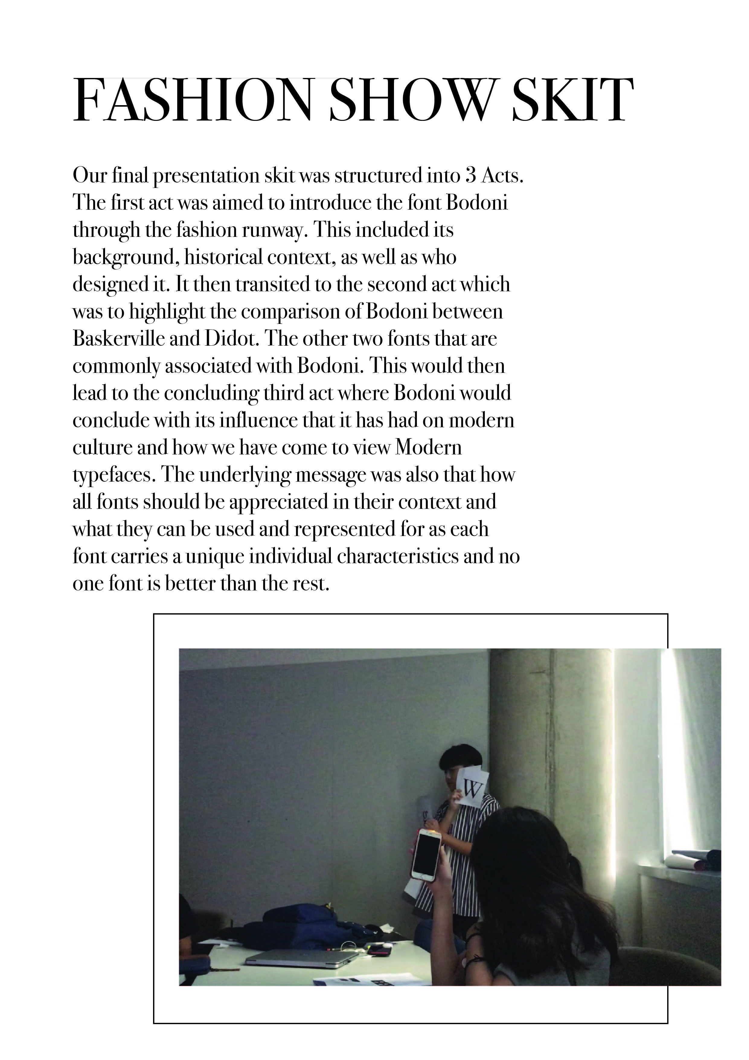
As for the skit, as a group, we had to come up with relatable elements to place into our script as we portrayed Bodoni, Didot and Baskerville as high fashion models. Besides that, the play of puns were used such as “font-tastic” lightens the mood of the presentation yet makes it memorable and easily absorbed which is one of our intentions of using a short skit for our presentation.
Overall, preparing and executing the skit was enjoyable as we got to apply what we learnt in class and make a twist to the otherwise dry content of learning the Bodoni typeface.
paintings


Programming – An End of Sem Project


C O N C E P T U A L I S A T I O N
Our team wanted to create an installation that involves creating an immersive space for audiences to enter into. We created the idea of a third dimension in our space where audiences have to make new discover with every step that they take, exploring the new dimension.
Taking inspiration from the piano stairs, where the whole experience encouraged people to take the stairs instead of the escalator, we thought this ties in well with our entire concept.
P R O C E S S
Diving into our first week, we first did up a mock up using the mousePress(); function to mimic the movements of the audiences in our space. We created the coloured grids using the Illustrator, then input the RGB code into Processing for each grid. Initially we worked with a 5×5 grid, but reduced it to a 3×3 grid due to the mismatch of dimensions of the Kinect and the projector.
Next, we figure out the codes to activate the use of the Kinect then input them into Processing. Meanwhile, we secure the usage of the Truss Room for the project and did a site test. Measuring the dimensions accurately and testing out the top-down projection was an important process since our project relies heavily on it the on-site experience that we cannot determine merely on our screens.
Apart from that, we recorded each piano note we used on the keyboard using the Zoom and input them into Processing using Minim.
S U M M A R Y
Proposal: The_Muse Proposal
Mock up Code: Mockup Code
SPACEVENTURE – A mid sem programming project

A B O U T
SPACEVENTURE is a one-player game that aims to shoot down the enemy spaceship and try to survive the battle. With every spaceship shot, player will gain one point.
s c r e e n s h o t s
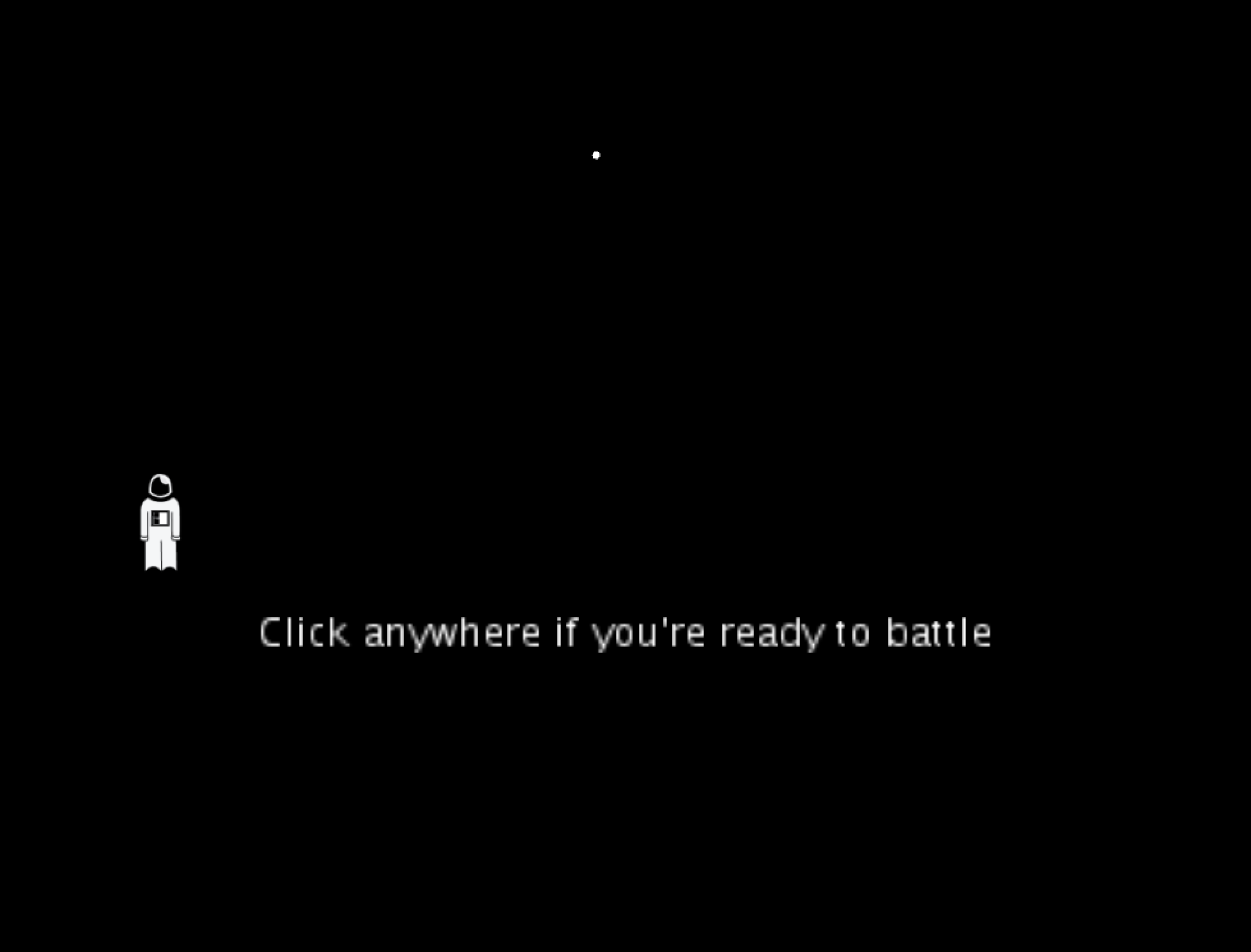
GAME START PAGE
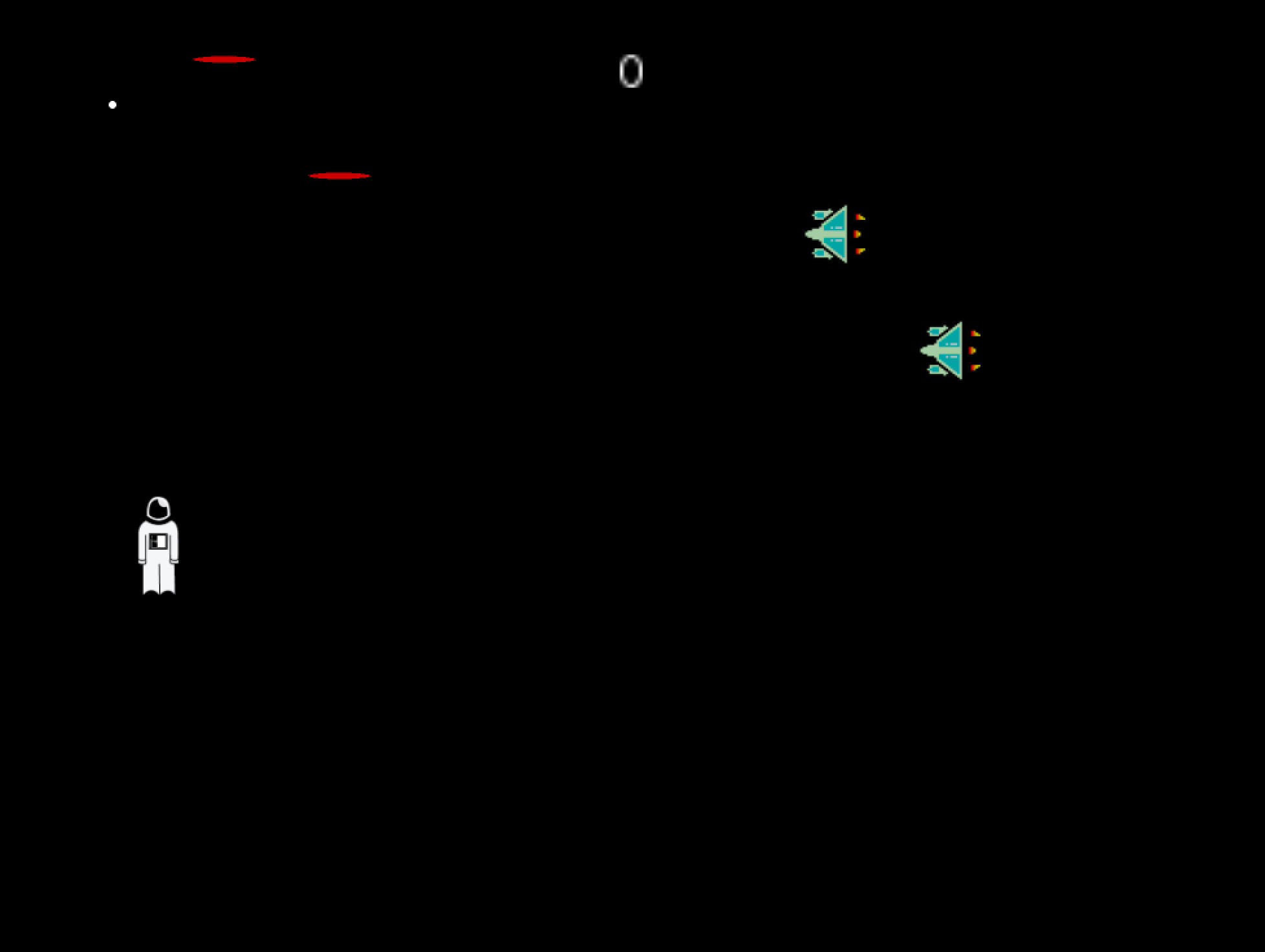
GAME PLAY PAGE
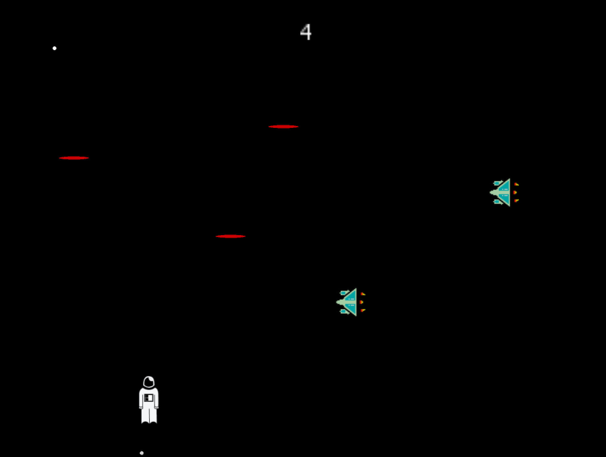
GAME PLAY WITH SCORE
t h o u g h t s
SPACEVENTURE is the first game I did up with the help of Corey using processing. With no prior knowledge on what coding or programming is, the concepts taught in class was helpful to help me code the fundamentals of the game. I learnt the use of a minim, and was able to use that for SPACEVENTURE. Also, got to upload an image for my player as an astronaut that I created on Illustrator.
Overall, although I struggled a lot, especially with the array list, it was fulfilling to create this game from scratch on my own. Coding Train’s tutorials have been a huge help apart from Corey and opensource codes as well!
Visual Communication I – Project 2 – Greater Than Design (Research and Development)
For Project 2, we were to create a poster for the Singapore Design Week 2019. We went on a trip down to the Singapore Design Centre to look around and get some inspirations.


C O N C E P T
My slogan is “>esign” or “Greater than Design” that aims to portray the art scene of Singapore as more than what it already is. As people put more attention and value on deign in Singapore, the Design week is a celebration of that phenomenon and a vast change in perspective. Of which I used a rising sun that portrays the “new light” people have on the topic of design and the art scene with a splash of memphis elements portraying a celebration.
I N I T I A L P H A S E S
As mentioned in my previous post on my visual research, I had some slogans in mind, namely “>esign” (greater than design), “Springing into >esign” (springing into greater design”.
1.

Initial phases of 1 was inspired by the moodboard I put together as seen on the previous post.
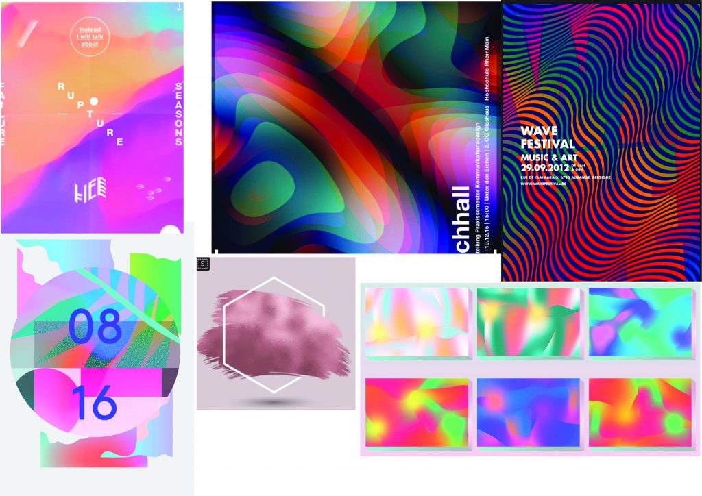
That includes fluid shapes that plays with opacity. I thought these effects gives off a mysterious impression, a foggy channel forward. Linking it back to my concept of >esign, it might show an onward lookingness, with the use of vibrant colours and inorganic shapes.
2
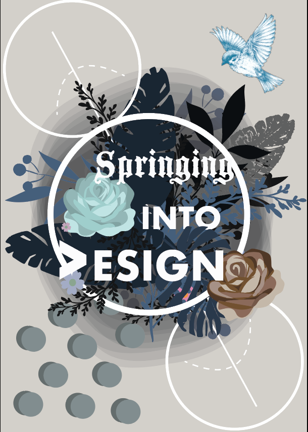
Initial phase of 2 for “Springing into >esign” looked more like an invitation rather than a poster and it looks more personal than for commercial uses. Hence, I decided to scrape the entire design.
3
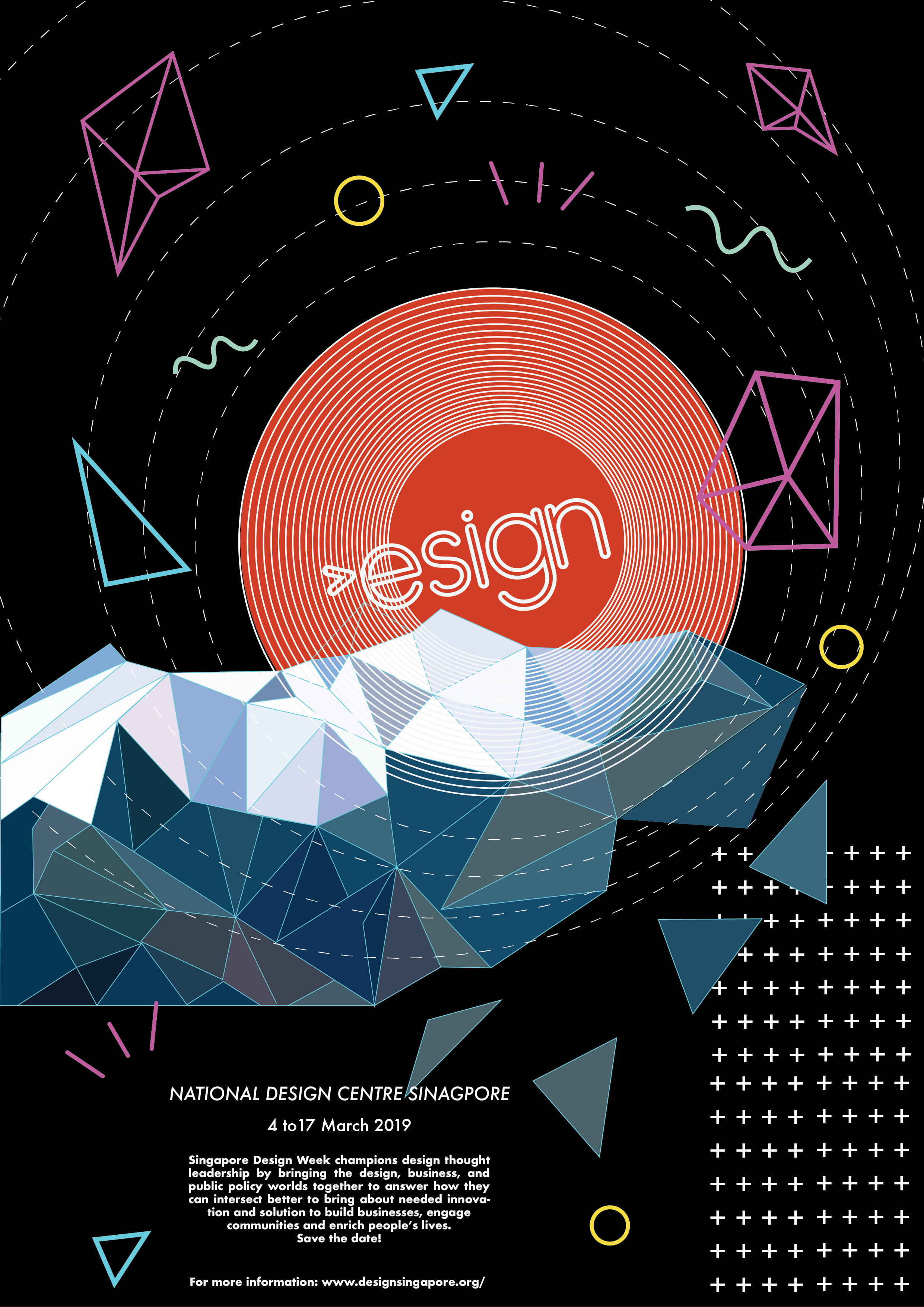
Design 3 is a brunch out from design 1. I added memphis elements to create a sense of playfulness and a black background to portray a vague future. However, it was seen as having little relation to help to reinforce the concept and the “>” looks vague.
—-
Relooking at my concept, i thought settling on a specific art movement will streamline the thought process in coming up with my design.
RetroFuturism
a trend in the creative arts that shows the influence of depictions of the future produced in the early era.
If “futurism” is called a “science bent on anticipating what will come, retrofuturim is the remembering of that anticipation.
Since “Greater than Design” has the element of forward-looking and yearning for the future, I thought RetroFuturism art movement is in line with my concept, hence I decided to adopt it.
4

Design 4 was born, using inspiration from the retro-futurism art movement to try to bring out my concept more. I played with gaussian blur to blend out harsh lines and to give a glowing effect.
Some feedbacks I got was that the black block of information feels harsh and sudden. Additionally, the I font chose seem really stiff. Also, more movement can be introduced to further bring out my concept, playing more with “>”.
5 (Final)
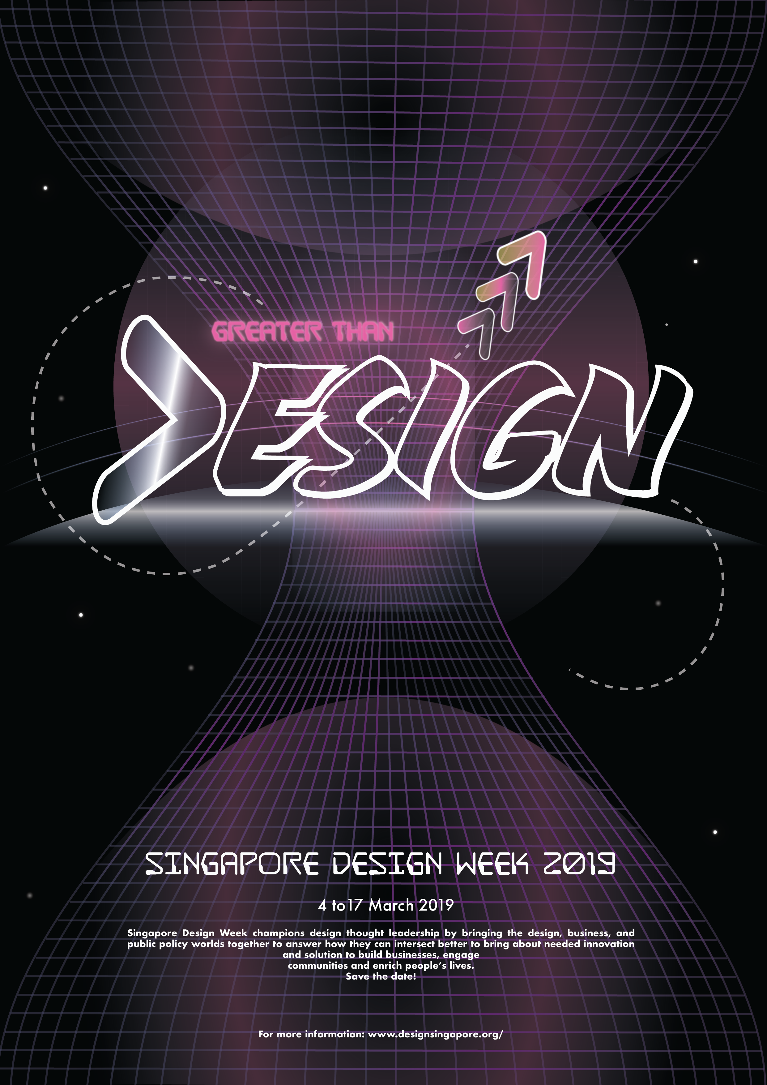
With much diversion at the start and feedbacks, design 5 was submitted. I chose a more fluid font in the end, trying to blend the “>” sign more as a vague “D” to poke people to wonder about the slogan and the sign itself.
C o n c l u s i o n
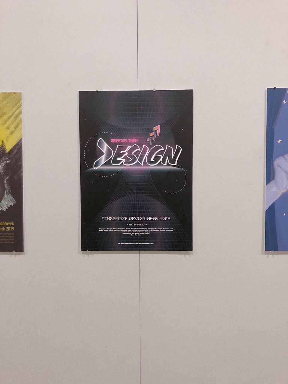
Concluding this project, I got to consider more about the elements I put on a single page that will blow up in size (looks much smaller on my screen). The hierarchy of elements, what you want your audiences to see first? What to see next? Will your audience view your information (fine prints?) Many to points to consider. Also, how the elements you use on the page communicates your concept.
I got to experiment the aforementioned points through this project. I thought with the given amount of time, I had solved most of the problem areas with the design. It was a tough ride, but looking at the A2 final product placed along the corridor was somewhat a bittersweet moment!
Artist Research
Nathan Yong (Singaporean)
“Furniture designer Nathan Yong is well-known for his trail-blazing career, and has been credited for advancing furniture design and furniture retail standards in Singapore. Having wanted to be a designer since the age of 15, he chose to pursue industrial design at Temasek Polytechnic as he was interested in the forms of products. Today, Nathan has a growing international profile with his products are sold globally.”
Furniture designer Nathan Yong is well-known for his trail-blazing career, and has been credited with nothing less than advancing furniture design and furniture retail standards in Singapore. Having wanted to be a designer since the age of 15, he chose to pursue industrial design at Temasek Polytechnic as he was interested in the forms of products. His aim at the time was ‘to be as famous as Philip Starck’.
Instead, he went on to forge his own path by establishing the furniture brand Air in 1999, at a time when there were very few local producers of modern furniture in Singapore. In 2006, armed with a Master in Design from the University of New South Wales, Nathan set up the subsidiary Air Design Group, of which he is the Principal Designer.
With an established and growing international profile, Nathan’s designs have been sold in Germany, Denmark, Morocco and the United States. He has also collaborated with renowned designer Toshiyuki Kita (designer of the SHARP Aquos® TV and the Wink Chair by Cassina) and multidisciplinary designers Voon Wong and Benson Saw from the United Kingdom to produce design-conscious furniture that aims to be affordable for all.
For Nathan, the journey to success has had its highs and lows. When the respected French furniture company Ligne Roset bought three of Nathan’s designs, its headquarters received a letter from its Singapore outlet asking them not to engage a Singapore designer because it would not be good business for the Singapore market. Nathan found the incident discouraging, ‘Here we were trying to break into the international market with our efforts, and there was someone from Singapore stopping us from putting Singapore on the global design map.’ At the same time, he recalls with pleasure and amusement the opening of Air Division’s first franchise in Jakarta, Indonesia. ‘I remember I was in a cab in Jakarta and saw an old man on a trishaw with trash and among that trash were Air Division wrappers and cartons. I found that image endearing.’
Nathan’s success lies in his design philosophy. Good design, according to Nathan, is a combination of three factors. To begin with, the intention of the client and the designer must be to improve on the existing situation. ‘Design is important,’ he says, ‘but only if it improves our living conditions, not just physically but also spiritually.’ The designer must also take into account factors such as the social, cultural, historical, artistic, technological and material aspects that form the design context. Most of all, Nathan believes in being ‘honest in the design approach, and in keeping it simple’.
This design philosophy has been the key to Nathan’s success. His relentless pursuit of simplicity and honesty in design has made him one of Singapore’s top designers, and has garnered him numerous awards both locally and at the international level, for instance the Red Dot Award. In 2006, the Break stool garnered a Silver Award at MINES International Design Intelligence and a Bronze Award at the Singapore Furniture Industries Council Furniture Design Award. In the same year, Nathan was also shortlisted as being among the 20 best designers in the DesignSingapore Council 20/20 series, by peer review.
Nathan’s influences are too numerous to name, but among those who have made an impression on him are the past great masters of the Bauhaus, Poul Kjaeholm, Charles and Ray Eames, Mies van der Rohe and Le Corbusier, as well as the more current Dieter Rams, Jasper Morrison, Konstantin Grcic, Naoto Fukasawa and Eugenio Perazza. He draws his inspiration from his surroundings and from the simple acts of daily life, such as a walk in the market or fixing his bicycle. Inspiration is like a lottery, he says, in which winning depends on a number of parts falling into place. As he notes wryly, ‘Sometimes it doesn’t happen.’
At the start of each new project, Nathan’s creative process includes taking into consideration numerous crucial aspects such as ‘function, materials, technology, cost, arts, form, proportion, engineering, markets, time, social, culture and wonderment, in order of importance according to the design brief’. He then changes the arrangement ‘until the result is an amalgamation of intelligence – intelligence from the distillation of informed choices’.
Nathan Yong is an exemplar to young design entrepreneurs with his winning blend of design integrity and commercial success. Success has not fazed him, and he views his accomplishments with his trademark unfussiness. When asked what sets him apart from other designers, he replies, with breathtaking simplicity, ‘I am me.’
Pann Lim (Singaporean)

“Pann Lim is the creative director of Kinetic Design and Advertising. He graduated with a Diploma in Design and Advertising from Temasek Polytechnic in 1998. Pann’s portfolio of work is a hybrid of visual design, interactive design and advertising. He works on these disciplines independently. To him, there is no distinction between these disciplines, as they are all tools of communication.”
Pann Lim is the creative director of Kinetic Design and Advertising. He graduated with a Diploma in Design and Advertising from Temasek Polytechnic in 1998, where he was inspired by mentors such as Lim Chong Jin, Hon, James Na and Iskandar Jalil. He started work at DDB Singapore and Batey Ads. In 2001, Pann was invited to start up a creative agency, Kinetic, with Carolyn Teo, Roy Poh, Adrian Tan, Sean Lam and Benjy Choo.
Pann’s portfolio of work is a hybrid of visual design, interactive design and advertising. He works on these disciplines independently. To him, there is no distinction between these disciplines, as they are all tools of communication.
He believes that design and advertising start with an idea. He has devoted his time to creating ideas that have won him over 300 industry awards including a D&AD Silver nomination and a Silver for Cannes Lions International Festival of Creativity in 2012. He was awarded Singapore’s Most Influential Creative Director by the Institute of Advertising Singapore in 2012. He is currently ranked tenth in Australasia by campaign Brief.
Pann is also involved in nurturing newcomers, as a way of fulfilling social responsibilities. He is a founding member of The Design Society, a Singapore- registered non-profit organisation, which aims to educate, proliferate and archive graphic design in Singapore. He has been actively involved in teaching and mentoring for prestigious awards such as Noise and Crowbar. He was chairman for the Crowbar Awards 2011 and head of Jury (activation) for Creative Circle Awards 2012.
In 2011, he started Holycrap.sg with his wife and two children, an art collective focusing on the arts. To date, they have had two successful exhibitions featuring the artworks of his children. Pann spends most weekends with them, working on projects, as well as exhibitions. He maintains that their works are not for sale, because he wants them to enjoy the process and not be caught up with the commercial benefits of the endeavour.
Pann handles projects by understanding the brief, ironing out the facts, needs, budgets, deadlines and objectives of the clients versus the needs and objectives of the agency. He works with like-minded partners, who believe that every project should serve the best interest of the client without compromising the creative integrity of the agency. For Pann, design is most meaningful when it makes sense and makes one happy. Every project is different, but needs to be based on the insights to the problems or situation. The agency operates like a family, with a strong culture of kinship. It is a healthy eco-system, where the best scheme is adopted via a voting system. This way, everyone who works hard gets a chance to be recognised and gets to do good work. To him, everyone needs to learn to deal with disappointments in life positively. His best life lesson is to constantly learn from others in order to accelerate one’s own learning. To him, learning is a life-long affair.
Alfie Leong (Singaporean)
“Singaporean fashion designer Alfie Leong, is the founder of fashion label mu and A.W.O.L. He is noted for his signature draping, unique cut and attention to detail. He won the Singapore Fashion Designers Contest in 1995; and subsequently received a scholarship for Raffles LaSalle International School of Design.”
Singaporean fashion designer Alfie Leong, is the founder of fashion label mu and A.W.O.L. He is noted for his signature draping, unique cut and attention to detail. He won the Singapore Fashion Designers Contest in 1995; and subsequently received a scholarship for Raffles LaSalle International School of Design. He graduated in 1998. Over the years, Leong has represented Singapore at the Beijing Fashion Week and the Smirnoff International Fashion Awards. In 2001, he made the top 20 list of international designers at the Enkamania International Competition. At home, Alfie has made waves during the Singapore Fashion Week, the Mercedes Benz Fashion Festival, and the Singapore Fashion Festival. He has also collaborated with Swatch as well as homegrown street wear brand 77th Street.
In 1999, Alfie started his own label and by 2004 set up The Little Voice Pte Ltd, to create unconventional designs to inspire customers who want to express themselves. The two private labels of the company, mu and A.W.O.L., aim to blur the boundary between creativity and practicality. The designs of mu are unique yet affordable. The label offers constructed designs that are a fusion between east and west. A.W.O.L., an abbreviation for “all walk of lives”, embodies an originality and refinement that are complementary to the life of the modern women. It is achieved through unconventional construction, emphasis on details and the use of luxurious and sophisticated fabric. His practice gives him the opportunity to fuse the diverse world of inspirations and cultures that motivates him.
When designing, Alfie considers form, materials, technology as well as saleability. The creations fundamentally need to be wearable. His design process usually starts with draping. He establishes a fixed point in the human posture, typically a staple point under the armpit, where comfort is essential. Once that staple point is established, he starts to challenge the silhouette. He consciously creates new silhouettes and accentuates the form. Alfie is very unassuming about it, but the strength of his works is in his ability to apply functional details with impeccable finish. It is a skill that is honed and backed by 20 years of practice.
For Alfie, sharing industry experiences with other fashion designers is very important. He recalls experiences of bringing local designs outside of Singapore which were often not smooth sailing, sometimes even fraught with setbacks. Helping each other in the industry and bringing related industries together are important.
His belief motivated him to start Workshop Element, a label that hosts a community of designers. It seeks outlets and opportunities for local designers to showcase their works in a curated space. The first edition of Workshop Element, launched in 2012, was a pop-up store. It presented an ensemble of 19 brands and 16 designers and curators. The venture was driven by a passion to give back, inspire and inculcate values that have served him well over the years.
Jessica Walsh (United States)
Jessica Walsh is a designer & art director working as a partner at NYC based design firm Sagmeister & Walsh. She lectures about design at creative conferences and universities internationally. She teaches design & typography at The School of Visual Arts in NYC. Her work has won numerous awards from most major design competitions including Type Director’s Club, Art Directors Club, SPD, Print, New York Festivals, D&AD, TDC Tokyo, and Graphis, among many others.
Clients include: Museum of Modern Art, The Jewish Museum, Institute of Contemporary Art Philadelphia, Barneys, The New York Times, Levis, Adobe, and The School of Visual Arts.
Reynold Ruffins (United States)

Reynold Ruffins’ present paintings and drawings are preceded by a career as an illustrator and designer. He is a graduate of The Cooper Union and a recipient of it’s most prestigious honor, The Augustus St. Gaudens Award for outstanding professional achievement in arts. The Cooper Union Presidential Citation was also presented to Ruffins for his work and prominence in his profession.
Professor Emeritus, Queens College CUNY, Ruffins has also taught at the School of Visual Arts, The Parsons-New School of Design and was a Visiting Adjunct Professor at Syracuse University. He is a founding member of the famed Push Pin Studio and also had his own design studio with Simms Taback. Ruffins commissions for an array of clients including IBM, AT&T, Coca-Cola, CBS, Pfizer, The New York Times, Scribners, Random House, Time Life, Fortune, Gourmet Magazine and the U.S. Post Office have garnered many awards, from the New York Art Directors Club and The Society of Illustrators (Silver Medal).
Teamed with Whoopie Goldberg and jazz musician Herbie Hancock, Ruffins’ brilliant illustrations produced a highly praised video for children. He has illustrated over fifteen children’s books. The American Library Association presented him with its Coretta Scott King Award.
Ruffins’ work has been acclaimed in trade and design publications, among them: 200 Years of American Illustration, A History of Graphic Design, The Push Pin Graphic, African American Art, Graphis and How Magazine. His work is internationally recognized in group show exhibitions at The Louvre in Paris, Milan, Bologna and Tokyo.
Visual Communication I – Project 2 Final


MANIFESTO


This Manifesto acknowledges the change in time and how the society has moved forward. With technological advancement and the rise in media art and digital art, dada is not dead. Glitch is the new dada. The emphasis on the randomness, the illogical. This is how we embrace it today.