Final Research Hyperessay – Wander Through the Crystal Universe

taken from teamLab

A Concoction of Human and Nature

teamLab is an art collective that consists of many specialists who bring to the table an array of installation pieces we can witness at the ArtScience Museum today. As a team of programmers, artists, engineers, CG animators, mathematicians and architects, this collective is indeed one that meld together different professions to create stunning interactive installations.

With a vision to successfully embody art, science, technology, design, nature into one, creating borderless immersive installations has been their forte. Having produced exhibitions all around the world, in Singapore, Japan, Sydney, New York, the team has seen their works go global. teamLab, as a collective, challenges their works to amalgamate human and its natural surroundings, bringing in our innate environment into the interactive, immersive realm.

Digital technology has allowed art to liberate itself from the physical and transcend boundaries. -teamLab

Indeed, this is apparent in their portfolio of works.

I m m e r s i n g into the Life-size Installation: Wander Through the Crystal Universe

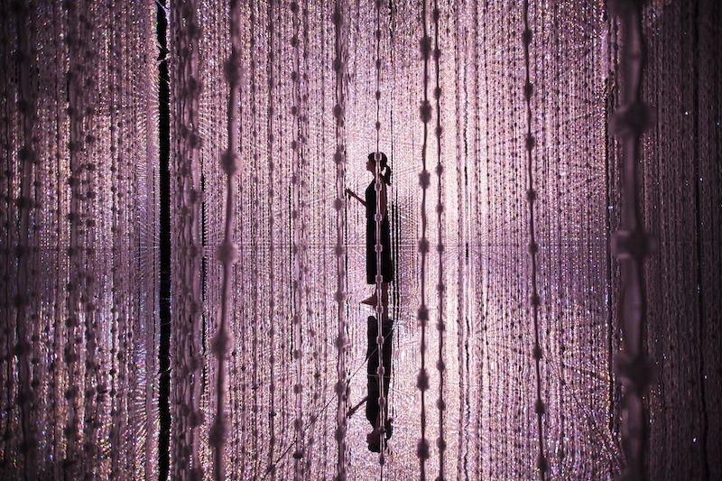
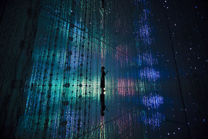
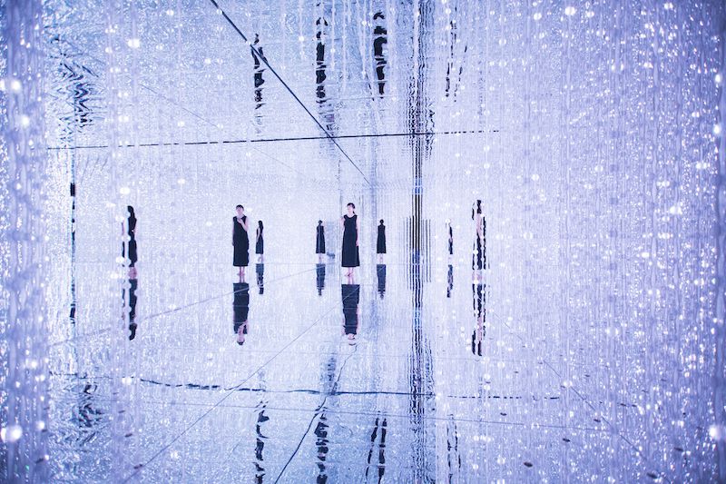
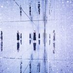
An interactive installation work that has many minute delineate light points coming together to form a sphere, Wander Through the Crystal Universe is one that is mesmeric. Tapping on the soundscape and visual effects by the light points, Wander Through the Crystal Universe is one that echos Scott Fisher’s concept of immersion.

Evaluation of image realism should also be based on how closely the presentation medium can simulate dynamic, multimodal perception in the real world… The image would move beyond simple photo-realism to immerse the viewer in an interactive, multi-sensory display environment.

Wander Through the Crystal Universe, as mentioned by Fisher, is one that submerges its audience into the massive life-size container that brings its audience into a whole new realm. Mesmerising orchestra of moving light points creates an abstract narrative, bringing the audience a whole new experience. The phenomenon of “suspension of disbelief”, when teamLab engulfed the audience with a stimuli of reality (not in its entity), through stimulating the audience visually and auditory. What is created is a realm of not unquestionably what realism looks like, but an augmented, tweaked reality, as if of a different world. The circumambient forms an expression of a world inside Crystal World, an imaginative, impressionable space created through the combination of light and sound effects.

I N T E R A C T I V I T Y  facilitating H y p e r m e d i a

Audiences can fish out their mobile phones and gain control of what is displayed in the Crystal World. A universal element is selected, by simply swiping in the direction of the Crystal World. The element will then be shown through the changes in the light points that lights up and are created. This creates a different “cosmic” experience for the audiences. With interactivity as a key part to appreciating this piece, distortion in the flow of the narrative may occur when one selects a universal element while one is simultaneously showing on the installation. The abstract representations of the universal elements might be distorted in a non-sequential narrative, showing immediate changes once a universal element is chosen.

The “surprise” element to the installation is the interaction that is allowed by the audiences, by changing the effects of the light points. Removing the passive characteristic of the piece, audiences can choose their type of telepresence with mobile control. This choice factor is the only thing that is non-programmed, totally up to the sovereignty of the audience.

Order and Disorder in E n t r o p y

In the ever-changing narrative of the effects of the light points, it created a series of possibilities, creating an entropy. There is a sense of unpredictability as the narrative can change with a click of a button on the mobile by any of the audiences. For Wander Through the Crystal Universe, it is of low entropy because of its structured and finite number of possibilities. Yet, entropy in this installation may not be wholly disordered. Since the narrative will flow from one to another with the change in the effects of the light points, the instances where the change is not stark, order is still in place. In the instance of a sudden transition, disorder occurs. Hence proves that the entropy here does not always lead to a disorder.

New E r a of Art

Indeed, digital art that taps on technology and science is moving forward, putting on the table new forms of art appreciation. Unconventional, non-traditional pieces reflects the advancement of the society, where technology plays a huge role today. “Art reflects the state of the society” and likewise, the new era of art places its medium on technology and science. Nam Jun Paik, the father of video art, pioneered the idea of creating art digitally (video art), pushed the boundaries of the traditional mediums. Advancement in technology also has played a part in making digital art more accessible and relatable to people of  all walks of life. We now live in the era where art starts to mould itself, digitalising, gearing away from the conventional brush and paint, pushing the boundaries of the new medium.

References

teamLab

Nerdist – Explore the Cosmos in the “Crystal Universe” Installation

Virtual Environments, Personal Simulation and Telepresence

Entropy and Art the View Beyond Arnheim

The Chicago School of Media Theory – Hypermedia 

Art is a Reflection on Society and the Times

John Maeda: Innovation is formed when art meets science

The Rise of Digital Art

DesignBoom: borderless and brilliant: teamlab’s dreamlike digital art museum is now open

VISUAL COMMUNICATION I – Proj 2 – visual research

TASK 1A – VISUAL RESEARCH

1.

Analysis

What is the poster communicating?

-Promoting an upcoming iLight Festival happening at Marina Bay.

What emotions does the design elicit?

-The colours elicit excitement and adventure.

What makes the poster captivating (Discuss the use and effect of imagery, text, texture, colour)

-the use of simple lines to create the skyline of Marina Bay in different colours on a black background.

How did the poster generate visual interest and facilitate readability / legibility?

-the use of different colours to create a visual element of the Marina Bay.

How do you feel about the approach and execution?

-has a near interpretation of how the event will look like.

2.

What is the poster communicating?

-Promoting an upcoming iLight Festival happening at Marina Bay.

What emotions does the design elicit?

-The colours elicit excitement and adventure.

What makes the poster captivating (Discuss the use and effect of imagery, text, texture, colour)

-the use of simple lines to create the skyline of Marina Bay in different colours.

How did the poster generate visual interest and facilitate readability / legibility?

-the use of different colours to create a visual element of the Marina Bay.

How do you feel about the approach and execution?

-has a near interpretation of how the event will look like.

TASK 1B – DEVELOPMENT OF SLOGAN & MOODBOARD

>esign for Tomorrow (Greater Design for Tomorrow)

DESIGN (Design SG) / DEIN + SG = DESIGN


ESIGN (Greater, Design, Singapore) // Springing into >Esign (Springing into Greater Design)

>esign (Greater than Design)

Reference:

The Annual Design Week is Back with Over 100 Events

Singapore Design Week – About 

Bring Design to the Masses (The Straits Times)


supernormal // post presentation essay

At the Milan Furniture Show of 2005, what shocked Fukasawa about the aluminium stools he had designed then sparked the birth of a new design philosophy and movement that later was coined “Supernormal”.  The designer aluminium stools were “plonked on the floor for people to sit on” instead of being placed on pedestals and “displayed on plinths like the other new products” at the show that year (Rawsthron, 2006). The stars of the show was not the limelight of the Milan Furniture Show, seamlessly blending themselves as entourages. However, how product designer, Jasper Morrison viewed the entire situation at the Milan Furniture Show was vastly different. He was taken aback by that epiphanic phenomenon. The set of designer furnitures integrated into the environment flawlessly. That was when we saw the birth of Supernormal through an empirical moment.


Supernormal consists of being less concerned with the visual aspects of the object, putting more emphasis on the practical use of the object in its environment (Domus, 2006). The main focus here is how the use of the particular object, in its most simplified form, impacts its users with solely its functionality. As Naoto Fukasawa would put it as his philosophy, “Achieve simpleness as a way to achieve completeness and harmonious relationship between users, objects, and environment.” (Nedgis, N.D). When the use and the simple design of the product coalesces and unites, this amicable fusion forms a whole. When user experience is further enhance by stripping away the counterproductive details, this simplicity completes and complements well in our daily environment. For Morrison, Supernormal is a link bridge between going away from the ordinary and trying to value-add to our ever changing man-made environment (Bhan, 2008).


Notable artists in the field of Supernormal designs include founders Naoto Fukasawa and Jasper Morrison.

Fukasawa’s philosophy is simply, “Without Thought”. He places awareness in the normal, mundane ways people interact and live in the environment (Fukasawa, 2007). Therefore, his designs often revolve around the unconscious, harmonious accord of people and things in its environment (Fukasawa, 2007). His designs incorporates human qualities that plays with our common knowledge of problem solving. He uses shape, colour, texture in its most condensed manner in his products in the enhancement of his simplistic industrial designs for products for users to have an instinctive knowledge of how and what the product is used for, stripping the need for an instruction manual (Fukasawa, 2007). He often uses the phrase “designing the unconscious”, convening the need to focus on our “core awareness” (Fukasawa, 2007). He is attentive to the daily actions we all take, cracking an egg or wearing our socks. Observations then turn into analytical break down of the every actions we make, having an “active memory” of each step in our daily task (Fukasawa, 2007). After the analysis, thoughtful design then takes place. This is what differentiates his meticulous design in the market. As for Jasper Morrison, his role as a designer revolves around enabling ideas to surface, avoiding creating a “facade” for the products, making things out of nothing. Instead, it is by being aware of what is already in the surrounding (Fukasawa, 2007). Supernormal products often as he described as “lack of problems” (Fukasawa, 2007). The design itself seem to have an ease that suggest that the problem never really existed, very much aligned with Marcel Duchamp’s notion of “there is no solution because there is no problem” (Fukasawa, 2007). There is a clear notion tapped onto the idea of Supernormal products. They have positive atmospheric influence and by default, they look acutely normal (Fukasawa, 2007). They are objects that we are so accustomed to see and use that we see and use them without thinking, or thinking too much into it. Supernormal products “play on a deeper level of human sensibilities” as it allures to an common knowledge we all have, based on our shared experiences. It is the experience of figuring things out with what we have and trying to get by in our natural habitat (Fukasawa, 2007).


One appliance worth noting under the Supernormal manifesto is the CD Player that Naoto Fukasawa designed for MUJI in 1998. Fukasawa noted the visual similarity the design he had for the CD Player with that of the rotating blades of a domestic extractor fan. He incorporated the innately simple structures of the extrator’s operating controls – a straightforward pull-cord used to switch the appliance on and off (Fukasawa, 2007). The cord very instinctively invites users to pull it,  triggering the operating controls to play the music in the CD Player. This creates an interactive experience between the user and the product. Fukasawa was very clear in creating an appliance that would evoke an unconscious cause of action for the users to utilize that product in their own environment (V&A, N.D). Despite placing large focus on the use of the product rather than the visual aspects of it, Fukasawa makes sure his users know what the product is used for. The CD Player designed for MUJI holds a shape of a typical CD cleverly placed in the middle of the player (Fukasawa, 2007). This is to ensure that users instinctively know what the use of the product is. This, as such, has become a norm design factor sifted into industrial design in creating electronic goods and household appliances (Fukasawa, 2007).


Having studied and observed how Naoto Fukasawa’s works are vastly different from the rest in the product design industry, Masato Sasaki deemed his design philosophy to be one that supplements James Gibson’s study of ecological psychology although they are not based on it (Fukasawa, 2007). In summary, Gibsonian theory about ecological psychology brings relation of potential human action to its living environment, under the umbrella of the term “affordance” (Fukasawa, 2007). “Affordance” describes the property of the object that provides its users with perceived or latent potentials — “action possibilities” (Fukasawa, 2007). This theory proves that objects cast a passive environment into one that is in an active determinant role (Fukasawa, 2007). Fukasawa uses minute details, guiding the behaviours of users. For instance, Fukasawa’s tea bag for the “Re-design” exhibition has a duo function ring slot that neatly holds the tea bag in place and is also the handle of the tea bag while brewing the tea, bearing the colour of the tea when it is good to consume. The whole interaction of tea drinking with Fukasawa’s design is the subconscious realization of when the tea is good to drink by colour observation (Fukasawa, 2007).  Granted, the use of mnemonic devices on guiding behaviours in product design proves successful in the designs of Fukasawa.


Good design always explains itself naturally, without the need of an instruction or a thought of “what is that for”, with that, I think Fukasawa and the pioneers of Supernormal has successfully and seamlessly integrated products of design into our daily lives with stealth. Scraping the need of an instruction manual. Many designers strive to make their work out of the blue, extraordinary. Yet, looking at Fukasawa’s simplistic designs that functions incredibly well, where function and design work hand-in-hand, it is of no surprise that his smart designs are indeed a trademark of industrial designs. I quote from Naoto Fukasawa himself, “The objects that really make a difference to our lives are often the least noticeable ones, that do not grab our attention. They are the things that add something to the atmosphere of our homes that we would miss the most if they disappear. That is why they are supernormal” (Rawsthron, 2006). Certainly.

1213 Words

Supernormal Essay in PDF

Bibliography

Bhan, N. (2008, March 23). ‘Jasper Morrison and Naoto Fukasawa discuss Super Normal Design’ Core77. Retrieved from: https://2021supernormal.wordpress.com/dialogue-defining-super-normal-jasper-and-naoto/


Domus. (2006, July 10). Naoto + Morrison = Supernormal. Retrieved from: https://www.domusweb.it/en/design/2006/07/10/naoto–jasper–super-normal.html


Fukasawa, N. (2007). Naoto Fukasawa. Phaidon


Nedgis, N.D. Naoto Fukasawa. Retrieved from: https://www.nedgis.com/en/designers/naoto-fukasawa


Rawsthorn, A. ( 2006, June 11). Celebrating the beauty of ‘super normal’ little objects of daily life, International Herald Tribune. Retrieved from: https://www.nytimes.com/2006/06/11/style/11iht-dlede12.1944160.html


V&A, N.D. CD-Player | Fukasawa, Naoto. Retrieved from: http://collections.vam.ac.uk/item/O1227135/cd-player-fukasawa-naoto/


VISUAL COMMUNICATION I – proj1 – moodboard & process

D R A W I N G  T O  L I G H T

The graphics aim to evoke comfort in the midst of adversity, through the use of colours, calm 
and encourage optimism, to wear a rose-coloured glasses, anticipating the future.

1.


Description:

The papercrane and the north star are the main subjects in this piece of graphic. It can be duo-viewed — a papercrane given to someone who receives it acceptingly and a papercrane is lifted out of its adversity, depicted by the harsh waves, as it keeps its eyes fixated on the north star.

Symbolism:

Papercrane is a symbol of hope in the Japanese culture. In hospitals, a 1000 papercrane is a common sight as it symbolize a grant of a wish – a pink of health.

The North Star is a bright star that is a “landmark to determine location” as it always stays in the north. It is also commonly associated to making wishes and making dreams come to reality.

2.

Description:

Two doves are seen flying towards the rising sun in a far distant in the midst of the mountains.

Symbolism:

Doves are a symbol of hope, care and love when come in pairs. The pilgrimage of the two doves symbolizes a journey towards a better tomorrow (the rising sun).

3.

Inspired by the quote by Victor Hugo in Les Miserables, “Even the darkest night will end and the sun will rise.”

Description:

A dove that has a silhouette of a thumbs up, confined in a space, drawn towards the light source. The next course of action is that the dove might gain total freedom and breakthrough a confined space, just like being bedridden in the hospital, the lack of freedom.

Symbolism:

The thumbs up is a universal sign of “good”, is an encouraging gesture that one can give another. & aforementioned, the dove is a symbol of hope and care.

I N S P I R A T I O N S

“Light at the end of the tunnel”

Word play on the word “light”


Light in the dark

Theme: nature

Fireflies and the moon (nature light of the dark)

Inspiration from the internet

Certainties in Life

The rising sun

Waves that hit the shore of our beaches

Birds soaring the air – doves????

Inspiration from the internet

Hands that speak

hands signs – universal

Inspiration from the internet

I n i t i a l sketches

Comments: 

Too illustrative, can use more shapes to illustrate the elements. Could reduce the number of lines used. Make more use of the negative spaces.

S E C O N D  ROUND OF CONSULTATION

Cut-outs and Paper Treatment

As I wanted to bring out the element of “light”, I explored the ways that I could. Using lines as sunrays, as seen in the illustrations. Or through paper cut-out of simple rectangles, very much like the one seen below that I had found  on Pinterest.

taken from: https://www.pinterest.com/pin/430797520602278246/

Hence, I incorporated the cut-out element to bring out the illusion of light. I thought this was a better treatment than merely using lines since the graphics will be hanged up.

K e y  Takeaways

One thing I struggled with throughout the project is showing in my graphics figure-ground relationship. However, I overcame that by being more conscious of what I am working towards – logo creation.

Initially, my graphics were towards the illustrative end, using more lines than shapes. I was advised to reduce the number of details, replacing important details with shapes that might be suggestive of the element that I am going for. Using the gestalt theory, line of closure, principle of grouping, similarity and proximity. Through this project, I am more aware of my treatment towards shapes, bringing them together to form a graphic itself, using minimal elements.

Lastly was my craftsmanship. The cut-out on every image required meticulous skills (which I initially did not possess) because of its close proximity to one another and the texture of paper that I had to deal with. Also, my designs were in an oval frame, but I changed it to a rectangular frame due to the difficulty in achieving a smooth cut-out for an oval frame.

Concluding this project, Therapeutic Graphics allowed me to explore more about shapes, and increased my awareness in using lesser elements to convey a message. It also forces me to move away from an illustrative point of view to one that is more aware of figure-ground relationship. Despite all the difficulties, I thoroughly enjoyed exploring and researching on various way designers create their logos for a brand.


References

Meaning of the Origami Crane

The History and Symbolism of the North Star

Dove Symbolism 


The History of Design; When it all started?

Victor Margolin, an emeritus professor of design history at the University of Illinois, Chicago, defined design into two large umbrella, design, created to meet the needs of the mass and Design, a term related to production in mass and used for communication to a large audience. How he coined the term “design” today “is continuous with the basic human need to organize the material environment for survival purposes“. Realizing the definition/s of “design” aforementioned is important to further dwell into the history of design itself. As such, it is also important to understand the meaning behind the work to deduce whether they are designs or art to be interpreted.

Design began in the midst of the Industrial Revolution, when there was a massive shift in production. As supply went up to meet the demand of the consumerist environment, advertising created an increase in the demand for design. Therefore, the first peak in the use of design as a norm in the society, in my opinion, properly started during the first wave of Industrial Revolution.

One of the first few Palmer Advertisement

References:

The Evolution of Design

Meaning of Design

The Implication of Advertising During the Industrial Revolution

Final Research Hyperessay – Key Work Selection

teamLab’s Wander through the Crystal Universe

Taken from: http://exhibition.team-lab.net/dmmplanets2016/en/art/art01.html

A B O U T

Wander through the Crystal Universe is an interactive installation work that uses the soundscape and lighting effects that fully submerges its audience into a whole new realm of escape. The lights are formed by creating many light points that light up to form a spectacular circumambient, a whimsical Crystal World that is fully immersive.

The circumambient forms an expression of a world inside Crystal World, an imaginative, impressionable space created through the combination of light and sound effects.

I N T E R A C T I V I T Y

Audiences can fish out their mobile phones and gain control of what is displayed in the Crystal World. A universal element is selected, by simply swiping in the direction of the Crystal World, the element will be shown through the changes in the light points that lights up and are created. This creates a different “cosmic” experience for the audiences.

References

Nerdist

teamLab – Wander through the Crystal World

Summer Internship 2018

TAG INITIATIVE

Title: Branding Intern

Job scope: Create a brand identity for Tag Initiative and its children company. Daily tasks include revamping the brand of Tag Initiative and starting a website.

Final Research Hyperessay – Artist Selection

T E A M L A B

i n t r o d u c t i o n

teamLab is an art collective and interdisciplinary group of ultra-technologists who challenges the inclusion of art, science, technology, design and the natural world in one. It is a team that consists of programmers, artists, engineers, CG animators, mathematicians and architects.

v i s i o n

teamLab’s works challenges the complicated relationship between human and nature through art.

Digital technology has allowed art to liberate itself from the physical and transcend boundaries. -teamLab

With digital art, the boundaries between humans and nature has blurred, one in the other and the other in one. The undetermined difference between humans and nature shows the coexistence of both in a beautiful way

____________________________________________________________

teamLab’s works are in the permanent collection of the Art Gallery of New South Wales, Sydney; Art Gallery of South Australia, Adelaide; Asian Art Museum, San Francisco; Asia Society Museum, New York; Borusan Contemporary Art Collection, Istanbul; and National Gallery of Victoria, Melbourne.

References

teamLab

Skip to toolbar