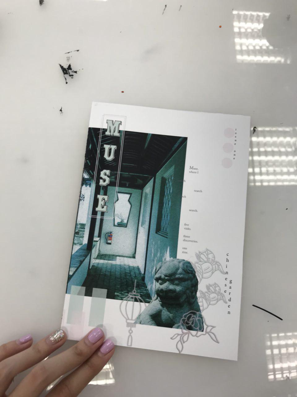
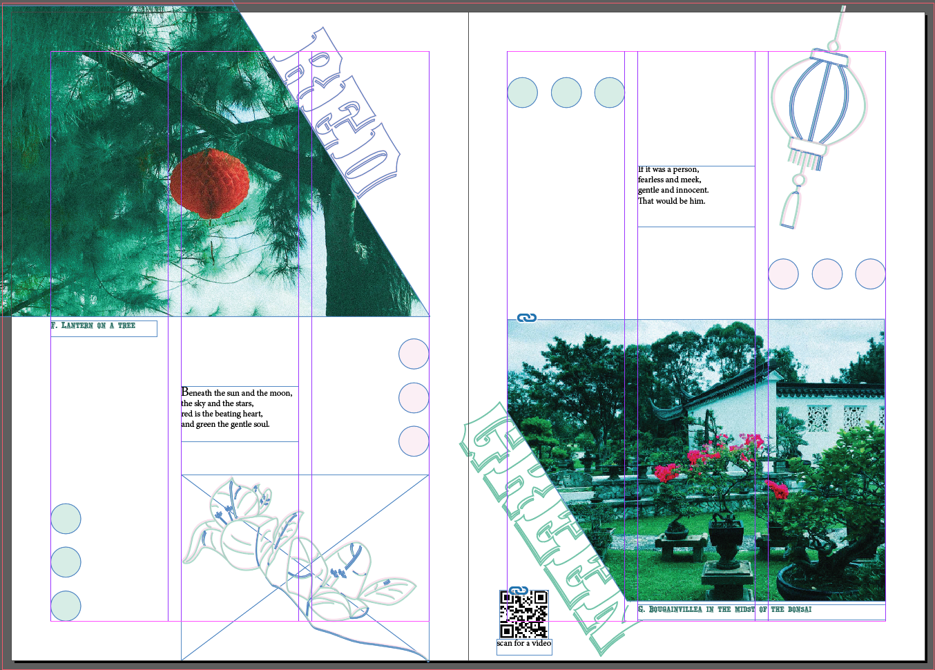
Locale Part II: Process + Zin(e)spiration


About Assignment 2

In Locale assignment 2, we are to visit a neighbourhood and create our very own zine!!!!

A “zine” is a self-published, non-commercial, independent publication, a DIY magazine-like thing.

Because you do it yourself it can be pretty much anything you want it to be, favorite bands, personal stories, subcultures, or collections (that’s the joy of zines!).(*screams* really excited) To embark on an exploration around a local neighbourhood! Find out what makes the neighbourhood unique and what are some of the interesting features in the area. The aim is also to develop one’s investigative research skills and present information in a visually engaging manner. To introduce inspiration and serendipity into creative development. To explore experimental formats and understand alternative layouts and grid formats. To learn more about binding methods and ways of putting together a self-made digital publication.

Concept Behind My Pieces

After exploring and discovering Chinese Garden (as seen in Locale Part I), the concept behind my zine is highlighting the contrast of Chinese Garden in a much subtle way through short proses, and photographs that might highlight each type of contrast in each spread.

1st Spread: Highlighting the contrast of the living and non-living “animals”.

2nd Spread: Highlighting the past and present objects, architecture that we can observe.

3rd Spread: Highlighting the complementary colour scheme of red and green.

Site Visit & Photographs

from my iPhone 7 and camera

Mood Board

images from pinterest

I looked through Pinterest many times and collated a few images or covers and layouts that I really like and the colour scheme that I am going for (green, blue, red).

Inspirations and Research on Layout and Presentation

taken from: http://ceoul.tumblr.com/post/124438211816/gridologie-just-finished-this-one-santa-monica

Texture & White Spaces

I particularly like the memphis texture that the artist has included to the white spaces, yet giving it enough breathing spaces for the reader.

Texts

I like the adventurous approach to the texts. The warp effect gave it a sense of flow and rhythm to the otherwise static page.

Colours

Enjoy the colour consistency throughout the page. Analogous colour of pinkish tone and purple makes this page really soothing to read.

taken from: https://78.media.tumblr.com/tumblr_mcusdfv0tG1qctmo8o1_1280.jpg

Sense of Hierarchy

There is a sense of hierarchy in this page. The biggest is the picture of the shore, then the headline “surfetur” then the smallest is the rectangular box “LORDAG 28/11”.

Colour

Complementary colours used (blue and orange).

Texture

Used the squiggly to create a sense of texture.

taken from: https://i.pinimg.com/originals/1d/6a/af/1d6aafef758f12c866fbfc00b2f96266.jpg

Theme Continuation

I like how there is a conversation between the hands at the top and bottom of the page.

Collage

The collage of small elements gave the page a little three-dimensional effect.

Texture

The lightning bolt and the star gave the page a quirky texture, something of strong statement and gave interest to the page aside from texts and images.

Balance

There is balance in both sides of the page. Although it is heavily highlighted by the black borders, the right side is balanced out by the busy elements going on on the left. The orange texts and the eye on the picture on the right creates another minor visual balance, everything else is muted in colour (black, white, light beige)

taken from: https://www.behance.net/gallery/53249095/Analog-Reflections

taken from: https://www.behance.net/gallery/53249095/Analog-Reflections

Really like the entire vibe of the zine, minimal, few texts and the pictures speak the message.

taken from: https://www.behance.net/gallery/58335321/The-Chelsea-Hotel-zine

Like the photos edited, very uniform throughout this zine. Something I want for my zine too!

Fonts Used

Yorktown is used for headers

Yorktown

and Minion Pro used for the proses.

Minion Pro upper and lower case

Designing Process

My designing process came a long way. Started from the bottom and now we’re here! hahhaha

But my final design really looked a lot different from the start!

Initial Phases

that evolved slowly…

then this happened after a talk with Brendan over how troubled I am about my zine at 3 am in the morning at NTU Starbucks… this happened after a few hours…

the rest is history!
BUT here’s my work from bleed to bleed

Adding Videos

Also, I decided to add moving images to enhance the visuals from the zine to the audience. I thought that to fully be able to grasp the environment of the place, merely pictures will not suffice. Besides, my first visit there was filled with boomerangs, as seen in my research presentation, so I thought for my subsequent visit, I take videos too! Special shoutout to Jun Meng , a film student who went to site visit with me and got some footages with me! Enjoyed it thoroughly! Here are our fruits from the labour which I had included in the zine using QR codes!

takeaways!!!

Initially I was super excited for this project!! To design a zine is my first, plus I really enjoy writing, so I thought I can really combine both together into my first ever publication. Then as the process continues, it got harder and harder especially when my layout was not fixed, and had to go back and forth with merely sketches which was when I feel like I am lagging behind everyone.

That was when I realize talking to your friends about it is really important especially when you have a mind block and you don’t know where or how to carry on!!!! special shoutout to Teri, Sihui, Niki, Brendan, JJ, Gloria, JunMeng. (hope i did not miss anyone)

And people around are really there to help you, when you have the ideas, ask for opinions, don’t shy away. Just get the critiques, you will learn and be better from there!

Also, during this project, I tried many new things in terms of layout, stared at InDesign for hours and hours and I can still be on similar layouts, but Pinterest is your good friend! (but don’t plagarize!) get inspired, use the elements you like and make them your own! Look out for the vibes you’re going for and work from there. It is similar to finding your style first then choosing the clothes! (cuz then you will have selected designs to choose from! easier)

overall it was quite an experience! to start from a blank inDesign

to something you can call your own!!

It was hell of a ride! BUt it was one of the greatest ride!!

Thank you for viewing!

View my final product here and Part I here!

Locale Part I: Research Presentation (Infographic Style)


Freeze Frame + My Explorations

  • I procrastinated going to the location for a long time.
  • When I finally decided to go there, it was during the weekends, in the end although it is very near to NTU, 2/3 times I went there from home in the central area:-(
  • Throughout the entire journey there, what’s going through my mind was “okay, I’m on my way there, I’m really on my way there!!!” The ride was painful.

  • At the entrance of Chinese Garden, I was greeted by the chinese guardian lions or the stone lions at the entrance of chinese garden.
  • A funny sight I got to witness was that birds seem to like to land on top of the stone lions, each taking turns.
  • And to me, when a bird lands on the stone lion, they look like they are of one entity of stone and flesh.

  • Thereafter, I was greeted by the pagoda!!!!

  • It is 7 storeys high, and I went to research after I got home and found out that it is inspired by the Ling Nan Temple in Nanjing, China.
  • Also, in the past, the pagoda was used to store human bones by the Buddhist.

  • I was marvelled by the interior architecture of the place
  • the chinese patterns, the spiral staircase and the grid windows

  • While I was in there I also spotted someone taking a nap there
  • And thereafter, I saw a handful of people taking naps at the little corners of the chinese garden

  • Walking around, I realize that the main colour scheme of the Chinese Garden is red and green.
  • Interestingly, there are complementary colours.
  • The red mainly from the ancient architectures and the green from the dense vegetation there.

  • I then walked into the Bonsai Garden and saw HDB emerging through the vegetation from afar, as if they were peeking at me.
  • I realized that at the Chinese Garden, I can observe past and present architecture (past: the pagodas, present: mrt tracks & HBD flats)

  • Walking in the Bonsai Garden, I saw many pots of bonsais and as I inch in closer to have a look, I realized that they look like trees on mountains
  • Seems like tiny humans can live on it, making a small ecosystem there.

  • Strolling through Chinese Garden on a hot day, I also witness the shadows casted on different surfaces : on the walls, on the pavements.

  • I always seem to walk in the shade, and the shadows of the trees look like guiding paves that leads my way.

  • I walked out of the Bonsai Garden and saw a cat and decided to observe it for awhile

  • I took a few boomerangs and pictures of it because I was inspired by the Cat zine that Shirley showed us in class.
  • It started to walk around the area and I followed it thinking “are we on a scavenger hunt?”
  • It just seem to laze around, outside the Bonsai Garden, could it actually be the living fortune cat?!?!

  • Nope! then it brought me to the bikes that were left outside the entrance of the Bonsai Garden … hmm

  • And talking about bikes, I realize I saw many bikes around, in solo, in pairs, as a group, left in the middle of the pavement in Chinese Garden
  • I thought they look better with someone’s arse on them (hahaha)
  • They destroy the scenery of the place
  • So… bikes? yikes!

  • Afterall, what stood out to me about Chinese Garden is the contrast of the place
  • Contrast: non-living thing and living thing (the stone lion and the bird, the living fortune cat), past and present (the HBD flats and the ancient architectures) and the colour scheme (red and green)

Thank you for viewing! :~)

Project 3: Ego (Final)

Foreword

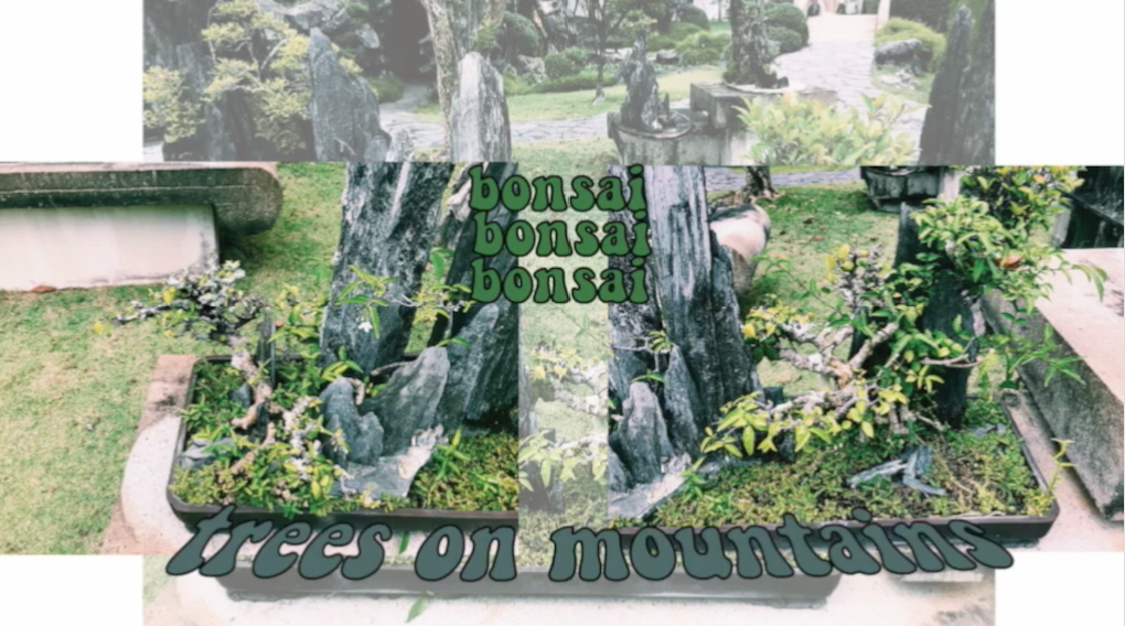
Before diving right in, view my process here! & my research here

As I was brainstorming for Project 3, I thought about the things that are often associated with me. (Daphne + (blank)).

First is Starbucks. I used to go there a lot to do my work and hang out with my friends. Besides, I even worked there about 6 months. I really enjoy the ambience of Starbucks and also had a lot of fun working there. Hence, naturally I included Starbucks and I into one of my equations.

Second is the sunset. I often witness the sunset (I take notice of it more than the sunrise) and even recently, after being in NTU for a few months. I realise my timetable has often cause me to leave school around 5.30 to 6pm, which is when I will often witness it, especially when it glares into my eyes. Because of that, I often take a snap of it and post it on my social media platforms. My close friends often comment about those sunset pictures and hence I used it as a subject matter for my second equation.

Third is Cupcorn!!!!!!!! I would say my favourite food/ snack is corn, especially corn in a cup. I often have it when I was super young and it did not stop until now. You can say I am obsessed with cup corn and I can have it anytime and anywhere. But I can be rather picky with them which means I will travel for good quality cupcorn too. (I really like the one at Nex, just saying)!! Hence, I used it for my third equation.

Fourth is music. I started learning the piano at a young age, and I have a sort of love-hate relationship with it. But I grew to like it more. Being exposed to music at a young age gave me a platform to express myself and learn things not everyone gets to (which I am also thankful for). Besides, I was in my school’s concert band and played the trumpet. I am familiar with brass instruments and got the chance to learn the instrument in depth after getting into an external band, which I dropped out of after a few months. But I would say the experience made me love the instrument more. Even recently, I started singing for a group of audience since I am in my hall’s jamband. Started singing in my bathroom, but now to a group of audience is a whole different story and it a testimony of me stepping out of my comfort zone. Hence, throughout the different phases of my life, I could see evidently how music has always been part of it, even in the smallest ways!

Okay enough of the ramblings!! Here are my final products.

Equation 1:

Composition 1: Exhaust

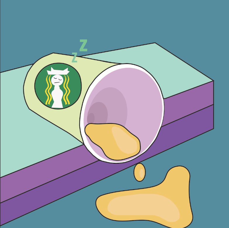
About: This composition uses personification and speaks about me, as the emptied cup, without Starbucks in my life. Hence, the cup looks like it was spilled and the contents are slowly emptied from the cup. Starbucks coffee has kept me up through my important nights and without it, I would not have a lot of stories to tell and a hideout place. Also, the Starbucks mermaid logo is illustrated as me in blonde, since Starbucks is often seen as a "white-girl" thing. (apart from the fact that my favourite colour is yellow)

Colour scheme: Triadic Colours. Green, violet & orange.
Composition 2: Advert

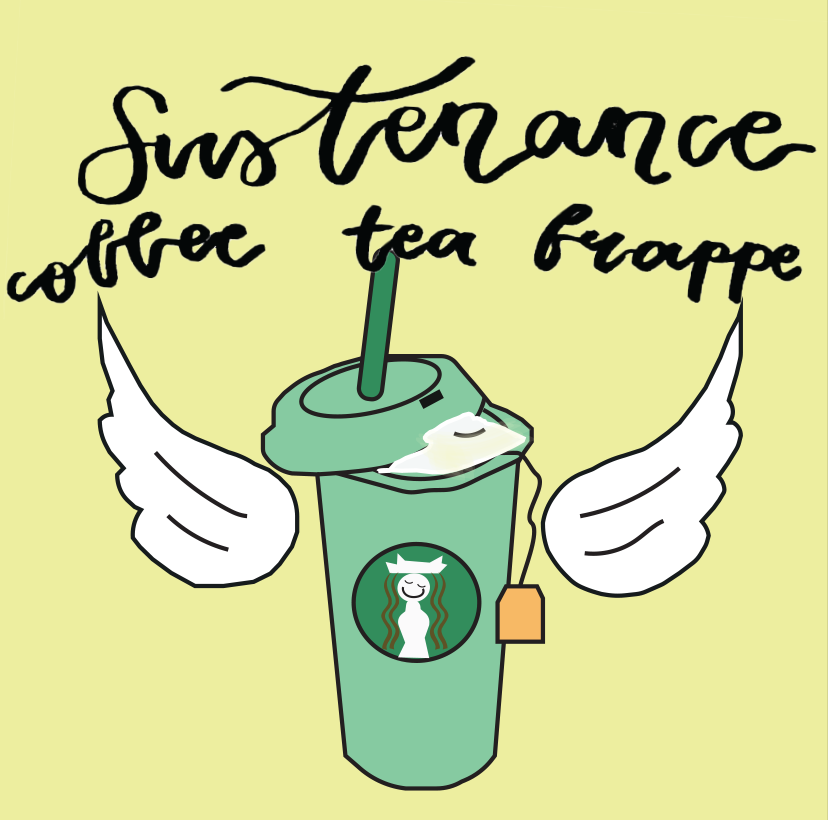
About: This composition speaks about how people would see Starbucks, since their marketing strategy is quite remarkable I would say. The wording says,"Sustenance. Coffee, tea, frappe", which are the different types of beverages Starbucks sells. The hot cup illustrates coffee, the whipped cream illustrates frappes and the tea bag illustrates tea, all in one cup. The wings added are inspired by redbull's catch phrase, "Redbull gives you wings", similarly to me, Starbucks gives me wings. 

Colour scheme: Analogous colours. Yellow-green, yellow and yellow-orange.
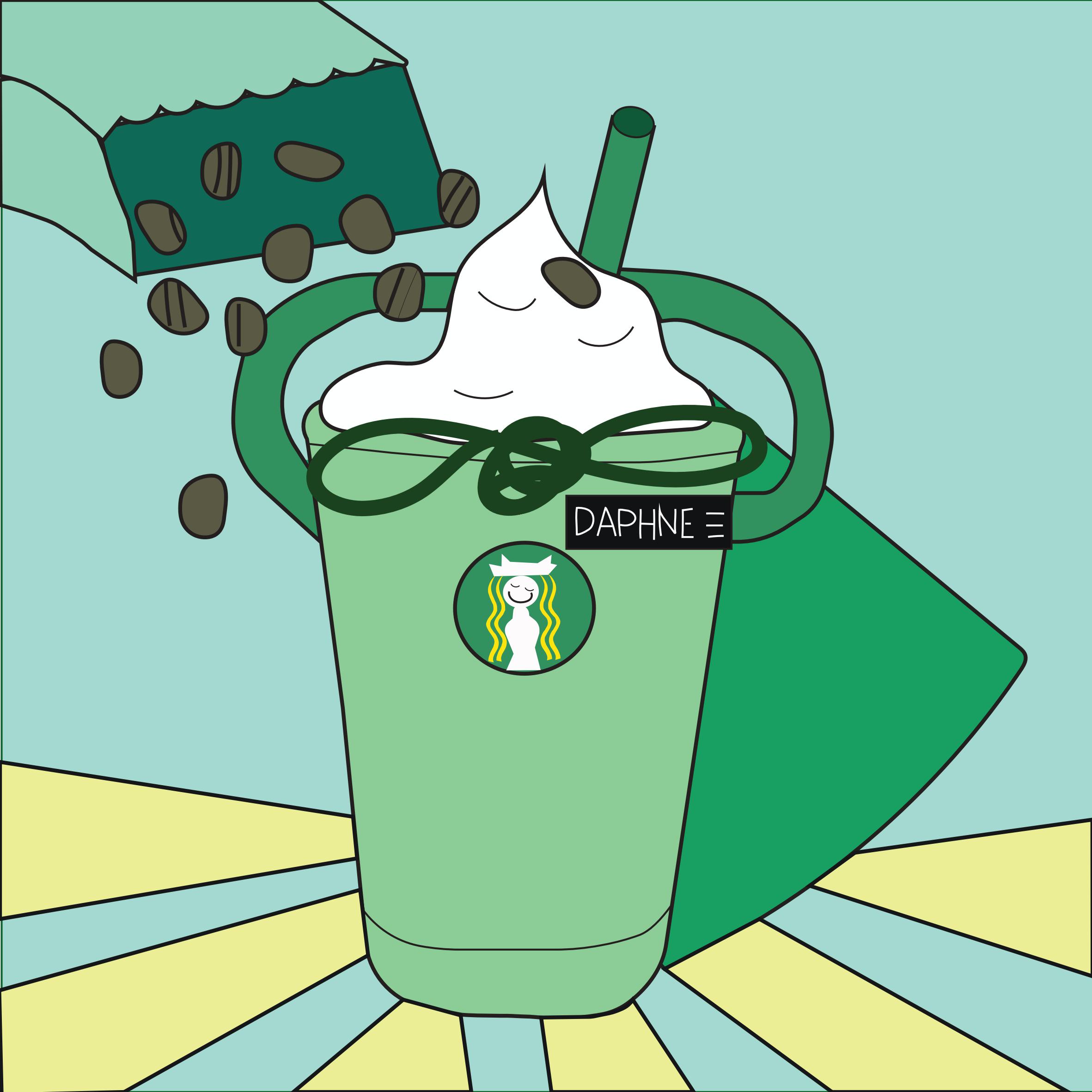
Composition 3: Conquer
About: This composition speaks about me + starbucks. Since I used to work there, I have my apron on me (the cup) and my name tag on, which is how it exactly look like. The apron looks like a superman cape because with Starbucks, I will feel like my own superman because I know I will be able to conquer whatever work I have and the fact that I survived working 6 months there. The bag of spilled beans is from an incident I went through while I was still working there. What happened was I needed to refill the coffee beans and ended up spilling them while on the job which was super embarrassing. Also, the beans are placed that way as if like a confetti for my mini celebration. Also, the beverage shown is green tea cream, my favourite drink from Starbucks, with extra whipped cream. 

Colour scheme: Analogous colours. Yellow-green, yellow and yellow-orange.

Equation 2:

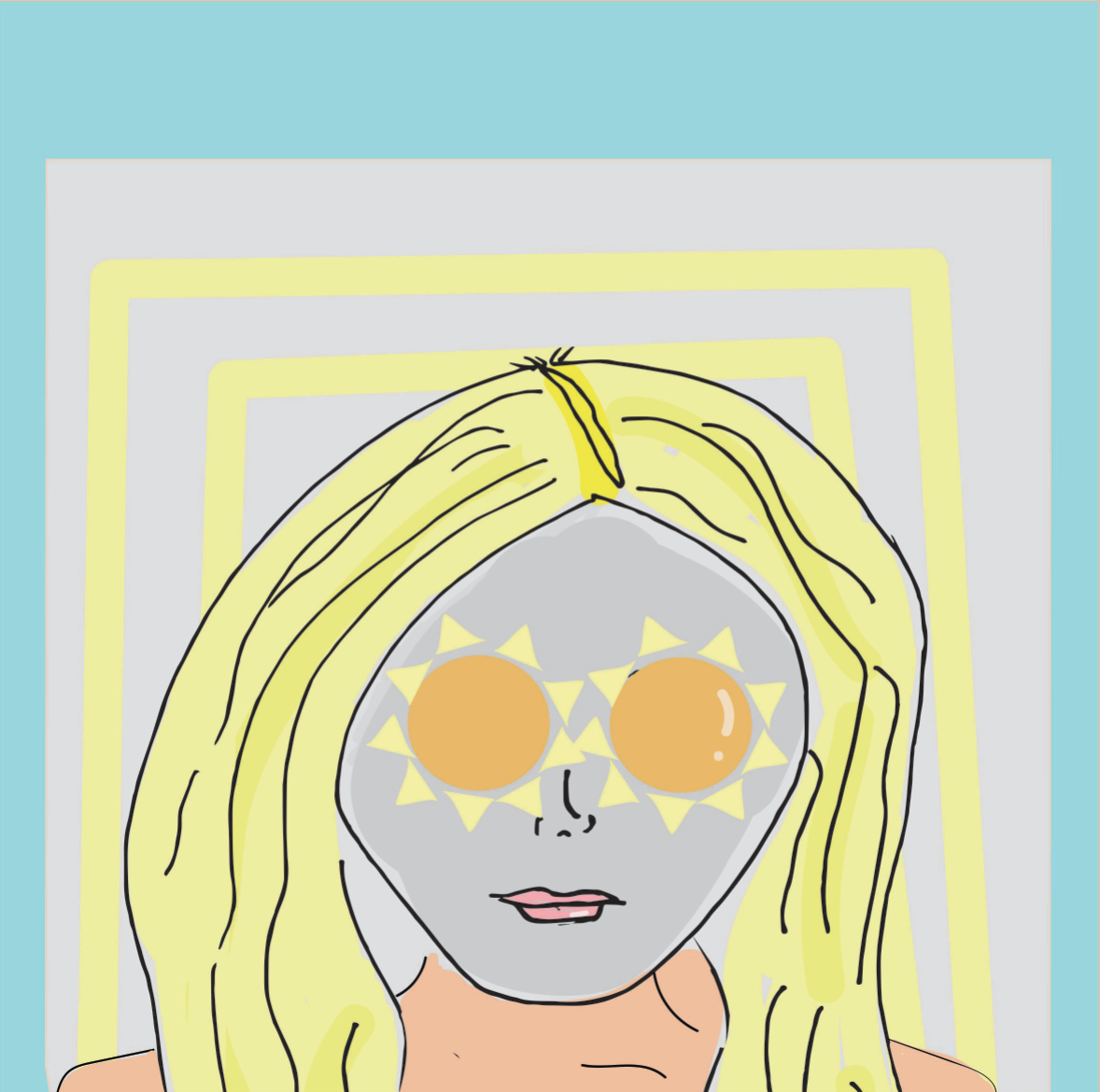
Composition 1: (Sun)glasses
About: This composition is a quirky way of subverting the word "sunglasses". I gave it a literal meaning. This illustrates me masking and doing my own thing with the "sunglasses" on. I am seen as a blonde is as a continuation of my previous equation.

Colour Scheme: Triadic Colours. Red, yellow & blue.
Composition 2: Expectation

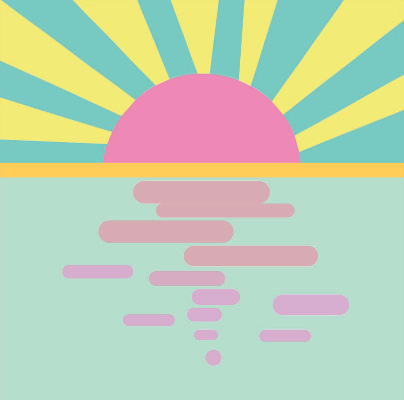
About: This composition is as it is named, expectation. This is how I would normally see sunset on the internet or social media. A sunset over a horizon, a very glorious sight. (to be continued)

Colour Scheme: Square Colours. Yellow, blue-green, violet and red-orange.
Composition 3: Reality

About: (continued) Yet, this is how I would usually witness sunset in NTU or around my neighbourhood. Sunset amongst the high-rise buildings of Singapore. 

Colour Scheme: Yellow-orange, red-violet & blue.

Process for Equation 3

Composition 1: Ma(i)ze

About: This composition illustrates me in a corn maize in the midst of all the corn cobs, searching for the right one for me, since I am picky about the corn I eat. 

Colour Scheme: Triadic Colours. Yellow, blue & red.
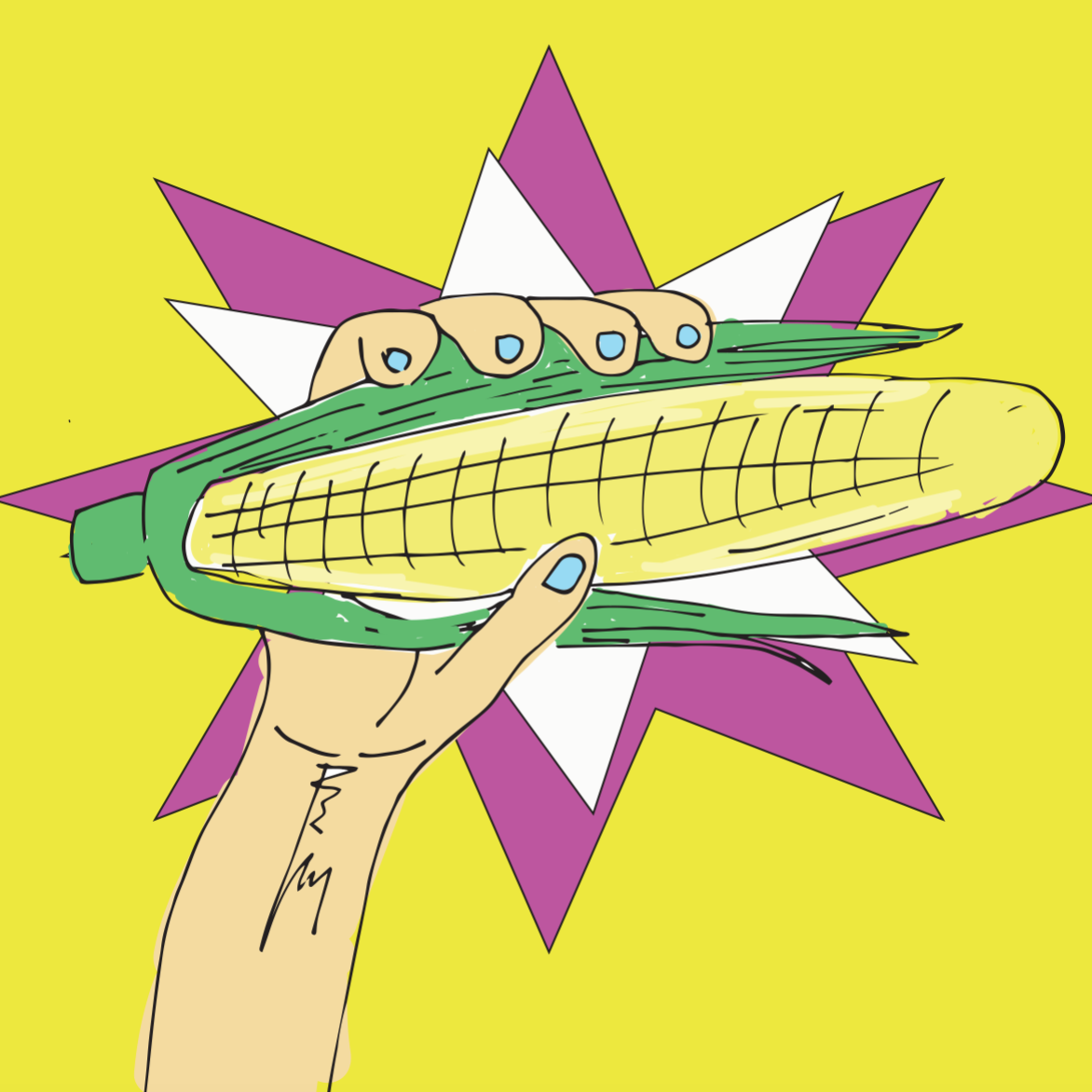
Composition 2: The One

About: This composition speaks about me (finally) picking out the right corn cob from the corn maize.

Colour Scheme: Split complementary. Yellow, red-violet and green.
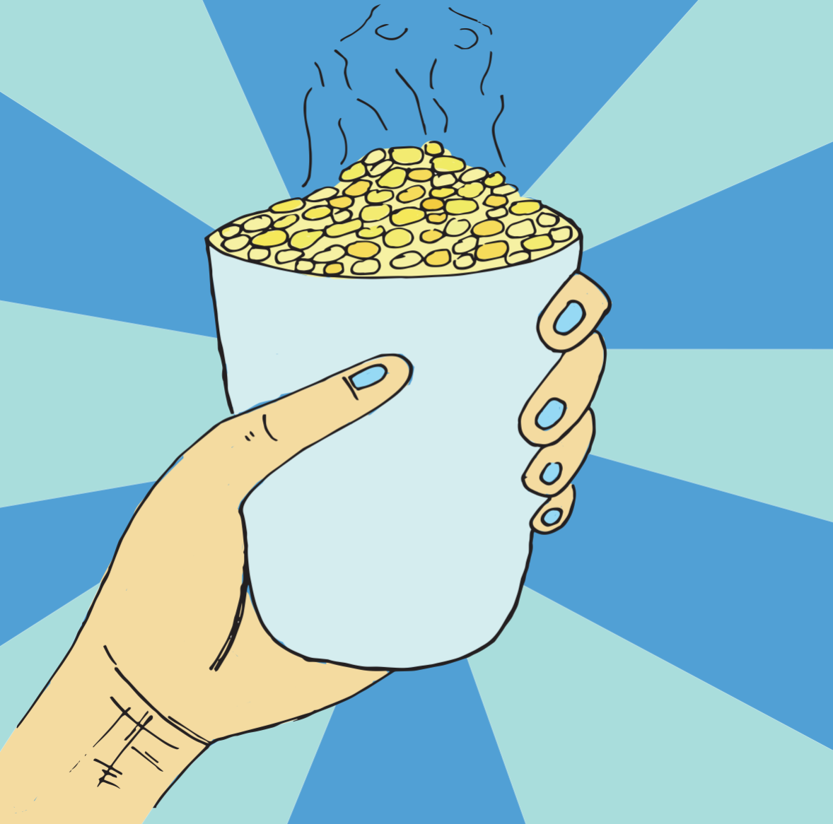
Composition 3: Hunger

About: This composition speaks about me finally having the cup of corn after much work of searching and choosing the right corn. The backgrounds gives emphasis and focus to the cup of corn in my hand, like a celebratory shot *cue heavenly music* very much like that.

Colour Scheme: Split complementary. Yellow-orange, red-orange and blue.
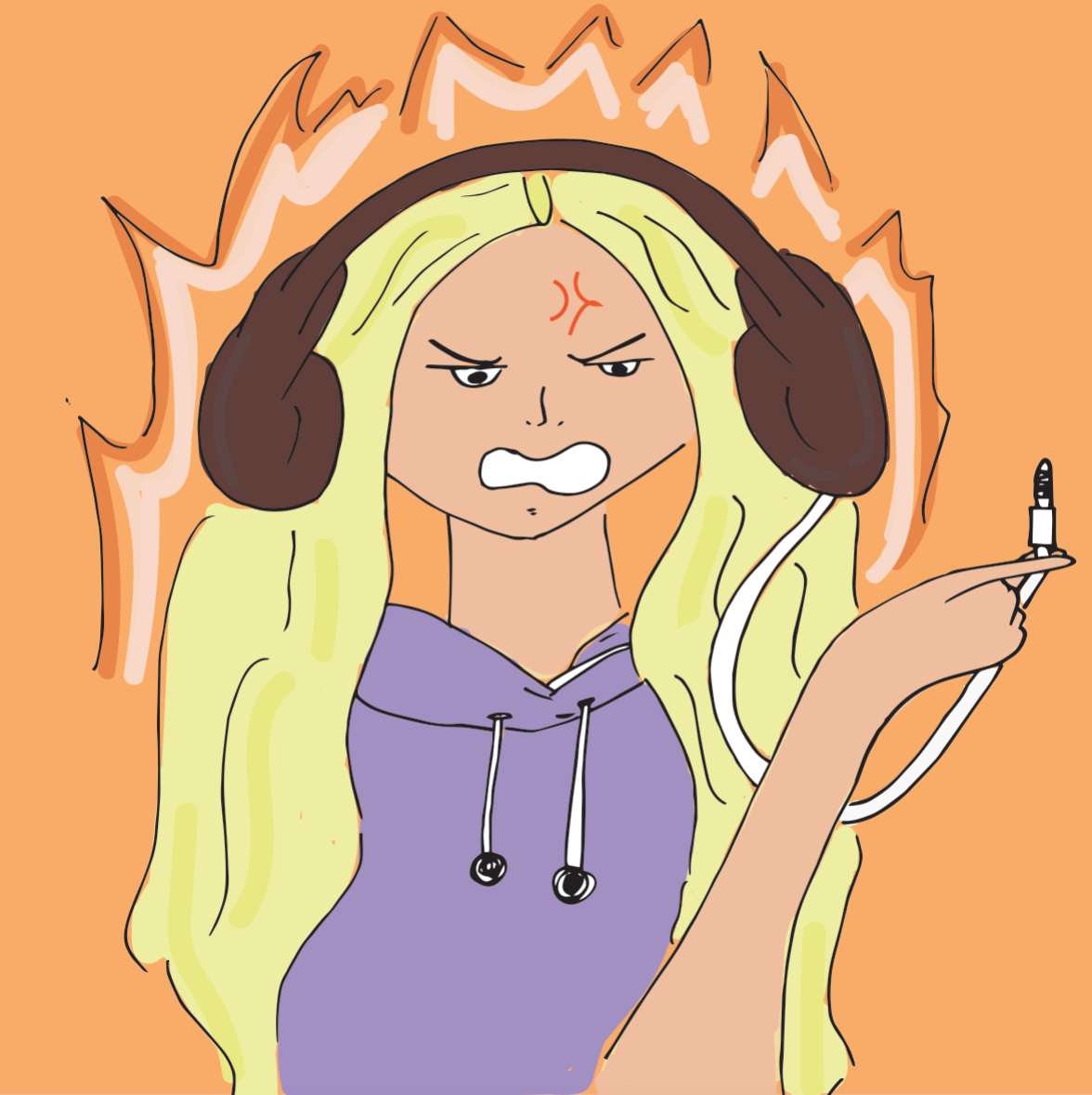
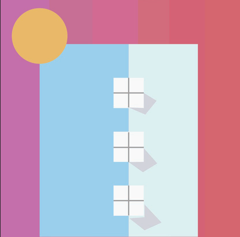
Composition 1: Adapter Issues

About: This composition speaks about the current situation I am facing (still facing). Me losing my adapter for my ear-piece jack. I use the iPhone 7, which requires the adapter which I think is really redundant, yet stops me from me enjoying my music. 

Colour Scheme: Split complementary. Orange, yellow & blue-violet.
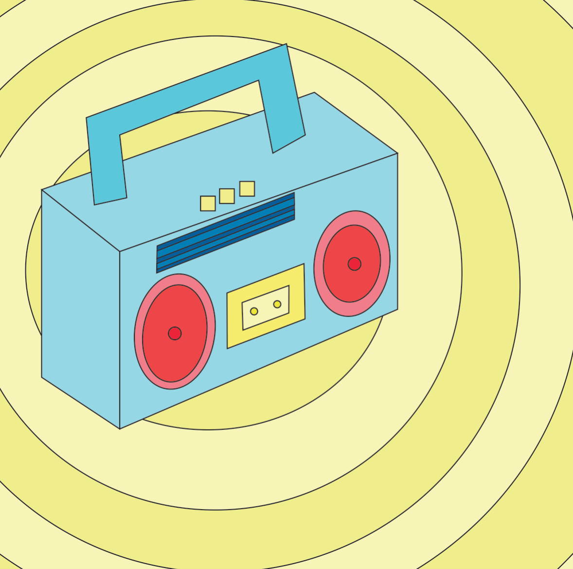
Composition 2: Mainstream Music


About: This composition speaks about just pure mainstream music, which you would normally hear from the radio. A retro radio was used because my first impression of music was from a very young age with my grandmother and she always carries a small old radio wherever she goes. Also, the circles added resembles beats that comes from the radio. It is positioned slightly off centre.

Colour Scheme: Split complementary. Red, yellow and blue.
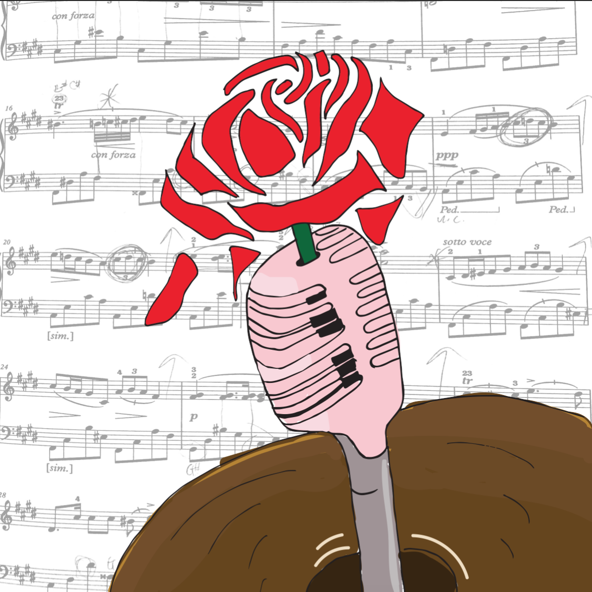
Composition 3: Brand New

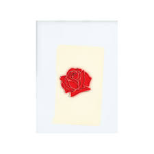
About: This composition speaks about music and I. All elements are my interactions with music. The old microphone is to have a continuity from the previous retro radio and shows my interaction with singing. The bell at the bottom illustrates my concert band days when I played the trumpet. The score overlayed at the background is a piano piece I am currently playing, Nocturne No. 20 in C Sharp Minor. The rose blossoming in the middle shows a brand new start I always have with music, learning different instruments and how it is always a part of my life. Also, it is inspired by a band called LANY that I recently love and they have a rose in the middle of their album which I thought is a nice touch to the composition and gives it a focus.

LANY Album

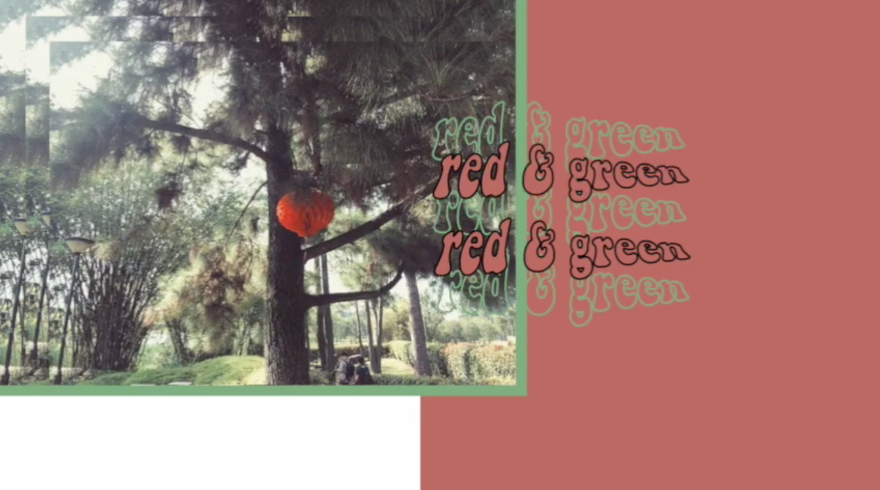
Colour Scheme: Complementary colours. Red & green


Afterword

I thought this project made me realize a bit more about myself, and be more self-aware of the things that are associated with me. Through this, I learnt about the different colour theories and throughout the project, I realized that I am attracted to yellow, blue and red and are commonly seen together in one composition.

Apart from that, I also got to learn illustrating on the illustrator from my classmates which I used for my Starbucks equation using shapes and vectors. The rest were hand drawn and scanned in. The colours were also added on illustrator.

Overall, I like the pastel-ish feel my compositions have and looking at the final product, I can really tell that these are really things associated with me.


; FORREST GUMP – Process

As we dive into Project 2: Forrest Gump, there were some brainstorming and process that I have captured! Here it is!

Brainstorming for quote:

Les Miserables – Even the darkest night will end and the sun will rise.

sun and moon on both opposite ends (using Japanese / Russian Construction)

Finding Dory -When Life gets you down you know what you’ve gotta do? Just Keep Swimming

space context instead of the sea?

Toy Story – To infinity and beyond!

Enchanted – Life’s enchanted cup sparkles near the brim

Alice In Wonderland – Imagination is the only war against reality

Hacksaw Ridge – With the world so set on tearing apart, It does seem like such a bad thing for me to put a little bit of it back together.

DRAFTS FOR “When life gets you down you know what you’ve gotta do? Just keep swimming”-finding nemo


drafts for “Even the darkest night will end and the sun will rise” — Les Misérables

drafts for “to infinity and beyond” – toy story

drafts for “Imagination is the only war against reality” – ALICE IN WONDERLAND


VARIATIONS OF TORNADO OF GEARS


View my final products here!

; FORREST GUMP: Fantasy Concretised

Final Product presented on 16 October 2017

Before going head-on in approaching the project, I did some research!

Also, view my work process here!

overall concept


“Fantasy”

The overall concept for Project 2: Forrest Gump is Fantasy. As part of the overall concept, I wanted for my designs to evoke afterthoughts to its viewers, further reflections or realisations.
Fantasy, using the imagination to bring forth something that might seem illogical at first glance, yet slowly concretise itself.

“When Life gets you down you know what you’ve gotta do? just keep swimming”–finding nemo 2009

Final Product (As printed on a tote bag)

totebag; exposed & silkscreened in class

“When Life Gets Hard You Know What You Got To Do? Just Keep Swimming” — Finding Nemo 2009

Main Idea

The idea behind this piece is to bring out the irony in the way we face challenges in life.

The astronaut is moving away from the ground (the planet) and the apparent dangers around him – shark that is emerging out of the water in space, the running cacti that are holding onto knives.
Since the quote can be understood figuratively as well, I decided to move away from the verb in the quote — swimming, I switched it up a little by using something seemingly the opposite of swimming. Walking/ running seemed too uninteresting, hence I decided to switched up the context of the design and use the astronaut to bring the context out of earth, something we can fully understand. Yet, the apparent dangers that he is facing is relatable as well, literally.
Surrealism
Bringing in sea creatures, the shark, and the cacti out of context and combining them in the same context I thought is a way to play with the idea of surrealism as well. Also, playfully adding the shark and cacti that has human qualities also tapped on the overall concept of Fantasy.
Deeper meaning..
However, a plot twist to the design is that there is a crack on his mask that is stripping away his oxygen supply. The blurry lower half of his body depicts the shortening of his life due to the shortage of oxygen supply that he was not aware of. It aims to challenge the quote itself as to whether we should “just keep swimming” in face of obstacles, or should we first analyse the problem, then come up with an action plan.

“Even the darkest night will end and the sun will rise” — Les Misérables

“Even the Darkest Night will End and the Sun will Rise” — Les Misérables 2012

Main Idea

This design is based off a true story about a World War II Japanese soldier, Hiroo Onoda, who was ordered to not just fight, but also to stay alive. He was assigned to fight in a forested area in Western Philippines. He escaped capture and stayed in the forest for 29 years even after the war ended. He survived through stealing food from the farmers or look for random food in the jungle. (View his full story here)

I had initially taken the quote very literally and after a consult, Joy told me about Onoda’s story. I thought this quote could resonate with how he was feeling while being trapped in the jungle and tie in well with his story as well.

Surrealism

Thereafter, I decided to tap on the phrase “You Are What You Eat” for this composition. By using food to depict the forest brings out the idea of Fantasy. Just like Onoda’s hunt for food everyday, unpredictable, I decided to use random food I can think of to add to the composition, as well as the size and shape of it.

Ice cream cones are used to depict the dense vegetation in the forest and the fusilli noodle depicts the forest bed, since fusilli pasta are always served flat on the plate.

Notice the Japanese flag at the background is used to relate the composition literally back to the quote itself. The off-centre placement of the flag is to capture the movement of the moon setting or the sun rising. I overlayed a cookie in the circle  of the flag to further blur out the interpretation of the background. Is it a Japanese flag, a sun rising, a moon setting? Or all of the above?

“TO INFINITY AND BEYOND” — tOY STORY 2011

“To Infinity and Beyond” — Toys Story 2011

Main Idea

This piece challenges the idea of doing good or what is convenient.

The White Rabbit from Alice in Wonderland is incorporated into this composition to borrow his character to further help the audience understand this piece better, or resonate with them better.

The stairs that seems to be limitless brings out the idea of infinity in the quote. How I wanted to further work on the word “infinity” is to use the idea of Heaven and Hell, two extreme opposites.

This piece strive question its audience, do good or do what’s convenient?

Surrealism

The idea of heaven and hell cannot be represented, except by tapping on the common stereotypes that hell can be associated with extreme heat, and heaven with the sky. Hence, I tap on that as an apparent way of portraying both complete opposite elements in one composition.

In Alice in Wonderland, the White Rabbit is someone who is constantly afraid of offending people and he is often put in a dilemmatic position as to whether he should help Alice out in Wonderland and risk offending the Queen or leave the poor girl alone in a foreign place. Tapping on this character of his, I thought he will be a perfect subject matter for this composition as we talk about doing good or doing what is convenient. He could choose to help, and take a step closer to heaven, or be indifferent and take a step closer to hell.

“imagination is the war against reality”– Alice in wonderland


“Imagination is the War Against Reality” — Alice in Wonderland

Main Idea

As I approach this quote, I first brainstormed what the “war” of reality is? Global Warming and Climate Change then came into my mind (perhaps it is because I was a geography student? HAHA)

Playing with the past and the present, I portrayed comrades, used to fight war in ancient time, saving the reality today.

Surrealism

The comrades from ancient times coming to “save” today’s day might be more accurate than you think it is.

Deeper meaning…

They are riding on horses and not automobiles that we use today, eliminating the release of harmful gases to the atmosphere. Moreover, their military weapon does not consist of chemical weapons, guns or rifles, depicting a very manual mode of fighting the war of today.

Critique

final words

Overall, I approached this project afraid because I was very unfamiliar with the concept of surrealism and having to study and produce relevant works was a challenge for me. Even so, I really liked the idea of using movie quotes and then giving them our own taste to it! Also, although it was also my first time silkscreening, I thoroughly enjoyed it and despite the long and tedious process, it was one filled with anticipation as we go one step closer to printing our designs onto the tote bags.

Here is a full PDF of my final works!

; FORREST GUMP: Introduction & exploring the different art movements and artist.

Approaching Project 2: Forrest Gump, we will have to select 4 movies quotes to create a visual narrative that expresses watch of the quote only using symbols, pictograms, dingbats, icons and engravings. With the help of Photoshop, the final project should be in black and white half-toned. At the end of it, we will even get a silkscreen print on our tote bag!

Before all that fun happens, there needs to be some work done…

Here are some of my research done!

Art Movement: Dadaism

Dadaism was an artistic and literary art movement of the European avant-garde in the early 20th century that flourished in Paris but first began in Zurich, Switzerland. It was influenced by other art movements like Cubism, Futurism, Constructivism and Expressionism. Developed in reaction to World War I, it is to reject logic, reason and aestheticism of modern capitalist society.

Dadaism is the first conceptual art movement where the focus of the artworks is not on its aesthetics, but how it was created to challenge, to generate difficult questions about the society, and the purpose of the work and what it implies and bring across to the mass. The main intent of the members of Dadaism is to boldly reject all norms of the bourgeois culture.

Some famous artists to note are Marcel Duchamp, Salvador Dali, André Breton, etc.

Some famous works include:

titled: Fountain, Marcel Duchamp | taken from: https://www.artyfactory.com/art_appreciation/art_movements/dadaism.htm

titled: L.H.O.O.Q., Marcel Duchamp | taken from: https://www.artyfactory.com/art_appreciation/art_movements/dadaism.htm

Art Movement: Surrealism 

Born mostly out of Dadaism, Surrealism is an art and cultural movement that began in the early 1920s started by Andre Breton (who was a major member of the Dada community), and is best known for its visual artworks and writings. Many surrealist artists painted illogically with photographic precision. Surrealist are imaginative and drive away from rationalism and literary realism in hopes of revealing the contradictions in the everyday world and spur on revolution.

Some famous artists to note are Pablo Picasso, Rene Margitta,

Some famous works include;

titled: The Persistence of Memory, Salvador Dali | taken from: https://art9b.wikispaces.com/surrealism+%28+The+Persistence+of+Memory+Salvador+Dali%29

Contrast between Surrealism and Dadism

Their emergence – Dadaism emerged during the period of World War I , while Surrealism emerged during a period of peace and prosperity.

Where they flourished – Dada artists where scattered across Europe while Surrealist artist were self-contained in Paris.

View on life – To Dada artists, life has no meaning, no reason, no purpose, and no logic. For Surrealist artists, life has meaning; one has to find its logic by unlocking visual and verbal codes secreted in the chambers of the unconscious mind where one finds Freud’s “uncanny.” Hence, Dada artists were more pessimistic while Surrealist artists tend to be more onward looking.

Dada photomontage may have used the technique of putting one randomly found image next to another, but the intent was to undermine meaning. Surrealism seeks new meaning, another meaning, an unexpected meaning, a sur-real meaning, but always, Surrealism wants live to mean something.

Style of expression – Both Dadaism and Surrealism sought to create works “automatically” without the conscious control of oneself.

Art Movement – Russian Constructivism

Russian Constructivism is the last and most influential modern art movement originated from Russian in the 20th century. It is inspired by Cubism, Suprematism and Futurism, which sought to abolish the traditional artistic concern with composition, and replace it with ‘construction. In its essence, this art movement sought to move working place from the studios to the factories. Russian Constructivism also work with the characteristics of many materials such as glass, wood, in construction to experiment and deploy different materials to demonstrate a certain idea. (usually that of the experiences in modern life).

Some famous artists to note are Alexander Rodchenko, El Lissitzky, Lyubov Popova, etc.

Some famous works include;

titled: Books, Alexander Rodchenko | taken from:http://analogue76.com/blog/entry/the_russian_constructivists

Beat the Whites with the Red Wedge, El Lissitzky | taken from: http://analogue76.com/blog/entry/the_russian_constructivists

Artist Research

André Breton

Andre Breton was a major member in the Dada society and a founder of Surrealism. He was into unconventional ways of creating art and had united a group of disparate artists to join him.

He wrote the Surrealist Manifesto to declare that Surrealism is all about “pure psychic automatism” that later deeply affected future art movements like Abstract Expressionism.

One of Breton’s greatest belief is that art is an anti-war protest, of which he postulated in World War I, which regain potency during and after World War II. While he was doing so, the other expressionist artists were creating art in response to the rage regarding the war itself.


References:

The Art Story – Dadaism 

The Art Story – Surrealism

Art History Unstuffed – Contrast Between Dadaism and Surrealism 

The Art Story – Russian Constructivism

The Art Story – Andre Breton

; MY LINE IS EMO: The Phrases That Tells It All [Gallery]

Final Product presented on 4 September 2017

How I decided to approach this project is by first brainstorming about how each emotions resonates with me, and subsequently working with different mark-making techniques to fit the qualities of each emotions to bring out its entity. My brainstorming process can be viewed here. I decided to categorise the emotions according to positive and negative emotions.

Top to bottom:


1.love

Love, that spreads from one end to another

thought process:

Love spreads from one person to another. Be it from your family members or from the people around you, love spreads in an outward motion. Also, we love because we are first loved. The feeling of being loved is similar to having tiny explosions inside of you, the tiny butterflies you feel, the warm and hearty feeling. The organic and fluid shape created shows a gradual outward motion with hard-edges. As the shapes intertwine, it shows the actions 0f love transmitted from one to another.

methodology:

The first panel was created by putting large amounts of ink on the paper and then using a straw to blow the ink in an outward direction, not fearing that they will connect with each other.

2.happiness

Happiness, the high points in life

thought process:

Happiness are the high points in life. There are high points in life when there are low points in life, hence the flowy nature of the second panel created. Life can be seen just like what is created in the panel, much like a roller-coaster. The soft-edges seen are like the times when we are overwhelmed by the tough moments in life when we find it hard to find happiness in life. However, when we try to find happiness in life, we can always find them. This was created on a huge sheet of paper to recreate the large motion of being happy since it is associated with being free-styled and liberal.

methodology:

Using a brush to create large motion of swirls across a huge sheet of paper and cropping out the section that I wanted.

3.surprise

Surprise, the party poppers that make your heart race

thought process:

Surprise is interpreted as good surprise. Good kind of surprises are much like birthday surprises or farewell surprises. In parties, party poppers are very commonly seen, hence it is the main subject in the third panel. The motion of the creation of the third panel also brings out the surprise factor. As a semi-dry brush is jammed onto the paper to create the effect, it gives a sudden fast motion, describing the nature of a surprise. Also, the effect created very perfectly described intensity of shock across time. As time passes, the intensity of shock gradually decreases, therefore, as it goes further away from the middle, the ink lightens, bringing out the element of surprise. Initially, I thought the party popper effect was not clearly brought out, so I added tiny swirls across the paper to mimic the strings that come out of party poppers to add more essence to the panel, and I thought it worked quite well as I do not mistake them as fireworks or explosives.

methodology:

Dabbing semi-dry brush onto the paper, then creating swirls using the back of a brush.

4.anger

Anger, the build up

Anger would most of the time be an accumulation of different events that ultimately build up to the ultimate event of being angry. The gradient seen on the paper also describes the intensity of anger very well. When the limit is met and one is angry, the initial emotion will be fury and hence, it coincides with the darker regions on the panel. Across time, one will be cooled down and that will coincide with the lighter regions on the panel.

methodology:

The forth panel was created by putting ink on my mini toy car and running it across the paper to create the straight strips of ink.

5.sadness

Sadness, the tears we collect in a jar

The first thing that came to my mind when I think about sadness is tears and the act of crying. Also, we tend to be sad over things that are significant and intimate to us, hence the phrase “we collect in a jar”, since they are something we hold close to our hearts, we will keep them in a secret place.  Therefore, the fifth panel is made up of fluid, tears-liked figures mimic the tears that flow down your cheeks when you cry.

methodology:

This panel was created by running black ink down the paper, creating the dripping down effect and cropping the top section of the paper out.

6.horror

Horror, the bloodstains on the wall


taken from: http://www.widewalls.ch/andy-warhol-piss-paintings/


I was very inspired by Andy Warhol’s oxidation painting effect as I thought they give off a gory and scary feeling to its audience. It is as if we cannot fully make sense of what is in front of us, but we sort of know its something unpleasant. Working towards that direction, I experimented with a few methods by imprinting ink from different surfaces onto the paper. I worked with different kinds of plastic bags, and tiny ones usually for food storage and found out that I prefer the effect of a zip-lock bag much better due to its smooth texture. As if blood was smeared across the glass wall, the gory effect it gave really resembles that of horror movies I usually watch.

taken from: http://historiadelavidadeblaze.blogspot.sg/2015/07/t2-carmesi.html


methodology:

Putting large amount of ink on a zip-lock bag and transferring the ink onto paper and cropping the parts out.

———————————————————-

Critique:

I like the directional element to the work, how the work can be categorised as horizontal, vertical, etc. It brings out a strong visual unity…

I came to realise that how I had categorised my emotions gave a “directional element” to the entire project. Like how anger contrasted with sadness, which then contrasted each emotions even more. I thought that was a good observation by my classmate that I had unintentionally displayed in my work.

I like your idea of using quotes!

As I approached this project, I thought emotions can be hard to express sometimes, hence the word “mixed-feelings”. Truth is sometimes we cannot comprehend or understand how we feel in a certain occasion or event. I thought the quotes really put things into a certain context or situation which can bring out the idea of each emotions even more, enhancing the understanding of each emotion further.


Conclusion:

Overall, I really enjoyed creating each emotions because they truly resonated well with me. Also, looking at how my friends created their prints was really interesting as well as I have classmates who experimented with oil and also capturing the contact print of a ball hitting the ground and et cetera. Even so, I enjoyed experimenting with different objects that I can find at home to create these prints as a final product and am overall encouraged by my lecturer, Joy, and my classmates’ comments and feedbacks for project 1. Although I would have hoped to be riskier with the objects I used, but never really got to try. Despite that, I thought this has been a great opportunity for me as during the process, I constantly found myself on a look out for objects with interesting texture and how I can use them for mark-making. As we close this project, I hope to further try out different mark-making techniques and hope to work with the linoleum and the pressing machine in future!