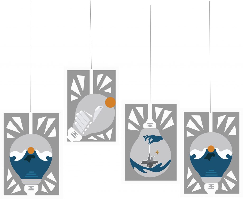
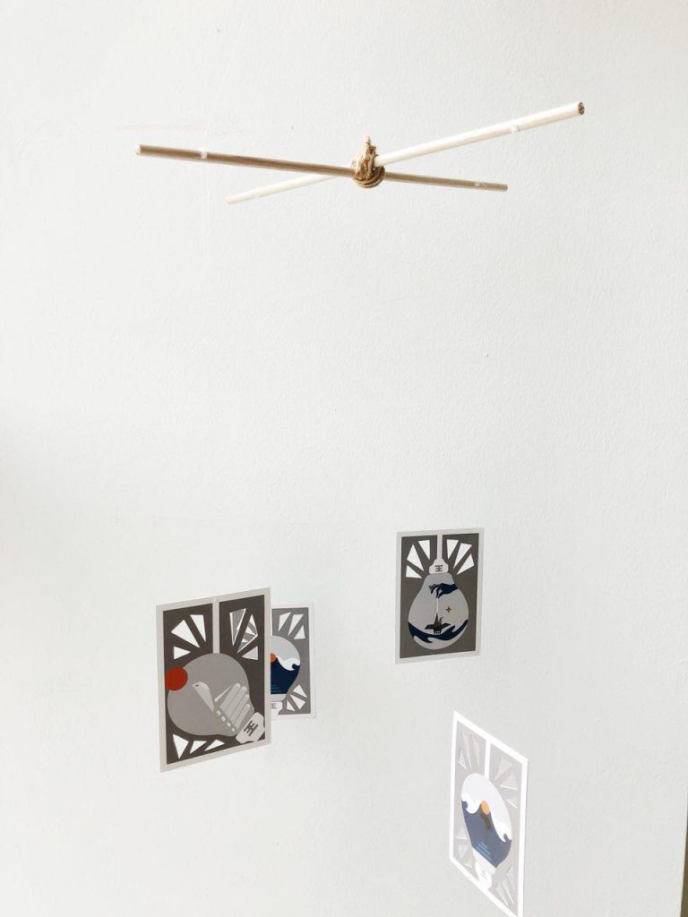
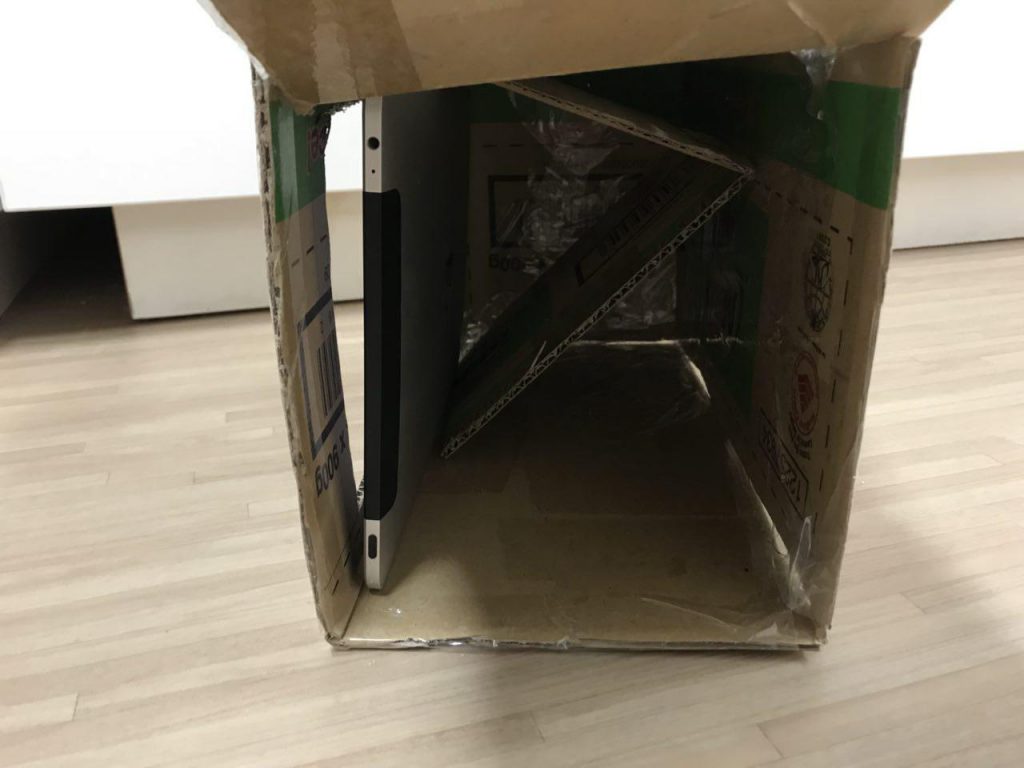
Programming – An End of Sem Project

C O N C E P T U A L I S A T I O N

Our team wanted to create an installation that involves creating an immersive space for audiences to enter into. We created the idea of a third dimension in our space where audiences have to make new discover with every step that they take, exploring the new dimension.

Taking inspiration from the piano stairs, where the whole experience encouraged people to take the stairs instead of the escalator, we thought this ties in well with our entire concept.

P R O C E S S

Diving into our first week, we first did up a mock up using the mousePress(); function to mimic the movements of the audiences in our space. We created the coloured grids using the Illustrator, then input the RGB code into Processing for each grid. Initially we worked with a 5×5 grid, but reduced it to a 3×3 grid due to the mismatch of dimensions of the Kinect and the projector.

Next, we figure out the codes to activate the use of the Kinect then input them into Processing. Meanwhile, we secure the usage of the Truss Room for the project and did a site test. Measuring the dimensions accurately and testing out the top-down projection was an important process since our project relies heavily on it the on-site experience that we cannot determine merely on our screens.

Apart from that, we recorded each piano note we used on the keyboard using the Zoom and input them into Processing using Minim.

S U M M A R Y

Proposal: The_Muse Proposal

Mock up Code: Mockup Code


SPACEVENTURE – A mid sem programming project

A B O U T

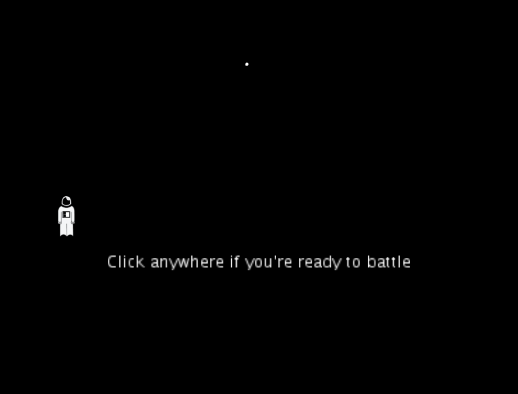
SPACEVENTURE is a one-player game that aims to shoot down the enemy spaceship and try to survive the battle. With every spaceship shot, player will gain one point.

s c r e e n s h o t s

GAME START PAGE

GAME PLAY PAGE

GAME PLAY WITH SCORE

t h o u g h t s

SPACEVENTURE is the first game I did up with the help of Corey using processing. With no prior knowledge on what coding or programming is, the concepts taught in class was helpful to help me code the fundamentals of the game. I learnt the use of a minim, and was able to use that for SPACEVENTURE. Also, got to upload an image for my player as an astronaut that I created on Illustrator.

Overall, although I struggled a lot, especially with the array list, it was fulfilling to create this game from scratch on my own. Coding Train’s tutorials have been a huge help apart from Corey and opensource codes as well!


Visual Communication I – Project 2 – Greater Than Design (Research and Development)

For Project 2, we were to create a poster for the Singapore Design Week 2019. We went on a trip down to the Singapore Design Centre to look around and get some inspirations.

C O N C E P T

My slogan is “>esign” or “Greater than Design” that aims to portray the art scene of Singapore as more than what it already is. As people put more attention and value on deign in Singapore, the Design week is a celebration of that phenomenon and a vast change in perspective. Of which I used a rising sun that portrays the “new light” people have on the topic of design and the art scene with a splash of memphis elements portraying a celebration.

I N I T I A L  P H A S E S

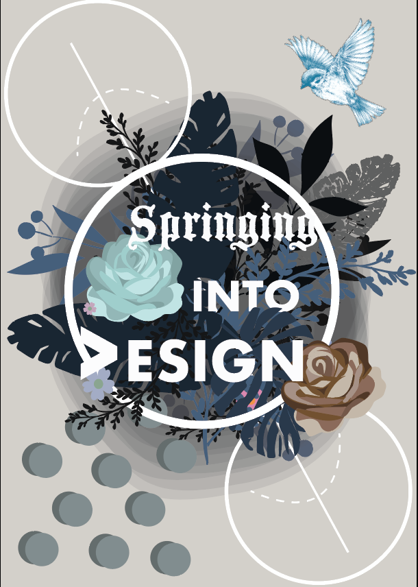
As mentioned in my previous post on my visual research, I had some slogans in mind, namely “>esign” (greater than design), “Springing into >esign” (springing into greater design”.

1.

Initial phases of 1 was inspired by the moodboard I put together as seen on the previous post.

That includes fluid shapes that plays with opacity. I thought these effects gives off a mysterious impression, a foggy channel forward. Linking it back to my concept of >esign, it might show an onward lookingness, with the use of vibrant colours and inorganic shapes.

2

Initial phase of 2 for “Springing into >esign” looked more like an invitation rather than a poster and it looks more personal than for commercial uses. Hence, I decided to scrape the entire design.

3

Design 3 is a brunch out from design 1. I added memphis elements to create a sense of playfulness and a black background to portray a vague future. However, it was seen as having little relation to help to reinforce the concept and the “>” looks vague.

—-

Relooking at my concept, i thought settling on a specific art movement will streamline the thought process in coming up with my design.

RetroFuturism

a trend in the creative arts that shows the influence of depictions of the future produced in the early era.

If “futurism” is called a “science bent on anticipating what will come, retrofuturim is the remembering of that anticipation.

Since “Greater than Design” has the element of forward-looking and yearning for the future, I thought RetroFuturism art movement is in line with my concept, hence I decided to adopt it.

4

Design 4 was born, using inspiration from the retro-futurism art movement to try to bring out my concept more. I played with gaussian blur to blend out harsh lines and to give a glowing effect.

Some feedbacks I got was that the black block of information feels harsh and sudden. Additionally, the I font chose seem really stiff. Also, more movement can be introduced to further bring out my concept, playing more with “>”.

5 (Final)

With much diversion at the start and feedbacks, design 5 was submitted. I chose a more fluid font in the end, trying to blend the “>” sign more as a vague “D” to poke people to wonder about the slogan and the sign itself.

C o n c l u s i o n

Concluding this project, I got to consider more about the elements I put on a single page that will blow up in size (looks much smaller on my screen). The hierarchy of elements, what you want your audiences to see first? What to see next? Will your audience view your information (fine prints?) Many to points to consider. Also, how the elements you use on the page communicates your concept.

I got to experiment the aforementioned points through this project. I thought with the given amount of time, I had solved most of the problem areas with the design. It was a tough ride, but looking at the A2 final product placed along the corridor was somewhat a bittersweet moment!


Third Space Fallacy, an Introduction

[About]

A Third Space Fallacy is an experimental interaction performance on third and first space that combines the responses collated on the third space through Instagram polls and stories to curate the next move in a friendship conflict between two girls (Bella and Daphne). To make the entire performance as real as possible, both girls had to put up an act in the span of 1 week in the first space, when questions arises from the people around them. Also, to stage that this is not part of our project for Experimental Interaction, our group have created another Instagram account @abracadabrrun, collating uninformed decisions made by our followers, which is part of the narrative of the death of Bella.

4d: Project 4 – Poetics of Time (final)

For our final project for 4D Foundation, we were to explore time & space.

Certain points to note are – rhythm, movement, causality, & duration of the piece which will be mentioned in the later part of the post.

Before diving straight into my final product, do view my process and research!


Conceptualising..

Approaching the last project, I wanted to explore out of conventional mediums and create a more poetic piece. Besides, with the rise of film camera apps like Gudak, I wanted to challenge myself to embrace the fact that I will not be able to preview the images I take, and see beauty in them. This project also embraces the Japanese aesthetic of Wabi-sabi that speaks about imperfections and the acceptance of them. (More explanation can be seen in my final proposal in my process & research post!)

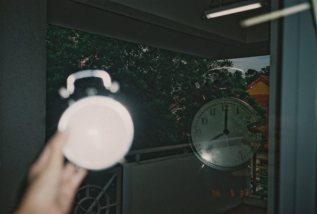
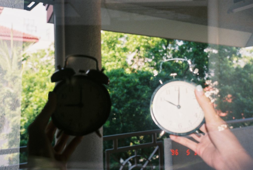
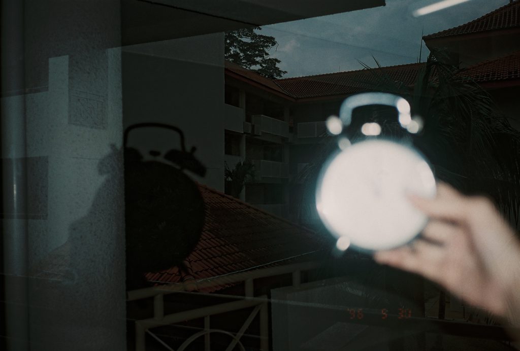
Therefore, for Project 4, I used the film camera, more specifically the Olympus Mju II, a pass-me-down automated film camera. It is not a conventional medium at this age, and the effect of the film camera gives a vintage and venerable feel. This style also brings out the passage of time much better than a conventional camera (phone camera, dslr) in my opinion.

Also, what tells time better than time itself, right?

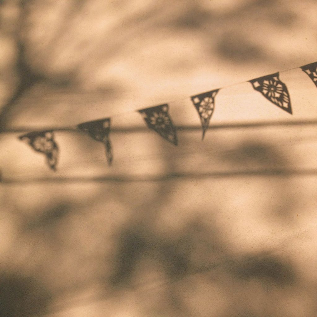
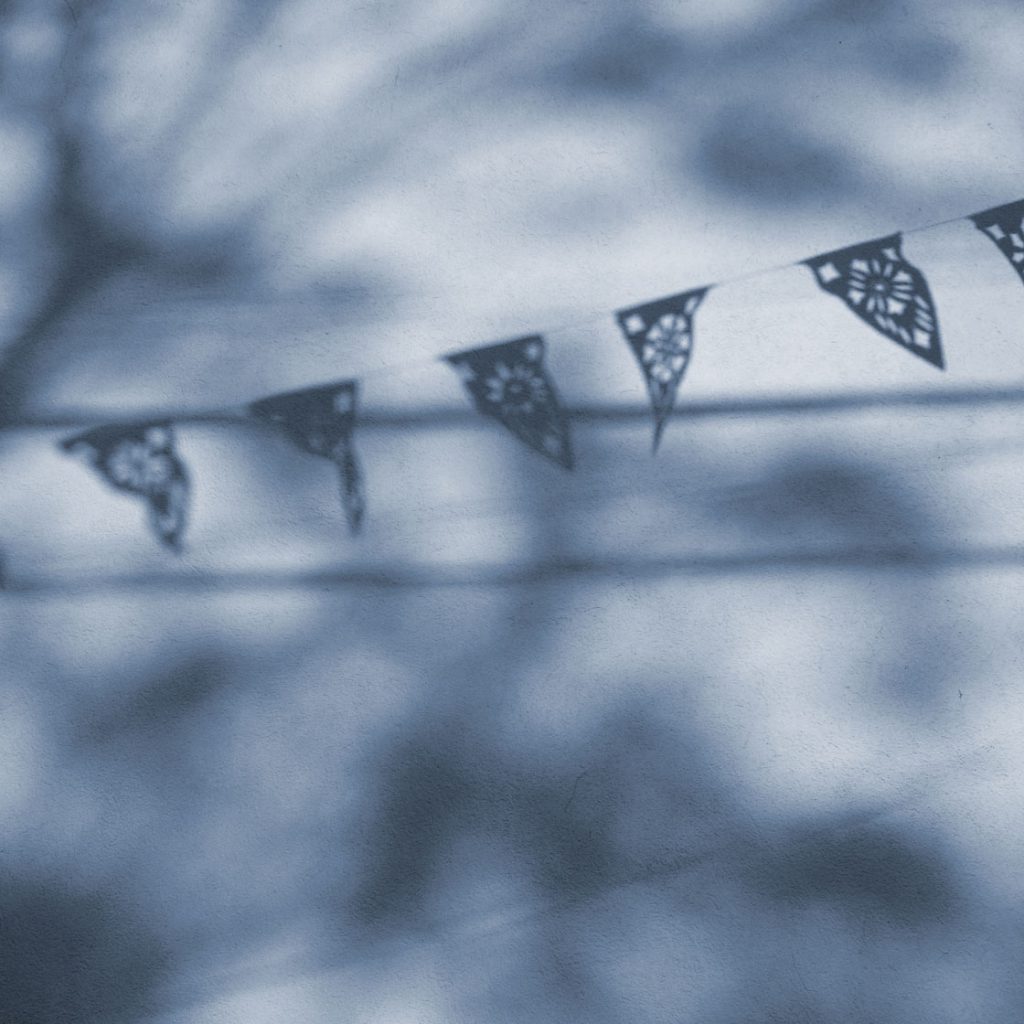
Comparison: iPhone Camera vs Gudak Film app (no edits)

on iPhone cam

on Gudak app

The feeling both evoke is rather different although both are of the same composition and have the same subject matter.

The warm tone of the outcomes of film camera are more stimulating and evokes a mood or feeling.

The outcome of the iPhone camera is much cooler than the one in film.

To better illustrate my point in the difference between the two methods of photography, I have included two images below.

picture in warm tone | taken from: https://iphonephotographyschool.com/color-temperature/

picture in cool tone | taken from: https://iphonephotographyschool.com/color-temperature/

To me it felt like I cannot fully explain the differences in words. So try comparing the mood, thoughts and feelings you have for the above two pieces.

fINAL pRODUCT

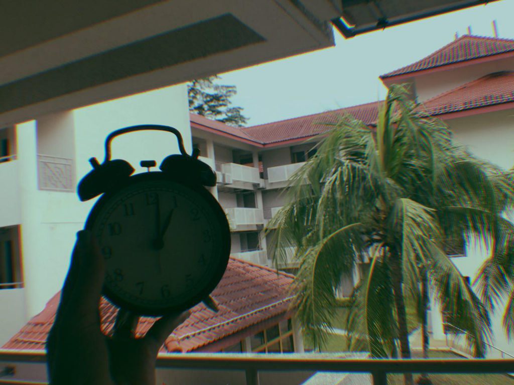
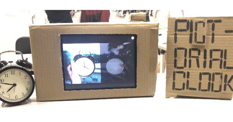
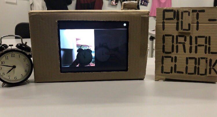
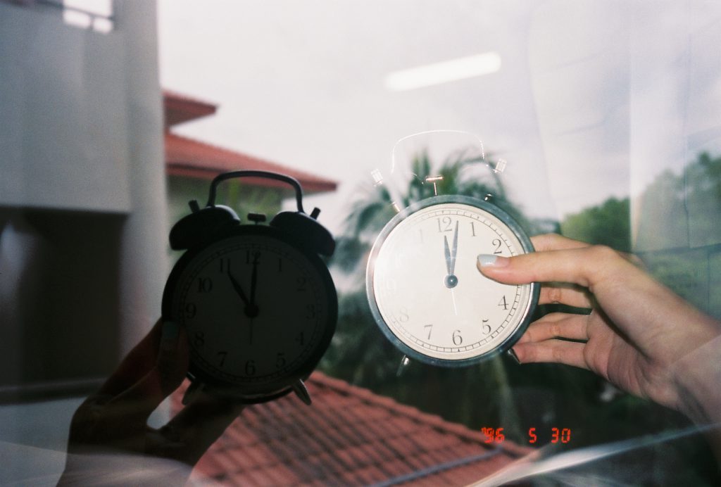
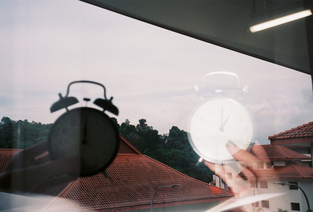
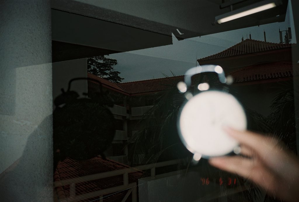
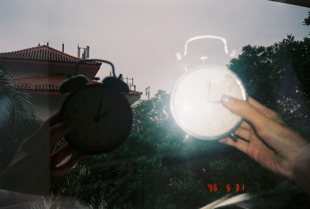
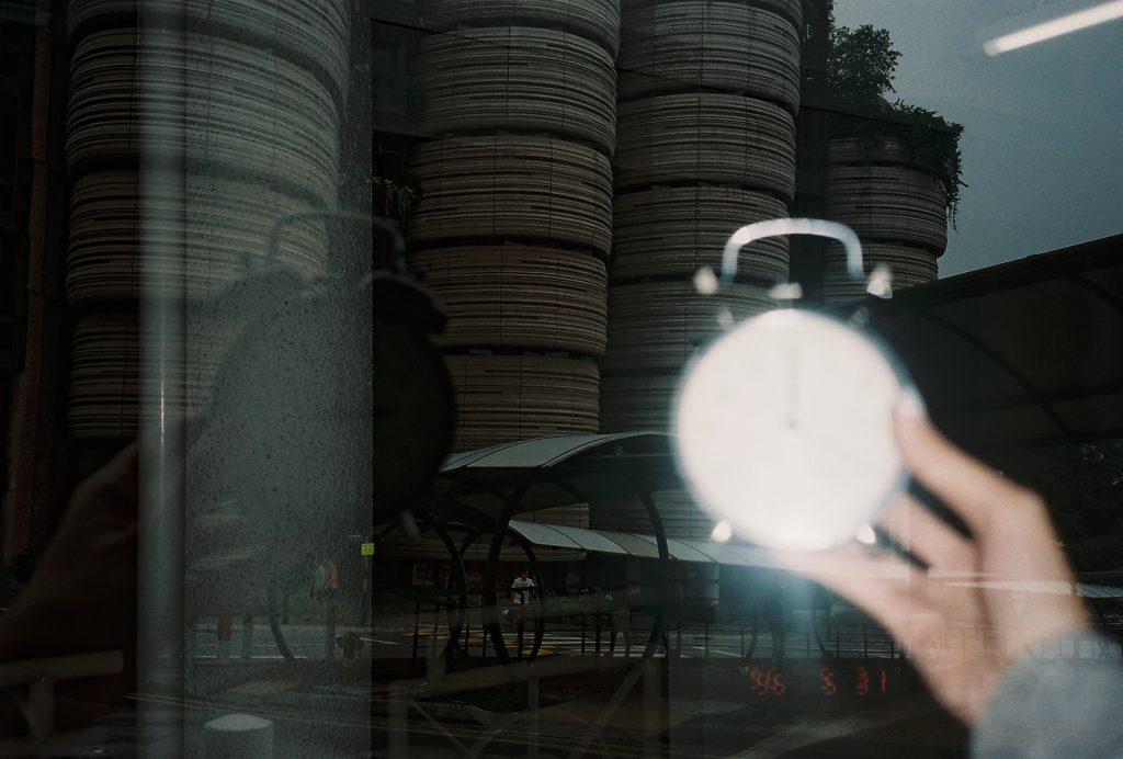
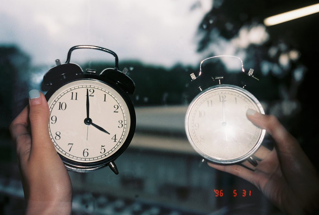
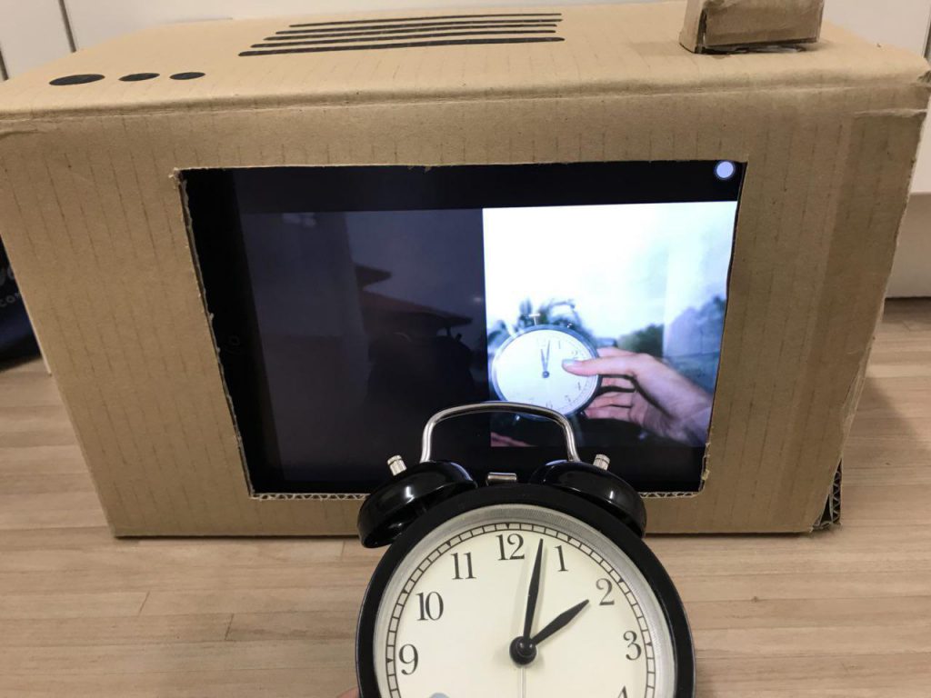
The clock was placed right next to the Pictorial Clock to show a vast difference in the speed of the actual clock and the Pictorial Clock.

How Rhythm is seen in the piece?

Rhythm: regularised repeating of movement or sound

Rhythm was seen in the regular interval of each image of 3 seconds. It can also be seen in the regular interval of the images itself of an hour.

The regular rhythm in this piece brings a calming effect, looking at the passage of time. This piece brings out the nostalgic effect of the film camera and the tranquility in the movement of time, compressed into the Pictorial Clock.

I made it such that

How Movement is seen in the piece?

Movement is the shift or variation in the location of an object, light or sound.

Movement can be seen in the variation of the background/ the environment, the amount of light and the placement of the clock in the images.

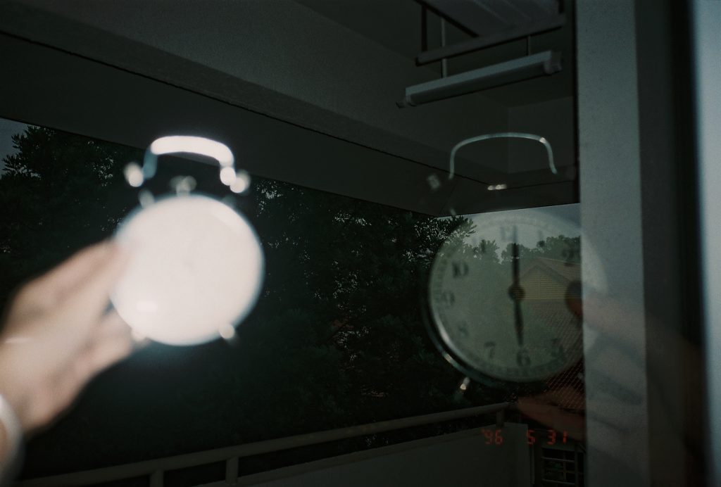
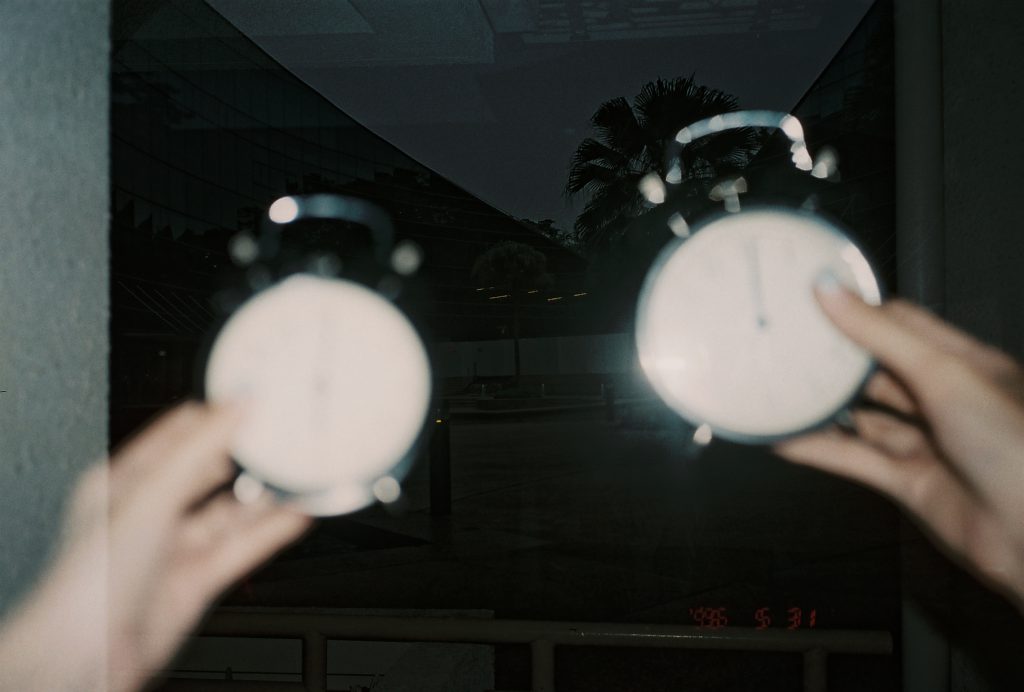
Since all the images were taken in a day itself, some images are taken in a different environment than the rest, since mostly are taken outside by dorm room. As you can see, some taken outside hive, some taken at adm, some taken on the way back to hall.

In terms of eye movement, the focus should be on the Pictorial Clock and in rare moments on the analogue clock beside. A bulk of the time the eye is in stillness.

How causality was seen in the piece?

Causality is the principle that everything has a cause and effect.

Pictorial Clock is a non-narrative piece, yet there is a clear account of connected events. For example, in order to have night, there is first day or vice versa.

It is also expected, since it works similarly to a regular clock that the audiences know.

What is the duration of the piece?

Duration is the overall length of time a work - or a portion of a work lasts.

Since this piece is looped, the technical duration of the piece is infinite.

Yet because it is an installation, the duration of this piece differs from viewer to viewer. It can be as short as a glance (say a few seconds).

How Should the Pictorial Clock Be Viewed?

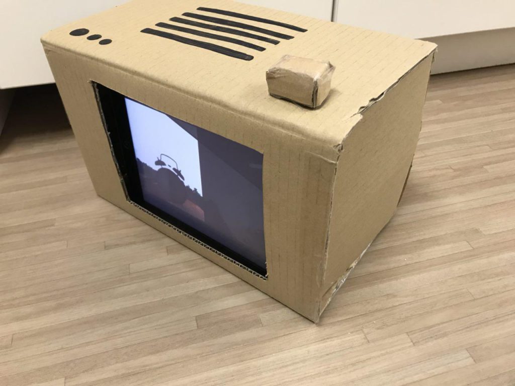
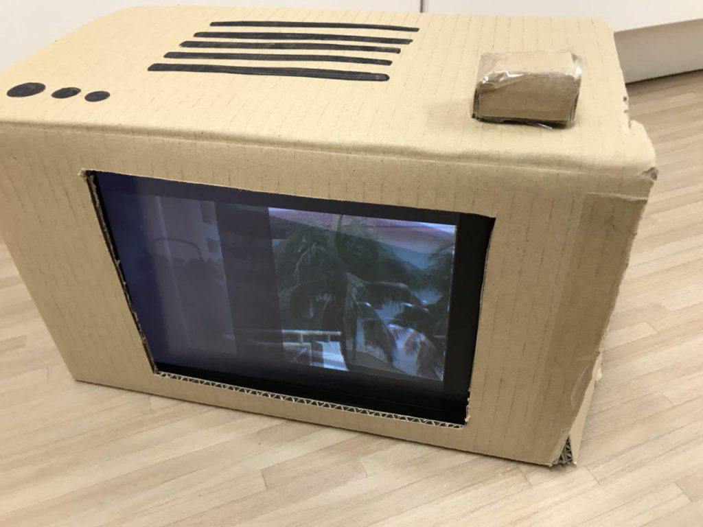
The left side of the Pictorial Clock shows day time (when the day is bright), while the right side shows night time (when the day is dark).

It can be viewed from any part of the video, since there is no start and end to time.

A three minutes interval is placed for every image, each image showing an hour difference. The Pictorial Clock is an example of edited time, since each hour is not 3 seconds long..

Edited Time is time that has been cut up and rearranged.

Actual Images Taken (raw images)

6am and 7pm

7am and 8pm        

8am and 9pm

9am and 10pm

10am and 11pm

11am and 12am

12pm and 1am

1pm and 2am

2pm and 3am

3pm and 4am

4pm and 5am

5pm and 6am

6pm and 7am

Some Pictures


Video of the presentation

Pictorial Clock

Video of the complied images

Project 3: Ego (Final)

Foreword

Before diving right in, view my process here! & my research here

As I was brainstorming for Project 3, I thought about the things that are often associated with me. (Daphne + (blank)).

First is Starbucks. I used to go there a lot to do my work and hang out with my friends. Besides, I even worked there about 6 months. I really enjoy the ambience of Starbucks and also had a lot of fun working there. Hence, naturally I included Starbucks and I into one of my equations.

Second is the sunset. I often witness the sunset (I take notice of it more than the sunrise) and even recently, after being in NTU for a few months. I realise my timetable has often cause me to leave school around 5.30 to 6pm, which is when I will often witness it, especially when it glares into my eyes. Because of that, I often take a snap of it and post it on my social media platforms. My close friends often comment about those sunset pictures and hence I used it as a subject matter for my second equation.

Third is Cupcorn!!!!!!!! I would say my favourite food/ snack is corn, especially corn in a cup. I often have it when I was super young and it did not stop until now. You can say I am obsessed with cup corn and I can have it anytime and anywhere. But I can be rather picky with them which means I will travel for good quality cupcorn too. (I really like the one at Nex, just saying)!! Hence, I used it for my third equation.

Fourth is music. I started learning the piano at a young age, and I have a sort of love-hate relationship with it. But I grew to like it more. Being exposed to music at a young age gave me a platform to express myself and learn things not everyone gets to (which I am also thankful for). Besides, I was in my school’s concert band and played the trumpet. I am familiar with brass instruments and got the chance to learn the instrument in depth after getting into an external band, which I dropped out of after a few months. But I would say the experience made me love the instrument more. Even recently, I started singing for a group of audience since I am in my hall’s jamband. Started singing in my bathroom, but now to a group of audience is a whole different story and it a testimony of me stepping out of my comfort zone. Hence, throughout the different phases of my life, I could see evidently how music has always been part of it, even in the smallest ways!

Okay enough of the ramblings!! Here are my final products.

Equation 1:

Composition 1: Exhaust
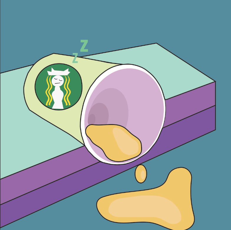
About: This composition uses personification and speaks about me, as the emptied cup, without Starbucks in my life. Hence, the cup looks like it was spilled and the contents are slowly emptied from the cup. Starbucks coffee has kept me up through my important nights and without it, I would not have a lot of stories to tell and a hideout place. Also, the Starbucks mermaid logo is illustrated as me in blonde, since Starbucks is often seen as a "white-girl" thing. (apart from the fact that my favourite colour is yellow)

Colour scheme: Triadic Colours. Green, violet & orange.
Composition 2: Advert
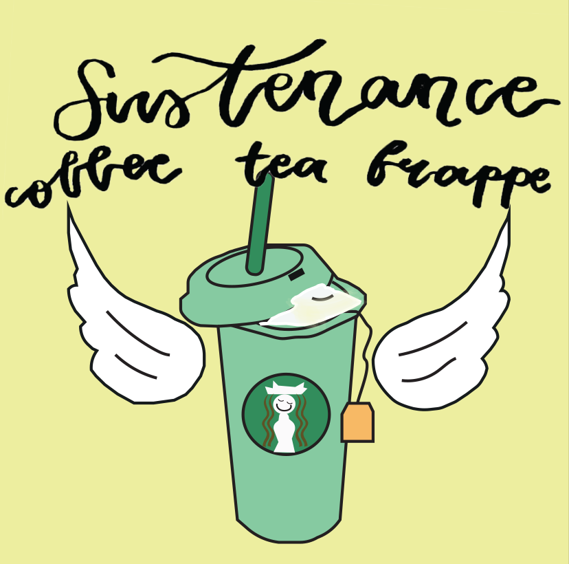
About: This composition speaks about how people would see Starbucks, since their marketing strategy is quite remarkable I would say. The wording says,"Sustenance. Coffee, tea, frappe", which are the different types of beverages Starbucks sells. The hot cup illustrates coffee, the whipped cream illustrates frappes and the tea bag illustrates tea, all in one cup. The wings added are inspired by redbull's catch phrase, "Redbull gives you wings", similarly to me, Starbucks gives me wings. 

Colour scheme: Analogous colours. Yellow-green, yellow and yellow-orange.
Composition 3: Conquer
About: This composition speaks about me + starbucks. Since I used to work there, I have my apron on me (the cup) and my name tag on, which is how it exactly look like. The apron looks like a superman cape because with Starbucks, I will feel like my own superman because I know I will be able to conquer whatever work I have and the fact that I survived working 6 months there. The bag of spilled beans is from an incident I went through while I was still working there. What happened was I needed to refill the coffee beans and ended up spilling them while on the job which was super embarrassing. Also, the beans are placed that way as if like a confetti for my mini celebration. Also, the beverage shown is green tea cream, my favourite drink from Starbucks, with extra whipped cream. 

Colour scheme: Analogous colours. Yellow-green, yellow and yellow-orange.

Equation 2:

Composition 1: (Sun)glasses
About: This composition is a quirky way of subverting the word "sunglasses". I gave it a literal meaning. This illustrates me masking and doing my own thing with the "sunglasses" on. I am seen as a blonde is as a continuation of my previous equation.

Colour Scheme: Triadic Colours. Red, yellow & blue.
Composition 2: Expectation

About: This composition is as it is named, expectation. This is how I would normally see sunset on the internet or social media. A sunset over a horizon, a very glorious sight. (to be continued)

Colour Scheme: Square Colours. Yellow, blue-green, violet and red-orange.
Composition 3: Reality
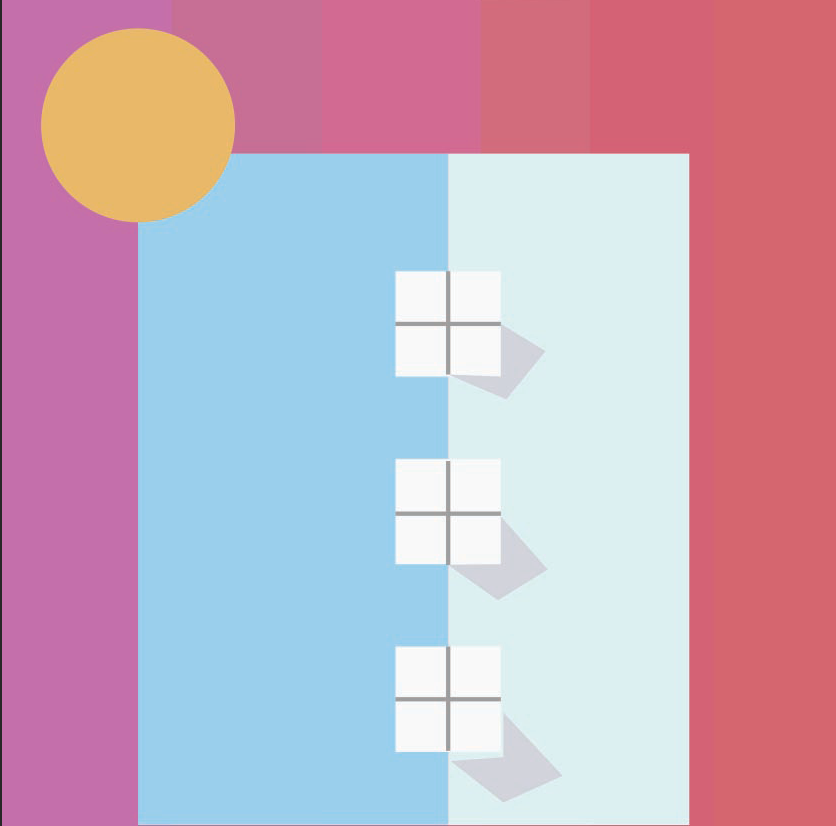
About: (continued) Yet, this is how I would usually witness sunset in NTU or around my neighbourhood. Sunset amongst the high-rise buildings of Singapore. 

Colour Scheme: Yellow-orange, red-violet & blue.

Process for Equation 3

Composition 1: Ma(i)ze

About: This composition illustrates me in a corn maize in the midst of all the corn cobs, searching for the right one for me, since I am picky about the corn I eat. 

Colour Scheme: Triadic Colours. Yellow, blue & red.
Composition 2: The One

About: This composition speaks about me (finally) picking out the right corn cob from the corn maize.

Colour Scheme: Split complementary. Yellow, red-violet and green.
Composition 3: Hunger

About: This composition speaks about me finally having the cup of corn after much work of searching and choosing the right corn. The backgrounds gives emphasis and focus to the cup of corn in my hand, like a celebratory shot *cue heavenly music* very much like that.

Colour Scheme: Split complementary. Yellow-orange, red-orange and blue.
Composition 1: Adapter Issues

About: This composition speaks about the current situation I am facing (still facing). Me losing my adapter for my ear-piece jack. I use the iPhone 7, which requires the adapter which I think is really redundant, yet stops me from me enjoying my music. 

Colour Scheme: Split complementary. Orange, yellow & blue-violet.
Composition 2: Mainstream Music


About: This composition speaks about just pure mainstream music, which you would normally hear from the radio. A retro radio was used because my first impression of music was from a very young age with my grandmother and she always carries a small old radio wherever she goes. Also, the circles added resembles beats that comes from the radio. It is positioned slightly off centre.

Colour Scheme: Split complementary. Red, yellow and blue.
Composition 3: Brand New

About: This composition speaks about music and I. All elements are my interactions with music. The old microphone is to have a continuity from the previous retro radio and shows my interaction with singing. The bell at the bottom illustrates my concert band days when I played the trumpet. The score overlayed at the background is a piano piece I am currently playing, Nocturne No. 20 in C Sharp Minor. The rose blossoming in the middle shows a brand new start I always have with music, learning different instruments and how it is always a part of my life. Also, it is inspired by a band called LANY that I recently love and they have a rose in the middle of their album which I thought is a nice touch to the composition and gives it a focus.
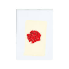
LANY Album

Colour Scheme: Complementary colours. Red & green


Afterword

I thought this project made me realize a bit more about myself, and be more self-aware of the things that are associated with me. Through this, I learnt about the different colour theories and throughout the project, I realized that I am attracted to yellow, blue and red and are commonly seen together in one composition.
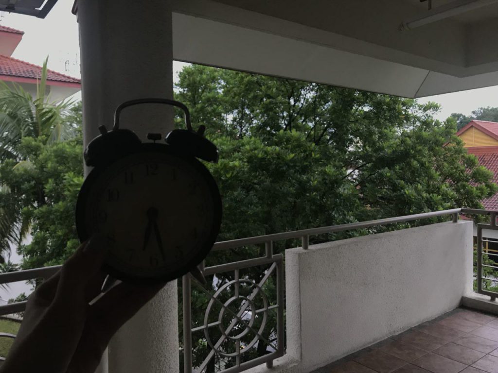
Apart from that, I also got to learn illustrating on the illustrator from my classmates which I used for my Starbucks equation using shapes and vectors. The rest were hand drawn and scanned in. The colours were also added on illustrator.

Overall, I like the pastel-ish feel my compositions have and looking at the final product, I can really tell that these are really things associated with me.