The City of Voids – Individual Moodbox

For the City of Voids, before we started doing up our final mood box and plug-in city, we were to work with the sounds we had created to build our own mood boxes! Here are the instrument we worked with!

Audio

Audacity Sound Snalysis

Frontal View

Inside(Analysis)

The Dominant -The yellow and white parts are the the resonating tone bars, and the white part is to capture the resonance and the ringing of the bars.

The sub-doninant -The pink parts, illustrating the woody sound of the claves.

The sub-ordinate – The blue triangles illustrates the finger cymbals.

The clear ringing sound of the resonating tone bars is depicted by the swirling of the metal wires across the model (yellow and white). The blocky beats of the claves are represented by the pieces of wood piece that are placed at the top of the structure (pink). The high pitch sound of the finger cymbals is shown through the tiny triangles on the walls of the structure(blue).

Video + WHY I DO WHAT I DO

After listening to the audio and the audio sounded magical, melancholic, zen, as if we are stepping into a new dimension, hence I added the element of secrecy and surprise by using the opening segment to my mood box.

The finger cymbals after every bar is a sub-ordinate, yet it has a wide presence in the audio, its high pitch and loud. It brought characteristic to the audio itself. Also, triangles are used to depict its high pitch, since a triangle has 3 sharp edges. Hence, to not shadow the SO, I added a tiny interactive touch to the finger cymbals.


Project 3: Impossibilities of Being

Sink-ing [(present participle) / verb: sink], the state of being in the sink. “i found myself sink-ing the other day, this was what happened..”

Wanna jump right into the video? FINAL VIDEO

//

Before diving right into the project, we were to list down places we have not been before and the toilet pipes were on my mind..

Thereafter, create a 1-minute film on how we would perceive the location.

So I decided to go along with a sink… since I thought recording the sounds of water will be interesting!!

taken from: https://pixabay.com/en/basin-sink-tap-drain-faucet-1114991

Here’s the video!

Perspective

Playing with perspective, I made the audience to be the in the first person view in the film. Shrinking them into a small creature who can fit into the scene, I added a tiny narrative along with it and a cliff hanger at the end of the film, where the audience can start to imagine what might happen to the tiny creature hiding in the sink.

Set-up Plan

Analyzing the Sounds

  • Synchronous Sounds: Heard at the same time as it is being produced The washing of hands, scrubbing of hands matches with the image of the video
  • Diegetic Sounds: any sounds emanating from the fictional world. The gasping, the panting of the character

    Sound Quality

  • Intensity

– the panting, loud to soft

– the gasping, sudden loudness, then dying down

  • Rhythm

-the panting and gasping.

  • Foley usage- The bubbling sounds, produced by blowing air into a cup of water
  • Multilayering- Putting two sets of sounds together, the reaction audio of the creature and the ambience audio.

StoryBoards:

Lo-Fi Storyboard:

Hi-Fi Storyboard (experimentation)

https://vimeo.com/241373522

password: daph0016

recording process

All sounds are recorded by me using the Zoom Recorder, adjusting it from 90 degrees to 120 degrees. 

This device is seriously good.

All audios are recorded separately, i.e walking into the toilet as an audio, washing hands as an audio, and then using iMovie to combine all audios together.

Since this project is more about the sounds we experiment with, I decided to record my ambience audio first, then record the visuals thereafter. Foley recording is recorded the last after the visuals and ambience audios are recorded to better match the entire film.

How was the visuals recorded

Visuals are recorded in a MTV style. The ambience audio was played at the background, and the washing of hands and the cliff hanger at the last part was simulated to match the audio itself.

How was the foley recorded

As aforementioned, the ambience audios and visuals are done up, I then continue to record the creature’s reaction in the sink.

It was difficult to keep it in sync (sink) with the rest of the clips. This was the hardest to record after the visuals. The first difficulty was deciding how I wanted my creature to react in the sink. The second was how am I going to record it and what sounds are appropriate?

While in thought, I was having a cup of drink and then I thought it will be a good idea to record me blowing bubbles into a cup of water. That was literally how I derived at using bubbles sounds to layer it with the ambience audios.

Conclusion

Overall, I enjoyed recording sounds for the first time, and discovering the different sounds that are produced in our environment which I rarely ever noticed before this project. The filming process was a lot of fun, and I have attached a photo below!

My friend, Vanetta, had to help me with the pouring of water and holding of the ladle as the sink.

I placed the camera in the box, tight with a ziplock bag and started the filming. Watching of hands was simulated, although you cannot see that clearly, but I wanted the audience to observe these small actions, especially when that is the main focus in the short film.

Also, I was very impressed by my classmates’ creation as a bulk of them used drawings and animations to portray their respective sounds. (which I did not expect) Besides, I got the chance to work with Brendan with his film, which was super fun and something out of my comfort zone.

In a nutshell, although the location the sink is  a tiny place that I can never visit, but coming up with the filming process and seeing the outcome is a very satisfying thing!

Don’t forget to view my in-class exercises here!

; FORREST GUMP: Fantasy Concretised

Final Product presented on 16 October 2017

Before going head-on in approaching the project, I did some research!

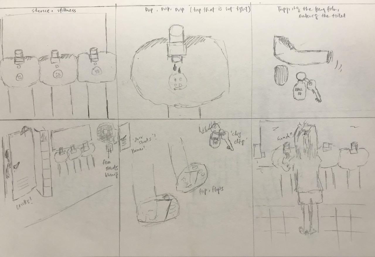
Also, view my work process here!

overall concept


“Fantasy”

The overall concept for Project 2: Forrest Gump is Fantasy. As part of the overall concept, I wanted for my designs to evoke afterthoughts to its viewers, further reflections or realisations.
Fantasy, using the imagination to bring forth something that might seem illogical at first glance, yet slowly concretise itself.

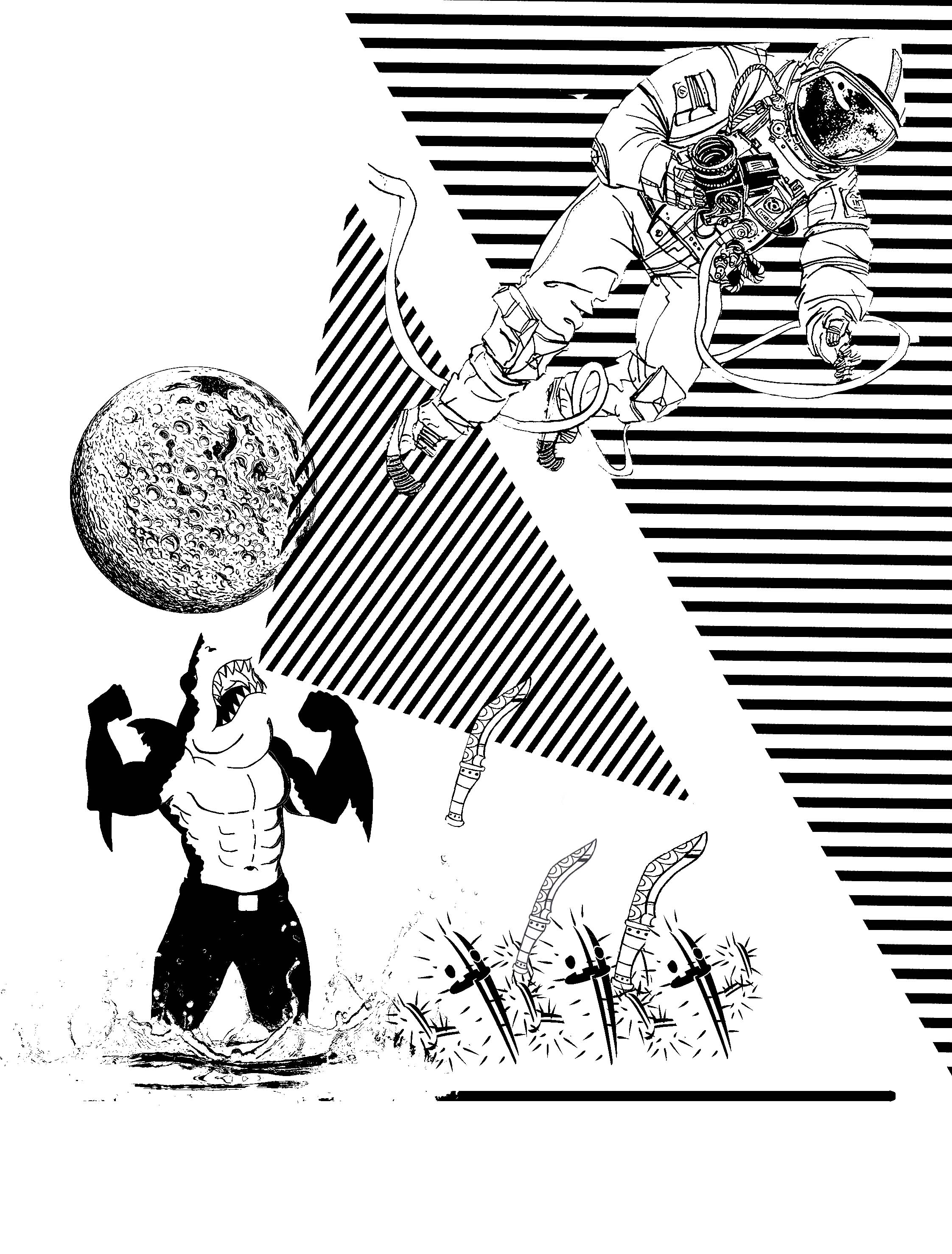
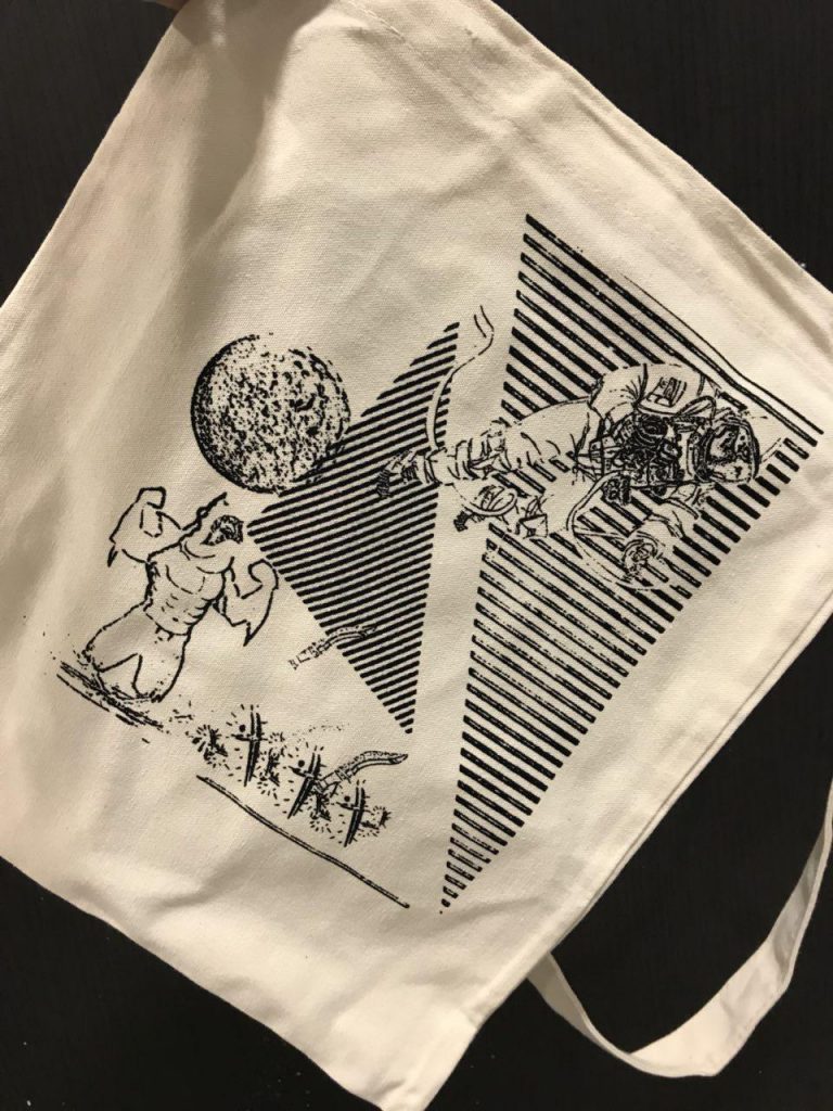
“When Life gets you down you know what you’ve gotta do? just keep swimming”–finding nemo 2009

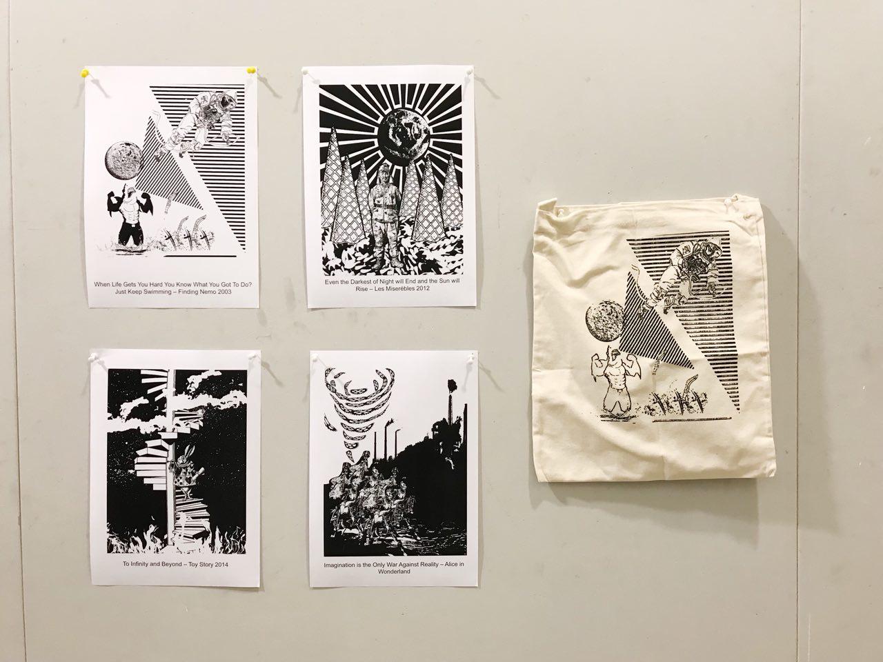
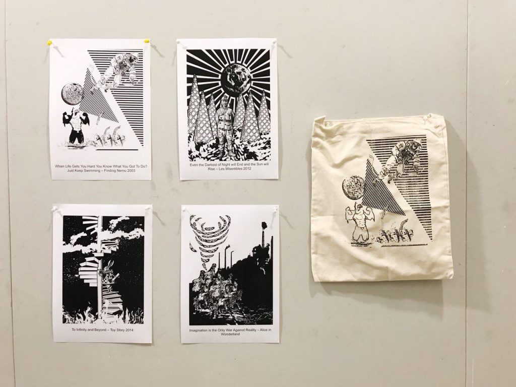
Final Product (As printed on a tote bag)

totebag; exposed & silkscreened in class

“When Life Gets Hard You Know What You Got To Do? Just Keep Swimming” — Finding Nemo 2009

Main Idea

The idea behind this piece is to bring out the irony in the way we face challenges in life.

The astronaut is moving away from the ground (the planet) and the apparent dangers around him – shark that is emerging out of the water in space, the running cacti that are holding onto knives.
Since the quote can be understood figuratively as well, I decided to move away from the verb in the quote — swimming, I switched it up a little by using something seemingly the opposite of swimming. Walking/ running seemed too uninteresting, hence I decided to switched up the context of the design and use the astronaut to bring the context out of earth, something we can fully understand. Yet, the apparent dangers that he is facing is relatable as well, literally.
Surrealism
Bringing in sea creatures, the shark, and the cacti out of context and combining them in the same context I thought is a way to play with the idea of surrealism as well. Also, playfully adding the shark and cacti that has human qualities also tapped on the overall concept of Fantasy.
Deeper meaning..
However, a plot twist to the design is that there is a crack on his mask that is stripping away his oxygen supply. The blurry lower half of his body depicts the shortening of his life due to the shortage of oxygen supply that he was not aware of. It aims to challenge the quote itself as to whether we should “just keep swimming” in face of obstacles, or should we first analyse the problem, then come up with an action plan.

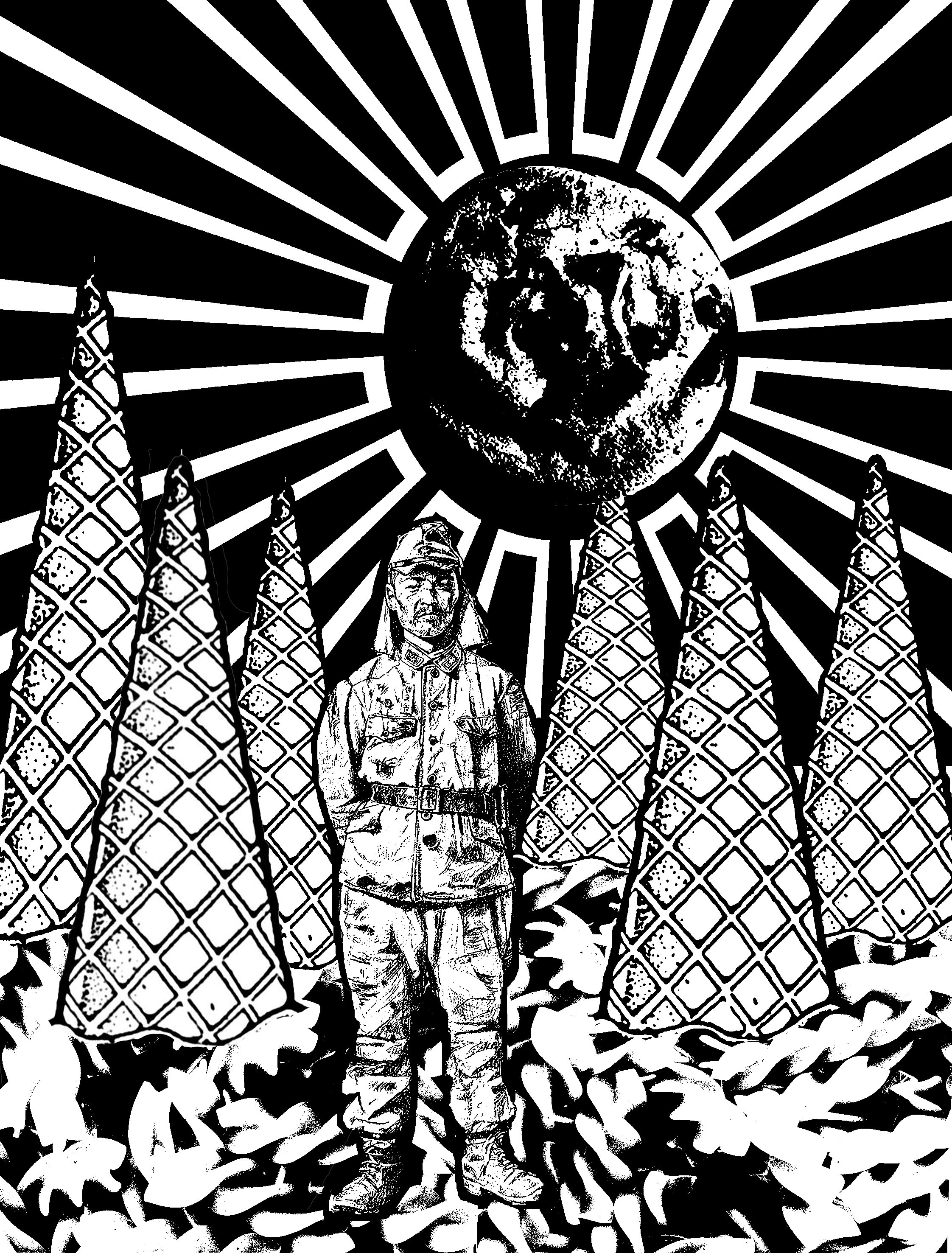
“Even the darkest night will end and the sun will rise” — Les Misérables

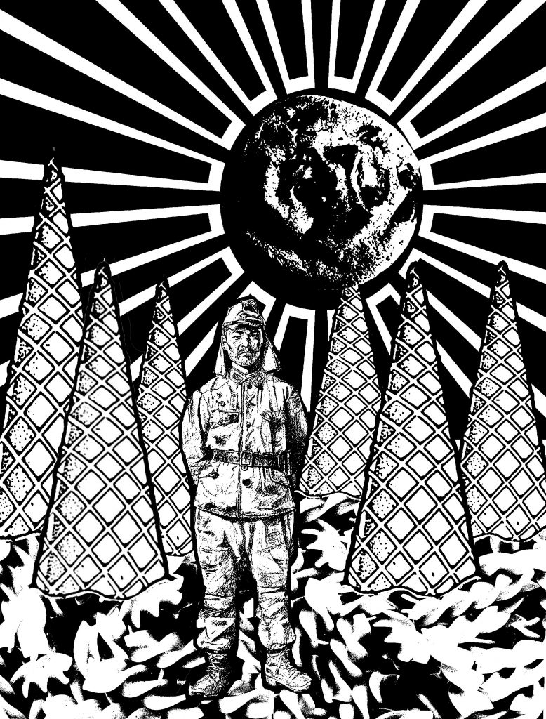
“Even the Darkest Night will End and the Sun will Rise” — Les Misérables 2012

Main Idea

This design is based off a true story about a World War II Japanese soldier, Hiroo Onoda, who was ordered to not just fight, but also to stay alive. He was assigned to fight in a forested area in Western Philippines. He escaped capture and stayed in the forest for 29 years even after the war ended. He survived through stealing food from the farmers or look for random food in the jungle. (View his full story here)

I had initially taken the quote very literally and after a consult, Joy told me about Onoda’s story. I thought this quote could resonate with how he was feeling while being trapped in the jungle and tie in well with his story as well.

Surrealism

Thereafter, I decided to tap on the phrase “You Are What You Eat” for this composition. By using food to depict the forest brings out the idea of Fantasy. Just like Onoda’s hunt for food everyday, unpredictable, I decided to use random food I can think of to add to the composition, as well as the size and shape of it.

Ice cream cones are used to depict the dense vegetation in the forest and the fusilli noodle depicts the forest bed, since fusilli pasta are always served flat on the plate.

Notice the Japanese flag at the background is used to relate the composition literally back to the quote itself. The off-centre placement of the flag is to capture the movement of the moon setting or the sun rising. I overlayed a cookie in the circle  of the flag to further blur out the interpretation of the background. Is it a Japanese flag, a sun rising, a moon setting? Or all of the above?

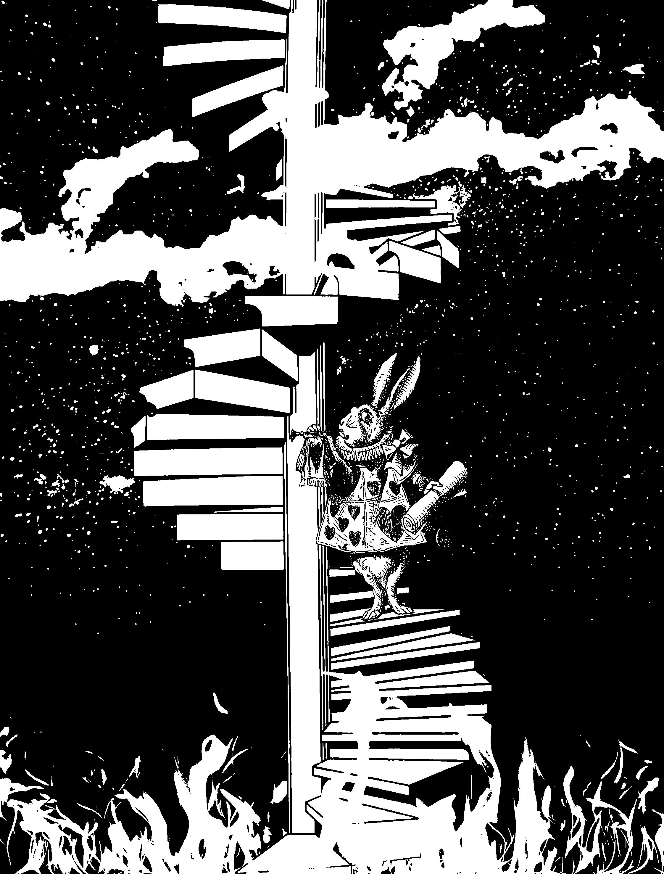
“TO INFINITY AND BEYOND” — tOY STORY 2011

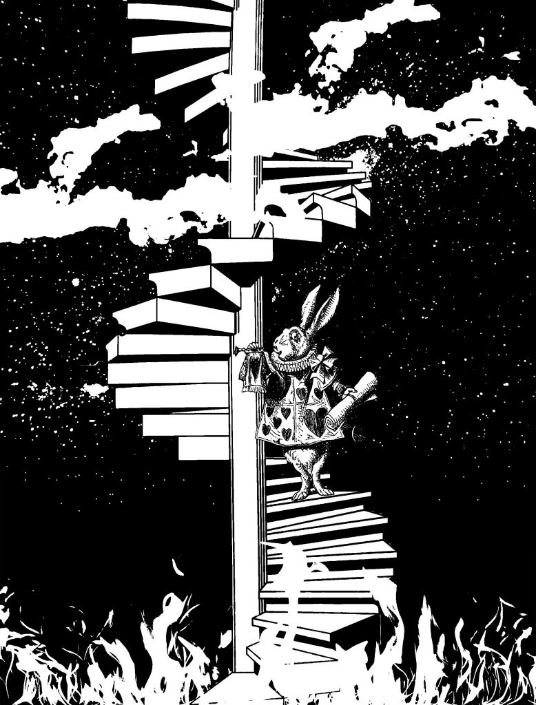
“To Infinity and Beyond” — Toys Story 2011

Main Idea

This piece challenges the idea of doing good or what is convenient.

The White Rabbit from Alice in Wonderland is incorporated into this composition to borrow his character to further help the audience understand this piece better, or resonate with them better.

The stairs that seems to be limitless brings out the idea of infinity in the quote. How I wanted to further work on the word “infinity” is to use the idea of Heaven and Hell, two extreme opposites.

This piece strive question its audience, do good or do what’s convenient?

Surrealism

The idea of heaven and hell cannot be represented, except by tapping on the common stereotypes that hell can be associated with extreme heat, and heaven with the sky. Hence, I tap on that as an apparent way of portraying both complete opposite elements in one composition.

In Alice in Wonderland, the White Rabbit is someone who is constantly afraid of offending people and he is often put in a dilemmatic position as to whether he should help Alice out in Wonderland and risk offending the Queen or leave the poor girl alone in a foreign place. Tapping on this character of his, I thought he will be a perfect subject matter for this composition as we talk about doing good or doing what is convenient. He could choose to help, and take a step closer to heaven, or be indifferent and take a step closer to hell.

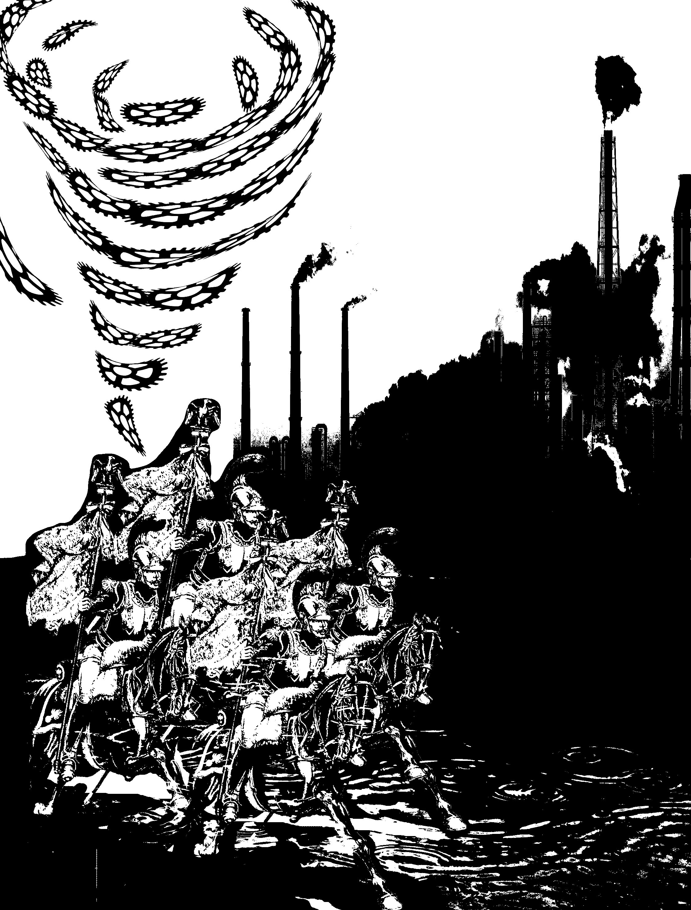
“imagination is the war against reality”– Alice in wonderland


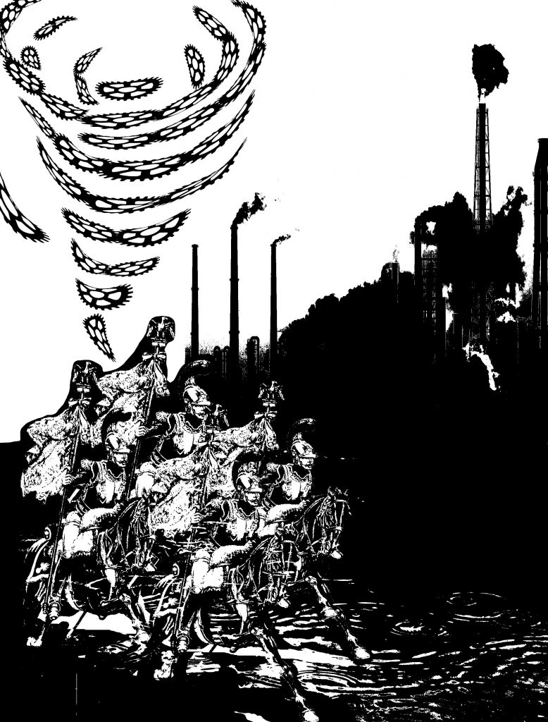
“Imagination is the War Against Reality” — Alice in Wonderland

Main Idea

As I approach this quote, I first brainstormed what the “war” of reality is? Global Warming and Climate Change then came into my mind (perhaps it is because I was a geography student? HAHA)

Playing with the past and the present, I portrayed comrades, used to fight war in ancient time, saving the reality today.

Surrealism

The comrades from ancient times coming to “save” today’s day might be more accurate than you think it is.

Deeper meaning…

They are riding on horses and not automobiles that we use today, eliminating the release of harmful gases to the atmosphere. Moreover, their military weapon does not consist of chemical weapons, guns or rifles, depicting a very manual mode of fighting the war of today.

Critique

final words

Overall, I approached this project afraid because I was very unfamiliar with the concept of surrealism and having to study and produce relevant works was a challenge for me. Even so, I really liked the idea of using movie quotes and then giving them our own taste to it! Also, although it was also my first time silkscreening, I thoroughly enjoyed it and despite the long and tedious process, it was one filled with anticipation as we go one step closer to printing our designs onto the tote bags.

Here is a full PDF of my final works!

; MY LINE IS EMO: The Phrases That Tells It All [Gallery]

Final Product presented on 4 September 2017

How I decided to approach this project is by first brainstorming about how each emotions resonates with me, and subsequently working with different mark-making techniques to fit the qualities of each emotions to bring out its entity. My brainstorming process can be viewed here. I decided to categorise the emotions according to positive and negative emotions.

Top to bottom:


1.love

Love, that spreads from one end to another

thought process:

Love spreads from one person to another. Be it from your family members or from the people around you, love spreads in an outward motion. Also, we love because we are first loved. The feeling of being loved is similar to having tiny explosions inside of you, the tiny butterflies you feel, the warm and hearty feeling. The organic and fluid shape created shows a gradual outward motion with hard-edges. As the shapes intertwine, it shows the actions 0f love transmitted from one to another.

methodology:

The first panel was created by putting large amounts of ink on the paper and then using a straw to blow the ink in an outward direction, not fearing that they will connect with each other.

2.happiness

Happiness, the high points in life

thought process:

Happiness are the high points in life. There are high points in life when there are low points in life, hence the flowy nature of the second panel created. Life can be seen just like what is created in the panel, much like a roller-coaster. The soft-edges seen are like the times when we are overwhelmed by the tough moments in life when we find it hard to find happiness in life. However, when we try to find happiness in life, we can always find them. This was created on a huge sheet of paper to recreate the large motion of being happy since it is associated with being free-styled and liberal.

methodology:

Using a brush to create large motion of swirls across a huge sheet of paper and cropping out the section that I wanted.

3.surprise

Surprise, the party poppers that make your heart race

thought process:

Surprise is interpreted as good surprise. Good kind of surprises are much like birthday surprises or farewell surprises. In parties, party poppers are very commonly seen, hence it is the main subject in the third panel. The motion of the creation of the third panel also brings out the surprise factor. As a semi-dry brush is jammed onto the paper to create the effect, it gives a sudden fast motion, describing the nature of a surprise. Also, the effect created very perfectly described intensity of shock across time. As time passes, the intensity of shock gradually decreases, therefore, as it goes further away from the middle, the ink lightens, bringing out the element of surprise. Initially, I thought the party popper effect was not clearly brought out, so I added tiny swirls across the paper to mimic the strings that come out of party poppers to add more essence to the panel, and I thought it worked quite well as I do not mistake them as fireworks or explosives.

methodology:

Dabbing semi-dry brush onto the paper, then creating swirls using the back of a brush.

4.anger

Anger, the build up

Anger would most of the time be an accumulation of different events that ultimately build up to the ultimate event of being angry. The gradient seen on the paper also describes the intensity of anger very well. When the limit is met and one is angry, the initial emotion will be fury and hence, it coincides with the darker regions on the panel. Across time, one will be cooled down and that will coincide with the lighter regions on the panel.

methodology:

The forth panel was created by putting ink on my mini toy car and running it across the paper to create the straight strips of ink.

5.sadness

Sadness, the tears we collect in a jar

The first thing that came to my mind when I think about sadness is tears and the act of crying. Also, we tend to be sad over things that are significant and intimate to us, hence the phrase “we collect in a jar”, since they are something we hold close to our hearts, we will keep them in a secret place.  Therefore, the fifth panel is made up of fluid, tears-liked figures mimic the tears that flow down your cheeks when you cry.

methodology:

This panel was created by running black ink down the paper, creating the dripping down effect and cropping the top section of the paper out.

6.horror

Horror, the bloodstains on the wall


taken from: http://www.widewalls.ch/andy-warhol-piss-paintings/


I was very inspired by Andy Warhol’s oxidation painting effect as I thought they give off a gory and scary feeling to its audience. It is as if we cannot fully make sense of what is in front of us, but we sort of know its something unpleasant. Working towards that direction, I experimented with a few methods by imprinting ink from different surfaces onto the paper. I worked with different kinds of plastic bags, and tiny ones usually for food storage and found out that I prefer the effect of a zip-lock bag much better due to its smooth texture. As if blood was smeared across the glass wall, the gory effect it gave really resembles that of horror movies I usually watch.

taken from: http://historiadelavidadeblaze.blogspot.sg/2015/07/t2-carmesi.html


methodology:

Putting large amount of ink on a zip-lock bag and transferring the ink onto paper and cropping the parts out.

———————————————————-

Critique:

I like the directional element to the work, how the work can be categorised as horizontal, vertical, etc. It brings out a strong visual unity…

I came to realise that how I had categorised my emotions gave a “directional element” to the entire project. Like how anger contrasted with sadness, which then contrasted each emotions even more. I thought that was a good observation by my classmate that I had unintentionally displayed in my work.

I like your idea of using quotes!

As I approached this project, I thought emotions can be hard to express sometimes, hence the word “mixed-feelings”. Truth is sometimes we cannot comprehend or understand how we feel in a certain occasion or event. I thought the quotes really put things into a certain context or situation which can bring out the idea of each emotions even more, enhancing the understanding of each emotion further.


Conclusion:

Overall, I really enjoyed creating each emotions because they truly resonated well with me. Also, looking at how my friends created their prints was really interesting as well as I have classmates who experimented with oil and also capturing the contact print of a ball hitting the ground and et cetera. Even so, I enjoyed experimenting with different objects that I can find at home to create these prints as a final product and am overall encouraged by my lecturer, Joy, and my classmates’ comments and feedbacks for project 1. Although I would have hoped to be riskier with the objects I used, but never really got to try. Despite that, I thought this has been a great opportunity for me as during the process, I constantly found myself on a look out for objects with interesting texture and how I can use them for mark-making. As we close this project, I hope to further try out different mark-making techniques and hope to work with the linoleum and the pressing machine in future!