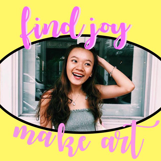

There are 7 posts tagged graphic design (this is page 1 of 1).


In Locale assignment 2, we are to visit a neighbourhood and create our very own zine!!!!
A “zine” is a self-published, non-commercial, independent publication, a DIY magazine-like thing.
Because you do it yourself it can be pretty much anything you want it to be, favorite bands, personal stories, subcultures, or collections (that’s the joy of zines!).(*screams* really excited) To embark on an exploration around a local neighbourhood! Find out what makes the neighbourhood unique and what are some of the interesting features in the area. The aim is also to develop one’s investigative research skills and present information in a visually engaging manner. To introduce inspiration and serendipity into creative development. To explore experimental formats and understand alternative layouts and grid formats. To learn more about binding methods and ways of putting together a self-made digital publication.
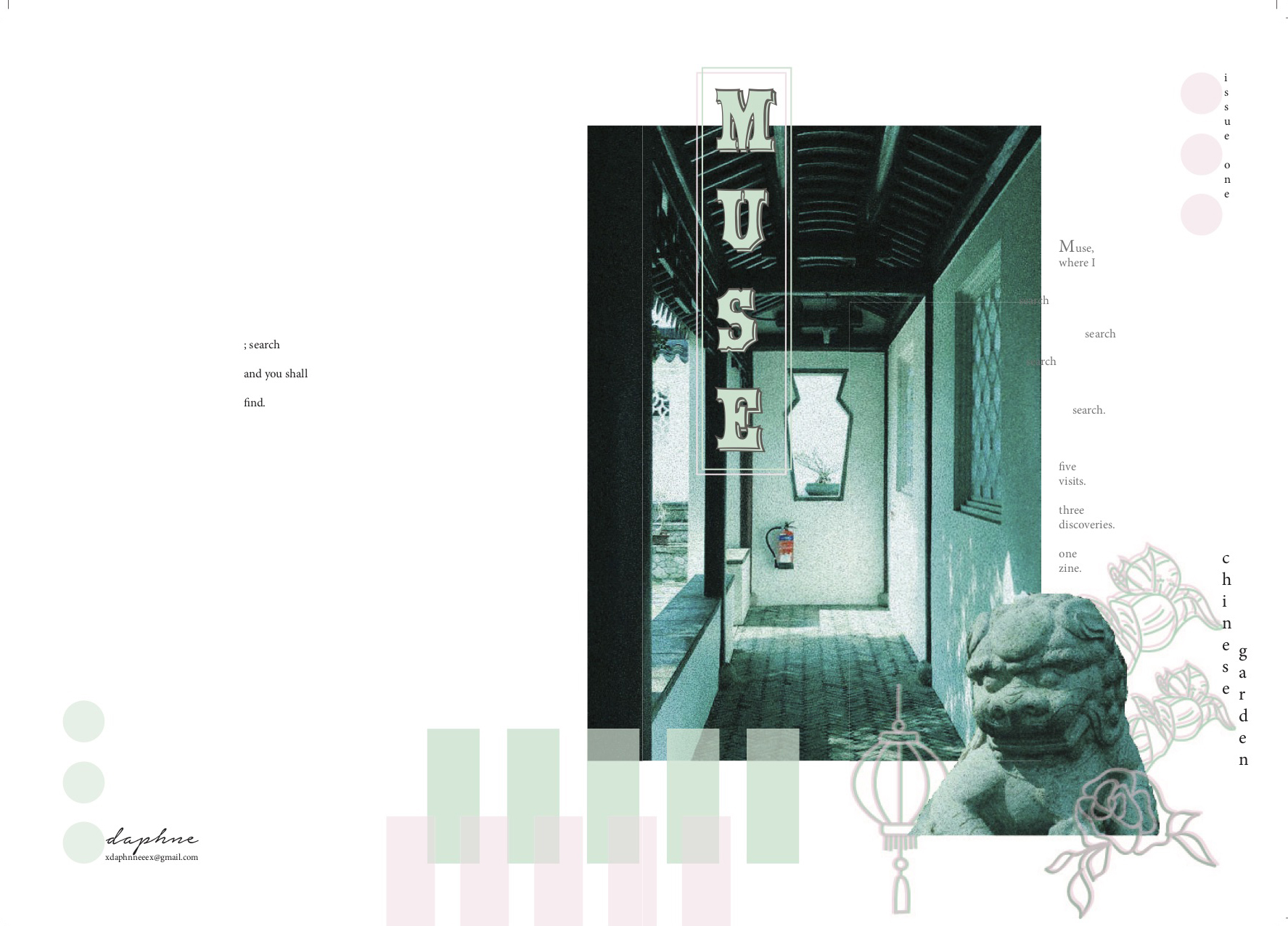
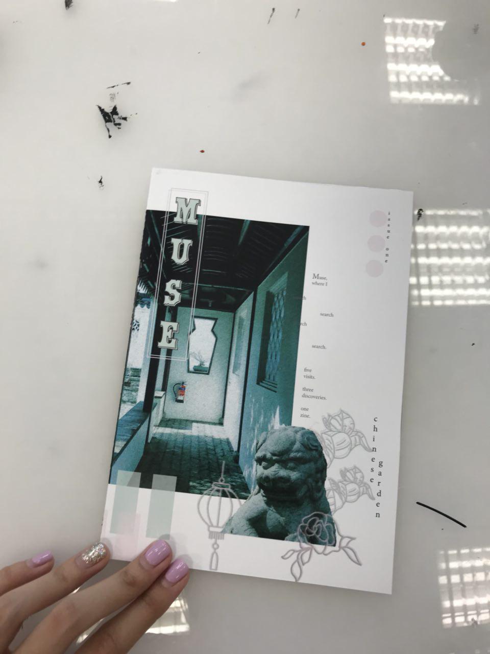
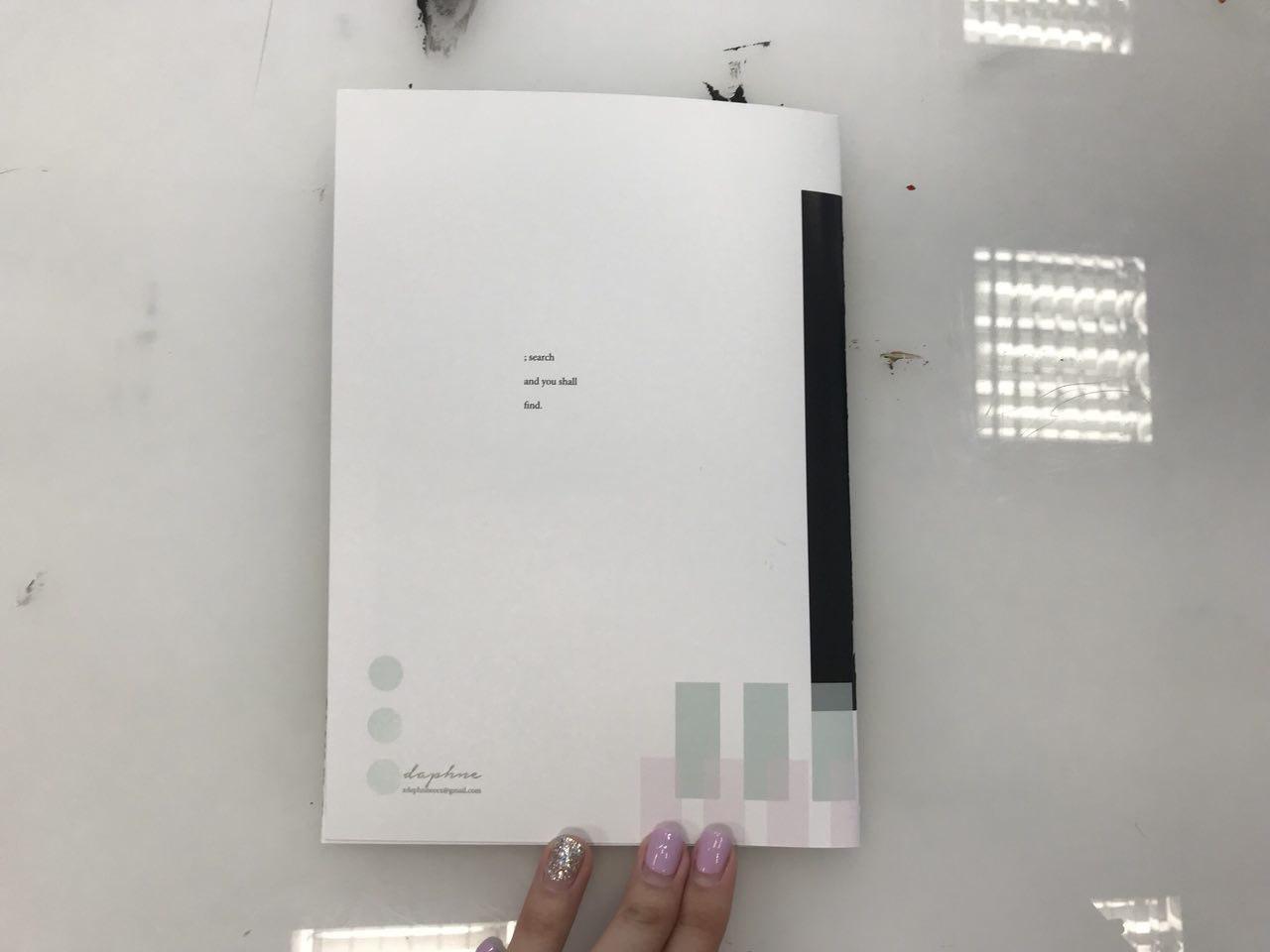
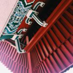
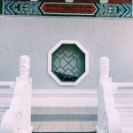
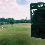
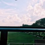
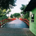
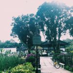
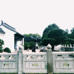
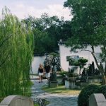
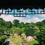
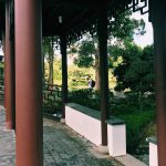
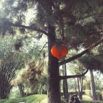
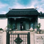
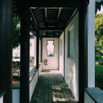
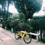
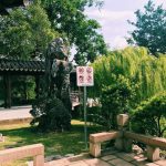
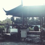
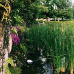
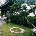
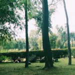
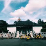
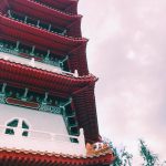
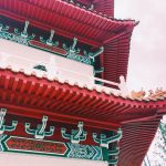
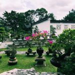
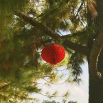
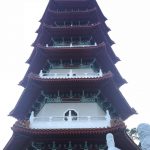
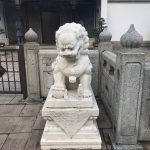
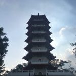
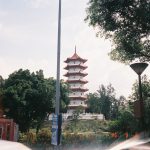
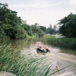
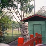
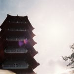
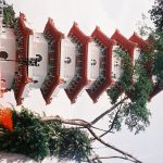
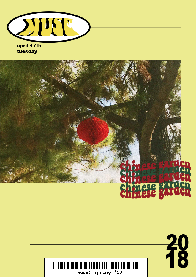
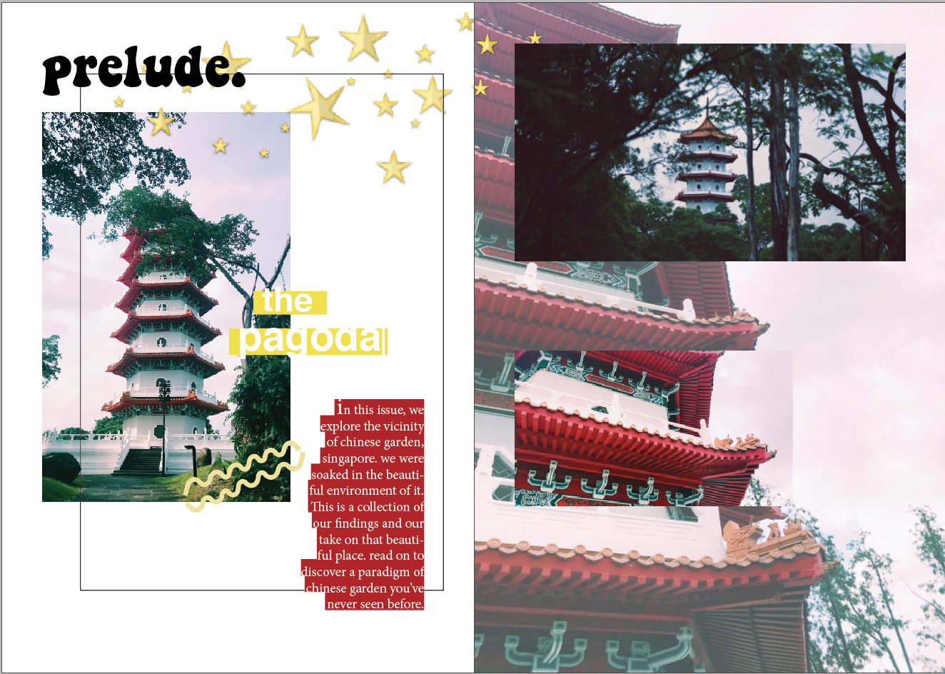
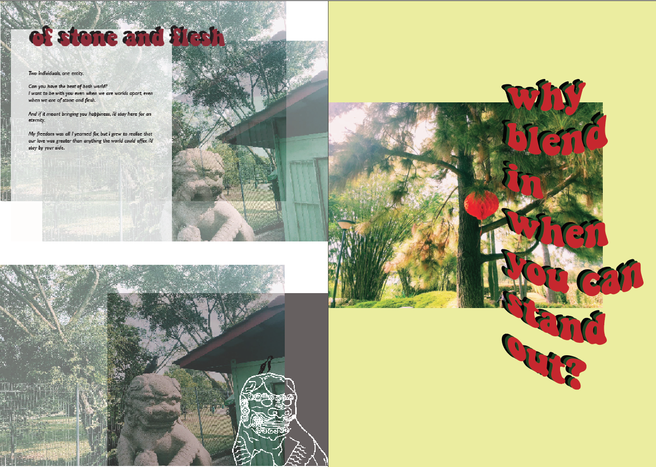
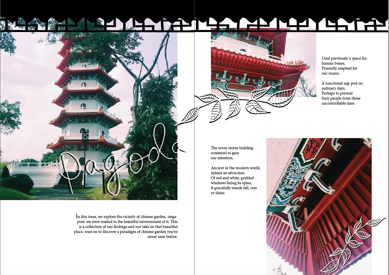
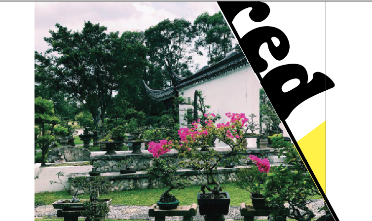
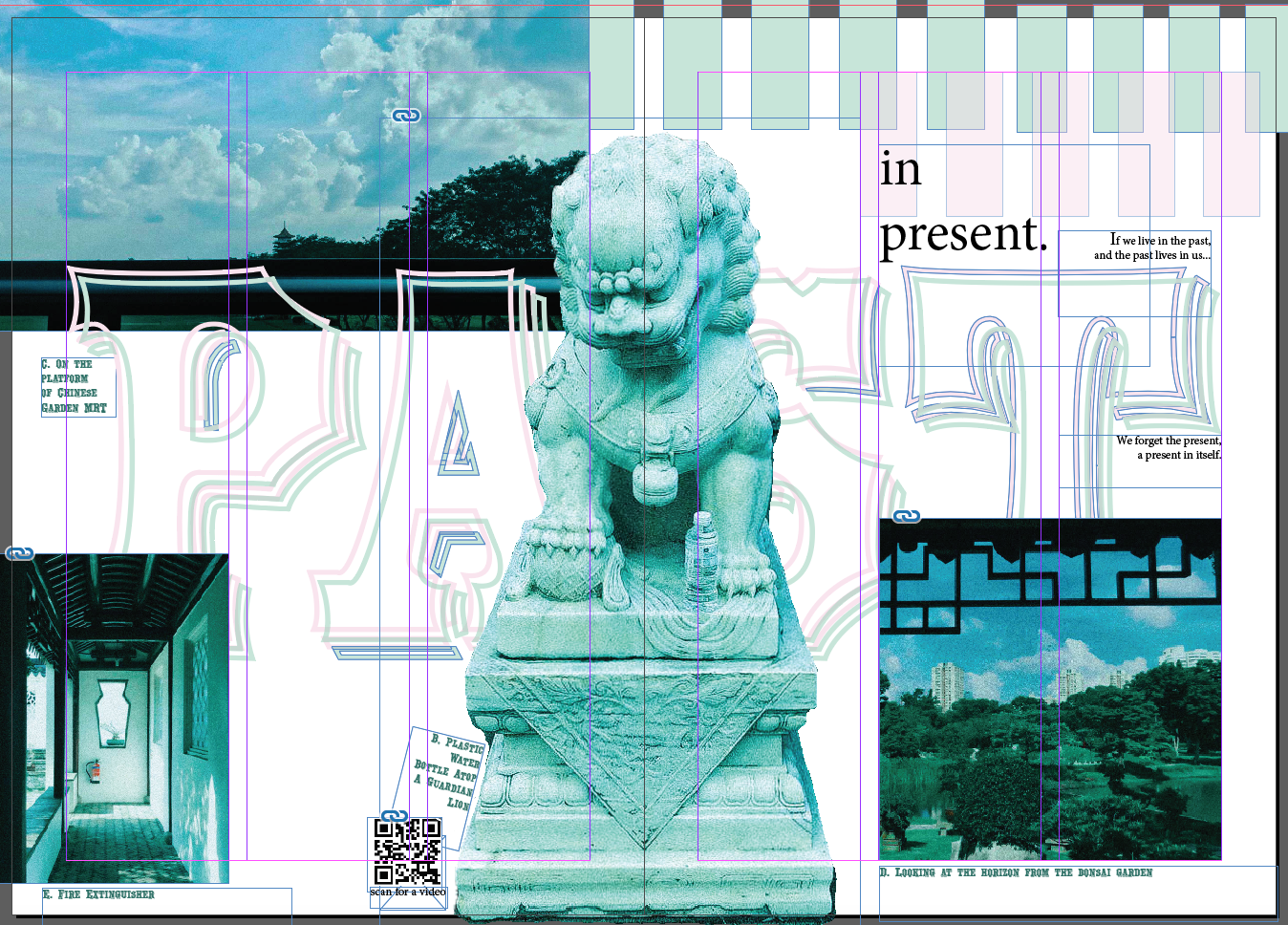
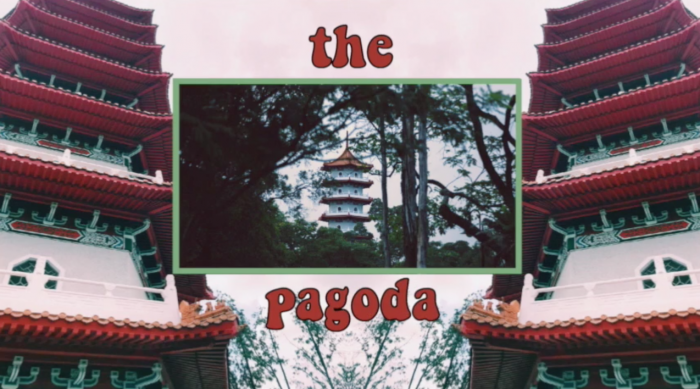
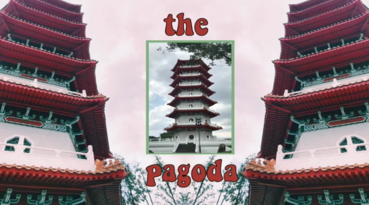
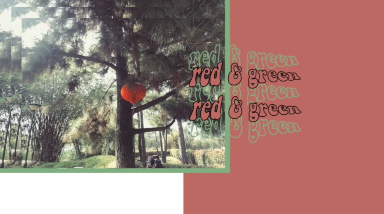
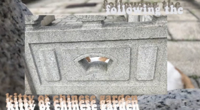
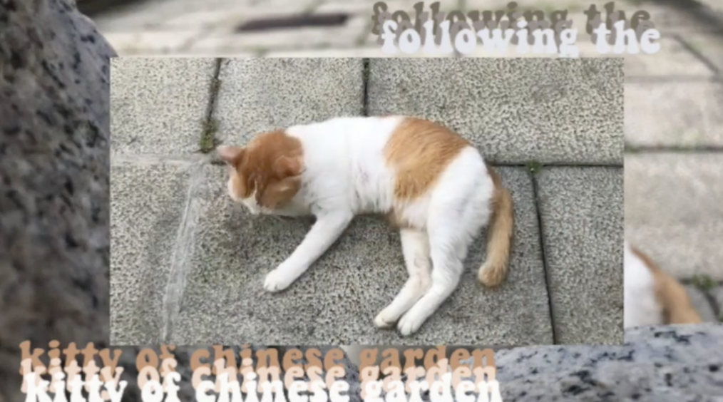
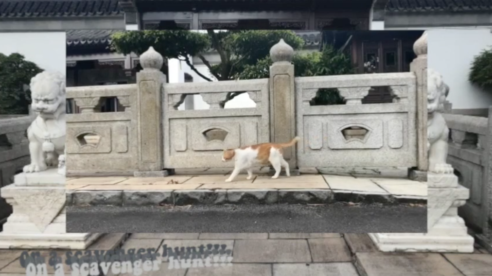
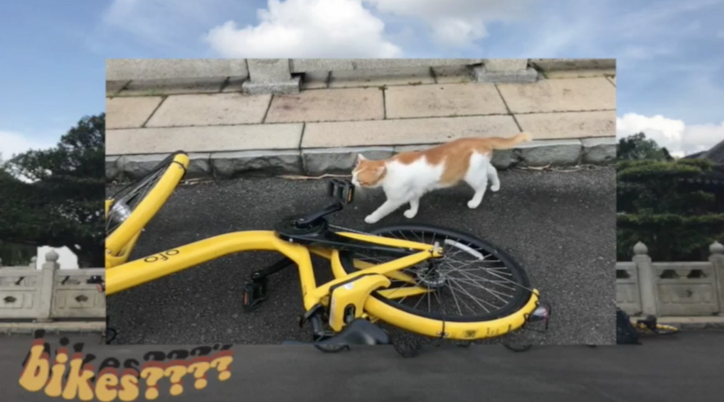
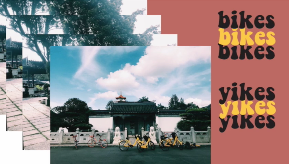
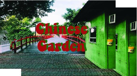
After exploring and discovering Chinese Garden (as seen in Locale Part I), the concept behind my zine is highlighting the contrast of Chinese Garden in a much subtle way through short proses, and photographs that might highlight each type of contrast in each spread.
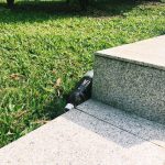
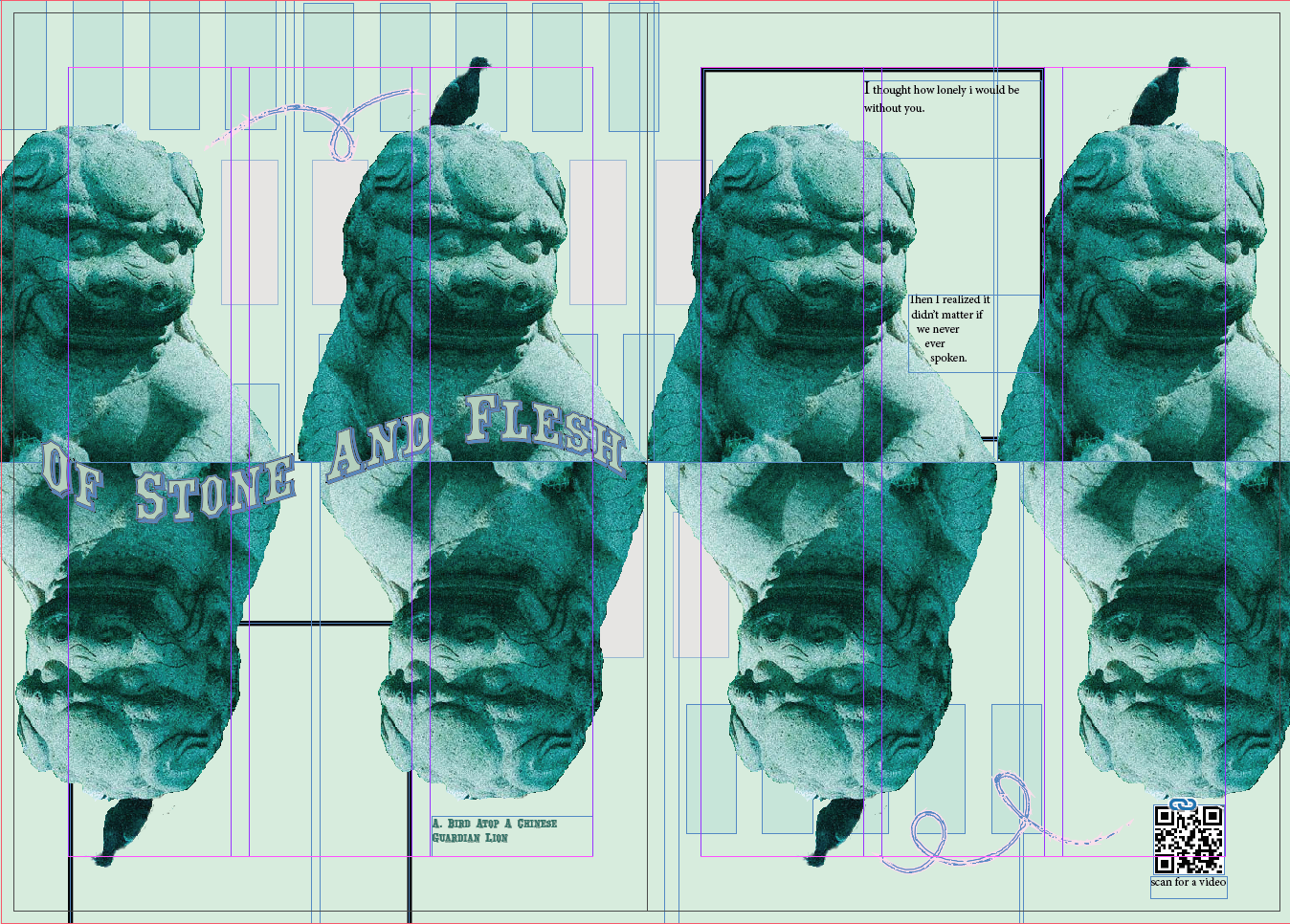
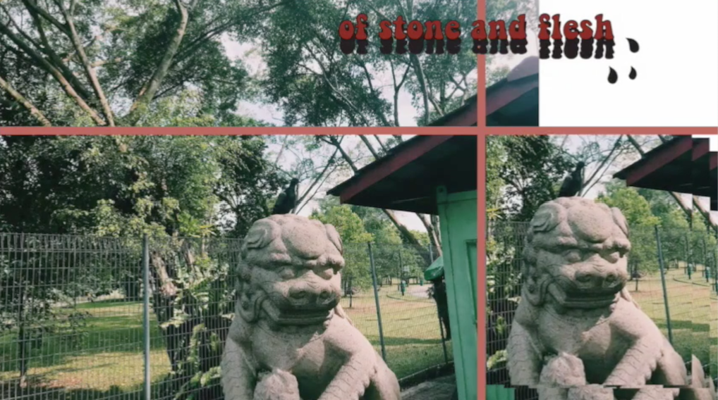
1st Spread: Highlighting the contrast of the living and non-living “animals”.
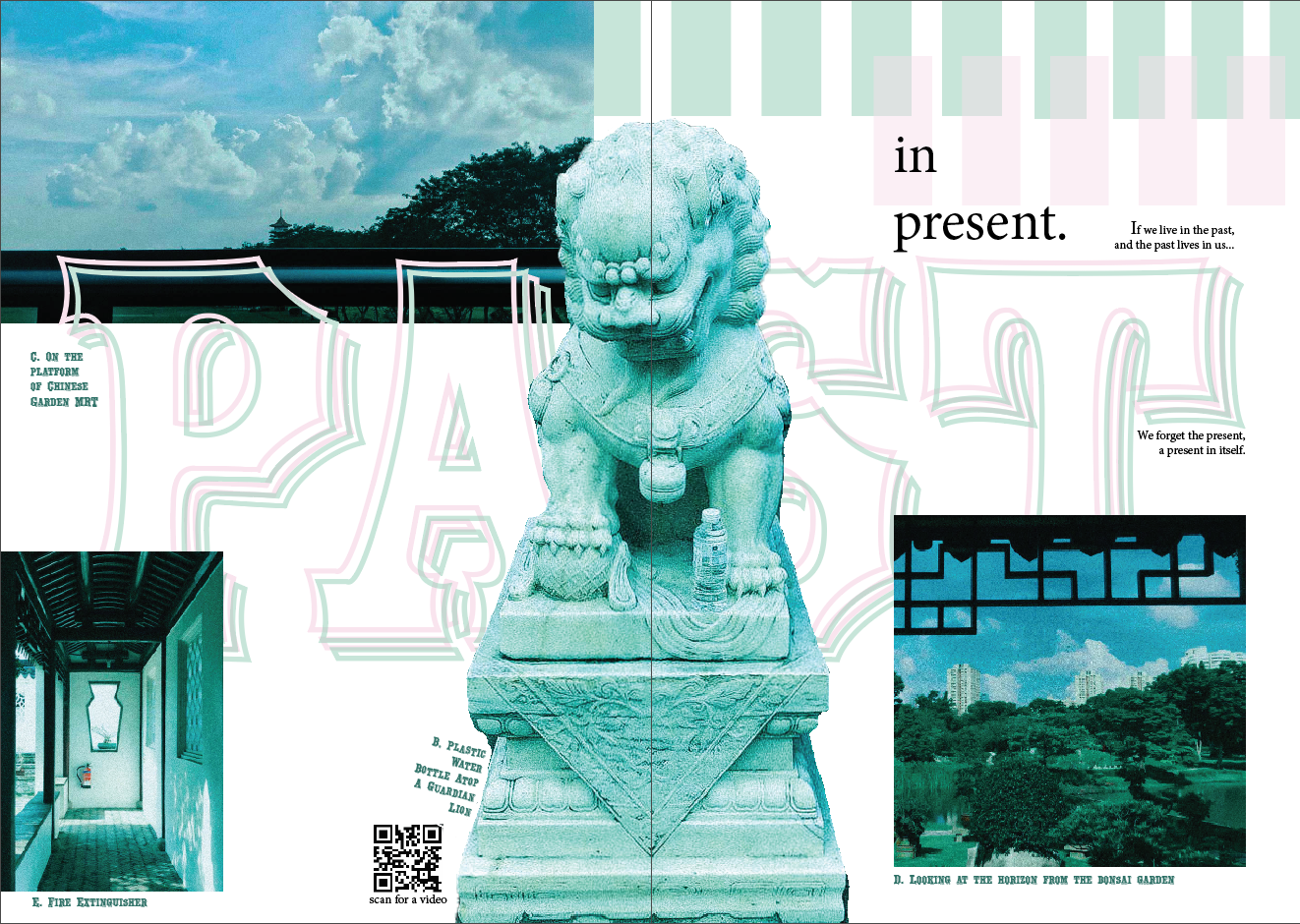
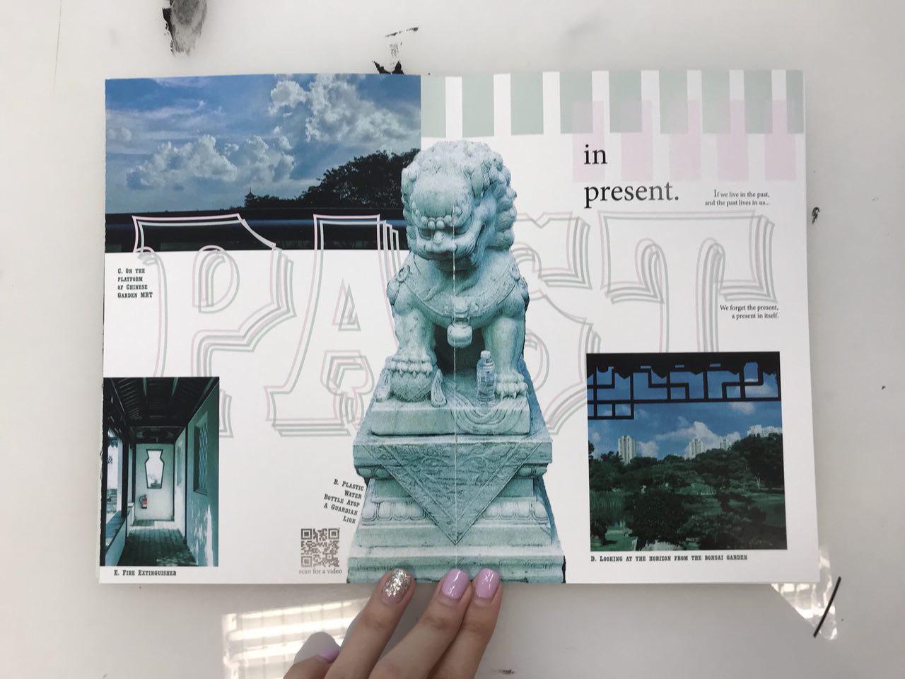
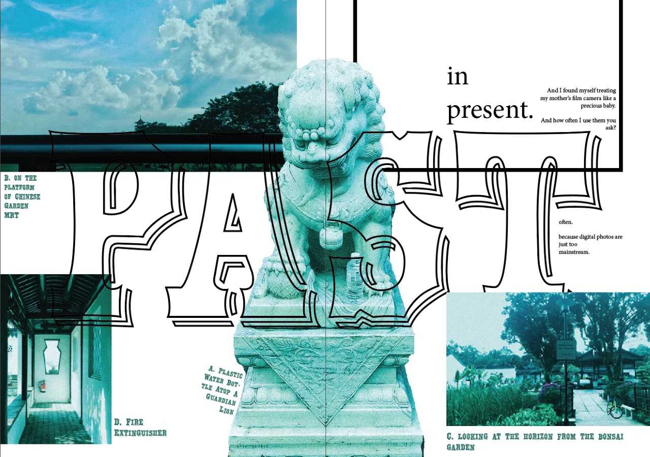
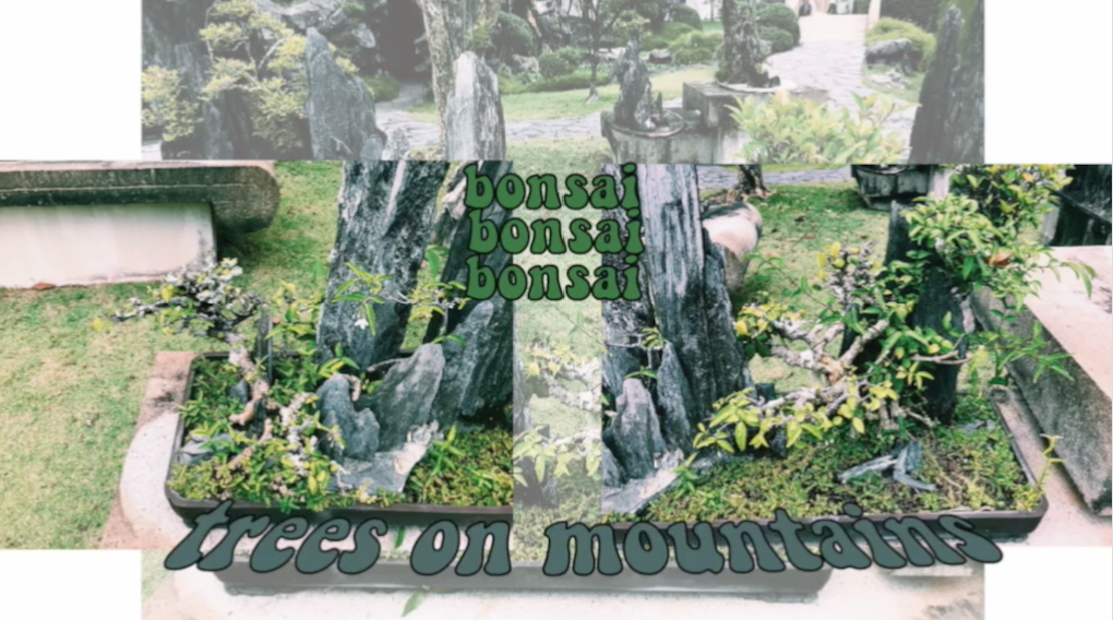
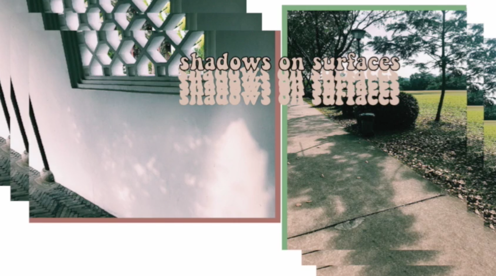
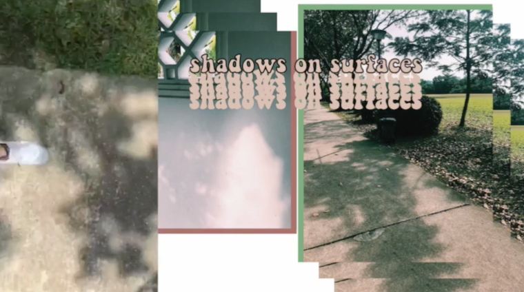
2nd Spread: Highlighting the past and present objects, architecture that we can observe.
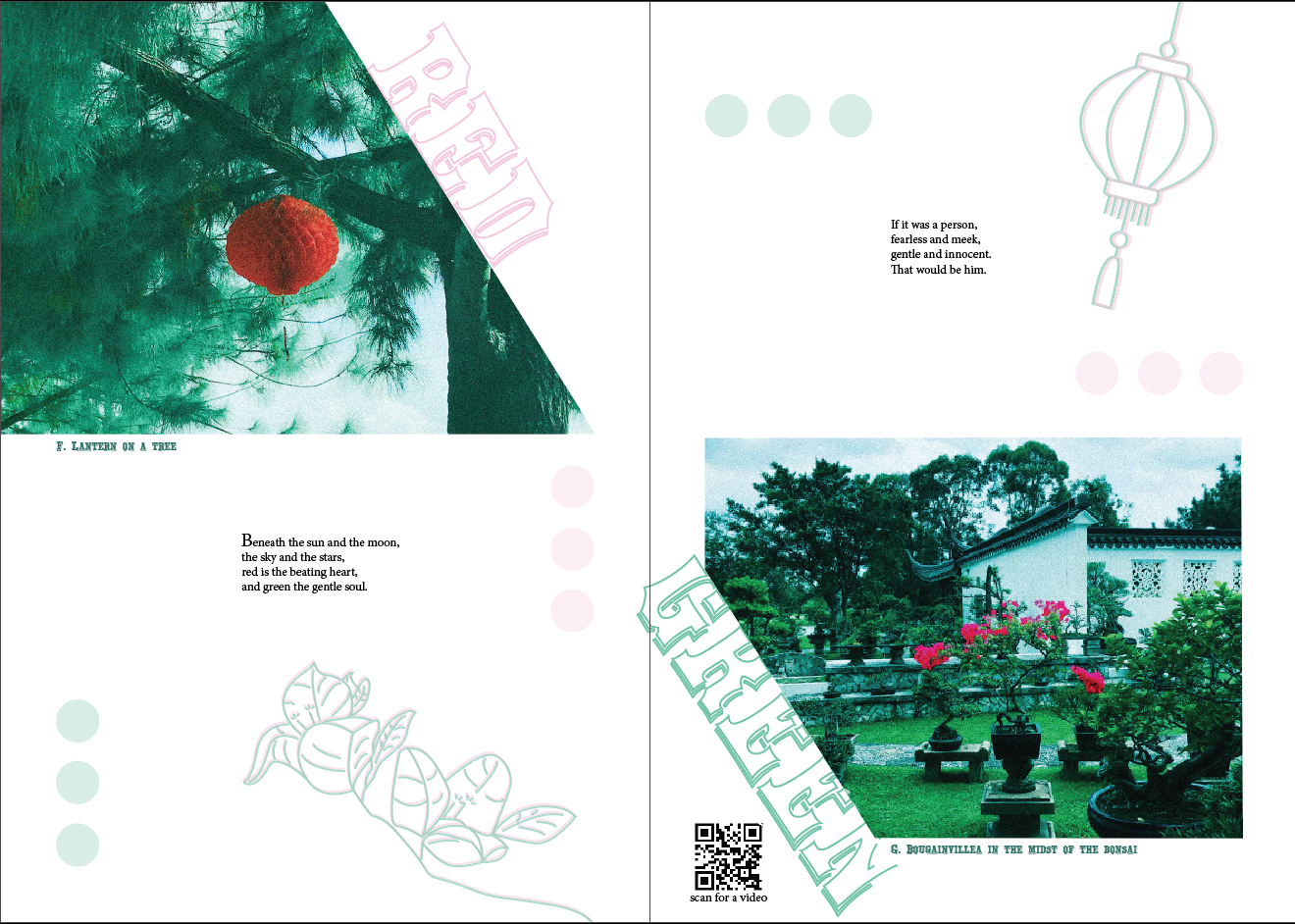
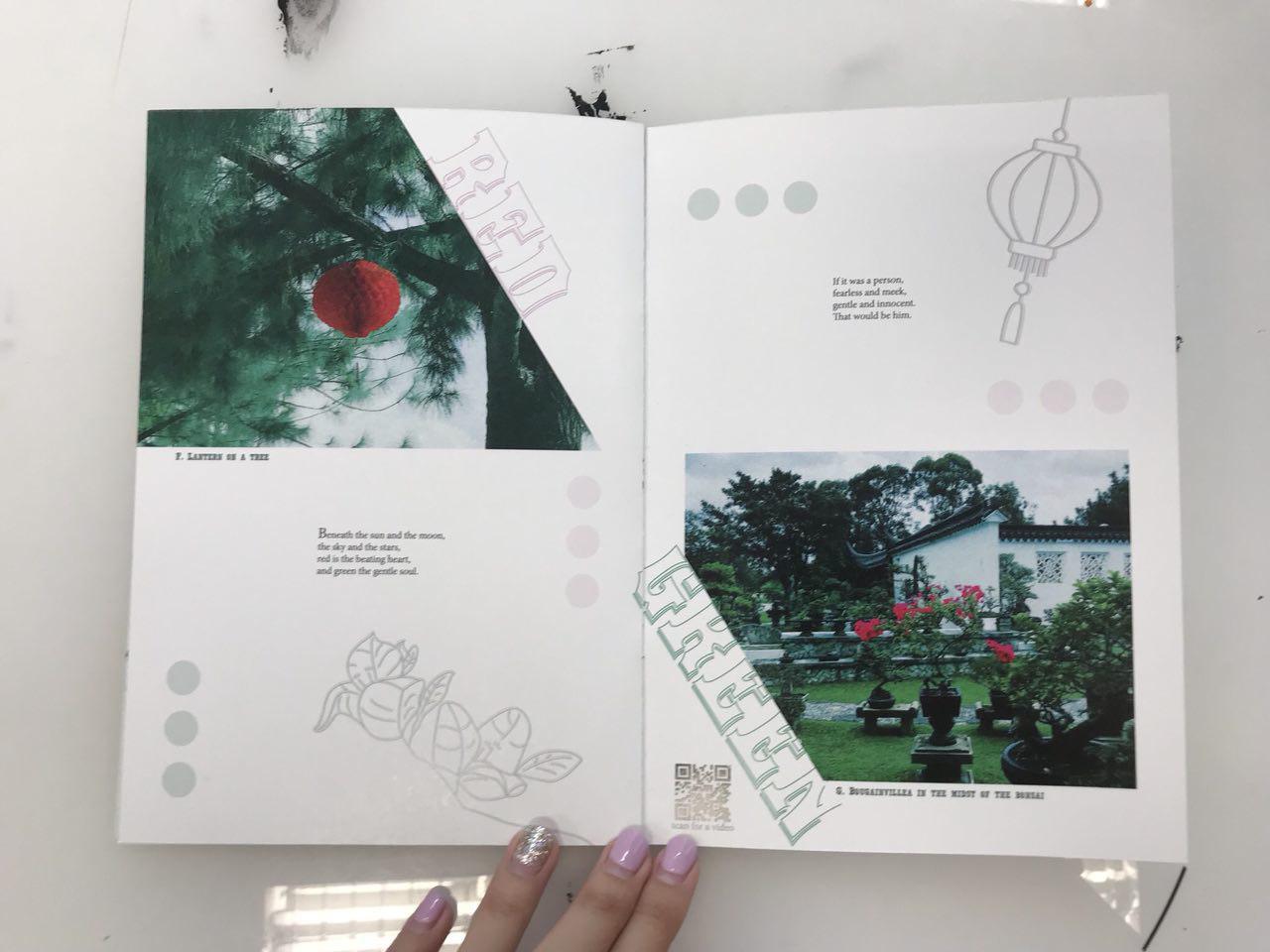
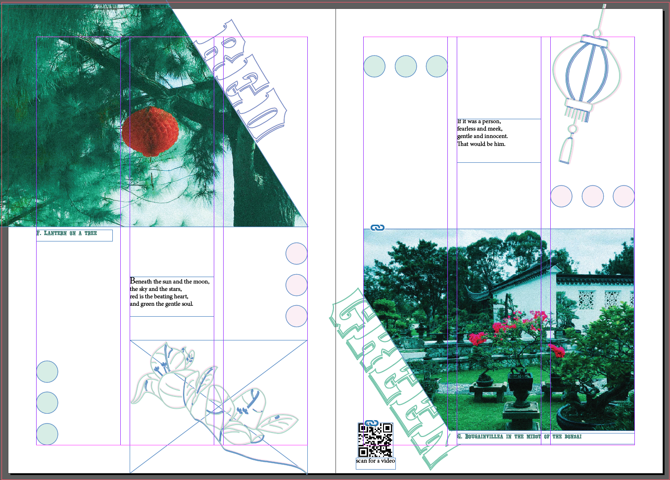
3rd Spread: Highlighting the complementary colour scheme of red and green.
from my iPhone 7 and camera


images from pinterest
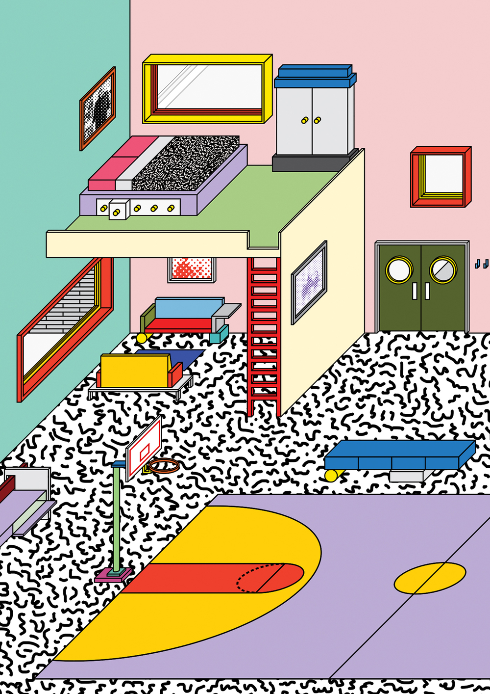
I looked through Pinterest many times and collated a few images or covers and layouts that I really like and the colour scheme that I am going for (green, blue, red).
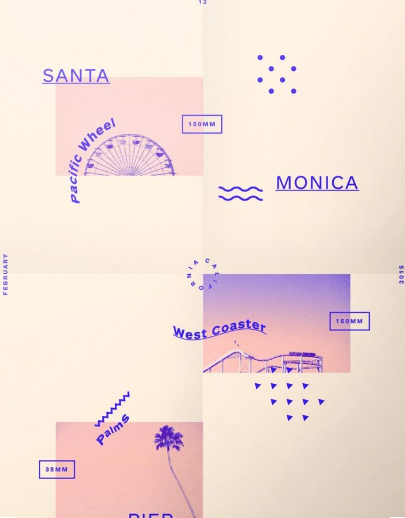
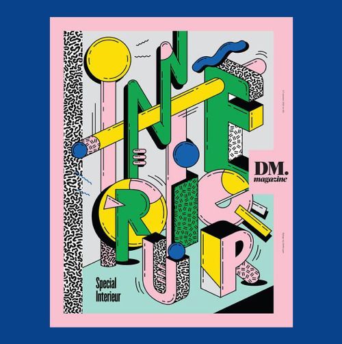
taken from: http://ceoul.tumblr.com/post/124438211816/gridologie-just-finished-this-one-santa-monica
I particularly like the memphis texture that the artist has included to the white spaces, yet giving it enough breathing spaces for the reader.
I like the adventurous approach to the texts. The warp effect gave it a sense of flow and rhythm to the otherwise static page.
Enjoy the colour consistency throughout the page. Analogous colour of pinkish tone and purple makes this page really soothing to read.
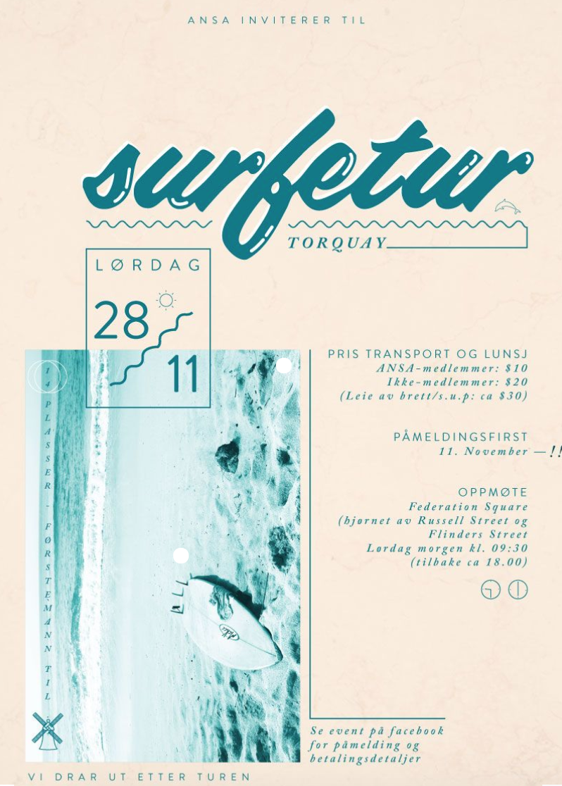
taken from: https://78.media.tumblr.com/tumblr_mcusdfv0tG1qctmo8o1_1280.jpg
There is a sense of hierarchy in this page. The biggest is the picture of the shore, then the headline “surfetur” then the smallest is the rectangular box “LORDAG 28/11”.
Complementary colours used (blue and orange).
Used the squiggly to create a sense of texture.

taken from: https://i.pinimg.com/originals/1d/6a/af/1d6aafef758f12c866fbfc00b2f96266.jpg
I like how there is a conversation between the hands at the top and bottom of the page.
The collage of small elements gave the page a little three-dimensional effect.
Texture
The lightning bolt and the star gave the page a quirky texture, something of strong statement and gave interest to the page aside from texts and images.
There is balance in both sides of the page. Although it is heavily highlighted by the black borders, the right side is balanced out by the busy elements going on on the left. The orange texts and the eye on the picture on the right creates another minor visual balance, everything else is muted in colour (black, white, light beige)
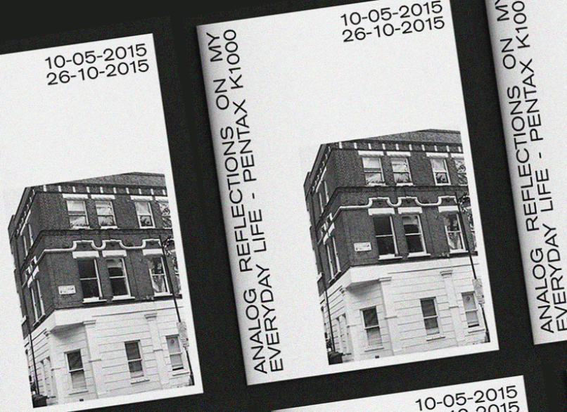
taken from: https://www.behance.net/gallery/53249095/Analog-Reflections
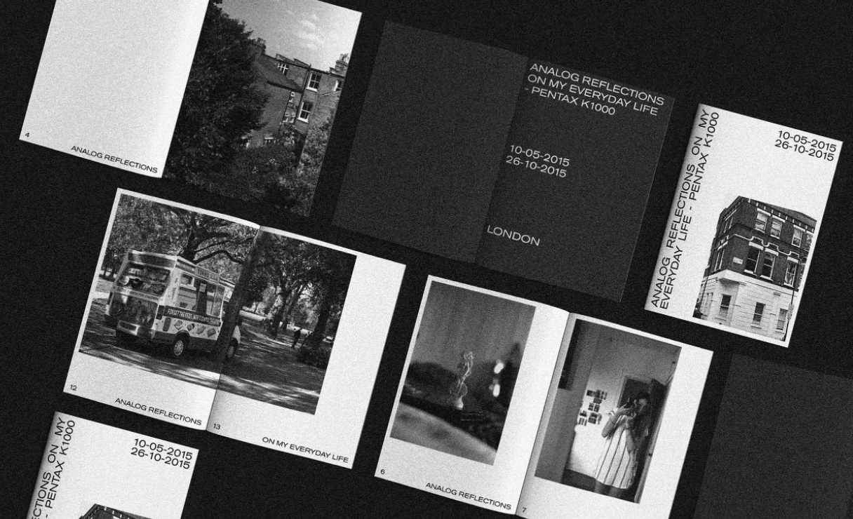
taken from: https://www.behance.net/gallery/53249095/Analog-Reflections
Really like the entire vibe of the zine, minimal, few texts and the pictures speak the message.
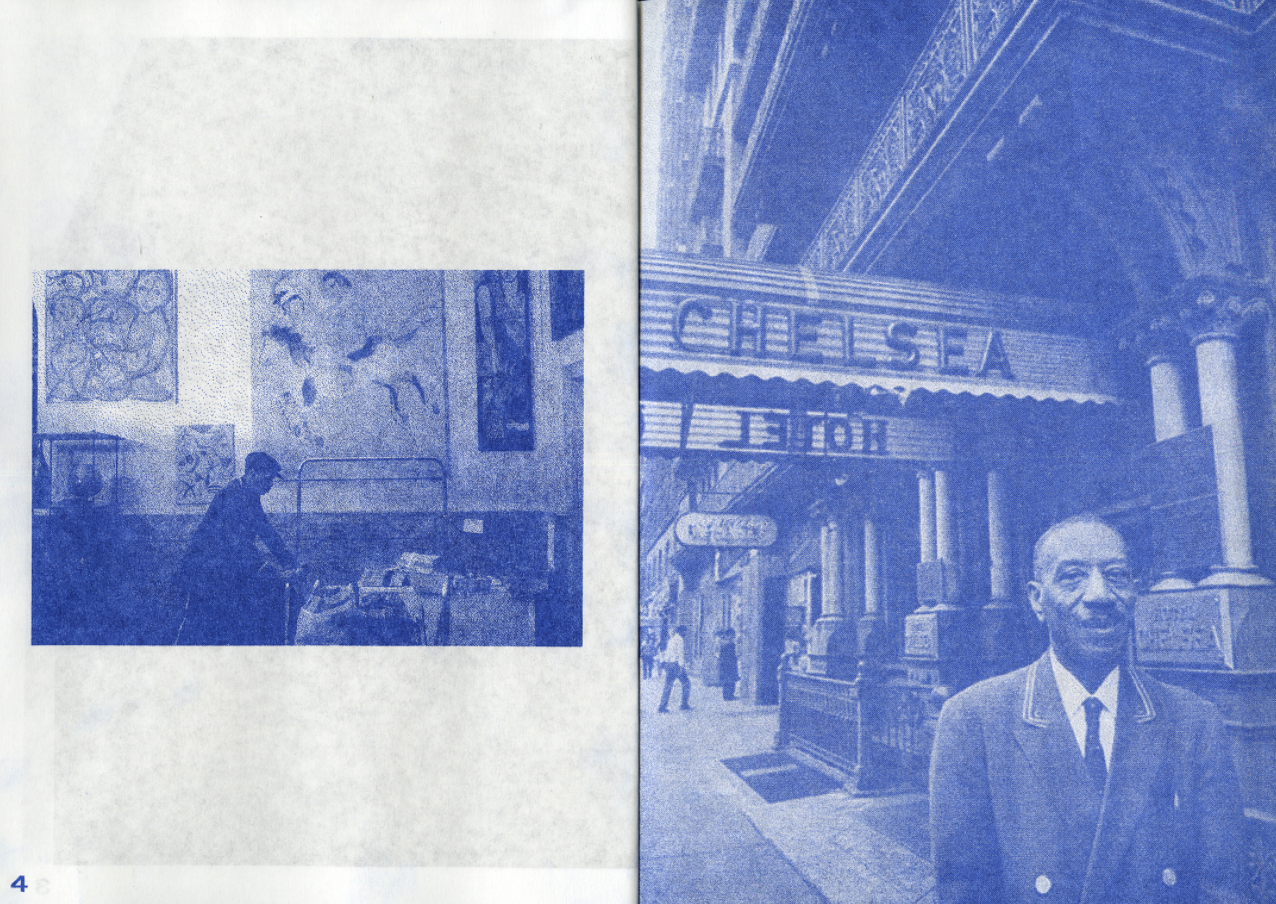
taken from: https://www.behance.net/gallery/58335321/The-Chelsea-Hotel-zine
Like the photos edited, very uniform throughout this zine. Something I want for my zine too!
Yorktown is used for headers

Yorktown
and Minion Pro used for the proses.

Minion Pro upper and lower case
My designing process came a long way. Started from the bottom and now we’re here! hahhaha
But my final design really looked a lot different from the start!

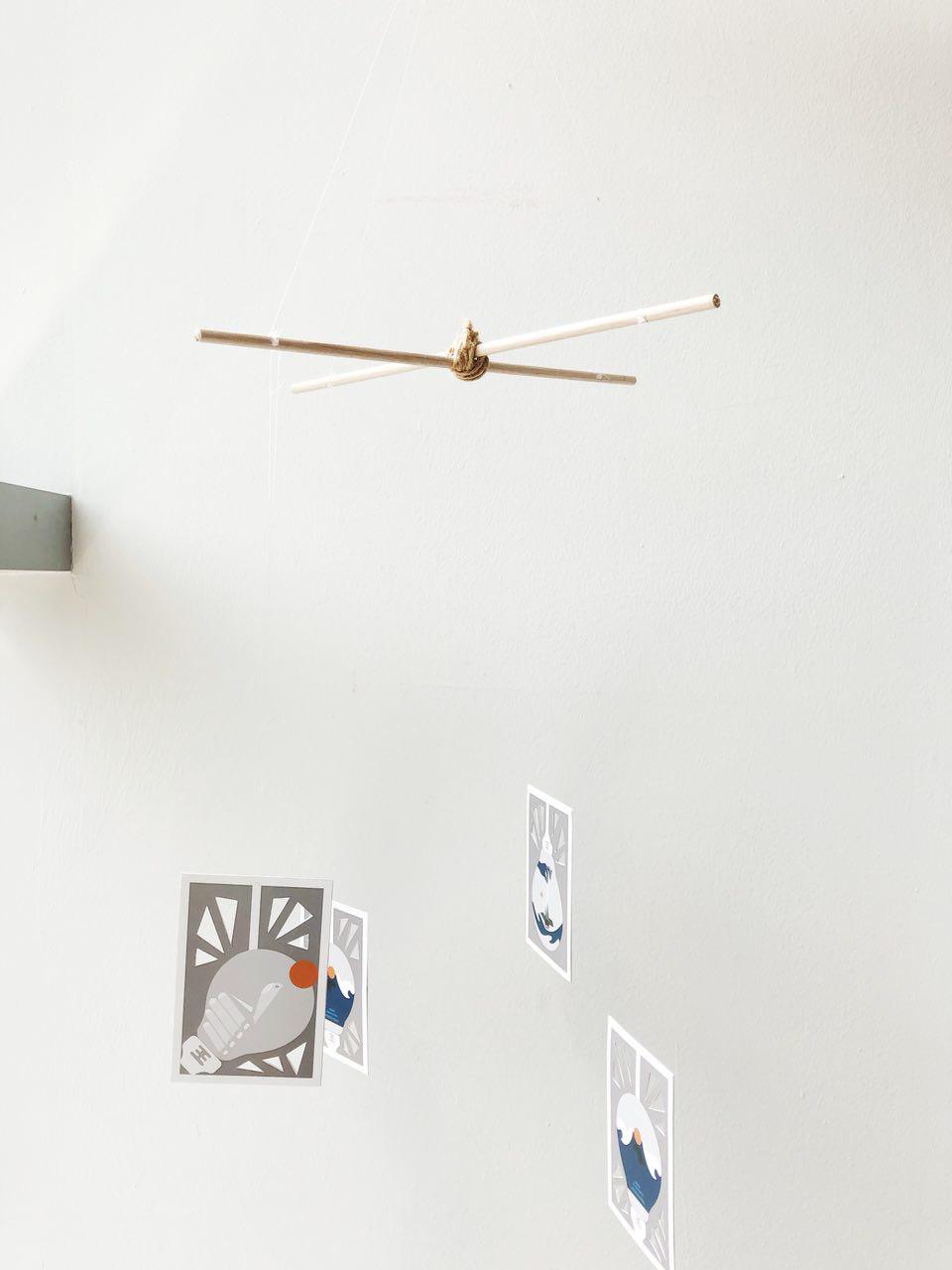
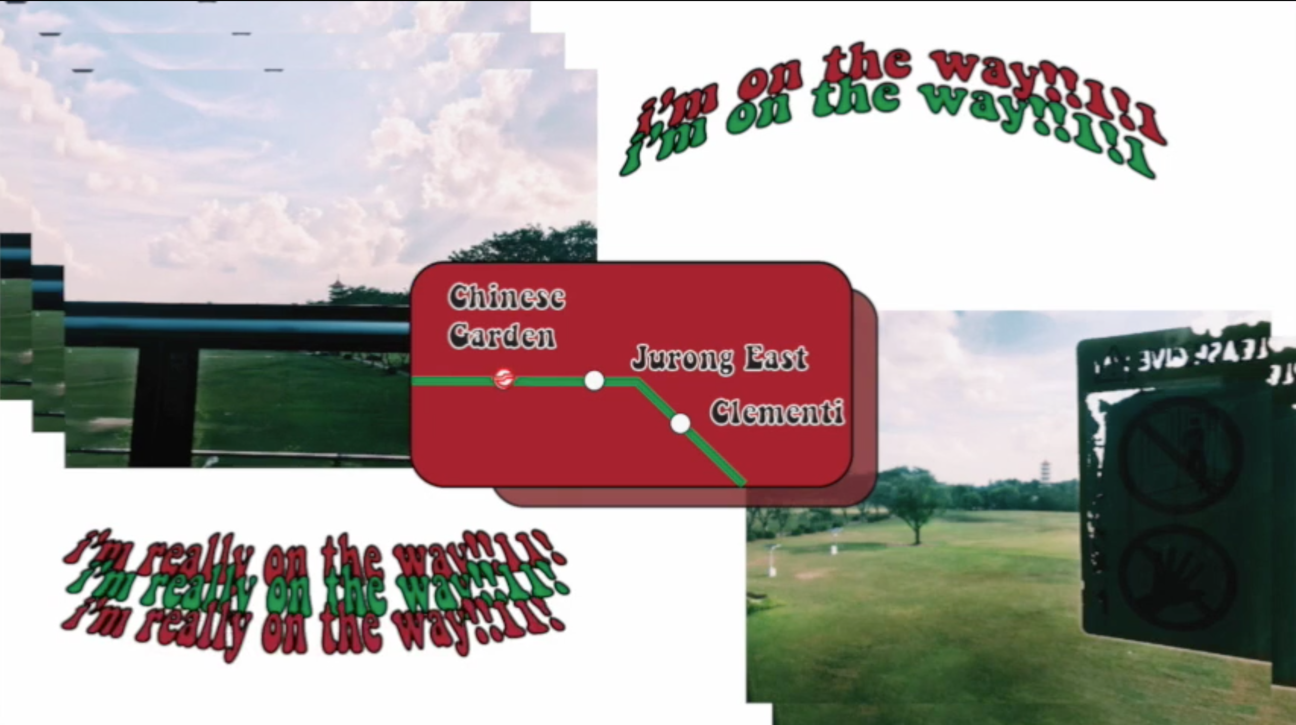
Also, I decided to add moving images to enhance the visuals from the zine to the audience. I thought that to fully be able to grasp the environment of the place, merely pictures will not suffice. Besides, my first visit there was filled with boomerangs, as seen in my research presentation, so I thought for my subsequent visit, I take videos too! Special shoutout to Jun Meng , a film student who went to site visit with me and got some footages with me! Enjoyed it thoroughly! Here are our fruits from the labour which I had included in the zine using QR codes!
Initially I was super excited for this project!! To design a zine is my first, plus I really enjoy writing, so I thought I can really combine both together into my first ever publication. Then as the process continues, it got harder and harder especially when my layout was not fixed, and had to go back and forth with merely sketches which was when I feel like I am lagging behind everyone.
That was when I realize talking to your friends about it is really important especially when you have a mind block and you don’t know where or how to carry on!!!! special shoutout to Teri, Sihui, Niki, Brendan, JJ, Gloria, JunMeng. (hope i did not miss anyone)
And people around are really there to help you, when you have the ideas, ask for opinions, don’t shy away. Just get the critiques, you will learn and be better from there!
Also, during this project, I tried many new things in terms of layout, stared at InDesign for hours and hours and I can still be on similar layouts, but Pinterest is your good friend! (but don’t plagarize!) get inspired, use the elements you like and make them your own! Look out for the vibes you’re going for and work from there. It is similar to finding your style first then choosing the clothes! (cuz then you will have selected designs to choose from! easier)
overall it was quite an experience! to start from a blank inDesign

to something you can call your own!!
It was hell of a ride! BUt it was one of the greatest ride!!
Thank you for viewing!


Thank you for viewing! :~)
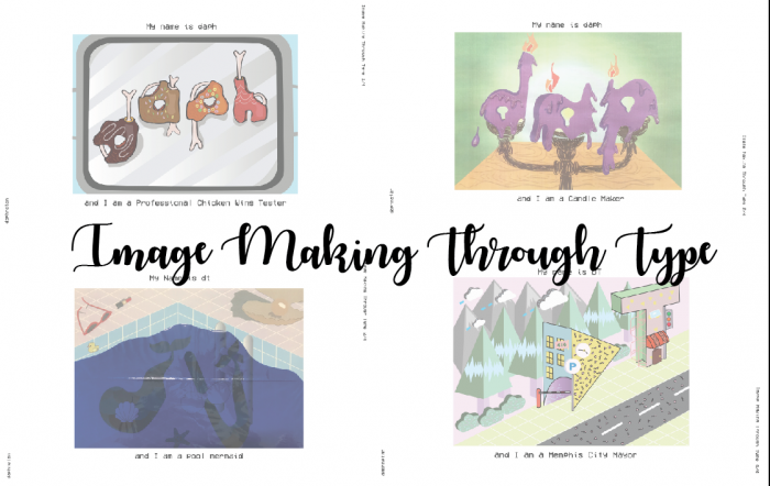
For assignment 1 for Graphic Form, we are to create typographic images related to our imaginary occupations. The use of typeface, style, size and the use of upper and lower case should be carefully thought through.
The pieces I created are expressions that hints at who I am. Each piece has a truth about me.
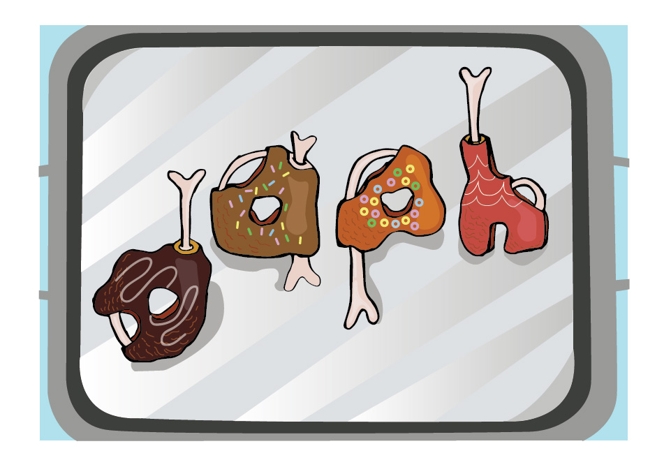
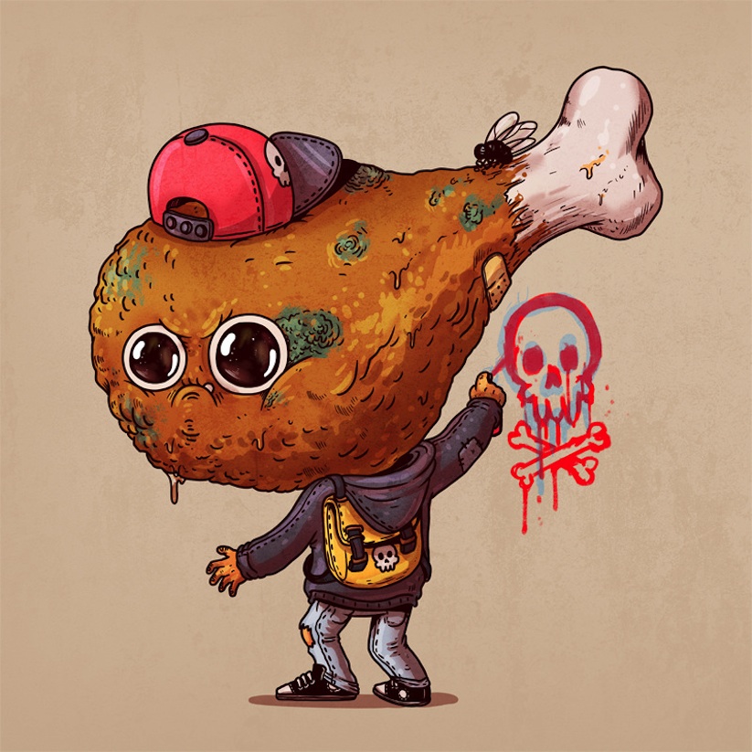
She is not fond of meat, but she likes chicken wings
And hence I am a Professional Chicken Wing Tester

“Inside” print by Wesley Bird
When I came across Wesley Bird’s “Inside” print, I thought it was really adorable how he incorporated the bones, flesh and skin into his type! I especially love how he illustrated the bones.
“Rotten Food” illustrated by Alex Solis
As for the texture of the chicken wing itself, I was unsure which kind of texture I should go for. The grilled, bbq, or crispy. Then I came across Alex Solis’ “Rotten Food” series for reference for the texture and the shadow of the surface of the meat and the bones.
She likes donuts, since young.
I had initially wanted to be a donut tester too, but the idea was put away because there were many type that are of donuts. Below is just one out of the many examples.
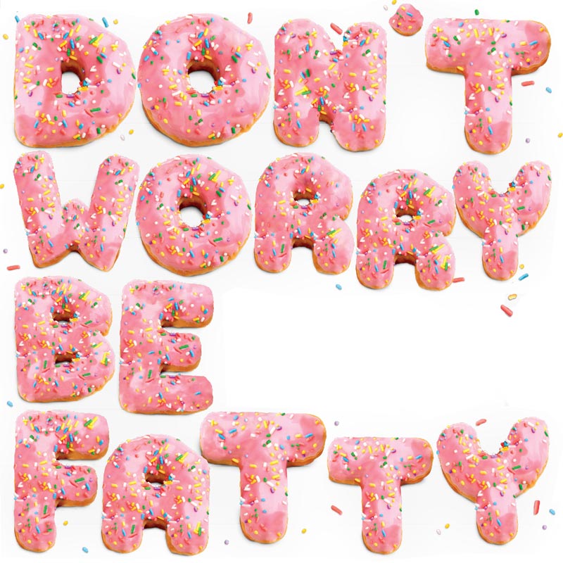
Time Out Magazine: Don’t Worry Be Fatty by Tom Hislop

Houston Donut Glossary | taken from Pinterest
Although I put away the idea of a donut tester, I decided to incorporate it in my Professional Chicken Wing Tester type. As a Professional Tester and critic, they will usually be asked to taste new products. Hence, I decided to incorporate donut toppings onto the Chicken Wings, very similar to honey glazed chicken wings.
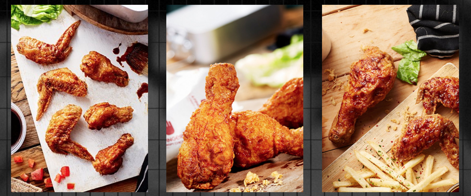
taken from: 4 Fingers Website | http://www.4fingers.com/Menu-Signature-Crispy-Chicken
I also went to 4 Finger’s Website to reference the types of chicken wings that they have.
I started out by sketching out the idea of it on my sketch book.
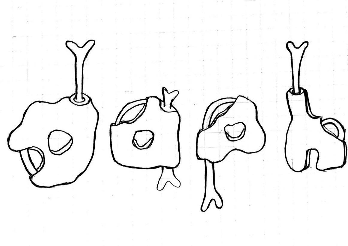
Self-drawn on sketch book
I scanned it onto Illustrator and added colours digitally.
The first few phases of the piece were my initials made up of similar Chicken Wing type with the same colours and textures. Also, it was without the use of shadow which made it look very flat.
I then researched a little about lighting conditions and added the highlights and shadows we learnt from Illustrator class.
Professional Chicken Wing Tester Final
Professional Chicken Wing Tester has the type placed in a way that it guides the eye from bottom to up, from the “d” to the “h”, creating a more interesting vision guide than if I had placed them merely straight on the platter.
For the colours, I used conventional donut topping colours, like the shade of chocolate, and the rainbow sprinkles and fruitloops. As for the colour of the “body” of the chicken wings itself, the colours used are analogous (red(“h”), orange(“a”, “p”) and dark purple(“d”)). The colours of the platter is merely shades of grey used.
Using the idea of the chicken wing and the toppings on donuts, I borrowed the bones and the texture of the chicken wings and the iconic element of the donut toppings which are the sprinkles and the sugar icing that goes on top of it.
I choose the lower case because all alphabets has a tail I can work with to insert the bone, giving the type more consistency. The alphabets have an organic shape because the shape of a chicken wing is not always the same.
She likes fragrances. Candles, perfumes…
Hence, I am a Candle Maker.

I stumbled upon this melting effect on type on Pinterest which I thought was what I want to go for for my Candle Maker type.
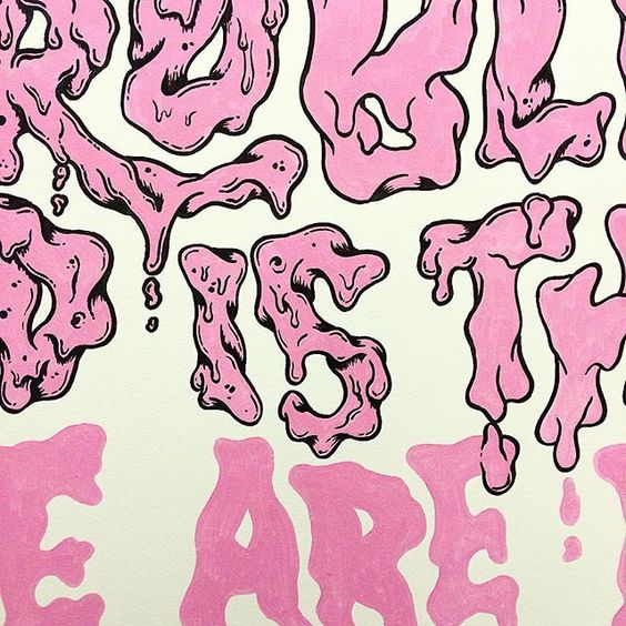
Type by Andreas Pedersen | taken from: https://www.instagram.com/andycloned/
To add an additional touch to my take on the occupation, I added flames and droplets of wax on my type to make it more suggestive of the occupation.
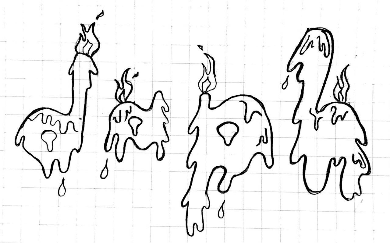
Hand-drawn on sketchbook
Besides, the initial design had hard outlines which after consultation, I decided to line the type with a darker shade than a harsh black outline.
This is a snapshot of one of the initial stages
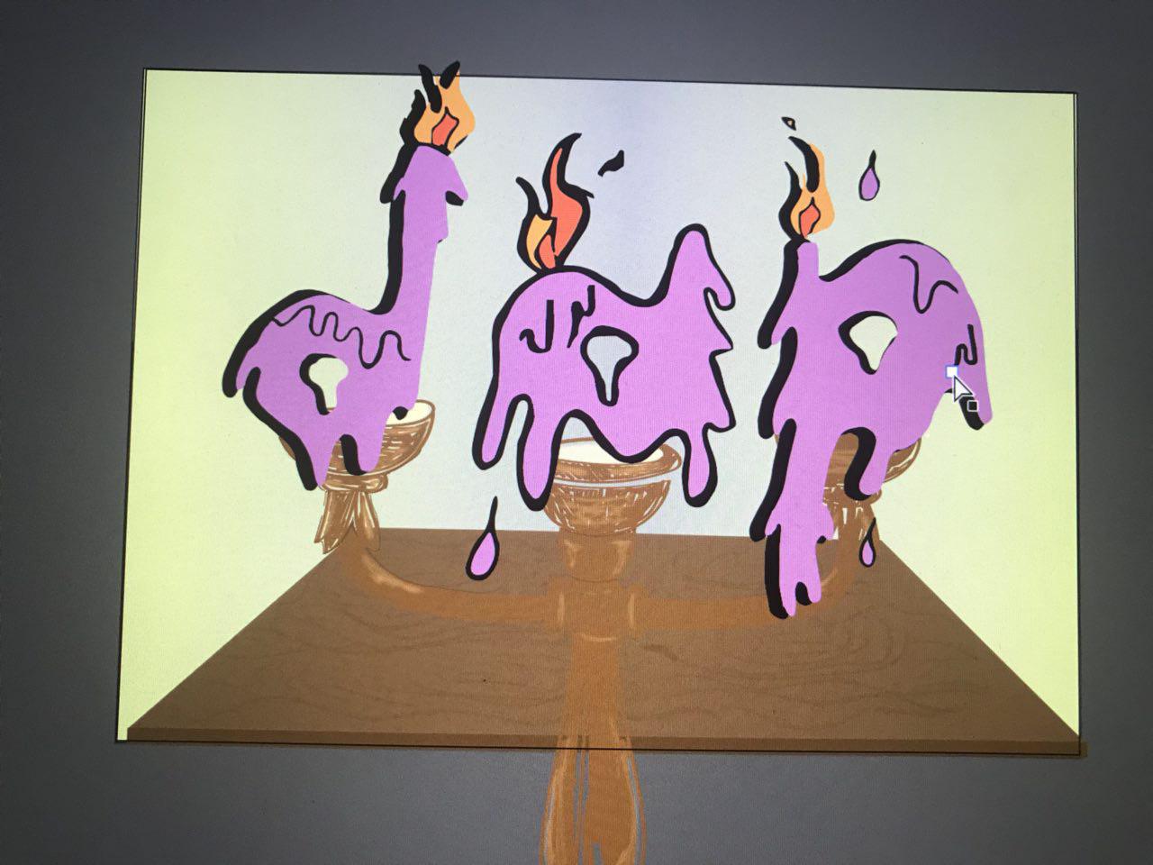
Also, to add an additional touch to it, I used a hot glue gun to give the final product a “melting” illusion and texture to the graphic. Below is a video of it!
The digital final piece is attached below:

Digital Final Piece for Candle Maker
Candle Maker Final (with hot glue texture and illusion)
The type “dap” is used instead of “daph” due to the number of candles the traditional candle maker can hold. The alphabets are places straight, side by side due to the placing and the nature of the candle holder. The play on the wax dripping gives the piece a slight touch to the otherwise boring line-up side by side alphabets.
The colours used are square (purple, green, orange and blue). The background goes dimmer away from the alphabets to give it an illusion that the type is placed in a dark room and the candles are lighting the place up.
I borrowed the element of wax dripping as a candle is lit to the texture of the alphabets. The flame from the candle makes up the flame seen at the top of the type.
The alphabets has a non-rigid shape, mimicking the actual candle, which shape and size will change as it is lit.
Her favourite Disney princess is Arial.
Hence, I am a pool mermaid.
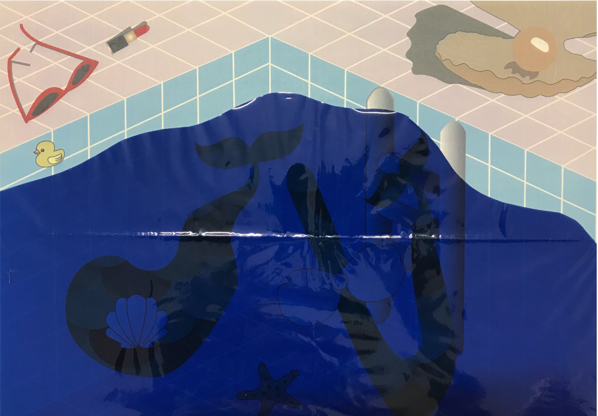
I thought being a mermaid will be too ordinary so I decided to spice things up and put things better into context, a mermaid in a pool.

Graphic of a mermaid tail | taken from: https://www.etsy.com/listing/541800432/mermaid-tail-svg-mermaid-svg-mermaid?utm_source=Pinterest&utm_medium=PageTools&utm_campaign=Share&utm_term=so.lp.d2.v1&share_time=1516587659000
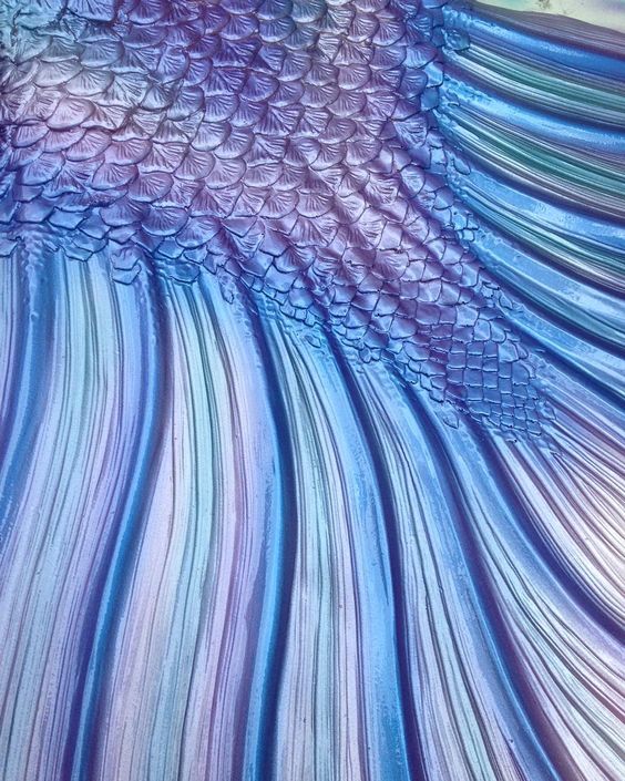
Mermaid tail | taken from: https://www.instagram.com/p/8wfUazNk4E/
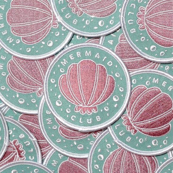
Shell | taken from: https://www.instagram.com/p/BSE_WmbDLWO/
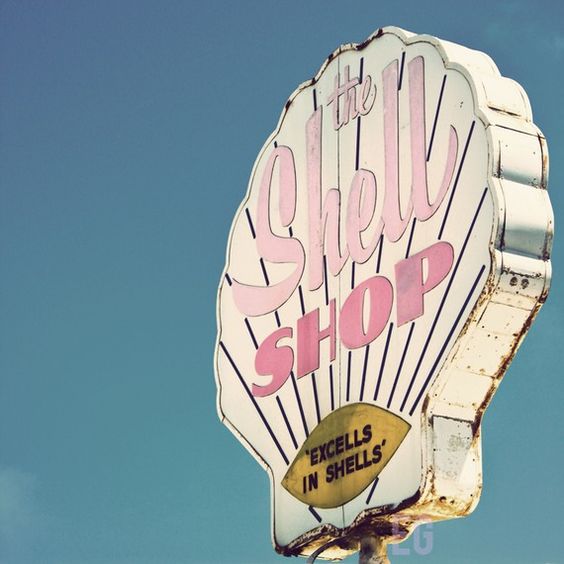
Font usage and colour usage | taken from: https://www.etsy.com/listing/56809840/shell-shop-8×8-print?ref=v1_other_2

taken from: https://www.behance.net/gallery/38674217/The-Architectural-Sculpture-in-Warsaw
background research and emphasis on the shadow and highlights used | taken from: https://www.etsy.com/listing/56809840/shell-shop-8×8-print?ref=v1_other_2
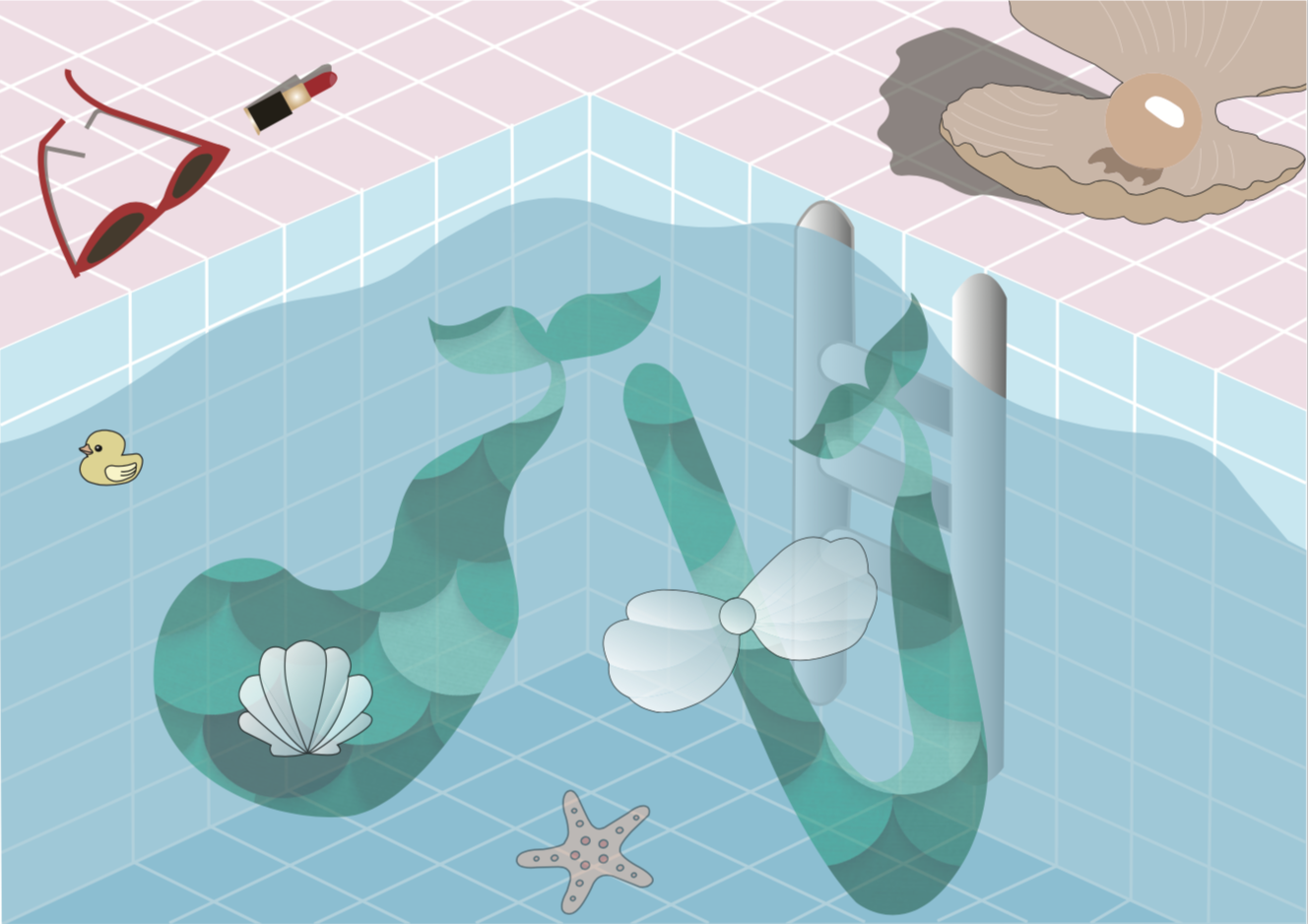
Initial stages
This was the initial stage of this piece. With the use of opacity on Illustrator to bring out the water in the swimming pool.
After much considerations to want to improve on this piece, I decided to use a transparent coloured sheet as the water to give it more visual appeal. Though I acknowledge that the colour of the coloured sheet might be a little too dark, but these sheets only come in certain shades of colour, which left me to not much choices. Because of that I decided to not conceal the transparent sheet, but make the piece removable from the plastic sheet to see the details. IMG_0811
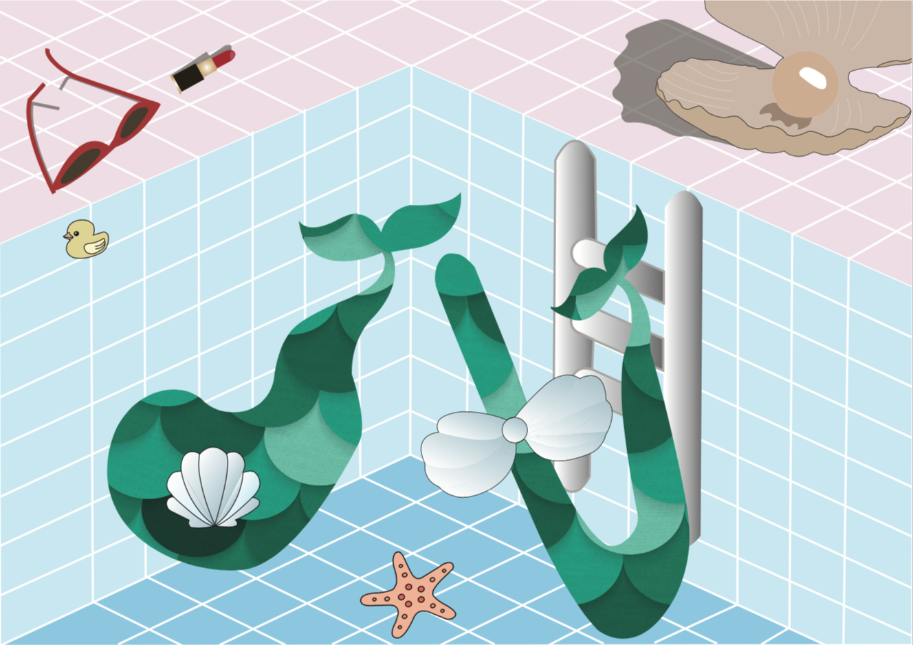
Digital Final piece
Pool Mermaid Final
Due to lighting and the fault in printing, the colours might differ.
The alphabets are placed in the lower two-third of the paper and the grid lines of the swimming pool leads our eyes to the corner in the middle where the alphabets “d” and “t” are.
A pastel colour palette was used for this piece.
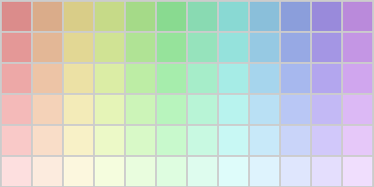
Pastel Colour Palette
I chose this colour palette because I thought that the colours fit will with the theme underwater and mermaid. The colour choice is triadic of red, blue and green.
The alphabets are fluid, mimicking the nature of water. The mermaid tail is also used to hint at the occupation of a mermaid. Also, the lipstick and sunglasses hints that the figure has a human nature, yet at the left hand side of the piece, the clam suntanning mat hints at a not so human nature of the mermaid.
The alphabets are fluid with organic sides.
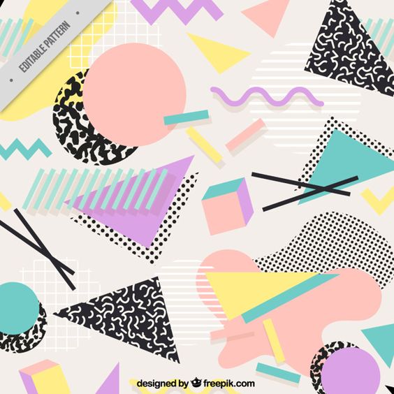
She is currently into memphis designs.
Hence, I am a Memphis city mayor.

taken from: https://www.britannica.com/biography/William-Longhauser
The artist reference is Peter Judson and I am in love with his Memphis graphic designs. I looked at many of his art works on his website.
taken from: http://www.beatpie.com/2014/04/sunday-blip.html
taken from: http://peterjudson.com/iai7zfzs05nmtxpj3g3k53cb59myha
taken from: http://peterjudson.com/2016/5/23/tribute

taken from: https://designshack.net/articles/graphics/designing-with-an-80s-trend-memphis-design-101/
I wanted my alphabets to be blockish although the Memphis font type uses block or bubble fonts because the previous 3 pieces are rather fluid in nature.

Initial stages
The buildings looked a little empty and not as apparent that it is a Memphis City. Hence, I decided to add more random patterns to the alphabets.
Memphis City Mayor Final
The “D” and “T” are placed in the two-third of the piece, making use of the rule of third. The perspective guides the eye of the viewers, with the add of the concrete floor and the grids, as well as the line-up by the trees and mountains at the back. This piece has a clear background and foreground.
Similar to Pool Mermaid, the pastel colour palette was used for this piece and the use of millennial pink (research). Analogous colours of yellow, green and blue are used to a large extent.
Pastel Colour Palette
I went to research on the characteristics of memphis designs to give myself a better picture of what the style of this piece will be. (research) Also, a city has residential buildings, cafes, stores, streets, hence I gave the alphabets characteristics of a residential building for “D”, with the carpark gantry and the parking sign in an ordinary carpark of a HDB in Singapore. Also, older shop houses in Singapore has the iconic spiral stairs outside of the building, with I had incorporated in “T” as well as a traffic light.
The buildings are placed roughly the same size as the trees and the mountains, the play of scale used in this piece for the alphabets.
I have explored various possibilities for my occupations and went back and forth, changing them to make them more imaginary than they are. Also, I thought creating jobs that are related to me will spice things up a little, rather than randomly choosing them. This way, I can better interpret them. I had many difficulties making sure my pieces spoke to the audience about the occupation at first glance. For all pieces, it went through consultations with my friends around me. Also, it was tough to incorporate elements of the occupation onto the alphabets itself, especially the one for Memphis City Mayor and Pool Mermaid. For the both aforementioned, I leeched onto the background to emphasize on the occupation, which I thought worked.
I enjoyed the process of illustrating them, and considering the colours I wanted to work with. Of which the last two consist of colours from the pastel palette which I am fond of. I thought through the way I wanted to place the alphabets in such a way that it matches the background and still gave an interesting visual. Overall, it was a fulfilling process and one of the projects that I really love. Thank you for viewing!
Do view my final products here!
Final Product presented on 16 October 2017
Before going head-on in approaching the project, I did some research!
Also, view my work process here!
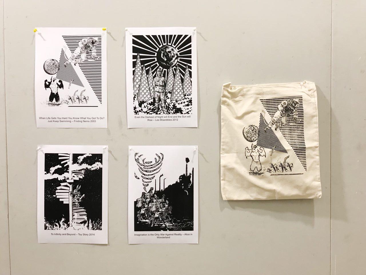
“Fantasy”
Final Product (As printed on a tote bag)

totebag; exposed & silkscreened in class
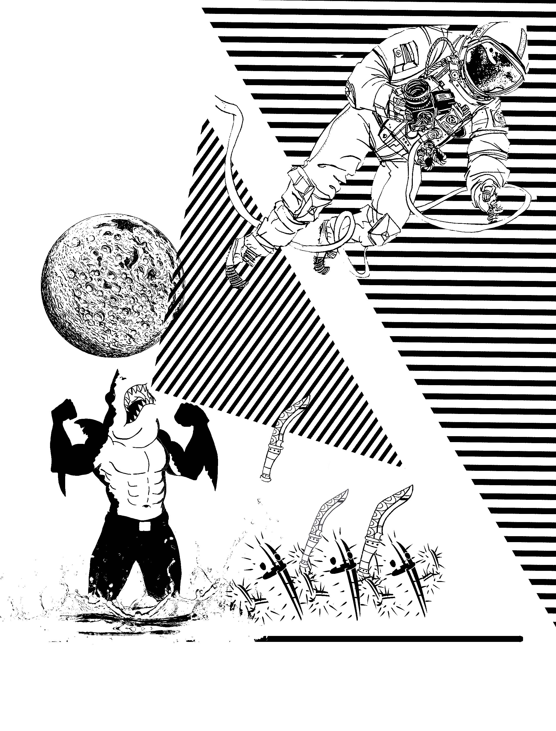
“When Life Gets Hard You Know What You Got To Do? Just Keep Swimming” — Finding Nemo 2009
Main Idea
The idea behind this piece is to bring out the irony in the way we face challenges in life.
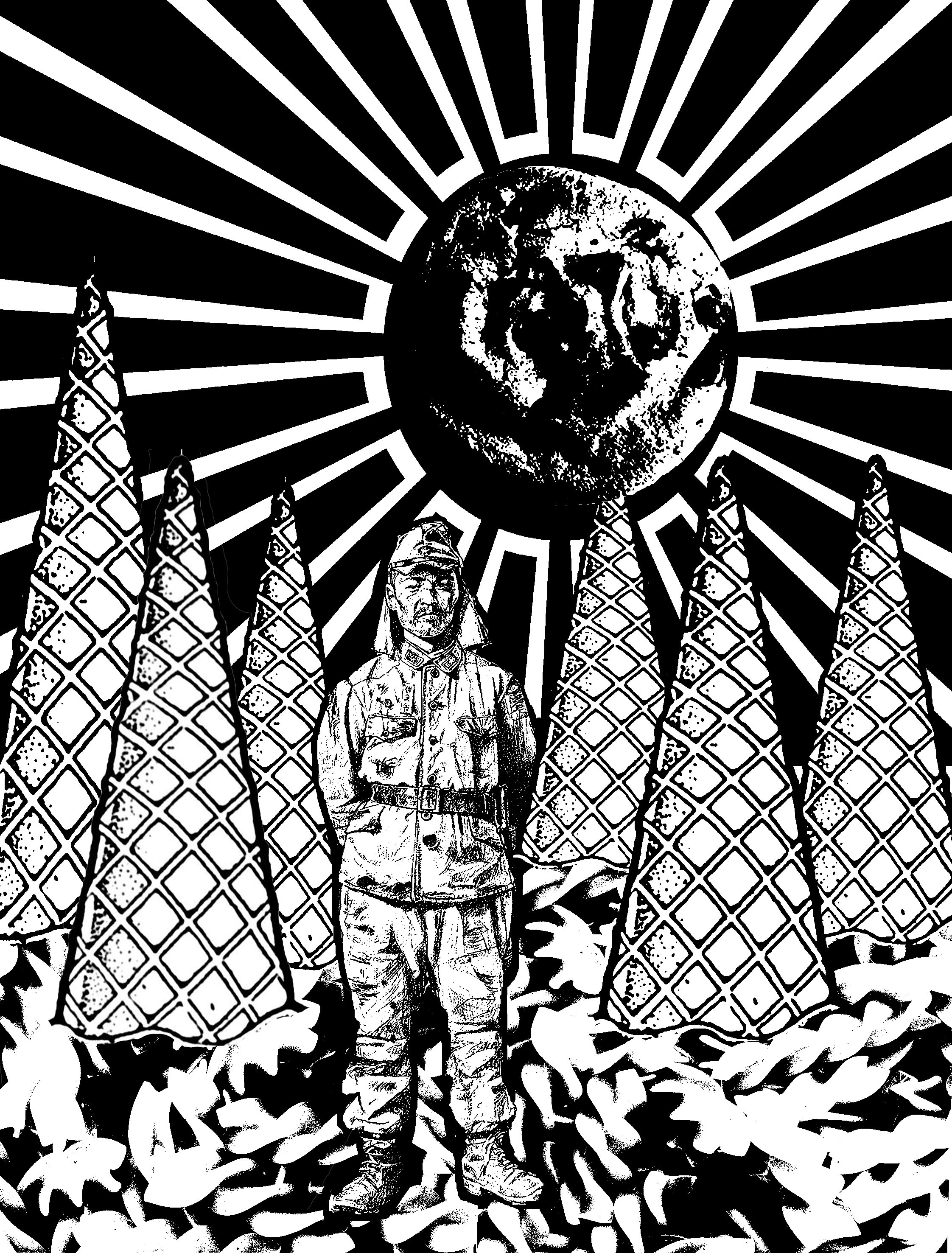
“Even the Darkest Night will End and the Sun will Rise” — Les Misérables 2012
Main Idea
This design is based off a true story about a World War II Japanese soldier, Hiroo Onoda, who was ordered to not just fight, but also to stay alive. He was assigned to fight in a forested area in Western Philippines. He escaped capture and stayed in the forest for 29 years even after the war ended. He survived through stealing food from the farmers or look for random food in the jungle. (View his full story here)
I had initially taken the quote very literally and after a consult, Joy told me about Onoda’s story. I thought this quote could resonate with how he was feeling while being trapped in the jungle and tie in well with his story as well.
Surrealism
Thereafter, I decided to tap on the phrase “You Are What You Eat” for this composition. By using food to depict the forest brings out the idea of Fantasy. Just like Onoda’s hunt for food everyday, unpredictable, I decided to use random food I can think of to add to the composition, as well as the size and shape of it.
Ice cream cones are used to depict the dense vegetation in the forest and the fusilli noodle depicts the forest bed, since fusilli pasta are always served flat on the plate.
Notice the Japanese flag at the background is used to relate the composition literally back to the quote itself. The off-centre placement of the flag is to capture the movement of the moon setting or the sun rising. I overlayed a cookie in the circle of the flag to further blur out the interpretation of the background. Is it a Japanese flag, a sun rising, a moon setting? Or all of the above?
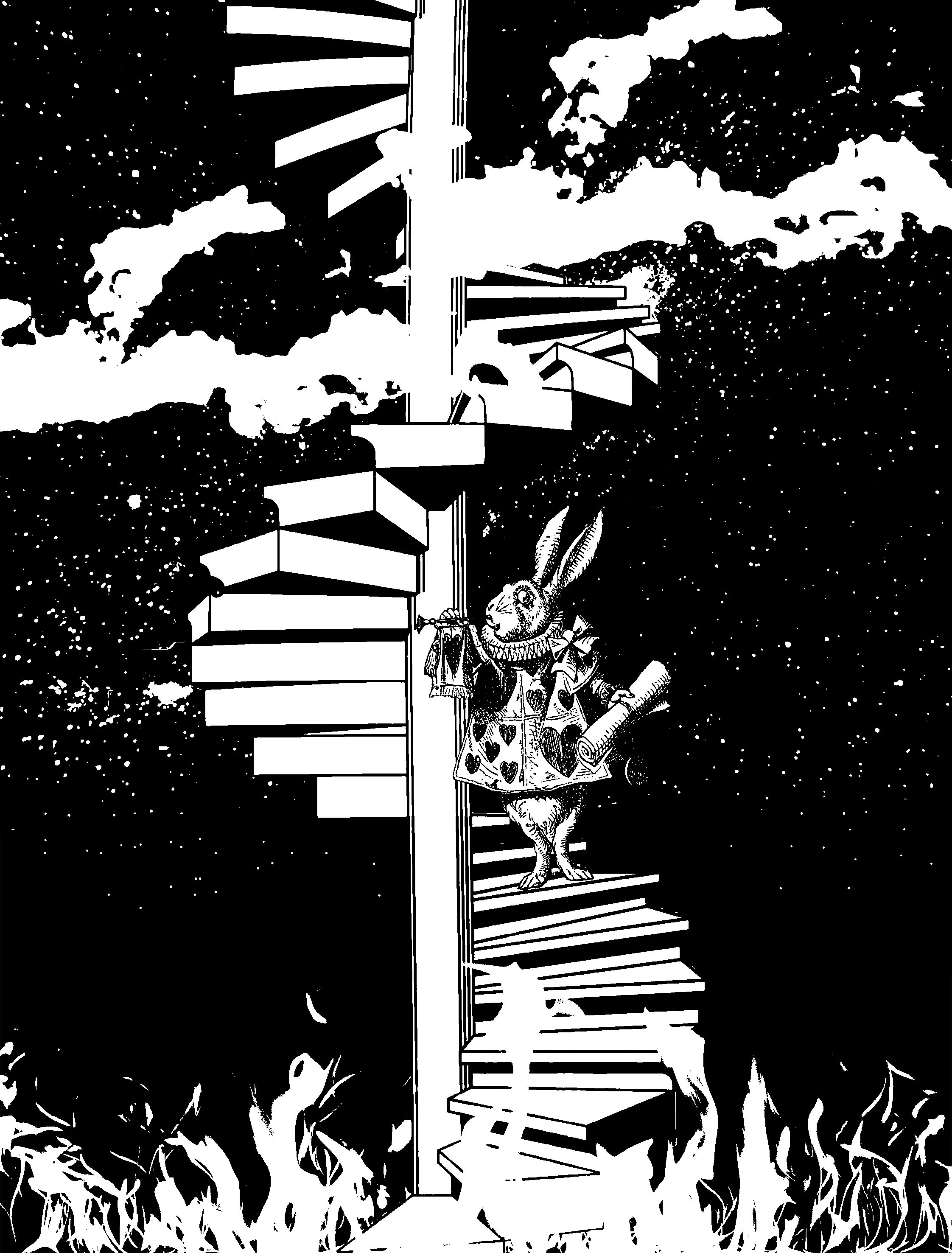
“To Infinity and Beyond” — Toys Story 2011
Main Idea
This piece challenges the idea of doing good or what is convenient.
The White Rabbit from Alice in Wonderland is incorporated into this composition to borrow his character to further help the audience understand this piece better, or resonate with them better.
The stairs that seems to be limitless brings out the idea of infinity in the quote. How I wanted to further work on the word “infinity” is to use the idea of Heaven and Hell, two extreme opposites.
This piece strive question its audience, do good or do what’s convenient?
Surrealism
The idea of heaven and hell cannot be represented, except by tapping on the common stereotypes that hell can be associated with extreme heat, and heaven with the sky. Hence, I tap on that as an apparent way of portraying both complete opposite elements in one composition.
In Alice in Wonderland, the White Rabbit is someone who is constantly afraid of offending people and he is often put in a dilemmatic position as to whether he should help Alice out in Wonderland and risk offending the Queen or leave the poor girl alone in a foreign place. Tapping on this character of his, I thought he will be a perfect subject matter for this composition as we talk about doing good or doing what is convenient. He could choose to help, and take a step closer to heaven, or be indifferent and take a step closer to hell.
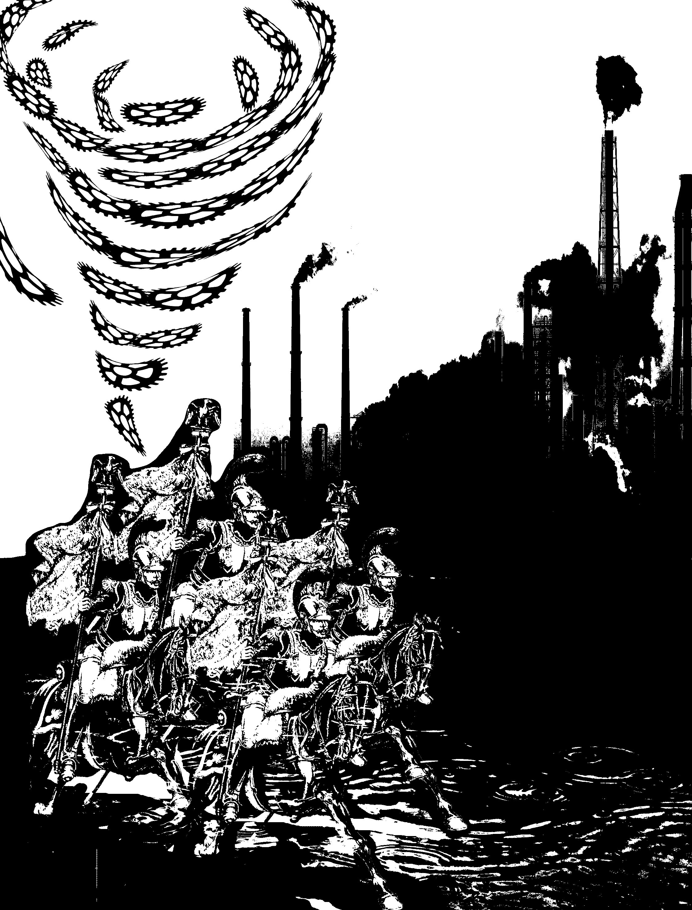
“Imagination is the War Against Reality” — Alice in Wonderland
Main Idea
As I approach this quote, I first brainstormed what the “war” of reality is? Global Warming and Climate Change then came into my mind (perhaps it is because I was a geography student? HAHA)
Playing with the past and the present, I portrayed comrades, used to fight war in ancient time, saving the reality today.
Surrealism
The comrades from ancient times coming to “save” today’s day might be more accurate than you think it is.
Deeper meaning…
They are riding on horses and not automobiles that we use today, eliminating the release of harmful gases to the atmosphere. Moreover, their military weapon does not consist of chemical weapons, guns or rifles, depicting a very manual mode of fighting the war of today.
Overall, I approached this project afraid because I was very unfamiliar with the concept of surrealism and having to study and produce relevant works was a challenge for me. Even so, I really liked the idea of using movie quotes and then giving them our own taste to it! Also, although it was also my first time silkscreening, I thoroughly enjoyed it and despite the long and tedious process, it was one filled with anticipation as we go one step closer to printing our designs onto the tote bags.
Here is a full PDF of my final works!
Final Product presented on 4 September 2017

How I decided to approach this project is by first brainstorming about how each emotions resonates with me, and subsequently working with different mark-making techniques to fit the qualities of each emotions to bring out its entity. My brainstorming process can be viewed here. I decided to categorise the emotions according to positive and negative emotions.
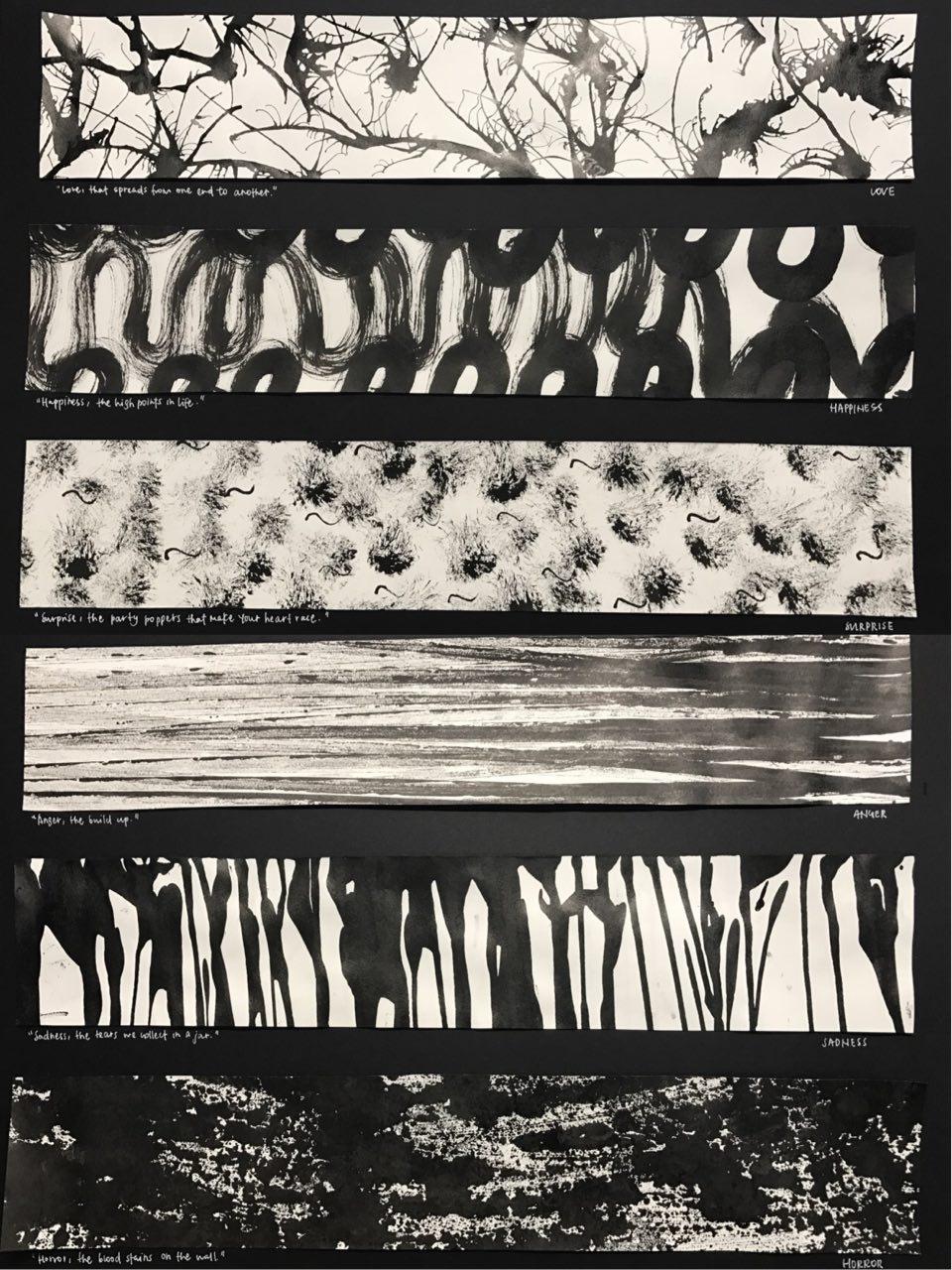
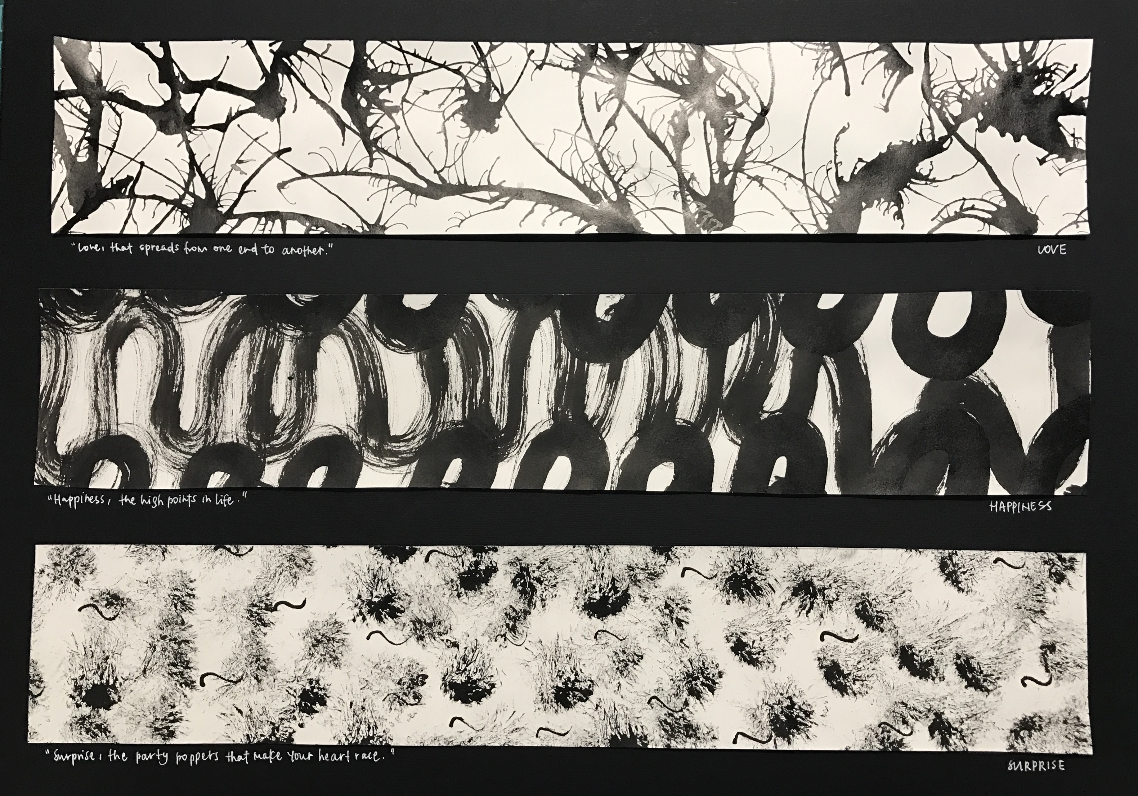
Top to bottom:
1.love
Love, that spreads from one end to another
thought process:
Love spreads from one person to another. Be it from your family members or from the people around you, love spreads in an outward motion. Also, we love because we are first loved. The feeling of being loved is similar to having tiny explosions inside of you, the tiny butterflies you feel, the warm and hearty feeling. The organic and fluid shape created shows a gradual outward motion with hard-edges. As the shapes intertwine, it shows the actions 0f love transmitted from one to another.
methodology:
The first panel was created by putting large amounts of ink on the paper and then using a straw to blow the ink in an outward direction, not fearing that they will connect with each other.
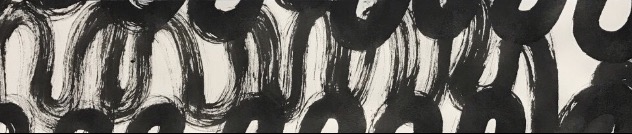
2.happiness
Happiness, the high points in life
thought process:
Happiness are the high points in life. There are high points in life when there are low points in life, hence the flowy nature of the second panel created. Life can be seen just like what is created in the panel, much like a roller-coaster. The soft-edges seen are like the times when we are overwhelmed by the tough moments in life when we find it hard to find happiness in life. However, when we try to find happiness in life, we can always find them. This was created on a huge sheet of paper to recreate the large motion of being happy since it is associated with being free-styled and liberal.
methodology:
Using a brush to create large motion of swirls across a huge sheet of paper and cropping out the section that I wanted.
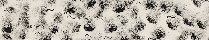
3.surprise
Surprise, the party poppers that make your heart race
thought process:
Surprise is interpreted as good surprise. Good kind of surprises are much like birthday surprises or farewell surprises. In parties, party poppers are very commonly seen, hence it is the main subject in the third panel. The motion of the creation of the third panel also brings out the surprise factor. As a semi-dry brush is jammed onto the paper to create the effect, it gives a sudden fast motion, describing the nature of a surprise. Also, the effect created very perfectly described intensity of shock across time. As time passes, the intensity of shock gradually decreases, therefore, as it goes further away from the middle, the ink lightens, bringing out the element of surprise. Initially, I thought the party popper effect was not clearly brought out, so I added tiny swirls across the paper to mimic the strings that come out of party poppers to add more essence to the panel, and I thought it worked quite well as I do not mistake them as fireworks or explosives.
methodology:
Dabbing semi-dry brush onto the paper, then creating swirls using the back of a brush.
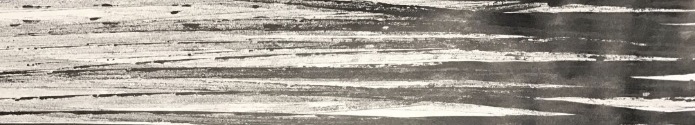
4.anger
Anger, the build up
Anger would most of the time be an accumulation of different events that ultimately build up to the ultimate event of being angry. The gradient seen on the paper also describes the intensity of anger very well. When the limit is met and one is angry, the initial emotion will be fury and hence, it coincides with the darker regions on the panel. Across time, one will be cooled down and that will coincide with the lighter regions on the panel.
methodology:
The forth panel was created by putting ink on my mini toy car and running it across the paper to create the straight strips of ink.
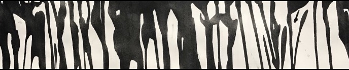
5.sadness
Sadness, the tears we collect in a jar
The first thing that came to my mind when I think about sadness is tears and the act of crying. Also, we tend to be sad over things that are significant and intimate to us, hence the phrase “we collect in a jar”, since they are something we hold close to our hearts, we will keep them in a secret place. Therefore, the fifth panel is made up of fluid, tears-liked figures mimic the tears that flow down your cheeks when you cry.
methodology:
This panel was created by running black ink down the paper, creating the dripping down effect and cropping the top section of the paper out.
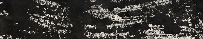
6.horror
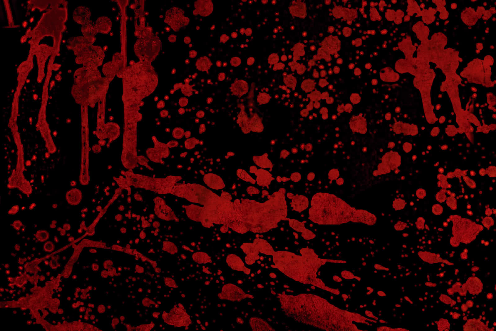
Horror, the bloodstains on the wall

taken from: http://www.widewalls.ch/andy-warhol-piss-paintings/
I was very inspired by Andy Warhol’s oxidation painting effect as I thought they give off a gory and scary feeling to its audience. It is as if we cannot fully make sense of what is in front of us, but we sort of know its something unpleasant. Working towards that direction, I experimented with a few methods by imprinting ink from different surfaces onto the paper. I worked with different kinds of plastic bags, and tiny ones usually for food storage and found out that I prefer the effect of a zip-lock bag much better due to its smooth texture. As if blood was smeared across the glass wall, the gory effect it gave really resembles that of horror movies I usually watch.
taken from: http://historiadelavidadeblaze.blogspot.sg/2015/07/t2-carmesi.html
methodology:
Putting large amount of ink on a zip-lock bag and transferring the ink onto paper and cropping the parts out.
———————————————————-
Critique:

I like the directional element to the work, how the work can be categorised as horizontal, vertical, etc. It brings out a strong visual unity…
I came to realise that how I had categorised my emotions gave a “directional element” to the entire project. Like how anger contrasted with sadness, which then contrasted each emotions even more. I thought that was a good observation by my classmate that I had unintentionally displayed in my work.
I like your idea of using quotes!
As I approached this project, I thought emotions can be hard to express sometimes, hence the word “mixed-feelings”. Truth is sometimes we cannot comprehend or understand how we feel in a certain occasion or event. I thought the quotes really put things into a certain context or situation which can bring out the idea of each emotions even more, enhancing the understanding of each emotion further.
Conclusion:
Overall, I really enjoyed creating each emotions because they truly resonated well with me. Also, looking at how my friends created their prints was really interesting as well as I have classmates who experimented with oil and also capturing the contact print of a ball hitting the ground and et cetera. Even so, I enjoyed experimenting with different objects that I can find at home to create these prints as a final product and am overall encouraged by my lecturer, Joy, and my classmates’ comments and feedbacks for project 1. Although I would have hoped to be riskier with the objects I used, but never really got to try. Despite that, I thought this has been a great opportunity for me as during the process, I constantly found myself on a look out for objects with interesting texture and how I can use them for mark-making. As we close this project, I hope to further try out different mark-making techniques and hope to work with the linoleum and the pressing machine in future!