4D – Project 2: The Subverted Object


In Project 2, we discover the idea of subverting the meaning behind objects. I went on to research on more ideas .. this is something I found super interesting!

The word I got for this project is KIWI!
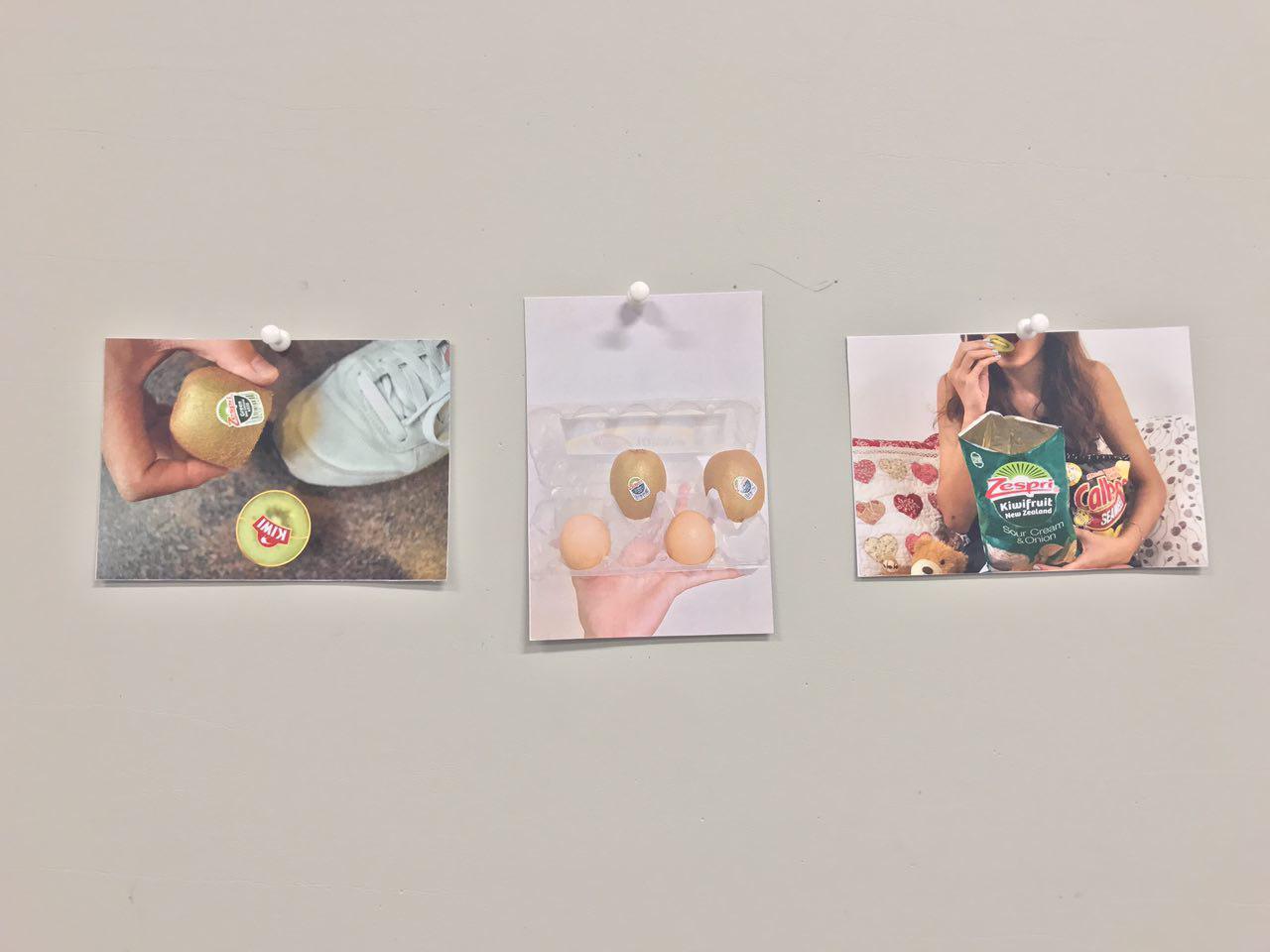
 

The Object


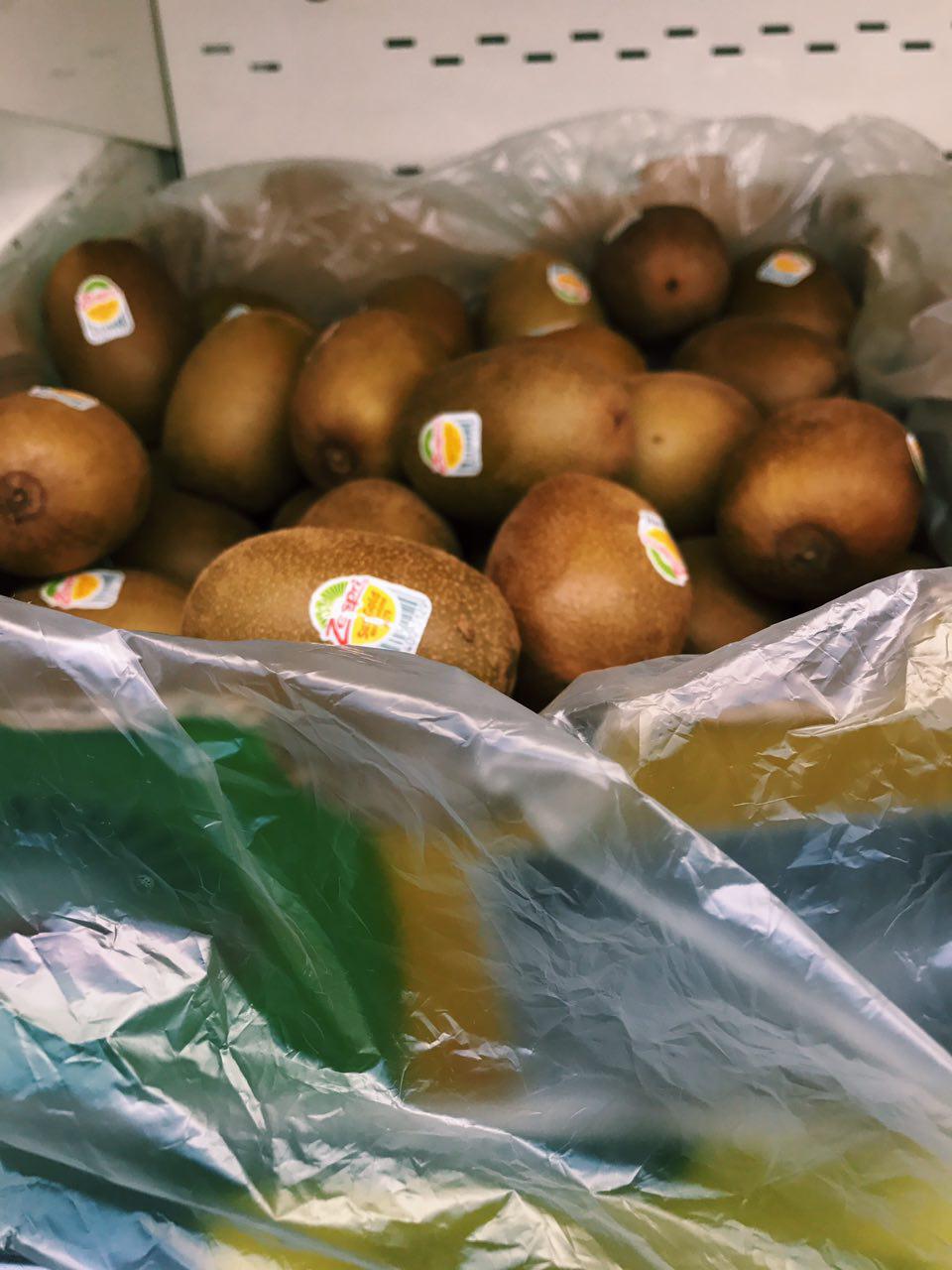
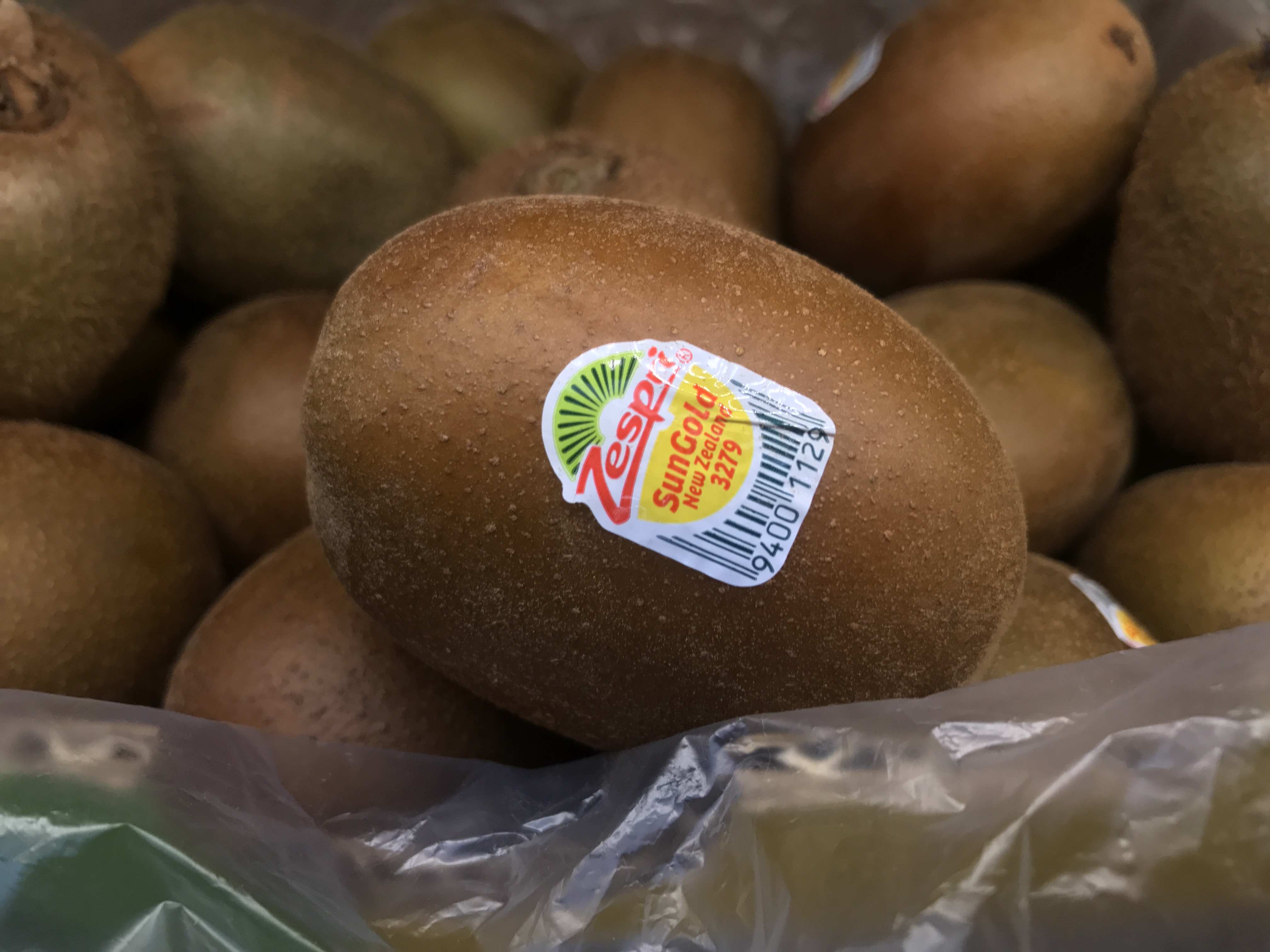
KIWI & its associated place

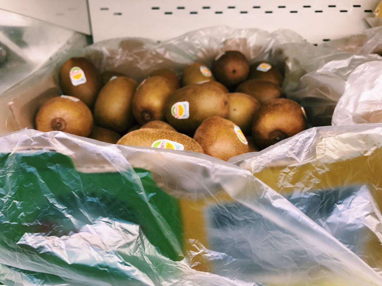
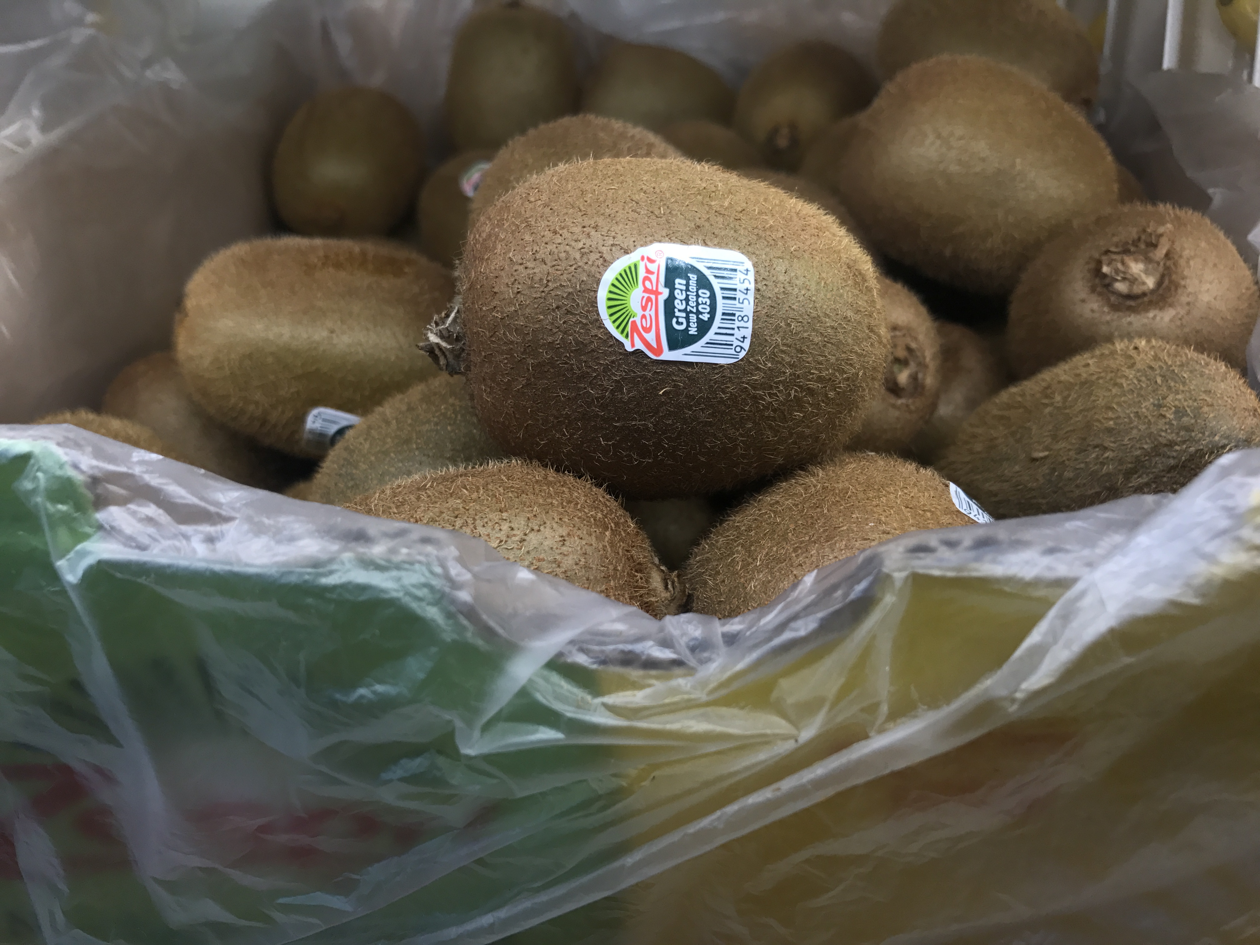
This shot was taken at a place that people will conventionally find kiwis. I thought the texture of the plastic bag that evokes a blurry feel gives more emphasis on the kiwis itself, yet still included in the picture to give a sense of context as to where the picture was taken – the supermarket / fruit store, essentially the place of purchase.

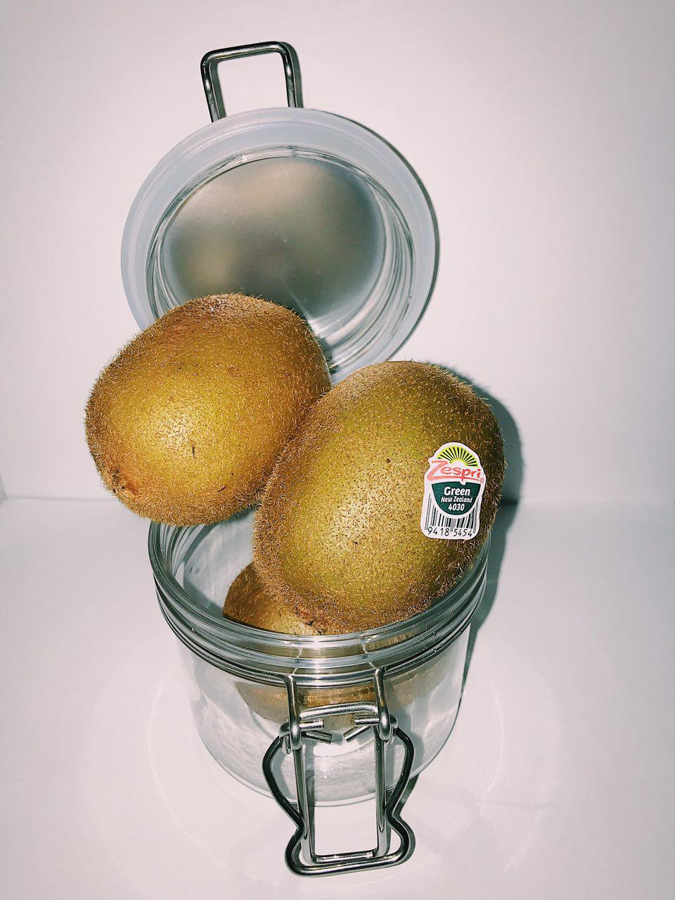
The portrait photo was not chosen as the background gave too much distraction, such as the air con fan and the extensive inclusion of the plastic bag holding the kiwis.
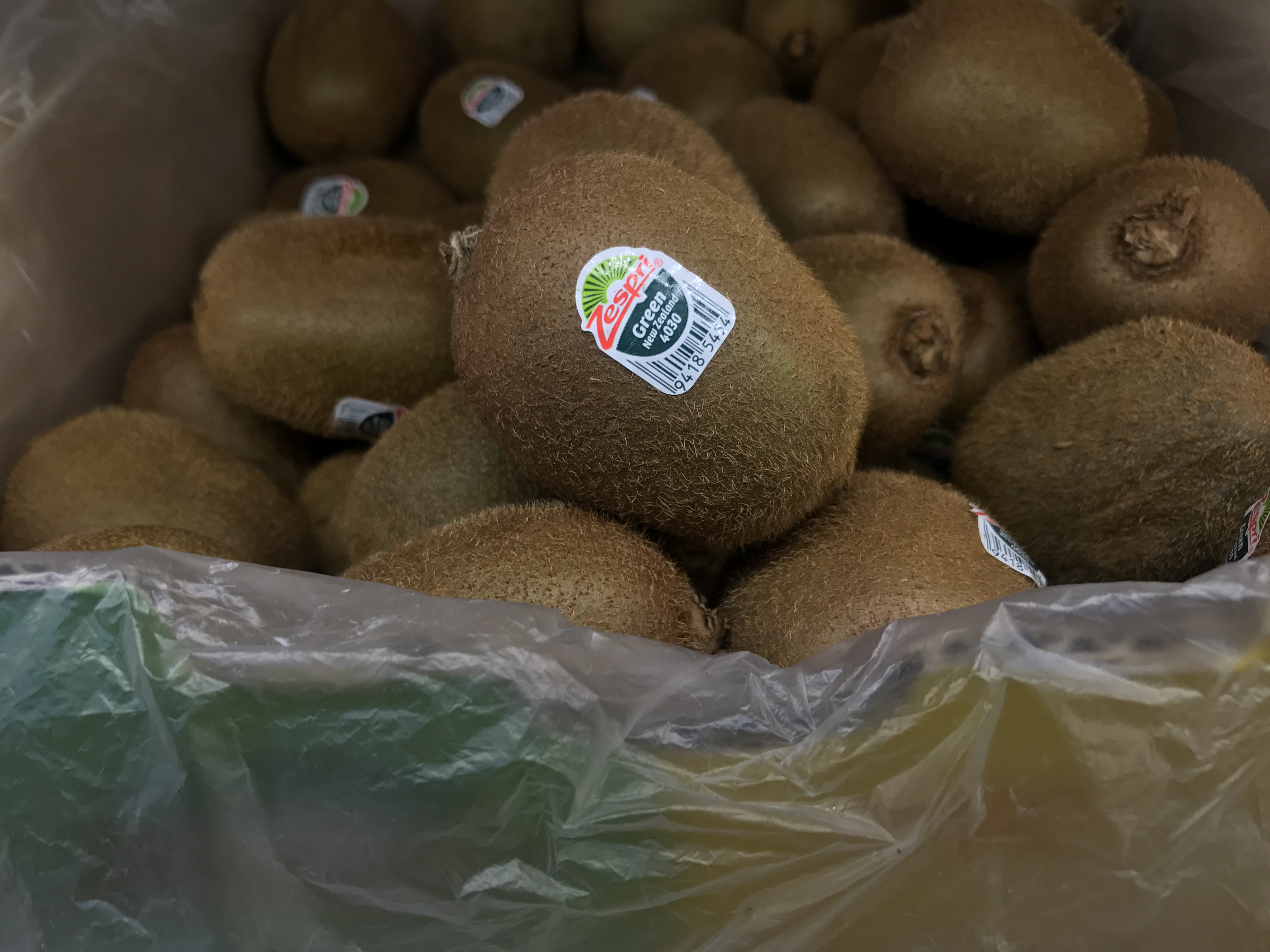
KIWI & its identity

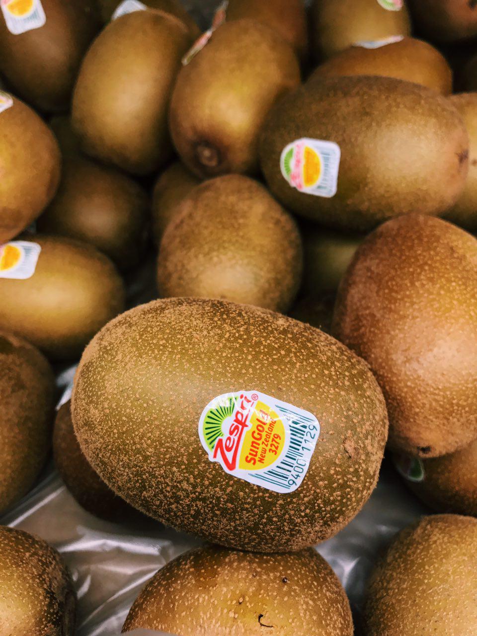
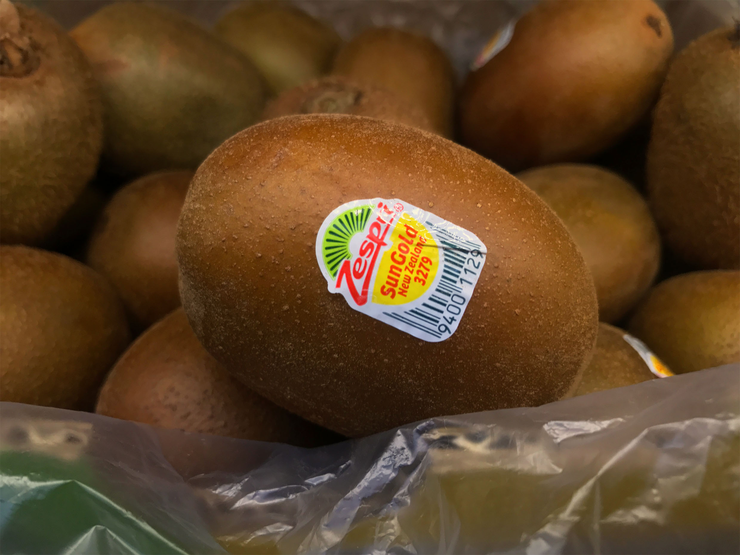
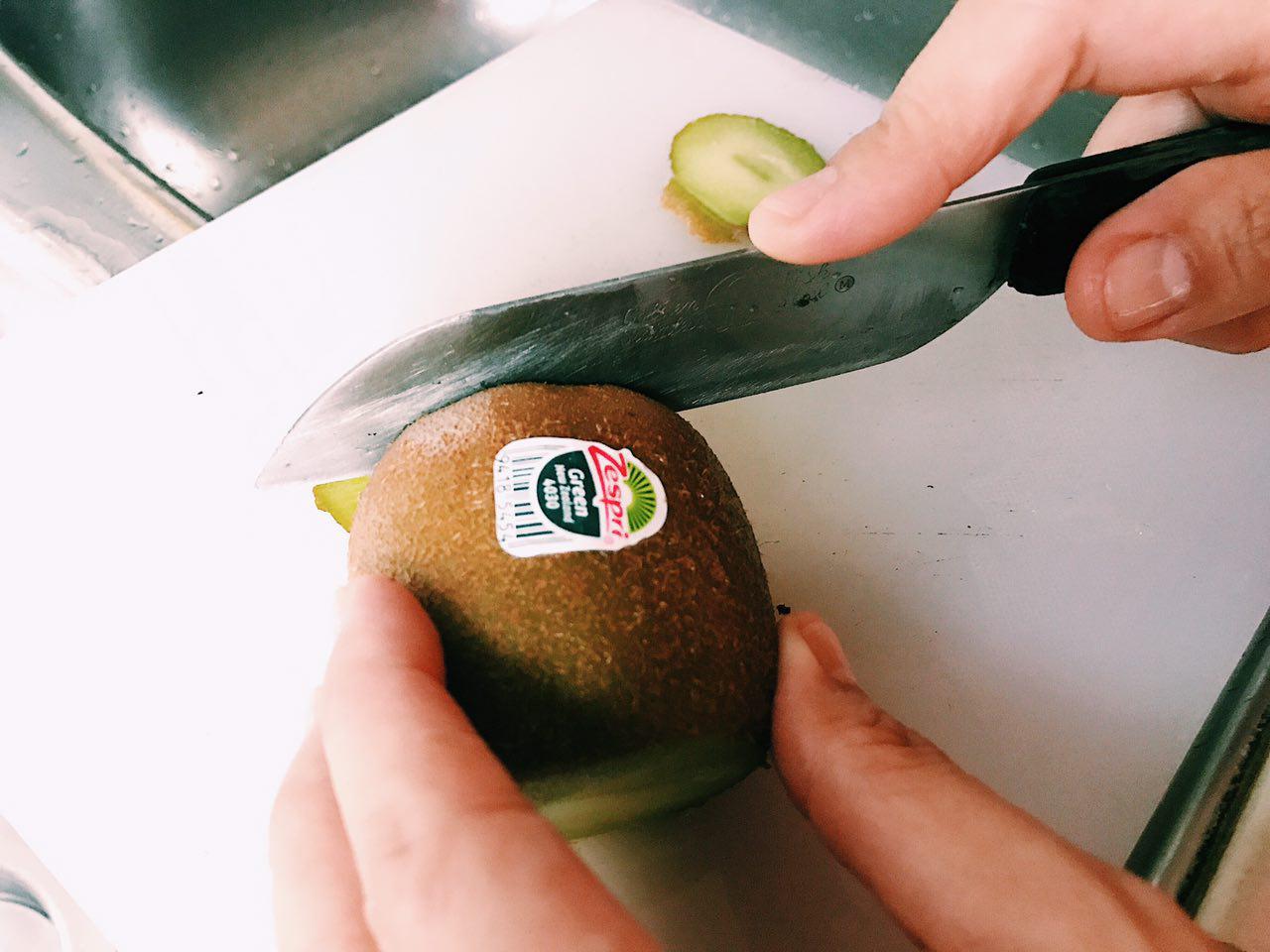
The close-up shot of the kiwis was not initially included into the presentation as it gave too little context as to where it was taken, which should tell its reader where you can normally and conventionally find and purchase kiwis. However, I thought this shot showed the texture and the shape of the rarer, yellow kiwi very well. A green kiwi was not used as I thought it was too conventional and too predictable. I included the Zespri brand of the kiwi as the focus of the picture as I found out that Zespri is one of the largest marketer of the kiwifruit. (About Zespri) Therefore, the branding is also a huge part of the identity of the kiwifruit.
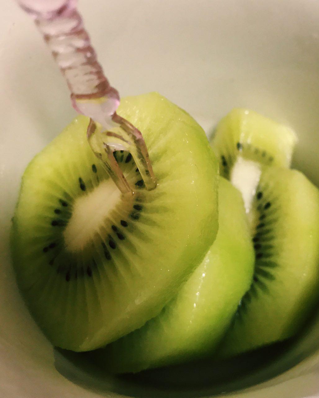
Some Test Shots:


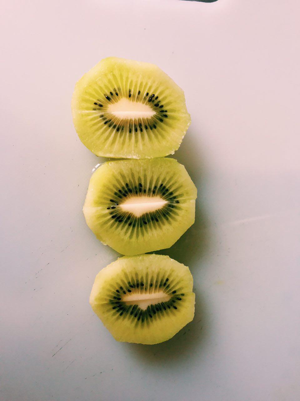
A KIWI Cross-section

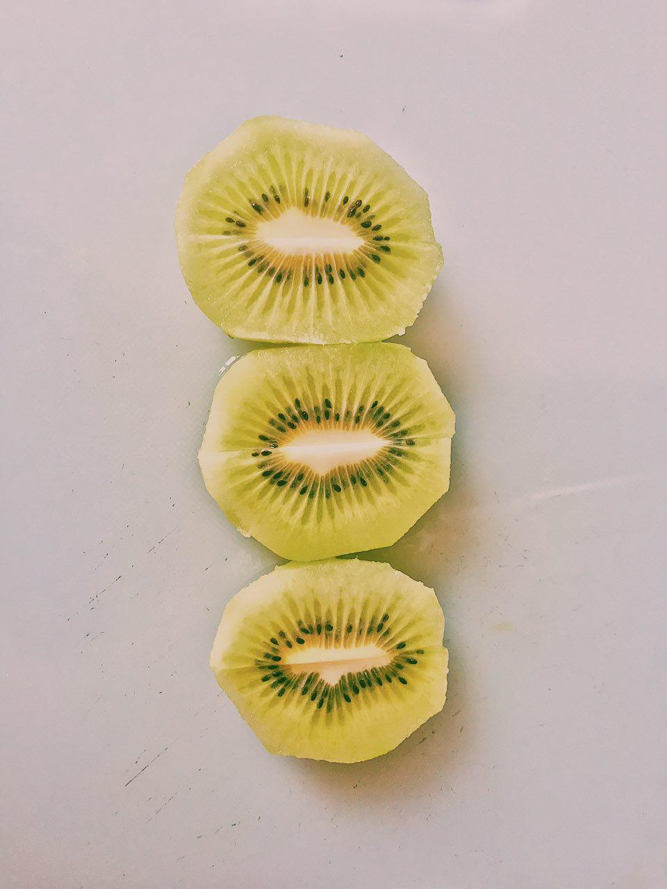
Something unique about the kiwifruit is also its cross-section. Therefore, I cannot miss that out! I used the rule of third to spice up this shot a little!

Some Test Shots:


The Subversion

I had many problems trying to subvert the idea of kiwi as it does not have a very apparent link to a different meaning. For example, the banana is also universally linked to a smile.

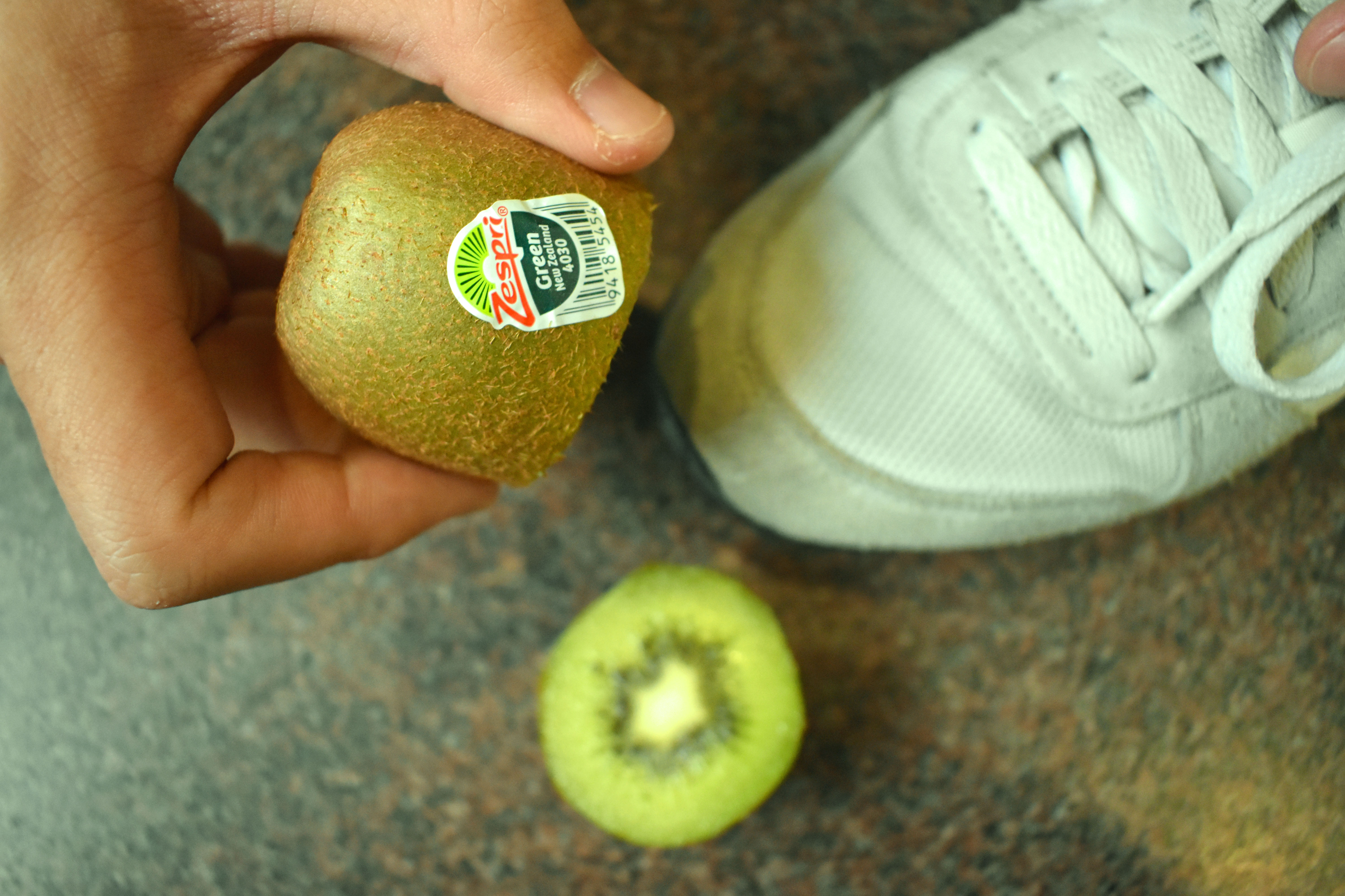
Despite that, I played with the brand of a shoe polish also called Kiwi, as well as the shape and unique qualities of it, like its cross section.

KIWI, SHOE POLISH

Original Photo:

After Photoshop:

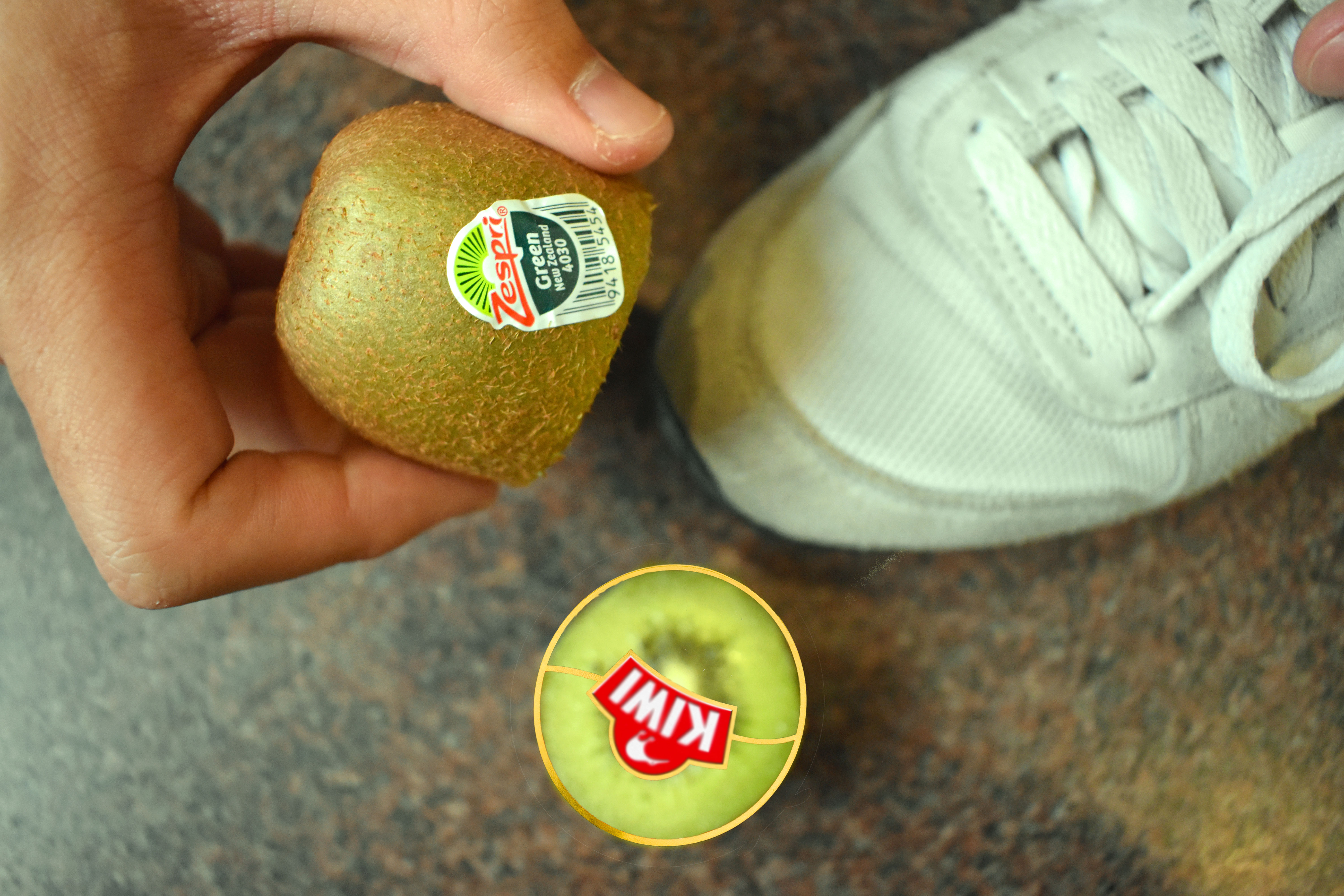
Since the kiwi shoe polish has a sole purpose (see what i did there?) of polishing up a men’s leather shoe, I wanted to switch it up a bit. I used a white sneakers instead to bring in the idea of kiwi as a fruit too, apart from it being a shoe polish. The fact is that if you smear a kiwifruit to your shoes, you will dirty it. Hence, in this photo composition, apart from the apparent paradox, I wanted to play with irony as well. True enough, the next scene after this shot is taken will be a stained sneakers that will not look good, definitely not polishing it.
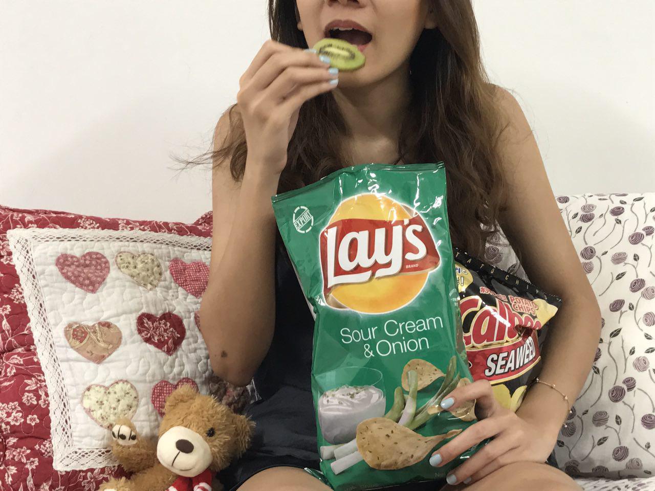
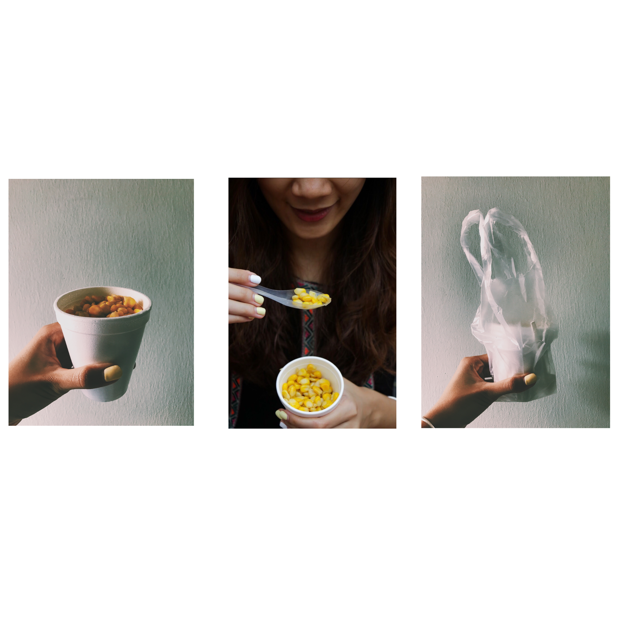
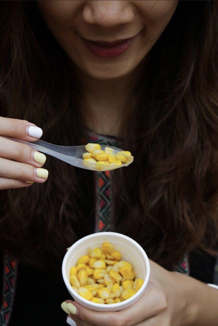
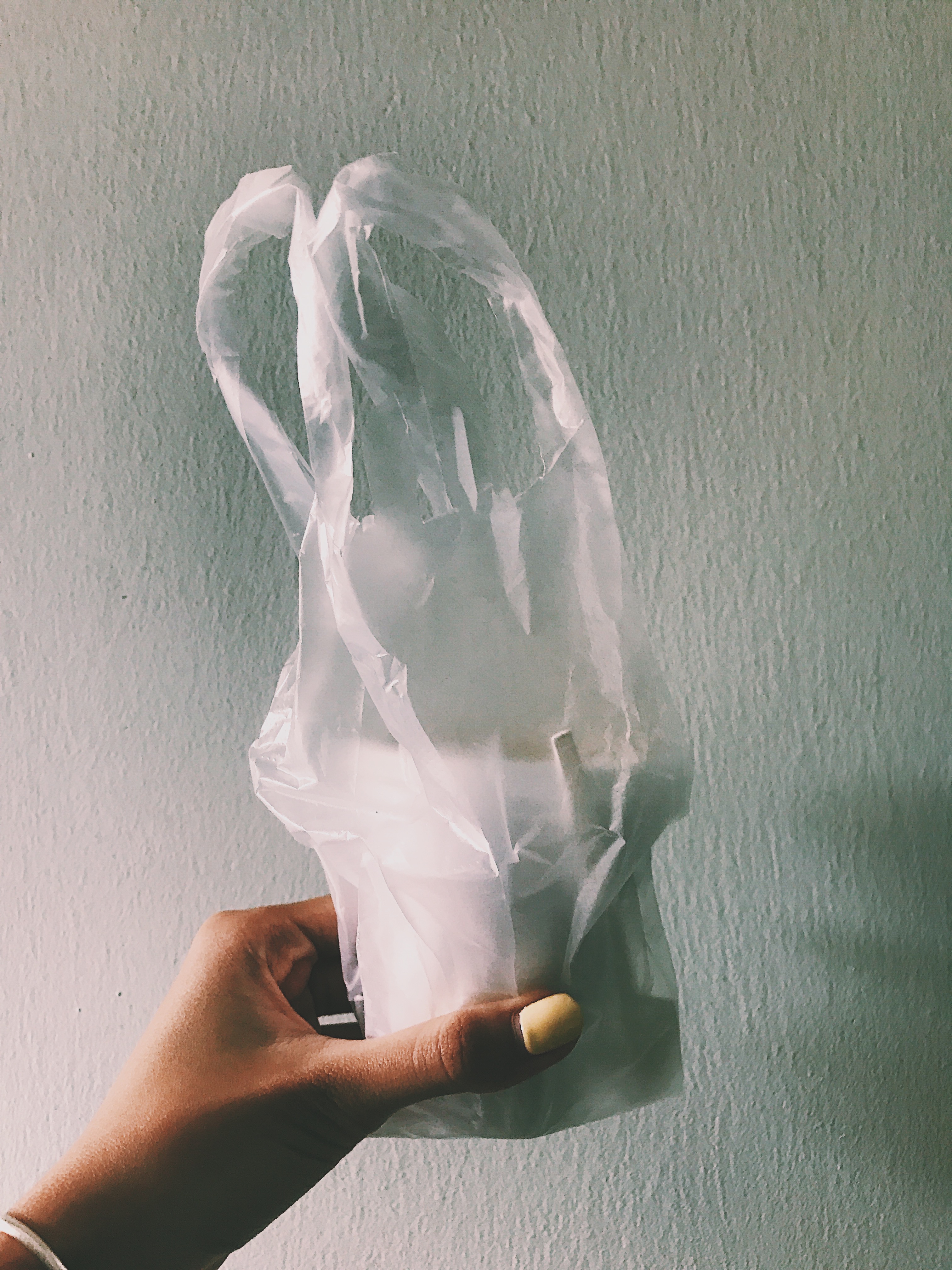
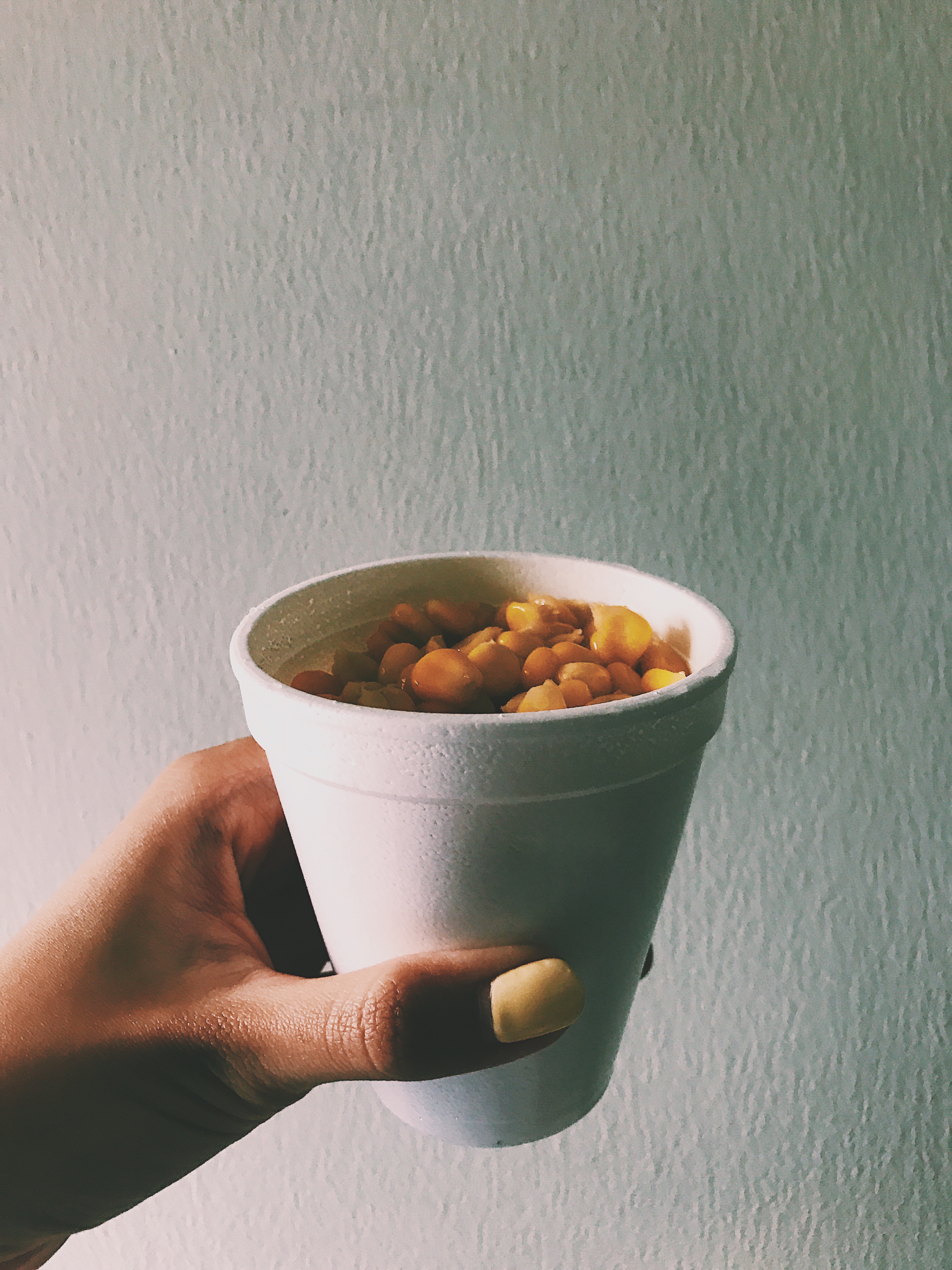
Kiwi Chips

Before Edit

After Edit

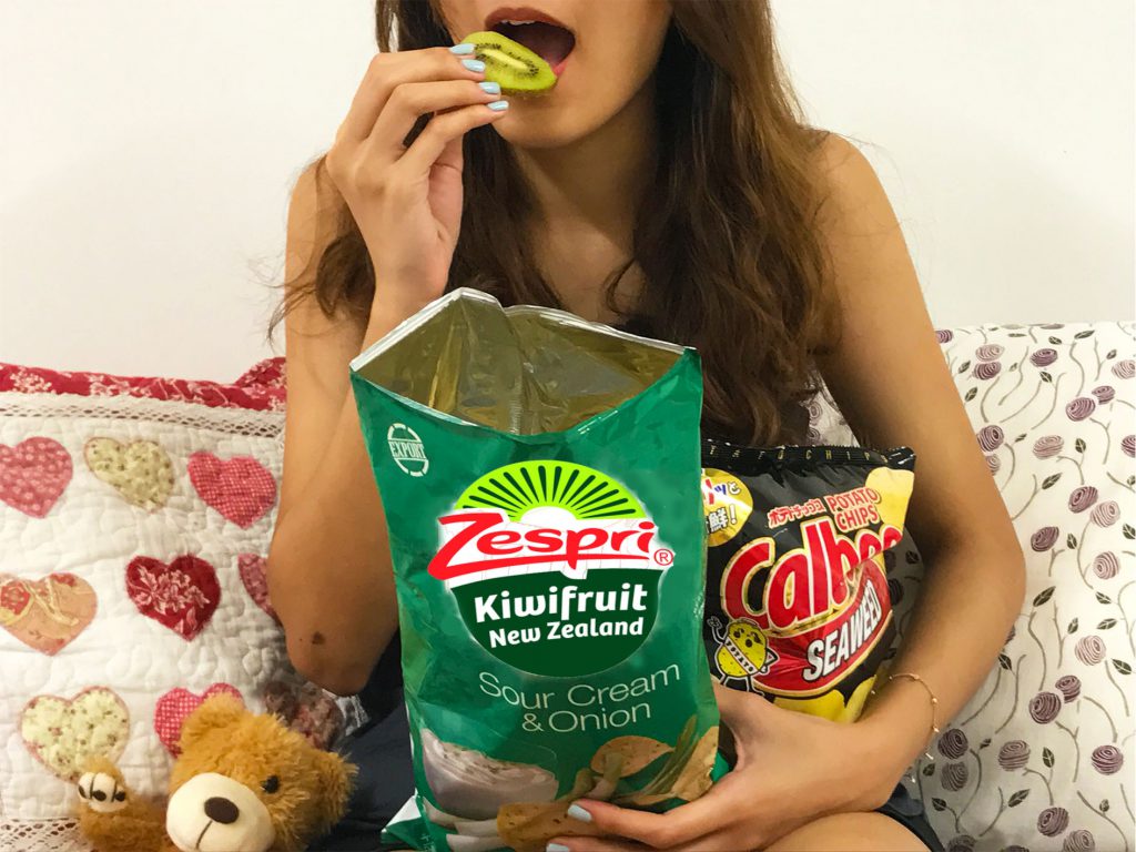
Kiwi seen as healthy food.

I thought sliced kiwi looked a lot like chips, so I played with that, riding on the fact that potato chips are unhealthy and oily food, whereas kiwifruit is known to be healthy.

Chips are usually “comfort food”

The orange hue in the photo accentuates the term “comfort food” together with the cozy background of a teddy bear and pillows.

A female figure is used because females are usually more associated with eating disorders like binge-eating and anorexia. (Research)

Test Shots:

Fit in

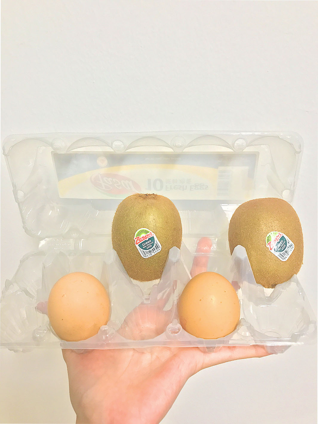
Looking at the shape of the kiwi, the egg seems like the one I can play with. Both rounded and elongated in shape, I thought I incorporate eggs and the egg tray in Task 2.

Fitting a kiwi onto the egg tray is no problem, but closing the cover is

Notice that while a kiwi could be placed on the egg tray, it is, however, impossible to close the cover. So does it fit in or not? Debatable?

Add the CAPTION!


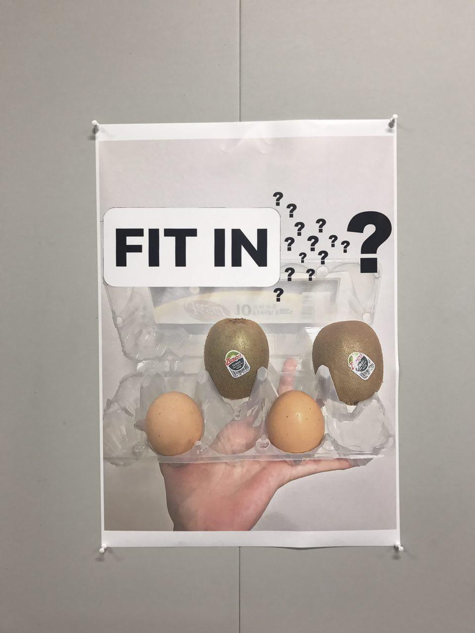
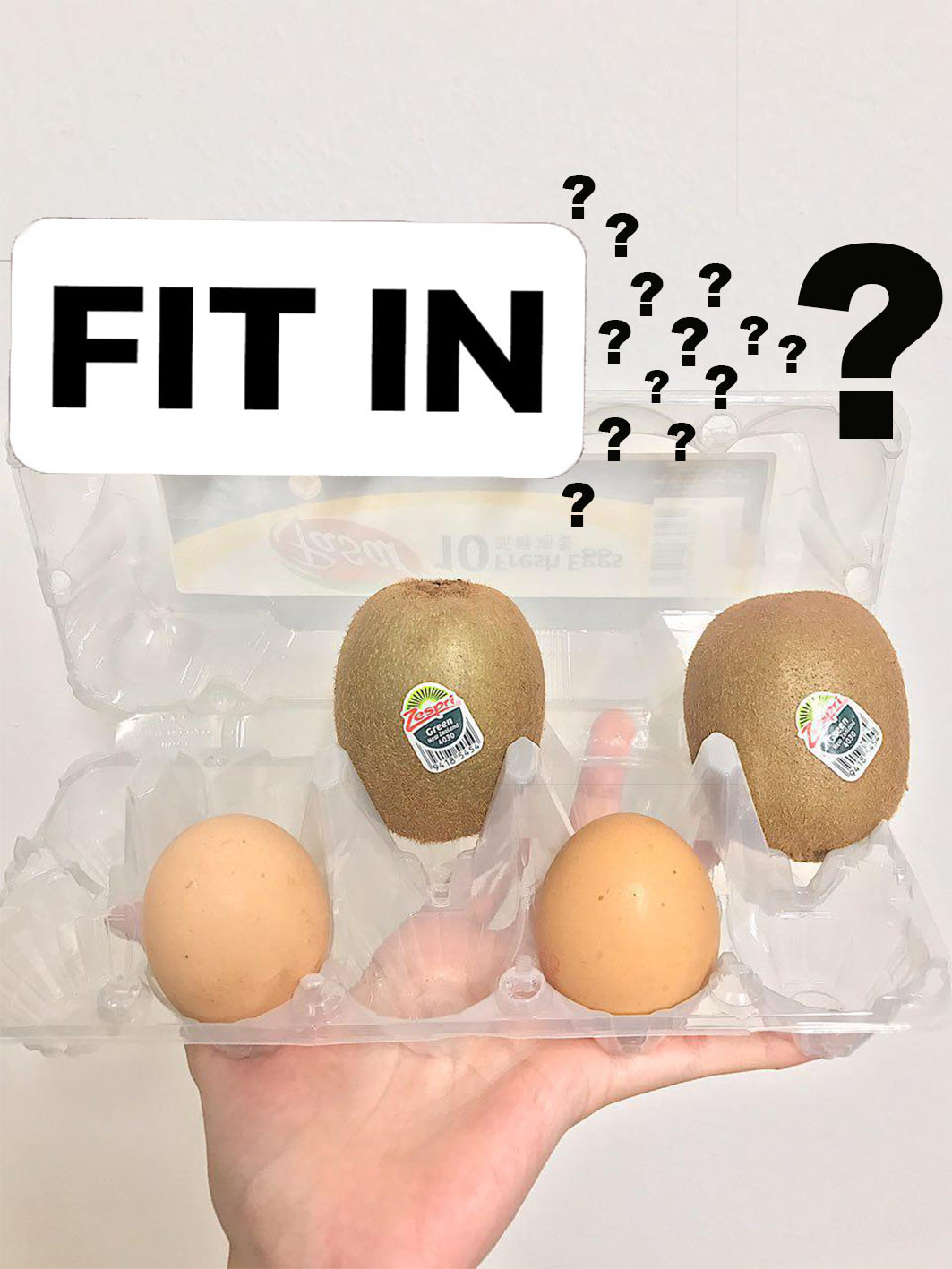
I knew I wanted to use this image to add a caption to further touch on the topic of whether the kiwi does fit into the egg tray. However, the caption was a tough one.

“where do we belong” was part of the selection, however, I thought it was a little too self-explanatory. Less is more.

I then worked with “FIT IN” since it has been a phrase that came to my mind when I brainstormed on the idea of fitting the kiwi into an egg tray.

How should I execute it? What font should I use? What message am I convey?

I first brainstormed with what message I wanted to work with. I wanted to challenge the impact of social media on the youths today.

How then should I execute it? As I was brainstorming, I thought what better way of coming up with the caption than to use Instagram since my message was related to social media. I did not like the idea of doing it up on an Instagram post, hence I worked with Instagram’s story features like its default font and colour.

I wanted the caption to be large and eye-catching, therefore, I put the black words against the white background.

The inclusion of question marks is to challenge the audience the idea of whether the kiwi actually fit into the egg tray. It is clustered to form an arrow, which is a directional and powerful sign of signal, very much like how our society “forces” us to be of a certain way. Similar to our society, the youths of today struggle to find an identity and because of the people around us, we are forced to fit in or be discriminated or bullied. People are expected to be put through a cookie-cutter even when every single person is unique and different in their own ways and cannot be fitted on a one-size “egg tray”. The one-size-fit-all theory is also challenged.

Task 3 – Research: Fonts & Meaning

  1. Serif Fonts

Example: Times New Roman

The presence of short lines on each letter gives it a formal feel. It is usually perceived as delicate, beautiful, expensive, warm and old. Usually used successfully in business news headers. However, when used in the body paragraph, the sizing may need to be noted as a small font will be hard on the eyes.

2. Sans Serif Fonts

Example:

Best used on the screen. It also creates a clean and intuitive reading process for the readers on screen. They are usually perfect for headlines and body paragraph. It produce an informal feel, hence not suitable for legal documents, however perfect for personal blogs and light-hearted magazines.

3. Script Fonts

The cursive fonts are best for screen use. They evoke an elegant feel. Some cursive fonts are similar to handwritings and hence are perfect for invitation cards.

4. Decorative Fonts

Decorative fonts builds a visual theme to your design that you put against. They are great for headlines but not really for the body. The emotional feel they evoke to the audience differs for each font.

Example:

One apparent example is the Harry Potter film cover and the “Harry Potter” font. It is distinctive and easy to recognise.

taken from: http://www.dvdsreleasedates.com/movies/4767/Harry-Potter-and-the-Deathly-Hallows-Part-2-2011.html

Reference:

Fonts and Meaning

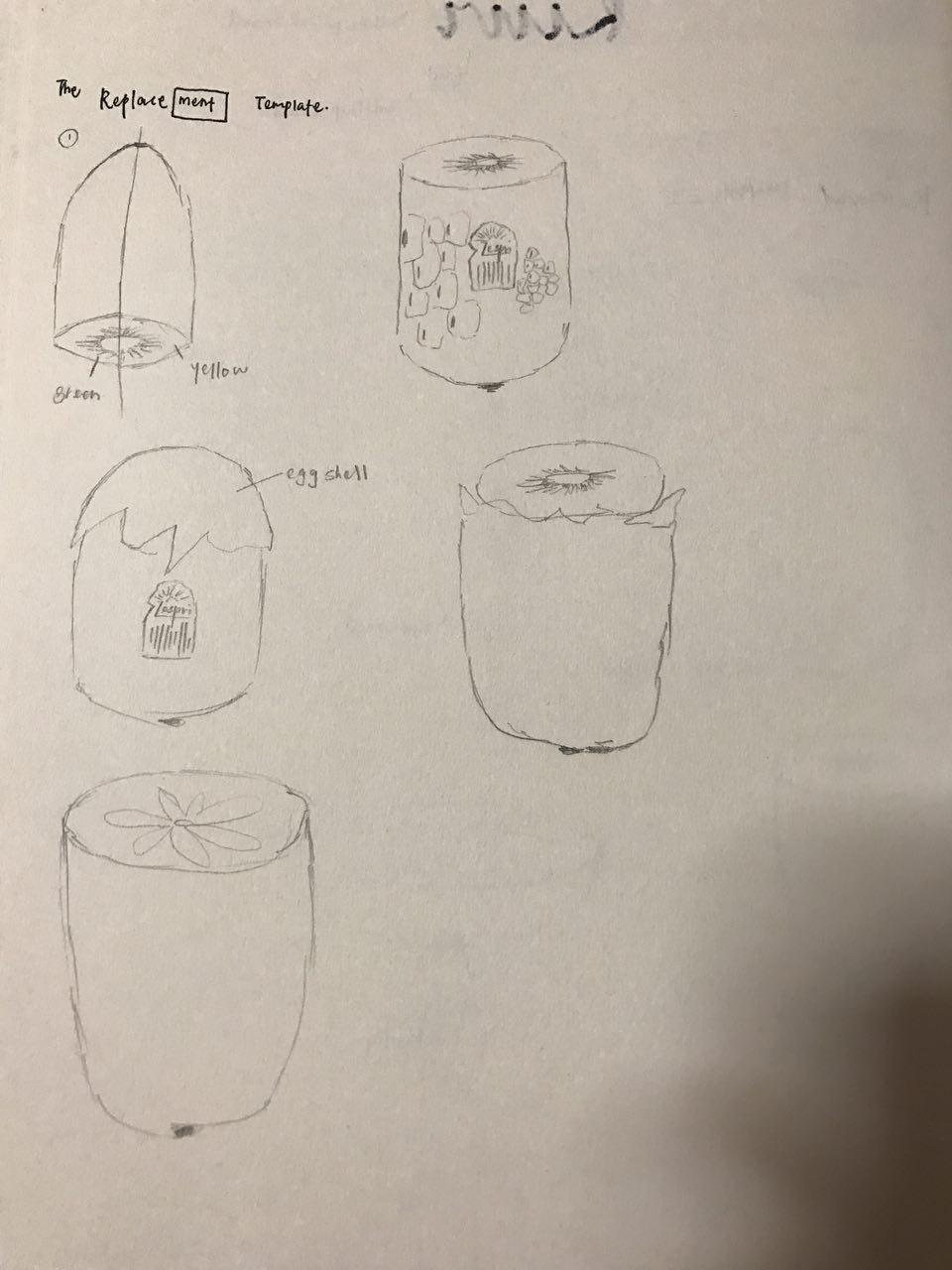
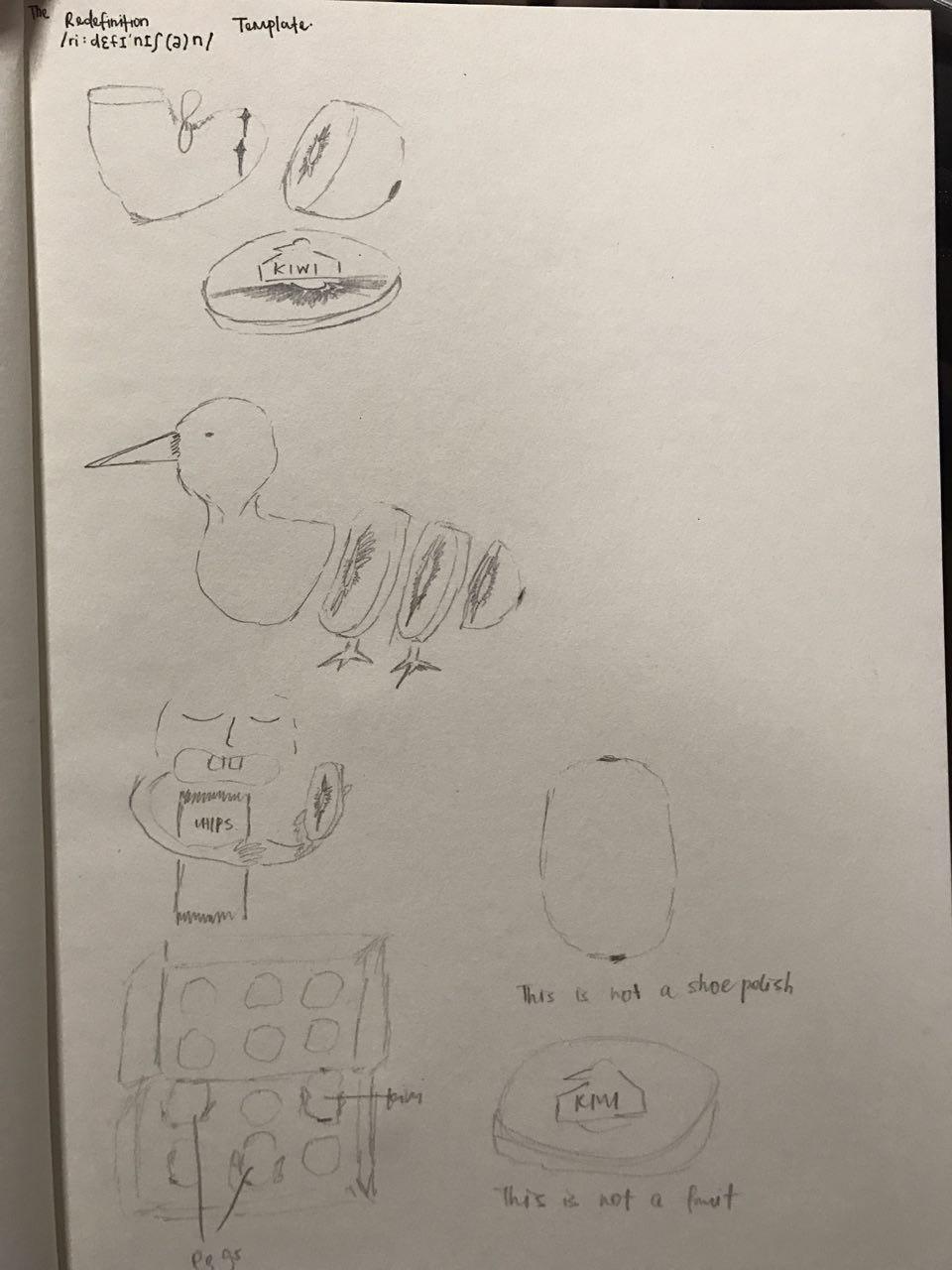
The Removal, Replacement and Redefinition Template

Artist Research:

Chema Madoz

Madoz is a photographer from Spain and is recognised for his monochromatic and surrealistic photos.
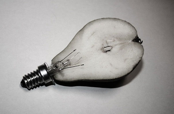
pear or lightbulb?

toilet paper or scroll?

drain or a plate holder?

After looking at his photos, I realise that his works often make me think twice as to what he is actually photographing. This inspired me to make my works questionable and debatable at first glance.

Reference:

Chema Madoz

It’s a Wrap!

Looking back at this project, I really enjoyed thinking out of the box and thinking atypically. Even though I had a lot of challenge subverting kiwi initially, with the research and looking at other artists’ works, I overcame that challenge and managed to still churn out ideas for Kiwi! (which i’m very happy about :))

Task 3 was a little to cluttered because of the question marks (as mentioned during critique), I thought I could have been more sensitive to the aesthetic of the message than the delivery of the message. That is something to work on!

All in all, this project helped me to look at things a little differently now! Hope you enjoyed viewing my work!


4D Foundation Exercise 1 – Scale and Framing

For this exercise, we are to take photos of our partners experimenting with scale and framing of our photos. My model for this project is Teri smile
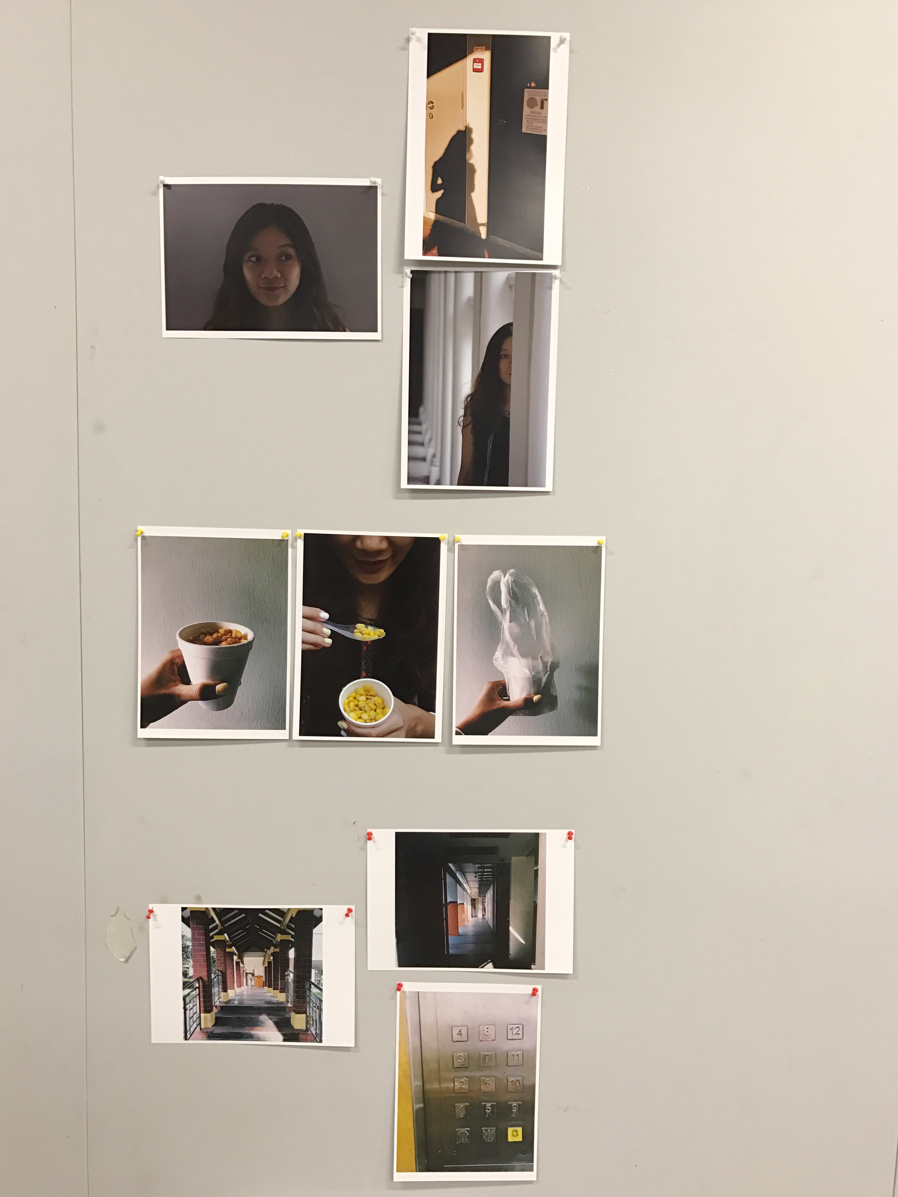
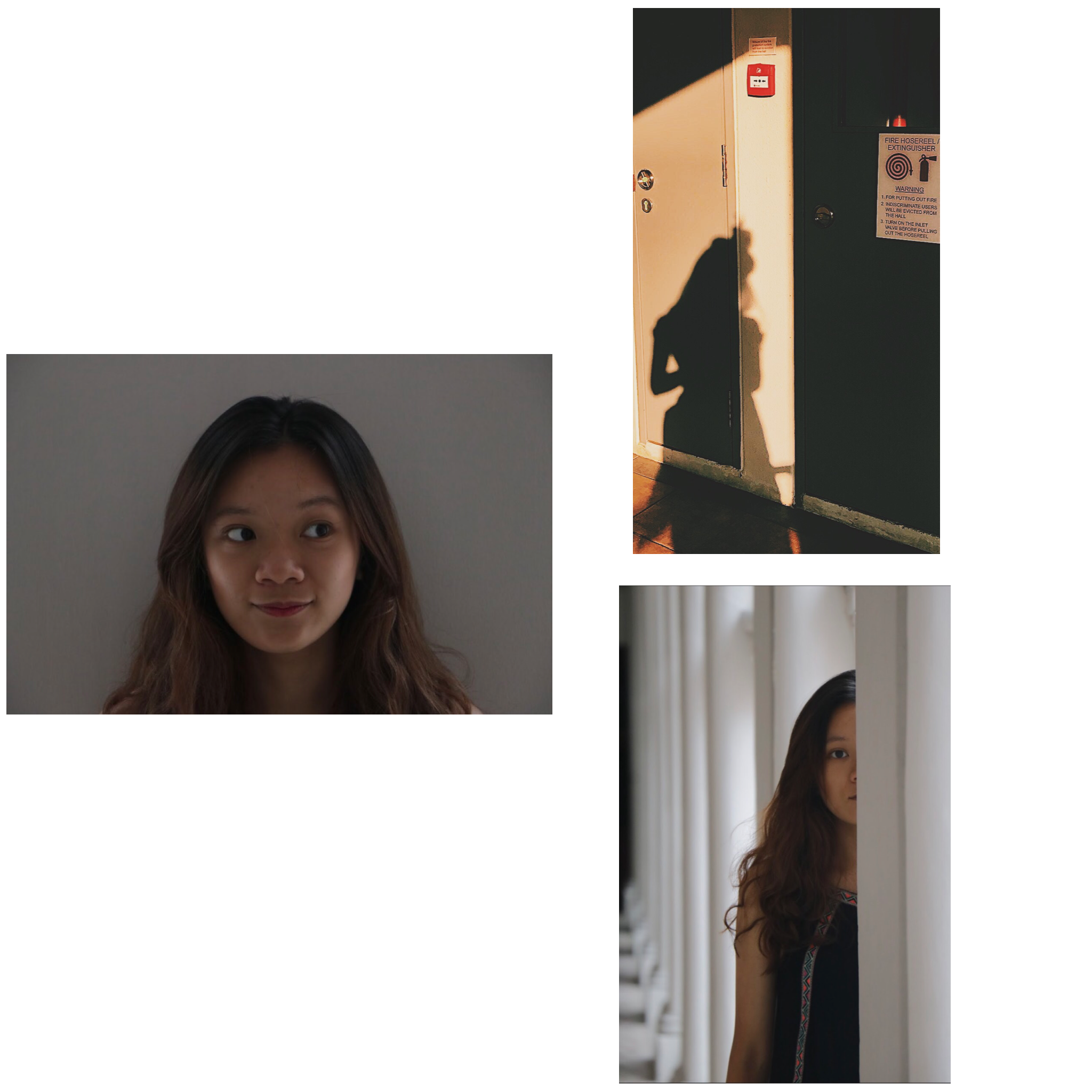
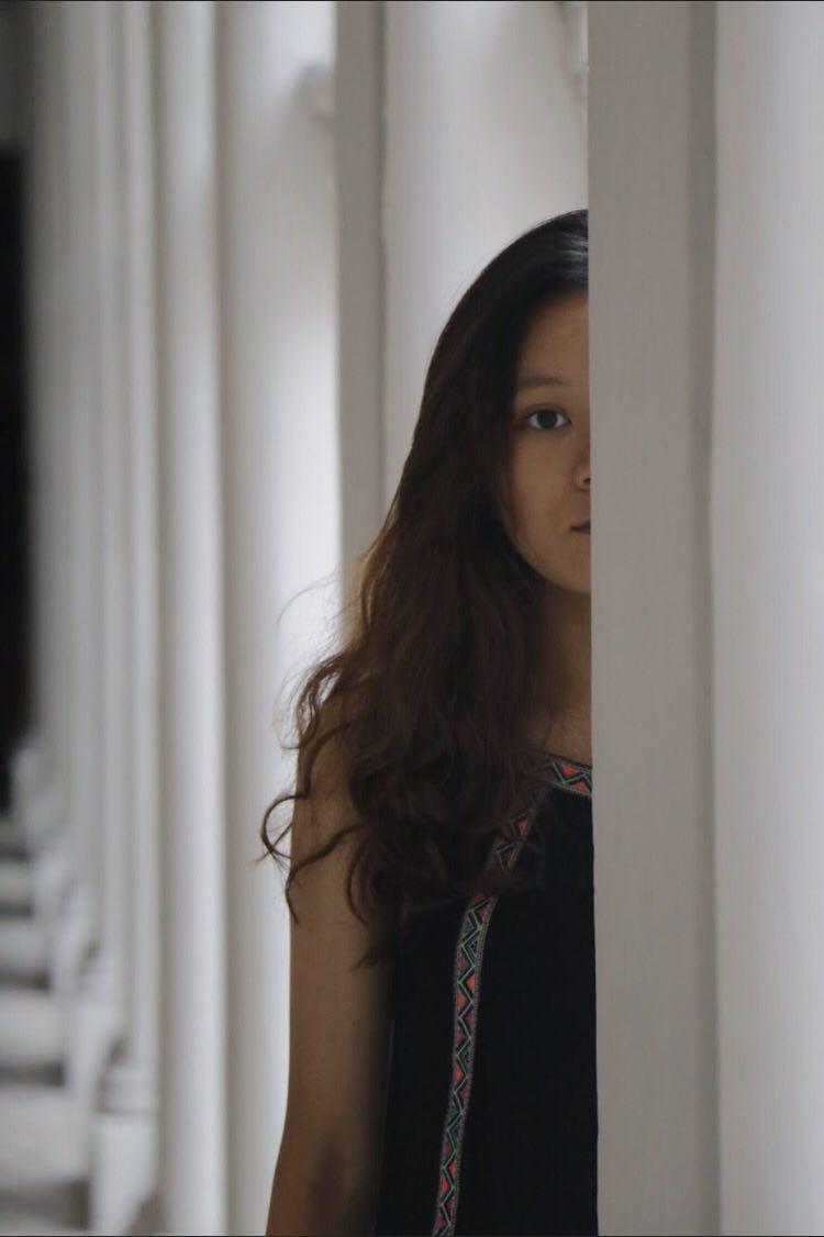
and here are some shots of her taken by me!

Location: Basement of ADM building at the cubicles section. We saw tiny pots of succulents and cactus and we started taking pictures at that corner.

Things noted down while taking the shots:-

-Trying to bring out a certain reality about our model.

-How to use scale and framing angles to convey the reality you want to show about our model.

-The micro-expressions of our model.

  1. A Close-Up Shot / High Angle

This is a close-up shot of Teri interacting with David the cactus. Working with the rule of thirds, I tried to position the image such that Teri can be seen interacting with David the cactus. She is seen in the first one-third of the frame, David the cactus is seen in the middle second-third of the frame and the other succulents are seen in the last one-third of the frame.

I thought a top-down angle of this shot can show how Teri loves plants and how she cares for them. Her tender gaze at David the cactus can be seen subtly through this angle, showing her love and interest for plants.


2. Medium Long Shot / Eye-level shot

Taken from a distance, David the cactus is seen in shallow-focus while Teri and a succulent is seen in deep-focus. I thought this angle is great to capture Teri’s body language when she handles the pots of plants around her. Also, this angle very perfectly showed the humanly comparison of Teri’s size versus the size of the potted plants. This portrayed Teri as a “motherly” figure to the plants.

3. Medium Shot / Relatively high angle

As Teri is seen blending forward to have a closer look at the tiny plants, I quickly took a shot. I thought this frame very strategically got her reflection in the middle of the picture. Hence, even though it is only a reflection, it will still gain attention from its audience. This picture brings out Teri’s curiosity about the succulents in ADM.


Project 1: Picture Story — Curating Self

Some test shots taken for Project 1: Picture Story — Curating Self

 Artist Inspiration:

1.

This image under Task 1: Me is inspired by Lee Friedlander and his style of photography. The way he subtly inserts shadows or reflections of himself in his images urges me to experiment with taking my shadows and reflections.

taken from: http://www.atgetphotography.com/The-Photographers/Lee-Friedlander.html

taken from:https://joshuabwakley.wordpress.com/tag/lee-friedlander/

2.

This image is also from Task 1: Me and I got inspired by Shirin Neshat’s portraits to do an up close picture of myself, except to add a little twist to it by showing a more fun side of myself rather than a serious side, which Shirin Neshat usually does.

taken from: http://signsjournal.org/shirin-neshat/

 Do not forget to view my final work here!

Project 1: Picture Story — Curating Self (final product)

hMy Presentation on 31 August overview

Task 1: Me

Pictures used:

Sequence on presentation day 

Write up:

As viewed in a somewhat circular motion, the first image that should catch your eyes first should be the only landscape photo, followed by the other 2 portraits.

This series shows the outer and the inner me as a whole.

Shot at eye-level, this picture of my close up face, as seen from shoulders up portrayed a very open truth about me as everyone will view or first notice on the outside. Having my face in the centre of the picture shows no hidden part of me. Just like what is shown, I am someone bubbly, cheerful, all smiles, positive. And if people know me well enough, I can sometimes be quirky!

As you continue to know me in a deeper level, we continue the series in a clockwise direction. This shot is taken in an eye-level, mid-shot. I can be someone who does not share my life that openly to the people around me and would not be an open book. The warm hue in the second picture depicts me in my comfort zone, taken during a golden hour. The bun was kept in the picture as seen in the shadow to still keep the elements of me that most people will know on the outside, positive, bright, quirky. However, a silhouette shot gave a sense of mystery in who I actually am on the inside. Yes, people do know me, but there will be a part of me that they will try to pry open but fail to succeed.

Moving along, the third picture is taken strategically to only include half of my face in the focal point. As I am staring right into the camera, it shows that the outer me is also the real me, no jokes, no kid. Yet, the inner me is another side that will not yet be shown. Also, there are times when I am alone, things might not always be that happy and positive for me, hence the expression. I am not exactly a social butterfly because I crave my alone time to think, reflect and feed my soul.

Task 2: Object

Sequence on presentation day 

Write up:

The attention should be put on the middle picture in this series that depicts how I truly enjoy eating corn. In fact, I can eat it for any meal, I will not complain. Taken in a top down angle (high angle), close-up shot, it can clearly show the act of me consuming the cup of corn, using the rule of third.

It is significant to me not because it is my favourite food, but also because it reminds me of the people whom I love and also love me.

So a little back story, the number one snack my parents always get for me is a cup corn be it in Pasar Malam or when we are overseas and it continued till today. It has slowly become my favourite food. Even thinking and talking about it now makes me salivate! I receive it out of the love they have for me. And as it slowly becomes my favourite food, yellow also slowly became one of my favourite colours. Like its colour, it makes me happy and positive and I think this can explain my positive front as a person as well.

Why I choose to include the picture with the packaging and the plastic bag is because I often receive it this way, in this packaging whenever someone buys a cup of corn for me. It is how I see and receive it.

As for the picture of the full cup of corn, this is the sight that will never fail to make my day as I get ready to eat it.

The two shadowed background for the first and third image strives to tone down the lighting in the surrounding to put more emphasis on the brightly coloured corn in the cup. Also, it directs the audience attention first to the process of me eating the cup of corn, which was the effect I wanted.

Task 3: Place

Sequence on presentation day 

Write up:

The place I chose is my neighbourhood, my void deck. I have lived in Ang Mo Kio for as long as I can remember and it is a place where my family members always gather during special occasions as I have many relatives living around me in Ang Mo Kio as well. It is significant to me because it means “home” to me, a place I am very familiar with, a place I know at the back of my hand. This series of shots are taken at eye-level to show accurately the exact site I would see as I am on my way home.

This series shows my usual route home. It aims to guide its audience how it is like for me to go home, a place of comfort, love, familiarity.

This stairway guides me home, and is where my family members will meet whenever we retrieve the car or want to get a drink from the mama shop nearby.

The second picture has dark hues of colour, yet shows a bright vanishing point shows how it is like for me when I finally get closer to home, to comfort. The day might be long, tiring, but I know once I walk this stretch, it means home gets closer and closer, comfort gets closer and closer. The vanishing point created in the frame gave the result I wanted as the diagonal lines of the concrete floor and the ceiling directs the audience’s attention to the direction where I am heading, very much like I am taking my audience on a journey back to my home. However, this shot is taken with a slight tilt to mimic the motion of me walking back home. This effect shows a much clearer idea of how I am bringing my audience through the pathway home and gave the effect of me walking towards home.

The last picture shows a top-down angle of what my view will be like when home is closer than it is. The level I stay on, and the sight of familiarity. The level eight is where I live on.

Conclusion:

Overall, the journey of curating the three series has allowed me to reflect on what are significant to me in life and discovering my identity in the process. Besides, I got to experiment with different angles, framing and shots and realise how each image, when carefully thought through, can each tell a story. In a nutshell, it was a very fun process in creating the images and using them to tell a story about me.

I hope you had fun viewing them and got to know me a little better thought the images I have created!

Process