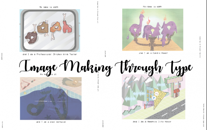
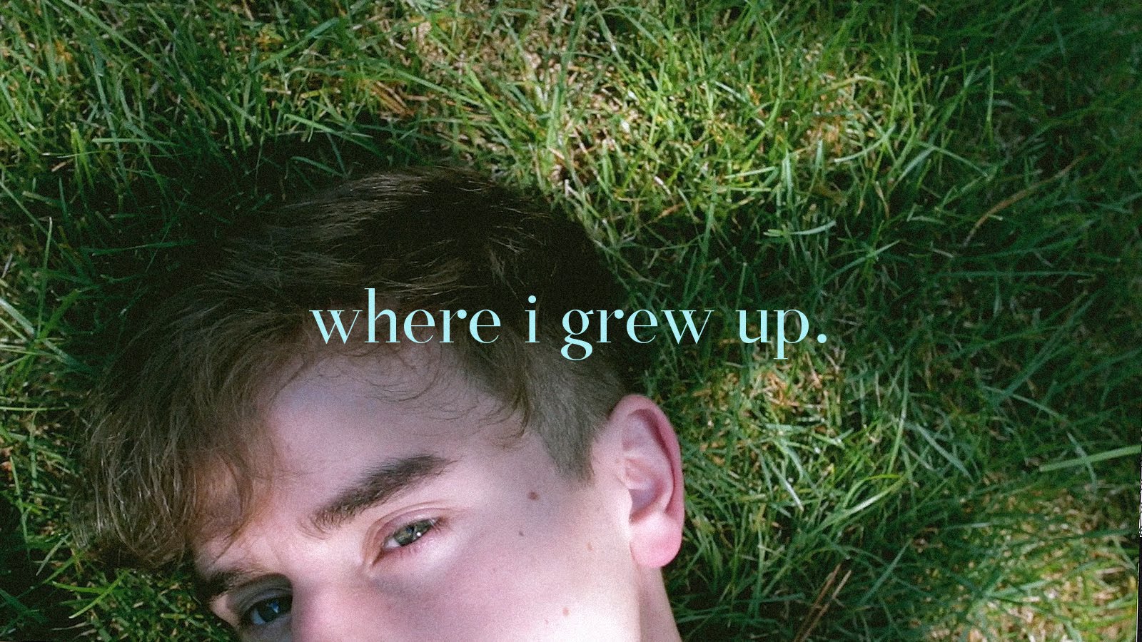
About Assignment 1
For assignment 1 for Graphic Form, we are to create typographic images related to our imaginary occupations. The use of typeface, style, size and the use of upper and lower case should be carefully thought through.
Concept Behind My Pieces
The pieces I created are expressions that hints at who I am. Each piece has a truth about me.
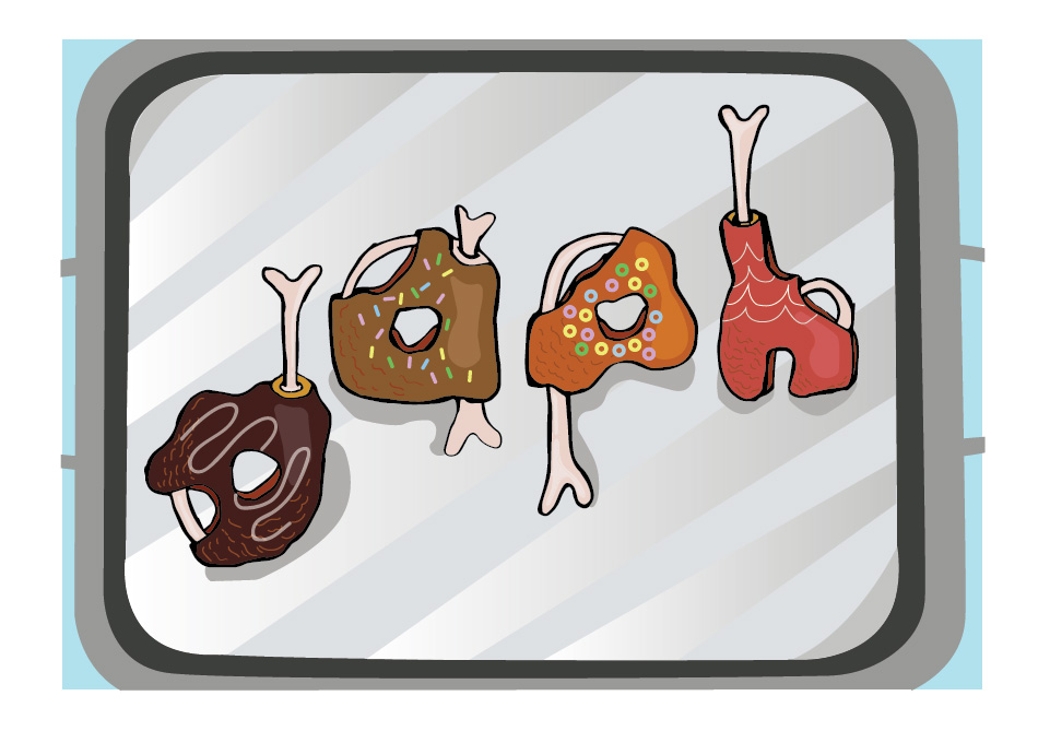
ONE – PROFESSIONAL CHICKEN WING TESTER
She is not fond of meat, but she likes chicken wings
And hence I am a Professional Chicken Wing Tester
ONE – RESEARCH

“Inside” print by Wesley Bird
When I came across Wesley Bird’s “Inside” print, I thought it was really adorable how he incorporated the bones, flesh and skin into his type! I especially love how he illustrated the bones.
“Rotten Food” illustrated by Alex Solis
As for the texture of the chicken wing itself, I was unsure which kind of texture I should go for. The grilled, bbq, or crispy. Then I came across Alex Solis’ “Rotten Food” series for reference for the texture and the shadow of the surface of the meat and the bones.
She likes donuts, since young.
I had initially wanted to be a donut tester too, but the idea was put away because there were many type that are of donuts. Below is just one out of the many examples.

Time Out Magazine: Don’t Worry Be Fatty by Tom Hislop

Houston Donut Glossary | taken from Pinterest
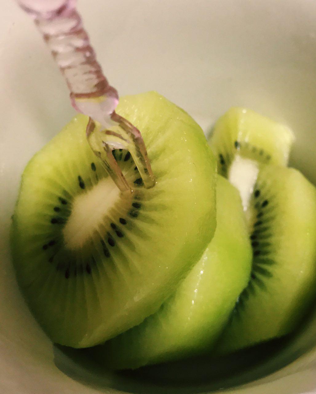
Although I put away the idea of a donut tester, I decided to incorporate it in my Professional Chicken Wing Tester type. As a Professional Tester and critic, they will usually be asked to taste new products. Hence, I decided to incorporate donut toppings onto the Chicken Wings, very similar to honey glazed chicken wings.
taken from: 4 Fingers Website | http://www.4fingers.com/Menu-Signature-Crispy-Chicken
I also went to 4 Finger’s Website to reference the types of chicken wings that they have.
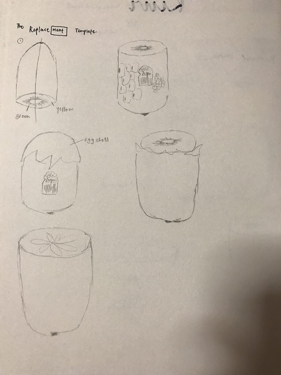
ONE – PROCESS
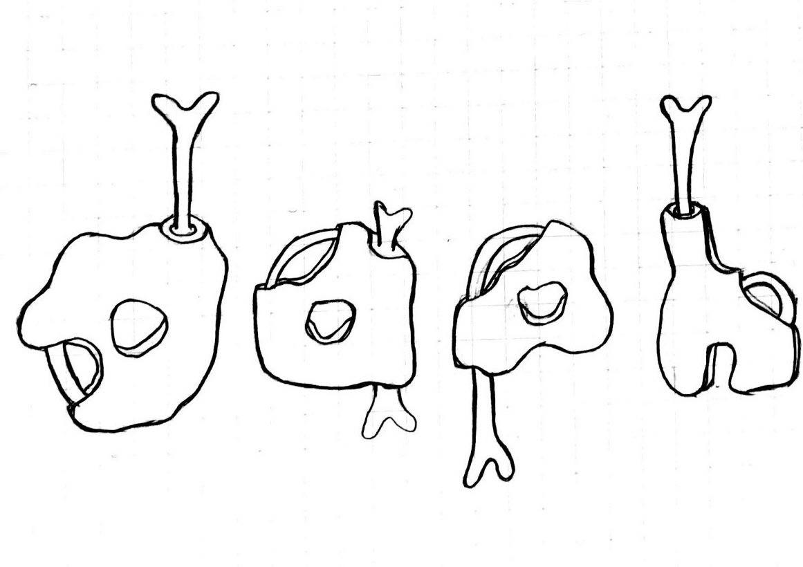
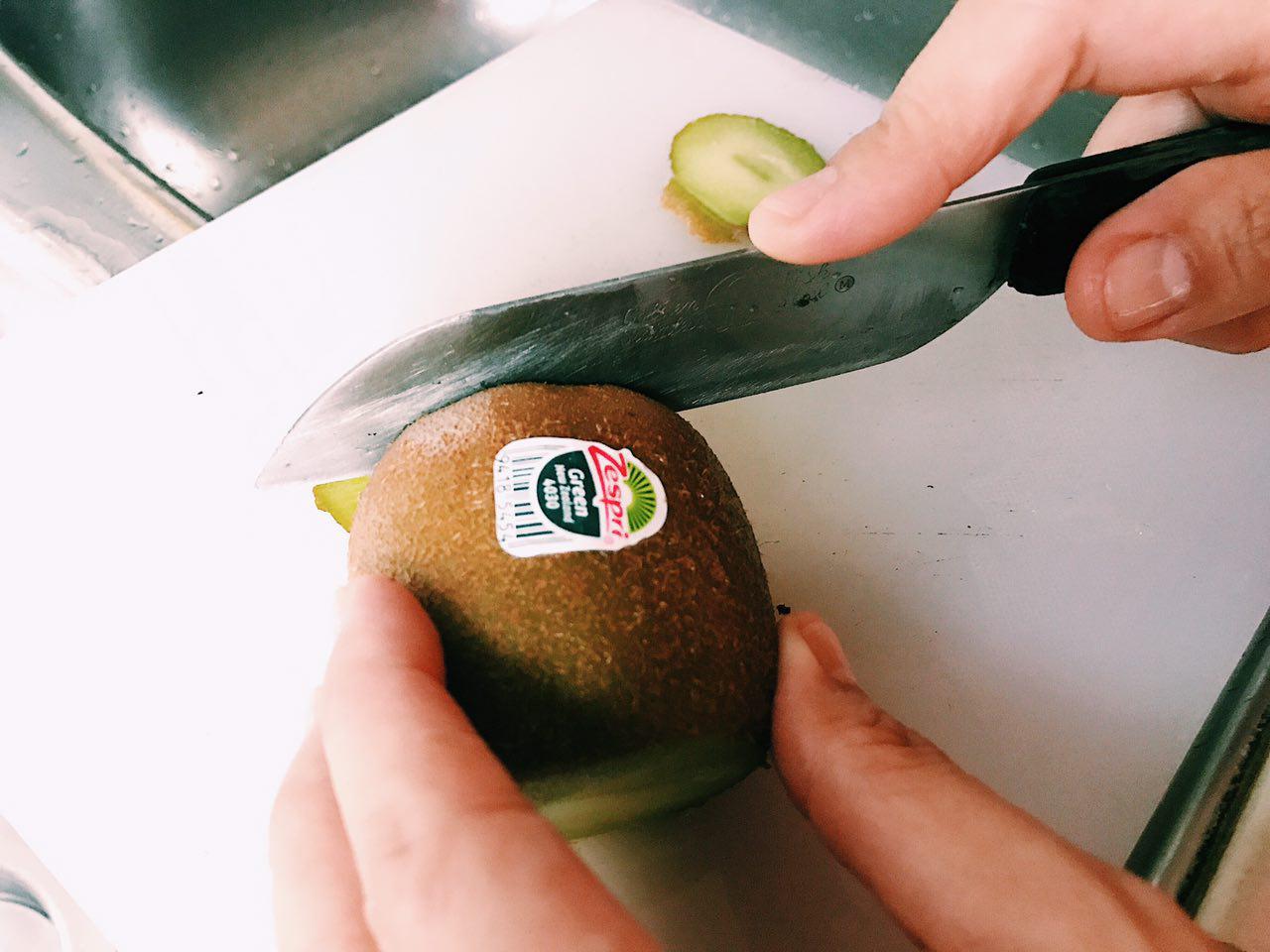
I started out by sketching out the idea of it on my sketch book.

Self-drawn on sketch book
I scanned it onto Illustrator and added colours digitally.
The first few phases of the piece were my initials made up of similar Chicken Wing type with the same colours and textures. Also, it was without the use of shadow which made it look very flat.
I then researched a little about lighting conditions and added the highlights and shadows we learnt from Illustrator class.
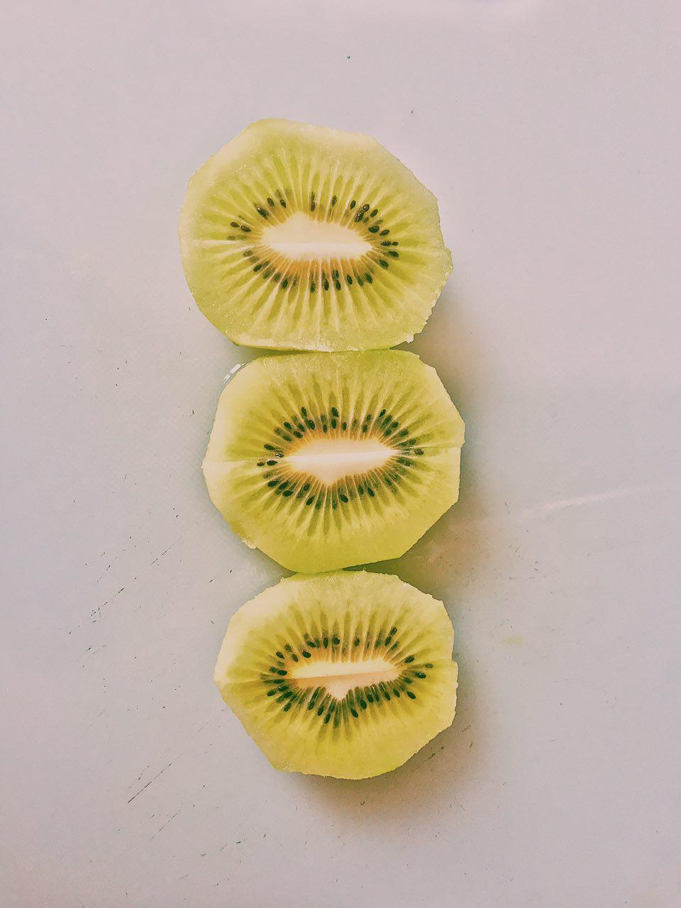
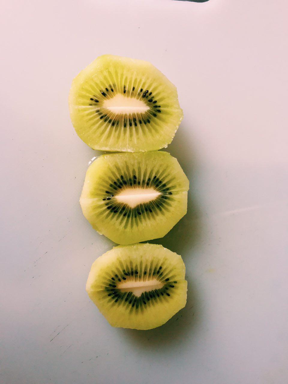
Professional Chicken Wing Tester Final
Composition
Professional Chicken Wing Tester has the type placed in a way that it guides the eye from bottom to up, from the “d” to the “h”, creating a more interesting vision guide than if I had placed them merely straight on the platter.
Colours
For the colours, I used conventional donut topping colours, like the shade of chocolate, and the rainbow sprinkles and fruitloops. As for the colour of the “body” of the chicken wings itself, the colours used are analogous (red(“h”), orange(“a”, “p”) and dark purple(“d”)). The colours of the platter is merely shades of grey used.
Semiotics
Using the idea of the chicken wing and the toppings on donuts, I borrowed the bones and the texture of the chicken wings and the iconic element of the donut toppings which are the sprinkles and the sugar icing that goes on top of it.
Type shape, size choice
I choose the lower case because all alphabets has a tail I can work with to insert the bone, giving the type more consistency. The alphabets have an organic shape because the shape of a chicken wing is not always the same.
TWO – CANDLE MAKER
She likes fragrances. Candles, perfumes…
Hence, I am a Candle Maker.
TWO – RESEARCH
I stumbled upon this melting effect on type on Pinterest which I thought was what I want to go for for my Candle Maker type.
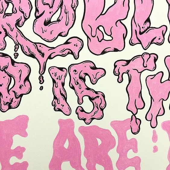
Type by Andreas Pedersen | taken from: https://www.instagram.com/andycloned/
TWO – PROCESS
To add an additional touch to my take on the occupation, I added flames and droplets of wax on my type to make it more suggestive of the occupation.
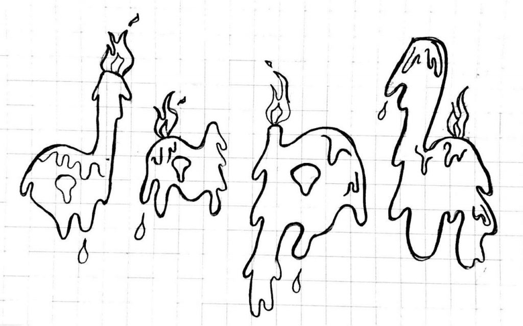
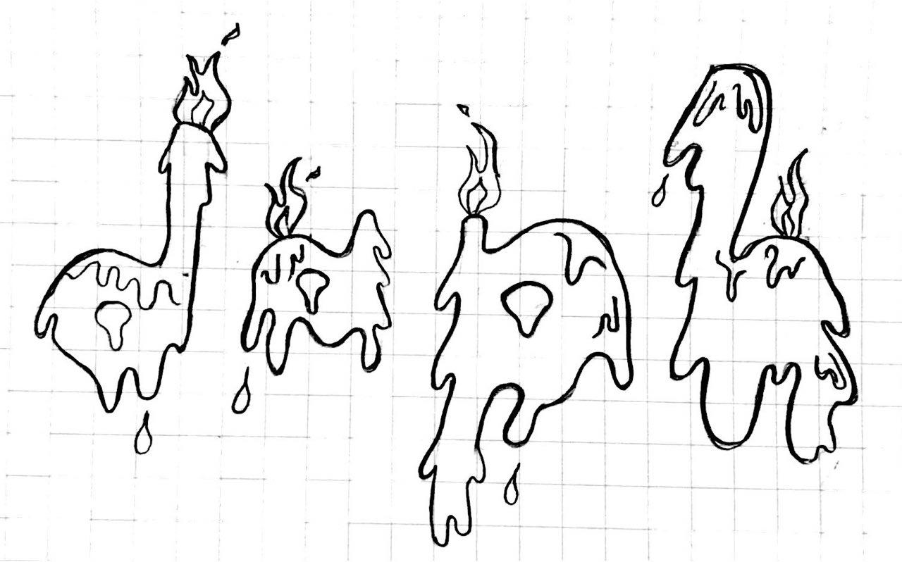
Hand-drawn on sketchbook
Besides, the initial design had hard outlines which after consultation, I decided to line the type with a darker shade than a harsh black outline.

This is a snapshot of one of the initial stages
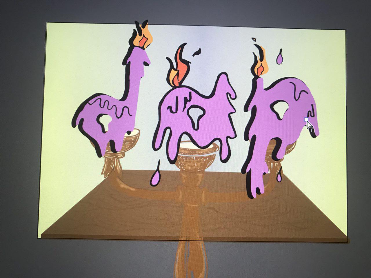
Also, to add an additional touch to it, I used a hot glue gun to give the final product a “melting” illusion and texture to the graphic. Below is a video of it!
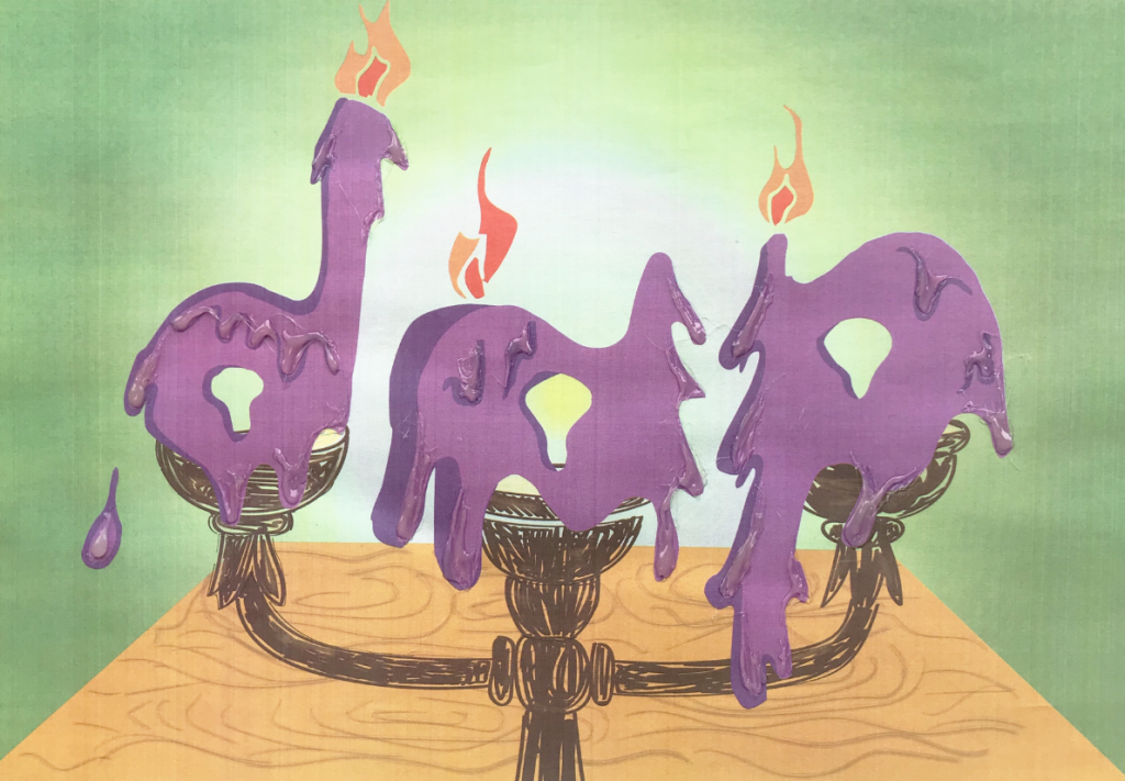
The digital final piece is attached below:
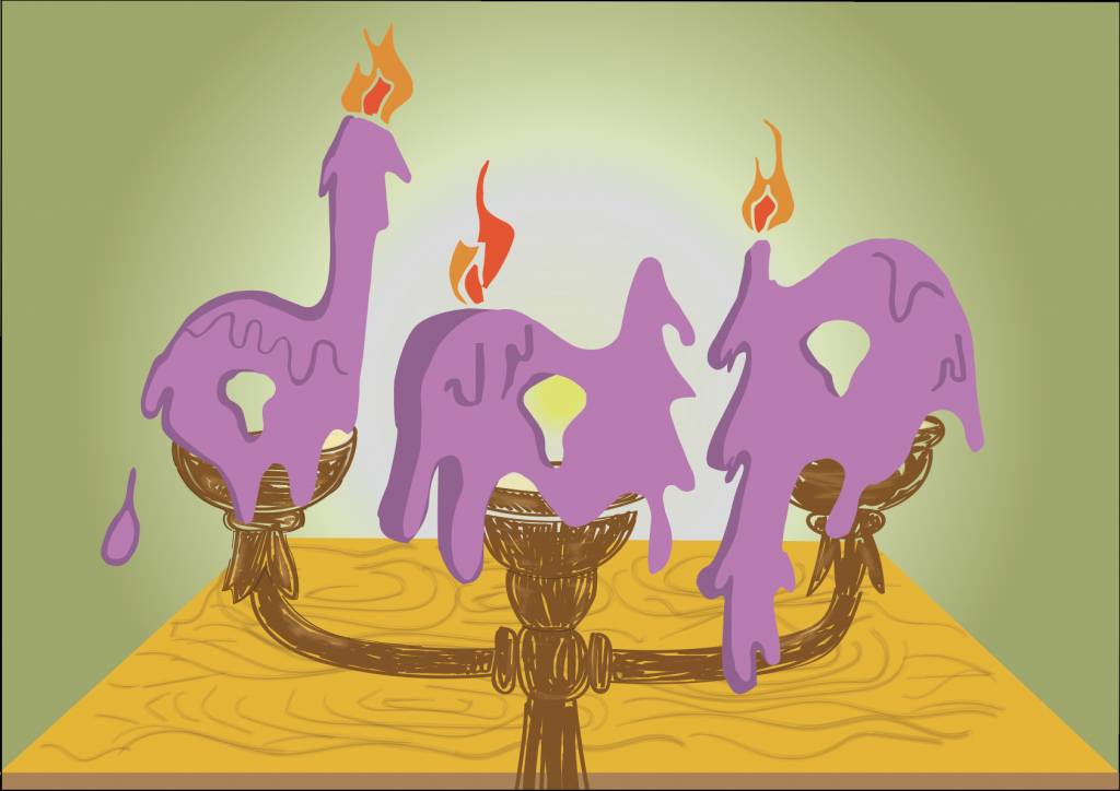
Digital Final Piece for Candle Maker
Candle Maker Final (with hot glue texture and illusion)
Composition
The type “dap” is used instead of “daph” due to the number of candles the traditional candle maker can hold. The alphabets are places straight, side by side due to the placing and the nature of the candle holder. The play on the wax dripping gives the piece a slight touch to the otherwise boring line-up side by side alphabets.
Colour
The colours used are square (purple, green, orange and blue). The background goes dimmer away from the alphabets to give it an illusion that the type is placed in a dark room and the candles are lighting the place up.
Semiotics
I borrowed the element of wax dripping as a candle is lit to the texture of the alphabets. The flame from the candle makes up the flame seen at the top of the type.
Type shape, size choice
The alphabets has a non-rigid shape, mimicking the actual candle, which shape and size will change as it is lit.
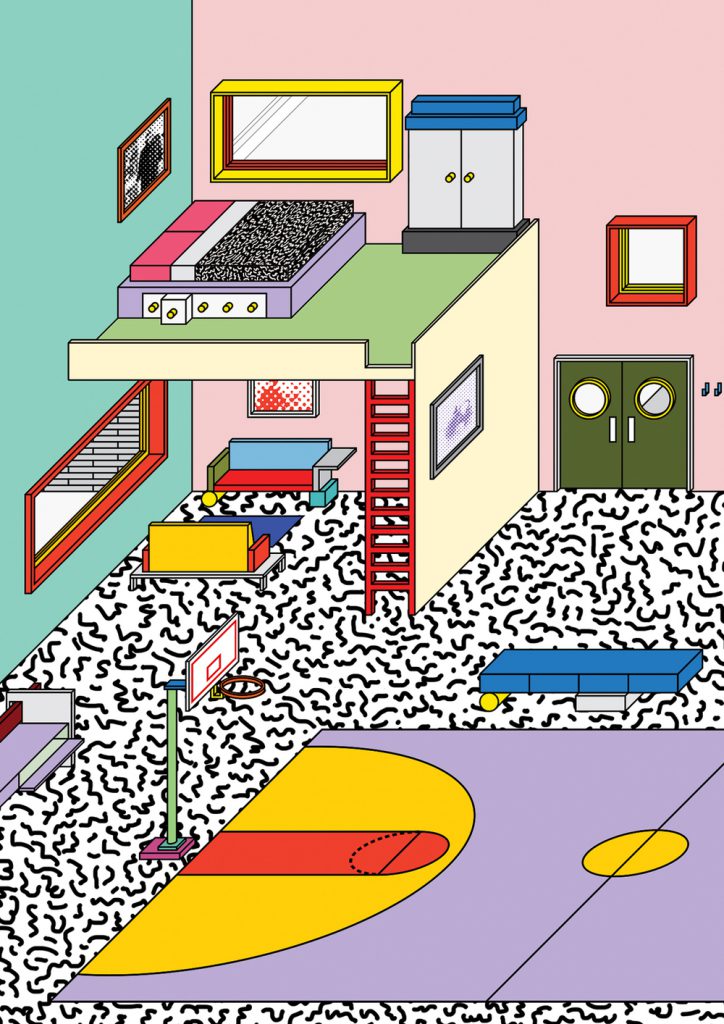
THREE – POOL MERMAID
Her favourite Disney princess is Arial.
Hence, I am a pool mermaid.

THREE – RESEARCH
I thought being a mermaid will be too ordinary so I decided to spice things up and put things better into context, a mermaid in a pool.

Graphic of a mermaid tail | taken from: https://www.etsy.com/listing/541800432/mermaid-tail-svg-mermaid-svg-mermaid?utm_source=Pinterest&utm_medium=PageTools&utm_campaign=Share&utm_term=so.lp.d2.v1&share_time=1516587659000
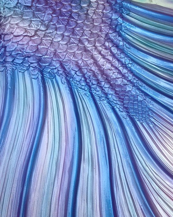
Mermaid tail | taken from: https://www.instagram.com/p/8wfUazNk4E/
Shell | taken from: https://www.instagram.com/p/BSE_WmbDLWO/
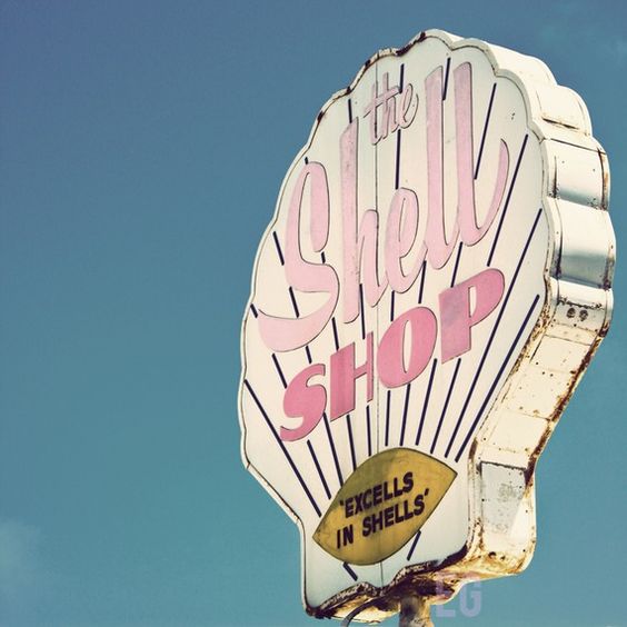
Font usage and colour usage | taken from: https://www.etsy.com/listing/56809840/shell-shop-8×8-print?ref=v1_other_2

taken from: https://www.behance.net/gallery/38674217/The-Architectural-Sculpture-in-Warsaw
background research and emphasis on the shadow and highlights used | taken from: https://www.etsy.com/listing/56809840/shell-shop-8×8-print?ref=v1_other_2
THREE – PROCESS
Initial stages
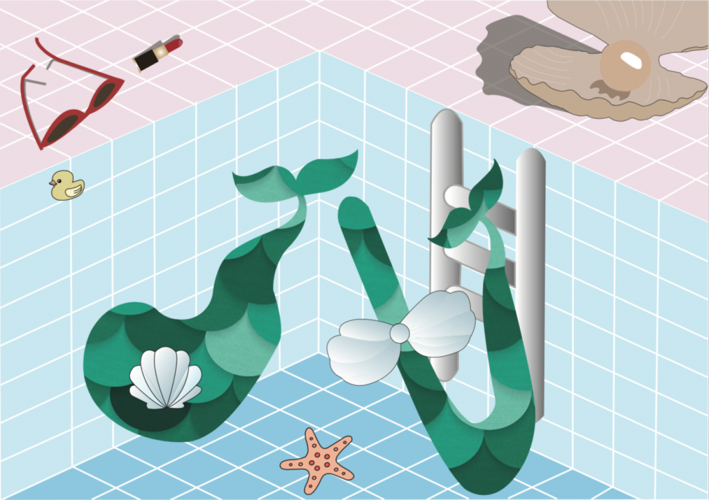
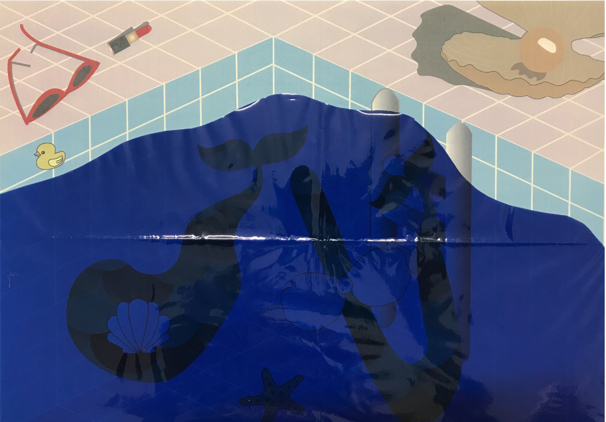
This was the initial stage of this piece. With the use of opacity on Illustrator to bring out the water in the swimming pool.
After much considerations to want to improve on this piece, I decided to use a transparent coloured sheet as the water to give it more visual appeal. Though I acknowledge that the colour of the coloured sheet might be a little too dark, but these sheets only come in certain shades of colour, which left me to not much choices. Because of that I decided to not conceal the transparent sheet, but make the piece removable from the plastic sheet to see the details. IMG_0811
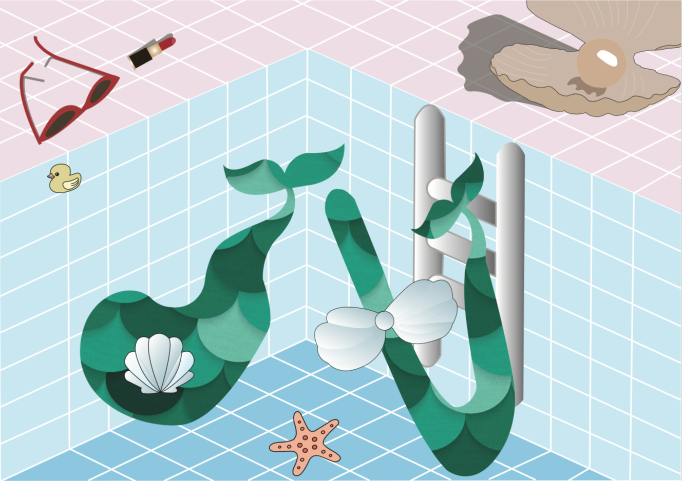
Digital Final piece
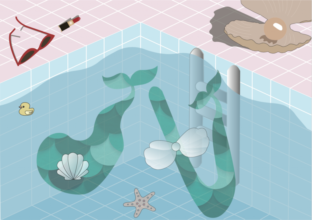
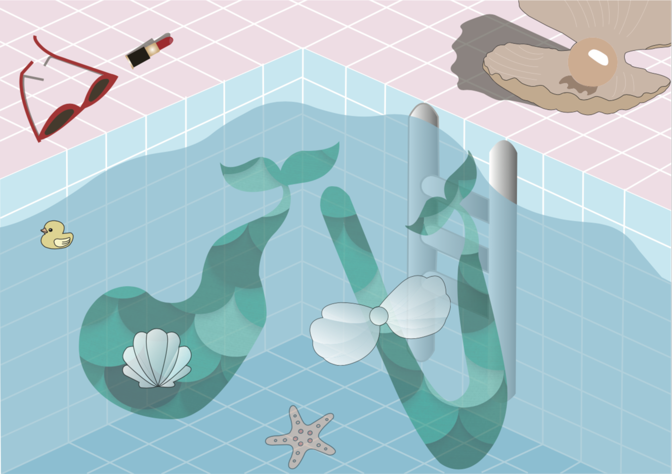
Pool Mermaid Final
Due to lighting and the fault in printing, the colours might differ.
Composition
The alphabets are placed in the lower two-third of the paper and the grid lines of the swimming pool leads our eyes to the corner in the middle where the alphabets “d” and “t” are.
Colour
A pastel colour palette was used for this piece.
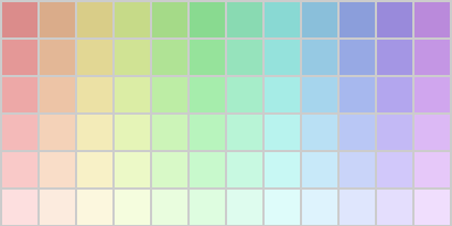
Pastel Colour Palette
I chose this colour palette because I thought that the colours fit will with the theme underwater and mermaid. The colour choice is triadic of red, blue and green.
Semiotics
The alphabets are fluid, mimicking the nature of water. The mermaid tail is also used to hint at the occupation of a mermaid. Also, the lipstick and sunglasses hints that the figure has a human nature, yet at the left hand side of the piece, the clam suntanning mat hints at a not so human nature of the mermaid.
Type shape, size choice
The alphabets are fluid with organic sides.
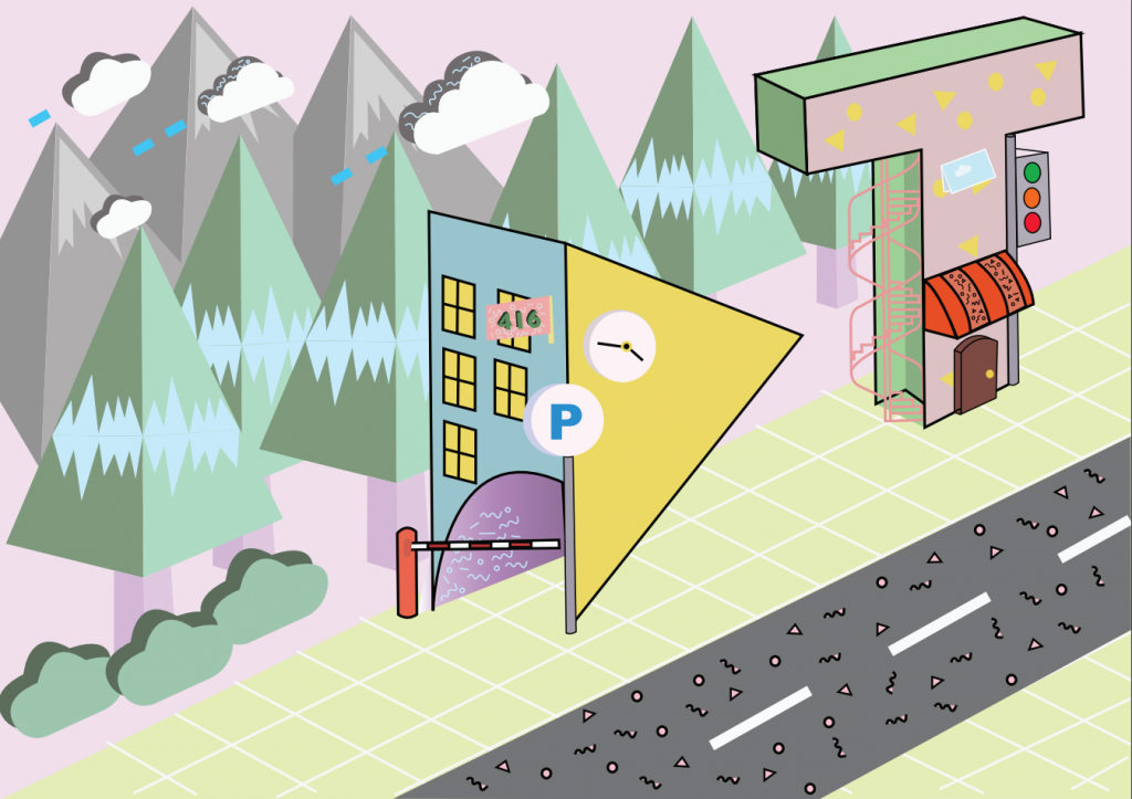
FOUR – MEMPHIS CITY MAYOR
She is currently into memphis designs.
Hence, I am a Memphis city mayor.
FOUR – RESEARCH
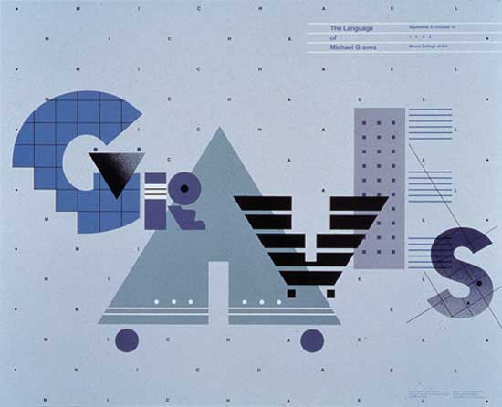
taken from: https://www.britannica.com/biography/William-Longhauser
The artist reference is Peter Judson and I am in love with his Memphis graphic designs. I looked at many of his art works on his website.
taken from: http://www.beatpie.com/2014/04/sunday-blip.html
taken from: http://peterjudson.com/iai7zfzs05nmtxpj3g3k53cb59myha
taken from: http://peterjudson.com/2016/5/23/tribute

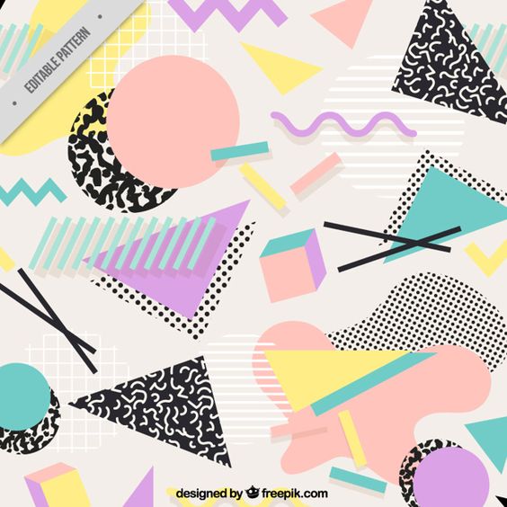
taken from: https://designshack.net/articles/graphics/designing-with-an-80s-trend-memphis-design-101/
FOUR – PROCESS
I wanted my alphabets to be blockish although the Memphis font type uses block or bubble fonts because the previous 3 pieces are rather fluid in nature.
Initial stages
The buildings looked a little empty and not as apparent that it is a Memphis City. Hence, I decided to add more random patterns to the alphabets.
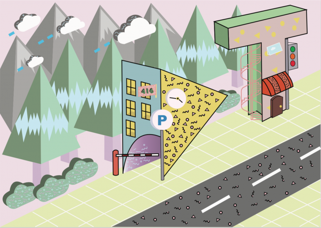
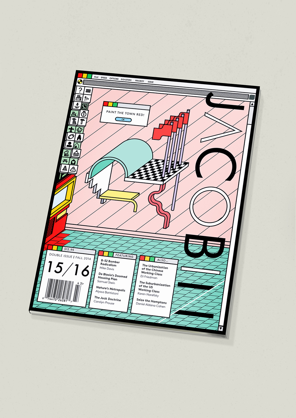
Memphis City Mayor Final
Composition
The “D” and “T” are placed in the two-third of the piece, making use of the rule of third. The perspective guides the eye of the viewers, with the add of the concrete floor and the grids, as well as the line-up by the trees and mountains at the back. This piece has a clear background and foreground.
Colours
Similar to Pool Mermaid, the pastel colour palette was used for this piece and the use of millennial pink (research). Analogous colours of yellow, green and blue are used to a large extent.
Pastel Colour Palette
Semiotics
I went to research on the characteristics of memphis designs to give myself a better picture of what the style of this piece will be. (research) Also, a city has residential buildings, cafes, stores, streets, hence I gave the alphabets characteristics of a residential building for “D”, with the carpark gantry and the parking sign in an ordinary carpark of a HDB in Singapore. Also, older shop houses in Singapore has the iconic spiral stairs outside of the building, with I had incorporated in “T” as well as a traffic light.
Type shape, size choices
The buildings are placed roughly the same size as the trees and the mountains, the play of scale used in this piece for the alphabets.
OVERALL CHALLENGES AND TAKE AWAYS
I have explored various possibilities for my occupations and went back and forth, changing them to make them more imaginary than they are. Also, I thought creating jobs that are related to me will spice things up a little, rather than randomly choosing them. This way, I can better interpret them. I had many difficulties making sure my pieces spoke to the audience about the occupation at first glance. For all pieces, it went through consultations with my friends around me. Also, it was tough to incorporate elements of the occupation onto the alphabets itself, especially the one for Memphis City Mayor and Pool Mermaid. For the both aforementioned, I leeched onto the background to emphasize on the occupation, which I thought worked.
I enjoyed the process of illustrating them, and considering the colours I wanted to work with. Of which the last two consist of colours from the pastel palette which I am fond of. I thought through the way I wanted to place the alphabets in such a way that it matches the background and still gave an interesting visual. Overall, it was a fulfilling process and one of the projects that I really love. Thank you for viewing!
Do view my final products here!


