VIEW SKIT HERE
INDIVIDUAL REFLECTIONS
JOSEPH
I learned a lot about bodoni through this presentation project alongside with my teammates. I didn’t know that Bodoni existed due to the evolution of Baskerville and then Didot and then Bodoni, and the fashion skit idea thought out by Jonathan really portrays all the informations that can be input into a storyline with all the facts we can gather from this 3 fonts by doing a comparison kind of concept to our presentation. All of us gets to research and have a better understanding not only 1 font but on all the 3 fonts! We now get to know where is the origins of Bodoni comes from and with the similar traits with the other 2 fonts why is Bodoni the better usage in display images rather than the other 2 fonts. We also get to know and understand more about the history on each font and understand how did the shape and characteristics of the character came from. Each font having a special type of stroke and shape which are different from one another but looks pretty similar and i always get confused by which font is which. Overall, we had a really good time spending on researching and getting a lot of informations on the 3 type fonts from this project!
_________________________________________________________
NAOMI
Through this project, I learnt that no two fonts are completely the same regardless of how similar they may look and if you look hard enough, there are many tell tale signs of those differences. Not to mention vast histories to accompany them. One issue I had in the research phase was that different sources occasionally had different information, such as the year Bodoni was created – some sources said 1788 while others said 1798. Then, going into this project, other difficulties we had included coming up with a concept for our presentation and once we did, the script – as we wanted to incorporate our character personalities into the skit while still keeping it educational and in line with our concept. We also had quite a bit of difficulty thinking of what to do for audience engagement as we weren’t too sure on whether it had to be educational, i.e. having them answer our questions, or just having them be a part of our skit like flashing their lights, was enough. In the end, we decided to combine both by having them answer their questions using our transparency sheets and their phone flashlights. Through all those difficulties and minor issues that cropped up during our presentation itself, I realised the importance of rehearsing our presentation and while we did have rehearsals, it’ll be good to have more in the future so that we’d be more prepared to face any issues that may occur and also to make sure we’re confident during the actual presentation. Overall, it was still a fun and enriching experience as it’s the first time I had to do a presentation with this sort of narrative and interactive factor, and I have definitely learned a lot from the various problems we faced.
_________________________________________________________
JONATHAN
I think this assignment has been one that is extremely challenging but very rewarding at the same time. It would be easy to simply create a presentation on a typeface and simply dump information to our peers on every information that we’ve managed to researched. But having to come out with a creative presentation that would help our friends better understand and appreciate the font better, this took one step further as it required us as a team and myself as an individual to understand the culture and historical significance of the font and at the same time try to express it out through the presentation in creative ways. And that was definitely a challenged. As a student doing design without much typography background, I often selected fonts based on its aesthetics or what seems to fit in the moment or in the design. What this assignment have taught me was that every typeface carries certain influence that can be a form of leverage to enhance the final outcome of the design. While in this assignment, it was through the use of Bodoni and Modern type classification as a “fashion, elegant” typeface for use to express these qualities in a presentation. The same ideas can be expressed through my work as well.
The group work element as always is not easy but coming together with friends to complete a project together and spurring each other on and seeing everyone contributing is very heartening as well. There were hiccups along the way during the preparation and process but at the end of the day I think it did help us learn better to work in a team setting for the future with other projects.
_________________________________________________________
DAPHNE
This presentation allowed me to look more into the history and context of the font my group has chosen – Bodoni.
As a group, we were able to go in-depth in research about the modern type mainly the Bodoni typeface, Didot and Baskerville as we used these three to compare and contrast. Because they are highly similar in nature, our short skit highlighted the minor differences and taught the class how to differentiate the three modern typefaces. Using the type anatomy taught in class, we were able to be precise in our description such as the differences in the tail of the uppercase “Q” and the upturn tail of uppercase “R”.
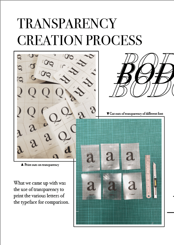
Adding to the short skit, as a group, we came out with the transparency that our classmates can keep to remember the small differences between the seemingly similar typefaces. It also serves as a momento for our class to remember our Fashion show skit.
As for the skit, as a group, we had to come up with relatable elements to place into our script as we portrayed Bodoni, Didot and Baskerville as high fashion models. Besides that, the play of puns were used such as “font-tastic” lightens the mood of the presentation yet makes it memorable and easily absorbed which is one of our intentions of using a short skit for our presentation.
Overall, preparing and executing the skit was enjoyable as we got to apply what we learnt in class and make a twist to the otherwise dry content of learning the Bodoni typeface.


You must be logged in to post a comment.