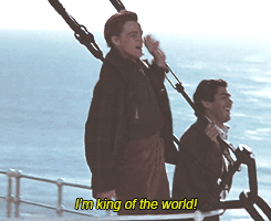
No Limit No Restriction: Online Collaborative Sentence

The World’s Longest Collaborative Sentence (1994) by Douglas Davis. 

Born in Washington DC 1933, Douglas Davis was an artist, critic, professor and author. He played an active role in the field of contemporary art since 1960. One of his first few artwork, he set up a live satellite performance through the use of interactive technology as a medium for art and communications, marking his first step into the use of the Third space. 

Together, Davis and the audience constructed an interactive piece in the Third space, known as “The World’s Longest Collaborative Sentence” for a survey exhibition of his work in 1994. In 1995, this piece was donated to the Whitney Museum of American Art in New York as an Internet art. This allows the viewers and visitors to contribute to an on-going collaborative sentence.

“The Sentence has no end. Sometimes I think it had no beginning. Now I salute its authors, which means all of us. You have made a wild, precious, awful, delicious, lovable, tragic, vulgar, fearsome, divine thing.”
—Douglas Davis, 2000

By using the web as a medium, this suggests that there is no limit and restriction to what people could say or express; which infers that people may be bolder in terms of what they post since they are hiding behind a screen where there is no physical contact. As mentioned in class, when we are able to see the other party’s facial expression and emotion, it is harder to say things directly compared to an indirect form online where we are not faced physically. 

In this piece, you can find both positive, neutral or negative comments, such as people publicising love to their friends or partners, or expressing random words or sentences, or even ranting about their bosses. Moreover, because this piece is posted online, this implies that it is accessible globally. You can see greetings from users in other countries! Thus, the use of the third space and the contribution of the users are unbelievable! With the network of connections branching out to users in different space and uniting each other all in one space, is the magic of the Third space. Audiences collectively collaborate and compromise, highlighting DIWO, gradually interlinking the audience and the art piece together. 


On the other hand, the software used in this piece had several errors where they had to reboot the piece, which may disrupt the ‘on-going’ collaborative sentence. Nonetheless, I think that this interactive piece was created to explore and examine how people interacted collaboratively in the third space (also known as the web) with the freedom given, no matter the space they are in. 

“I DID NOT FEEL SEPARATED I FELT VERY CLOSE EVEN THOUGH WE WERE THOUSANDS OF MILES APART AND I WAS SURROUNDED BY PEOPLE HERE I FELT CLOSE . . . ”

SOURCE USED:
http://whitney.org/Exhibitions/Artport/DouglasDavis
https://www.eai.org/artists/douglas-davis/biography


Across ‘Borders’ – Telematic Embrace

Introduced to the world of Adobe Connect, it was the first time I have heard and experienced this application. In class, we experimented and immersed ourselves into the Third space as a team.

We talked about emotional bandwidth expanded over the years, from simple texting, to calling, to Facetime and social broadcasting. Through the development of this, we are able to view the expression the other party holds and the movement they display through the video, fully engaging in the conversation and response. As a class, we were all in one place (first space), and stepped into the virtual world of third space. We played and interacted with different type of movements and objects through the third space, connecting us together.

Here are some of the things we did through screenshots:

“The Third Space ET Touch”
“Water Bottle Filter”
“PINNKCHROME”
“BLUECHROME”

As a class we worked together as a team through connection, negotiation and compromising each other in order to achieve these masterpieces shown above. We were all involved and crossing the borders of our screen in order to connect with one another. This is an absolute example of DIWO (Do It With Others)! I had an incredible time playing in the third space with my class and this experiment. It is definitely an important skill and realisation to have in the future where we have to interact and work with clients across the border, TOGETHER.

Engulfed by the Space.

Sherry Rabinowitz & Kit Galloway,
Hole in Space, 1980. 

On November 1980, Sherry Rabinowitz and Kit Galloway had set up a live sized two way broadcast connecting the East and West coast through a satellite, called “Hole in Space”. It was unannounced, with no signs, no credits nor explanation to what it is. This installation ran for three days located at the Lincoln Center for the Performing Arts in Manhattan, New York City and the other in an open air shopping center, «The Broadway» in Century City, Los Angles.

Spectators who passed by and who were ‘pulled’ in by the installation eventually became part of it. It was a never-before-seen live interaction in the real time, opening a new space in this universe.

First, they were puzzled and unsure of what was happening. In the documentation, we get to see different reactions, emotions and thoughts on the interactive artwork through different individuals. Conversations among the spectators chattered on, some thought that the live display were young actors on television before they found out that they were people living in the other side of America. When they found out, people were surprised by the live interaction where they could see and hear the people in live size display,  in the real time. Word spread through the media as more people came to spectate the installation.

At one part of the documentation, at 22:06 to be exact, a woman was interviewed and mentioned that her daughter lived in Manhattan, New York City while she is in Los Angeles. Her daughter called her in the morning and told her to meet her at Century City where she could say hi to her. This highlights the idea of the third space, where people at different places can meet at one place at the same time.

http://www.medienkunstnetz.de/works/hole-in-space/

Through the documentary of “Hole in Space,” we can see the celebratory of people through the laughter and joy. Not only did the installation deepened the bond between the two coast, it also reunites friends and family who are living in the different coast. It has redefined and shortened what space was between the East and the West coast of America.

Sherrie Rabinowitz and Kit Galloway has created “Hole in Space” to exhibit that size and bandwidth communicate emotion through the third space. It portrayed human interaction filled with rich emotions through the third space. It showed the beauty of people coming together in another space.

“There was the evening of discovery, followed by the evening of intentional word-of-mouth rendezvous, followed by a mass migration of families and trans–continental loved ones, some of which had not seen each other for over twenty years.”

This quote emphasises the breakthrough of the live broadcast and the reconnection of people living at different places, meeting at a space where emotions and memories can be newly formed, known as the third space.

Considering it was 1980, we could almost assume that it was the first few experimental breakthrough of the third space. Where it all began.

Living in this millennial age, instant communication over vast distances is easily accessible and intertwined into our daily lives compared to before. It became something so granted and reachable that it is hard to believe to what life was before when the third space was still yet to be discovered. Emotions could not be shown or  instant delivered through a call or mail delivery. However, we could say that almost all of us are submerged into a life of the third space that we are busy connecting with others online rather than real life. Has our world dived into the third space where we forget what reality is, becoming more dependable towards the virtual world?


SOURCE USED:
http://www.medienkunstnetz.de/works/hole-in-space/
(https://www.youtube.com/watch?v=QSMVtE1QjaU)
(https://www.youtube.com/watch?v=SyIJJr6Ldg8&t=1378s)


Micro-Project #2: Telescroll (Social Broadcasting)

Posted by Daphne Natimin on Tuesday, 23 January 2018

As the remaining three amigos, we decided to do a double pairing, in which my partner became Bella. After a few brainstorms, we decided to do something ordinary for girls, something that happens daily for most girls. This led to the idea of girls getting ready together. Have you ever wondered why girls go to the bathroom together or even do things almost together all the time? Its fun! We get an increase of communication in order to further deepen the relationship and understanding of each other.

There will always be this one time when your friend, a close friend, best friend or even a family member who would move away to another country for a certain reason, which decreases the communication between the two or more. Through the interaction of doing things together online/media makes up for it. It serves the purpose to show that even if one may not be physically next to each other, they could always meet in the third space, connecting people together. For example, leaving each other on call whilst doing work, eating or even casual chilling. This is also the reason why Facebook, Skype or OSS was programmed. ITS ABOUT CONNECTING, COLLABORATION AND COMMUNICATION.

During the process of the live performance, it was quite hard to mirror the other accurately and synchronise, even though some were pre-planned. Research has shown that the more time you spend with another the more synchronise you get in terms of movements- due to our mirror neurons. However, as time passed, we slowly became more synchronised in terms of the timing on getting ready. Furthermore, rather than a casual live broadcast, it felt more of a performance art in synchronisation in the third space. This was a pleasant experience in dabbling in the social art and doing it in real time, different location. It creates a new space for the art where people from all over the world can come together!

Open Source Studio (OSS)

Leaping one step further into expanding the digital world and innovative platforms, such as Linux or GNU, Randall Packer went ahead and expanded these innovations by creating the Open Source Studio (OSS).

https://oss.adm.ntu.edu.sg/

The term open source originated in the context of software development to designate a specific approach to creating computer programs. Open Source Studio (OSS) is a joint, online software environment programmed to meet the needs and dynamics of studio-based teaching in the media arts, where it is open publicly. It provides new potential for artists to collaborate or produce peer to peer artistic results amplified by the network. Furthermore, it exposes open source thinking to challenge and inspire peers. Encouraging the cross pollination of ideas and process for in-depth understanding and learning in order to produce artistic fruitage. This leads to the emphasis of DIWO (Do It With Others). 

Through OSS, peer to peer interaction became more inclusive where concepts were easily understood through the reference of the documentation of peers.  It also allows us to see or read in different perspectives or manipulation, in order to achieve a broader mind. Moreover, engaging on online discussion, comments or feedback. Creative inspiration comes from the ‘outdoors’, where social interaction stands. OSS promotes the fairness to artists to document or reference anything, however, it crosses a blur line onto the laws of plagiarism and copyrights. 

OSS is all about the collaborative practices among peer groups that share goals, methods, ideologies, and aspirations that helps all of us grow. 

http://www.memes.com/advice-yoda/104


Micro-Project 1: Experiment in Social Broadcasting

The social broadcasting experience is quite true and real especially with friends.I think it made the experience more enjoyable and less awkward, in contrast to, doing it yourself. Furthermore, I found another level of respect towards youtubers who vlog daily…on the angles and the content they release to keep the audiences entertained. Social broadcasting is another medium that is fascinating to me how we could see other people who are vlogging at the same time, yet, different space into one space – called the ‘Third space’. Through the learning and playing in the medium of the internet, it made it much more interesting whilst taking it globally. I guess to a certain extend it holds much relevance to this millennial world which keeps the world connected through this interaction.

Hi this is awkward

Posted by Daphne Natimin on Thursday, 18 January 2018

https://thirdspacenetwork.com/public-video-wall/


FINAL: EGO IN DIFFERENT SETTINGS

“Design is a journey of discovery. In design, color plays a significant role. It does not only play with the aesthetics but it also reinforces the design in harmony.”

Being the only project where we are allowed to play with color, this places great emphasis in manipulating the harmonies of color to produce our desired outcome. I wanted to choose a color palette that reflects both my style of illustration and I. Thus, I chose a pastel color scheme, playing with both complementary and analogous colors. I chose to illustrate through vectors and flat illustration which plays with shapes and the choices of colors.

B R A I N S T O R M of me + setting = ???

  1. me (a deer) + a food market/festival = food coma w food on my antlers lying down w a big belly ?
  2. me (a peach) + stacks of assignments/ squashed under = escape – dream (pressing esc button or parachute with papers flying around?)
  3. sleeping/tired me (a pig) + coffee = hyper pig bouncing off the walls
  4. me (a donut) + trapped in a room filled w negative F = donut worry be happy (fills up w jam) turns the F to an A
    me (a donut) + failure ( fail to hit target) = do whatever it takes to achieve target
  5. me (a curious fennec fox) + map/GPS = exploring a bizarre world/ new world

Before I ventured on to the final illustrations, I created a moodboard/inspiration board to refer back on how I would want the whole format and illustrations to be like. Taking reference and inspiration from pinterest, to fully visualise the desired outcome.


Top Row: A pictorialization of a bizarre world/ new world
Second Row: me (a deer) + a food market/festival
Third Row
me (a peach) + stacks of assignments/ squashed under
Fourth Row: me 
(a sleeping pig) + coffee = hyper pig bouncing off the walls/ dancing
Fifth Row: me (a donut) + failure

CHOSEN COLOR PALLETTE


I chose a cool pastel color scheme to play with as it is my favorite color scheme. It reflects off a soft, dainty, sweet and delicate feeling which mirrors the vibe I give off (according to my friends). It is also aesthetically pleasing and fulfils the outcome I want to display.

________________________________________________________________________________________

FINAL
. I decided to go off with these four ideas for my final illustrations.

  1. me (a curious fennec fox) + a map/GPS = exploration of a bizarre world/ new world
  2. me (a peach) + stacks of assignments = escape (pressing esc button with shades on)
  3. me (a donut) + failure to hit target = will do whatever it takes to achieve target (places the arrow on the bullseye)
  4. me (a deer) + a food market/festival (food stalls) = food coma // food on my antlers (gets everything) 

In each boxes, each rows, I try to vary the composition of each frame such that there is a sense of dynamism yet consistency in framing in each story. As well as, an unified color scheme as a whole instead of focusing on individual rows.

ROW 1

I started the equation with me as a fennec fox as I’ve always found them adorable and since they were pretty apt for the chosen setting, with their curious nature, I decided to go for it. In addition, I’ve heard that if I was an animal, I would resemble a fox. In the first frame, I’m portrayed as a cheerful fennec fox, with smiling eyes. Following, when given a map or GPS (a chance to venture off), I would head into a new world. This row reflects one of my personality, in which of my curious nature, I love wandering and exploring new places.

For the choice of color palette, I did not go for any color schemes but to harmonise as a whole. Starting with the fennec fox with a touch of neutral tones of nude beige and white + hints of complementary colors of “red and green”, in this case, turquoise and pink. In the second frame, I went with the color blue to represent the sky and sea, a sense of vastness and boundless, conveying the feel of endless exploration. It also carries on colors from the first frame, in order to harmonise as a whole. In the last frame, I made it more colorful with different pops of colors yet unifying, to achieve a sense of excitement and wonders in a ‘new world’, inspired by an album cover referenced in my moodboard. An attempt of subtle complementary and triadic colors.
Simple and centrally composed to bring focus on the main illustration in the first two frames – me and the setting. It ends with a more crowded composition encircling the depiction of me, in a sort of welcoming manner to achieve the sensation of wonder and positivity.

ROW 2 

Depicting a peach to represent me, when meets an overload of work equals to “vacation needed please – press to escape.”

For this row, I went with a complementary color scheme of yellow and purple as the background. As usual, I kept the first frame clean and central, following with an overwhelming squeezed composition depicting various sizes of stacks of assignments, to give off the sense of suffocation and overload in a box. Ending with a fresh cut illustration in the last frame which keeps it simple and direct. In this row, I carried over hints of the colors used from the previous row to give more of a unified look.

ROW 3

A donut. I went for more of a blue + neutral tones in this row, again, trying to incorporate colors from before. In the first frame, I chose a color that could make the donut ‘pop out’ against the background, as well as, pleasing to the eye. The second frame, I decided to tone it down by using a neutral color scheme and analogous colors with a touch of warm red. The last frame, I went for the complementary colors of red and green, with the donut in a neutral tone to balance the color composition of choice.
Compositionally, I positioned the illustrations in central and consistent for my first frames in each row. Whereas the dynamism of composition comes from the last frame. In the second frame, initially, I made the arrows more of an orderly touch with identical sizes (as shown below). However, I re-arranged it to a composition of big to small, in order to create a sense of depth and also incorporating a leading line. This row was more focused on a simple, clean-cut composition, thus directing the viewers focus to the main illustration and story line.


ROW 4

A deer. Deers are usually known to have an elegant and petite vibe where they are imaged to eat when accessible or less. I played with this image and contrasted it with a deer who is both playful and loves to eat, reflecting myself in the deer. The first frame is the portrayal of a typical quiet and still deer, but when situated in a food festival, out comes the playful, greedy-eyed me as I start getting all the food! The first frame of the deer remains a pinkish-neutral tone as its docile and elegant nature before meeting the joy of life (food festivals)^^ Food festivals are known to be lively and festive, hence this piece also incorporates a colourful bright touch of complementary colors (orange-blue, yellow-purple, red-green), as shown in the second frame. The last frame portrays a playful yet innocent-like deer with food stacked on it’s antlers while eating a donut. This plays an irony on the fact that deers are usually not seen as big nor greedy eaters, which reflects me…. Compositionally, I wanted to keep things consistent and simple by positioning the stalls as a row rather than a clutter of stalls. The last frame, I played with the depth and framing of the deer. I placed it as a near-shot where only the head could be seen with its antlers, making it more ‘interactive’ with the audience. With the colors cautiously chosen during the process, this row characterises a sort of ease, cheerfulness and docility.

FINAL 

To conclude, through this project I got to explore the world of colors (which I love using). I enjoyed composing my illustrations and picking out different color schemes to fit in as a whole. This mirrors the strategic planning and exploring of color schemes that would compose the 12 frames as a whole, like Instagram. I reflected myself and mood through the colors and illustration depicted in the 12 frames. This project makes you self-reflect in the knowledge of whether you are assertive or turbulent in knowing who you are, what you think you are and finding how others perceive you. Thus, using these perceptions into colored illustrations. I do not have any BIG takeaways but it did let me get back into digital drawing/illustrating through photoshop. AND most importantly, the joy in creating and completing this project.

Thank you so much Shirley for everything! I really enjoyed this class, in the bonus of your guidance and teaching that made me LOVE it even more ♥‿♥

“Be a pop of color in a world of black and white.”

P2 FORREST GUMP


Quote #1:
“Im the King of the world!” – Titanic, 1997
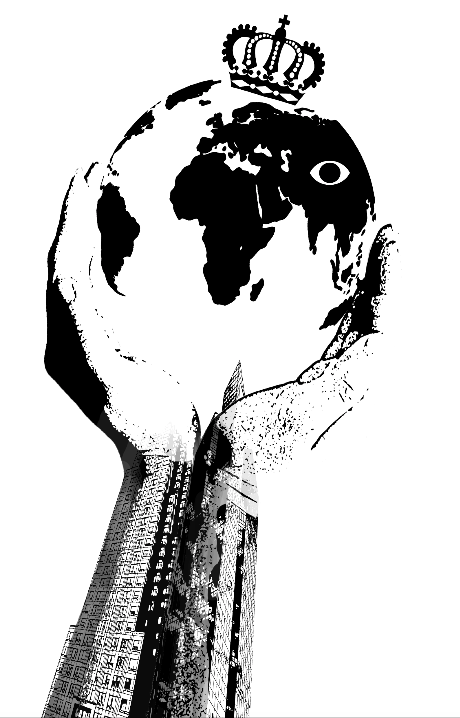
FINAL DESIGN

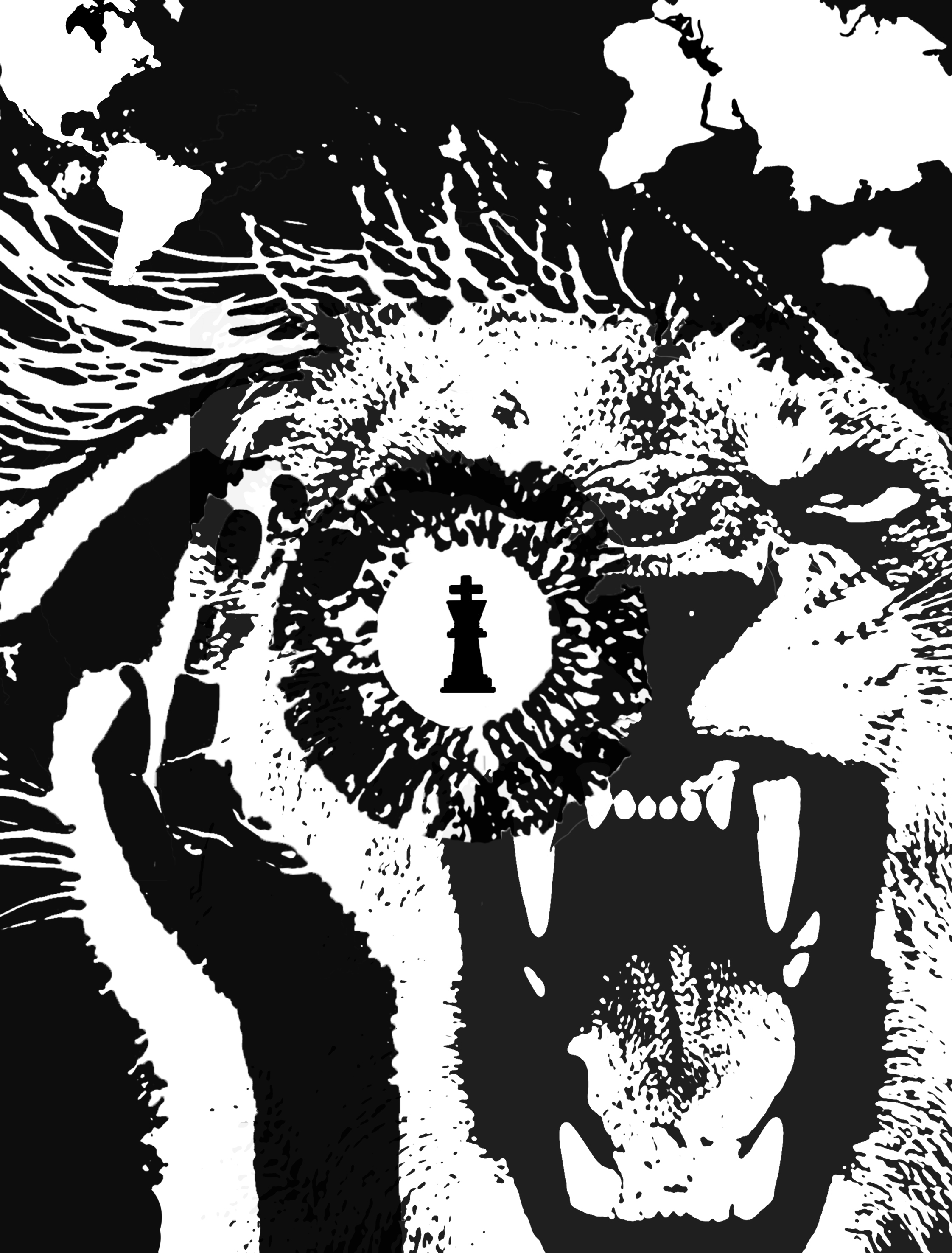
First, I decided to break the quote up into key words to focus the on the visuals.

I, King, World

After chosen these words, I went on to make a mind-map of potential visuals I could use to represent those key words.

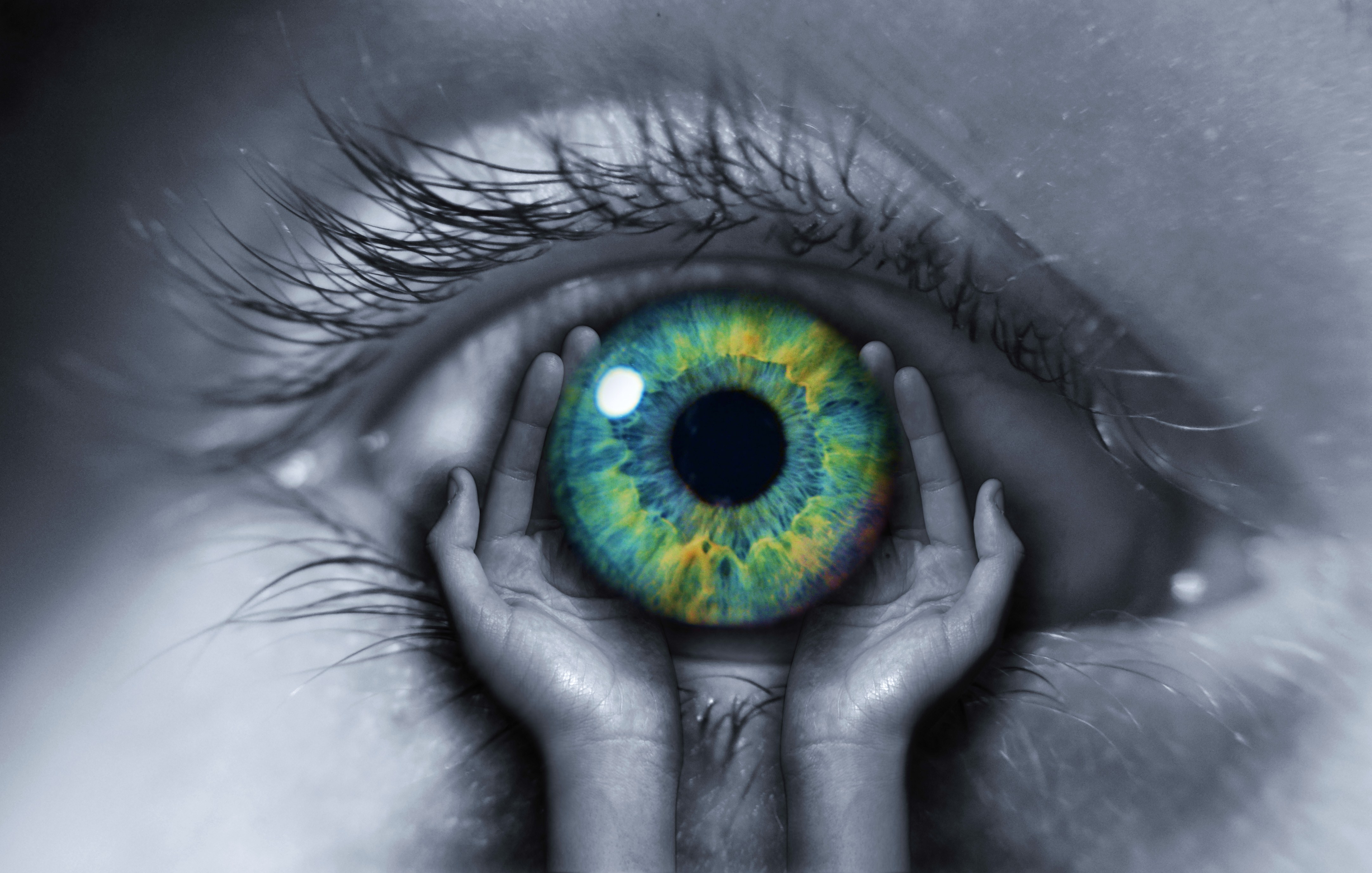
I: hand gestures, eye, an individual

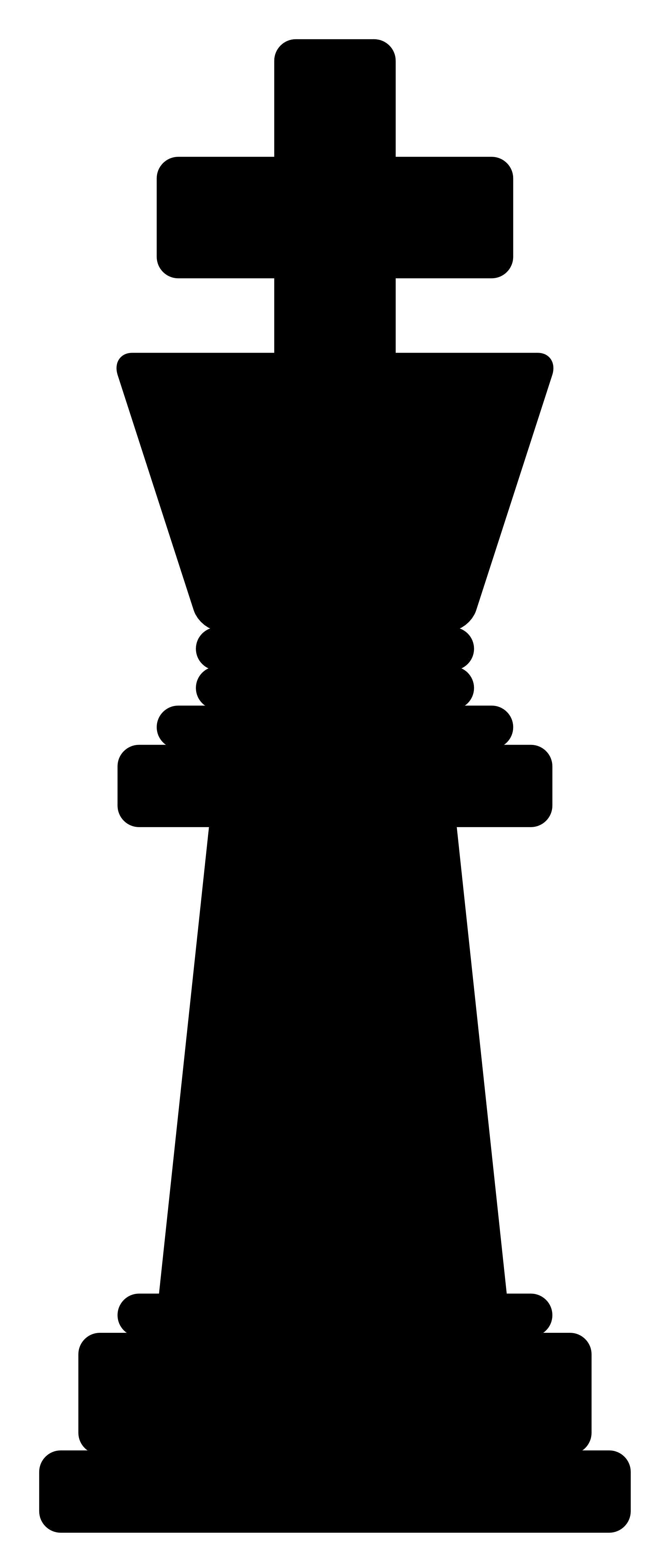
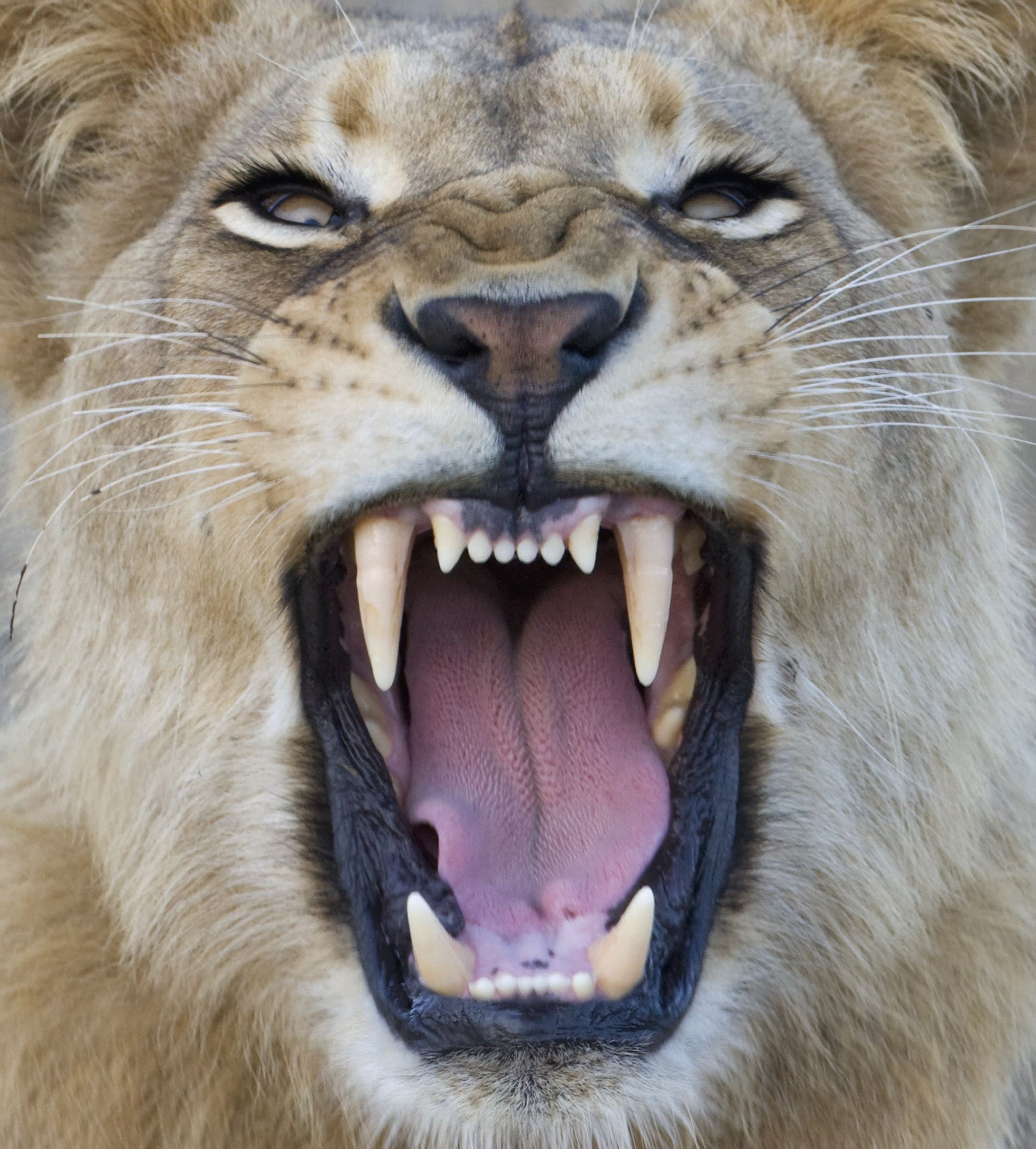
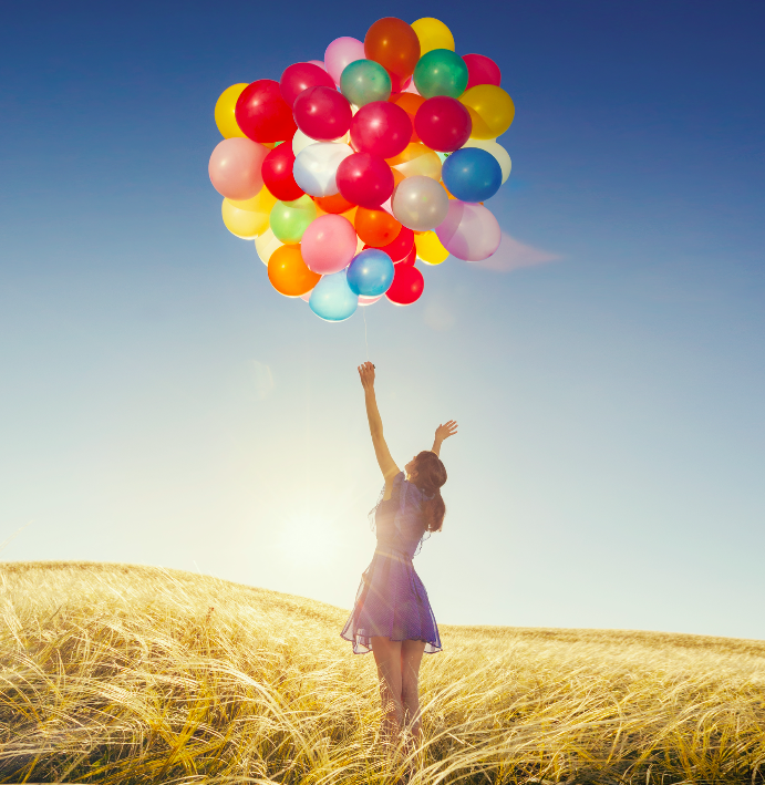
King: crown, throne, wealth, power, chess piece, skyscraper, lion, top of the hierarchy, centre of attention

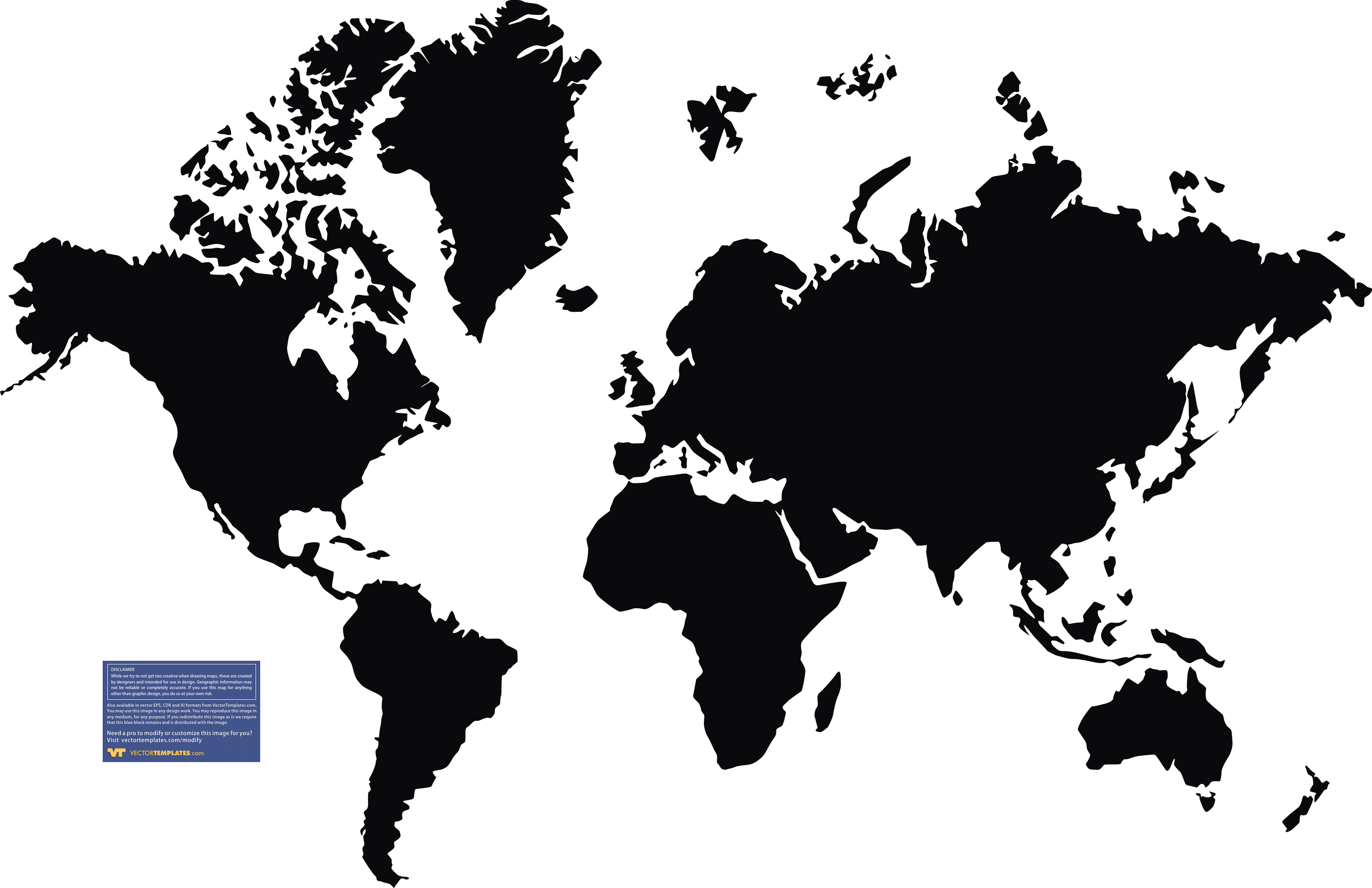
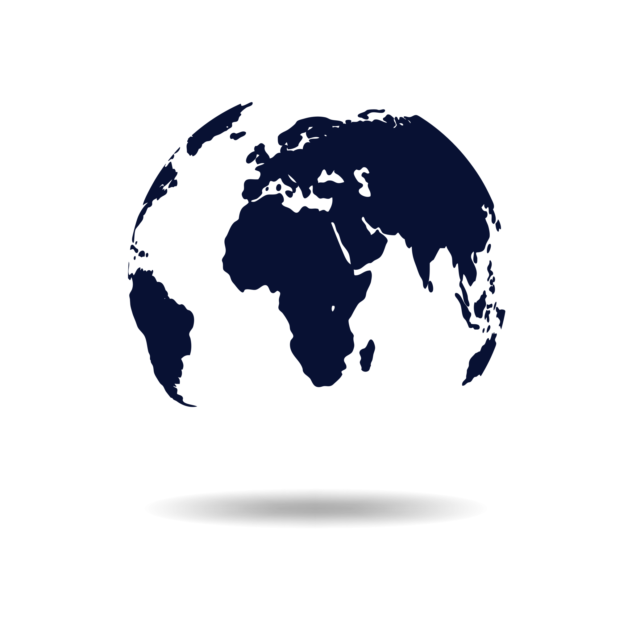
World: map of the world, globe, earth, plane

Then I decided to pick a few images to work with:

with these, I started to piece together what I had, adding elements throughout the journey and making two different versions of my interpretation.
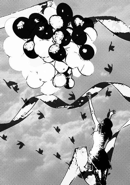
 

Design #1:

 I felt that the composition was too centralised and consistent in dominance, making it dull and lacked an element of interest. Thus, I decided to abandon this and progress on my second design idea.

Design #2:

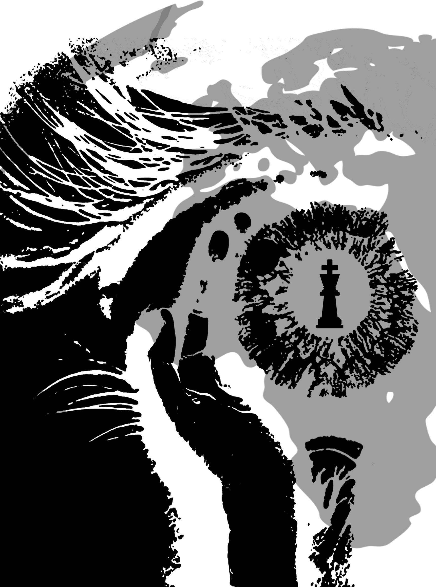
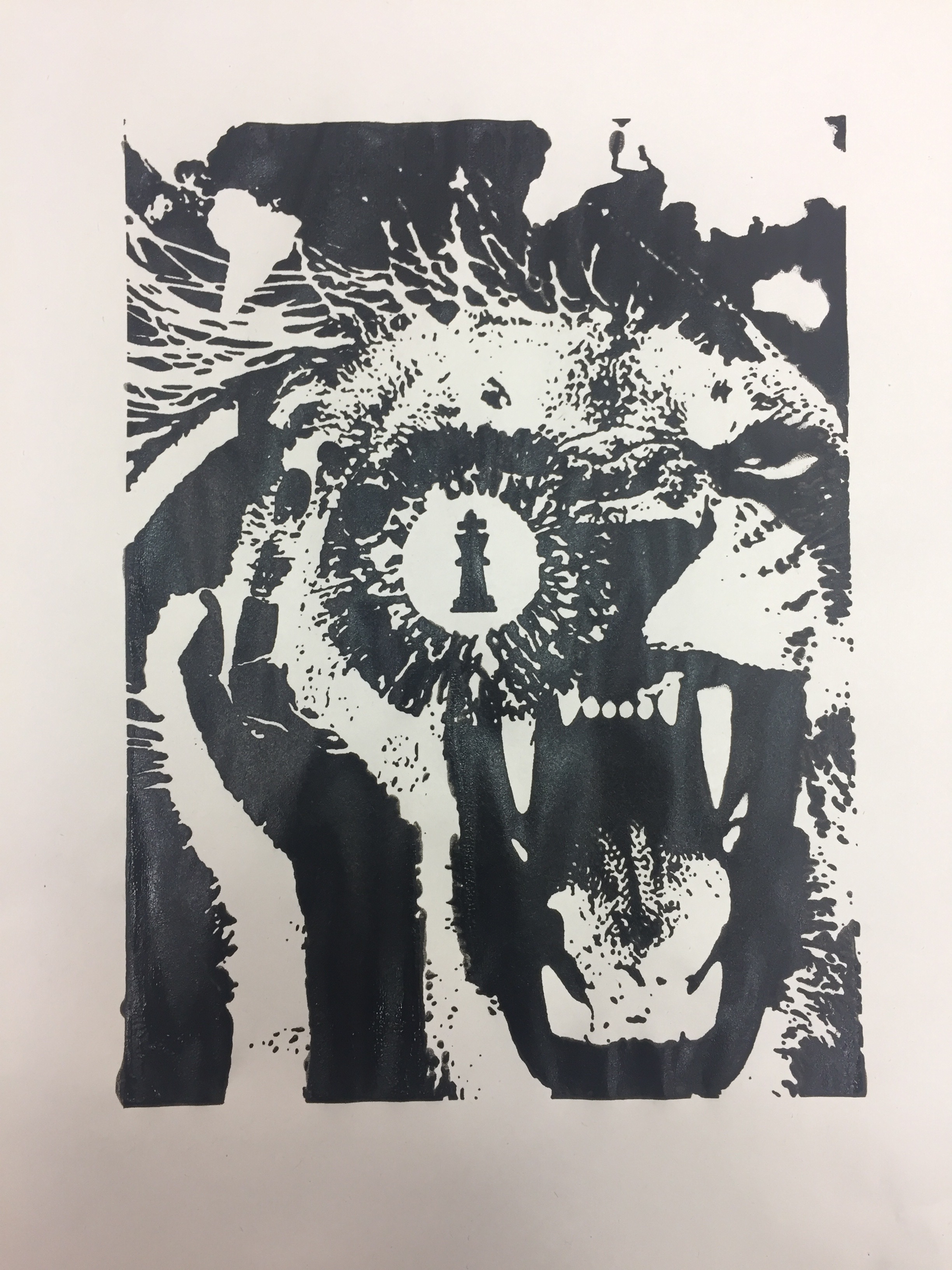
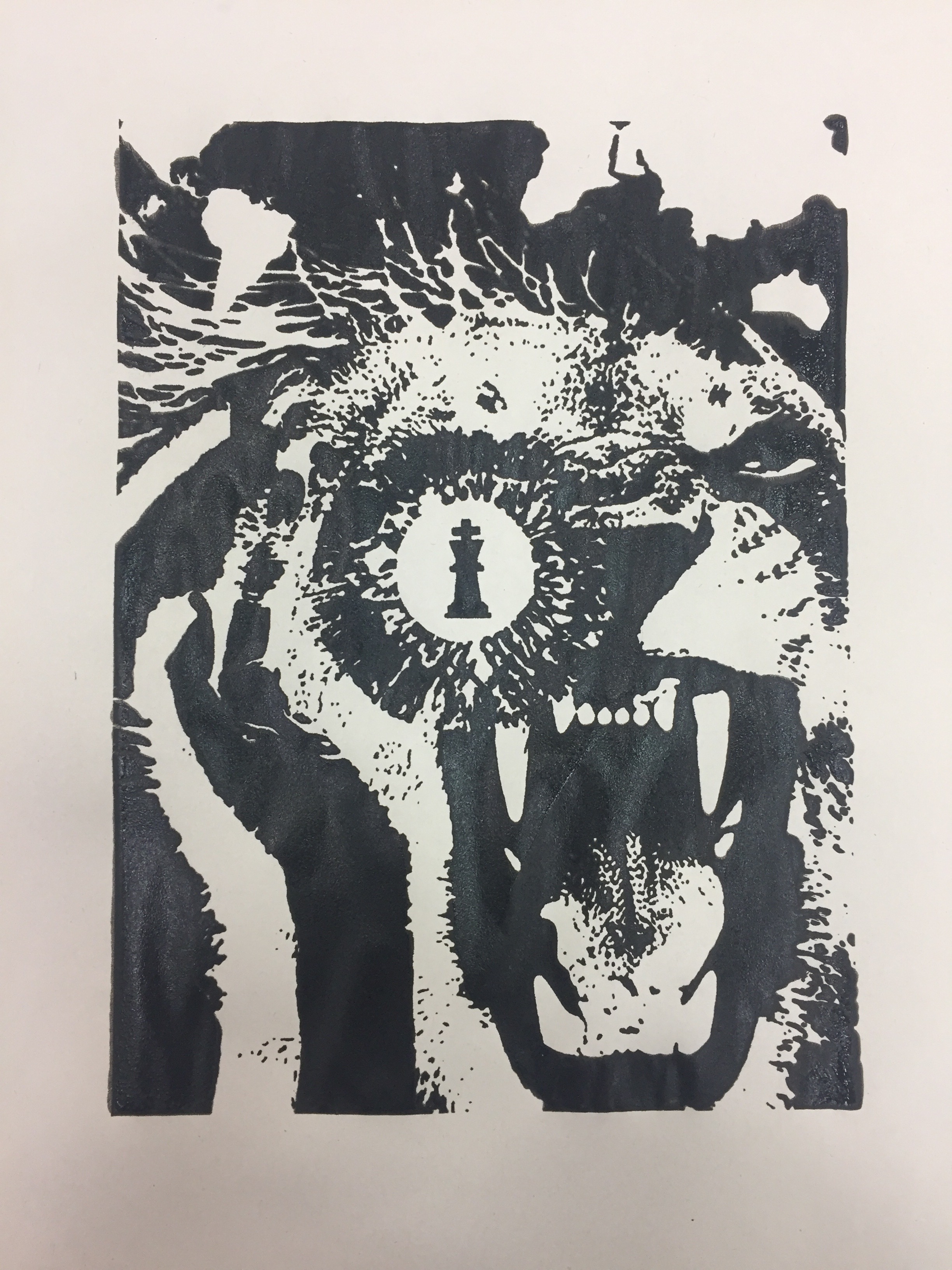
The image on the left was my initial progress of the design but I felt it lacked the emphasis of “King” and felt rather flat. Thus, I rearranged my composition and added in a stamp print of a lion to give the print a more powerful feel and a sense of liveliness through the roar of the lion. I centralised the chess piece to place emphasis on the object, with the help of the hand leading our eyes into the centre. This shifted the visual focus to the centre of the design, foreshadowing the definition of being “King” (centre of attention). Hence, this was my final design.

This is also the design I chose to have printed on my tote bag.

Before printing on my tote bag, I test printed at least 5 times on newsprint. The results came out similar, despite the amount of ink I placed for printing. (Test print on newsprint):
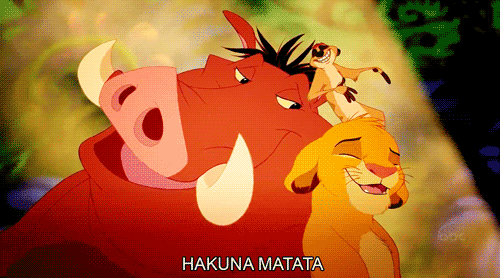


Quote #2:
“Hakuna Matata” – The Lion King, 1994

FINAL DESIGN

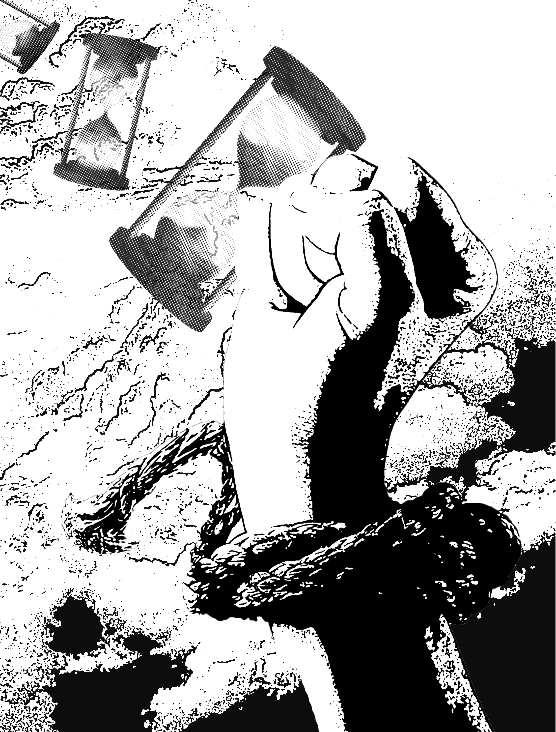
There was no key words to break apart, so I came about the meaning of “Hakuna Matata; it means no worries, for the rest of your days!” I took the concept of no worries into words and incorporate into visual images. Unlimited time, freedom, unchain, flying, no heavy weight, carefree.

These following images that I thought could work:


I came out with, yet another, two version of my interpretation on the quote.


For both design, I added a clouded background to give the design more of a texture. This gives both designs a soft yet ambiguous feel of freedom. In this design, I tried to compile a visual direction. I felt that the first one, on the right, was quite cliche withe the term of freedom and a typical mind of thought. Therefore, I decided to go with the second one, on the left, where it is slightly more indirect. I placed emphasis on the fist breaking free from the tied rope through the dominance and visual weight it carries. Next, I used the image of a sand timer to show the unlimited time the hand has by inducing a swirling effect and variation in size/angle. Even though, this does not mirror the movie, it brings out the same context as the quote of no worries. 

Quote #3:
“Just keep swimming.” – Finding Nemo, 2003

FINAL DESIGN

This quote was rather challenging to work with as it only consists of three words. I decided to focus on the key word of swimming and the context of “just keep”.
I did not waant to be literal with an icon of swimming so this are some few words I linked it up with…

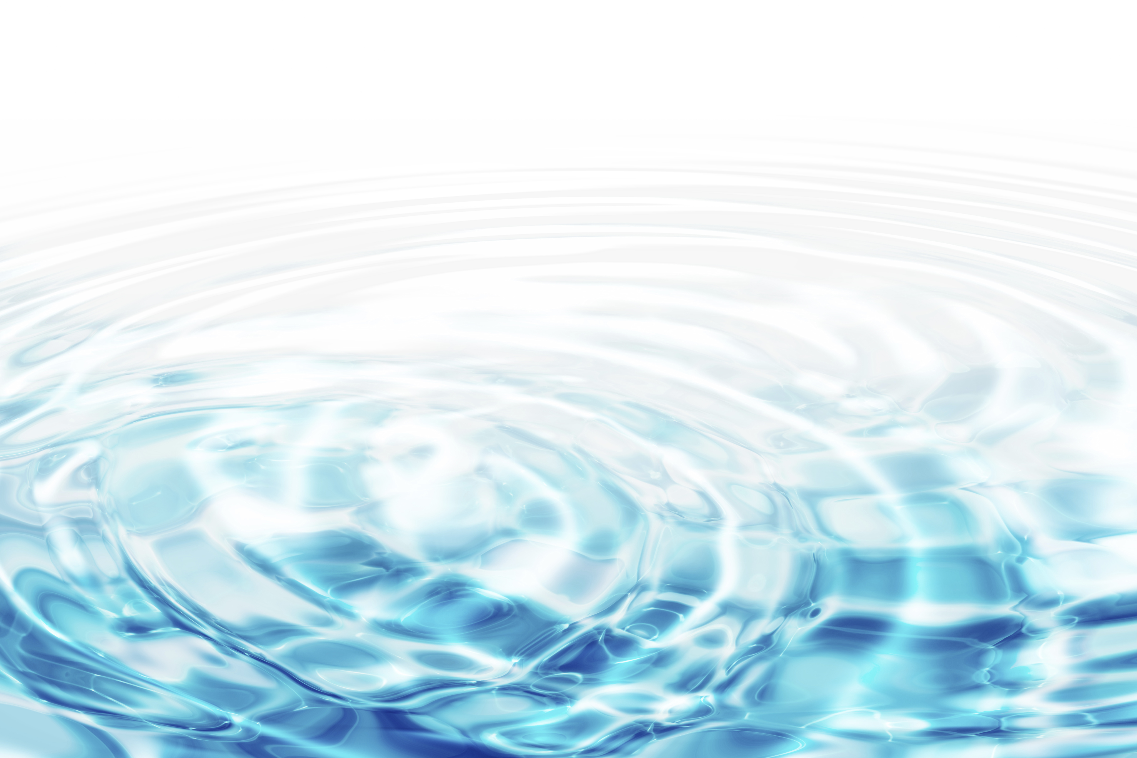
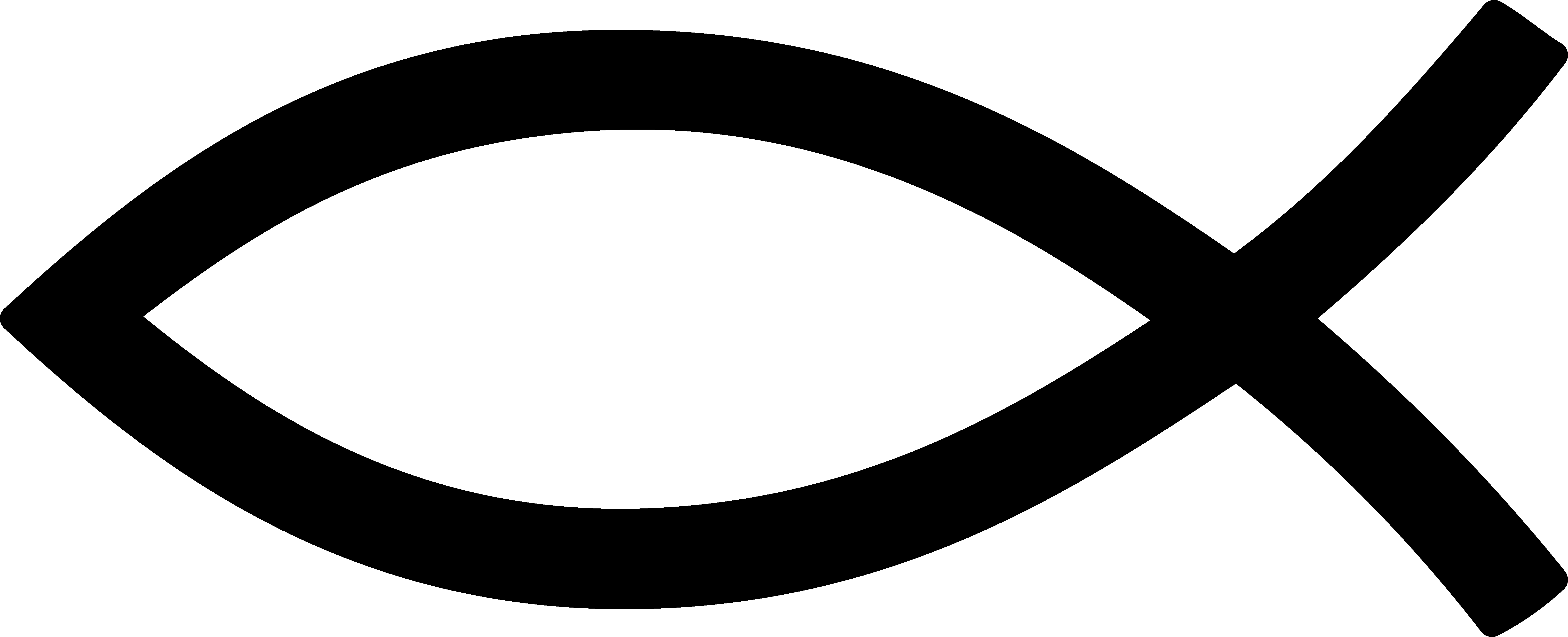
swimming: fish, ocean, water, googles, diver’s mask, diving helmet, ripples

Images I played with:


Initial Design:

First, I composed a design with the world wearing a goggle mask but it seems a little off to me. I was not satisfied with the overall look, it felt like something was still missing. Hence, I decided to abandon this idea and carried on playing with different images and structure.

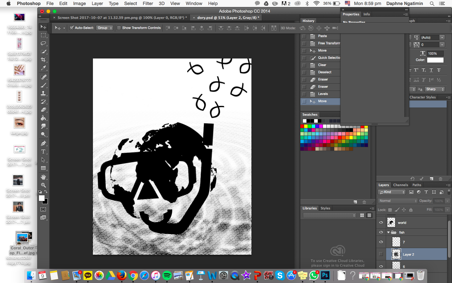
After scrapping my initial composite, I played with an image of a diving mask. I enlarged the diving mask to give it dominance and placed it in a off-centre composition, giving it an asymmetrical feel. Next, I used an icon of a fish and replicated it in various sizes in as a visual direction, giving the design more of an interest. The fishes help lead your eyes towards the diving helmet. It still seemed plain for me, thus I placed a rippled background of water giving the design more of a texture, emphasising the calm tone the quote gives off. Moreover, it gives the context of “just keep” through the ‘on going’ ripple effect; which led me to my final piece!


Quote #4:
“Frankly, my dear, I don’t give a damn.” – Gone with the Wind, 1939
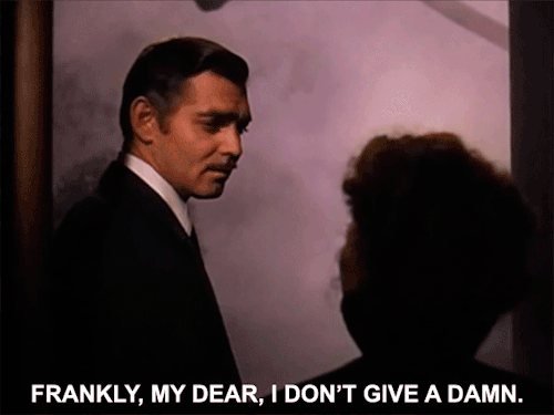
FINAL DESIGN

Key words: frankly, dear, don’t give a damn

frankly: hand gestures, law, judge, scale of truth

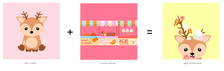
dear: sweetheart, love, hearts, sweets, dessert, deer

The quote gives off a nonchalant and callous feel. Thus I incorporated these images to different compositions.


I played with the composition of my visuals and these were my first few design:

I felt that the design was too messy and many things were going on at once, that there is no point of visual focus. Hence, I decided to take some elements away to keep things simple. This led me to my final piece!


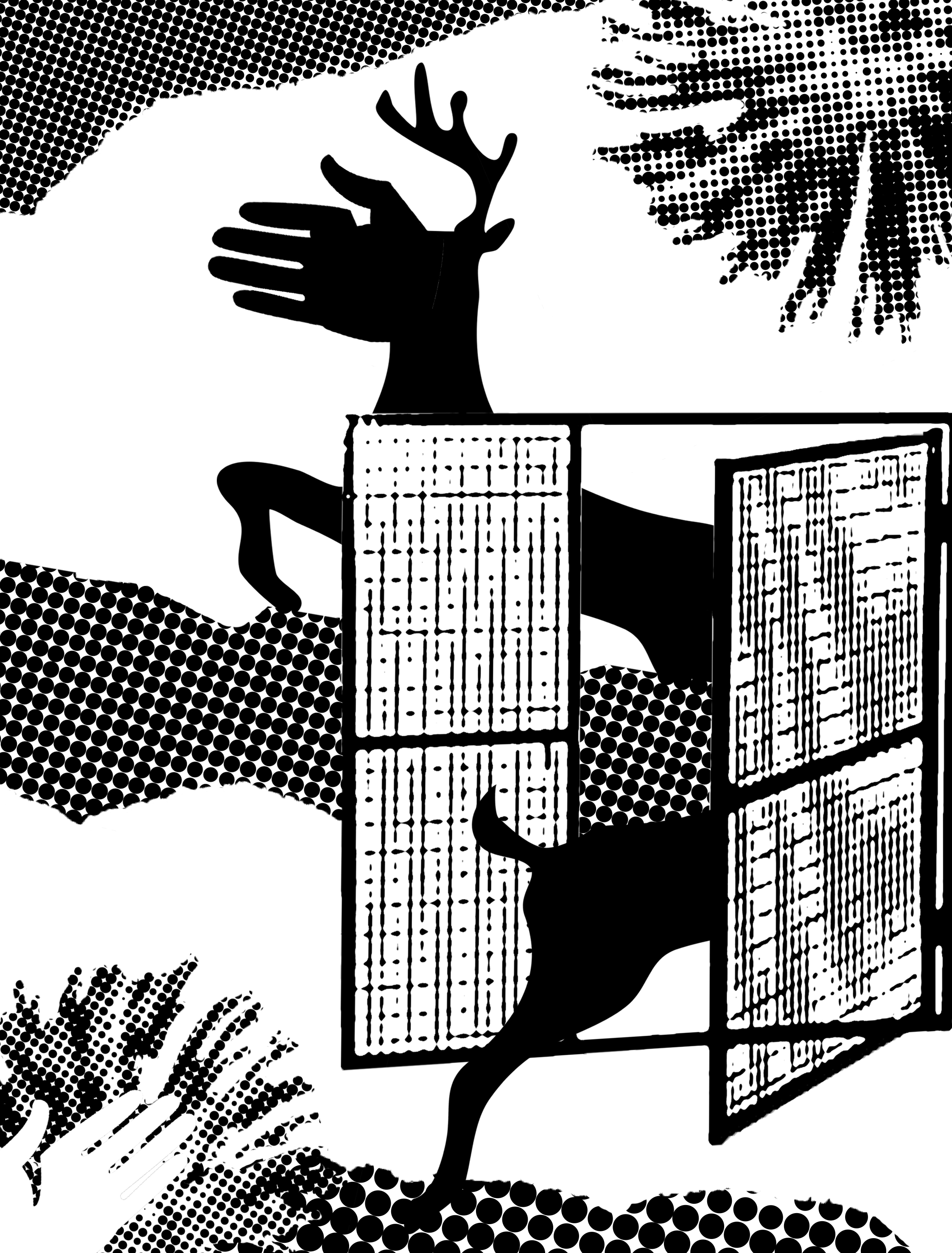
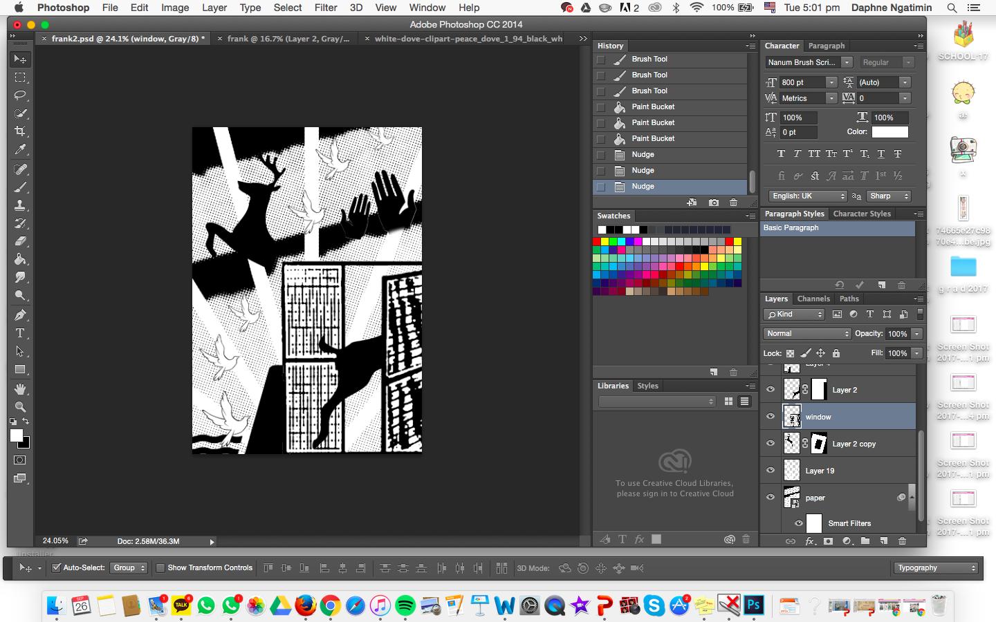
For this final design, I added textures of torn paper to induce the feel of carefree and “I don’t give a damn”, applying what I have learnt from “Project 1: My line is Emo” (this can also be seen on my other composition pieces). The fireworks emphasises these texture to give the nonchalant feel and “whatever-ness”. I came about using the deer from the word “dear” and applied it into my piece. Through the usage of the door, the deer going in-and-out disproportionately and unrealistically gives the quote further context and prominence. I replaced the deer’s head with a hand to create interest and wonder in the audience’s mind, attracting them to look at this composition longer. Furthermore, the hand and the deer gives the audience’s eye a visual direction that leads out of the design. This gives the quote further emphasis and meaning. I felt like this quote helped me explore more out of the box and indirect way of interpreting the quote.

_________________________________________________________________________________________________________________________________________

To conclude, I felt that this project was refreshing and eye-opening. It challenged me to think more out of the box and indirectly, widening my vision of design. It was quite difficult to find the exact images and angle I wanted to incorporate in my design, which pushed me to visualise another composition. As I worked on my design, ideas would pop in my head and I would try to experiment what I have envisioned, even though it may not work out. Project 2 had made me take even more notice of the principles of design, and not to stick with the typical cliche imageries. To incorporate what I have learnt from project 1 and applying it on this project. I have enjoyed making these compositions and has expanded my design and composition skills.

-THE END-