Thinking with Type: Letter

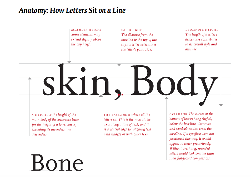
Just like our human body, letters too have anatomies to learn!

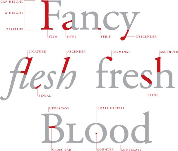
However, not only the anatomy, typefaces and letters have more than that; such as: How letters sit on a line? The height and size. Scaling. Variation of typeface. Classification. Families and the list goes on!

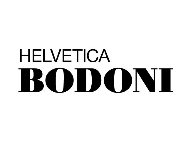
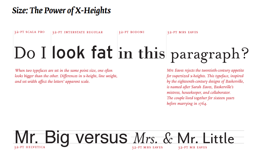
After listening to Lisa’s lectures in class, it made me absorb and understand this reading much easier.  Choosing the right typeface and font is not easy, it all has factors to consider such as the context and the importance of the type. For example, the power of x-height of a typeface affects its apparent size, space efficiency and the overall visual impact. Typefaces with small x-heights evokes a delicate and lyrical charm, while a huge x-height, like Helvetica can look elegant yet bulky and bland.

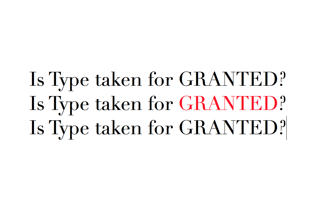
Typefaces and fonts also plays with legibility and readability. Optical sizes do matter. Graphic designers selects a style based on context. Optical sizes designed for headlines or display tend to have delicate, lyrical forms, while styles created for text and captions are built with heavier strokes, such as the example below.

https://fashionista.com/2018/03/kendall-jenner-vogue-april-2018-cover

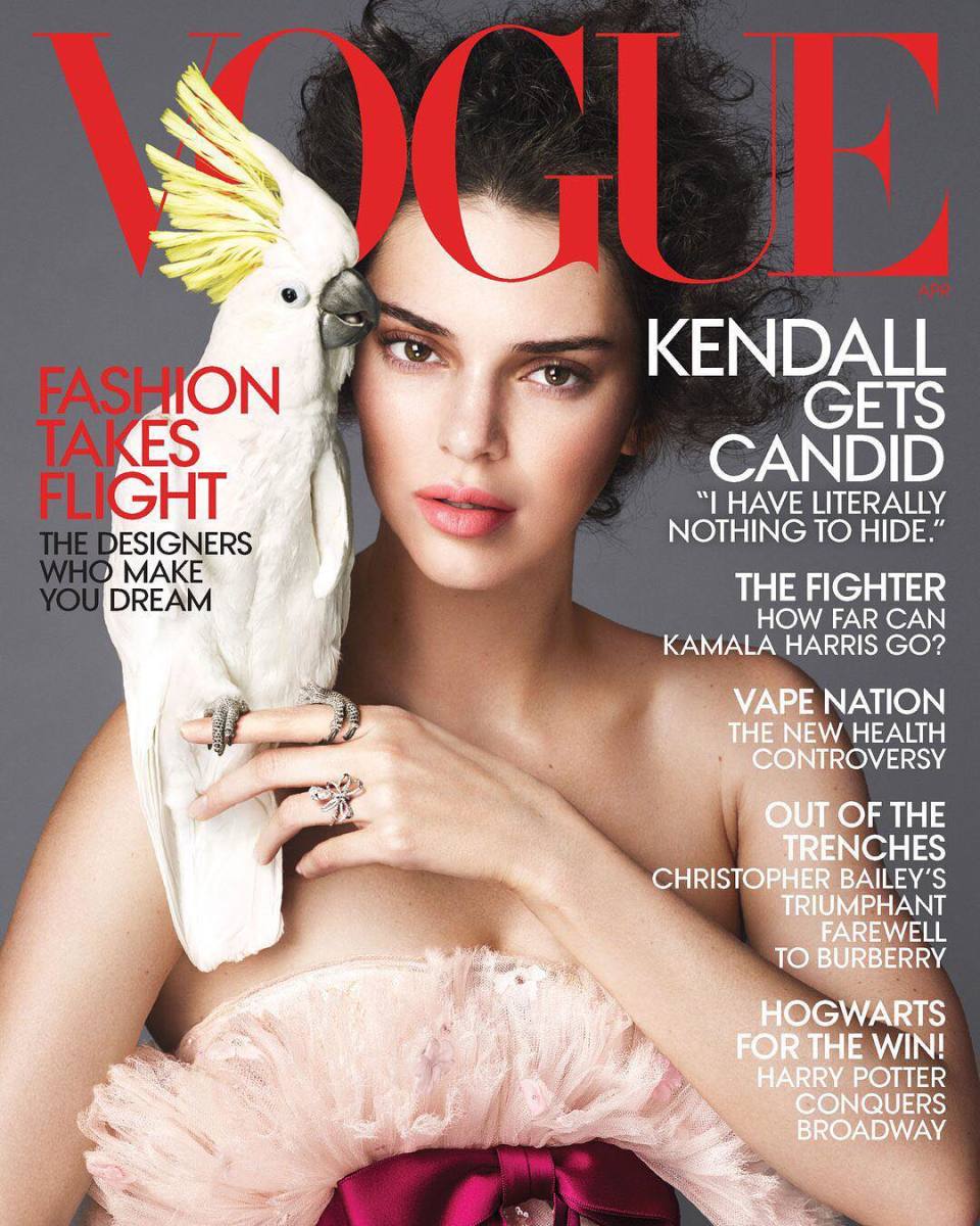
However, the VOGUE magazine shown above used ALL CAPS for their cover lines which made the readability harder. Usually a block of CAPS text looks big and bulky, AND QUITE HARD TO DIFFERENTIATE IN TEXT SUCH AS THE EXAMPLE ABOVE (usually it also may appear as someone SHOUTING or SHOVING INFORMATION to your face).

Small capitals are designed to match the x-height of lowercase letters. Many designers prefer to use all small caps as it creates an aesthetically clean line with no ascending elements.

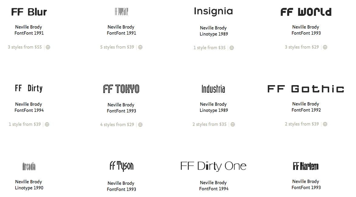
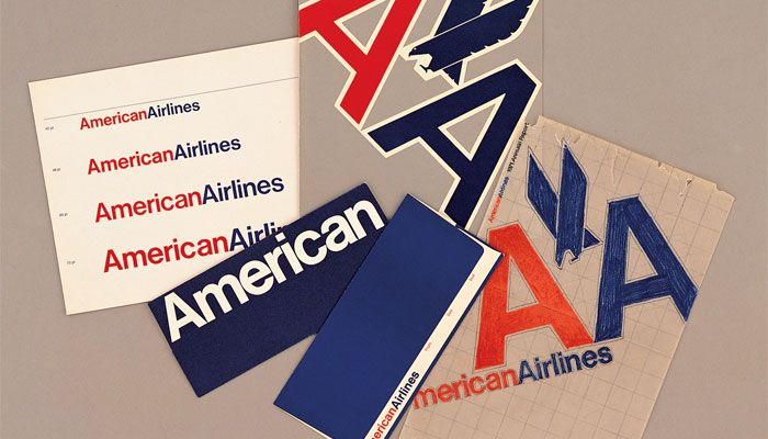
Thus this leads to the importance of curating a symphony of typefaces. With the constancy yet vibrant beats and notes, which gives coherency and beauty. Designers play with the contrast in scale and weight, the coherence of a san-serif with a serif.  This teaches us how the properties of a typeface and the pairing of different typefaces can establish a good visual impact. It allows the type to portray the whole image to the readers just by choosing a typeface, a type classification and adjusting the weight, scale and size.

References:
http://thinkingwithtype.com/letter/
https://fashionista.com/2018/03/kendall-jenner-vogue-april-2018-cover

Typographer of the Week: Neville Brody

Neville Brody is an English graphic designer, typographer and art director. In his student years, his designs were often criticised by his professors as uncommercial designs. Brody was highly inspired and influenced during the era of punk rock, but his experimentation was not met up to standards to his teachers. However this did not stop him into exploring the boundaries of graphic design, thus he began researching on the subject comparison between Dadaism and Pop art (which is reflected in his following works).

Brody started his career as a record cover designer but was recognised in the market through his work as an Art Director for The Face magazine. Thereafter, he gave direction to several international magazines, newspapers and even redesigned one of the top two leading English newspapers. His achievements has revolutionised and gave meaning to the media and the world of visual communication. 

Brody is also one of the founding members of Fontworks/Fontshop and has designed numerous notable typefaces for websites. Such as:
Arcadia, Industria, Insignia, FF Pop.

Some of his font design, such as Arcadia was influenced through the style of Art deco. It reflects “the great gatsby” period, capturing the vibrant spirit and the lush atmosphere of the Art Deco. It features a tall and striking geometric design with extremely condensed and contrasting forms. Arcadia’s elegance is used to display settings for advertising, packaging, invitations, or logos. 

Furthermore, Neville Brody established the FUSE project, which fuses typeface and graphic design in a magazine. The project brings forth designers, architectures, sound and film directors together through conferences. 

https://ozivizieviaggi.wordpress.com/2014/09/24/anti-design-movement-neville-brody/
https://typographica.org/typography-books/fuse-1-20/
https://www.pinterest.com/pin/220394975491833936/?lp=true

Neville Brody plays with colors, form, weight and type that evokes loudness and eye-catching elements in order to push through the boundaries of design whilst playing with the unconventional. His work effectively hinders the line of rule breaking by creating a refreshing side on graphic design. Brody embodies the essence and the true meaning of design and to communicate visually, instead of falling into commercialism. One has to stand up in order for the rest to rise. 

Typographer of the Week: Massimo Vignelli

MASSIMO VIGNELLI

Massimo Vignelli is an Italian designer who dappled in a vast range of design: branding, packaging, housewares, furniture, showroom design and etcetera. Together with his wife, he founded Vignelli Associates. One of his ethos was that “If you can design one thing, you can design everything.” This ethos was reflected in his work within the Modernist tradition. Vignelli focuses on simplicity and clarity of design through the use of basic geometric forms in all his work. He is also a constant user of Helvetica, which can be seen in most of his work.

Vignelli’s first major presence into the field of brand identity was working under Unimark International, which thereafter became one of the largest design studios in the world. He has designed identities for international corporations such as American Airlines, Bloomingdales and Knoll. 

American Airlines

In 1967, Vignelli was commissioned to design the logo for American Airlines. He created a branding that was bold and simple – two capital As, one red and the other blue. The use of the colors was to indicate the company’s pure intent service and professionalism. It was also to symbolise the American flag. He incorporated a geometric shaped X-eagle to represent America. This was the rise of Vignelli, receiving one of the biggest commission. 

Knoll

Knoll recruited Vignelli to design  and reconstruct its brand identity. He used geometrics, a grid and the type Helvetica to create the following outcome, together with Heinz Waibl. 

New York City Subway

In 1972, Vignelli redesigned the New York subway map to simplify its complex signage system. His map was colorful and based on the right angles, however it distorted the actual dimensions of New York City and the path of subway lines. In 1979, the city decided to replace it with a more geographically accurate map. However, in 2011, the city brought back Vignelli’s version for  the display of service changes on weekends. Vignelli’s directory use of the typeface Helvetica has never been changed due to its readability and clarity. It also provides subway users in an interactive way of getting information – information design.

Our Bodoni

As the number of typefaces increase throughout the years, Vignelli believed that there was only the need of 6 typefaces: Bodoni, Century Expanded, Futura, Garamond, Helvetica, Times Roman. In 1989, he created Our Bodoni, which is a combination of Bodoni and his favourite typeface, Helvetica.

Vignelli suggested whether the context requested something classical, in the sense of something refined, then we would use Garamond. For something more informational we would use Helvetica. Moreover, he inferred that we as designers should set a goal to simplify things.

Massimo Vignelli is one of the most important figures in the history of design. He has designed graphic systems that has a use for people in every day life . His design and cultural commitment has produced a foundation to the world of Modernism in the Early 20th century. Vignelli has taught us to appreciate the practicality and the elegance of simplicity.
To present information in a visual and structural form.


References:
http://www.designishistory.com/1960/massimo-vignelli/
https://99designs.com.sg/blog/famous-design/remembering-massimo-vignelli-modernist-master/
http://www.eyemagazine.com/feature/article/reputations-massimo-vignelli
http://www.designculture.it/interview/massimo-vignelli.html
https://www.pinterest.com/pin/512003051357850035/?lp=true
https://www.pinterest.com/pin/71635450299405430/?lp=true

Type Speaks 1948: Reflective Thoughts

“What if printing type never existed? and Is it taken for granted?”

Type Speaks 1948 is a short documentary on how a type was intricately dimensioned, engraved, scaled with height and weight. It shows a complex stage to create a certain type letter under a skilled craftsman. Yet after inventions and evolutions, type might be taken for granted.

To many people, typography is not art but a legible language to communicate. Typefaces and font families are just there taken for granted. However, if you observe closely, each letter is an individual design dependent on every other letter in the font. This is made so that when they are placed in every combination, it looks cohesive and constant. Furthermore, type craftsman considers the thought of creating a serif or san serif? How far down should the descending or tail be in a certain letter? The angle placement of an ear? The curved angle of a letter’s shoulder? and etcetera. (For example, like the image below.)

http://aboutletterg.blogspot.com/

These are just a few of the macro design decisions of typographers. Further into the micro decision of the subtle differences in line thickness, curve, slant or embellishment. These far intricate process to create a type are past us, that we do not understand yet taken for granted. Opening a word document, picking a typeface and font to create our script. All we care is that is the legibility and the message the type can carry across. 

However, one thing that everyone sees type as is a language. It can be used in different situation and purposes to emphasise a certain message, depending on the typeface. It speaks the language. Thus, after watching this video made me realise and appreciate typography even more and how it was more than just a legible language. Developed and processed throughout the years, I could definitely say it is an under-appreciated art that people should know more about through history.