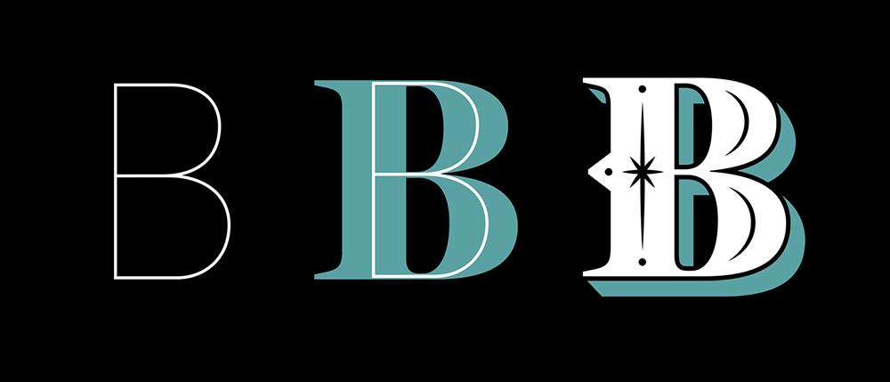
There are bountiful intricately designed typefaces up to this day, but how do we choose one that will be the perfect fit for our project?
Jessica Hische’s article, Uping Your Type Game will just be able to help us with that! She gives a thorough discussion on how type designers are the underdogs. She provides step by step pointers on how to choose a good typeface that may be the perfect fit for our design work and how we should broaden our horizon by not having a favourite type (but maybe a favourite type designer).
- To analyse the weight of the type. To Jessica, it is important to have access to a wide range of weights. This allows the flexibility in designing with perception of type weight.
- Look at the x-height, where it is best to look for an x-height that allows you to set type at small sizes and still have it be legible.
- True italics
- Type’s personality: What does the type convey and what historical baggage does it carry? What is the meaning behind its design?
- Spacing. This affects the legibility, whether it is easy, smooth and fluent to read.
- Even type color. This is my first time coming across this term. This is to make sure the letters don’t feel optically heavier at the joints. “Consistent type color also has a lot to do with the counters, or the spaces within the letters. If counters are too closed, it can make a letter seem heavy or affect legibility and letter recognition.” This made me reflect on how precise and intricate type designers must be and I would never pay close attention to it until this reading. Truly impressive!
- Widths. This ensures that the type is legible and beautiful per-line word-count.
- Using sans serifs. Jessica mentioned that using sans serif could be tricky as a body text. She introduced the “I to i to 1” rule where a capital I, lowercase i and a number 1 are placed next to each other. “If you can’t tell the difference between these characters, you may run into some trouble when setting the text.”
Besides these pointers, choosing a type means defining the right mood. One must read the content, write down the key points and visual cues. When pairing typefaces, Jessica recommended to choose within a super-family, same type designer or one that has similar characteristics. For example, when pairing a serif with a sans-serif, it is best to choose the ones with a similar skeleton or proportions. When placing the text, place the serif for your body copy and a sans for your headlines.
After reading the article, it made me more aware on these detailed elements a type carries. When and what is appropriate in different moods, pairings and design. However, the article only talks about the functional use of proper text base fonts instead of the decorative and fun flourishing fonts that one can create for a project. It is does not necessarily mean we have to stick to these pointers but rather to keep in mind, for example, when one is designing an editorial or information texts. Personally, I feel it is more important to have fun and go wild with experimentation without these rules, and then maybe come back to them when finalising the design piece. At the end of the day, it all comes down to context, mood and the appropriation of type for the project.