
Herb Lubalin is a spirited American designer who has won wide recognition for his innovations in advertising, publications and books. At the age of seventeen, he entered Cooper Union and was enticed by the world of typography. He was captivated by the various interpretations one could execute by changing one typeface to another. Lublin is one of the pioneers of expressive typography and an influential figure in the ‘creative revolution’ that has transformed American advertising in the 1960s.
”You can do a good ad without good typography but you can’t do a great ad without good typography.’’ – Herb Lubalin
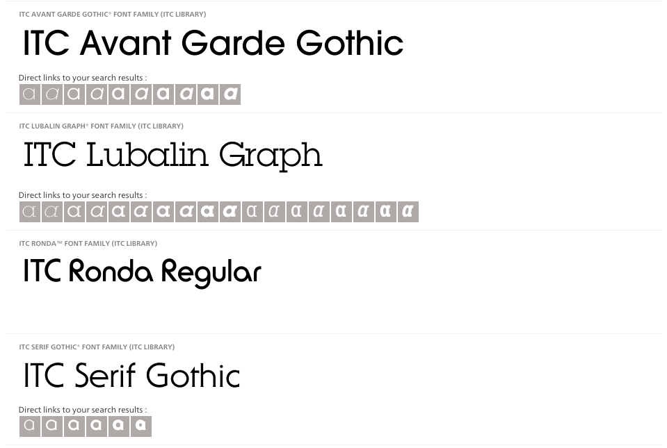
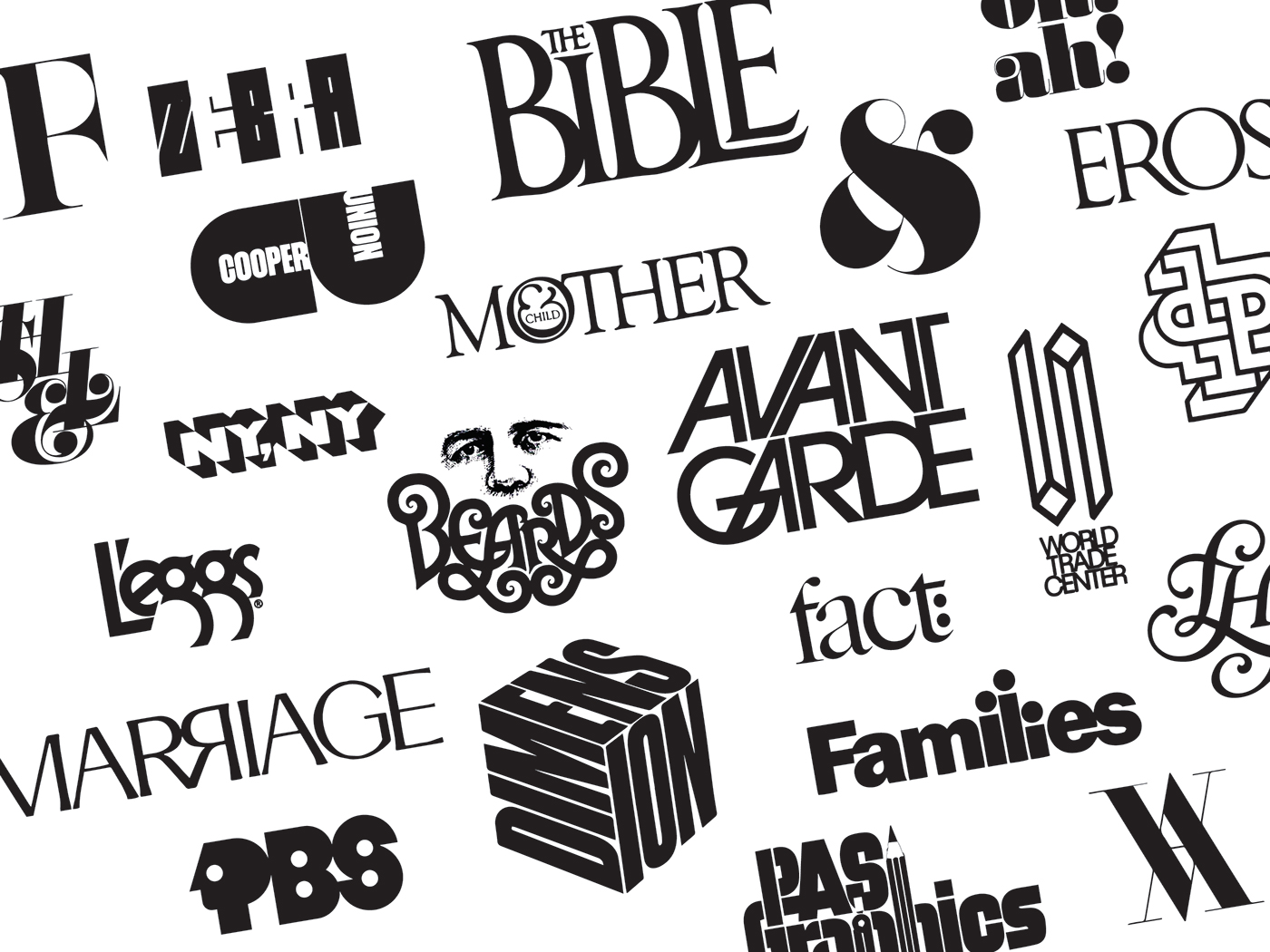
Lublin once declared that a good art director should know the strong points of every one of the many typefaces that existed and how to use them best. However, the existing typefaces were not good enough for him, thus, creating his own. Lubalin designed four typefaces: ITC Avant Garde Gothic (1970), Ronda (1970), Lubalin Graph (1974), a slab serif and ITC Serif Gothic (1974). One of his prominent faces was ITC Avant-garde. It is also mostly known for being a revision of art deco. He customises serifs, ascenders and descenders to his liking.
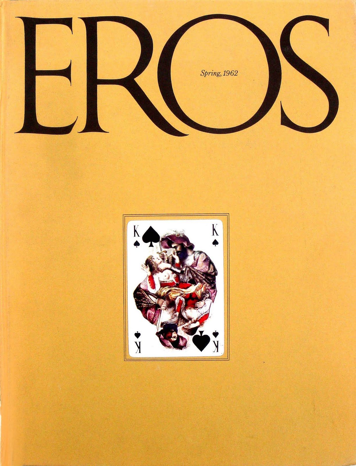
Lubalin puts the stress on bold headlines and graphic simplicity. For example, he used flashy layouts and strikingly elaborate graphics for a magazine called Eros, which carries a more sensuous content.
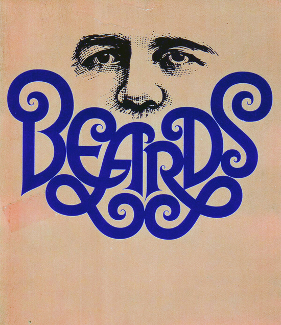
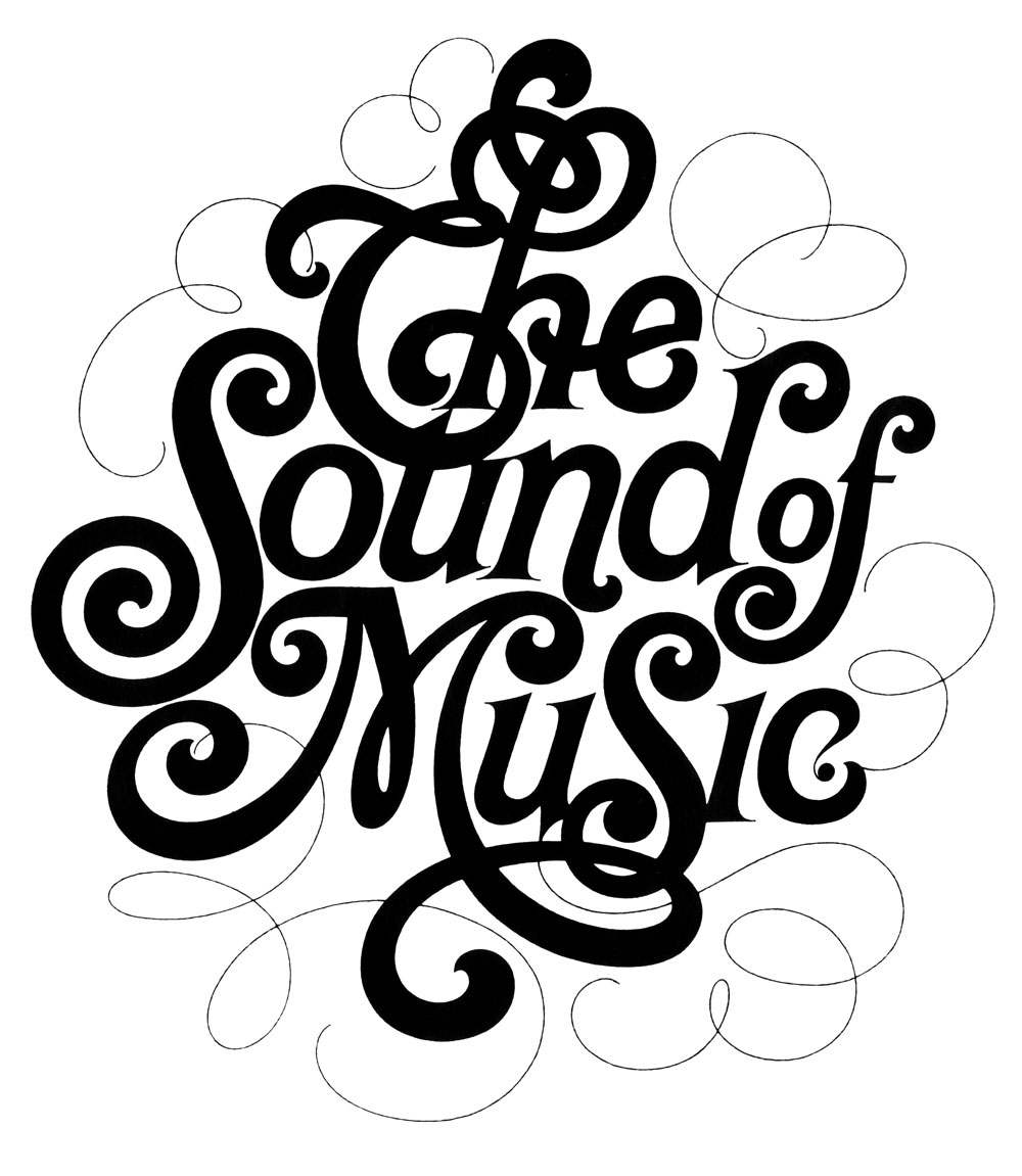
Lubalin took Modernism into the palm of his own hands with the use of geometry and tightly constructed compositions. He also adds slight humor, sensuality and flourishes. For example, his hand lettering for The Sound of Music Programme to the whisper-thin justified stack for Cooper Union. He was also commissioned with a project for Sprite in creating a new package, logotype and ad. He also did graphics for everything from Bazooka bubble gum and Chicken of the Sea tuna to Ebony magazine.
What caught me by surprise was that Lubalin holds a stand in the use of graphic design in advertisement of products or services.
“I don’t particularly like to advertise products and help clients sell products that I have no particular use for. And very often I turn down a product because I just think it detrimental for people to buy certain products.” – Herb Lubalin
This got me intrigued that there are designers out there that still holds there morals to the ground in the belief of pure graphic design, to communicate your own voice, choice and beliefs. He also rejected Swiss modernism in favor of a more humanistic ‘graphic expressionism’. He felt that it did not fit in with American culture and imagination. This idea links back to Erik Spiekermann’s manifest on how fonts must be altered and varied to ones culture. The different lifestyle and perceptions may affect the people’s opinion on a certain typeface. Hence, it is important to have designs stylized into cultures for it to be understood, absorbed and well functioned. Lubalin commented that the Americans react to new ideas and that they are a “concept-conscious society”. Thus, the creation of graphic expressionism by Lubalin.
In 1979, Lubalin wrote an article for Print magazine and said: “Graphic Expressionism is my euphemism for the use of typography, or letterforms, not just as a mechanical means for setting words on a page, but rather as another creative way of expressing an idea, telling a story, amplifying the meaning of a word or a phrase, to elicit an emotional response from the viewer.”
He illustrates human emotion through impactful juxtaposition. His constant search for something innovative and fresh made him one of the most successful art director/designer of the 20th century.
(Yet another designer that I found myself adoring.)
Herb Lubalin’s sketches + design work:


References:
http://www.eyemagazine.com/feature/article/up-close-and-tight
https://www.linotype.com/483/herb-lubalin.html
http://www.lubalin100.com/day-7/
https://www.aiga.org/medalist-herblubalin