“Brand = Function”
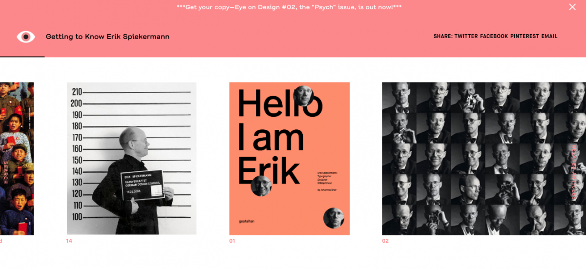
Erik Spiekermann is a German type designer and information architect that has shaped Germany’s visual culture. With two other designers, Spiekermann established MetaDesign. Some of the notable projects undertaken by the design studio for includes Audi, Volkswagen, Skoda, Berlin Transit and Heidelberg Printing and other leading companies.
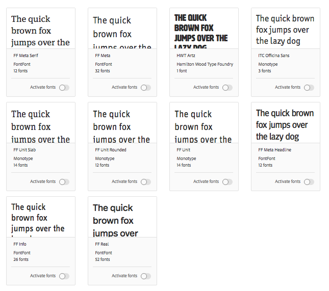
The image attached below shows the typefaces Spiekermann has designed and developed for neutral/practical uses. Two of the typefaces are actually altered towards the German culture.
Spiekermann has a ‘minimalistic’, non whimsical, neat, clear and informative style. He holds a devotion to clarity and grid-based design, sticking to the base of designer rules. “I need order. I need systems. I don’t really do anything without a design grid.” This shows how grounded and discipline he is in making informative designs and typefaces. How a grid and design principles can have a good impact in the application of form.

“Classic is my own adaption of Bodoni; for Contemporary, I somewhat rearranged Meta Bold; Industrial is a generic industrial typeface as negative stencils; and Tech is my attempt at designing numbers without any diagonal strokes. The materials are laser-cut, enamelled steel, extruded, and anodised aluminium, laser-cut, painted steel, and water-cut, polished stainless steel.”
– Erik Spiekermann
Spiekermann also mentioned how fonts must be altered and varied depending on the culture. The different lifestyle and perception may affect the people’s opinion on a certain typeface. Hence, it is important to have designs stylised into cultures for it to be understood, absorbed and well-functioned. Erik Spiekermann prides himself as a communication designer with clear underlining through his designs, which make him different and grounded from the whimsical and over-elaborative designers. His designs gives of a neat, clean and guided look – pleasing to the eyes in a sense of practicality and functionality (down to the purest form).
References:
https://spiekermann.com/en/
https://www.fontshop.com/designers/erik-spiekermann
https://www.goethe.de/en/kul/des/20449739.html