
Jan Tschihold is a highly influential and inspirational typographer in the 20th century of design. He was exposed to the Russian constructivism and the Bauhaus, which led him to form his early typographic style and theories. Tschihold developed and promoted principles of typographic modernism through his most known work of redesigning Penguin books. Despite his passion for the elements of asymmetrical typography during his youth, he comes to associate its rigid style with totalitarianism in general. This led to a turn into the classical and symmetric style that he had once criticised.
Some of his works:
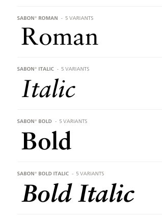
- Sabon
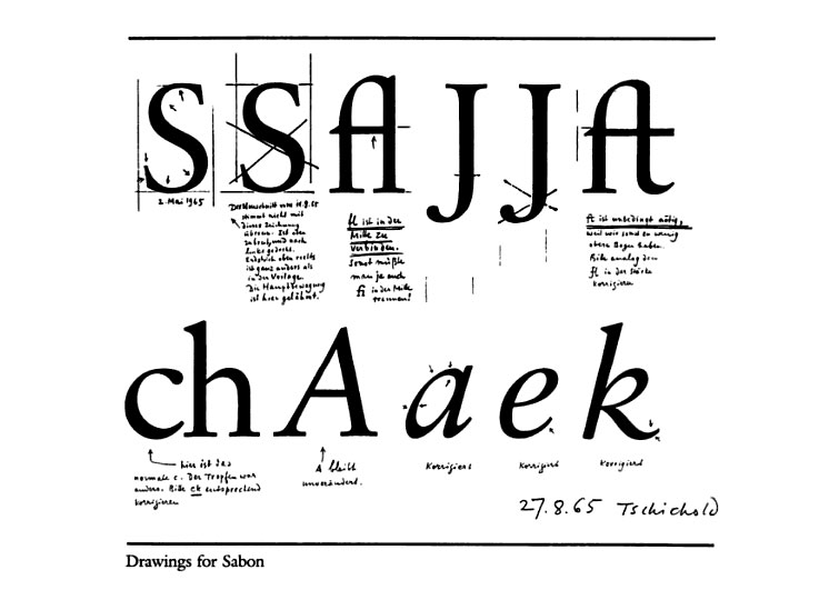
Tschichold was commissioned to design a new version of Garamond’s classical serif Roman typeface. It was released in 1967 as part of a joint venture by the Monotype, Linotype and Stempel foundries. Sabon is mostly used by typographers as book text, due to its smooth texture. It was also well received by the printing industry and continues to be used frequently in digital typesetting.
2. Page Canons
With the help of the Fibonacci Sequence and the Golden Ratio, Tschihold established a new rule of a page ratio of 2:3. He expresses this as ‘the key to this positioning of the type area is the division into nine pans of both the width and height of the page’. A text block which is in a relatively fixed proportional positions with echoed margins.


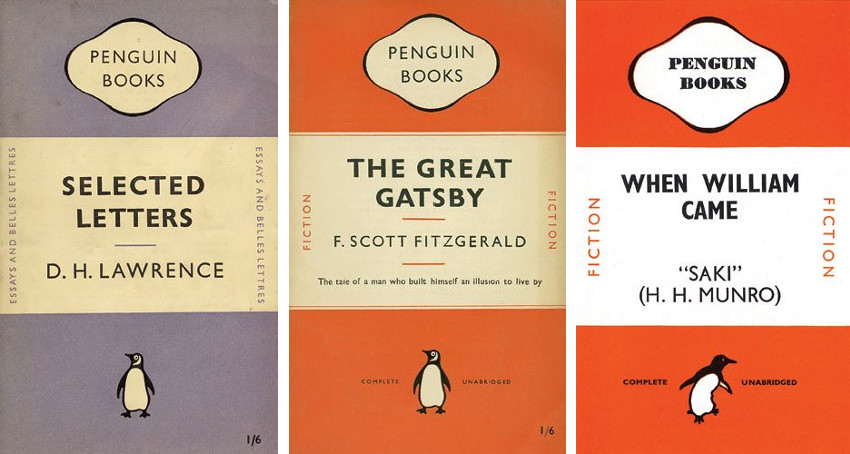
3. Penguin Books
Tschichold first incorporated a four page guide that covered all things from margins to italics, punctuation to footnotes, which would be used as the base grid. He then started to rework the covers through different weights of Gill San and a hierarchy was established. The tone of those infamous orange strips was changed and rules were made for tracking of text.
A second revision was then made through the rules between title and author. The logo was redesigned and all fonts were made smaller. In the following revision, the fonts were reduced while upholding the golden ratio with a smaller book size.
This was how Tschichold developed the character in each book.
“It had to be perfect.”
The different ways in which Tschichold played with typography, space, layout highlights the importance of experimentation. It is fascinating in how much thought typographers put in their design work compared to the fine arts or crafts. More than emotions and expression, typographer uses math, ratio and much thought. It is so well thought and concise that almost every single grid system and typeface is still used in various context in this modern day no matter how old it may have aged. Most important the baggage of history it has, the richness a typeface or rule may carry. This is the beauty.
References:
https://www.linotype.com/5598633/sabon-family.html
http://retinart.net/graphic-design/secret-law-of-page-harmony/https://www.moma.org/artists/5951