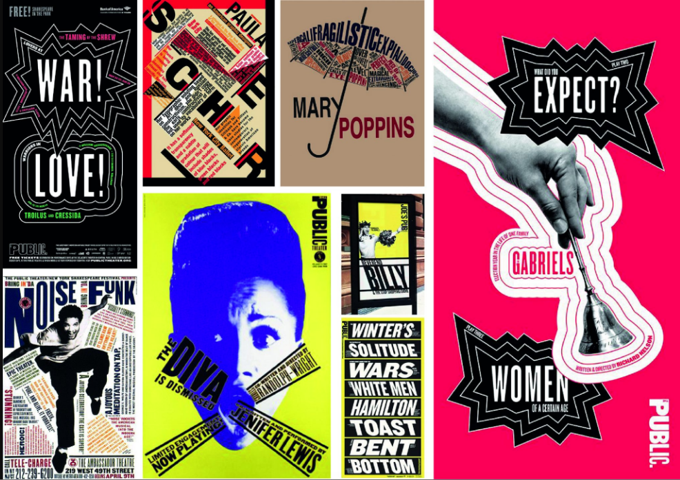
Paula Scher has developed brand identity and branding systems, promotional materials, environmental graphics, packaging and publications for a wide range of clients. She creates images that speaks to contemporary audiences with emotional impact and appeal. These images have come to be visually identified with the cultural life of New York City.


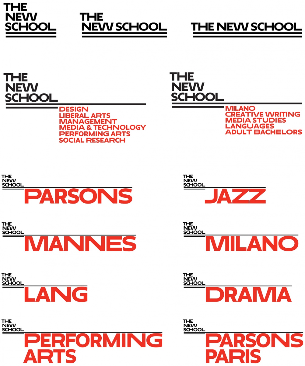
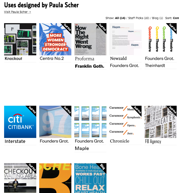
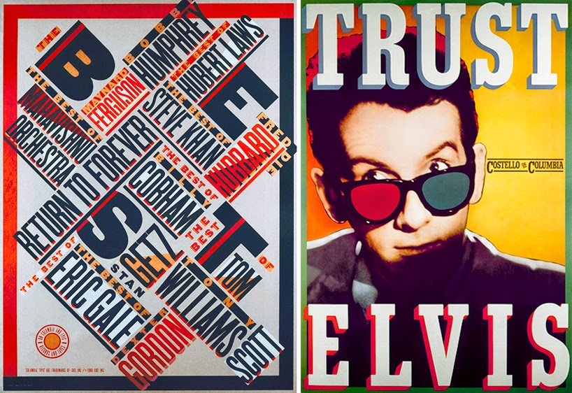
Scher first began her career by creating record and album covers for both Atlantic and CBS. After a few years, she then joined Pentagram where she created memorable identities for clients such as Citi Bank, Coca-Cola, the Metropolitan Opera, the Museum of Modern Art, Parsons and Windows, among others. Furthermore, Scher also maintains an avid interest in environmental design, and a mural-scale painting practice all on her own. It stems from her rejection of modernist structures on neutral and “clean” designs, to expressive art (very different in contrast to Massimo Vignelli, where its clean, simple and functional). For Scher, expressivity is key to high value.
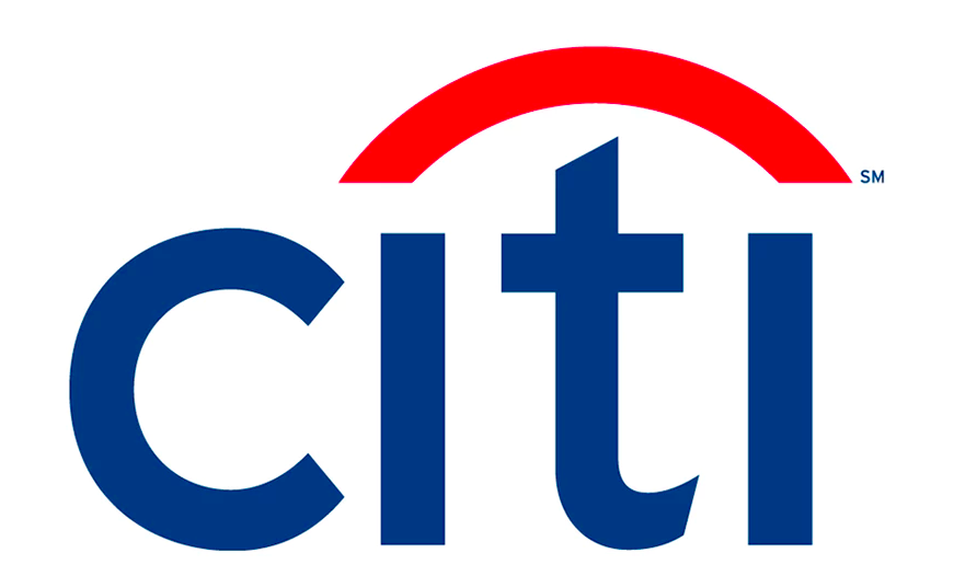
The Citibank Logo carries a polished corporate look. This brand identity was created after Scher’s first meeting with her clients. She was mind mapping on a napkin when she finished “the final idea” the moment she walked out. In the video, she talked about this process and it struck my attention that the ‘t’ with the over head curved red line was a depiction of an umbrella. Scher operates heavily on her intuition, as she believes design is from within where it takes a very intuitive process. For Scher, “big bold strokes of design that comes in her mind first or second are usually the final idea.” This statement is one to follow. We, as designers, should not force ourselves to design something so fixed in a way that does not reflect our own designer identity, rather we should follow our own intuition that helps us color and reflect our designer identity into our works. Sometimes, you may never know what you come up with is one spectacular piece…right?
Scher suggests that “words have meanings and typography has feelings.” When you add them together it creates a spectacular combination. She responds negatively towards Helvetica as it neutralises feelings. It acts like a plain white wall instead of a bold loud colored wall that speaks emotions. Typefaces have personalities of their own and we should use that to our advantage when designing. She suggests that we as designers should illustrate with type and not press in the corner of type. Scher developed typographic solution based on Art deco and Russian constructivism, which incorporated outmoded typefaces into her work. The Russian constructivism had provided inspiration for her typography, using it as a vocabulary of form in her works.
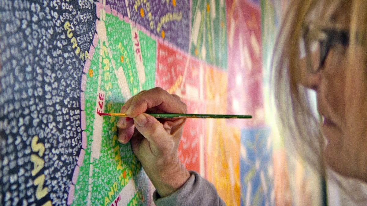
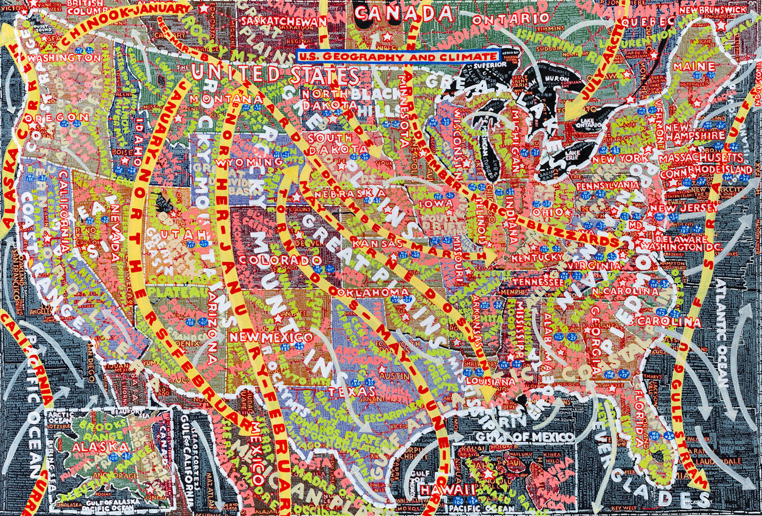

Scher illustrate maps using demographic information and paints her type during her weekends, which takes a long time to complete. Before technology, Scher has been using her hands to paint album covers and type. After the invention and innovation of technology, it had made her hands feel useless. Strongly puts forward that we as designers should create our own designs and type with our bare hands through experimentation and process, hence, “you don’t type design”.
Scher’s design communicates with the contemporary audiences through the use of pop iconography, music and film. Her work has been published internationally and her contributions to the field design are numerous. She uses her large scale of experiences and skills vary what the client wants; from a corporate look of citibank to a fun-funky design for an art school like Parsons. She incorporates photos and typography into her works, plays with pure typography that can make such an impact! As a global artist influencer, Scher continues to inspire the new generation of designers.
References:
https://99designs.com.sg/blog/famous-design/paula-scher-titan-of-postmodern-design
https://www.pentagram.com/about/paula-scher
https://fontsinuse.com/designers/369/paula-scher
http://www.semipermanent.com/articles/interview-paula-scher