Value: Punctuality
To me, one of the qualities/values a respectable person ought to exhibit is Punctuality. Being punctual reflects discipline/strict/rigid and responsibility of oneself. In addition, it also shows the respect one has for others. This value has also been ingrained in me since my Secondary School days of being in an uniformed group and further emphasized while serving National Service.
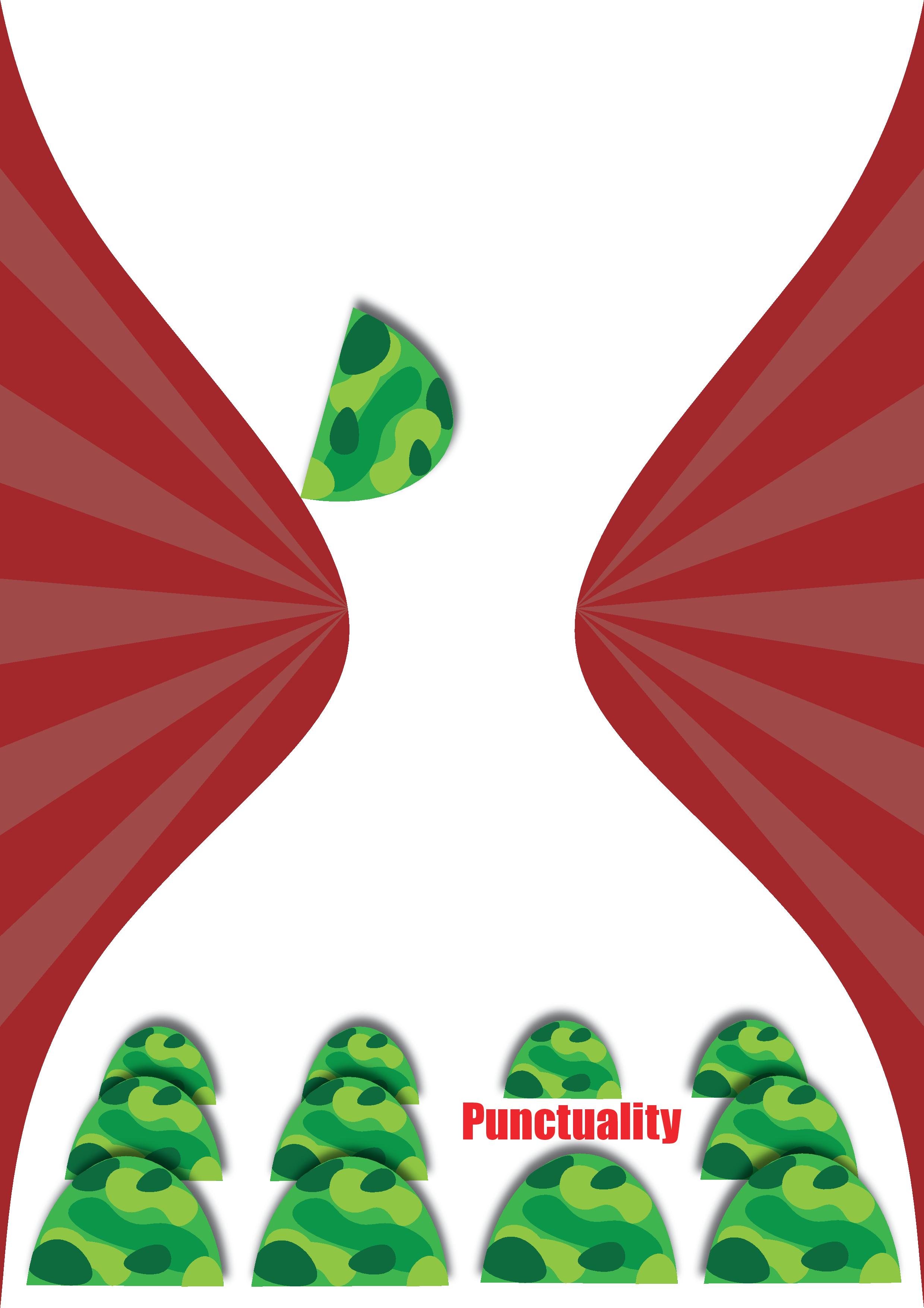
Design Elements
Shapes – Ellipses were used to create the patterns and outline of the helmets.
Lines – Curved lines were used to create the outline of the hourglass. Curved lines gives of an impression of movement, thus it was used to help portray the falling action of the sole helmet. Straight lines were used to create leading lines centering at the middle of the hourglass.
Color – Different values of green were used to represent the camouflage pattern on the helmet. The newer SAF color scheme was used to make the poster relevant in the present context. Red was chosen for the text and background since it is the complimentary color of green, thus creating a bigger contrast and making it dynamic. The contrast between different red values marking the leading lines were reduced so as to not take away the emphasis of the hourglass. White was used for the hourglass to place emphasis on it since our eyes are drawn towards white/empty spaces. In addition, Red and White (colors of Singapore’s flag) makes it relevant in the local context when matched with the SAF helmets.
Font – Impact was chosen as it has thick lines with compressed letter-spacing making it seem rigid and straight following the theme of punctuality being strict and rigid.
Principles of Design
Balance – Asymmetrical balance was used to give stability to the poster design to further emphasize the rigidness of punctuality.
Emphasis – Emphasis through isolation was used on the sole helmet near the middle of the hourglass to draw attention to it.
Gradation – Gradation was used for the squad of helmets; the helmets in front were the largest while the helmets at the back were the smallest. This was used to create depth in the poster.
Movement – The sole helmet is placed at its tip (pivot point) and its center of gravity towards the right of the pivot point indicating movement towards the right. Thus, making the helmet look as though it’s falling.
Gestalt Laws
Similarity – The helmets are arranged and positioned upright in straight rows and columns. The dissimilarity of the sole helmet in a tilted position further draws emphasis to it.
Closure – No lines were drawn for the top and bottom of the hourglass but the hourglass figure could still be implied.
Proximity – Since the leading lines are grouped together and heading towards a similar direction, they appear to be part of the same object; the background behind the hourglass.
Rules of Third – The elements in the poster are positioned in 1/3 sections. In addition, the text is placed 2/3 of the width of the poster.
Challenges & Takeaway
The main challenge is to learn illustrator and being familiar with the different functions and tools in the software. I found it difficult to use the pen tool but after much trial and errors, I could achieve the straight and curve lines that I wanted. Likewise the main takeaway is to be able to learn a new software and to be able to create a poster using simple shapes.