Amongst the 2 other themes, Style and Obsession, I decided to choose Empathy as I thought the illustrations I could come up with might be more personal and relatable. I also wanted to push myself to explore this theme beyond its usual connotations. Thus, my choice of theme is, emapthy.
Research
I started my research by just listing out several things that first come to mind when I thought of the word empathy.
From there I picked out those words that spoke to me more.
human, priorities, others, love, suffering
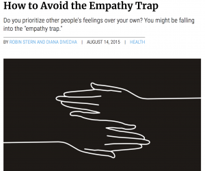
After which I realised that I thought there was a little problem with empathy at times. I feel that many people around me fail to put themselves first. They are always empathising with others, but they forget to empathise themselves. In other words they lack of self empathy.
This article spoke to me as I realised that this issue is indeed prevalent in society today. As such, I was excited to start sketching.
sketches (ideation)
USER PERSONA
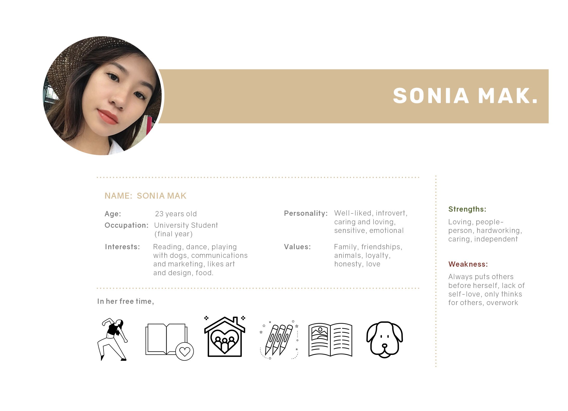
I created a persona that my illustration will speak to and is meant for.
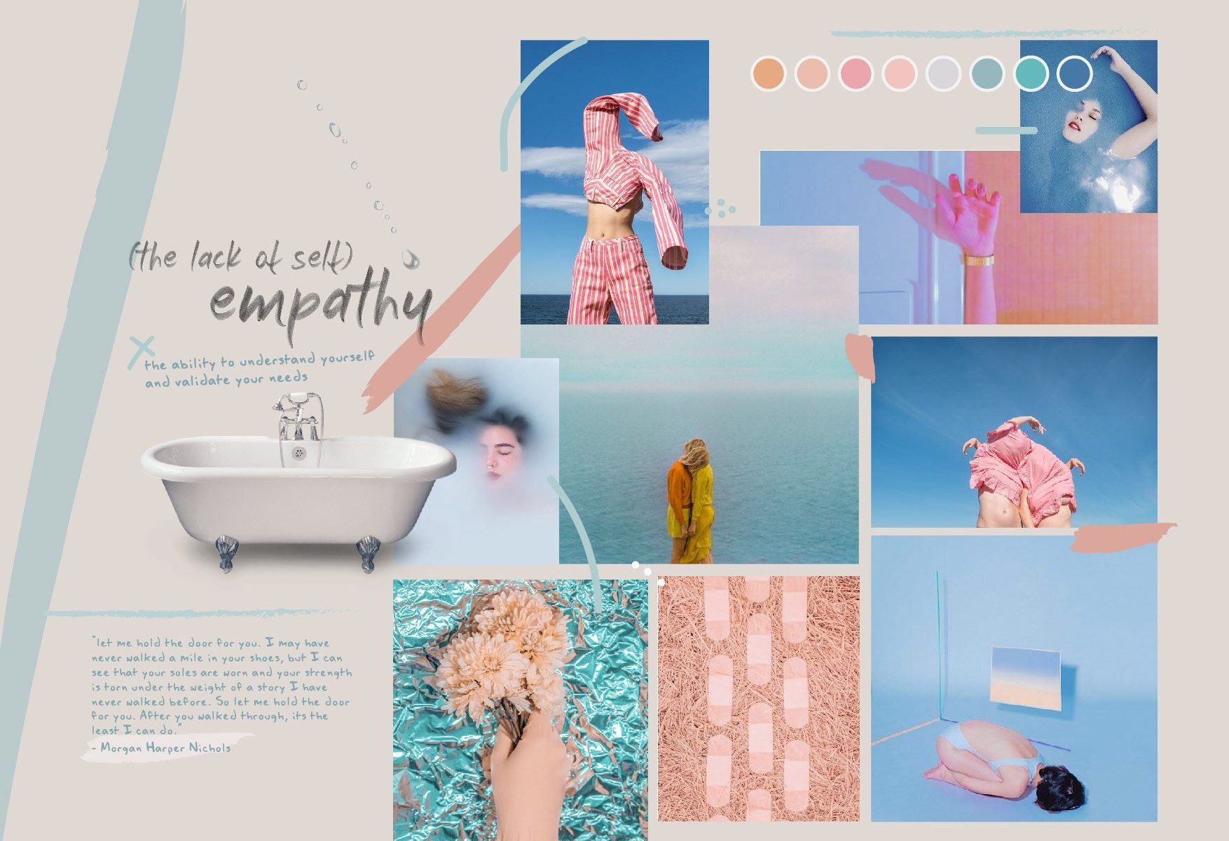
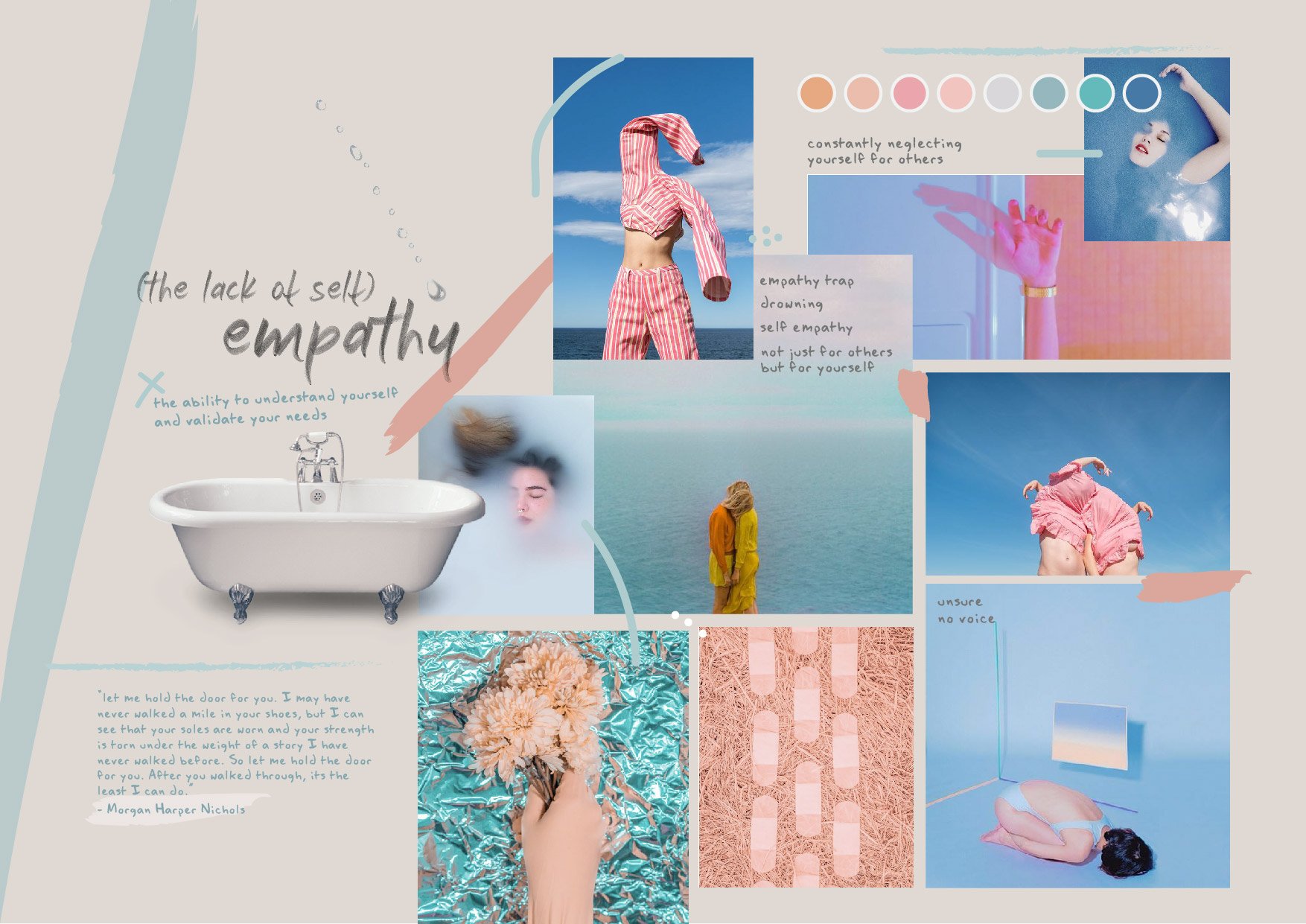
moodboard
Initial moodboard –
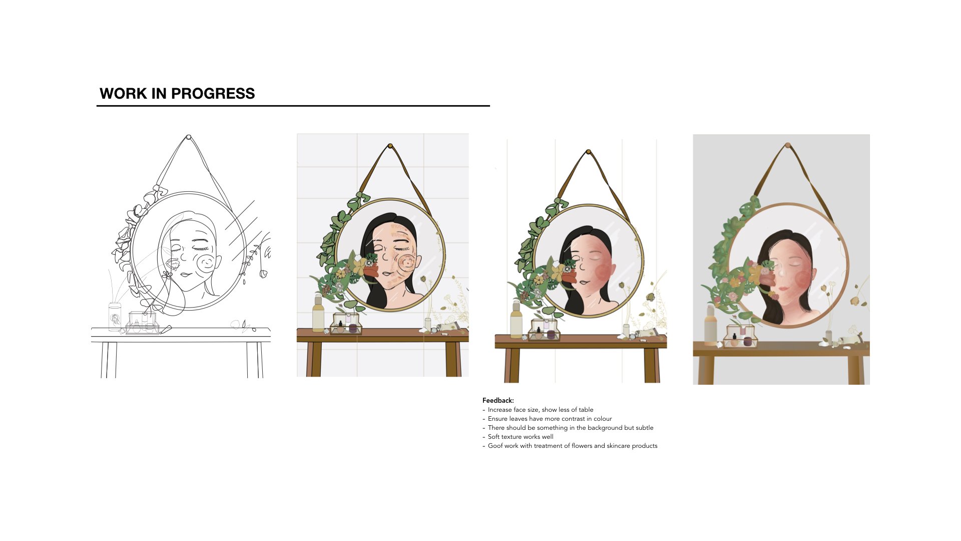
After which, I had to revise the colour scheme slightly to match certain objects in my illustration.
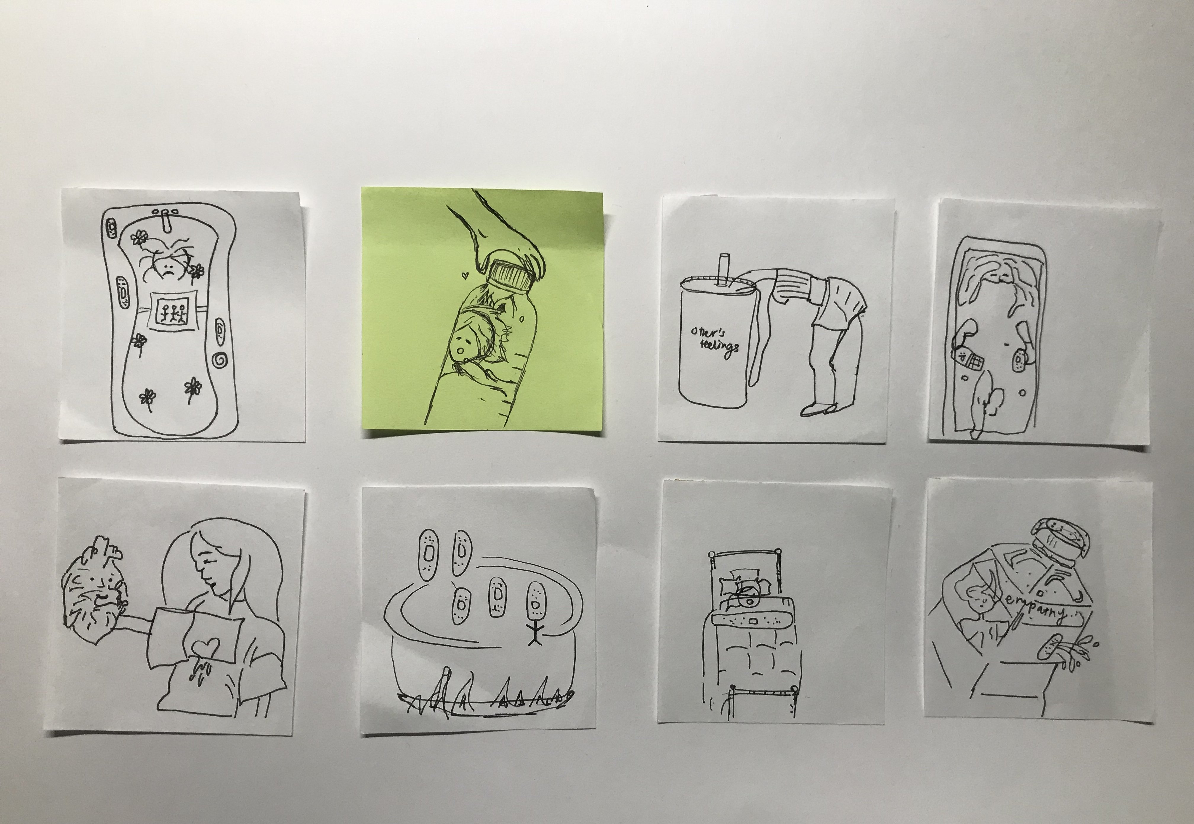
pencil sketches
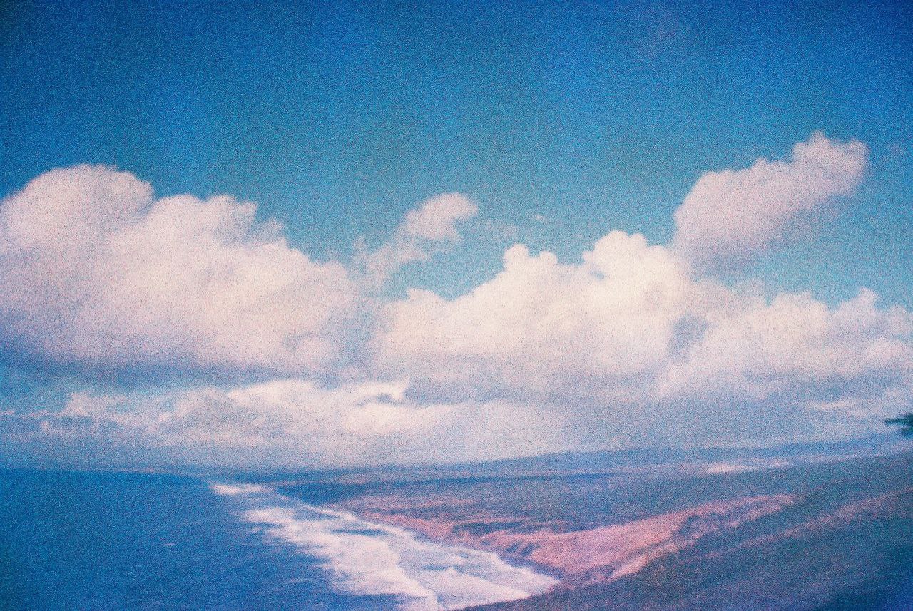
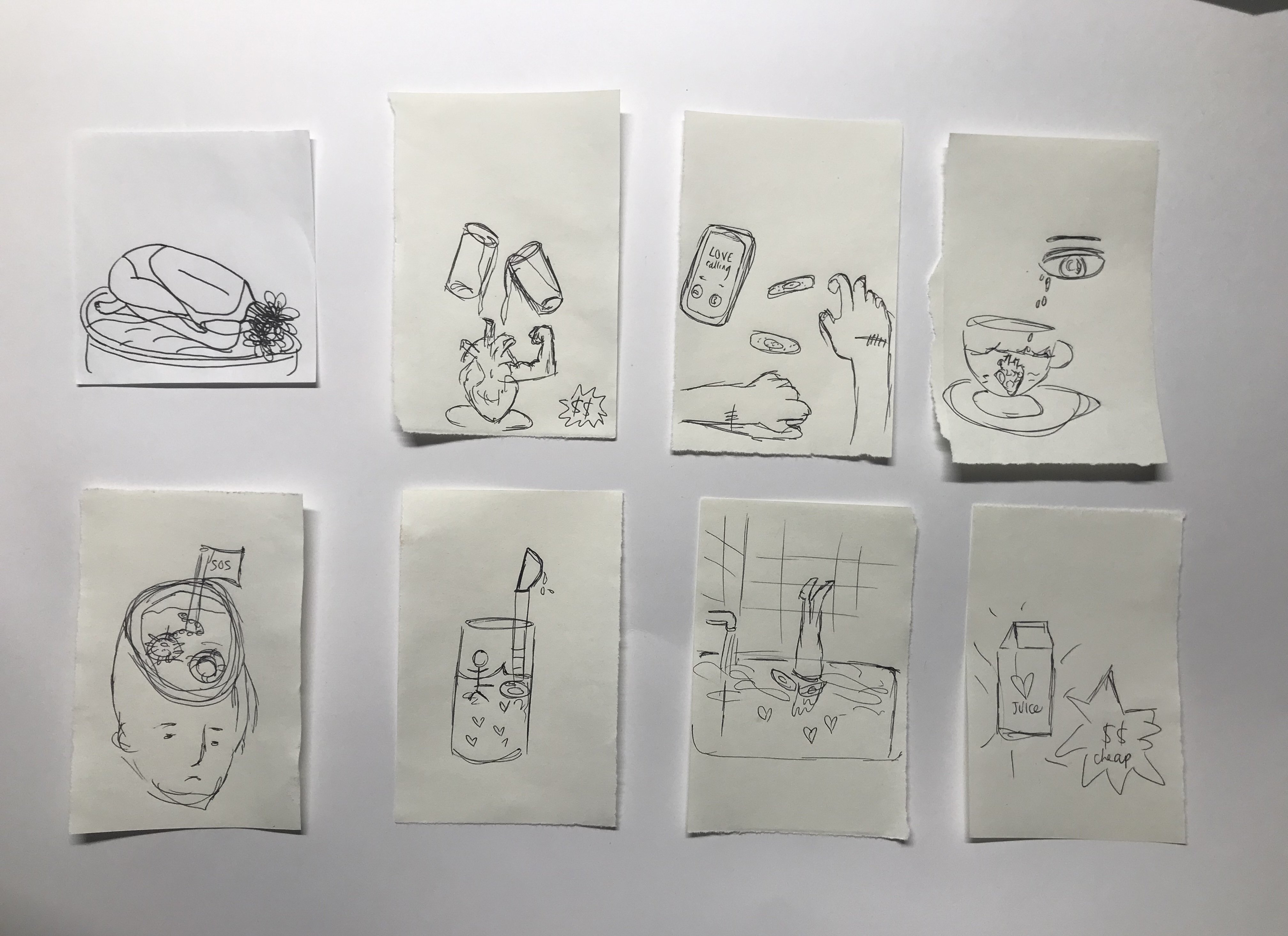
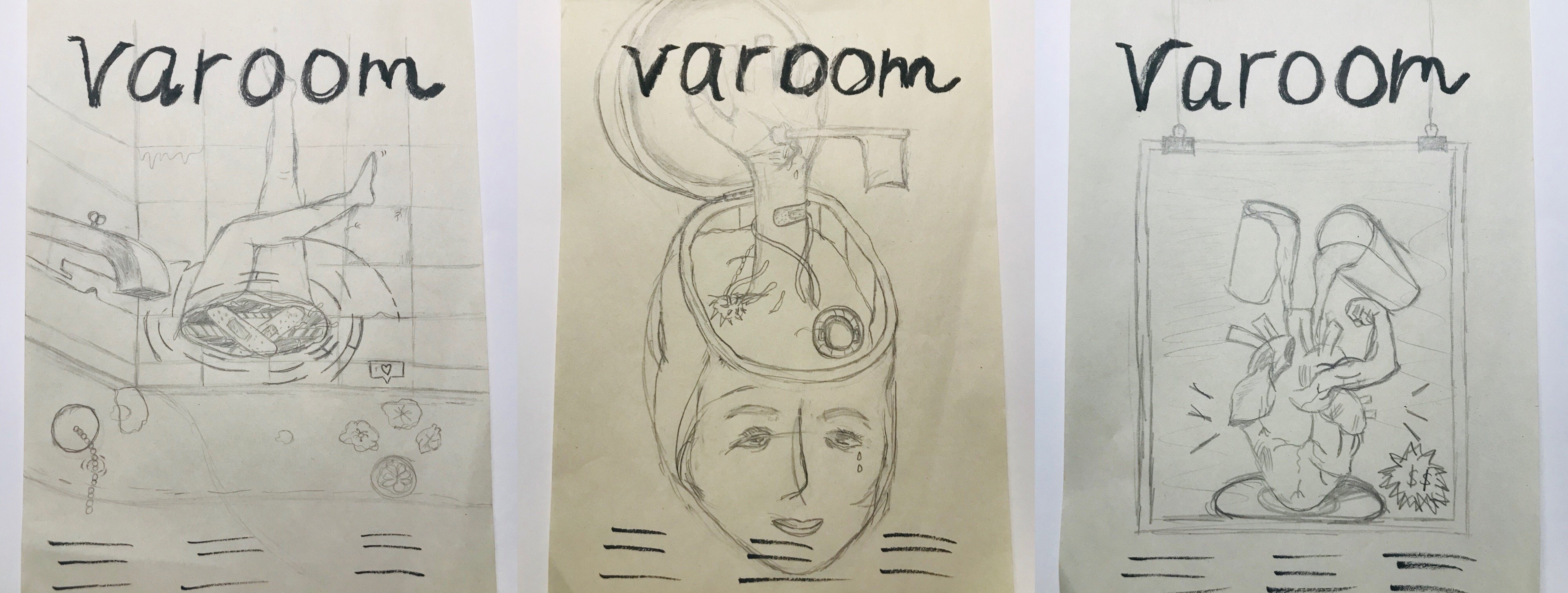
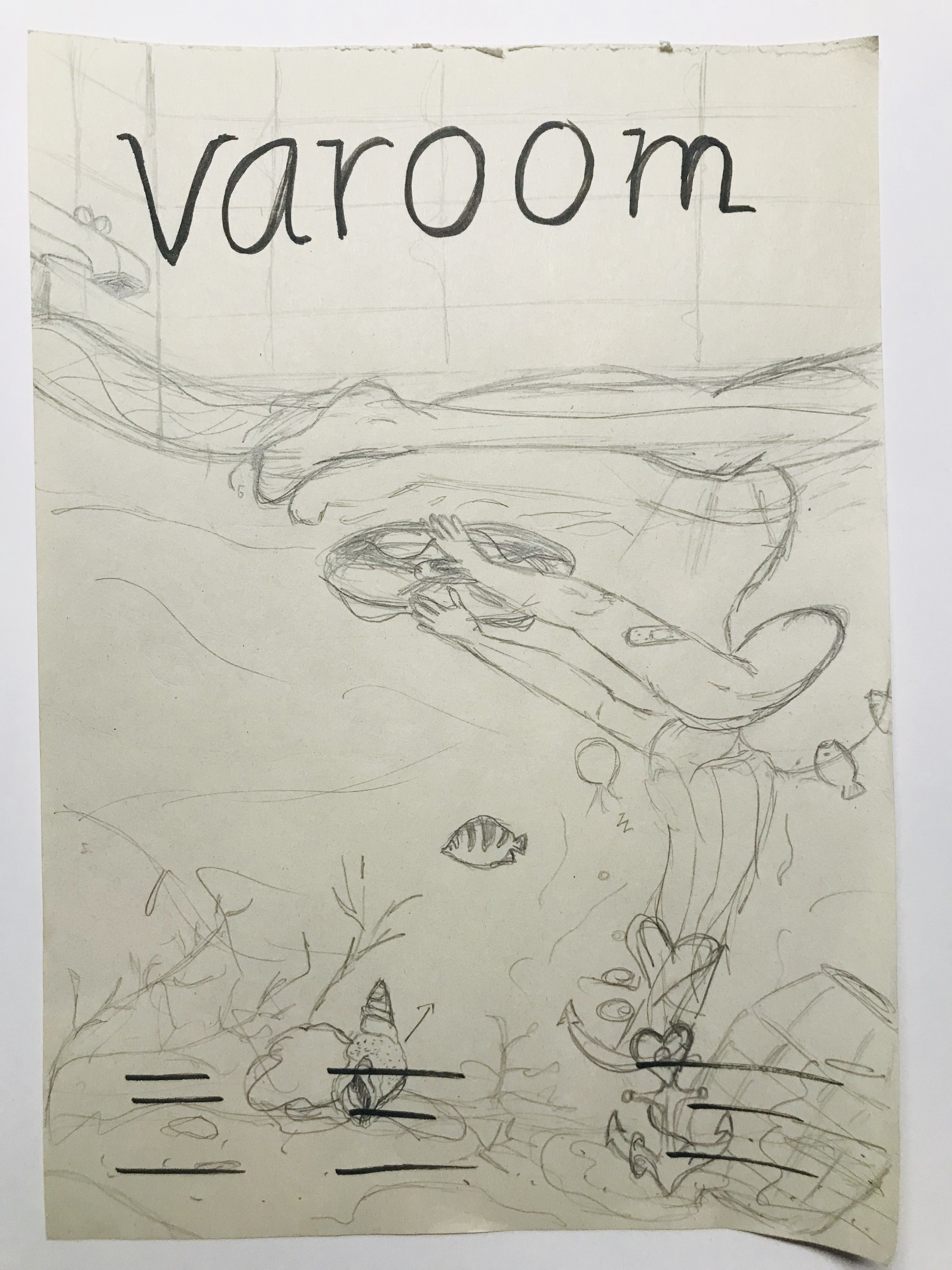
Left: This illustration will address the issue of the lack of self-empathy and the idea of being stuck in it. In a bathroom setting, where people can spend “me time” on reflection, I placed upside down feet as if the person is drowning in the water. The water has bathbomb and pretty things that are actually harmful for humans. This conveys the idea of an empathy trap where people are so quick to put others before themselves. Middle: This illustration also address the lack of self-empathy. The scene is a cut open head. The head is where we think and make decisions, in this case, the head seems to not be functioning as usual as the hand sticking out conveys the need for help and it is also holding a flag to surrender. Right: This is something alittle different and not so much self-empathy but rather how empathy isn’t genuine anymore. It is now fake and people show it just to gain popularity or make friends. Thus portrayed in a form of an advertisement, “empathy for sale”
Revised and finalised sketch
This is a revised version of the first composition seen above. I revised it after gathering feedback from the class. Instead of a human leg sticking out, the human is now submerged in the bathtub. The water in the bathtub expands to a underwater ocean scene, with fishes, etc. The girl’s hair is weighed down or rather entangled with a anchor that represents empathy and the heart. Her hands reaching out to a lifebuoy as she needs help. There is also an angular fish which is dangerous and uses the alluring and trick method, as much as empathy is like.
I started this project by brainstorming various things that relate to me or how I feel at the current stage of my life. This the word list I created:
I decided to go through with the theme of reflections, as I feel that that best encapsulates myself and my current stage of life. Instead of taking the light-hearted path, I decided to do something more serious because just very frankly I could not think of anything fun and cute besides FOOD, FOOD and more FOOD!
Initial Idea
Here’s the very first sketch I did:
First Sketch
After consulting my classmates, I realised that my concept and idea behind this portrait is a little vague and all over the place. I, myself also felt a little lost in the direction as I just wanted to include so many things.
refining the concept
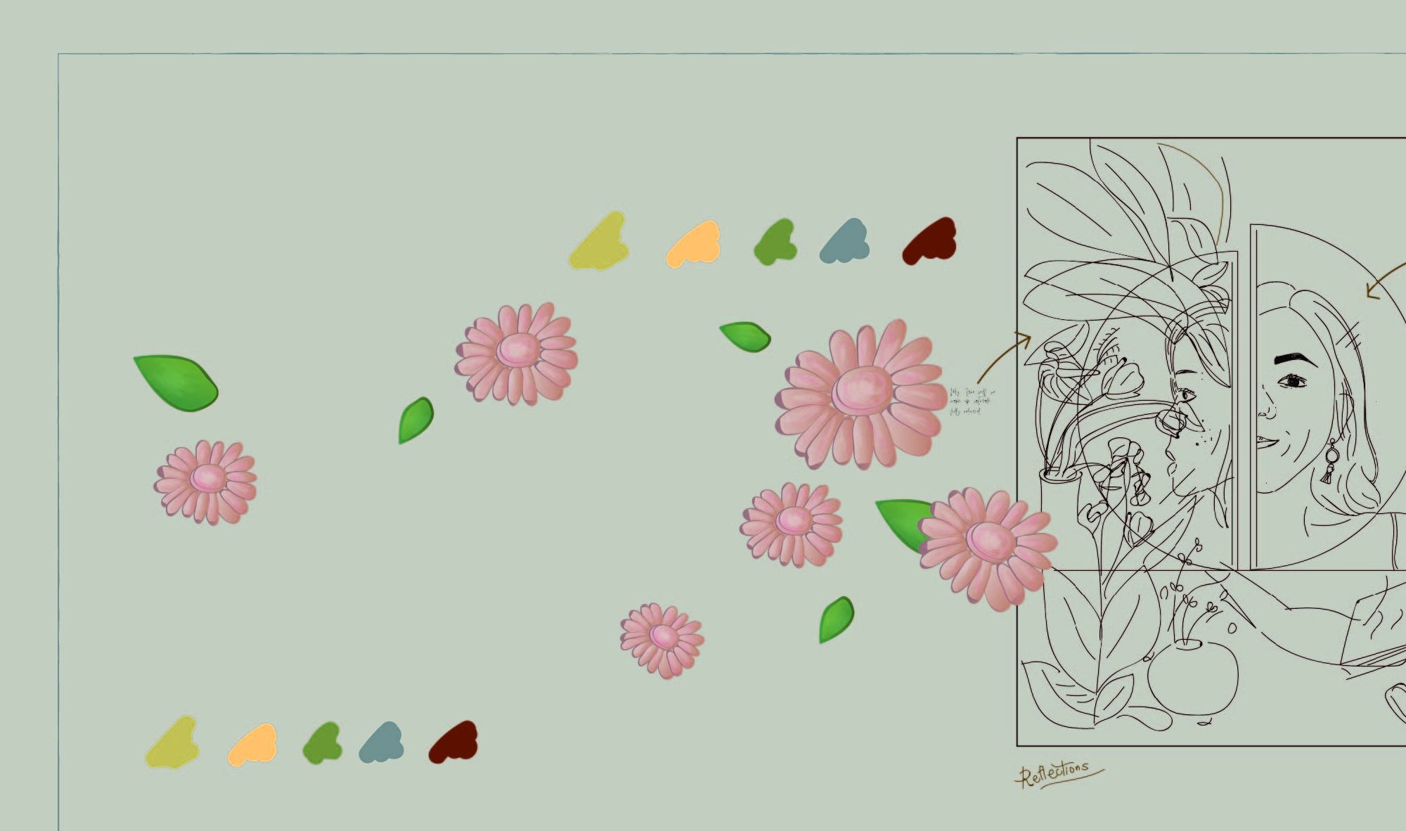
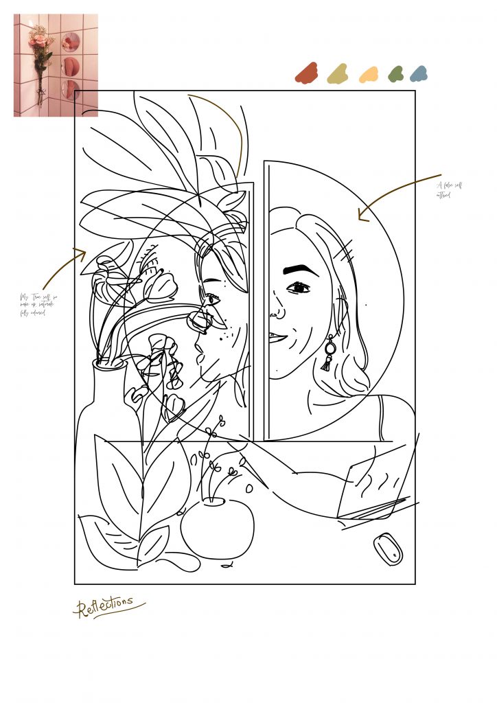
Taking the comments and feedback into consideration, I refined my concept. Instead of showing my made-up self in contrast to my natural (at home) self with the flowers in the background.
I decided to switch it up and include just one face of mine instead of two different faces and angles. This face will still sort of be split into half through the application of different colours. One side will now represent my trust in skincare products – it’s effect exaggerated through the use of flora and fauna. While the other side will show the downside of using too much of such products or “too little”. The negative side will instead have dead/dried flowers instead of blooming ones and my troubled skin further illustrated with redness and acne spots.
colours
In this illustration, I will be using warm – earth tone colours and it feels more grounded and “realistic” which goes hand in hand with my overall theme of reflections. Furthermore, it is currently my favourite colour palette.
earth tones
INSPIRATION
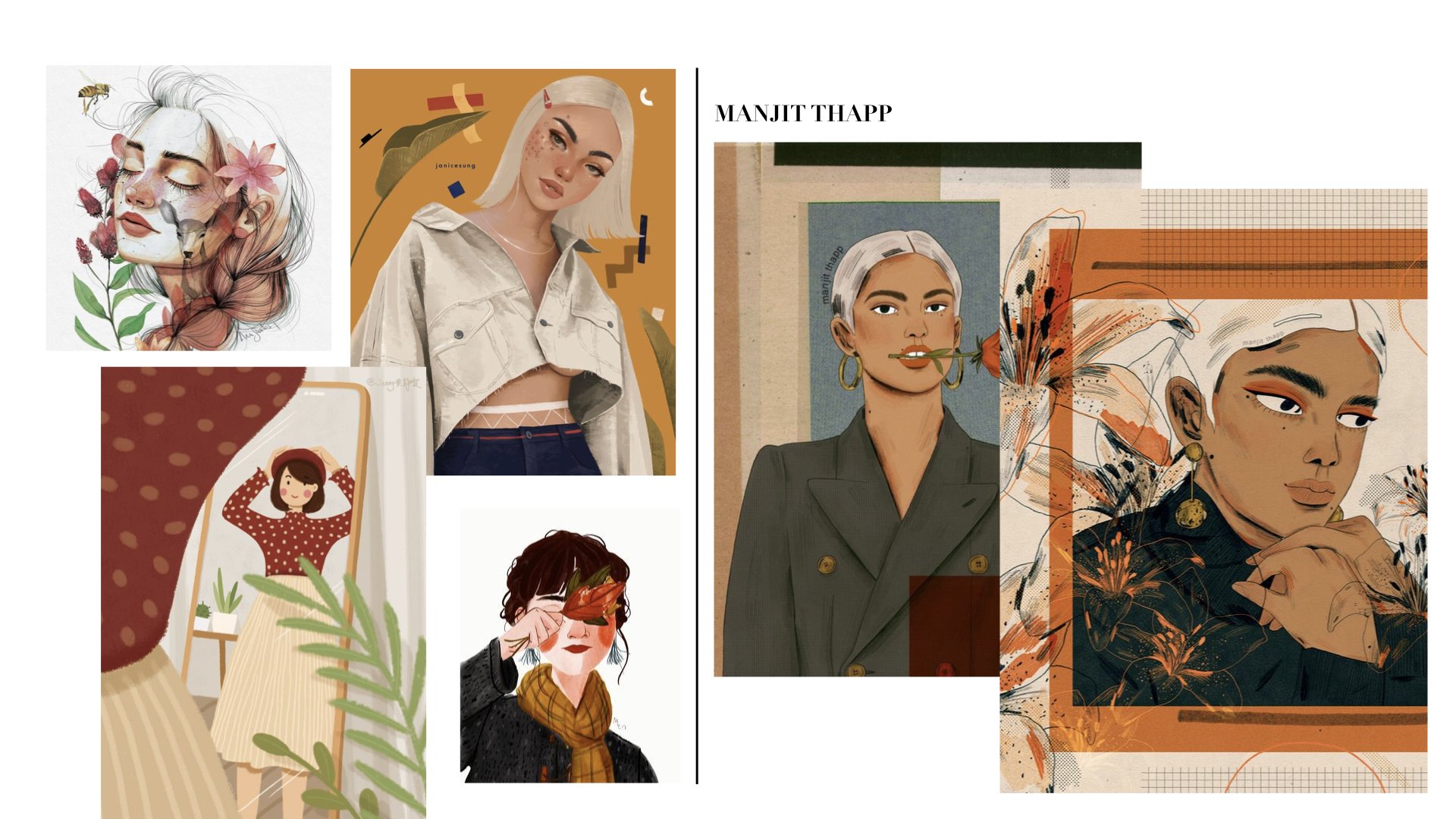
A huge part of my inspiration came from Manjit Thapp. I love her portraits – her composition, elements, and technique all falls together so nicely all the time.
PROGRESS
FINAL
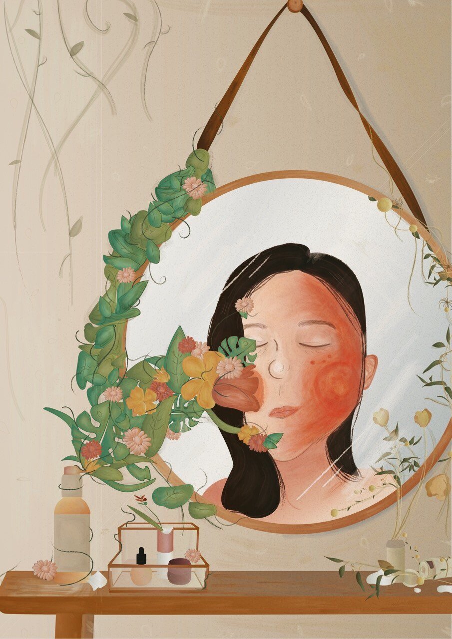
This self-portrait reflects how I look at myself not just physically but also emotionally. Sometimes when I wake up in the morning and look at myself in the mirror, I just wish I didn’t see redness, marks or any acne on my face. When I proceed to wash my face, I wish somehow a miracle will happen when I open my eyes again and somehow the face wash and its “essence” would have worked its wonders on my skin.
Thus, I used flowers and leaves to represent this “essence” on one side while the other side has dead and dried flowers together with a “bad” face to show how nothing works or basically there’s two sides to me.
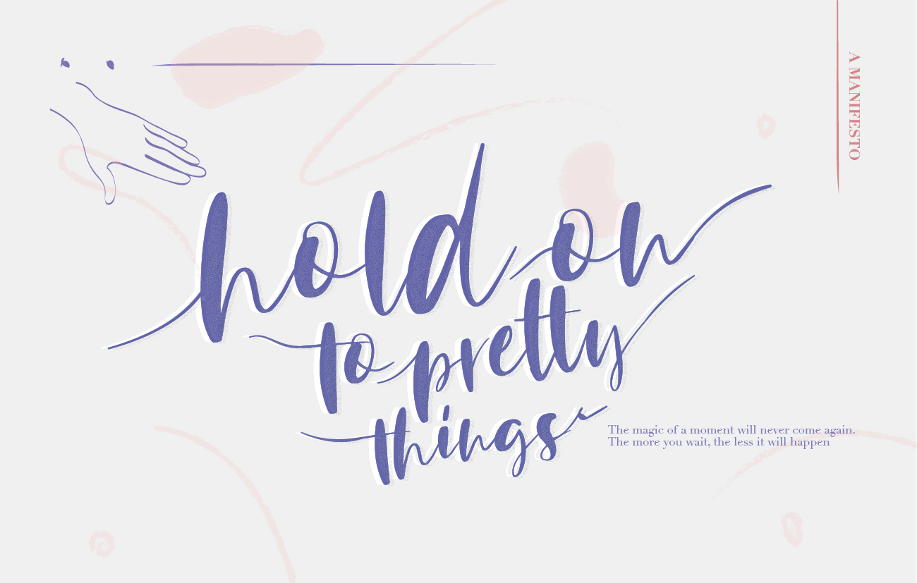
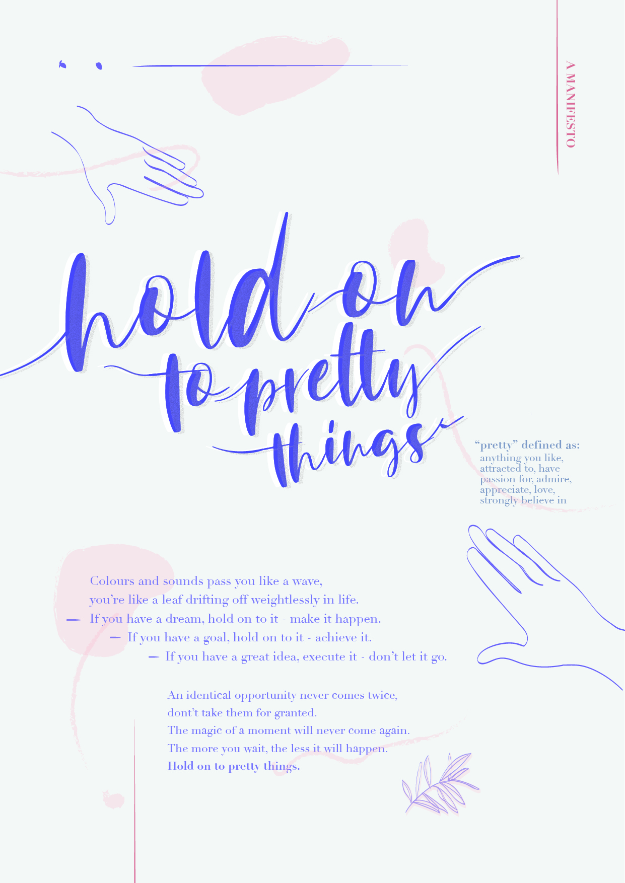
After a semester of History of Design, I have realised that the most important thing out of all concepts and ideas, is having something to believe in and hold on to. Focusing on a very simple idea of, “Hold on to pretty things”, it encourages one to seize opportunities, hold on to dreams, goals, ideas, concepts. One shouldn’t have to be afraid to design something, if they have an idea they feel strongly about, they should go forth and execute it. Life is only so short, create things you love, hold on to pretty things.
Industrial Revolution is known as the period where agrarian societies became industrial and urban. This took place during the 18th to 19th centuries where mechanisation, the factory system and mass production were prioritised. Industrialisation not only shaped the world’s economy but also played a pivotal role in the shift of focus in the world’s design scene. At the beginning of the Industrial Revolution, designers and artists struggled with simplifying complex designs for the masses. This process of reduction and simplification meant less time allowed to spend on the crafts. This made me question if design lost its meaning and value during this period of time.
Contrary to my thoughts, the Industrial Revolution in actual fact acted as a bridge that connected art and functionality – giving birth to fresh and well-admired designs. There were two key features of the Industrial Revolution, the Textile and Steam Engine industry of which both gave rise to functional and efficient machines that allowed large scale manufacturing and helped boost the economy.
It is obvious that The Industrial Revolution definitely influenced the world in more than one way. Technologically, the usage of new materials were reduced, new energy sources were introduced and development of transportation and communications increased. Socio-economically, more jobs were created and free trade boosted. However, not all influences were positive, an example of a negative influence was the drop of standards of living within the working class. The Industrial Revolution introduced the idea of changing complex designs to simple ones that were affordable by the mass and not just the rich. In addition, Industrialisation also promoted the idea of globalisation and pushed for more functional designs made with fresh technology. This eventually led to the evolvement of new design movements.
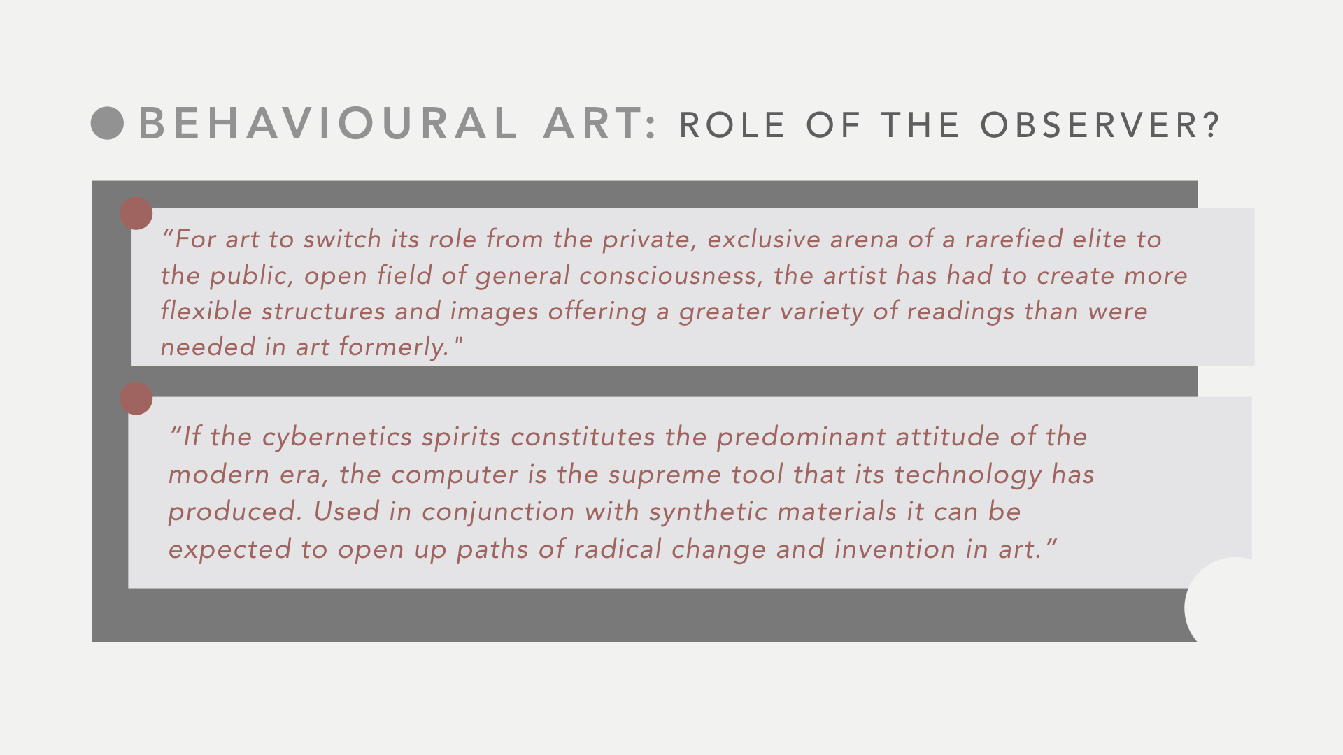
One design movement that evolved in reaction to the industrial revolution was the Arts and Crafts Movement. The movement began in the late 19th century and was one of the first design movements that disagreed with industrialisation. The Arts and Crafts movement believed that the urban and mechanised society was dull and unfulfilling. Some key features of the movement included the use of “high quality materials and emphasis on utility of design” – a great disparity from the Industrial Revolution. Materials such as wood, metal, enamel and glass were largely used in this period of time. The fine craftsmanship and ornate details associated the Arts and Crafts Movement closely with the Aesthetic movement of which has a slogan,“Art for art’s sake”. Through the Arts and Crafts Movement, the mass grew appreciative of the decorative arts that most popularly consisted of floral, mosaic, stained glass and tapestry decoration. Even though it is clear that the Arts and Crafts Movement was against simplified designs created during the Industrial Revolution, it in itself also portrayed a simplified version of nature as seen in its slightly repetitive decorative forms. This suggests that the Arts and Crafts movement was slightly influenced by industrialization despite being a major critic of it.
Not really considered to be a movement, but more of a term created to describe the integration of concepts of Japanese art into European art, is Japonisme. The study of Japonisme began together with the start of trade between Japan and Europe. Aesthetics and philosophies of Japanese design was appreciated and quickly became popular in Europe. Japanese often wrote poetry and as such they were able to stylize and symbolize complex scenes easily into wood block prints. Such prints consist ofwhiplashes and curves which are simplified versions of nature as compared to the Arts and Crafts Movement. With lesser details and more negative spaces, Japonisme inspired works were more affordable to the masses – an influence similar to the Industrial Revolution. Some Ukiyo-e woodblock prints created in the past are considered as world class prints today. An extremely famous one is, “The Great Wave off Kanagawa” by Katsushika Hokusai. Thus, this shows how impactful design movements are as it still relevant to the modern world today.
Speaking of the modern world, Japonisme art and design drove the creation of Modernism and Bauhaus designs. In Japonisme art and designs, negative spaces were translated into Modernism. Modernism focuses on basic elements of life which explains its undecorated, clean, minimal, simple forms and smooth finishes. Modernism runs by three main principles. Firstly, Modernism is the rejection of decoration and and applied ornament. Secondly, it emphasises the preference for abstraction. Lastly, it encourages the belief that design and technology could transform society. Thus, it is evident that Modernism is really an evolvement of industrialisation and completely against the Arts and Crafts movement.
Besides Modernism, Bauhaus also played a huge role in the world of art and design. Bauhaus was an influential modernist art school in the 20th century. Founded by Walter Gropius, it was a reaction to the chaotic. To elaborate, Bauhaus developed during a time of radical changes when WWI stripped away most social values. Artists were starting to get worried about the soullessness in products that might have been a result of the widening gap between creativity and manufacturing. Thus, through Bauhaus, designs, architecture and art became more functional with the use of true materials. It was characterised by minimalist, linear and geometric forms with the use of lines, shapes and colours. At this period of time, decorative art with the use of whiplash and curves were outdated and no longer as appreciated as compared to the time of the Arts and Crafts Movement.
In conclusion, historicism is indeed important to know and understand as it educates us on various art movements that have shaped is still shaping art and design in the world. With different techniques and characteristics, art movements can still create similar economic, technological and social influences in the world. It can be seen that art has progressively evolved from ornate details and decorative designs to functional and minimalist, clean designs. As art progresses, the gap between craftsmen and artists also decreases.
(985 words)
Works Cited
Catawiki. (n.d.). 5 Characteristics of Bauhaus Art, Architecture and Design – Catawiki. Retrieved
Abstract pattern representative of Art Nouveau style
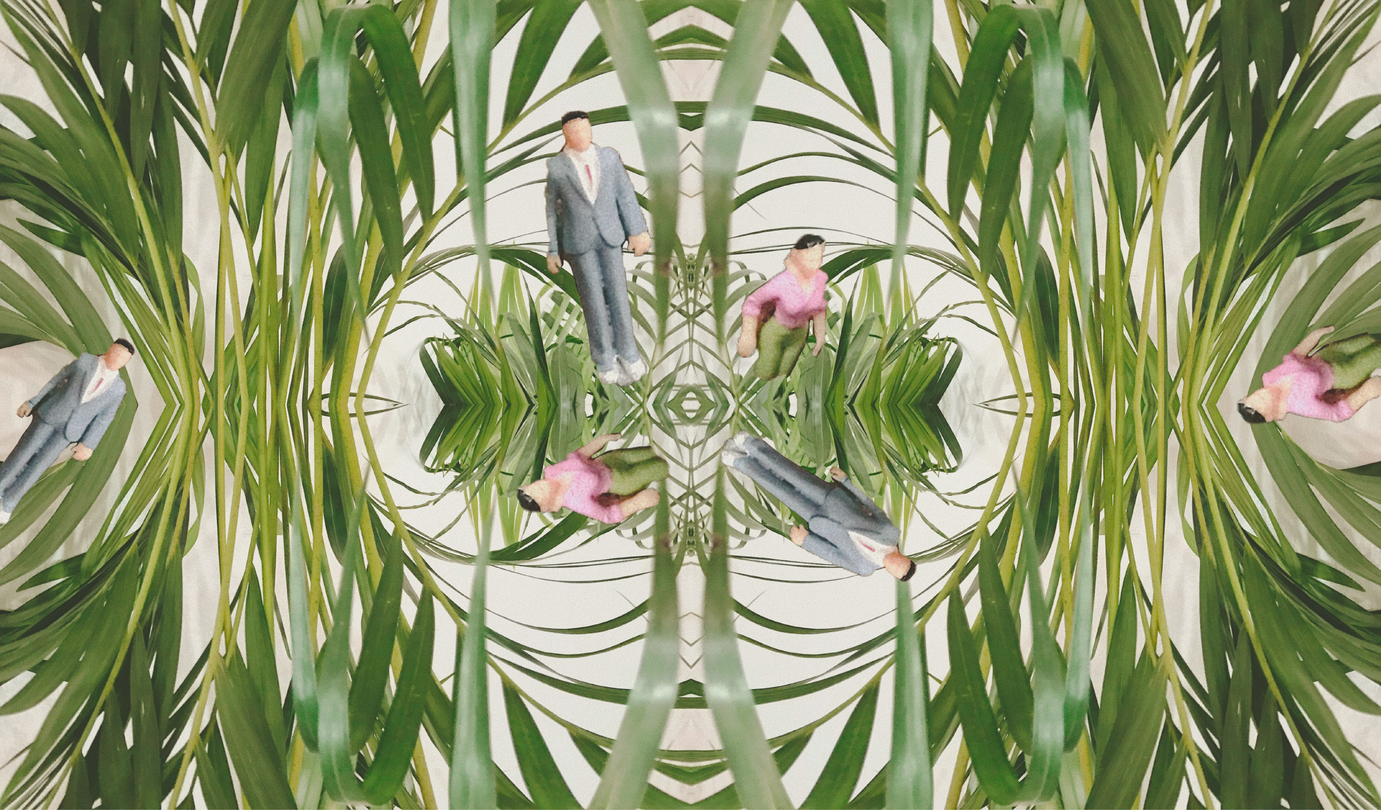
Using this picture I took of leaves that I see everyday in Singapore,
I reflected and repeated them so that they will form a circling and enclosing pattern of sorts. The final pattern to me, represents the conventional usual routines that Singaporeans go through repeatedly. The mundane lifestyle repeats itself everyday and Singaporeans are completely sucked into it.
I added additional “humans” into the patterns to further elaborate how the fast-paced life of Singaporeans is part of our culture and our biggest and most powerful source, humans are stuck in a never-ending cycle of workload.
wILLIAM MORRIS
William Morris Leicester Wallpaper
I chose this wallpaper as I think it brings out a beautiful image of leaves and flowers in this world. Even with similar elements, the composition does not come off repetitive but instead balanced and pleasing to the eye. I also love the use of colours and the variation in sizes of the various elements in this wallpaper.
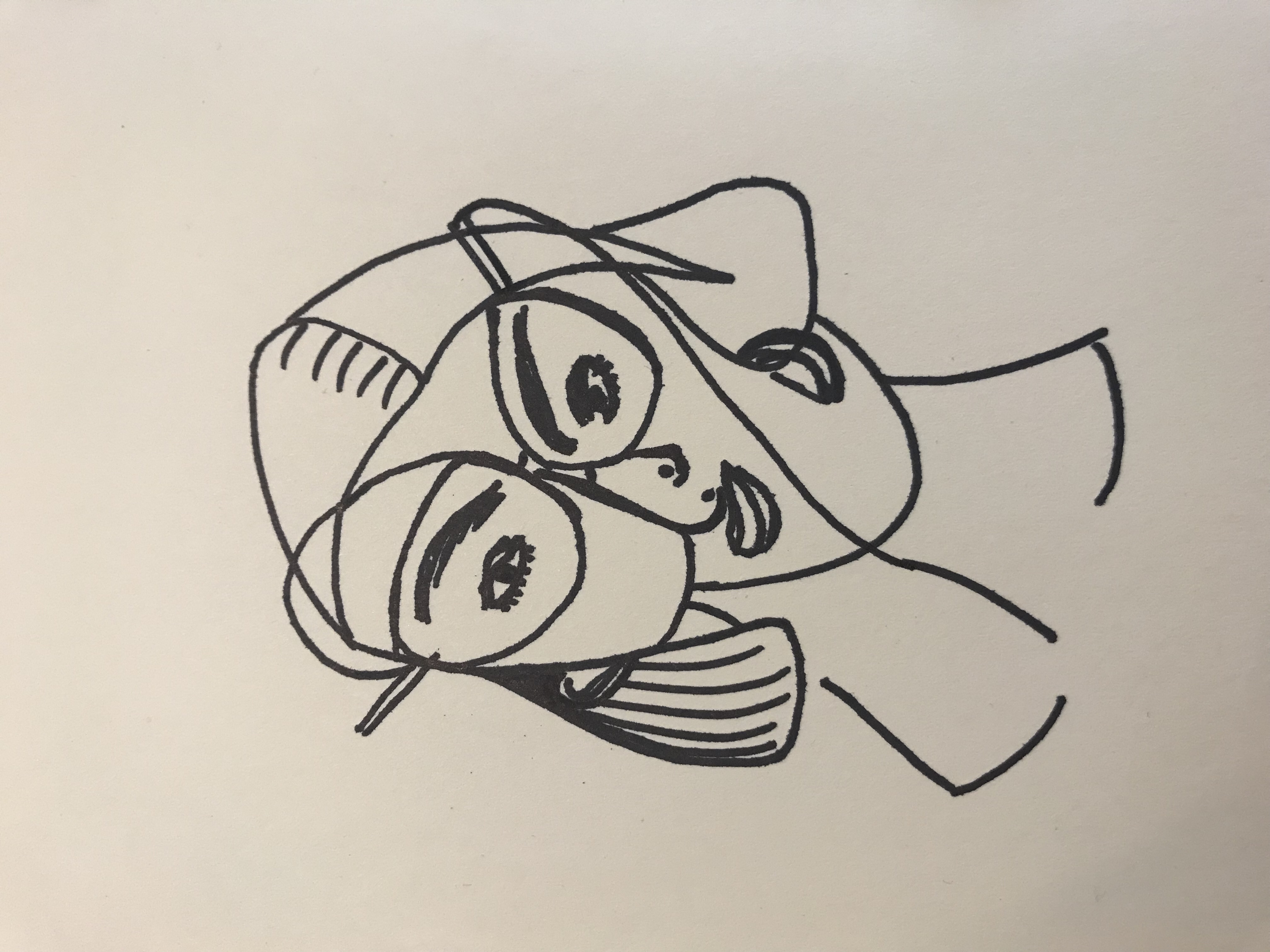
cubism portrait
my attempt at a Cubism Portrait
I attempted to draw a cubism portrait of my friend Dominique. Well… it doesn’t look like her at all! :/
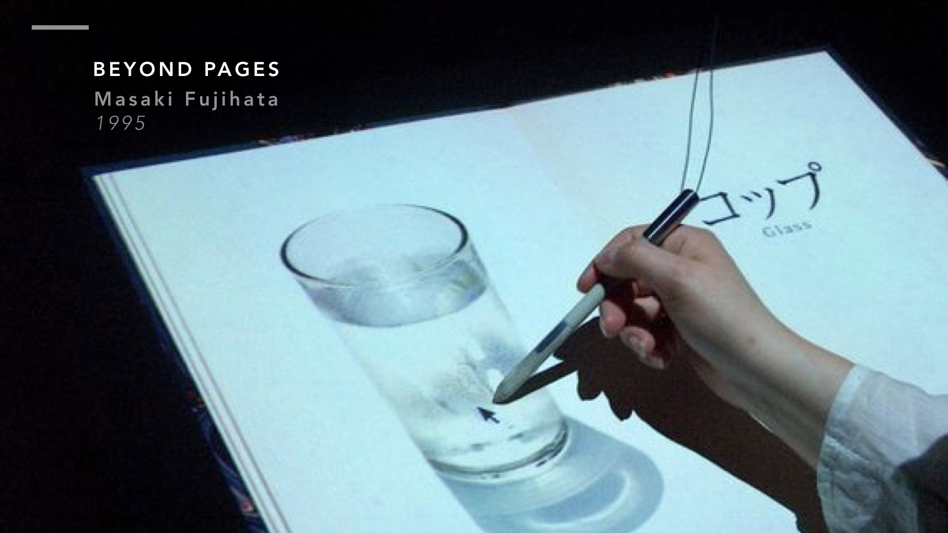
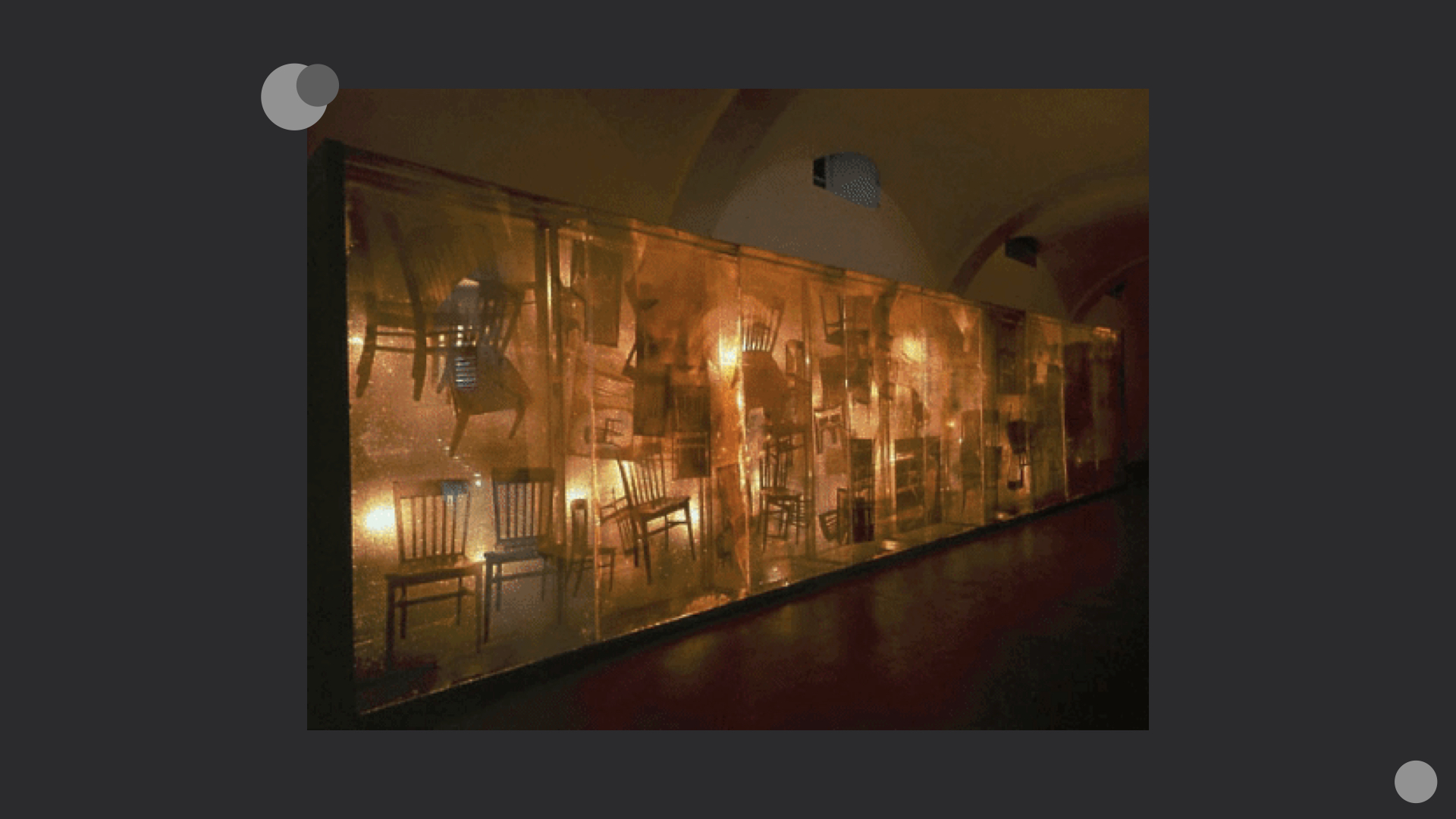
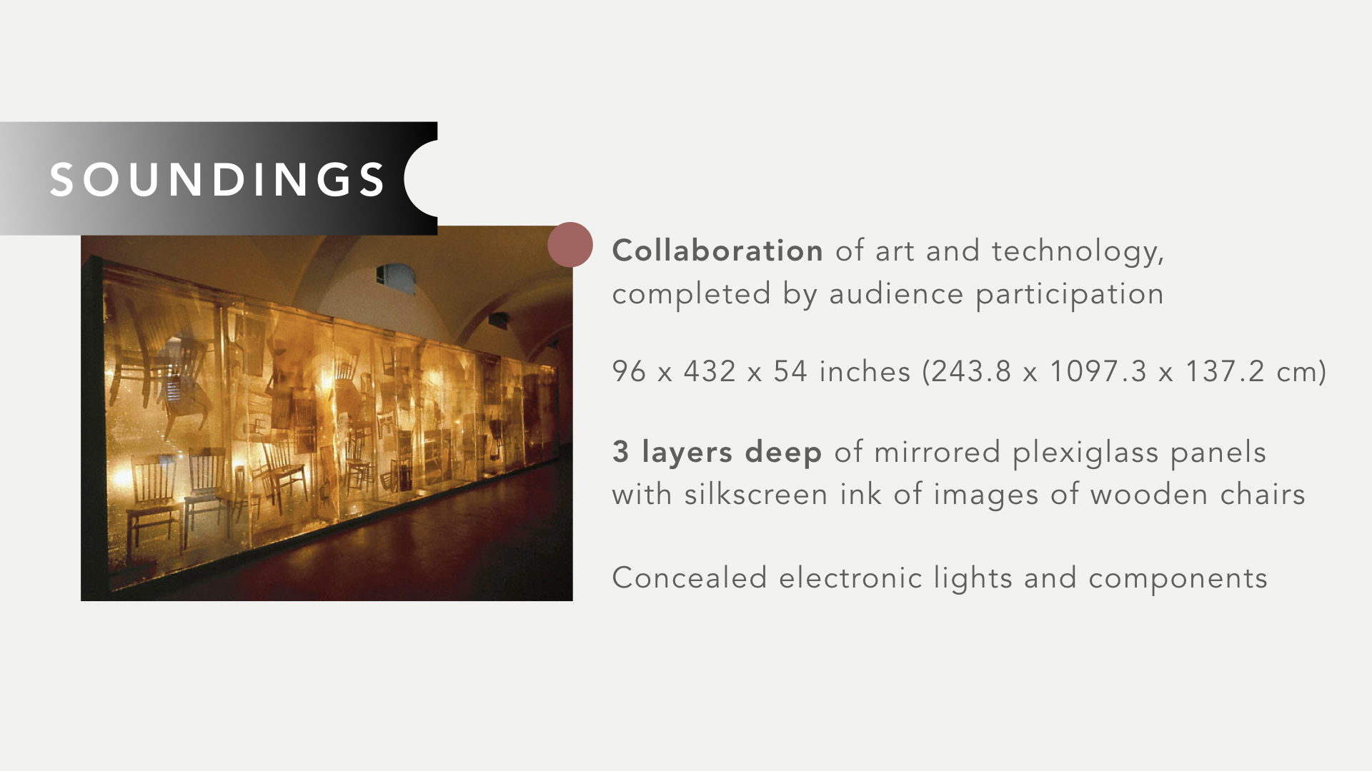
Beyond Pages, Interactive Installation Custom-made table with digitizer tablet, table lamp, chair, data projector x 2, PowerMac 7600, speaker
| beyond pages | masaki fujihata |
Introduction
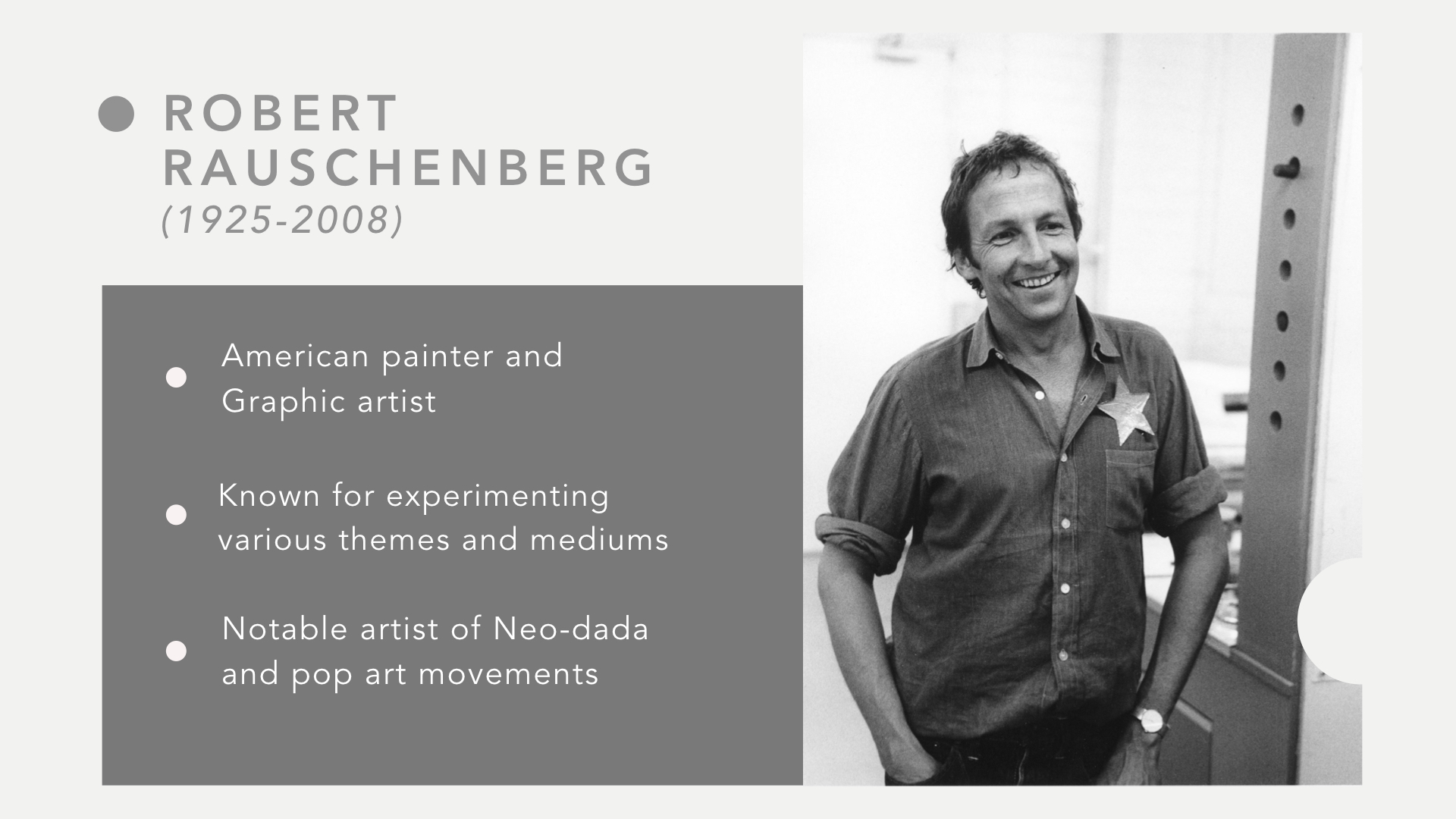
Masaki Fujihata is one of the pioneers of Japanese New Media art. He graduated from the Faculty of Fine Arts from Tokyo University of the arts. As a new media art practitioner, Masaki Fujihata has exhibited in galleries and museums all around the world. His works are very well-received by people.
Masaki Fujihata
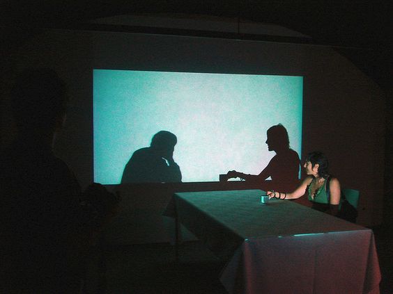
A computer-based installation created in 1995 by Masaki Fujihata, Beyond Pages, is an example of an artwork made to encourageinteractivity and a form of audience feedback. Working within the sphere of cognition and imagination, Beyond Pages, turns a seemingly natural everyday scene/situation into an area of exploration and play.
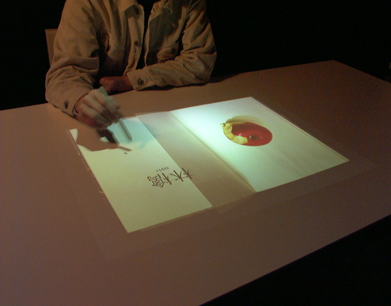
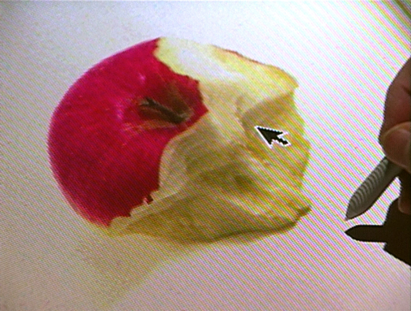
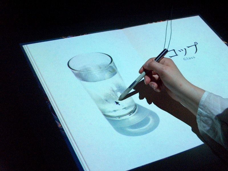
As one enters the scene and sits on the chair, he/she will find a virtual picture book on the table in front of them. This picture book is the essence of the installation, each page showing one item each in images or letters. The items and images come to motion upon any form of interaction. For example, when an apple is touched, the responding action will be the apple getting bitten into, accompanied with respective biting sounds.
Example of apple beaten into – Beyond Pages installation
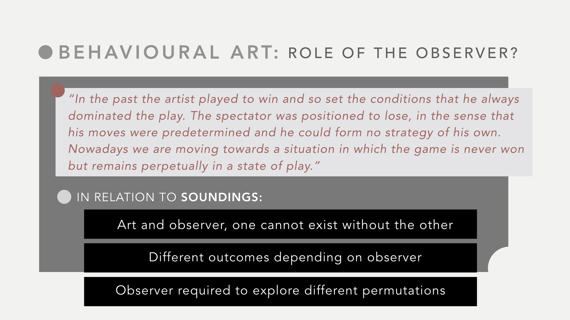
Beyond Pages aims to spark thoughts about both the true and future function of books where a book is not just an interface for storing and accessing information but also a portal that encourages additional forms of knowledge and creativity.
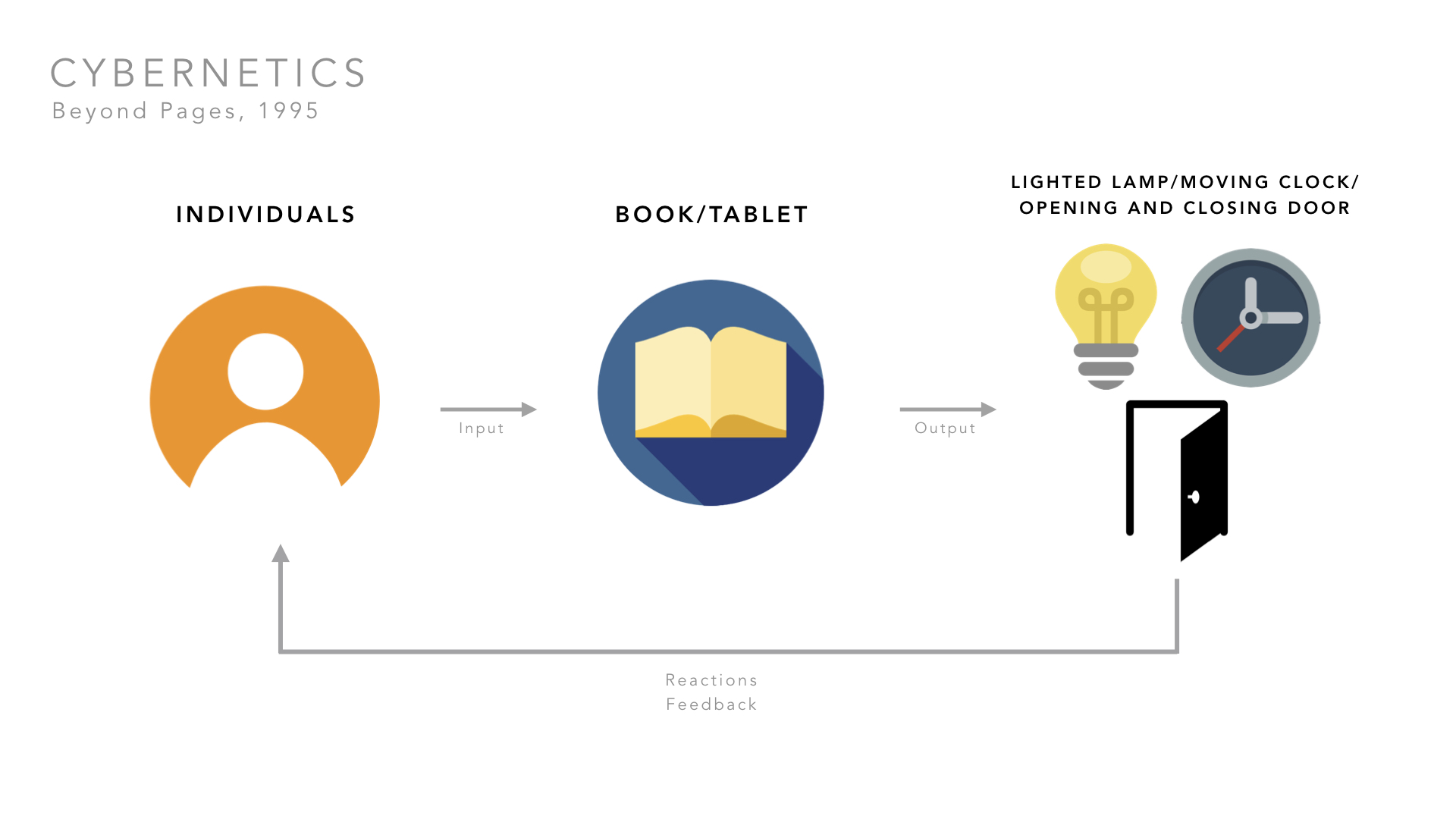
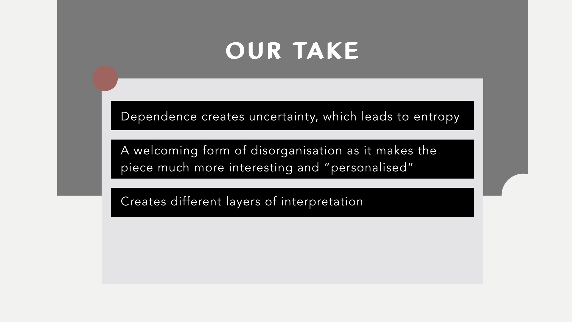
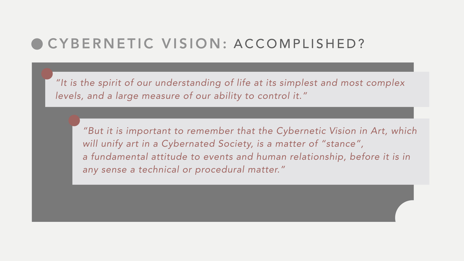
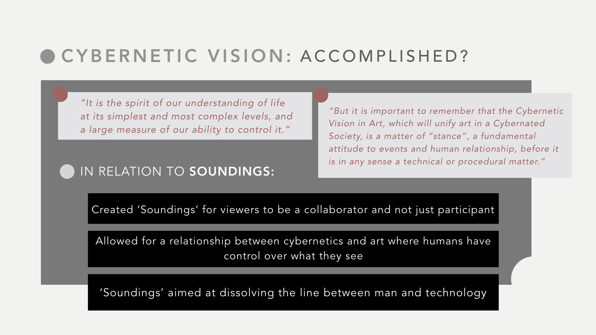
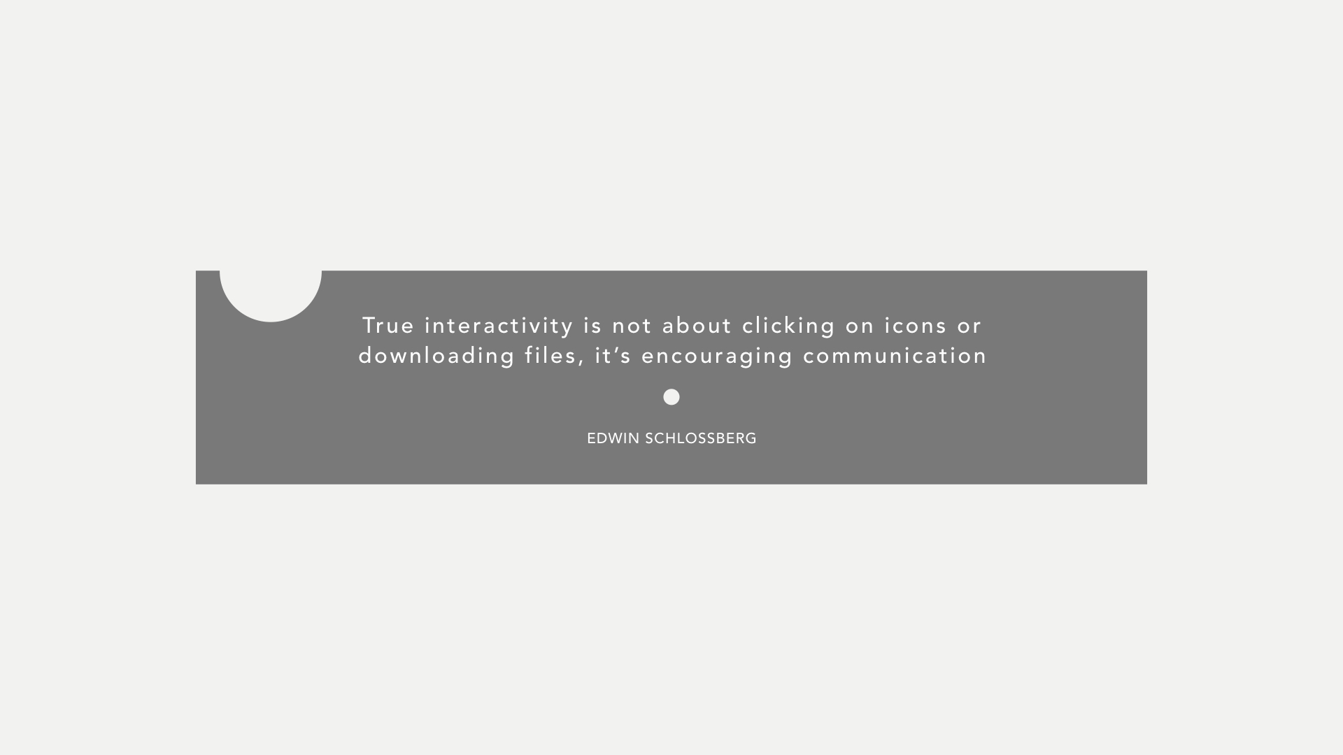
A cybernetic spirit is understanding life at its simplest and most complex levels and having the ability to control it. In Beyond Pages, Masaki Fujihata believes that technology has the potential to shape valuable content through fantasy, concentration and curiosity. Through technology, opportunity for interactive art has increased as there are endless options to explore and allow for participation and communication of spectators.
Thus, interactivity is not just the reliance of the participation of spectators, it is also what the spectators make out of the installation experience. It may make them ask questions, think, feel something or perhaps feel nothing at all.
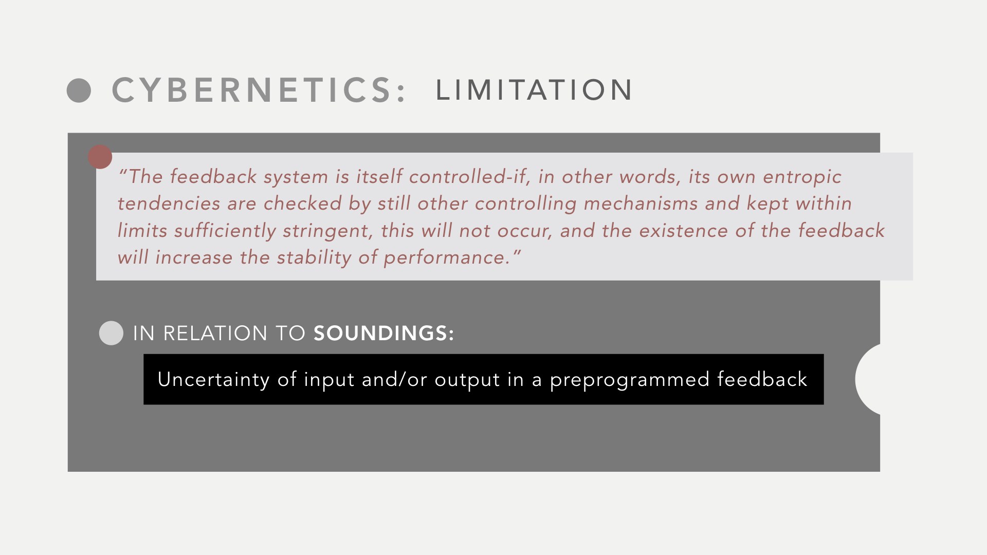
The words, “state of play”, suggest that one has the freedom to “play” however much he/she wants, thus, allowing each experience to be unique and different. In Beyond Pages, objects on the book do not respond until it is being touched or played around with in the right way. If the object does not detect the right motion to trigger the action, the object will remain static.
An example can be seen in this video where the person is unable to trigger the motion until after several attempts,
Some people may choose to make less attempts and not receive the full intended experience of the installation.
Immersion
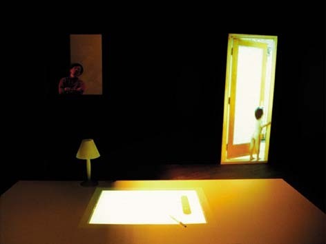
Although Beyond Pages is not an installation involving Virtual Reality, spectators are still sat in a dark room meant to immerse them in a familiar room setting consisting of a table, chair, window, lamp and door. As seen from the video above, a light switch image on the “book” flicks on the light of the real lamp on the table. Such interactions allow people to be even more absorbed into the scene itself.
Dark room scene of Beyond Pages
In order for a person to be fully immersed in a scene, human senses have to be involved. In the case of Beyond Pages, the sense of sight, sound and touch are fulfilled. This suggests that Beyond Pages sets a rather immersive environment for spectators but could be better “improved” with perhaps the sense of smell. Nonetheless, Masaki Fujihata may not have wanted the full immersive experience but perhaps wanted to lightly push spectators into it without completely forgetting about the function of a book.
Conclusion
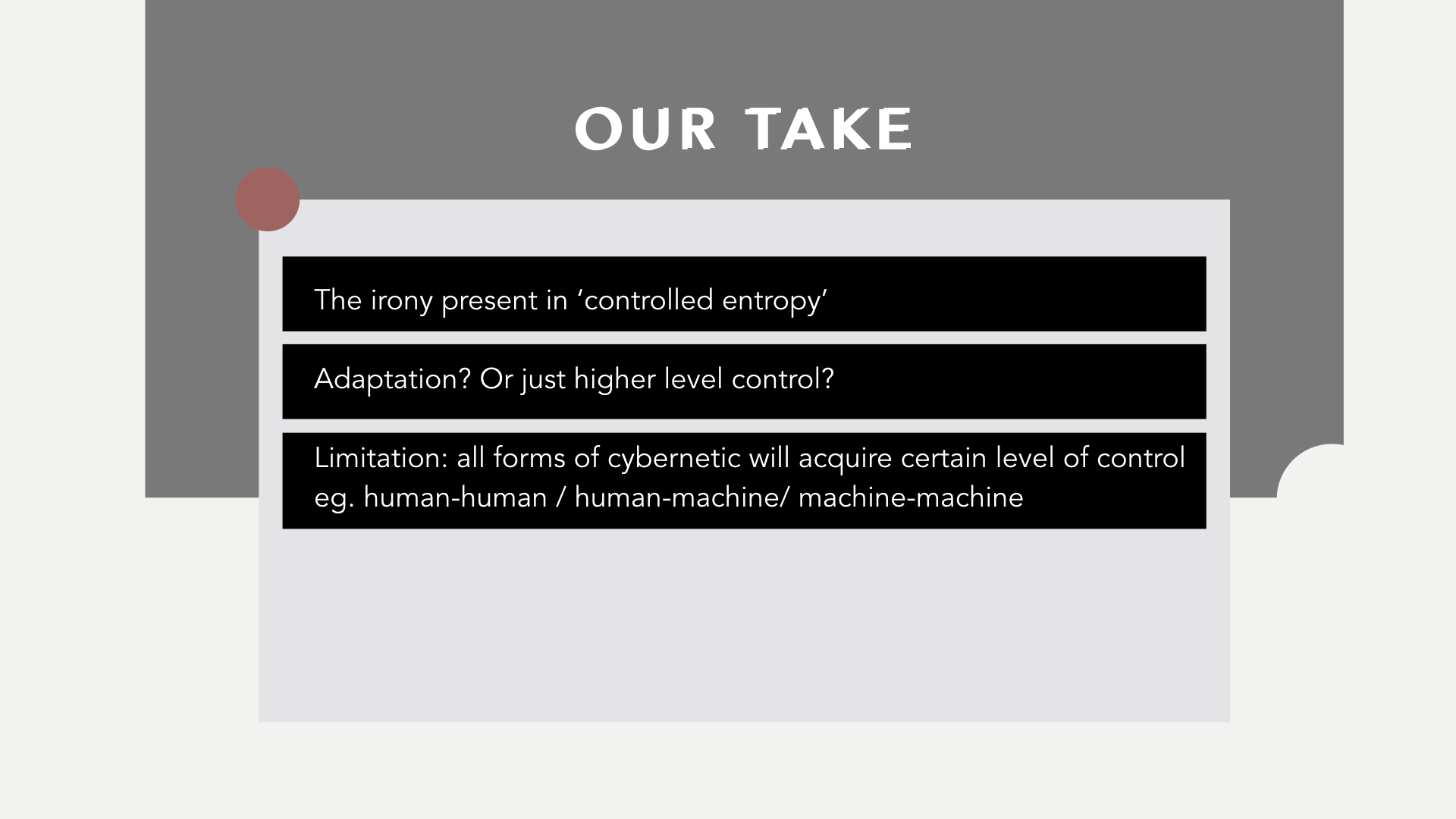
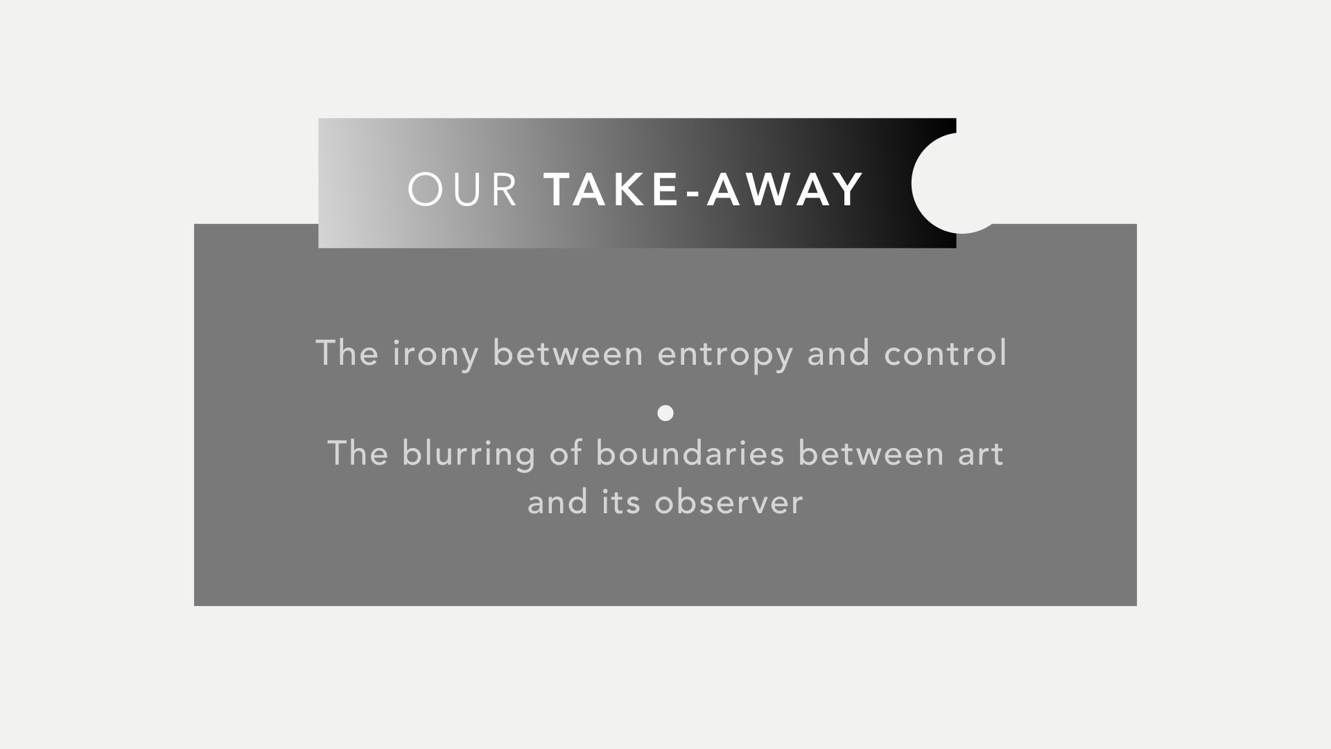
Beyond Pages stretches the imagination and pushes the cognitive sphere of an individual. Besides just allowing for some form of interactivity, the cybernetic vision has followed through as there is a form of input, output and a feedback loop as shown in the diagram above. In addition to a never ending feedback loop, Masaki Fujihata managed to create an immersive environment for the installation, allowing individuals to feel as if they amongst the communication with virtual spaces.
Through the use of such simple and familiar daily objects, Masaki Fujihata has managed to add in an element of controlled entropy – not completely unpredictable in outcome but rather unpredictable in reaction. I wish to experience Beyond Pages for myself if ever possible.
The artist that I have chosen is Masaki Fujihata. He is a Japanese sound, installation and interactive artist. As a professor at the Faculty of Environmental Information at Keio University in Kanagawa, Makasi Fujihata is one of the pioneers of Japanese new media art. As such, he was an early practitioner of the application of new technologies to the process of art-making.
He is most recognised for his interactive network installations such as Removable Reality (1992), Impressing Velocity (1994) and Beyond Pages (1995).
Beyond Pages is an computer-based interactive installation created in 1995 by Masaki Fujihata. In this interactive piece, one enters a seemingly natural situation of a table and chair. He or she sits down and finds a virtual picture book on the table. The pages shows one item each in images and letters. Upon touching an item, for example an apple, someone bites into it, accompanied with sounds of apple biting. Or another example, when a lamp is touched, the actual table lamp will turn on.
Through Beyond Pages, Masaki believes that technology has the potential to shape valuable content through fantasy, concentration, curiosity, and reminds us of the true function of books. A sphere of cognition and imagination is played with in Beyond Pages.
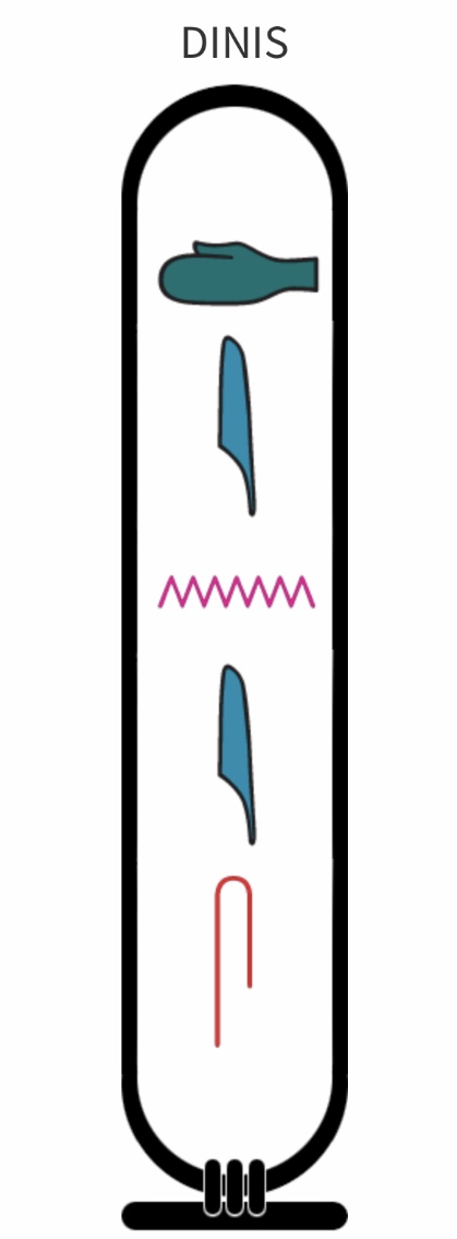
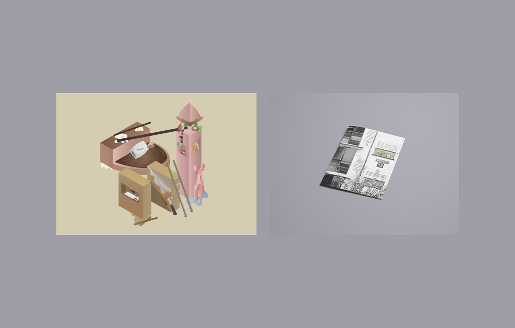
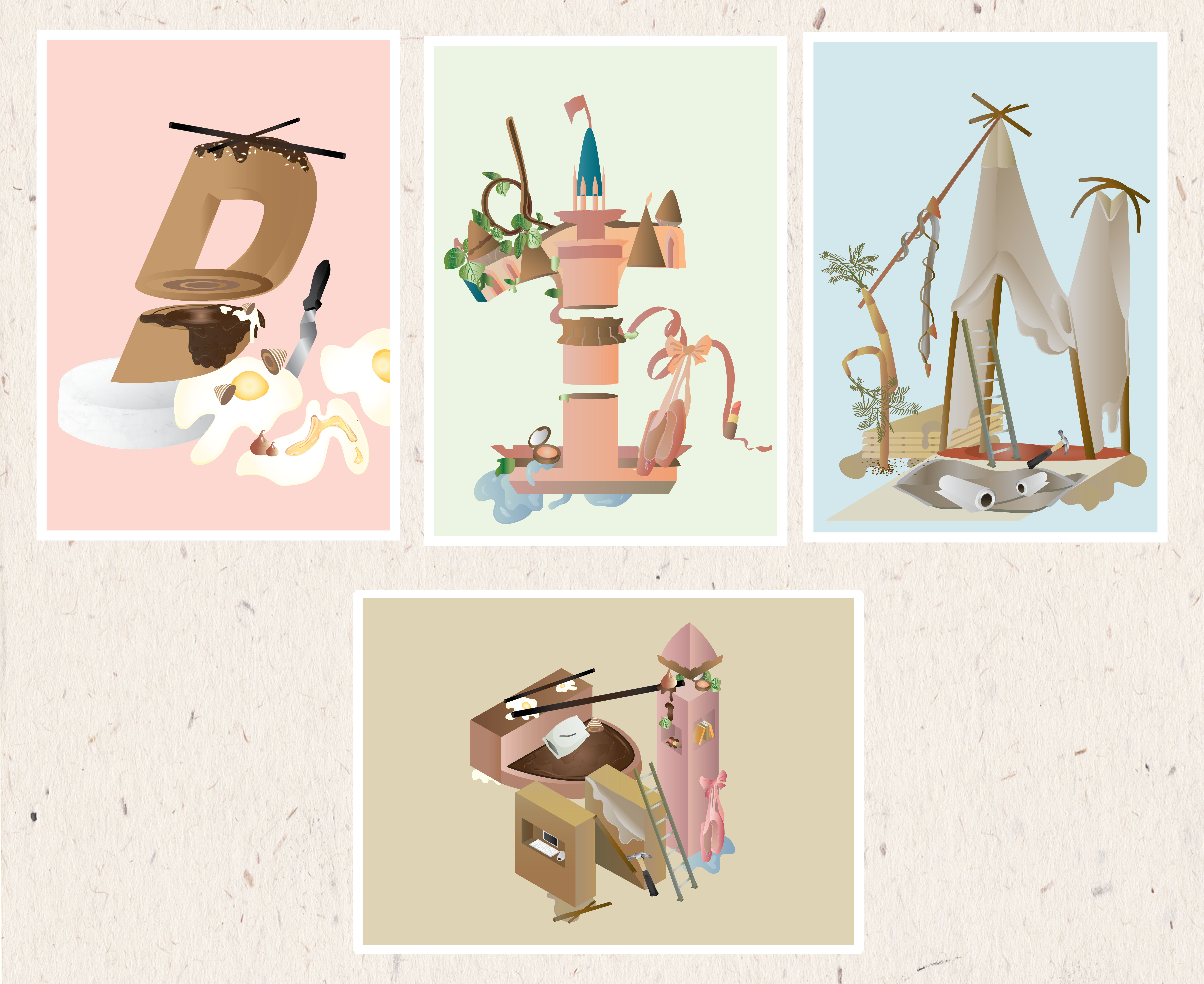
A series of four compositions incorporating my nickname, “Din” into scenes of four different occupations. These occupations reflect my personal attitudes towards the journey of growing up and getting a first job to growing older and settling down with something I enjoy. It is a play on letter forms, each composition except the last one, highlighting a certain alphabet. If you look carefully, you’ll spot others as well.
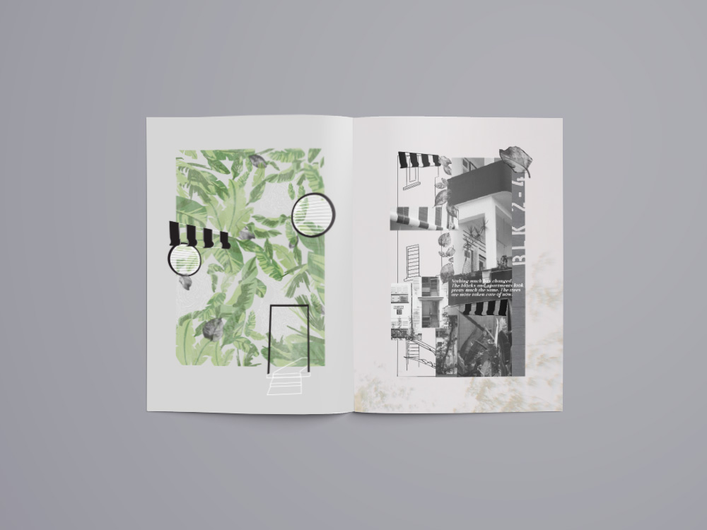
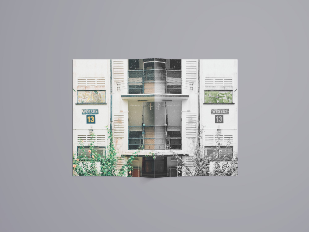
A project focused on discovering a location’s unique quality. Wessex Estate is one of Singapore’s existing colonial estates. Its currently a housing estate as well as an arts enclave. Serene and warm, this estate has a creative community that is still growing despite its rich history.