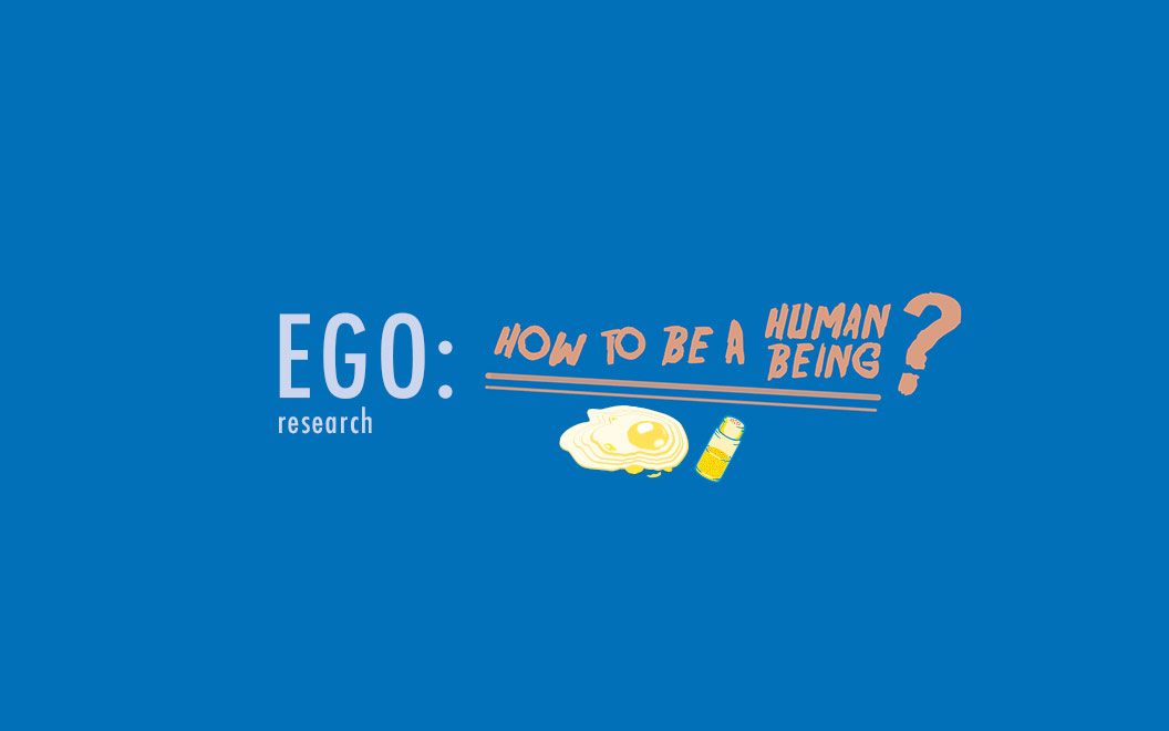
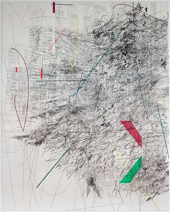
This project required us to explore our egos and personalities but with less limitation on medium, colour and concepts.
Of course the first art direction that came to my head was illustrations as I always wanted to create my own kind of illustration from scratch. I immediately starting browsing through my favourite illustrators on Instagram and also did a inspirational browse through Pinterest.
Illustrators
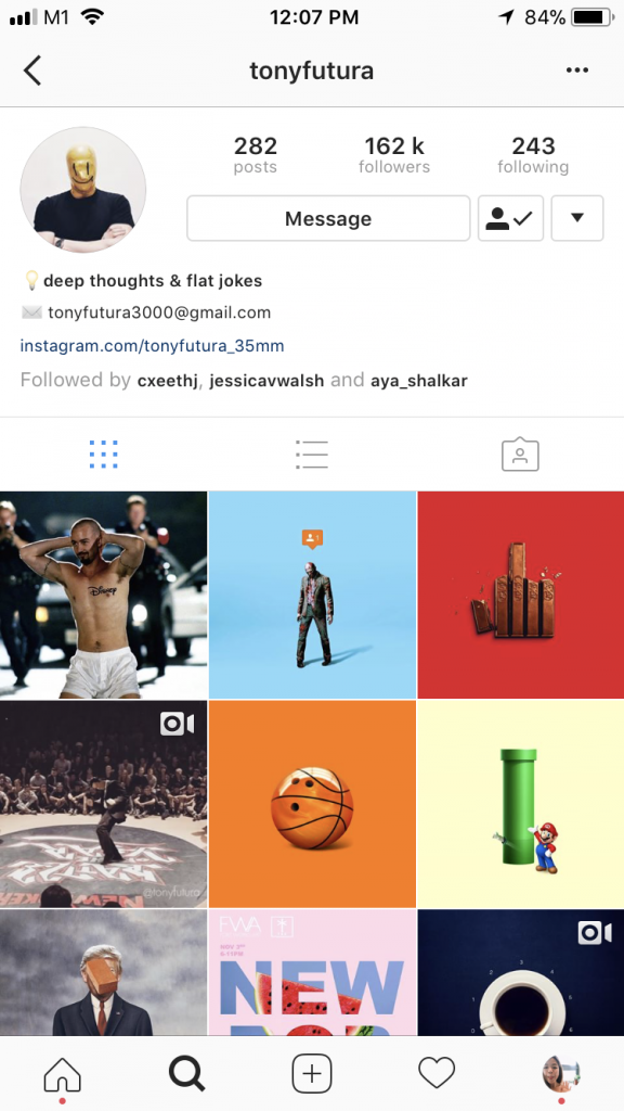
1. Tony Futura
Tony Futura’s Instagram
I’ve been following Tony Futura for a while and have always been a fan! I love his art direction and the slightly unpredictable twist to certain objects. His works are mostly a combination of two known objects combined together very seamlessly almost as if there’s nothing strange about the final outcome. His works have definitely inspired me to combine items together and also put them in unexpected contexts.
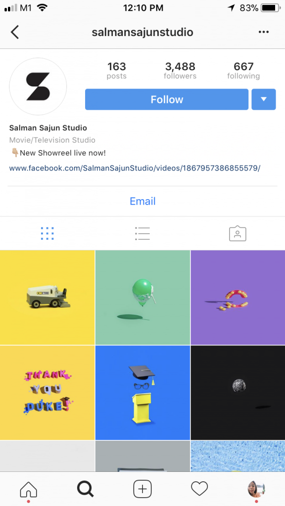
2. Salman Sajun Studio
Salman Sajun Studio’s Instagram
When I first came across @salmansajunstudio I was captivated by the colours used in his compositions. He likes to use pink, blue and red and those are actually my favourite colours in illustrations just because they go with each other so well and give each other that kinda good contrast (at least to me). His works are very minimalist but actually detailed and the same time. It makes you want to stare at them longer. His objects in the compositions always seems to be levitating or slightly off balance giving it a very fun and playful feel to it all.
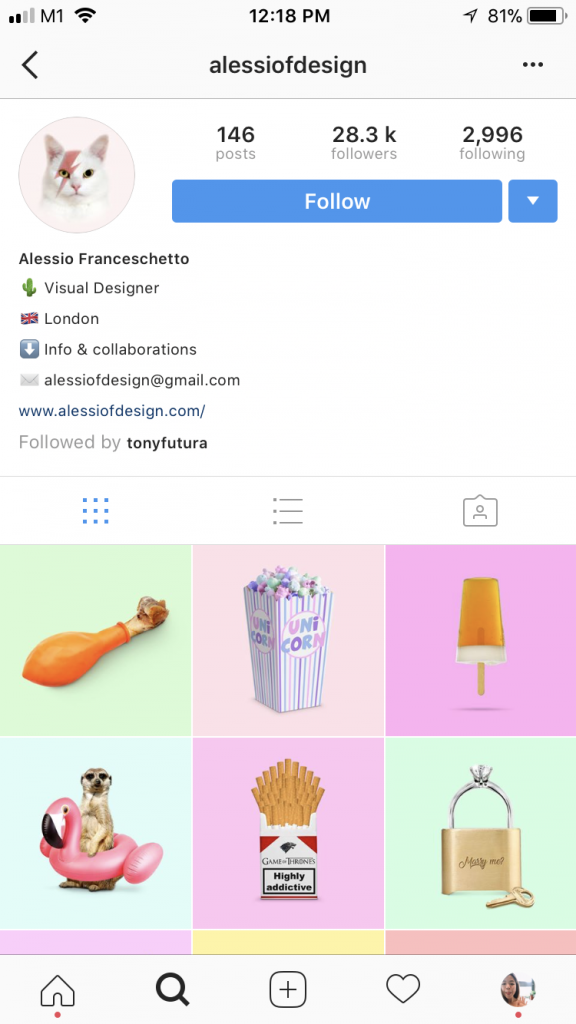
3. Alessio Franceschetto
Alessio Franceschetto’s Instagram
Alessio Franceschetto likes to use pastel/light colours as backgrounds, thus allowing the main visual to pop slightly. Compared to @tonyfutura and @salmansajunstudio, the object in the illustration is bigger and more in your face. The compositions are more straightforward and sometimes even left very raw and unedited. The art direction used is unique and I really like the use of food in his illustrations.
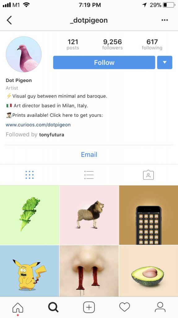
4. Dot Pigeon
Dot Pigeon’s Instagram
Dot Pigeon portrays quite a distinct character through his illustrations. He adds a twist to everyday items and they are usually twisted in a comical or mocking way so it is always very entertaining to look at. Some of his compositions are out of the blue like a butt replacing the seed of an avocado. As a result of that, his illustrations are very relatable and also very visually pleasing.
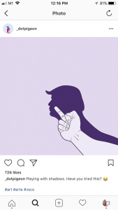
This post featured Donald Trump being displayed as the shadow of a middle finger. This clearly shows @_dotpigeon’s exaggerated and pretty comical art direction. This has inspired me to venture more and create something less predictable.
next steps
After looking at these artist references, I feel very inspired to create something out of the norm but yet relatable to everyone. The use of colours from the 4 artists were similar yet different in their own way and I would like to create illustrations that have instilled in them my very one interpretation of colour. Keep reading for more!
Hannah Hoch is a artist who practiced Dadaism in the 20th century. She was an active female promoting the idea of women working creatively generally in society. She was a political iconoclast who actively critiqued prevailing society.
‘High Finance’ was a perfectly composed example of her innovative photomontage technique. The viewer is presented with two banker figures, each with a disproportionately large and mismatched head, one of which is a photograph of 19th century British chemist and astronomer Sir John Herschel. The effect would be comical, were it not for Höch’s intelligent arrangement of the other visual elements. One of the bankers’ heads is spliced cleanly in half, and behind it are two shotguns, which look as if they are simultaneously being aimed by and at the banker.
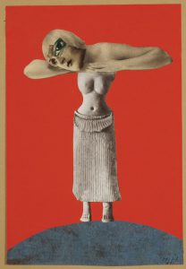
Höch combines this imagery of the non-Western sculpture with a picture of a beautiful woman from the European popular press, distorted with the addition of an exaggeratedly large eye. She suggests that society looks at women much as they look at a piece of unknown sculpture: as exotic and erotic objects. She also questions the position of the “New Woman” of the Weimar Republic, looking at her as a fragmented and constructed image that serves particular ends in society, suppressing and disregarding other possible individual choices and desires.
John heartfield
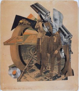
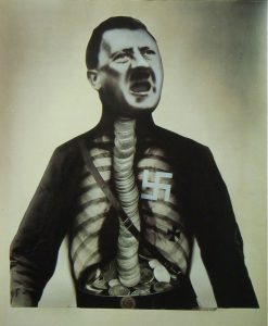
John Heartfield is a dada artist, credited as a founder of photo montage and pioneered modern collage techniques. His work was largely focused on anti-Nazi and anti-fascist statements.
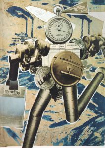
John Heartfield, Adolf Hitler The Superman: Swallows Gold And Spouts JunkJohn Heartfield, Rationalization Is On The March!, 1972
In 1927, John Heartfield brilliantly commented on corporate rationalizations for replacing human workers with robots. What will happen to those workers.
Heartfield’s collage about the corporate rationalization to have robots replace workers is eerily visionary in another way as well. I found this paragraph on the blog
SURREALISM
Founded by the poet André Breton in Paris in 1924, Surrealism was an artistic and literary movement. It is a cultural movement best known for its visual artworks and writings.
Surrealism is based around the idea of liberating thought, language and human experience. They make use of everyday objects and add juxtaposition. It was a movement which sought to release the creative potential of the unconscious mind.
SALVADOR DALI
Salvador Dali was a spanish surrealist who was among the most versatile and prolific artists of the twentieth century and the most famous Surrealist. From an early age, Dali was encouraged to practice his art and would eventually go onto study, interacting with Picasso and Magritte
Lobster Telephone 1936 Salvador Dali http://www.tate.org.uk/art/work/T03257The Mae West Brooch 1949 In The Mae West brooch, we find continued Surrealism in the way the teeth are literally pearls, sitting in a slightly plumped leer of a mouth, ever so slightly contorted as to make the viewer uneasy.
Rene Magritte
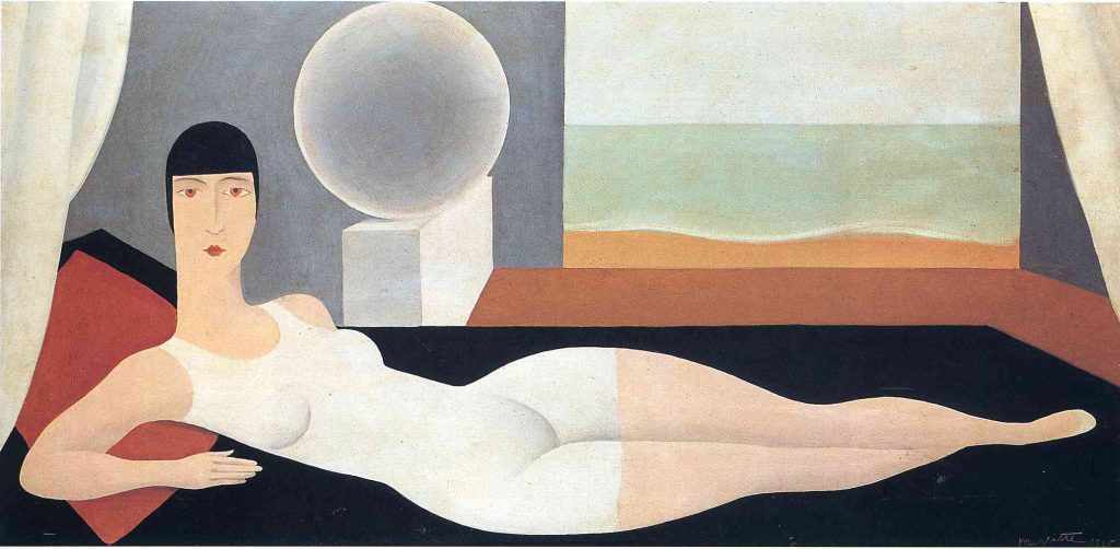
Rene Magritte was a known surrealist who used deadpan illustrative techniques. He wished to cultivate an approach that avoided the stylistic distractions of most modern painting. Magritte often used bowler-hatted men in his pictures – as a self portrayal. Repetition was an important strategy for Magritte, informing not only his handling of motifs within individual pictures, but also encouraging him to produce multiple copies of some of his greatest works.
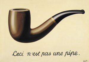
Bather 1925, Rene Magritte This work bears the influence of Magritte’s professional forays into the world of fashion advertising, and his interest in the works of Fernand LégerThe Treachery of Images (1929) Rene Magritte The Treachery of Images cleverly highlights the gap between language and meaning. Magritte combined the words and image in such a fashion that he forces us to question the importance of the sentence and the word. “Pipe,” for instance, is no more an actual pipe than a picture of a pipe can be smoked.
Thoughts, ideas, objects flooded my head as I read the brief.
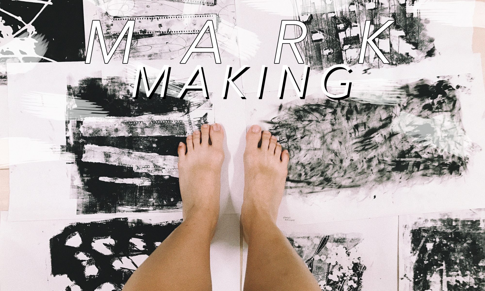
This was going to be my first 2D assignment.
Initial thoughts: I thought that this brief was actually pretty interesting and allowed us to basically have fun. I immediately started looking into Pinterest for various mark making techniques hoping it would eventually spark an idea in me
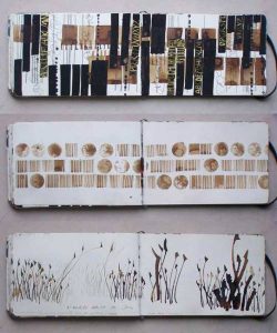
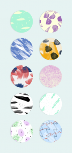
I liked the simplicity of the various marks put togetherThese cute round cut-out patterns caught my eyes even with its simple elements – brush strokes, dots, blotchesEven daily objects we have at home can create unique expressions and art
Emotions are pretty subjective, they mean different things and feel different to each human. I felt that this topic was rather broad and actually had no clue where to began. After which, I decided that exploration and experimenting might narrow my train of thoughts and help me to eventually settle with something I am most comfortable with or am happy about.
“Your emotions are the slaves to your thoughts, and you are the slave to your emotions.” – Elizabeth Gilbert
early stage exploration
In the midst of my explored mark making papers
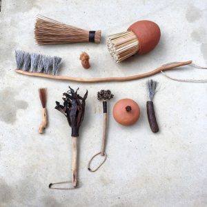
Played with objects I found at home. I chose these objects as they connect with me on a deeper level.
OBJECTS USED:
Film Roll
Dried Baby’s Breath Flowers
Sequins
Sponge
Old Necklace
here are some of my favourite outcomes,
Left to Right: Sequins, Dried Flowers, Film Roll
| I liked how the marks formed had some form of contrast to them. Especially from the sequins, I expected the white parts to be circular but it resulted in unexpected organic shapes kind of resembling mood swings, unpredictable and in batches.
|| The dried flowers formed sort of an outline leaving the inside of the stalk white in contrast to the background. They formed random long lines, sort of giving direction to the piece. Some blotches of white were created, giving a mystical yet mysterious effect.
||| The film strip mark was made using the remaining ink after printing it a few times. Thus, the background was quite faint and a lot lighter compared to the other two. I liked how the outline of the film strip turned out to be darker than the rest, making the strip pop up a little more. Also, one strip turned out to be darker than the other showing some sort of progression in that piece.
IDEATION AND NARROWING IDEAS
I think that I feel a range of emotions in a span of a day. From being sad to feeling slightly happier to being grouchy and then feeling loved like my heart is warm and full. I am actually not too sure how healthy that is? but generally I am a person who just feels a lot.
As such, I thought why not incorporate this fact into my project and make my daily emotions come to life. I feel that my emotions vary a lot depending on daily situations and I am sure that it is the same for others as well, but I think on the whole, some of my emotions stay consistent on a day to day basis unless affected by a huge factor.
Since I feel so many emotions at once, my emotions are actually being felt concurrently. This to me, translates into layers in art form.
LAYERS
Using layers to convey concurrent emotions —
Searched ‘Art Layers’ on PinterestI like how the layers used bring out the colour and emotion of the art piece
ARTIST REFERENCES
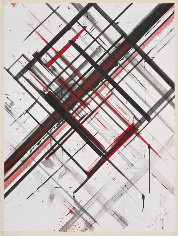
Ed Moses
Ed Moses can be described as an abstract expressionist. He is known for experimenting with layers using basic shapes to create depth. His art works comprises of layers of different mediums.
Ed Moses, Untitled, 1975-77, Acrylic, ink, and tape on foamcoreEd Moses, Cubist Drawing #11, 1977-78 Charcoal, acrylic, india ink and masking tape on board
His use of layers are intriguing, though pretty simple, it still manages to draw me in. I liked how he manages to create depth through his use of layers, making the art piece pop little more.
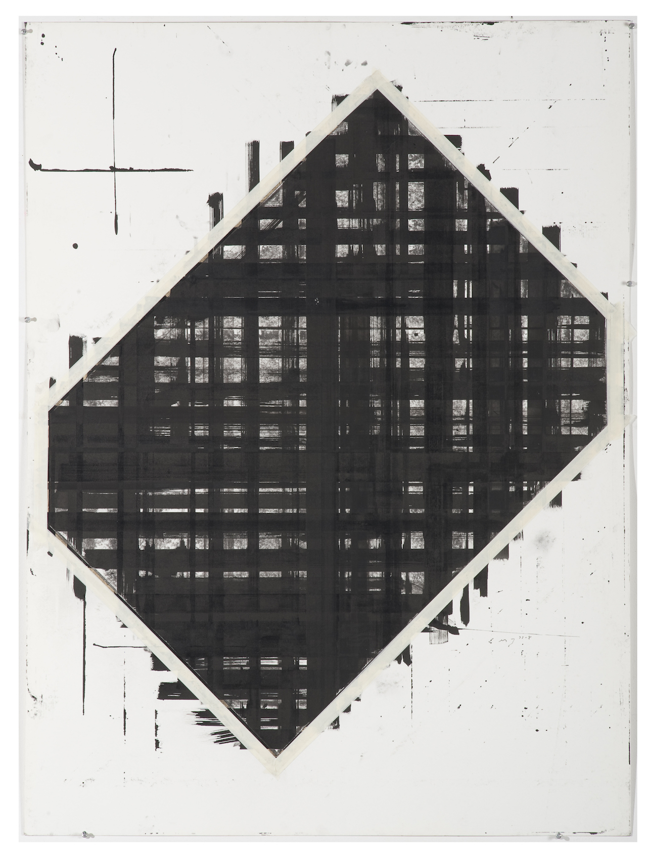
Bernd Ribbeck
Bernd Ribbeck is described as a spiritualist, using spiritual ideas to inspire his works. He is influenced by artists such as Hilma Af Klint and Emma Kunz. His work is process-orientated, making use of layers and scrapping surfaces to achieve the desired effect.
Bernd Rebbick, Untitled, 2014, acrylics, ballpointpen, pigmented marker on mdfBernd Ribbeck, Ohne Titel (Untitled), 2010, acrylic and pigment marker on MDF
Through the use of geometric shapes, Bernd Ribbeck manages to create artworks that look quite pleasing to the eye. With the different use of textures and layers, he manages to add life to his works, making me want to stare at it longer.
Julie Mehretu
Julie Mehretu is an abstract artist known for her use of layers throughout her works. She layers mediums, images, marks and even makes use of figurative layering. Her work from a far looks creates a whole picture but when seen unclose, it breaks down to smaller bits and suddenly there are many different narratives happening at the same time. Some mediums she use include, acrylic, pen, pencil and ink.
Julie Mehretu, Mogamma Part 1, 2012, Ink and Acrylic on canvasJulie Mehretu, Invisible Line, 2010-2011, Ink and Acrylic on canvas
—
After doing some research on layers, I experimented layering marks one on top of another. Initially, I thought that layering would be a breeze, but I was proven wrong by my own actions. In the process of layering, instead of immediately seeing the final results of the mark made, I had to plan what looks better as the top layer or vice versa. In addition, I had to wait for the ink to dry before attempting the second layer. This took up extra time and effort but it was definitely worth it all!!
I felt that layering helped in bringing out more contrast in the lines and more obviously showed empty space. The values of the lines were also more varied due to the different ink pressures from different layers.
Some pretty decent outcomes –
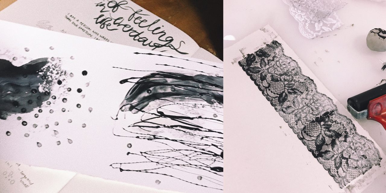
Left to Right: Watercolour (bottom) Charcoal mask (top), Lace (2 layers)
| I was quite happy with the results produced through layering. By layering, it helped add depth to my emotions and gave some room for space and different textures. As seen in the left picture, the first layer is a lot softer than the lines made by the charcoal mask. The lines added made the emotion feel more confusing and highlighted the dark tone of the whole piece.
|| The right picture was an outcome after 2 layers of opposite lace was stacked one of top another. Although it seems like there is only one layer from far, when looked in detail, you can see some of the flower patterns overlapping each other adding a blur effect to the whole piece. The layering also made some parts darker than the other, bringing out some contrast.
ENROUTE TO FINAL ‘EMO LINES’
6 different emotions
Since I feel a set of emotions daily, my lines are a representation of my day according to how I feel. After much thought and analysis, I have arranged the various emotions along a span of a day.
Sadness > Fear > Anger > Surprise > Joy > Love
S A D N E S S
As depressing as it sounds, I am generally sad when I wake up (with the exception of days where there is something exciting to look forward to). The second the alarm on my phone rings, I am awake. Sometimes, I really hate being a light sleeper just so that I can sleep just a teeny weeny bit longer…
In my layers, I hope to stick through the idea of putting together a use of a daily object and a movement to express the emotion.
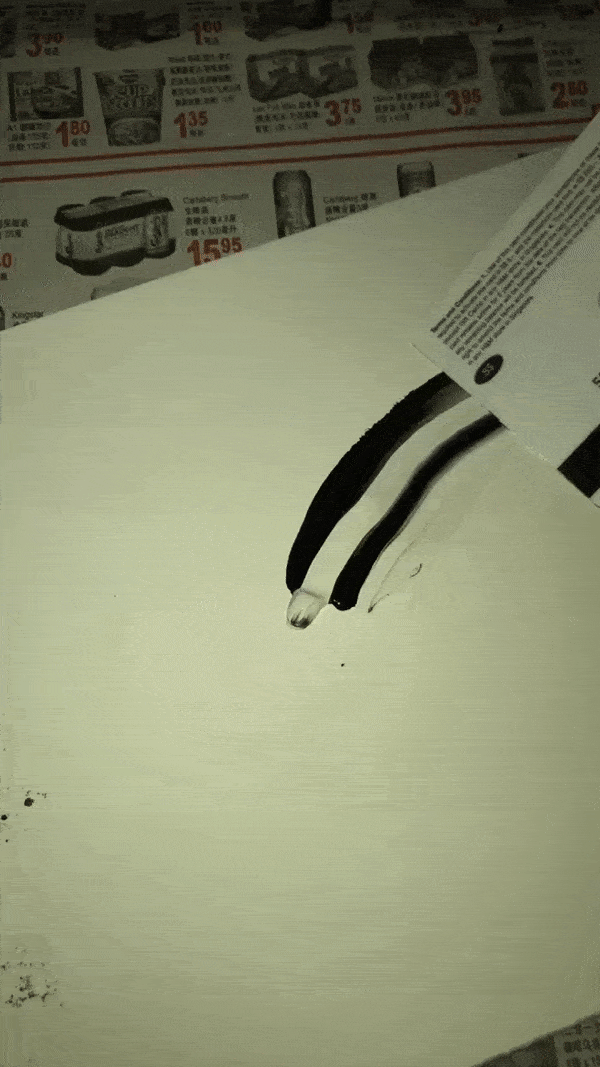
Object: Pimple Cream (applied with cotton bud)
Movement: Draggy, dreadful
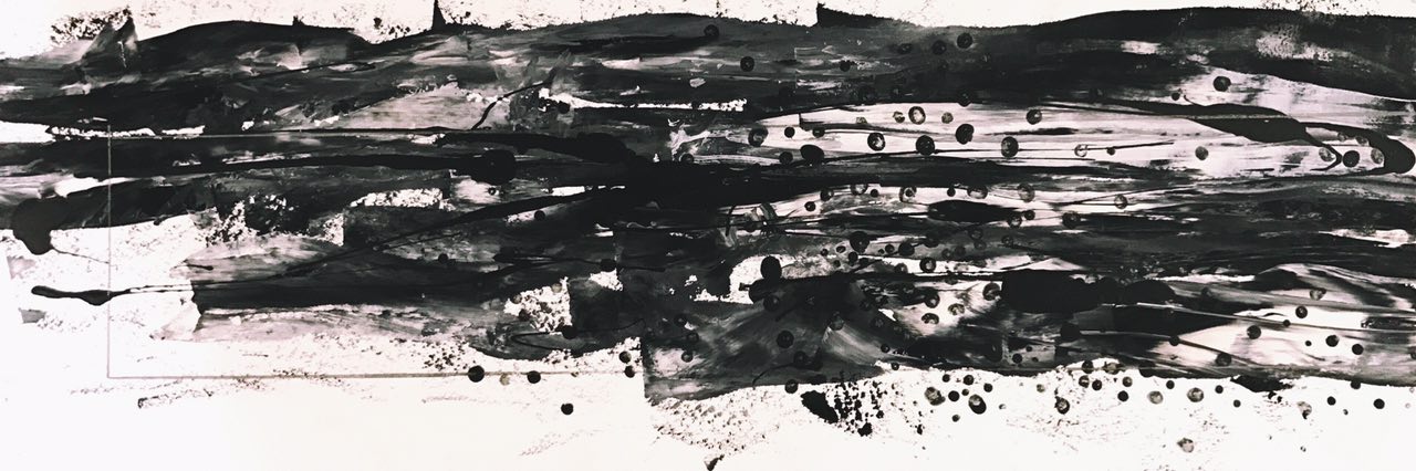
Top: Watercolour Bottom: Results of dragged out watercolour using a card
Final outcome with added use of dots and horizontal drips of charcoal mask
F E A R
I will definitely never use the word, “brave” to describe myself as unpredictable and new situations tend to be pretty intimidating to me. I feel the emotion, fear, more in the beginning of the day because I don’t quite know what the day ahead will be like for me (good or bad). Thus, I tend to overthink and fear for things that have not happened.
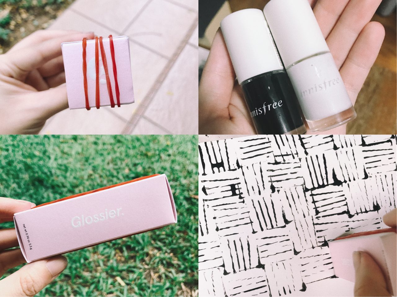
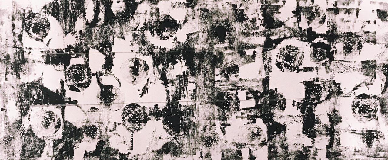
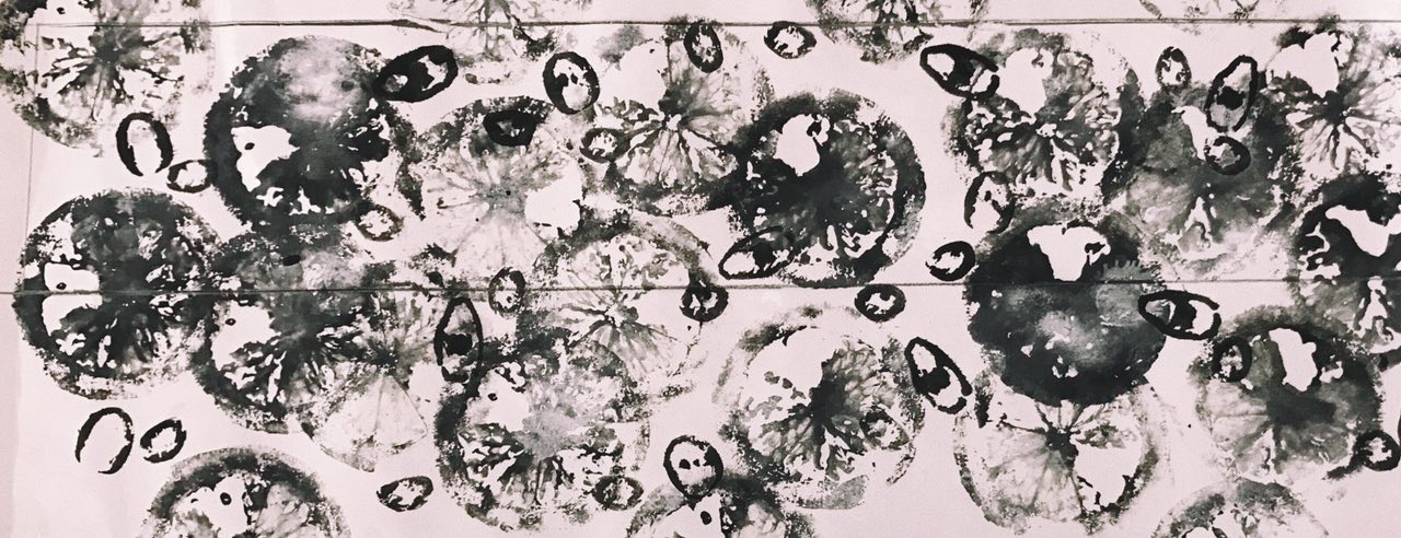
Object: Rubber bands and empty skincare box
Movement: Circles, repeated, never ending & haunting
Left two pics: Rubber bands on empty skincare Top right: Nail polish used to create circles and never ending effect Bottom right: effect produced with DIY mark making tool
Final outcome
A N G E R
During the day, when things get little wonky and don’t go according to plans, I tend to get a little frustrated and irritated because interruptions to any kind of plans irritate me. Of course, mood swings can also be a reason for a more moody Dinis, once every time of the month.
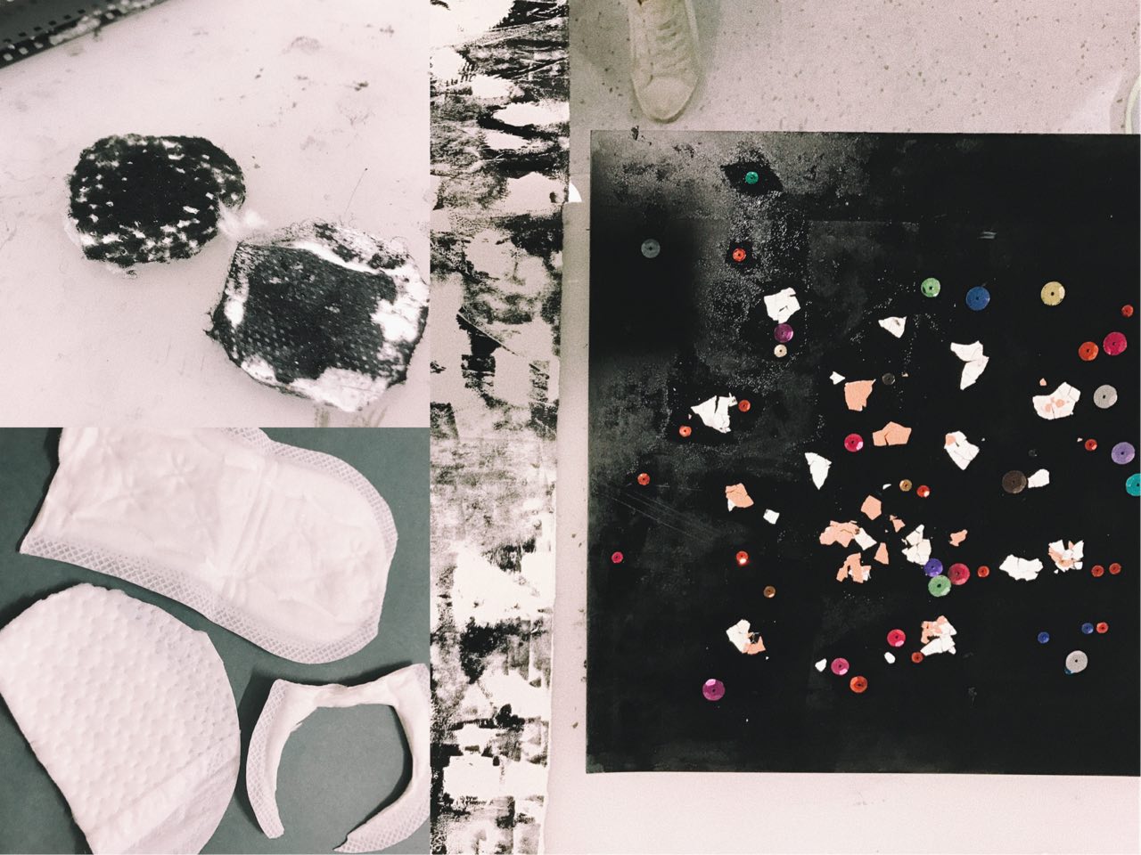
Object: Eggshells sequins, pads
Movement: Clear marks made with strength from negative energy
Left two pics: Pads used to represent grouchiness Right: Eggshells and sequins as mark making toolsFinal outcome. Pad effect on top layer.
S U R P R I S E
Any sudden unplanned situation/event would be considered a surprise to me. Seeing a sudden familiar face, or eating something with an unexpected taste are some things that will definitely surprise me. Being surprised means I will never know when its going to happen, however, I feel that in the middle of my day, there are generally more opportunities for me to be surprised. E.g. running into a friend outside.
Object: Lemons, Chili
Movement: Sprayed marks using dry shampoo (conveys impromptu and sudden movements)
Top two pics: Chili and lemon used as mark making tools Bottom pic: Using dry shampoo to produced “sprayed” movement onto paperFinal outcome. Dry shampoo effect on top layer.
J O Y
Happiness is the simple things in life. I am usually pretty simple-minded and even little things can excite me. I guess I feel generally blissful and content with what I have in life. Some things that make me happy include eating (especially with family or friends) and exploring new places. Joy comes at different times of the day but for me, I feel most happy and content at almost the end of a long day because it means finally some time to rest and also to be grateful for the day that has just past.
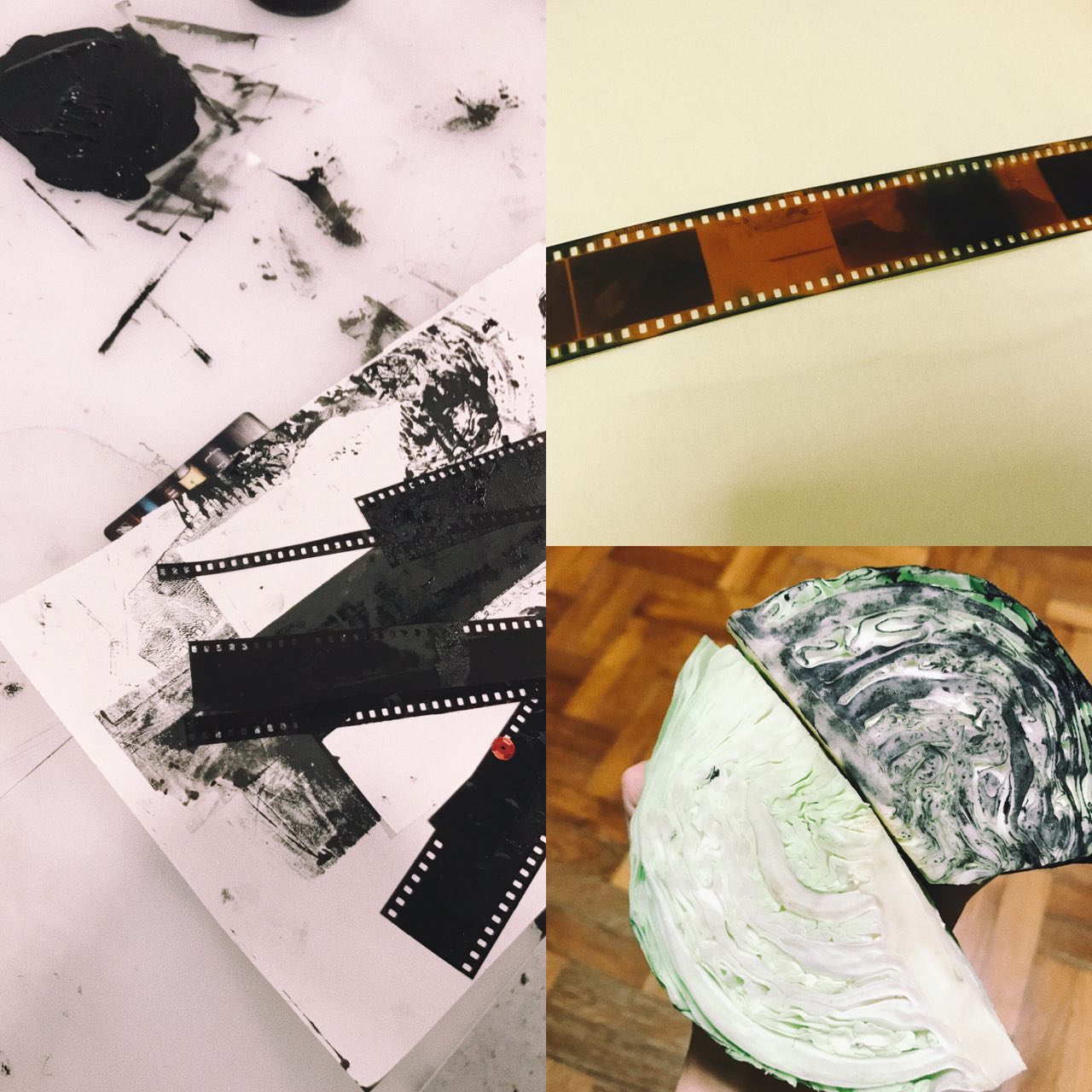
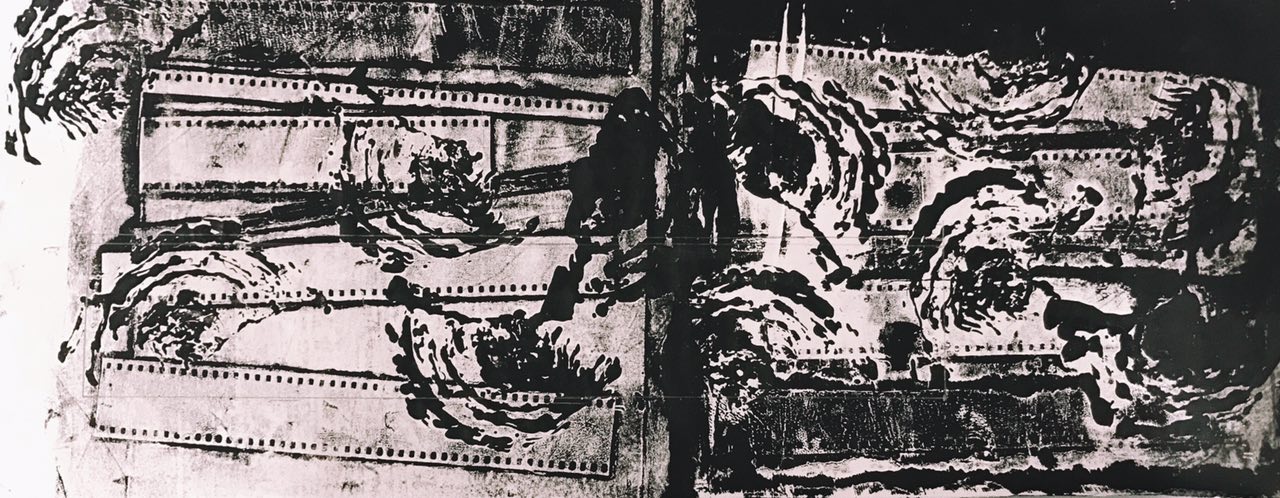
Object: Cabbage and film strips
Movement: Simple, straightforward, easy
Left pic: Inked Film Strip Bottom right: Inked Cabbage that represents my joy for foodFinal outcome. Cabbage marks on bottom layer, film strip marks on top layer.
L O V E
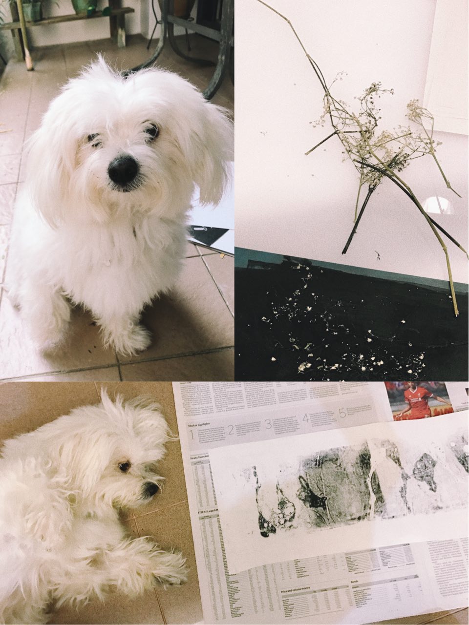
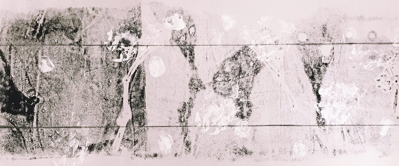
And finally the day ends with love! Love is kind, compassionate and it makes my heart warm & full. Cringy, but love is really the best reward at the end of a long day. Family and close friends make me feel loved and makes me want to share my love with those that are important to me. Things like flowers also remind me of the beauty in life which often relate back to my loved ones.
Object: Dried flowers
Movement: Dog paw prints and thumbprints of my family members (using face paint)
Top right pic: Dried Baby’s Breath Flowers Bottom pic: My dog laying next to print before putting in his paw printFinal outcome. Simple and light. Flowers print on bottom layer and paw print/thumbprints on top layer.


