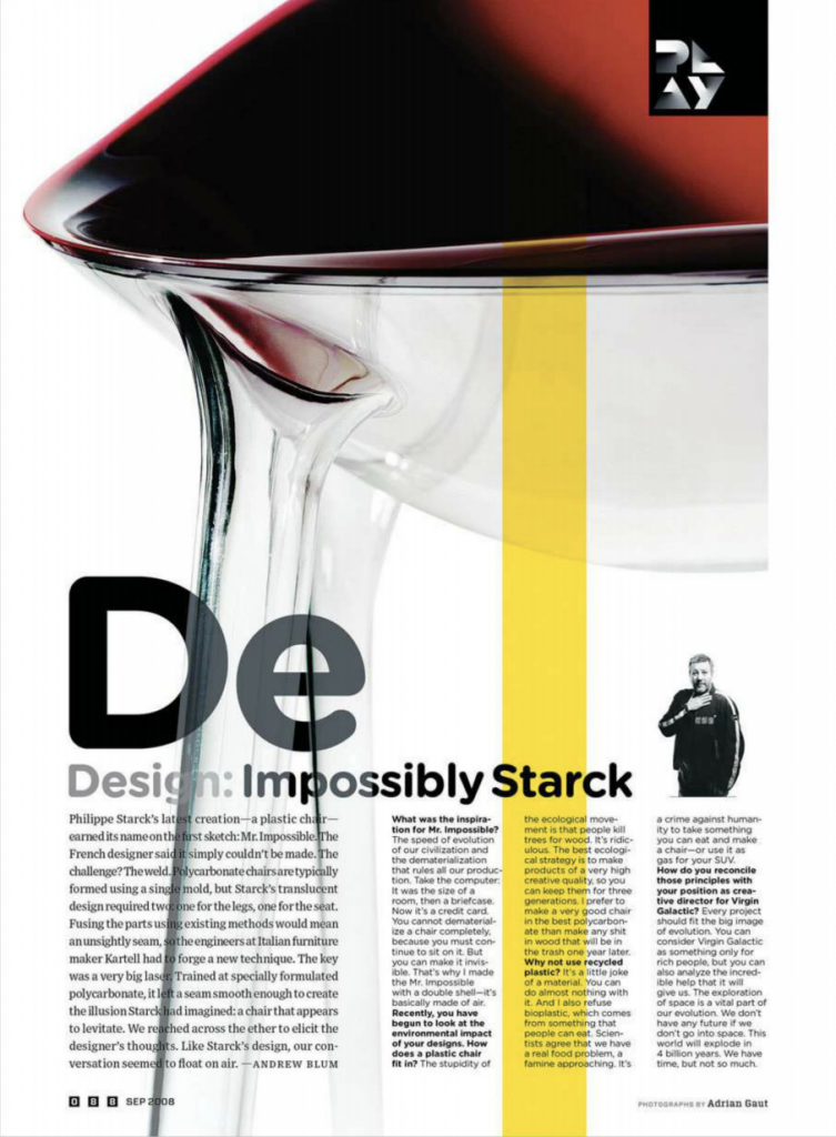
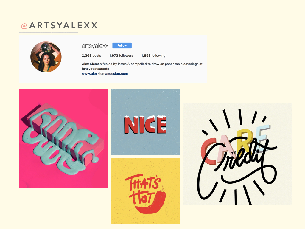
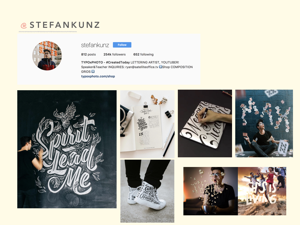
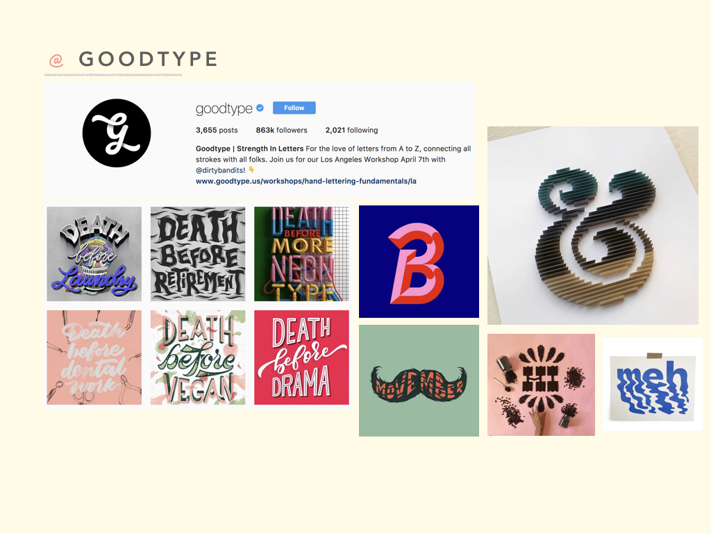
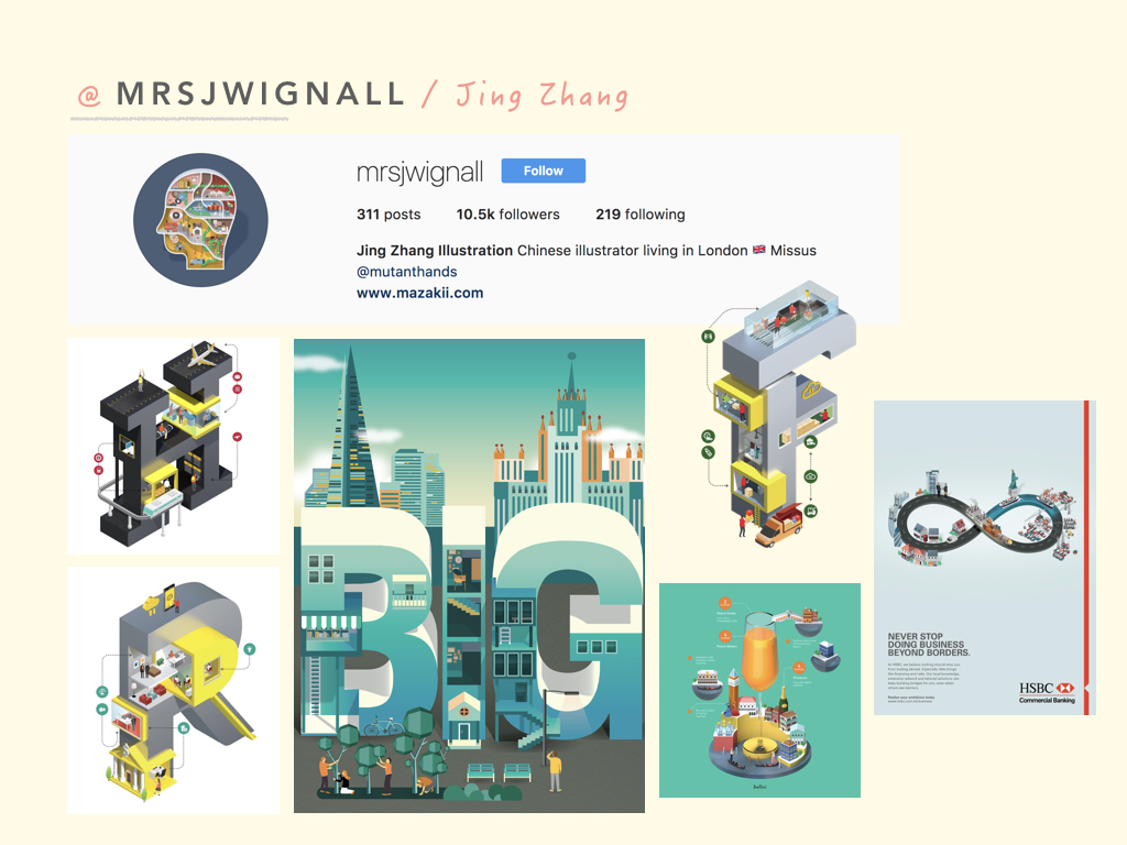
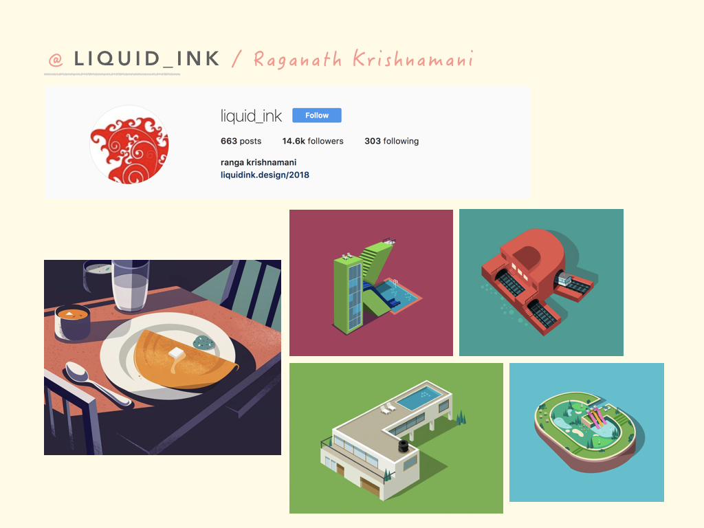
After much research and scrolling through Pinterest for inspiration. I took those inspiration and channeled it towards my thought process for my concept and ideas.
For this project, we were tasked to create a type-image based on our ideal occupations or rather just any occupations that resonate in some way to ourselves. They can even be abstract, unrealistic and imaginative.
Honestly, that got me excited because I knew I didn’t have to stick to the ordinary thought of, “what do you want to be when you grow up?”
concept
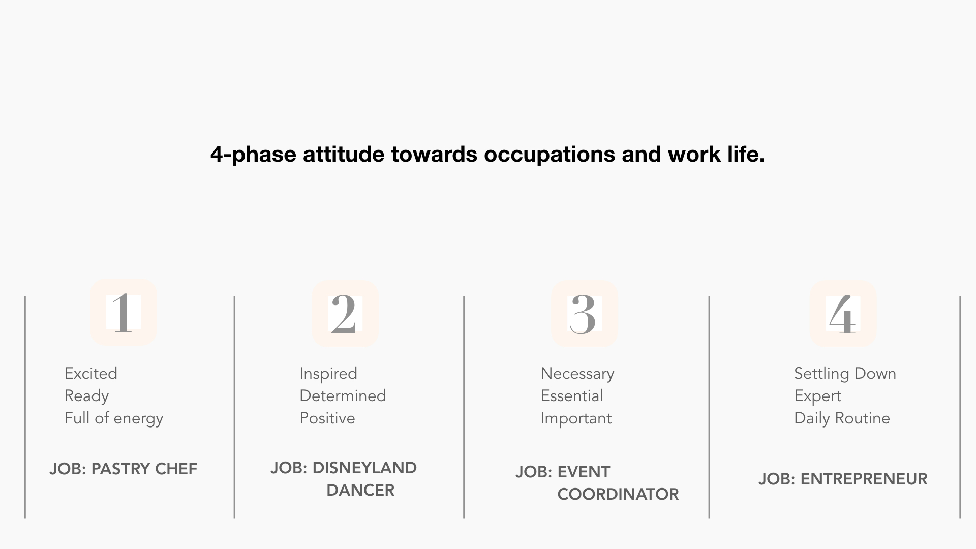
With that, I thought along the lines of occupation and my attitudes towards it. It was then when I realised that I feel more than a certain way about occupations and work in general. & that is because I have experienced jobs that made me laugh and also jobs that made me cry.
That being said, I concluded that I feel an array of emotions when it comes to working.
CHOSEN OCCUPATIONS
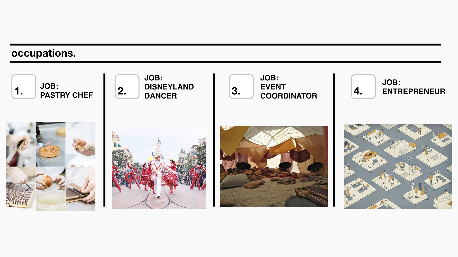
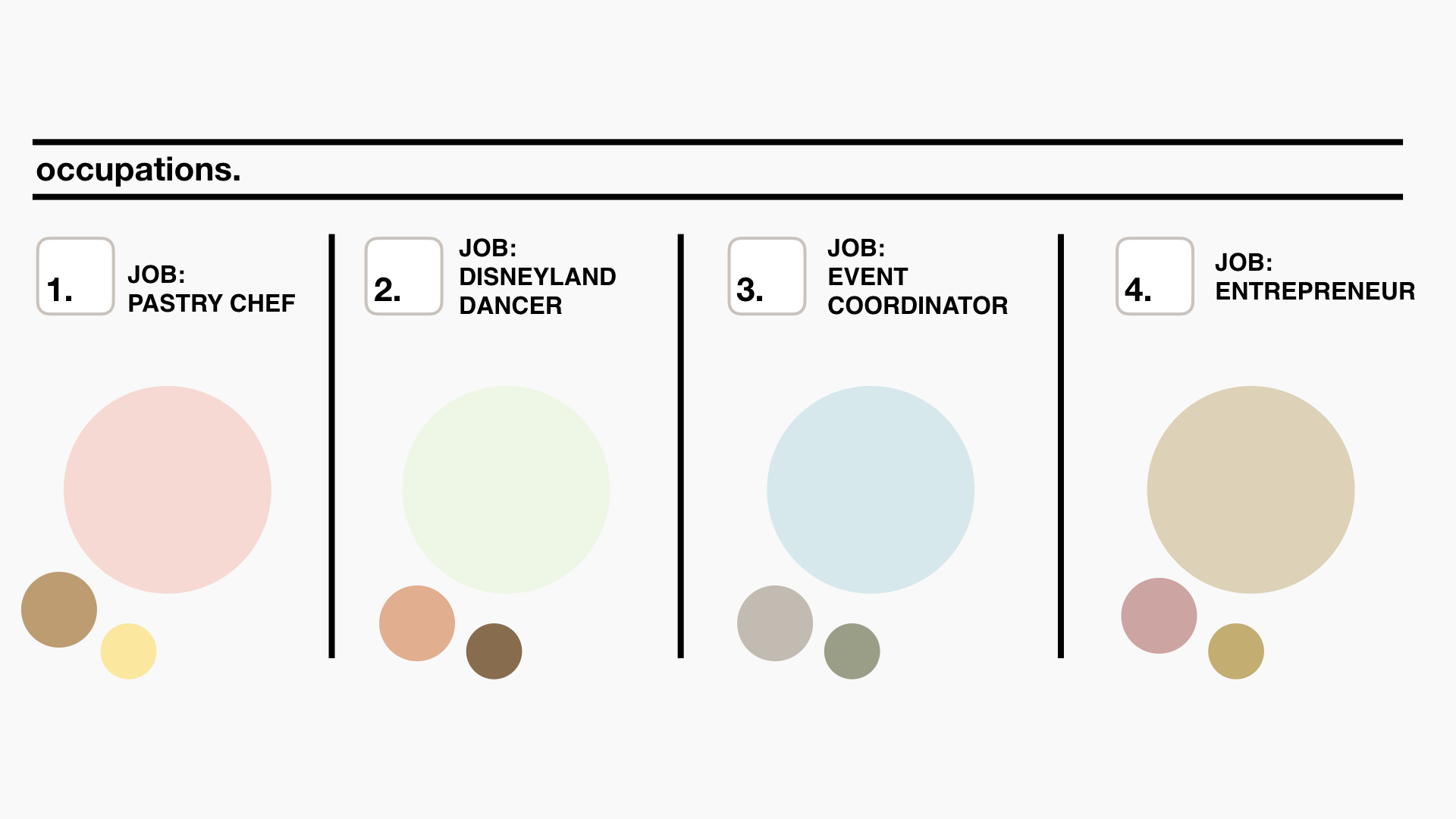
The occupations I’ve chosen are, Pastry Chef, Disneyland Dancer, Event Coordinator and Entrepreneur.
I’ve chosen these occupations as it reflects my mood towards work life and occupations while growing up – from a teenager to a full-grown working adult.
Process
As stated in my research post, my art direction for this project will be illustrations. I decided to go for a single subject in a composition to show how a few alphabets can form a “city” or “life” of its own.
The letters that I have chosen for all 4 of my compositions are, “D, I, N”, spelling DIN.
The reason why I chose DIN is because some of my closest friends and family call me Din and I feel comfortable with that nickname. I feel that if I had to choose alphabets that best resonates with me and my life, it would be DIN.
The colours I decided to go with for all 4 compositions are more pastel light colours. The colours I have chosen are also chosen according to the emotion I have towards the occupation during that period of time.
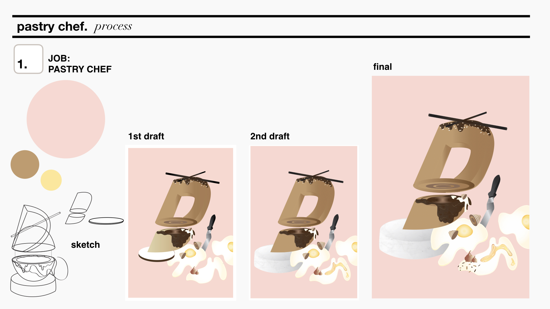
pastry chef
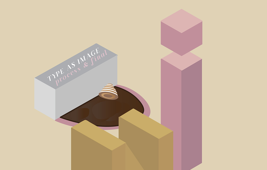
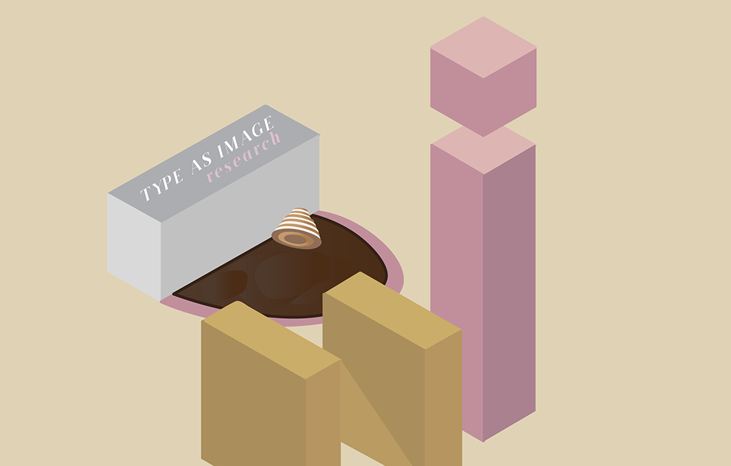
The letter D.
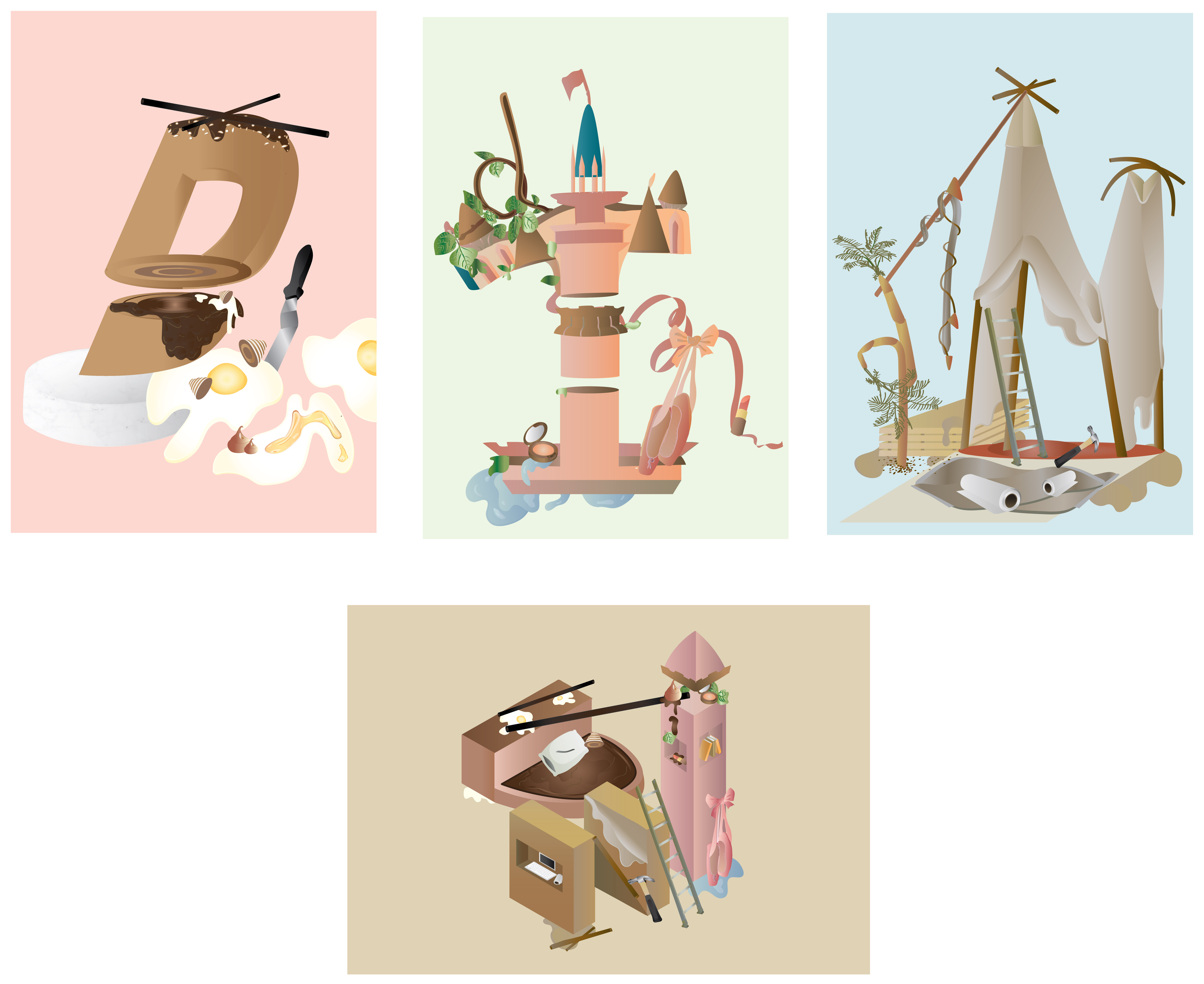
Pastry Chef reflects my excitement towards growing up and getting my first job. The reason why I chose Pastry Chef is because I always loved the pastries these chefs produced – they are so meticulous and they are basically edible art. If I weren’t in ADM I will probably struggling in the kitchen trying to whip up some pretty desserts. Since the idea of this job gets me all excited (:>) I decided to use it to reflect my excitement towards occupations. The letter D is manipulated to become the pastry, the palette knife i and an egg splatter n.
I picked warm colours and chose pink as my background as pink reminds me of being young and innocent.
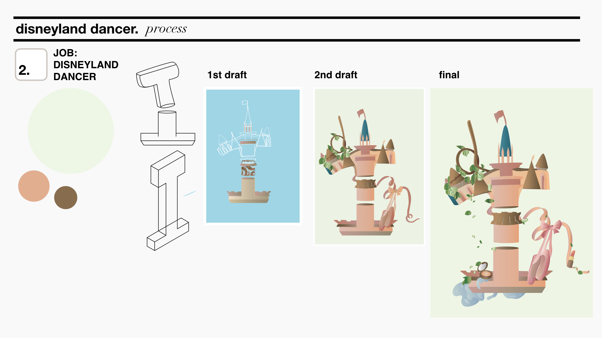
disneyland dancer
The letter I.
The idea of being a Disneyland Dancer feels far yet it seems like such a fun and happy job. I chose Disneyland Dancer to reflect my determination and positive attitude towards working as it feels like a job that will require substantial amount of commitment yet inspire me everyday. It also feels far away because there is no Disneyland in Singapore which sort of reflects my thoughts about being a full time working adult, “aiya, still got a few more years to go”. The letter I manipulated to represent the Disney castle, a twirled branch d and ribbons and ballet shoes n.
I chose colours that will pop a little more and will be a little contrasting yet complementary to each other. Pink is used for the castle as mentioned pink just reminds me of childhood and playtime just like Disneyland does. The brighter pink stands out in contrast to the lime green background.
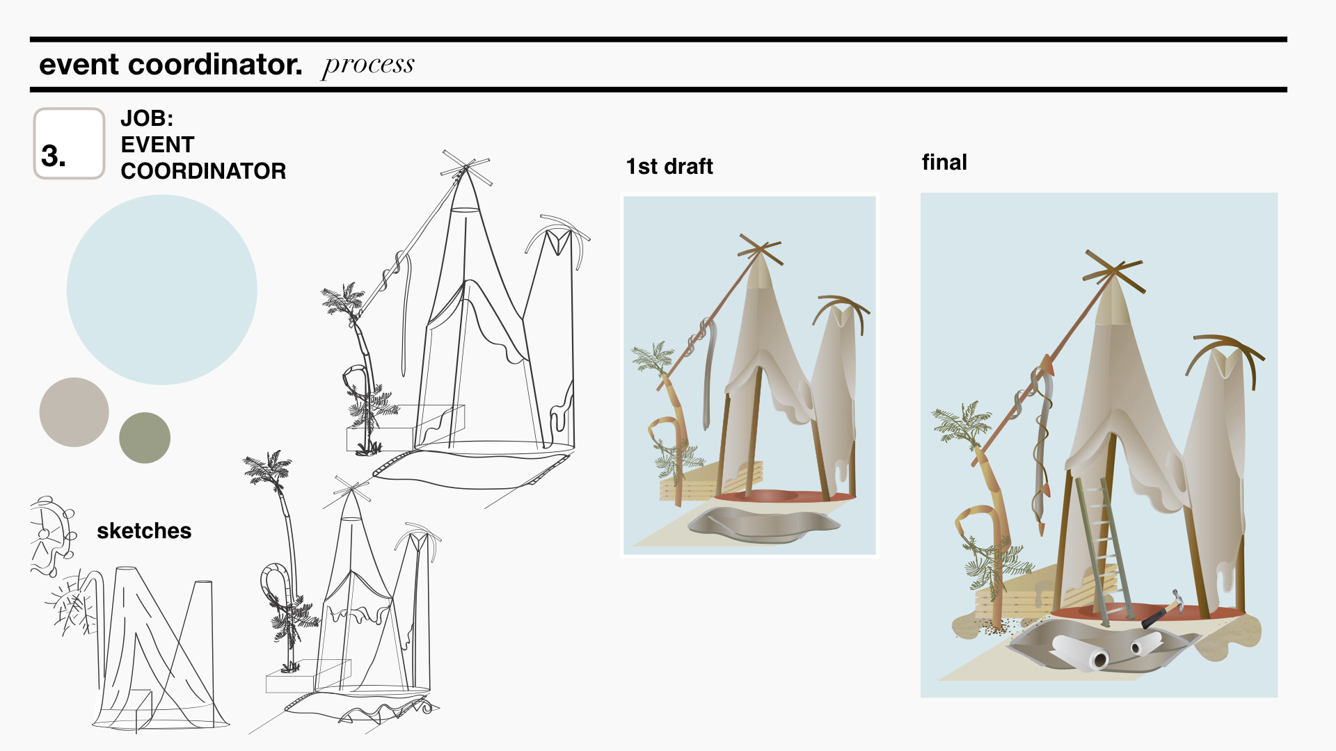
event coordinator
The letter N.
As you get over your first job, you start to think about a job that will give you a more stable income so that you can support yourself. As such, an Event coordinator reflects a stable income job that is essential and necessary for survival. The letter N manipulated to represent the tent of an event set-up, in this case a Coachella inspired set-up. Manipulated palm tress for d and strings and cloth for i.
As the years go by, I foresee myself getting tired and bored of the working life. Thus, the colours I picked for the composition are more dull and earth tone. This also goes in line with dessert feels that events can take place at.
entrepreneur
The letters D, I, N.
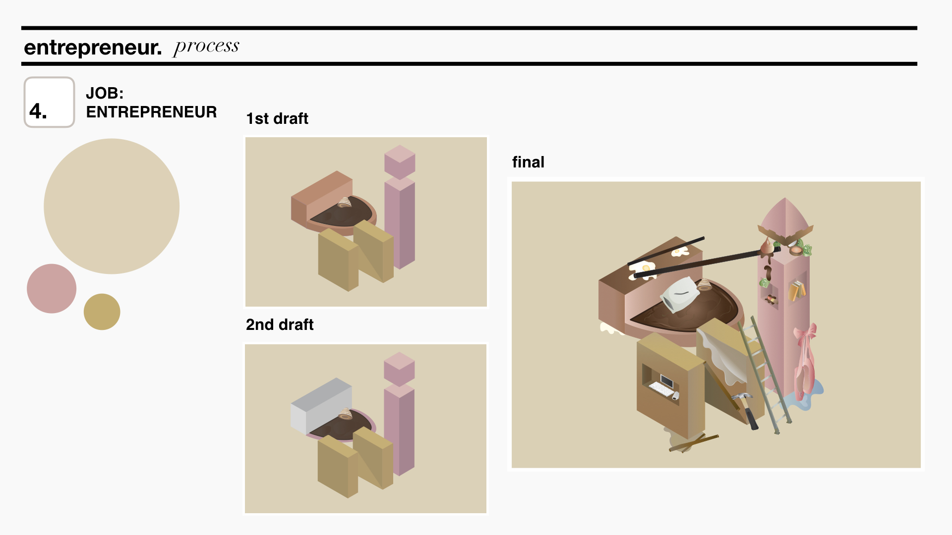
After life takes me on a few different jobs, I would think I would have gathered skills through my experience and know what I like and dislike. To represent my future and wanting to eventually settle down, I thought of an Entrepreneur. I feel that an Entrepreneur has the freedom to do what she wants and that reflects exactly my sentiments about finally doing something I will want to do for the rest of my life. Thus, this is combination of my previous three combinations as I will definitely be using what I’ve learnt from my past occupations to help me in becoming a successful Entrepreneur. D represents Pastry Chef, I represents Disneyland Dancer and N represents Event Coordinator. However, in each of the these letters, I tweaked it a little to add more home elements as I have settled down and could be working from home.
The colours used here are not as bright to represent settling down but also includes colours from the previous three compositions.
FINAL COMPOSITIONS
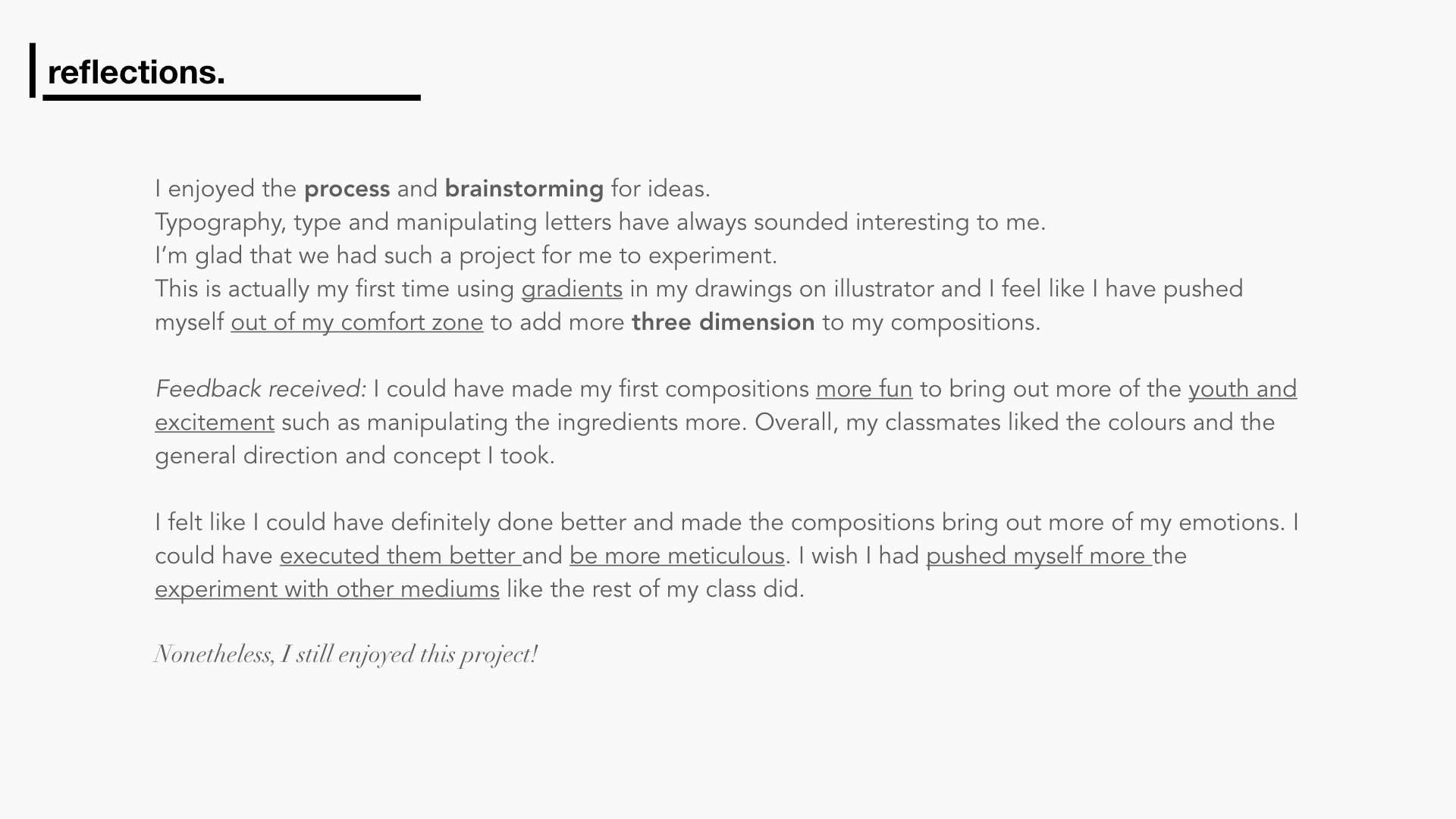
REFLECTIONS
Read about my research here.
Thanks for reading!
