Creative Industry Report: Evi O.

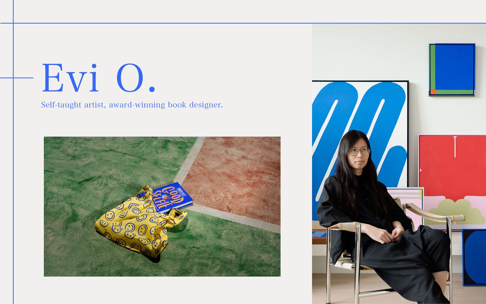
self-taught artist and award winning designer

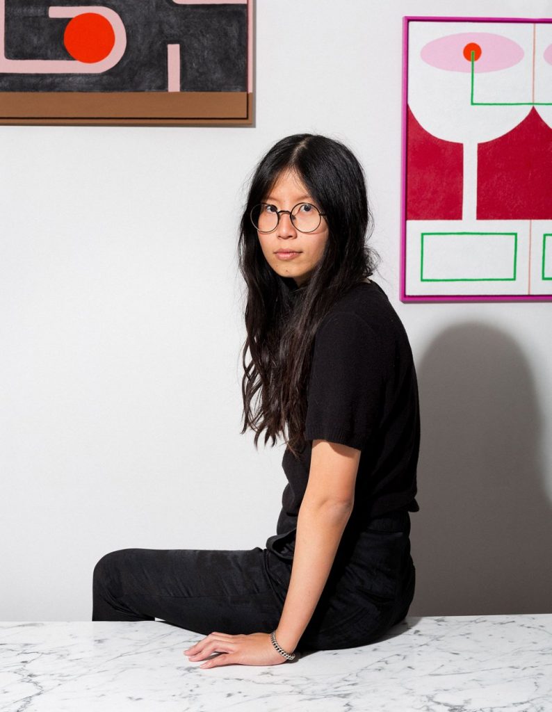
Evi O. is a designer based in Sydney but grew up in Surabaya, Indonesia. A curious learner and someone who finds joy in both playing and working, she never lets her days get boring. Starting small as a junior designer at Penguin Books, she slowly became sought after for her well designed books and illustrations. Her hard work and determination paid off as she started to win awards with her first in 2012, when a book she had designed at Penguin won  book of the year and best general illustrated book.

Evi O. is someone who is usually restless and functions better when juggling many different projects at once, she feels that different design tasks and processes stimulate her. However, she also believes in work life balance and thus, believes that all creatives should have their own creative outlet. Perhaps, that is one of the reasons why she founded her own studio, Evi O. Studio after spending almost a decade at Penguin.

Evi o. studio

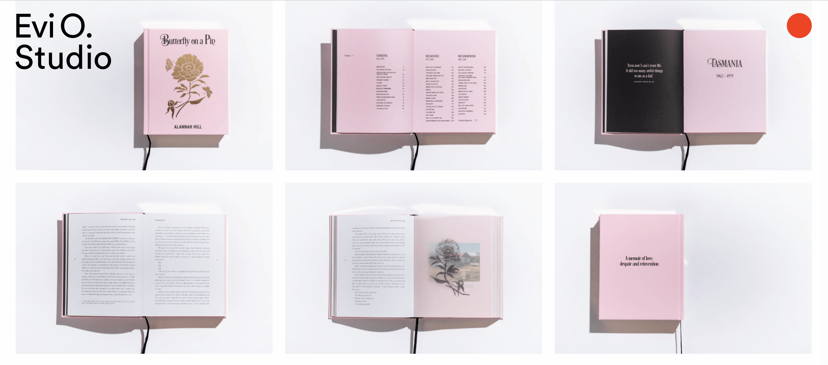
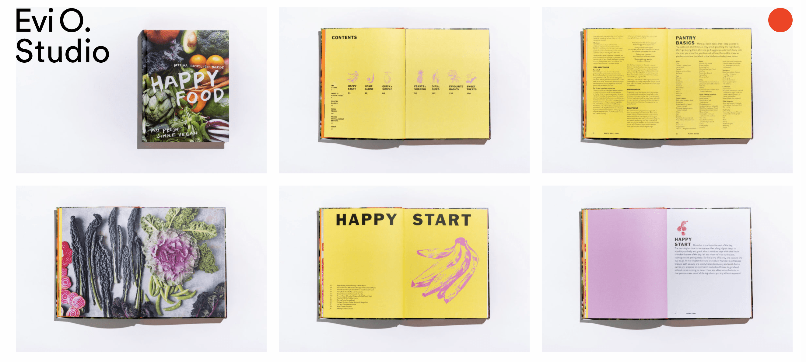
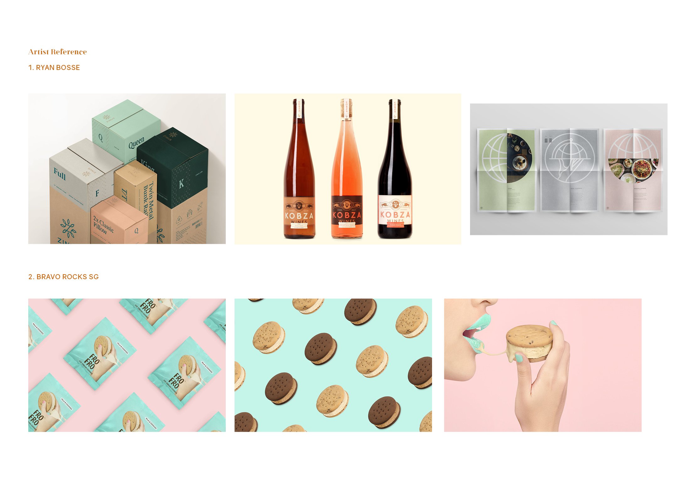
Evi O. Studio was founded in 2017 and the studio specialises in designing publications and branding identities. Her team and she can be found illustrating vegetables, gin bottles, portraits and much more. Her projects and music are what makes her studio always vibrant and never boring. Her studio is known for it’s hand-drawn approach to design where projects usually start with black ink and a brush on paper before manipulating the typefaces digitally. This is something I hope to practice more as a designer as I believe this traditional approach has its benefits and can help elevate my works plus start my projects with a different perspective.

what i have learnt from her

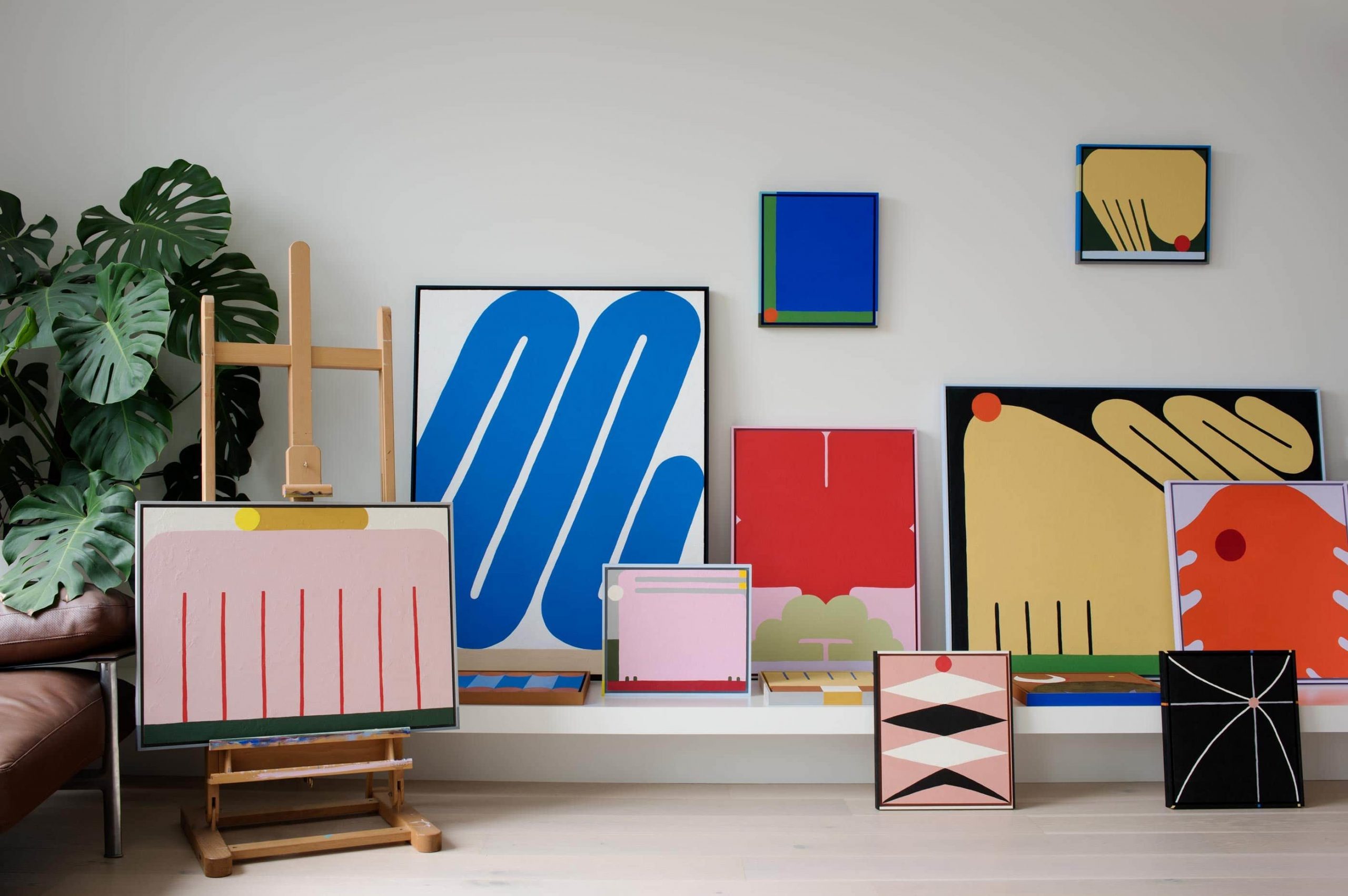
There is a Chinese proverb that says, “learn till old, live till old” and I felt like I understood this better through Evi. Although she is not old yet, the fact that she is still young and is still experimenting with new art forms such as her recent venture into abstract painting. She started with a visual communications degree, became an established book designer, opened her own design studio and now exhibits paintings in galleries. It surely came with lots of commitment and long days/nights. I hope to approach life with her advice for aspiring artists and designers, “make sure work feels like play”!

References

Book designer spotlight: Evi O. (2019, August 7). Retrieved September 23, 2020, from https://www.booksandpublishing.com.au/articles/2019/08/07/137243/book-designer-spotlight-evi-o/

Sadokierski Lecturer, Z. (2016, June 22). Designers on collaboration: Evi O. Retrieved September 23, 2020, from https://theconversation.com/designers-on-collaboration-evi-o-29785

Rets, J. (2017, April 10). The long and winding creative journey of Australian artist Evi O. Retrieved September 23, 2020, from https://happymag.tv/from-books-to-art-to-graphic-design-no-medium-escapes-the-creative-clutches-of-evi-o/

Home. (n.d.). Retrieved September 23, 2020, from https://evi-o.studio/

About. (n.d.). Retrieved September 23, 2020, from https://evi-o.art/about/

News. (2018, August 8). Retrieved September 23, 2020, from https://www.telegramco.com/meet-evi-o-award-winning-artist-and-designer/

Walton, N. (2015, January 27). DESIGNER + ILLUSTRATOR EVI OETOMO. Retrieved September 23, 2020, from http://www.dailyimprint.net/2015/01/designer-illustrator-evi-oetomo.html

Koskela, R. (2018, October 02). 5 questions with Evi O. Retrieved September 23, 2020, from https://koskela.com.au/blogs/news/5-questions-with-evi-o

Applied Illustration – A Gooey Gooed Time (research and process)

For this final project, we were given the freedom to decide on any event we want and it can be as bizarre or as simple as possible, entirely up to us! The deliverables required are 5 items related to our event and at least one of them has to be 3D. 

ideation

Since there are endless of possibilities, I had a hard time narrowing it down to just one idea. However, after much consideration and feeling hungry while brainstorming, I decided to go with a product launch event for cookie fillings. 

WHAT ARE COOKIE FILLINGS? 

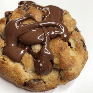
I’m sure once in your life you’ve had a gooey dessert, whether it’s a cookie or not, I really hope you have tried them because they are AMAZING (at least I think so) !!!! Recently, I chanced upon a local cookie shop called, “Nasty Cookie”.  Nasty cookie’s best selling point is basically they’re nasty gooey fillings in their fat cookies!

A little treat for your eyes

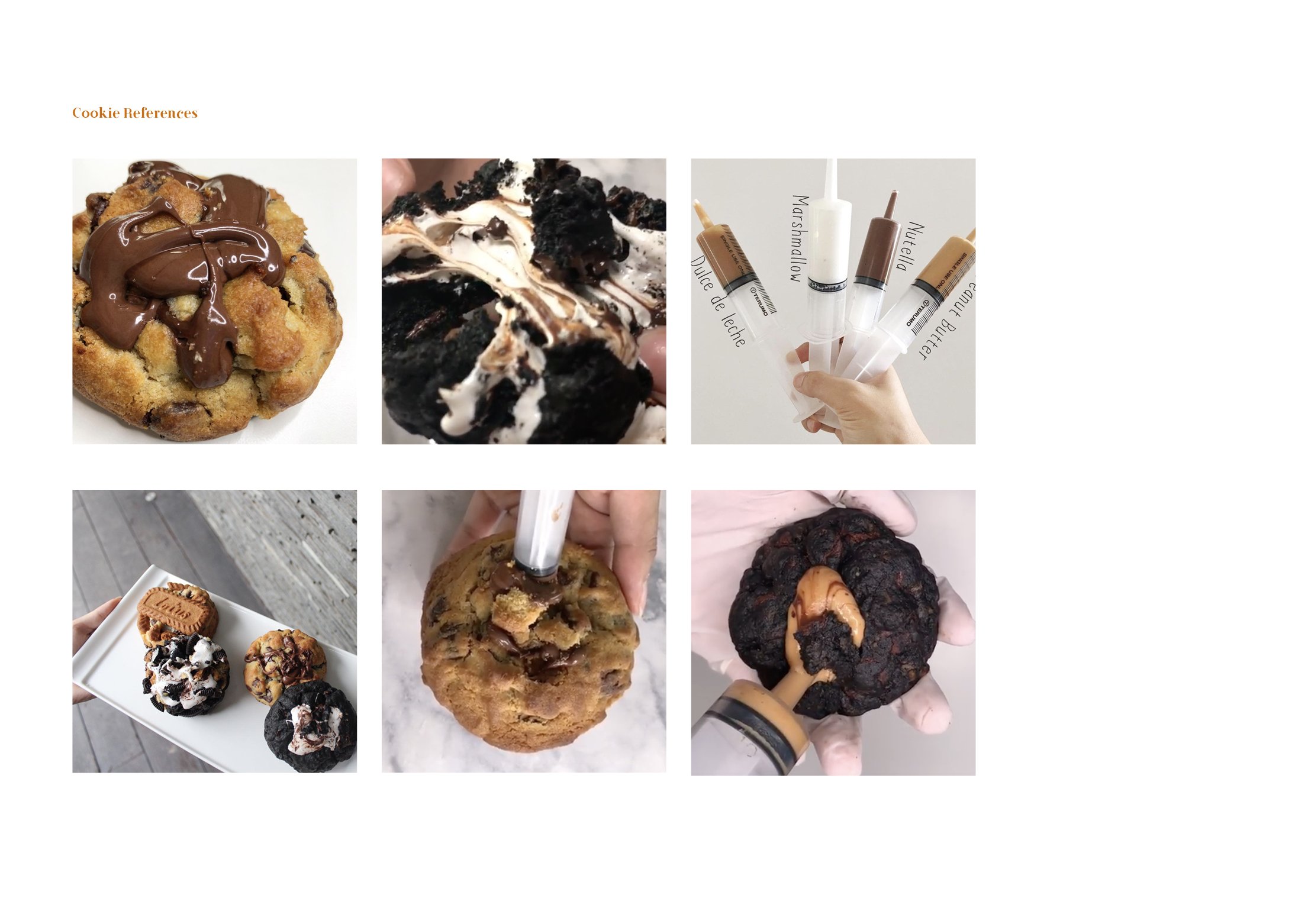
But the thing that intrigued me the most was how they inserted these gooey fillings. I always thought the bakers inserted a solidified chunk in the middle of the dough and then the chunk melts and becomes goo.

BUT actually! They insert the goo via a syringe and what makes it satisfying is it has a crispy ASMR of the cookie crack.

Inserting the goo
what if these bakers sold their fillings?

I decided to recreate a brand and have this brand market and sell their fillings. Thus, the event that I have decided on is  Gooeyooey’s first ever event and product launch that will also help people to destress by “stabbing” the cookie.

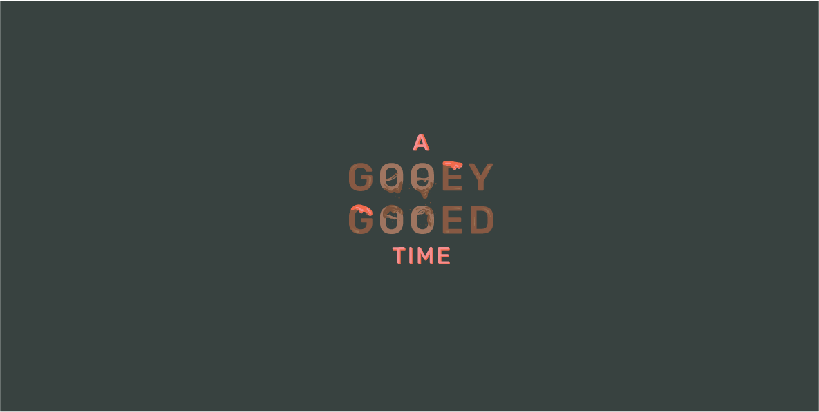
Thus the name of my event is, “A Gooey Gooed Time”

A GOOEY GOOED TIME

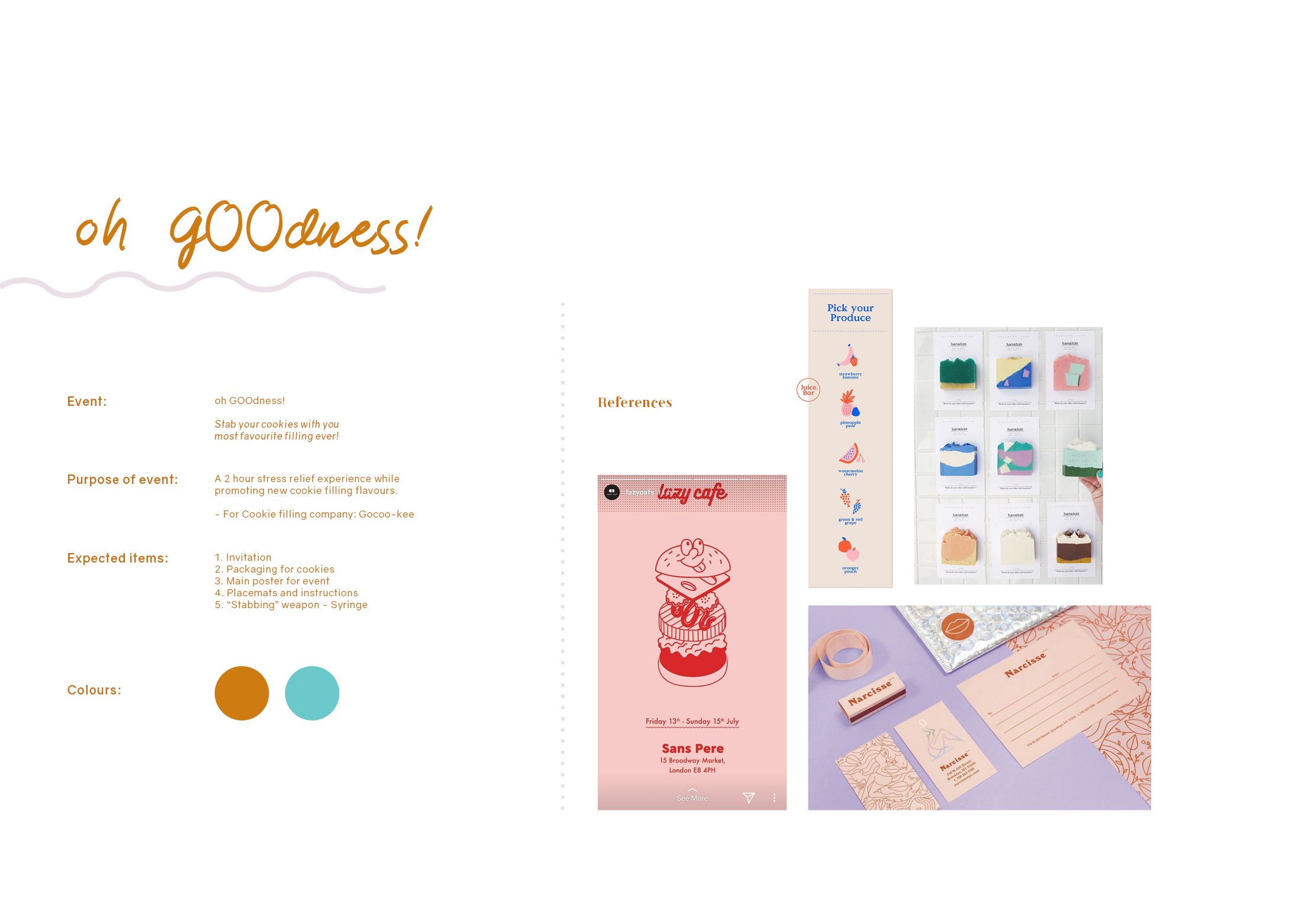
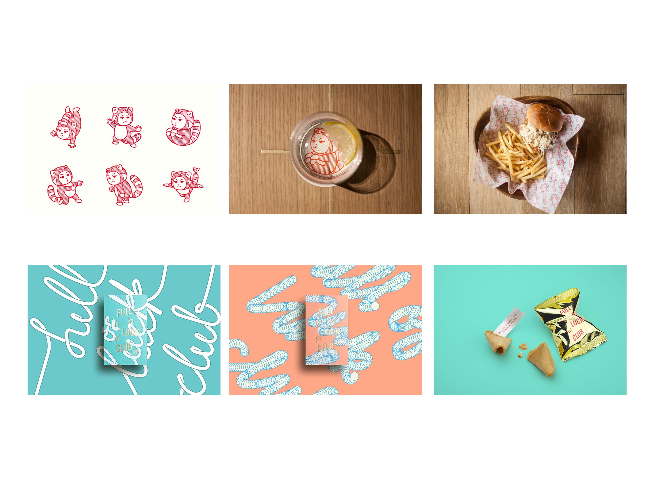
Initially, I named the event, Oh Gooedness! Here is my initial research and inspiration,

While thinking about my colour scheme, I thought that I wanted to do something more fun and not so related to typical dessert colours like brown.

My initial five items are:
  1. Poster
  2. Invitation
  3. Table placemat (later taken out as only 4 items are required)
  4. Packaging
  5. Syringe (for goo)
creative process

LOGO

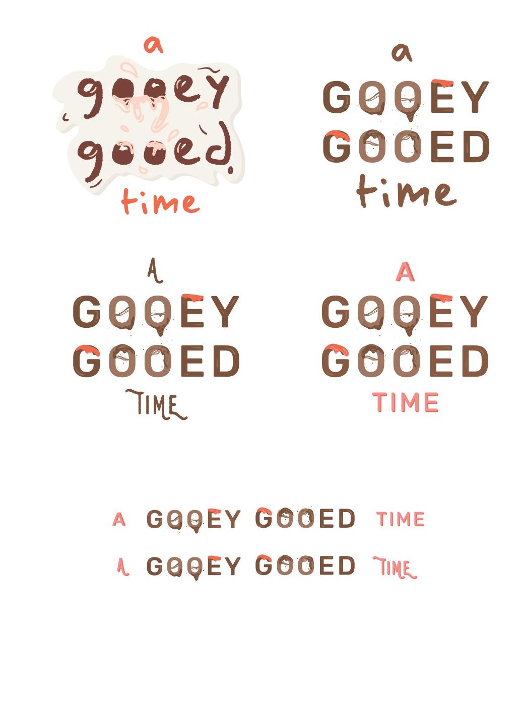
Initially, I designed the logo to look more playful and fun. However, I did not want the entire event to look too childish as my intended target audience are working adults. Thus, I decided to go with this.

INVITATION

first draft

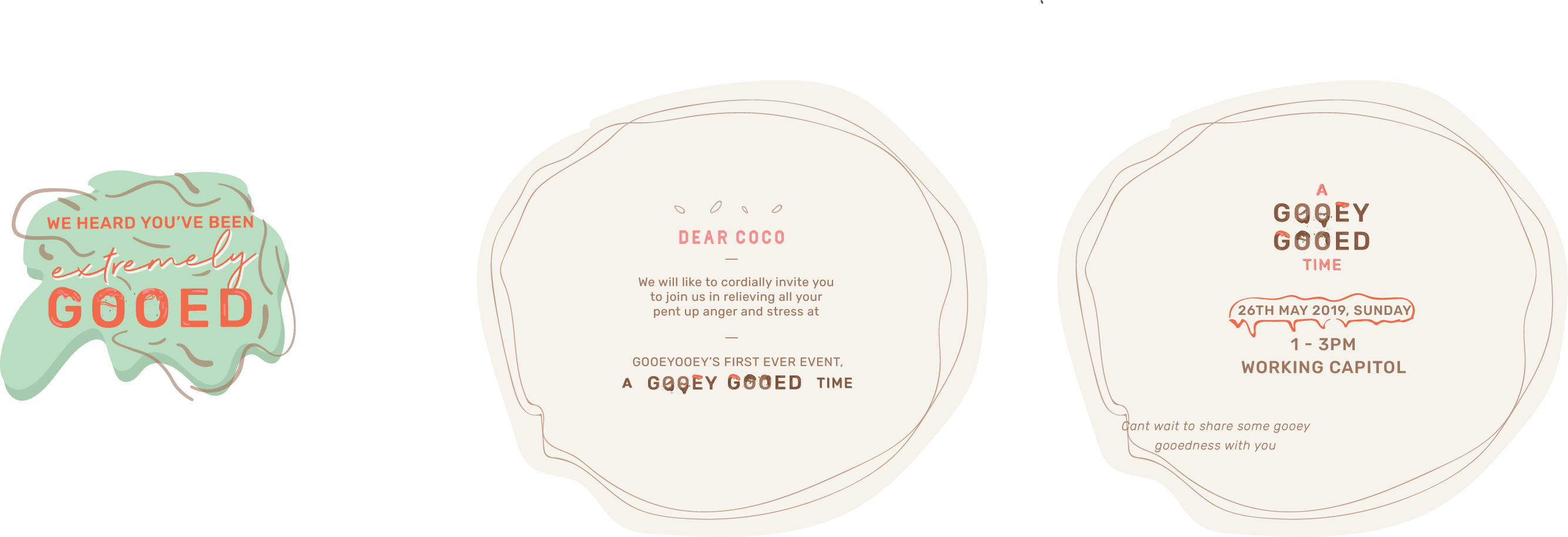
I was thinking of an odd shaped invitation at first. But later i realised it doesnt will make sense or look good, so I changed it to a more simple design. However, I received feedback that it looked to corporate and does not go with the other deliverables.

For the other 3 deliverables I adapted the same style throughout but do not have huge changes from edition to edition and so I will talk about them more in my next post.

Read more about my final deliverables here.


Varoom Illustration: Process & Final

Continuing from previous post, here is the process towards 
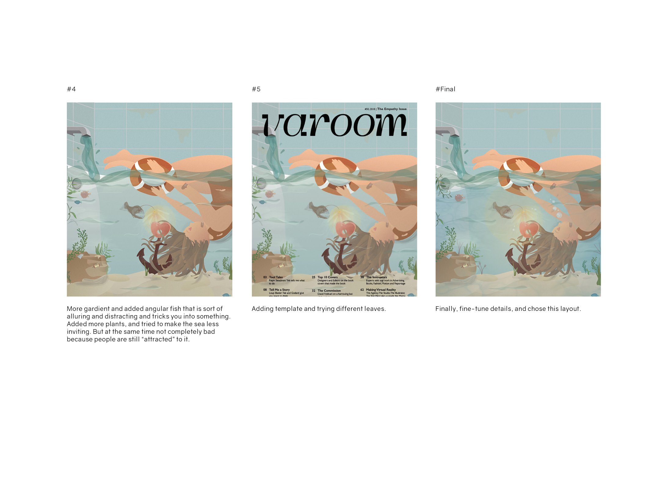
my final layout.
PROCESS OF ILLUSTRATION
DRAFT

FINAL

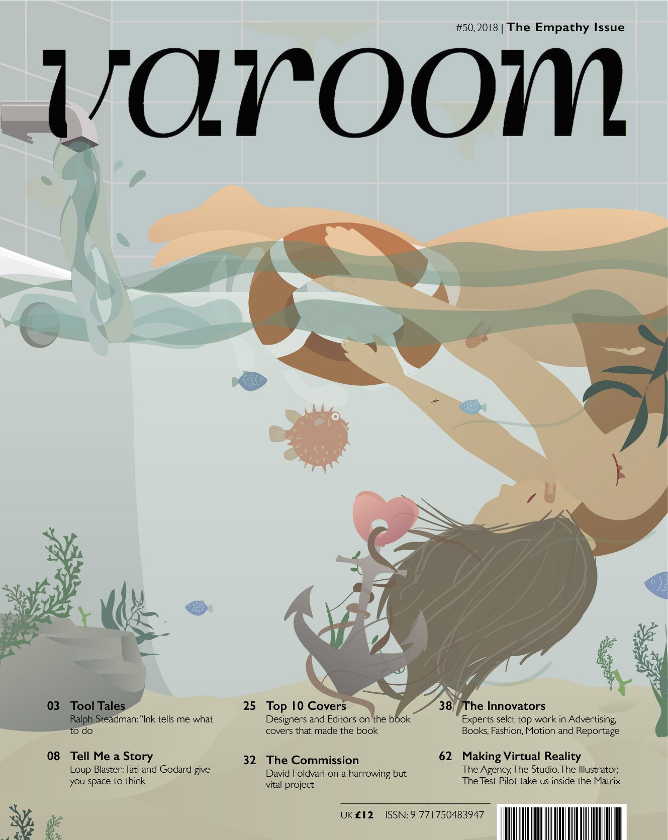
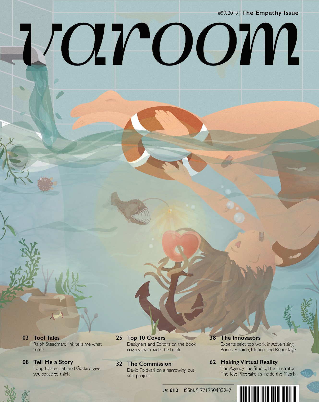
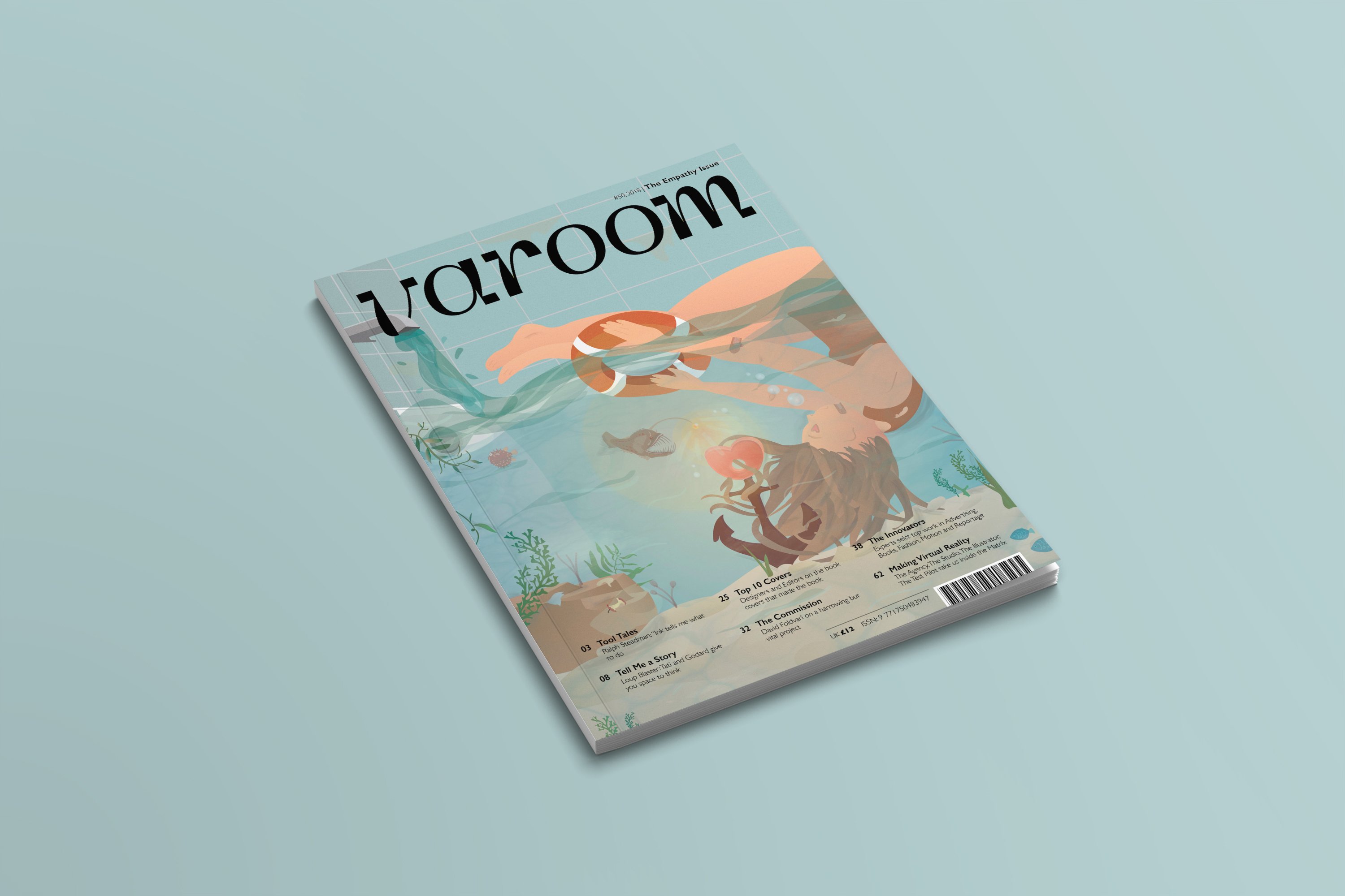
Final Varoom Illustration Magazine cover

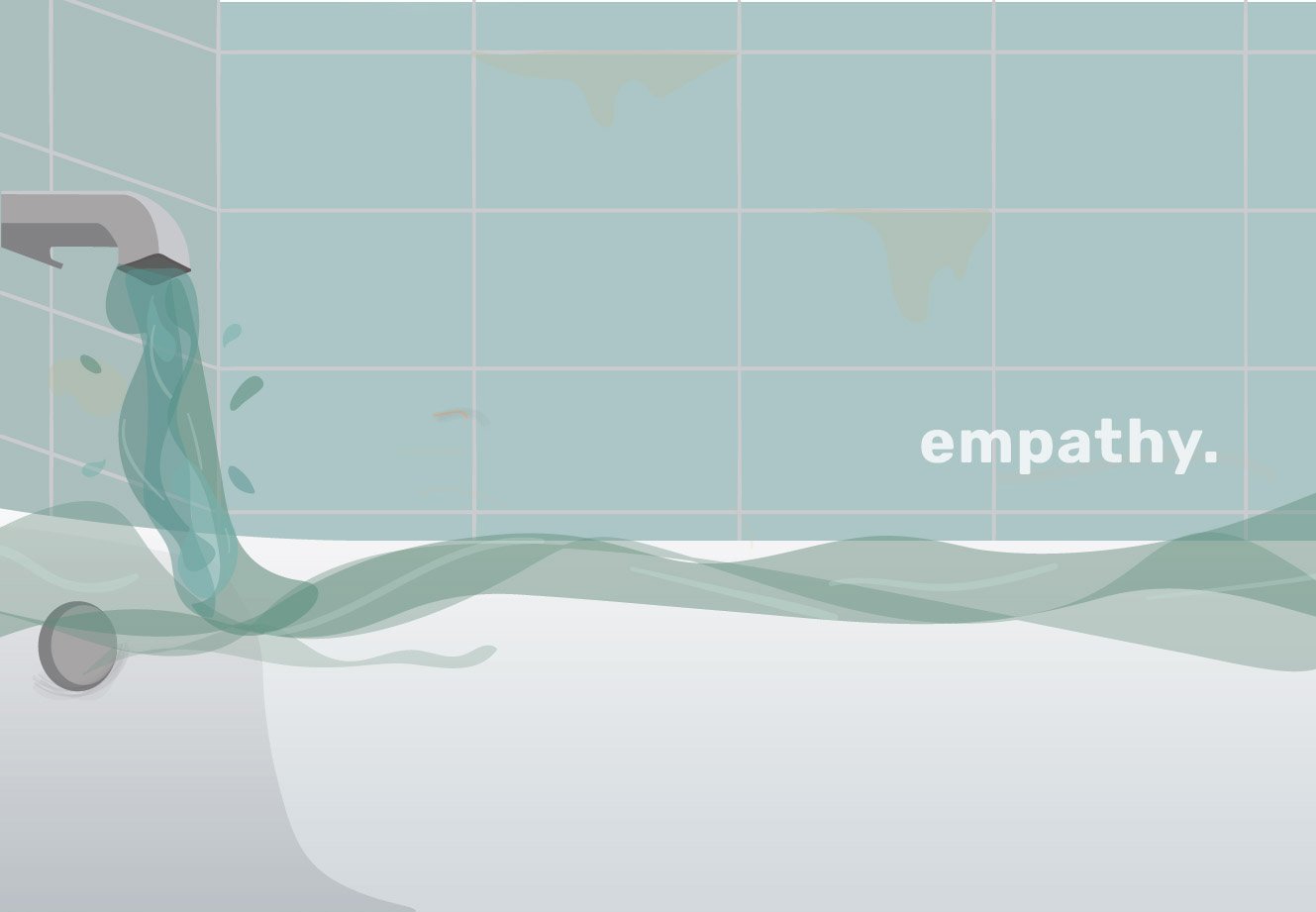
The lack of self-empathy and the inability to stay away from caring for others – represented through a bathroom scene where the water expands to a ocean scene. The human is submerged in the water, her hair entangled with the anchor which represents the heart and in this context empathy. The ocean represents the scary world and how being stuck in the empathy trap can be dangerous. This is represented through the angular fish, using its light to make the empathy alluring and attractive. The girl reaches her hand out to a lifebuoy which signifies the help he needs.

Varoom Illustration – Research & Process

empathy

Amongst the 2 other themes, Style and Obsession, I decided to choose Empathy as I thought the illustrations I could come up with might be more personal and relatable. I also wanted to push myself to explore this theme beyond its usual connotations. Thus, my choice of theme is, emapthy.

Research

I started my research by just listing out several things that first come to mind when I thought of the word empathy.

Words: Love, others, understanding, care, sensitivity, 
relationships, friendships, emotions, pain, suffering, 
priorities, damage, media, human.

From there I picked out those words that spoke to me more.

human, priorities, others, love, suffering

After which I realised that I thought there was a little problem with empathy at times. I feel that many people around me fail to put themselves first. They are always empathising with others, but they forget to empathise themselves. In other words they lack of self empathy.

inspiration

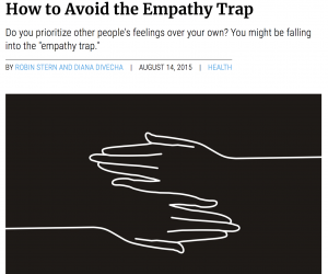
I did further research on articles and found a particular one titled, “How to Avoid the Empathy Trap”

This article spoke to me as I realised that this issue is indeed prevalent in society today. As such, I was excited to start sketching.

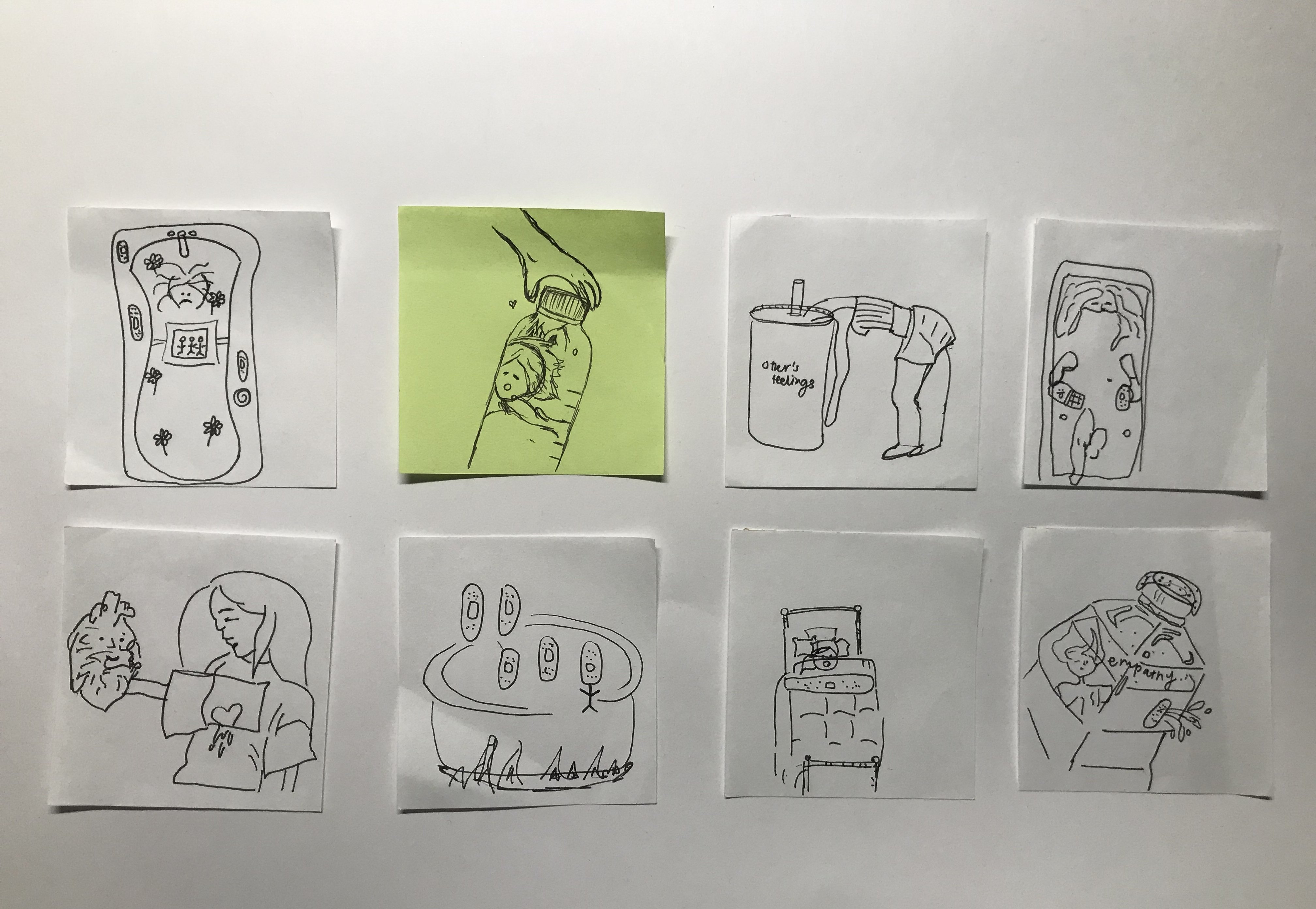
sketches (ideation)
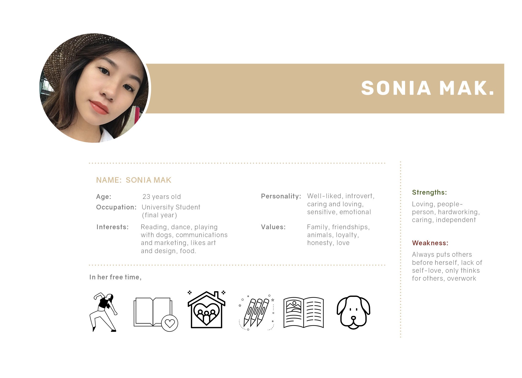
USER PERSONA

I created a persona that my illustration will speak to and is meant for.

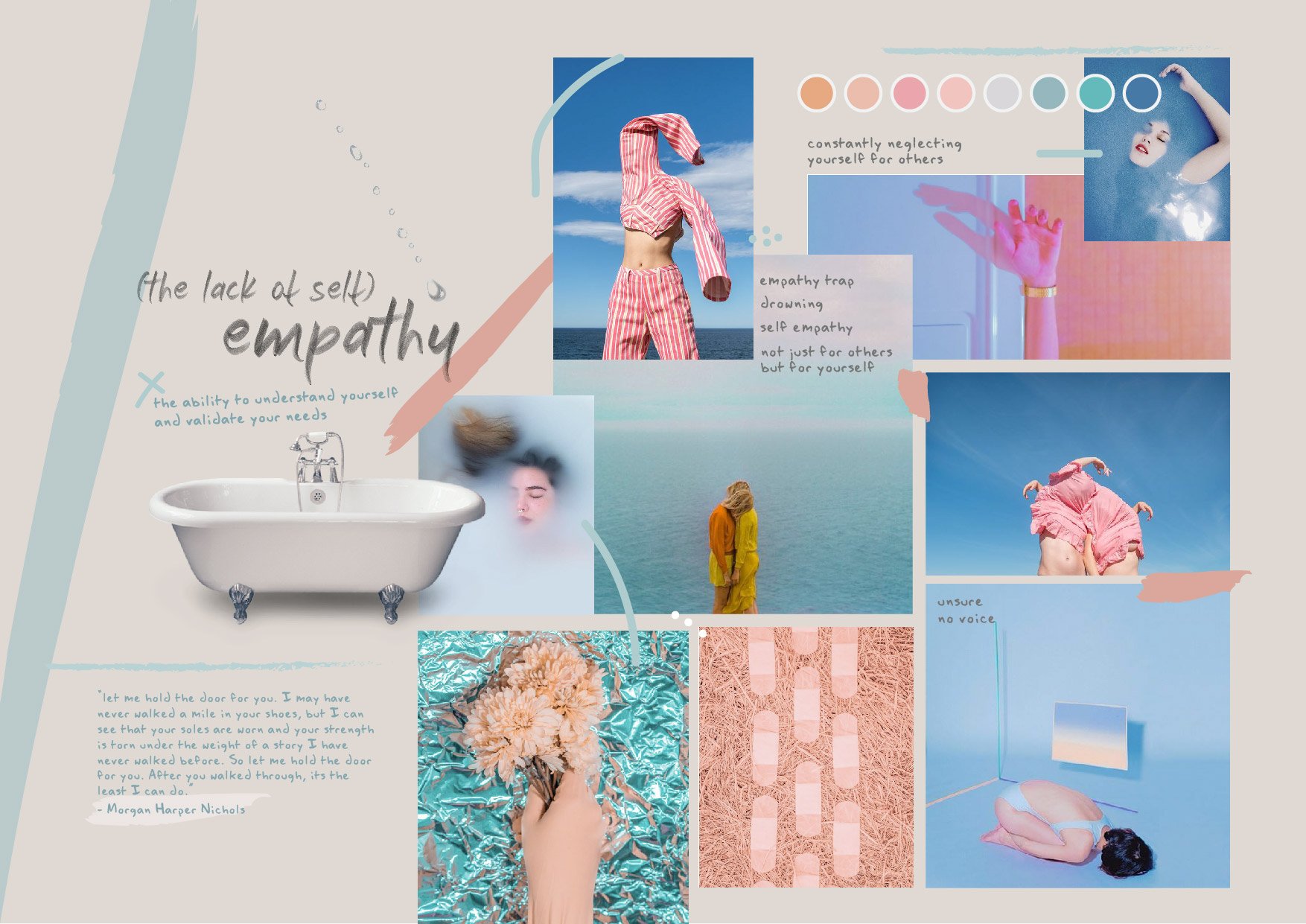
moodboard

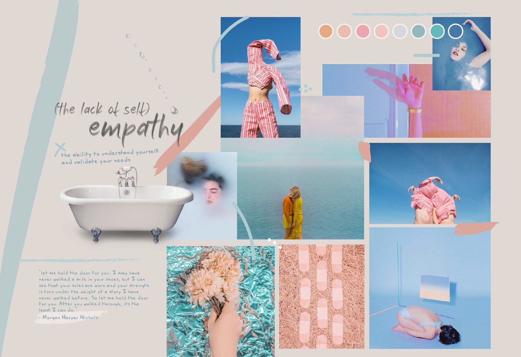
Initial moodboard –

After which, I had to revise the colour scheme slightly to match certain objects in my illustration.

pencil sketches
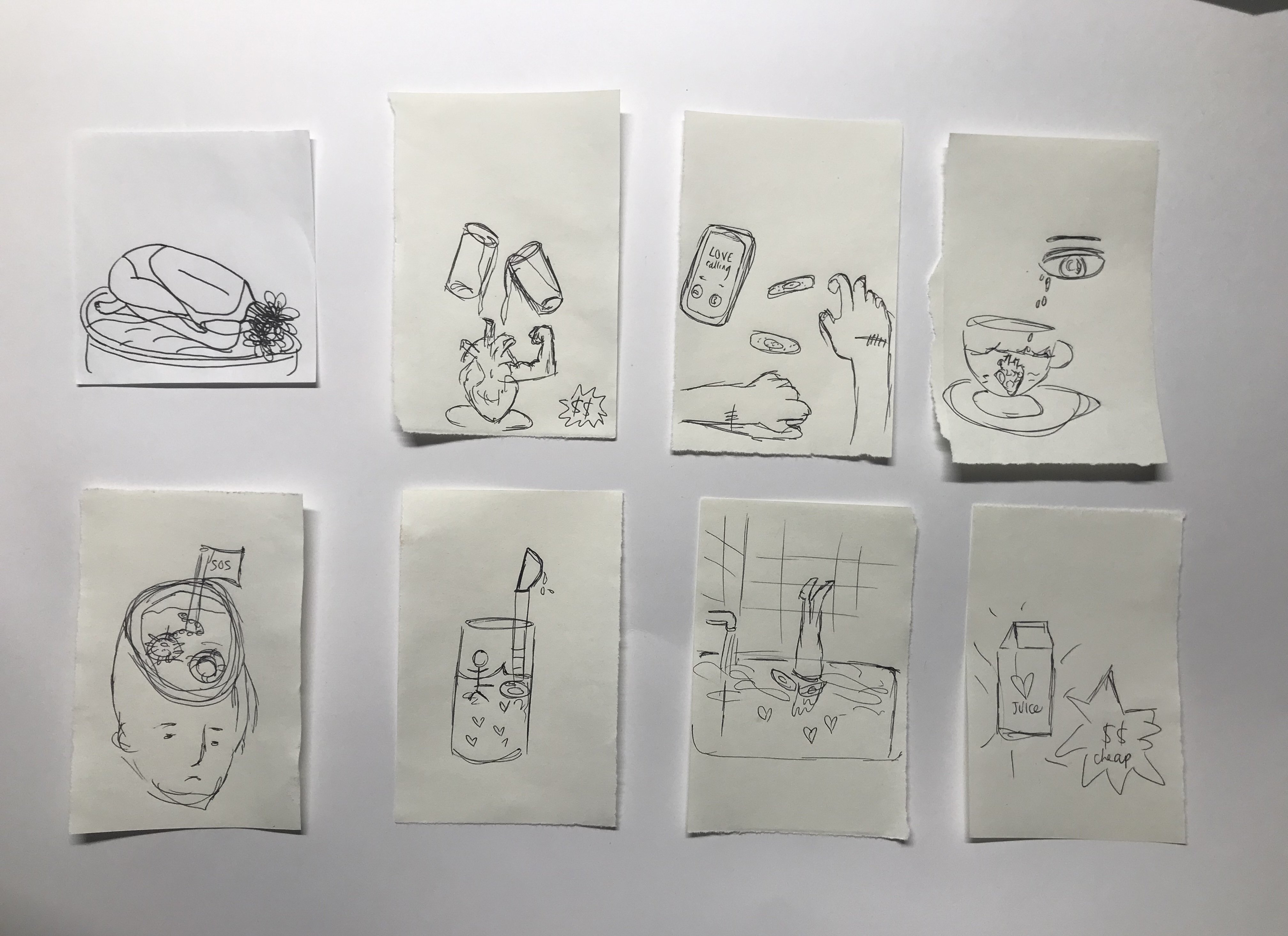
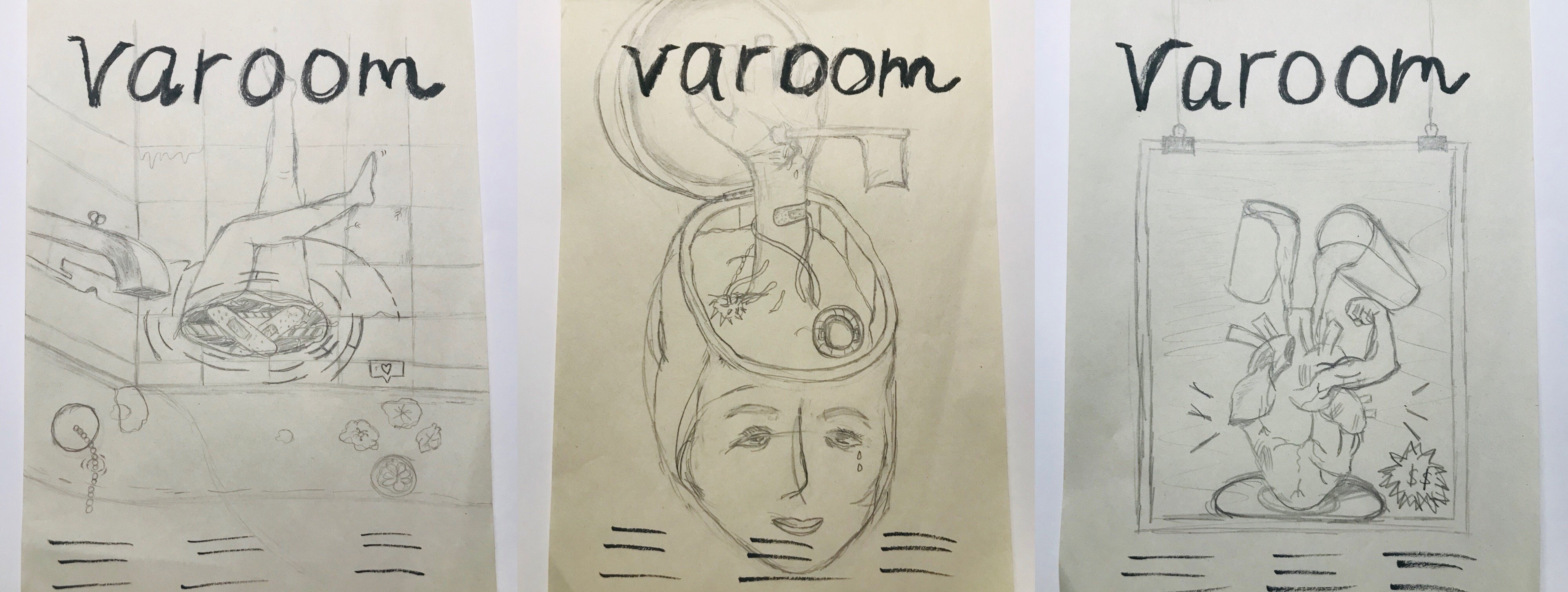
Left: This illustration will address the issue of the lack of self-empathy and the idea of being stuck in it. In a bathroom setting, where people can spend “me time” on reflection, I placed upside down feet as if the person is drowning in the water. The water has bathbomb and pretty things that are actually harmful for humans. This conveys the idea of an empathy trap where people are so quick to put others before themselves. Middle: This illustration also address the lack of self-empathy. The scene is a cut open head. The head is where we think and make decisions, in this case, the head seems to not be functioning as usual as the hand sticking out conveys the need for help and it is also holding a flag to surrender. Right: This is something alittle different and not so much self-empathy but rather how empathy isn’t genuine anymore. It is now fake and people show it just to gain popularity or make friends. Thus portrayed in a form of an advertisement, “empathy for sale”


Revised and finalised sketch

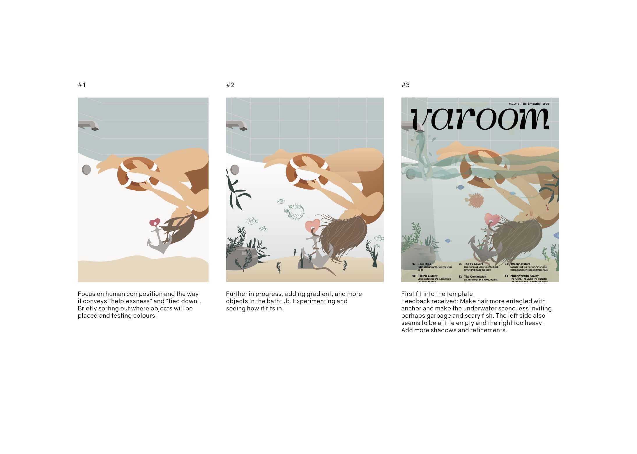
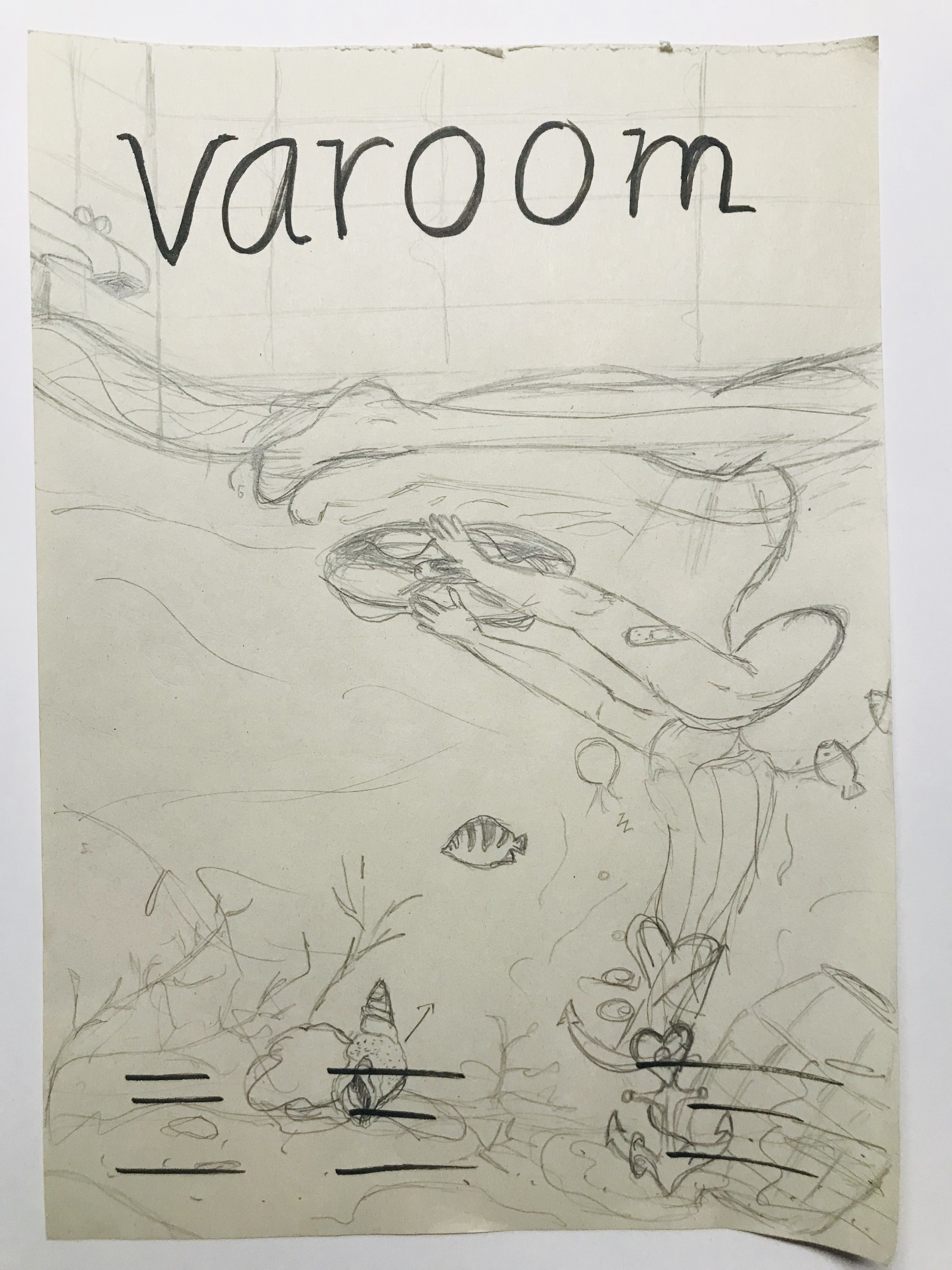
This is a revised version of the first composition seen above. I revised it after gathering feedback from the class. Instead of a human leg sticking out, the human is now submerged in the bathtub. The water in the bathtub expands to a underwater ocean scene, with fishes, etc. The girl’s hair is weighed down or rather entangled with a anchor that represents empathy and the heart. Her hands reaching out to a lifebuoy as she needs help. There is also an angular fish which is dangerous and uses the alluring and trick method, as much as empathy is like. 

Read next post for process towards my final work.

Self-Portrait: Process & Final

I started this project by brainstorming various things that relate to me or how I feel at the current stage of my life. This the word list I created:

I decided to go through with the theme of reflections, as I feel that that best encapsulates myself and my current stage of life. Instead of taking the light-hearted path, I decided to do something more serious because just very frankly I could not think of anything fun and cute besides FOOD, FOOD and more FOOD!

Initial Idea

Here’s the very first sketch I did:

First Sketch

After consulting my classmates, I realised that my concept and idea behind this portrait is a little vague and all over the place. I, myself also felt a little lost in the direction as I just wanted to include so many things.

refining the concept

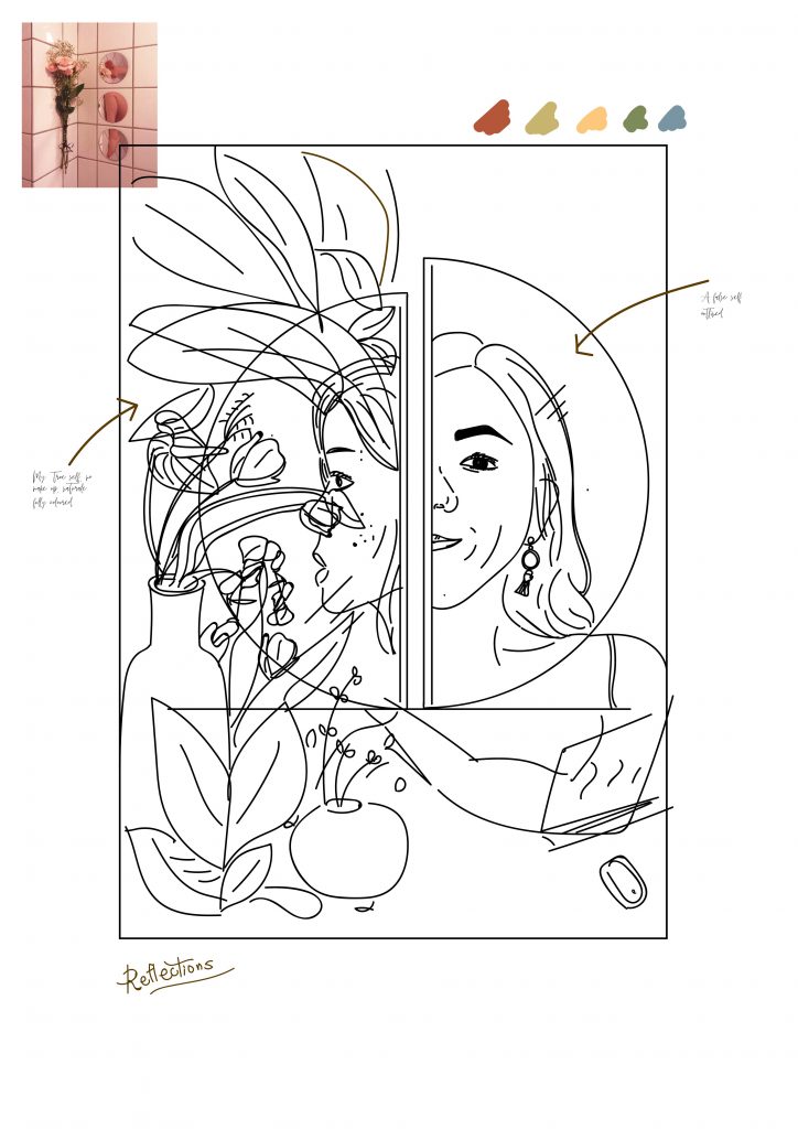
Taking the comments and feedback into consideration, I refined my concept. Instead of showing my made-up self in contrast to my natural (at home) self with the flowers in the background.

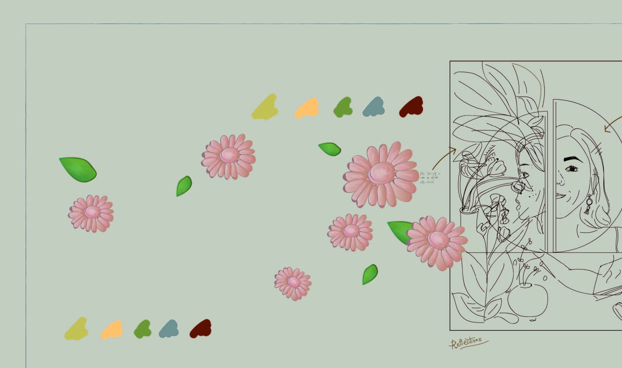
I decided to switch it up and include just one face of mine instead of two different faces and angles. This face will still sort of be split into half through the application of different colours. One side will now represent my trust in skincare products – it’s effect exaggerated through the use of flora and fauna. While the other side will show the downside of using too much of such products or “too little”. The negative side will instead have dead/dried flowers instead of blooming ones and my troubled skin further illustrated with redness and acne spots.

colours

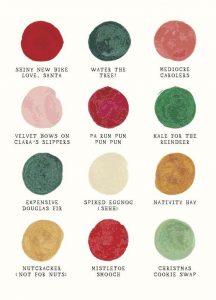
In this illustration, I will be using warm – earth tone colours and it feels more grounded and “realistic” which goes hand in hand with my overall theme of reflections. Furthermore, it is currently my favourite colour palette.

earth tones
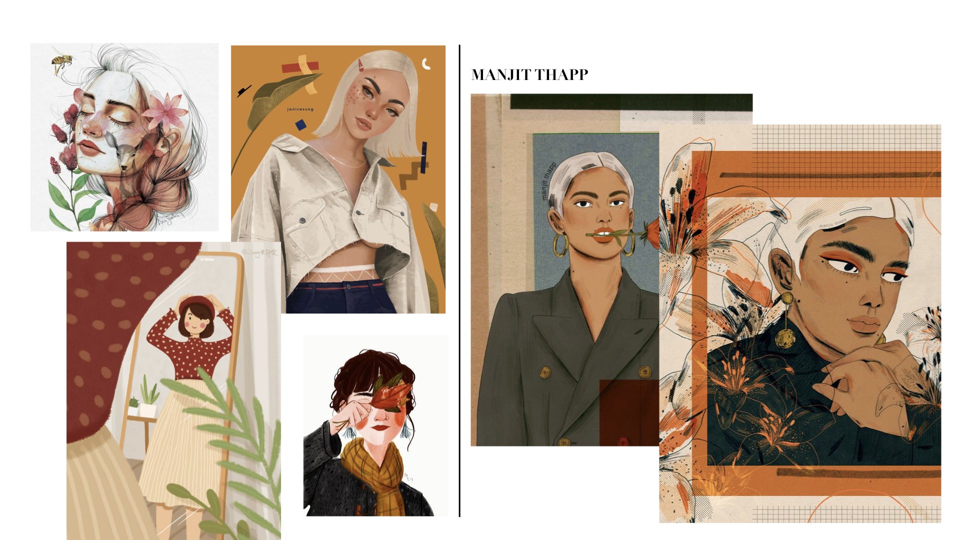
INSPIRATION
A huge part of my inspiration came from Manjit Thapp. I love her portraits – her composition, elements, and technique all falls together so nicely all the time.
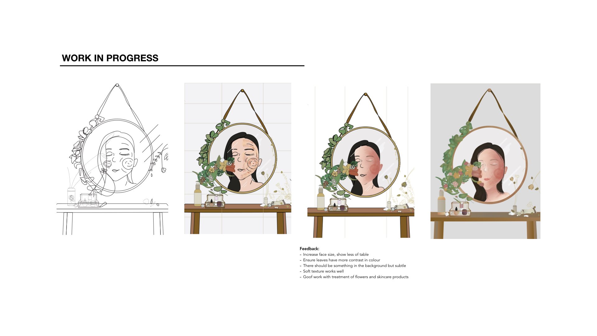
PROGRESS

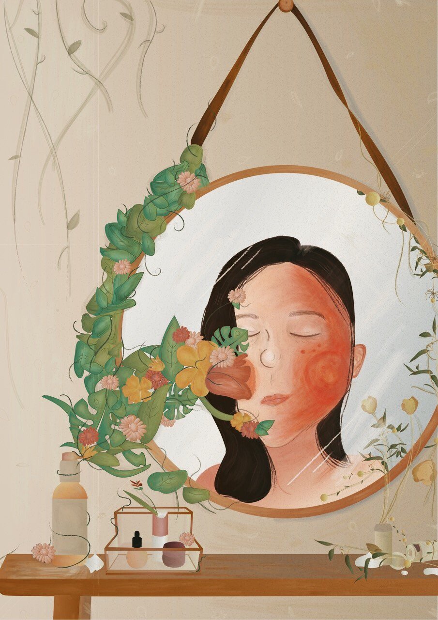
FINAL

This self-portrait reflects how I look at myself not just physically but also emotionally. Sometimes when I wake up in the morning and look at myself in the mirror, I just wish I didn’t see redness, marks or any acne on my face. When I proceed to wash my face, I wish somehow a miracle will happen when I open my eyes again and somehow the face wash and its “essence” would have worked its wonders on my skin.

Thus, I used flowers and leaves to represent this “essence” on one side while the other side has dead and dried flowers together with a “bad” face to show how nothing works or basically there’s two sides to me.

:))))))

Hyperessay | Beyond Pages, 1995, by Masaki Fujihata

Beyond Pages, Interactive Installation Custom-made table with digitizer tablet, table lamp, chair, data projector x 2, PowerMac 7600, speaker
| beyond pages | masaki fujihata |

Introduction

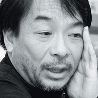
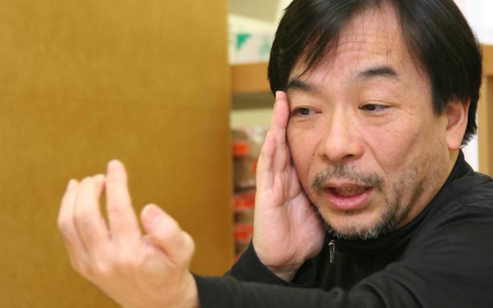
Masaki Fujihata is one of the pioneers of Japanese New Media art. He graduated from the Faculty of Fine Arts from Tokyo University of the arts. As a new media art practitioner, Masaki Fujihata has exhibited in galleries and museums all around the world. His works are very well-received by people.

Masaki Fujihata

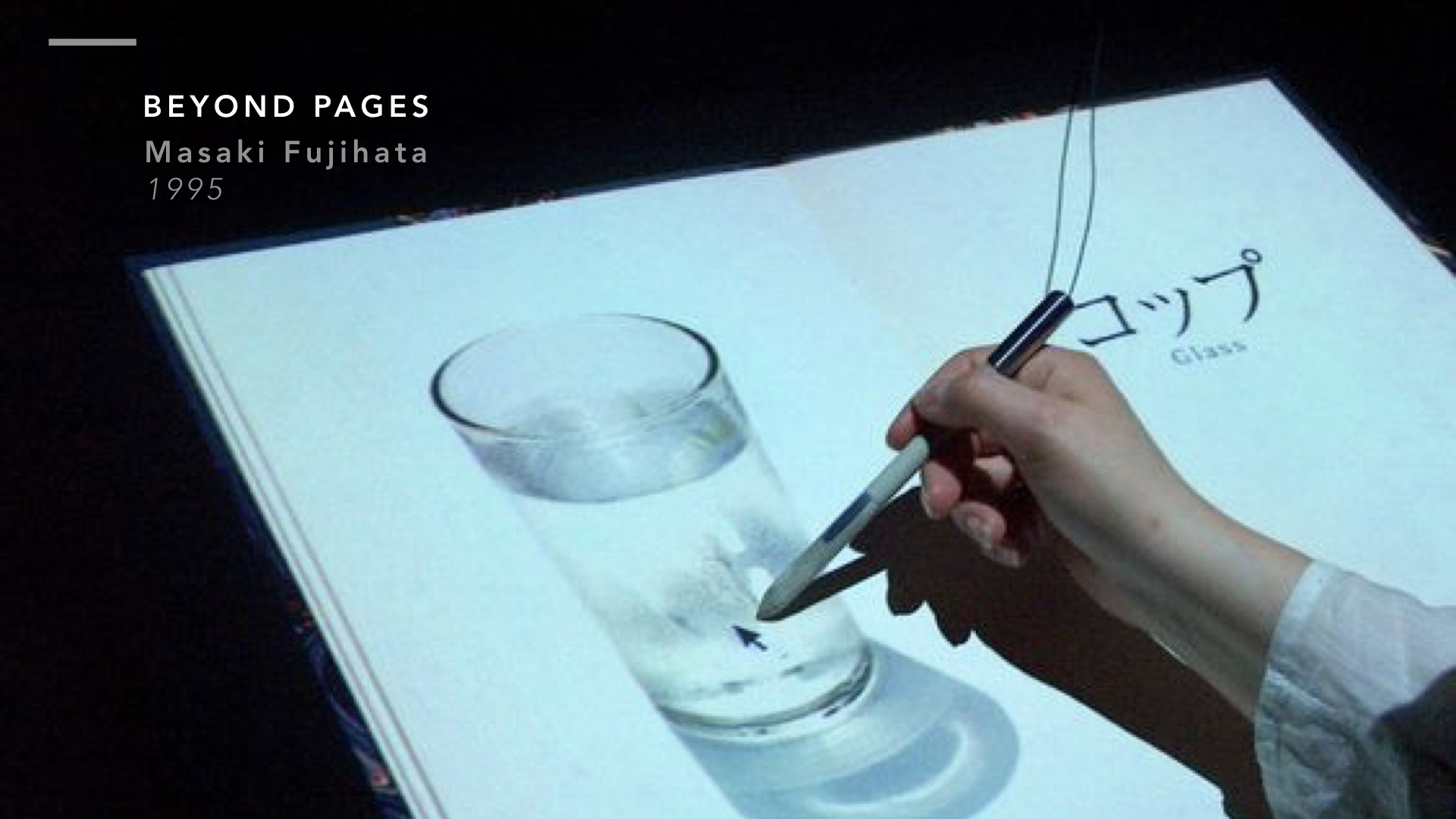
A computer-based installation created in 1995 by Masaki Fujihata, Beyond Pages, is an example of an artwork made to encourage interactivity and a form of audience feedback. Working within the sphere of cognition and imagination, Beyond Pages, turns a seemingly natural everyday scene/situation into an area of exploration and play.

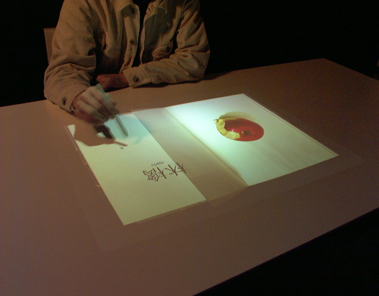
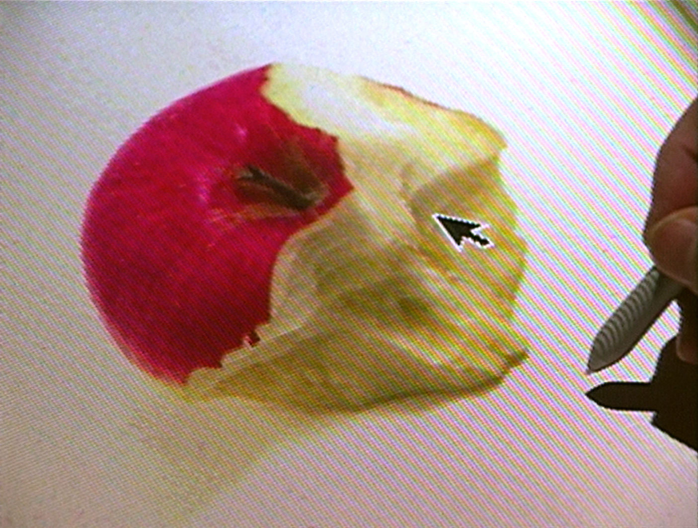
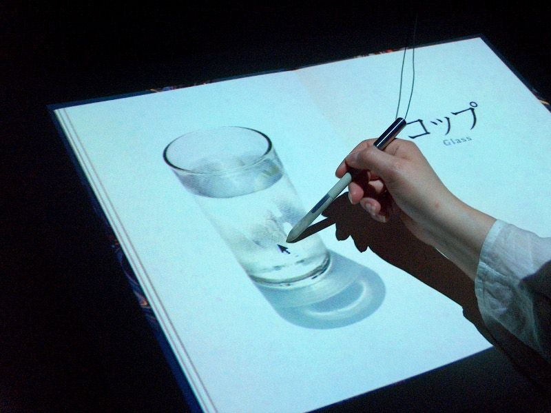
As one enters the scene and sits on the chair, he/she will find a virtual picture book on the table in front of them. This picture book is the essence of the installation, each page showing one item each in images or letters. The items and images come to motion upon any form of interaction. For example, when an apple is touched, the responding action will be the apple getting bitten into, accompanied with respective biting sounds.

Example of apple beaten into – Beyond Pages installation

Beyond Pages aims to spark thoughts about both the true and future function of books where a book is not just an interface for storing and accessing information but also a portal that encourages additional forms of knowledge and creativity.

Interactivity

Its most simple explanation, ‘Interactive Art’ describes art that relies on the participation of spectators. However, with the rise of technology, Interactive Art and the term, “interactivity” is becoming increasing detachable from technology or rather cybernetics itself – “the science of communications and automatic control systems in both machines and living things”

A cybernetic spirit is understanding life at its simplest and most complex levels and having the ability to control it. In Beyond Pages, Masaki Fujihata believes that technology has the potential to shape valuable content through fantasy, concentration and curiosity. Through technology, opportunity for interactive art has increased as there are endless options to explore and allow for participation and communication of spectators.

There are many ways to to interpret Masaki Fujihata’s exact sentiments about the installation. However interactive art then again, gives us the freedom to “create” our own experience and form our own interpretations. Through the fusion of technology and a traditional medium, Masaki Fujihata indeed, wanted to go beyond the pages, beyond the boundaries of a plain, simple medium – a book. Allowing spectators to experience moving images while “reading” a book and corresponding to their actions via a special pen, allows for communication and going beyond what we’re used to. I would like to share a remark from Jeffrey Shaw as he said, “Beyond Pages definitively and convincingly shows us that our information spaces are no longer bound within their traditional wrappers (book, stage, screen, canvas, etc.) – instead they can manifest themselves as ubiquitous presences that move between and link together the totality of things in a new imaginary of being.

Thus, interactivity is not just the reliance of the participation of spectators, it is also what the spectators make out of the installation experience. It may make them ask questions, think, feel something or perhaps feel nothing at all.

Behavioural Art

Unique to every individual, Beyond Pages can create a fair variety of spectator experience depending on their choice of actions and reactions to the content. This links back to a quote from Roy Ascott’s reading, “Nowadays we are moving towards a situation in which the game is never won but remains perpetually in a state of play”

The words, “state of play”, suggest that one has the freedom to “play” however much he/she wants, thus, allowing each experience to be unique and different. In Beyond Pages, objects on the book do not respond until it is being touched or played around with in the right way. If the object does not detect the right motion to trigger the action, the object will remain static.

An example can be seen in this video where the person is unable to trigger the motion until after several attempts,

Some people may choose to make less attempts and not receive the full intended experience of the installation.

Immersion

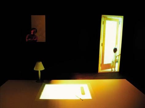
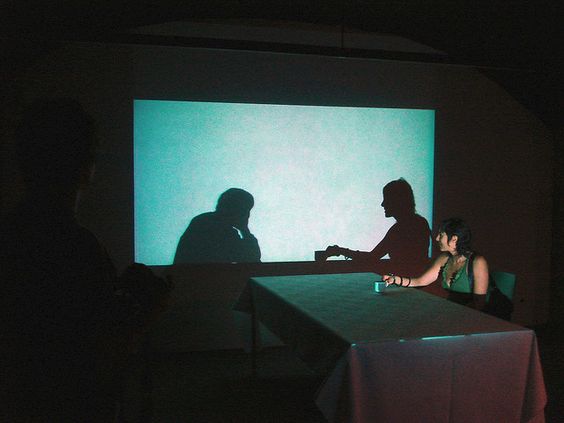
Although Beyond Pages is not an installation involving Virtual Reality, spectators are still sat in a dark room meant to immerse them in a familiar room setting consisting of a table, chair, window, lamp and door. As seen from the video above, a light switch image on the “book” flicks on the light of the real lamp on the table. Such interactions allow people to be even more absorbed into the scene itself.

Dark room scene of Beyond Pages

In order for a person to be fully immersed in a scene, human senses have to be involved. In the case of Beyond Pages, the sense of sight, sound and touch are fulfilled. This suggests that Beyond Pages sets a rather immersive environment for spectators but could be better “improved” with perhaps the sense of smell. Nonetheless, Masaki Fujihata may not have wanted the full immersive experience but perhaps wanted to lightly push spectators into it without completely forgetting about the function of a book.

Conclusion

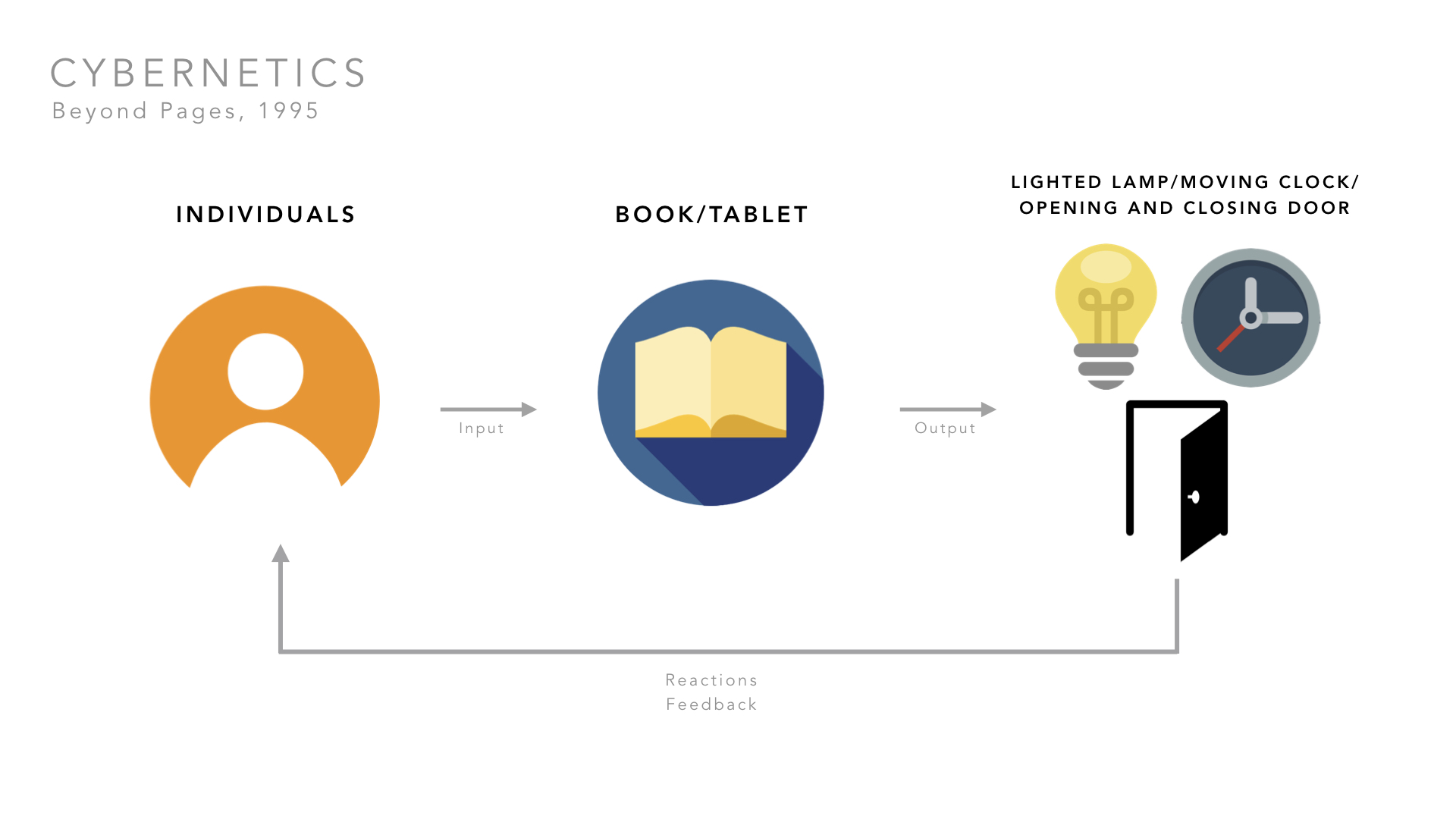
Beyond Pages stretches the imagination and pushes the cognitive sphere of an individual. Besides just allowing for some form of interactivity, the cybernetic vision has followed through as there is a form of input, output and a feedback loop as shown in the diagram above. In addition to a never ending feedback loop, Masaki Fujihata managed to create an immersive environment for the installation, allowing individuals to feel as if they amongst the communication with virtual spaces.

Through the use of such simple and familiar daily objects, Masaki Fujihata has managed to add in an element of controlled entropy – not completely unpredictable in outcome but rather unpredictable in reaction. I wish to experience Beyond Pages for myself if ever possible.

References

https://homemcr.org/app/uploads/old_site/media/Art/Exhibition%20guides/Masaki%20Fujihata%201.pdf

http://pl02.donau-uni.ac.at/jspui/bitstream/10002/615/1/Roy%20Ascott.pdf

https://www.dictionary.com/browse/cybernetics

http://we-make-money-not-art.com/beyong_pages/

http://userwww.sfsu.edu/infoarts/links/actobjects/activatedartists.html

http://artelectronicmedia.com/artwork/beyond-pages

IMAGE references

http://www.laznia.pl/index.php?mod=aktualnosciart&aid=1077&&lang=en

https://www.museum-joanneum.at/en/neue-galerie-graz/exhibitions/exhibitions/events/event/2261/im-buchstabenfeld-2

http://build.isea-archives.org/person/masaki-fujihata/

VIDEO reference


Hyperessay: Artist and Artwork Selection

masaki fujihata

The artist that I have chosen is Masaki Fujihata. He is a Japanese sound, installation and interactive artist. As a professor at the Faculty of Environmental Information at Keio University in Kanagawa, Makasi Fujihata is one of the pioneers of Japanese new media art. As such, he was an early practitioner of the application of new technologies to the process of art-making.

He is most recognised for his interactive network installations such as Removable Reality (1992), Impressing Velocity (1994) and Beyond Pages (1995).

Masaki Fujihata’s primary concern: “to employ multimedia technology in order to examine the possibilities for communication within virtual spaces”

Chosen Artwork: Beyond Pages, Interactive Environment, 1995


Beyond Pages is an computer-based interactive installation created in 1995 by Masaki Fujihata. In this interactive piece, one enters a seemingly natural situation of a table and chair. He or she sits down and finds a virtual picture book on the table. The pages shows one item each in images and letters. Upon touching an item, for example an apple, someone bites into it, accompanied with sounds of apple biting. Or another example, when a lamp is touched, the actual table lamp will turn on.

Through Beyond Pages, Masaki believes that technology has the potential to shape valuable content through fantasy, concentration, curiosity, and reminds us of the true function of books. A sphere of cognition and imagination is played with in Beyond Pages.

Watch video of Beyond Pages!

References:

http://we-make-money-not-art.com/beyong_pages/

http://userwww.sfsu.edu/infoarts/links/actobjects/activatedartists.html

http://www.medienkunstnetz.de/artist/fujihata/biography/

Gallery – Graphic Form

image making through type

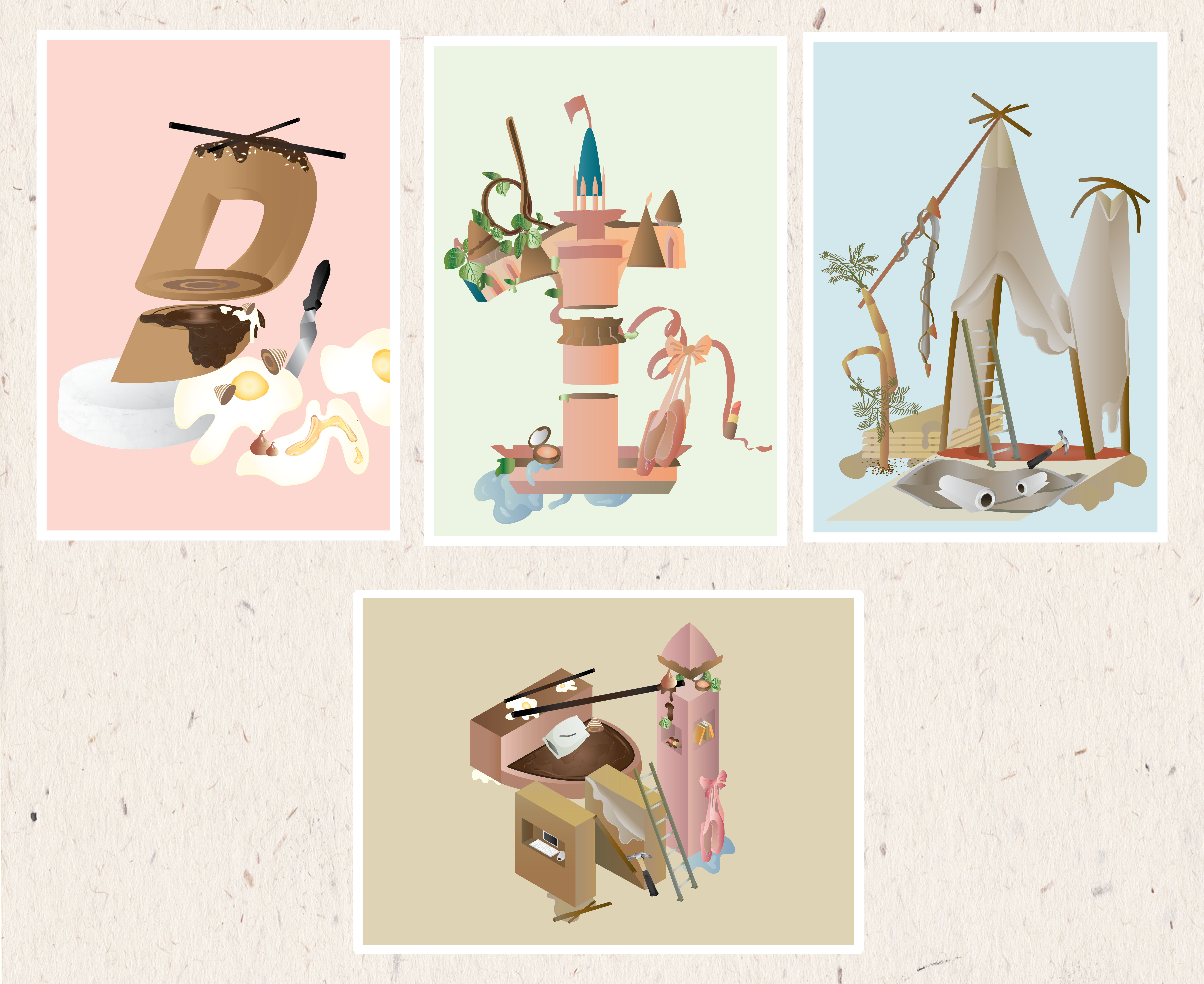
A series of four compositions incorporating my nickname, “Din” into scenes of four different occupations. These occupations reflect my personal attitudes towards the journey of growing up and getting a first job to growing older and settling down with something I enjoy. It is a play on letter forms, each composition except the last one, highlighting a certain alphabet. If you look carefully, you’ll spot others as well. 

Read more about this project here: 
Research
Process & Final
locale

A project focused on discovering a location’s unique quality. Wessex Estate is one of Singapore’s existing colonial estates. Its currently a housing estate as well as an arts enclave. Serene and warm, this estate has a creative community that is still growing despite its rich history. 

Find out more about Wessex Estate here: 
Research
Visual Presentation
Zine Process & Final

See my other works here.

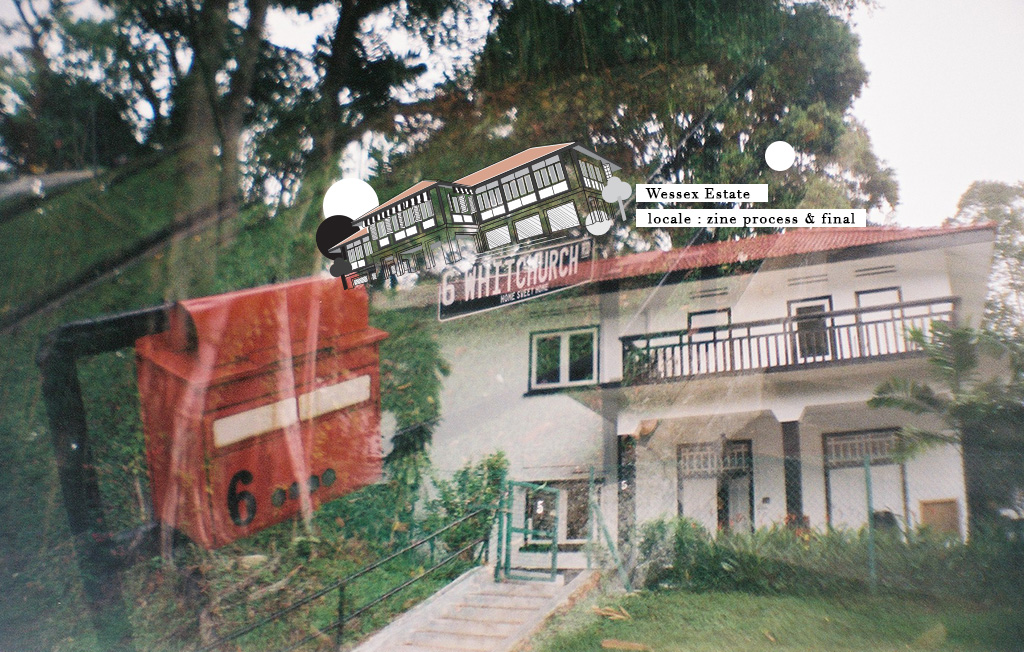
Locale: Zine Process & Final

The second part of this project is to create a zine.

After my visual presentation, I received positive feedback about my site’s unique feature :

The only colonial estate in Singapore that has an art community living amongst a residential and not for commercial purposes.

THOUGHT PROCESS
Initially, I had difficulties coming up with a concept that will have enough content to spread across an eight-page zine. I was worried that my concept will be too simple, too predictable or nothing special.

concept
Based on my experience at Wessex estate and what I’ve gathered about the community, I really think that the community is special because of elements such as the B&W colonial buildings, the friendly people, the growing art community and the serenity of the entire estate.


flow of zine
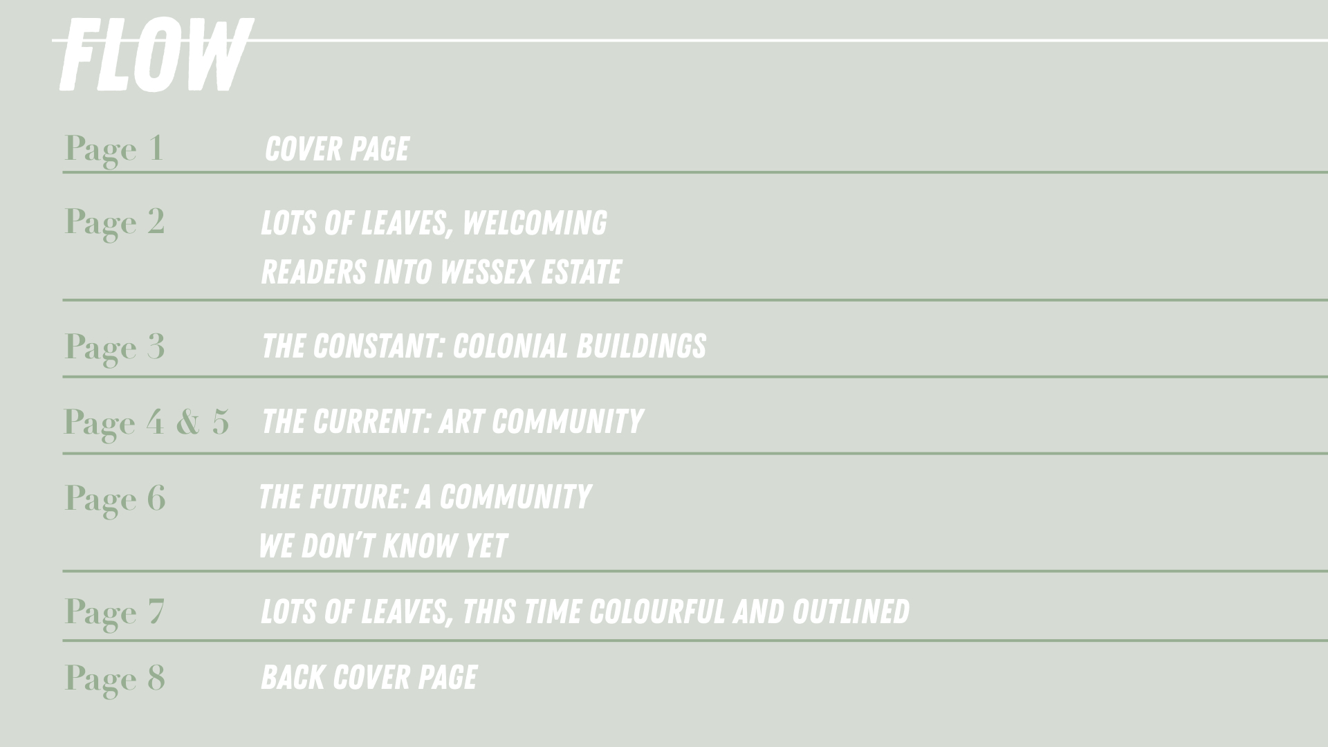
The zine sort of takes readers into the estate and view the different elements that make the community in Wessex and then takes them out of it but now taking away a little something knowing that it is a estate that is still growing.

mark-making

In addition to my concept explained above, I also wanted to include mark-making or items from the wessex into my zine. Mark-making will sort of allow a co-creation between the the physical site, the humans at the estate and myself. This further highlights the creative community of Wessex.

For my mark-making, I was thought that using leaves will be a good way to represent the estate as some interviewees said that the trees and the greenery is what makes the estate special to them (and they can also be found easily hahaha).

According to the flow of the zine state above, my zine is almost split into 3 sections. Thus, I will be treating the leaves that I have picked from the floor at Wessex Estate in 3 different ways – each way to reflect the same meaning as the page it is on.
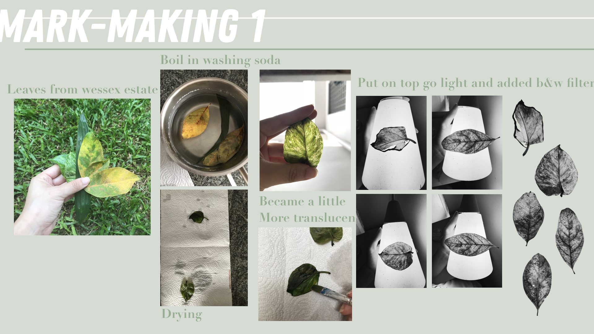
I wanted this mark-making to reflect the the constant and thus, what I initially wanted was the get the skeleton of the leaves. However, that didn’t work out despite soaking the leaves in washing soda for more than 2 hours. But it did still make the leaves more translucent. So to get a more x-ray effect on these leaves, I placed them on a lamp so that light will can be seen through it.

Afterwards, I added a B&W filter to make it go more in line with the colour of the colonial buildings.
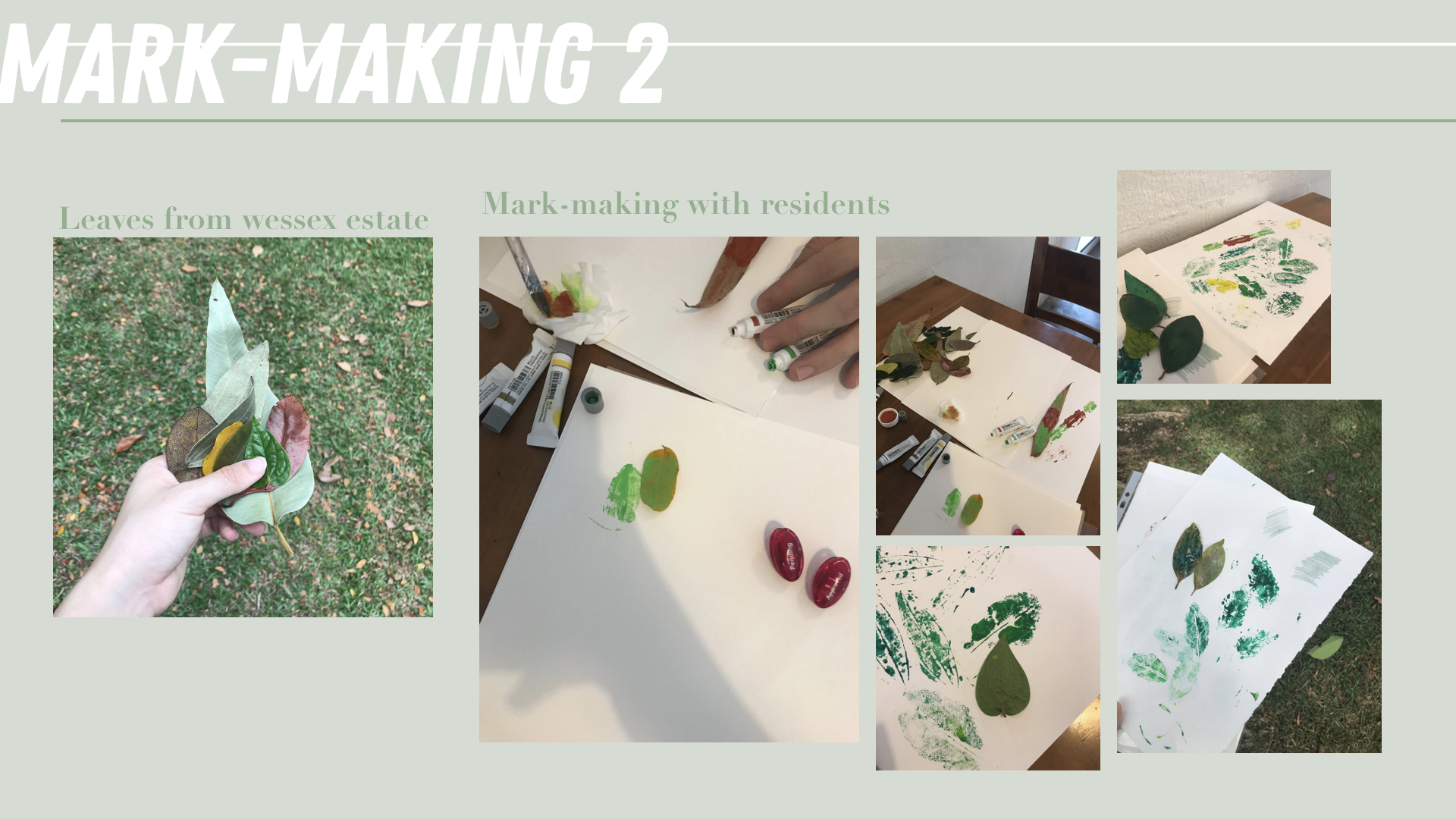
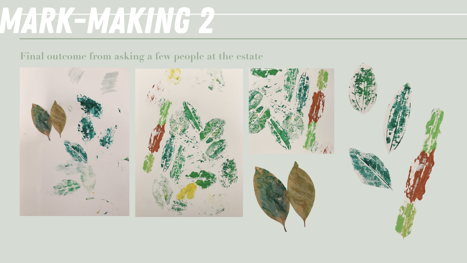
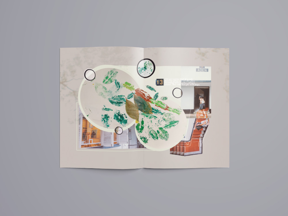
The second mark-making is supposed to reflect the art and creative community of Wessex. I picked fallen leaves from around the estate and walked around and approached people to help me imprint the leaves wherever they like on a piece of A3 size paper. Some things I asked them to think about when imprinting are the community, the environment in wessex and how it makes them feel.

This was honestly such a tough task as I was afraid of being rejected by people. This definitely pushed me out of my comfort zone as I did get rejected a few times and I’m definitely not the most extroverted person. However, I’m glad I plucked up my courage and did this because it also helped me realise how those that helped me also had a thing for arts and they were more than happy to help me with this. Some even commented that they like doing arts and crafts at home too! This just shows how this estate is really growing into a creative community 🙂
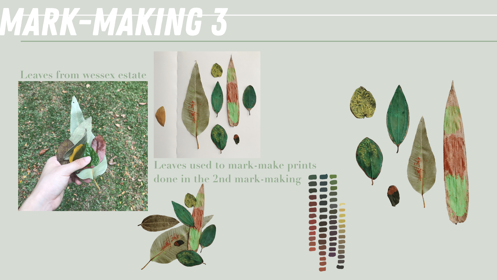
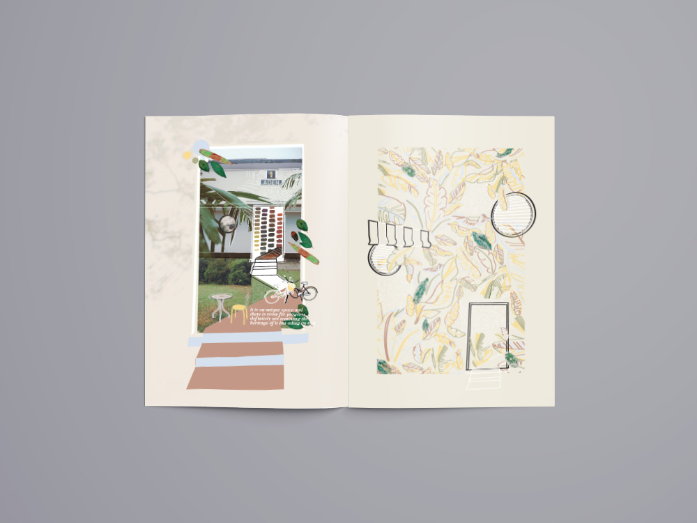
For the third mark-making, I gathered the leaves used to imprint and took photos of them so that I can crop them out digitally. These painted leaves also became an art piece on their own. I also picked up the some painted colour that I found in one of the artist studio that I visited. I hoped for these leaves to reflect the future of the estate and how vibrant the estate is with its growing arts enclave within a residential area. There is so much room for this estate to grow despite the long history it already has.

process

I started with the inside spreads before designing the covers. These pages went through many rounds of shifting and amendments before finally reaching the final outcome.
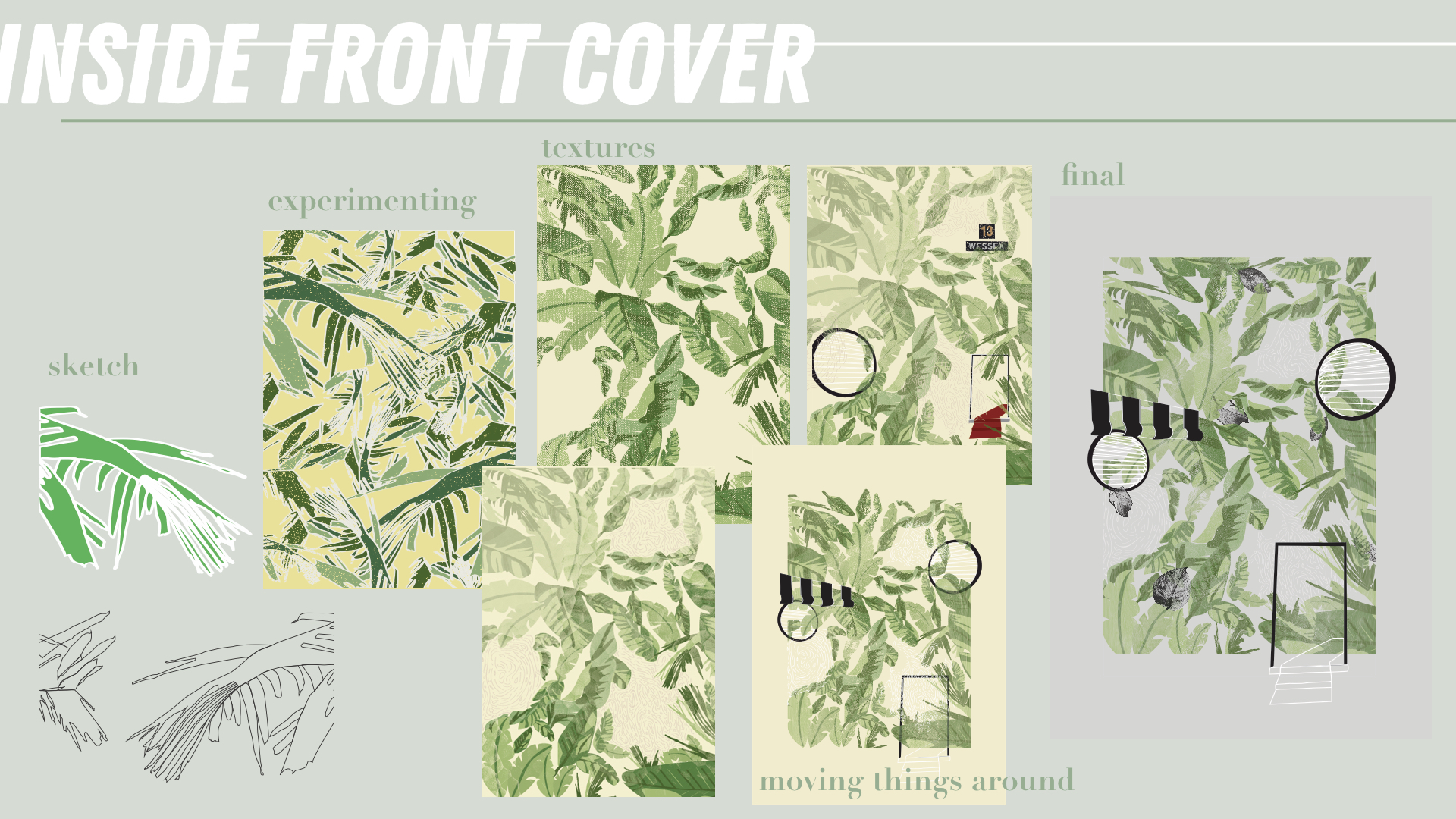
*Incorporated mark-making 1.

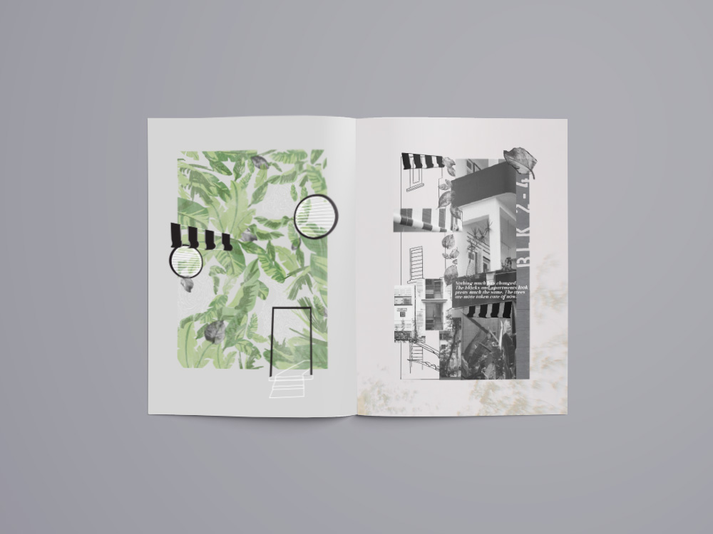
I wanted the inside front cover to sort of illustrate how I felt when I travel to Wessex. A long road is covered in abundance of leaves and you suddenly realise there are much tall buildings around you unlike other parts of SG. After a few bus stops, a few colonial buildings start to appear, their iconic B&W really catching your eyes and attention. For me the 3 most iconic elements of the colonial buildings at Wessex are the B&W blinds, the round windows and the doors of the apartment blocks. I figured that I will use this three elements as motifs to represent the three main points in my zine.

Thus, I placed them amongst the leaves in this page showing how the trail of leaves reveal the colonial houses at Wessex estate.
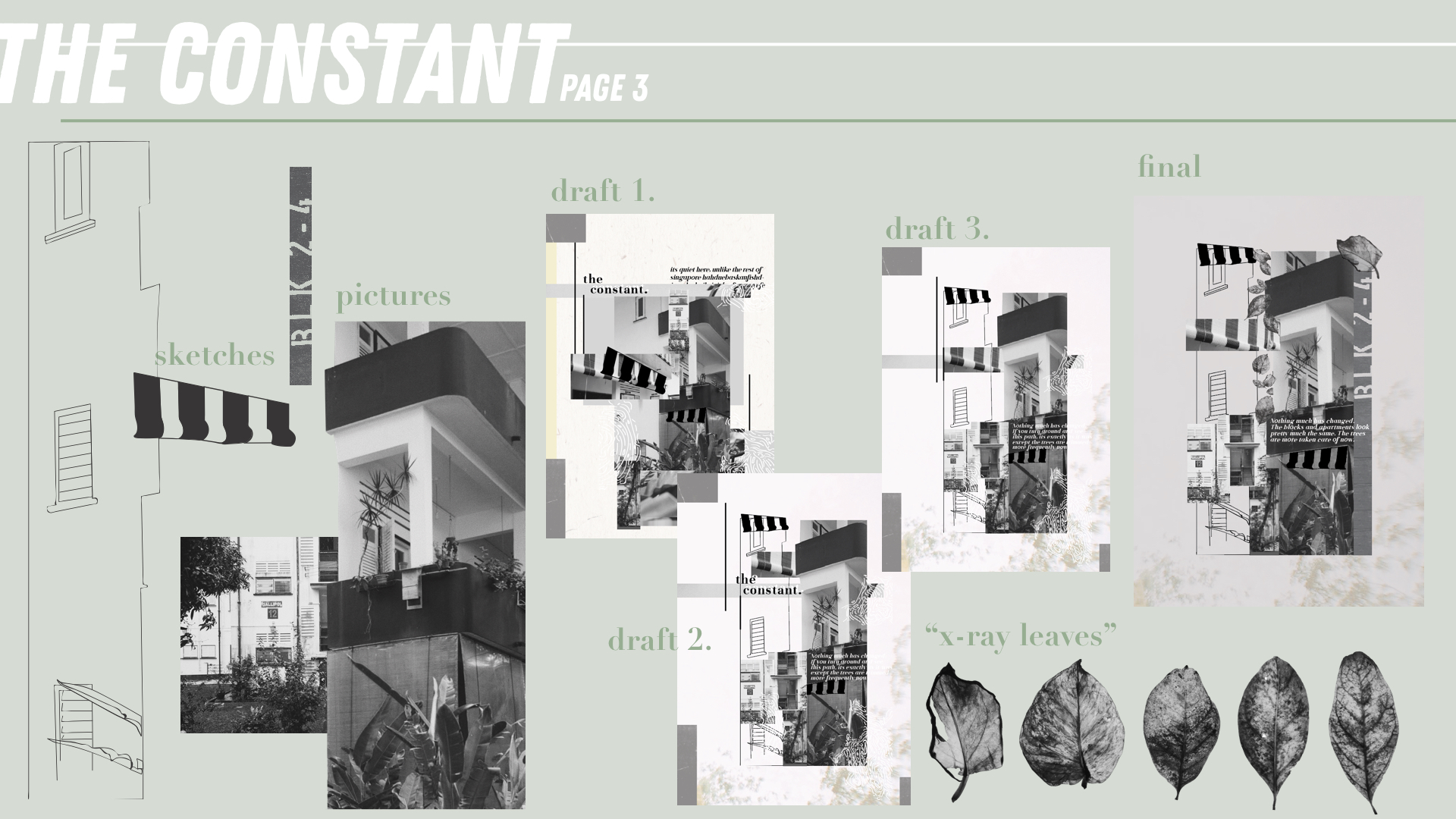
*Incorporated mark-making 1.

For the page next to the inside front cover, I decided to share about “the constant” here. “The Constant” (represented by the blinds) of Wessex is really the buildings as they haven’t changed. This is probably one of the reasons why this place has a charm and its because it has houses that most other parts of Singapore doesn’t. This is an element that contributes to its unique feature. For the pages in my zine, I’ve decided to go with a mixed collage and line drawing with the pictures taken by me. In this page I’ve also included the “x-ray” leaves to convey the roots of this estate.

Every section also has an extract from the interviews I had with some people at the estate and this one reads,Nothing much has changed. The blocks and apartments look pretty much the same. The trees are more taken care of now.”
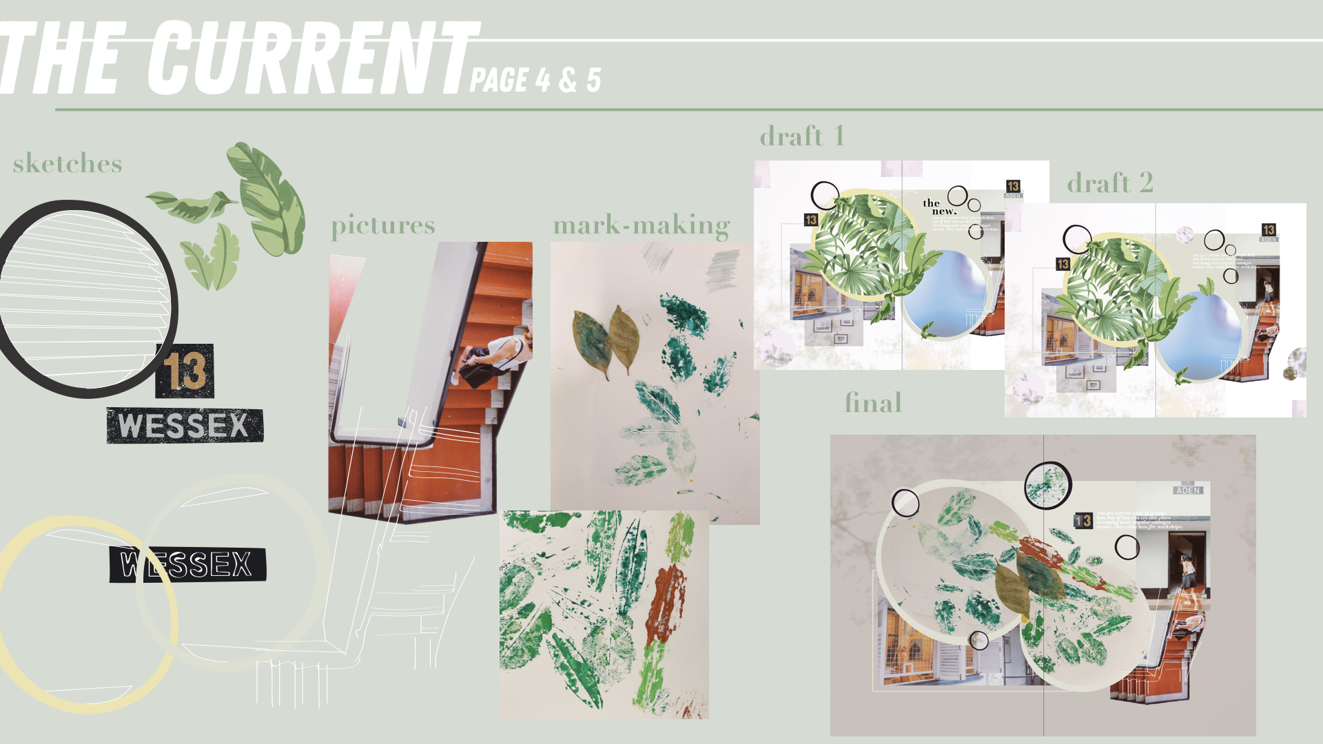
*Incorporated mark-making 2.

“The Current” (represented by the round windows) conveys the arts enclave that Wessex currently has. There are a few art studios amongst the houses in the Estate and the idea of some artists leaving within their own space is really special and interesting. These artists live simply and conduct workshops from time to time right at their houses. The imprinted mar-making leaves are put into two circles that are actually in the shape of the round windows. The staircase at the side is unique to me as even though the buildings are B&W, there is suddenly this painted red walkway that sort of brings out that artsy side of the whole building.

The extract here reads, You get various kind of people here but of late you see this place becoming more popular amongst artists. They come here for workshops.”
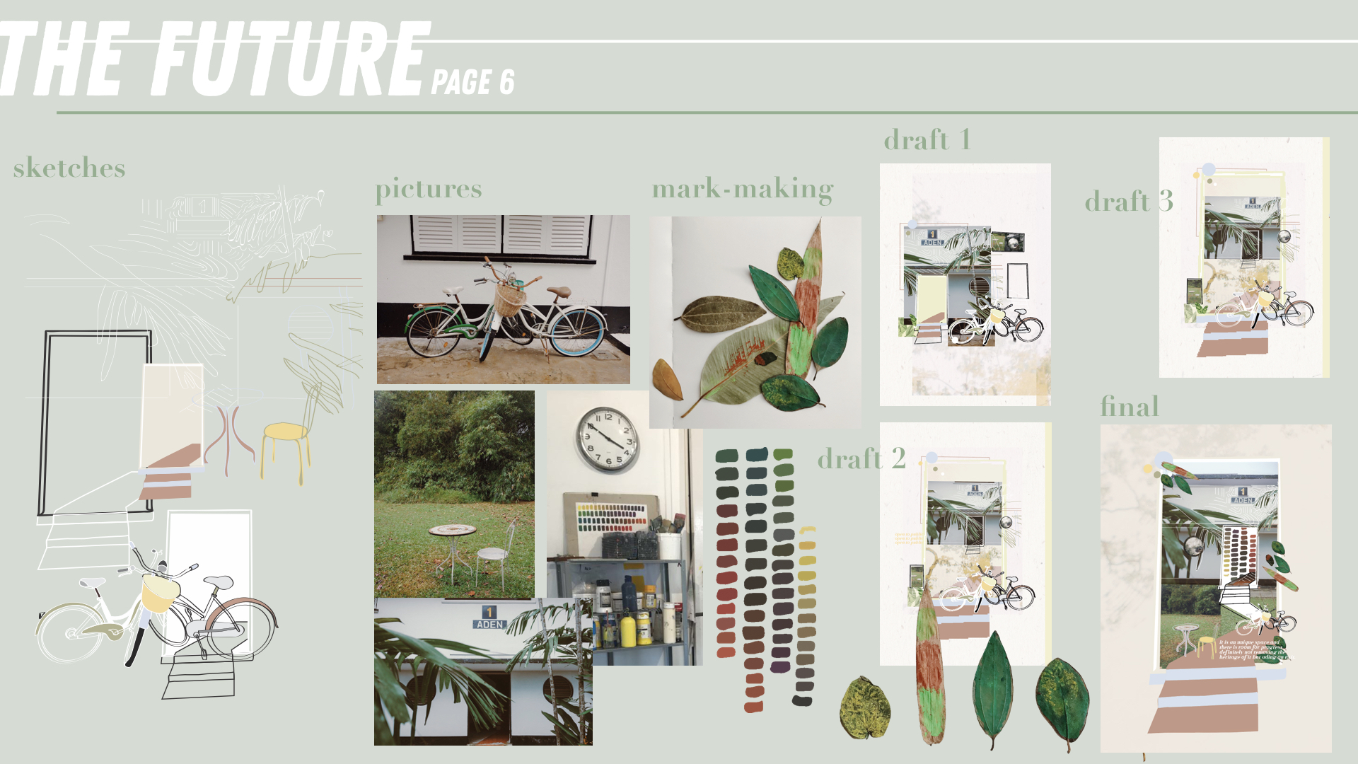
*Incorporated mark-making 3.

“The Future” (represented by the doors) conveys the future of Wessex and what community it will grow and blossom into. With the arts enclave and creative community even amongst residents, this place has so much potential to grow despite its already rich history. The painted leaves are placed in this page as they represent the fruit of the mark-making made in the last page. This page is a little more colourful than the others as I wanted to bring out the colour in this estate. That despite it being mostly B&W, its community is colourful and its definitely still growing. Some kine drawings of the bikes and the table and chairs are some things that I found interesting while walking around the estate.

The extract here reads,It is an unique space and there is room for progress definitely not removing the heritage of it but adding on to it.”
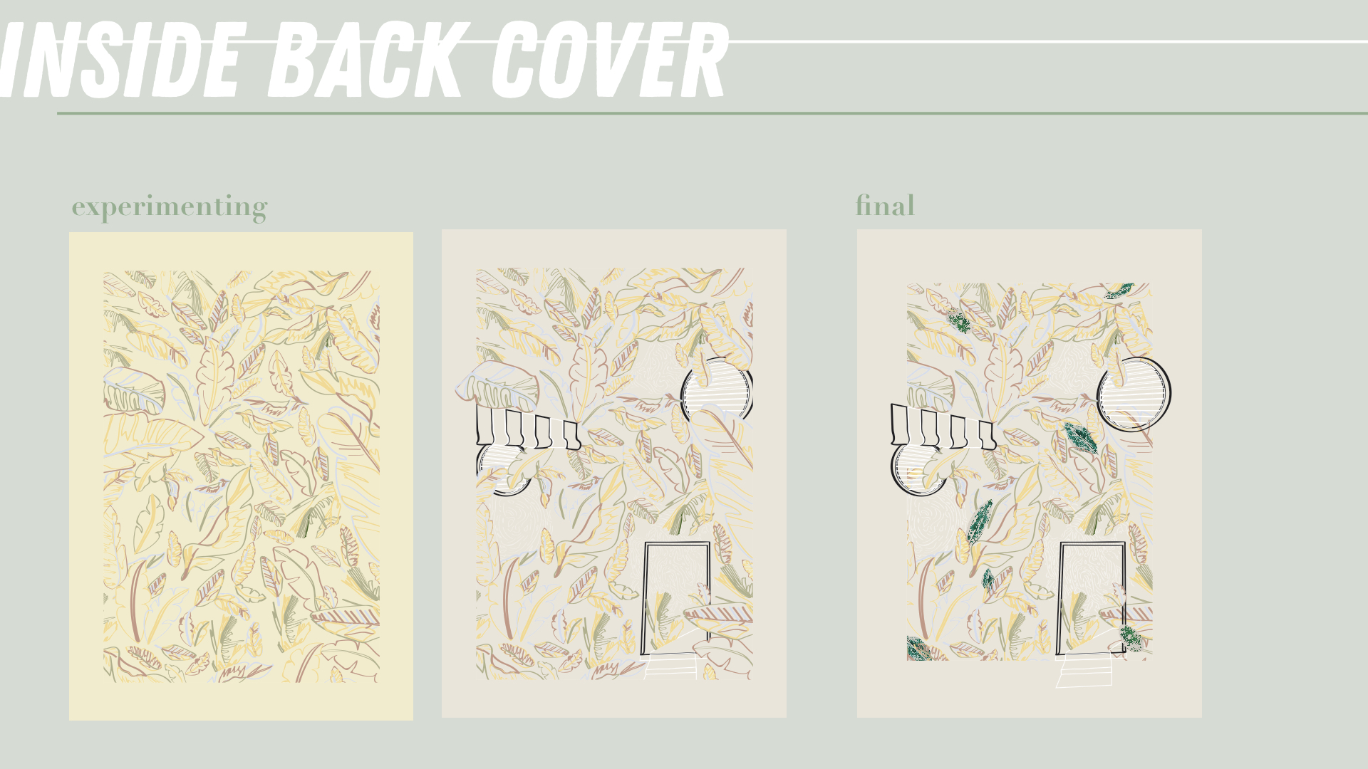
 

*Incorporated mark-making 3.

The inside back cover is actually the same as the inside front cover except that it is now filled with outlined leaves and the leaves are now colourful. This is to portray how this place is still growing and not filled up yet. The community is colourful and always opens its doors to the public to visit.
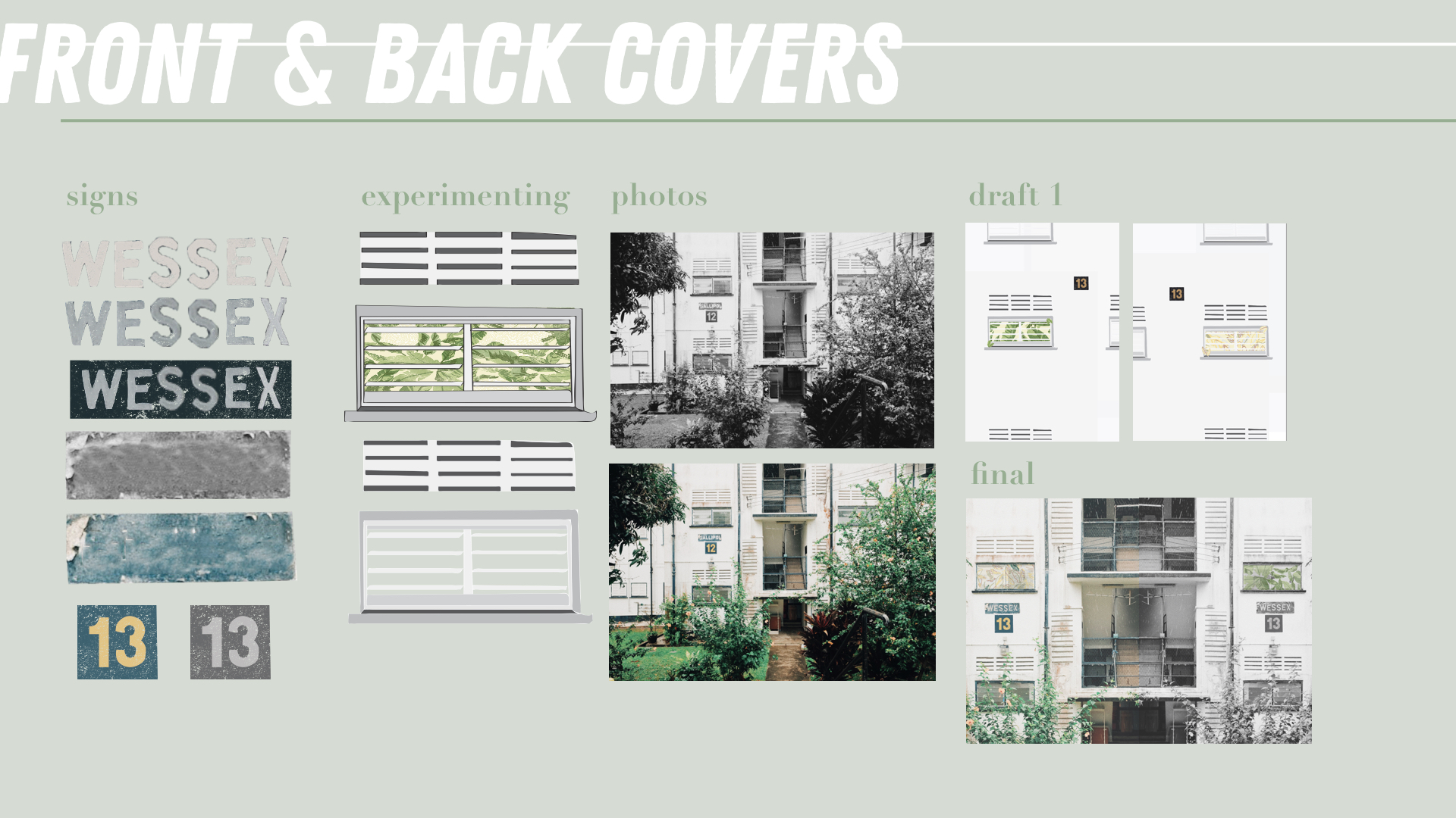
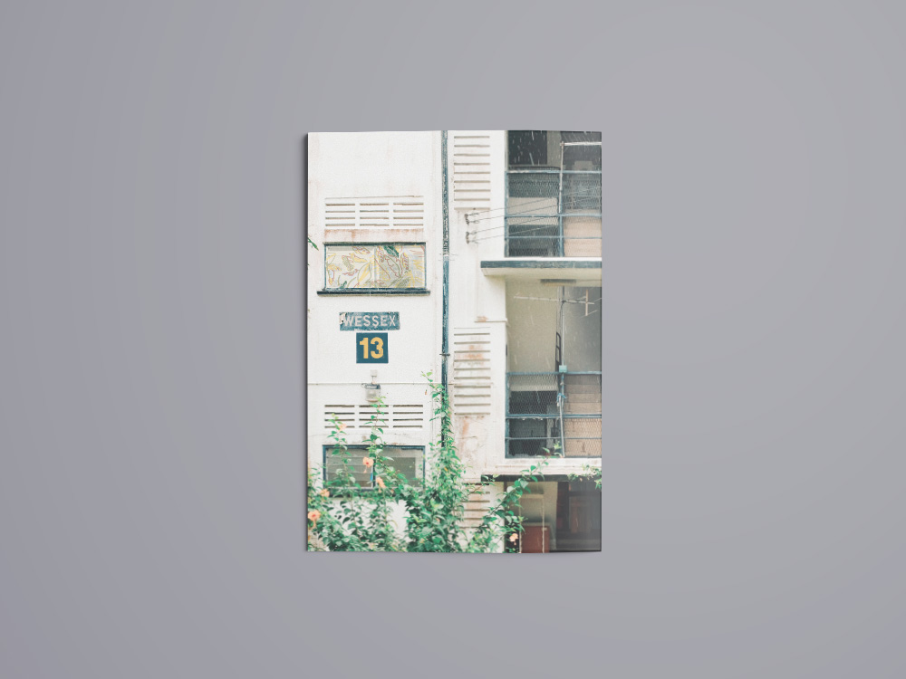
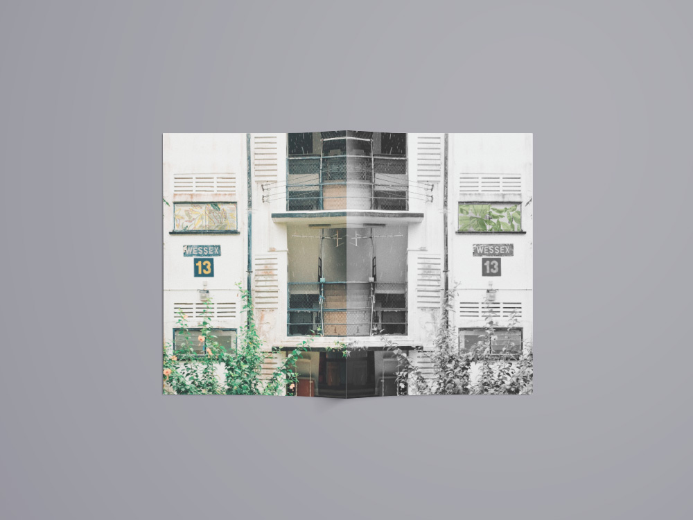
The covers are a zoomed in picture I took of the apartment buildings in Wessex. The number 13 is replicated from the block numbers on every apartment building and I chose the number 13 because in that area all the postal codes start with 13. Usually the sign “WESSEX” will be the name of the block. However, there was no block called wessex and thus, I took the various letters from the different blocks and put them together to form “WESSEX”. The window in the picture is replaced with a snippet of either the IFC or IBC which is what readers will see when they flip to the next page.

The front cover is B&W because the zine still hasn’t shared about the art community. However, the back cover because coloured because now readers know that the community of Wessex is colourful and alive!

When you open the booklet, the covers align up to each other showcasing a full apartment building at Wessex Estate!

final

rEFLECTION

I really enjoyed this project even though it really pushed me out of my comfort zone especially when I had to interview people and ask them to use leaves and paint to create marks. It has opened my eyes to an estate in SG that I didn’t know about until I had to work on this project. I struggled with the concept of the zine at the beginning and the arrangement of my marks, pictures and words. I was afraid that everything won’t be abstract enough.
Thankfully, my zine was well-received in the end and it all came together. I’ve gotten to meet new people along the way and made friends with the workers at the cafe in Wessex Estate! I hope that my friends and classmates have also learnt more about this estate in Singapore and will check the place out on their own 🙂

Thanks for reading!

Read my research and view my visual presentation as well!