For this project, we were tasked to pick an area/estate in Singapore and uncover an unique characteristic or feature about it.
After much research and thought, I settled on Wessex Estate along Portsdown Road!Prior to choosing Wessex Estate, I also considered other locations such as Balestier and Whampoa as they had unique characteristics. However after much field research, I decided to go with Wessex Estate due to where its located, the people I met there and the serenity of the whole estate itself – unlike many other estates in Singapore.
RESEARCH
SECONDARY through online, websites, books
PRIMARY through field research, interviews
From both Secondary and Primary research I have gathered qualitative and quantitative data about Wessex Estate.
comparison
Since there are plenty of other colonial estates in Singapore, What makes Wessex estate so different from the rest?
Out of the many colonial estates, I picked out a few of the most known and popular ones amongst Singaporeans and did a comparison between them.
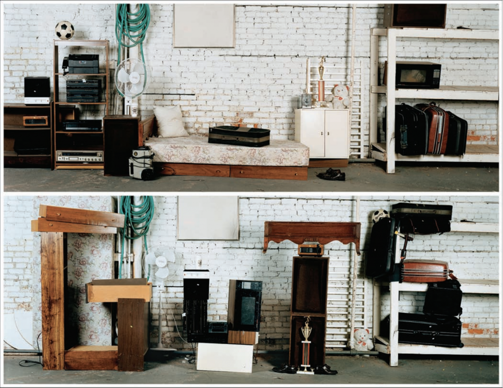
| Wessex is the only colonial estate in Singapore that has an art community within a residential, and is not focused on profits for their work |
fIRST VISIT
second visit
Decided to take some pictures with my film camera 🙂
THIRD VISIT
Wessex Carnival –
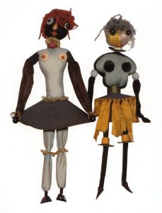
art community in wessex
As mentioned, there are art studios in Wessex Estate that open their doors to public annually or twice a year for “Artwalk@Wessex“.
This gives the public an opportunity to see the artist’s beautiful work and understand a little more about the culture and life in Wessex. This also gives the artists a great opportunity to showcase their hard work. And this walk is completely FOC!! It truly is a place that promotes creativity and the arts in Singapore without much thought of profit in mind.
I managed to visit two art studios during my trips to the estate.
reflections
I’ve really learnt and opened my eyes so much just from walking around this estate, talking to people and taking pictures of little things that I find interesting. I really enjoy my trips down to the estate even though I can only take one bus “191” in and it has bus intervals of 15mins. Nonetheless, I’m grateful for the existence of an estate like this in Singapore because I know that if I ever need a breather from the hustle and bustle, I can take a little breather and chill at Wessex. This has made it a lot more easier for me to work on the two parts of this project.
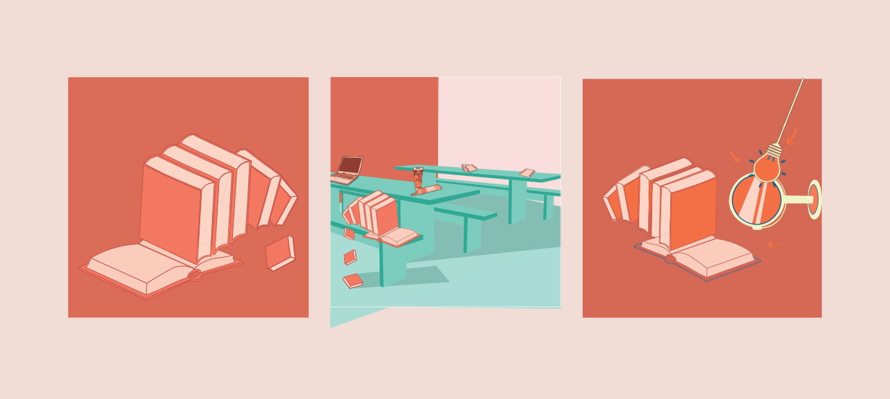
For part 1 of this project, we were required to give a visual presentation that brings out the unique feature of this site and what makes it different from other estates in Singapore. We had to include Secondary and Primary research as well as sort our data into Qualitative and Quantitative data.
For my Visual Presentation, I wanted to create something more interactive but did not want to limit myself to the normal presentation slides. Thus, I decided to explore interactive PDF done in indesign and so even if you are a Mac or Windows user, one can still view the animations or interactivity of the presentation without the PPT or Keynote application.
Midterm Project: Get into groups of not more than 4 to
create anything related to softwares we have learnt
- Processing, Arduino, Adafruit -
or anything related to experimental interaction.
My group mates and I brainstormed and eventually decided to use the Circuit Playground express to create an interactive agar piano using capacitive touch. From there, we built on the idea and wanted to our final product to produce something with visuals.
With that thought in mind, we decided to expand our initial idea into:
An interactive agar piano causing a visual to appear when a key on our “piano” is pressed.
inspiration
Use fruit to play soundsVisual produced with each sound made
division of work
Since our project consists of different components – Circuit Playground, Making of Agar and buying of fruits to experiment with, Processing – we decided to split our work into these categories as well. At the same time, we still all did research on ways to improve our project.
Processing — Claire
Ada Fruit — Dominique
Agar Agar fruit experimentation with Circuit Express— Jamie & Dinis
This way we could all work on our individual parts at our own time and put everything together at our group meetings.
Process
Our first group meeting was mainly to test out if capacitive touch really works with the fruits. Jamie and I prepared boxes of Agar and Jello to see the difference and brought whole pieces of fruits to test out as well.
Prepared a variety of materials to experiment for capacitive touchCircuit express programming
Unfortunately, our agars and jello did not work, instead we only managed to get the capacitive touch to work with the vegetable our fruit slice.
This method of poking crocodile clips into fruits worked and allowed us to play sounds by just touching the fruits. As a result, we decided to go back and try again as it should work with the Agar and at the same time, Claire could still work out the visuals through Processing.
Difficulties
During our consult on recess week, our group’s main problem was to link Adafruit to Processing so that one key on the “piano” is pressed, it will create a reaction in Processing, then forming a visual on screen because of the key pressed. However, there were several port issues and the adafruit code would not link. We first tried the method of connecting adafruit to arduino first as it may be easier to connect it bit by bit this way. BUT! It also didn’t work! Dominique and I realised that the computer port may not be recognised and tried to troubleshoot it through the control panel on her windows laptop.
Finally!!! We managed to fix it and the port connection was still successful so we eventually managed to transfer the code over. From there we worked out the connection to processing as well.
Claire was also struggling with the visuals as she wasn’t sure how to make the visuals come out and how to make it sync with the sound/key pressed. Thankfully she managed to clear her doubts and eventually coded boids that looked amazing 🙂 We all owe it to her for the coding on Processing.
Jamie suggested to use real piano audio notes instead of the adafruit sound, so that we can make it louder and also it is clearer that we are trying to mimic a original Piano.
On the day of the presentation itself, we realised that we were not able to carry out capacitive touch as processing reads pure touch and not different pressures. Because of that, we weren’t able to clip the crocodile clips as the boids will appear non stop because of the constant pressure and crash the code.
FINAL
I was in charge of creating the looks of the agar agar piano and testing out with the circuit express if the capacitive touch works with it, and it did! 🙂
Final Agar Piano Keys LookFinal Set UpFinal Boids Look: More swimming colourful triangles will appear everytime you touch the adafruit. They can swim in different patterns such as disperse, avoid and gather. They can also grow or shrink in size with different keys pressed.
Reflection
Overall, this project was enjoyable even though we met a lot of difficulties. I do think that it has taught us a lot and we have managed to find out more about these various softwares. Creating the Agar was fun but I hope to be able to do more coding for my future projects.
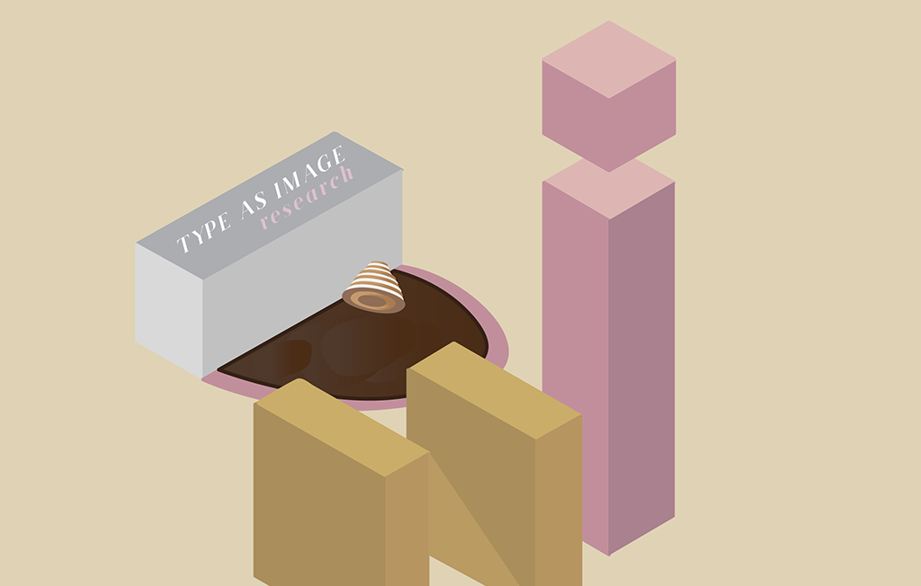
I started this project with a little difficulty as I had no idea what direction I should take. After looking through some of previous semester’s students’ work, I realised that this project was tricky as it was not solely typography, but rather creating type as an image.
I started the ball rolling by reading up and doing research
on typography as well as searching for examples and
inspiration online - from Instagram and Pinterest.
RESEARCH
John Foster – Dirty Fingernails
“We can all choose the same font for a project, but we could never draw identical typography”
Keeping a Diary by Sagmeister Inc.
Instalment series are called, ” Things I Have Learned In My Life So Far”
Sagmeister adapted what had been a still photography exercise into a short movie
Having Guts Always Works Out For Me by Sagmeister Inc.
“This time we built the typography in wildly different ways and locations”
Showed the before and after effect in photos
Explored various mediums and were experimental
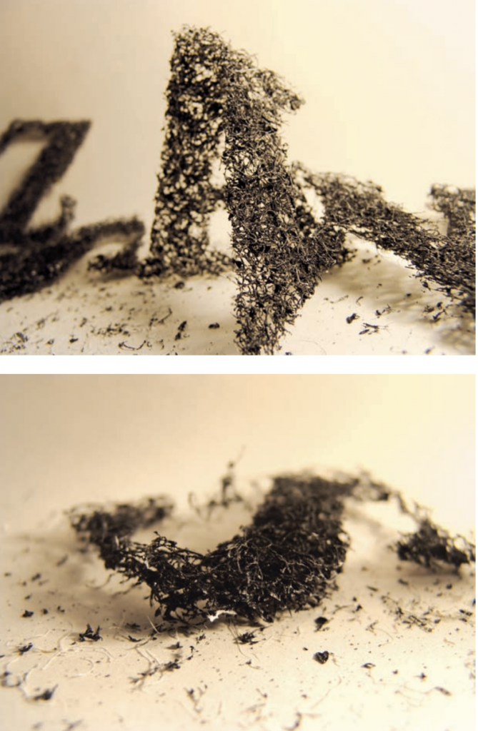
Temporary Type by Oded Ezer
Used industrial conditional air fillers
Looks as if they were made out of ashes or dust
“I’m testing the intersection between typography and art” – they have the same meaning but not a medium for direct communication
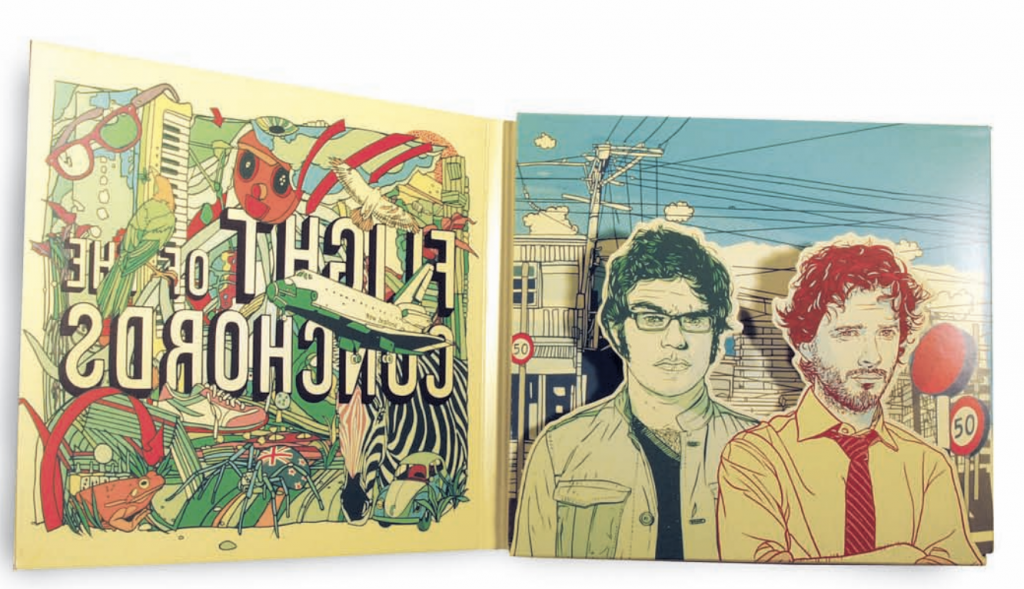
Flight of the Conchords by Subpop Records
Pop Art 1970s style
Hand drawn illustrations
A surreal landscape of shapes and colours
Ina Saltz – Typography Essentials (design principles when working with typography)
– some points that I felt were interesting and have not never really thought about before –
1) Using Letter as Form
each letter is a shape unto itself
series as an illustration
can be expressive when used alone
2) Emphasis using weight
when you stay within the same type family and vary the weight of the family member
it can create contrast and more emphasis on certain alphabets
can signal shift in hierarchy
Wired
3)High Contrast in Reverse
reversing or “dropping out” may be a good effect but it must be done with care and at small sizes
those that have at least a moderate stroke weight, with little or medium contrast between thicks and thins – work best with reversed-out type
4)Deconstructed Type
can be used as an ornament, as navigation on devices and as pattern
inspiration
I mostly draw my inspiration from Instagram accounts and Pinterest. Here are some accounts and artists that I’ve come across.
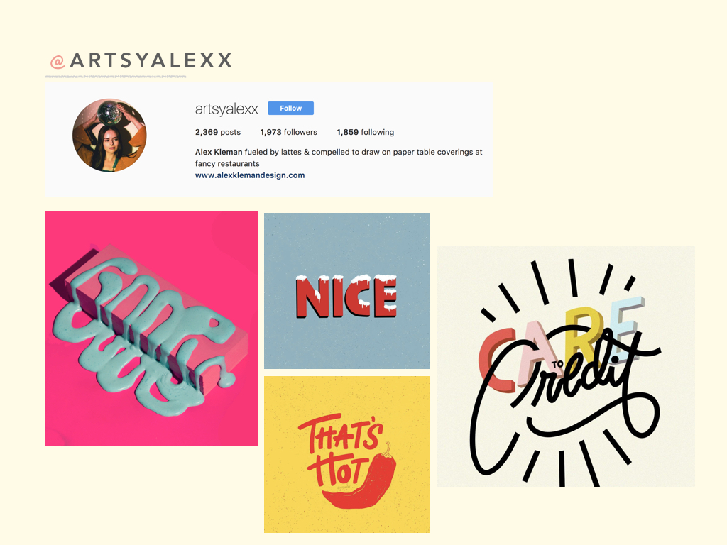
I’ve always been a fan of @artsyalexx. Although her typography works are simple, the colours that she use are very eye catching and easy to relate to. Her works are trendy and very attractive with the younger crowd. I really like the way her fonts always vary in terms of style as well as size in the alphabets. She digitally draws these artworks.
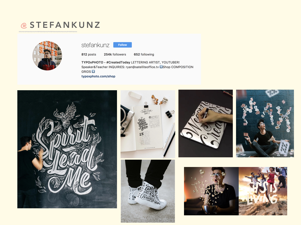
I’ve been following @stefankunz for a while. He turns encouraging words and phrases into typography art pieces. He doesn’t just draw these words on regular paper, but instead he draws them on shoes and even laptops. Any surface can be his canvas!
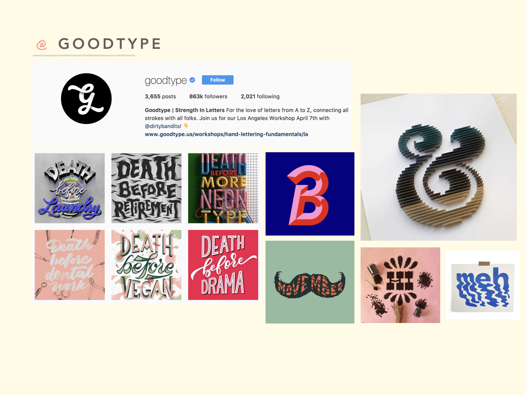
I chanced upon @goodtype while researching for inspiration. This Instagram account consists of so many great typography examples and has allowed me to look at the variety of letter forms and ways to play around with form and style.
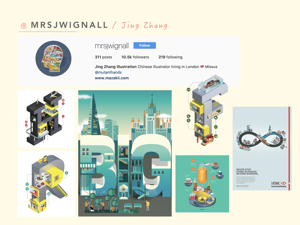
Jing Zhang is an illustrator who has done an alphabet series. She takes a single alphabet and manipulates it. Its almost as if she creates a world out of one alphabet.
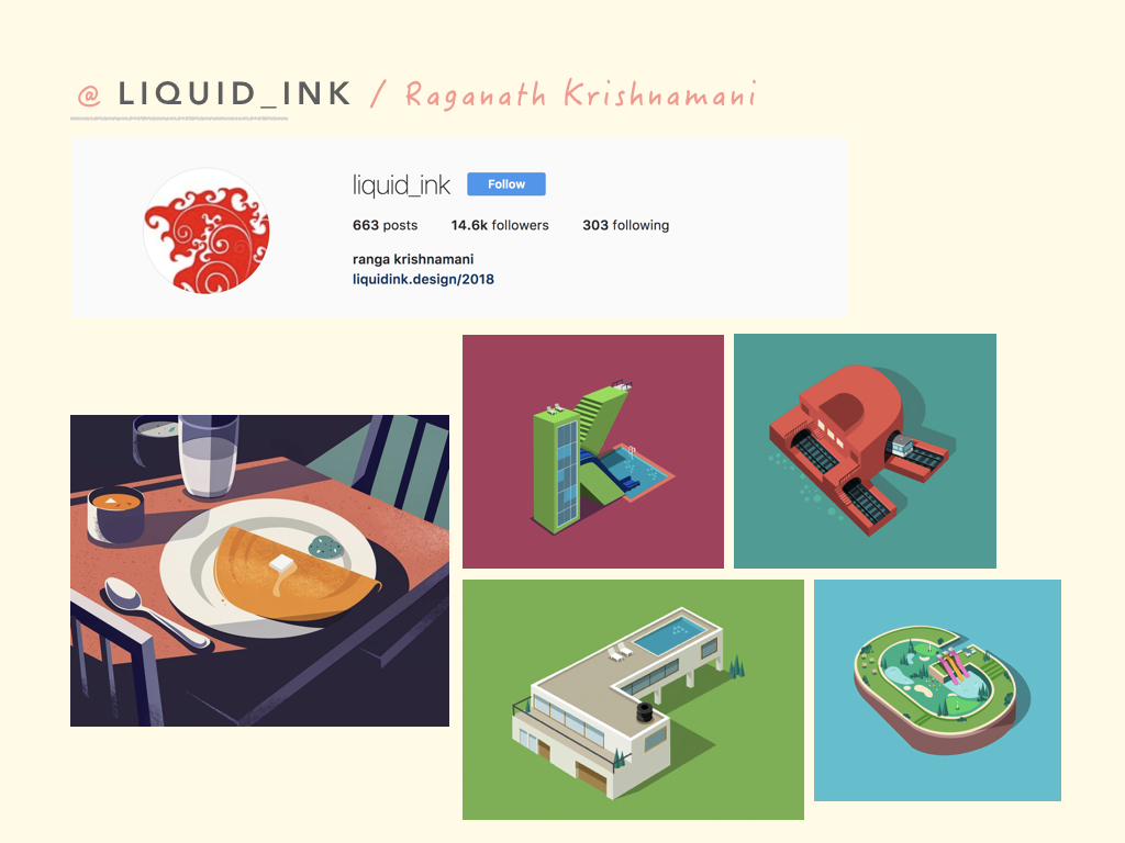
Raganath Krishnamani is an illustrator that also occasionally plays with alphabets. Similar to Jing Zhang, he also manipulates letters, adding elements to them so they look like they are a world/building of their own. His other illustrations are also usually quite dark with lots of shadows.
thoughts
After doing research and looking at many different artworks, I was more certain of the art direction that I wanted to follow. I decided to go with illustrations as I thought that illustrations will be the best way to portray my ideas and thought process across.
“Explore your personalities, Explore your alter ego“
not gonna lie, this project got me feeling excited to list down some of my personalities since I think I react differently in different situations and I tend to think I am pretty different with different people and contexts
Brief:
Touch a truth in oneself
Think deeply about colours
Deliverables – 12 squares printable on A4
initial thoughts/brainstorming
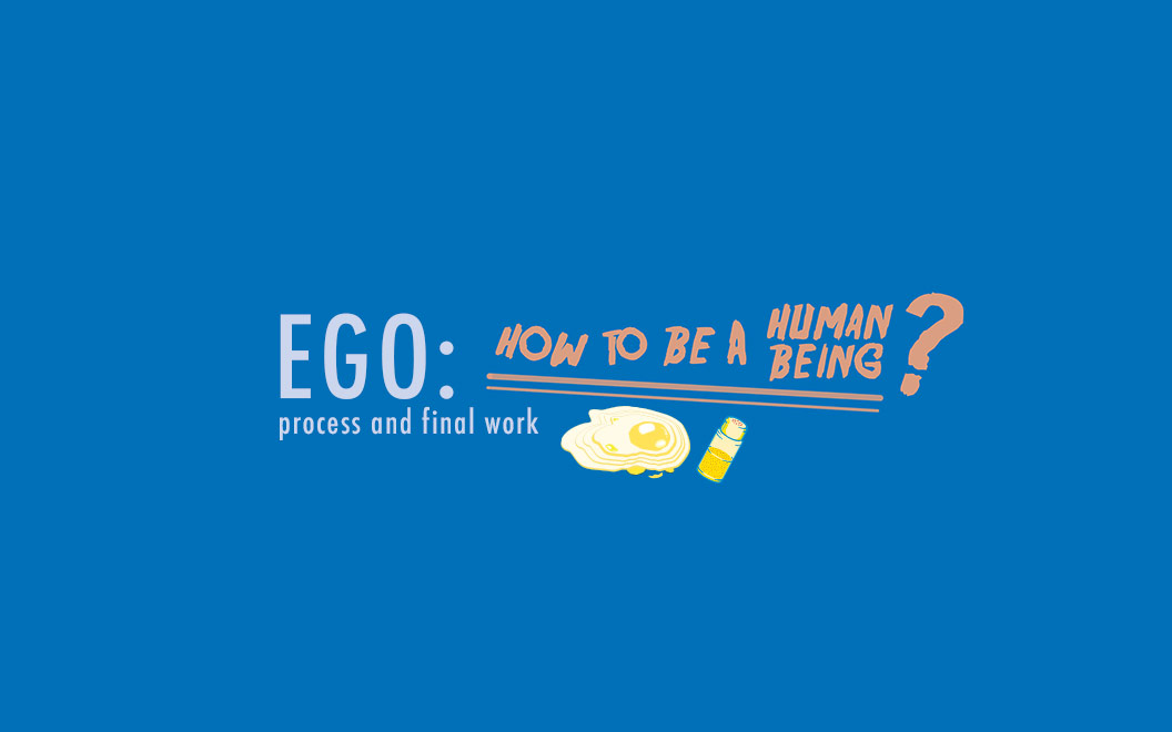
The first thought that came to my mind when I heard the words, ego and everyone’s personalities, I thought about “How to be a Human Being?”
While growing up, we tend to get slightly more self conscious as we understand and know more things! Because of that, we find ourselves lost and unsure at certain situations, not knowing what is the best kind of reaction or what we should do in order not to screw up.
(we don’t wanna lose an important opportunity, make a weird first impression, unintentionally offend someone, etc)
Because of that I thought of Guides to living life!
Although this concept isn’t supposed to be well planned out to be a cheat sheet for everyone out there, it is instead a personal guide based on my own personalities and settings that I tend to struggle with or find myself having a lot of questions to ask.
CONCEPT
“How to Adult?” – in really simple words, this is exactly what my concept is. Many people around me find themselves in situations where they have no idea whats best to do. Questions like, “should I say hi?” “isn’t small talk bad?” “how do I reply him?” “what if she gets more annoyed after reading this?”. The questions never stop.
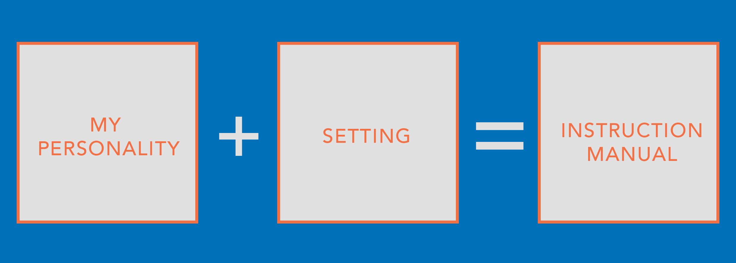
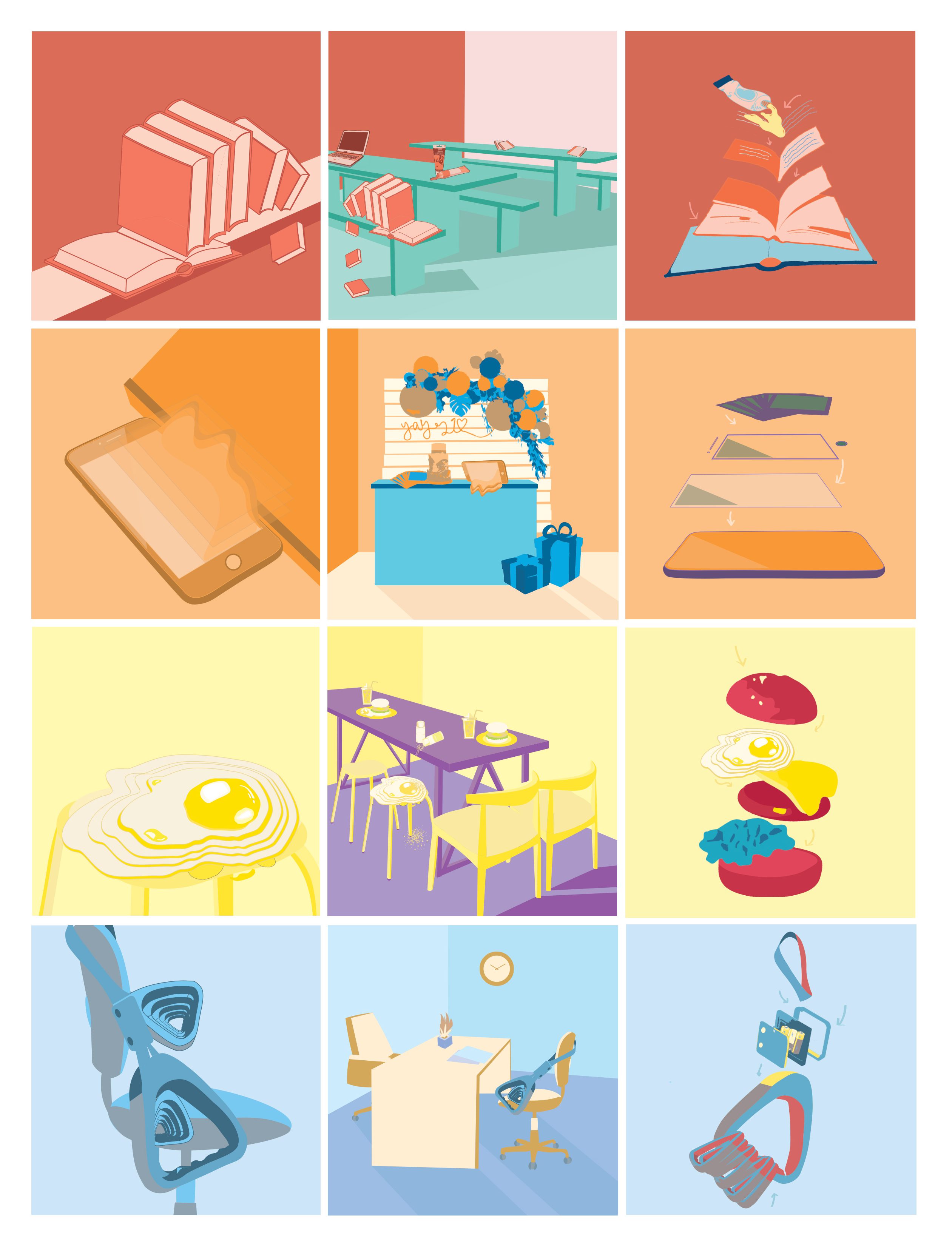
Since we are required to create equations, I decided to split my boxes into this standard equation throughout the 4 rows and columns of boxes.
The first box is “my personality”. I just narrowed down some of my more prominent personalities and fit them into the equations.
The second box is “setting” which I interpreted it to be situations where I’m alone, or is awkward or I have to deal with people or its just a situation where I don’t really know whats the right way to react.
The third box is “instruction manual”. This instruction manual, is a result of combination of my first and second boxes, creating a guide on how to adult. To make it really look like an instruction manual I will be adding arrows between dissected objects that appeared in either of the 2 boxes before so that it seems like its giving instructions on how to put these small parts together to form a proper functioning object which represents my life.
colour theories
For this project, we were required to explore colour theories and use them to represent the different composition in our boxes. We were not limited to any colours at all and were really allowed to just experiment with them.
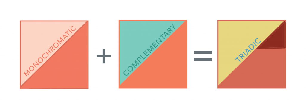
After forming my standard equation above, I also decided that I want to standardise the use of colour theories throughout my 4 columns and rows.
| Monochromatic | Complementary | Triadic |
I decided on these three harmonies for my equations.
The first column of my personalities will be monochromatic because they are the closest to me and they aren’t anything surprising or new. Monochromatic uses shades and tints of the same colour and so it doesn’t make it too striking yet at the same time it feels simple and easy to take in.
The second column of settings will be complementary as some of them are awkward and tensed situations where I just don’t really know how exactly to react. Complementary colours or opposite colours on the colour wheel and although they go together quite well they also give off some kind of tension and awkward vibe which is what I would like to portray exactly in my compositions.
The third column of instruction manuals will be triadic because its when the problem is solved, like there’s finally a solution. Triadic colours tend to come together quite harmoniously, giving the composition a complete feel. A guide to being a human being, should feel that way as it should be something that one can trust and depend on.
compositions/illustrations
I wanted to keep my illustrations simple with nothing too complicated. However, I would like them to intrigue the viewers and make them question why I chose to put certain objects that way. My illustrations will be slightly abstract but still relatable with the use of daily objects or just common objects that people are familiar with.
In addition, I will like my illustrations to follow the same art direction and thought process esp within each column.
so going back to this,
MY PERSONALITY
I will be using a “guide to life” to represent a certain personality of mine. As such I have narrowed down 4 different “guides” that I feel are essential to survive in today’s world.
GUIDES:
Food ?
Books ?
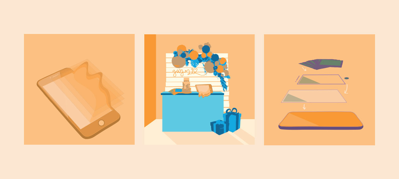
Smart Phone ?
Transportation ?
The 4 personalities that I picked are: optimistic, clumsy, sentimental, sensitive. I combined a “guide” and “personality” together almost as if I gave the object a character.
Optimistic ☺️
Food ?
Clumsy ?
Books ?
Sentimental ?
Smart Phone ?
Sensitive ?
Transportation ?
SETTING
I picked 4 settings that involves more than one person. Some of them are slightly awkward, filled with tension or simply just setting that make one unsure of how to react
SITUATIONS:
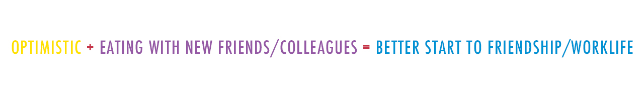
Eating with a new group of friends/colleagues
Doing work alone in public areas
My own 21st birthday party
Jon interview
I wanted to make these settings a little less simple by placing “myself” which in this case are my “guides + personality” into the setting itself.
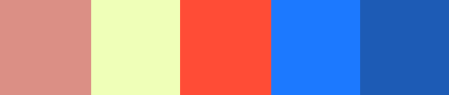
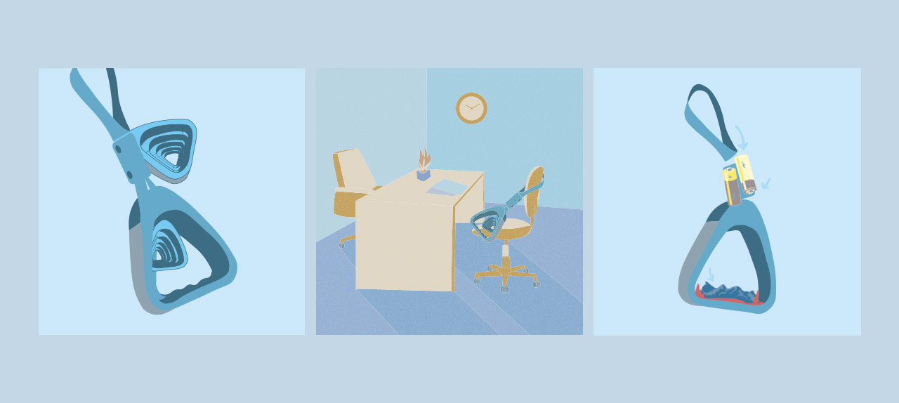
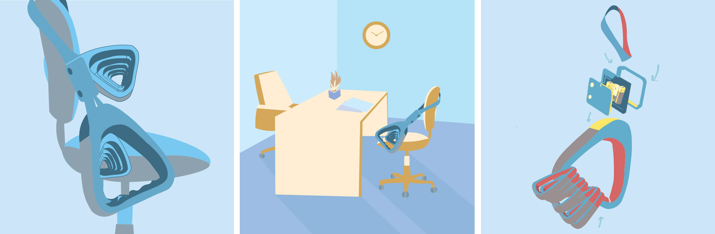
INSTRUCTION MANUAL
The instruction manuals will be a combination of the first and second boxes to create something that will eventually become an abstract manual on “How to Adult?” or rather “How Does Dinis Adult?”
Optimistic
Eating with a new group of friends/colleagues
A better start to new friendships/work life
Clumsy
Doing work alone in public
New discoveries by my clumsiness and art projects
Sentimental
My 21st birthday party
More memories created and captured forever
Sensitive
Job Interview
Well-prepared and ready for the interview
The bolded words in the table are the ideas behind the compositions of the instruction manuals.
I arranged the books so that it will look like its falling off, mimic-ing clumsiness. The books now represent me and are seated on the chair alone and just doing its own stuff. Unlike the people around it, the book isn’t using a laptop or a notebook but is using paint, this represents me when I’m out alone because I’m an art student. The instruction manual shows paint getting onto the pages of a book and this is a result of my clumsiness that led to a new and accidental discovery.
It is very hard for me to let go of moments and I tend to always reminisce past memories. The phone seems like its leaking substance together with multiple screens melting with it. This represents me overflowing with sentiments and feeling hard for me to close to chapter and start a new one. The phone now represents me and is laid on the dessert table of my 21st birthday party. The dessert table is where everyone takes pictures of the birthday girl and will probably be the fondest memory of the birthday party. The instruction manual shows a dissected phone and an additional layer of Polaroid photos on the top showing that memories have been captured and I have nothing to feel sad about.
I chose an egg to represent optimism because I like eggs. The sunny side up has layers to it because to me optimism is growing and climbing higher. I placed the egg on a stool where it seems like people around it are having scrumptious meals while the egg is awkwardly having some salt and pepper. Some of the pepper even got on the floor! This represents me feeling awkward with a new group of people and unsure of how to break the ice over a meal. The final box shows a dissected burger but instead of the burger seen in the second box, this burger now has an egg. This shows me slotting myself in into a new group of people and having a good start to new friendships.
I used a recognisable bus handle to represent transportation that is essential for anyone to get anywhere. The bus handles seem like they are multiplying and have many layers. This represents my sensitivity as when a person is sensitive he/she tends to over think and uncover unnecessary layers. I placed myself on a chair like one would for a job interview. The table is almost empty just with a few pieces of paper to portray the formalness of an interview. The final box shows a dissected bus handle with the bottom part of the handle now replaced with many smaller bus handles which represents how sensitive I am. In the middle, there are also batteries which show how prepared I am for an interview because I’m so sensitive to details and making sure I’m well equipped before it.
FINAL WORK
“GUIDE TO BEING A HUMAN BEING”
Overall, I really enjoyed myself throughout the process of this project. I learnt so much more about colour theories that I never understood before and got to explore creating illustrations which is a style I have always wanted to experiment with. After this project, I think I’ve become a lot more sensitive to colour and understanding what colours go together better than others. It has been really fun finding out more about my own personalities through the equations.
Though this process was enjoyable, I also encountered several setbacks, one of which was production and printing. Even though my test prints came out fine, my final prints were not showing up as well as they were supposed to 🙁 I was a little disappointed because I had to re-print some of the prints and they still didn’t come out the way I wanted it to. However, I decided not to re-print them anymore as they were costly. Part of me wished that I had printed all my compositions out during my test print so that I could have presented those instead.
This taught me to be more sensitive to be colour and never be complacent even if the first time was good. Printing is very unpredictable and I hope that in my future printing assignments to come, I’ll have better luck! Besides my production, I received positive feedback during my critique and it has given me the motivation to work harder and do better next time 🙂
This project required us to explore our egos and personalities but with less limitation on medium, colour and concepts.
Of course the first art direction that came to my head was illustrations as I always wanted to create my own kind of illustration from scratch. I immediately starting browsing through my favourite illustrators on Instagram and also did a inspirational browse through Pinterest.
Illustrators
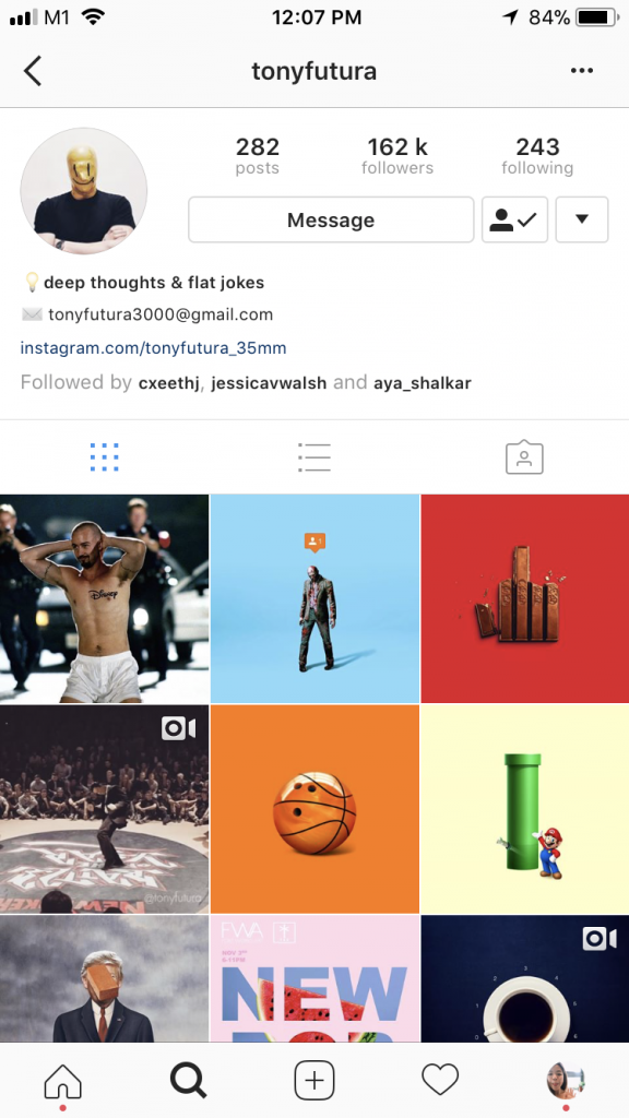
1. Tony Futura
Tony Futura’s Instagram
I’ve been following Tony Futura for a while and have always been a fan! I love his art direction and the slightly unpredictable twist to certain objects. His works are mostly a combination of two known objects combined together very seamlessly almost as if there’s nothing strange about the final outcome. His works have definitely inspired me to combine items together and also put them in unexpected contexts.
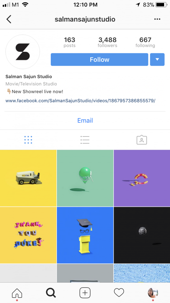
2. Salman Sajun Studio
Salman Sajun Studio’s Instagram
When I first came across @salmansajunstudio I was captivated by the colours used in his compositions. He likes to use pink, blue and red and those are actually my favourite colours in illustrations just because they go with each other so well and give each other that kinda good contrast (at least to me). His works are very minimalist but actually detailed and the same time. It makes you want to stare at them longer. His objects in the compositions always seems to be levitating or slightly off balance giving it a very fun and playful feel to it all.
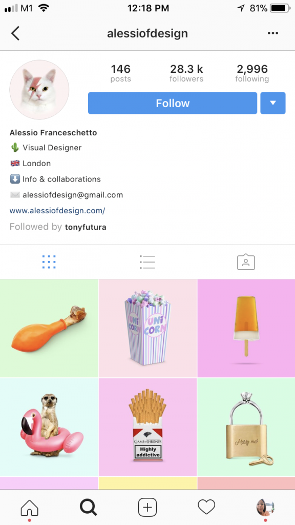
3. Alessio Franceschetto
Alessio Franceschetto’s Instagram
Alessio Franceschetto likes to use pastel/light colours as backgrounds, thus allowing the main visual to pop slightly. Compared to @tonyfutura and @salmansajunstudio, the object in the illustration is bigger and more in your face. The compositions are more straightforward and sometimes even left very raw and unedited. The art direction used is unique and I really like the use of food in his illustrations.
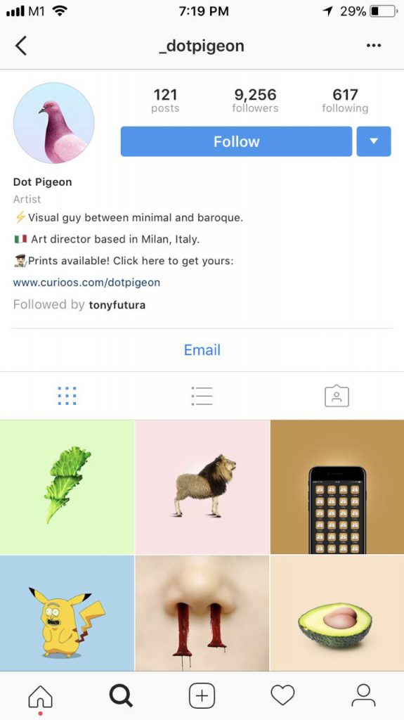
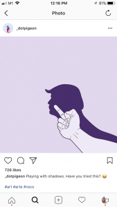
4. Dot Pigeon
Dot Pigeon’s Instagram
Dot Pigeon portrays quite a distinct character through his illustrations. He adds a twist to everyday items and they are usually twisted in a comical or mocking way so it is always very entertaining to look at. Some of his compositions are out of the blue like a butt replacing the seed of an avocado. As a result of that, his illustrations are very relatable and also very visually pleasing.
This post featured Donald Trump being displayed as the shadow of a middle finger. This clearly shows @_dotpigeon’s exaggerated and pretty comical art direction. This has inspired me to venture more and create something less predictable.
next steps
After looking at these artist references, I feel very inspired to create something out of the norm but yet relatable to everyone. The use of colours from the 4 artists were similar yet different in their own way and I would like to create illustrations that have instilled in them my very one interpretation of colour. Keep reading for more!
T O T H E F I N A L I S E D C O M P O S I T I O N S
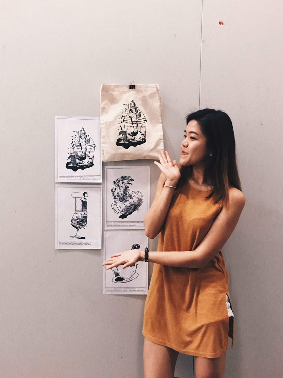
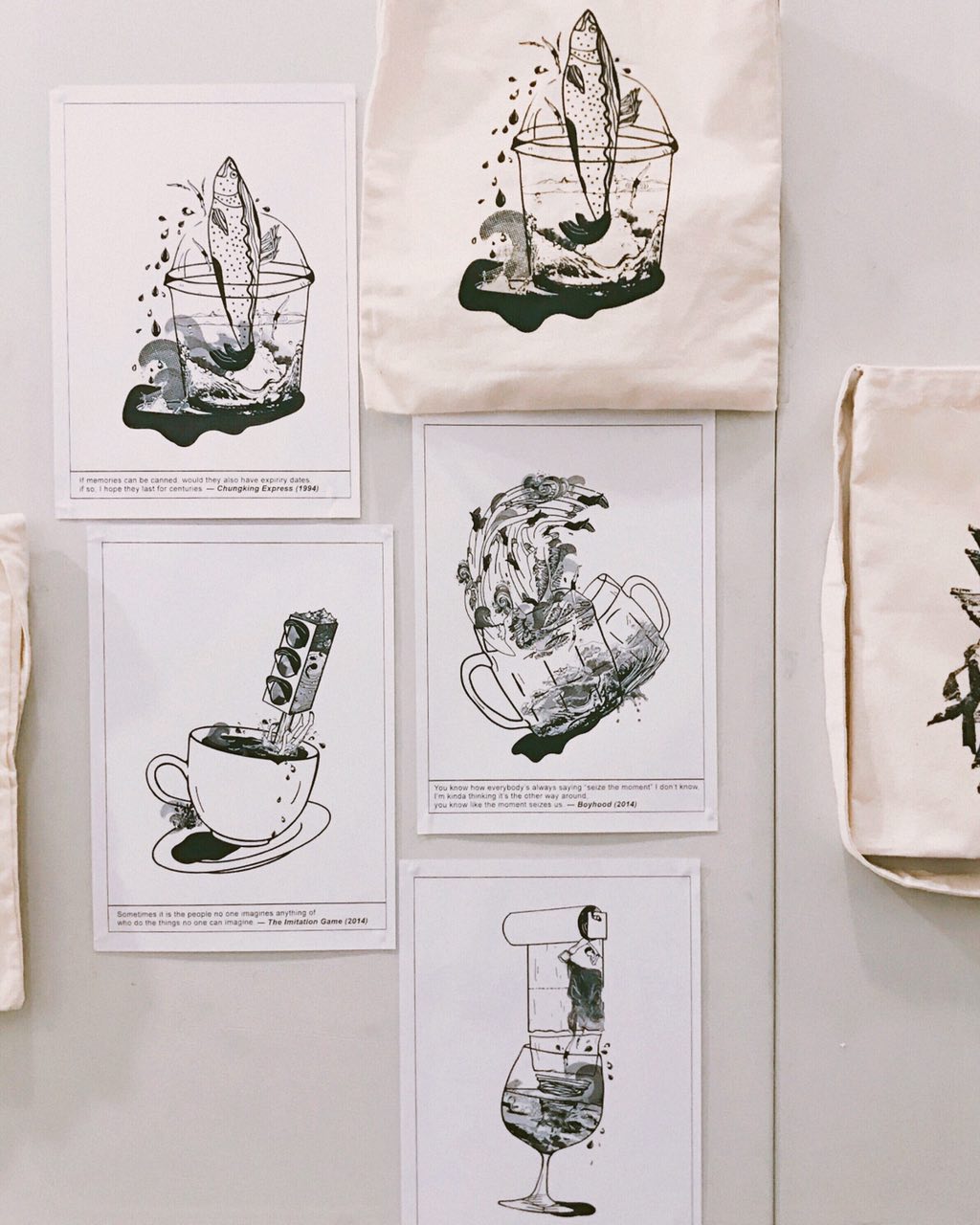
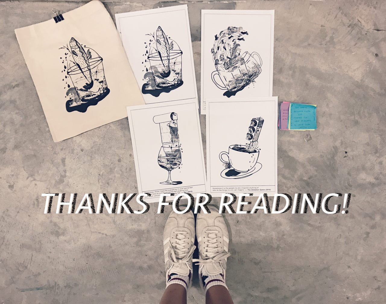
In this brief, we were required to create four different compositions based on four different chosen movie quotes and have one composition silk-screened onto a tote bag successfully.
compositions
My compositions were mainly inspired by surrealism and the use of everyday objects to create an entirely different world of its own and allow others to be intrigued by the choice of objects used to represent different elements.
Read more about my thought process and
artist references here!
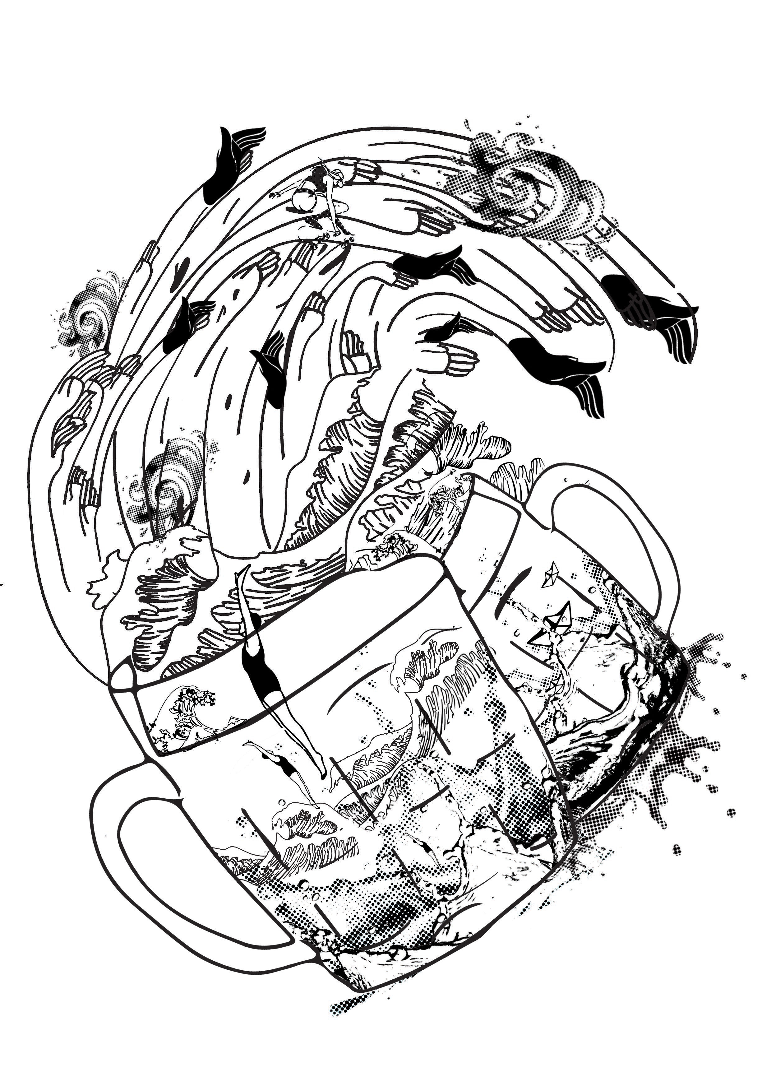
All four of my finalised compostions include the use of similar objects but in a different way. Some objects like the hands, are morphed into another object itself to give an additional personal meaning to the everyday object. Elements like water and cups are repeated in the compositions as they portray the meaning of life/moments/feelings to me.
Most of my compositions were made with a combination of halftones and vector objects with the exploration of layers and contrast differences –
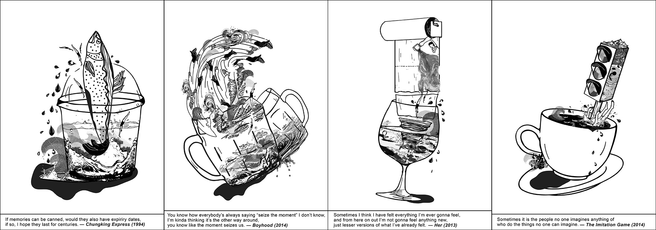
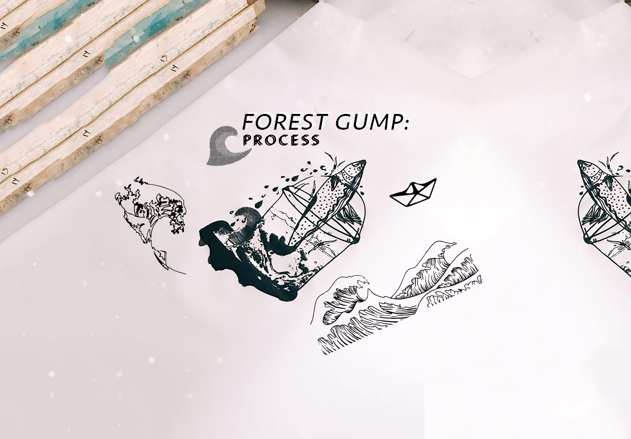
| CHUNKING EXPRESS
I remembered Chungking Express as a memory filled film, where many different emotion were involved especially ones that make me feel like curling up into a ball on my comfy bed. It made me want to bottle up these feelings I felt and remember it for life. In fact, the quote that I picked from this movie aptly described how I was feeling.
“If memories can be canned, would they also have expiry dates, if so, I hope they last for centuries”
Elements used in this composition: sardine fish, cup, water, humans, splashes, hands
Cup – symbolises a can that stores life’s precious memories and feelings
Sardine Fish – cans reminded me of sardine fishes and I made it big + popping out of the cup to represent the huge factor in our lives that leave a great impact on us. Sometimes, there are too many moments and memories that we want to protect and remember for life but there is to much to remember them all
Water – overflowing water represents the amount of memories we create in a lifetime but not can be etched in our head forever. Water in the cup represents how these memories and feelings can be so full of life and energy
Human Divers – Reminding viewers of the human aspect so that they will have more connection to it and it also seems as if these humans just want to drown themselves in past memories that make them feel good
Hands – the hands replaces the regular fin and tail of the fish. They add a more human touch to the composition and also how hands hold onto things. In this case, it is holding on to memories
Progression of Chungking ExpressChungking Express Final Composition
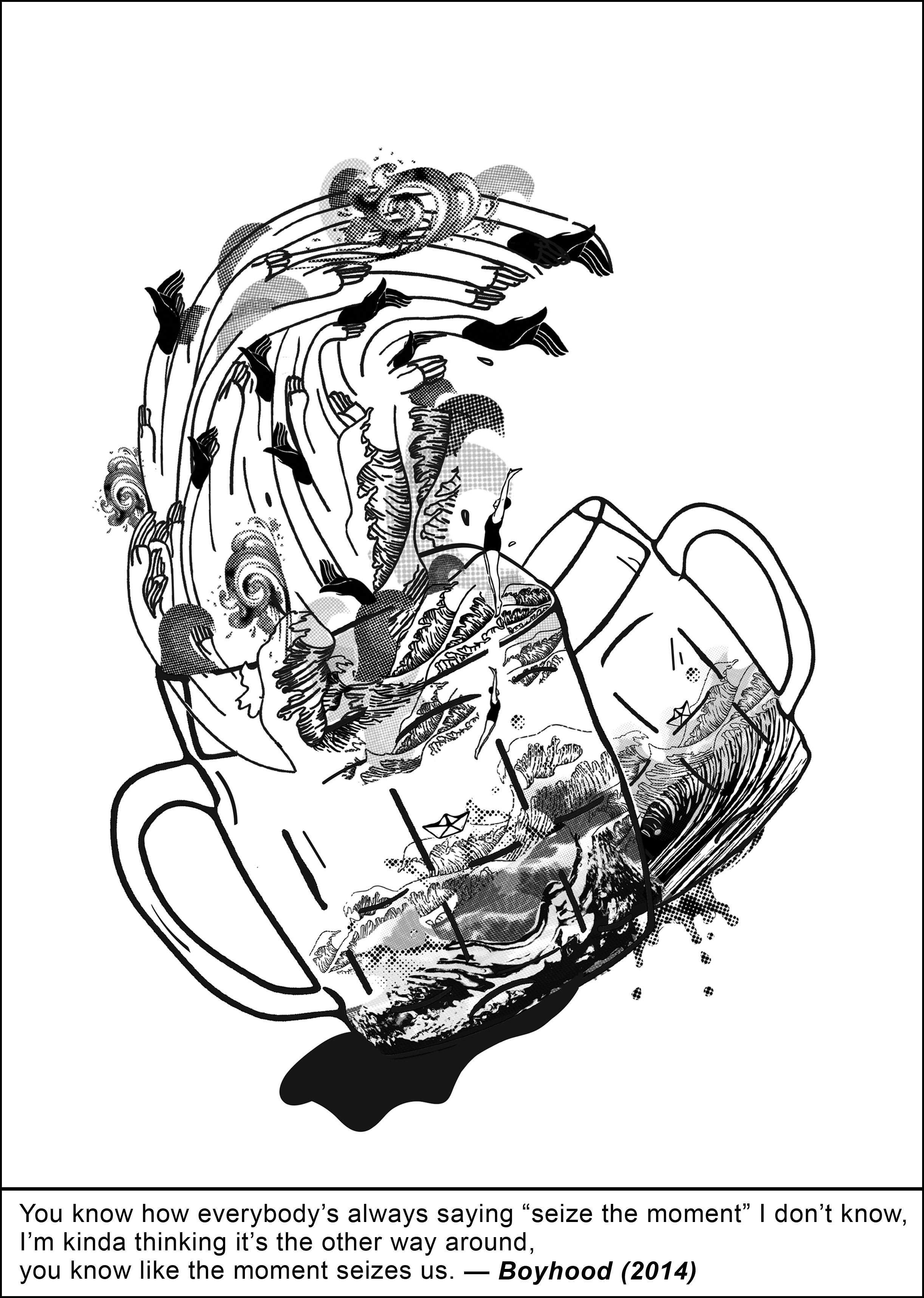
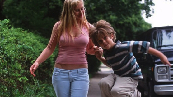
|| BOYHOOD
Boyhood was a slow long movie/documentary that revealed its story bit by bit. The story didn’t hit me all at once but rather in pieces. At the end of the movie, I felt different, I felt like I have watched something that made me feel reflective about life and how a simple story could make me feel this way. Sometimes, that is how a moment makes us feel. Even the simplest moments can take over and seize us.
“You know how everyone’s always saying “seize the moment” I don’t know, im kinda thinking it’s the other way around, you know like the moment seizes us”
Elements used in this composition: waves, cup, water, humans, splashes, hands
Cup – symbolises one’s life
Waves – my representation of a moment seizing us just like how a wave can seem so harmless but is actually very harmful and powerful. Waves can even take away lives. Thus, when I read the quotes I immediately thought about waves.
Hands – I morphed hands into the waves almost as if the waves can grab or hold on to your life. They add a human touch to the composition
Water – the water in the cup seems to have its own life of its own and is very active. This represents the unpredictability of life and its moments
Humans – again, there are humans in the composition to give a human touch to the composition. In this composition, they are going in the direction of the wave almost as if the wave is about to engulf them
Progression of BoyhoodBoyhood Final Composition
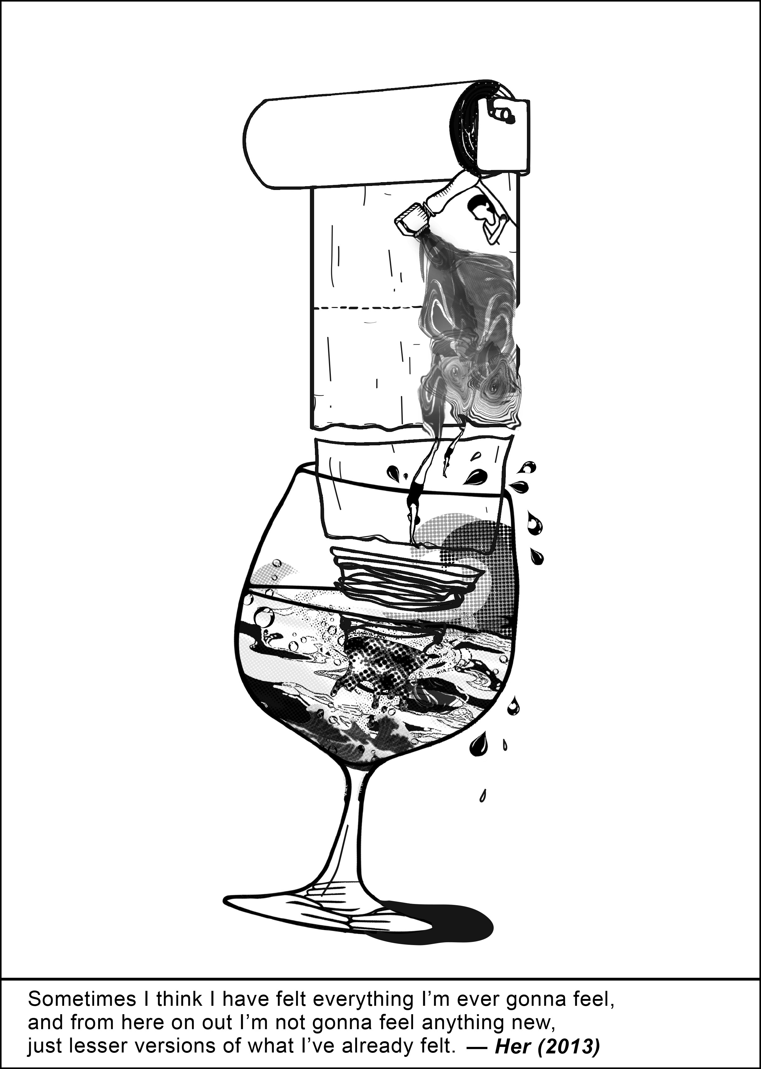
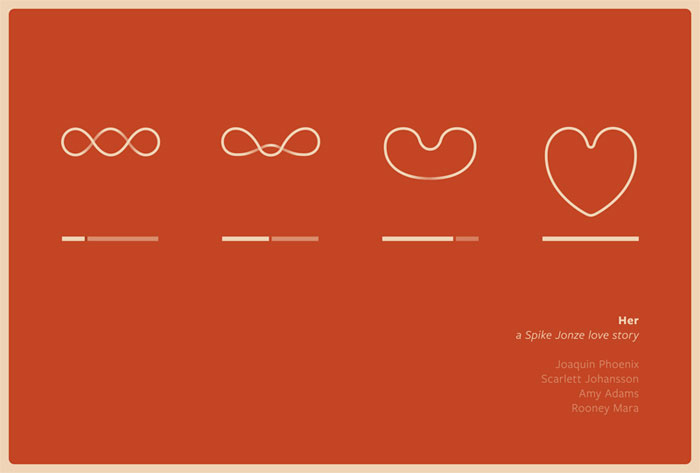
||| HER
Her, was an extremely different kind of movie. It was strange yet intriguing. Although its something that I would have never imagined before, I could still understand his love, pain and other emotions well through the mood of the movie and its various shots. The movie had a unique touch to it and is definitely memorable.
“Sometimes I think I have felt everything i’m ever gonna feel, and from here on out i’m never gonna feel anything new, just lesser versions of what i’ve already felt”
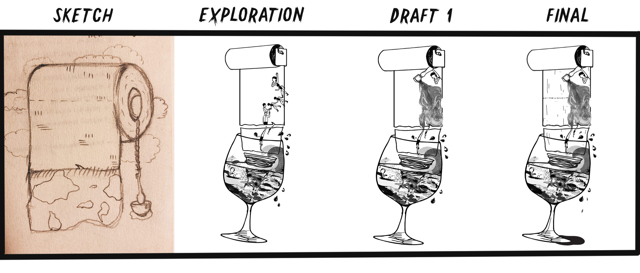
Elements used in this composition: cup, water, humans, coffee filter, toilet paper roll, hands
Cup – the wine cup symbolises life and its emotions/feelings.
Toilet Paper Roll – the quote says that sometimes “you’re never gonna feel anything new, just lesser versions…”. In that way, a toilet paper once used will never be the same again. The next roll you encounter will look similar, but you will never be able to get the same thing back again, just possibly a different version of it. The rolling effect also symbolises how life will just keep rolling on and there will be more emotions/feelings to deal with
Water – the water in the cup seems to have its own life of its own, it has bubbles, splashes and even something similar to a whirlpool. It represents how quick a moment last and sometimes when its gone, the feelings of that moment goes with it and one will never be able to get the exact feeling back again
Coffee Filter – where the essence of the coffee comes out from but in this case, marbled water is coming out and they are my representation of feelings
Humans – additional human touch to the composition. Human is entering its own feelings
Hands – morphed into the base of the wine cup as if it is holding on to “life” but in a subtle way
Progression of HerHer Final Composition
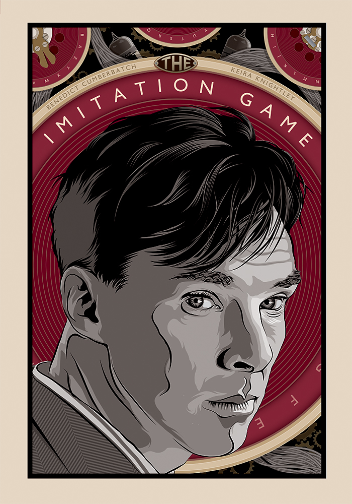
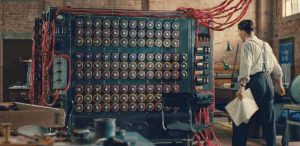
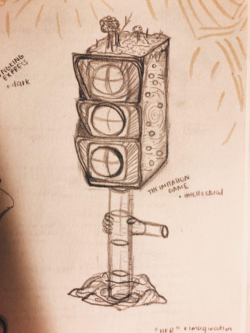
|||| THE IMITATION GAME
The Imitation Game was an eye-opening movie with intellectual scenes and reminders of why we should never doubt someone of their capabilities. We should never judge one based on their looks or on just one incident. We should learn to be patient and believe in others.
“Sometimes it is the people that no one imagines anything of who do the things no one can imagine”
Elements used in this composition: cup, water, humans, traffic light, desert and mountains, galaxy
Cup – symbolises life and its moments
Traffic Light – represents imagination because no one will imagine a traffic light as a stirrer in a cup and have a mountains on top of it + galaxies on the side
Desert and mountains – represent different worlds, something imaginative
Galaxies – symbolises dreams and a different reality
Water – Life’s moments and its struggles
Human – added human touch to composition. In this composition, the human is seen drowning and has the traffic light piercing through her. It is a scene that no one will ever imagine
Hands – hands are morphed into the traffic light shades on top to represent how our hands are part of the things we do in life and how they affect our moments and struggles
Progression of The Imitation GameThe Imitation Game Final Composition
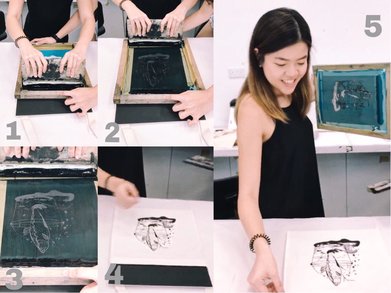
silkscreen process and final product
The silkscreen process sounded very complicated to me when I first heard about it. However, I was also filled with excitement to try it out. The thought of printing my own composition on a tote bag also made me want to do it well so that I’ll have a new tote bag to carry out.
PROCESS
The process consists of several parts but we were guided well with the help of our work study. We were each give one screen to expose and had to make sure we took care of it well.
We were first told to label our screens so that we don’t accidentally take the wrong screens or spend time figuring which is ours. Then we had to slightly rinse the screen and pat it dry before going into the dark room.
The Dark Room
After layering the light-sensitive ink onto our screens, we had to light it dry before pasting on our transparency print of our composition onto one side of the screen to let it get exposed. After exposing, we had to use the water spray jet to wash off the exposed ink in order for our composition to appear.
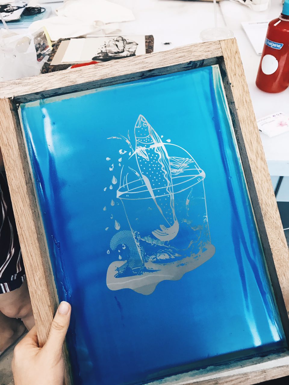
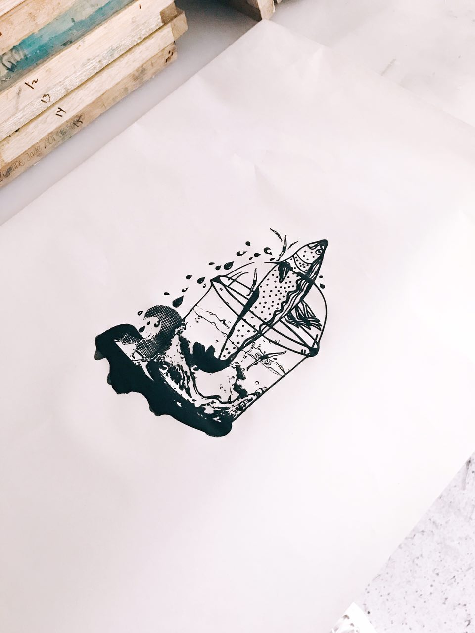
Transparency print of first compositionAfter exposing the screen, the design is ready to be printed!!First try print, newsprint paper
FINAL PRODUCT
We were required to go back another day to re-expose our screens and get it printed onto our tote bags. Lucky for me everything went quite smoothly on that day besides accidentally tearing a small bit of my screen on the side. Thankfully, it was not a big problem as it could be covered with tape.
I did a few test prints before eventually printing into my tote bag!
Silkscreening on tote bag
AFTER THOUGHTS – I thought that the the whole process was an interesting experience and I’m glad I got to learn something new through this. I was always curious about the silkscreening process and wanted to try it out for myself. So I guess this experience is a strike off my to-try list
End Product of Tote Bags
final products for submission
4 finalised compositions for submission
Ready for critique
After critique thoughts: This project allowed me to explore alternative ways of putting together compositions and coming up with designs. Although it was challenging at the beginning, I eventually narrowed down my concept and it became easier to work from there. A challenge I faced was attempting to make the 4 compositions look consistent throughout and re-using the same elements in each of the composition.
I received overall good feedback after the critique and was very happy to receive such a good response from my classmates. I’m glad that my compositions were understood by others and was slightly relatable. On the whole, I am glad that my hard work has paid off and this project has been quite an experience for me!
Click here for more about my process and here for more research!
After going through the brief, various thoughts and ideas came to my head. However, I was not sure of how exactly I wanted to come up with and portray my compositions.
I immediately started off by going through quotes that are closely related to life and human feelings. I drowned myself in a sea of emotions and feelings from movies that I closely relate to or have been inspired by.
4MOVIES
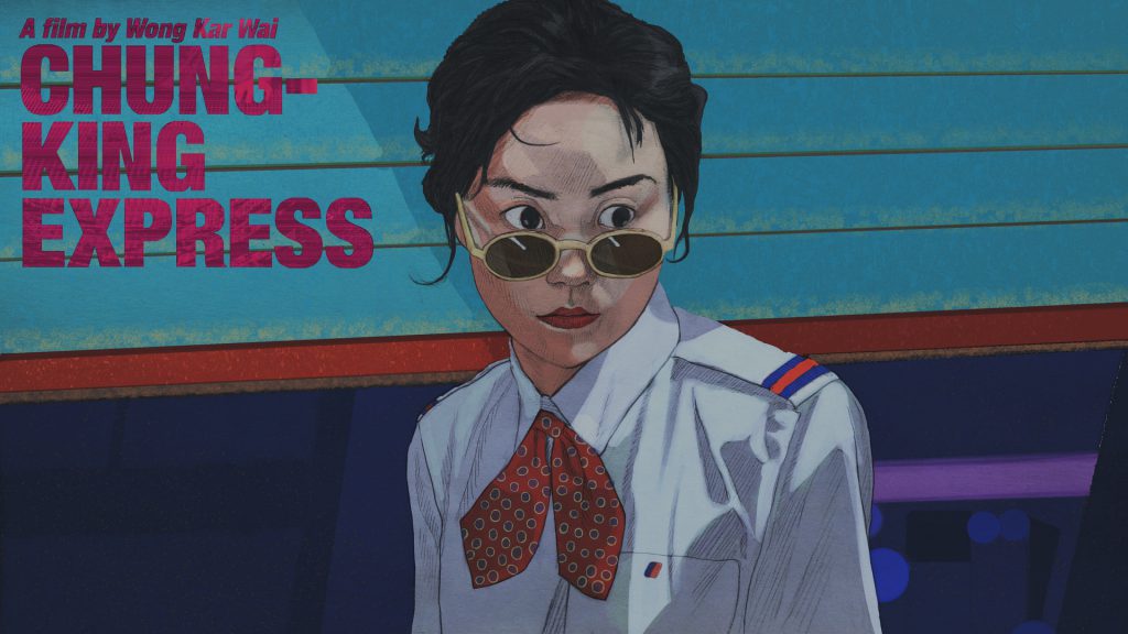
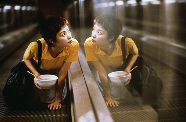
Chungking Express (1994)
Artist Impression of Chungking Express (1994)Chungking Express Scene (1994)
Boyhood (2014)
Boyhood (2014)Boyhood Scene (2014)
Her (2013)
Her (2013)Her Scene (2013)
The Imitation Game (2014)
The Imitation Game (2014)The Imitation Game Scene (2014)
4MOVIE QUOTES
I settled on these 4 quotes as I felt that they spoke to me in a certain way and had the potential to explore various compositions.
l THE APPROACH l
“think about the quote in a different perspective” / “dig out a different meaning” / “link quote to various objects in life” / “be unconventional, don’t be literal”
These thoughts replayed in my head as I tried to come up with a concept/overarching idea for my compositions. I took to staring at objects around me and tried to create a connection between them and the movie quotes.
Deeply inspired by surrealism, I wanted to make use of everyday objects to tell a story about my quotes, almost as if the compositions/interpretations of these quotes are from a different world of its own, where everything works differently.
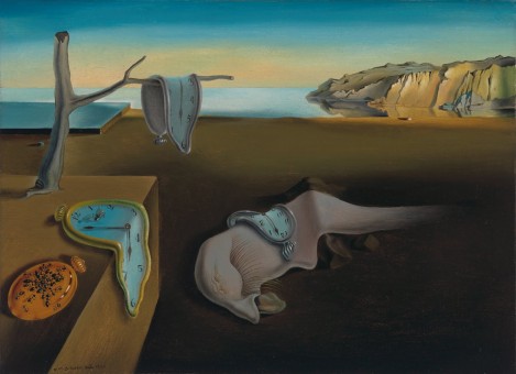
Salvador DaliThe Persistence of Memory, Salvador Dalí (Spanish, 1904–1989)
Dali’s works are compelling, making one want to stare at it longer to uncover what different meanings each element in the painting portrays. In this piece, Dali portrayed the theme of time with an objective of discarding the world of reality. He did this by distorting (melting) the clocks and creatures with a perfectly normal background. It is clear this art piece was a result of his interpretation and imagination.
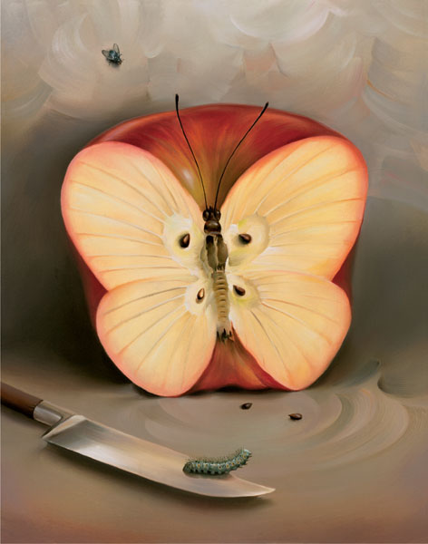
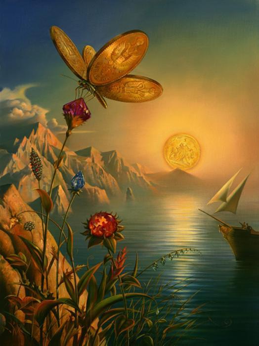
2.Vladimir Kush
A surrealist artist greatly inspired by Salvador Dali. His works portrays fascinating stories and imagination with the use of everyday objects such as food, and shoes.
Henn Kim is an illustrator from South Korea who evokes theme of, “beautiful dark twisted fantasy” in her art works. Her works are compelling and are always in black & white. Her art style and work were my main form of inspiration for my 4 compositions.
Drenched through my mindSleep Forever
IDEAS & SKETCHES
Chungking Express first sketchBoyhood first sketchHer first sketchThe Imitation Game first sketch
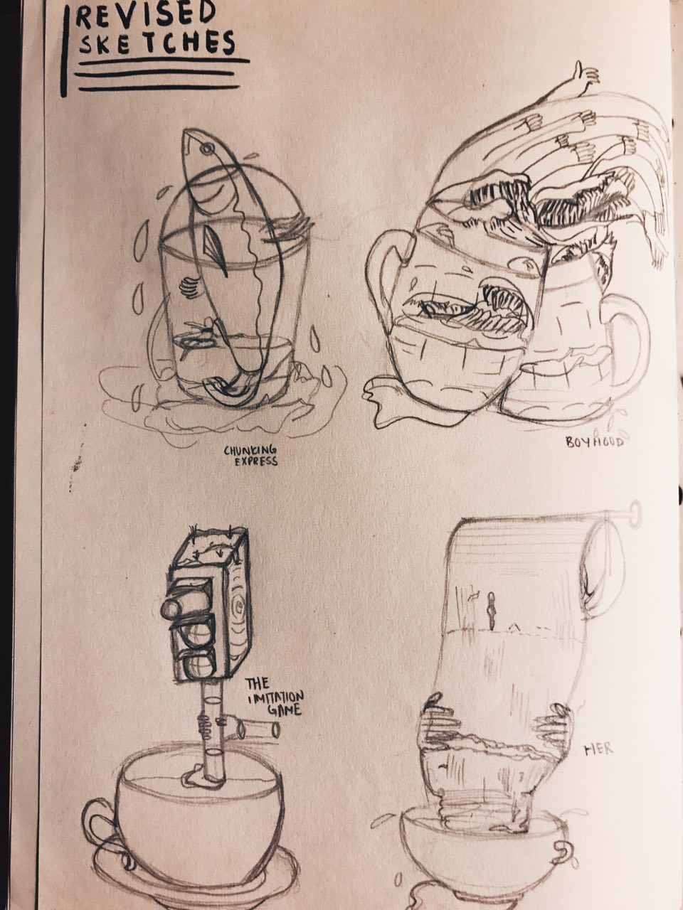
These sketches received generally okay feedback on the first round of consultation but were given feedback for improvements. Since the use of the hand motif is strong, I decided to use that as a common element in my compositions to make them look more consistent. It was also suggested to maybe also use cups across all my compositions to suggest the same meaning of life in each of them.
REVISED SKETCHES
– Included use of hands and cups in all 4 compositions –
digital drafts
Chungking Express
Chungking Express Draft 1
Feedback: Cup and sardine seem to be clashing, girl looks like she is about to crash into cup, fish fin can be tilted slightly upwards to have a better direction flow.
Boyhood
Boyhood Draft 1
Feedback: Looks alot more messy and complicated compared to Chungking Express composition, there is no focal point, not sure where to look at, maybe you can have one thing that is prominent, similar to Chungking Express one where the cup and the sardine sort os stands out the most, play with more halftones in the composition
Her
Her Draft 1
Feedback: Interesting use of toilet paper roll (at least some thought so), humans on the composition are a little disconnected/doesn’t make a lot of sense, can flow better, replace with something similar to other compositions.
The Imitation Game
The Imitation Game Draft 1
Feedback: Looks abit more plain compared to rest of compositions, can make cup tilt little so that the cup looks unstable almost like the rest of the cups in other compositions, add more water droplets, traffic light currently doesn’t look like a stirrer, tilt traffic light a little to show that it is in motion.
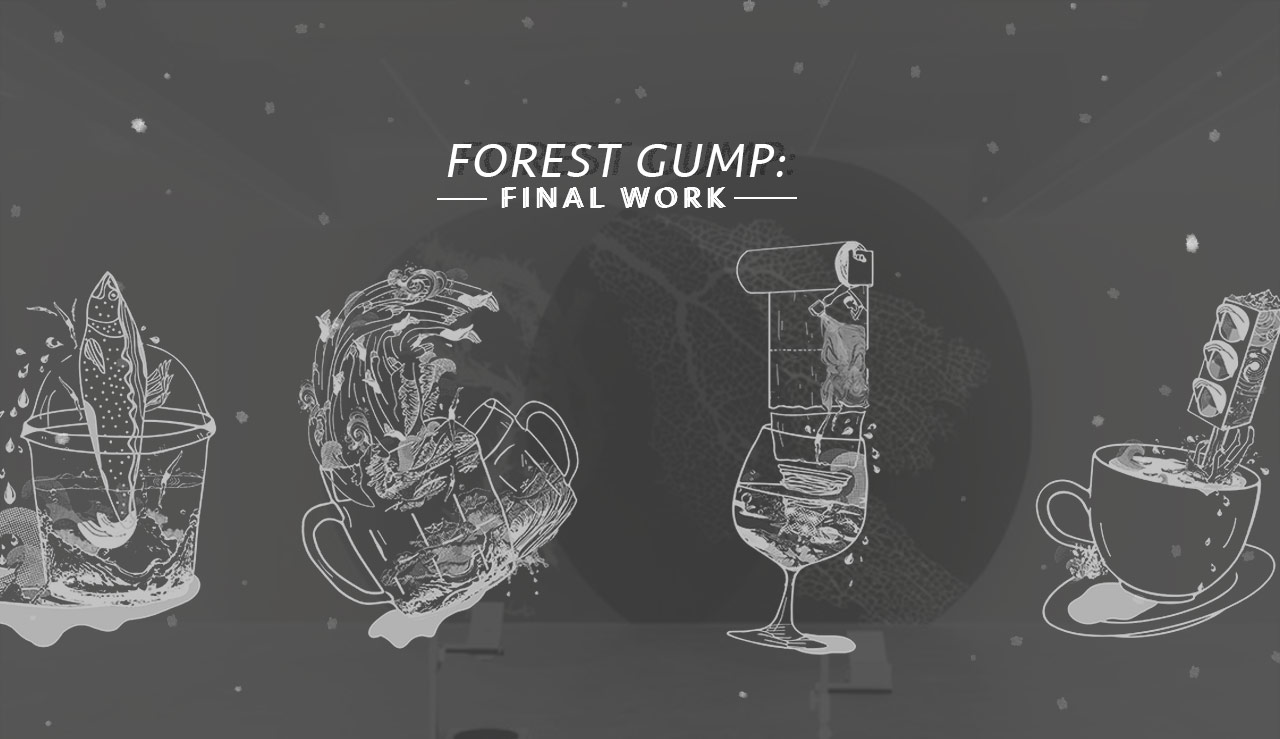
Read more about the ideas and meanings behind each composition in my final Forest Gump post!
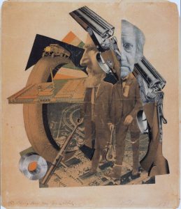
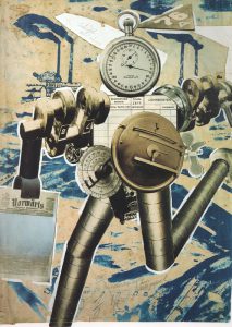
Hannah Hoch is a artist who practiced Dadaism in the 20th century. She was an active female promoting the idea of women working creatively generally in society. She was a political iconoclast who actively critiqued prevailing society.
‘High Finance’ was a perfectly composed example of her innovative photomontage technique. The viewer is presented with two banker figures, each with a disproportionately large and mismatched head, one of which is a photograph of 19th century British chemist and astronomer Sir John Herschel. The effect would be comical, were it not for Höch’s intelligent arrangement of the other visual elements. One of the bankers’ heads is spliced cleanly in half, and behind it are two shotguns, which look as if they are simultaneously being aimed by and at the banker.
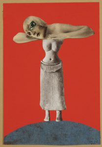
Höch combines this imagery of the non-Western sculpture with a picture of a beautiful woman from the European popular press, distorted with the addition of an exaggeratedly large eye. She suggests that society looks at women much as they look at a piece of unknown sculpture: as exotic and erotic objects. She also questions the position of the “New Woman” of the Weimar Republic, looking at her as a fragmented and constructed image that serves particular ends in society, suppressing and disregarding other possible individual choices and desires.
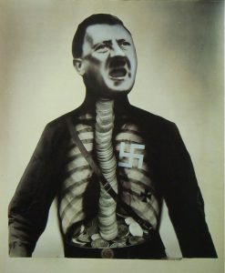
John heartfield
John Heartfield is a dada artist, credited as a founder of photo montage and pioneered modern collage techniques. His work was largely focused on anti-Nazi and anti-fascist statements.
John Heartfield, Adolf Hitler The Superman: Swallows Gold And Spouts JunkJohn Heartfield, Rationalization Is On The March!, 1972
In 1927, John Heartfield brilliantly commented on corporate rationalizations for replacing human workers with robots. What will happen to those workers.
Heartfield’s collage about the corporate rationalization to have robots replace workers is eerily visionary in another way as well. I found this paragraph on the blog
SURREALISM
Founded by the poet André Breton in Paris in 1924, Surrealism was an artistic and literary movement. It is a cultural movement best known for its visual artworks and writings.
Surrealism is based around the idea of liberating thought, language and human experience. They make use of everyday objects and add juxtaposition. It was a movement which sought to release the creative potential of the unconscious mind.
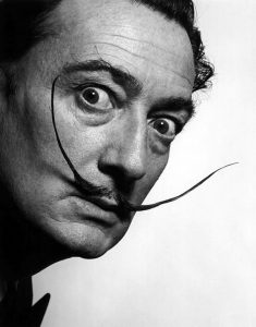
SALVADOR DALI
Salvador Dali was a spanish surrealist who was among the most versatile and prolific artists of the twentieth century and the most famous Surrealist. From an early age, Dali was encouraged to practice his art and would eventually go onto study, interacting with Picasso and Magritte
Lobster Telephone 1936 Salvador Dali http://www.tate.org.uk/art/work/T03257The Mae West Brooch 1949 In The Mae West brooch, we find continued Surrealism in the way the teeth are literally pearls, sitting in a slightly plumped leer of a mouth, ever so slightly contorted as to make the viewer uneasy.
Rene Magritte
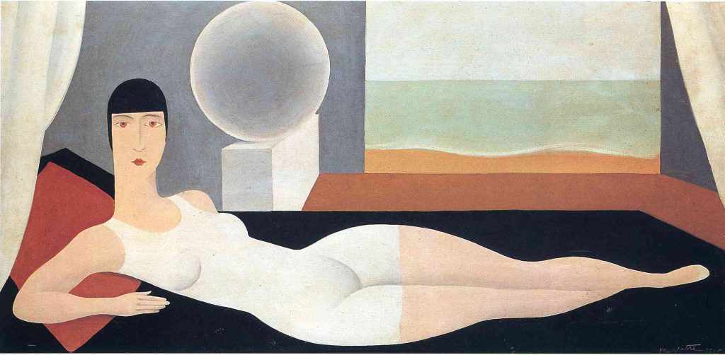
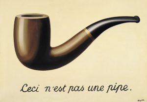
Rene Magritte was a known surrealist who used deadpan illustrative techniques. He wished to cultivate an approach that avoided the stylistic distractions of most modern painting. Magritte often used bowler-hatted men in his pictures – as a self portrayal. Repetition was an important strategy for Magritte, informing not only his handling of motifs within individual pictures, but also encouraging him to produce multiple copies of some of his greatest works.
Bather 1925, Rene Magritte This work bears the influence of Magritte’s professional forays into the world of fashion advertising, and his interest in the works of Fernand LégerThe Treachery of Images (1929) Rene Magritte The Treachery of Images cleverly highlights the gap between language and meaning. Magritte combined the words and image in such a fashion that he forces us to question the importance of the sentence and the word. “Pipe,” for instance, is no more an actual pipe than a picture of a pipe can be smoked.
After 4 weeks of research, exploration and narrowing of ideas, my lines of emotions have been executed
and finalised.
CONCEPT
| As sensitive person, I feel that my emotions are never defined or absolute, they seem to co-exist and hard to describe |
It’s almost as if my emotions are made up of different elements and joined together to form a unique emotion of its own.
Hence, I incorporated the use of layers to convey different elements that make up a particular emotion of mine. Through the use of layers, I was able to better convey emotions from my personal point of view and allow room for exploration. I found out that layering helps to add depth to my lines, create empty spaces and give a varied use of values even in single line.
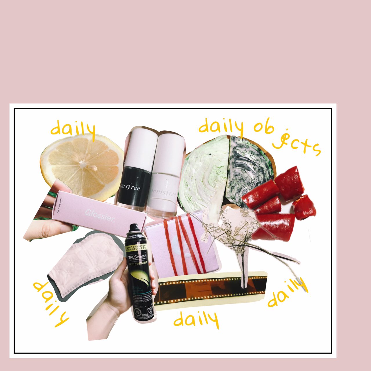
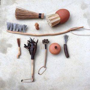
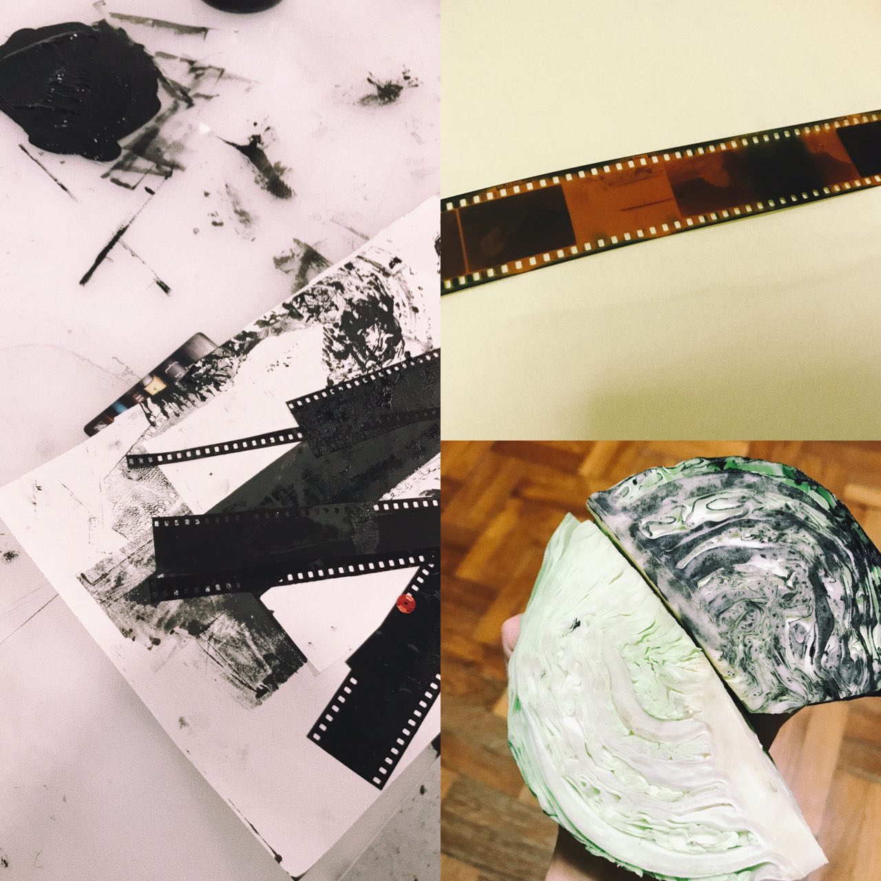
OBJECTS/TOOLS USED
I utilised daily objects that can found in my home as mark making tools for this project. Using them helped me to connect to my personal emotions and emphasise on my daily emotions better.
Some objects found at home
A more detailed list and description of items used can be read in my ‘Process and Research’ post!
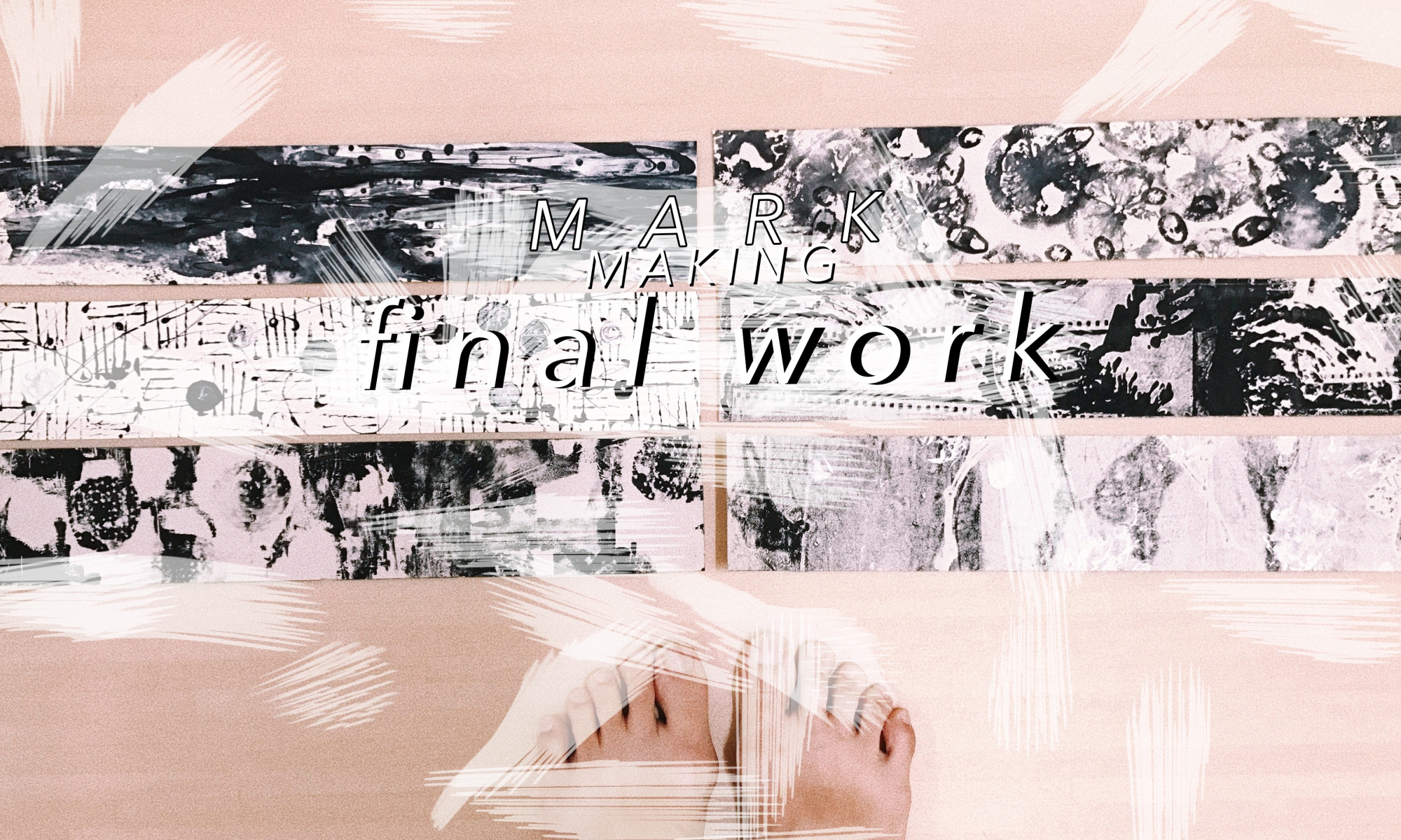
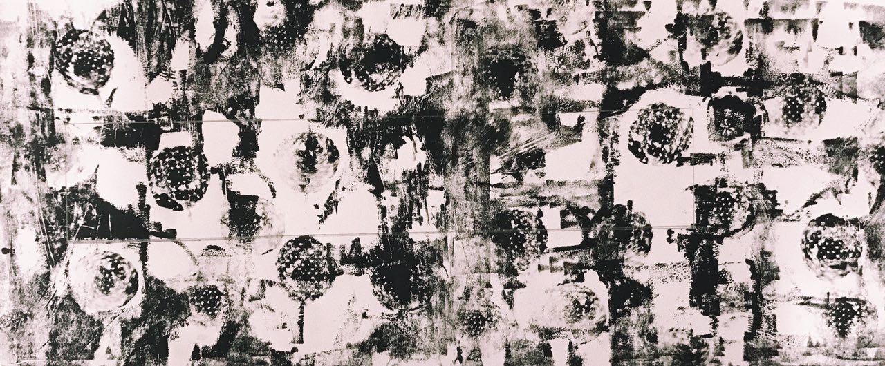
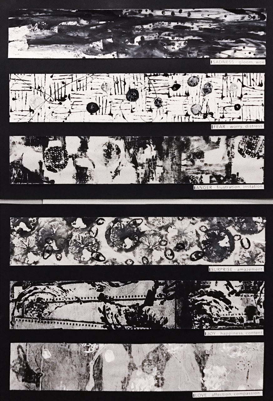
FINAL LINES OF EMOTIONS
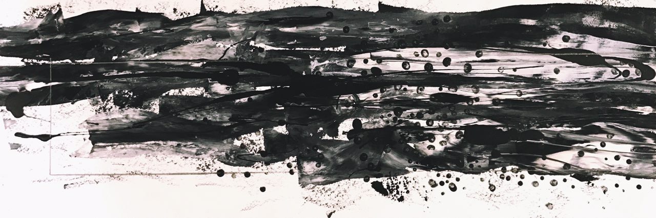
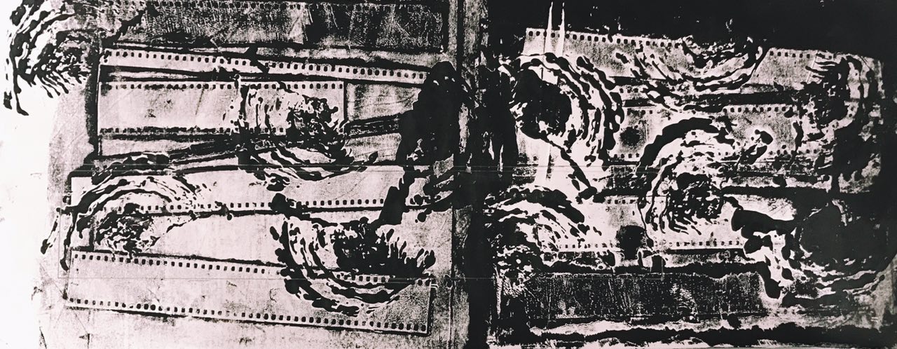
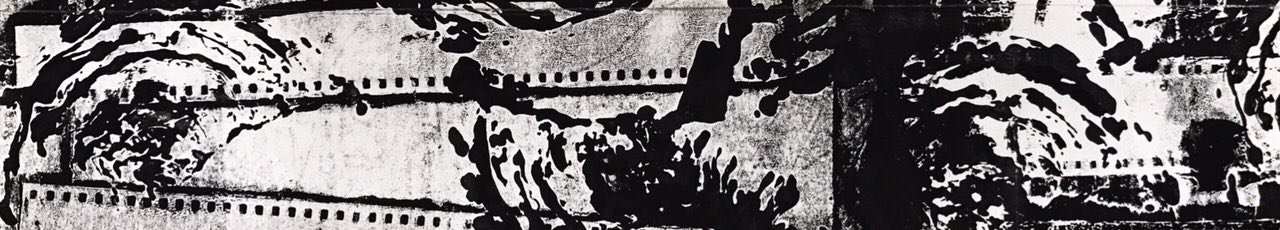
SADNESS
Before being cropped: Looking at the piece from right to left, the amount of in-between white spaces decreased. The left is darker but seem to draw thinner as if the emotion of “sadness” was felt less. It also made the piece look like a progression and caused a clear change of values throughout the piece. The dots created by the face charcoal mask were almost playing with the space, allowing more space on certain parts, as if the other parts of the piece represented breathing space.Cropped/Final: I chose to crop this part out as I feel it has a good balance of white and black parts. On the right corner of the line, you can tell that its slightly more blended out with the white water colour. The blended out texture gave the line a nice end when seen from left to right, as if the emotion is evolving and changing into something else. On the left, there is more empty space which sort of conveys a progression and also brings out the contrast. Some dots can be seen more obviously on the top, bringing out the use of shapes in contrast to the implied horizontal lines, made by the dragged out paint and drizzled charcoal mask.
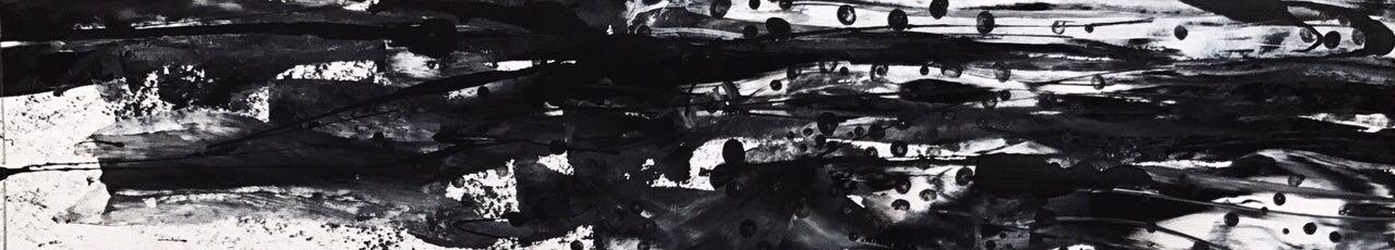
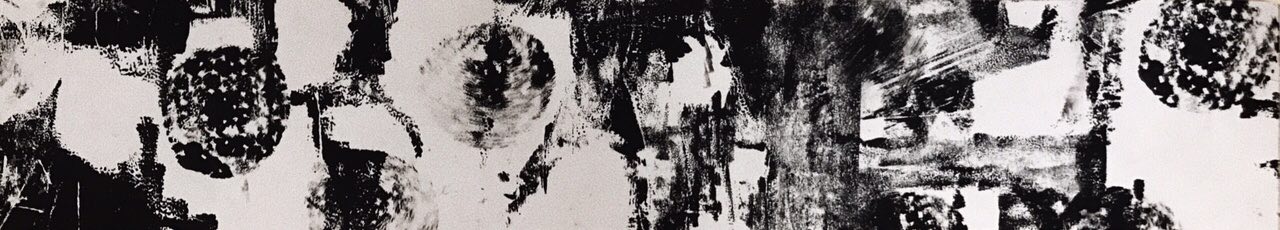
FEAR
Before being cropped: I wanted Fear to be represented by haphazard looking lines/lines that varied from each other. Thus, for the first layer, I created lines that went in different directions as if they were colliding. Some lines were not exactly straight, but slightly curled up. I felt that that brought out the uncertainty felt in the emotion of fear. Some lines are not as impactful as the rest showing some contrast and exposing more white space into the line. Circles of marbled nail polish were added on top randomly, almost as if they were clashing into the movements of the line. The use of a geometric shape represented how things are known to go in circles; never-ending, just like my fears. The difference in the circle motifs are mainly seen in their colours, bringing out a different value of light to dark tones. I thought that the final product gave me sort of a mysterious creepy feeling that can sometimes be felt in the emotion of fear.Cropped/Final: I decided to crop this portion of the line because I felt that the circle motifs were more prominent in this area which helped in bringing out the factor of creepiness and unpredictable happenings. The drizzle in this area was in a more haphazard motion which made me feel like things were more chaotic. They created a change of direction in addition to the already clashing lines. Some of the lines here are also less harsh than in other areas which made me feel that sometimes fear can come and go really quickly. The background of this line is also completely white bringing out a clear contrast to the lines, circles and drizzles used in this emotion. This final line made me feel like there is no start and end to fear because there is no clear/distinct darker area on the left/right/top/bottom.
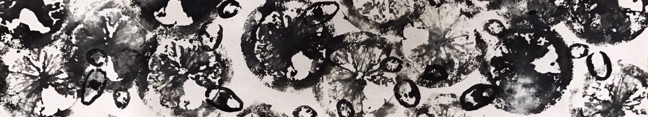
ANGER
Before being cropped: Looking at this line after it was done, I felt like it looked very patchy as if it was trying to convey some feeling of indecisiveness. The patches were made by broken eggshells and sequins (sequins because I experimented with it during early stages and liked the effect it gave). The darker tones of this line is not as strong and harsh because it was the second layer of print transferred, giving it a slightly faded and grainy texture to it. I liked how the values of this line is varied throughout as it sort of added to the idea of moodswings never quite being the same. The overall look of this line is a little messy which a factor that makes me frustrated and irritated. For the second layer, I used cut-out circular pads to imprint circle prints randomly around the paper. They ended up giving a slightly blurry effect making the sides look a little 3D. As it was printed on randomly, it still left ample white space around making the line look less of a pattern and further emphasised on the contrast. The ends of this line is slightly less crowded and vivid compared to the middle almost as if it conveys the idea of anger being built up.Cropped/Final: Deciding where to crop this line was slightly challenging for me as I thought every part of it was quite essential to convey the feeling of anger and frustration. I eventually chose this area as the final line as it most effectively showed the blurry sides of the circular pad imprints, in contrast to the almost empty background at the back. After seeing how that worked out, it made me feel how sometimes anger isn’t caused by a single situation but rather can be a built up of other elements as well. Towards the end of line on the right, the dynamics of the line changes slightly, almost trying to convey a different side of anger and frustration. I felt that, that turned out quite nicely, conveying the idea that anger often changes when the heat of the moment is over. There are some sort of lines formed towards the right of this piece and it looks like movement lines as the sides are quite blurry almost as if the circular pad imprints are travelling/bouncing around the paper.
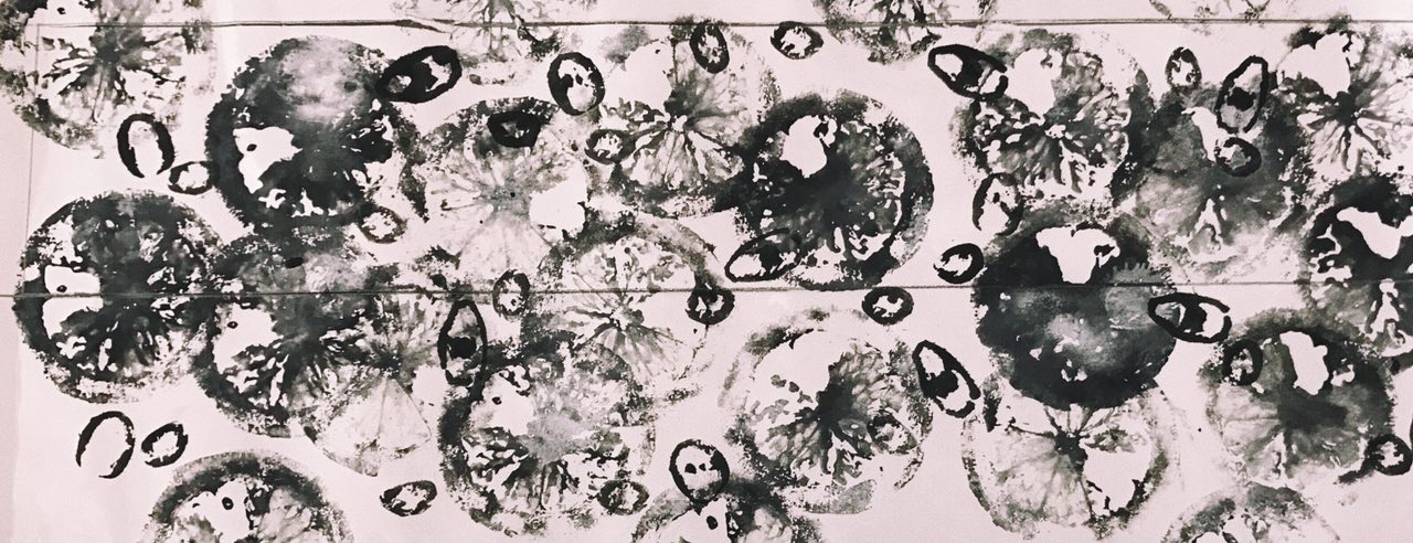
SURPRISE
Before being cropped: The emotion of surprise was initially the most challenging for me as I tried to associate objects to that feeling of amazement. However, I ended up having the most fun doing this line. I initially had the idea of overlapping the lemon prints but I ended up just imprinting them more spread out and surrounding most of the paper. I spread out my motion and thus the dark tones of this line is also spread out. Because of that, some lemon prints were more prominent than others, almost like the rest of the lemons were like an after effect of being surprised – less impactful and faded. The empty space in this line was still evident despite it being slightly more overcrowded compared to the other emotions. The chili prints were slightly darker so they looked like they were above the lemons like they were being separated by a plastic sheet in the middle. The emotion of amazement and surprise can be of different levels depending on how rare it happens and how focused I am in what I am doing. As I wanted to include a layer involving movement, I continued to spray the line with dry shampoo, giving the line blotches of white patches that faded out and added grey bits to existing prints. The middle of the line is darker than the sides and it sort of shows a progression of the emotion.Cropped/Final: I chose this part of the line as it was more crowded, and more elements were clashing and overlapping. To me surprise can sometimes come less frequently compared to other emotions and so this overcrowding effect became a surprise to me. It was like something different and it amazed me. the white bits of this line is more evident towards the middle of the piece before it immediately continues with a much darker lemon imprint, showing the big contrast. Although the lemon slice is quite overcrowding, bits of it are slightly faded out in contrast to the dark chili imprints. The final piece of this line felt as if the start of the emotion was more overlapped and concurrent before slowly separating and spreading out towards the right of the line.
JOY
Before being cropped: The emotion of Joy was very interesting to create. The only trouble I had was not knowing what daily object to use to convey happiness because so many things made me content and happy. I made use of the layering once again but this time round, the layers fused together quite nicely resulting in a effect I was not expecting but loved it a lot anyway. I like how there’s a good contrast in the tones of this line, conveying the idea of vividness especially in Joy. The flim strips were placed randomly but all almost going towards the same direction as if trying the reach the ultimate goal (of contentment and joy). The lines lead the eyes to the ends of the paper and draws me in to observe the emotion even more. The middle part of this line is darker and sudden so I thought that this showed how happiness can sometimes flow in all at once leaving us speechless and lost for words. The cabbage imprints turned out to almost resemble seashells which many associate with contentment and happiness. The right side of the line is a lot darker and rich before reaching a lighter side on the left. I liked that it sort of showed different stages of happines.Cropped/Final: The cabbage imprints of this portion, particularly look as if it was part of the film strip. It added an element of dialogue to the line. From that, I could relate to my perception of joy as a lot of it involves the people around me and the activities done with them which all involves a dialogue. As said above, the abrupt dark tone in the middle sort of shows the stages of joy and happiness. I like how the cabbage print came out even more strong and vivid after the layer of film roll was added. Great contrast can be seen even when the light tone of this line is not actually white. This piece feels kind of like a story because the lines from the film strips gives a direction and the cabbage imprints look like they are travelling across the paper.
LOVE
Before being cropped: I liked how this line turned out more faded and lighter compared to the rest of the emotions even though this line has far lesser white space. At a glance, the line gets darker towards the left of the paper. The flowers kind of convey the growth of love because almost every relationship (friend or partner) starts from being strangers. They also help to bring out the contrast of this line. The flowers are placed almost in a straight line which helps lead one’s eyes from one end of the line to the other and also makes the line look minimalist and simple. The added white paint represent my loved ones. Even though they are not abundant, they are important and stand out in my life just like how the white bits stand out in this line. The more complicated white imprints are actually from my dog’s paws but because he is so furry, they did not appear like paw prints at all. I guess that brought out the realness and authenticity of love.Cropped/Final: I chose to crop this part of the line as it had the main elements of the piece and clearly showed different but similar looking elements in a line. I liked the contrast produced by the prints of the flowers and how it ended light and most defined towards the right of the line. As if love has blossomed and will continue to stay simple yet powerful. The elements of this line is spread out and feels calming to me as if it is not in a rush. To me, love is soft, light and slow but yet impactful underneath. It is almost surreal and thus, I wanted it to look most different from the rest of the emotions.
AT ONE GLANCE
When put together —
After putting them together and seeing them in sequence, I felt as if there were a story and dialogue going on within my lines!
More detailed exploration and process can be found here!
HAD A LOT FUN CREATING NEW PERSPECTIVES TO
MY EMOTIONS!
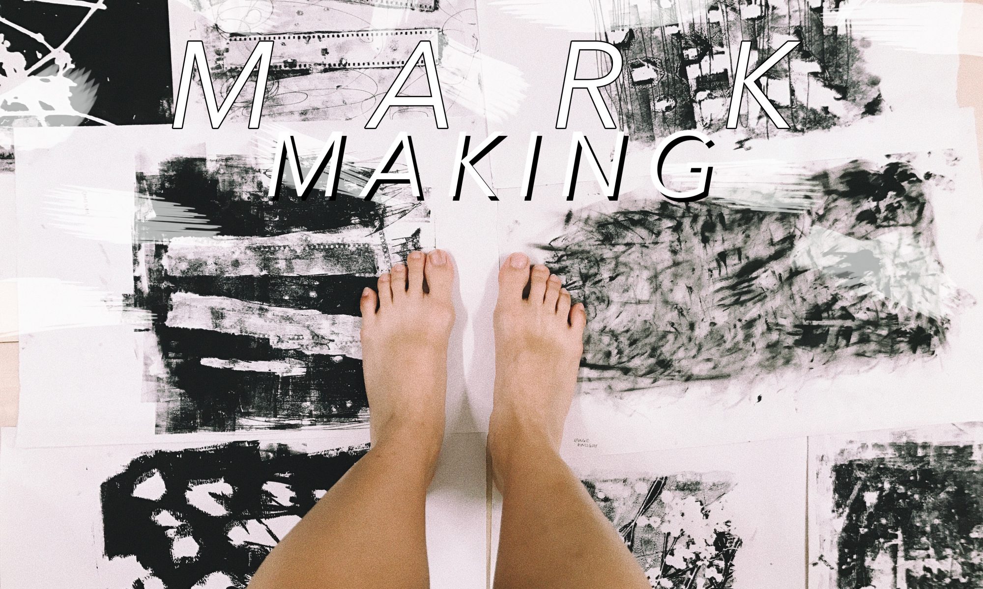
Thoughts, ideas, objects flooded my head as I read the brief.
This was going to be my first 2D assignment.
Initial thoughts: I thought that this brief was actually pretty interesting and allowed us to basically have fun. I immediately started looking into Pinterest for various mark making techniques hoping it would eventually spark an idea in me
I liked the simplicity of the various marks put togetherThese cute round cut-out patterns caught my eyes even with its simple elements – brush strokes, dots, blotchesEven daily objects we have at home can create unique expressions and art
Emotions are pretty subjective, they mean different things and feel different to each human. I felt that this topic was rather broad and actually had no clue where to began. After which, I decided that exploration and experimenting might narrow my train of thoughts and help me to eventually settle with something I am most comfortable with or am happy about.
“Your emotions are the slaves to your thoughts, and you are the slave to your emotions.” – Elizabeth Gilbert
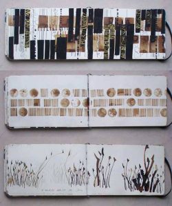
early stage exploration
In the midst of my explored mark making papers
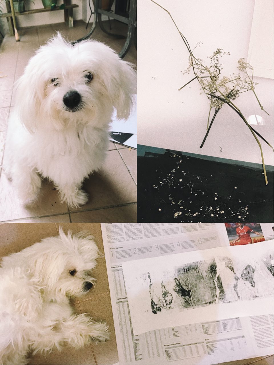
Played with objects I found at home. I chose these objects as they connect with me on a deeper level.
OBJECTS USED:
Film Roll
Dried Baby’s Breath Flowers
Sequins
Sponge
Old Necklace
here are some of my favourite outcomes,
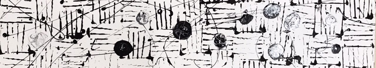
Left to Right: Sequins, Dried Flowers, Film Roll
| I liked how the marks formed had some form of contrast to them. Especially from the sequins, I expected the white parts to be circular but it resulted in unexpected organic shapes kind of resembling mood swings, unpredictable and in batches.
|| The dried flowers formed sort of an outline leaving the inside of the stalk white in contrast to the background. They formed random long lines, sort of giving direction to the piece. Some blotches of white were created, giving a mystical yet mysterious effect.
||| The film strip mark was made using the remaining ink after printing it a few times. Thus, the background was quite faint and a lot lighter compared to the other two. I liked how the outline of the film strip turned out to be darker than the rest, making the strip pop up a little more. Also, one strip turned out to be darker than the other showing some sort of progression in that piece.
IDEATION AND NARROWING IDEAS
I think that I feel a range of emotions in a span of a day. From being sad to feeling slightly happier to being grouchy and then feeling loved like my heart is warm and full. I am actually not too sure how healthy that is? but generally I am a person who just feels a lot.
As such, I thought why not incorporate this fact into my project and make my daily emotions come to life. I feel that my emotions vary a lot depending on daily situations and I am sure that it is the same for others as well, but I think on the whole, some of my emotions stay consistent on a day to day basis unless affected by a huge factor.
Since I feel so many emotions at once, my emotions are actually being felt concurrently. This to me, translates into layers in art form.
LAYERS
Using layers to convey concurrent emotions —
Searched ‘Art Layers’ on PinterestI like how the layers used bring out the colour and emotion of the art piece
ARTIST REFERENCES
Ed Moses
Ed Moses can be described as an abstract expressionist. He is known for experimenting with layers using basic shapes to create depth. His art works comprises of layers of different mediums.
Ed Moses, Untitled, 1975-77, Acrylic, ink, and tape on foamcoreEd Moses, Cubist Drawing #11, 1977-78 Charcoal, acrylic, india ink and masking tape on board
His use of layers are intriguing, though pretty simple, it still manages to draw me in. I liked how he manages to create depth through his use of layers, making the art piece pop little more.
Bernd Ribbeck
Bernd Ribbeck is described as a spiritualist, using spiritual ideas to inspire his works. He is influenced by artists such as Hilma Af Klint and Emma Kunz. His work is process-orientated, making use of layers and scrapping surfaces to achieve the desired effect.
Bernd Rebbick, Untitled, 2014, acrylics, ballpointpen, pigmented marker on mdfBernd Ribbeck, Ohne Titel (Untitled), 2010, acrylic and pigment marker on MDF
Through the use of geometric shapes, Bernd Ribbeck manages to create artworks that look quite pleasing to the eye. With the different use of textures and layers, he manages to add life to his works, making me want to stare at it longer.
Julie Mehretu
Julie Mehretu is an abstract artist known for her use of layers throughout her works. She layers mediums, images, marks and even makes use of figurative layering. Her work from a far looks creates a whole picture but when seen unclose, it breaks down to smaller bits and suddenly there are many different narratives happening at the same time. Some mediums she use include, acrylic, pen, pencil and ink.
Julie Mehretu, Mogamma Part 1, 2012, Ink and Acrylic on canvasJulie Mehretu, Invisible Line, 2010-2011, Ink and Acrylic on canvas
—
After doing some research on layers, I experimented layering marks one on top of another. Initially, I thought that layering would be a breeze, but I was proven wrong by my own actions. In the process of layering, instead of immediately seeing the final results of the mark made, I had to plan what looks better as the top layer or vice versa. In addition, I had to wait for the ink to dry before attempting the second layer. This took up extra time and effort but it was definitely worth it all!!
I felt that layering helped in bringing out more contrast in the lines and more obviously showed empty space. The values of the lines were also more varied due to the different ink pressures from different layers.
Some pretty decent outcomes –
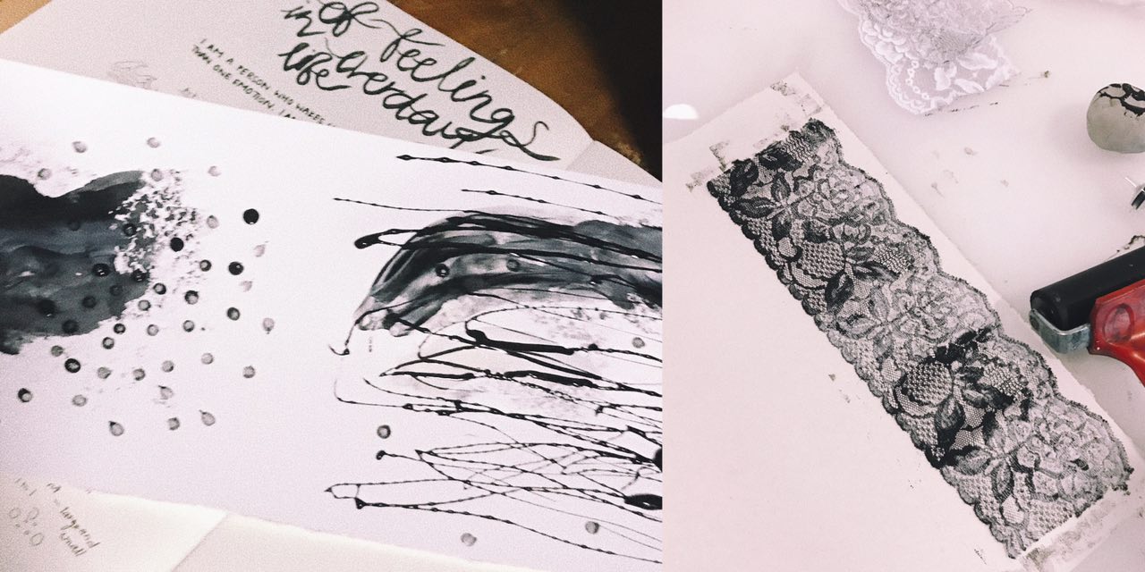
Left to Right: Watercolour (bottom) Charcoal mask (top), Lace (2 layers)
| I was quite happy with the results produced through layering. By layering, it helped add depth to my emotions and gave some room for space and different textures. As seen in the left picture, the first layer is a lot softer than the lines made by the charcoal mask. The lines added made the emotion feel more confusing and highlighted the dark tone of the whole piece.
|| The right picture was an outcome after 2 layers of opposite lace was stacked one of top another. Although it seems like there is only one layer from far, when looked in detail, you can see some of the flower patterns overlapping each other adding a blur effect to the whole piece. The layering also made some parts darker than the other, bringing out some contrast.
ENROUTE TO FINAL ‘EMO LINES’
6 different emotions
Since I feel a set of emotions daily, my lines are a representation of my day according to how I feel. After much thought and analysis, I have arranged the various emotions along a span of a day.
Sadness > Fear > Anger > Surprise > Joy > Love
S A D N E S S
As depressing as it sounds, I am generally sad when I wake up (with the exception of days where there is something exciting to look forward to). The second the alarm on my phone rings, I am awake. Sometimes, I really hate being a light sleeper just so that I can sleep just a teeny weeny bit longer…
In my layers, I hope to stick through the idea of putting together a use of a daily object and a movement to express the emotion.
Object: Pimple Cream (applied with cotton bud)
Movement: Draggy, dreadful
Top: Watercolour Bottom: Results of dragged out watercolour using a card
Final outcome with added use of dots and horizontal drips of charcoal mask
F E A R
I will definitely never use the word, “brave” to describe myself as unpredictable and new situations tend to be pretty intimidating to me. I feel the emotion, fear, more in the beginning of the day because I don’t quite know what the day ahead will be like for me (good or bad). Thus, I tend to overthink and fear for things that have not happened.
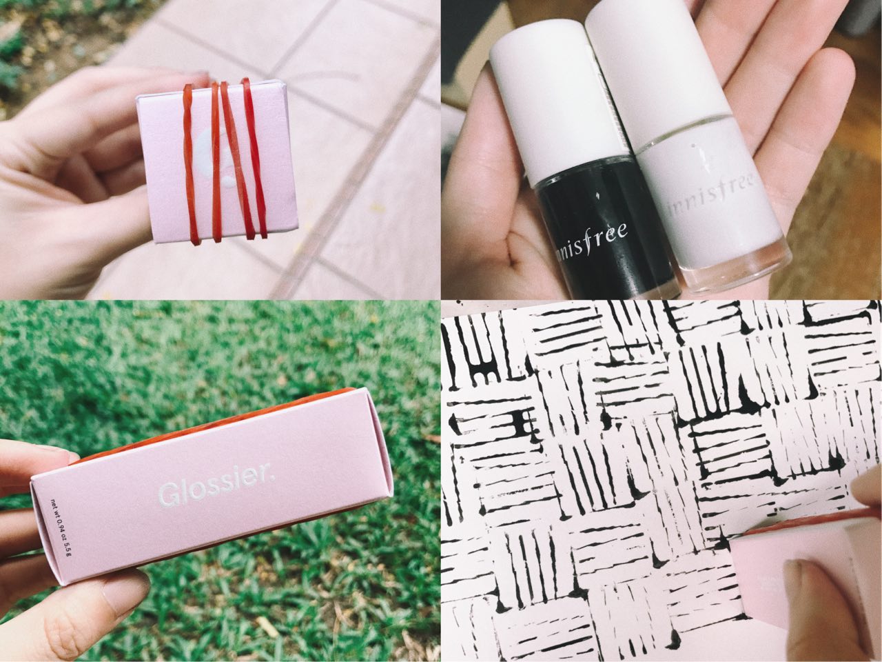
Object: Rubber bands and empty skincare box
Movement: Circles, repeated, never ending & haunting
Left two pics: Rubber bands on empty skincare Top right: Nail polish used to create circles and never ending effect Bottom right: effect produced with DIY mark making tool
Final outcome
A N G E R
During the day, when things get little wonky and don’t go according to plans, I tend to get a little frustrated and irritated because interruptions to any kind of plans irritate me. Of course, mood swings can also be a reason for a more moody Dinis, once every time of the month.
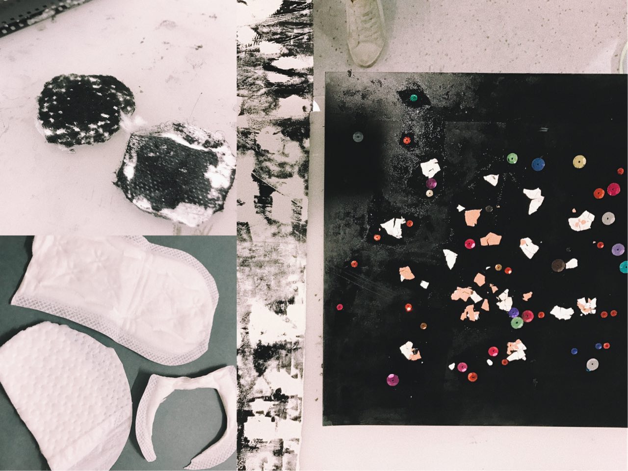
Object: Eggshells sequins, pads
Movement: Clear marks made with strength from negative energy
Left two pics: Pads used to represent grouchiness Right: Eggshells and sequins as mark making toolsFinal outcome. Pad effect on top layer.
S U R P R I S E
Any sudden unplanned situation/event would be considered a surprise to me. Seeing a sudden familiar face, or eating something with an unexpected taste are some things that will definitely surprise me. Being surprised means I will never know when its going to happen, however, I feel that in the middle of my day, there are generally more opportunities for me to be surprised. E.g. running into a friend outside.
Object: Lemons, Chili
Movement: Sprayed marks using dry shampoo (conveys impromptu and sudden movements)
Top two pics: Chili and lemon used as mark making tools Bottom pic: Using dry shampoo to produced “sprayed” movement onto paperFinal outcome. Dry shampoo effect on top layer.
J O Y
Happiness is the simple things in life. I am usually pretty simple-minded and even little things can excite me. I guess I feel generally blissful and content with what I have in life. Some things that make me happy include eating (especially with family or friends) and exploring new places. Joy comes at different times of the day but for me, I feel most happy and content at almost the end of a long day because it means finally some time to rest and also to be grateful for the day that has just past.
Object: Cabbage and film strips
Movement: Simple, straightforward, easy
Left pic: Inked Film Strip Bottom right: Inked Cabbage that represents my joy for foodFinal outcome. Cabbage marks on bottom layer, film strip marks on top layer.
L O V E
And finally the day ends with love! Love is kind, compassionate and it makes my heart warm & full. Cringy, but love is really the best reward at the end of a long day. Family and close friends make me feel loved and makes me want to share my love with those that are important to me. Things like flowers also remind me of the beauty in life which often relate back to my loved ones.
Object: Dried flowers
Movement: Dog paw prints and thumbprints of my family members (using face paint)
Top right pic: Dried Baby’s Breath Flowers Bottom pic: My dog laying next to print before putting in his paw printFinal outcome. Simple and light. Flowers print on bottom layer and paw print/thumbprints on top layer.

 Prior to choosing Wessex Estate, I also considered other locations such as Balestier and Whampoa as they had unique characteristics. However after much field research, I decided to go with Wessex Estate due to where its located, the people I met there and the serenity of the whole estate itself – unlike many other estates in Singapore.


 The first column of my personalities will be


