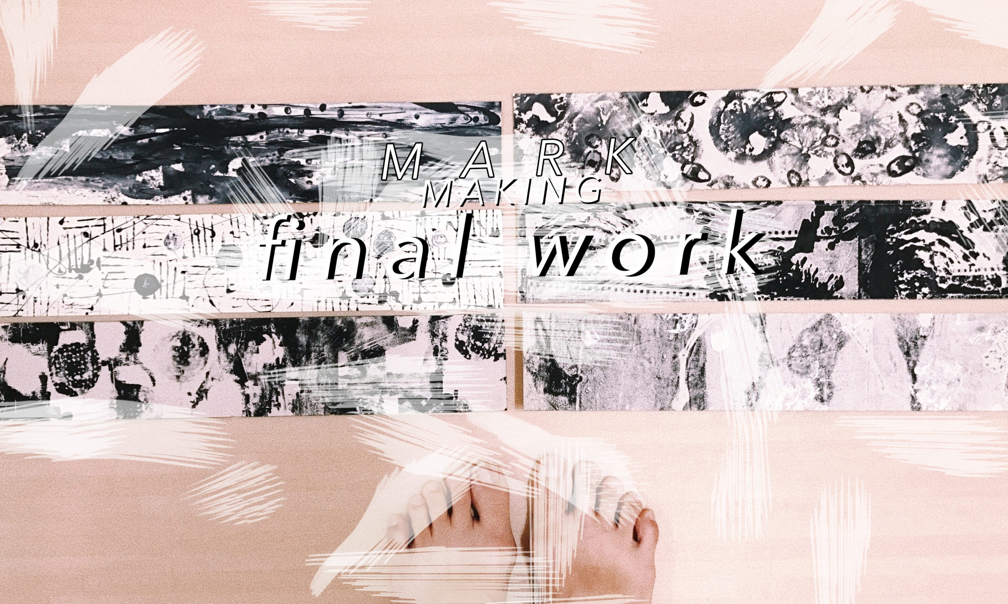
After 4 weeks of research, exploration and narrowing of ideas, my lines of emotions have been executed
and finalised.
CONCEPT
| As sensitive person, I feel that my emotions are never defined or absolute, they seem to co-exist and hard to describe |
It’s almost as if my emotions are made up of different elements and joined together to form a unique emotion of its own.
Hence, I incorporated the use of layers to convey different elements that make up a particular emotion of mine. Through the use of layers, I was able to better convey emotions from my personal point of view and allow room for exploration. I found out that layering helps to add depth to my lines, create empty spaces and give a varied use of values even in single line.
OBJECTS/TOOLS USED
I utilised daily objects that can found in my home as mark making tools for this project. Using them helped me to connect to my personal emotions and emphasise on my daily emotions better.
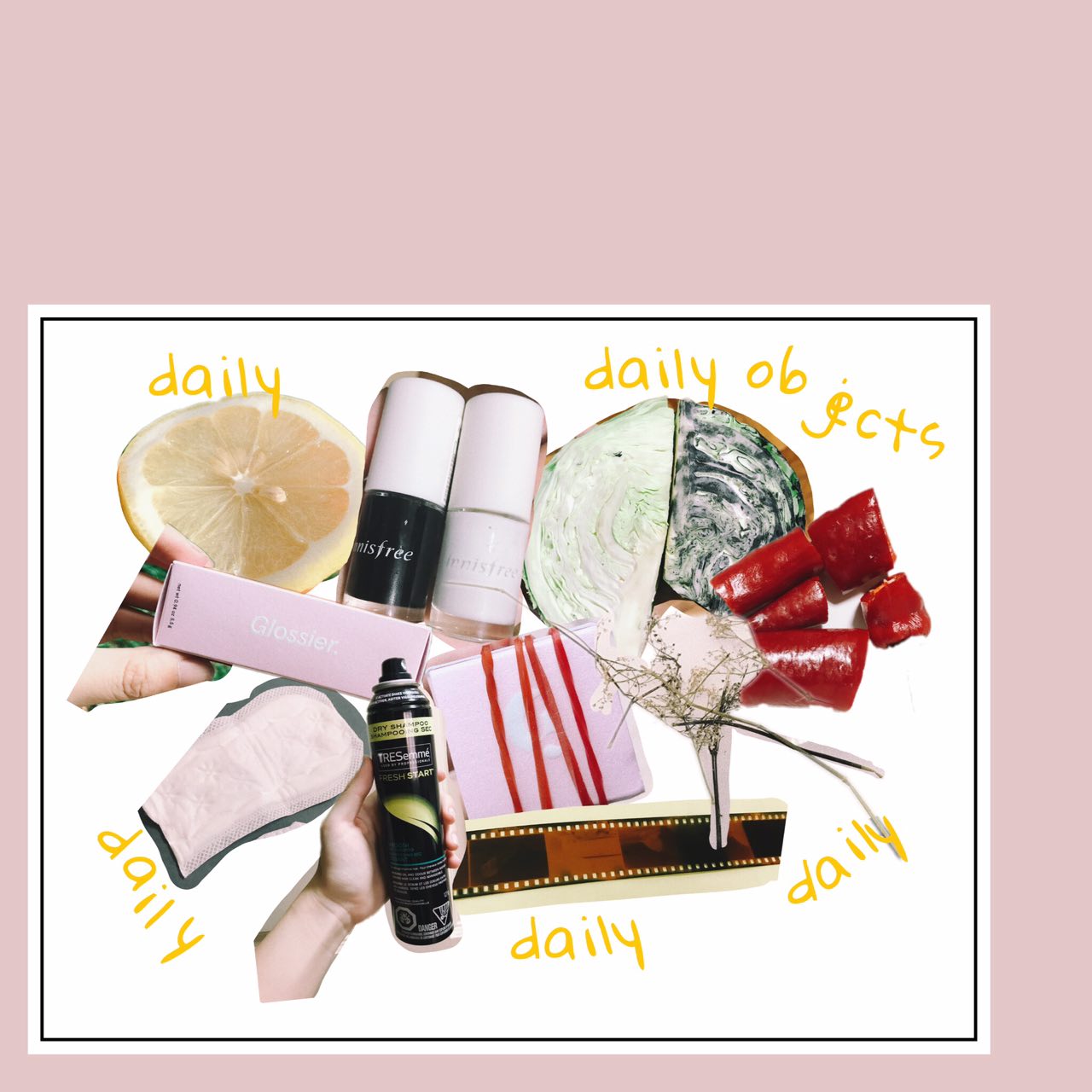
A more detailed list and description of items used can be read in my ‘Process and Research’ post!
FINAL LINES OF EMOTIONS
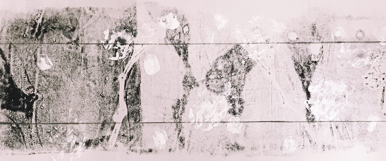
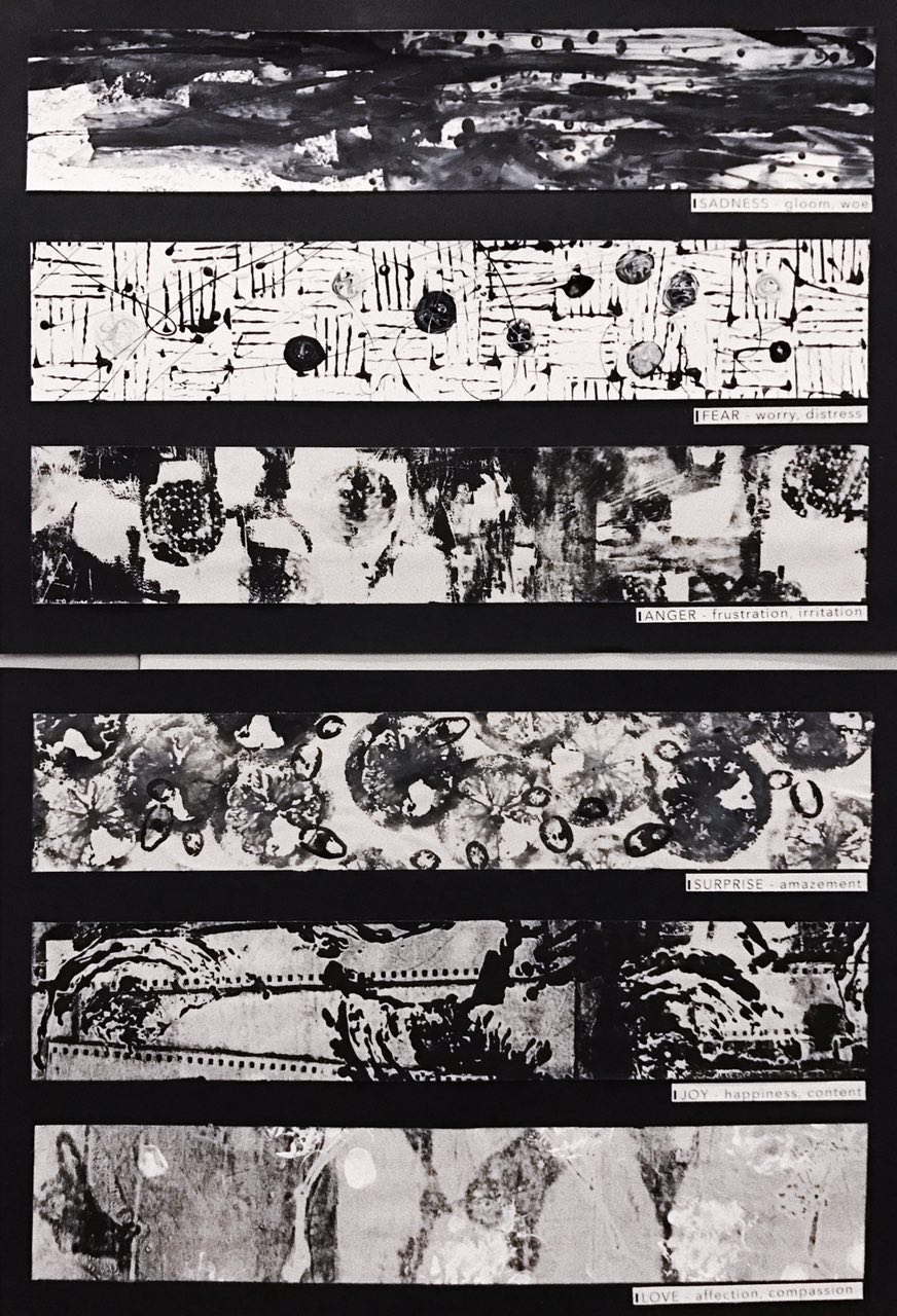
SADNESS
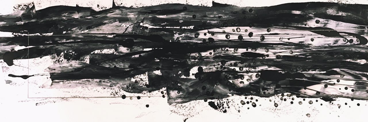
Looking at the piece from right to left, the amount of in-between white spaces decreased. The left is darker but seem to draw thinner as if the emotion of “sadness” was felt less. It also made the piece look like a progression and caused a clear change of values throughout the piece. The dots created by the face charcoal mask were almost playing with the space, allowing more space on certain parts, as if the other parts of the piece represented breathing space.
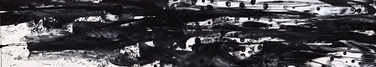
I chose to crop this part out as I feel it has a good balance of white and black parts. On the right corner of the line, you can tell that its slightly more blended out with the white water colour. The blended out texture gave the line a nice end when seen from left to right, as if the emotion is evolving and changing into something else. On the left, there is more empty space which sort of conveys a progression and also brings out the contrast. Some dots can be seen more obviously on the top, bringing out the use of shapes in contrast to the implied horizontal lines, made by the dragged out paint and drizzled charcoal mask.
FEAR

I wanted Fear to be represented by haphazard looking lines/lines that varied from each other. Thus, for the first layer, I created lines that went in different directions as if they were colliding. Some lines were not exactly straight, but slightly curled up. I felt that that brought out the uncertainty felt in the emotion of fear. Some lines are not as impactful as the rest showing some contrast and exposing more white space into the line. Circles of marbled nail polish were added on top randomly, almost as if they were clashing into the movements of the line. The use of a geometric shape represented how things are known to go in circles; never-ending, just like my fears. The difference in the circle motifs are mainly seen in their colours, bringing out a different value of light to dark tones. I thought that the final product gave me sort of a mysterious creepy feeling that can sometimes be felt in the emotion of fear.
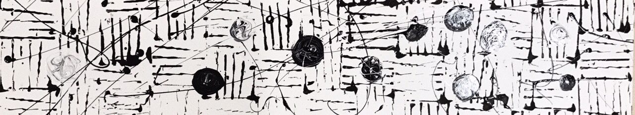
I decided to crop this portion of the line because I felt that the circle motifs were more prominent in this area which helped in bringing out the factor of creepiness and unpredictable happenings. The drizzle in this area was in a more haphazard motion which made me feel like things were more chaotic. They created a change of direction in addition to the already clashing lines. Some of the lines here are also less harsh than in other areas which made me feel that sometimes fear can come and go really quickly. The background of this line is also completely white bringing out a clear contrast to the lines, circles and drizzles used in this emotion. This final line made me feel like there is no start and end to fear because there is no clear/distinct darker area on the left/right/top/bottom.
ANGER
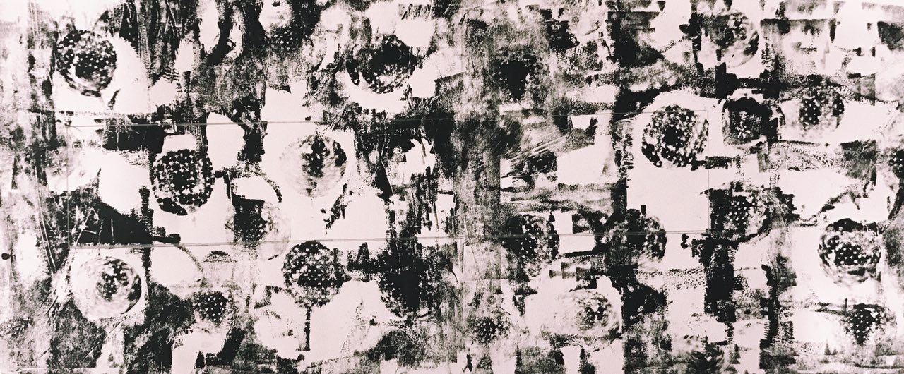
Looking at this line after it was done, I felt like it looked very patchy as if it was trying to convey some feeling of indecisiveness. The patches were made by broken eggshells and sequins (sequins because I experimented with it during early stages and liked the effect it gave). The darker tones of this line is not as strong and harsh because it was the second layer of print transferred, giving it a slightly faded and grainy texture to it. I liked how the values of this line is varied throughout as it sort of added to the idea of moodswings never quite being the same. The overall look of this line is a little messy which a factor that makes me frustrated and irritated. For the second layer, I used cut-out circular pads to imprint circle prints randomly around the paper. They ended up giving a slightly blurry effect making the sides look a little 3D. As it was printed on randomly, it still left ample white space around making the line look less of a pattern and further emphasised on the contrast. The ends of this line is slightly less crowded and vivid compared to the middle almost as if it conveys the idea of anger being built up.
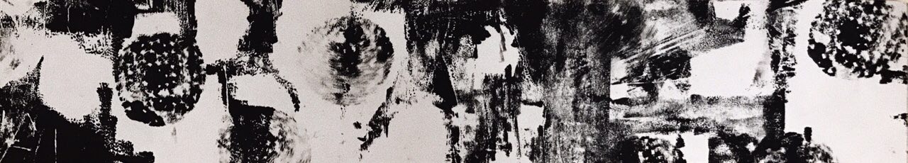
Deciding where to crop this line was slightly challenging for me as I thought every part of it was quite essential to convey the feeling of anger and frustration. I eventually chose this area as the final line as it most effectively showed the blurry sides of the circular pad imprints, in contrast to the almost empty background at the back. After seeing how that worked out, it made me feel how sometimes anger isn’t caused by a single situation but rather can be a built up of other elements as well. Towards the end of line on the right, the dynamics of the line changes slightly, almost trying to convey a different side of anger and frustration. I felt that, that turned out quite nicely, conveying the idea that anger often changes when the heat of the moment is over. There are some sort of lines formed towards the right of this piece and it looks like movement lines as the sides are quite blurry almost as if the circular pad imprints are travelling/bouncing around the paper.
SURPRISE
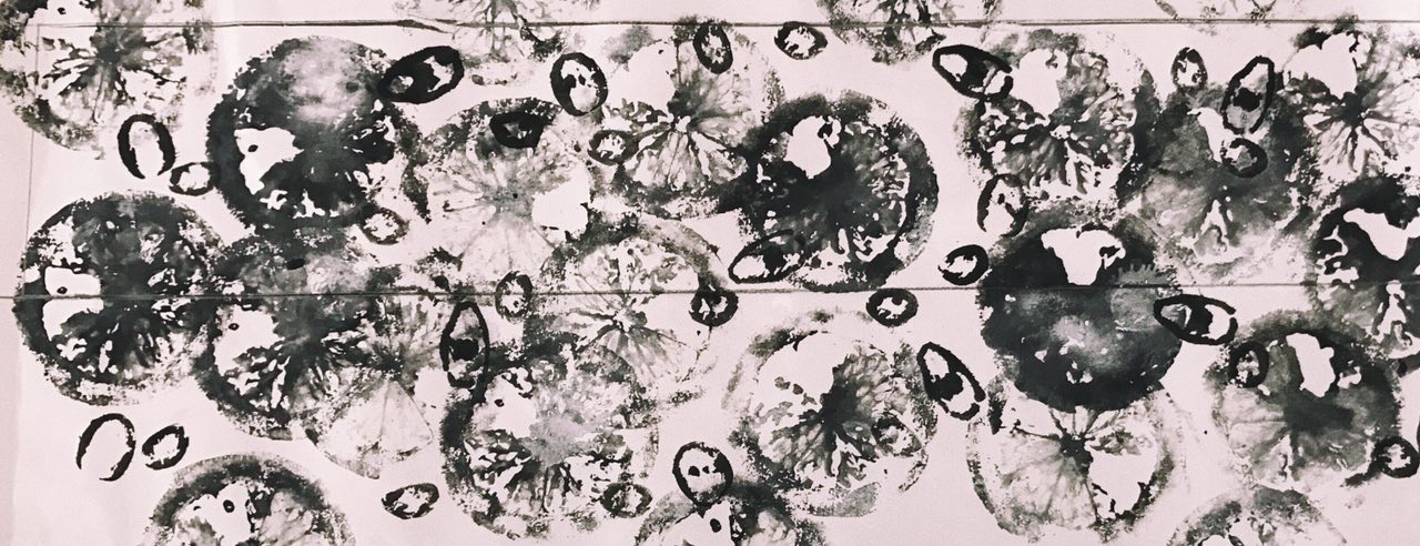
The emotion of surprise was initially the most challenging for me as I tried to associate objects to that feeling of amazement. However, I ended up having the most fun doing this line. I initially had the idea of overlapping the lemon prints but I ended up just imprinting them more spread out and surrounding most of the paper. I spread out my motion and thus the dark tones of this line is also spread out. Because of that, some lemon prints were more prominent than others, almost like the rest of the lemons were like an after effect of being surprised – less impactful and faded. The empty space in this line was still evident despite it being slightly more overcrowded compared to the other emotions. The chili prints were slightly darker so they looked like they were above the lemons like they were being separated by a plastic sheet in the middle. The emotion of amazement and surprise can be of different levels depending on how rare it happens and how focused I am in what I am doing. As I wanted to include a layer involving movement, I continued to spray the line with dry shampoo, giving the line blotches of white patches that faded out and added grey bits to existing prints. The middle of the line is darker than the sides and it sort of shows a progression of the emotion.
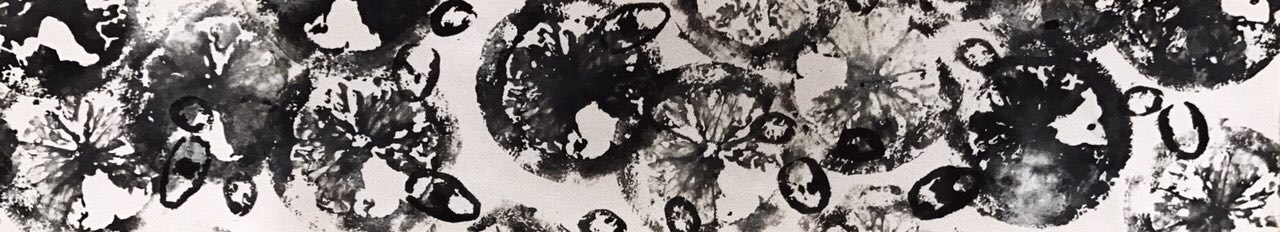
I chose this part of the line as it was more crowded, and more elements were clashing and overlapping. To me surprise can sometimes come less frequently compared to other emotions and so this overcrowding effect became a surprise to me. It was like something different and it amazed me. the white bits of this line is more evident towards the middle of the piece before it immediately continues with a much darker lemon imprint, showing the big contrast. Although the lemon slice is quite overcrowding, bits of it are slightly faded out in contrast to the dark chili imprints. The final piece of this line felt as if the start of the emotion was more overlapped and concurrent before slowly separating and spreading out towards the right of the line.
JOY
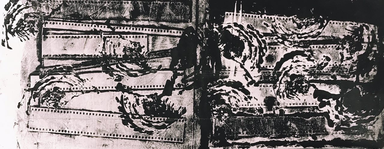
The emotion of Joy was very interesting to create. The only trouble I had was not knowing what daily object to use to convey happiness because so many things made me content and happy. I made use of the layering once again but this time round, the layers fused together quite nicely resulting in a effect I was not expecting but loved it a lot anyway. I like how there’s a good contrast in the tones of this line, conveying the idea of vividness especially in Joy. The flim strips were placed randomly but all almost going towards the same direction as if trying the reach the ultimate goal (of contentment and joy). The lines lead the eyes to the ends of the paper and draws me in to observe the emotion even more. The middle part of this line is darker and sudden so I thought that this showed how happiness can sometimes flow in all at once leaving us speechless and lost for words. The cabbage imprints turned out to almost resemble seashells which many associate with contentment and happiness. The right side of the line is a lot darker and rich before reaching a lighter side on the left. I liked that it sort of showed different stages of happines.
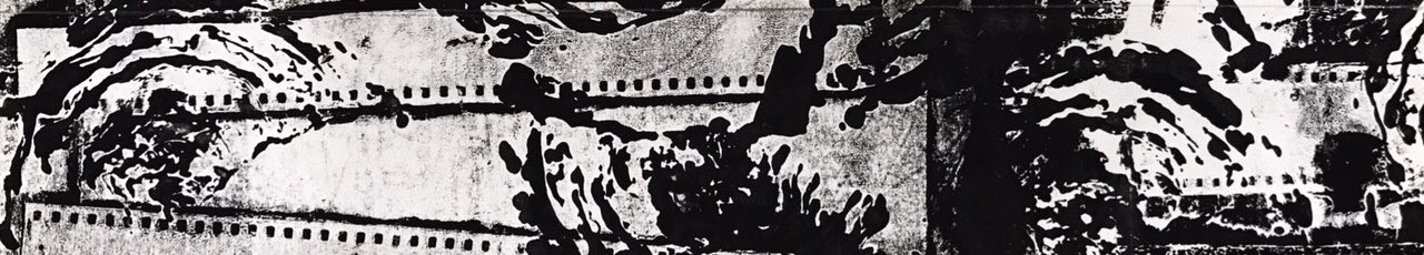
The cabbage imprints of this portion, particularly look as if it was part of the film strip. It added an element of dialogue to the line. From that, I could relate to my perception of joy as a lot of it involves the people around me and the activities done with them which all involves a dialogue. As said above, the abrupt dark tone in the middle sort of shows the stages of joy and happiness. I like how the cabbage print came out even more strong and vivid after the layer of film roll was added. Great contrast can be seen even when the light tone of this line is not actually white. This piece feels kind of like a story because the lines from the film strips gives a direction and the cabbage imprints look like they are travelling across the paper.
LOVE
I liked how this line turned out more faded and lighter compared to the rest of the emotions even though this line has far lesser white space. At a glance, the line gets darker towards the left of the paper. The flowers kind of convey the growth of love because almost every relationship (friend or partner) starts from being strangers. They also help to bring out the contrast of this line. The flowers are placed almost in a straight line which helps lead one’s eyes from one end of the line to the other and also makes the line look minimalist and simple. The added white paint represent my loved ones. Even though they are not abundant, they are important and stand out in my life just like how the white bits stand out in this line. The more complicated white imprints are actually from my dog’s paws but because he is so furry, they did not appear like paw prints at all. I guess that brought out the realness and authenticity of love.
I chose to crop this part of the line as it had the main elements of the piece and clearly showed different but similar looking elements in a line. I liked the contrast produced by the prints of the flowers and how it ended light and most defined towards the right of the line. As if love has blossomed and will continue to stay simple yet powerful. The elements of this line is spread out and feels calming to me as if it is not in a rush. To me, love is soft, light and slow but yet impactful underneath. It is almost surreal and thus, I wanted it to look most different from the rest of the emotions.
AT ONE GLANCE
When put together —
After putting them together and seeing them in sequence, I felt as if there were a story and dialogue going on within my lines!
More detailed exploration and process can be found here!
HAD A LOT FUN CREATING NEW PERSPECTIVES TO
MY EMOTIONS!