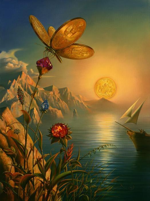
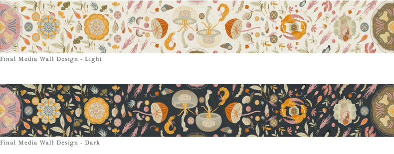
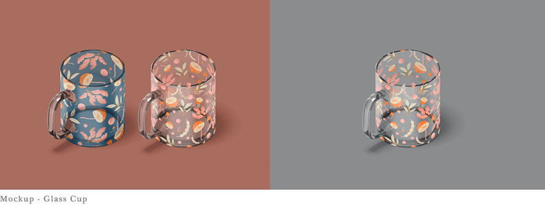
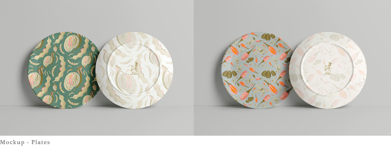
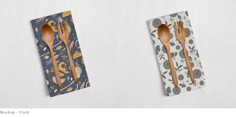
Foraged Earth – Whether by animals or humans, we source for food from Mother Earth. It could have been plucked from the grounds, hunted in the woods or fished from the sea. The natural food our Earth produces is intriguing, unique and so important to us. Thus through this, I hope to highlight some food ingredients together with important organisms that are essential in our food chain. May we learn to be more aware of our surroundings and learn to slow down to appreciate our natural ingredients every now and then.
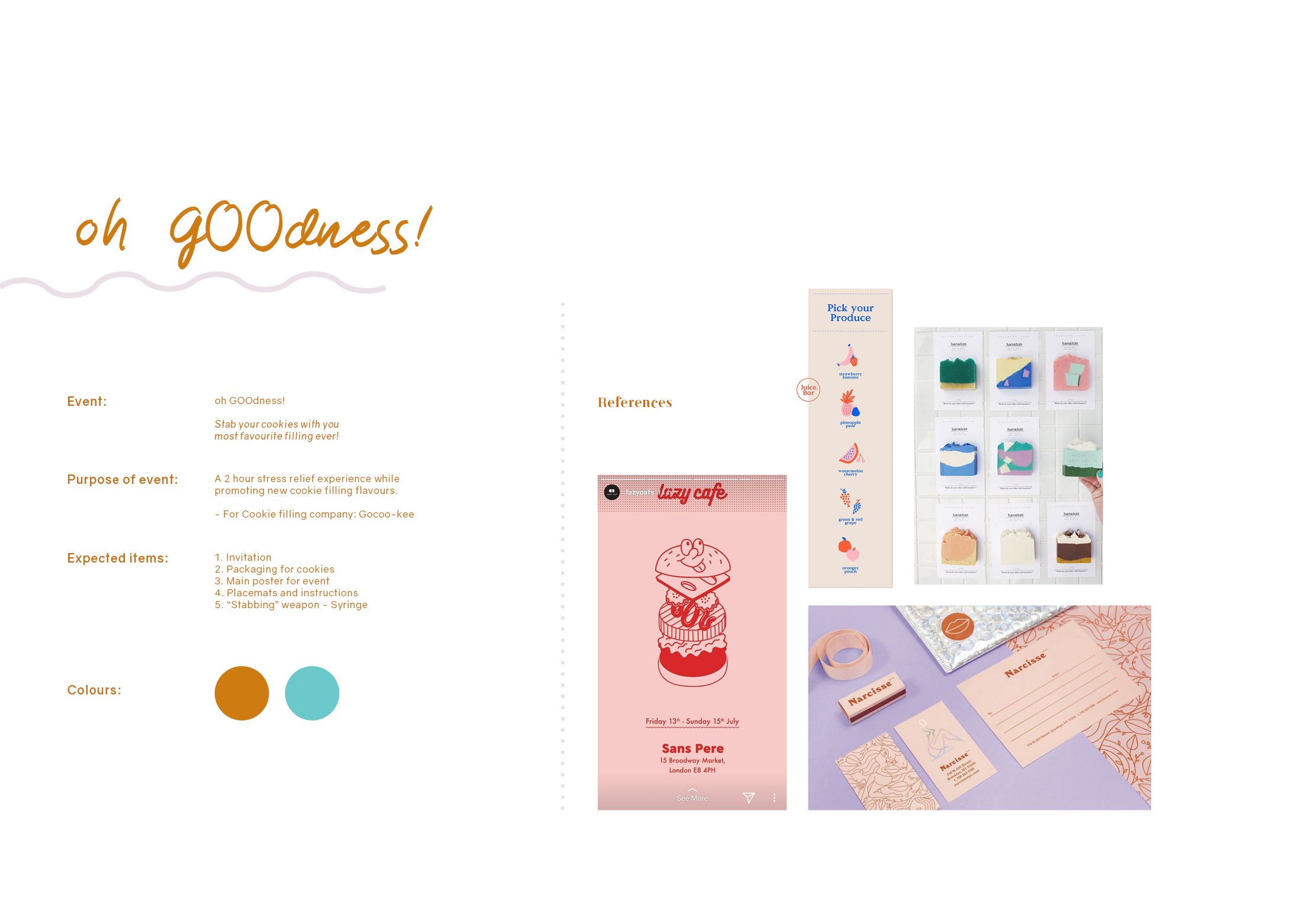
For this final project, we were given the freedom to decide on any event we want and it can be as bizarre or as simple as possible, entirely up to us! The deliverables required are 5 items related to our event and at least one of them has to be 3D.
ideation
Since there are endless of possibilities, I had a hard time narrowing it down to just one idea. However, after much consideration and feeling hungry while brainstorming, I decided to go with a product launch event for cookie fillings.
WHAT ARE COOKIE FILLINGS?
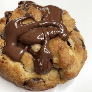
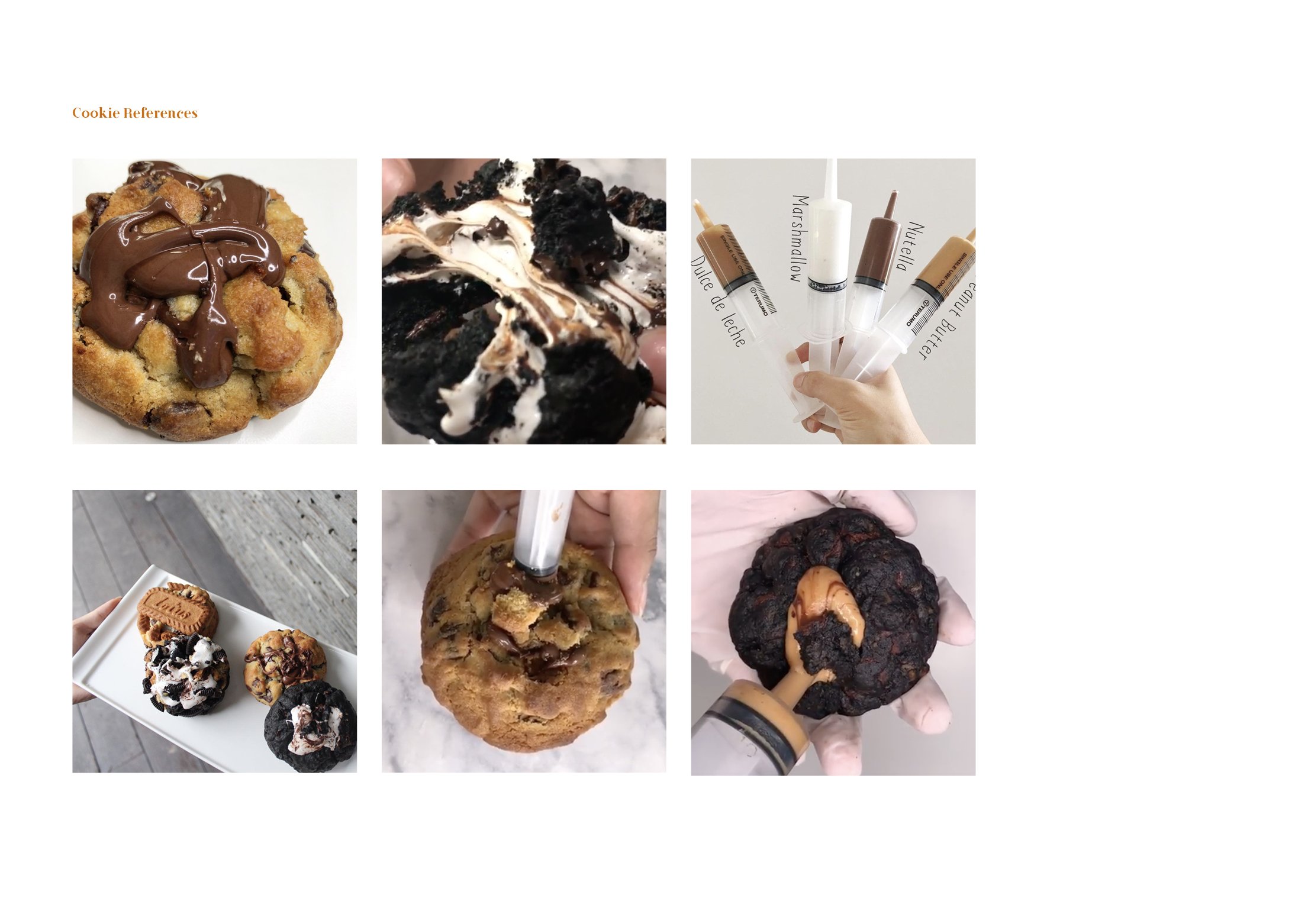
I’m sure once in your life you’ve had a gooey dessert, whether it’s a cookie or not, I really hope you have tried them because they are AMAZING (at least I think so) !!!! Recently, I chanced upon a local cookie shop called, “Nasty Cookie”. Nasty cookie’s best selling point is basically they’re nasty gooey fillings in their fat cookies!
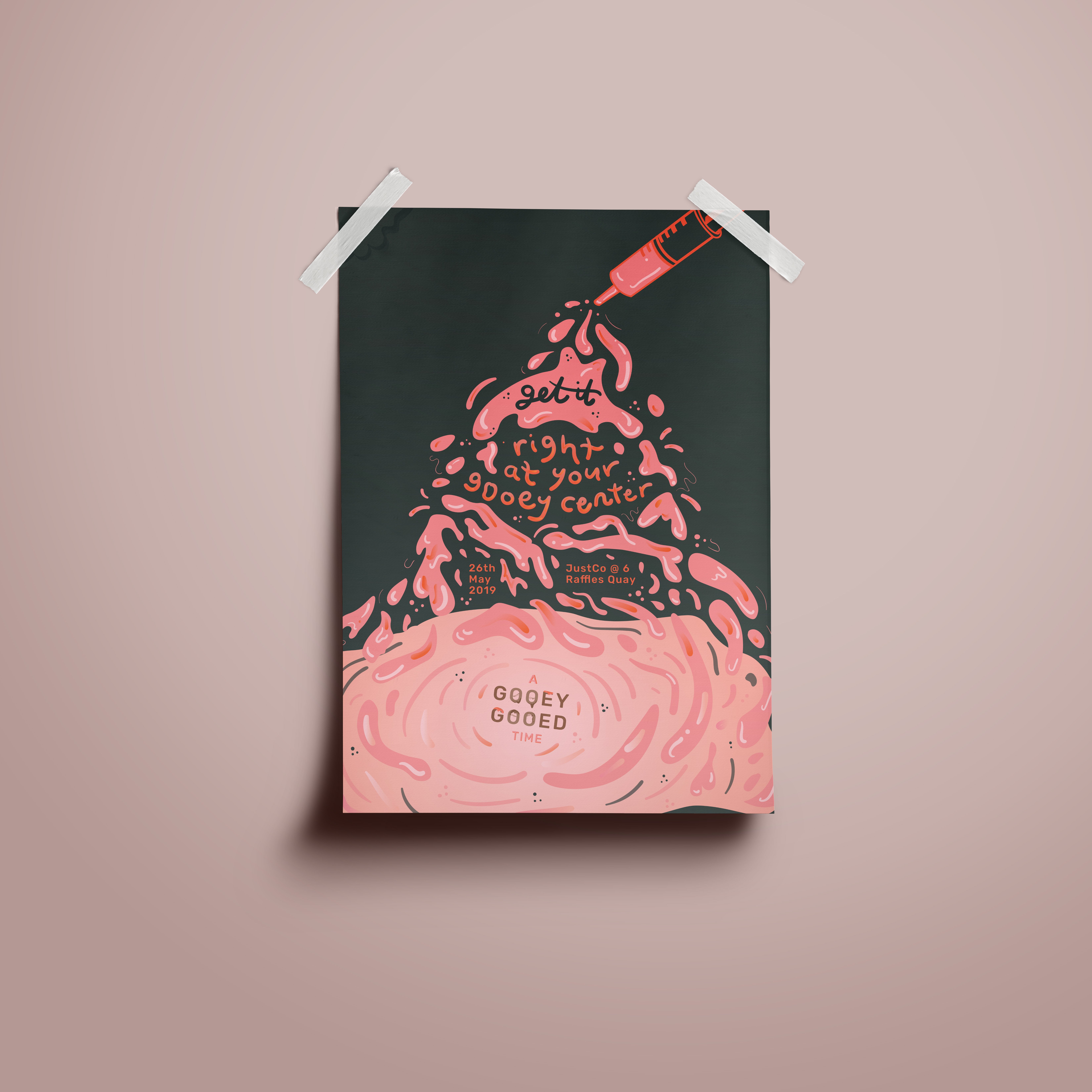
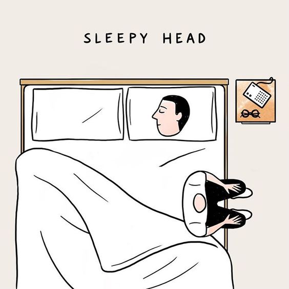
A little treat for your eyes
But the thing that intrigued me the most was how they inserted these gooey fillings. I always thought the bakers inserted a solidified chunk in the middle of the dough and then the chunk melts and becomes goo.
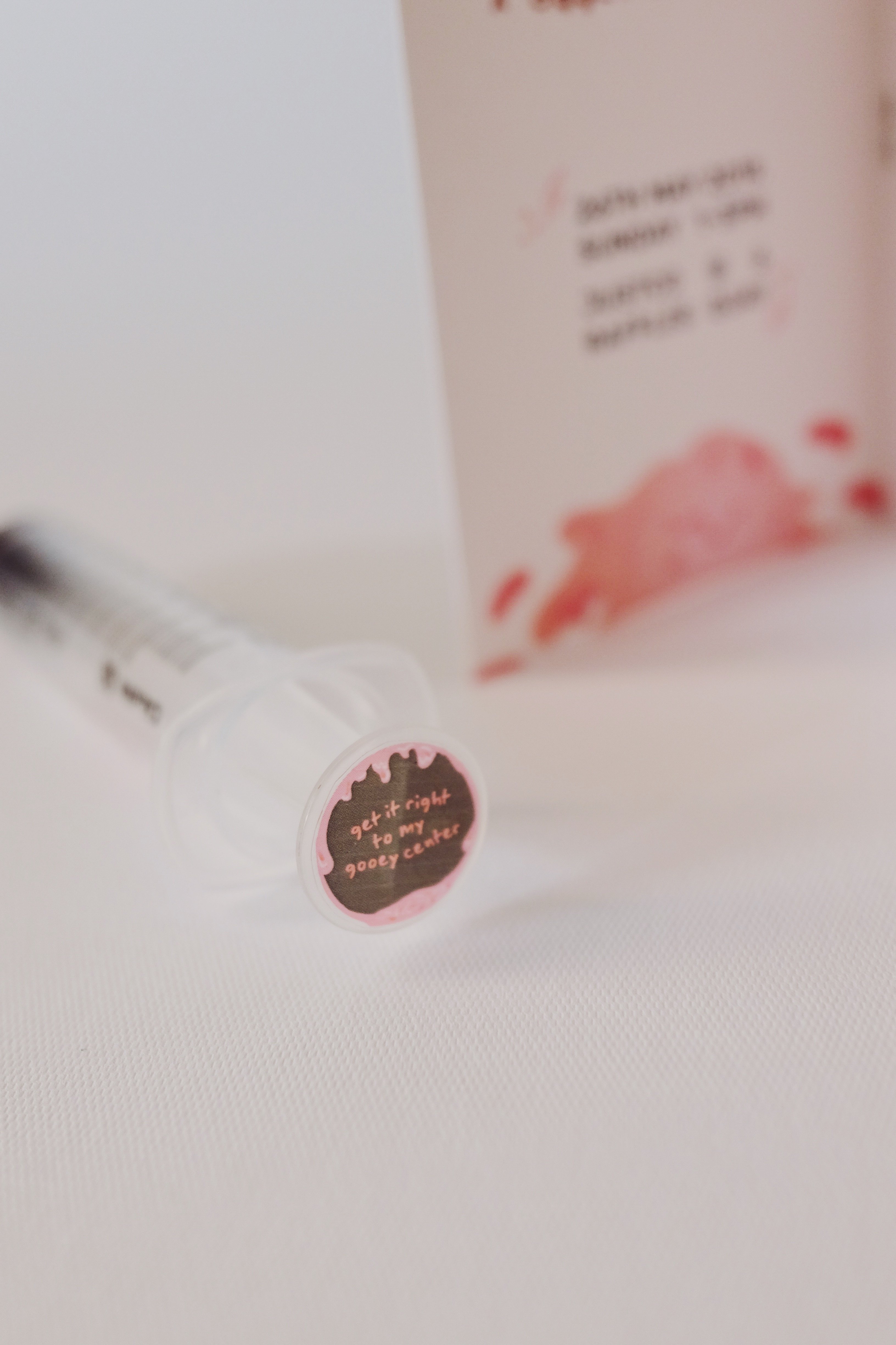
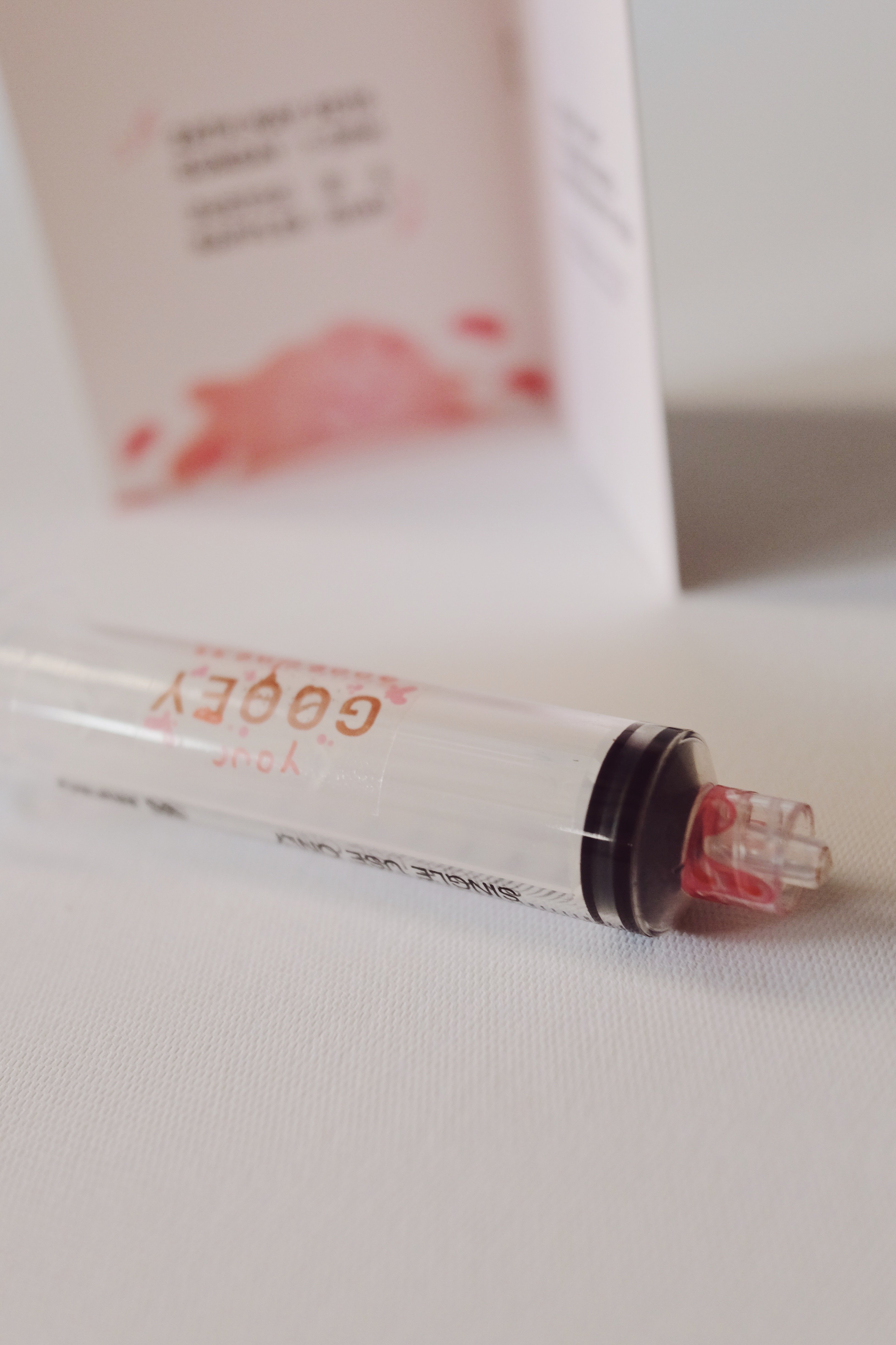
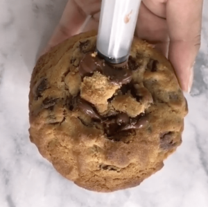
BUT actually! They insert the goo via a syringe and what makes it satisfying is it has a crispy ASMR of the cookie crack.
Inserting the goo
what if these bakers sold their fillings?
I decided to recreate a brand and have this brand market and sell their fillings. Thus, the event that I have decided on is Gooeyooey’s first ever event and product launch that will also help people to destress by “stabbing” the cookie.
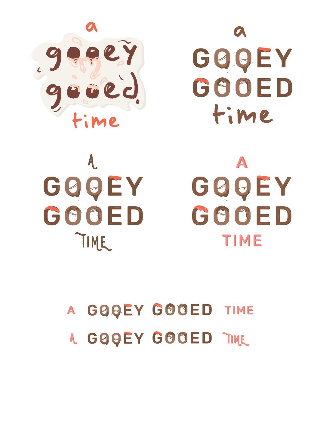
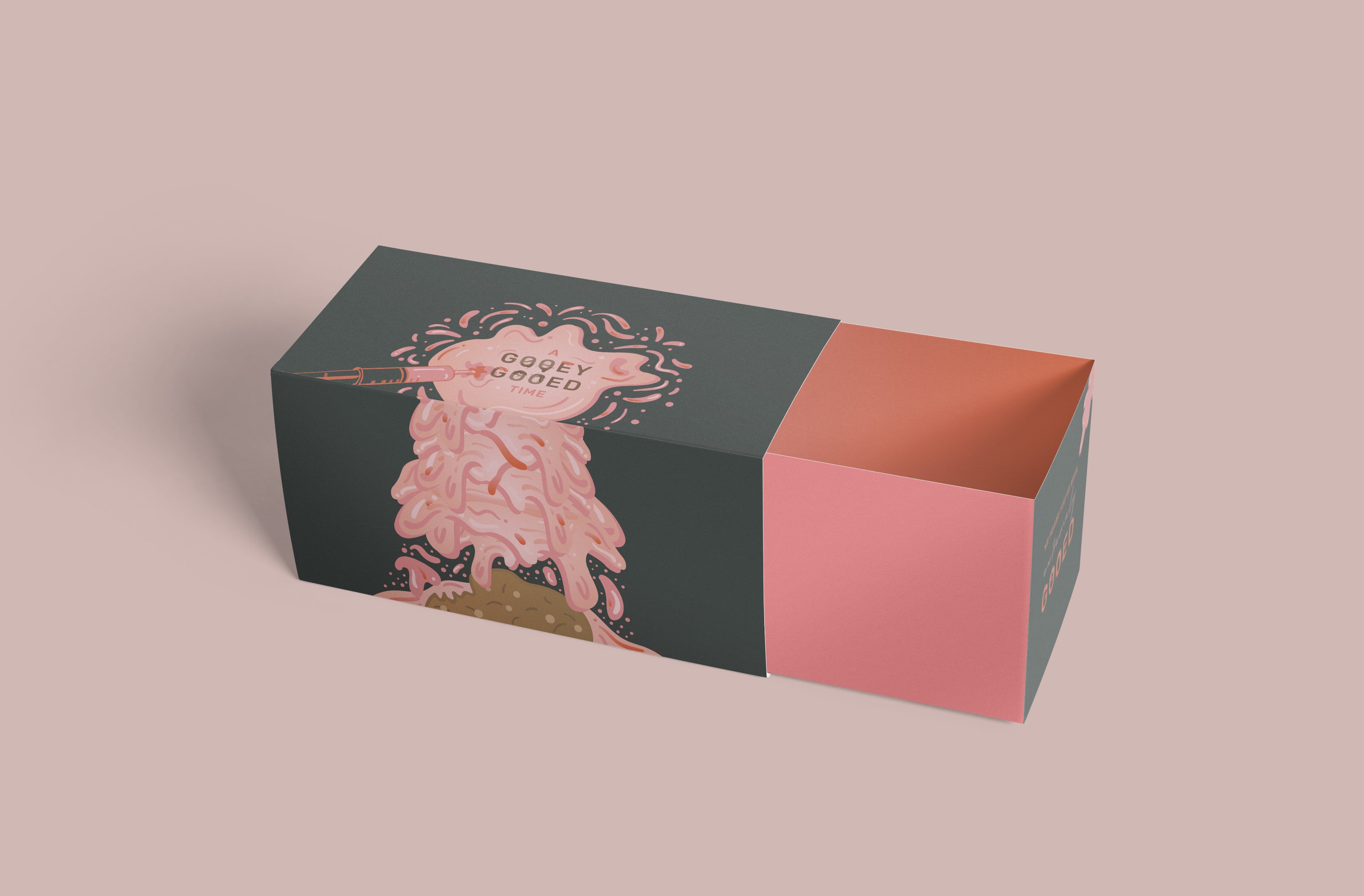
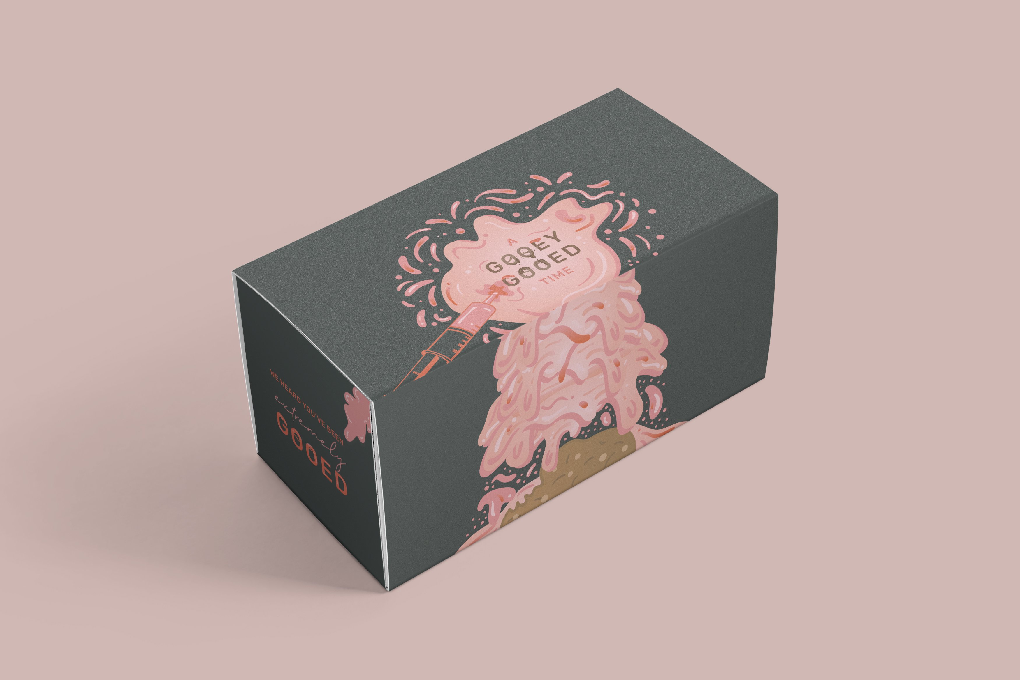
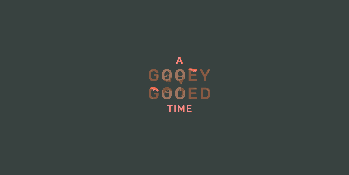
Thus the name of my event is, “A Gooey Gooed Time”
A GOOEY GOOED TIME
Initially, I named the event, Oh Gooedness! Here is my initial research and inspiration,
While thinking about my colour scheme, I thought that I wanted to do something more fun and not so related to typical dessert colours like brown.
My initial five items are:
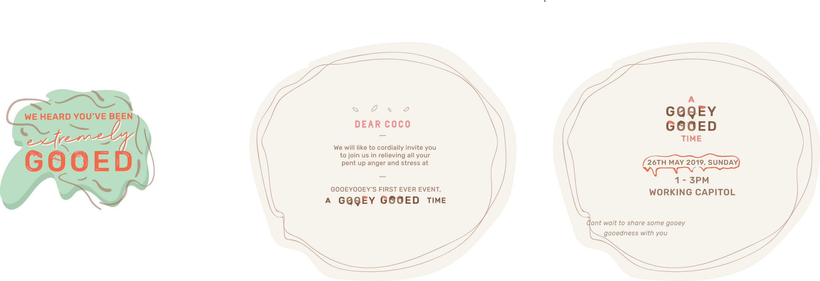
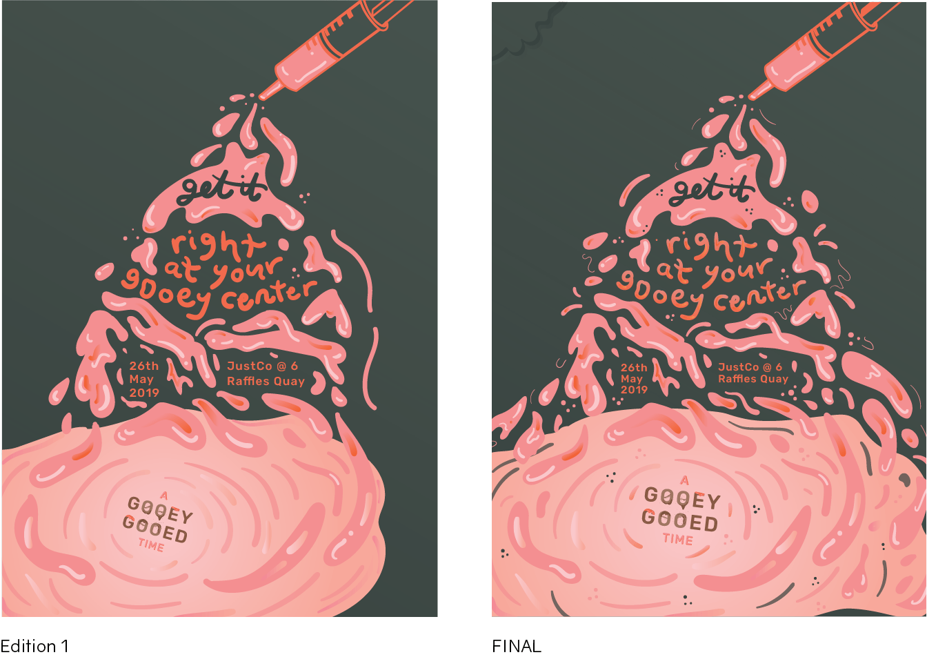
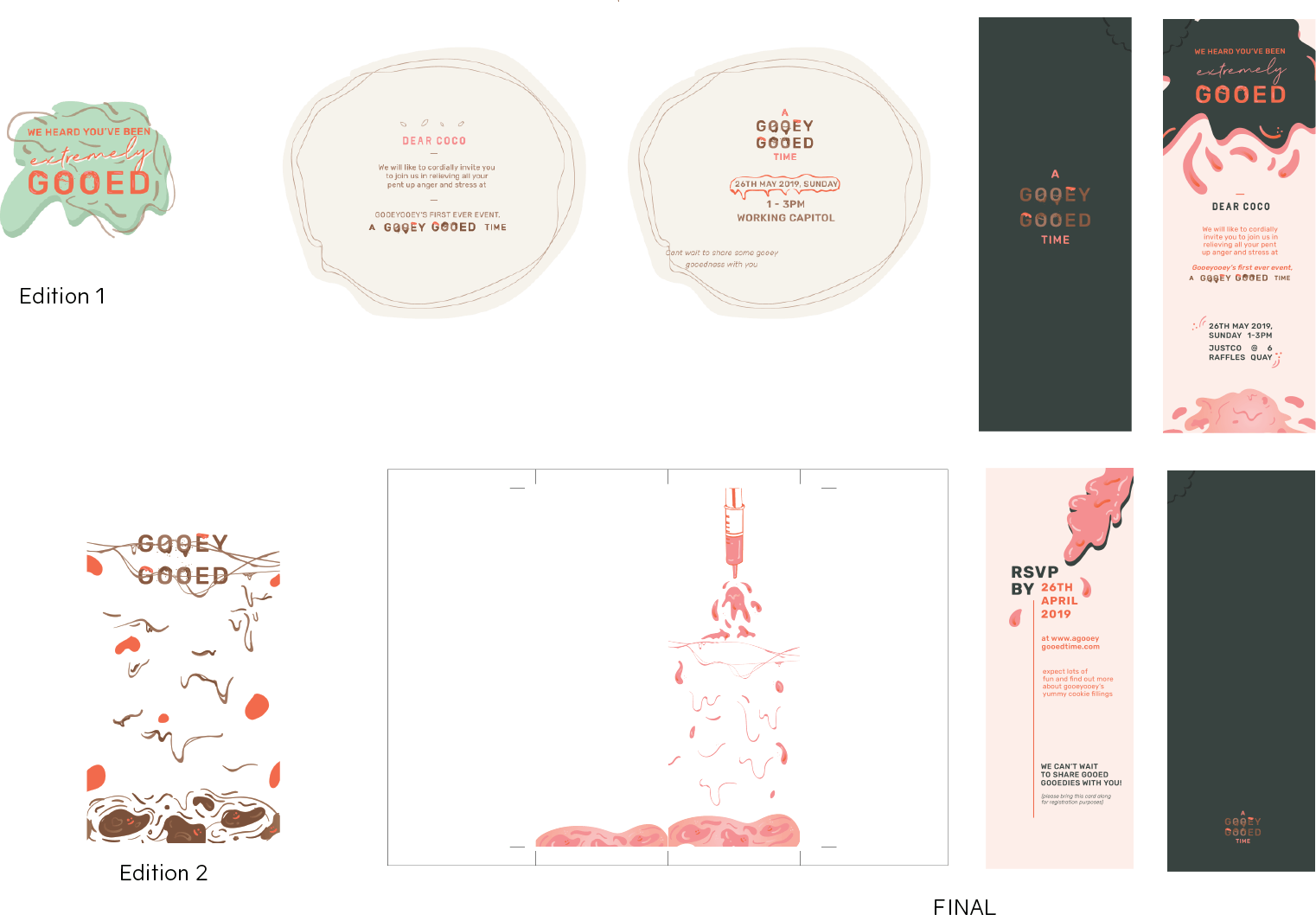
Poster
Invitation
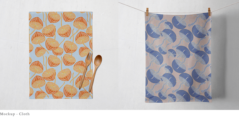
Table placemat (later taken out as only 4 items are required)
Packaging
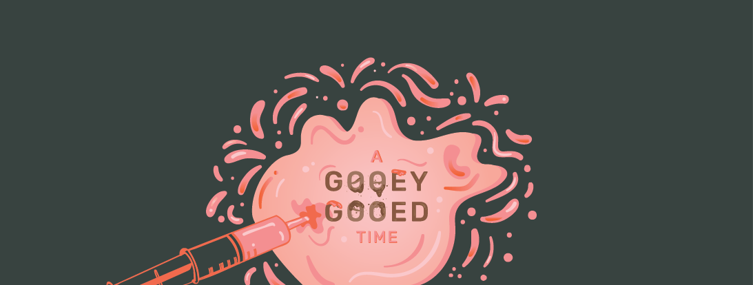
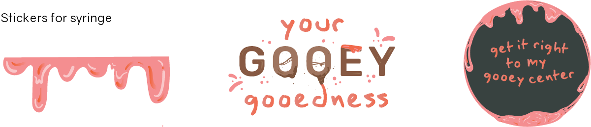
Syringe (for goo)
creative process
LOGO
Initially, I designed the logo to look more playful and fun. However, I did not want the entire event to look too childish as my intended target audience are working adults. Thus, I decided to go with this.
INVITATION
first draft
I was thinking of an odd shaped invitation at first. But later i realised it doesnt will make sense or look good, so I changed it to a more simple design. However, I received feedback that it looked to corporate and does not go with the other deliverables.
For the other 3 deliverables I adapted the same style throughout but do not have huge changes from edition to edition and so I will talk about them more in my next post.
After many rounds of editions, I finally found the colour scheme that fit my theme and event.
Colour scheme
A mix of complementary colours and some brown to have some link to the cookie fillings.
confirmed deliverables
Poster
Invitation
Syringe
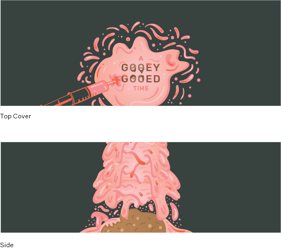
Cookie Packaging
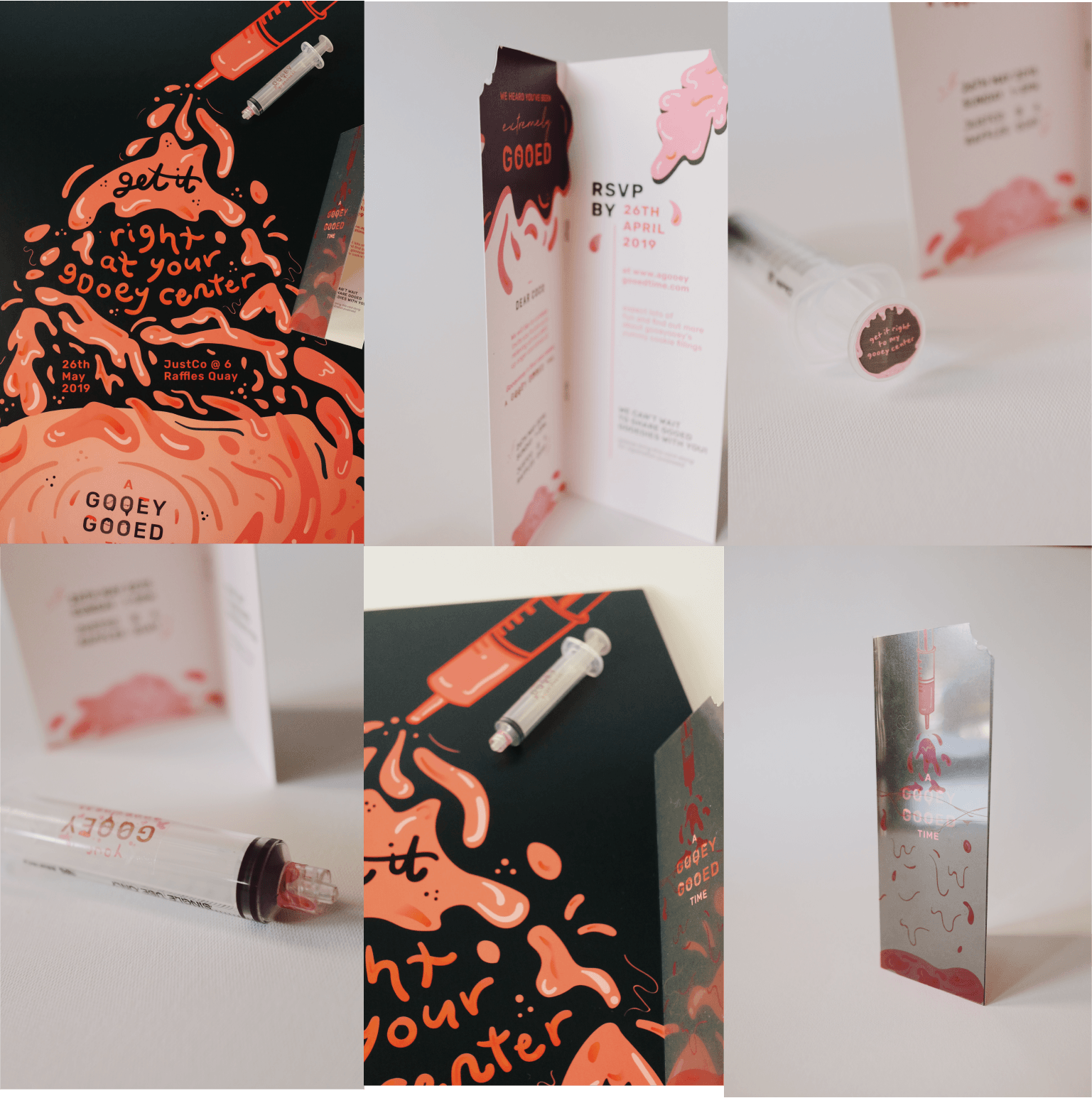
POSTER
INVITATION
SYRINGE
PACKAGING
ALL DELIVERABLES
REFLECTIONS
Overall, this project was very fun to work on and although there were difficulties along the way. It was interesting applying an entire concept to different deliverables and finding different ways to fit them in and for different context as well. I learnt a lot through this project and if given more time, I would have been able to experiment with alot more and improve the illustrations. This idea is simple and does not involve complicated illustrations or fine details but it is something that I’ve always wanted to try (filling a whole poster with goo) and i’m glad I got to try that out!
Continuing from previous post, here is the process towards
my final layout.
PROCESS OF ILLUSTRATION
DRAFT
FINAL
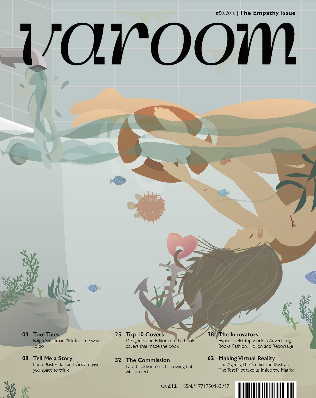
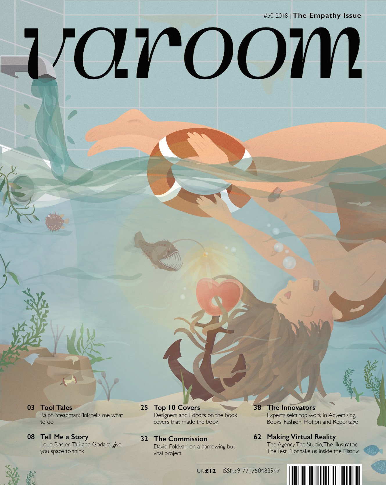
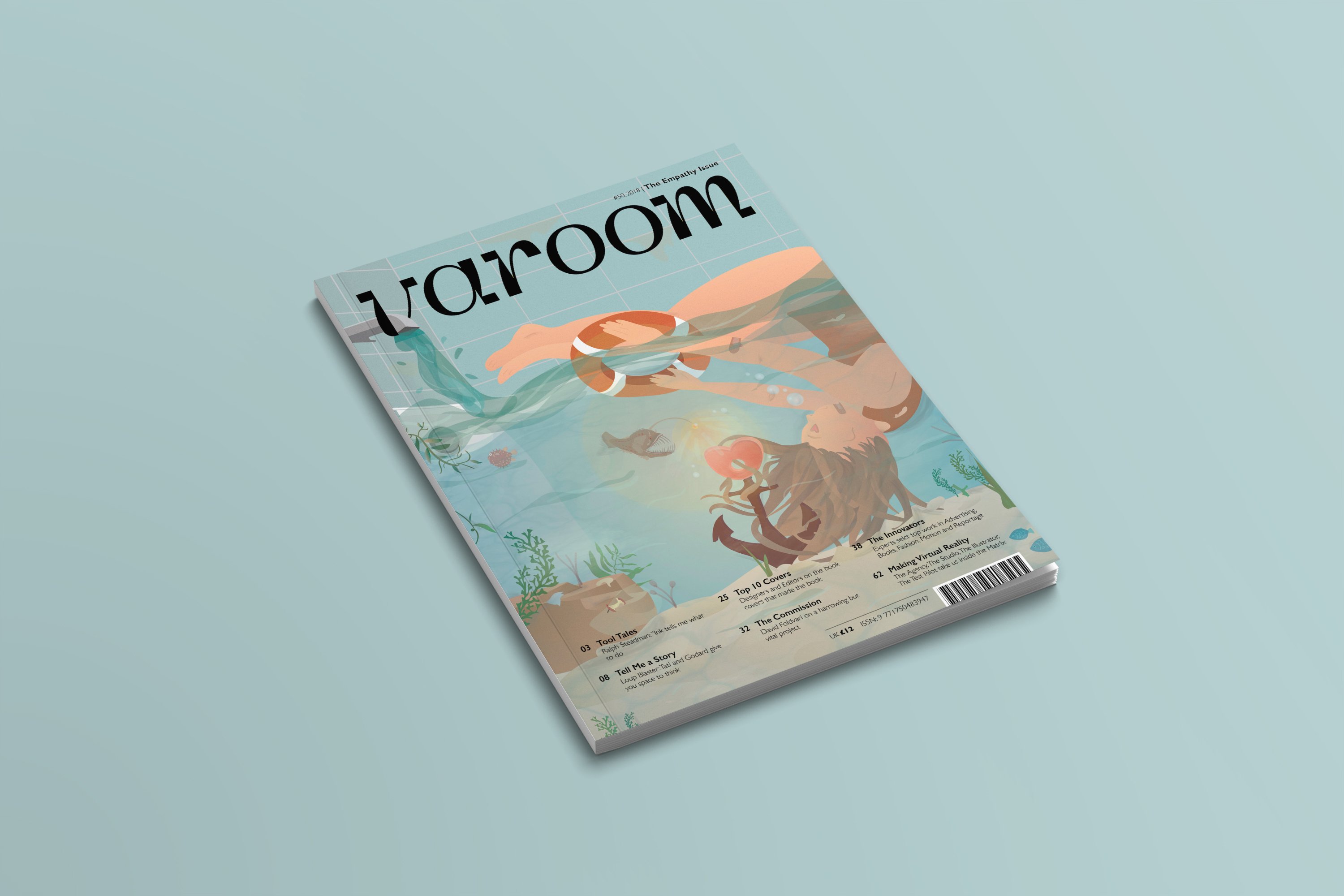
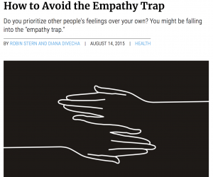
Final Varoom Illustration Magazine cover
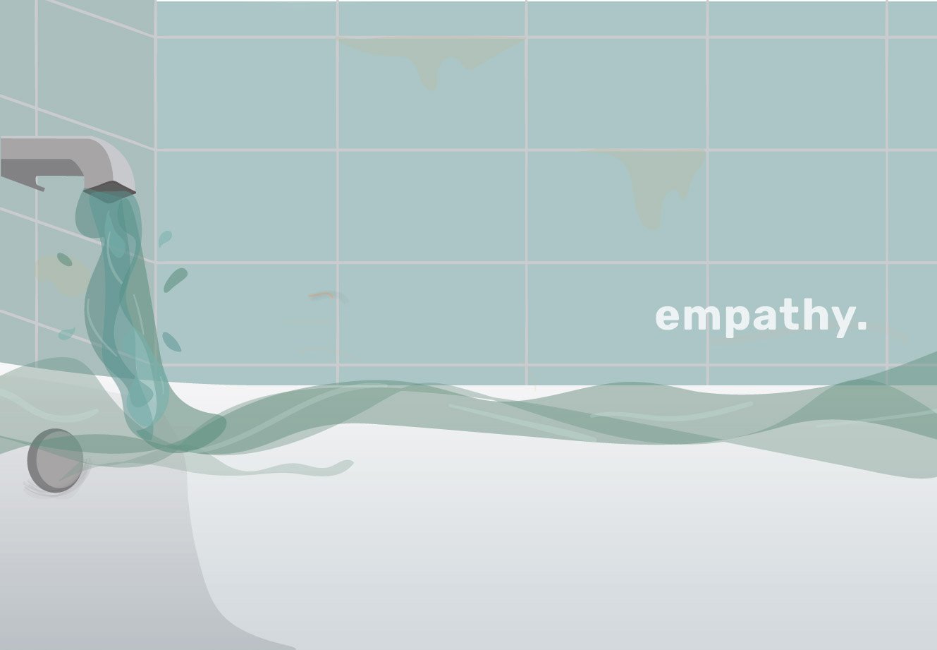
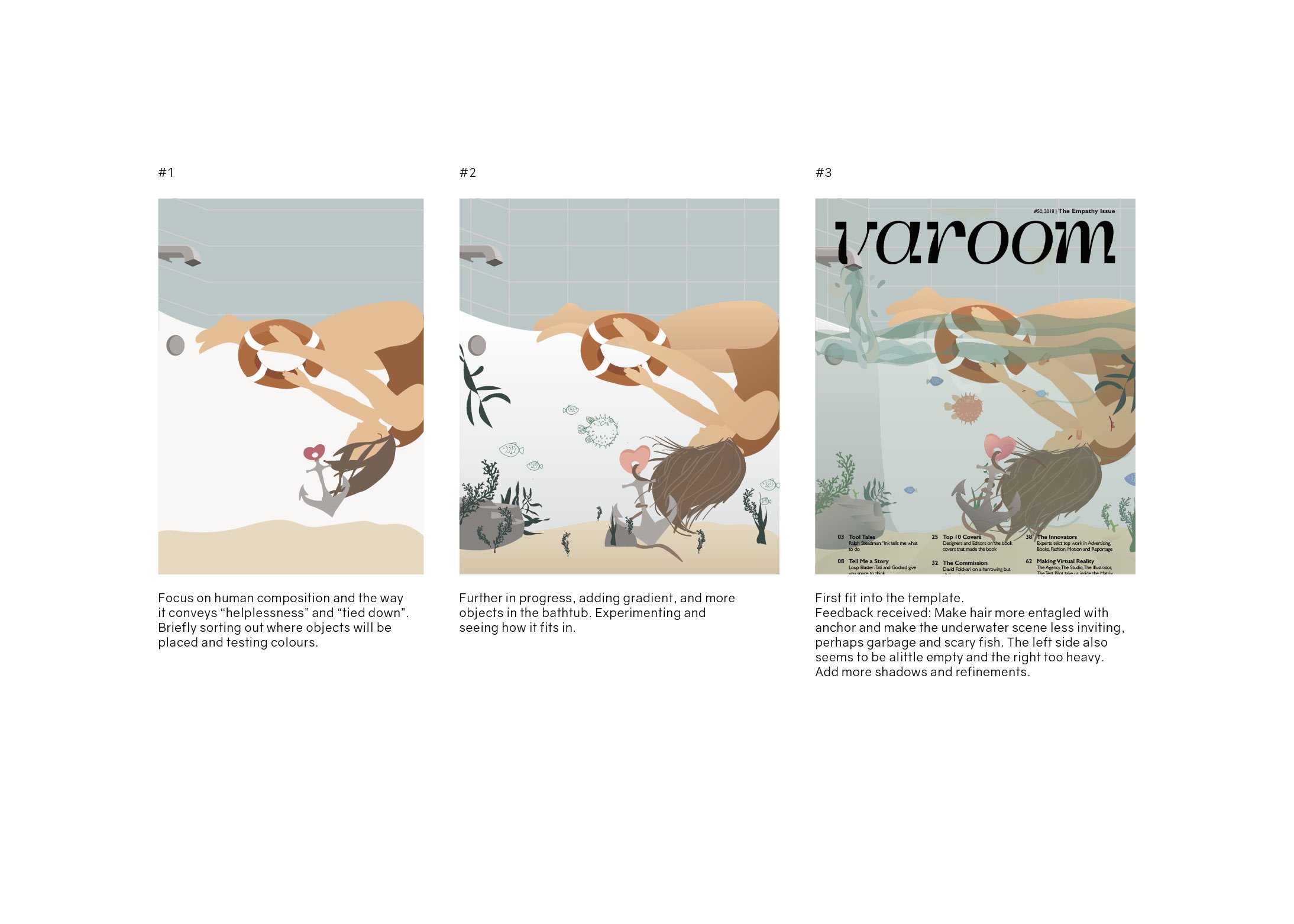
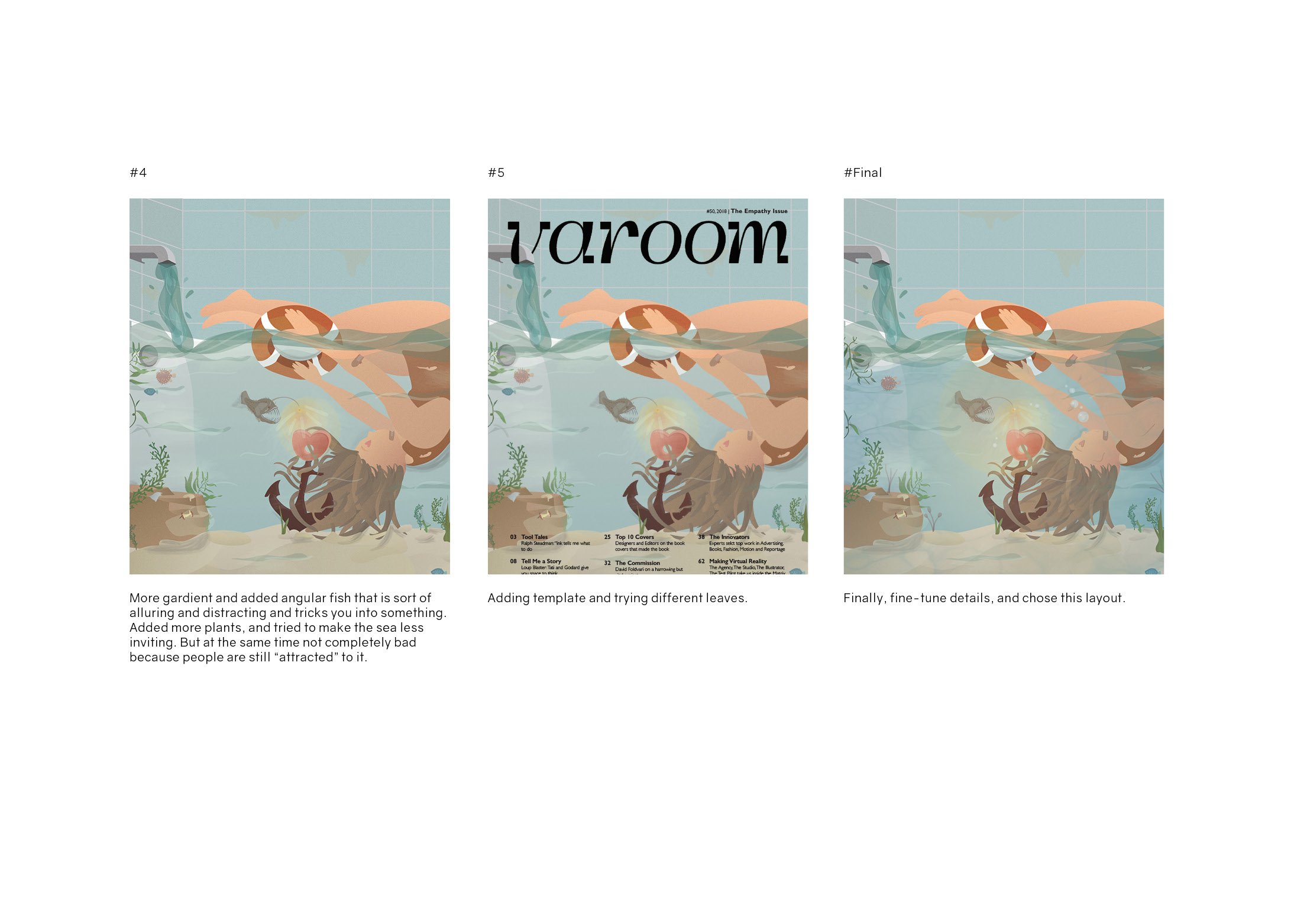
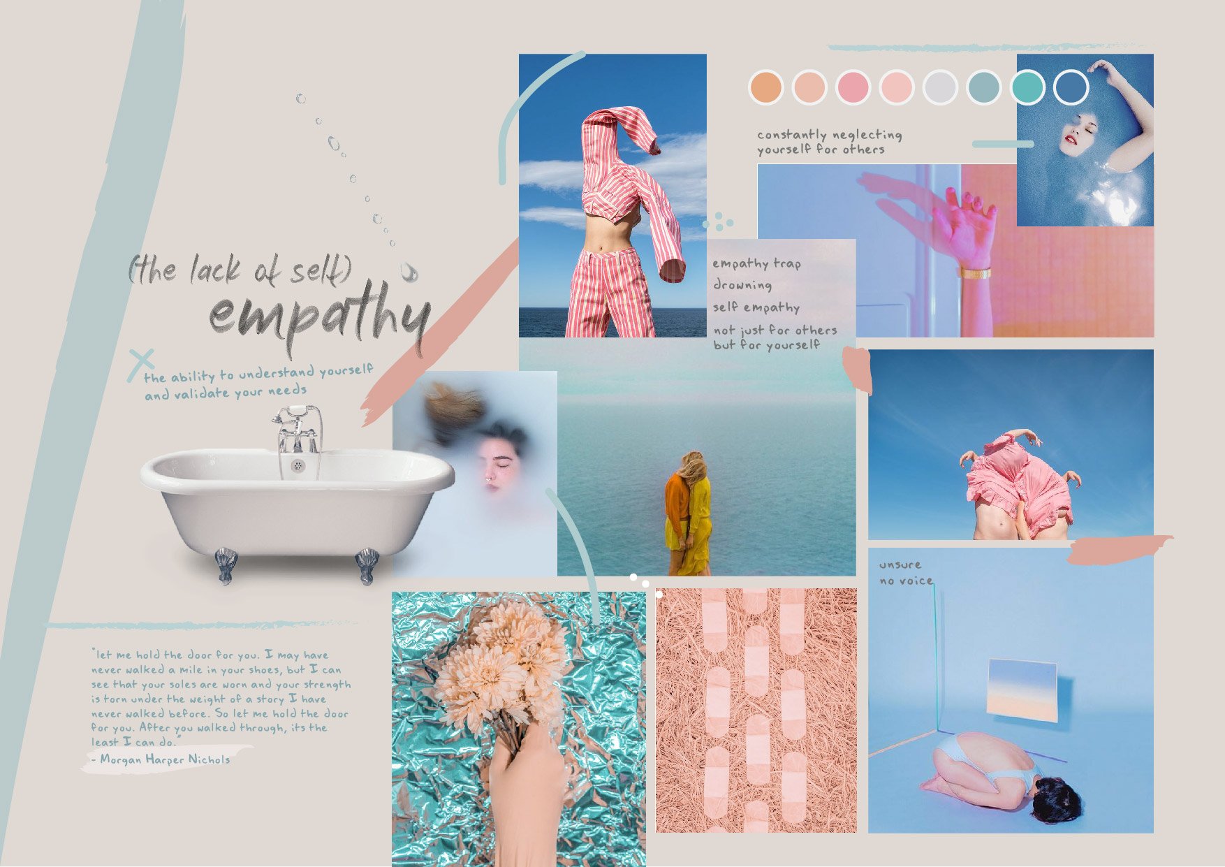
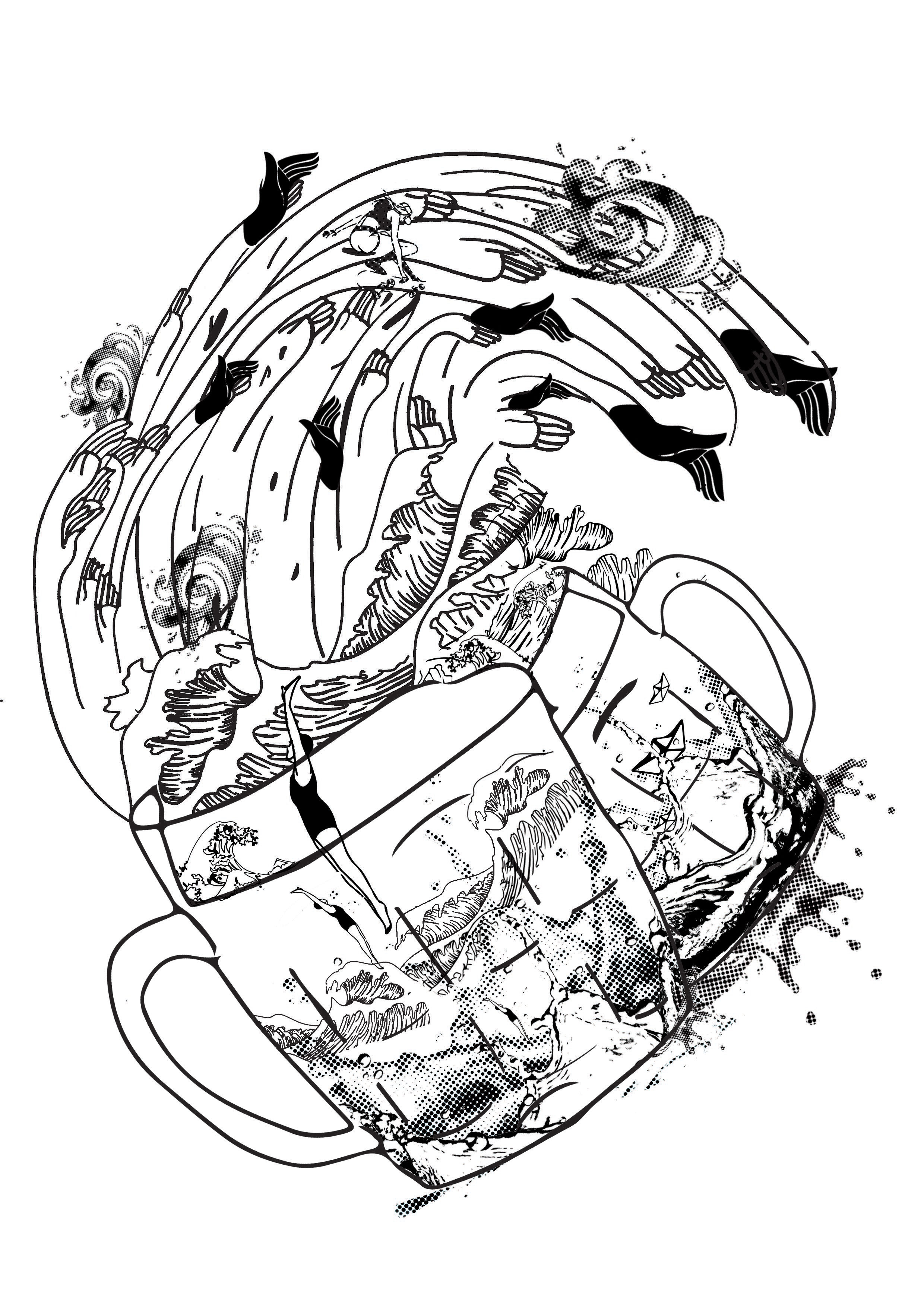
The lack of self-empathy and the inability to stay away from caring for others – represented through a bathroom scene where the water expands to a ocean scene. The human is submerged in the water, her hair entangled with the anchor which represents the heart and in this context empathy. The ocean represents the scary world and how being stuck in the empathy trap can be dangerous. This is represented through the angular fish, using its light to make the empathy alluring and attractive. The girl reaches her hand out to a lifebuoy which signifies the help he needs.
Amongst the 2 other themes, Style and Obsession, I decided to choose Empathy as I thought the illustrations I could come up with might be more personal and relatable. I also wanted to push myself to explore this theme beyond its usual connotations. Thus, my choice of theme is, emapthy.
Research
I started my research by just listing out several things that first come to mind when I thought of the word empathy.
From there I picked out those words that spoke to me more.
human, priorities, others, love, suffering
After which I realised that I thought there was a little problem with empathy at times. I feel that many people around me fail to put themselves first. They are always empathising with others, but they forget to empathise themselves. In other words they lack of self empathy.
This article spoke to me as I realised that this issue is indeed prevalent in society today. As such, I was excited to start sketching.
sketches (ideation)
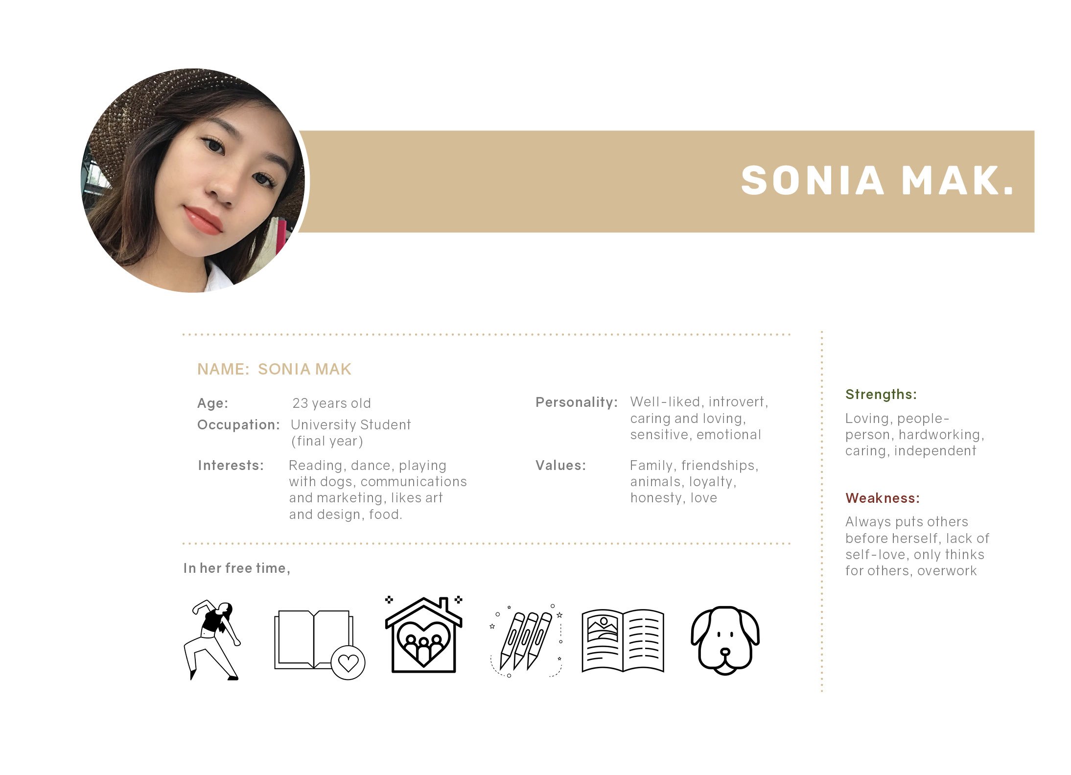
USER PERSONA
I created a persona that my illustration will speak to and is meant for.
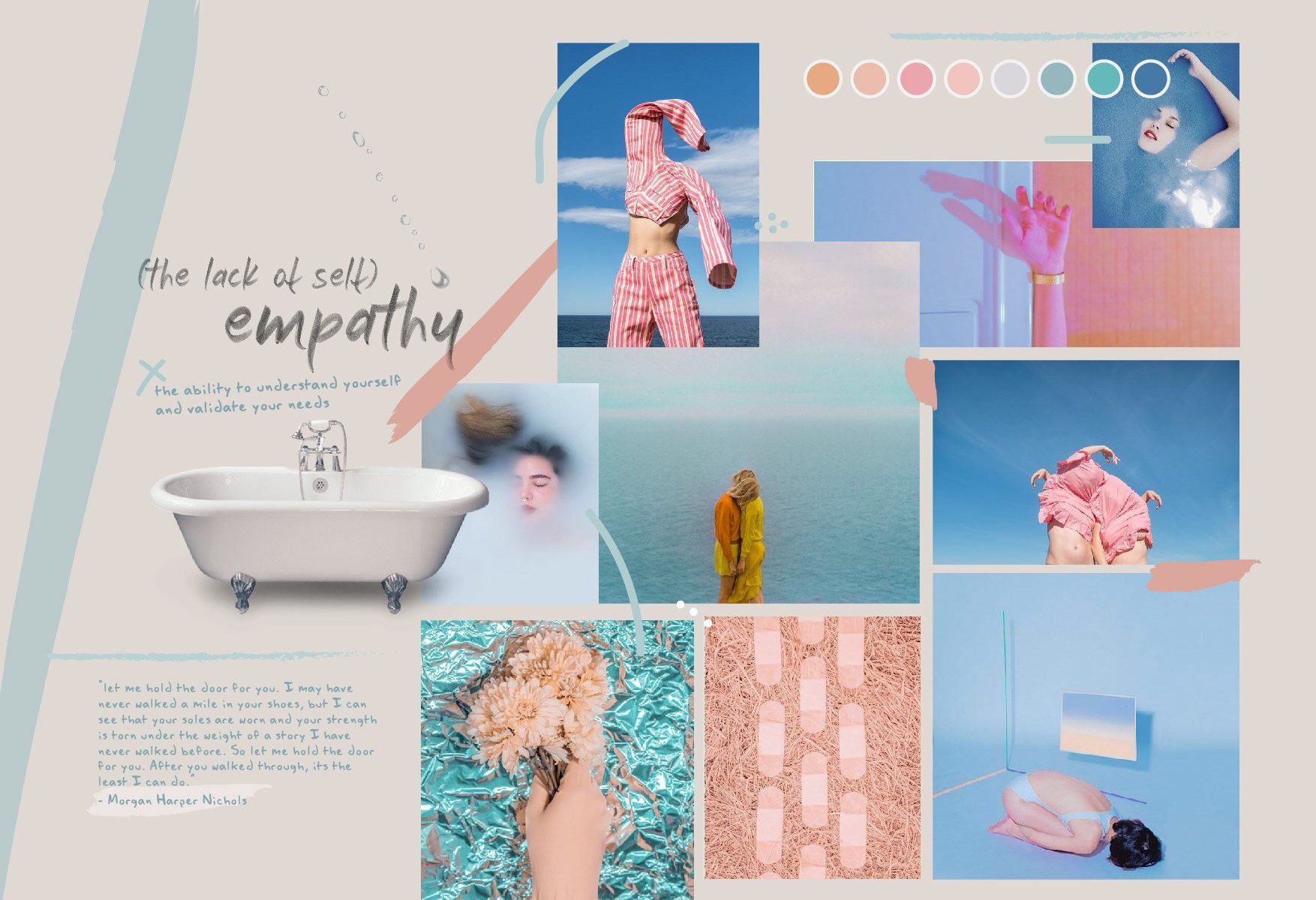
moodboard
Initial moodboard –
After which, I had to revise the colour scheme slightly to match certain objects in my illustration.
pencil sketches
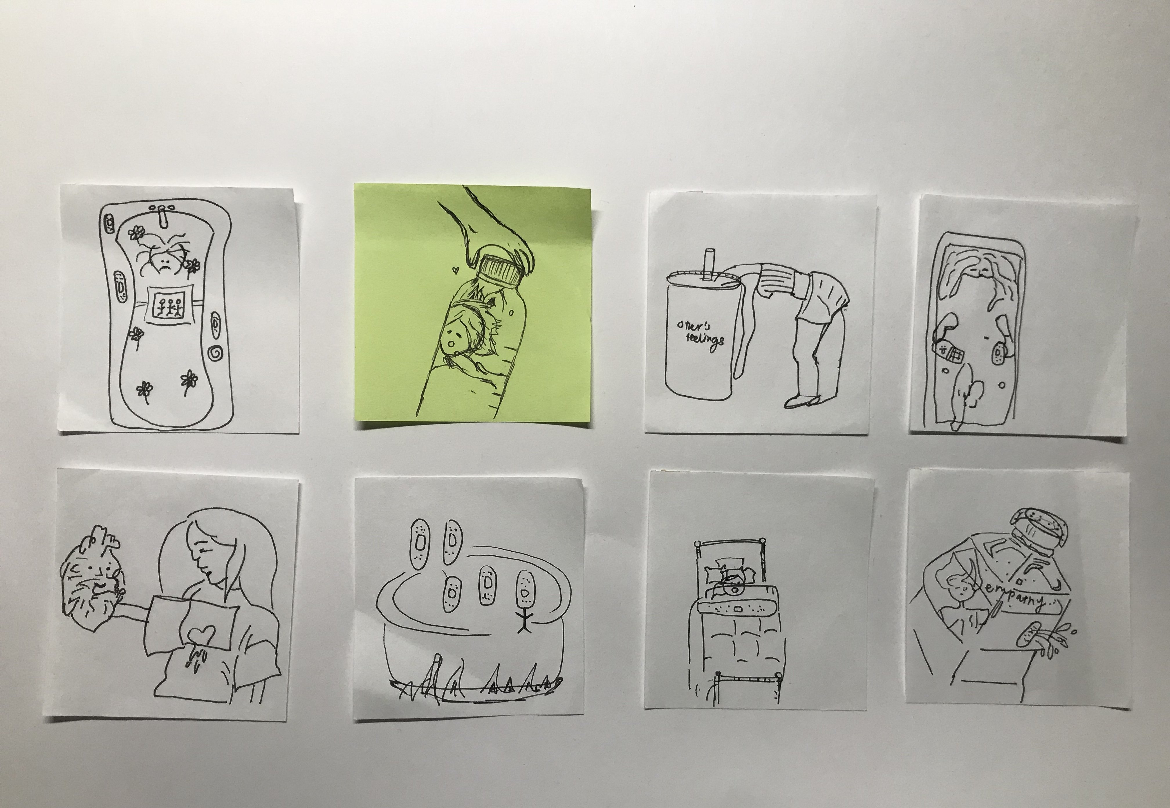
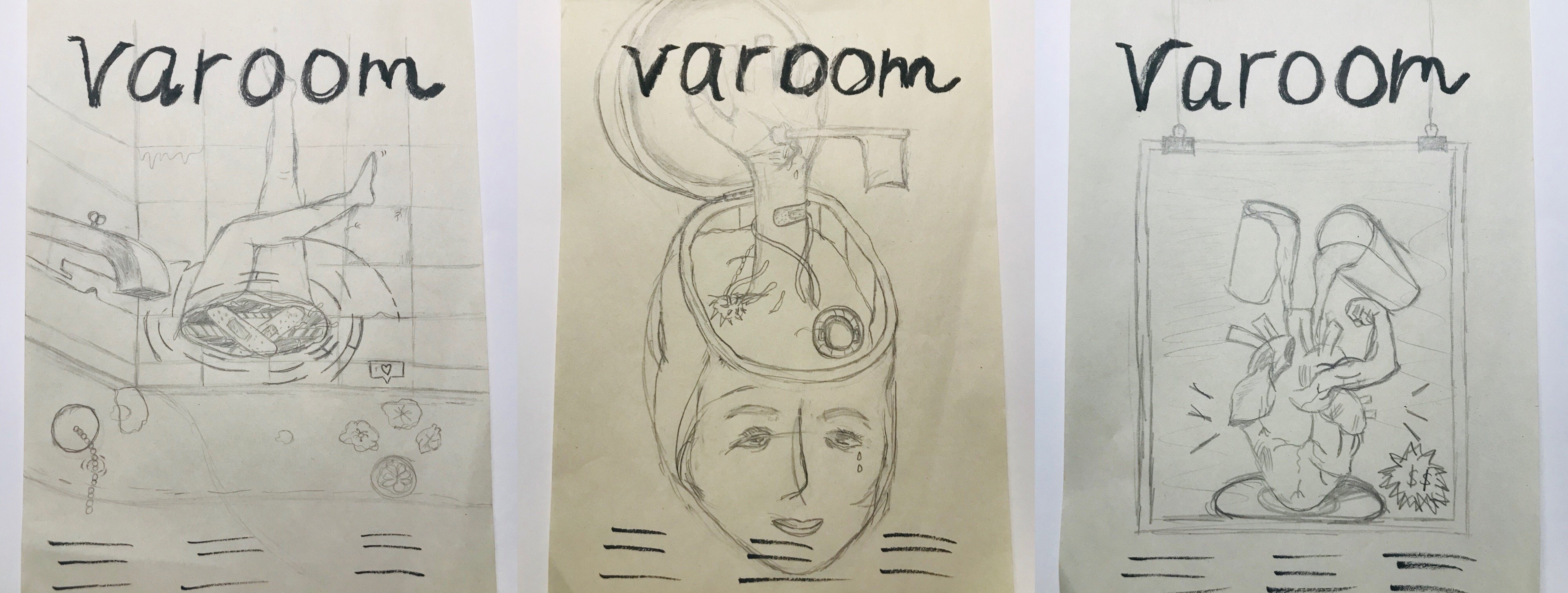
Left: This illustration will address the issue of the lack of self-empathy and the idea of being stuck in it. In a bathroom setting, where people can spend “me time” on reflection, I placed upside down feet as if the person is drowning in the water. The water has bathbomb and pretty things that are actually harmful for humans. This conveys the idea of an empathy trap where people are so quick to put others before themselves. Middle: This illustration also address the lack of self-empathy. The scene is a cut open head. The head is where we think and make decisions, in this case, the head seems to not be functioning as usual as the hand sticking out conveys the need for help and it is also holding a flag to surrender. Right: This is something alittle different and not so much self-empathy but rather how empathy isn’t genuine anymore. It is now fake and people show it just to gain popularity or make friends. Thus portrayed in a form of an advertisement, “empathy for sale”
Revised and finalised sketch
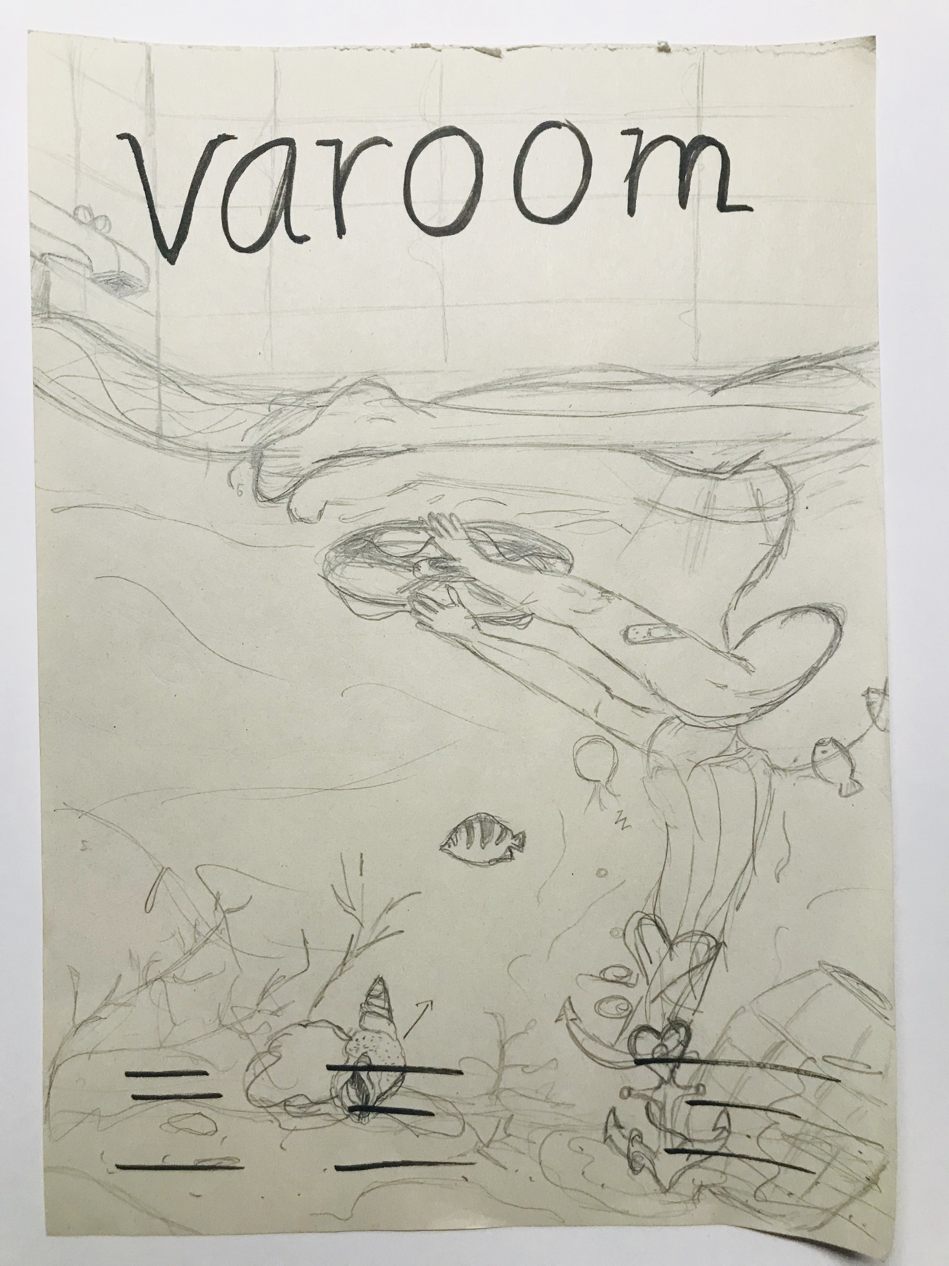
This is a revised version of the first composition seen above. I revised it after gathering feedback from the class. Instead of a human leg sticking out, the human is now submerged in the bathtub. The water in the bathtub expands to a underwater ocean scene, with fishes, etc. The girl’s hair is weighed down or rather entangled with a anchor that represents empathy and the heart. Her hands reaching out to a lifebuoy as she needs help. There is also an angular fish which is dangerous and uses the alluring and trick method, as much as empathy is like.
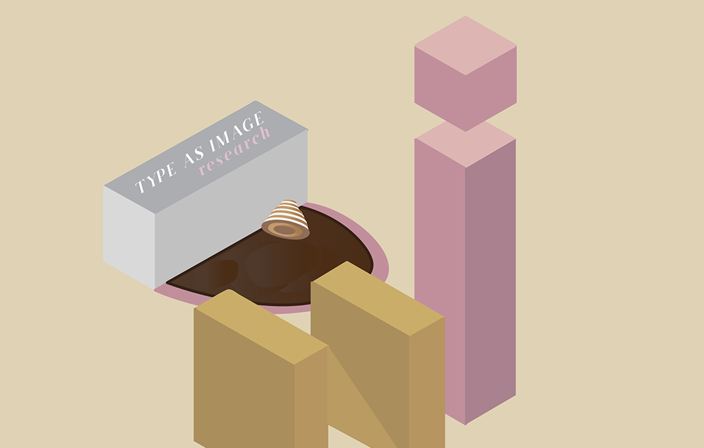
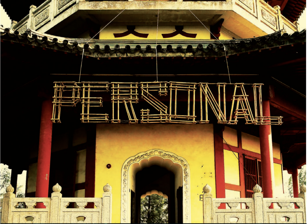
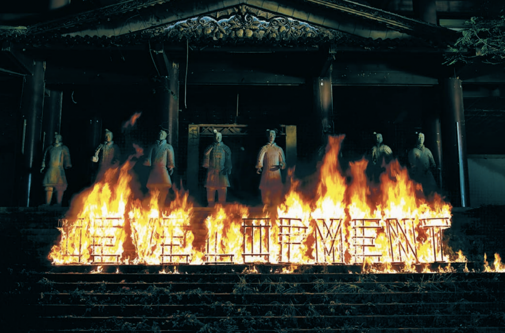
I started this project with a little difficulty as I had no idea what direction I should take. After looking through some of previous semester’s students’ work, I realised that this project was tricky as it was not solely typography, but rather creating type as an image.
I started the ball rolling by reading up and doing research
on typography as well as searching for examples and
inspiration online - from Instagram and Pinterest.
RESEARCH
John Foster – Dirty Fingernails
“We can all choose the same font for a project, but we could never draw identical typography”
Keeping a Diary by Sagmeister Inc.
Instalment series are called, ” Things I Have Learned In My Life So Far”
Sagmeister adapted what had been a still photography exercise into a short movie
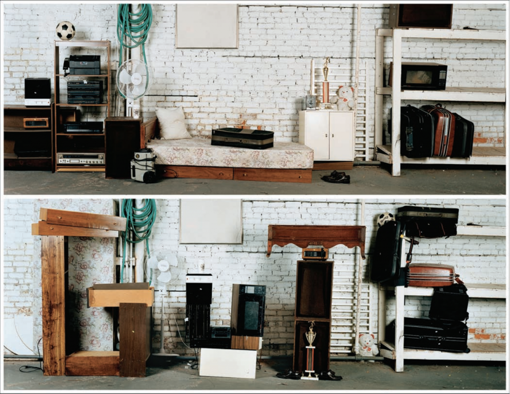
Having Guts Always Works Out For Me by Sagmeister Inc.
“This time we built the typography in wildly different ways and locations”
Showed the before and after effect in photos
Explored various mediums and were experimental
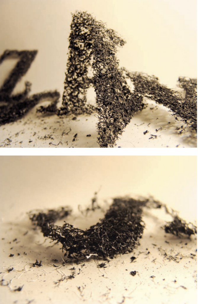
Temporary Type by Oded Ezer
Used industrial conditional air fillers
Looks as if they were made out of ashes or dust
“I’m testing the intersection between typography and art” – they have the same meaning but not a medium for direct communication
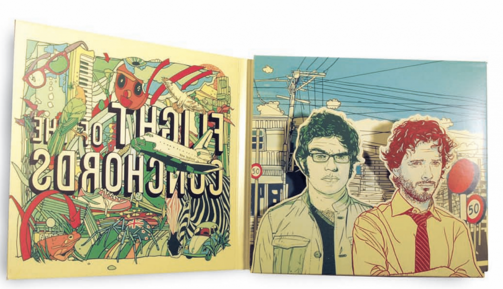
Flight of the Conchords by Subpop Records
Pop Art 1970s style
Hand drawn illustrations
A surreal landscape of shapes and colours
Ina Saltz – Typography Essentials (design principles when working with typography)
– some points that I felt were interesting and have not never really thought about before –
1) Using Letter as Form
each letter is a shape unto itself
series as an illustration
can be expressive when used alone
2) Emphasis using weight
when you stay within the same type family and vary the weight of the family member
it can create contrast and more emphasis on certain alphabets
can signal shift in hierarchy
Wired
3)High Contrast in Reverse
reversing or “dropping out” may be a good effect but it must be done with care and at small sizes
those that have at least a moderate stroke weight, with little or medium contrast between thicks and thins – work best with reversed-out type
4)Deconstructed Type
can be used as an ornament, as navigation on devices and as pattern
inspiration
I mostly draw my inspiration from Instagram accounts and Pinterest. Here are some accounts and artists that I’ve come across.
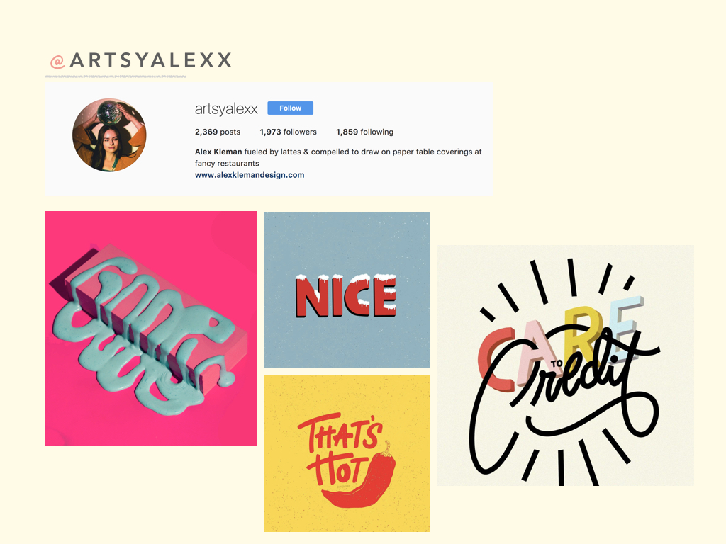
I’ve always been a fan of @artsyalexx. Although her typography works are simple, the colours that she use are very eye catching and easy to relate to. Her works are trendy and very attractive with the younger crowd. I really like the way her fonts always vary in terms of style as well as size in the alphabets. She digitally draws these artworks.
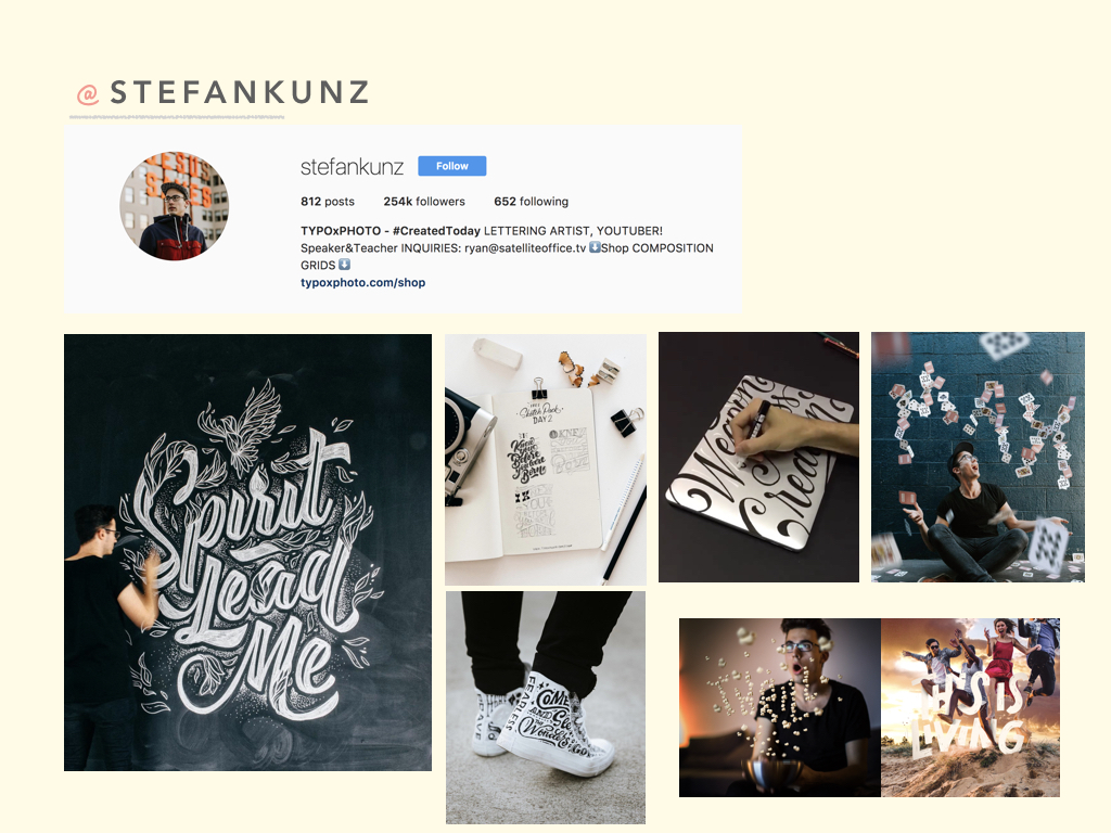
I’ve been following @stefankunz for a while. He turns encouraging words and phrases into typography art pieces. He doesn’t just draw these words on regular paper, but instead he draws them on shoes and even laptops. Any surface can be his canvas!
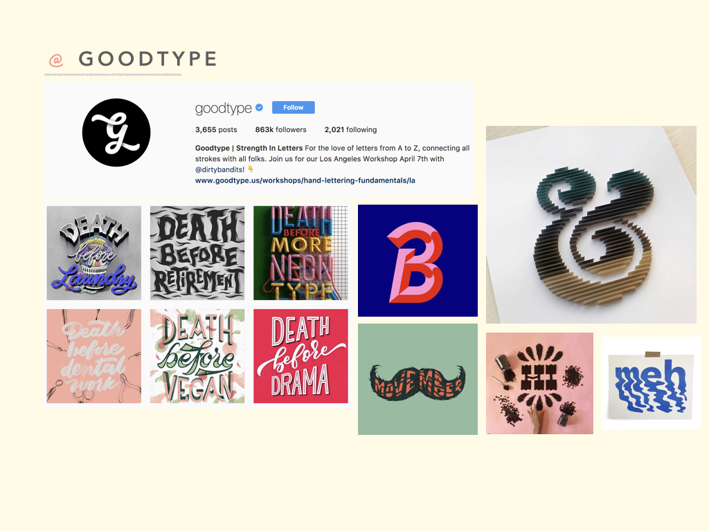
I chanced upon @goodtype while researching for inspiration. This Instagram account consists of so many great typography examples and has allowed me to look at the variety of letter forms and ways to play around with form and style.
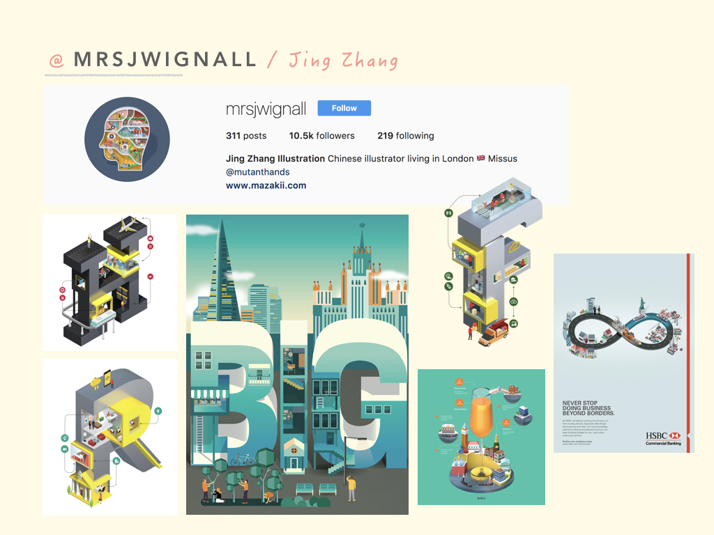
Jing Zhang is an illustrator who has done an alphabet series. She takes a single alphabet and manipulates it. Its almost as if she creates a world out of one alphabet.
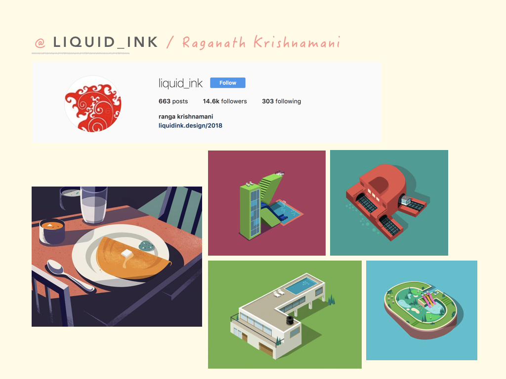
Raganath Krishnamani is an illustrator that also occasionally plays with alphabets. Similar to Jing Zhang, he also manipulates letters, adding elements to them so they look like they are a world/building of their own. His other illustrations are also usually quite dark with lots of shadows.
thoughts
After doing research and looking at many different artworks, I was more certain of the art direction that I wanted to follow. I decided to go with illustrations as I thought that illustrations will be the best way to portray my ideas and thought process across.
After going through the brief, various thoughts and ideas came to my head. However, I was not sure of how exactly I wanted to come up with and portray my compositions.
I immediately started off by going through quotes that are closely related to life and human feelings. I drowned myself in a sea of emotions and feelings from movies that I closely relate to or have been inspired by.
4MOVIES
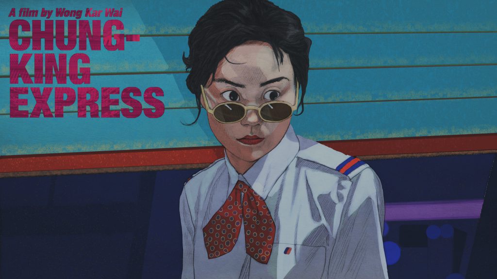
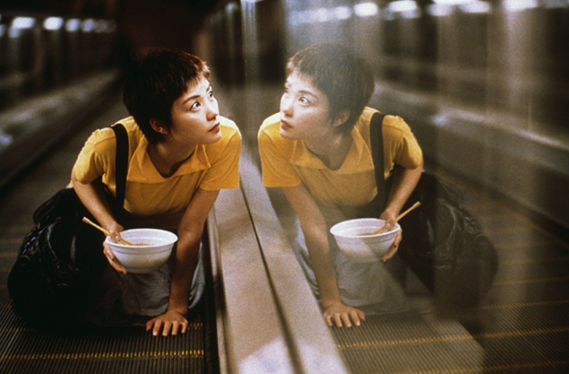
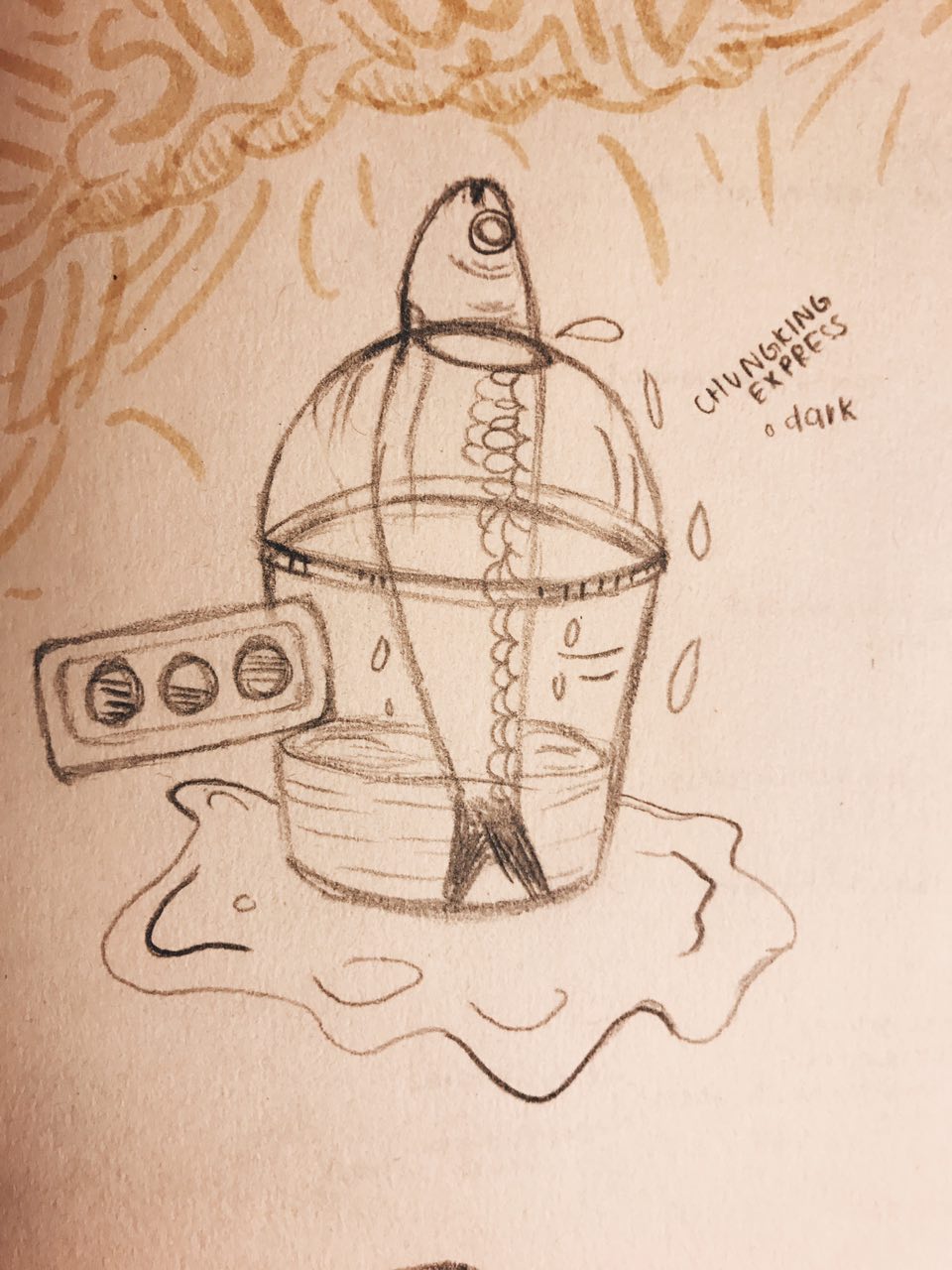
Chungking Express (1994)
Artist Impression of Chungking Express (1994)Chungking Express Scene (1994)
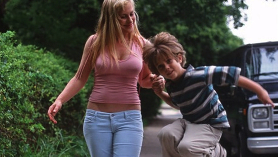
Boyhood (2014)
Boyhood (2014)Boyhood Scene (2014)
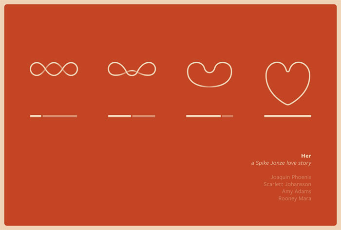
Her (2013)
Her (2013)Her Scene (2013)
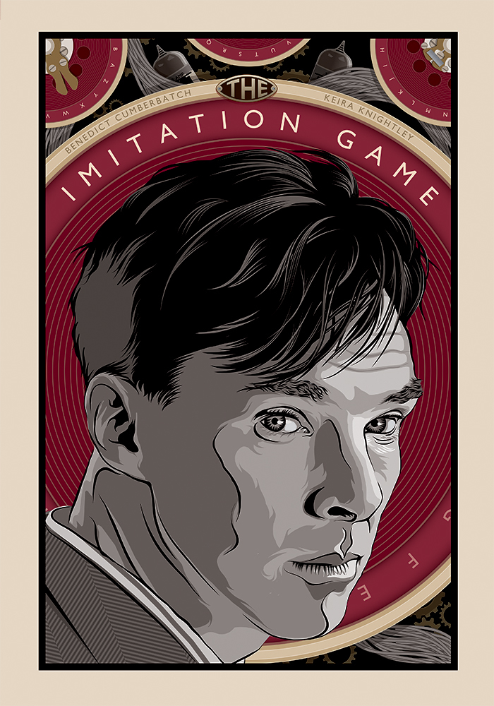
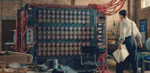
The Imitation Game (2014)
The Imitation Game (2014)The Imitation Game Scene (2014)
4MOVIE QUOTES
I settled on these 4 quotes as I felt that they spoke to me in a certain way and had the potential to explore various compositions.
l THE APPROACH l
“think about the quote in a different perspective” / “dig out a different meaning” / “link quote to various objects in life” / “be unconventional, don’t be literal”
These thoughts replayed in my head as I tried to come up with a concept/overarching idea for my compositions. I took to staring at objects around me and tried to create a connection between them and the movie quotes.
Deeply inspired by surrealism, I wanted to make use of everyday objects to tell a story about my quotes, almost as if the compositions/interpretations of these quotes are from a different world of its own, where everything works differently.
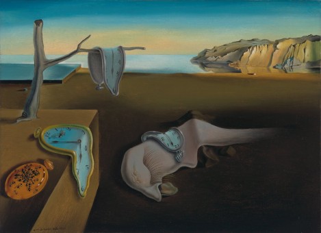
Salvador DaliThe Persistence of Memory, Salvador Dalí (Spanish, 1904–1989)
Dali’s works are compelling, making one want to stare at it longer to uncover what different meanings each element in the painting portrays. In this piece, Dali portrayed the theme of time with an objective of discarding the world of reality. He did this by distorting (melting) the clocks and creatures with a perfectly normal background. It is clear this art piece was a result of his interpretation and imagination.
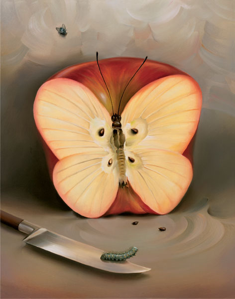
2.Vladimir Kush
A surrealist artist greatly inspired by Salvador Dali. His works portrays fascinating stories and imagination with the use of everyday objects such as food, and shoes.
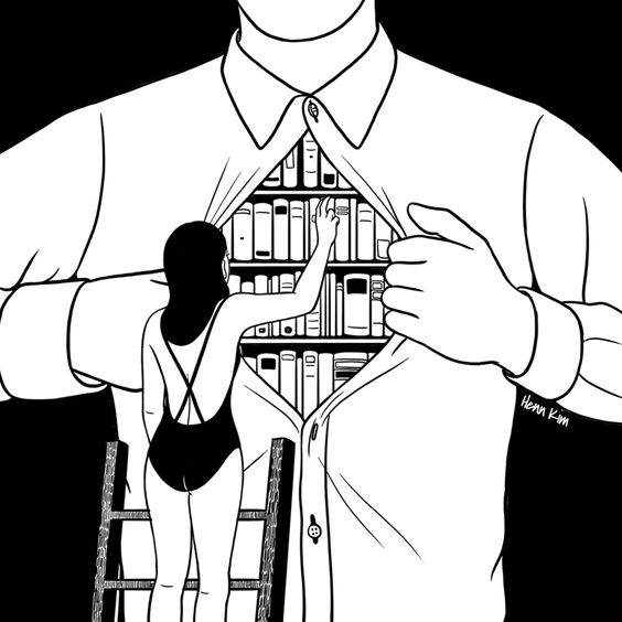
Henn Kim is an illustrator from South Korea who evokes theme of, “beautiful dark twisted fantasy” in her art works. Her works are compelling and are always in black & white. Her art style and work were my main form of inspiration for my 4 compositions.
Drenched through my mindSleep Forever
IDEAS & SKETCHES
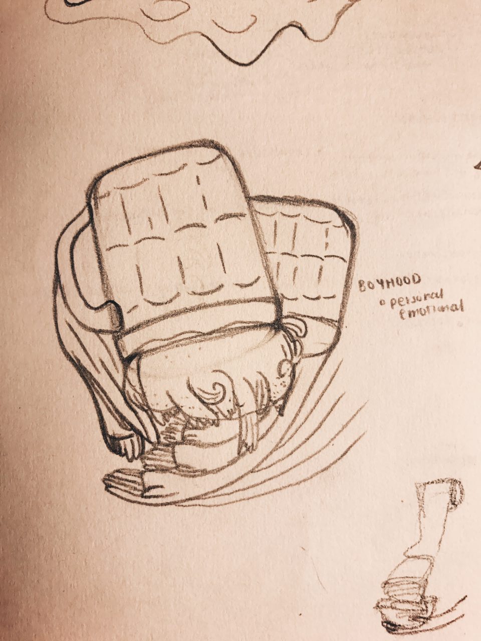
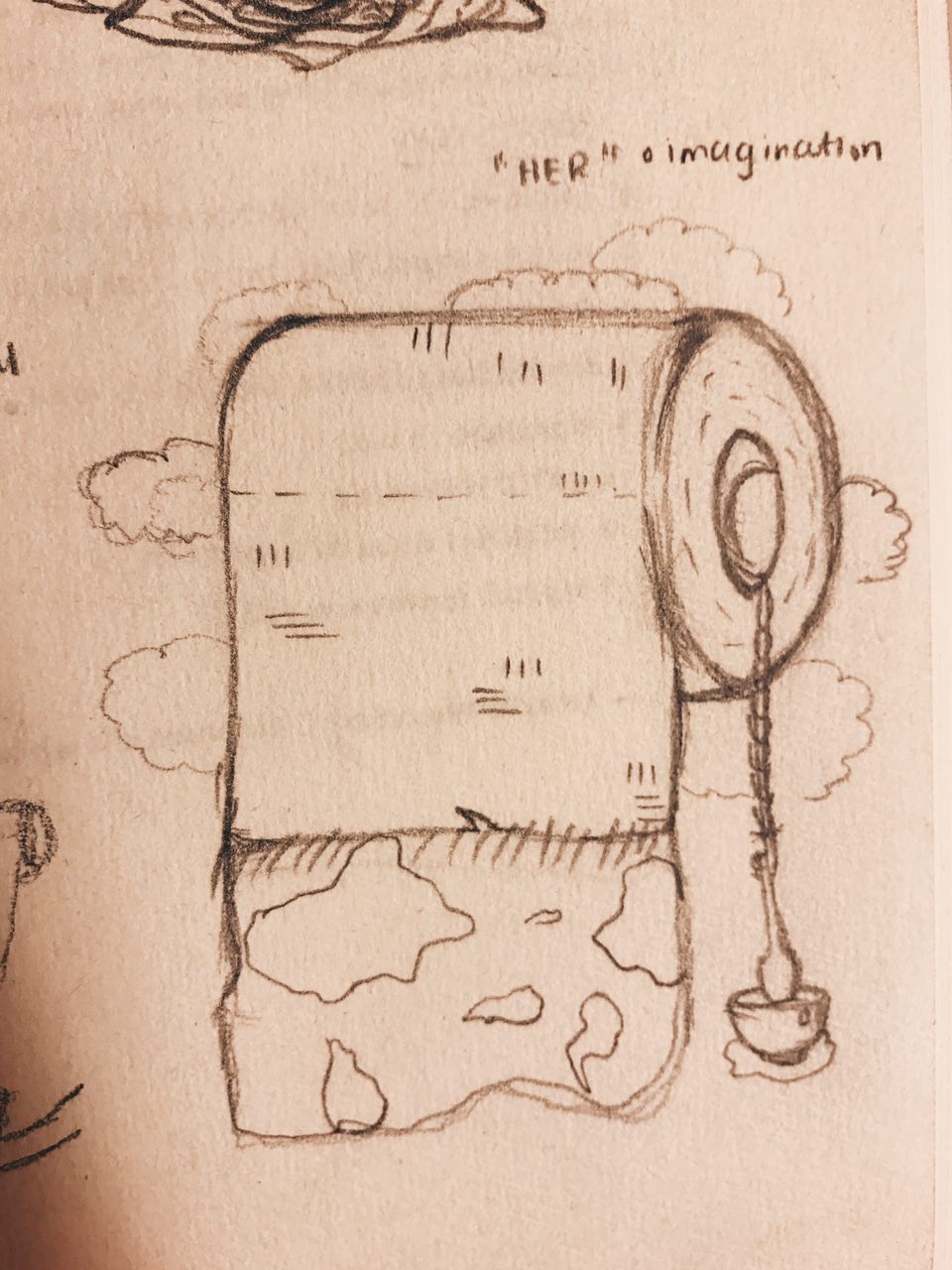
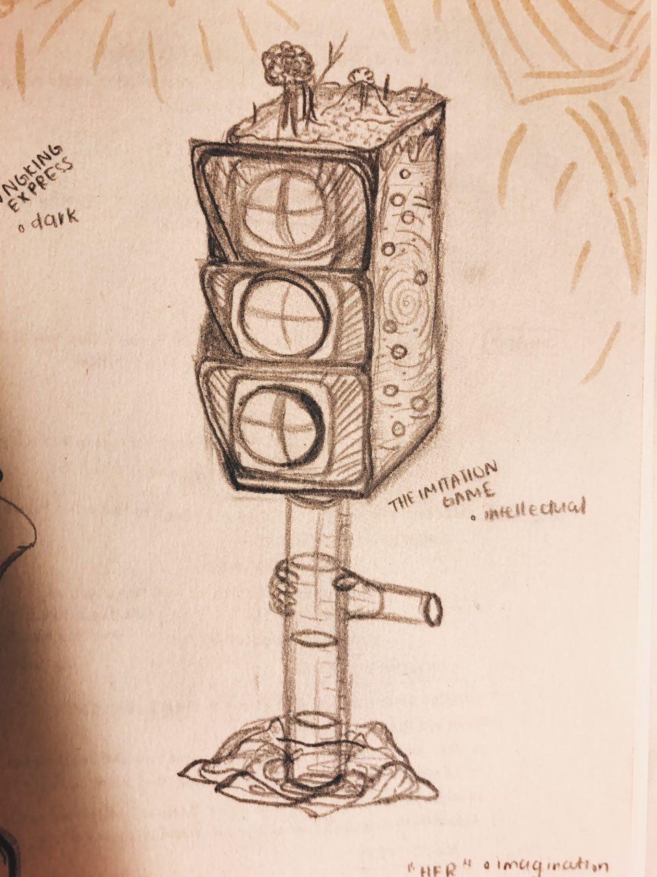
Chungking Express first sketchBoyhood first sketchHer first sketchThe Imitation Game first sketch
These sketches received generally okay feedback on the first round of consultation but were given feedback for improvements. Since the use of the hand motif is strong, I decided to use that as a common element in my compositions to make them look more consistent. It was also suggested to maybe also use cups across all my compositions to suggest the same meaning of life in each of them.
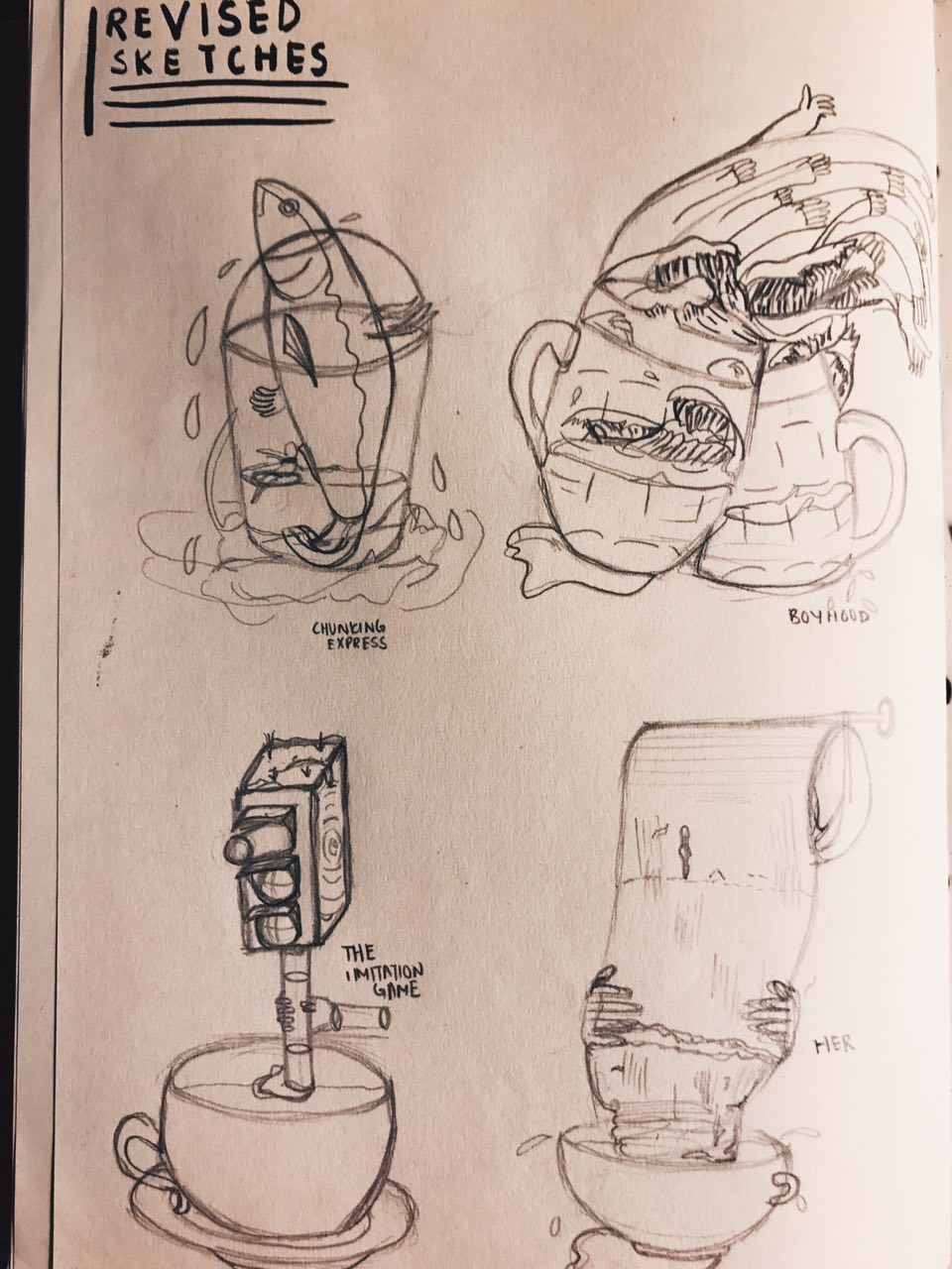
REVISED SKETCHES
– Included use of hands and cups in all 4 compositions –
digital drafts
Chungking Express
Chungking Express Draft 1
Feedback: Cup and sardine seem to be clashing, girl looks like she is about to crash into cup, fish fin can be tilted slightly upwards to have a better direction flow.
Boyhood
Boyhood Draft 1
Feedback: Looks alot more messy and complicated compared to Chungking Express composition, there is no focal point, not sure where to look at, maybe you can have one thing that is prominent, similar to Chungking Express one where the cup and the sardine sort os stands out the most, play with more halftones in the composition
Her
Her Draft 1
Feedback: Interesting use of toilet paper roll (at least some thought so), humans on the composition are a little disconnected/doesn’t make a lot of sense, can flow better, replace with something similar to other compositions.
The Imitation Game
The Imitation Game Draft 1
Feedback: Looks abit more plain compared to rest of compositions, can make cup tilt little so that the cup looks unstable almost like the rest of the cups in other compositions, add more water droplets, traffic light currently doesn’t look like a stirrer, tilt traffic light a little to show that it is in motion.
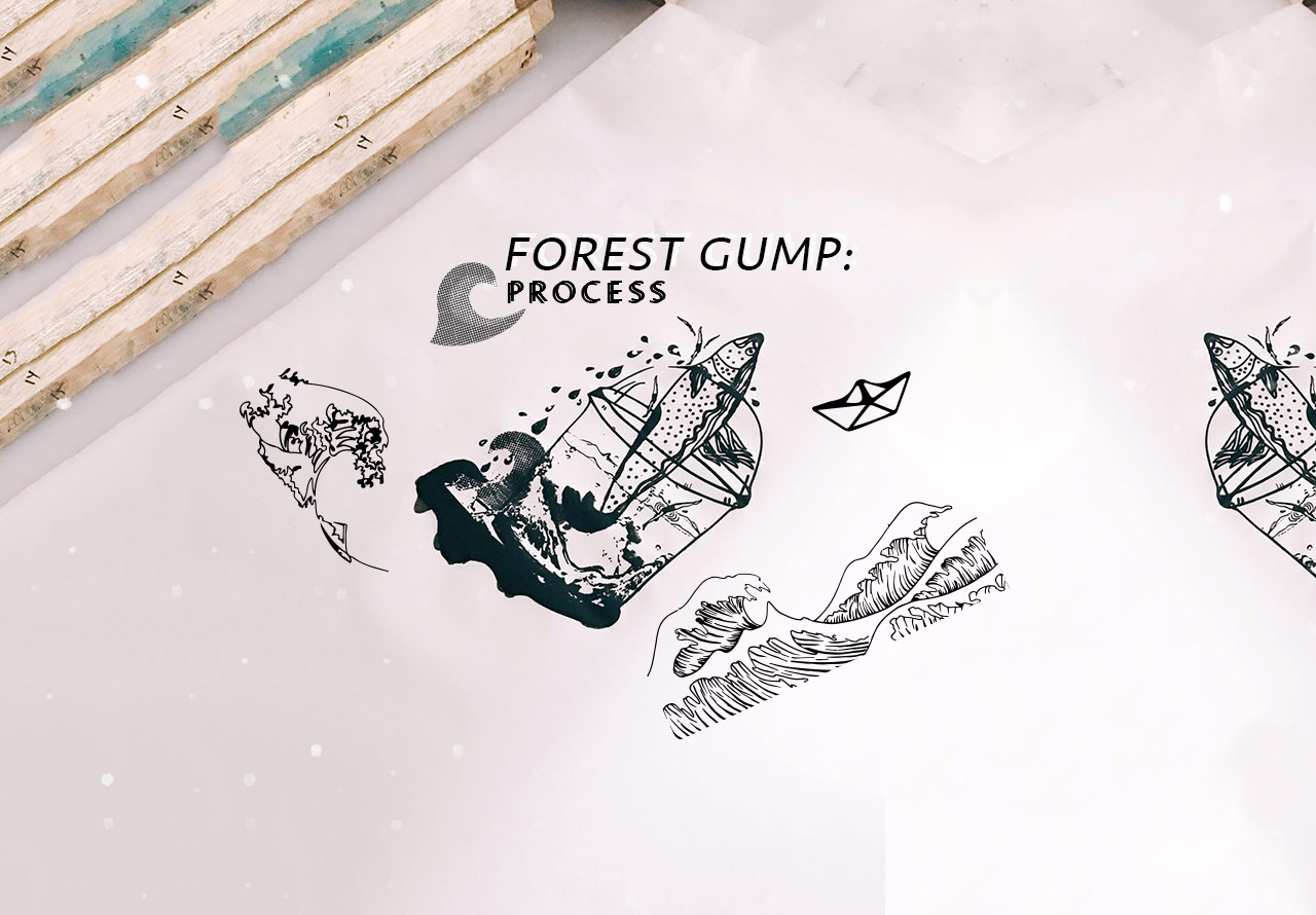
Read more about the ideas and meanings behind each composition in my final Forest Gump post!
 While thinking about my colour scheme, I thought that I wanted to do something more fun and not so related to typical dessert colours like brown.