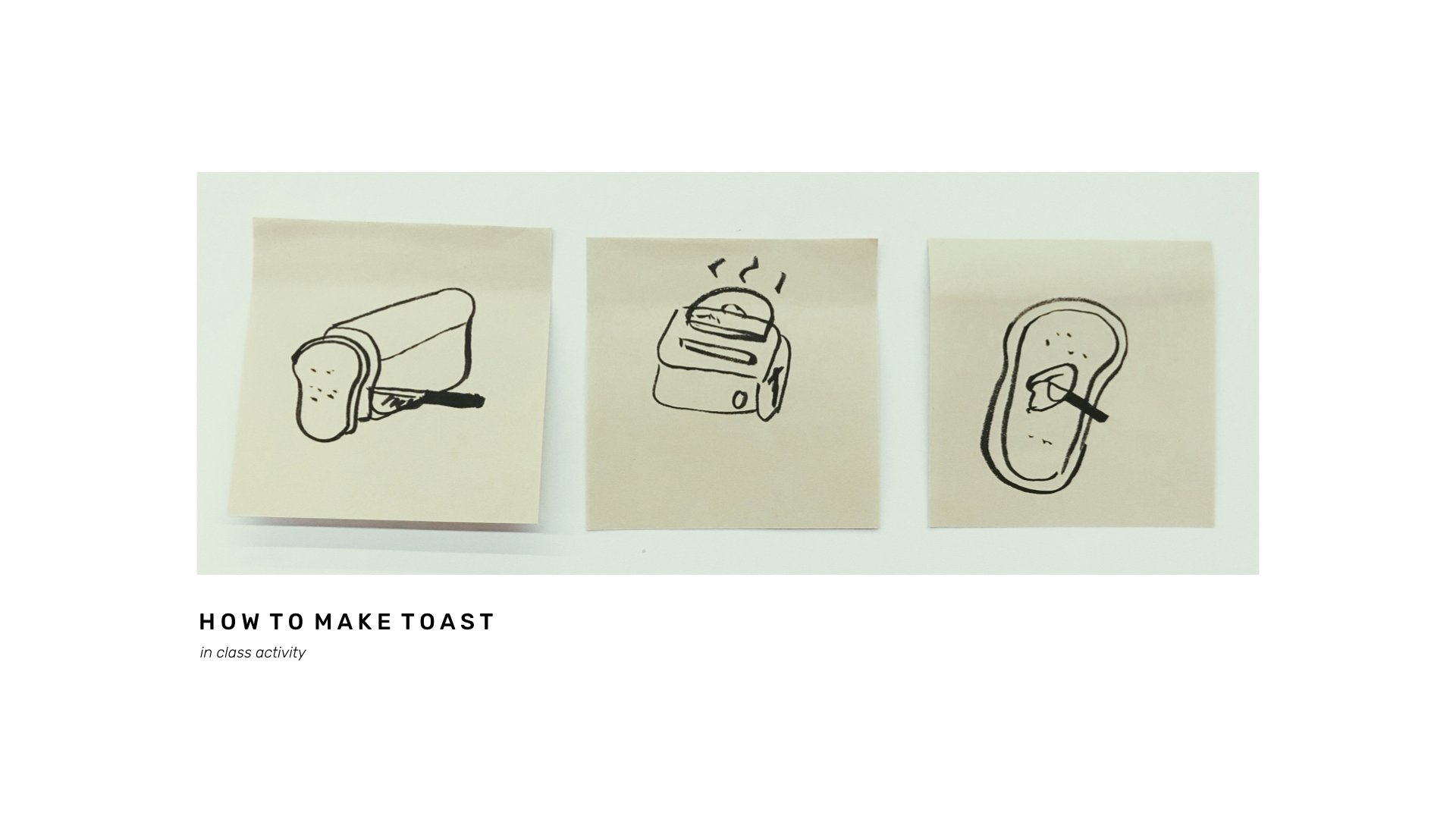
This particular week, we learned the importance of processes and how listing out our problems step by step might help us to reveal unexpected truths. This method is known as system thinking and all we require are some post its and a pen/pencil.
Before starting the exercise, we first watched a video by Tom Wujec, in which it explained the steps to begin!
“Without writing down any words or explaining the steps, draw out how to make toast on a piece of paper”
“Together in groups, separate the job or do it individually and piece them together, you’ll be surprised at the result”
It was a really interesting exercise that is simple yet so helpful!
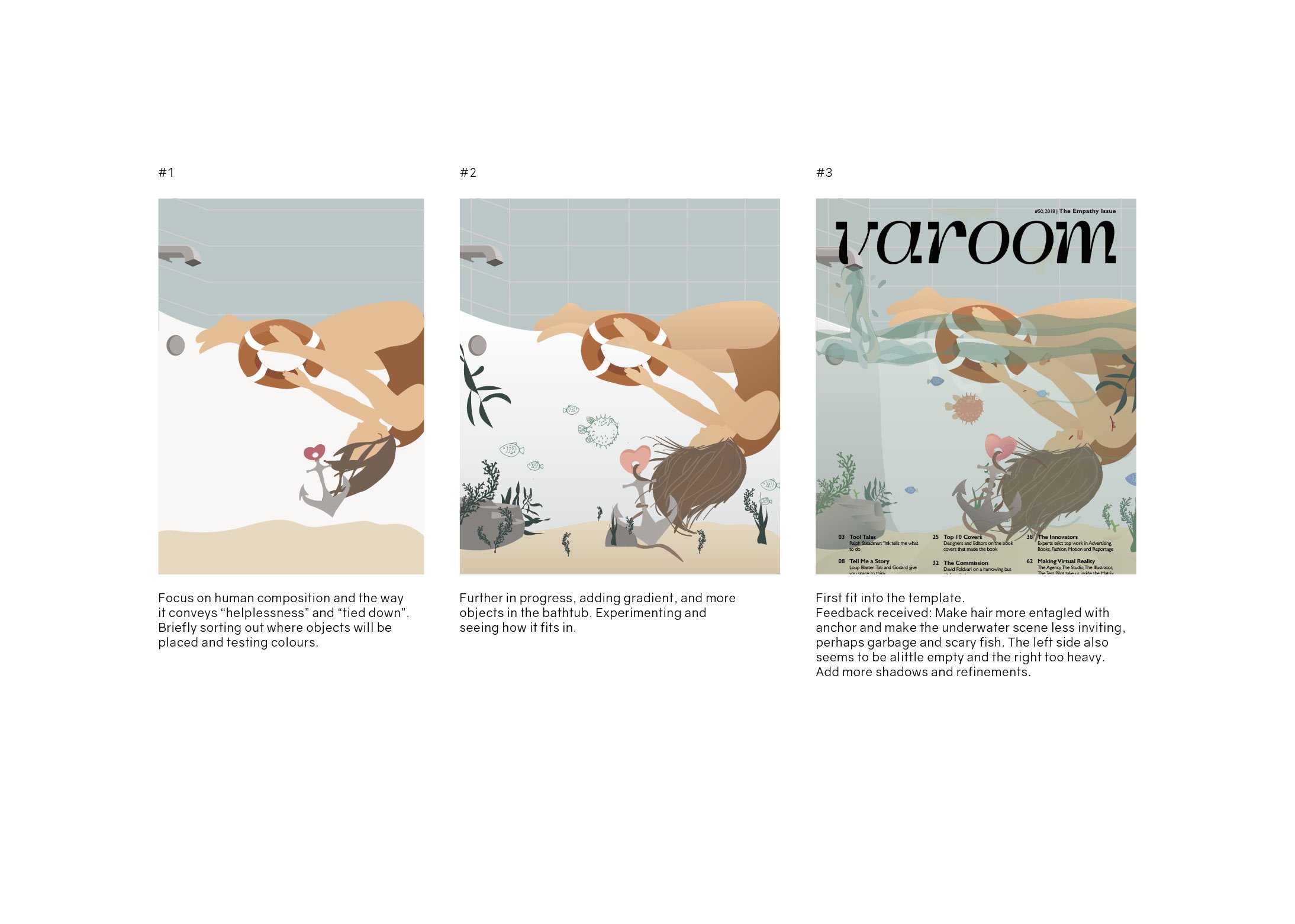
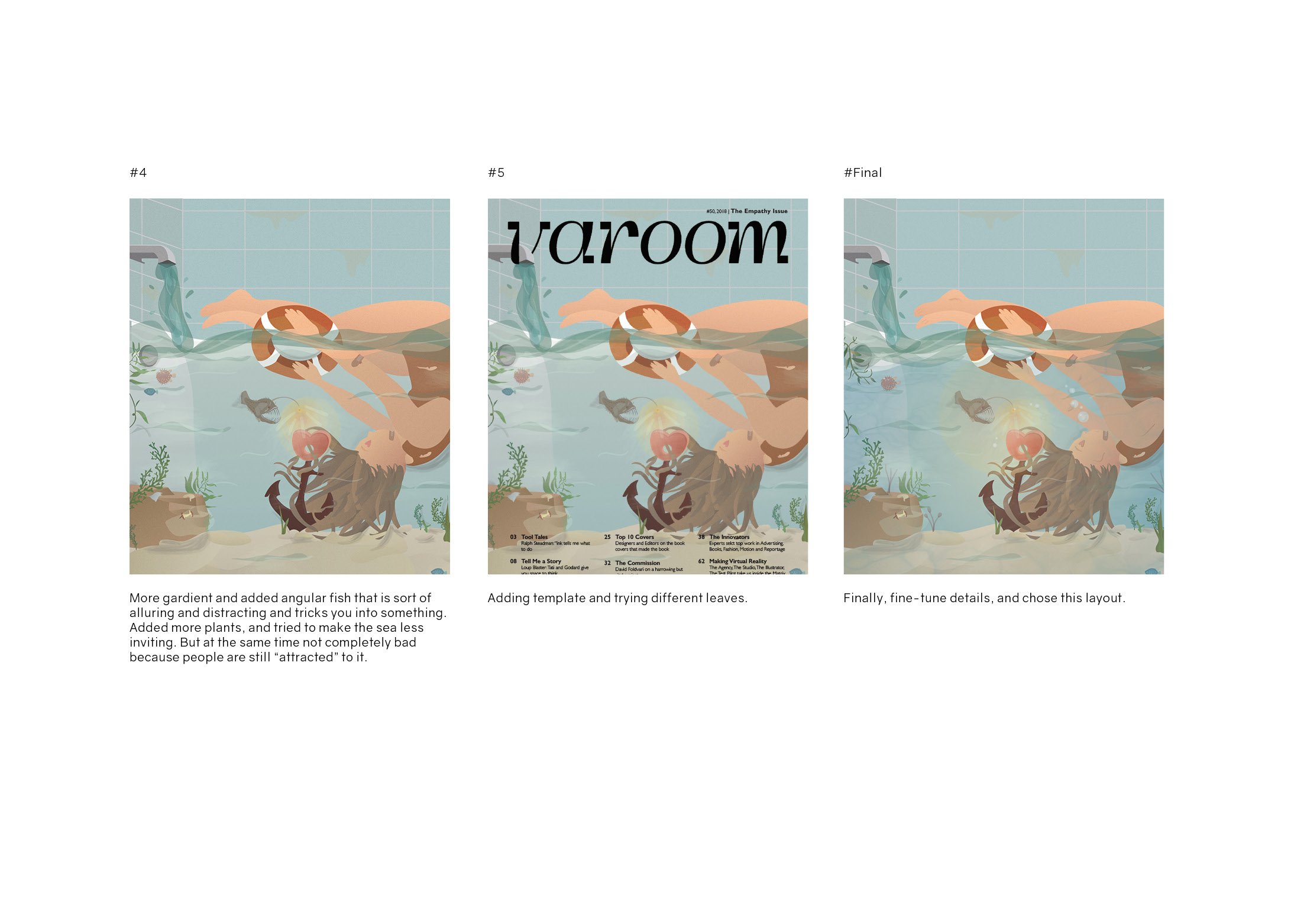
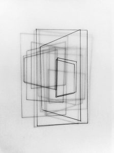
Continuing from previous post, here is the process towards
my final layout.
PROCESS OF ILLUSTRATION
DRAFT
FINAL
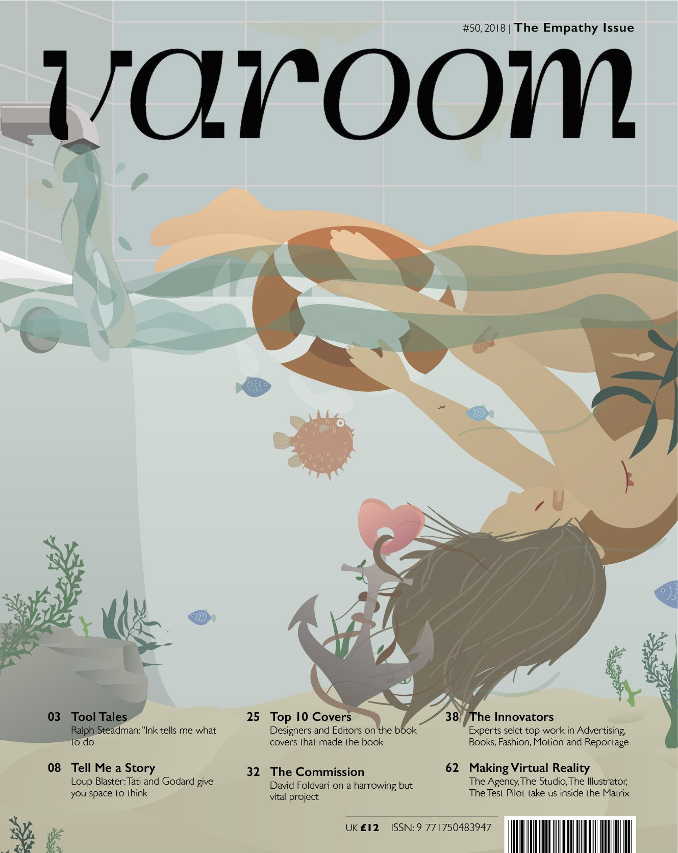
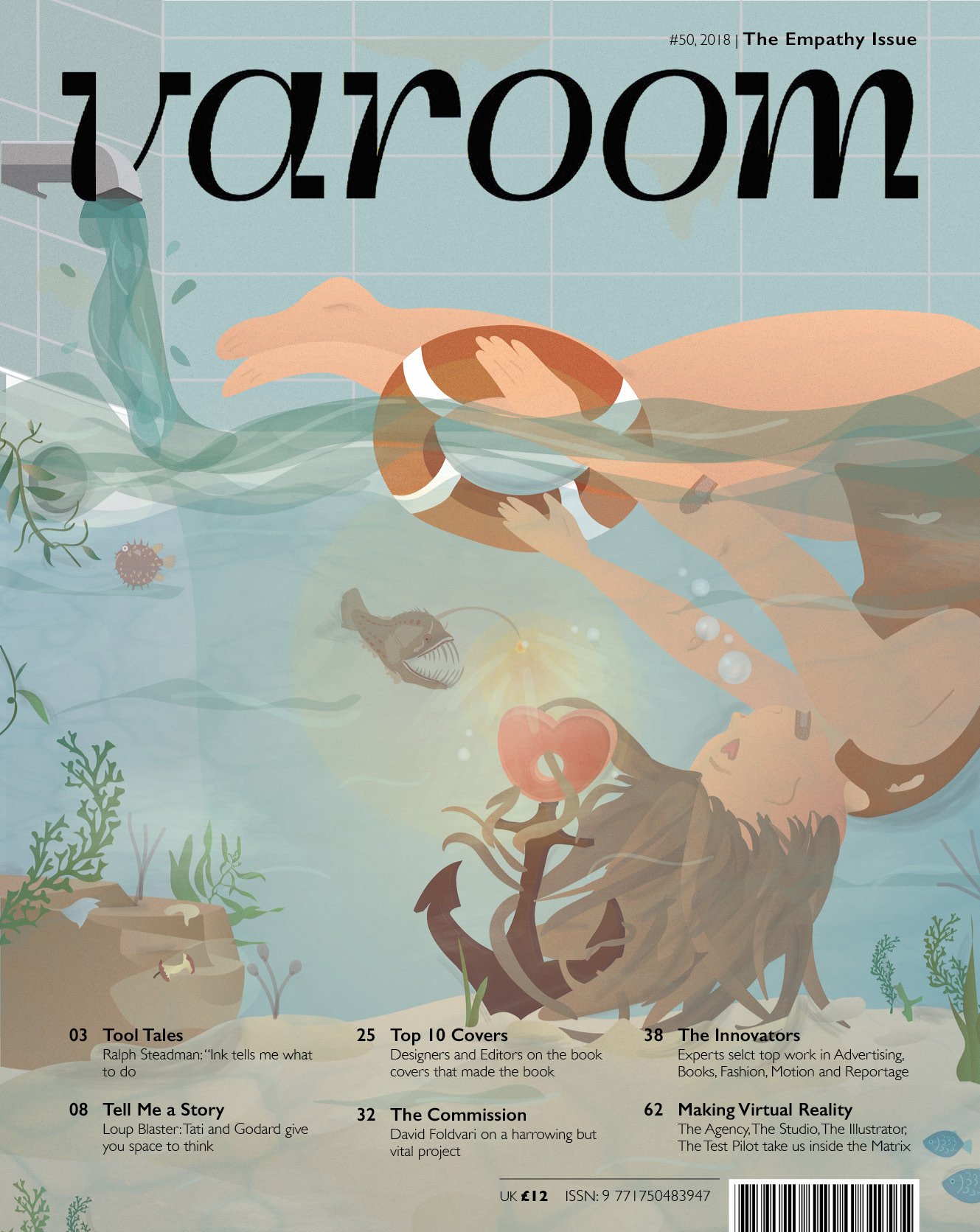
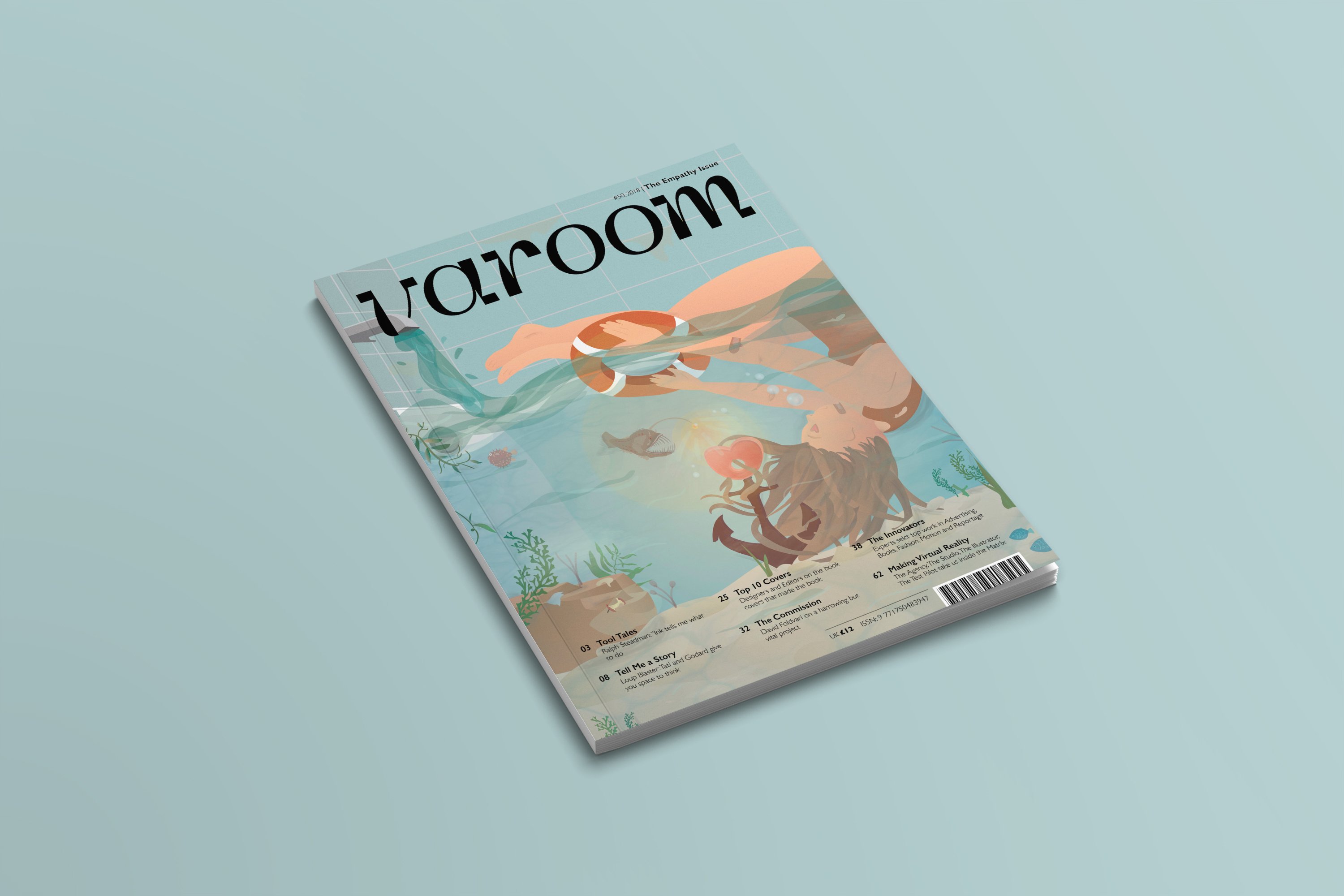
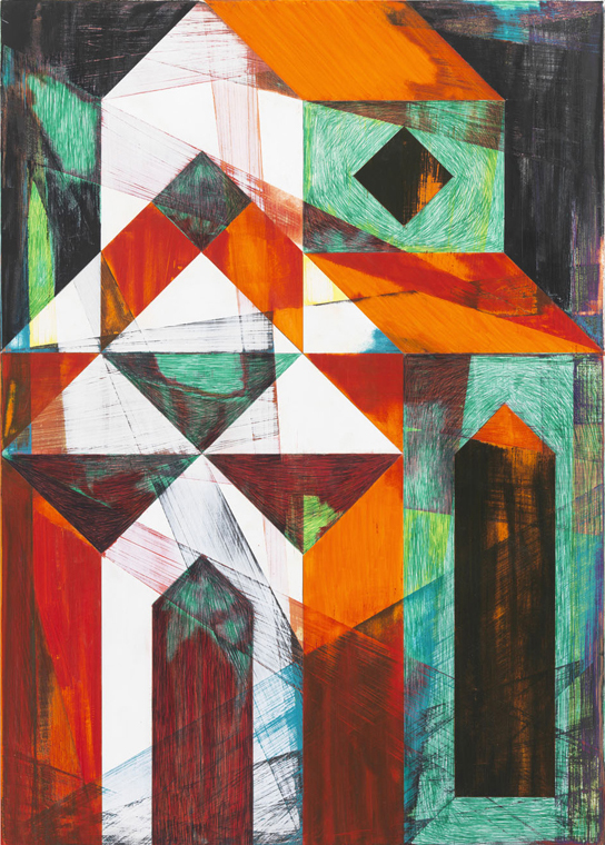
Final Varoom Illustration Magazine cover
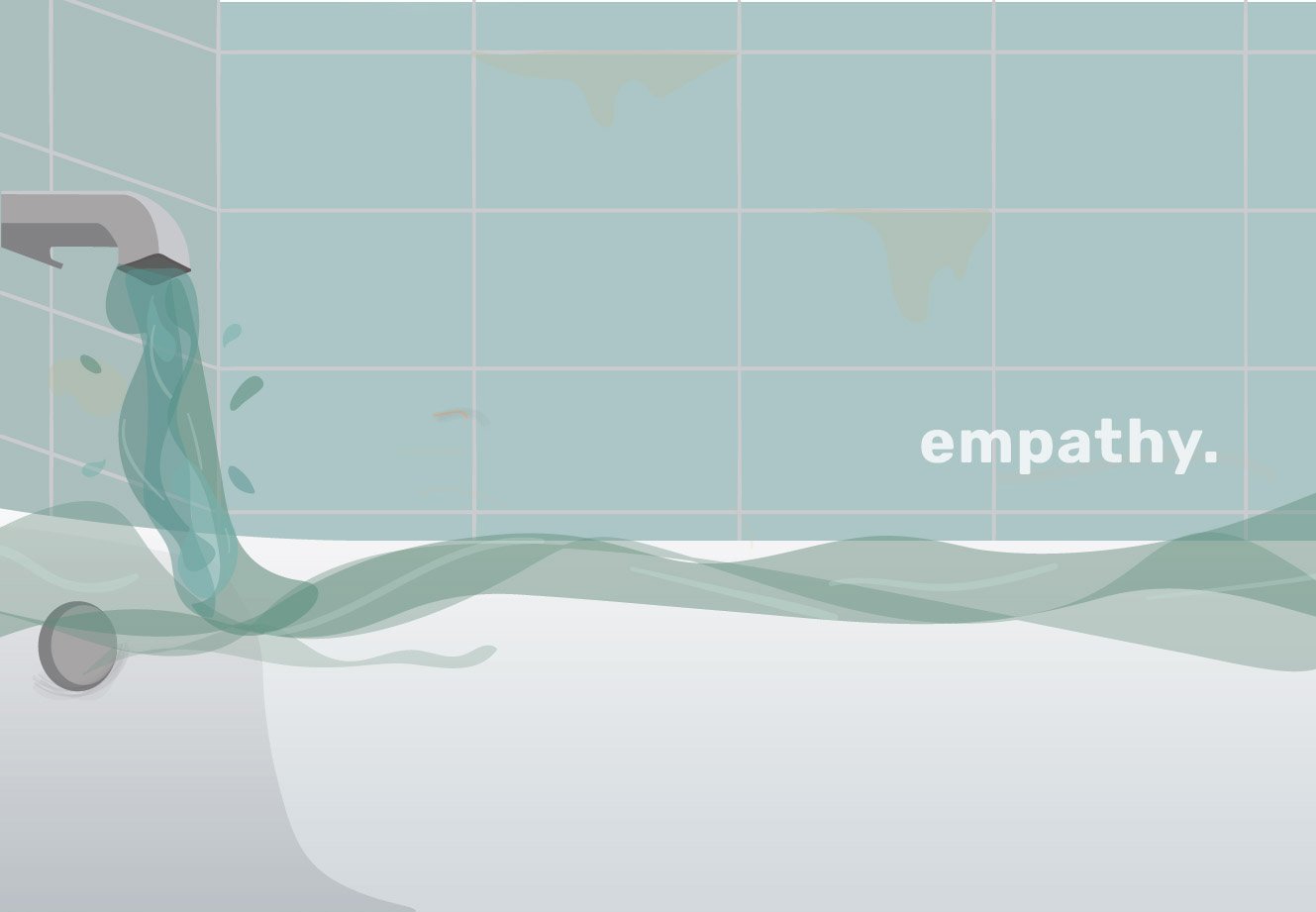
The lack of self-empathy and the inability to stay away from caring for others – represented through a bathroom scene where the water expands to a ocean scene. The human is submerged in the water, her hair entangled with the anchor which represents the heart and in this context empathy. The ocean represents the scary world and how being stuck in the empathy trap can be dangerous. This is represented through the angular fish, using its light to make the empathy alluring and attractive. The girl reaches her hand out to a lifebuoy which signifies the help he needs.
The second part of this project is to create a zine.
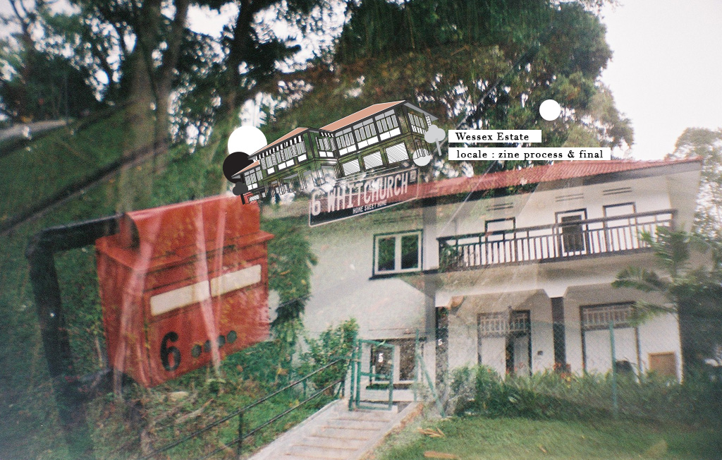
After my visual presentation, I received positive feedback about my site’s unique feature :
The only colonial estate in Singapore that has an art community living amongst a residential and not for commercial purposes.
THOUGHT PROCESS
Initially, I had difficulties coming up with a concept that will have enough content to spread across an eight-page zine. I was worried that my concept will be too simple, too predictable or nothing special.
concept
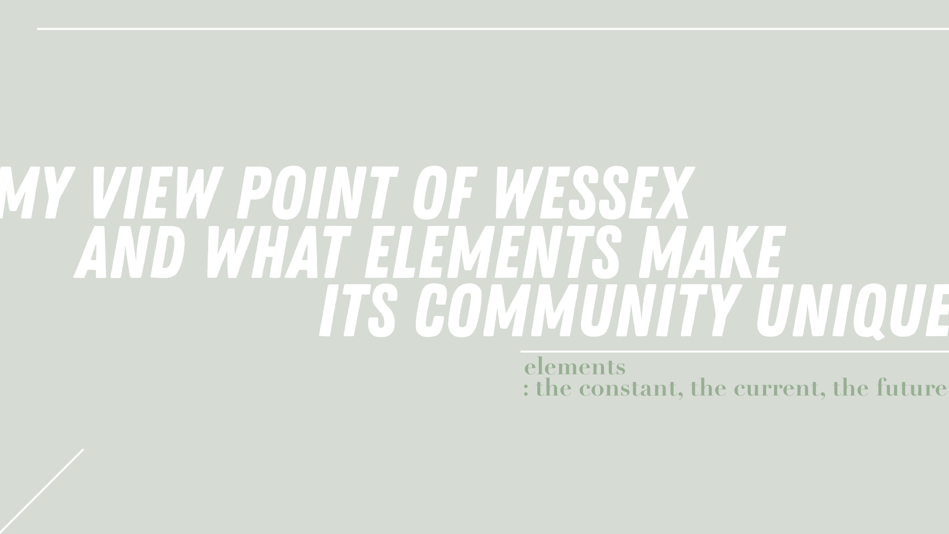
Based on my experience at Wessex estate and what I’ve gathered about the community, I really think that the community is special because of elements such as the B&W colonial buildings, the friendly people, the growing art community and the serenity of the entire estate.
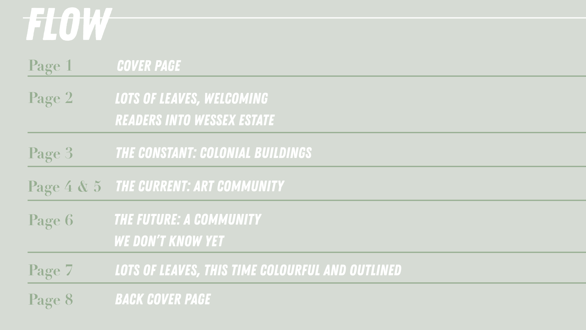
flow of zine
The zine sort of takes readers into the estate and view the different elements that make the community in Wessex and then takes them out of it but now taking away a little something knowing that it is a estate that is still growing.
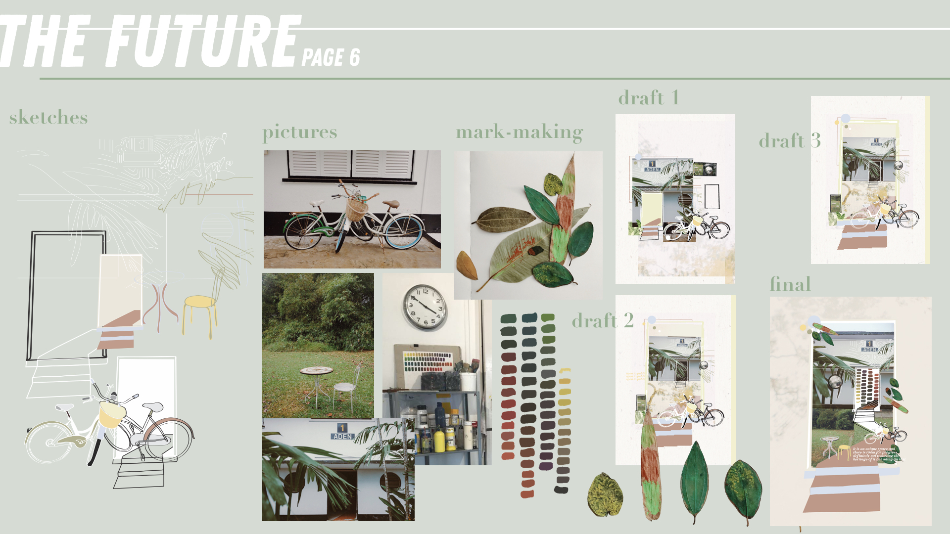
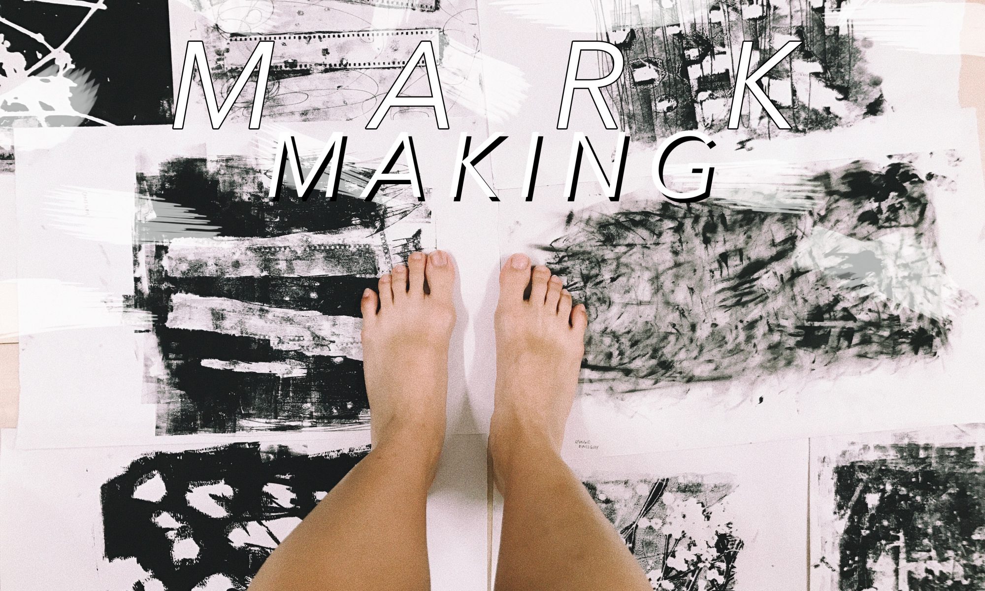
mark-making
In addition to my concept explained above, I also wanted to include mark-making or items from the wessex into my zine. Mark-making will sort of allow a co-creation between the the physical site, the humans at the estate and myself. This further highlights the creative community of Wessex.
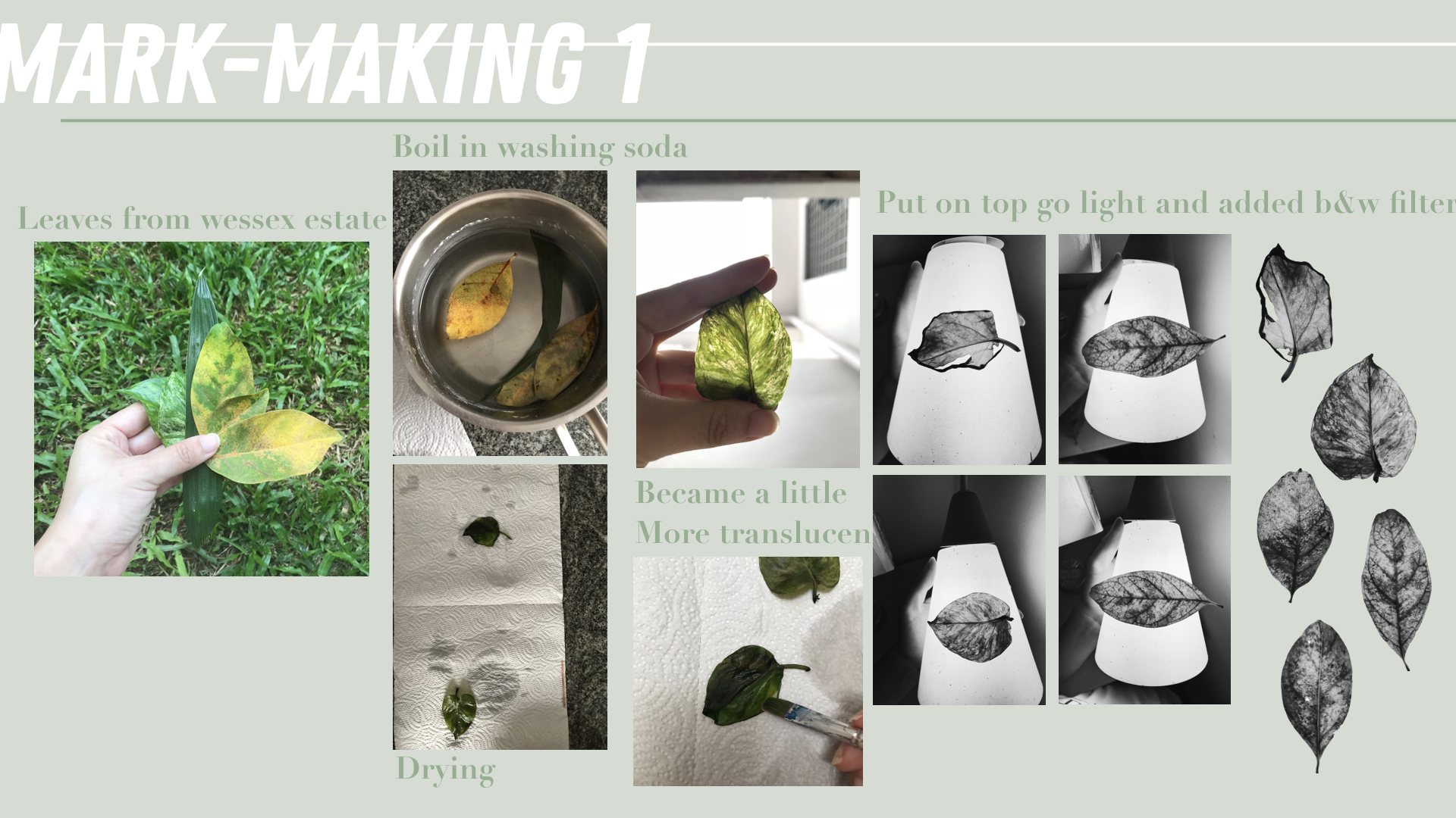
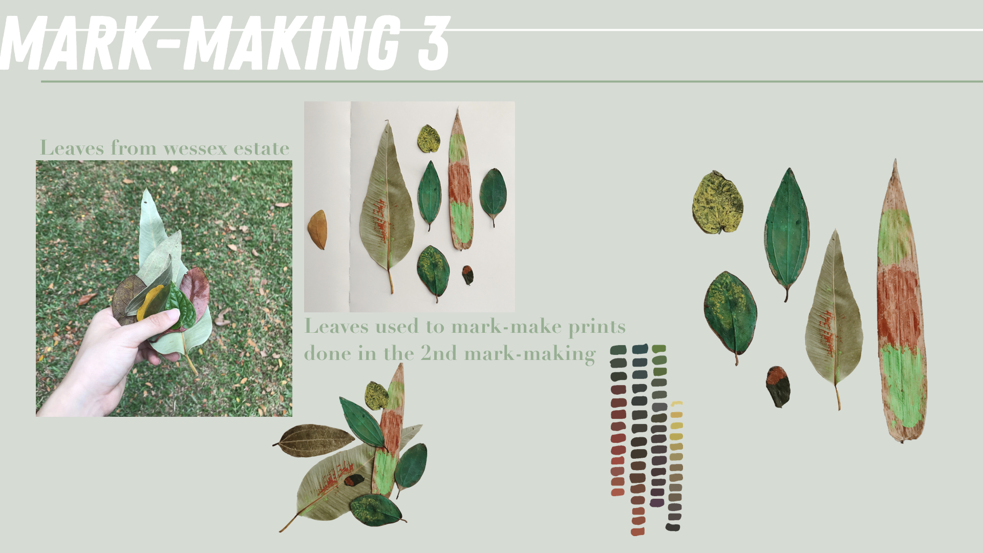
For my mark-making, I was thought that using leaves will be a good way to represent the estate as some interviewees said that the trees and the greenery is what makes the estate special to them (and they can also be found easily hahaha).
According to the flow of the zine state above, my zine is almost split into 3 sections. Thus, I will be treating the leaves that I have picked from the floor at Wessex Estatein 3 different ways – each way to reflect the same meaning as the page it is on.
I wanted this mark-making to reflect the the constant and thus, what I initially wanted was the get the skeleton of the leaves. However, that didn’t work out despite soaking the leaves in washing soda for more than 2 hours. But it did still make the leaves more translucent. So to get a more x-ray effect on these leaves, I placed them on a lamp so that light will can be seen through it.
Afterwards, I added a B&W filter to make it go more in line with the colour of the colonial buildings.
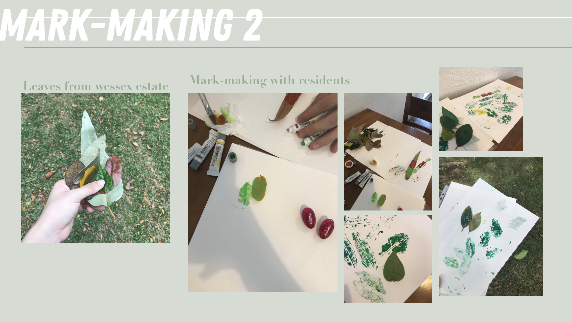
The second mark-making is supposed to reflect the art and creative community of Wessex. I picked fallen leaves from around the estate and walked around and approached people to help me imprint the leaves wherever they like on a piece of A3 size paper. Some things I asked them to think about when imprinting are the community, the environment in wessex and how it makes them feel.
This was honestly such a tough task as I was afraid of being rejected by people. This definitely pushed me out of my comfort zone as I did get rejected a few times and I’m definitely not the most extroverted person. However, I’m glad I plucked up my courage and did this because it also helped me realise how those that helped me also had a thing for arts and they were more than happy to help me with this. Some even commented that they like doing arts and crafts at home too! This just shows how this estate is really growing into a creative community 🙂
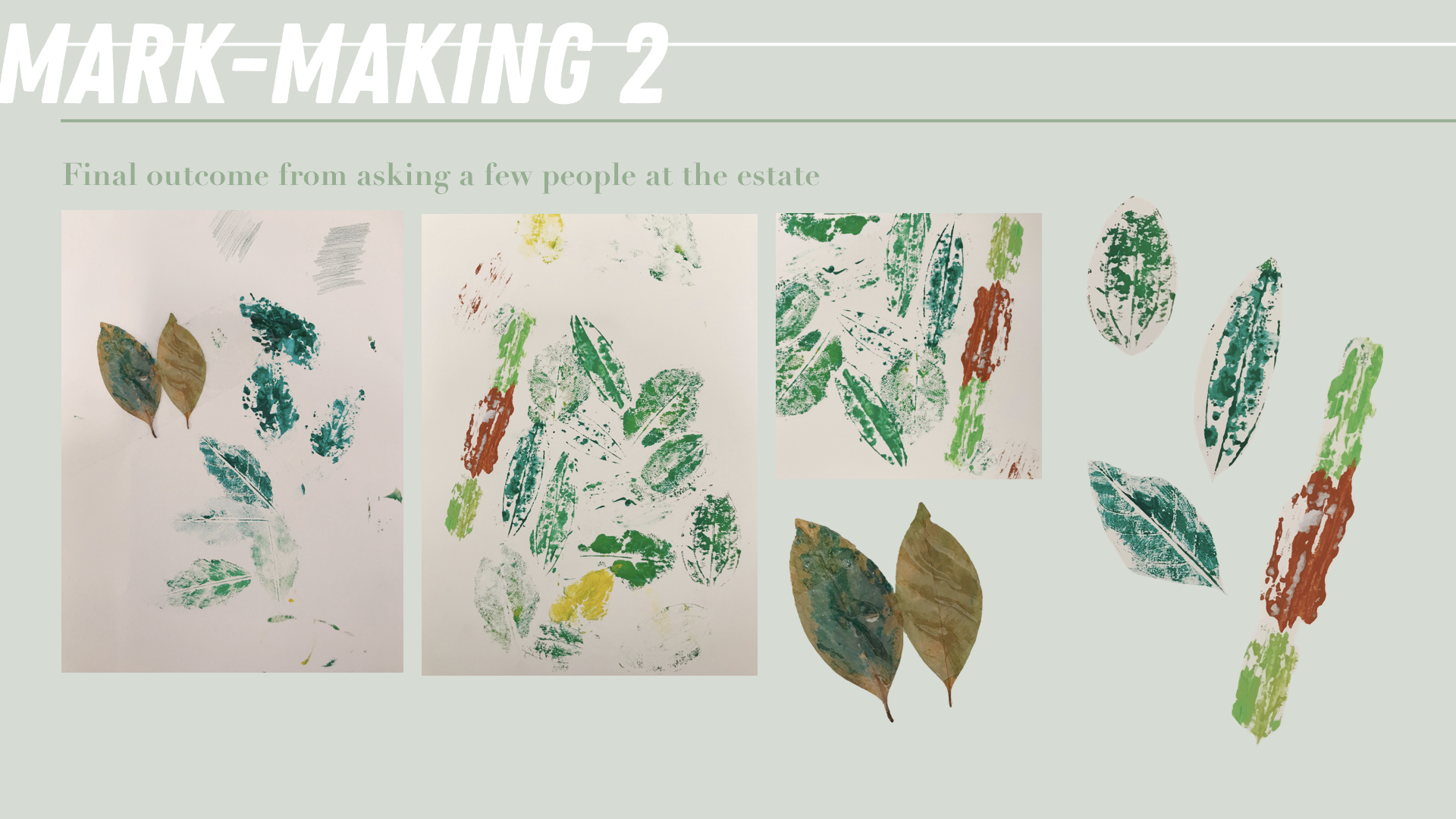
For the third mark-making, I gathered the leaves used to imprint and took photos of them so that I can crop them out digitally. These painted leaves also became an art piece on their own. I also picked up the some painted colour that I found in one of the artist studio that I visited. I hoped for these leaves to reflect the future of the estate and how vibrant the estate is with its growing arts enclave within a residential area. There is so much room for this estate to grow despite the long history it already has.
process
I started with the inside spreads before designing the covers. These pages went through many rounds of shifting and amendments before finally reaching the final outcome.
*Incorporated mark-making 1.
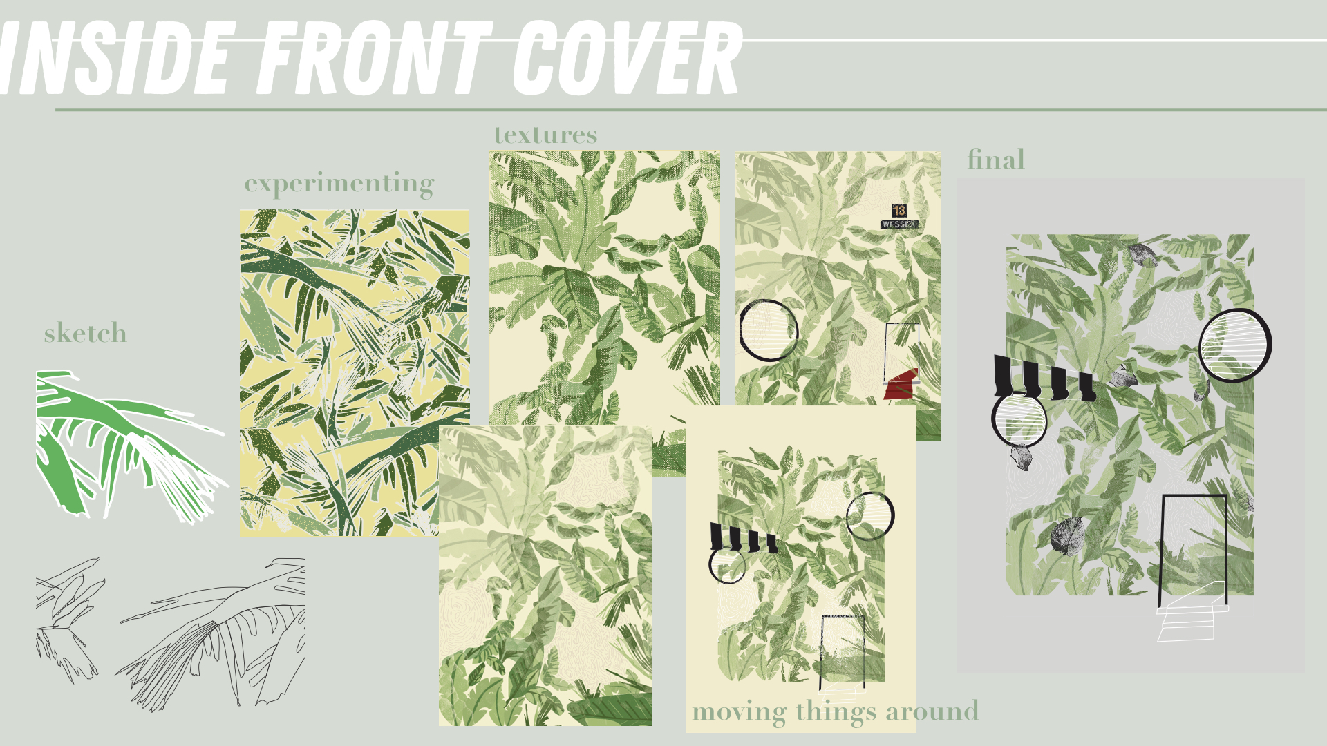
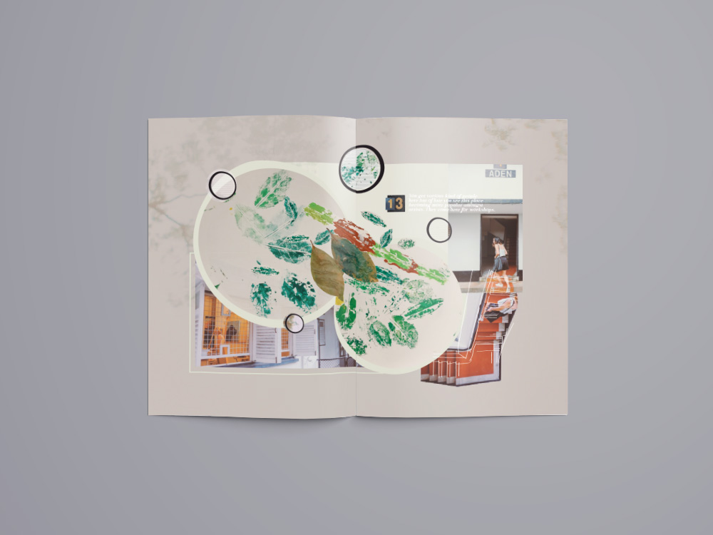
I wanted the inside front cover to sort of illustrate how I felt when I travel to Wessex. A long road is covered in abundance of leaves and you suddenly realise there are much tall buildings around you unlike other parts of SG. After a few bus stops, a few colonial buildings start to appear, their iconic B&W really catching your eyes and attention. For me the 3 most iconic elements of the colonial buildings at Wessex are the B&W blinds, the round windows and the doors of the apartment blocks. I figured that I will use this three elements as motifs to represent the three main points in my zine.
Thus, I placed them amongst the leaves in this page showing how the trail of leaves reveal the colonial houses at Wessex estate.
*Incorporated mark-making 1.
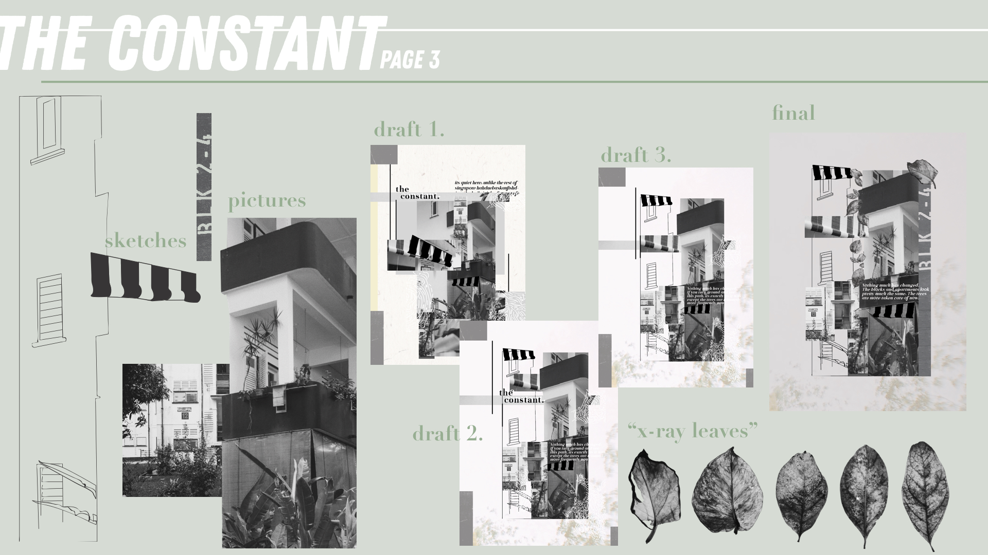
For the page next to the inside front cover, I decided to share about “the constant” here. “The Constant” (represented by the blinds) of Wessex is really the buildings as they haven’t changed. This is probably one of the reasons why this place has a charm and its because it has houses that most other parts of Singapore doesn’t. This is an element that contributes to its unique feature. For the pages in my zine, I’ve decided to go with a mixed collage and line drawing with the pictures taken by me. In this page I’ve also included the “x-ray” leaves to convey the roots of this estate.
Every section also has an extract from the interviews I had with some people at the estate and this one reads, “Nothing much has changed. The blocks and apartments look pretty much the same. The trees are more taken care of now.”
*Incorporated mark-making 2.
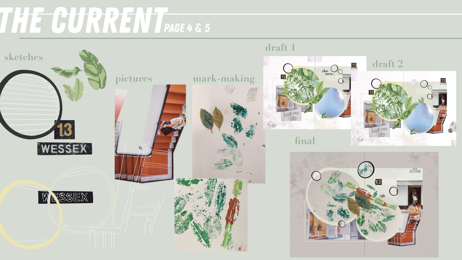
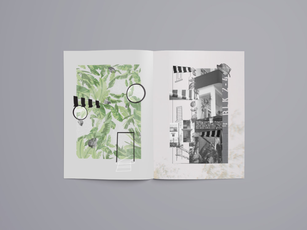
“The Current” (represented by the round windows) conveys the arts enclave that Wessex currently has. There are a few art studios amongst the houses in the Estate and the idea of some artists leaving within their own space is really special and interesting. These artists live simply and conduct workshops from time to time right at their houses. The imprinted mar-making leaves are put into two circles that are actually in the shape of the round windows. The staircase at the side is unique to me as even though the buildings are B&W, there is suddenly this painted red walkway that sort of brings out that artsy side of the whole building.
The extract here reads, “You get various kind of people here but of late you see this place becoming more popular amongst artists. They come here for workshops.”
*Incorporated mark-making 3.
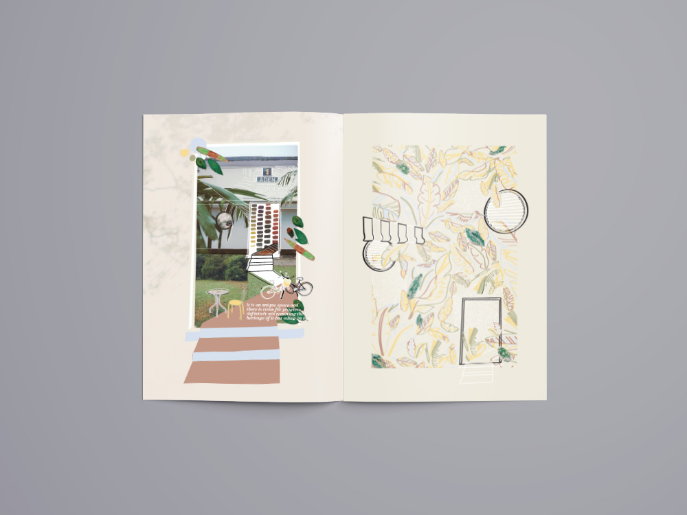
“The Future” (represented by the doors) conveys the future of Wessex and what community it will grow and blossom into. With the arts enclave and creative community even amongst residents, this place has so much potential to grow despite its already rich history. The painted leaves are placed in this page as they represent the fruit of the mark-making made in the last page. This page is a little more colourful than the others as I wanted to bring out the colour in this estate. That despite it being mostly B&W, its community is colourful and its definitely still growing. Some kine drawings of the bikes and the table and chairs are some things that I found interesting while walking around the estate.
The extract here reads, “It is an unique space and there is room for progress definitely not removing the heritage of it but adding on to it.”
*Incorporated mark-making 3.
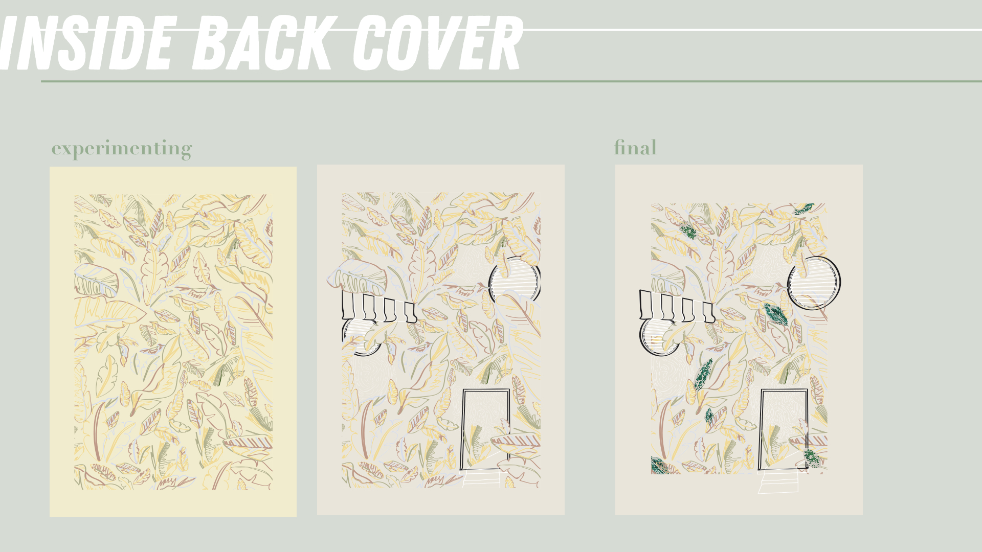
The inside back cover is actually the same as the inside front cover except that it is now filled with outlined leaves and the leaves are now colourful. This is to portray how this place is still growing and not filled up yet. The community is colourful and always opens its doors to the public to visit.
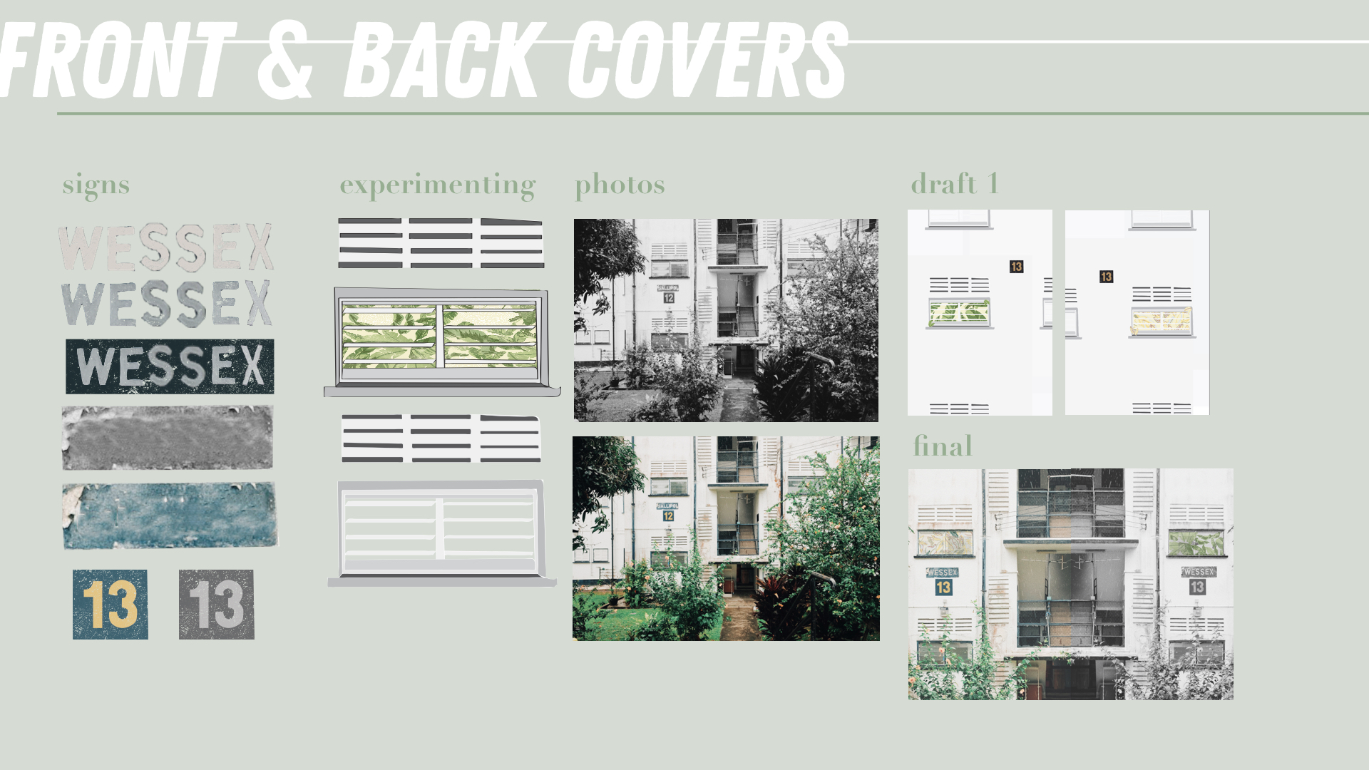
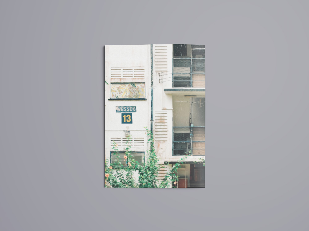
The covers are a zoomed in picture I took of the apartment buildings in Wessex. The number 13 is replicated from the block numbers on every apartment building and I chose the number 13 because in that area all the postal codes start with 13. Usually the sign “WESSEX” will be the name of the block. However, there was no block called wessex and thus, I took the various letters from the different blocks and put them together to form “WESSEX”. The window in the picture is replaced with a snippet of either the IFC or IBC which is what readers will see when they flip to the next page.
The front cover is B&W because the zine still hasn’t shared about the art community. However, the back cover because coloured because now readers know that the community of Wessex is colourful and alive!
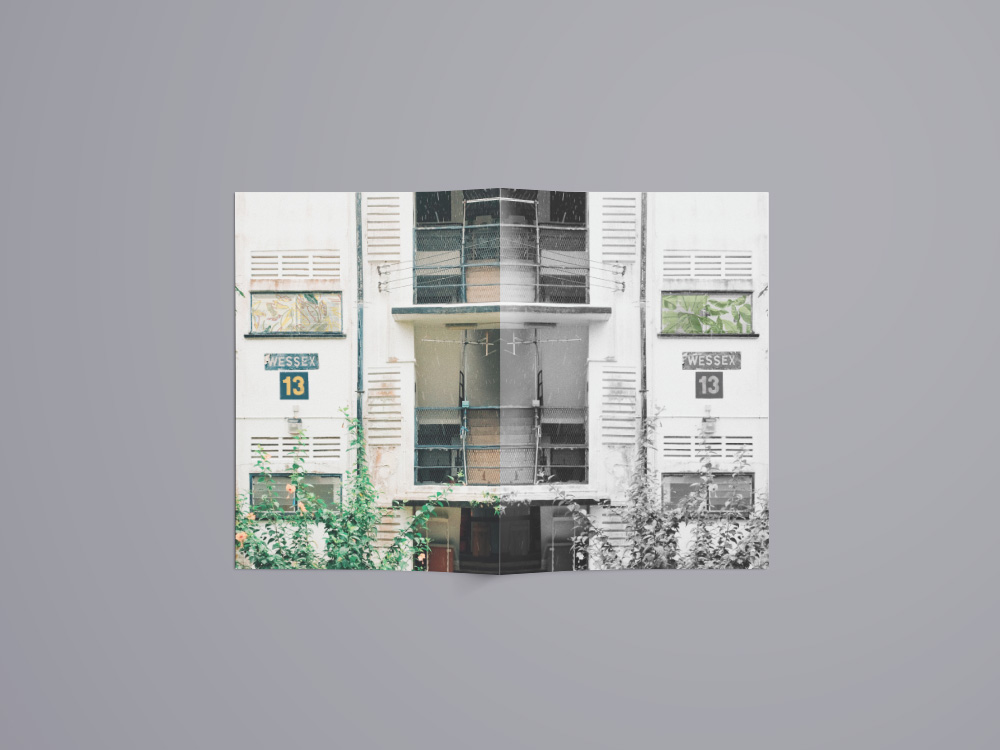
When you open the booklet, the covers align up to each other showcasing a full apartment building at Wessex Estate!
final
rEFLECTION
I really enjoyed this project even though it really pushed me out of my comfort zone especially when I had to interview people and ask them to use leaves and paint to create marks. It has opened my eyes to an estate in SG that I didn’t know about until I had to work on this project. I struggled with the concept of the zine at the beginning and the arrangement of my marks, pictures and words. I was afraid that everything won’t be abstract enough.
Thankfully, my zine was well-received in the end and it all came together. I’ve gotten to meet new people along the way and made friends with the workers at the cafe in Wessex Estate! I hope that my friends and classmates have also learnt more about this estate in Singapore and will check the place out on their own 🙂
After much research and scrolling through Pinterest for inspiration. I took those inspiration and channeled it towards my thought process for my concept and ideas.
For this project, we were tasked to create a type-image based on our ideal occupations or rather just any occupations that resonate in some way to ourselves. They can even be abstract, unrealistic and imaginative.
Honestly, that got me excited because I knew I didn’t have to stick to the ordinary thought of, “what do you want to be when you grow up?”
concept
With that, I thought along the lines of occupation and my attitudes towards it. It was then when I realised that I feel more than a certain way about occupations and work in general. & that is because I have experienced jobs that made me laugh and also jobs that made me cry.
That being said, I concluded that I feel an array of emotions when it comes to working.
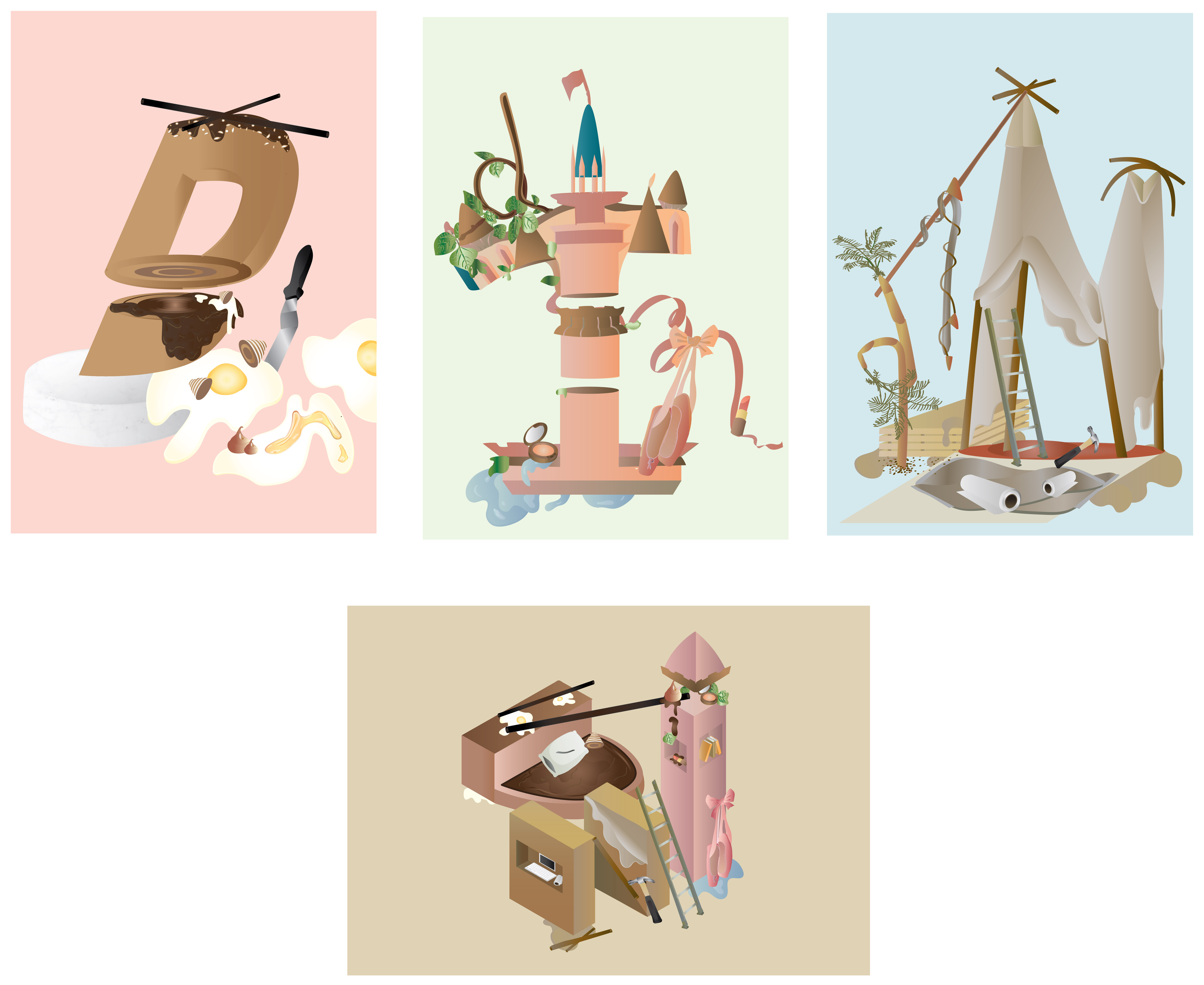
CHOSEN OCCUPATIONS
The occupations I’ve chosen are, Pastry Chef, Disneyland Dancer, Event Coordinator and Entrepreneur.
I’ve chosen these occupations as it reflects my mood towards work life and occupations while growing up – from a teenager to a full-grown working adult.
Process
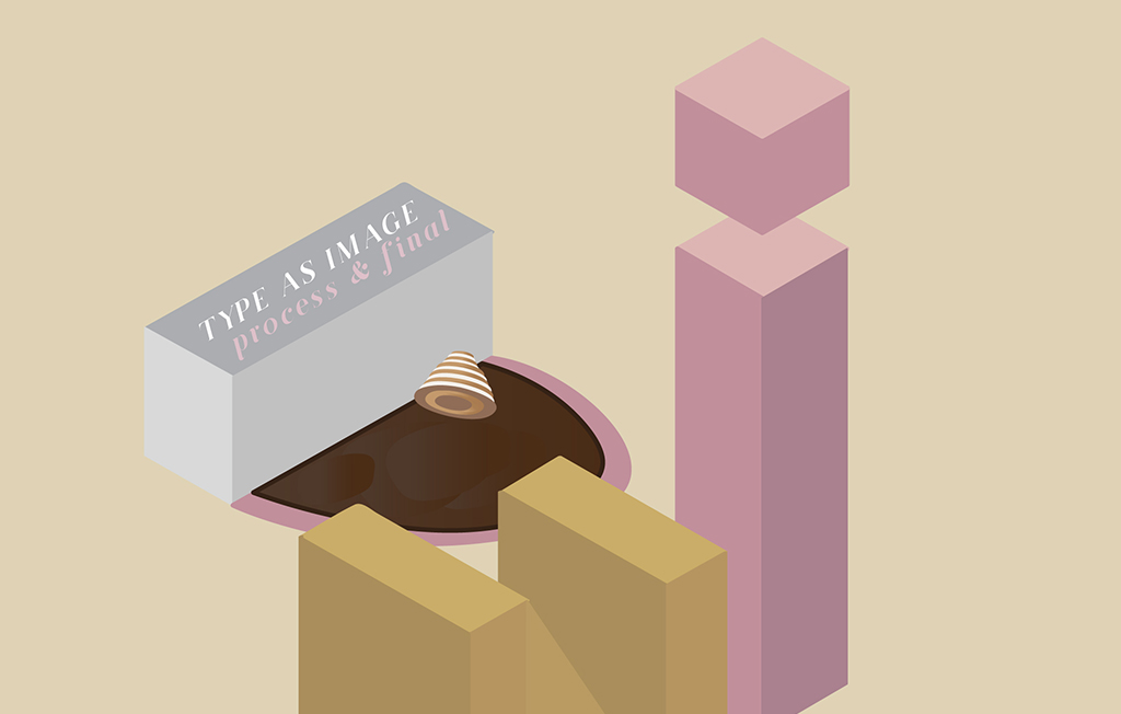
As stated in my research post, my art direction for this project will be illustrations. I decided to go for a single subject in a composition to show how a few alphabets can form a “city” or “life” of its own.
The letters that I have chosen for all 4 of my compositions are, “D, I, N”, spelling DIN.
The reason why I chose DIN is because some of my closest friends and family call me Din and I feel comfortable with that nickname. I feel that if I had to choose alphabets that best resonates with me and my life, it would be DIN.
The colours I decided to go with for all 4 compositions are more pastel light colours. The colours I have chosen are also chosen according to the emotion I have towards the occupation during that period of time.
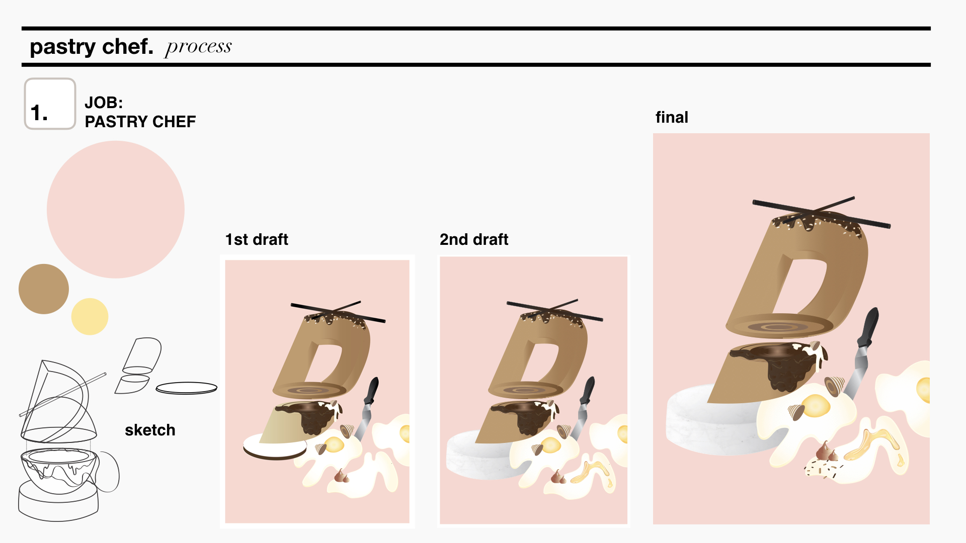
pastry chef
The letter D.
Pastry Chef reflects my excitement towards growing up and getting my first job. The reason why I chose Pastry Chef is because I always loved the pastries these chefs produced – they are so meticulous and they are basically edible art. If I weren’t in ADM I will probably struggling in the kitchen trying to whip up some pretty desserts. Since the idea of this job gets me all excited (:>) I decided to use it to reflect my excitement towards occupations. The letter D is manipulated to become the pastry, the palette knife i and an egg splatter n.
I picked warm colours and chose pink as my background as pink reminds me of being young and innocent.
disneyland dancer
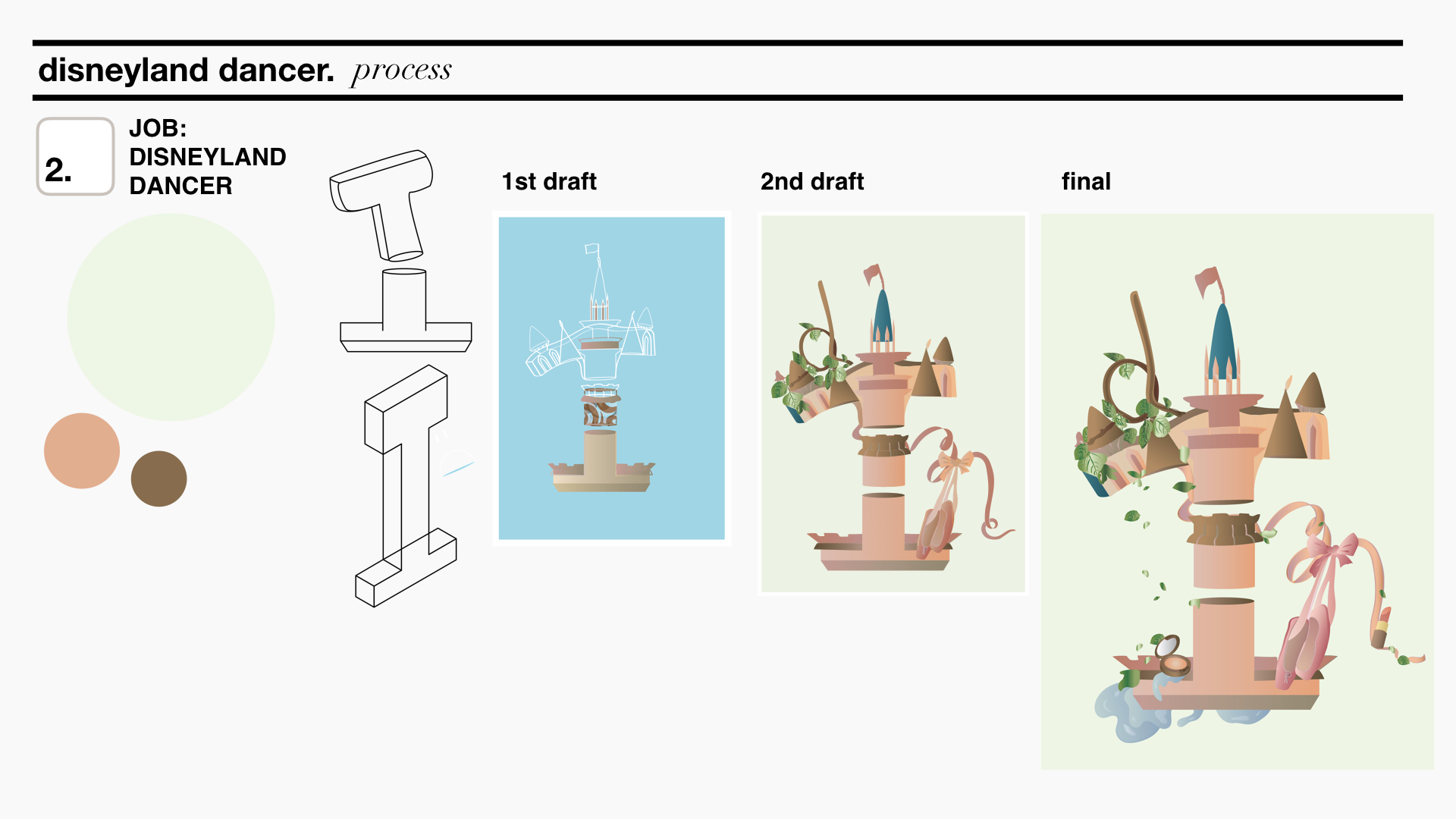
The letter I.
The idea of being a Disneyland Dancer feels far yet it seems like such a fun and happy job. I chose Disneyland Dancer to reflect my determination and positive attitude towards working as it feels like a job that will require substantial amount of commitment yet inspire me everyday. It also feels far away because there is no Disneyland in Singapore which sort of reflects my thoughts about being a full time working adult, “aiya, still got a few more years to go”. The letter I manipulated to represent the Disney castle, a twirled branch d and ribbons and ballet shoes n.
I chose colours that will pop a little more and will be a little contrasting yet complementary to each other. Pink is used for the castle as mentioned pink just reminds me of childhood and playtime just like Disneyland does. The brighter pink stands out in contrast to the lime green background.
event coordinator
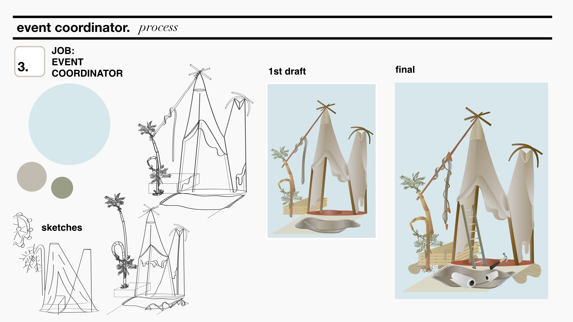
The letter N.
As you get over your first job, you start to think about a job that will give you a more stable income so that you can support yourself. As such, an Event coordinator reflects a stable income job that is essential and necessary for survival. The letter N manipulated to represent the tent of an event set-up, in this case a Coachella inspired set-up. Manipulated palm tress for d and strings and cloth for i.
As the years go by, I foresee myself getting tired and bored of the working life. Thus, the colours I picked for the composition are more dull and earth tone. This also goes in line with dessert feels that events can take place at.
entrepreneur
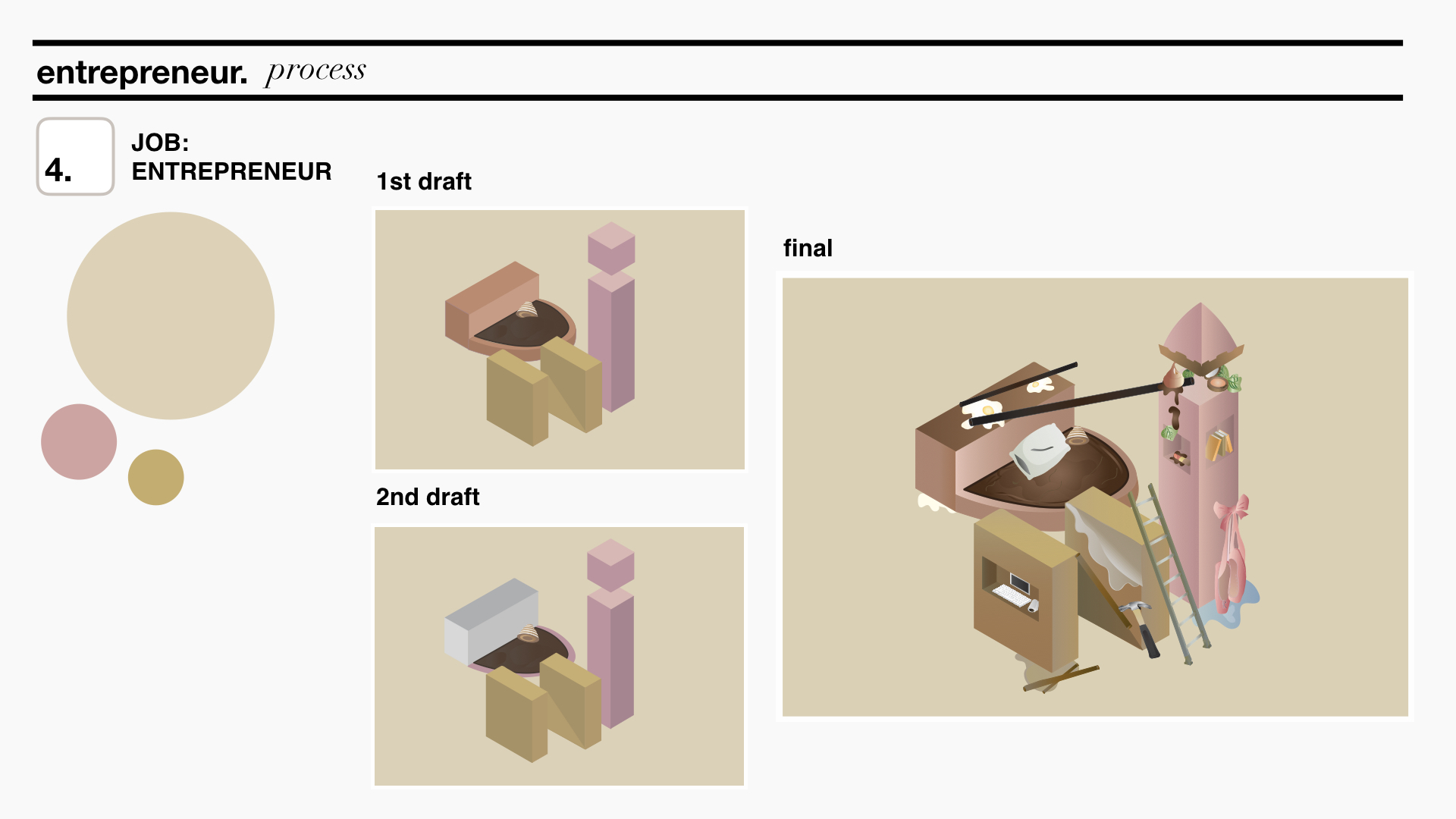
The letters D, I, N.
After life takes me on a few different jobs, I would think I would have gathered skills through my experience and know what I like and dislike. To represent my future and wanting to eventually settle down, I thought of an Entrepreneur. I feel that an Entrepreneur has the freedom to do what she wants and that reflects exactly my sentiments about finally doing something I will want to do for the rest of my life. Thus, this is combination of my previous three combinations as I will definitely be using what I’ve learnt from my past occupations to help me in becoming a successful Entrepreneur. D represents Pastry Chef, I represents Disneyland Dancer and N represents Event Coordinator. However, in each of the these letters, I tweaked it a little to add more home elements as I have settled down and could be working from home.
The colours used here are not as bright to represent settling down but also includes colours from the previous three compositions.
After going through the brief, various thoughts and ideas came to my head. However, I was not sure of how exactly I wanted to come up with and portray my compositions.
I immediately started off by going through quotes that are closely related to life and human feelings. I drowned myself in a sea of emotions and feelings from movies that I closely relate to or have been inspired by.
4MOVIES
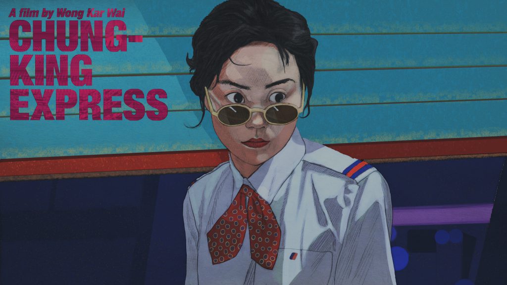
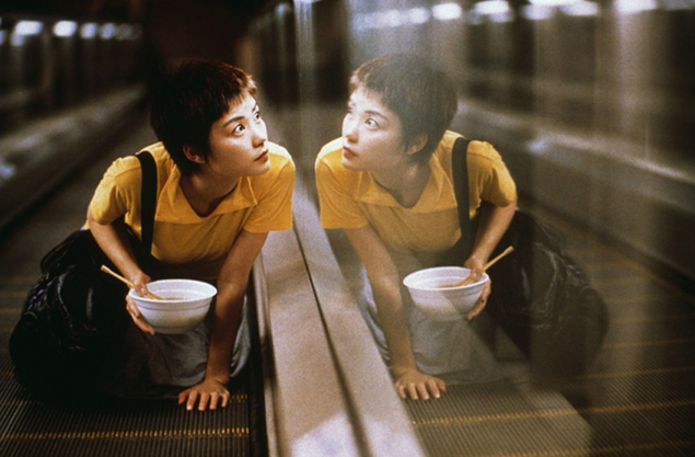
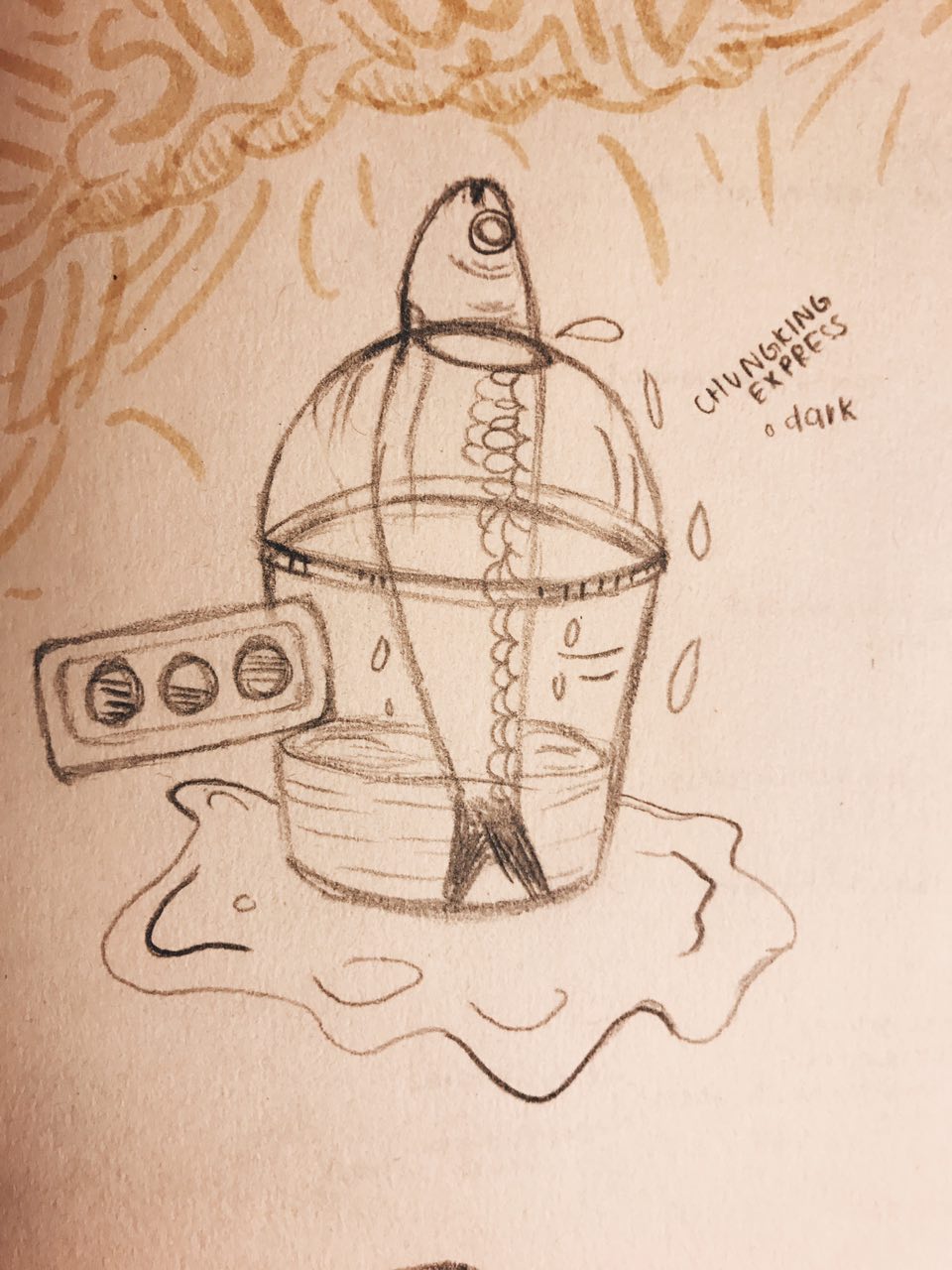
Chungking Express (1994)
Artist Impression of Chungking Express (1994)Chungking Express Scene (1994)
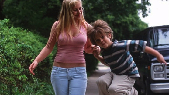
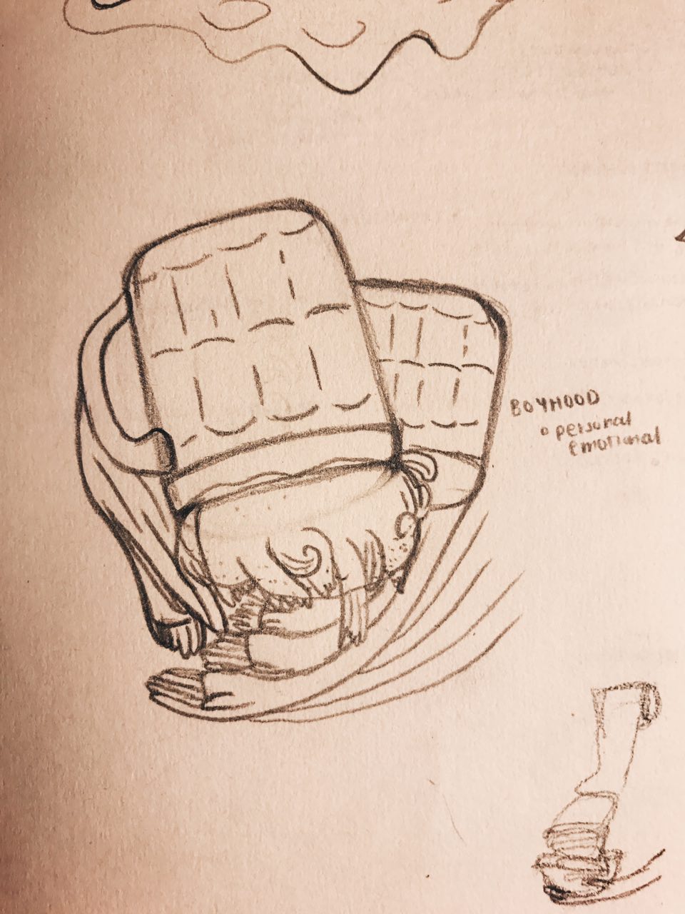
Boyhood (2014)
Boyhood (2014)Boyhood Scene (2014)
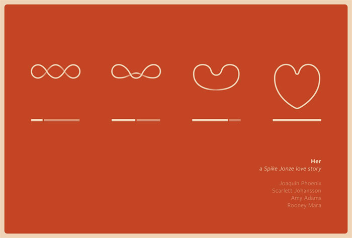
Her (2013)
Her (2013)Her Scene (2013)
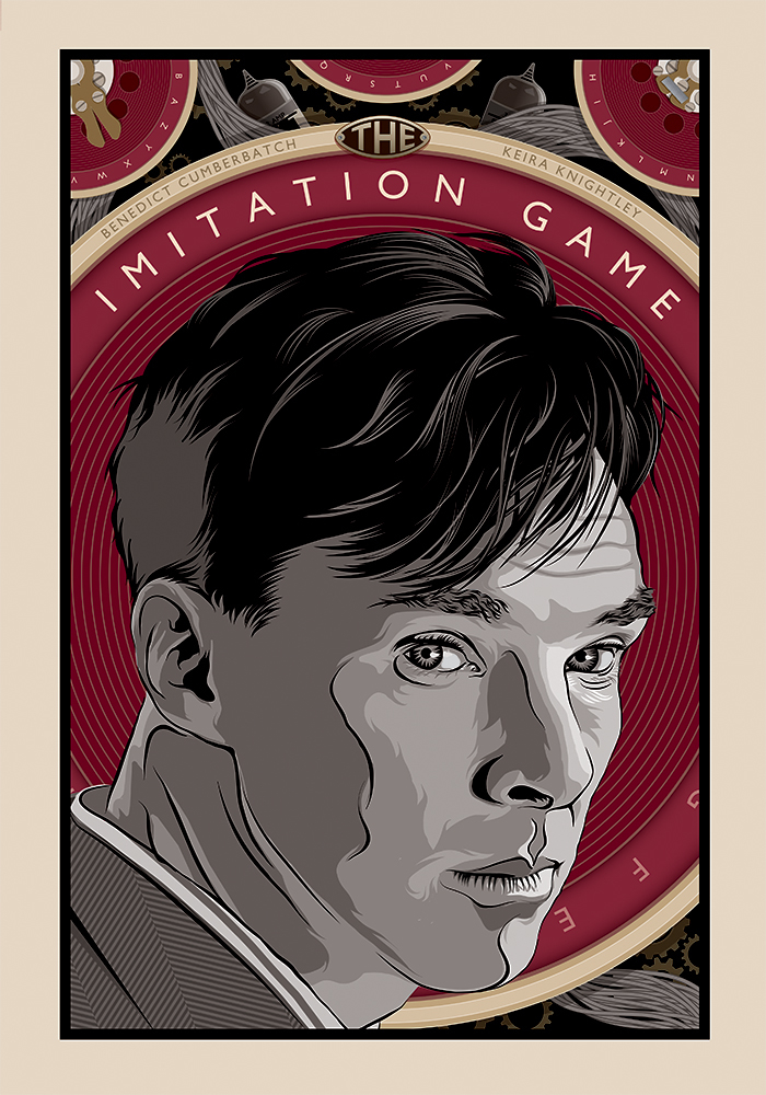
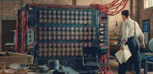
The Imitation Game (2014)
The Imitation Game (2014)The Imitation Game Scene (2014)
4MOVIE QUOTES
I settled on these 4 quotes as I felt that they spoke to me in a certain way and had the potential to explore various compositions.
l THE APPROACH l
“think about the quote in a different perspective” / “dig out a different meaning” / “link quote to various objects in life” / “be unconventional, don’t be literal”
These thoughts replayed in my head as I tried to come up with a concept/overarching idea for my compositions. I took to staring at objects around me and tried to create a connection between them and the movie quotes.
Deeply inspired by surrealism, I wanted to make use of everyday objects to tell a story about my quotes, almost as if the compositions/interpretations of these quotes are from a different world of its own, where everything works differently.
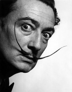
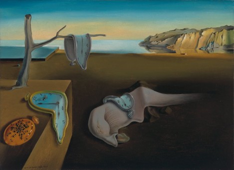
Salvador DaliThe Persistence of Memory, Salvador Dalí (Spanish, 1904–1989)
Dali’s works are compelling, making one want to stare at it longer to uncover what different meanings each element in the painting portrays. In this piece, Dali portrayed the theme of time with an objective of discarding the world of reality. He did this by distorting (melting) the clocks and creatures with a perfectly normal background. It is clear this art piece was a result of his interpretation and imagination.
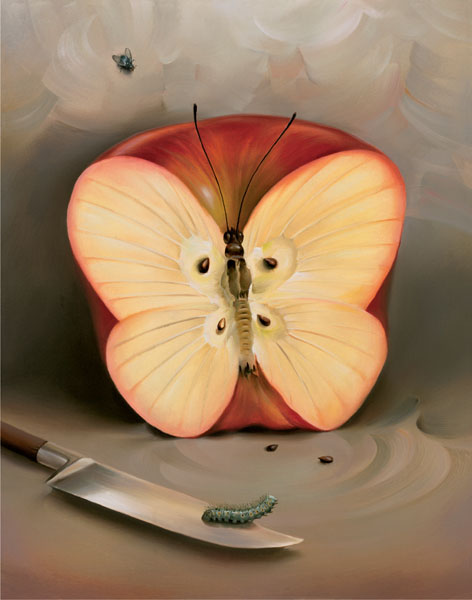
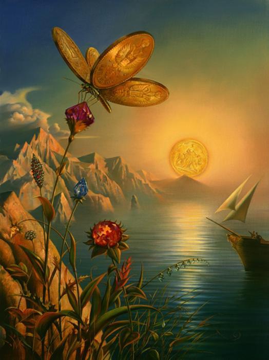
2.Vladimir Kush
A surrealist artist greatly inspired by Salvador Dali. His works portrays fascinating stories and imagination with the use of everyday objects such as food, and shoes.
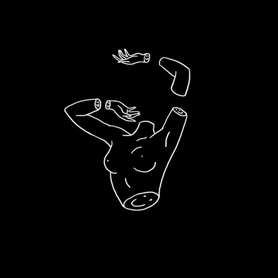
Henn Kim is an illustrator from South Korea who evokes theme of, “beautiful dark twisted fantasy” in her art works. Her works are compelling and are always in black & white. Her art style and work were my main form of inspiration for my 4 compositions.
Drenched through my mindSleep Forever
IDEAS & SKETCHES
Chungking Express first sketchBoyhood first sketchHer first sketchThe Imitation Game first sketch
These sketches received generally okay feedback on the first round of consultation but were given feedback for improvements. Since the use of the hand motif is strong, I decided to use that as a common element in my compositions to make them look more consistent. It was also suggested to maybe also use cups across all my compositions to suggest the same meaning of life in each of them.
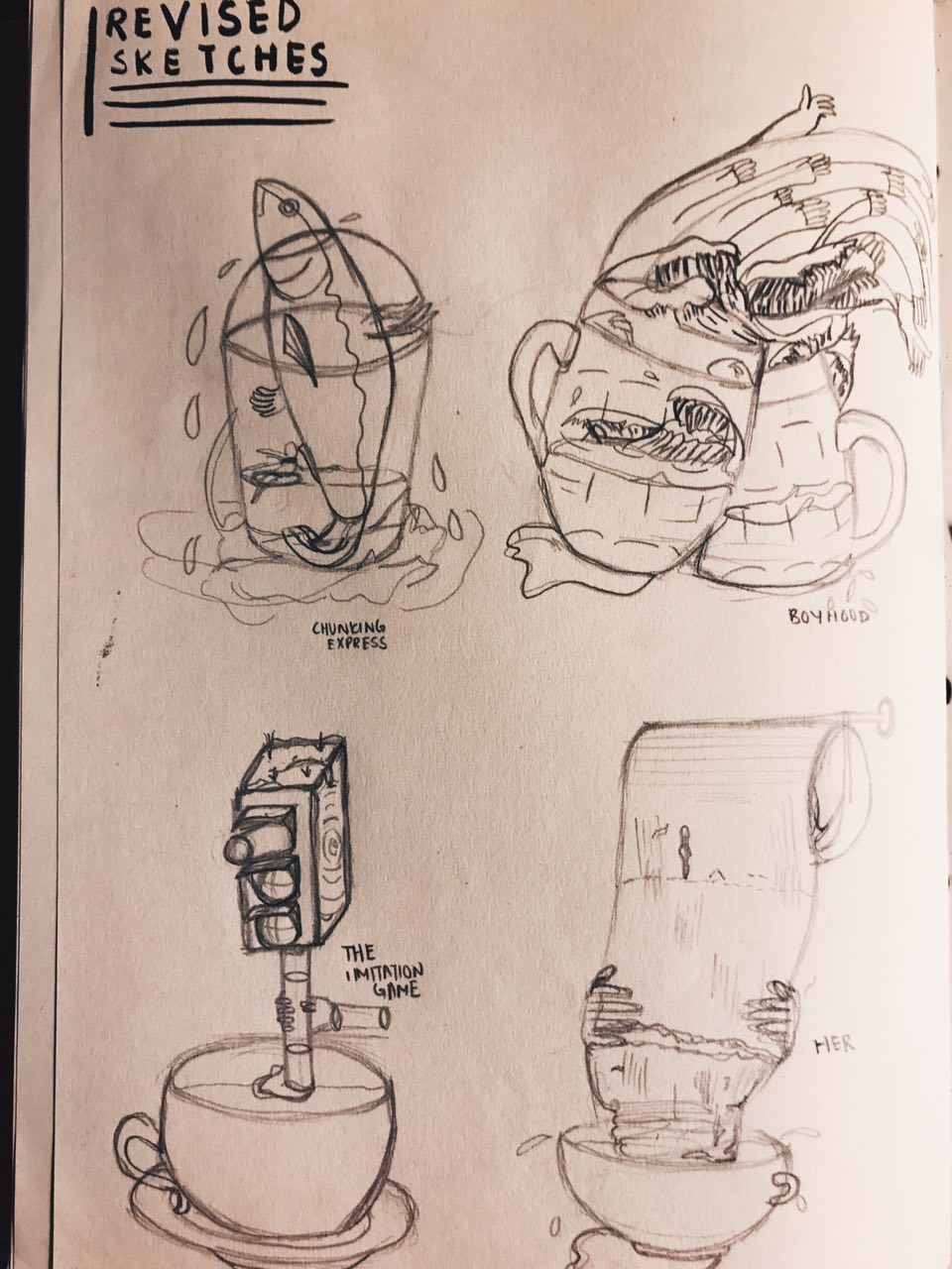
REVISED SKETCHES
– Included use of hands and cups in all 4 compositions –
digital drafts
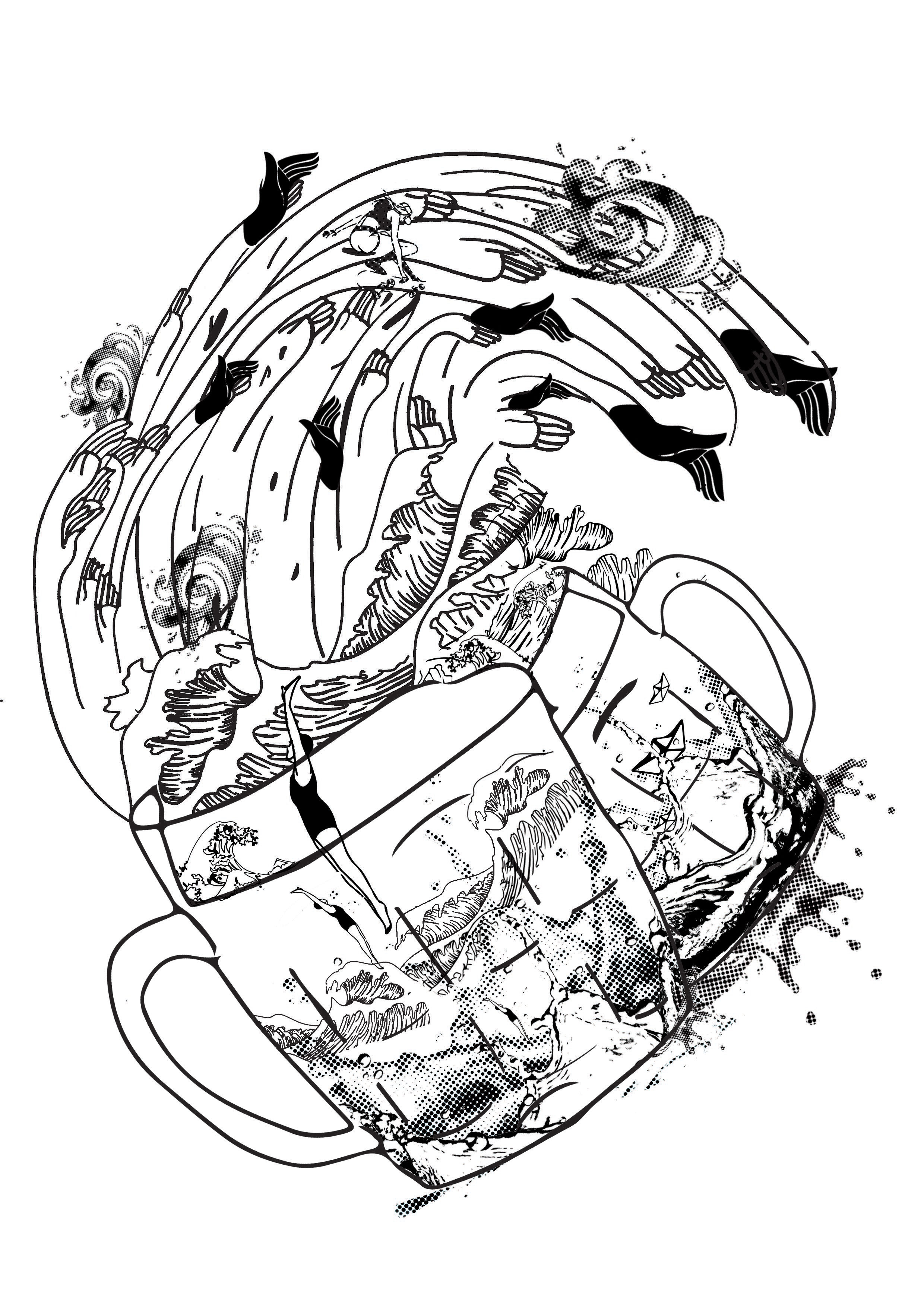
Chungking Express
Chungking Express Draft 1
Feedback: Cup and sardine seem to be clashing, girl looks like she is about to crash into cup, fish fin can be tilted slightly upwards to have a better direction flow.
Boyhood
Boyhood Draft 1
Feedback: Looks alot more messy and complicated compared to Chungking Express composition, there is no focal point, not sure where to look at, maybe you can have one thing that is prominent, similar to Chungking Express one where the cup and the sardine sort os stands out the most, play with more halftones in the composition
Her
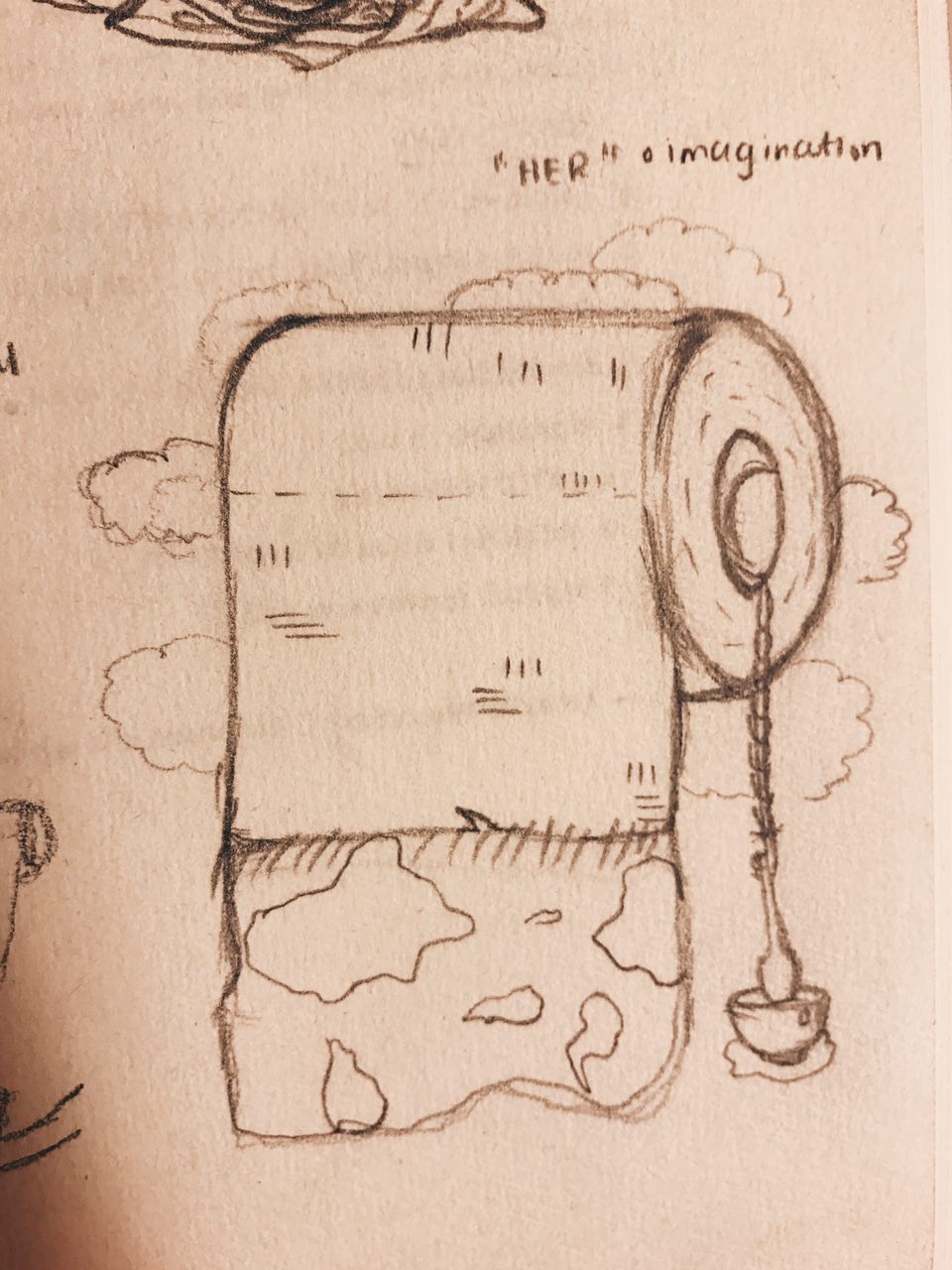
Her Draft 1
Feedback: Interesting use of toilet paper roll (at least some thought so), humans on the composition are a little disconnected/doesn’t make a lot of sense, can flow better, replace with something similar to other compositions.
The Imitation Game
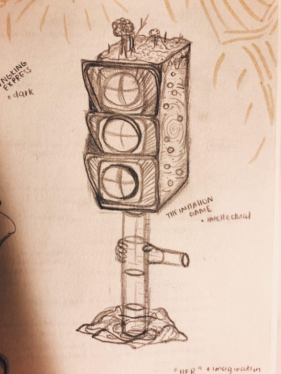
The Imitation Game Draft 1
Feedback: Looks abit more plain compared to rest of compositions, can make cup tilt little so that the cup looks unstable almost like the rest of the cups in other compositions, add more water droplets, traffic light currently doesn’t look like a stirrer, tilt traffic light a little to show that it is in motion.
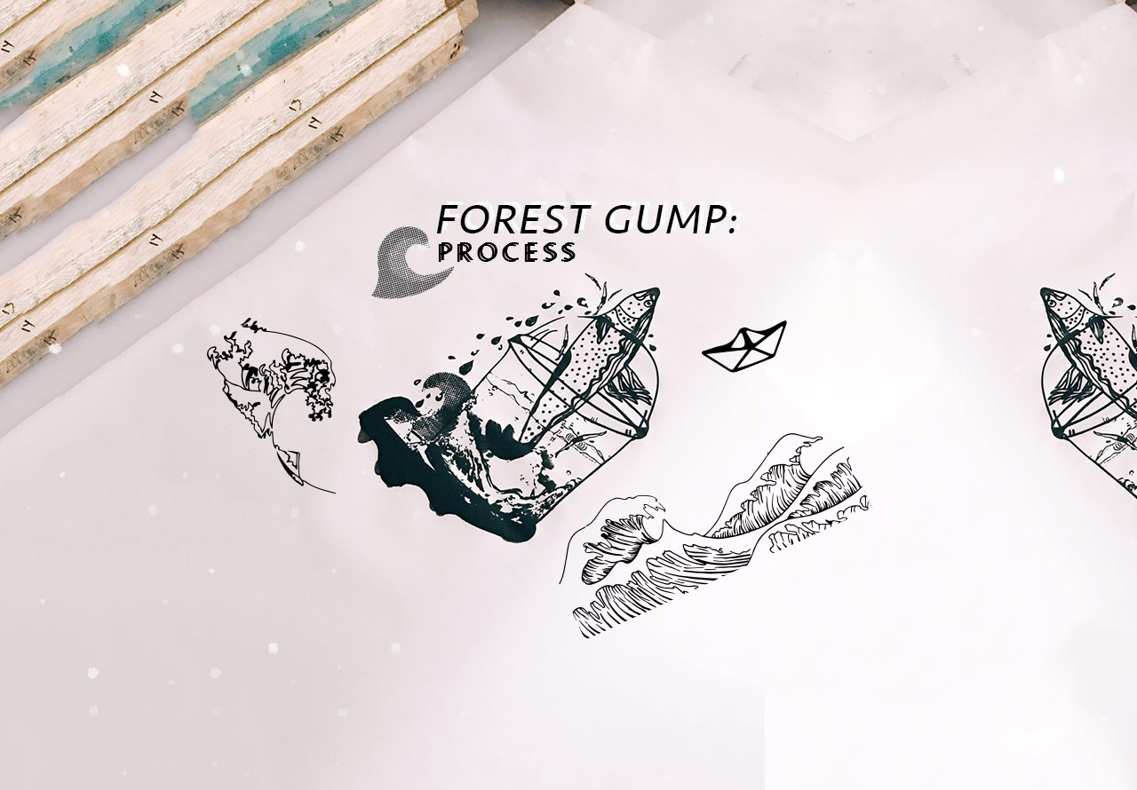
Read more about the ideas and meanings behind each composition in my final Forest Gump post!
Thoughts, ideas, objects flooded my head as I read the brief.
This was going to be my first 2D assignment.
Initial thoughts: I thought that this brief was actually pretty interesting and allowed us to basically have fun. I immediately started looking into Pinterest for various mark making techniques hoping it would eventually spark an idea in me
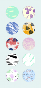
I liked the simplicity of the various marks put togetherThese cute round cut-out patterns caught my eyes even with its simple elements – brush strokes, dots, blotchesEven daily objects we have at home can create unique expressions and art
Emotions are pretty subjective, they mean different things and feel different to each human. I felt that this topic was rather broad and actually had no clue where to began. After which, I decided that exploration and experimenting might narrow my train of thoughts and help me to eventually settle with something I am most comfortable with or am happy about.
“Your emotions are the slaves to your thoughts, and you are the slave to your emotions.” – Elizabeth Gilbert
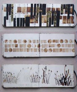
early stage exploration
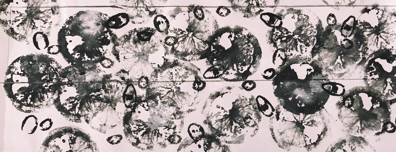
In the midst of my explored mark making papers
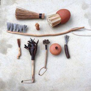
Played with objects I found at home. I chose these objects as they connect with me on a deeper level.
OBJECTS USED:
Film Roll
Dried Baby’s Breath Flowers
Sequins
Sponge
Old Necklace
here are some of my favourite outcomes,
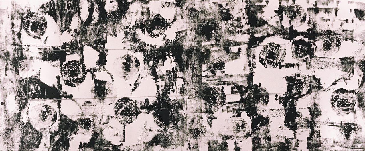
Left to Right: Sequins, Dried Flowers, Film Roll
| I liked how the marks formed had some form of contrast to them. Especially from the sequins, I expected the white parts to be circular but it resulted in unexpected organic shapes kind of resembling mood swings, unpredictable and in batches.
|| The dried flowers formed sort of an outline leaving the inside of the stalk white in contrast to the background. They formed random long lines, sort of giving direction to the piece. Some blotches of white were created, giving a mystical yet mysterious effect.
||| The film strip mark was made using the remaining ink after printing it a few times. Thus, the background was quite faint and a lot lighter compared to the other two. I liked how the outline of the film strip turned out to be darker than the rest, making the strip pop up a little more. Also, one strip turned out to be darker than the other showing some sort of progression in that piece.
IDEATION AND NARROWING IDEAS
I think that I feel a range of emotions in a span of a day. From being sad to feeling slightly happier to being grouchy and then feeling loved like my heart is warm and full. I am actually not too sure how healthy that is? but generally I am a person who just feels a lot.
As such, I thought why not incorporate this fact into my project and make my daily emotions come to life. I feel that my emotions vary a lot depending on daily situations and I am sure that it is the same for others as well, but I think on the whole, some of my emotions stay consistent on a day to day basis unless affected by a huge factor.
Since I feel so many emotions at once, my emotions are actually being felt concurrently. This to me, translates into layers in art form.
LAYERS
Using layers to convey concurrent emotions —
Searched ‘Art Layers’ on PinterestI like how the layers used bring out the colour and emotion of the art piece
ARTIST REFERENCES
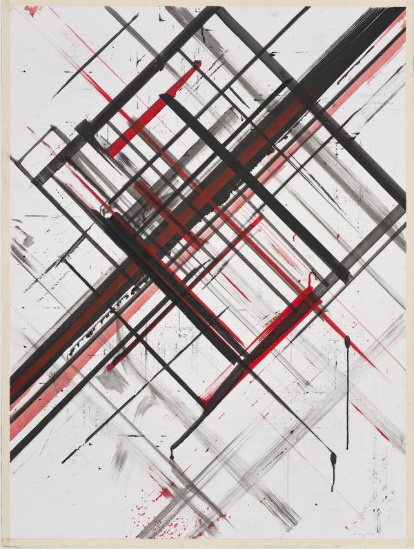
Ed Moses
Ed Moses can be described as an abstract expressionist. He is known for experimenting with layers using basic shapes to create depth. His art works comprises of layers of different mediums.
Ed Moses, Untitled, 1975-77, Acrylic, ink, and tape on foamcoreEd Moses, Cubist Drawing #11, 1977-78 Charcoal, acrylic, india ink and masking tape on board
His use of layers are intriguing, though pretty simple, it still manages to draw me in. I liked how he manages to create depth through his use of layers, making the art piece pop little more.
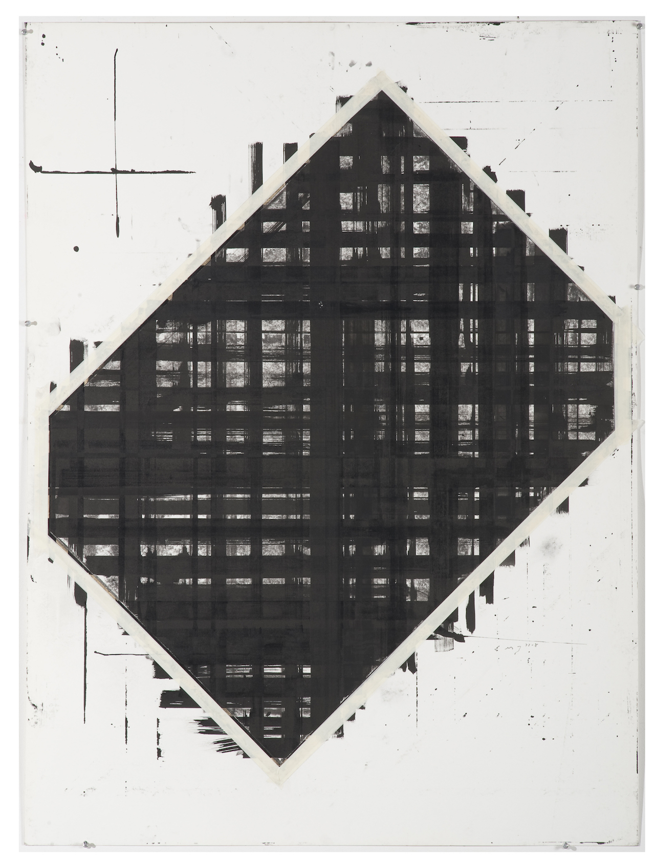
Bernd Ribbeck
Bernd Ribbeck is described as a spiritualist, using spiritual ideas to inspire his works. He is influenced by artists such as Hilma Af Klint and Emma Kunz. His work is process-orientated, making use of layers and scrapping surfaces to achieve the desired effect.
Bernd Rebbick, Untitled, 2014, acrylics, ballpointpen, pigmented marker on mdfBernd Ribbeck, Ohne Titel (Untitled), 2010, acrylic and pigment marker on MDF
Through the use of geometric shapes, Bernd Ribbeck manages to create artworks that look quite pleasing to the eye. With the different use of textures and layers, he manages to add life to his works, making me want to stare at it longer.
Julie Mehretu
Julie Mehretu is an abstract artist known for her use of layers throughout her works. She layers mediums, images, marks and even makes use of figurative layering. Her work from a far looks creates a whole picture but when seen unclose, it breaks down to smaller bits and suddenly there are many different narratives happening at the same time. Some mediums she use include, acrylic, pen, pencil and ink.
Julie Mehretu, Mogamma Part 1, 2012, Ink and Acrylic on canvasJulie Mehretu, Invisible Line, 2010-2011, Ink and Acrylic on canvas
—
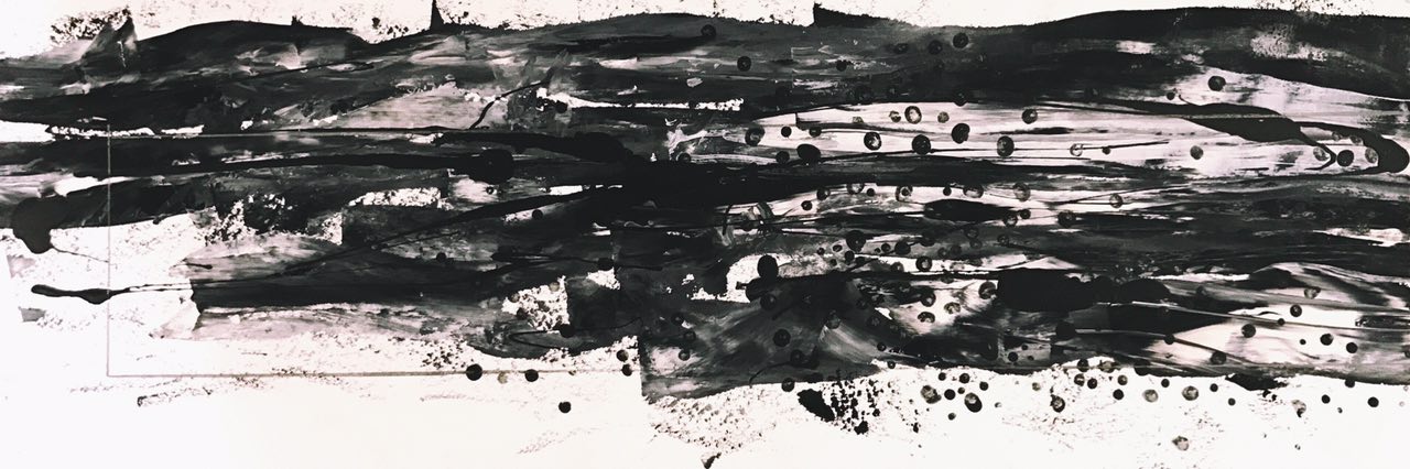
After doing some research on layers, I experimented layering marks one on top of another. Initially, I thought that layering would be a breeze, but I was proven wrong by my own actions. In the process of layering, instead of immediately seeing the final results of the mark made, I had to plan what looks better as the top layer or vice versa. In addition, I had to wait for the ink to dry before attempting the second layer. This took up extra time and effort but it was definitely worth it all!!
I felt that layering helped in bringing out more contrast in the lines and more obviously showed empty space. The values of the lines were also more varied due to the different ink pressures from different layers.
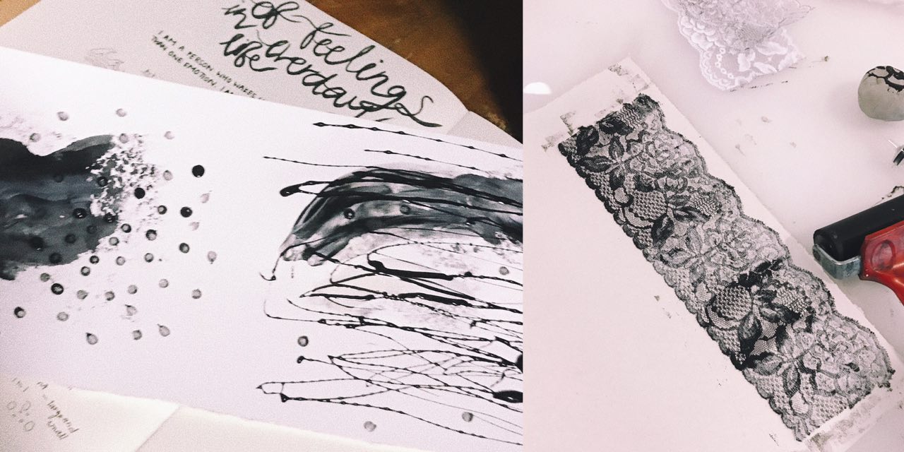
Some pretty decent outcomes –
Left to Right: Watercolour (bottom) Charcoal mask (top), Lace (2 layers)
| I was quite happy with the results produced through layering. By layering, it helped add depth to my emotions and gave some room for space and different textures. As seen in the left picture, the first layer is a lot softer than the lines made by the charcoal mask. The lines added made the emotion feel more confusing and highlighted the dark tone of the whole piece.
|| The right picture was an outcome after 2 layers of opposite lace was stacked one of top another. Although it seems like there is only one layer from far, when looked in detail, you can see some of the flower patterns overlapping each other adding a blur effect to the whole piece. The layering also made some parts darker than the other, bringing out some contrast.
ENROUTE TO FINAL ‘EMO LINES’
6 different emotions
Since I feel a set of emotions daily, my lines are a representation of my day according to how I feel. After much thought and analysis, I have arranged the various emotions along a span of a day.
Sadness > Fear > Anger > Surprise > Joy > Love
S A D N E S S
As depressing as it sounds, I am generally sad when I wake up (with the exception of days where there is something exciting to look forward to). The second the alarm on my phone rings, I am awake. Sometimes, I really hate being a light sleeper just so that I can sleep just a teeny weeny bit longer…
In my layers, I hope to stick through the idea of putting together a use of a daily object and a movement to express the emotion.
Object: Pimple Cream (applied with cotton bud)
Movement: Draggy, dreadful
Top: Watercolour Bottom: Results of dragged out watercolour using a card
Final outcome with added use of dots and horizontal drips of charcoal mask
F E A R
I will definitely never use the word, “brave” to describe myself as unpredictable and new situations tend to be pretty intimidating to me. I feel the emotion, fear, more in the beginning of the day because I don’t quite know what the day ahead will be like for me (good or bad). Thus, I tend to overthink and fear for things that have not happened.
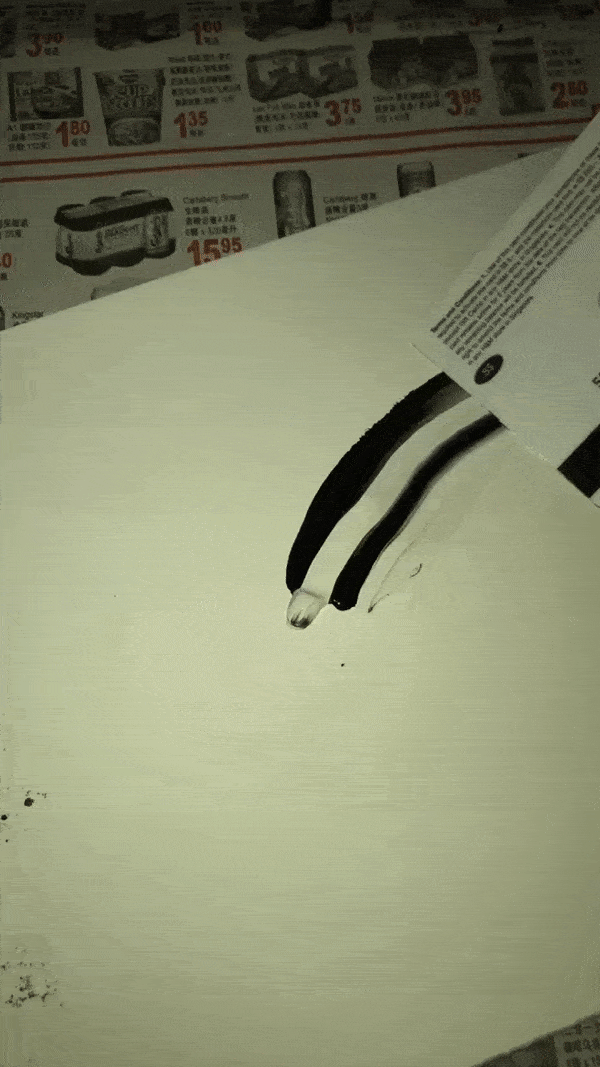
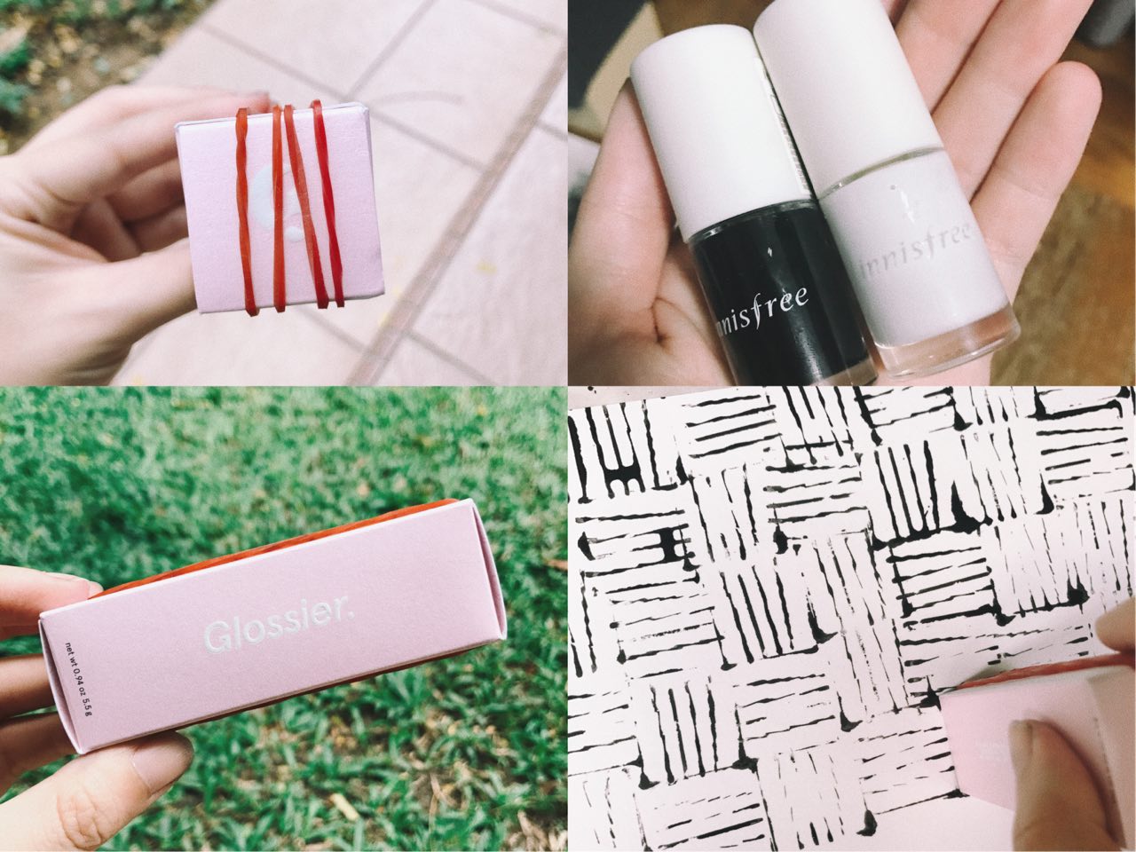
Object: Rubber bands and empty skincare box
Movement: Circles, repeated, never ending & haunting
Left two pics: Rubber bands on empty skincare Top right: Nail polish used to create circles and never ending effect Bottom right: effect produced with DIY mark making tool
Final outcome
A N G E R
During the day, when things get little wonky and don’t go according to plans, I tend to get a little frustrated and irritated because interruptions to any kind of plans irritate me. Of course, mood swings can also be a reason for a more moody Dinis, once every time of the month.
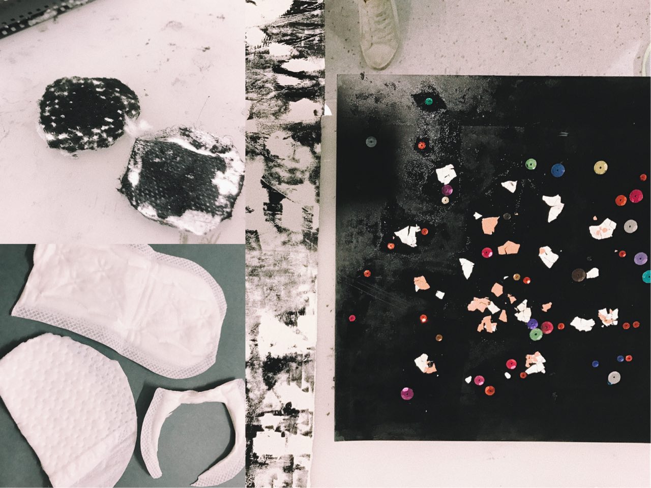
Object: Eggshells sequins, pads
Movement: Clear marks made with strength from negative energy
Left two pics: Pads used to represent grouchiness Right: Eggshells and sequins as mark making toolsFinal outcome. Pad effect on top layer.
S U R P R I S E
Any sudden unplanned situation/event would be considered a surprise to me. Seeing a sudden familiar face, or eating something with an unexpected taste are some things that will definitely surprise me. Being surprised means I will never know when its going to happen, however, I feel that in the middle of my day, there are generally more opportunities for me to be surprised. E.g. running into a friend outside.
Object: Lemons, Chili
Movement: Sprayed marks using dry shampoo (conveys impromptu and sudden movements)
Top two pics: Chili and lemon used as mark making tools Bottom pic: Using dry shampoo to produced “sprayed” movement onto paperFinal outcome. Dry shampoo effect on top layer.
J O Y
Happiness is the simple things in life. I am usually pretty simple-minded and even little things can excite me. I guess I feel generally blissful and content with what I have in life. Some things that make me happy include eating (especially with family or friends) and exploring new places. Joy comes at different times of the day but for me, I feel most happy and content at almost the end of a long day because it means finally some time to rest and also to be grateful for the day that has just past.
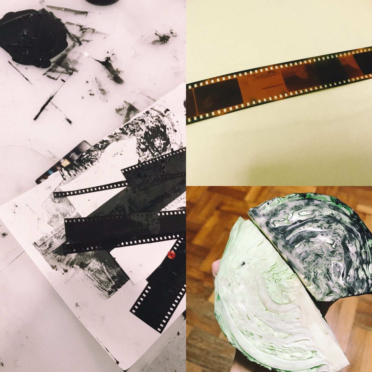
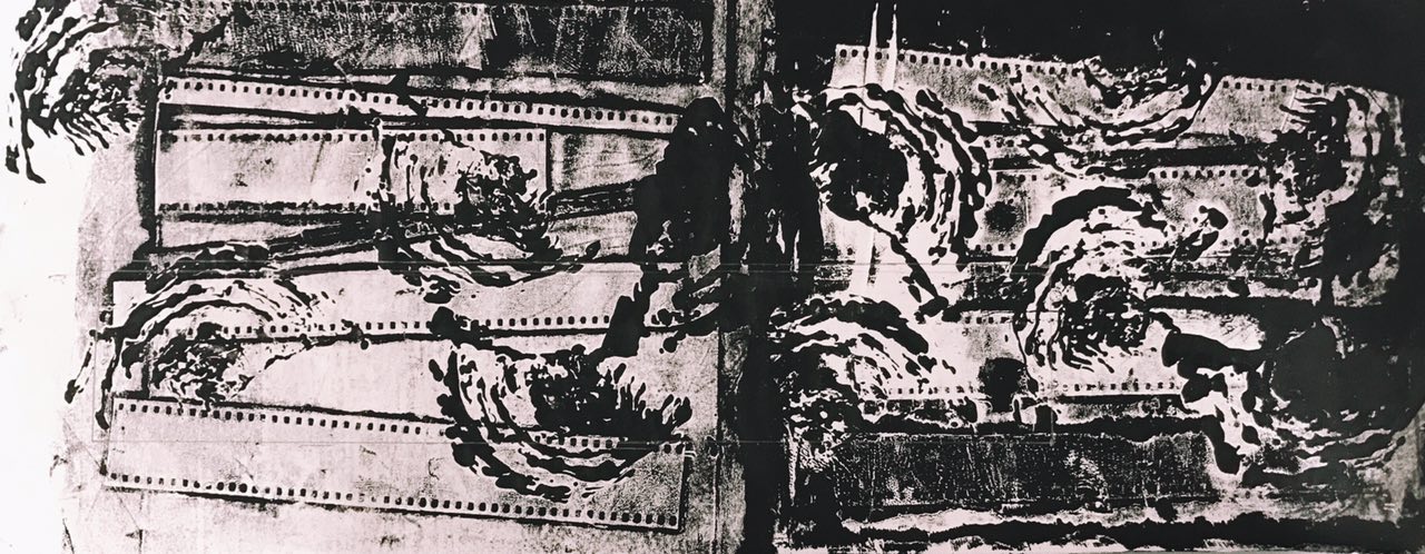
Object: Cabbage and film strips
Movement: Simple, straightforward, easy
Left pic: Inked Film Strip Bottom right: Inked Cabbage that represents my joy for foodFinal outcome. Cabbage marks on bottom layer, film strip marks on top layer.
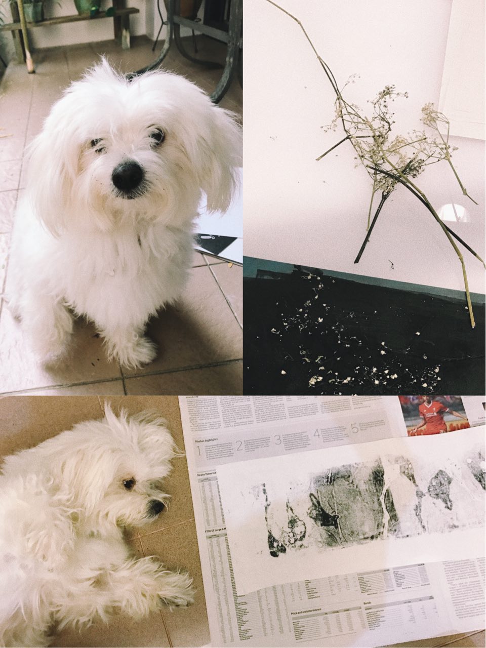
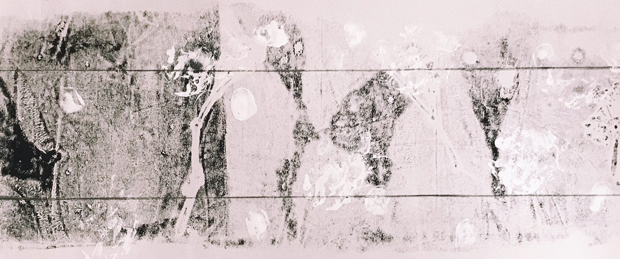
L O V E
And finally the day ends with love! Love is kind, compassionate and it makes my heart warm & full. Cringy, but love is really the best reward at the end of a long day. Family and close friends make me feel loved and makes me want to share my love with those that are important to me. Things like flowers also remind me of the beauty in life which often relate back to my loved ones.
Object: Dried flowers
Movement: Dog paw prints and thumbprints of my family members (using face paint)
Top right pic: Dried Baby’s Breath Flowers Bottom pic: My dog laying next to print before putting in his paw printFinal outcome. Simple and light. Flowers print on bottom layer and paw print/thumbprints on top layer.


