


*names and faces have been blocked for privacy reasons, some content are overlapping as this is an interactive pdf and thus have “roll-over” animations, etc.
Read about my Locale research here and view my final zine!
——


*names and faces have been blocked for privacy reasons, some content are overlapping as this is an interactive pdf and thus have “roll-over” animations, etc.
Read about my Locale research here and view my final zine!
For this project, we were tasked to pick an area/estate in Singapore and uncover an unique characteristic or feature about it.
After much research and thought, I settled on Wessex Estate along Portsdown Road! Prior to choosing Wessex Estate, I also considered other locations such as Balestier and Whampoa as they had unique characteristics. However after much field research, I decided to go with Wessex Estate due to where its located, the people I met there and the serenity of the whole estate itself – unlike many other estates in Singapore.
SECONDARY through online, websites, books

PRIMARY through field research, interviews

From both Secondary and Primary research I have gathered qualitative and quantitative data about Wessex Estate.
Since there are plenty of other colonial estates in Singapore, What makes Wessex estate so different from the rest?
Out of the many colonial estates, I picked out a few of the most known and popular ones amongst Singaporeans and did a comparison between them.


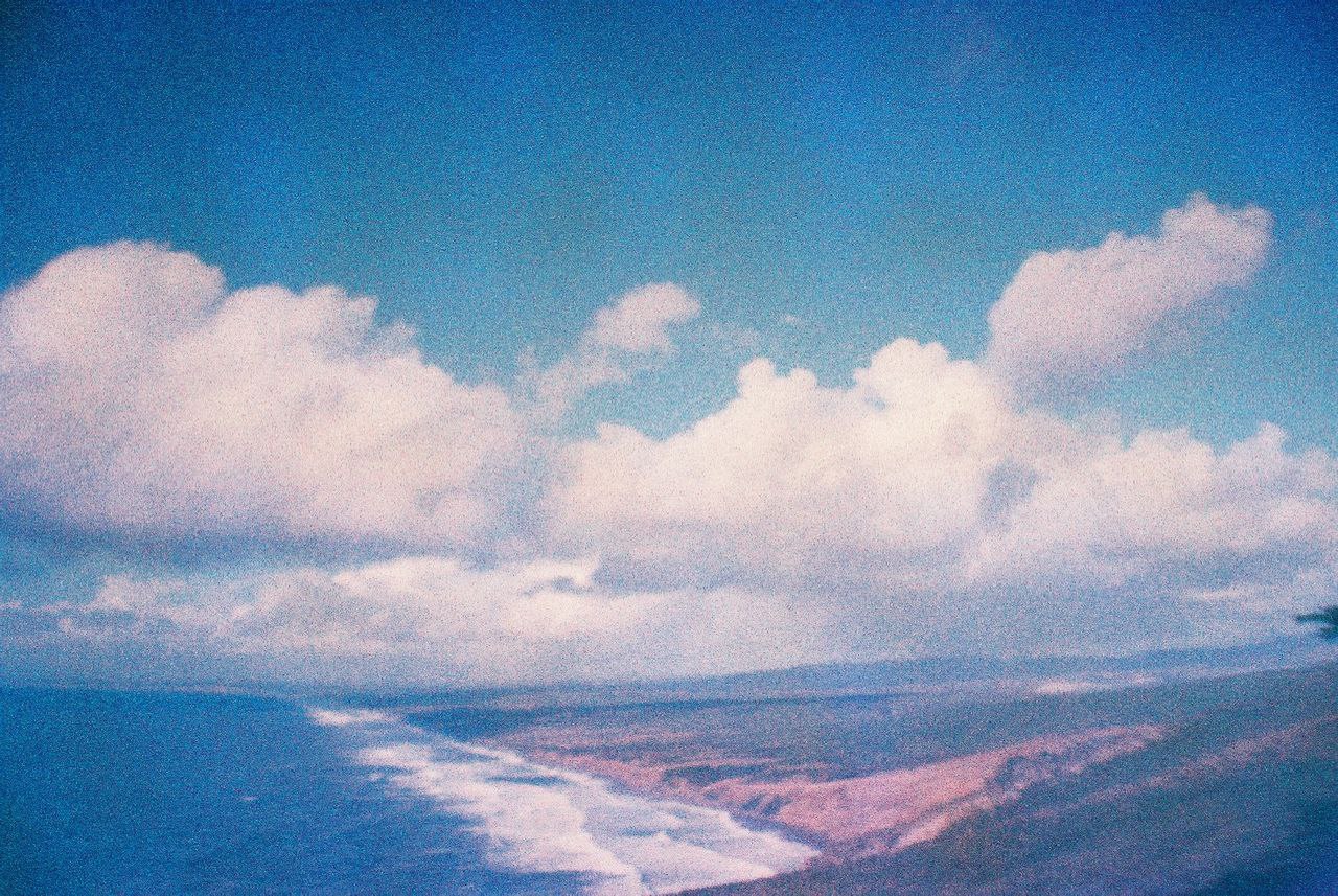
Decided to take some pictures with my film camera 🙂


Wessex Carnival –


As mentioned, there are art studios in Wessex Estate that open their doors to public annually or twice a year for “Artwalk@Wessex“.

This gives the public an opportunity to see the artist’s beautiful work and understand a little more about the culture and life in Wessex. This also gives the artists a great opportunity to showcase their hard work. And this walk is completely FOC!! It truly is a place that promotes creativity and the arts in Singapore without much thought of profit in mind.
I managed to visit two art studios during my trips to the estate.
I’ve really learnt and opened my eyes so much just from walking around this estate, talking to people and taking pictures of little things that I find interesting. I really enjoy my trips down to the estate even though I can only take one bus “191” in and it has bus intervals of 15mins. Nonetheless, I’m grateful for the existence of an estate like this in Singapore because I know that if I ever need a breather from the hustle and bustle, I can take a little breather and chill at Wessex. This has made it a lot more easier for me to work on the two parts of this project.
For part 1 of this project, we were required to give a visual presentation that brings out the unique feature of this site and what makes it different from other estates in Singapore. We had to include Secondary and Primary research as well as sort our data into Qualitative and Quantitative data.
For my Visual Presentation, I wanted to create something more interactive but did not want to limit myself to the normal presentation slides. Thus, I decided to explore interactive PDF done in indesign and so even if you are a Mac or Windows user, one can still view the animations or interactivity of the presentation without the PPT or Keynote application.
See my next post for my Visual Presentation!
View my Zine!
I started this project with a little difficulty as I had no idea what direction I should take. After looking through some of previous semester’s students’ work, I realised that this project was tricky as it was not solely typography, but rather creating type as an image.
I started the ball rolling by reading up and doing research
on typography as well as searching for examples and
inspiration online - from Instagram and Pinterest.
“We can all choose the same font for a project, but we could never draw identical typography”
Keeping a Diary by Sagmeister Inc. 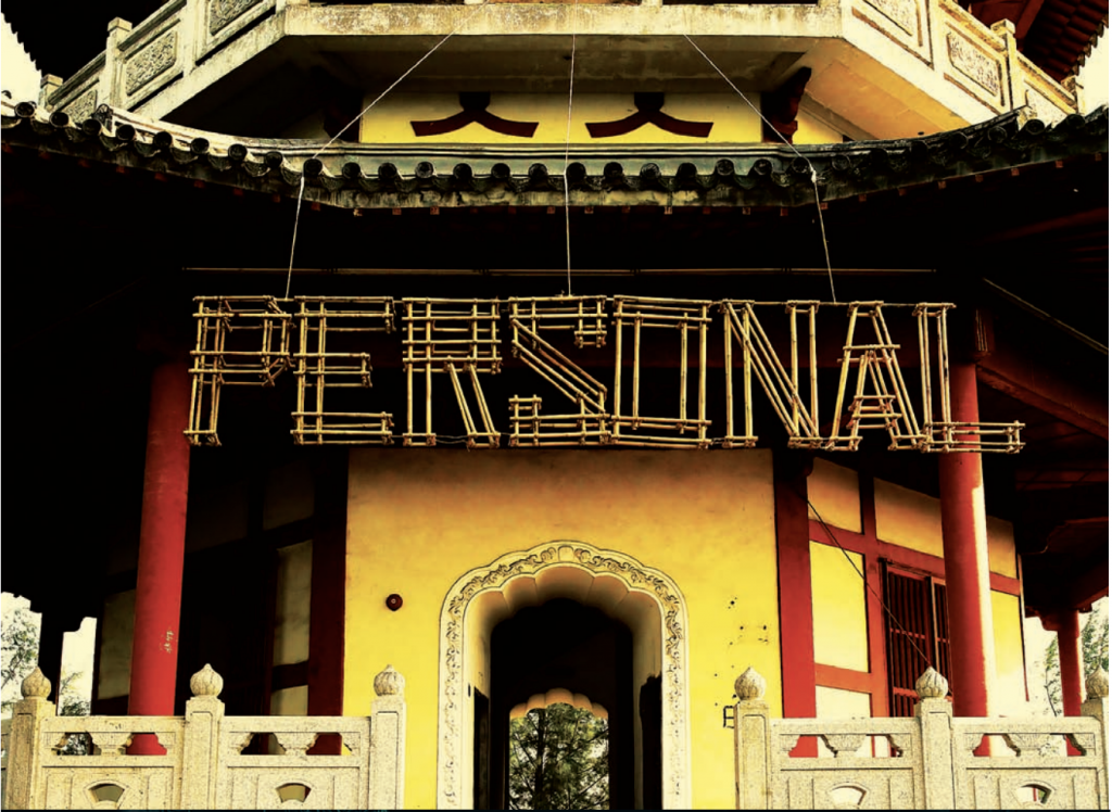
Having Guts Always Works Out For Me by Sagmeister Inc.
Flight of the Conchords by Subpop Records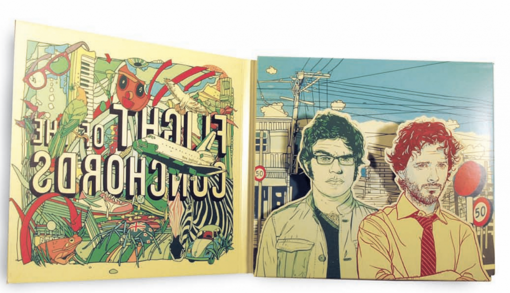
– some points that I felt were interesting and have not never really thought about before –
1) Using Letter as Form
2) Emphasis using weight
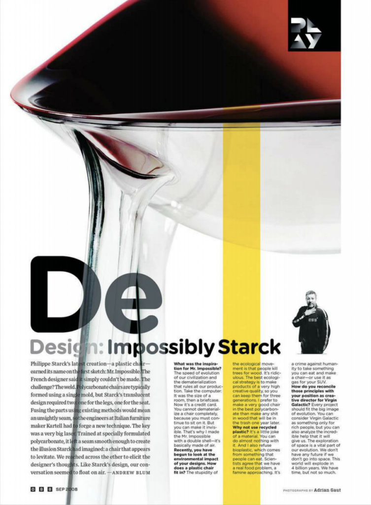
3) High Contrast in Reverse
4) Deconstructed Type
I mostly draw my inspiration from Instagram accounts and Pinterest. Here are some accounts and artists that I’ve come across.
I’ve always been a fan of @artsyalexx. Although her typography works are simple, the colours that she use are very eye catching and easy to relate to. Her works are trendy and very attractive with the younger crowd. I really like the way her fonts always vary in terms of style as well as size in the alphabets. She digitally draws these artworks.
I’ve been following @stefankunz for a while. He turns encouraging words and phrases into typography art pieces. He doesn’t just draw these words on regular paper, but instead he draws them on shoes and even laptops. Any surface can be his canvas!
I chanced upon @goodtype while researching for inspiration. This Instagram account consists of so many great typography examples and has allowed me to look at the variety of letter forms and ways to play around with form and style.
Jing Zhang is an illustrator who has done an alphabet series. She takes a single alphabet and manipulates it. Its almost as if she creates a world out of one alphabet.
Raganath Krishnamani is an illustrator that also occasionally plays with alphabets. Similar to Jing Zhang, he also manipulates letters, adding elements to them so they look like they are a world/building of their own. His other illustrations are also usually quite dark with lots of shadows.
After doing research and looking at many different artworks, I was more certain of the art direction that I wanted to follow. I decided to go with illustrations as I thought that illustrations will be the best way to portray my ideas and thought process across.
See my next post for my process and final compositions!
Thoughts, ideas, objects flooded my head as I read the brief.
This was going to be my first 2D assignment.
Initial thoughts: I thought that this brief was actually pretty interesting and allowed us to basically have fun. I immediately started looking into Pinterest for various mark making techniques hoping it would eventually spark an idea in me
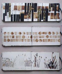
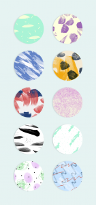
Emotions are pretty subjective, they mean different things and feel different to each human. I felt that this topic was rather broad and actually had no clue where to began. After which, I decided that exploration and experimenting might narrow my train of thoughts and help me to eventually settle with something I am most comfortable with or am happy about.
“Your emotions are the slaves to your thoughts, and you are the slave to your emotions.” – Elizabeth Gilbert
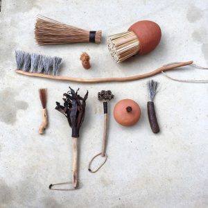
Played with objects I found at home. I chose these objects as they connect with me on a deeper level.
OBJECTS USED:
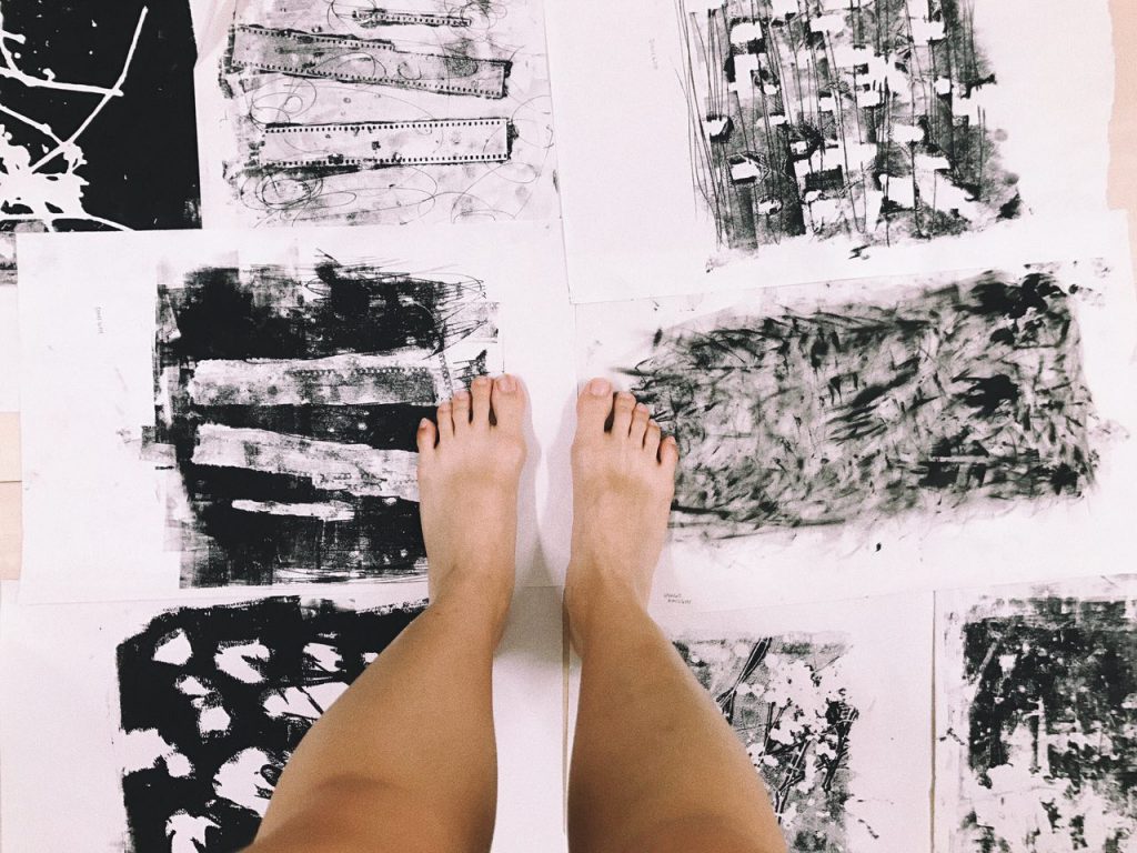
here are some of my favourite outcomes,

| I liked how the marks formed had some form of contrast to them. Especially from the sequins, I expected the white parts to be circular but it resulted in unexpected organic shapes kind of resembling mood swings, unpredictable and in batches.
|| The dried flowers formed sort of an outline leaving the inside of the stalk white in contrast to the background. They formed random long lines, sort of giving direction to the piece. Some blotches of white were created, giving a mystical yet mysterious effect.
||| The film strip mark was made using the remaining ink after printing it a few times. Thus, the background was quite faint and a lot lighter compared to the other two. I liked how the outline of the film strip turned out to be darker than the rest, making the strip pop up a little more. Also, one strip turned out to be darker than the other showing some sort of progression in that piece.

I think that I feel a range of emotions in a span of a day. From being sad to feeling slightly happier to being grouchy and then feeling loved like my heart is warm and full. I am actually not too sure how healthy that is? but generally I am a person who just feels a lot.
As such, I thought why not incorporate this fact into my project and make my daily emotions come to life. I feel that my emotions vary a lot depending on daily situations and I am sure that it is the same for others as well, but I think on the whole, some of my emotions stay consistent on a day to day basis unless affected by a huge factor.
Since I feel so many emotions at once, my emotions are actually being felt concurrently. This to me, translates into layers in art form.
Using layers to convey concurrent emotions —
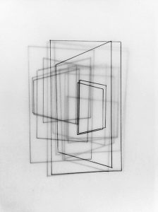

Ed Moses
Ed Moses can be described as an abstract expressionist. He is known for experimenting with layers using basic shapes to create depth. His art works comprises of layers of different mediums.
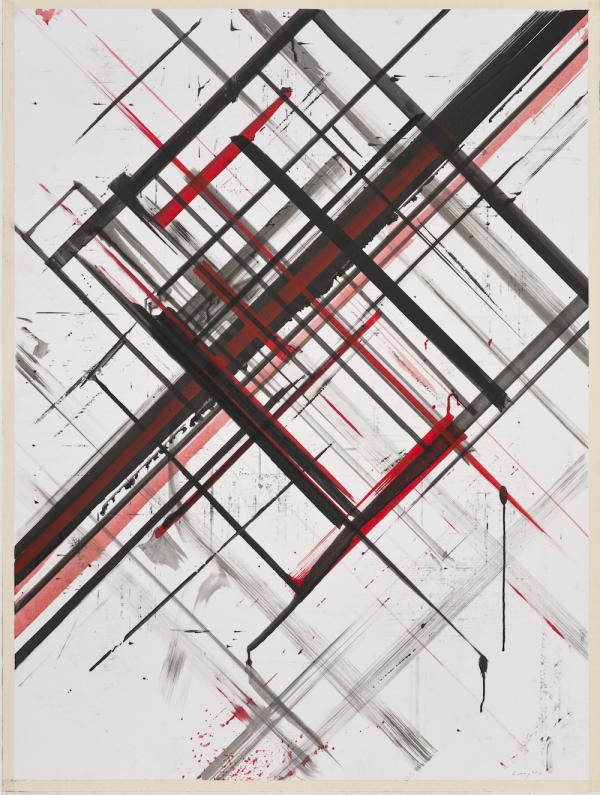
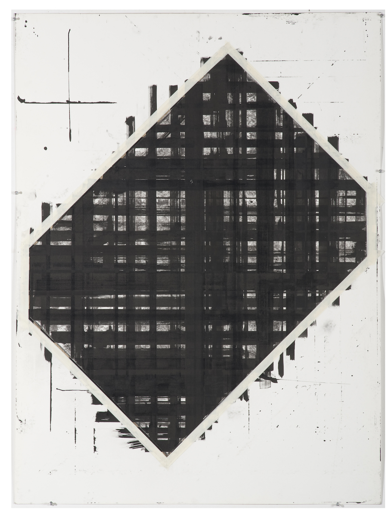
His use of layers are intriguing, though pretty simple, it still manages to draw me in. I liked how he manages to create depth through his use of layers, making the art piece pop little more.
Bernd Ribbeck
Bernd Ribbeck is described as a spiritualist, using spiritual ideas to inspire his works. He is influenced by artists such as Hilma Af Klint and Emma Kunz. His work is process-orientated, making use of layers and scrapping surfaces to achieve the desired effect.
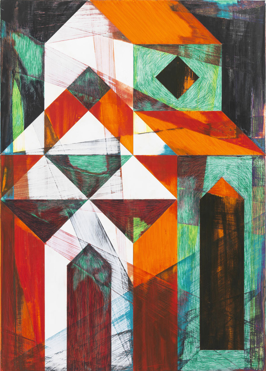
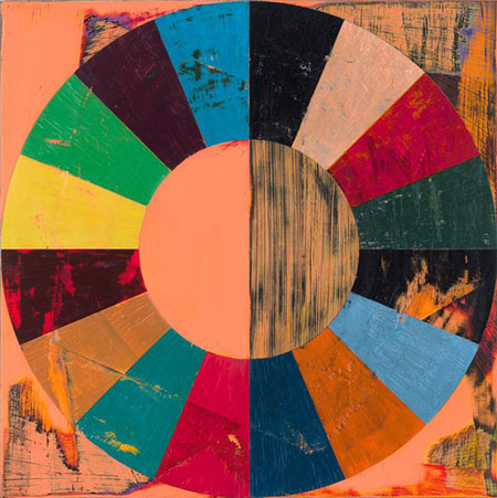
Through the use of geometric shapes, Bernd Ribbeck manages to create artworks that look quite pleasing to the eye. With the different use of textures and layers, he manages to add life to his works, making me want to stare at it longer.
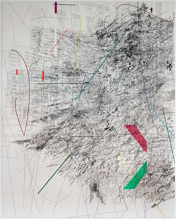
Julie Mehretu
Julie Mehretu is an abstract artist known for her use of layers throughout her works. She layers mediums, images, marks and even makes use of figurative layering. Her work from a far looks creates a whole picture but when seen unclose, it breaks down to smaller bits and suddenly there are many different narratives happening at the same time. Some mediums she use include, acrylic, pen, pencil and ink.

After doing some research on layers, I experimented layering marks one on top of another. Initially, I thought that layering would be a breeze, but I was proven wrong by my own actions. In the process of layering, instead of immediately seeing the final results of the mark made, I had to plan what looks better as the top layer or vice versa. In addition, I had to wait for the ink to dry before attempting the second layer. This took up extra time and effort but it was definitely worth it all!! 
I felt that layering helped in bringing out more contrast in the lines and more obviously showed empty space. The values of the lines were also more varied due to the different ink pressures from different layers.
Some pretty decent outcomes –
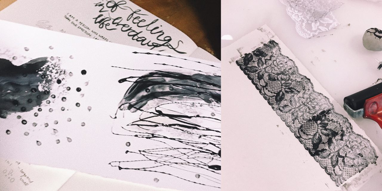
| I was quite happy with the results produced through layering. By layering, it helped add depth to my emotions and gave some room for space and different textures. As seen in the left picture, the first layer is a lot softer than the lines made by the charcoal mask. The lines added made the emotion feel more confusing and highlighted the dark tone of the whole piece.
|| The right picture was an outcome after 2 layers of opposite lace was stacked one of top another. Although it seems like there is only one layer from far, when looked in detail, you can see some of the flower patterns overlapping each other adding a blur effect to the whole piece. The layering also made some parts darker than the other, bringing out some contrast.
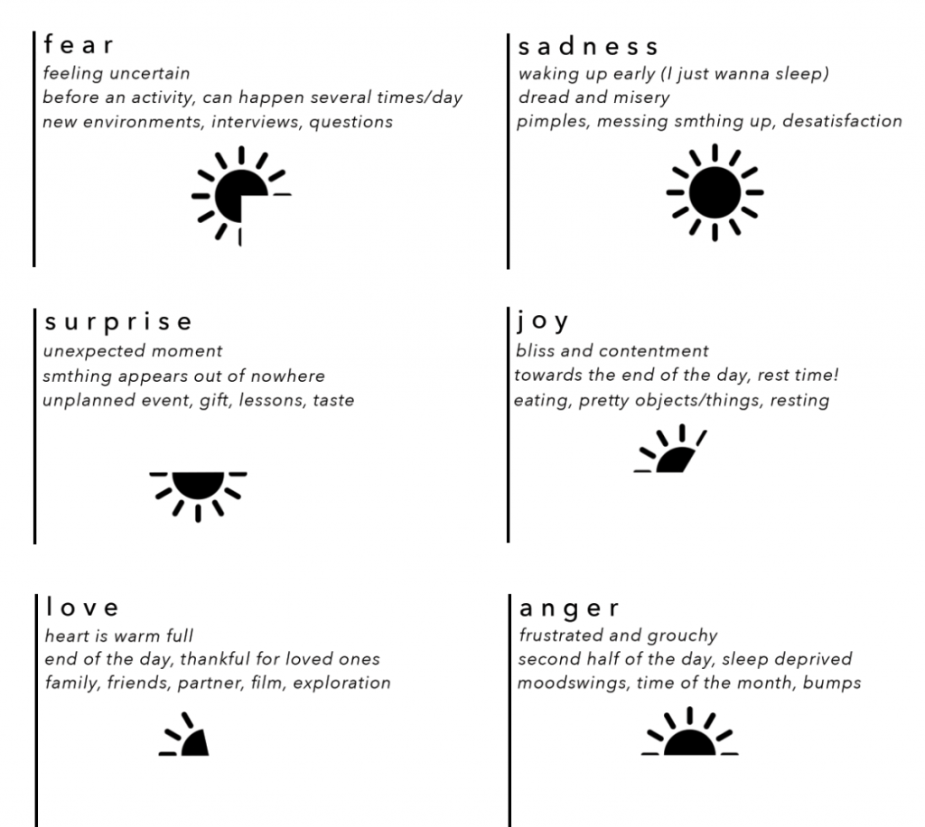
Since I feel a set of emotions daily, my lines are a representation of my day according to how I feel. After much thought and analysis, I have arranged the various emotions along a span of a day.
Sadness > Fear > Anger > Surprise > Joy > Love
As depressing as it sounds, I am generally sad when I wake up (with the exception of days where there is something exciting to look forward to). The second the alarm on my phone rings, I am awake. Sometimes, I really hate being a light sleeper just so that I can sleep just a teeny weeny bit longer…
In my layers, I hope to stick through the idea of putting together a use of a daily object and a movement to express the emotion.
| Object: Pimple Cream (applied with cotton bud) | Movement: Draggy, dreadful |
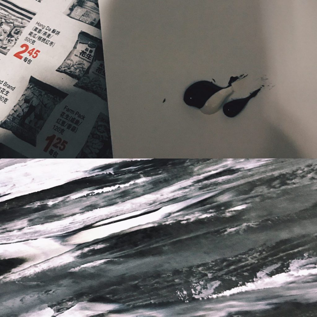

I will definitely never use the word, “brave” to describe myself as unpredictable and new situations tend to be pretty intimidating to me. I feel the emotion, fear, more in the beginning of the day because I don’t quite know what the day ahead will be like for me (good or bad). Thus, I tend to overthink and fear for things that have not happened.
| Object: Rubber bands and empty skincare box | Movement: Circles, repeated, never ending & haunting |
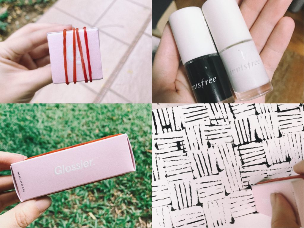

During the day, when things get little wonky and don’t go according to plans, I tend to get a little frustrated and irritated because interruptions to any kind of plans irritate me. Of course, mood swings can also be a reason for a more moody Dinis, once every time of the month.
| Object: Eggshells sequins, pads | Movement: Clear marks made with strength from negative energy |
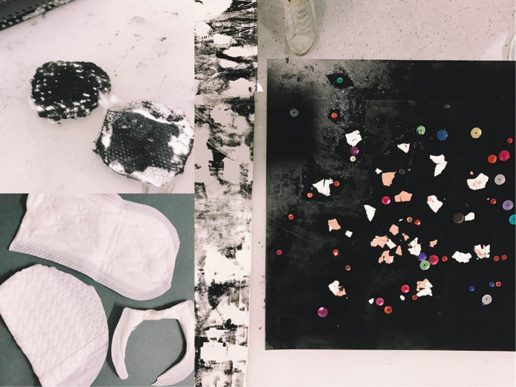
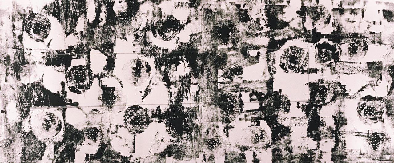
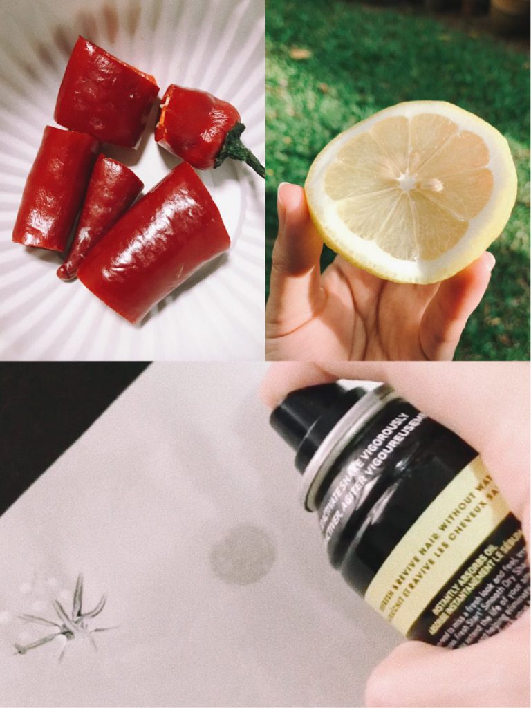
Any sudden unplanned situation/event would be considered a surprise to me. Seeing a sudden familiar face, or eating something with an unexpected taste are some things that will definitely surprise me. Being surprised means I will never know when its going to happen, however, I feel that in the middle of my day, there are generally more opportunities for me to be surprised. E.g. running into a friend outside.
| Object: Lemons, Chili | Movement: Sprayed marks using dry shampoo (conveys impromptu and sudden movements) |
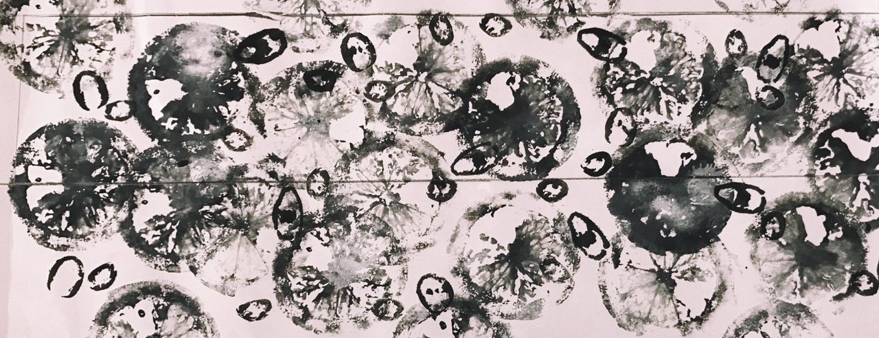
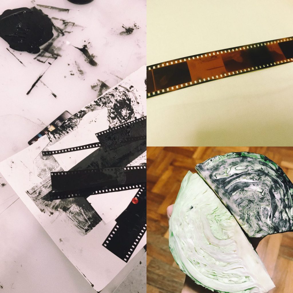
Happiness is the simple things in life. I am usually pretty simple-minded and even little things can excite me. I guess I feel generally blissful and content with what I have in life. Some things that make me happy include eating (especially with family or friends) and exploring new places. Joy comes at different times of the day but for me, I feel most happy and content at almost the end of a long day because it means finally some time to rest and also to be grateful for the day that has just past.
| Object: Cabbage and film strips | Movement: Simple, straightforward, easy |
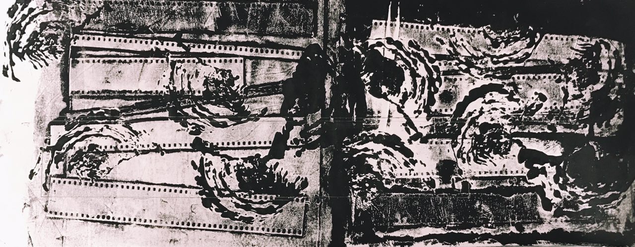
And finally the day ends with love! Love is kind, compassionate and it makes my heart warm & full. Cringy, but love is really the best reward at the end of a long day. Family and close friends make me feel loved and makes me want to share my love with those that are important to me. Things like flowers also remind me of the beauty in life which often relate back to my loved ones.
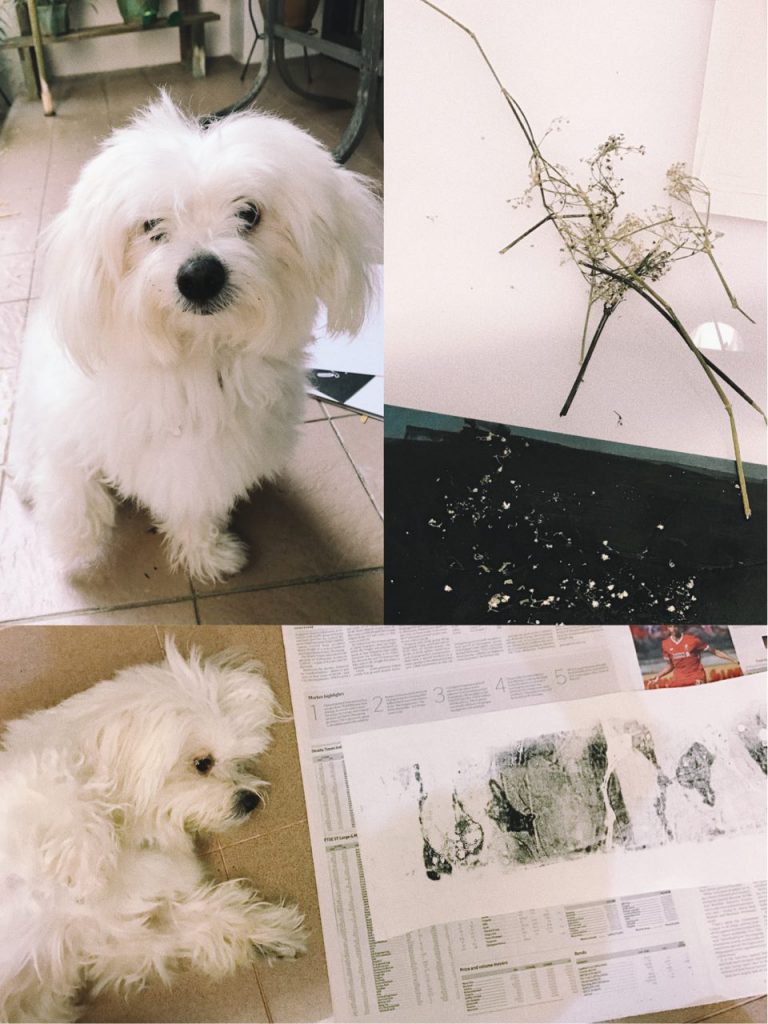
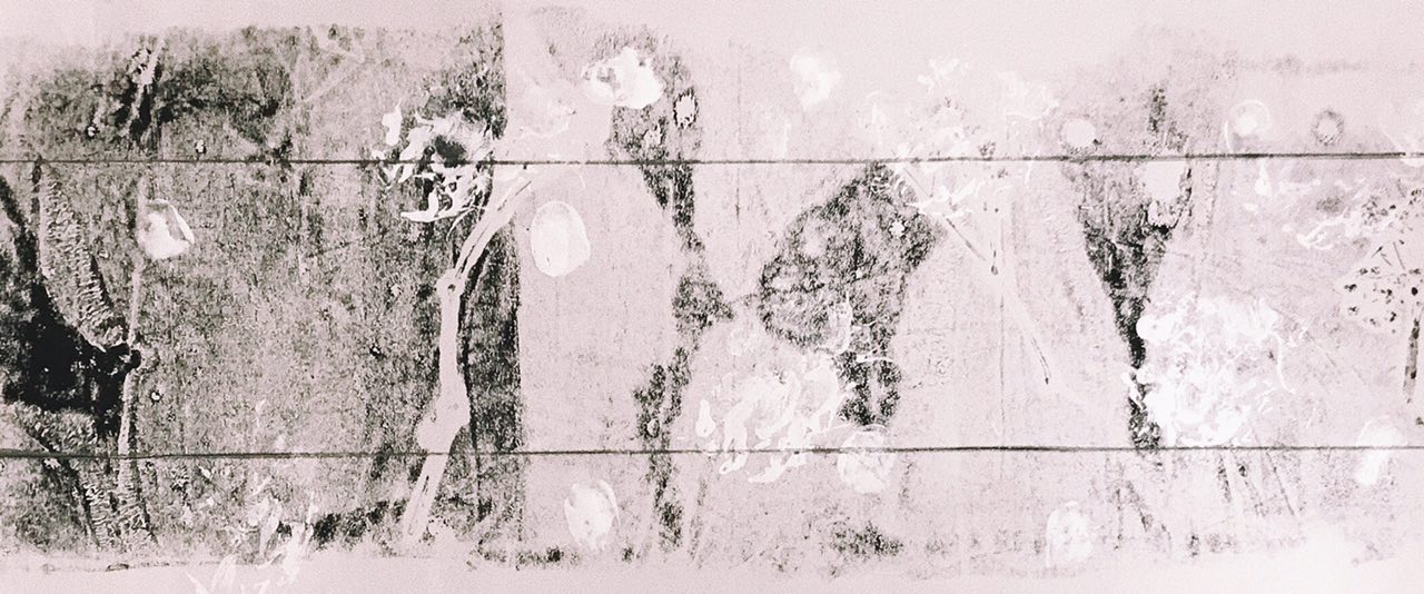
| Object: Dried flowers | Movement: Dog paw prints and thumbprints of my family members (using face paint) |
NEXT: FINAL WORK FOR SUBMISSION