
From left to right: Surprise,Anger,Happiness

From left to right: Fear,Sadness,Love
For this post I will start with the challenges I faced using the linoleum method. Originally I planned to use solely this method for project 1, as it was very interesting to me. However the issue was the slight degree of uncertainty when it came to the results of the print itself. When I think of certain emotions an image already comes to my mind and it is quite clear what I’m looking for. Even arranging the items I placed on the linoleum a couple of times did not guarantee that it would produce the type of line with the right tone or pattern,etc.Therefore I opted for the more traditional mark making strategies like using brushes,brayers, cups and anything around the 2D studio that could make the desired shapes.
Each strip is my take on that particular emotions itself as I wanted to see what I was capable of coming up with so I did not stick to a particular theme. I also felt that it was a more raw form of self expression.I will discuss more of the process some later on in this post.
For “love” I straightaway thought of one love,which refers to the universal love and respect expressed by all people for all people, regardless of race, creed, or colour. The idea of positivity and diversity came into mind.So i decided to use circle`which a soft shape to me, due to the lack of sharp corners,and also because it is an infinite shape.I used different sizes of bottle caps,back of a Chinese paintbrush and cups to portray the idea of diversity.Then i thought of using different tones of Chinese ink and linoleum ink to further add to this idea.At first the circles were only the outlines then i considered adding some filled circles too.Intensifying the tones of strip at each end and leaving it lighter in the middle also gave a sense of the circles moving together.
Anger is a strong negative emotion.I think of violence, But I felt that the violence I want to portray would be even more emphasised when its compared with something calm. I used Chinese ink and diluted it to create a soft grey colour and used a big paintbrush to create two broad strokes.I chose two strokes because its even as opposed to a single stroke and broad uniform strokes to evoke the feeling of calmness/satisfaction.I did not go too broad as I liked how the white negative space brought out the intensity of the dark linoleum ink i laid over top.I used a large dry paintbrush and dipped it directly into the linoleum ink to gather enough paint and used quick,uncontrolled motions to create a harsh, short,thick lines to mimic the state of mind when one is angry.At first the lines i made over top the wash of colour at the back were too thick which masked the lighter tone under it and the ink was too diluted so it did not stand out as much compared to the lighter tone and negative space.
Sadness to me feels like emptiness which also quite an intense feeling,so i decided to make the final strip mostly black to evoke the feeling of “darkness”When i think empty, i think of echoes too.I wanted to reflect that in the strip by using a brayer and dipping it in a mixture of Chinese ink and linoleum ink, rolling it downwards on paper.It created this repeating pattern similar to an echo,and the intensity of the ink decreases as it rolls downwards just as the sound of the echo gets more faint further away.The gradient effect and the distorted wavy lines added to the texture and thus the sense of uneasiness.
Panic,disorientation,tension, uneasiness are some words I associate with fear. Since it is a negative emotion, i once again decided to use extremely black opaque ink.I left the background white as i felt that the negative spaces would contrast well and bring out the intensity of the black ink.Lines suggest rigidity and stiffness which shows tension.I used a combination of thick,thin,short and long lines going in every direction to express the disorientation.To achieve this i used a metal ruler and dipped it into the linoleum ink and slammed the ruler onto the paper several times in different directions.I also used the ruler as a pivot and slid the ruler,with a sudden motion to spread the partially dried ink.This created very fine trailing lines which give the look of movement,mimicking the fidgety gestures of a panicking person.
For surprise,the idea of birthday surprise comes into mind-a buildup and some form of impact/release.A pleasant experience of course.I opted for circles(soft/pleasant) and sized them from small to big to create a form of buildup.I also made sure the inner circles were more uniform to in contrast to the outer most circle(largest) which disperses out to show impact Also with the circles being so uniform i would expect the outer ring to be too.I also diluted the ink to create different tones to keep the inner circle light, trying to builds its colour up the rings progress outwards.I repeated the pattern to create multiple focal points which creates “distraction” to accentuate the slight degree of confusion when it comes to surprises.Similar to love, i made marks using cups,bottle caps and paintbrushes.
I had a bit of trouble trying to express joy,so I thought along the lines of what makes me happy/relaxed.Immediately I thought of classical music and I wanted to mirror that into the strip.I gathered twigs of similar sizes to illustrate the different notes and tied them together using string to make my own mark making tool.Next i dipped the twigs into diluted Chinese ink and created long waves to represent the soft sweeping sounds of the music as opposed to straight lines which seem bit tense.The twigs picked up different amounts of ink so some lines were slightly more intense as compared to the others,however they flowed together nicely which feels harmonious to me.
 The idea you suggested for surprise was to play with the shapes,Since you pointed out i tend to create patterns for my other strips.I tried thinking along these lines and felt what i came with was very flat in terms of tone.I dipped cups into ink and forcefully to create circlular marks and the bottom of the chinese ink bottle to create rectangular shapes.I realised that the ink i was using was too thick so it was not splattering that much,so i tested out inks at different dilution levels.From here i thought i could base the idea of surprise using different tones of ink. The rings splattered too messily which was too distracting, so i wanted to concentrate on keeping most of the rings very clean and uniform.I created a pattern with the circles to have a few focal points instead, as i wanted to show more of a person being “Startled” .Originally the circles were spaced randomly,hence,there was a lack of focus.I thought creating a few focal points would give the appropriate degree of the idea of distraction.
 I used a brayer to make marks for sadness.The results for this were pretty unpredictable depending on how you use the brayer.Fortunately, it was pretty quick,so i could keep repeating the method until i got a strip that i liked.After a few attempts I realised i liked the result on the extreme left as i thought it encapsulated the idea of sadness.I started zooming in on the formal qualities and thinking why i saw it that way.I have already explained it earlier on in this post , but i decided to increase the intensity of the ink to portray the negativity a little more.
 Same goes for Joy.I repeated the print over and over with the mark making tool i made at different wavelengths,or how much they overlapped which determines how the linesintertwined.The slightly more intertwined lines looked more harmonious to me as they flow very nicely together and fills up the negative space a little more making the contrast between the background and the ink itself not too stark. The idea of different sized,soft,wavy lines it is i wanted it to look soothing so i avoided sudden harsh peaks.I also wanted a mixture of dark and light tones as the entire idea of different types of lines and tones blending together very smoothly made me happy.
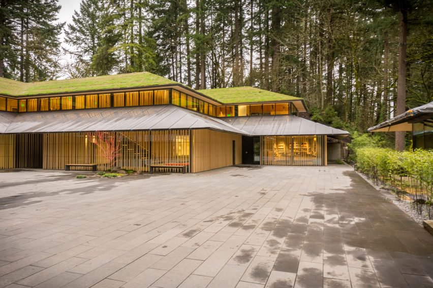 https://www.dezeen.com/2017/04/04/kengo-kuma-major-expansion-portland-japanese-garden-opens/
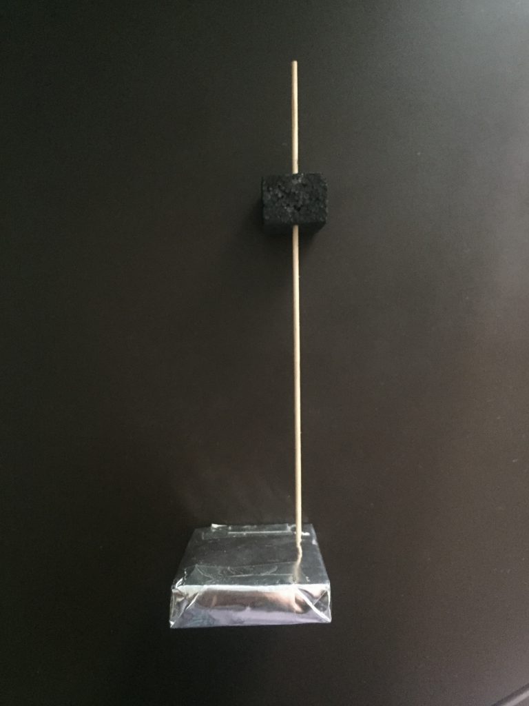
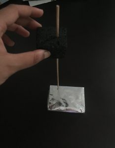


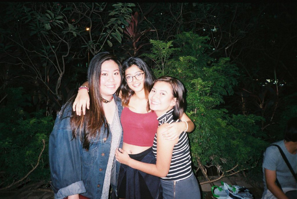


 On the left was one of the test shots, I felt that it was quite impersonal and also there were too many distractions.