My interest lies in collaging images to create my own artwork.I normally find these images in magazines and comics and I usually bring them together in my own vision.I thought applying a similar concept for my assignment would be true to me and at the same time I would enjoy doing it. I find myself to be a patchwork of a lot of different things , so the idea of collaging also sat well with me. Since there is a subject for this work, my face, I decided to opt for a pixellated collage technique which allows me to control the image produced (usually for my own works I lay out my material and compose something out of that material, so I’m unaware of the end product) at the same time stylize it.Although it appears simple,I knew this technique would be challenging as there are many tones involved in making the pixellated artwork look identifiable in the end at the same time visualizing which tones go where and how to shade.I took inspiration from the pictures below as well as the Pantone artwork introduced by Lisa.


Word List:
Food
- Healthy (salad, fruits, nuts, eggs)
- Junk ( ice cream, cookies)
Gym
- Leg and booty day
- Weights
- Feeling strong
Art
- colourful
- experimental/eclectic
- Bold
- digital/traditional
fashion
- branded goods
- girly/princess
Private
Pet
- hamsters (nike and nugget <3 )
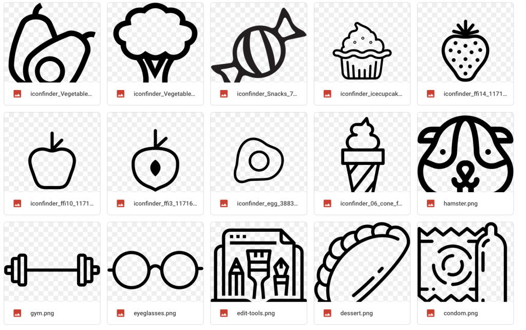
I decided to find icons in line with my wordlist as starting material to compose my final work and I’m using this selfie as reference.I collated some of the icons below.
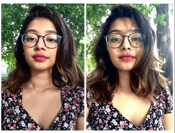
Originally I used this image but it was not very compositionally exciting.Lisa told me to maybe add a prop like in this Audrey Hepburn image, where she poses with a super long cigarette.

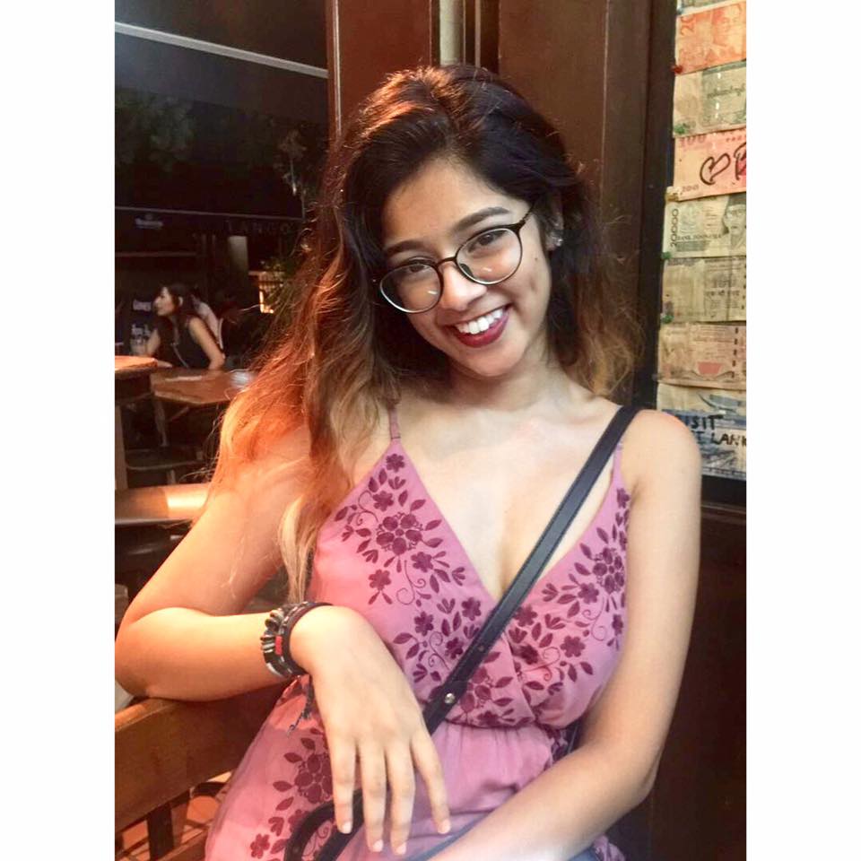
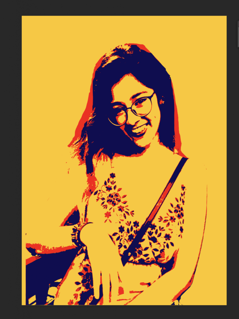
So, I looked through my photos and found one where I was interacting with a chair and I thought that could be my “prop” and opted for this image instead.
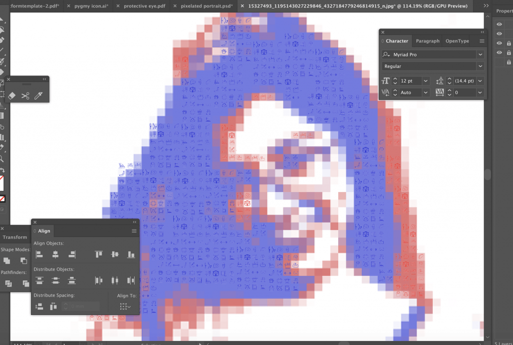
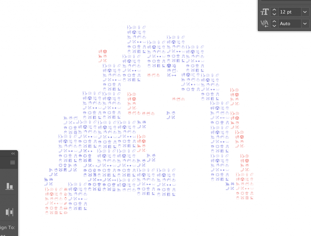
I proceeded crop the image and then convert the colours into the primary colours using the threshold tool.This would minimise matching of pixels and icons I would have to do if I didn’t limit the colour scheme.I adjusted the threshold to 3 different levels and adjusted their hues and layered them back on to each other.
Then I experimented with a few different degrees of pixelation.
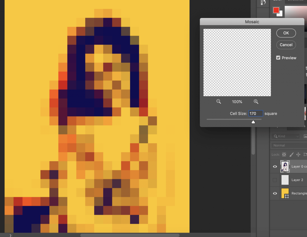 Cell size :170
At first I chose the cell size to be 170 as I didn’t want to deal with too many icons.
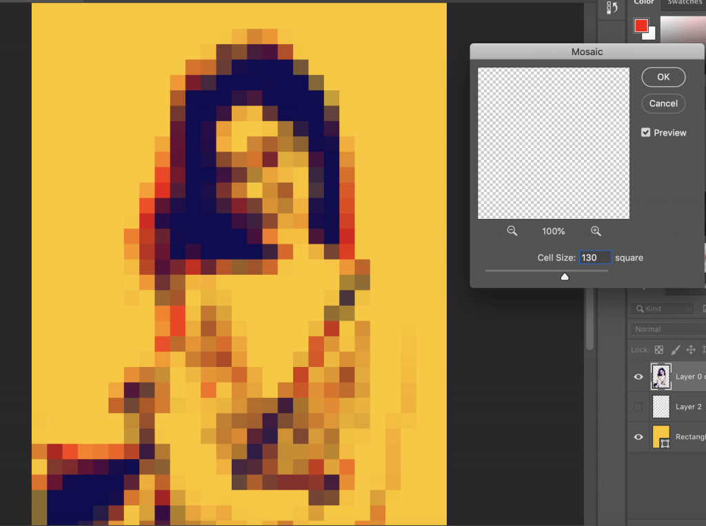 Cell size:130
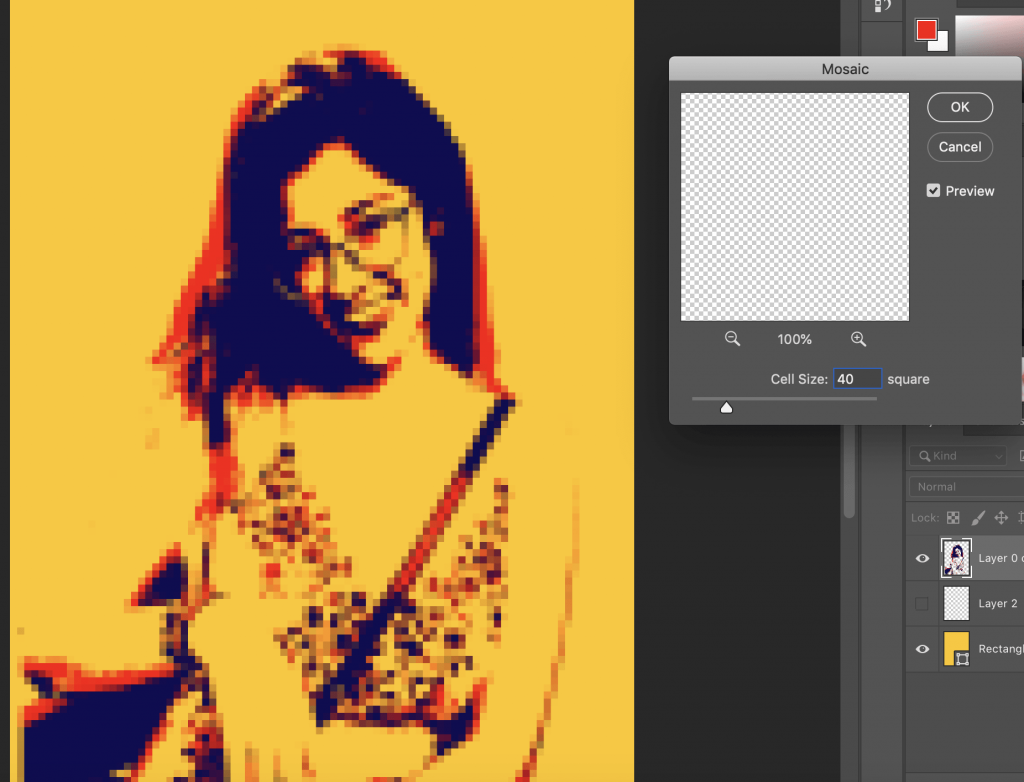 Cell size:40
After choosing the cell size I proceeded to patch the icons together and lay it over my pixelated image.
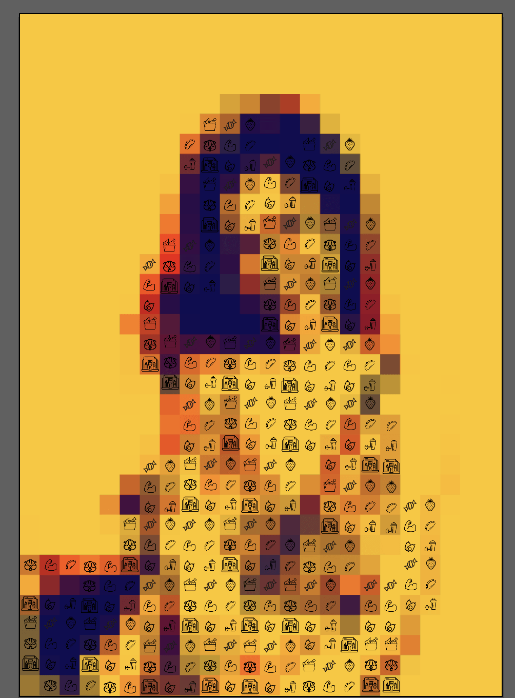
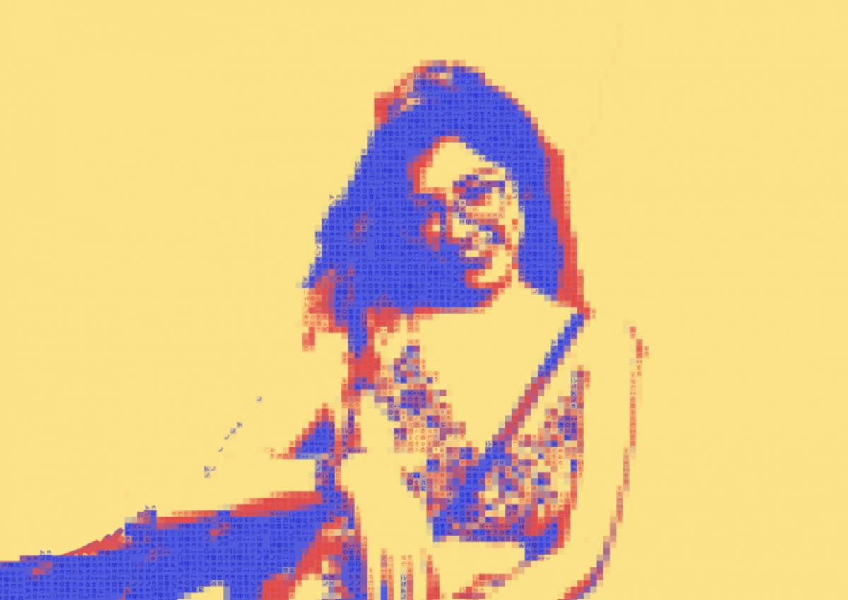
I realised that combining the icons and pixelation made it look very messy.Upon consultation I was told to reduce the pixel size so that it was obvious it was a persons face and also adjust the hue of the icon to match the pixel colour at the back to make it look more seamless.I reduced the cell size to 9 and then I started collaging the icons over the pixels and ended up with this.
I also changed the composition to landscape to provide more breathing space like in the Audrey Hepburn image.The icons blended better when they were changed to blue and red respectively, however their hue was too close to the original colour of the pixels.When I printed it out the icons would disappear.
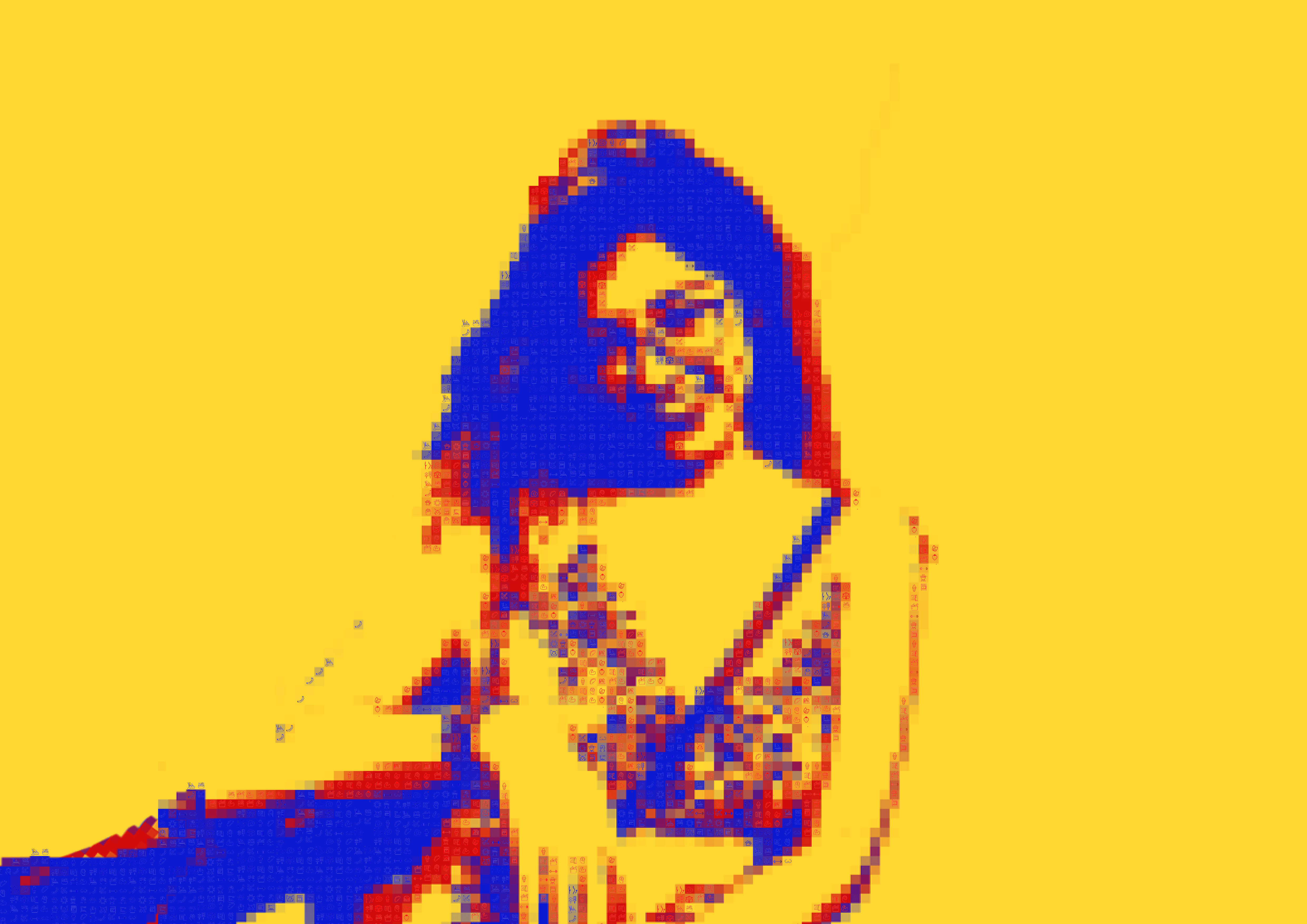
I added a semi opaque white layer over the artwork to make the icons pop and it’s soothing on the eyes.
This is how it turned out
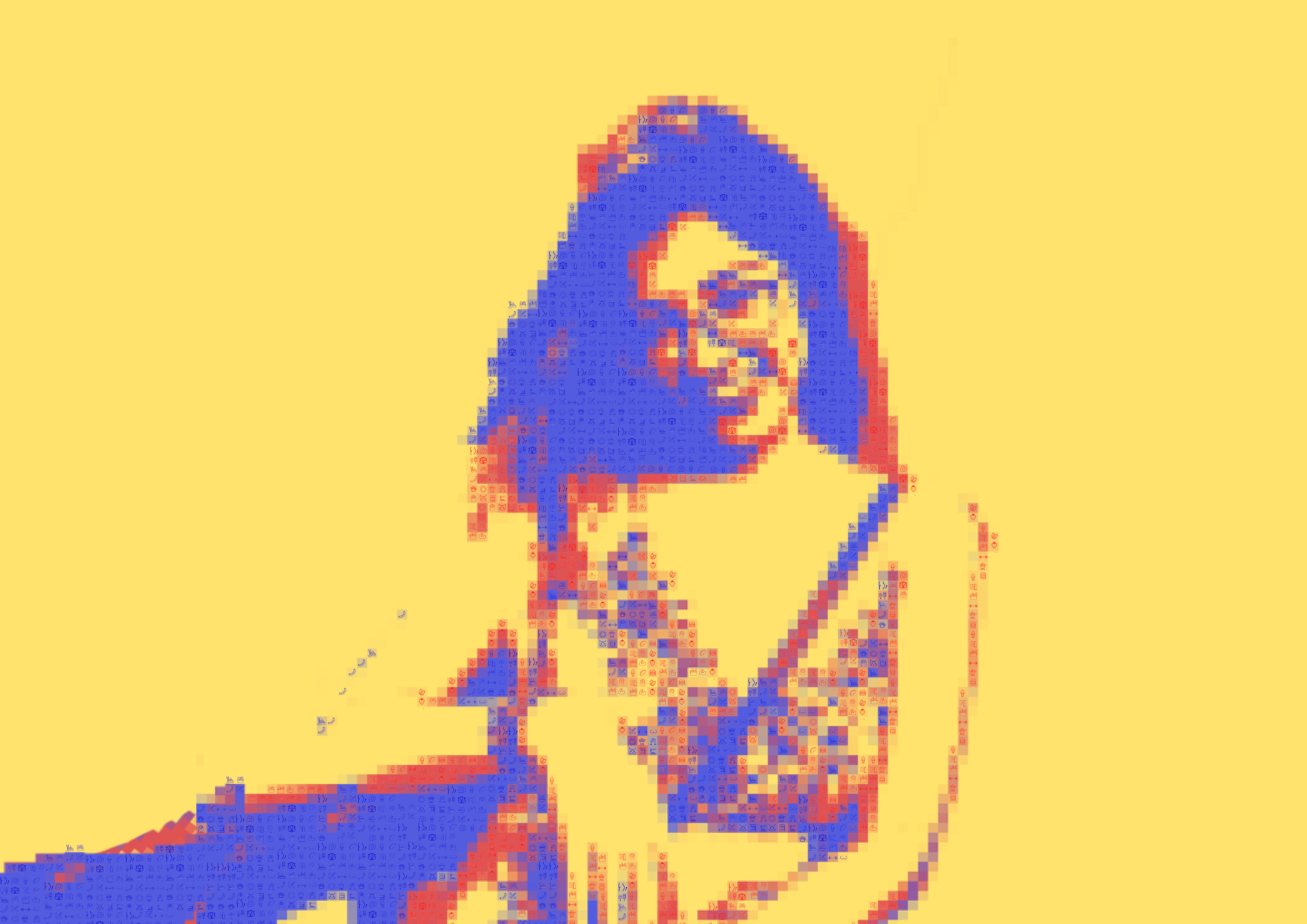
Working with primary colours has helped me realise that its important to achieve balance using it, if not it would be too jarring.Personally a ratio of 3:1:1 of the stated colours work best . what worked for me was using blue as the shadow ,red as the mid tone and yellow as the highlight colour, or the main colour.I wanted to create a more uplifting vibe to my final work.
https://www.pinterest.com/pin/281052832973678761/
http://gimpchat.com/viewtopic.php?f=11&t=12379&start=190
https://www.pinterest.com/pin/30117891228460898/?lp=true
http://www.analog-pixel-art.com/gallery_2.html