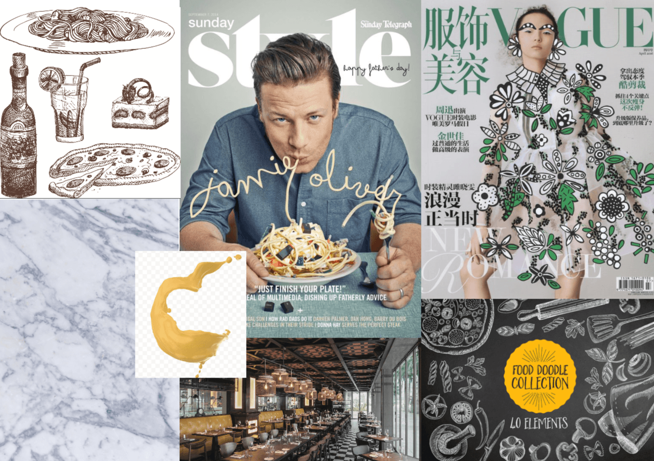
STEP 1: List of descriptive words
Fun
Illustrative
Simple
Elegant
Modern
STEP 2: Colour palette

STEP 3: The look
photographic
illustrative
sketches
lettering
glossy
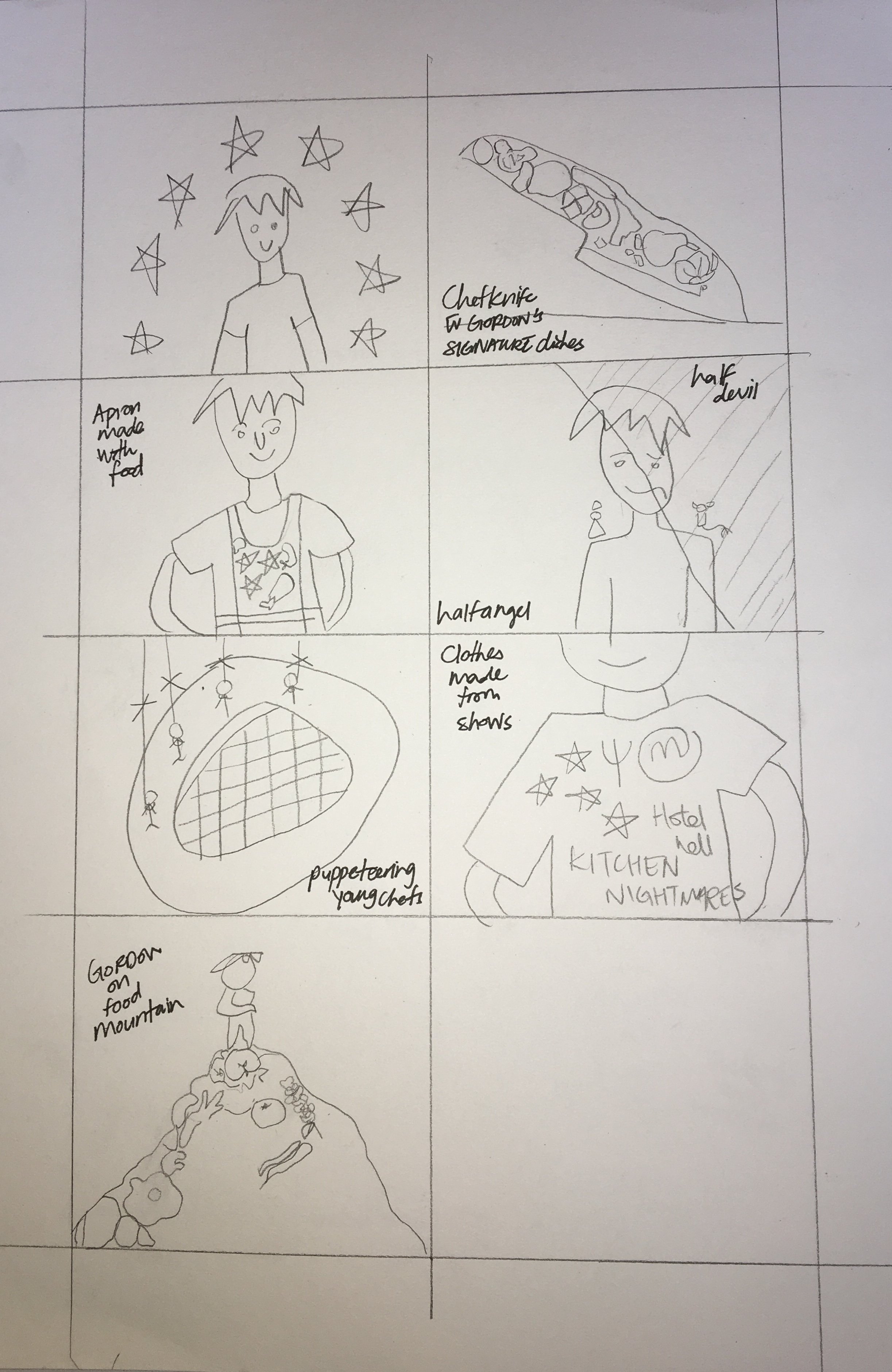
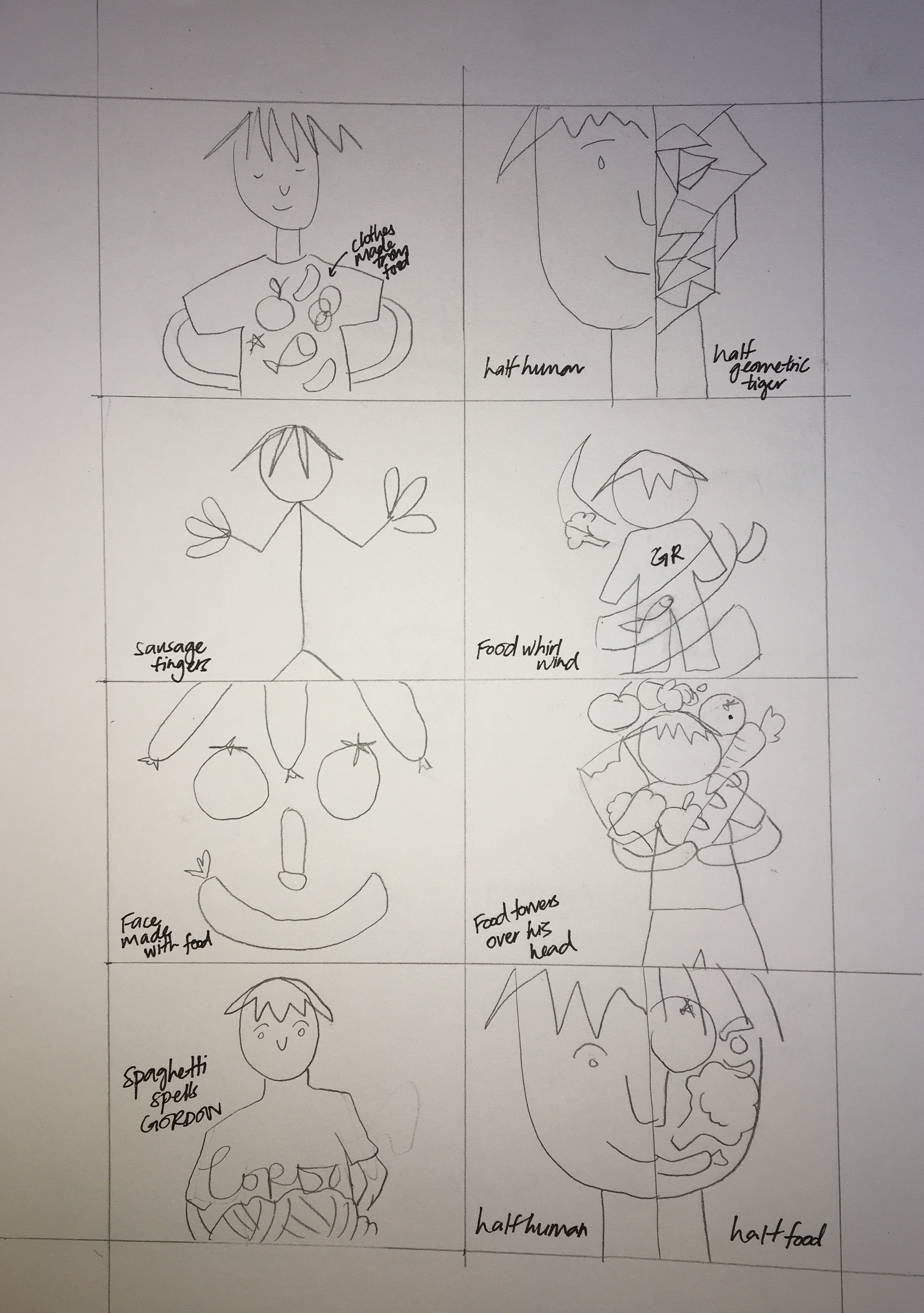
THUMBNAIL SKETCHES:
Just another Open Source Studio site

STEP 1: List of descriptive words
Fun
Illustrative
Simple
Elegant
Modern
STEP 2: Colour palette

STEP 3: The look
photographic
illustrative
sketches
lettering
glossy
THUMBNAIL SKETCHES:


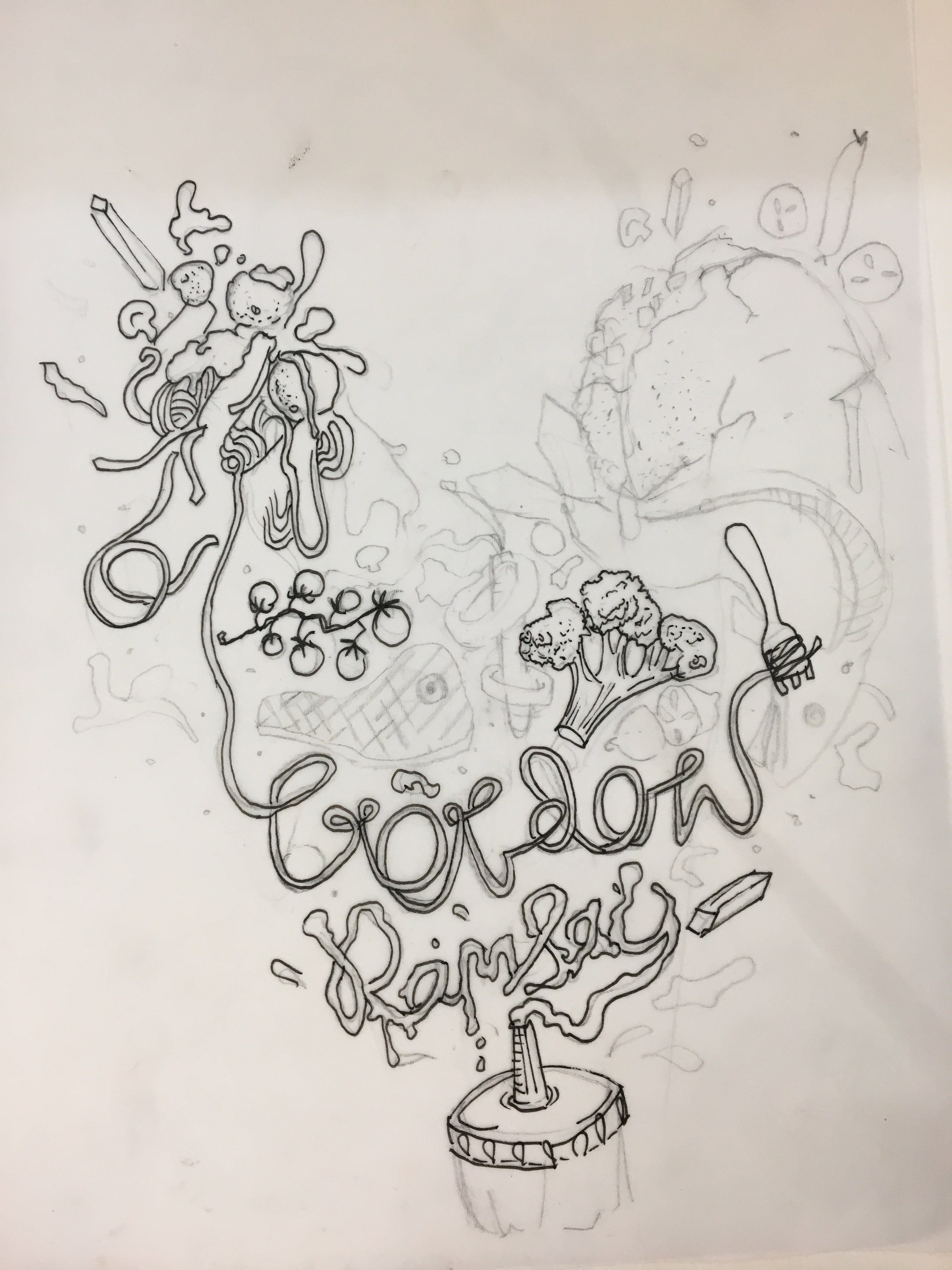
I opted for a dynamic composition for my illustrations as I thought it suited the concept of Gordon being overwhelmed by food. The triangular shape of the composition adds movement and energy to the magazine cover giving it visual interest.There are multiple elements within the design which have varying sizes and also different line weights, as pens with different thicknesses were used. This contributes to the sketchy and fun look I was going for. Overlapping the magazine template over the illustrations which are over Gordon Ramsay himself gives the design more depth and in turn makes it more exciting compared to a flat 2D design.
PENCIL COMPS: Drawn on tracing paper
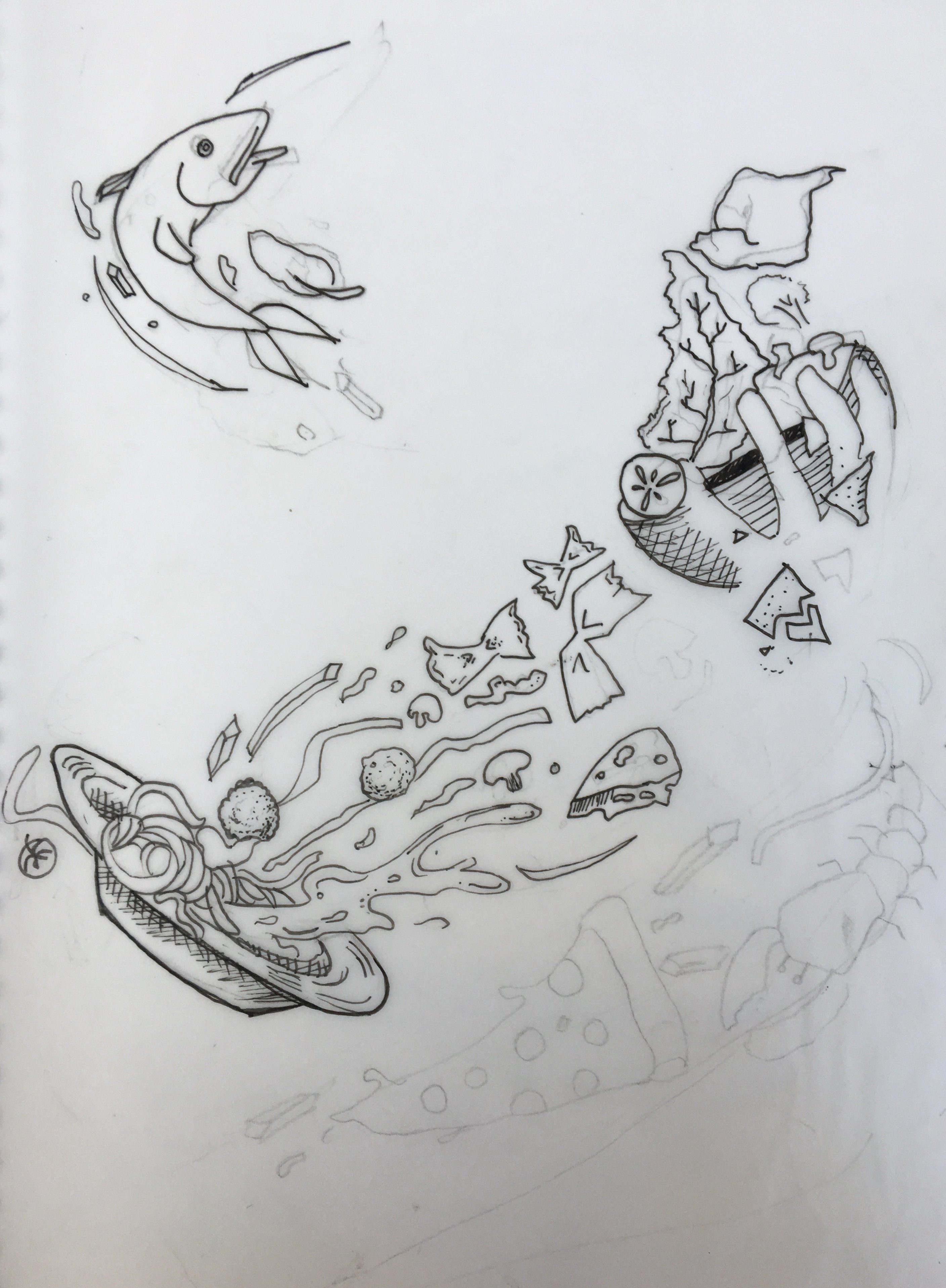
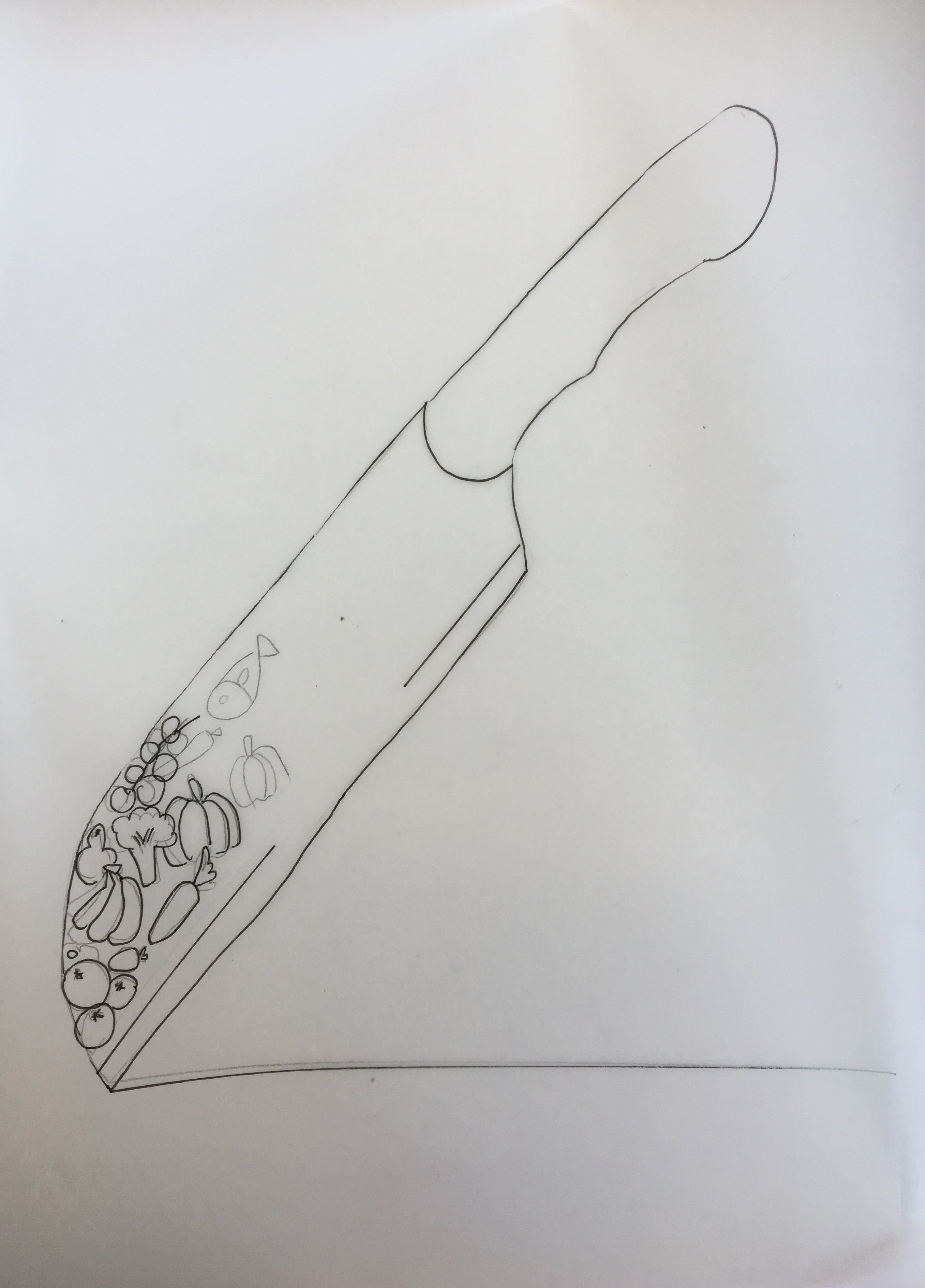
PROCESS:
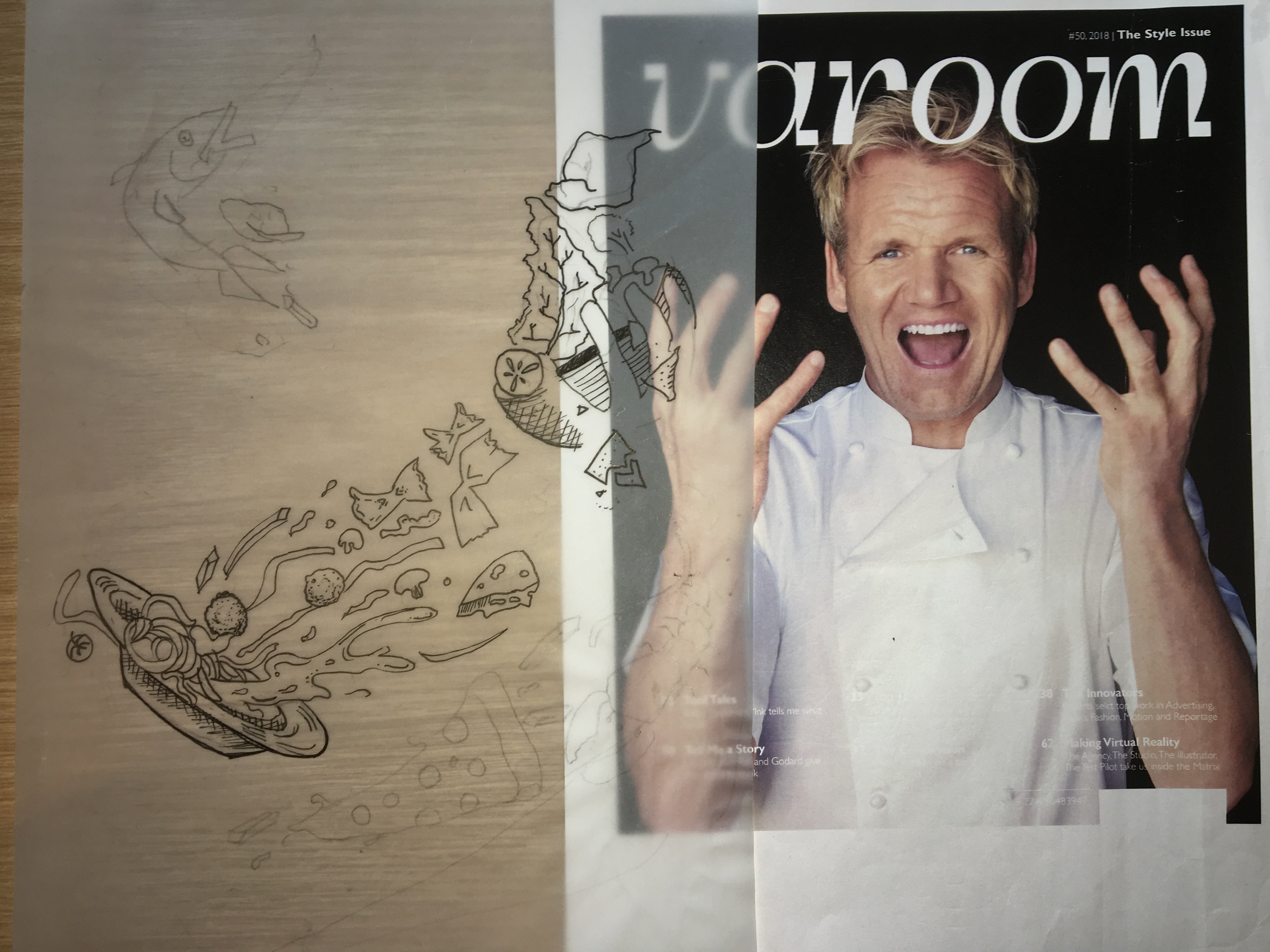
I began by printing an image of Gordon and illustrating over him using tracing paper, So I could get a rough idea of how the final magazine cover would look like and also to align my illustrations with the image.I laid over the pencil comps over the image and chose the one I liked best.

I picked the first design and proceeded to digitise my work using image trace in illustrator.The original image of Gordon came with a black background and my illustrations were also black, So I decided to switch out the background for a marble one, which adds to culinary theme of my cover the as it reminds me of an expensive kitchen counter.The marble background was a soft grey colour which allowed my black pen illustrations to stand out.I cropped gordon out, added the marble background and a drop shadow for depth.
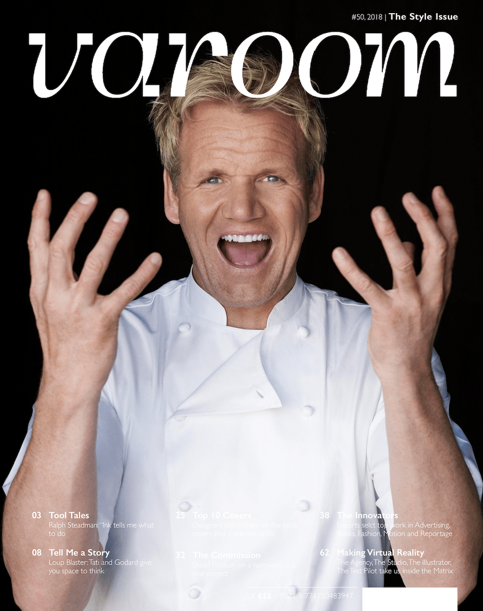
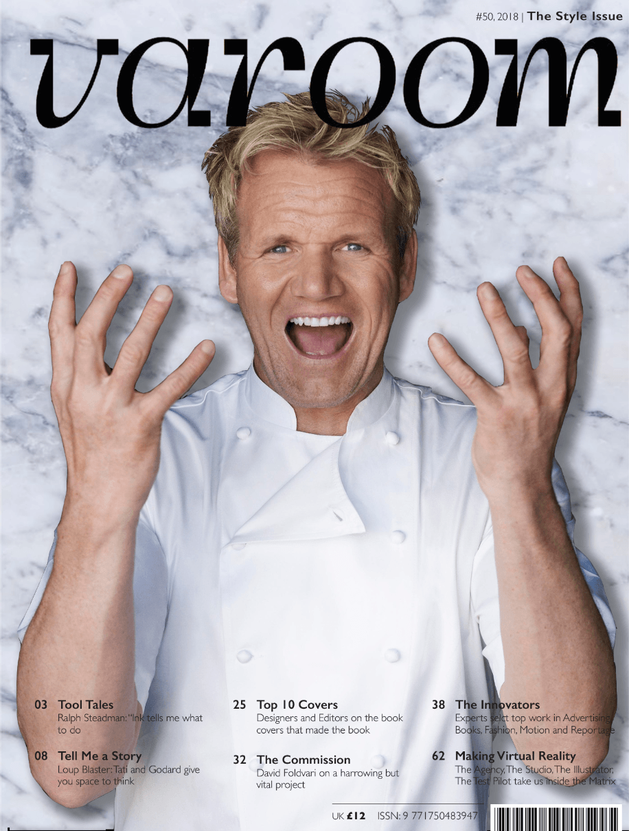
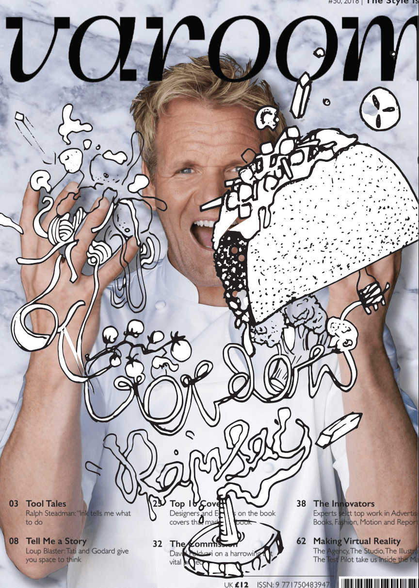
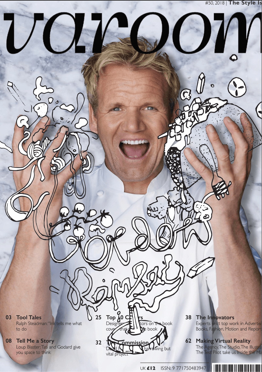
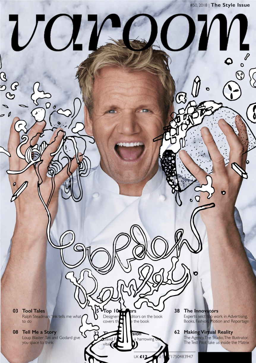
After consulting Lisa, she suggested to declutter and improve the legibility of the “Gordon Ramsay” illustration. She also suggested drawing over his face, but since it is a focal point, I omitted laying illustrations over his face and instead on his head.I had to keep the amount white on both sides even for a more balanced design.Initially my design was imbalanced as there were more elements and more white on the right than left.The taco was reduced in size so that it would not compete too much with the face. This led me to my Final magazine cover.
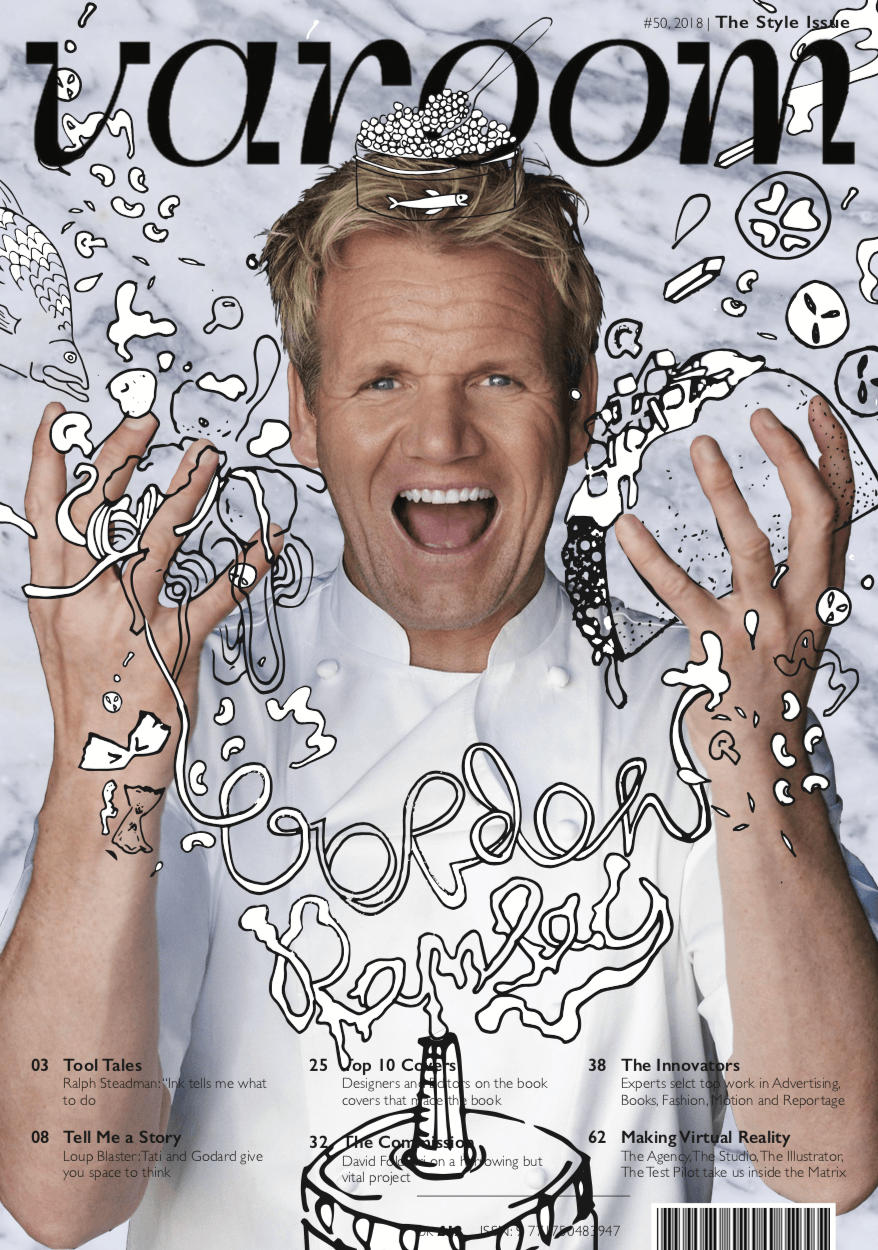
For this magazine cover I have chosen the word style and I’m interested in exploring the combination of two different styles to form another.Combining photography and illustrative overlay, it gives this playful artsy vibe to the work and also more visual interest in terms of texture.the illustrations allow me to explore the different textures I could work withIt makes the piece look more modern/street,depending on the kind of illustration that’s being explored.Here are some inspiration images below.
These first two images look more dreamy and playful, as the illustrations are more realistic(fishes, seahorse corals),whereas in the image below, its more abstract as lines,organic forms and solid colours are being used.
Im very inspired by this artist named Ana Strumpf, http://www.anastrumpf.com.br,but her works normally features very feminine girly designs on women.Although I know what style im going for im not sure of the composition, and how to include the elements I want to.I need to choose a dynamic image of Gordon Ramsay first and then consider how im going to illustrate over him.The article I chose mentioned certain elements like steak, sea bass, wine etc. But, im unsure of how to tie the whole thing together.I feel that illustrating over gordon may risk me losing that more classy looking vibe I was going for initially for my cover.I want it to look more avant grade/street yet maintain that elegant vibe.
Fun Magazine Cover Doodle Art by Ana Strumpf & Hattie Stewart
Options for the base of my cover:
http://www.officalcharts.com/gordon-ramsay-cookware/gordon-ramsay-cookware-terrific-maze-white-covered-casserole-discontinued-gordon-ramsay-by-royal/
https://www.google.com/url?sa=i&rct=j&q=&esrc=s&source=images&cd=&ved=2ahUKEwjnvc72i7LgAhVGfCsKHcaHCewQjRx6BAgBEAU&url=https%3A%2F%2Fwww.pinterest.com%2Frootsartskyart%2Fsky-art%2F&psig=AOvVaw1G8ZjI4CwkTKTRiQXN26JS&ust=1549919922677342
https://www.seattlemet.com/articles/2010/1/12/masterchef-seattle-011210
https://www.pinterest.com/mei7272/.