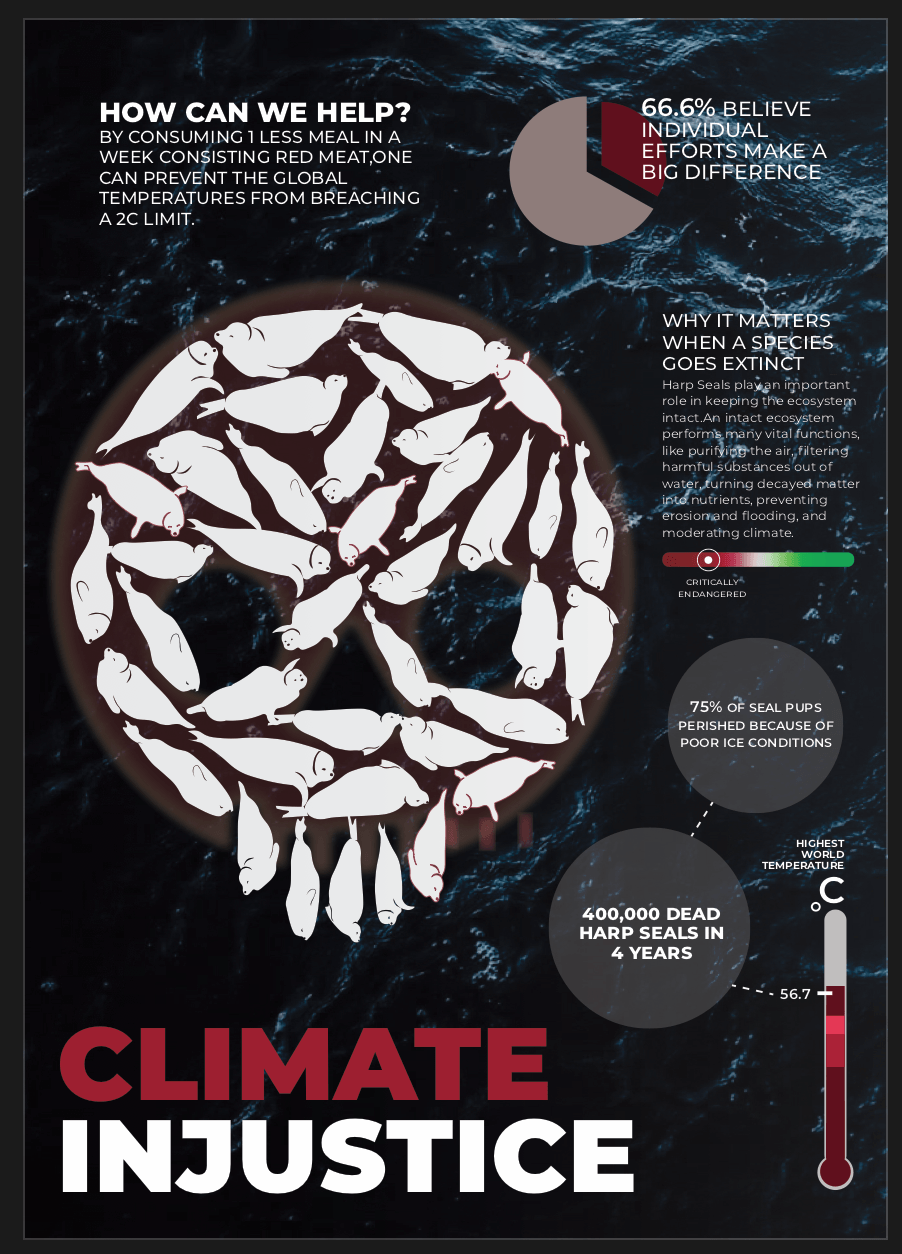
Flyer
Following the poster, I wanted to create an app that will help individuals incorporate curbing climate change as a priority in their lives, while keeping it super simple yet effective. I would want long term efforts that are convenient so the purpose is to not get its users to give up easily, also reminding them daily of things they can do to help the planet. I decided to promote this app by creating a flyer. To maintain the coherence of the 3 deliverables I wanted the flyer to be a “bridge” to the app. The app looks completely different to the poster so I wanted the flyer to have elements of the poster as well as the app.
This was the first draft of my flyer.
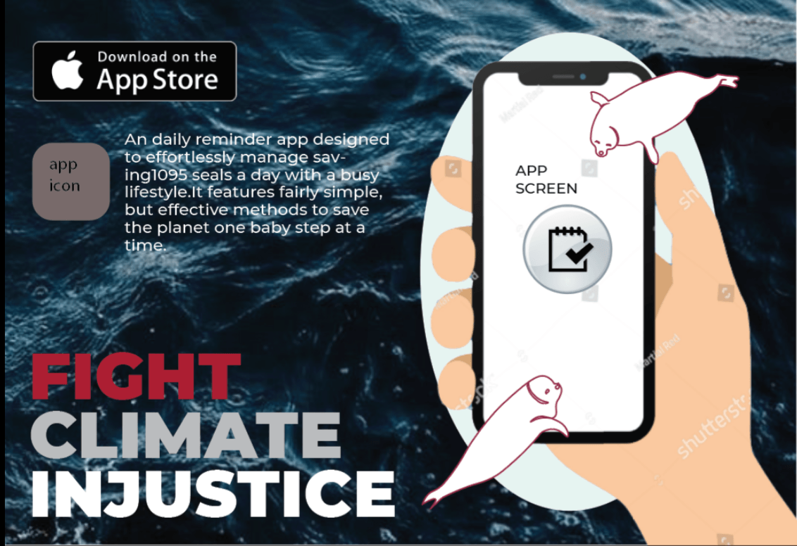
The initial idea was for the phone to be on a ice cap where the seals would seek refuge on it also the app.It included the app icon the brief description of it as well as the title.I was given comments on how the call to action was missing as well as the illustration was not very clear.This led to my second draft.

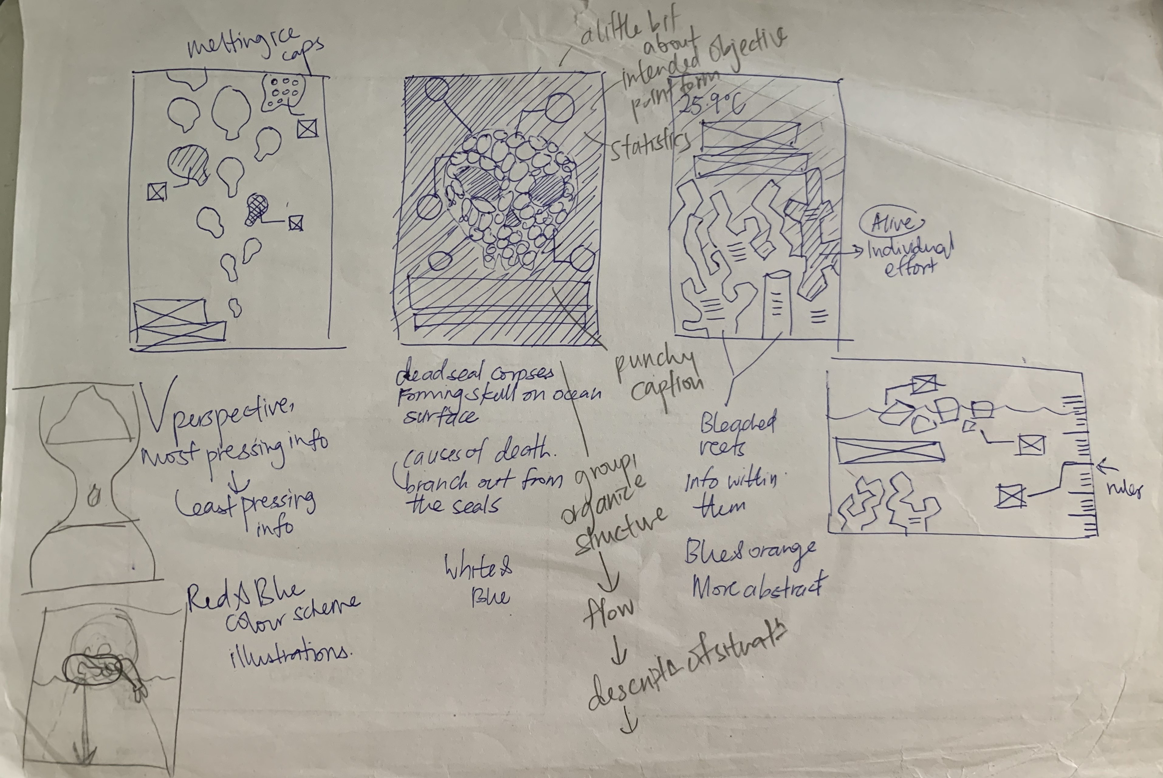
I removed the red in the title as I thought it was too jarring and shifted the title to the top. I clarified the illustration, however I struggled with the scale of the iceberg and showing that it was melting and the seals were dying.To that, I was given comments on playing with the scale of the seals in relation to the ice bergs and also adding in more seals.Prof Michael gave me feedback on how I should compartmentalise my content into “rectangles” so the eyes would perceive it as one unified section instead of confining my title and the app description to the corners of the page.There was also random empty spaces in the middle of my work that was un appealing, so aligning and compartmentalising was a key to eradicate this problem.This was to make it look more balanced and aesthetically pleasing. I was also told that my iceberg, seals as well as screen were white so it was confusing for viewers to clearly define the elements.I was missing the app name as well as a android download option.This led to my next revision.
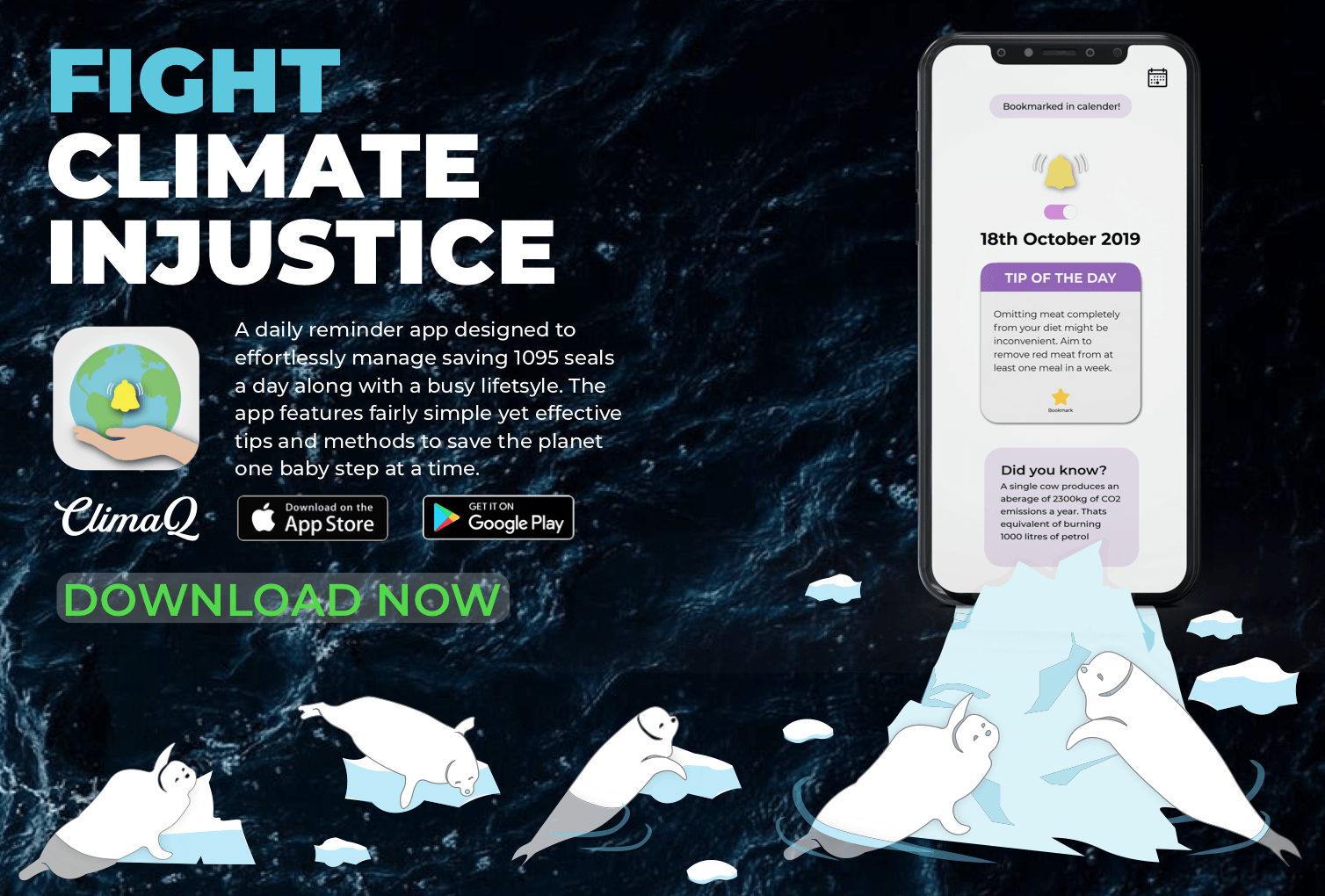
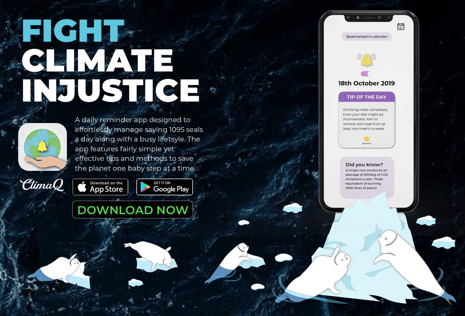
I tried to balance the text elements with the illustration element by creating 2 balanced “rectangles”. The content took up a rectangle on the top left while the illustration could span across the bottom in an L shape as shifting the text freed up space on the bottom.I decided to name the app “ClimaQ” , “Q” being a short form of the word cue, suggesting a notification/signal. I was told to use the 1/3 proportion to align the “ClimaQ” within the set rectangle to make it look less out of place as it didnt align with the description neither did it with the download options. Also I wanted to neaten the jagged edges of the app description.Although the illustration was clearer upon adding more seals and changing the colour of the icebergs, I was suggested to play with the scale alot more to create a push and pull effect, creating a foreground and background to have depth in my illustration.I had to adjust the colours of the seals in water to blue so it would be more natural.I added a faint grey outline around the iPhone to make sure that the black parts of the phone were not lost to my background image.My final flyer is below.Similarly to my poster I would improve on my alignments and my margins.
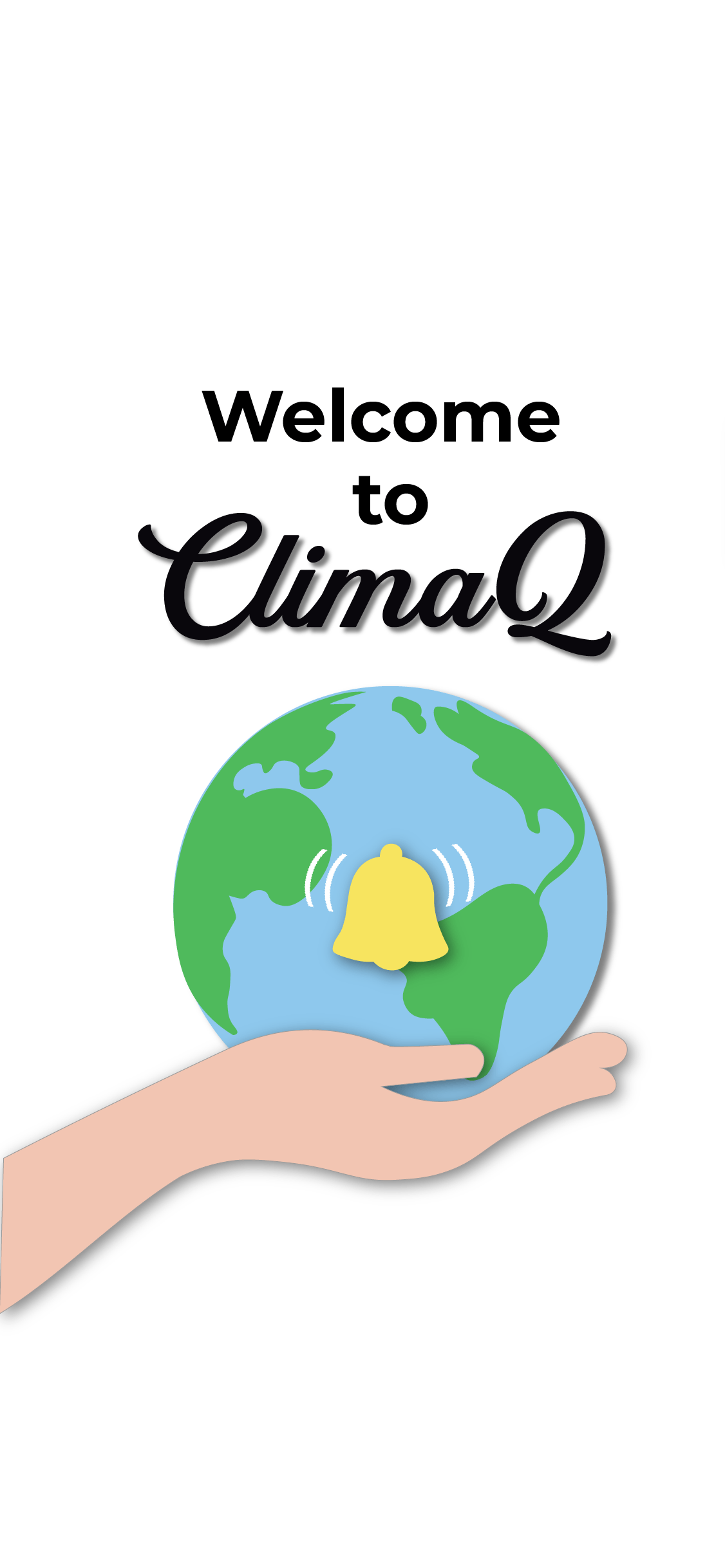
ClimaQ App mockup
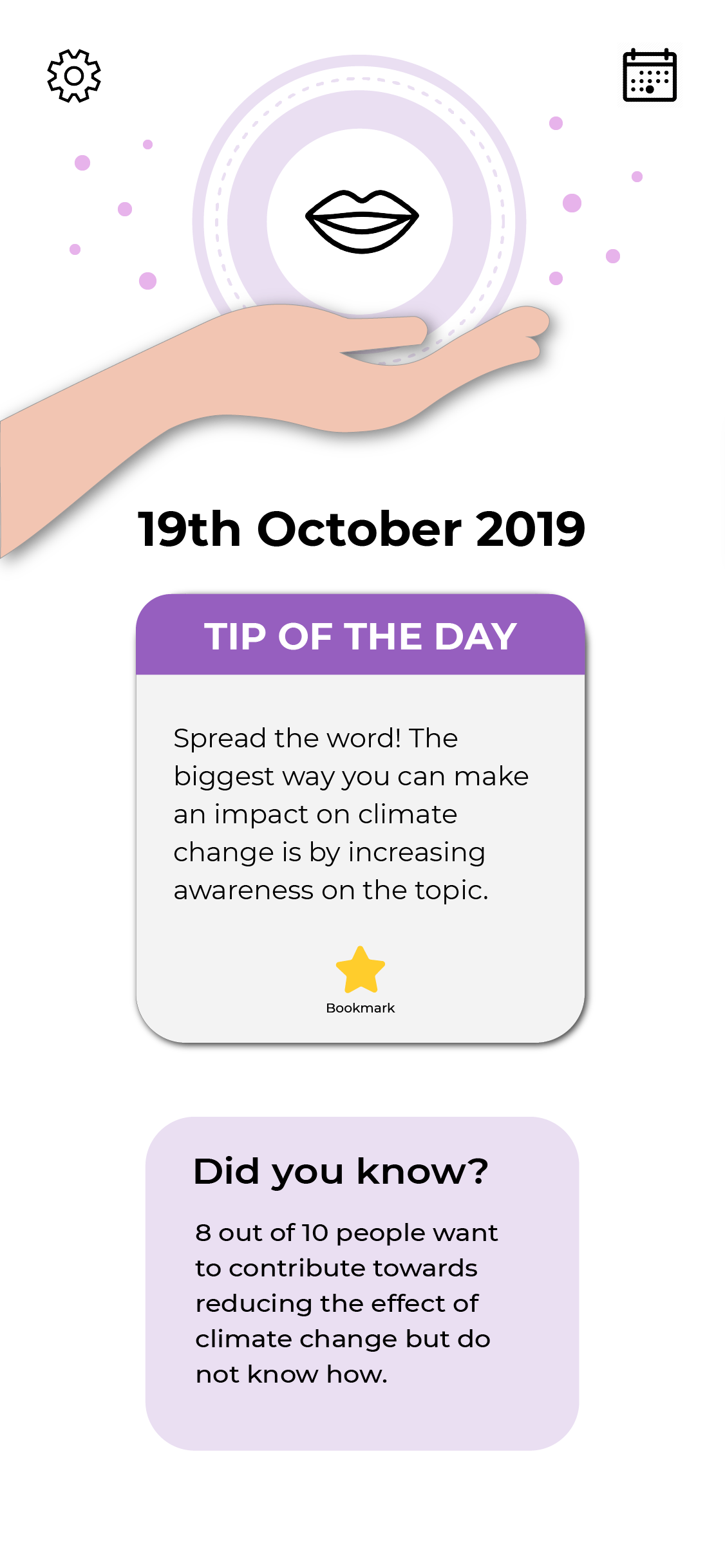
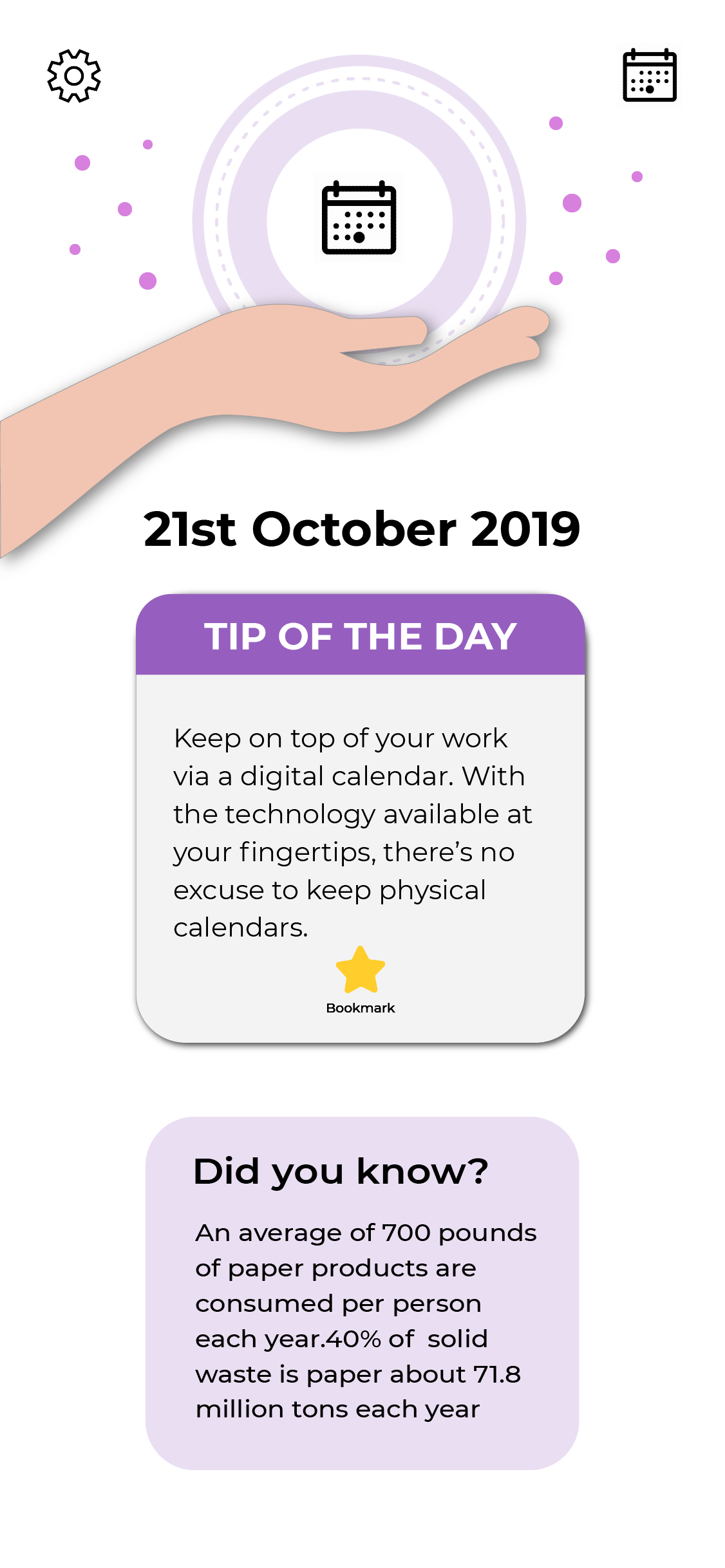
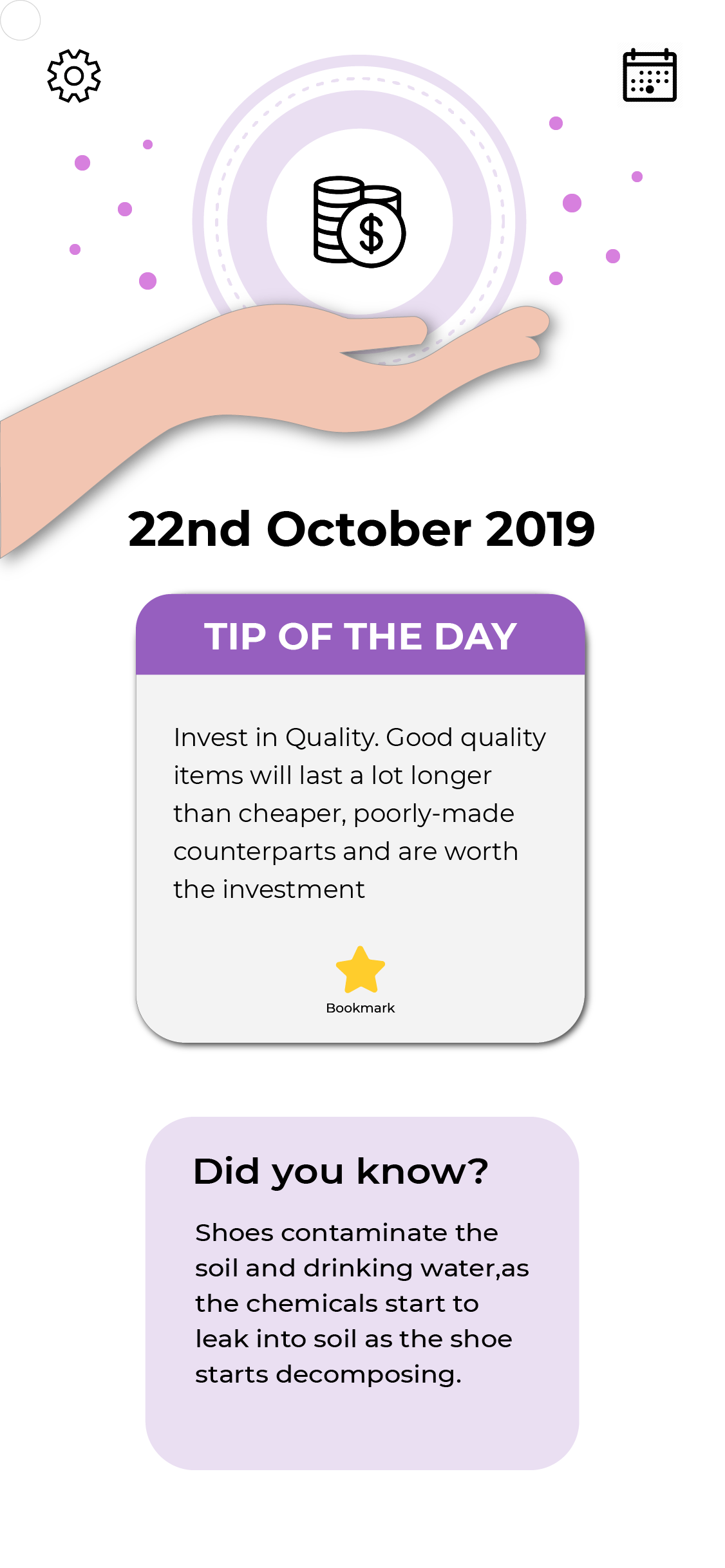
ClimaQ is a daily reminder app designed to notify its user everyday with a simple tip that they can incorporate into their daily lives. So each day will present a new tip to its user with an interesting fact about climate change to deepen their understanding about the main topic of climate change.This was my first draft of the app.I didnt want the app to just be related to the idea of seals even though that was the focus of the poster.I want the app to be about curbing climate change in general and remove that specific focus on the seals.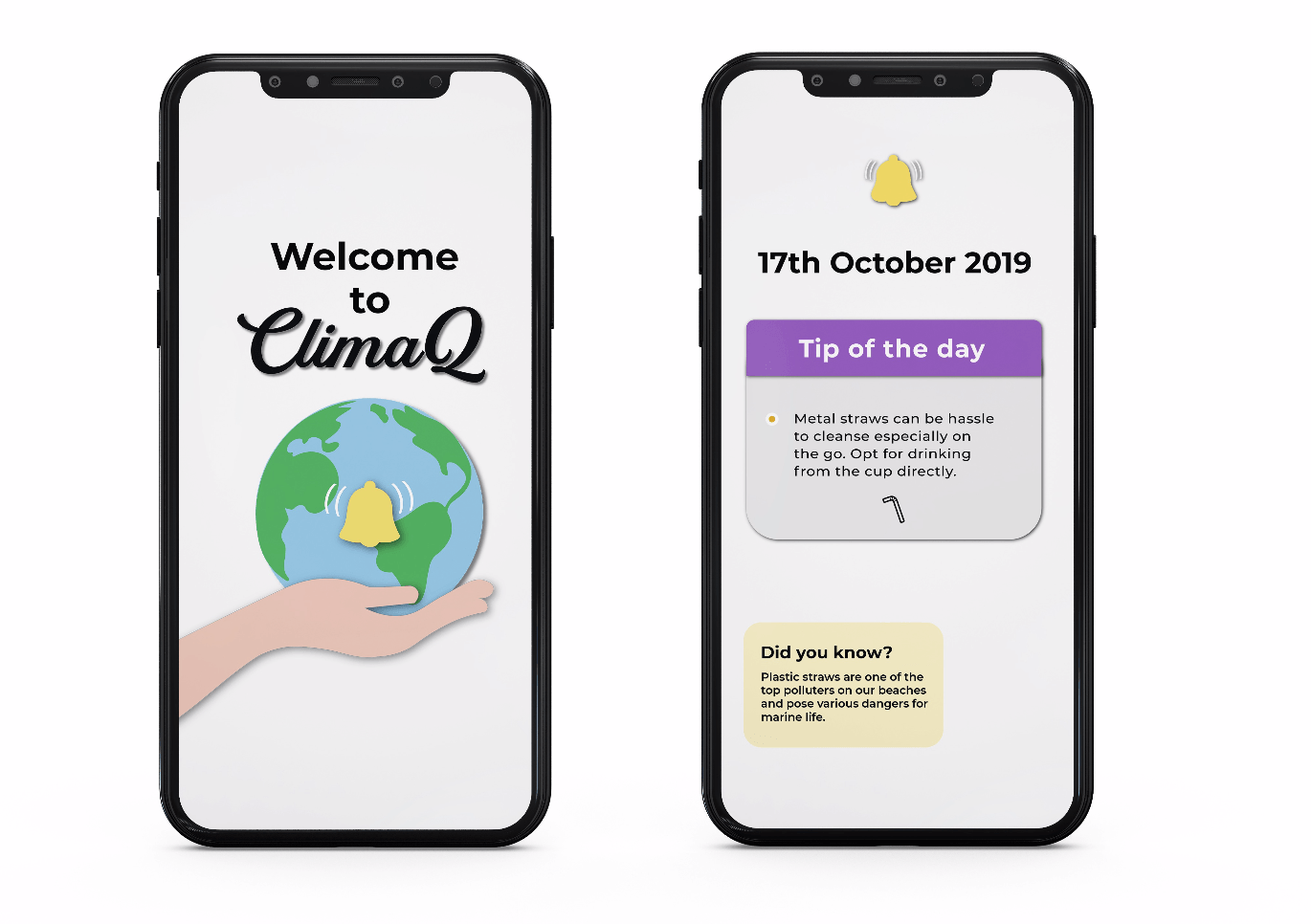
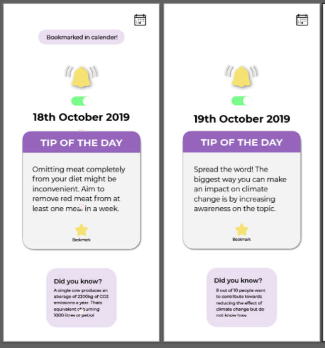
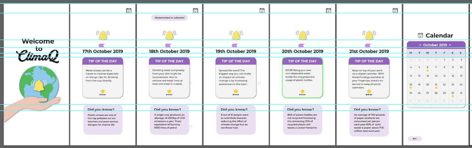
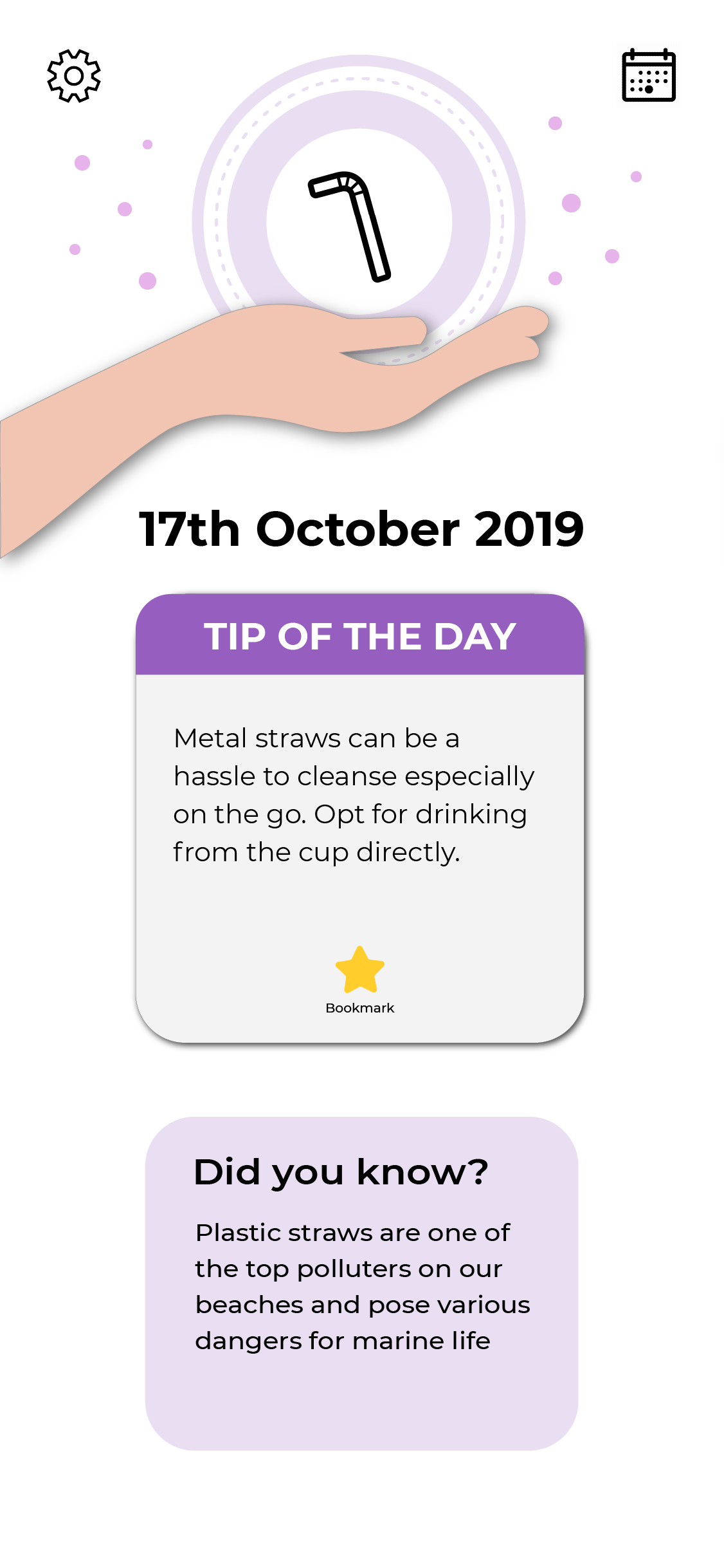
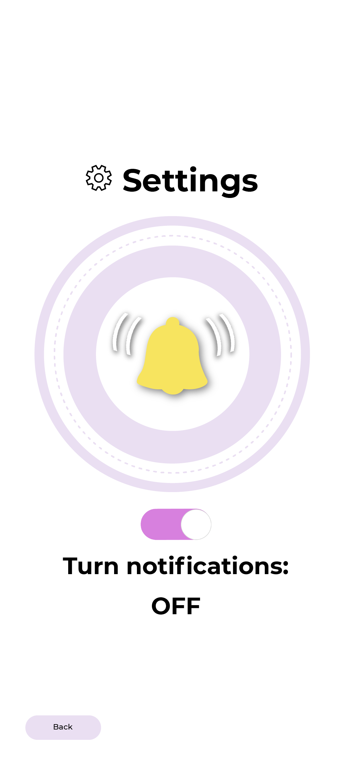
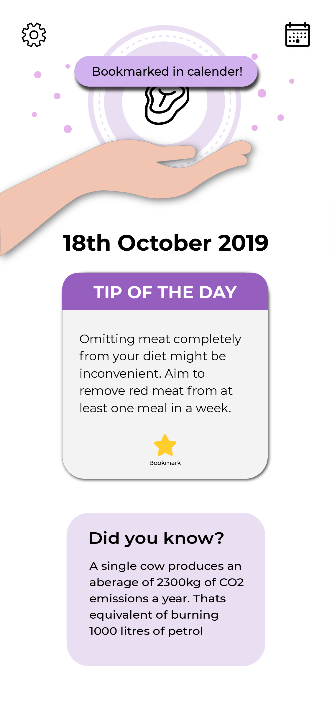
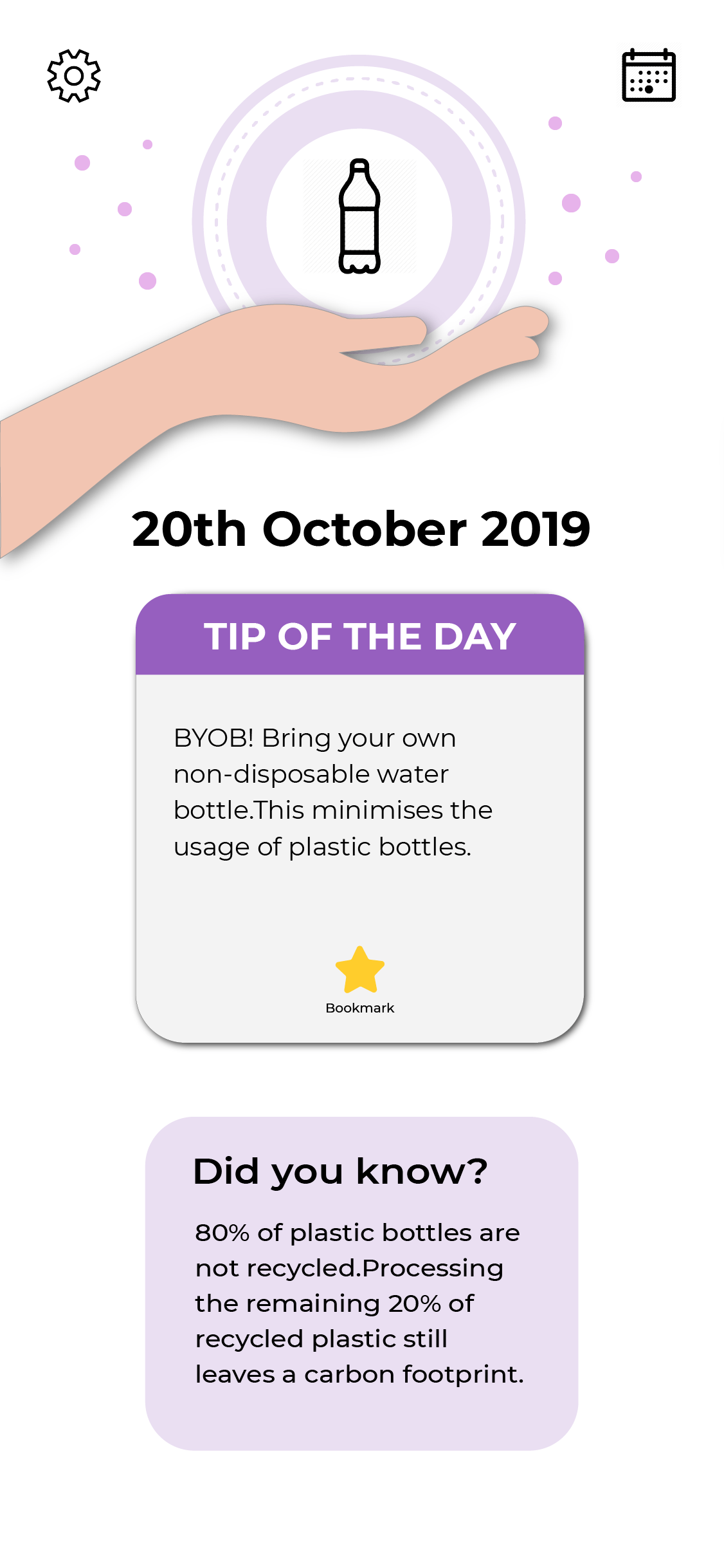
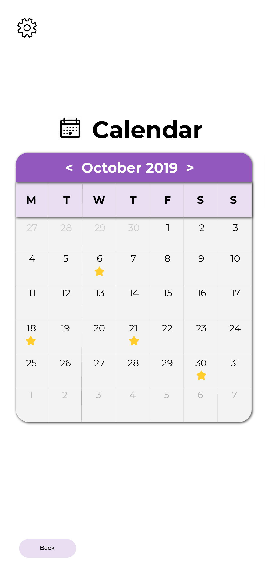
I designed the home page with a hand, globe and also a notification bell to give the idea of saving the planet is within our hands as well as the bell to signify notifications. The screen on the right is what I initially wanted each tip to look like. The bell above was a turn off/on function for notifications.I included an icon to give the user a quick idea of what the tip may be about as well as a “did you know” section to keep them interested in the app.I was prompted to think of a way to match the colours better, instead of using purple and yellow. So I opted for a monochromatic colour scheme. As the “Did you know” was also rather important I increased the scale of the info box to the same size of the tip.I was also asked to think of a way of how users can revisit the tips that they like and keep track of their favourite ones. So I created a bookmark option and calendar as seen below.
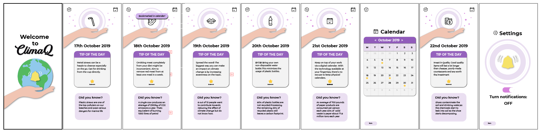
I fixed the alignment issues as well as hierarchy and colour issues within my screens. I kept it to mainly purple and changed the colour of the notification slider to purple instead of green as it was too jarring.The yellow stars were also not visible so I changed it to orange to help it stand out. The bell motif was very repetitive through the app screen, so I decided to switch it out for graphics to make it more visually interesting for its users and shift the bell to a separate settings page. This resulted in my final app screens.The feed back I received was that maybe since I had seals in my poster that I include some within the graphics of the screen as well as make the graphics more visually exciting instead of plastering the hand on every page.Overall, I had lots of fun embarking on this journey in VC2 and I feel like I managed to fill alot of the gaps in my graphic design knowledge that I can take away with my into other aspects of my life.I was given useful criticism by Prof Michael and my classmates that really opened my eyes to the spectrum of design possibilities and my own problems that reflect through my design.
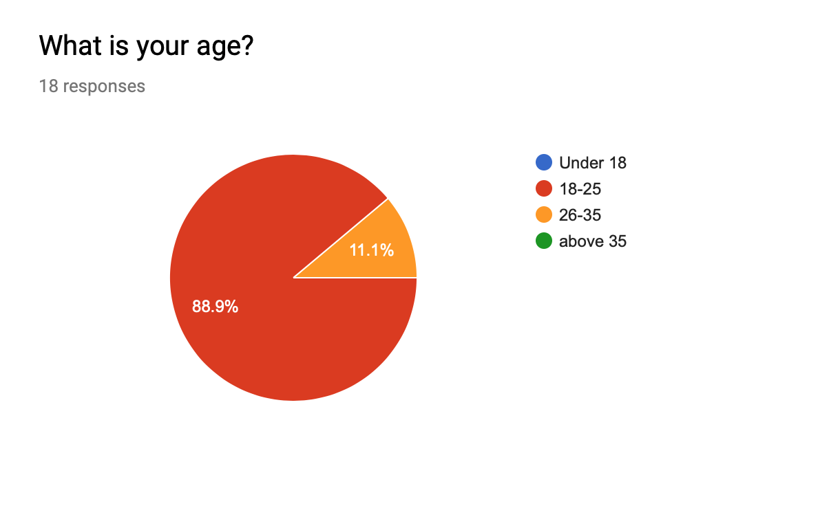
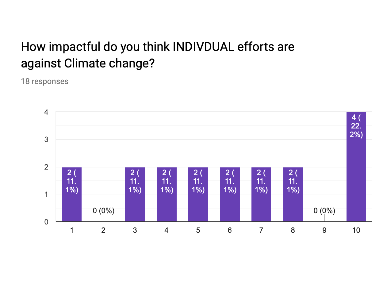
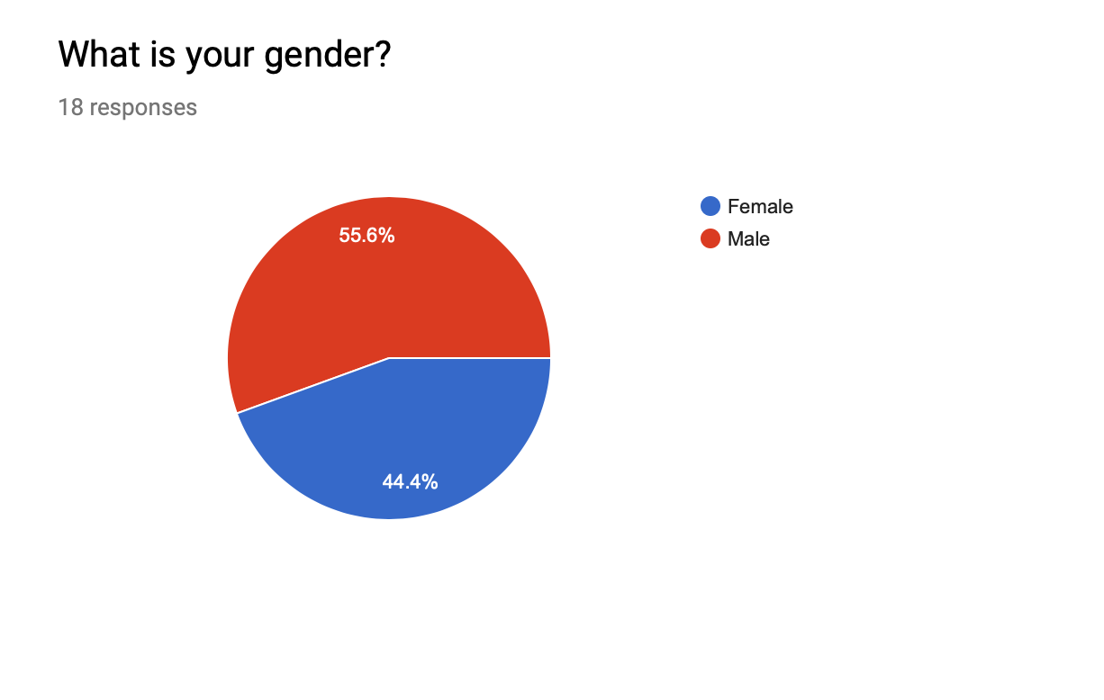 Majority of those who participated in the survey are male.So this encouraged me to keep the design a little bit more “masculine” By using a bold fonts, graphics and avoiding softer girlier colours.
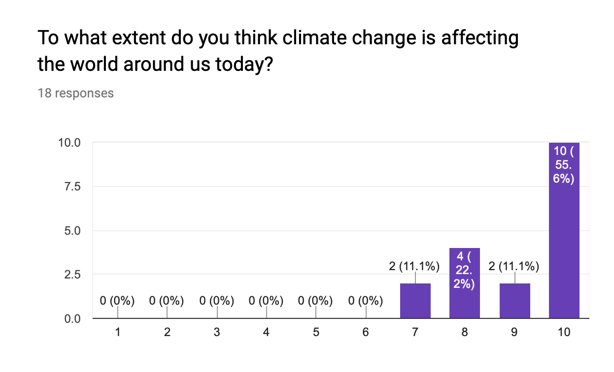
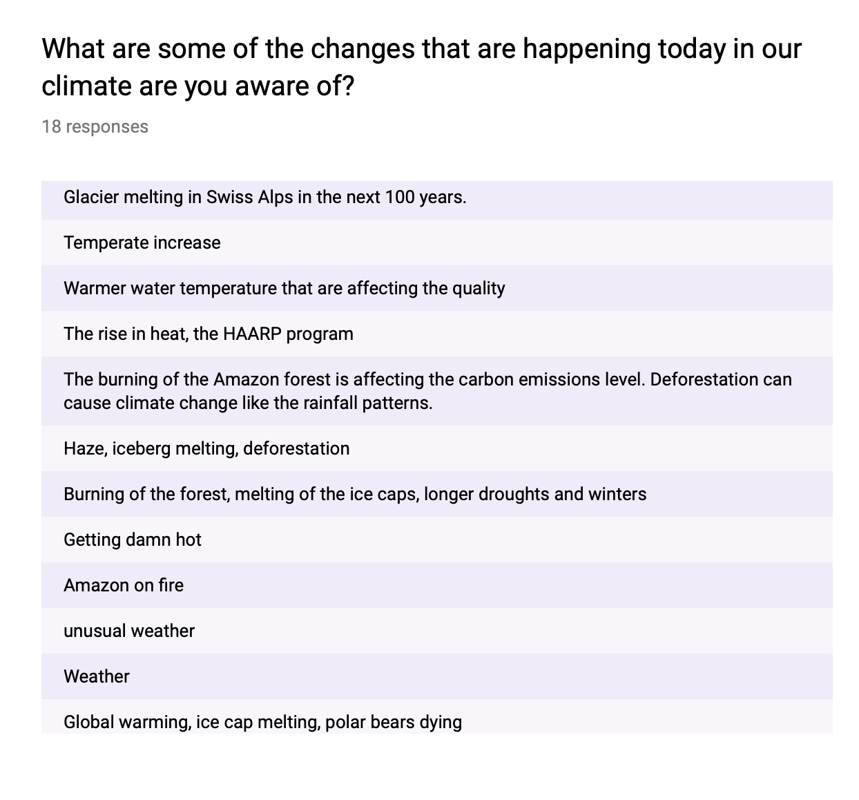
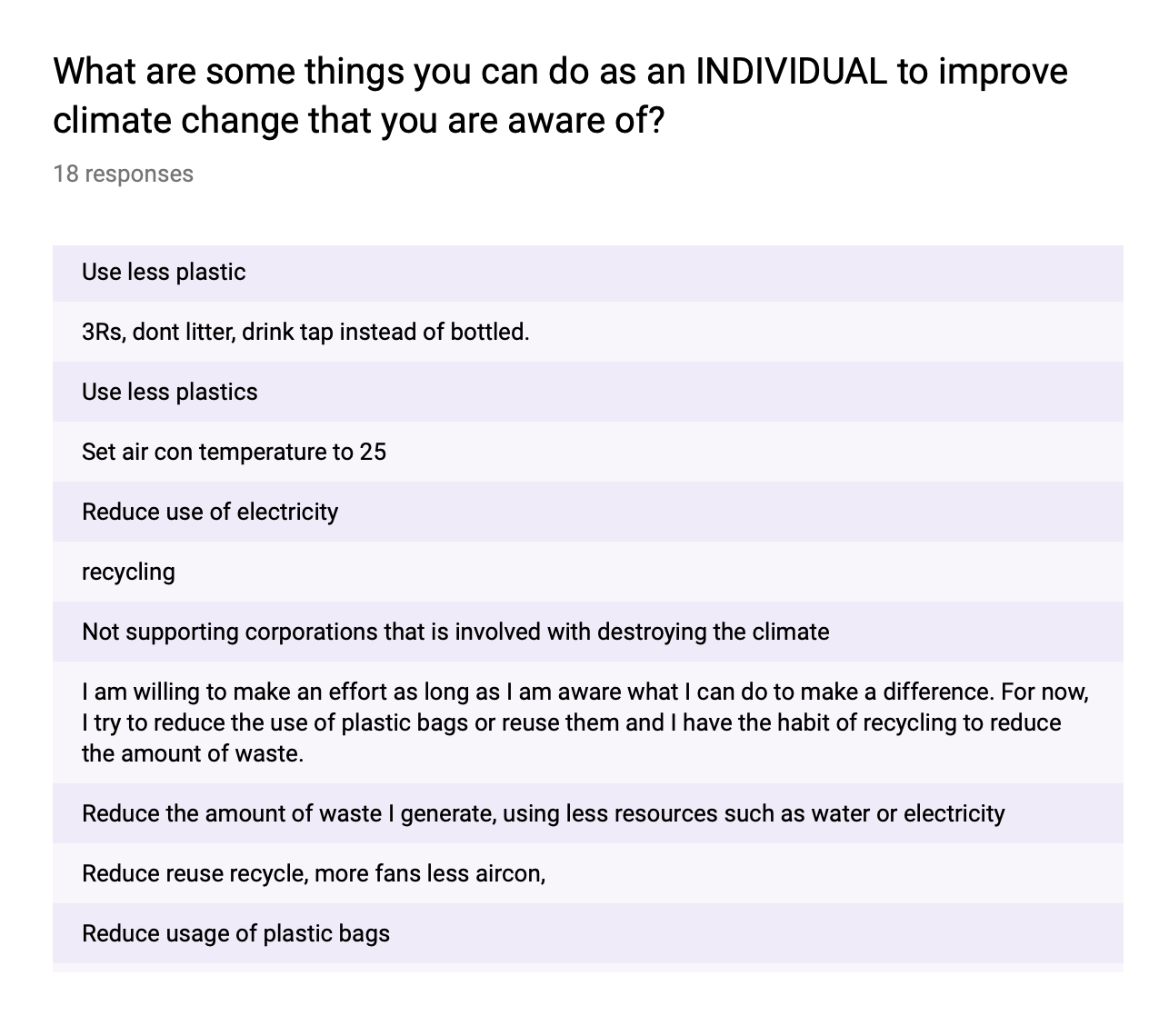
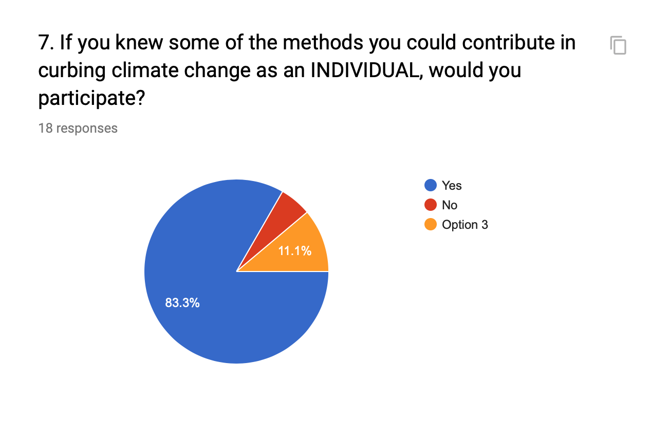
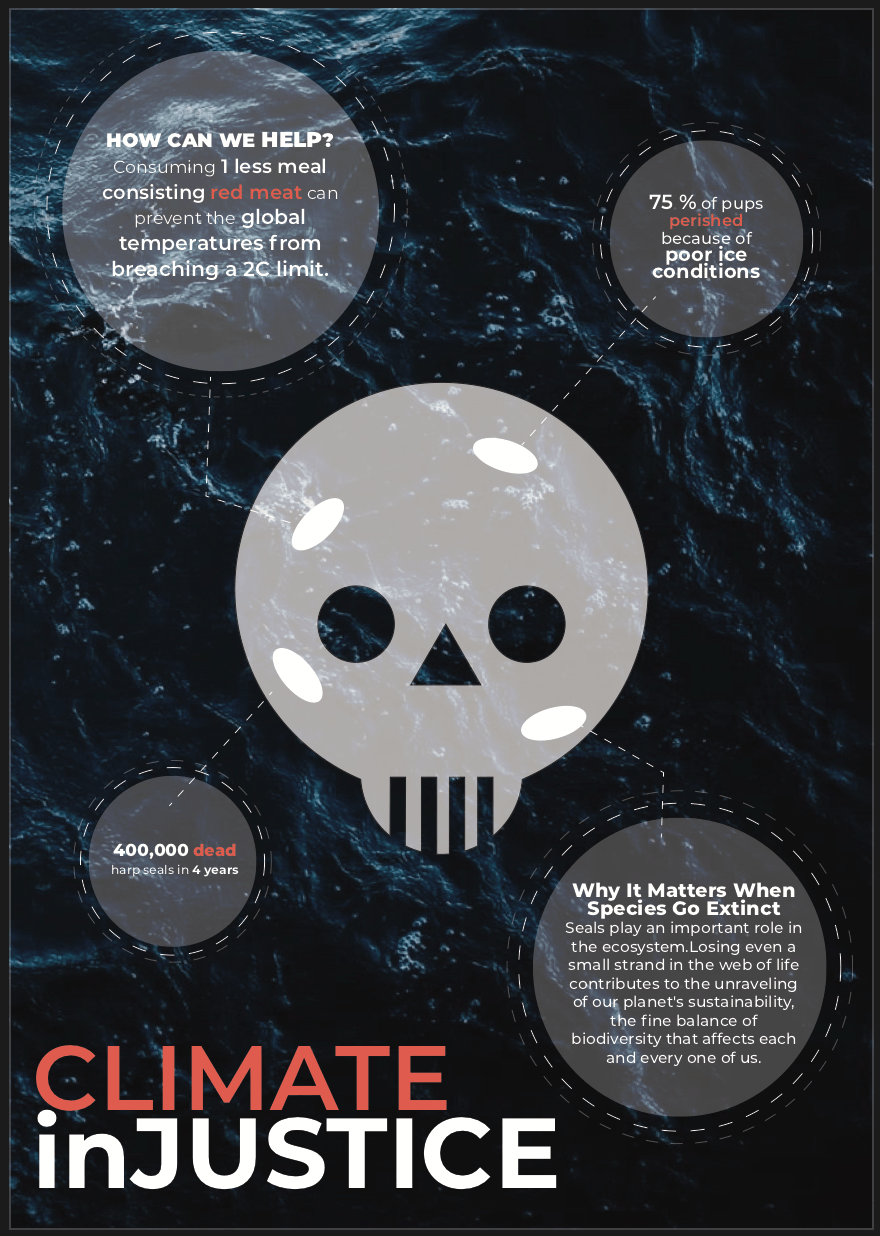
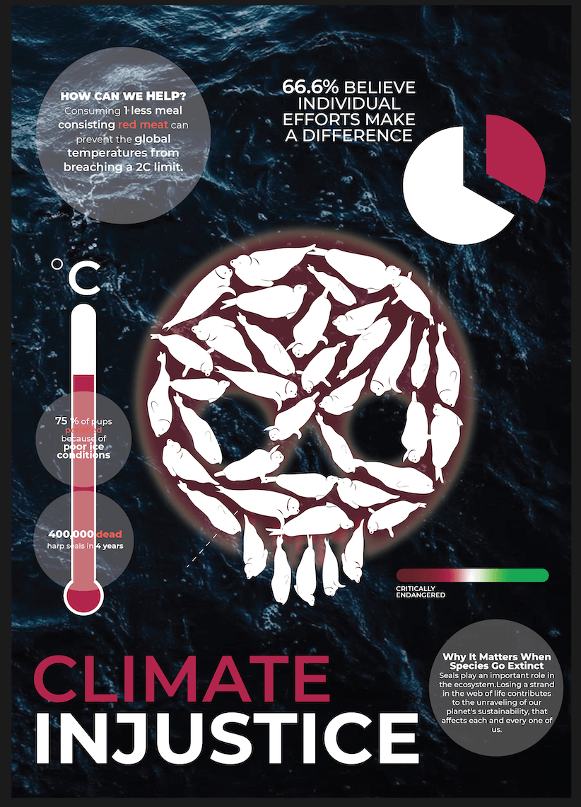
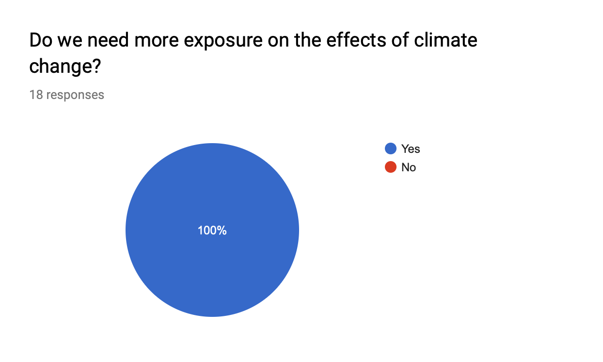 This confirms the need for me to spread more awareness on the topic of climate change using my infographic poster. In my poster I want to cover a few statistics as some shocking facts going on in the current world of today to deepen their understanding on the effects of climate change.