Hi! I am Dhanusha, and I am currently pursuing a fine arts degree at NTU, specializing in Visual communication. I enjoy typography related work, illustrations, packaging, branding, and designing logos. Although I specialize in Visual communication, I consider myself an experimental mix-media artist. I spent time exploring other disciplines within my school, including Product design, UI/UX, and animation to widen my skill set and experiment with different art styles.
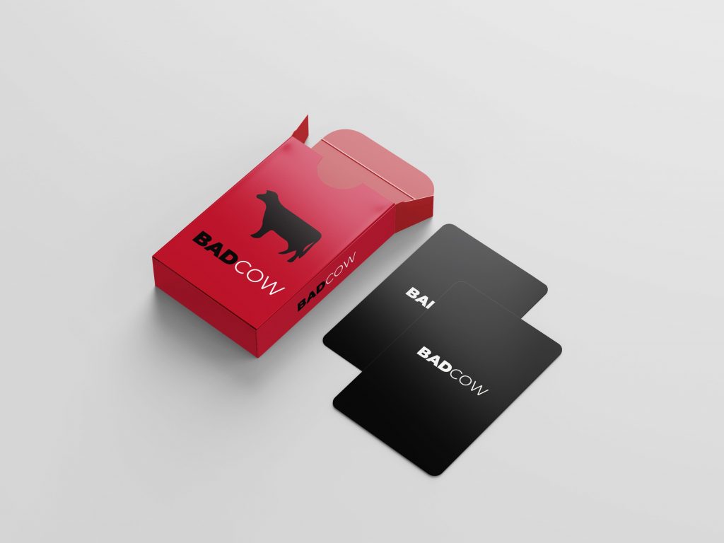
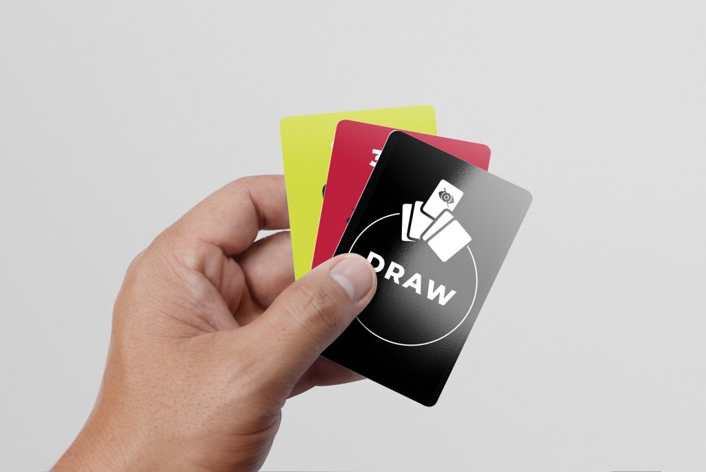
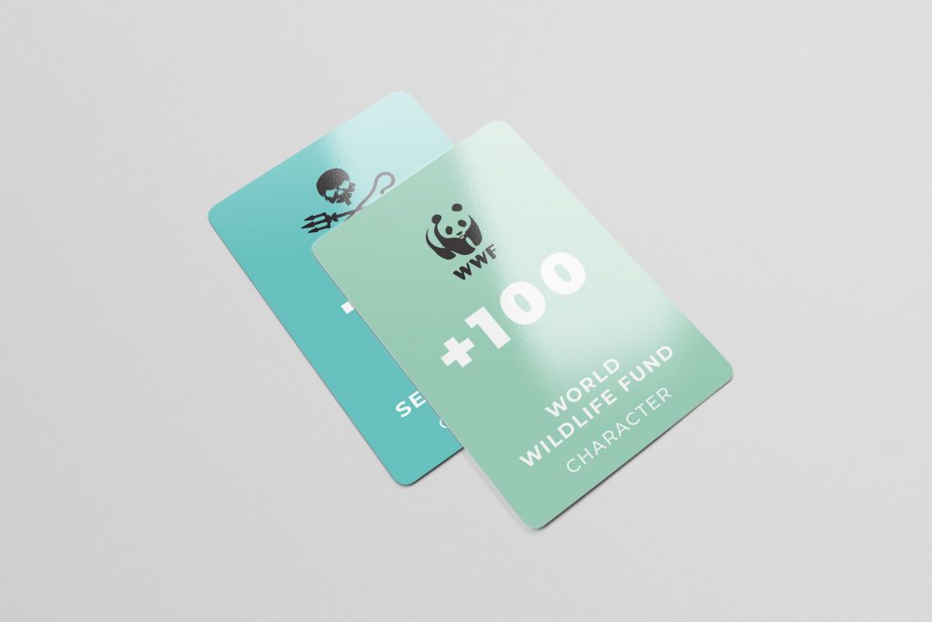
Badcow
This is one of my latest projects which stemmed from environmental activism. I enjoyed creating educational content in a medium that presents itself in a fun-lighthearted way. I created a card game based on the environmental film “Cowspiracy” depicting the water consumption of various food items. There are 3 card categories – Consumption, Character, and Power cards. The consumption cards are arranged from green to red to depict the range of good to bad consumption. The objective of the game is to clear all your cards by placing down cards of the same colors with the assistance of power cards or character and to not be left with the cow card.
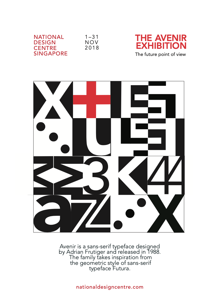
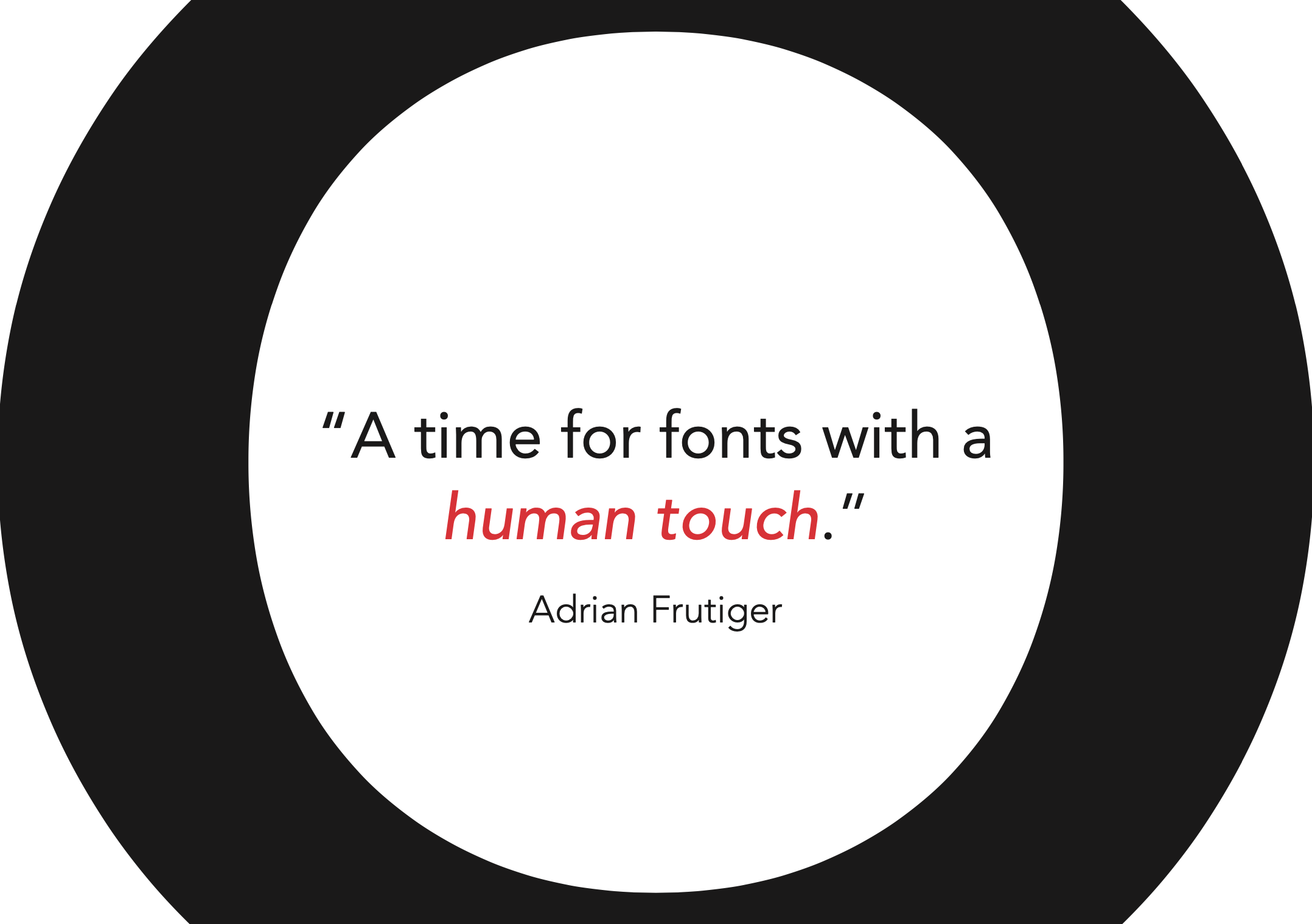
Typeface as a form – Avenir
In this project, I was tasked to see the typeface itself as a graphic form while exploring the intricacies of the typeface. I created a poster as well as a few A5 sized postcards to showcase the typeface Avenir.I chose to share this project because I learned about the versatility of type, layout, and how it can be creatively used in various applications. I feel it has a contemporary look which also shows the variety of styles I apply in the work I do.
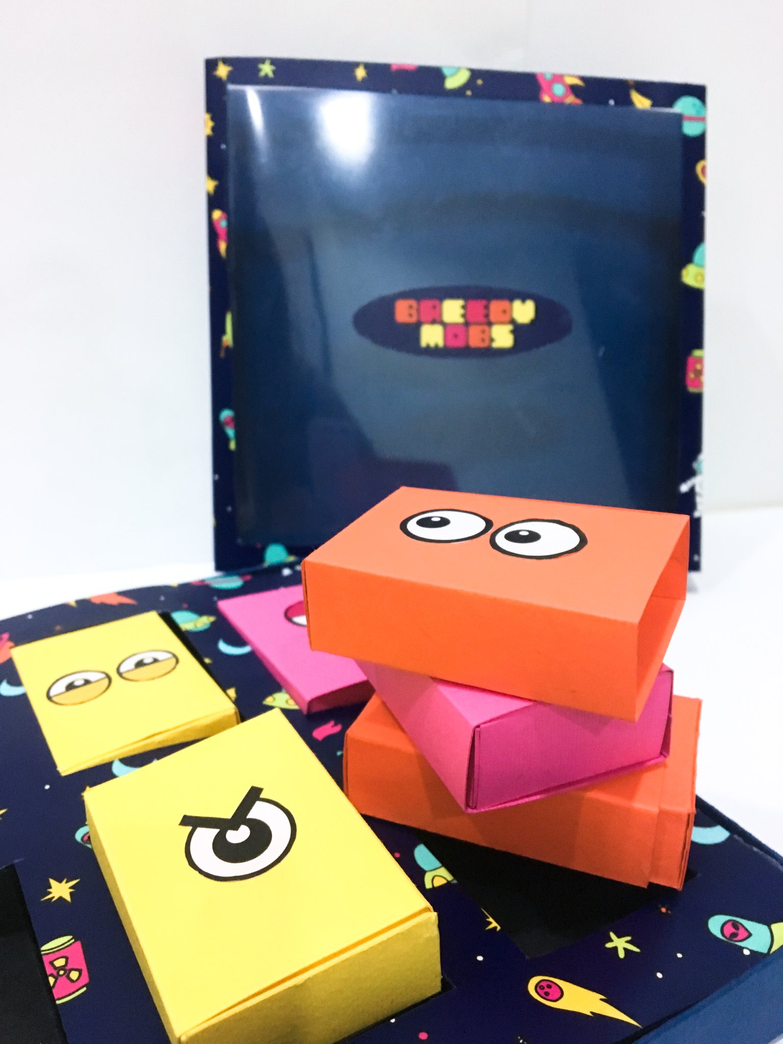
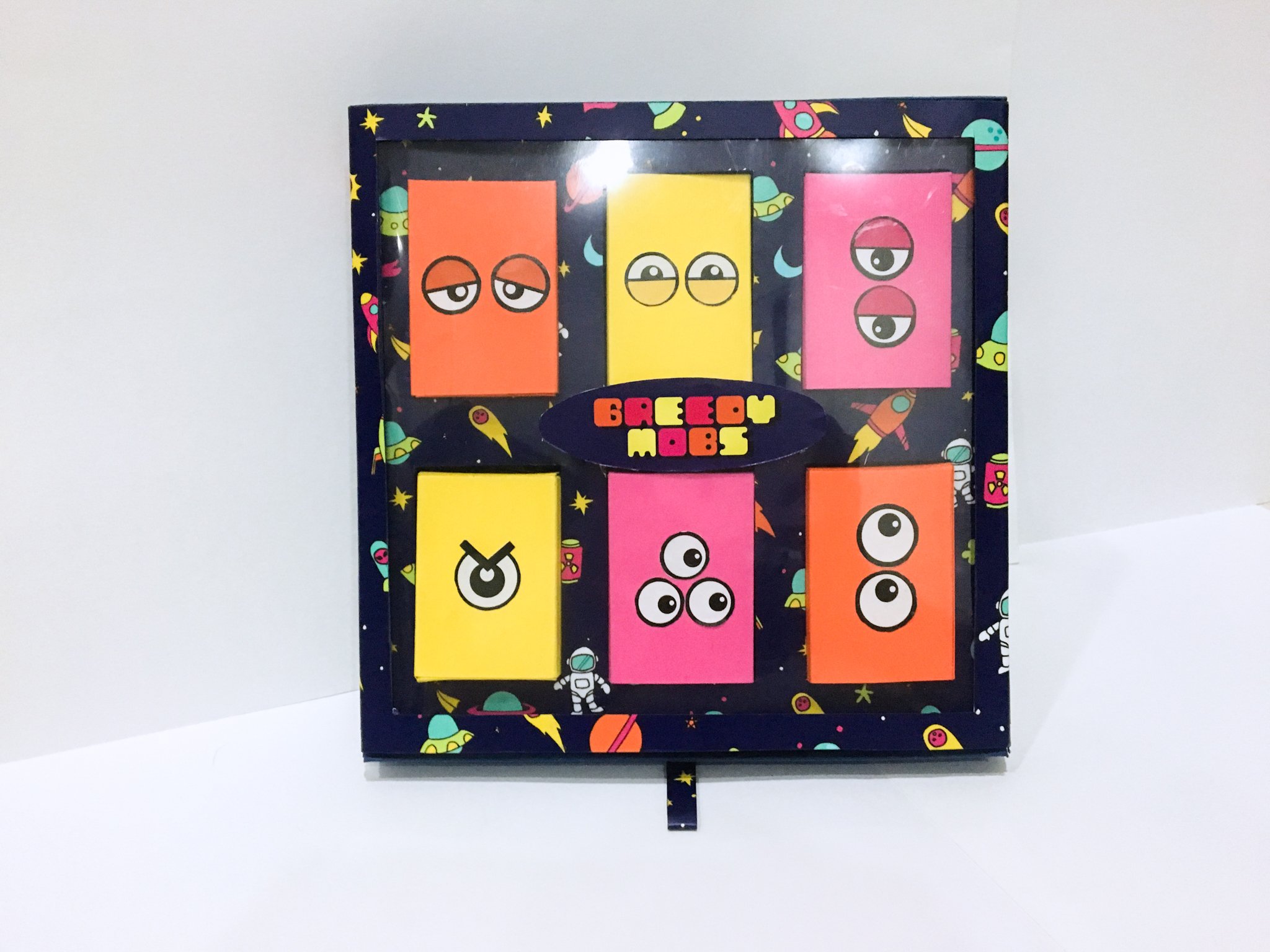
Greedy mobs
For my packaging module, I was tasked to design packaging catered towards kids that was themed “mini-monsters”.The concept I came up with was to create a box of candies, where the packaging can be reused. The packaging had 4 parts- the sleeve, base, insert, and candy boxes. I went with an alien theme and illustrated the print that was applied all over the package and also designed 6 different alien-themed friction lockboxes to package the candies. The sleeve acted as the base of the board game, and the playable characters can be found inside the candy packaging. This project taught me a lot about the effort that goes into designing aesthetic packaging and the different ways it can be functionally designed.
For my creative industry presentation, I picked the artist, Mearone. The artist displays his work mostly on his website. He also shares the creative process of some of his more iconic works on YouTube. Overall, all his online platforms are being used for different purposes. He uses social media as a means to channel viewers to his website where he has a store, portfolio, and contact information. In his Biography, he sells himself based on the amount of experience he’s had in a specialized scene in LA. He also names some of his iconic works and the themes he likes to cover in his work such as philosophy, politics, and mythology. The biography is then summed up by’ this statement, “MEAR ONE helps us envision the sublime spirit of our time – not by escaping reality, but by confronting it head-on. “. This intrigues me and transitions me into looking at his portfolio to decipher the messages behind his works.
For this assignment, I chose to focus on an American graffiti artist MearOne, also known as Kalen Ockerman. MearOne has been at the forefront of LA’s graffiti and mural culture for 30 years and is known for building the bridge between graffiti and fine art. He creates surrealistic, controversial, and thought-provoking works of art, which are usually more than what meets the eye. MearOne creates powerful narratives through his artworks, which involve philosophy, ancient mythology, and modern politics.He combines content and forms to explore the human condition. He has a signature style that includes geometric shapes, magical colours, and mythical figures which interact seamlessly with the natural world. His surrealistic paintings evoke tranquillity, mysticism, thoughtfulness, and wonder, which seeks to share what he sees in the world around him to his viewers. The intricate details in his work draw the viewer in, encouraging them to dig deeper and decipher its many messages.Although his popular artworks are mainly murals, he also does prints, digital work and applies his artwork on various merchandises.By using his art as a medium, He expresses his opinions on current world affairs and aims to spark conversations on the deeper meaning behind his work.
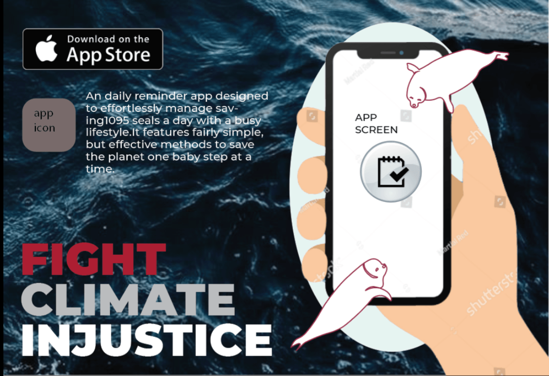
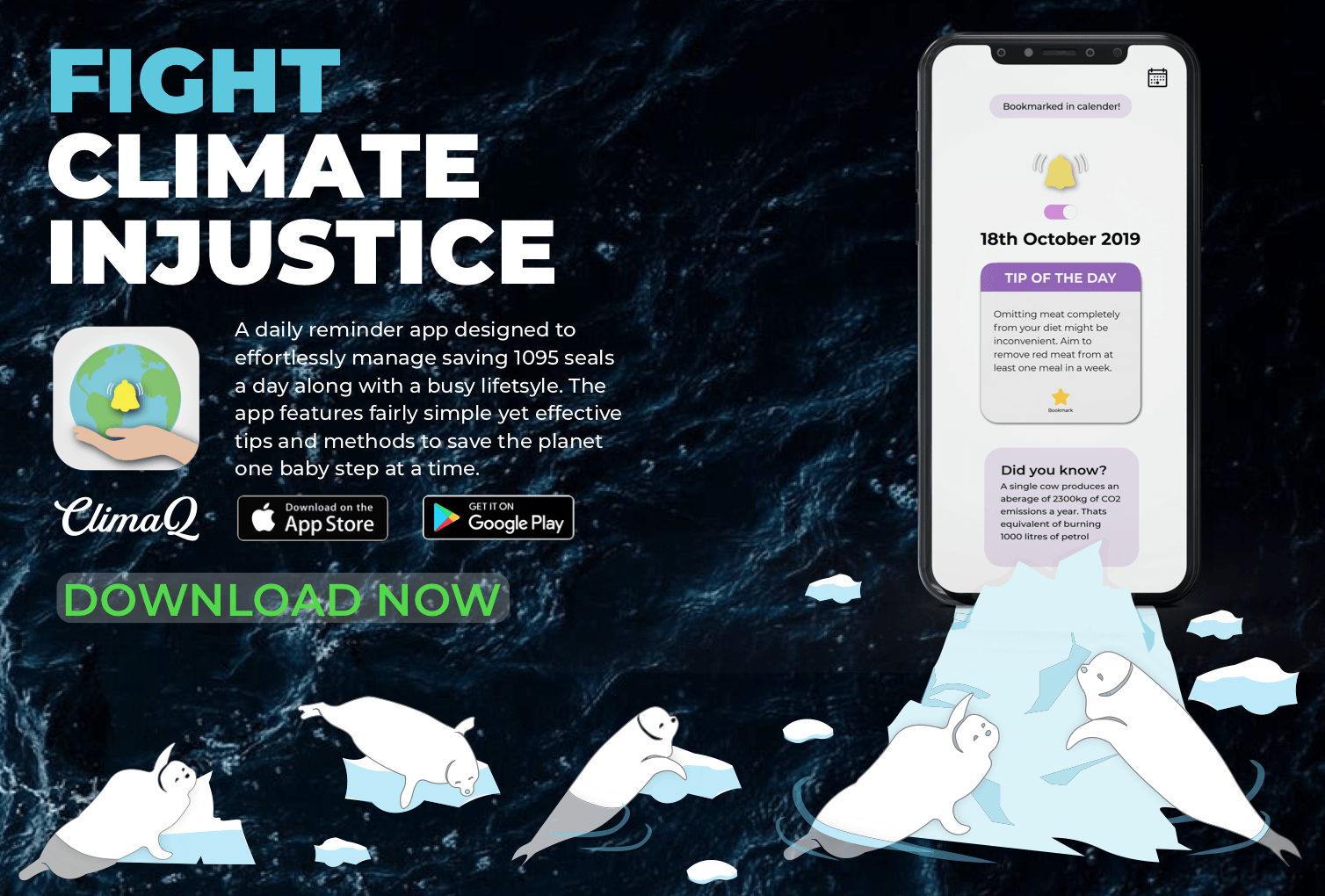
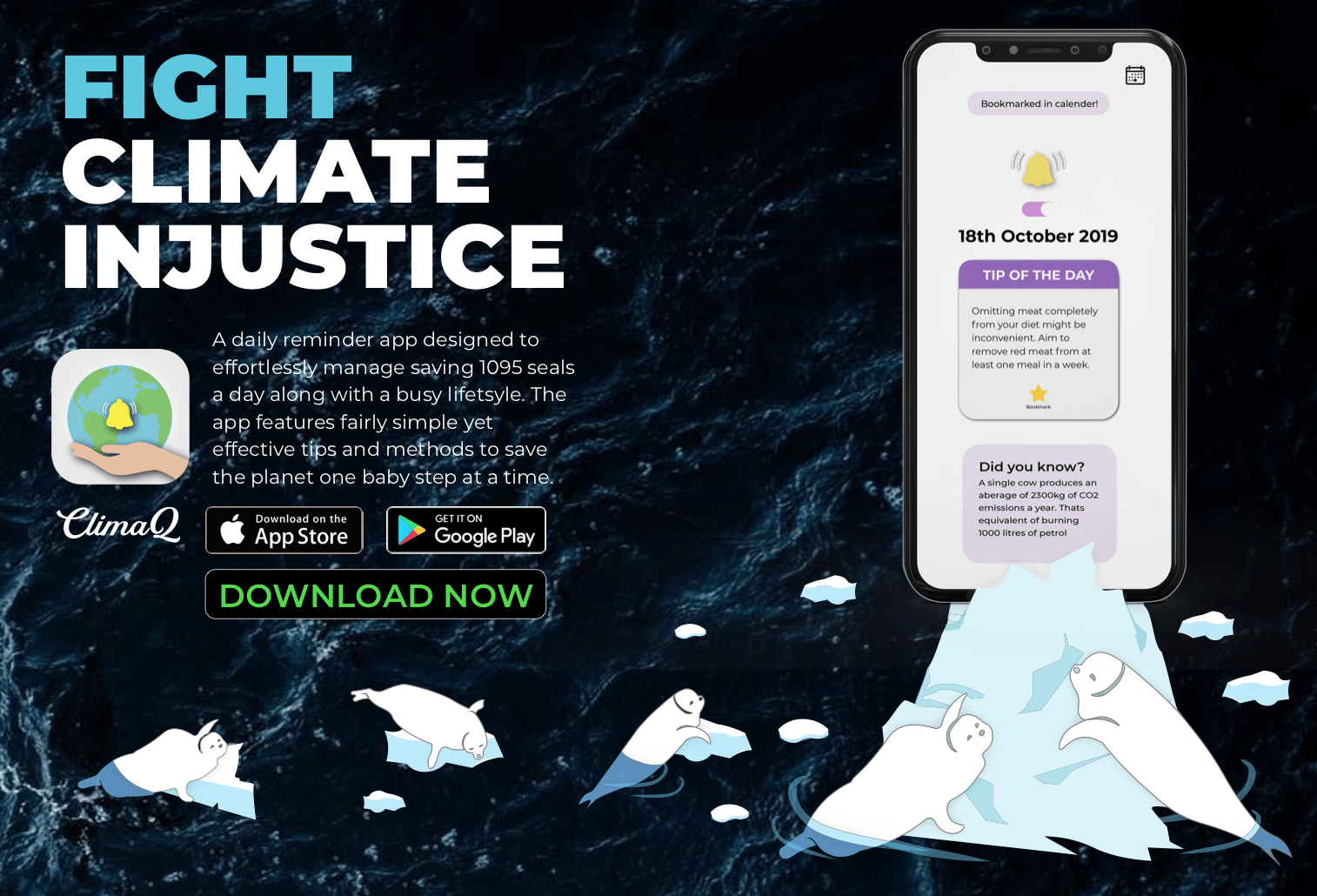
Following the poster, I wanted to create an app that will help individuals incorporate curbing climate change as a priority in their lives, while keeping it super simple yet effective. I would want long term efforts that are convenient so the purpose is to not get its users to give up easily, also reminding them daily of things they can do to help the planet. I decided to promote this app by creating a flyer. To maintain the coherence of the 3 deliverables I wanted the flyer to be a “bridge” to the app. The app looks completely different to the poster so I wanted the flyer to have elements of the poster as well as the app.
This was the first draft of my flyer.
The initial idea was for the phone to be on a ice cap where the seals would seek refuge on it also the app.It included the app icon the brief description of it as well as the title.I was given comments on how the call to action was missing as well as the illustration was not very clear.This led to my second draft.
I removed the red in the title as I thought it was too jarring and shifted the title to the top. I clarified the illustration, however I struggled with the scale of the iceberg and showing that it was melting and the seals were dying.To that, I was given comments on playing with the scale of the seals in relation to the ice bergs and also adding in more seals.Prof Michael gave me feedback on how I should compartmentalise my content into “rectangles” so the eyes would perceive it as one unified section instead of confining my title and the app description to the corners of the page.There was also random empty spaces in the middle of my work that was un appealing, so aligning and compartmentalising was a key to eradicate this problem.This was to make it look more balanced and aesthetically pleasing. I was also told that my iceberg, seals as well as screen were white so it was confusing for viewers to clearly define the elements.I was missing the app name as well as a android download option.This led to my next revision.
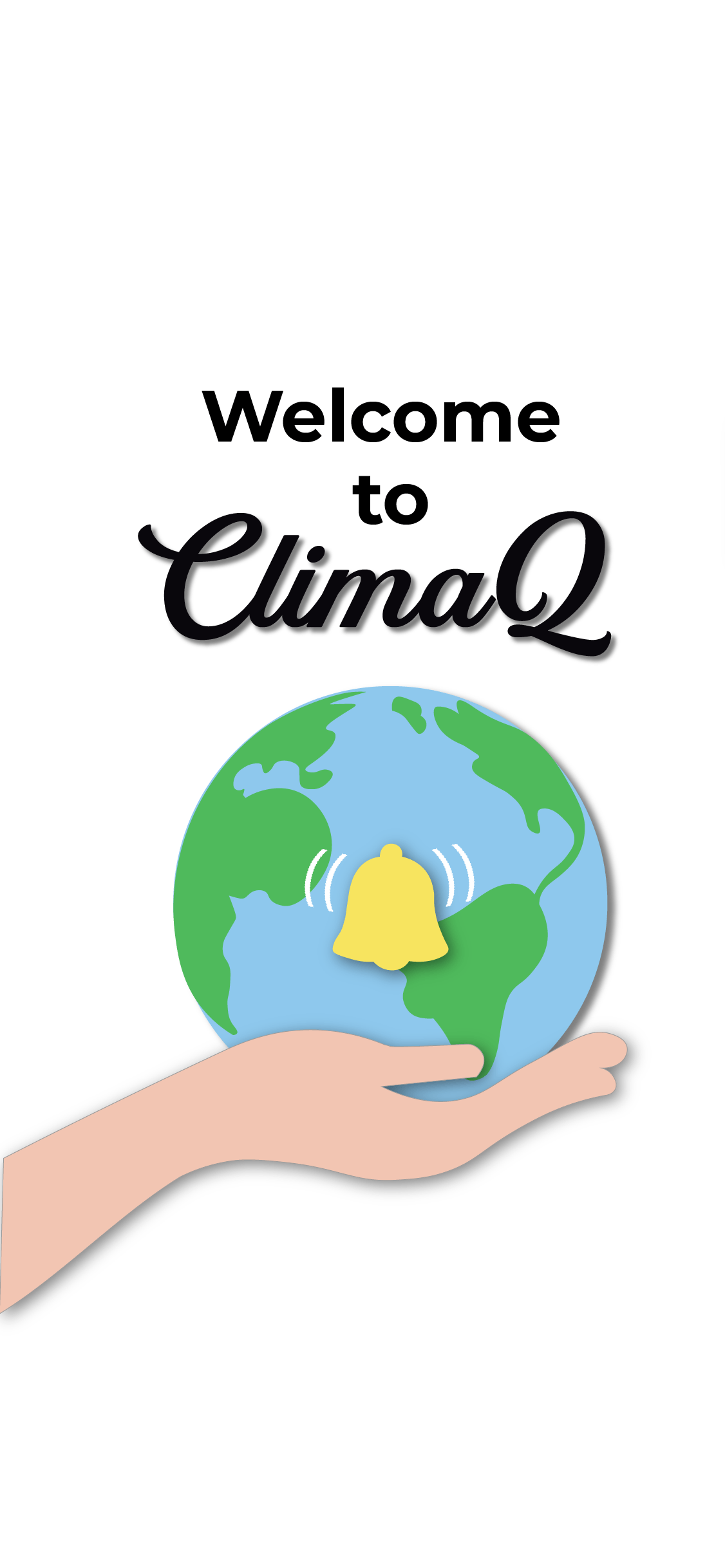
I tried to balance the text elements with the illustration element by creating 2 balanced “rectangles”. The content took up a rectangle on the top left while the illustration could span across the bottom in an L shape as shifting the text freed up space on the bottom.I decided to name the app “ClimaQ” , “Q” being a short form of the word cue, suggesting a notification/signal. I was told to use the 1/3 proportion to align the “ClimaQ” within the set rectangle to make it look less out of place as it didnt align with the description neither did it with the download options. Also I wanted to neaten the jagged edges of the app description.Although the illustration was clearer upon adding more seals and changing the colour of the icebergs, I was suggested to play with the scale alot more to create a push and pull effect, creating a foreground and background to have depth in my illustration.I had to adjust the colours of the seals in water to blue so it would be more natural.I added a faint grey outline around the iPhone to make sure that the black parts of the phone were not lost to my background image.My final flyer is below.Similarly to my poster I would improve on my alignments and my margins.
ClimaQ App mockup
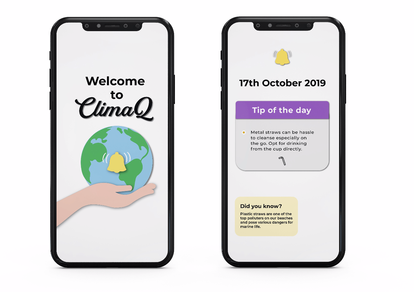
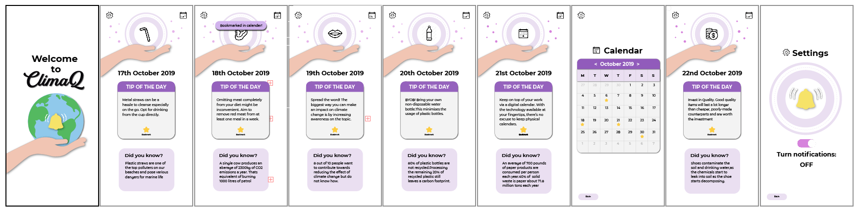
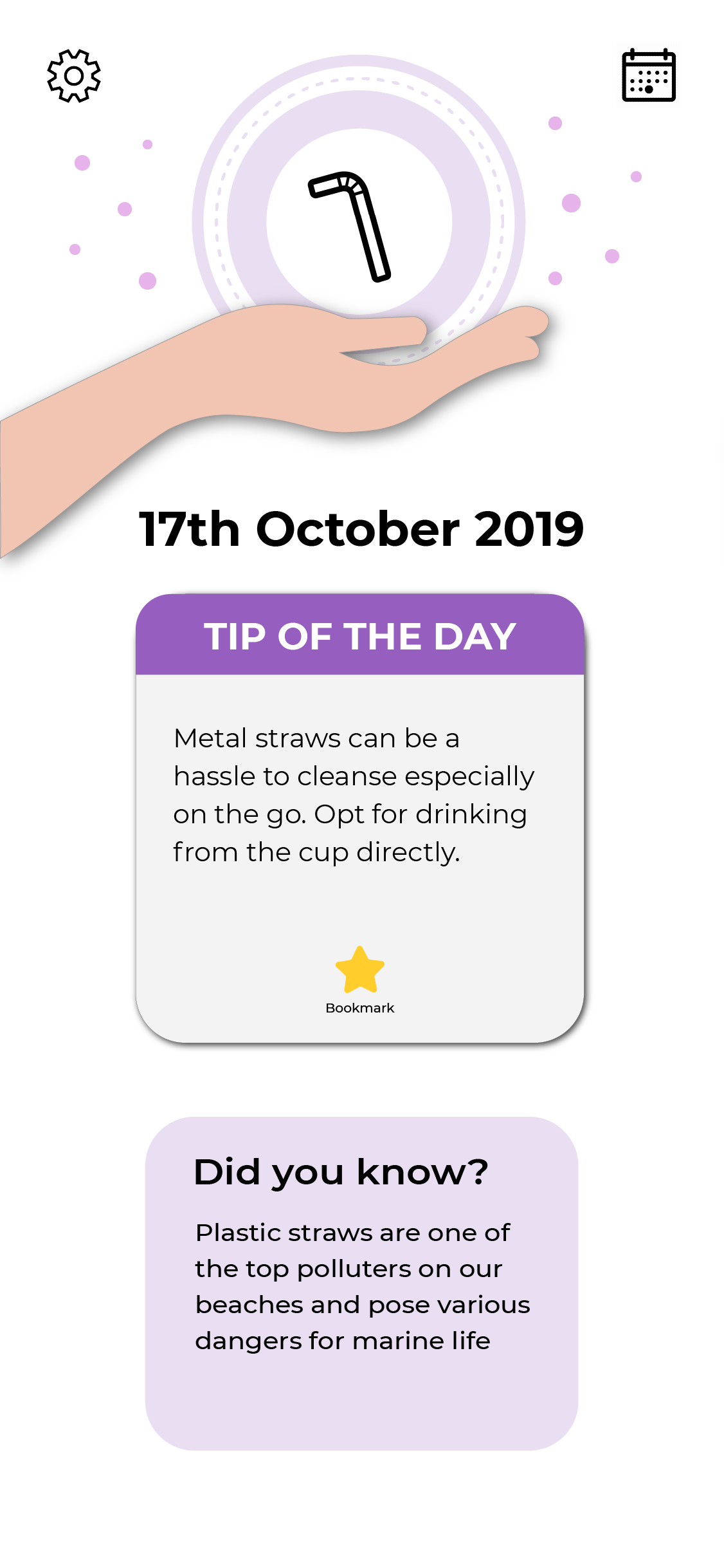
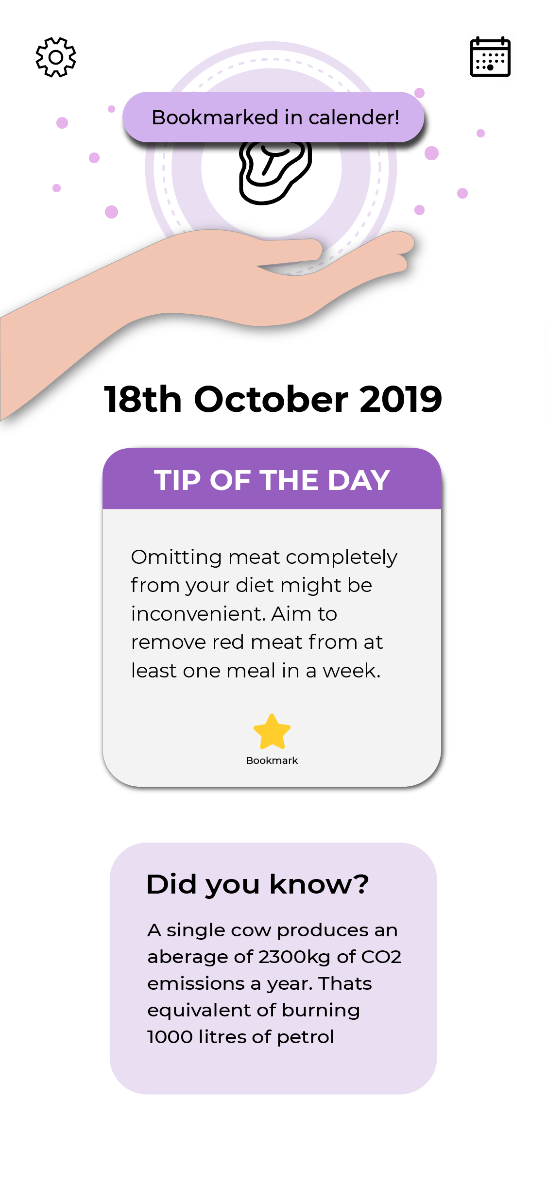
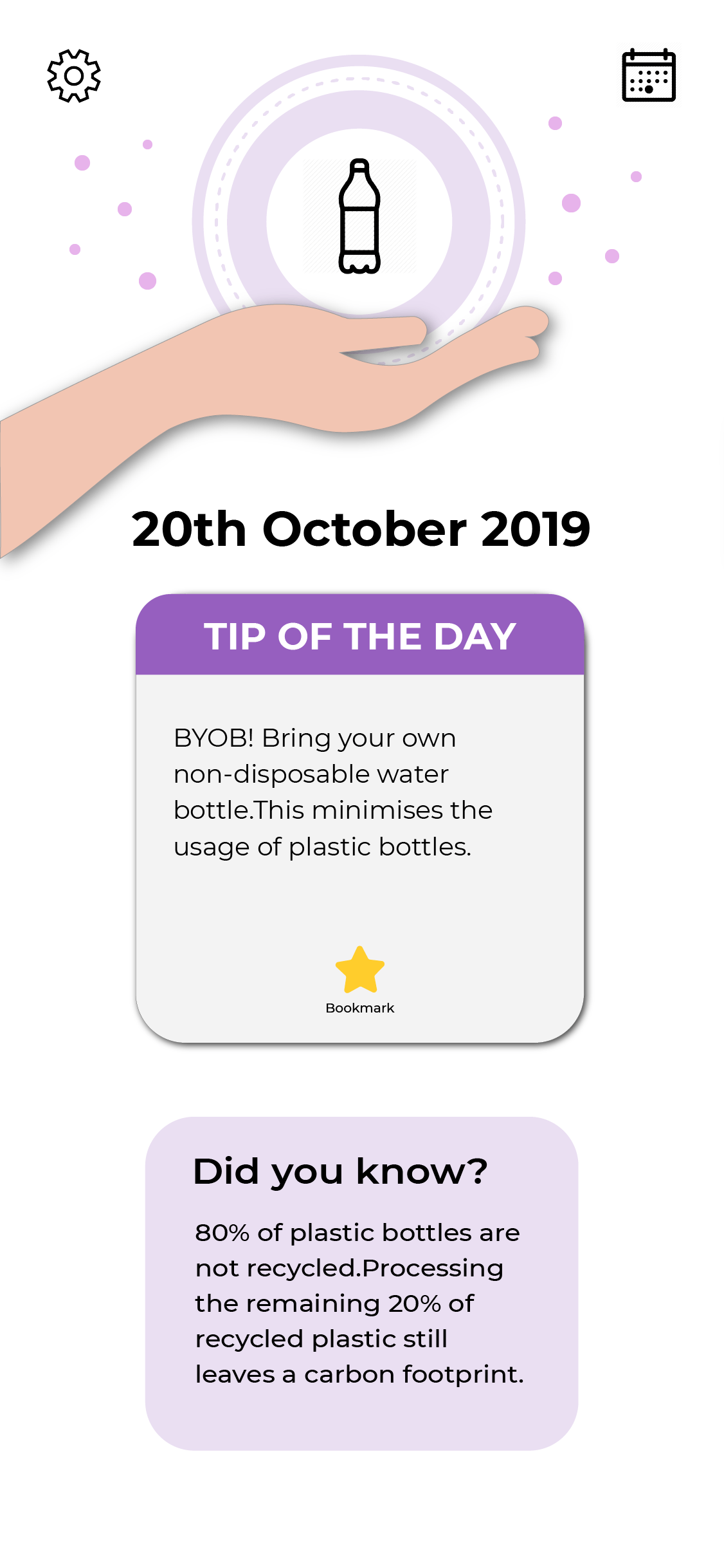
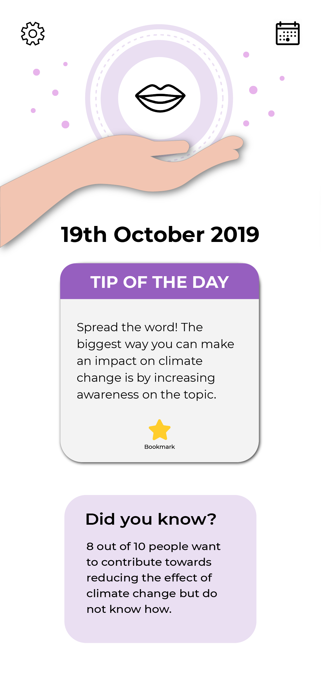
ClimaQ is a daily reminder app designed to notify its user everyday with a simple tip that they can incorporate into their daily lives. So each day will present a new tip to its user with an interesting fact about climate change to deepen their understanding about the main topic of climate change.This was my first draft of the app.I didnt want the app to just be related to the idea of seals even though that was the focus of the poster.I want the app to be about curbing climate change in general and remove that specific focus on the seals.
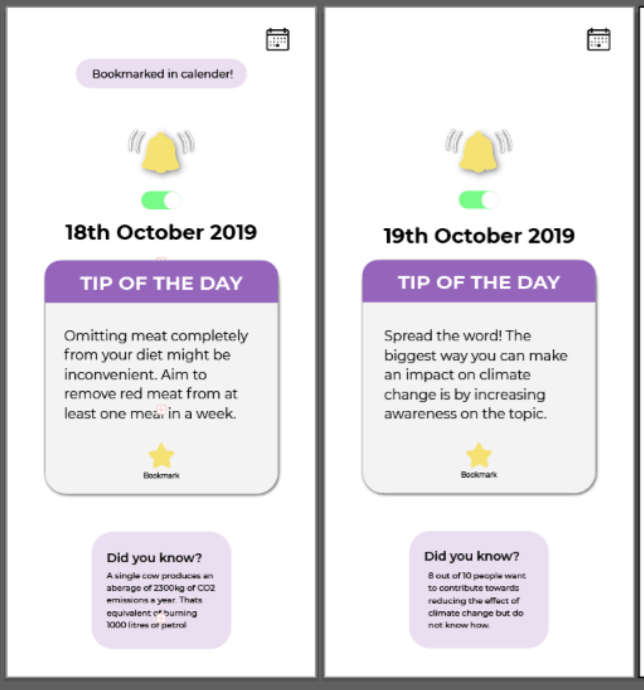
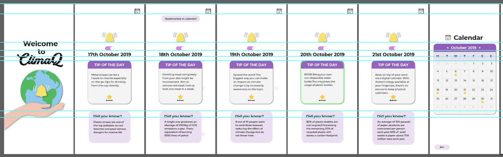
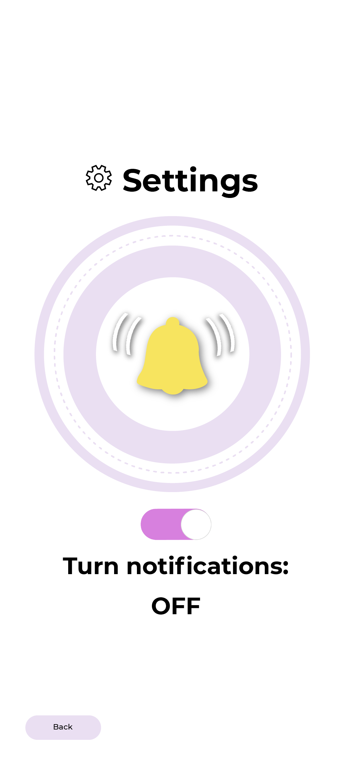
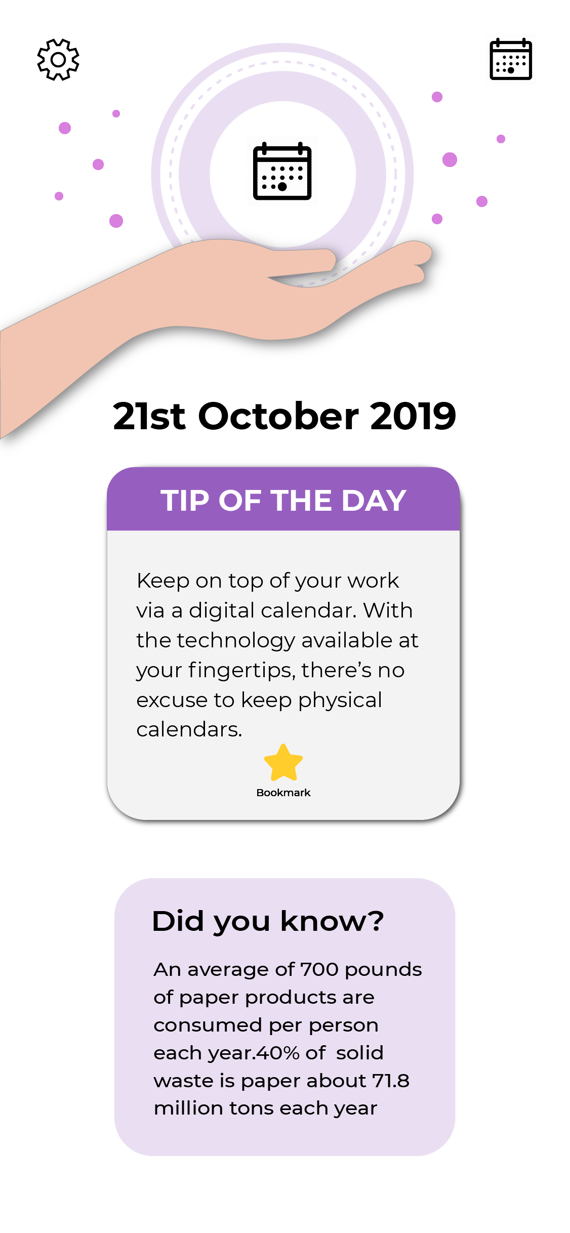
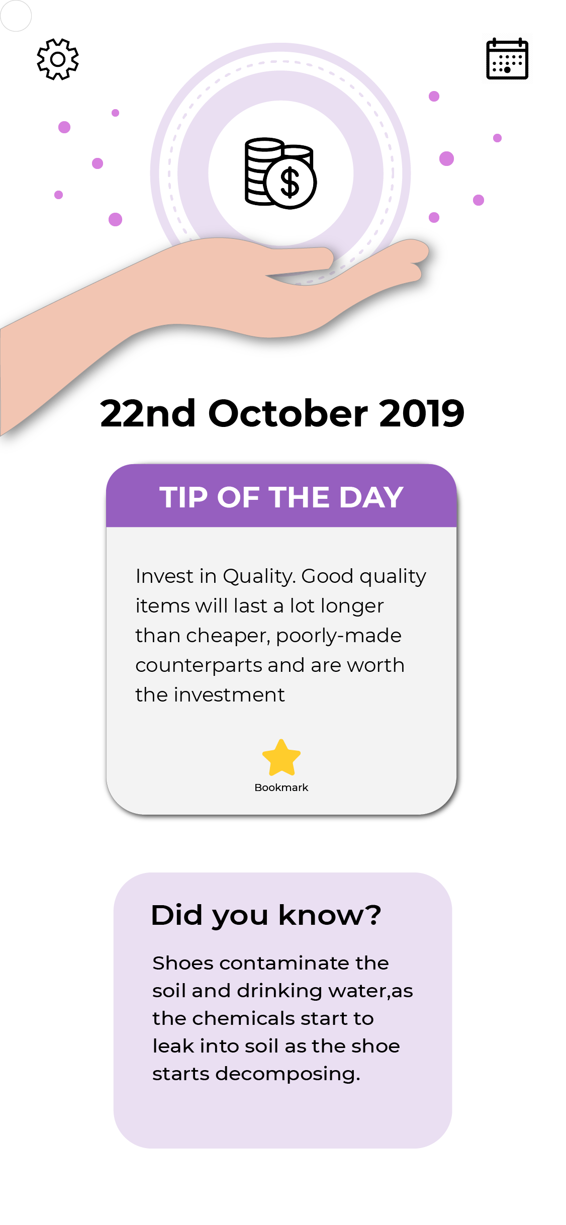
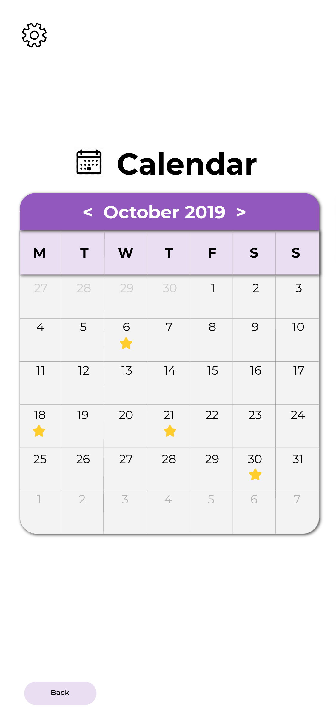
I designed the home page with a hand, globe and also a notification bell to give the idea of saving the planet is within our hands as well as the bell to signify notifications. The screen on the right is what I initially wanted each tip to look like. The bell above was a turn off/on function for notifications.I included an icon to give the user a quick idea of what the tip may be about as well as a “did you know” section to keep them interested in the app.I was prompted to think of a way to match the colours better, instead of using purple and yellow. So I opted for a monochromatic colour scheme. As the “Did you know” was also rather important I increased the scale of the info box to the same size of the tip.I was also asked to think of a way of how users can revisit the tips that they like and keep track of their favourite ones. So I created a bookmark option and calendar as seen below.
I fixed the alignment issues as well as hierarchy and colour issues within my screens. I kept it to mainly purple and changed the colour of the notification slider to purple instead of green as it was too jarring.The yellow stars were also not visible so I changed it to orange to help it stand out. The bell motif was very repetitive through the app screen, so I decided to switch it out for graphics to make it more visually interesting for its users and shift the bell to a separate settings page. This resulted in my final app screens.The feed back I received was that maybe since I had seals in my poster that I include some within the graphics of the screen as well as make the graphics more visually exciting instead of plastering the hand on every page.Overall, I had lots of fun embarking on this journey in VC2 and I feel like I managed to fill alot of the gaps in my graphic design knowledge that I can take away with my into other aspects of my life.I was given useful criticism by Prof Michael and my classmates that really opened my eyes to the spectrum of design possibilities and my own problems that reflect through my design.
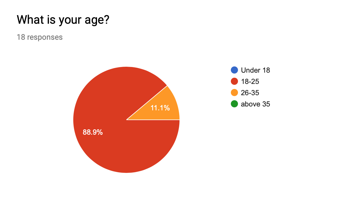
After researching the 4 topics, I narrowed down to climate change and it will be the focus of my infographic poster as well as my next few deliverables.Within climate change I had a few subtopics that I wanted to explore while researching, namely, bleaching coral reefs, the melting ice caps and how the trash in the ocean affects climate change.Before diving into these subtopics I wanted to see the current attitude and understanding of my target audience (18-25) so I could cater the content within the poster more effectively.
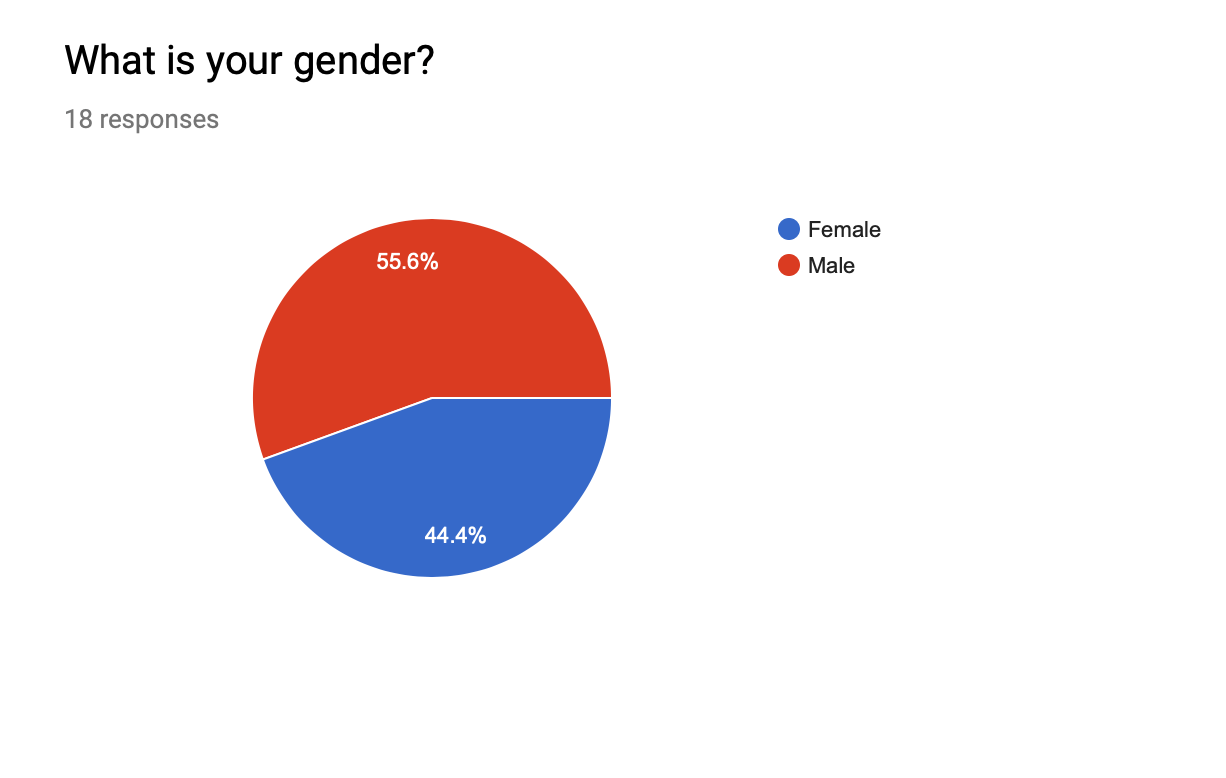
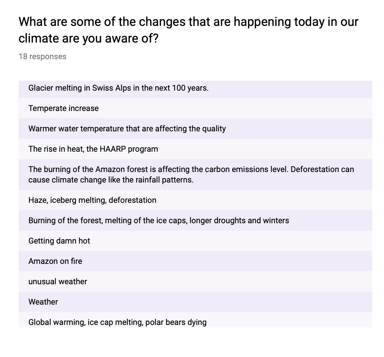
These are the questions as well as the responses of my survey.
Majority of those who participated in the survey are male.So this encouraged me to keep the design a little bit more “masculine” By using a bold fonts, graphics and avoiding softer girlier colours.
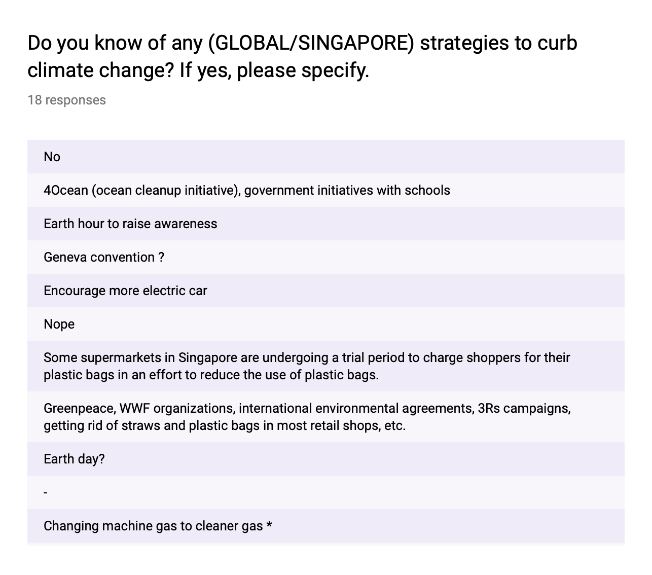
Here we can see that the target audience understands this is a pressing issue and their concern towards it. They also have some form of understanding on some of the factors causing climate change such as deforestation, extinction and melting ice caps.The most popular topic seemed to be melting of the ice caps.
This confirms the need for me to spread more awareness on the topic of climate change using my infographic poster. In my poster I want to cover a few statistics as some shocking facts going on in the current world of today to deepen their understanding on the effects of climate change.
Out of the 18 responses 10 participants are leaning towards Individual efforts are quite impactful against climate change. This makes me believe that these participants understand that as individuals are able to make the change, where the most impactful option “10” gathered 4 votes.
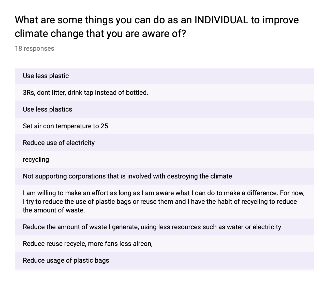
Most of the participants showed a lack of awareness in individual efforts besides reducing plastic, electricity and recycling.So even though they knew that climate change is a pressing issue and individual efforts are impactful in combatting it, they didn’t really know how to go about working towards it other then the ways mentioned above.There are more simple and effective ways an individual can engage in without it being to inconvenient which I will cover in the later deliverables.
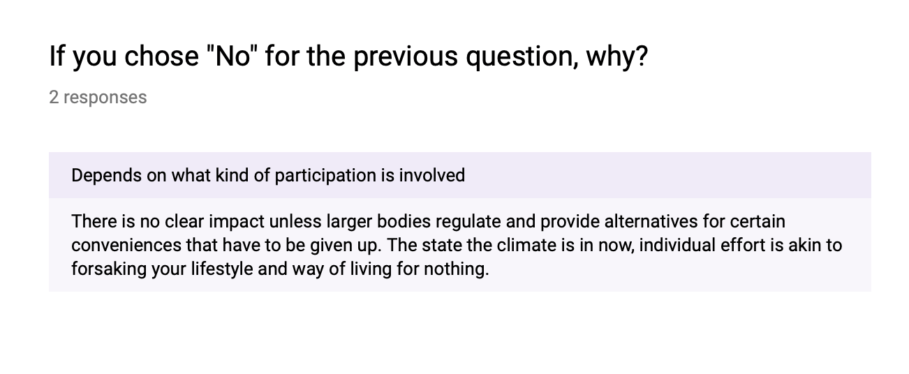
“Individual effort Is akin to forsaking your lifestyle and way of living for nothing” was a concern raised by a participant. Although this is a valid point whereby the damage we have done to the planet requires so much work that an individual himself is unable to rectify, it forced. me to think of ways to encourage people to participate in individual efforts without feeling like they are “forsaking” their lifestyle for nothing. So simplicity and convenience was a key factor in my project.
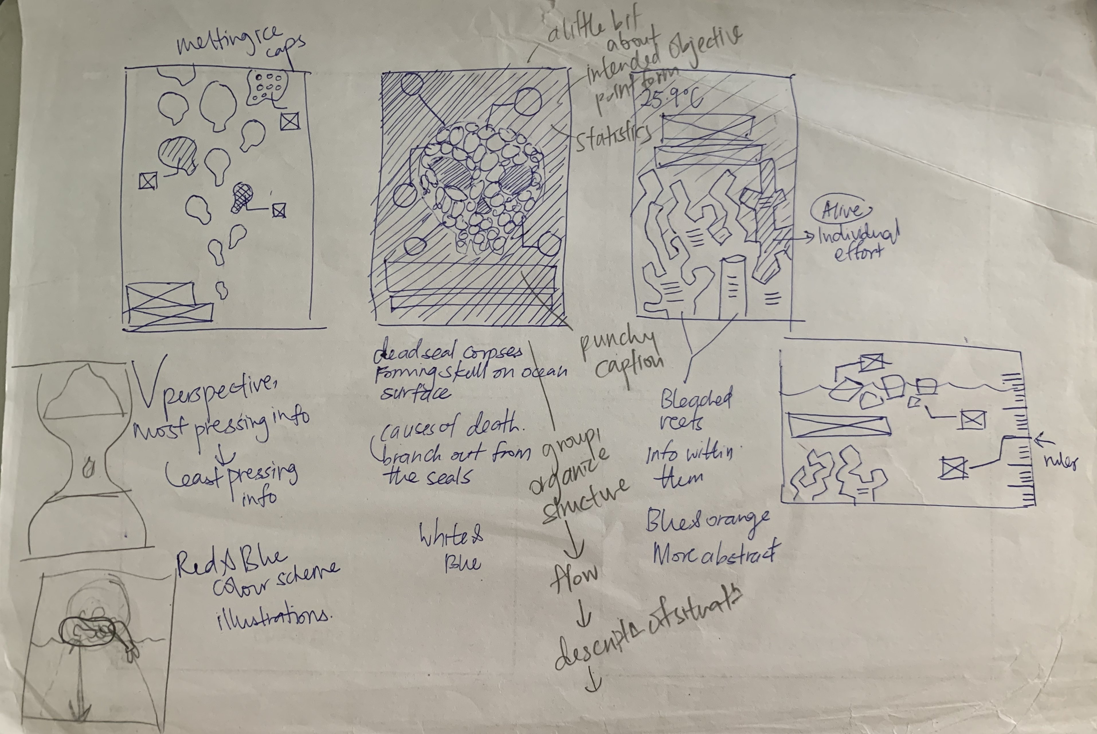
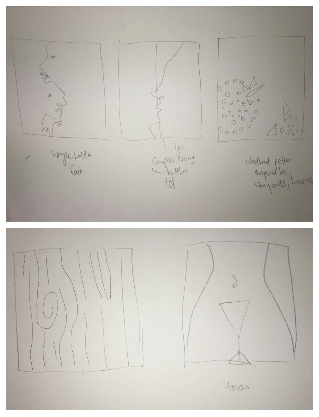
After analysing the results of my survey I proceeded to do a sketch on each of the 3 subtopics I wanted to explore in order to decide which one I can execute the best and was powerful in its imagery.My sketches are below.
From left to right : An abstract interpretation of melting ice caps, skull symbol made with seal bodies, bleaching of coral reefs.
I intended on exploring the forms and scale of the melting ice caps on the life in the north pole, while using a downward perspective to direct the readers eyes from the most important info to the least important. The title would take up the bottom left of the poster.
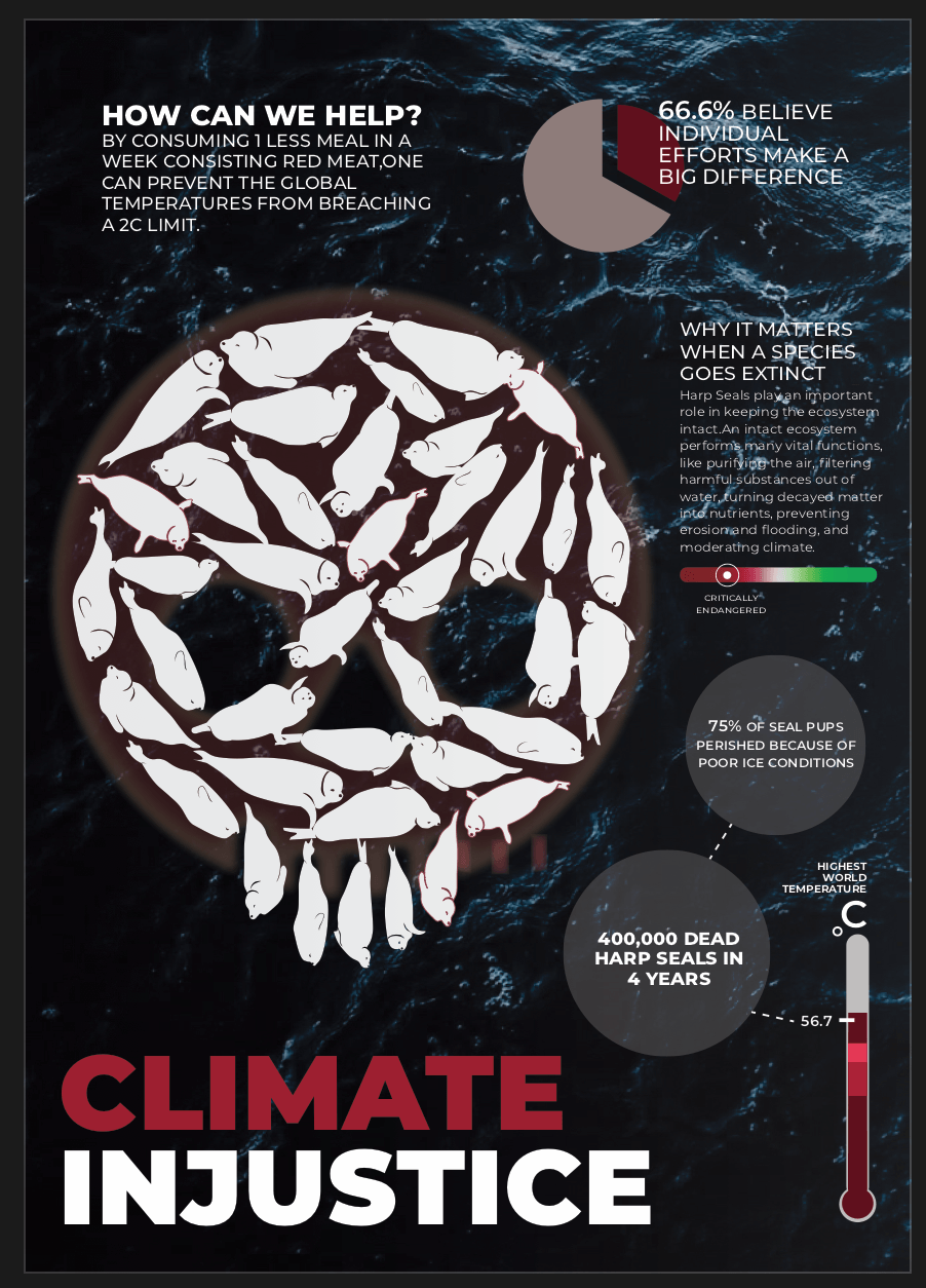
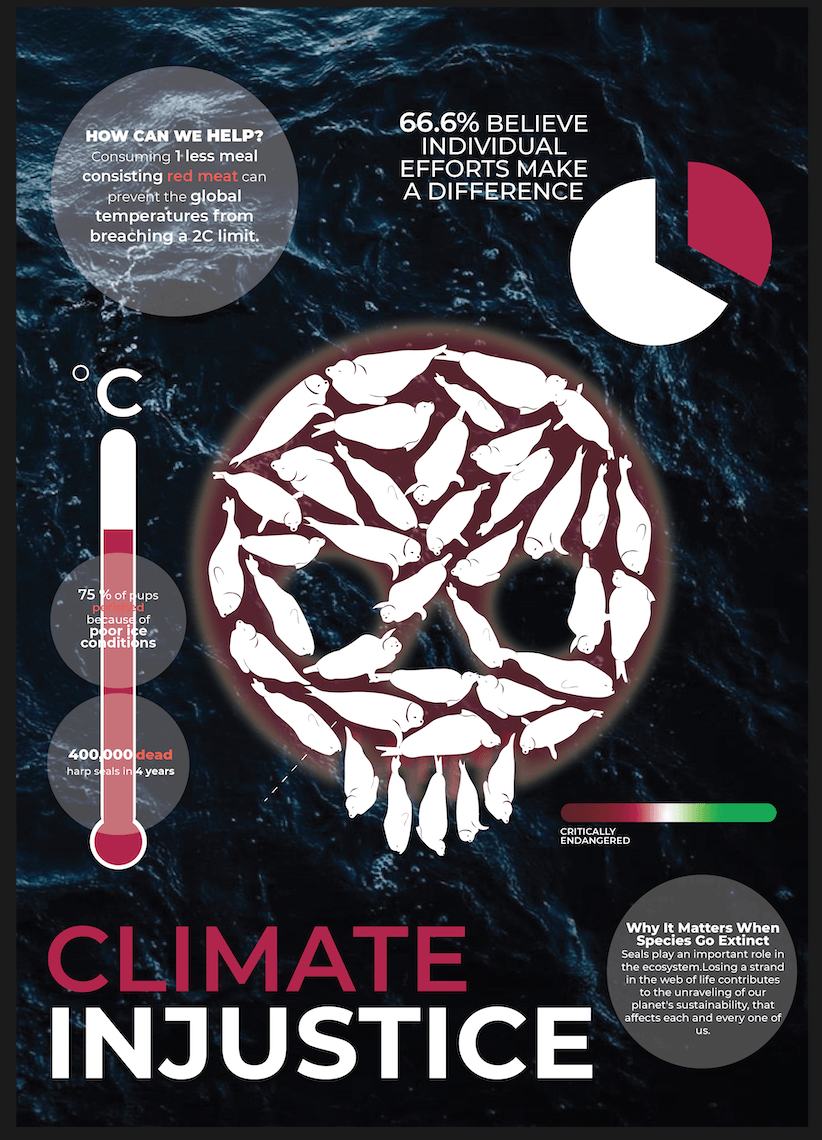
using a skull symbol to depict the idea of death and destruction to show the detrimental effects of climate change in this case the extinction of harp seals. The info will be clustered around the skull and each seal will point out to information regarding the “death of the seal” which is also a impact of climate change.
A literal depiction of bleached coral reefs under the sea.Each coral reef would contain a piece of info regarding climate change. One non bleached reef to depict how individuals can contribute in saving the reefs and in turn the eco system.
I felt that the second option was the most powerful in depicting the concept of climate change. I proceeded to create an initial digital sketch of it below.The ovals represent the seals and the scale of the skull in relation to the poster is the portion for the illustration.
I received feedback from my classmates as well as Prof Michael.The idea of the death of the seals were not clear, my title caused some confusion because of the lowercase “in”. There was also no clear flow , where do I lead the readers eyes? The readers randomly reading from different parts of the poster, so I had to think of a way to link pieces of information together as well as fix the visual hierarchy of the content.I also had alignment issues because my skull was in the centre which restrained me in how I could position my information. There was a lack of space hence I could not get in more content into to the poster.There were some unnecessary details around the circles containing the info as well as my colour coding for the text within them. There were too many weights, colours which distracted readers from the true focus of the message in each of the circles.There was also a lack of icons and images to accompany the information to help readers visualise the content.
This is my second digital sketch of the poster with adjustments made.
After adding in the pie chart, thermometer and other chunks of info around the skull, I felt that the poster became too cluttered.There was a lack of hierarchy still. I used a split complimentary colour scheme to make the colours more balanced.The images also were too jarring in scale and clashed with my information. I still had a lack of space for the information hence the lack in the content.Therefore, I decided to ditch the idea of having the skull in the middle to free up some space as well as scale down the images and pie chart , Resulting in draft 3/ Final below.
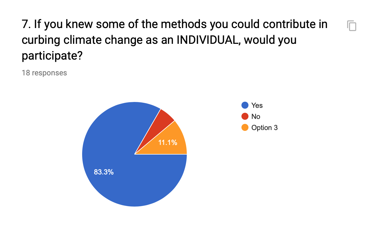
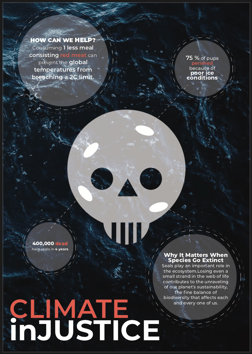
Reducing the scale of the images, as well as shifting the skull allowed me more room to beef up my content. The hierarchy is also clearer from the title, to the right where the thermometer is placed, following the leading lines upwards in an upside down “L” formation.It can Also be read from top down after the title as the section of info in the extreme top left is the biggest in scale.I wanted it to one of the main takeaways of the poster. How can people help towards curbing climate change? followed by 66.6% of people believe in individual efforts encouraging the readers to participate individually towards climate change.I also muted the colours of the pie chart as white made it stand out too much. Also for the texts, I removed all colours and instead created hierarch with font weights instead which made my content a lot neater as well as created a clearer sense of focus.If I could change one thing I would fix my aligning up and not make the margin too narrow.
1.What are some of the current issues confronting our world today?
1. Climate change
Climate change has always been a concern to many and in the recent days, it is becoming more alarming and prevalent of an issue in the eyes of society. As the greenhouse gases accumulate within the atmosphere, the surface temperature of the world rises causing the arctic permafrost to thaw. This further accelerates climate change as the softened soil is releasing vestiges of ancient life—masses of carbon enter the atmosphere as methane or carbon dioxide—that have been locked in frozen dirt for millennia. In turn, this hinders the natural biological development of wildlife, destroying the ecosystem and causing a massive impact on our world today.
Eg. Drowning of harp seals
In 2007, for example, more than 75 percent of pups in Canada perished because of poor ice conditions—in 2010, almost none survived, Johnston said.
Eg. Slowing down of hurricanes
“Nothing good comes out of a slowing storm,” says James Kossin, “It can increase storm surge. It can increase the amount of time that structures are subjected to strong wind. And it increases rainfall.”
Eg. Bleaching of coral reefs
In half the sites surveyed, live corals populated less than one percent of a given reef. At 80 percent of the Samoan sites, live corals were below 10 percent. The scientists estimate that these reefs may have previously had live coverage between 60 and 80 percent
Progressively over the years , there is an increase in awareness and understanding about drugs such as marijuana, and the relationship it has with mental health. More people slowly became exposed to it and its benefits, proven and tested by scientists all over the world. One cannot deny the medicinal properties that marijuana has on its consumers and liberalising it would benefit the society in many ways. Instead of criminalising marijuana consumption, which results in a disproportioned incarceration rate (The United Nations reports that, by the beginning of the 21st century, an estimated 185 million people over the age of 15 were consuming drugs globally) and illegal drug trafficking, we could shift our perspective to see it as a form of medicine and understand that legalising it could potentially save many lives.
Number of new drug abusers remains high, CNB figures show
While the number of drug abusers arrested fell from 3,265 in 2016 to 3,089 last year, about 40 per cent of them were new abusers.Of the 1,249 new abusers arrested, about 64 per cent were below the age of 30.
Cannabidiol, or CBD, is a natural compound that has gained popularity in recent years, thanks in part to a growing body of research into its potential health benefits, which may include treating depression. The initial results of some studies into CBD and depression look promising.
Depression was the most common mental illness in Singapore (among the conditions assessed in the study), with one in 16 people (6.3 per cent) having had the condition at some point in their lives
Our planet is now in the midst of its sixth mass extinction of plants and animals — the sixth wave of extinctions in the past half-billion years. As of 2019, there are too many animals that are on the critically endangered list because of human behaviour. To sustain the growing human population, we poach, we contaminate bodies of water, destroy forests and the habitats of wild animals.The extinction of a single species not only means that we no longer get to co exist with them but it also accelerates the rate at which other animals within the food web go extinct too.This contributes to the unraveling of our planets sustainability. Fortunately, conservation efforts around the world are bent on helping these endangered animals revitalise their dwindling populations through a variety of humanitarian efforts, including curtailing illegal poaching, halting pollution, and habitat destruction, and curtailing the introduction of exotic species into new habitats.
Why does it matter when species go extinct?
“A single species’ disappearance can, in fact, make a huge difference on a global scale. Like pieces of yarn in a woven tapestry, the removal of one can start unraveling the whole system.When you remove one element from a fragile ecosystem, it has far-reaching and long-lasting effects on biodiversity.”
China’s medicinal tiger bones and rhino horns: Tradition or travesty?
Tiger bones and rhino horns may have a role in traditional Chinese medicine, but critics say that trendy health products with no medical value made from endangered animals are only a status symbol for the wealthy.
Colombia is the seventh most unequal country in the world and faces extreme disparity in terms of income. Where the top 10% earners receiving 39% of the total income in Columbia.The current laws and policies widen the income gap further.The inequality causes stark differences in the standard of living between columbians and this definitely bears its consequences on the columbian society. Since about 34% (12.7 million) of columbians live below the poverty line -earning less than $2 USD a day, they do not have access to food, basic healthcare and to survive ,are more inclined to contribute to the rampant illegal drug industries.
high child mortality rate
higher number of crimes
lack of basic healthcare
distributive conflict and social tension
Ineffective taxation laws?
” The personal income tax system in Colombia is regressive. This means that the richer you are, the lower is your tax effective rate. The Government proposes to overcome this problem by introducing a progressive tax system, i.e. to let the richer households pay a relatively higher effective tax rate. “
2.Why is the issue important? Who does it affect and how?
Global climate change has already resulted in a wide range of impacts across every region of the country and many sectors of the economy. Increasing temperatures, rising sea levels, extinction of animals, human health, deterioration of the atmosphere are just some of the many pressing issues brought about by climate change. It affects all life on earth, as it becomes increasingly disruptive throughout this century and beyond.
https://www.globalchange.gov/climate-change
3.Who do you need to communicate to and why?
Target audience:
Millennials aged 18-34 tend to generally be more interested and understanding of current affairs/progressive and it is necessary to mould and equip the current generation with the knowledge to change to world in whatever small way that they can. Have the power to contribute to small changes which eventually leads to a global change.In essence, the issues that I have brought up eventually affects the individual himself in one way or another. With an increase in awareness, these millennials may try to lessen the impacts of climate change in small ways,eg.using metal straws.If empowered, they would be more inclined to make changes to their lifestyle that would impact the world.
4.How has visual communication contributed to address the cause?
The loud contrasting colours create a bold and eye catching look which is necessary especially in increasing awareness.Yellow and black are used on roads and signs to draw attention to it. The font is a bold san serif, the boldness further emphasises the importance of the message and the san serif removes unnecessary distractions from the purpose of the text.Normally when I see posters related to climate change, very expected colours are used, like blue for the seas as well as green for the earth etc, however in this case its nothing related to those earthy colour schemes.
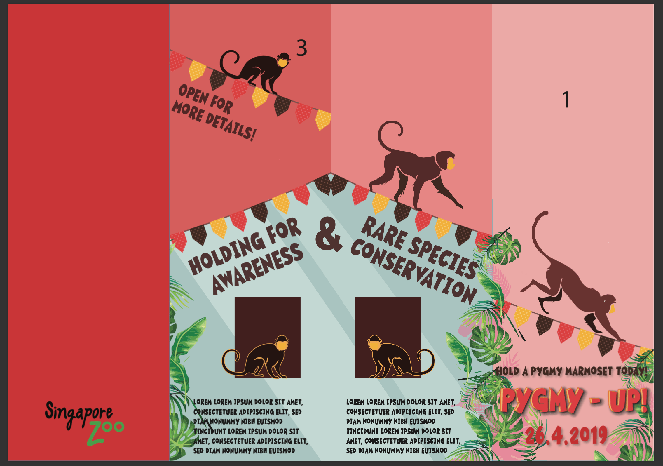
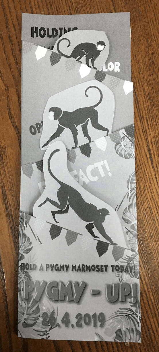
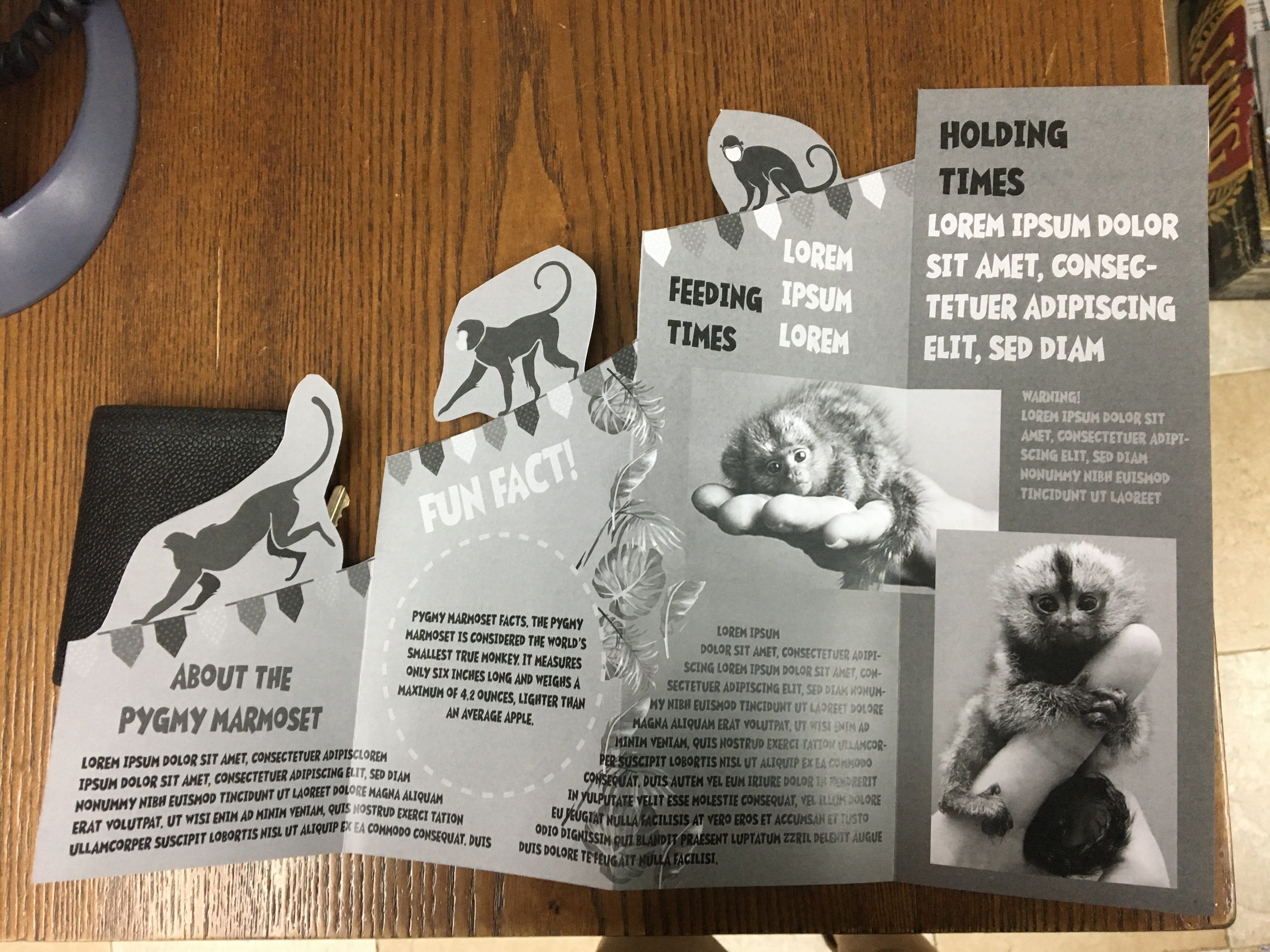
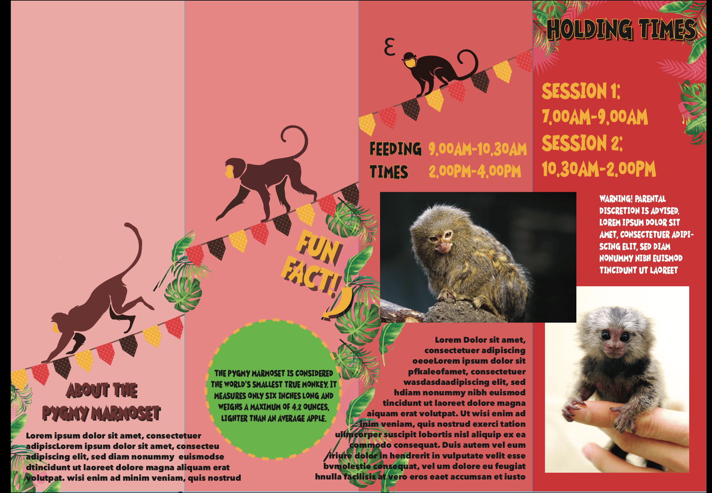
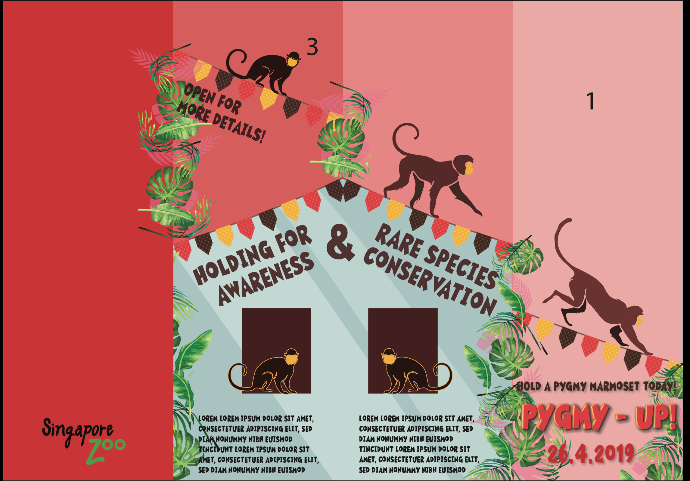
My initial idea when I began this brief was to create a card that would allow monkey to jump from one side of the card to the other upon being opened. However after researching, the mechanisms behind that technique were very advanced and I wanted something simpler so I could manage my time better.I decided to follow this tutorial to make a twist pop up card. The idea of the monkeys popping out as you opened the card i thought was very representative of the fun, playful nature of the monkey.
I realised the measurements given in the card tutorial were for a card thats of a smaller dimension.It was too small , so I had to double it in size. After doing so, the increase in size made the card itself to heavy which jeopardised the pop up effect and also my monkey cut outs made the paper structurally weak.
After consulting Lisa she suggested that I play with the layers that I have in my poster and I decided on an accordion folding technique.
I labelled the panels on both sides on the paper to make it easier for me to layout my graphics.I adopted my design elements from the poster and I achieved the results below.
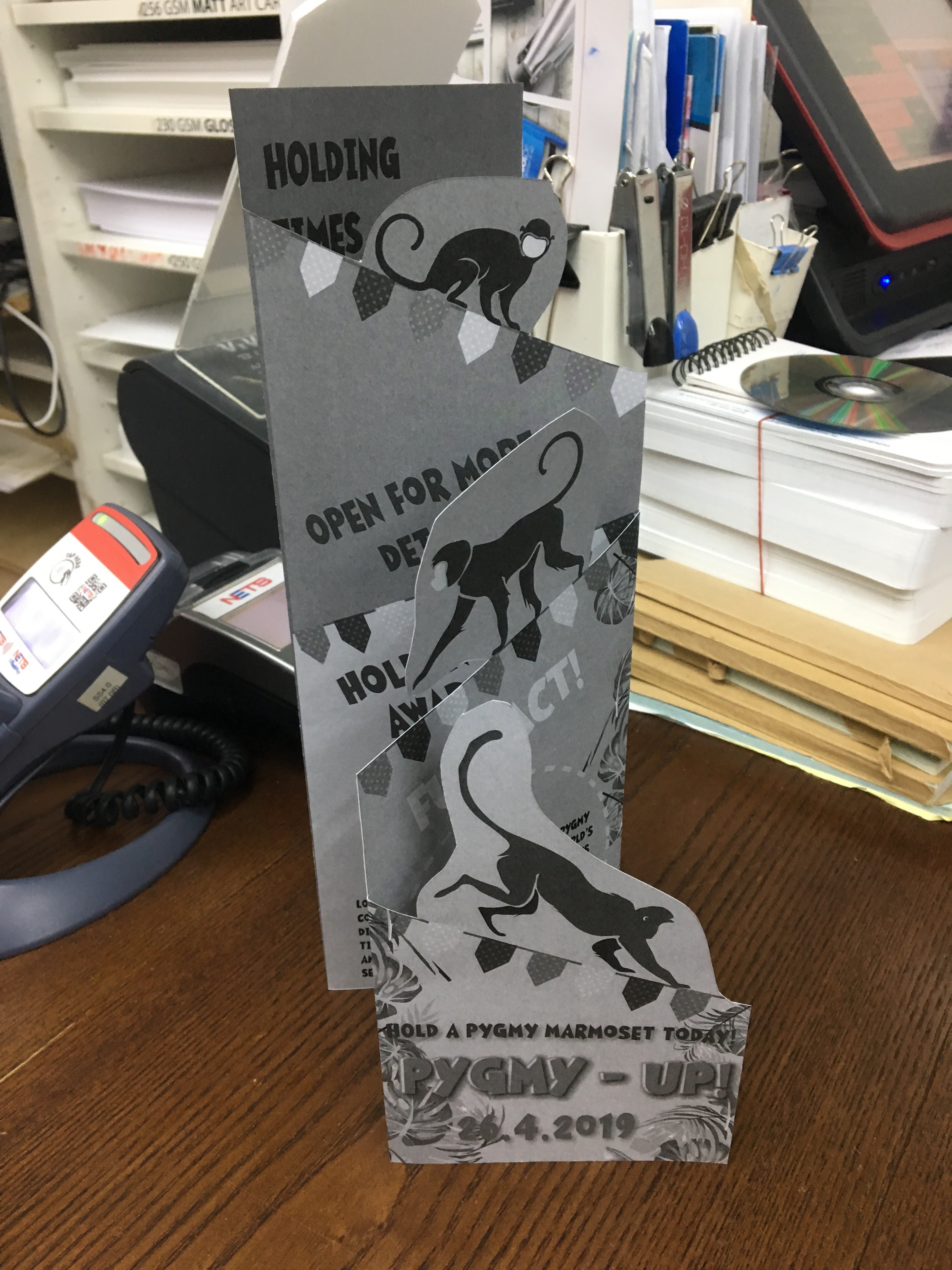
I proceeded to do a b&w test print and my layout issues were made obvious.The design elements from the pages behind the cover page were showing through and the monkeys were blocking out the texts beneath it.So I made the necessary adjustments and came up with a new layout
Also the font in my body text, graham cracker, existed only in uppercase which made reading very difficult so I opted for Avenir next bold instead.
With that I made few more minor changes to the typography to help them stand out more and also added more details to the blue enclosure illustrations.This led me to the final brochure.
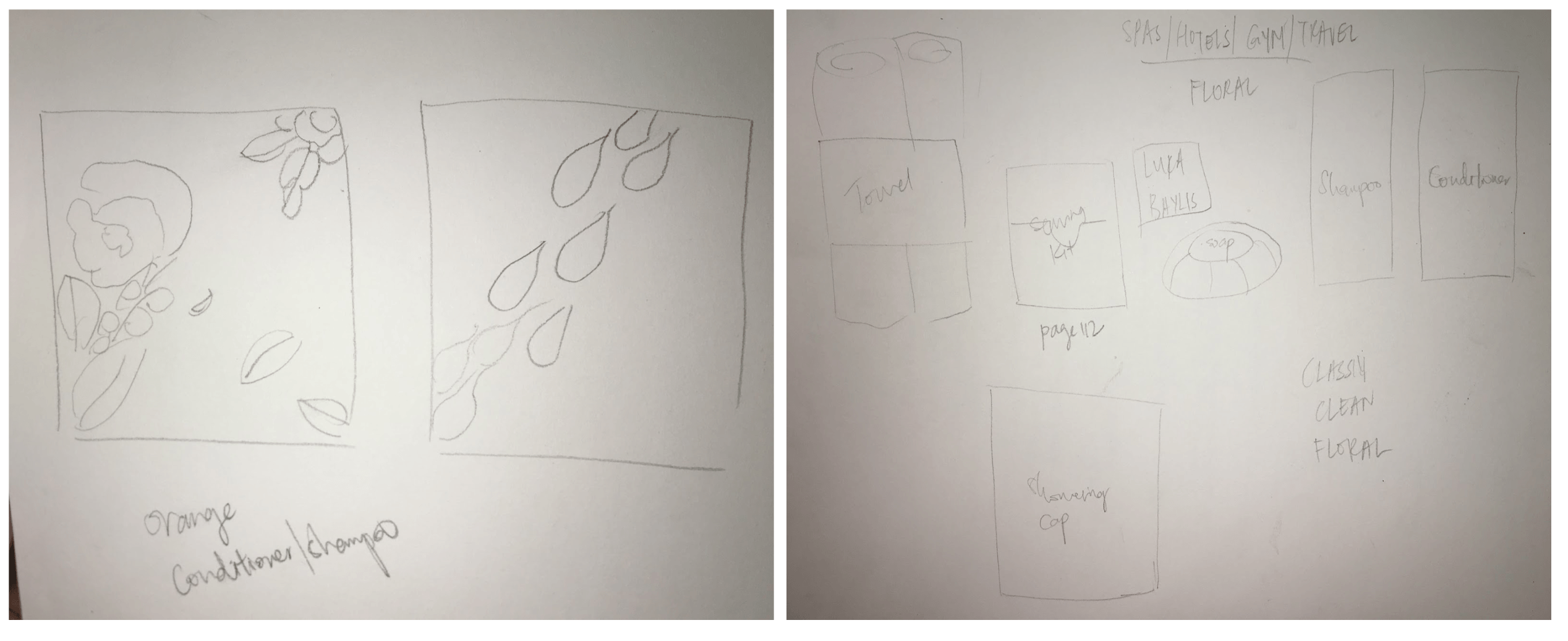
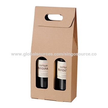
For this project we were tasked to produce a set of illustrated items that looked like they had the same theme/belonged to the same family. I began researching on applied illustrations and an event that I could possibly design products for.In order to streamline my thoughts better I decided to come up with 3 separate events, products and come up with 5 thumbnails sketches for each one, so I would have a variety of sketches to choose from.
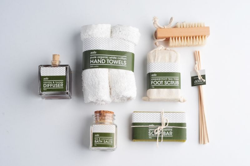
Event 1 : Toiletries event for hotels/gyms/spas
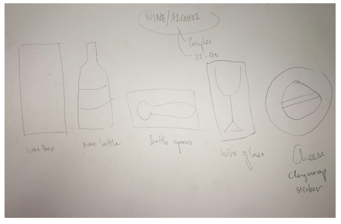
Event 2 : Couple wine event
Event 3: Cosmetic
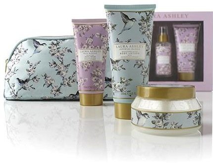
I scoured the net for inspiration images for each event.These were some of the images that spoke to me and some of my thumbnail sketches were based off of these found images.
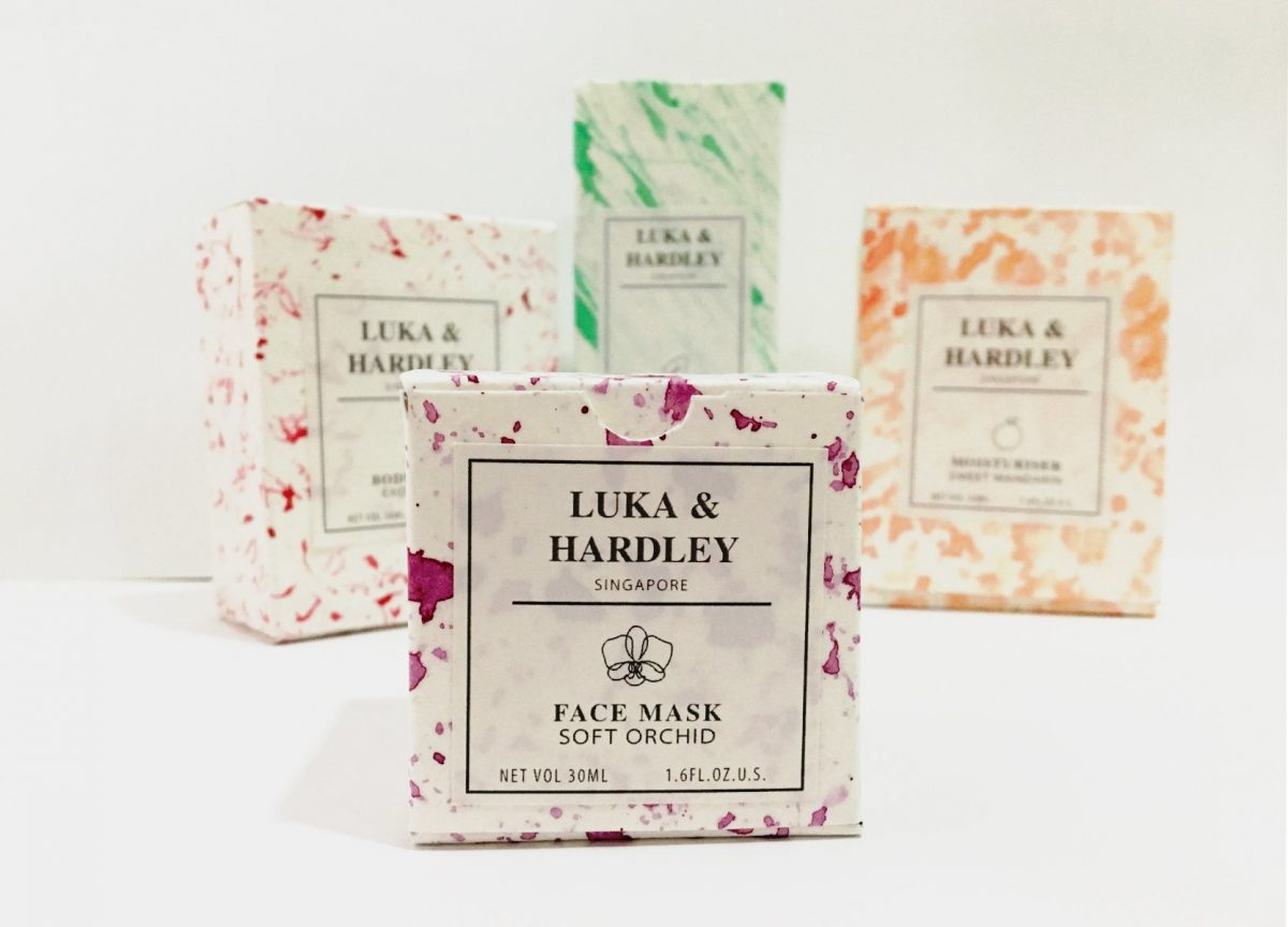
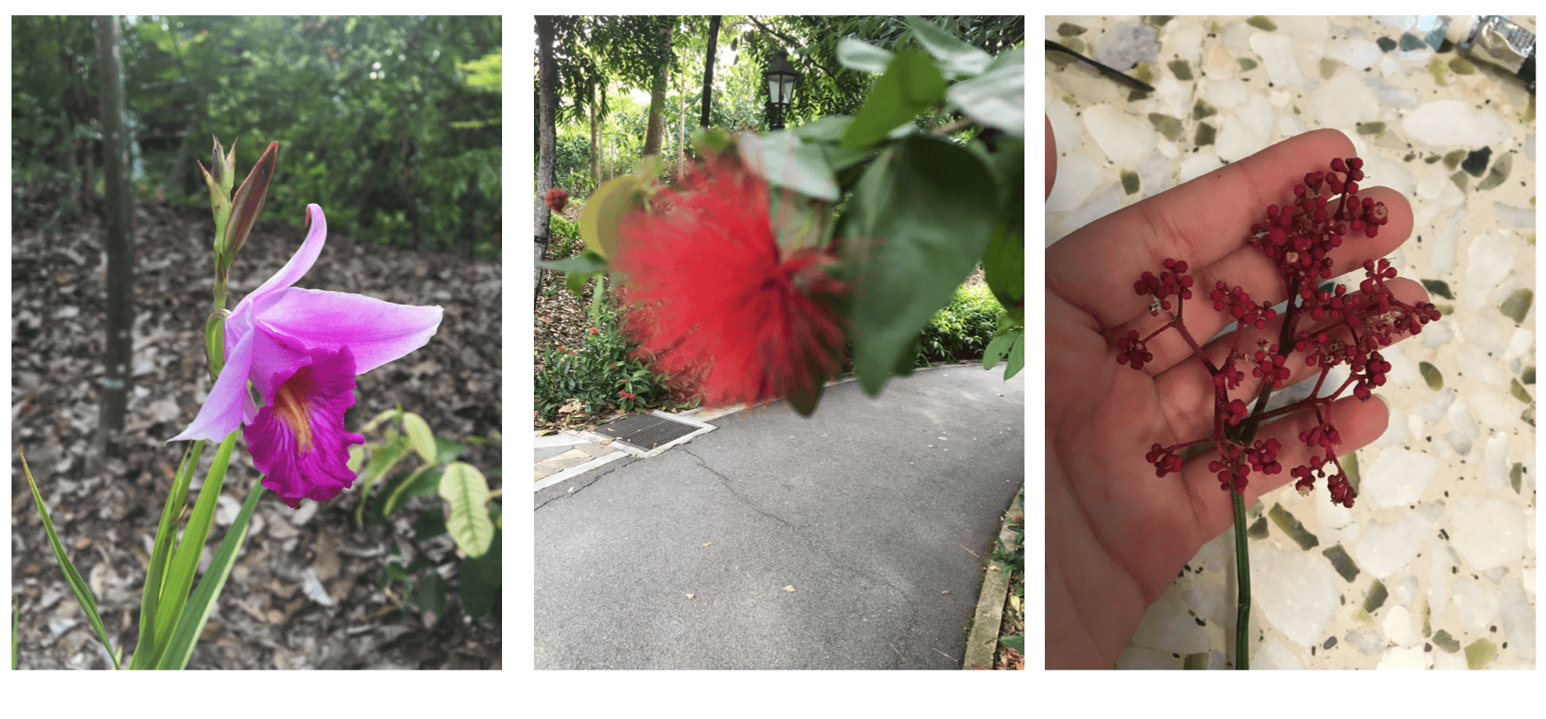
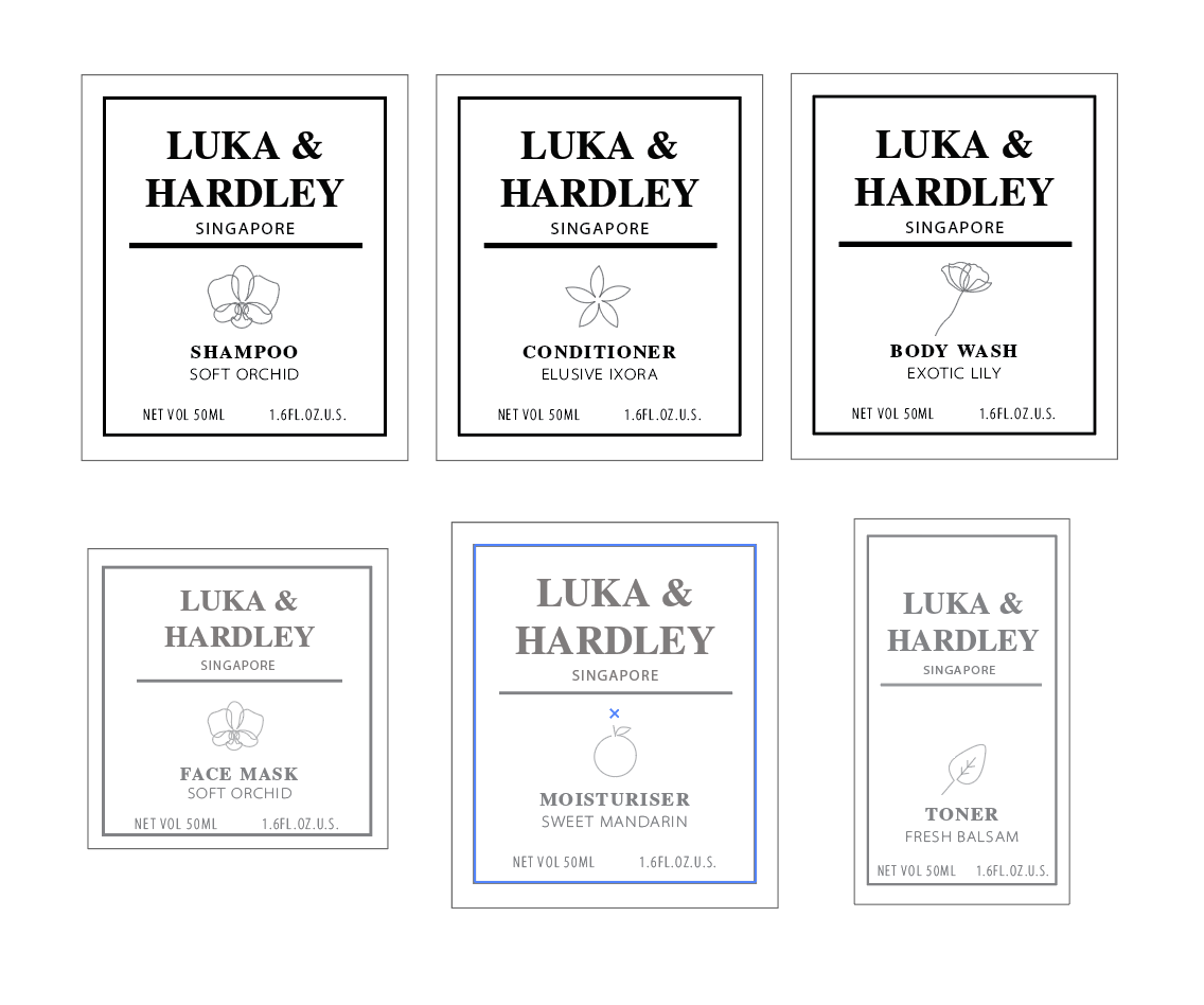
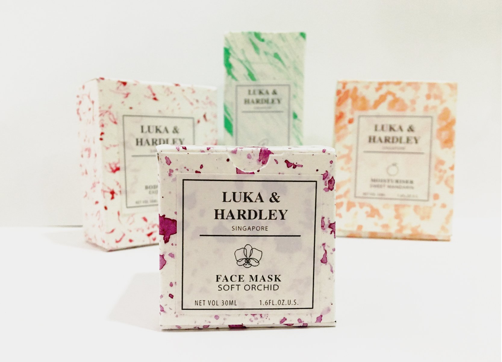
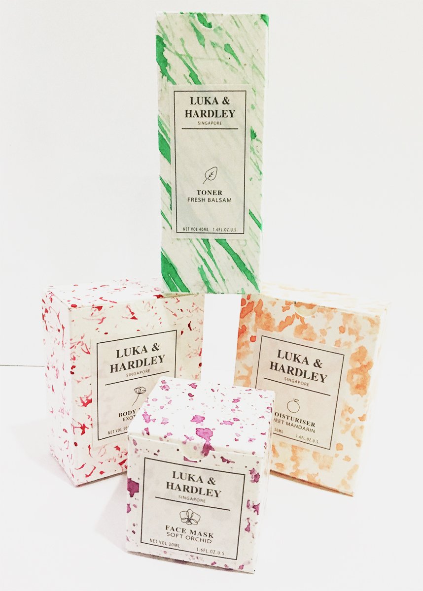
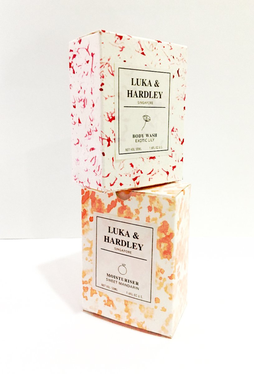
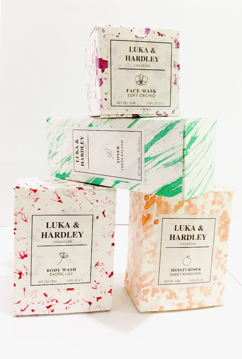
I was particularly attracted to this packaging because of the contrast between intricate patterns and minimalistic branding. It reminded me of me of luxurious skincare products for example those from crabtree and Evelyn.I decided to develop this idea for this illustration project and do a ‘pick n mix’ skincare event. However I knew I wanted to go in an abstract direction so I started conceptualising on how I was going to create this abstract pattern.I wanted to incorporate local flowers and also create a local brand, So I made my way to Botanic Gardens to take a look at the kind of flowers I could use.
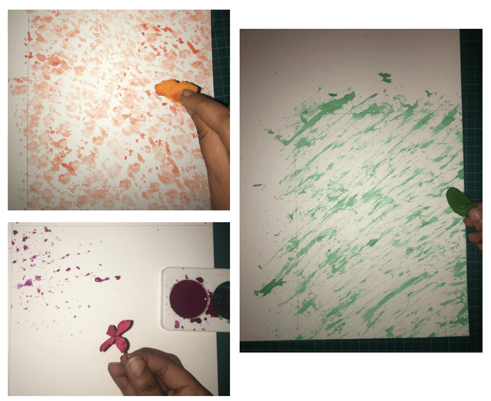
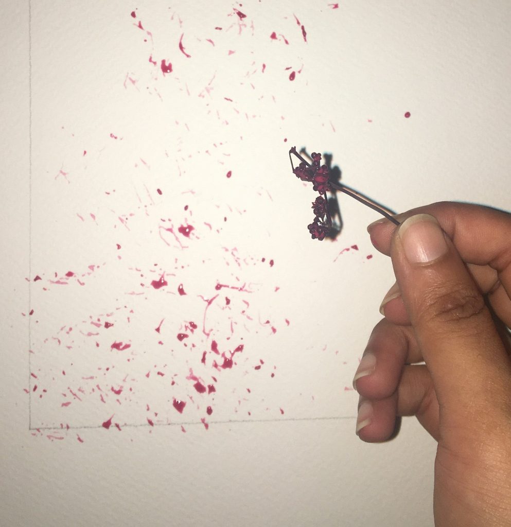
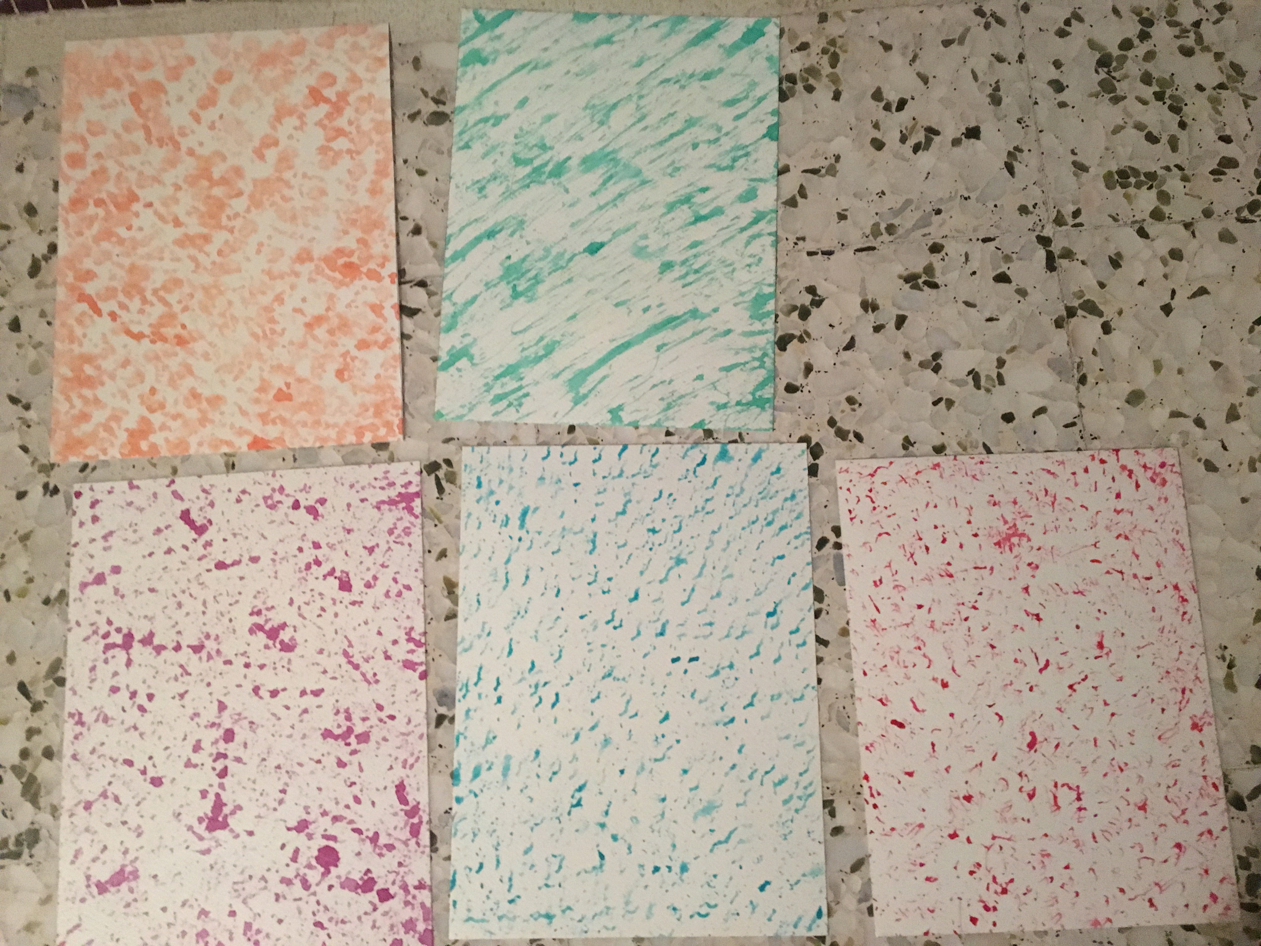
I decided on 5 different plants that I was going to use for my packaging: Orchid, Lily,Ixora,mandarin and balsam. These were flowers that could be found in Singapore, and I decided to use watercolour , for that softer more fluid look and create patterns via mark making. I experimented with the textures and the water content in my paint to achieve a set of patterns. I stuck to jewel tones for my colour scheme as I thought it would bring out the luxurious skin care vibe out in my packaging.
Then I proceeded to create a unique pattern for each product I was making using the plant itself.For the mandarin and balsam I used the skin of an orange and a leaf for the balsam.
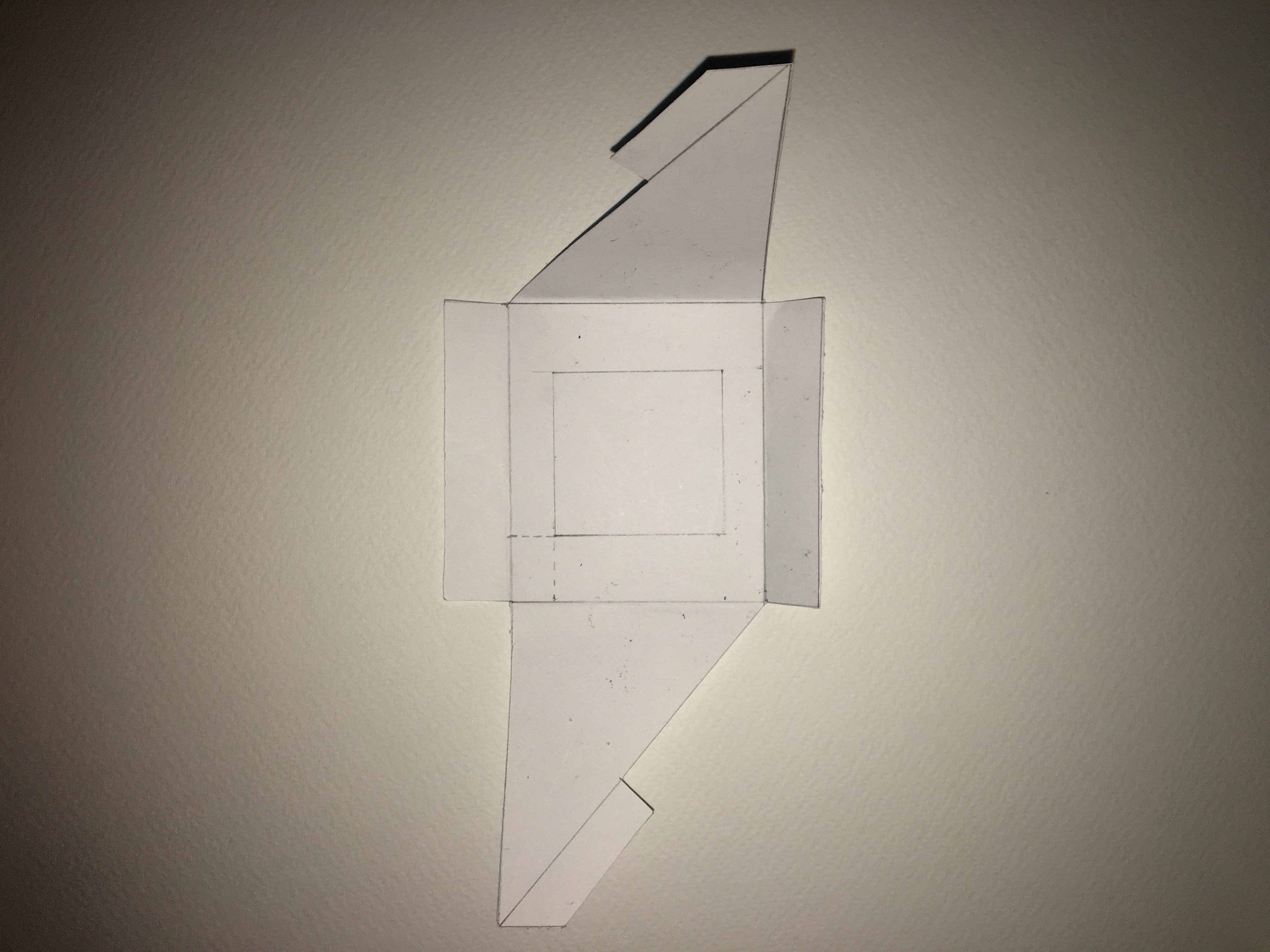
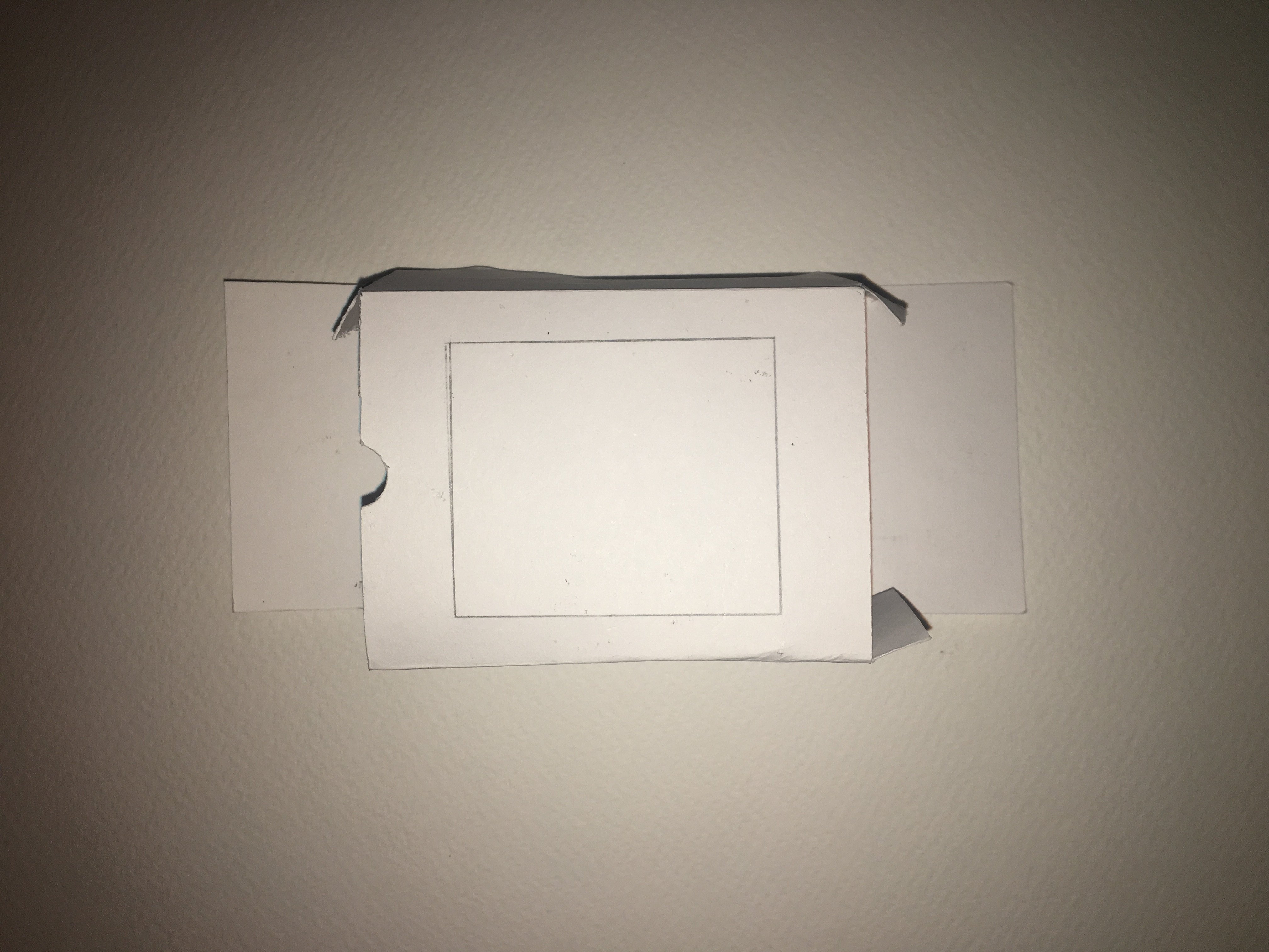
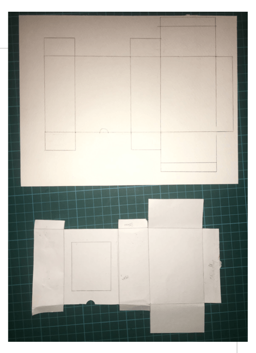
I experimented with drawing nets for the packaging itself and also different types of packaging.I narrowed it down to one type of package but after consultation with Lisa she said it was not innovative, so I created packages with varying sizes and heights to create visual interest .Then I proceeded to work on the branding and I was inspired by high end English luxury bath and body products.
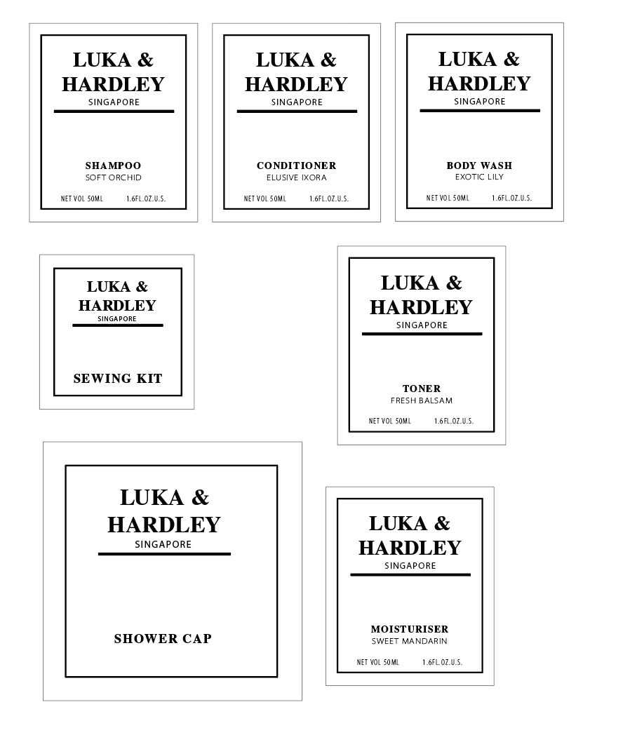
Lisa suggested on adding an icon for each of the products as there was space I could more efficiently use. I thought the addition of the icons really brought the branding closer to my design objective.The use of black in the branding was very jarring as my colour scheme was light bright and soft, thus I changed the black to grey to match the soft look of the products.
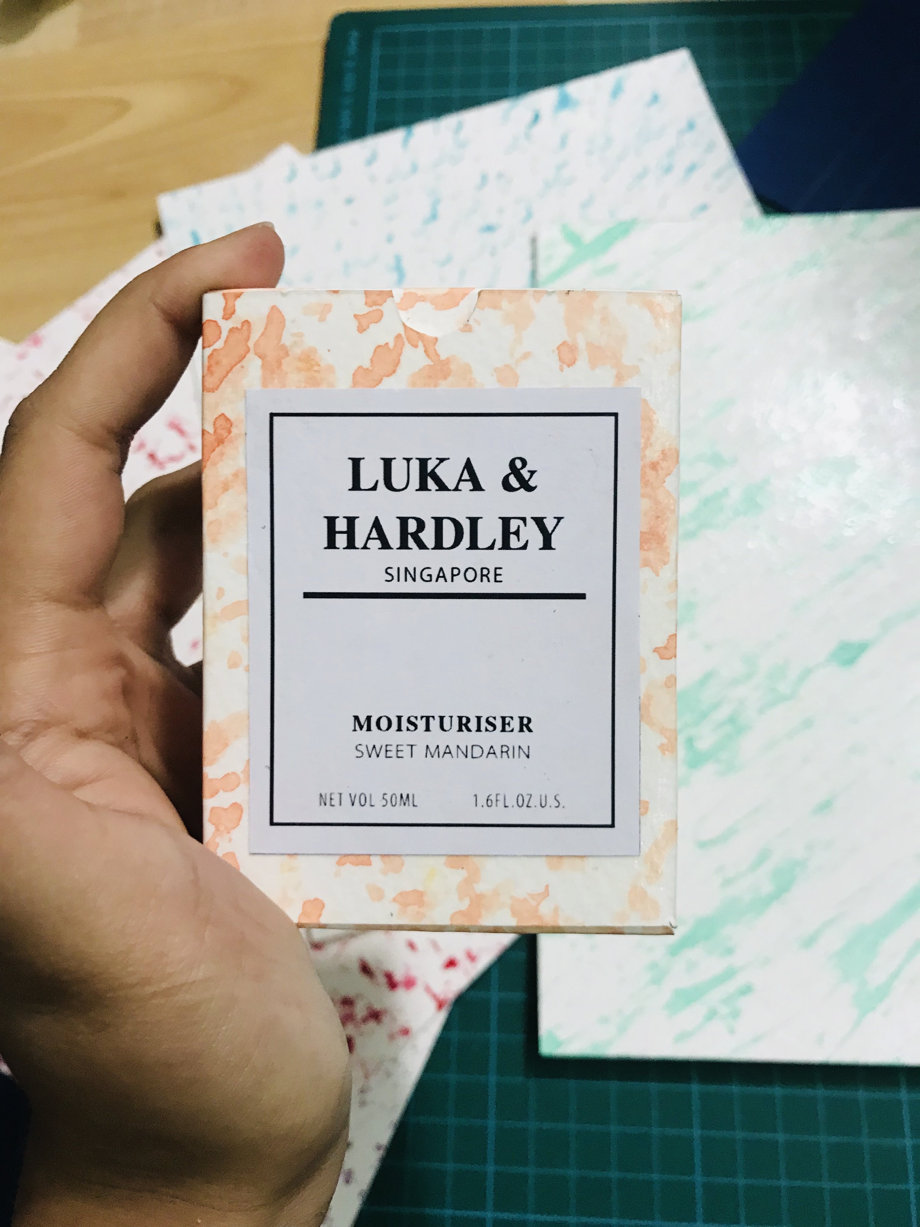
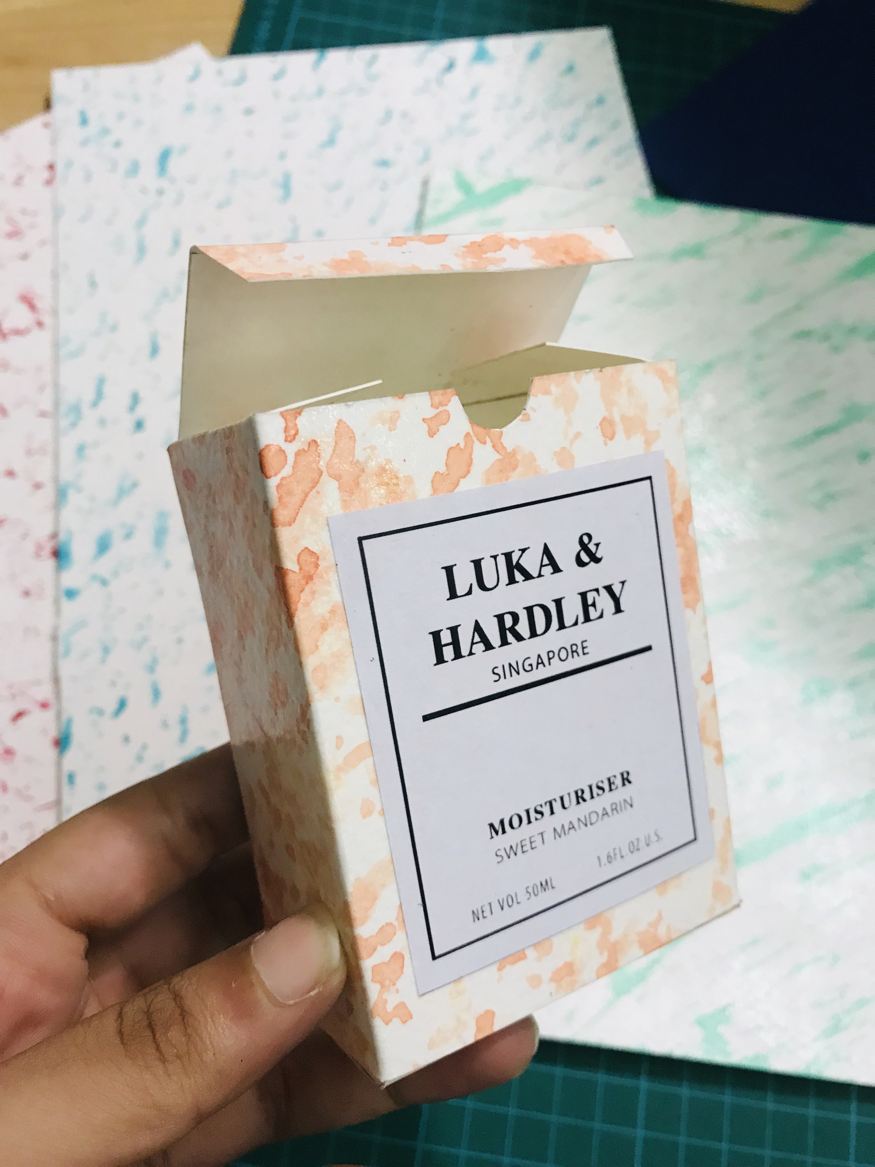
After creating all the nets, prints and the branding. I finally came to my final products as seen in the photographs below.
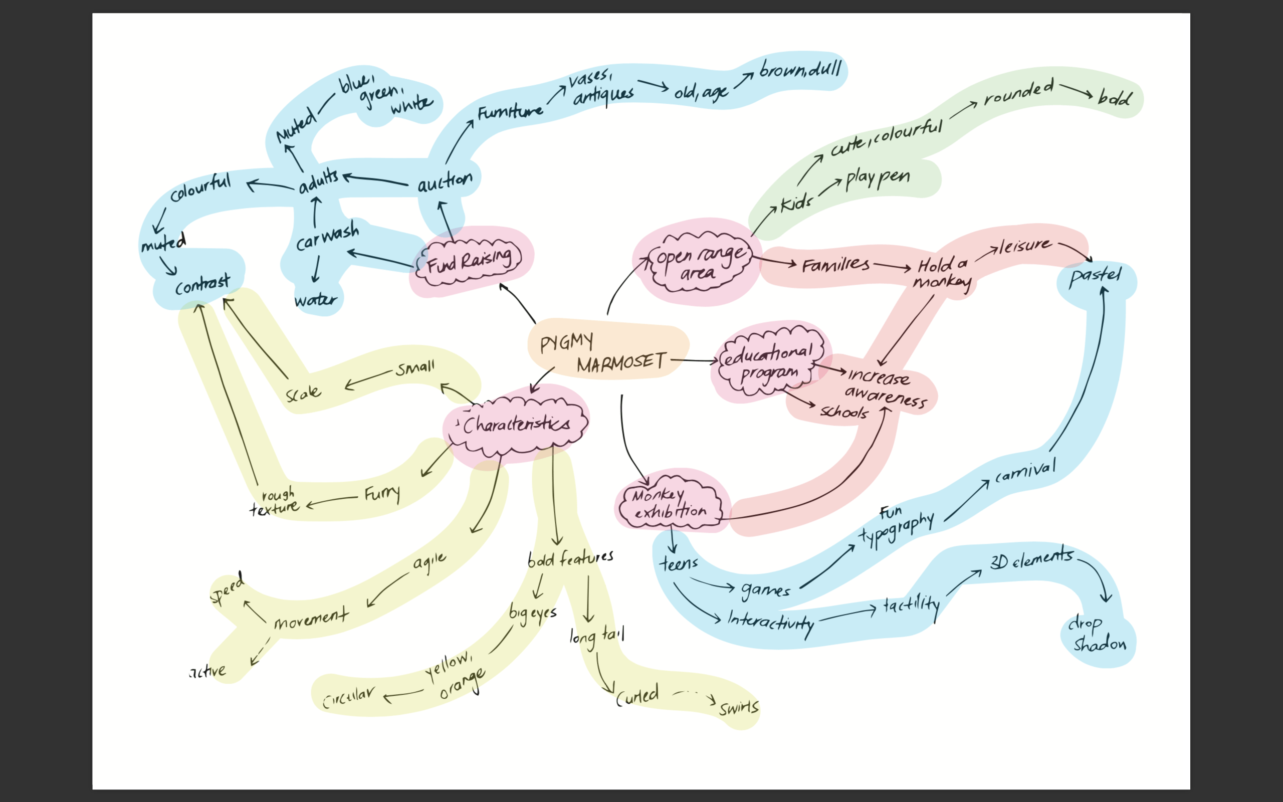
I created a mind map to help me think of the creative direction of my poster.
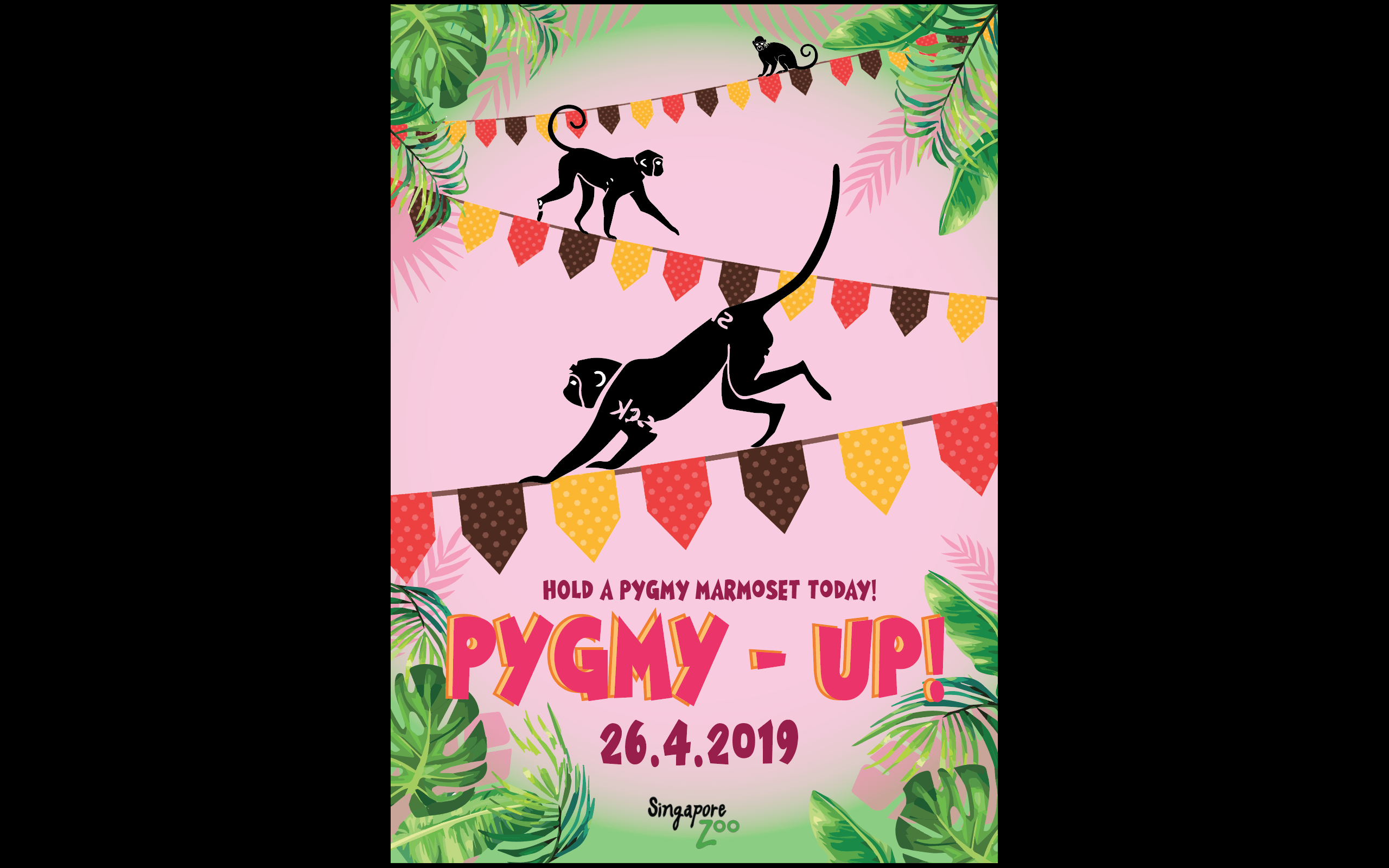
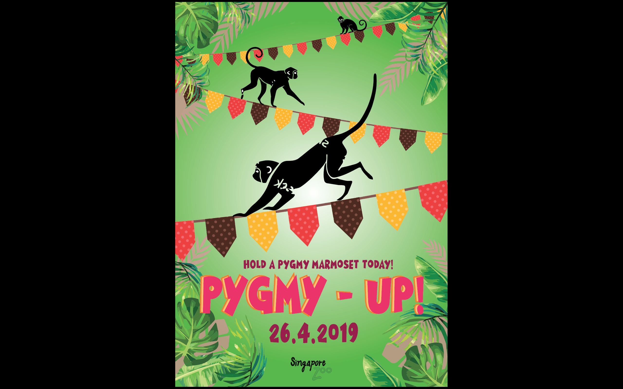
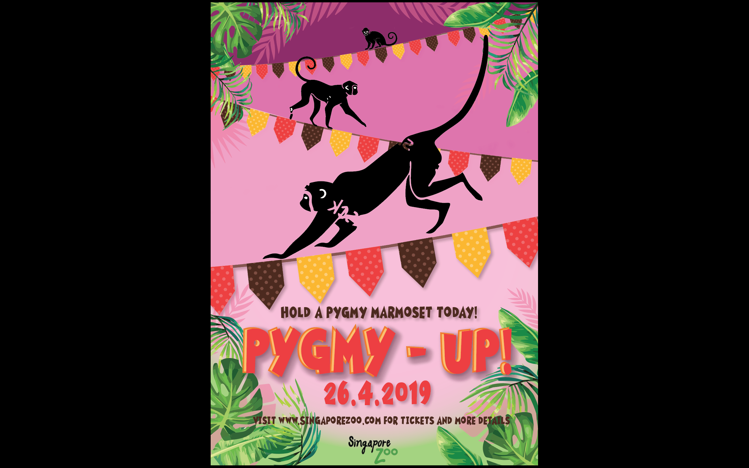
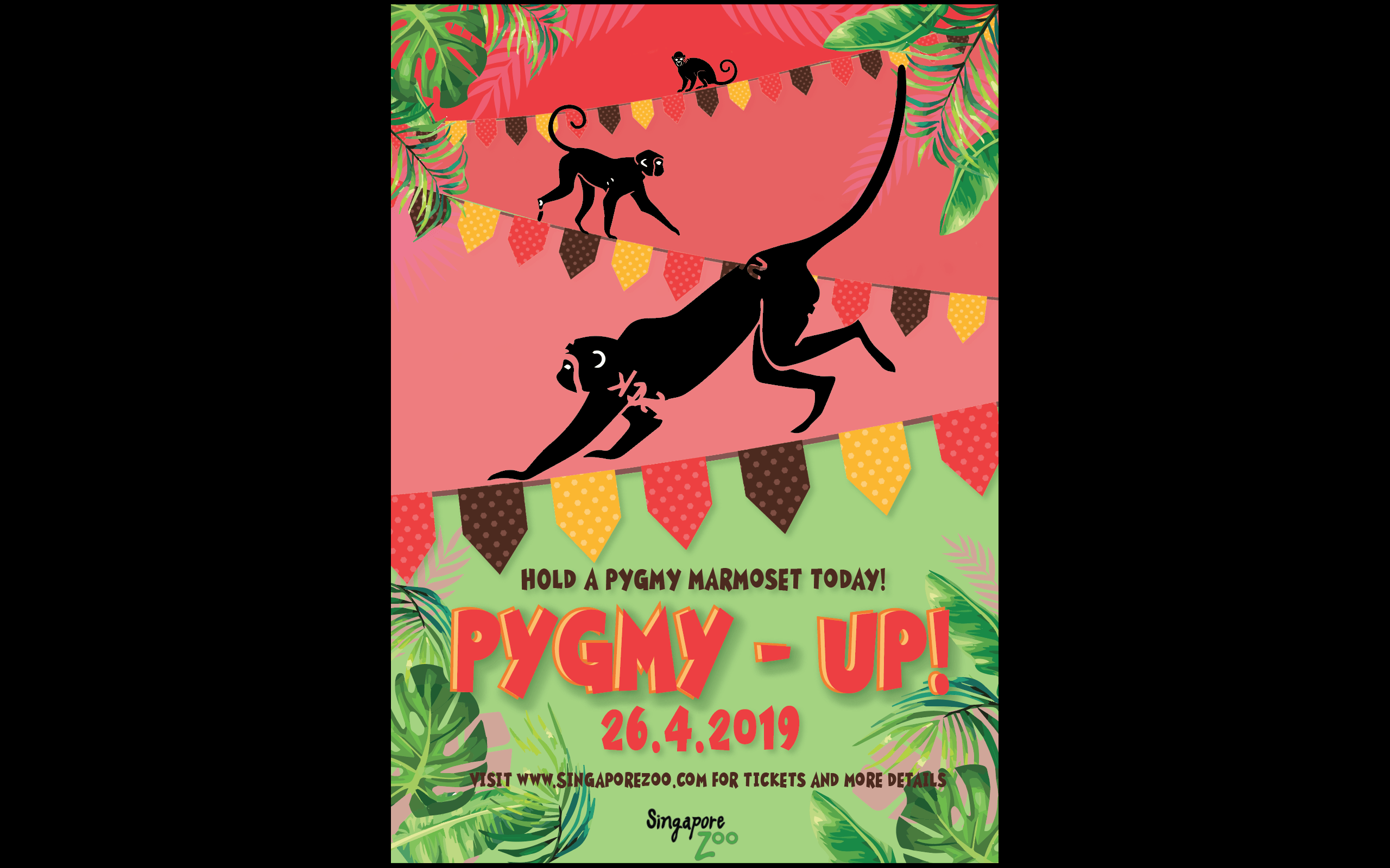
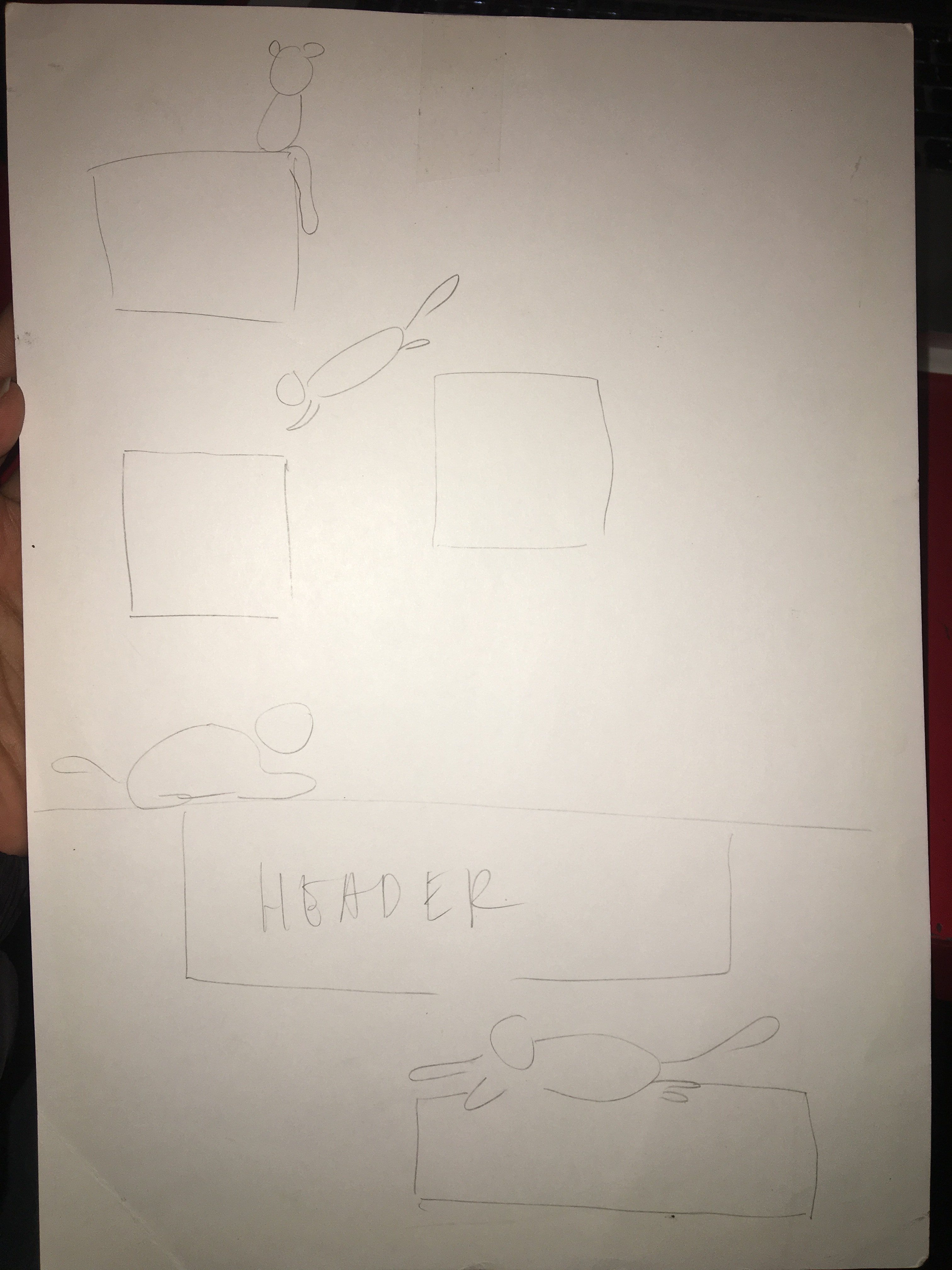
Due to the fun and cute nature of the animal that I chose, I decided on a playpen for kids so that they can engage with the animal at the same time be educated on it. Leading on from assignment 8, I came up with 3 rough sketches of my layout with a sentence accompanying each sketch.
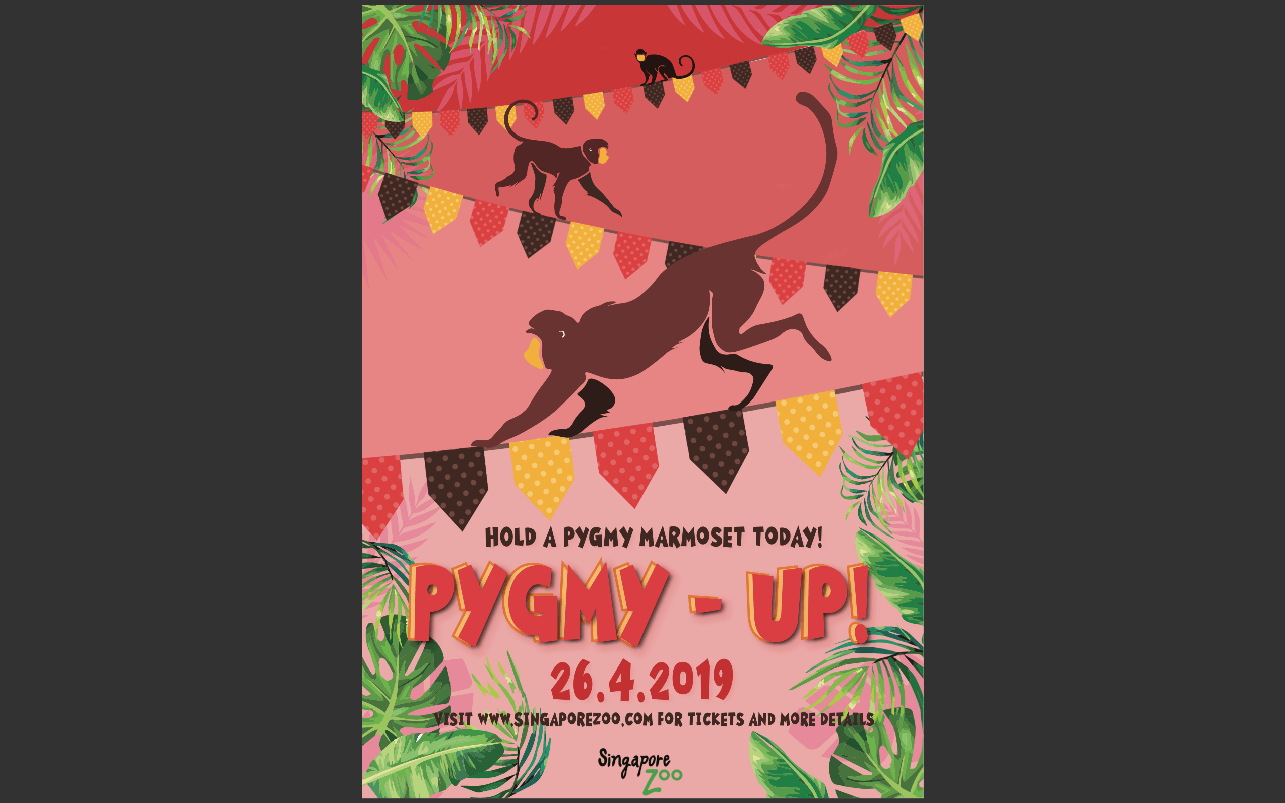
Sentence 1:Movement and agility is key Sentence 2: Celebrating summer with popsicles and watermelonSentence 3: Monkey see Monkey do(symmetrical)
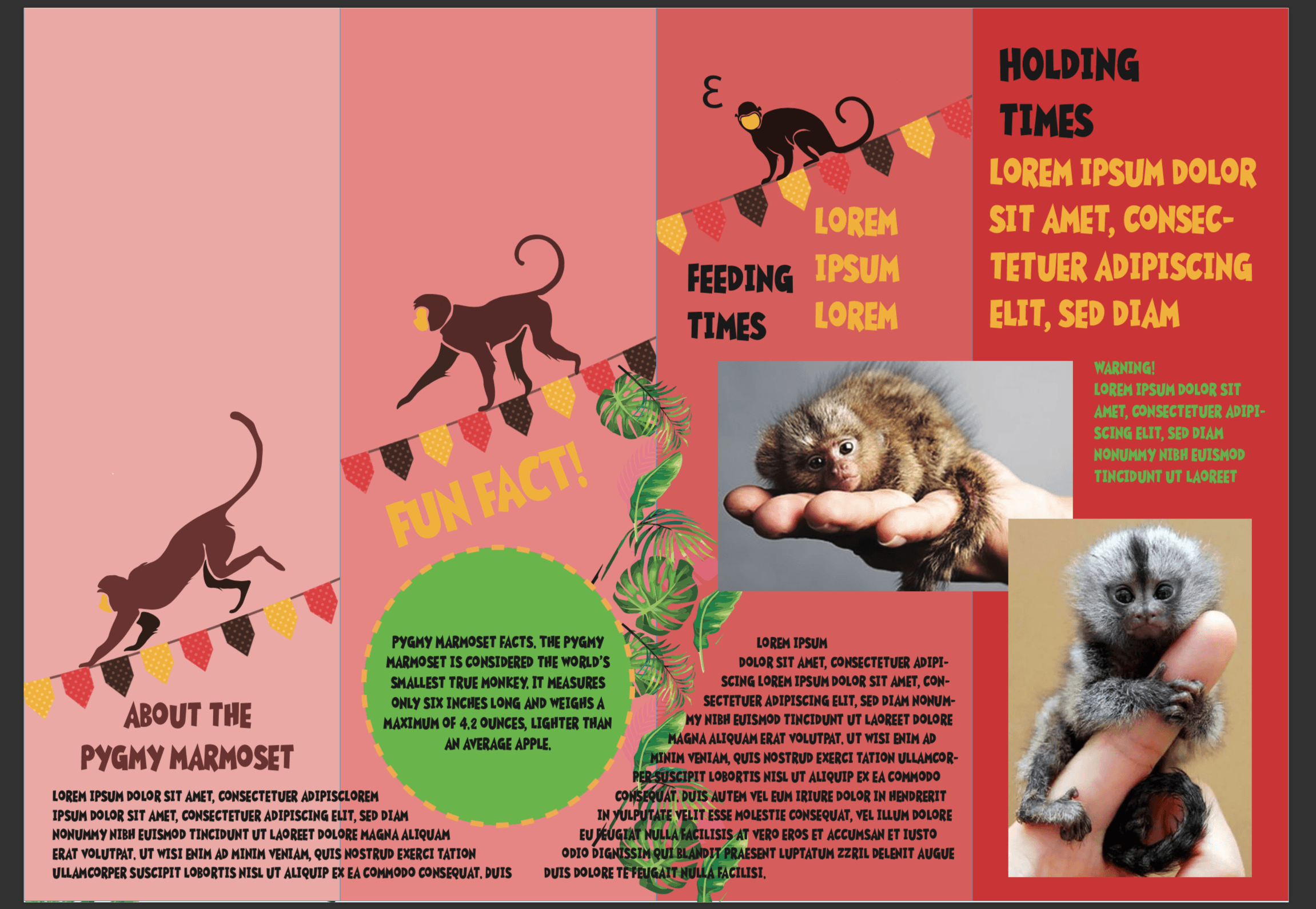
From here I developed the second sketch as I thought the summer theme would allow me to use colours to entice kids, at the same time pygmy marmosets thrive in tropical climates so it was apt considering the direction I was going.I proceeded to create a digital version of the second sketch.I applied the watermelon colour scheme and also added party flags to emphasise the idea of fun and summer. I thought that the agility of the monkey would be exaggerated if I used the party flags as a tightrope. I choose bold and colourful typography as well to cater to the children who might be interested in my design.I chose to include tropical leaves and use them to frame the macro elements to draw attention to the middle of the poster because my macro and typography were aligned to the middle.At the same time I adjusted the opacity of the leaves(lighter pink) to act as shadows for the tropical leaves, again to add to the idea of depth.
My design looked rather flat and the macro elements lacked visual hierarchy. After consultation with Lisa, she suggested on increasing the contrast in relation to the scale of the monkeys as well as adding layers of different opacities within the area under the tightropes to give the idea of a receding background and protruding foreground, which led me to my next draft.
This draft conveys the idea of depth a a little better,However there were too many jarring colours.I decided to use the eyedropper tool and pick the red of the flag as a base instead of the magenta colour I originally used.
I wanted to use green against the red as they are contrasting colours which would add to the boldness of the poster. But the green was dividing my poster into half which affected the coherency of it. Thus, I decided to stick to the red as a base maintaining the lightness as it came downwards to the foreground.I proceeded to use the eyedropper tool to select the brown colour from the party flags and colour my monkeys to limit the colour scheme at the same time gel the entire look together.I applied the same concept with the shades of the monkeys as I did with the background – darker as they got further away.I removed the placeholder monkeys and made a similar rendition of it and it led me to my final poster.
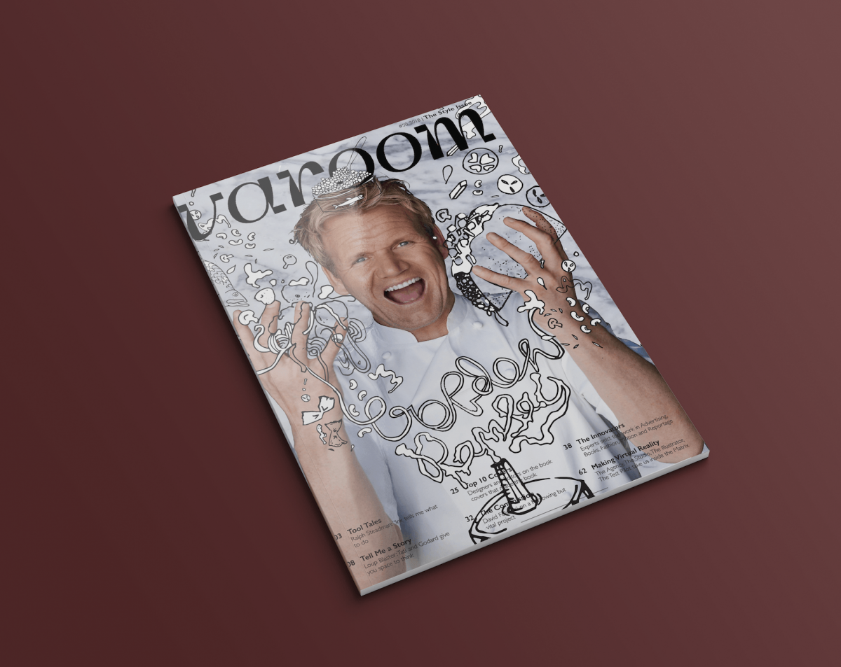
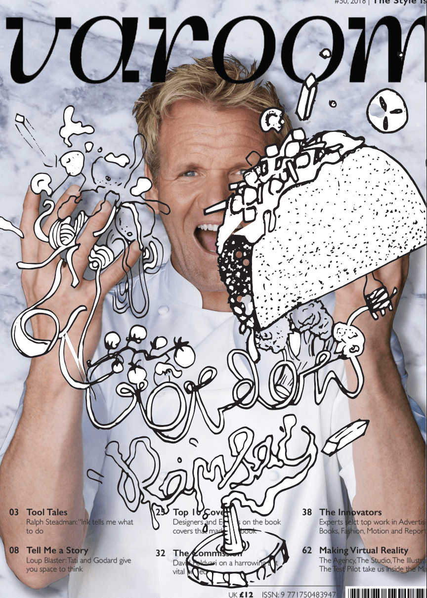
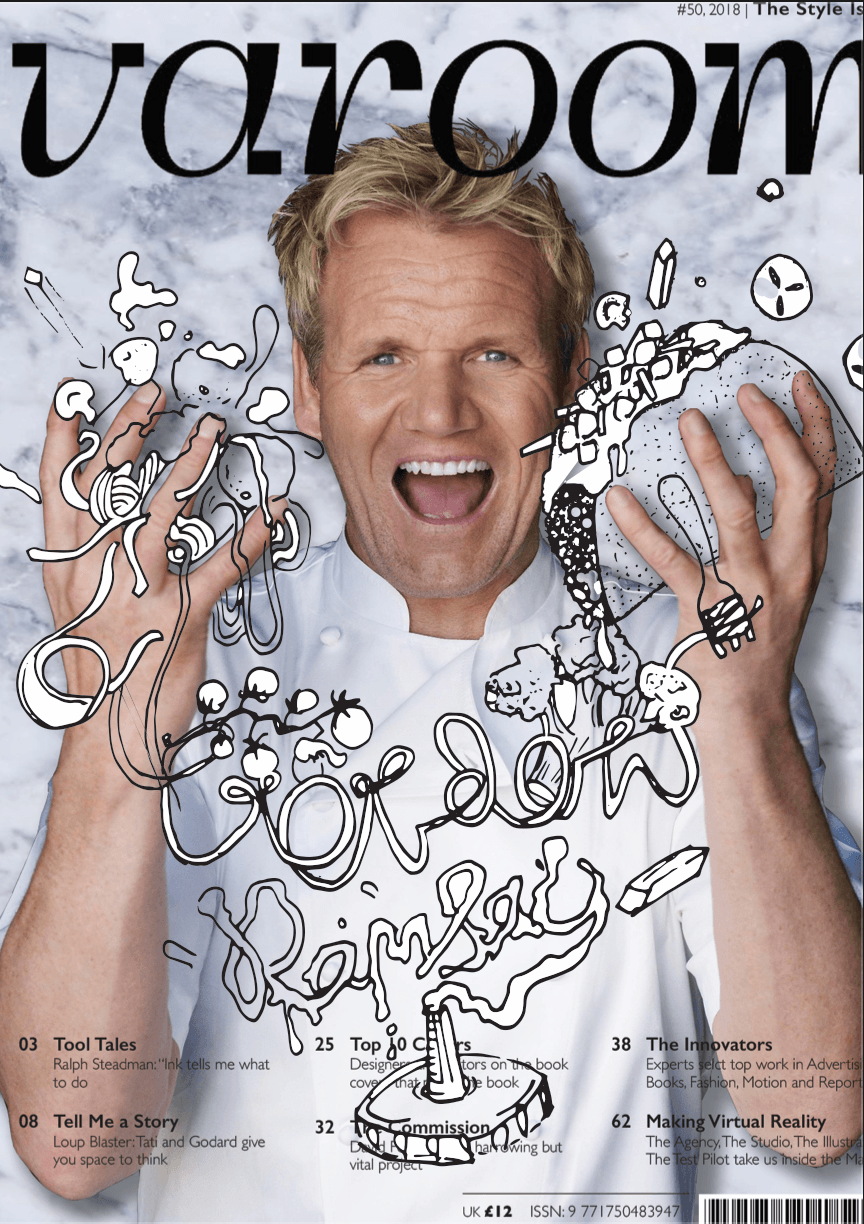
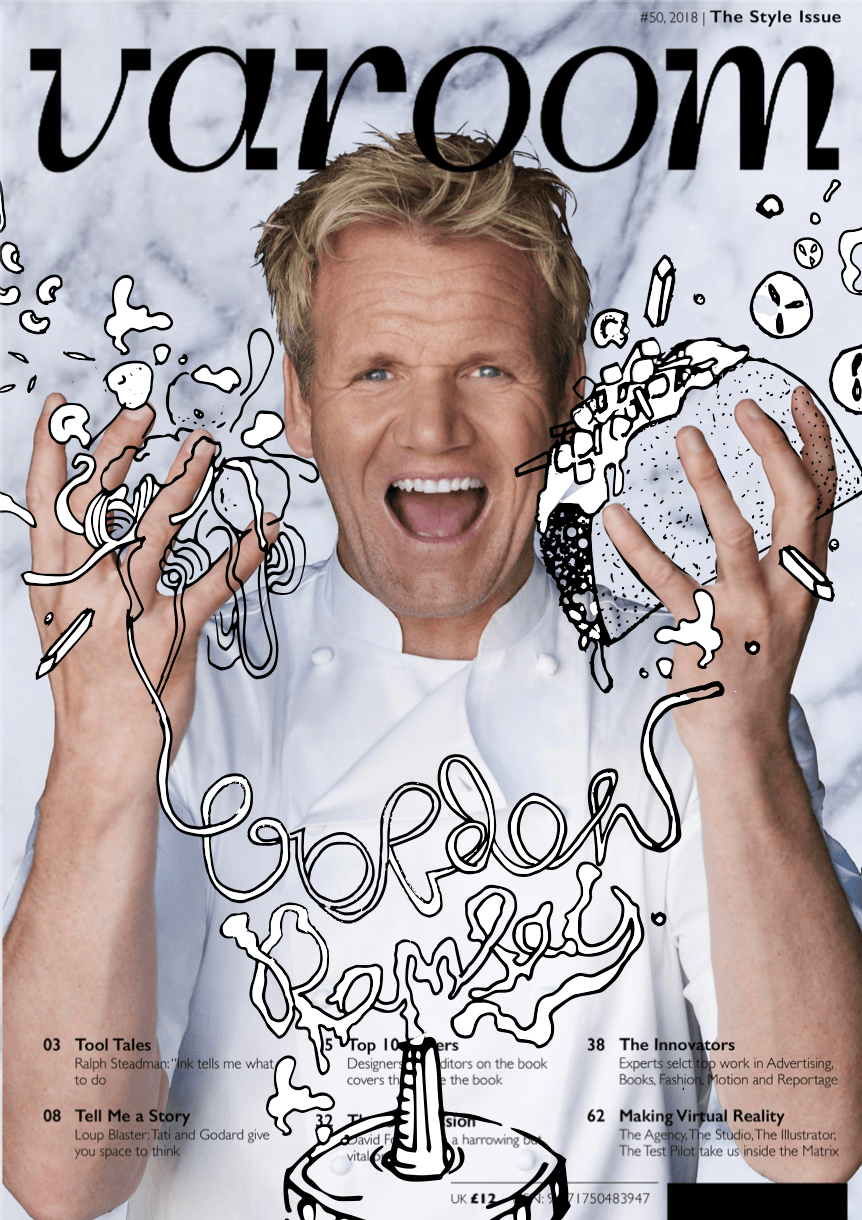
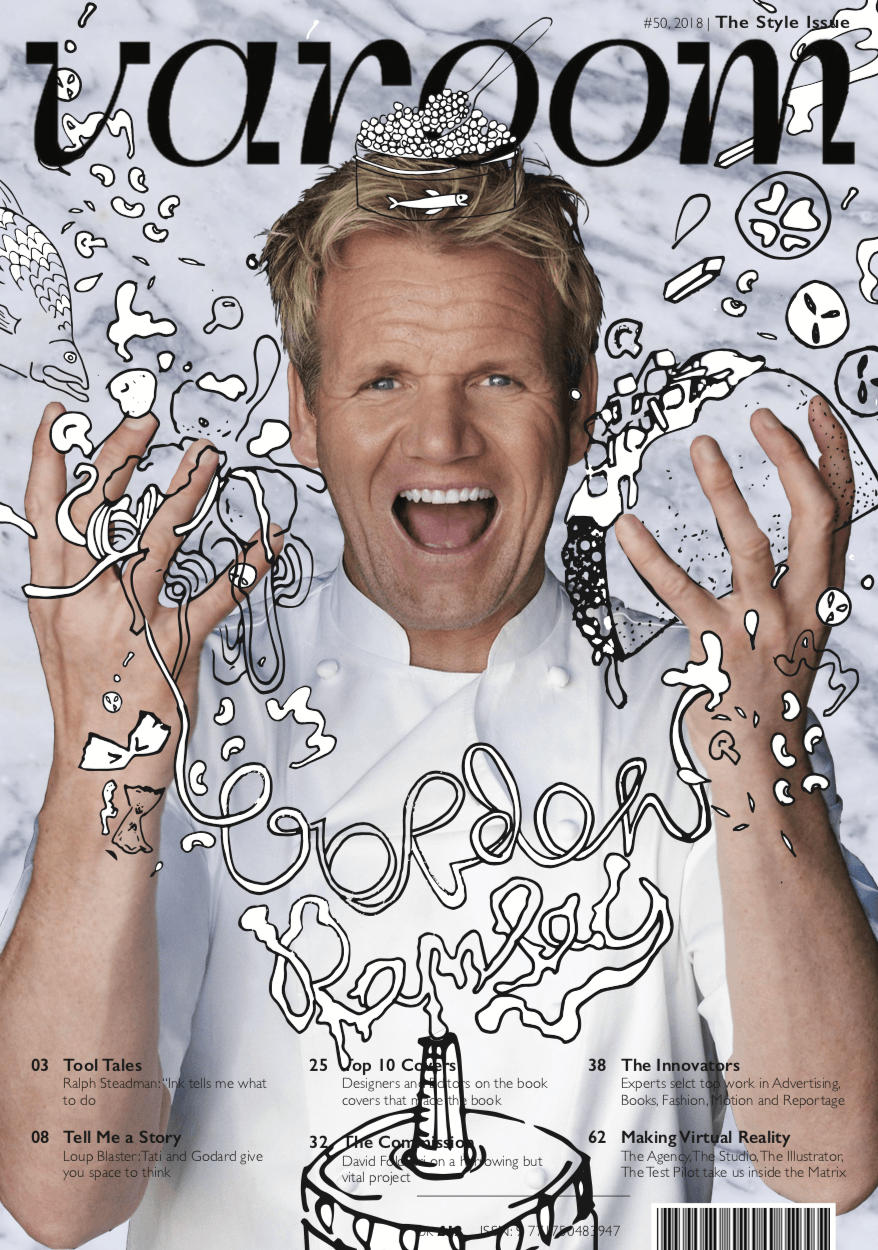
I opted for a dynamic composition for my illustrations as I thought it suited the concept of Gordon being overwhelmed by food. The triangular shape of the composition adds movement and energy to the magazine cover giving it visual interest.There are multiple elements within the design which have varying sizes and also different line weights, as pens with different thicknesses were used. This contributes to the sketchy and fun look I was going for. Overlapping the magazine template over the illustrations which are over Gordon Ramsay himself gives the design more depth and in turn makes it more exciting compared to a flat 2D design.
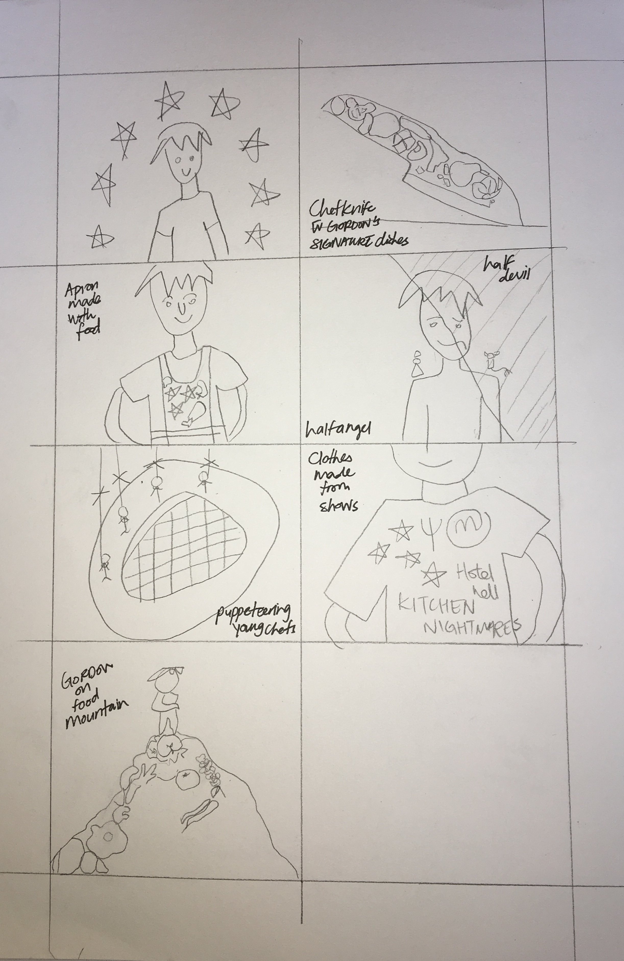
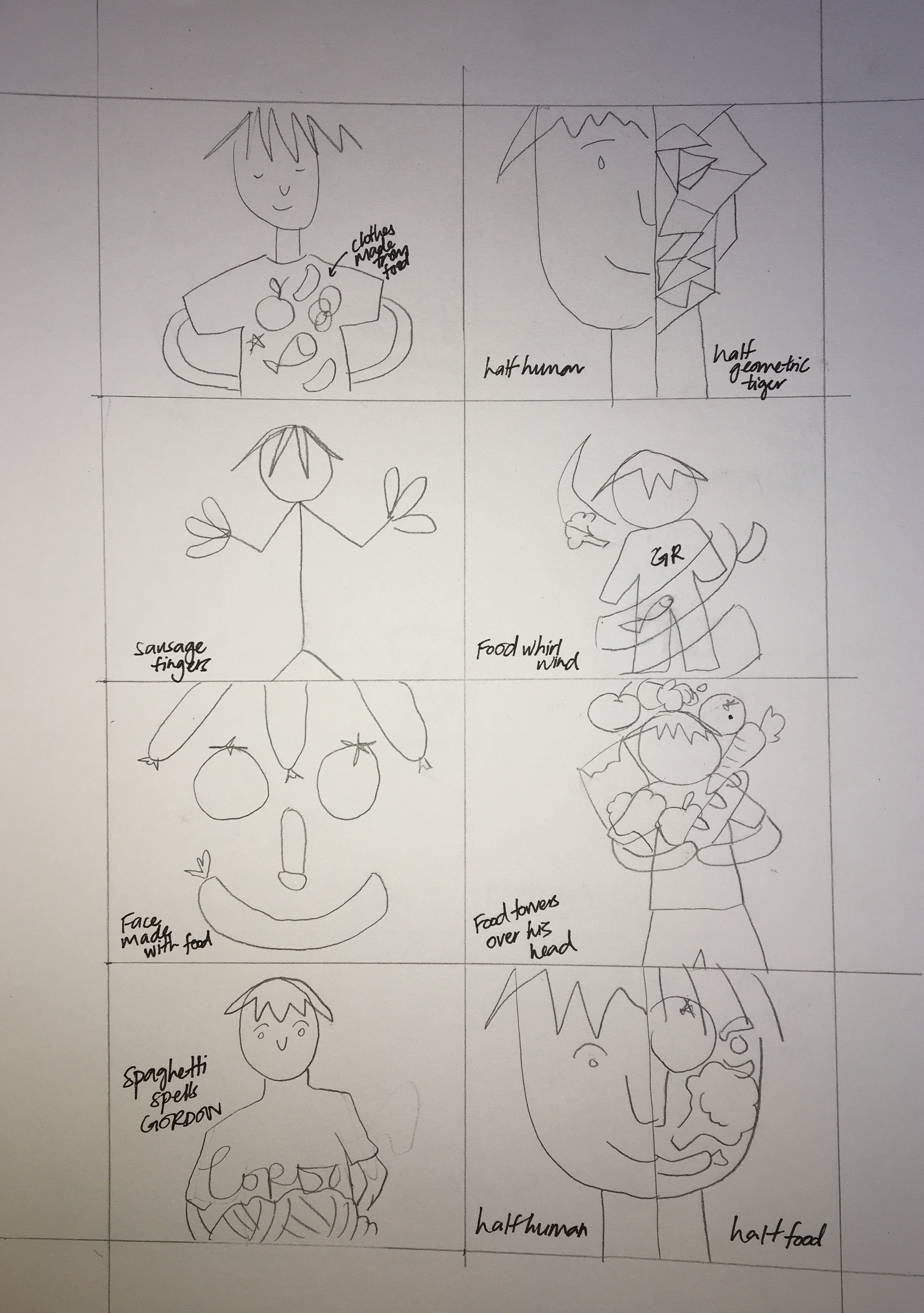
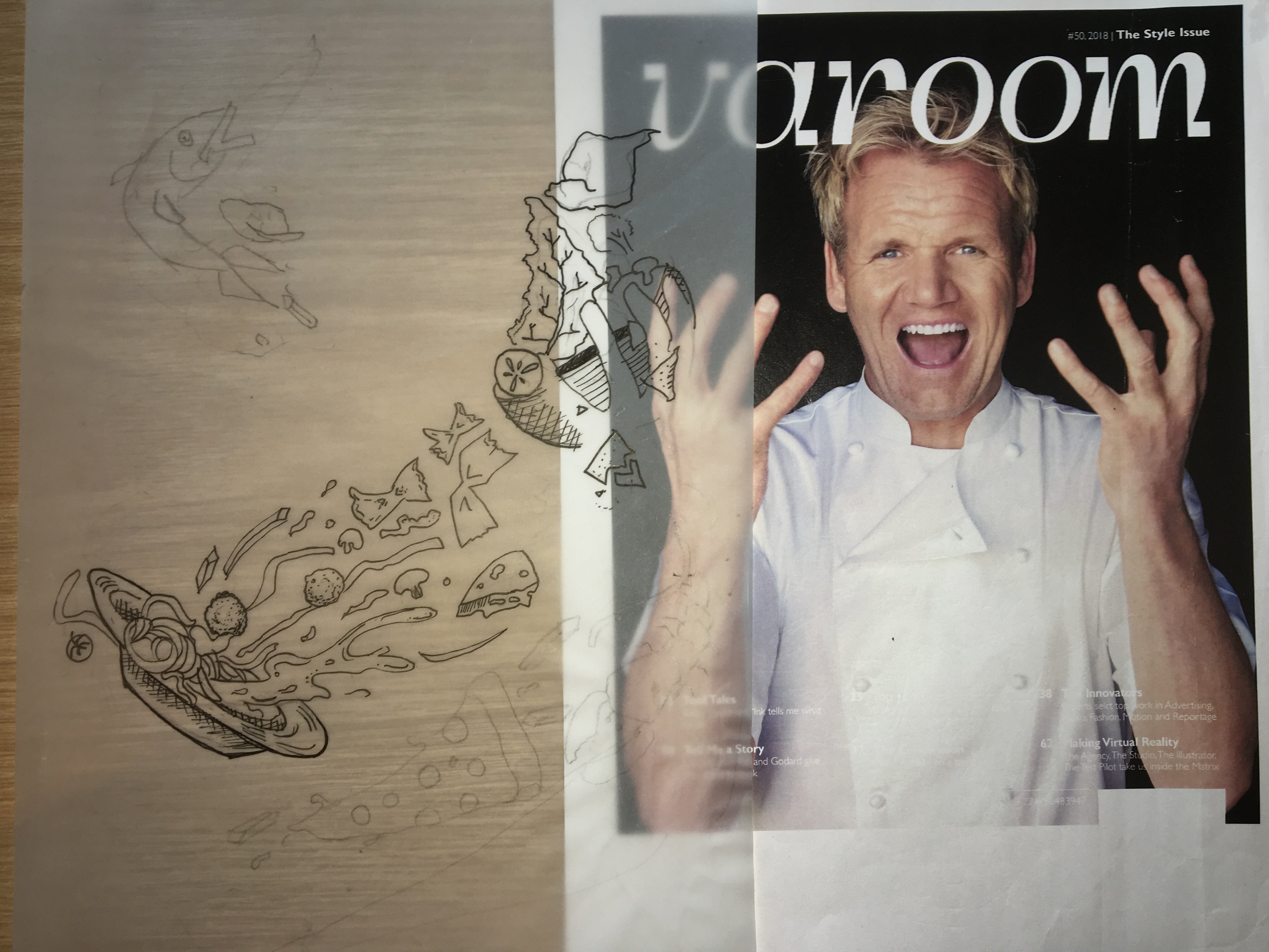
PENCIL COMPS: Drawn on tracing paper
PROCESS:
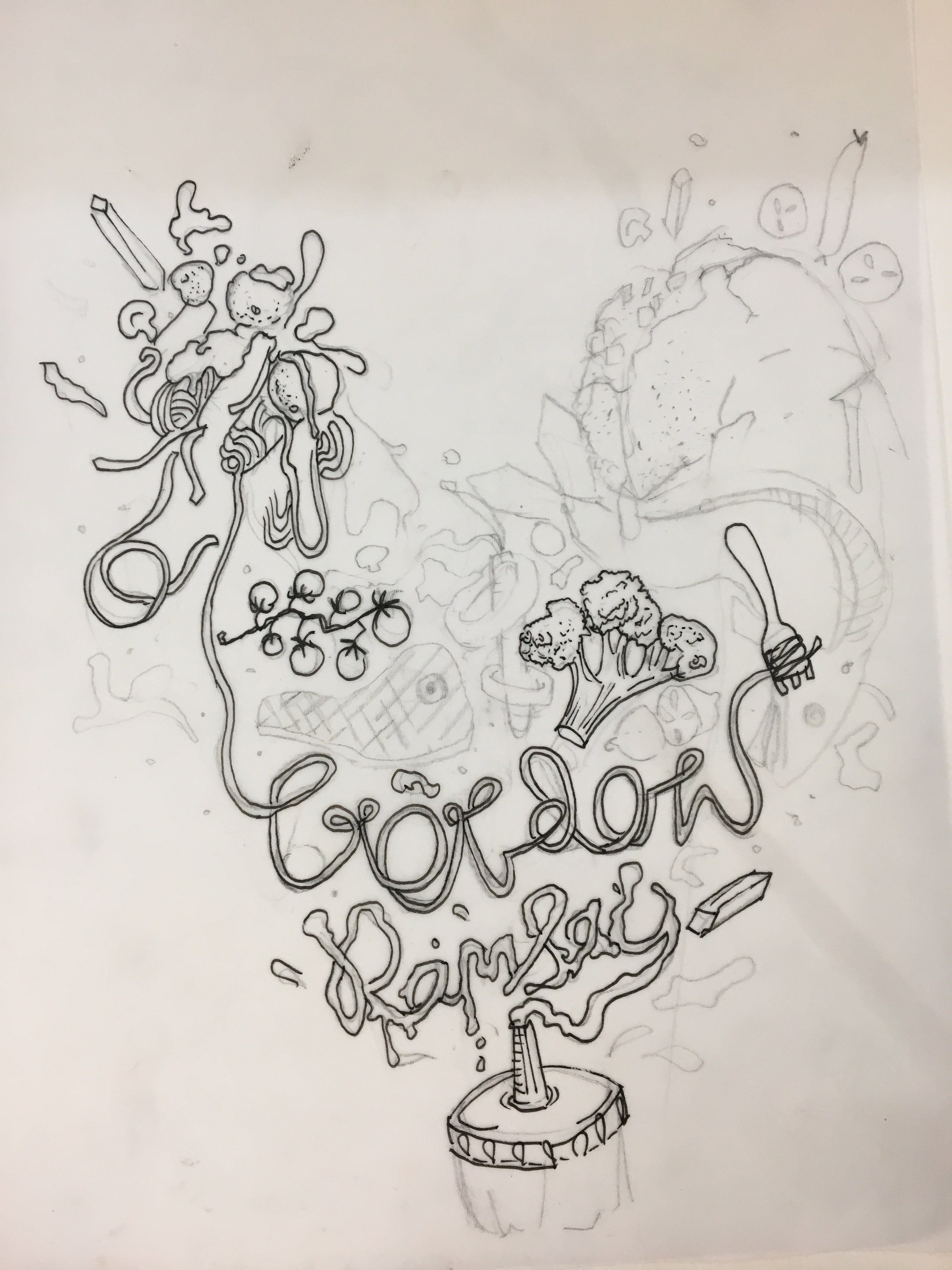
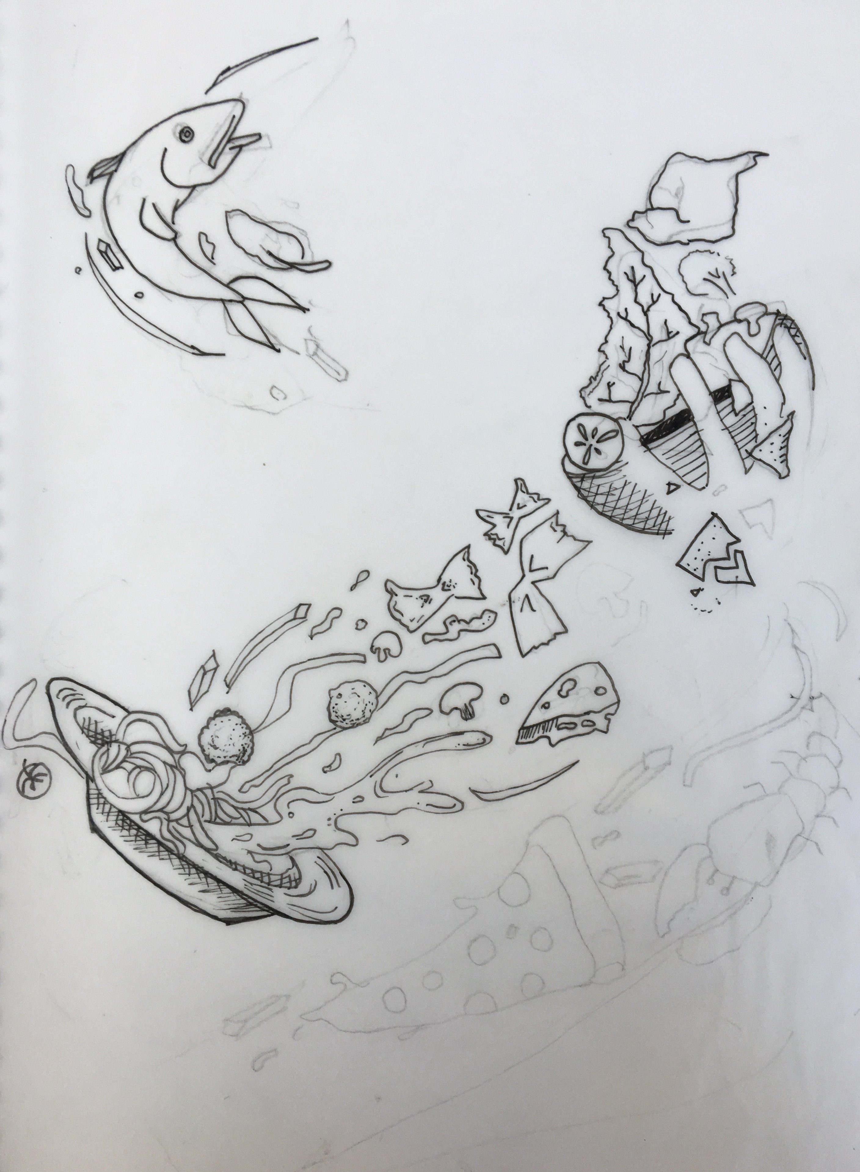
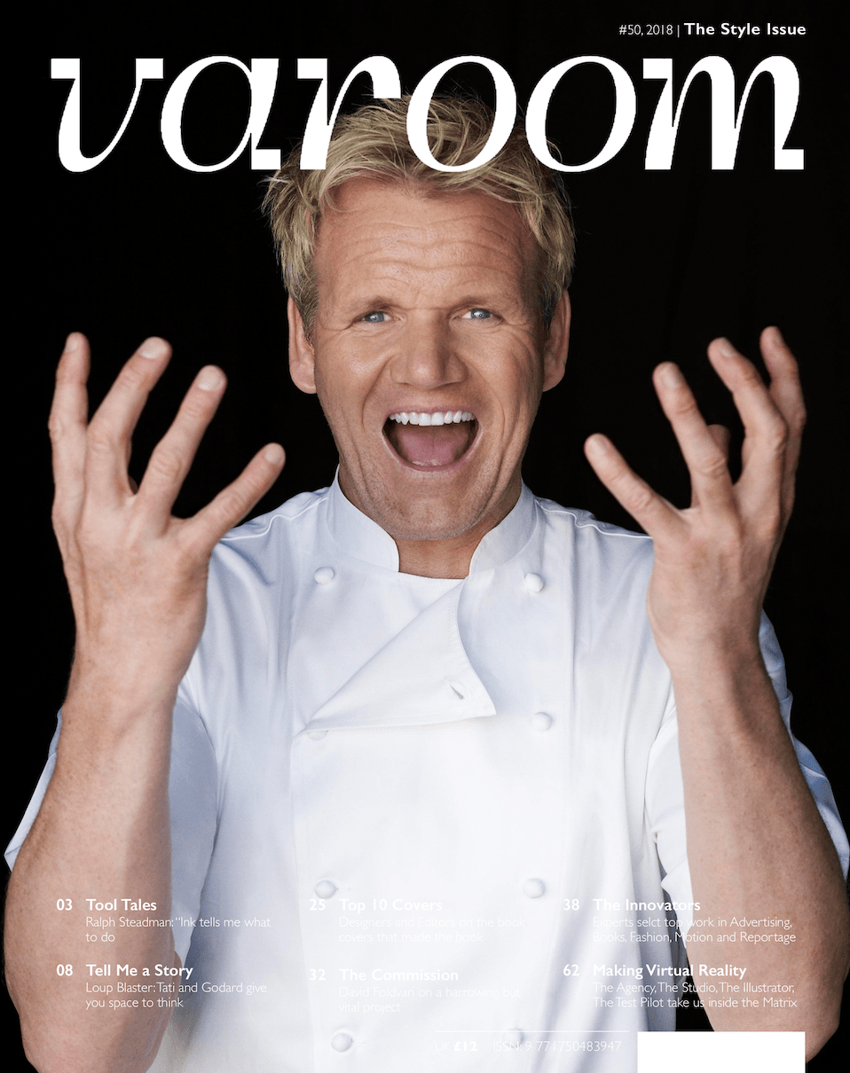
I began by printing an image of Gordon and illustrating over him using tracing paper, So I could get a rough idea of how the final magazine cover would look like and also to align my illustrations with the image.I laid over the pencil comps over the image and chose the one I liked best.
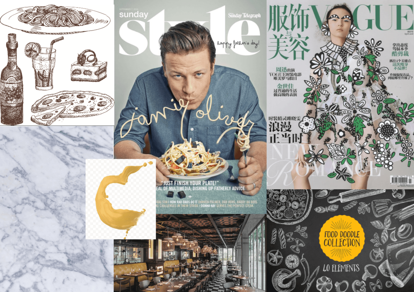
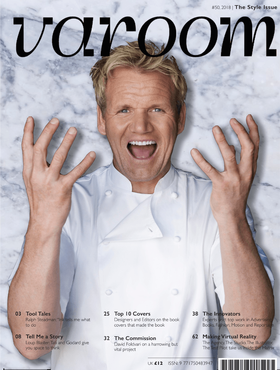
I picked the first design and proceeded to digitise my work using image trace in illustrator.The original image of Gordon came with a black background and my illustrations were also black, So I decided to switch out the background for a marble one, which adds to culinary theme of my cover the as it reminds me of an expensive kitchen counter.The marble background was a soft grey colour which allowed my black pen illustrations to stand out.I cropped gordon out, added the marble background and a drop shadow for depth.
After consulting Lisa, she suggested to declutter and improve the legibility of the “Gordon Ramsay” illustration. She also suggested drawing over his face, but since it is a focal point, I omitted laying illustrations over his face and instead on his head.I had to keep the amount white on both sides even for a more balanced design.Initially my design was imbalanced as there were more elements and more white on the right than left.The taco was reduced in size so that it would not compete too much with the face. This led me to my Final magazine cover.


 Majority of those who participated in the survey are male.So this encouraged me to keep the design a little bit more “masculine” By using a bold fonts, graphics and avoiding softer girlier colours.
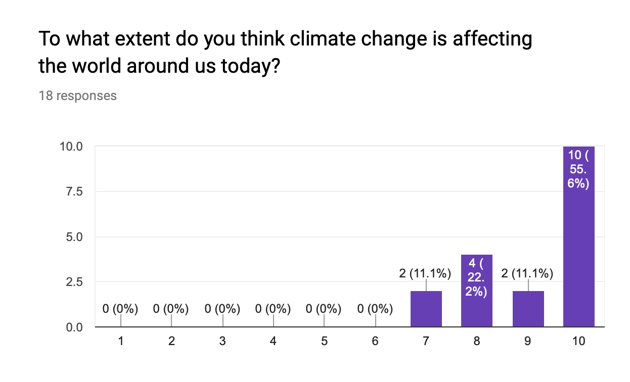
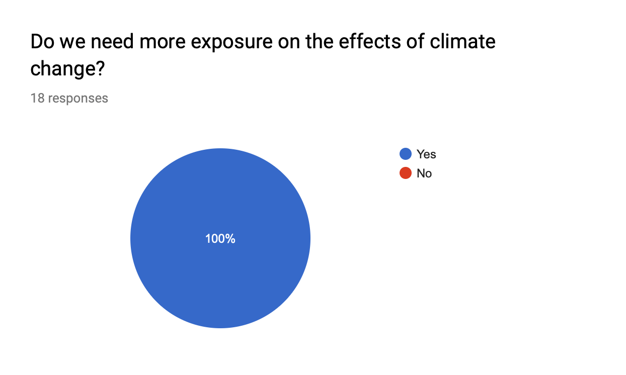 This confirms the need for me to spread more awareness on the topic of climate change using my infographic poster. In my poster I want to cover a few statistics as some shocking facts going on in the current world of today to deepen their understanding on the effects of climate change.
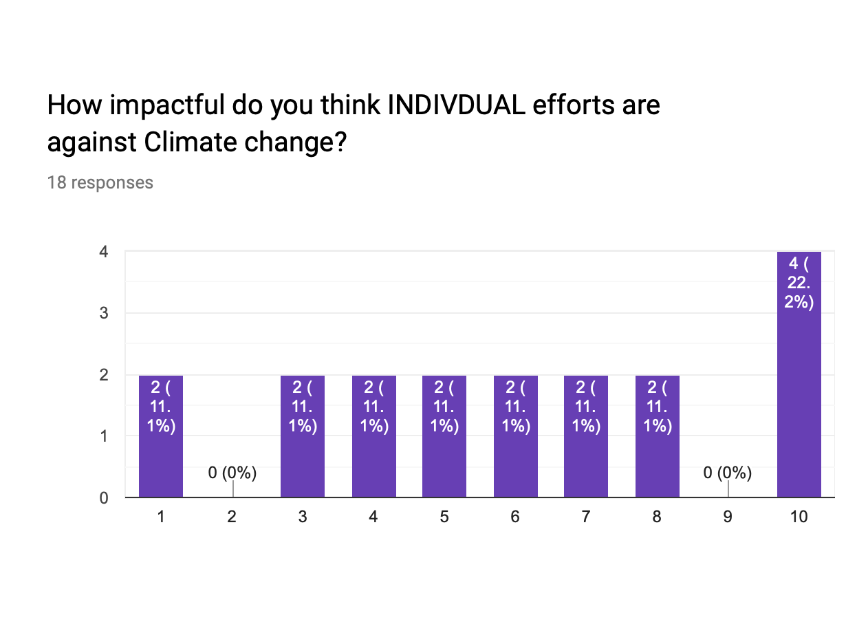


 Sentence 1:Movement and agility is key
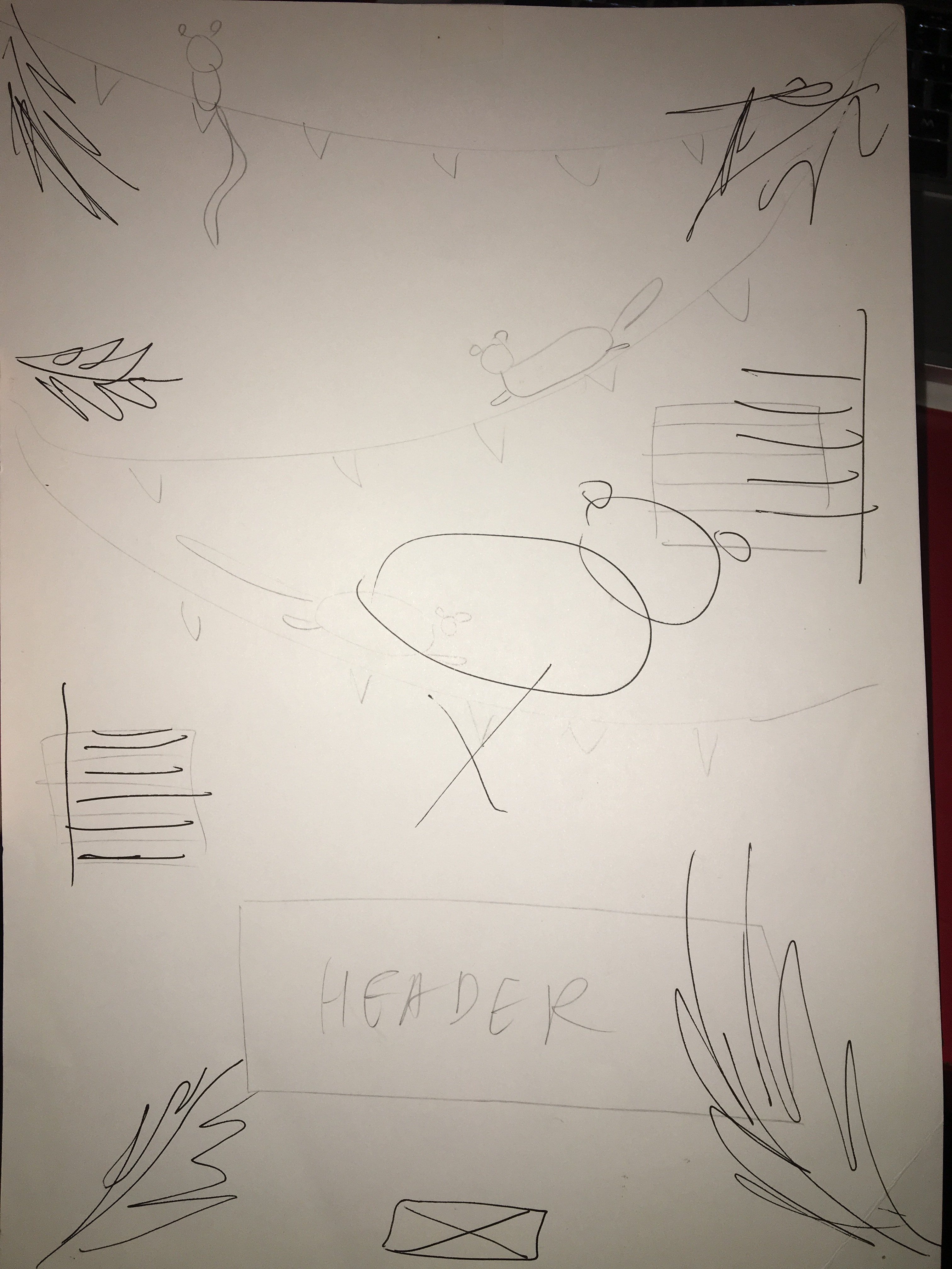 Sentence 2: Celebrating summer with popsicles and watermelon
 Sentence 3: Monkey see Monkey do(symmetrical)