My initial idea when I began this brief was to create a card that would allow monkey to jump from one side of the card to the other upon being opened. However after researching, the mechanisms behind that technique were very advanced and I wanted something simpler so I could manage my time better.I decided to follow this tutorial to make a twist pop up card. The idea of the monkeys popping out as you opened the card i thought was very representative of the fun, playful nature of the monkey.
I realised the measurements given in the card tutorial were for a card thats of a smaller dimension.It was too small , so I had to double it in size. After doing so, the increase in size made the card itself to heavy which jeopardised the pop up effect and also my monkey cut outs made the paper structurally weak.
After consulting Lisa she suggested that I play with the layers that I have in my poster and I decided on an accordion folding technique.
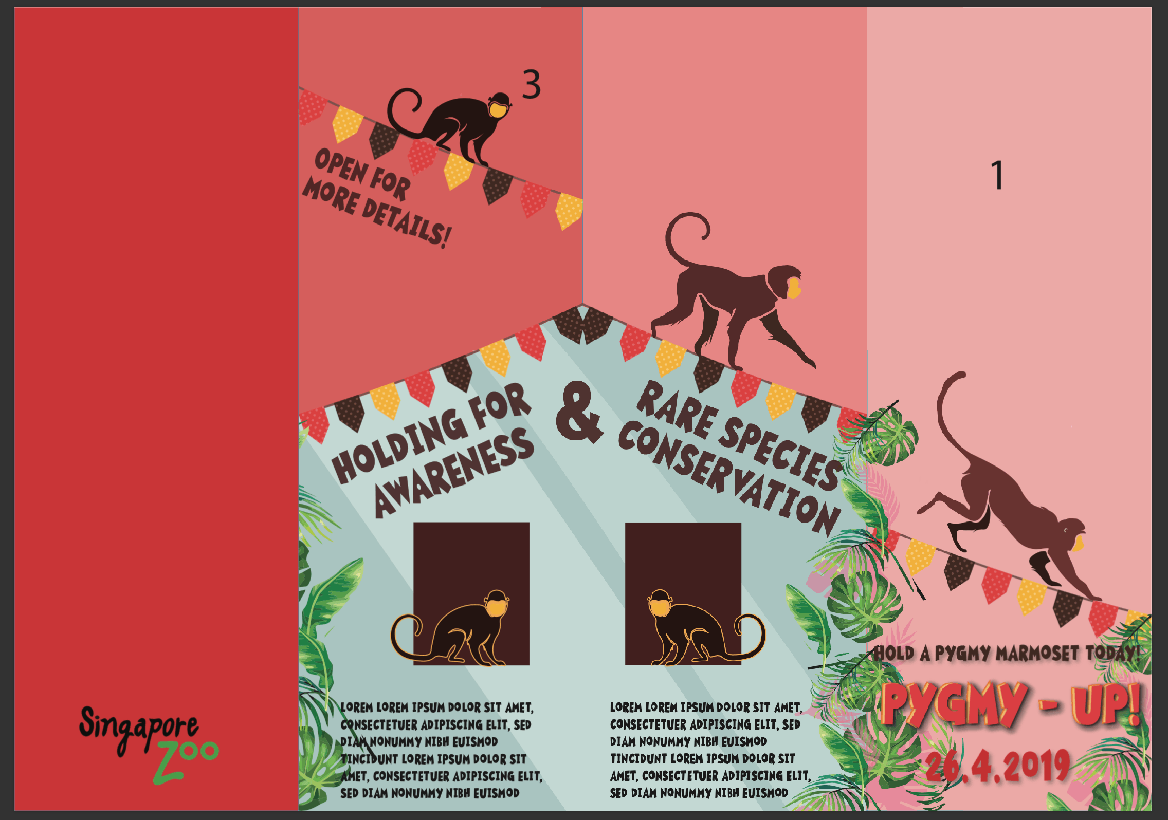
I labelled the panels on both sides on the paper to make it easier for me to layout my graphics.I adopted my design elements from the poster and I achieved the results below.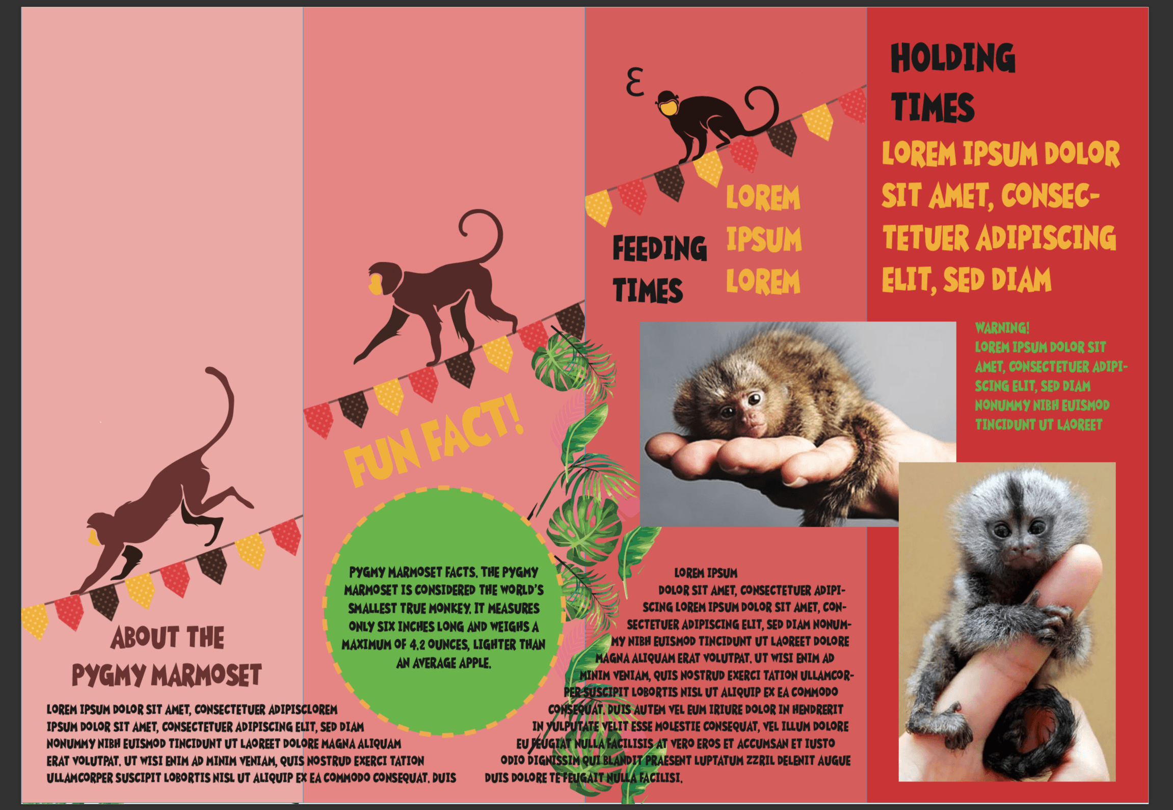
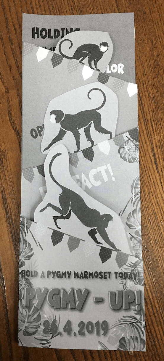
I proceeded to do a b&w test print and my layout issues were made obvious.The design elements from the pages behind the cover page were showing through and the monkeys were blocking out the texts beneath it.So I made the necessary adjustments and came up with a new layout
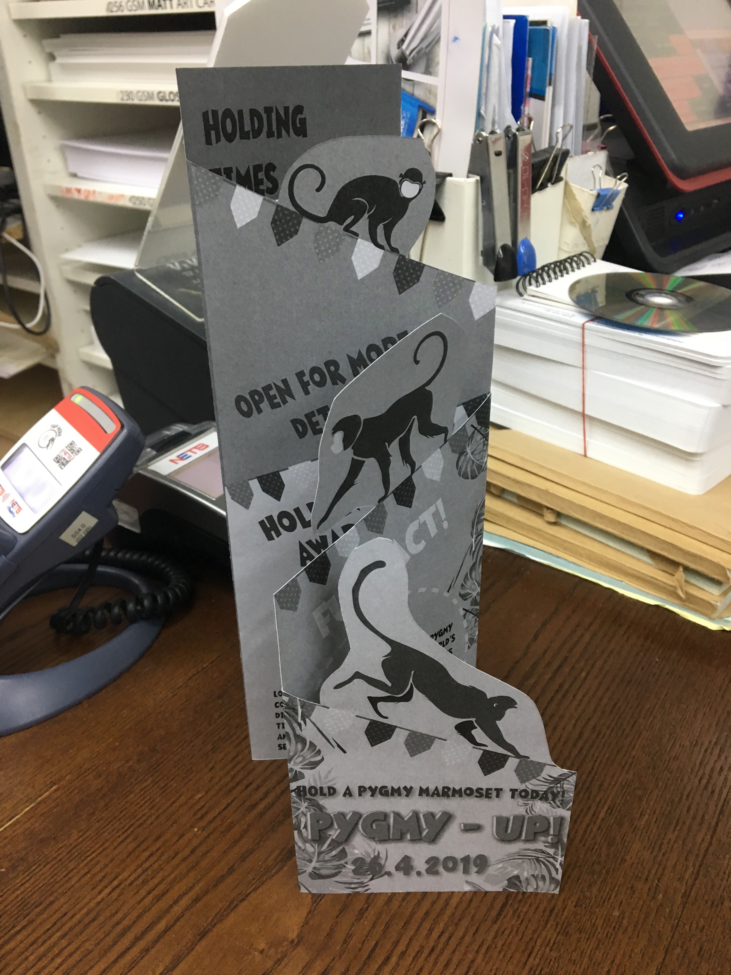
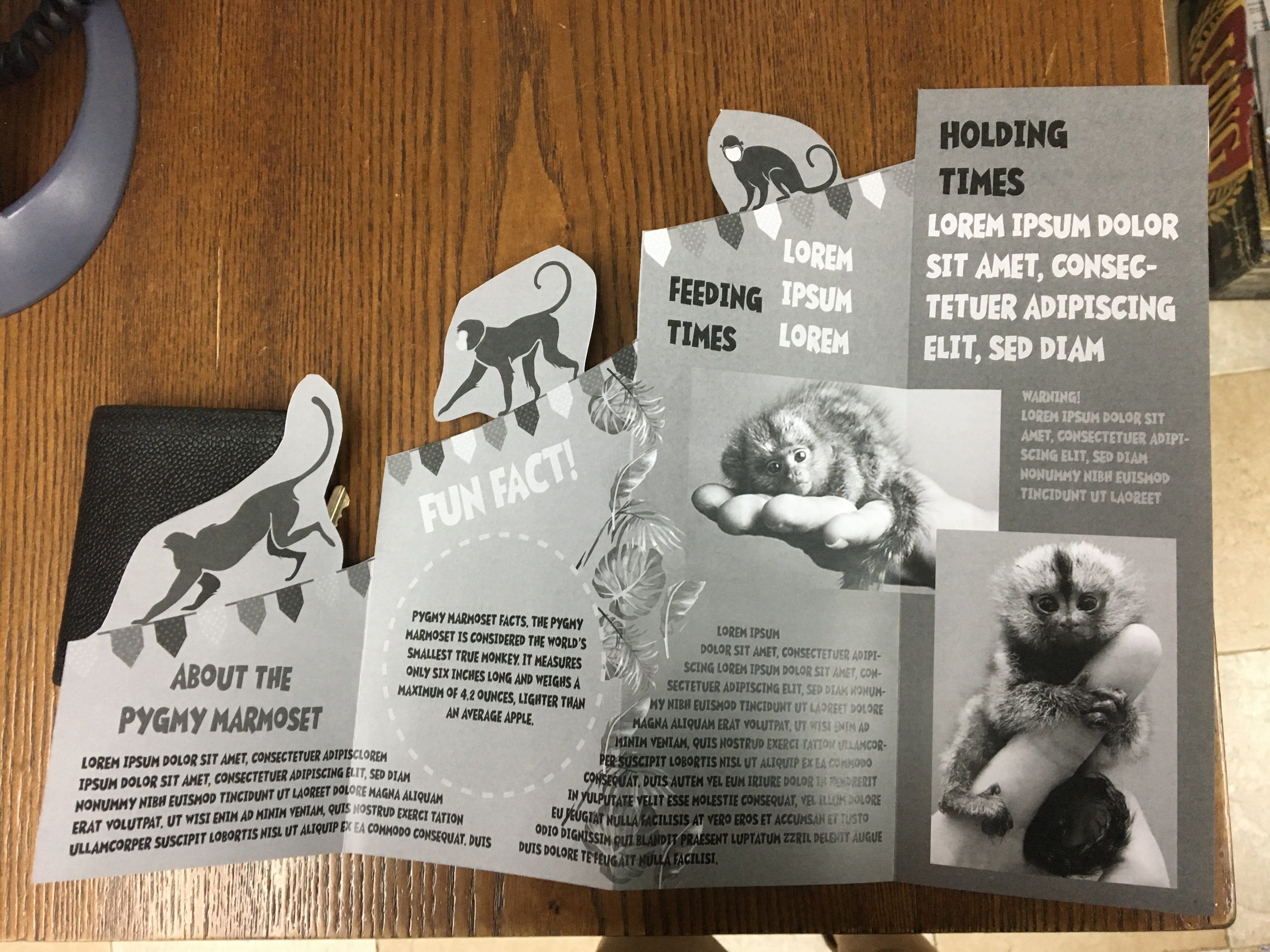
Also the font in my body text, graham cracker, existed only in uppercase which made reading very difficult so I opted for Avenir next bold instead.
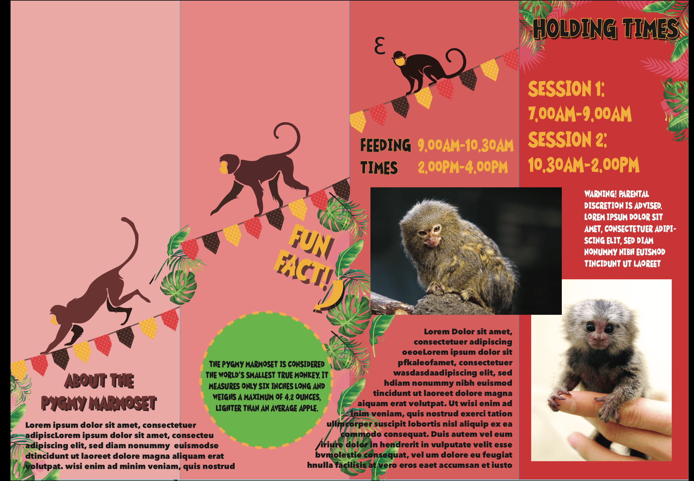
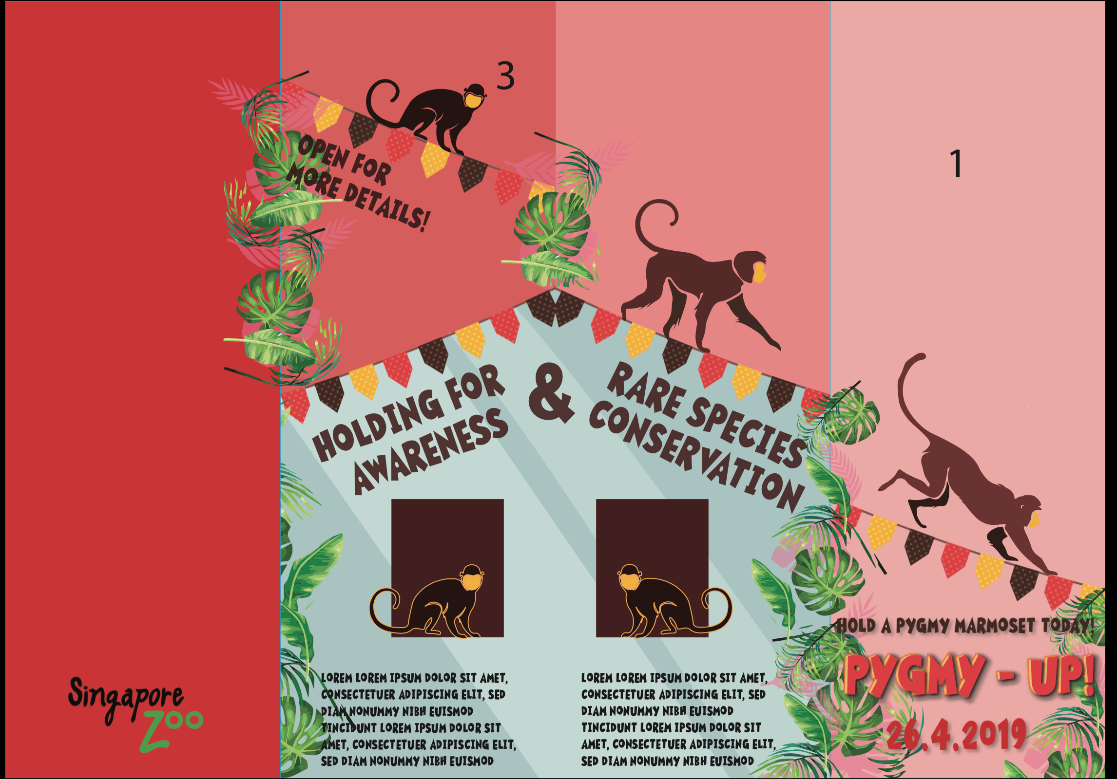
With that I made few more minor changes to the typography to help them stand out more and also added more details to the blue enclosure illustrations.This led me to the final brochure.
