Hi! I am Dhanusha, and I am currently pursuing a fine arts degree at NTU, specializing in Visual communication. I enjoy typography related work, illustrations, packaging, branding, and designing logos. Although I specialize in Visual communication, I consider myself an experimental mix-media artist. I spent time exploring other disciplines within my school, including Product design, UI/UX, and animation to widen my skill set and experiment with different art styles.
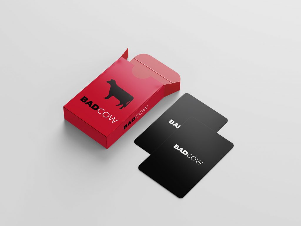

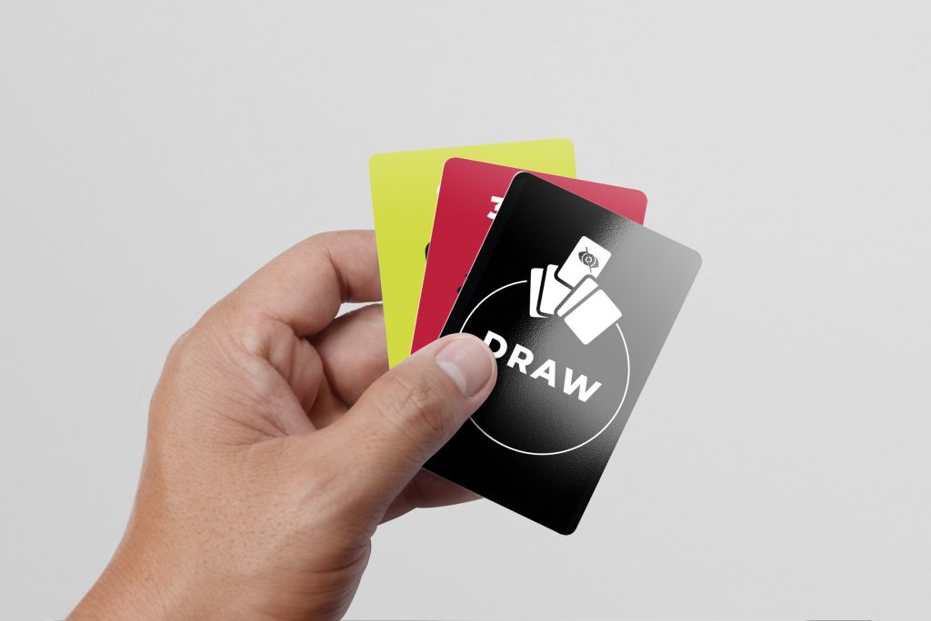
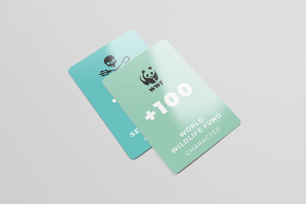
Badcow
This is one of my latest projects which stemmed from environmental activism. I enjoyed creating educational content in a medium that presents itself in a fun-lighthearted way. I created a card game based on the environmental film “Cowspiracy” depicting the water consumption of various food items. There are 3 card categories – Consumption, Character, and Power cards. The consumption cards are arranged from green to red to depict the range of good to bad consumption. The objective of the game is to clear all your cards by placing down cards of the same colors with the assistance of power cards or character and to not be left with the cow card.
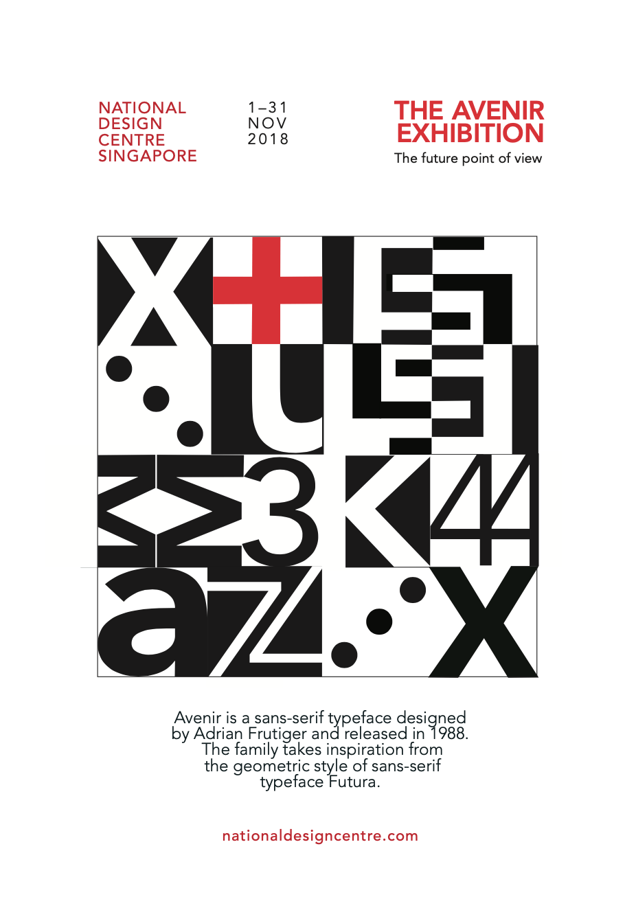


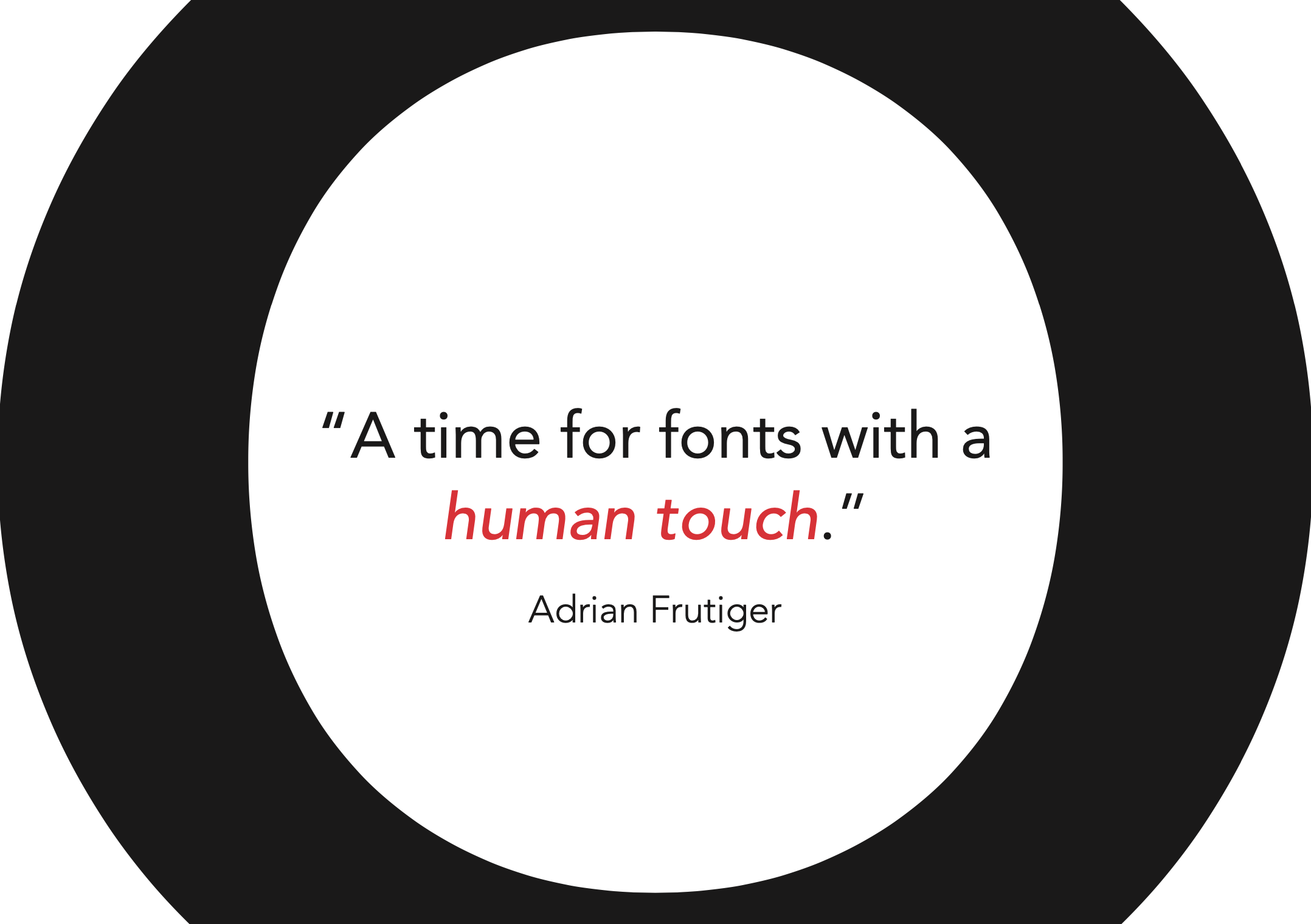
Typeface as a form – Avenir
In this project, I was tasked to see the typeface itself as a graphic form while exploring the intricacies of the typeface. I created a poster as well as a few A5 sized postcards to showcase the typeface Avenir.I chose to share this project because I learned about the versatility of type, layout, and how it can be creatively used in various applications. I feel it has a contemporary look which also shows the variety of styles I apply in the work I do.
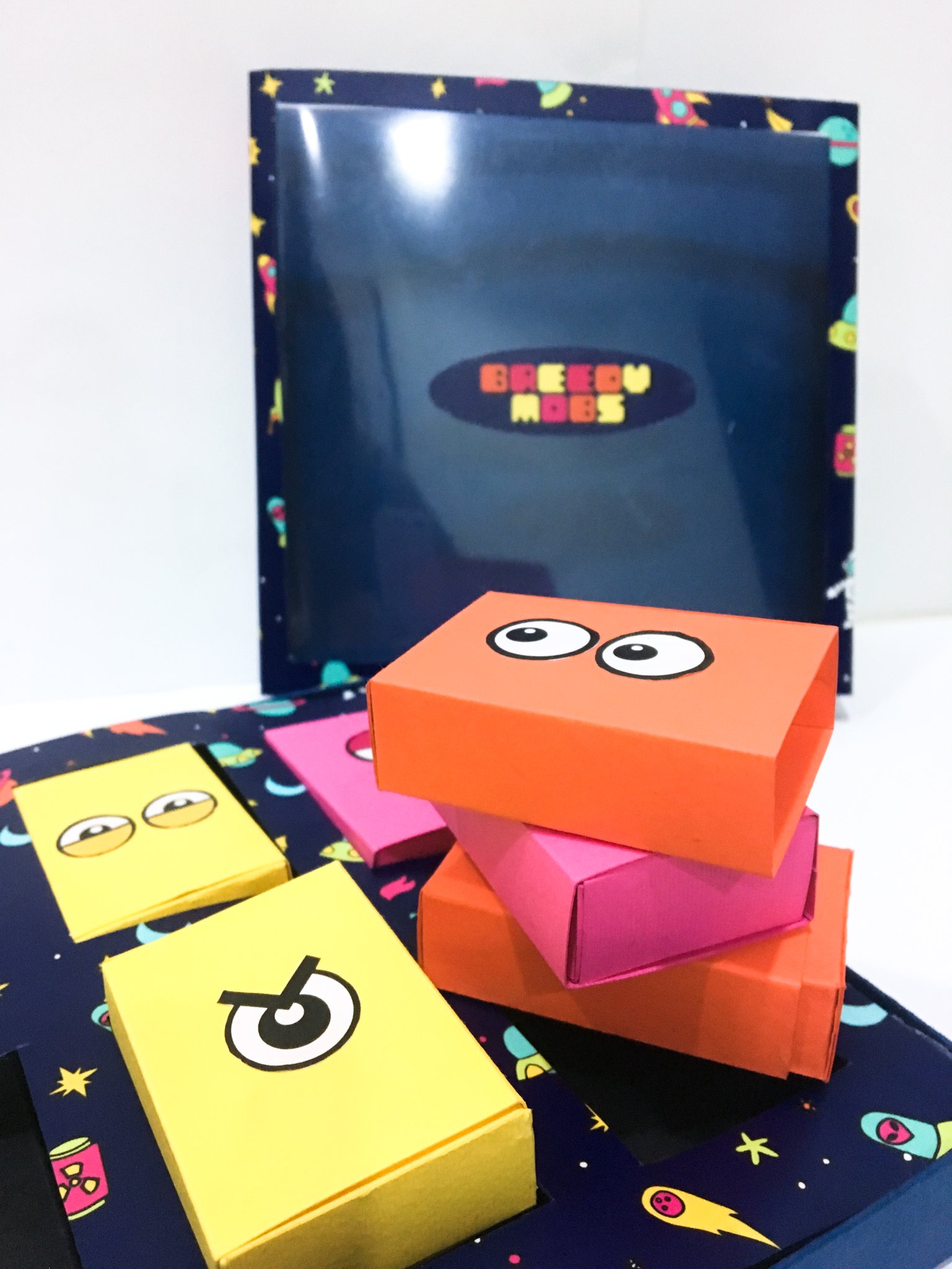
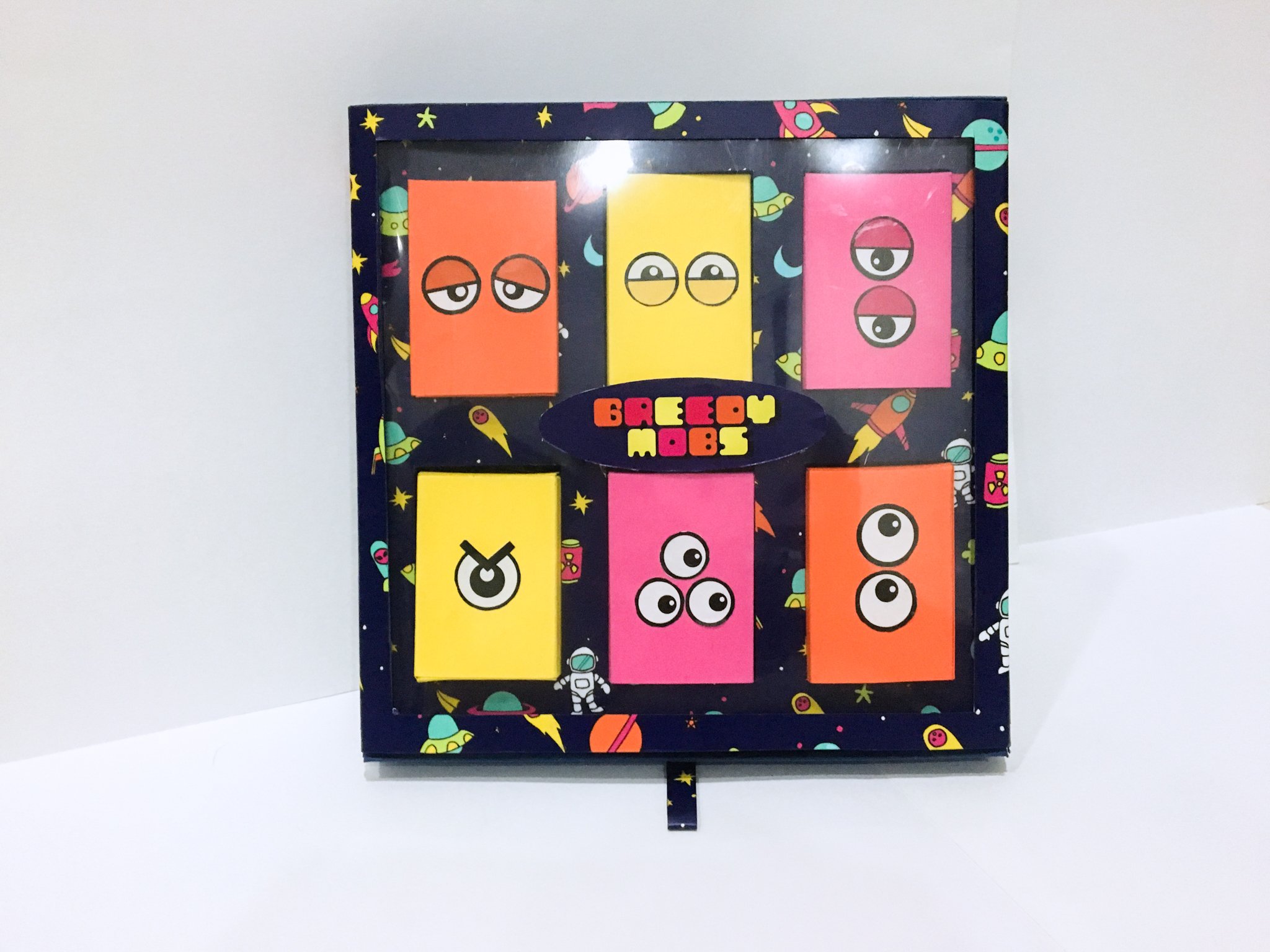

Greedy mobs
For my packaging module, I was tasked to design packaging catered towards kids that was themed “mini-monsters”.The concept I came up with was to create a box of candies, where the packaging can be reused. The packaging had 4 parts- the sleeve, base, insert, and candy boxes. I went with an alien theme and illustrated the print that was applied all over the package and also designed 6 different alien-themed friction lockboxes to package the candies. The sleeve acted as the base of the board game, and the playable characters can be found inside the candy packaging. This project taught me a lot about the effort that goes into designing aesthetic packaging and the different ways it can be functionally designed.
For my creative industry presentation, I picked the artist, Mearone. The artist displays his work mostly on his website. He also shares the creative process of some of his more iconic works on YouTube. Overall, all his online platforms are being used for different purposes. He uses social media as a means to channel viewers to his website where he has a store, portfolio, and contact information. In his Biography, he sells himself based on the amount of experience he’s had in a specialized scene in LA. He also names some of his iconic works and the themes he likes to cover in his work such as philosophy, politics, and mythology. The biography is then summed up by’ this statement, “MEAR ONE helps us envision the sublime spirit of our time – not by escaping reality, but by confronting it head-on. “. This intrigues me and transitions me into looking at his portfolio to decipher the messages behind his works.