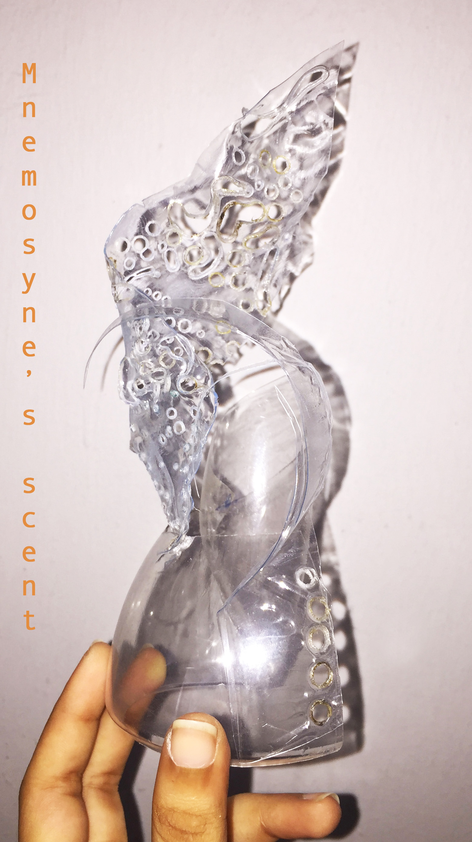
Colours and what they mean
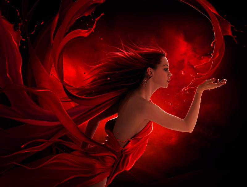
RED. Physical
Positive: love, passion, desire, sexuality,Physical courage, strength, warmth, energy, basic survival, ‘fight or flight’, stimulation, masculinity, excitement.
Negative: Defiance, aggression, visual impact, strain.
Red is a powerful colour. It has the property of appearing to be nearer than it is and therefore it grabs our attention first. Its effect is physical; it stimulates us and raises the pulse. It is stimulating and lively, very friendly. At the same time, Too much red causes loss of temper, agitation, anger, and overbearing, demanding, and oppressive behaviors. To get out of control emotions under control add green, the opposite of red. To get rid of exhaustion, add more red.


BLUE. Intellectual.
Positive: Intelligence, communication, trust, efficiency, serenity, duty, logic, coolness, reflection, calm.
Negative: Coldness, aloofness, lack of emotion, unfriendliness.
Blue is soothing; You see blue on a lot of websites because,it is the colour of trust. Blue is the colour of calm and serenity, and as such inspires security and a feeling of safety. However not all blues are serene and sedate. Electric or brilliant blues become dynamic and dramatic,it affects us mentally, rather than the physical reaction we have to red. Blue represents both the sky and the sea, and is associated with open spaces, freedom,imagination, expansiveness, inspiration, and sensitivity. Darker blues tend to be more sombre, heightening the security aspects, which makes them an excellent choice for professionalism and lighter, soft blues will calm the mind and aid concentration.Too much blue can create feelings of melancholy, negativity, sadness, self-righteousness, and self-centeredness. It can be perceived as cold, unemotional and unfriendly.
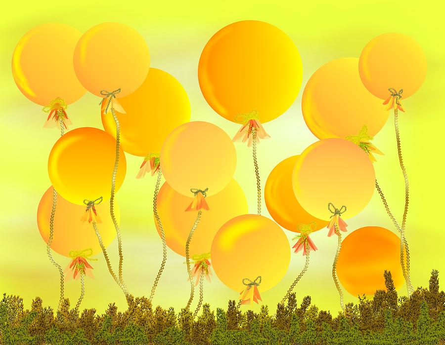
YELLOW. Emotional
Positive: Optimism, confidence, self-esteem, extraversion, emotional strength, friendliness, creativity.
Negative: Irrationality, fear, emotional fragility, depression, anxiety, suicide.
The yellow wavelength is relatively long and essentially stimulating. In this case the stimulus is emotional, therefore yellow is the strongest colour, psychologically. The right yellow will lift our spirits and our self-esteem; it is the colour of confidence and optimism. Too much of it, or the wrong tone in relation to the other tones in a colour scheme, can cause self-esteem to plummet, giving rise to fear and anxiety.. A dull or dingy yellow may represent caution, sickness, and jealousy.

GREEN. Balance
Positive: Harmony, balance, growth,refreshment, universal love, rest, restoration, reassurance, environmental awareness, equilibrium, peace.
Negative: Boredom, stagnation, blandness, enervation.
The color green has healing power and is understood to be the most restful and relaxing color for the human eye to view. Being in the centre of the spectrum, it is the colour of balance – a more important concept than many people realise. When the world about us contains plenty of green, this indicates the presence of water, and little danger of famine, so we are reassured by green, on a primitive level. Green is soothing, relaxing, and youthful. Green is a color that helps alleviate anxiety, depression, and nervousness. dark green represents greed, ambition, and wealth, while yellow-green stands for sickness, jealousy, and cowardice, and olive green represents the traditional color of peace. Negatively, it can indicate stagnation and, incorrectly used, will be perceived as being too bland.

VIOLET. Spiritual
Positive: Spiritual awareness, containment, vision, luxury, authenticity, truth, quality, royalty, nobility, creativity . Negative: Introversion, decadence, suppression, inferiority.
It takes awareness to a higher level of thought, even into the realms of spiritual values. It is highly introvertive and encourages deep contemplation, or meditation. It has associations with royalty and usually communicates the finest possible quality. Light purple or lavender is a feminine, graceful, elegant color that has long been associated with refined, wealthy women. Dark purple hues evoke feelings of gloom, sadness, and frustration. Bright purple hues suggest riches and royalty. Excessive use of purple can bring about too much introspection and the wrong tone of it communicates something cheap and nasty, faster than any other colour.
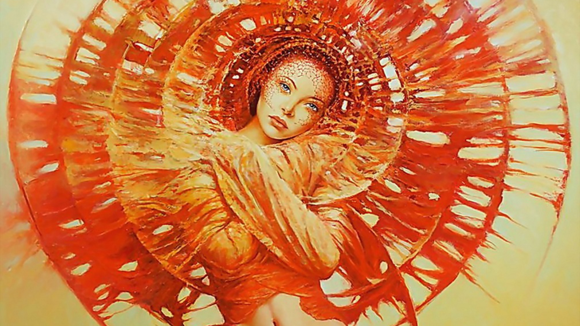
ORANGE.
Positive: Physical comfort, food, warmth, security,playful,energetic passion,sensual, abundance, fun.
Negative: Deprivation, frustration, frivolity, immaturity.
Since it is a combination of red and yellow, orange is stimulating and reaction to it s a mixture of the energy associated with red and the happiness associated with yellow.Dark orange may represent deceit and distrust, while red-orange relates to passion, pleasure, desire, aggression, domination, and action, and a golden orange often stands for prestige, wisdom, illumination, wealth, and quality. A light orange or peach color tend to be more friendly and soothing.Studies show that the orange color can create physical effects such as increased hunger and heightened sense of activity. It is a ‘fun’ colour. Negatively, it might focus on the exact opposite – deprivation. This is particularly likely when warm orange is used with black. Equally, too much orange suggests frivolity and a lack of serious intellectual values.
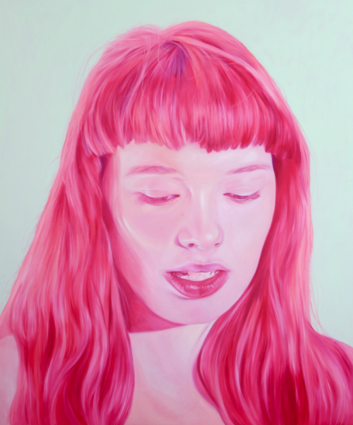
PINK.
Positive: Physical tranquillity, nurture, warmth, femininity, love, sexuality, survival of the species.
Negative: Inhibition, emotional claustrophobia, emasculation, physical weakness.
Being a tint of red, pink also affects us physically, but it soothes, rather than stimulates.Pink, a delicate color that means sweet, nice, playful, cute, romantic, charming, feminine, and tenderness, is associated with bubble gum, flowers, babies, little girls, cotton candy, and sweetness.The color pink is the color of universal love of oneself and of others. Pink represents friendship, affection, harmony, inner peace, and approachability. However,too much pink is physically draining and can be somewhat emasculating.
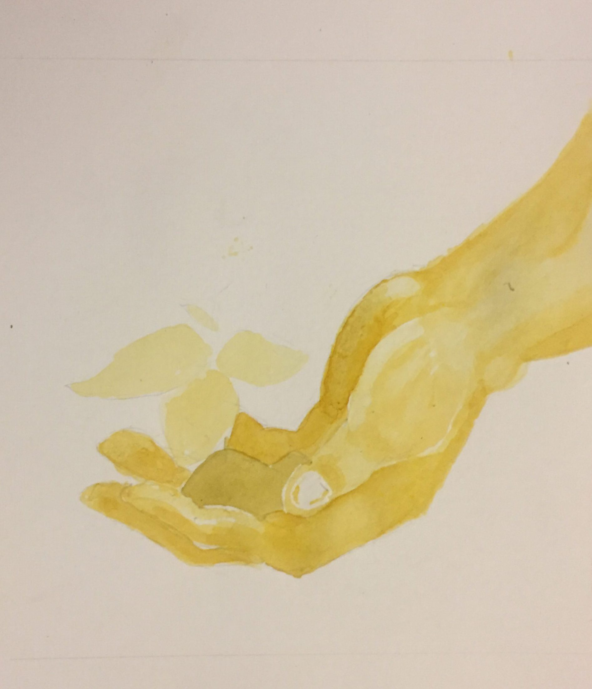
With this Information I proceeded to conceptualise and choose the colours for my compositions.Keeping in mind to use different colour harmonies to bring out the emotions I am trying to convey.My approach was to use humans for the “me” column , Body parts to represent the settings and animals to symbolise the outcome. The colour harmonies I chose to employ for this project would be :Triadic, Analogous ,Monochrome and split complementary.I also chose to keep each composition monochromatic as well , In order to be able to include more details and increase my speed as I was using watercolours.
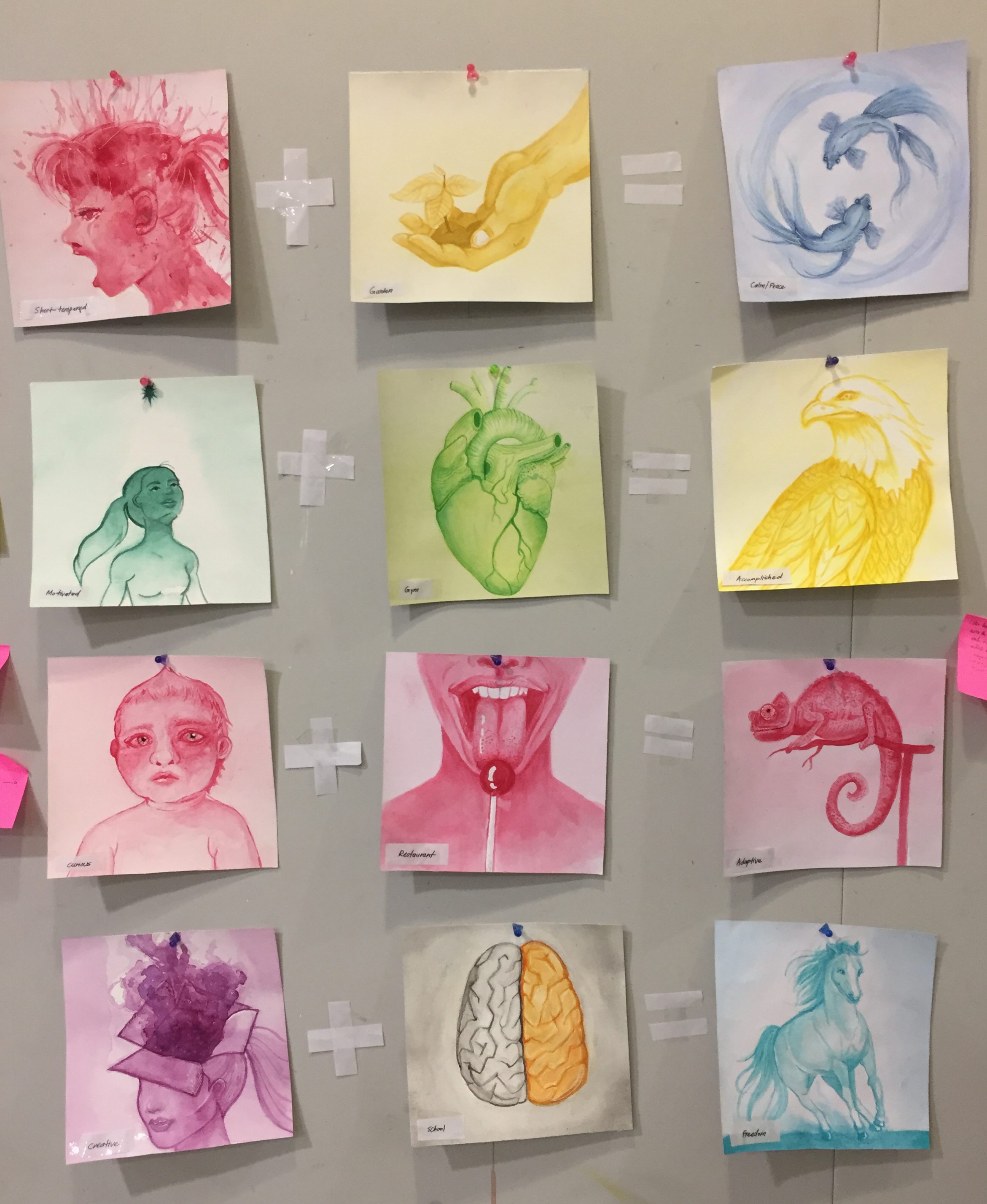
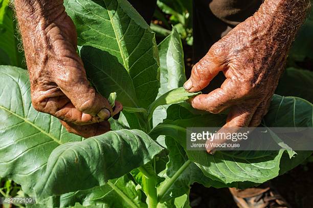
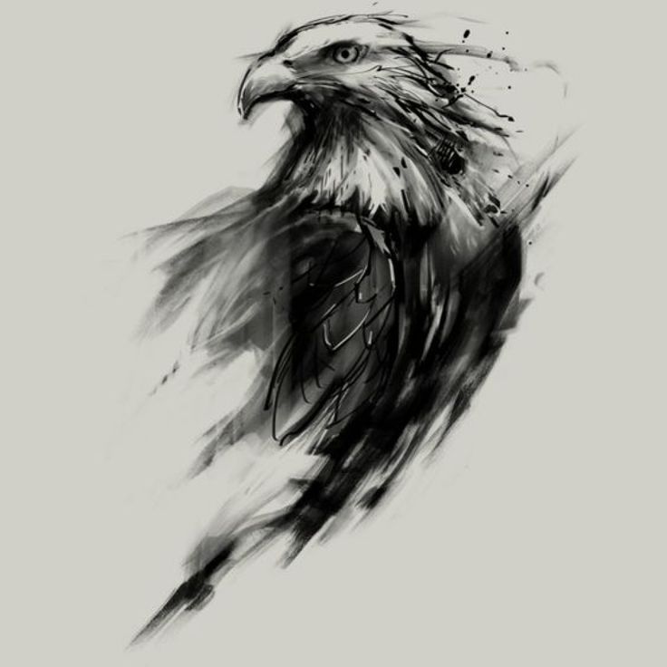
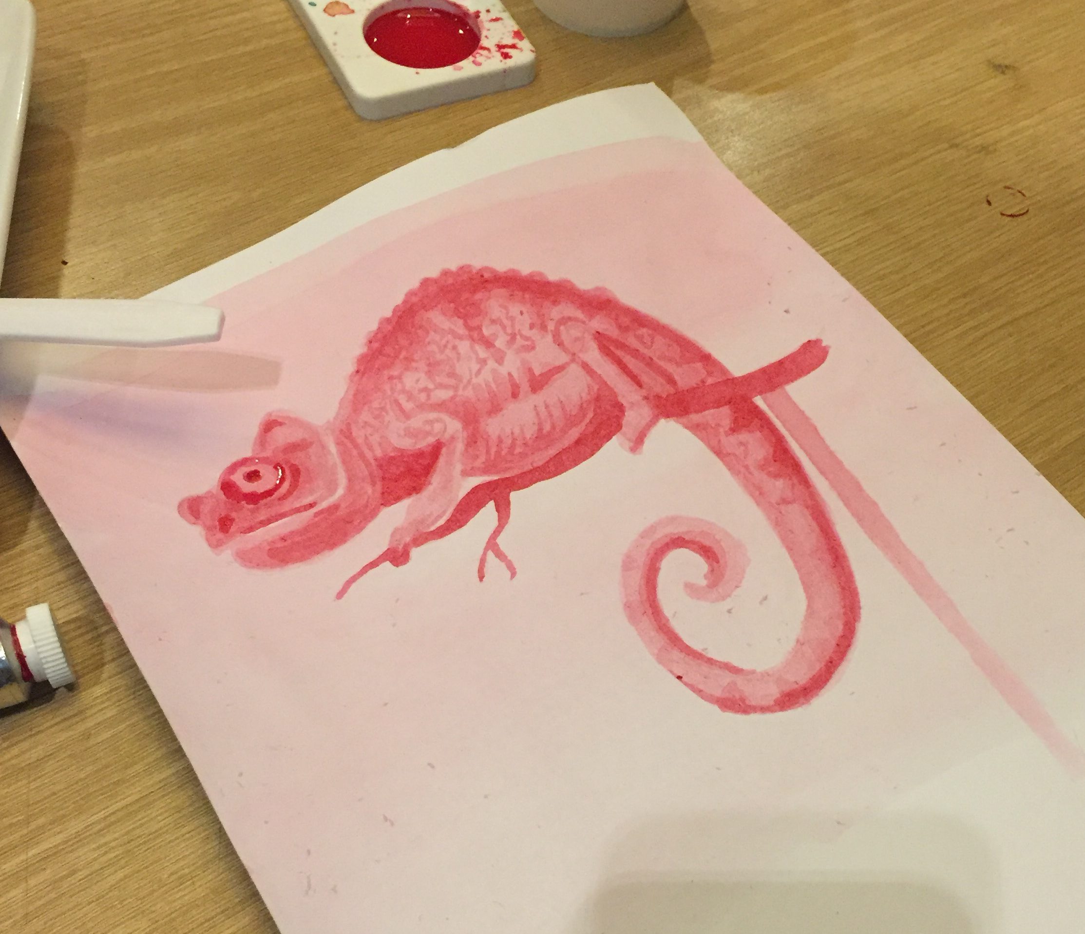
For each of the compositions, I found a reference picture and added my own spin to them. For example for my hand composition, I was inspired by this picture..so on and so forth.
FEEDBACK
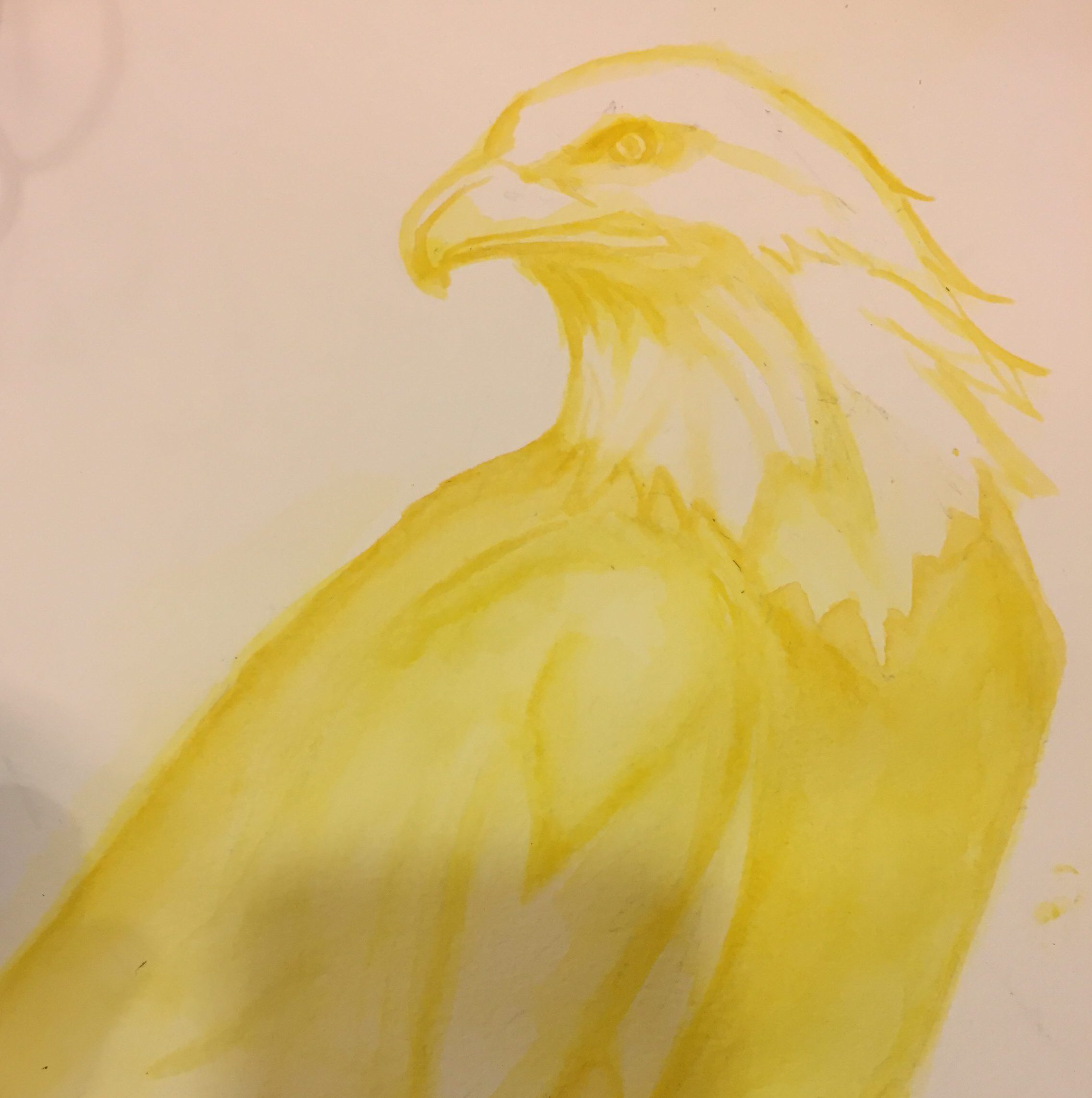
Ms joy stated i should have been more clear with my final row,which is the split complementary row.I should lean my colours more towards blue green instead of the blue that i used in order for it to be more split complementary in nature.With that said, She also commented that my eagle was more clear and she could see the effort put into building the layers of the water colour.
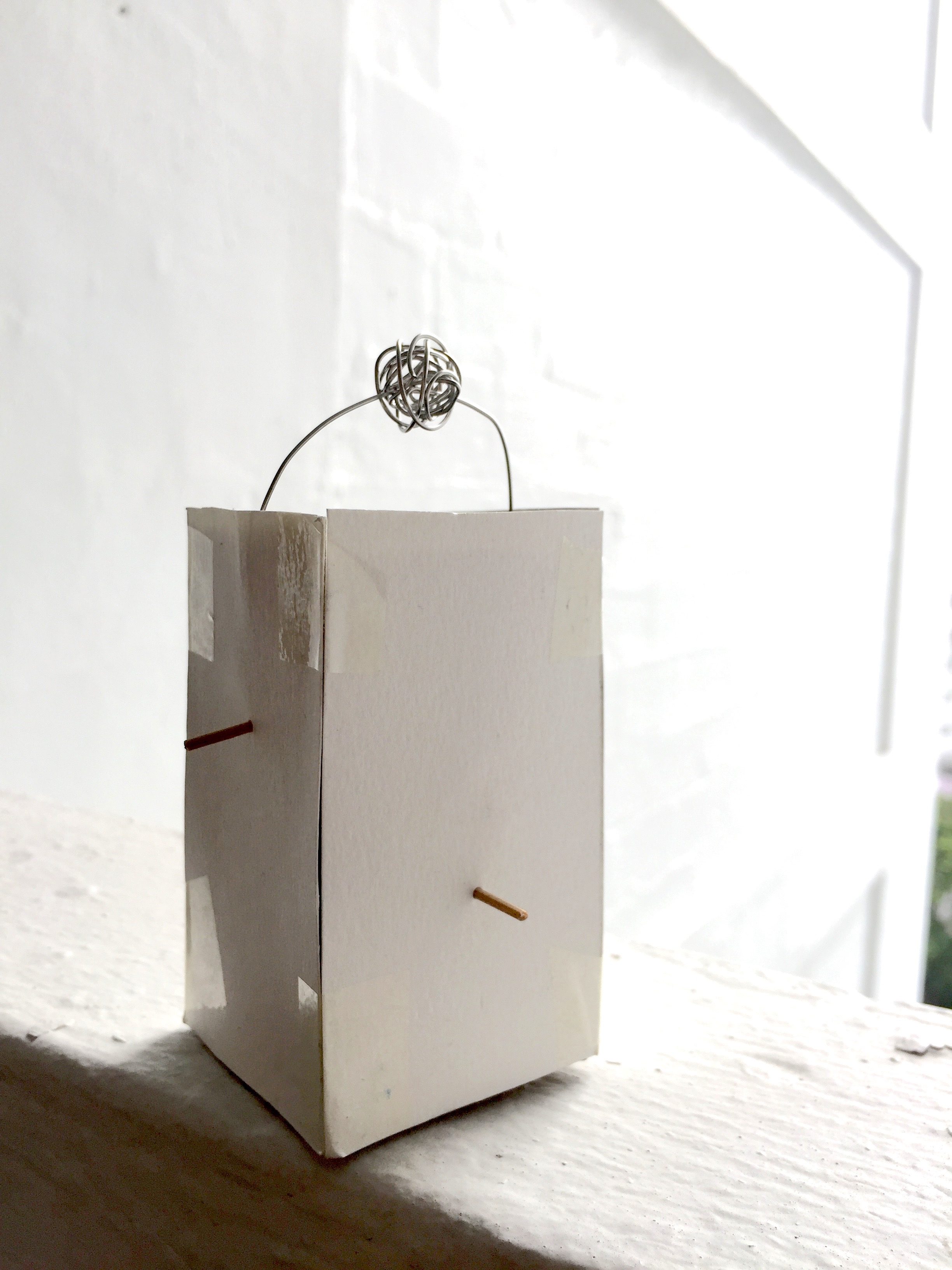
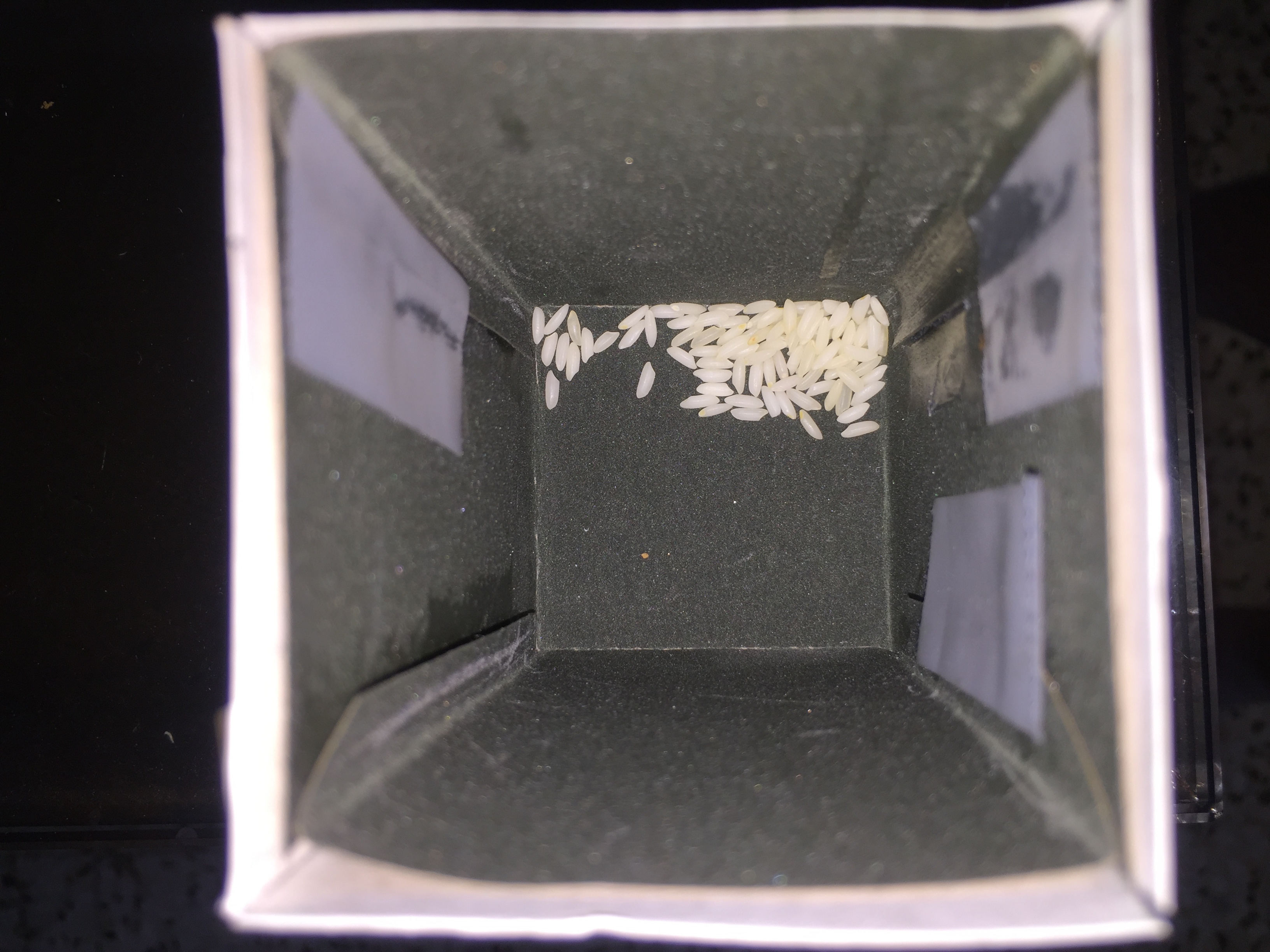
Side view of toothpicks progressing higher up the sides of the box

Top view
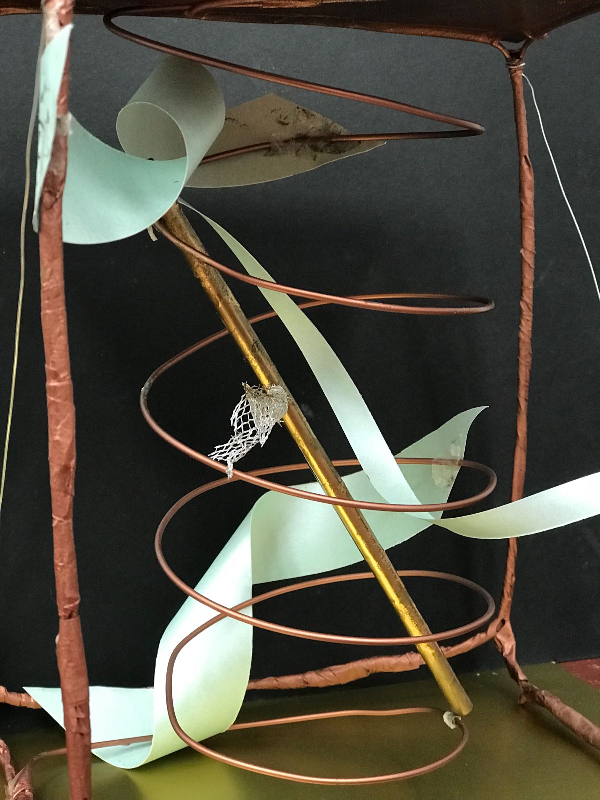 Green strips of paper-Subdominant,Mesh wire-Sub ordinate
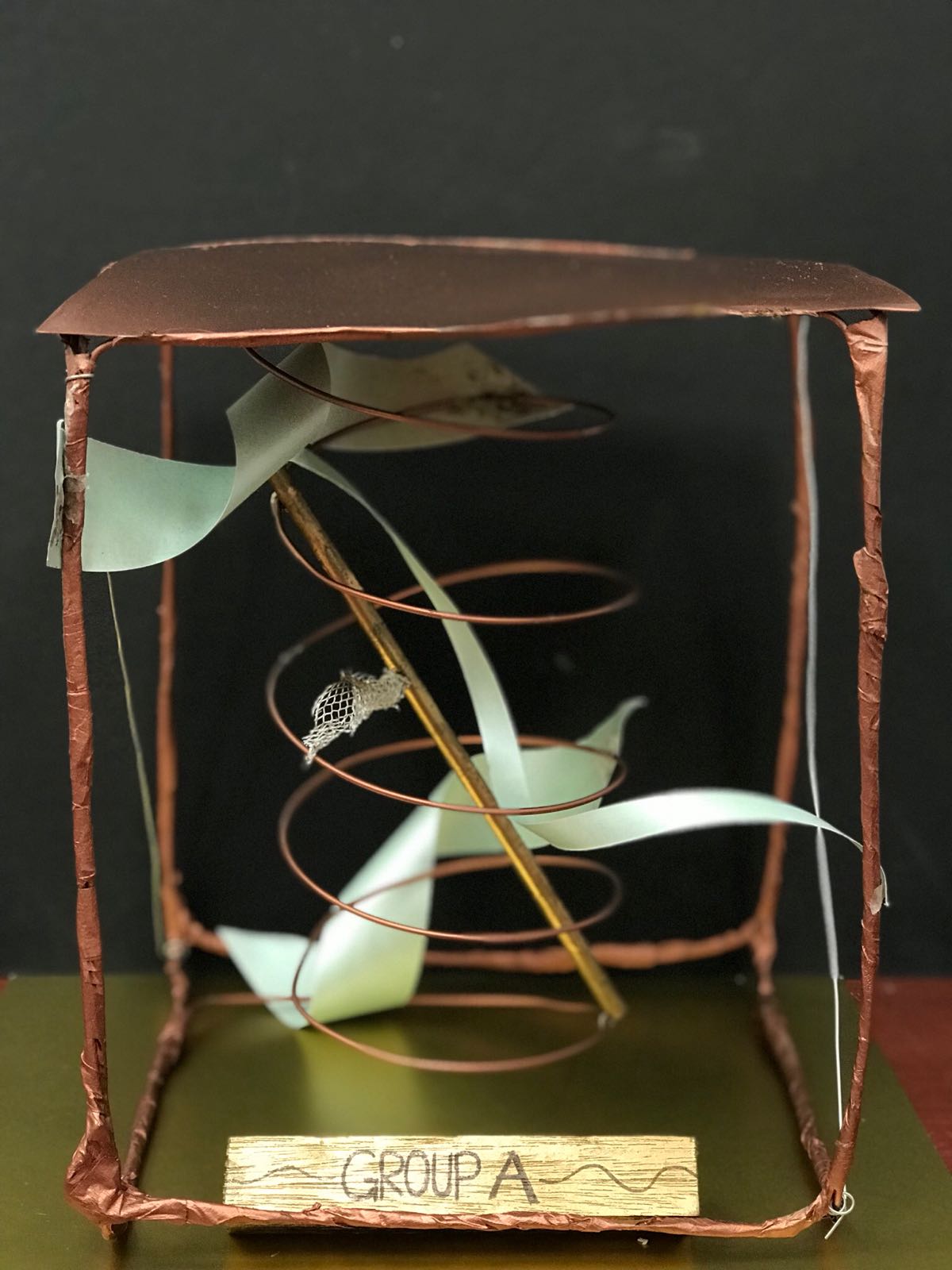
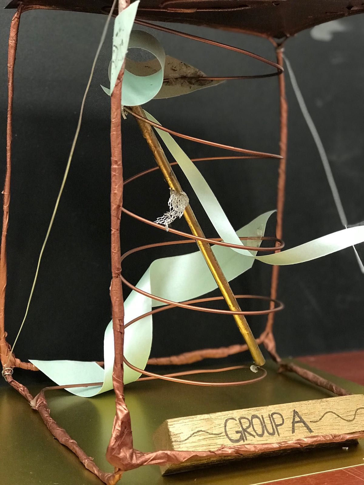
 Front view
 Side view - Contrasting voids
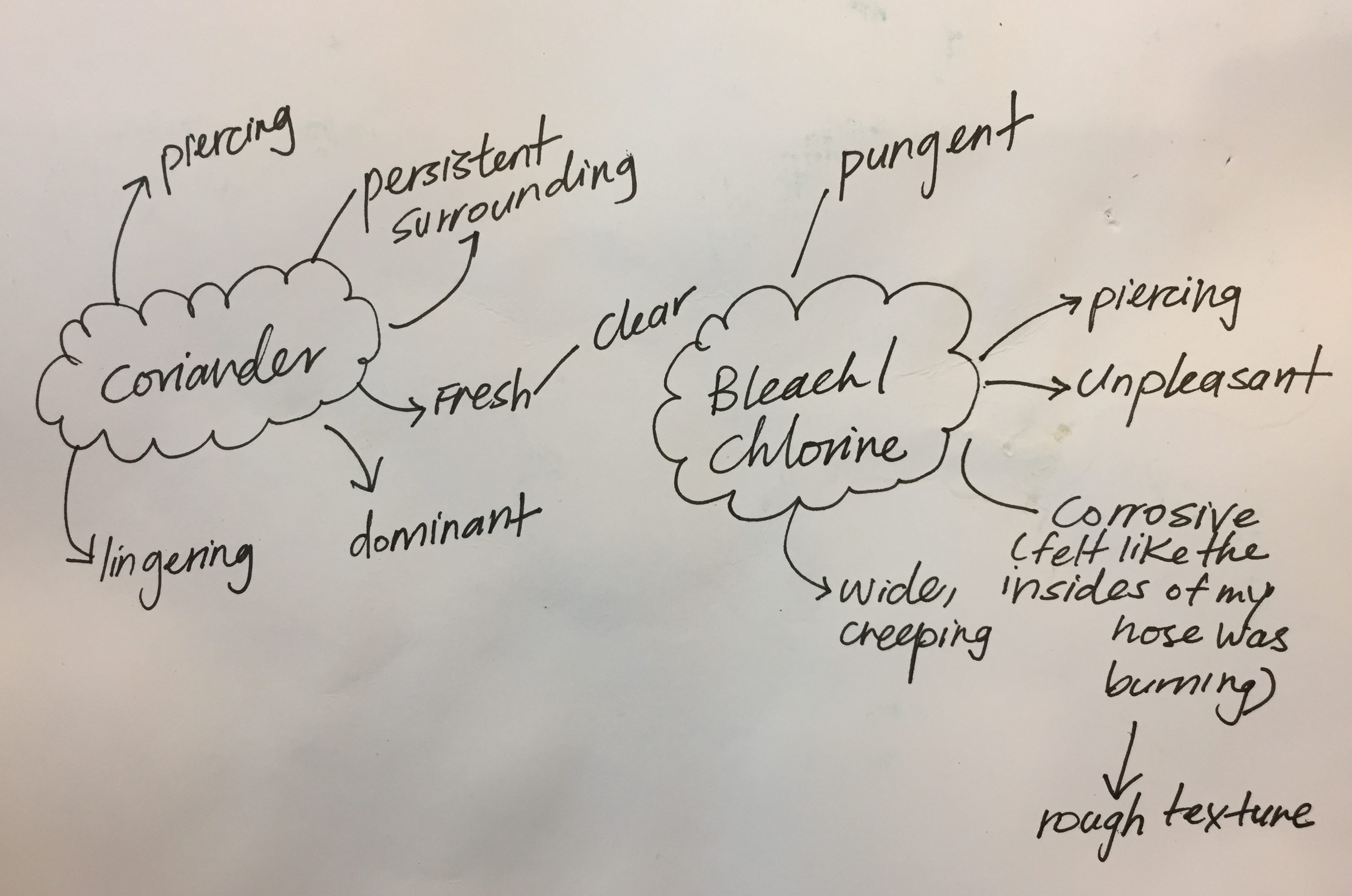


 My original sketch for this composition did not have clear focus. Also there was no direction in which I was placing certain images,symbols,etc. After the consultation,I researched on the different design principles like proportion and pattern and came up with the composition on the left,I placed the skull in the middle which draws focus to it. However the background was still a bit too dark and the deities could not be seen.

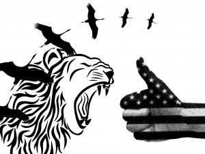 This composition is based off the same quote as the previous one. Using the golden ration i placed some found images accordingly.however, My first sketch did not have enough details to bring across the idea of Amos Yee fleeing Singapore. Also the lion and the hand were similar in size and were drawing equal amount of attention.There was also no clear direction at which the birds were headed.
 To improve i photoshopped the lions ad onto a suit symbolising a member of the parliament and placed the birds such that they’re flying into the mouth on the right.I decided to use the american flag to give more information about the quote and i also enjoyed how it fit into the golden ratio template.Unfortunately,I had to convert my design into portrait..Resulting in composition 2.


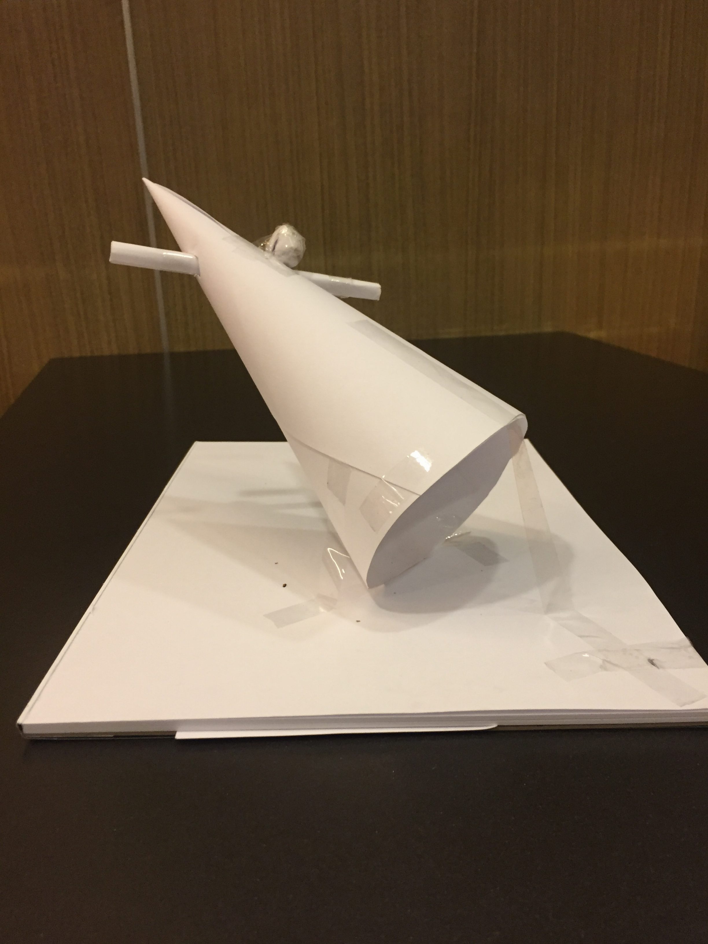
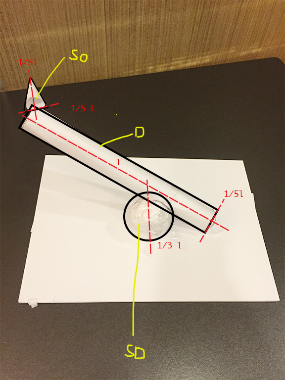
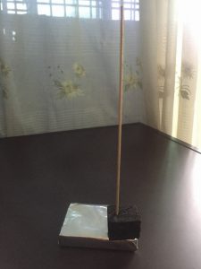
 Final model
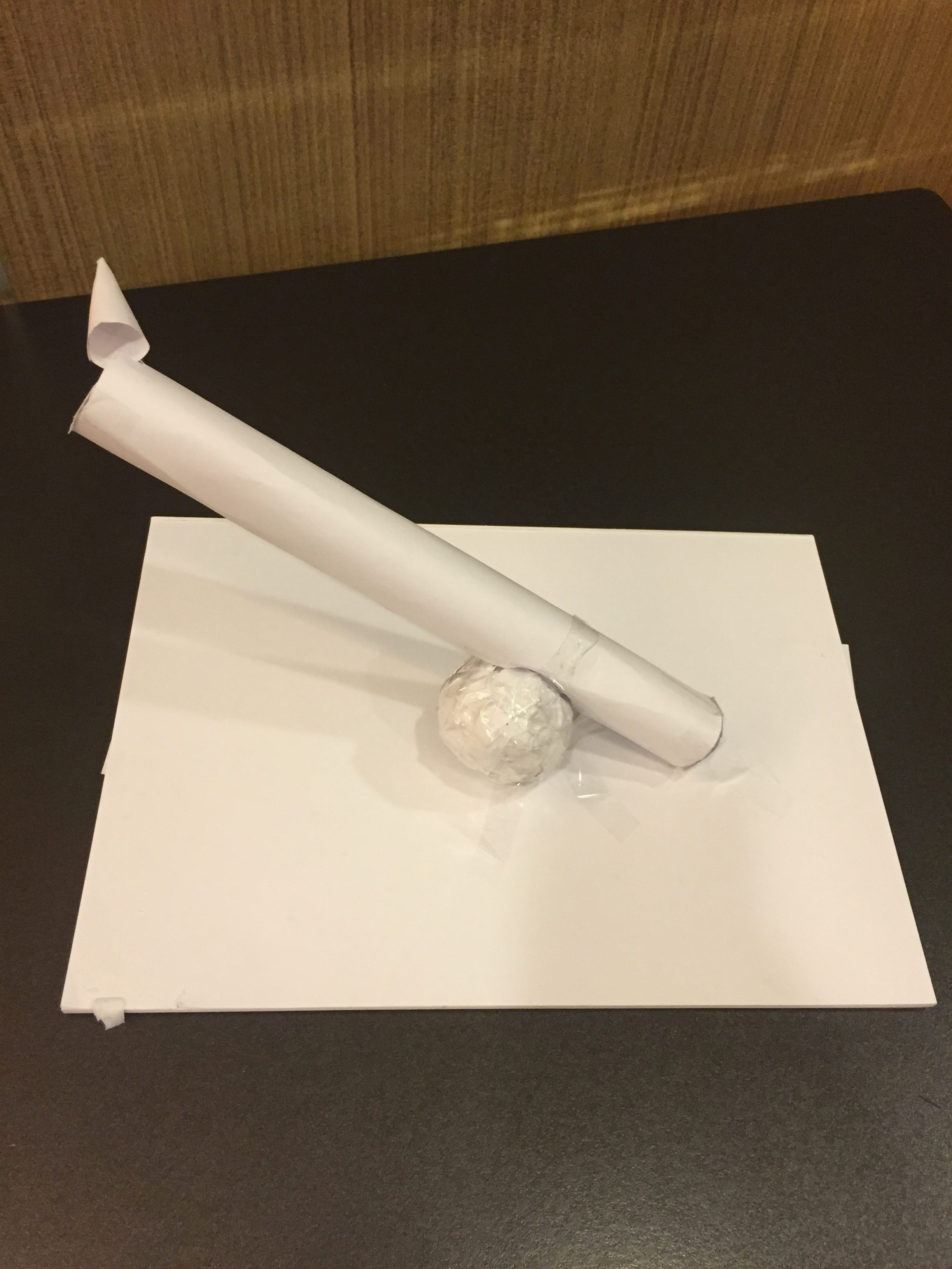
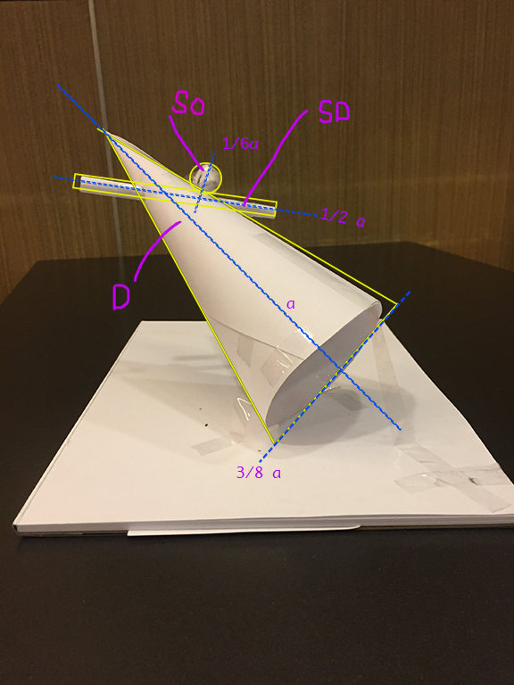
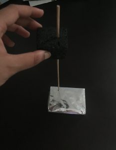
 1st model
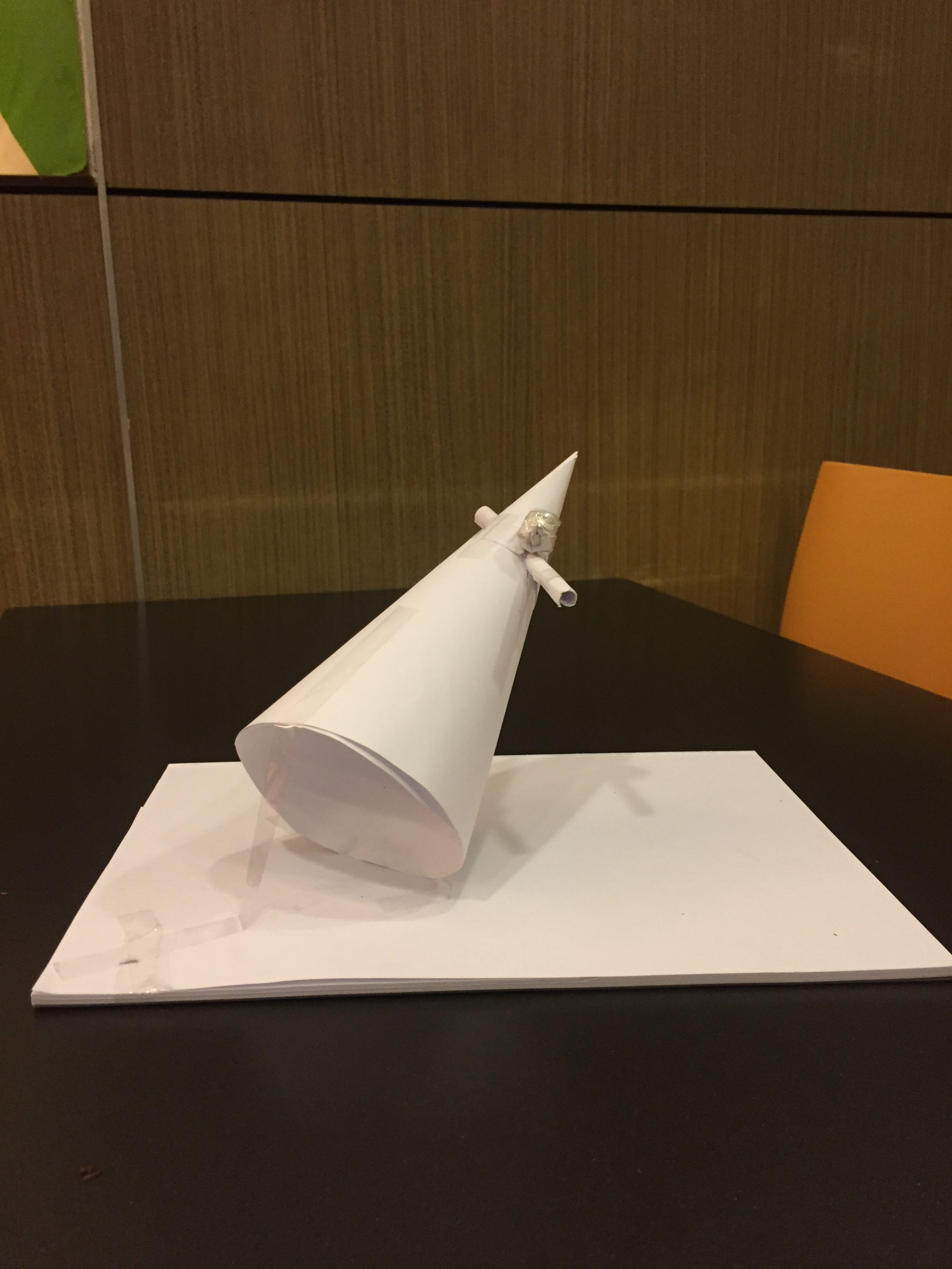


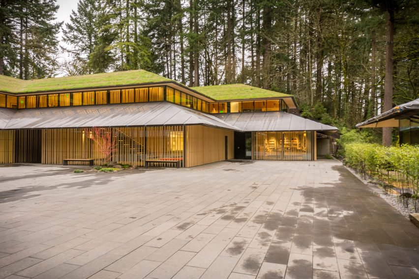 https://www.dezeen.com/2017/04/04/kengo-kuma-major-expansion-portland-japanese-garden-opens/


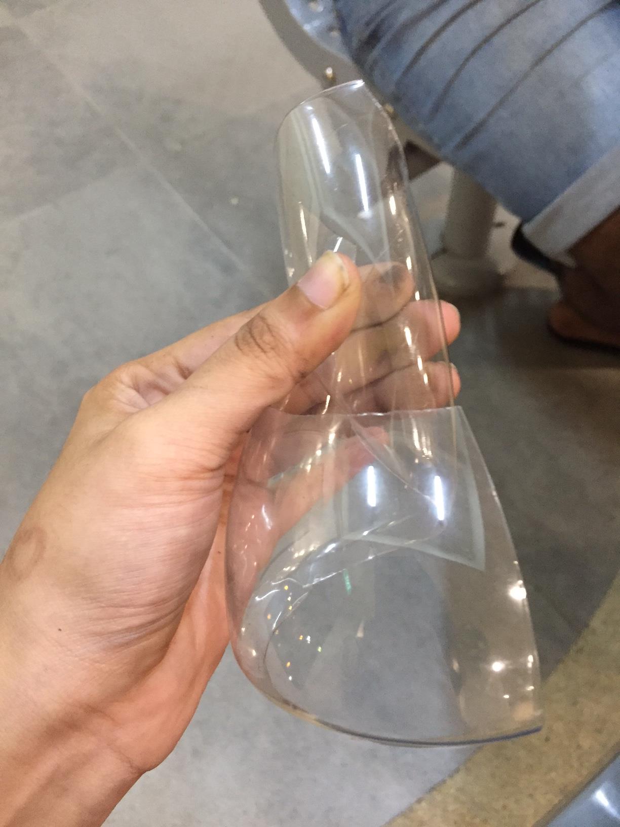
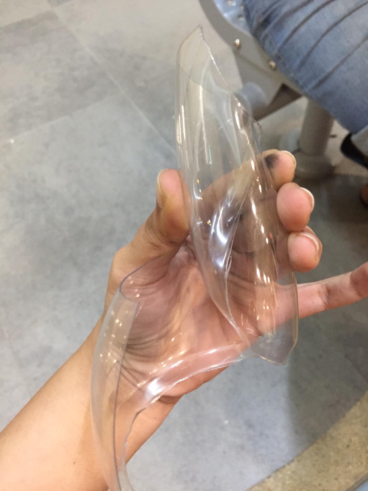
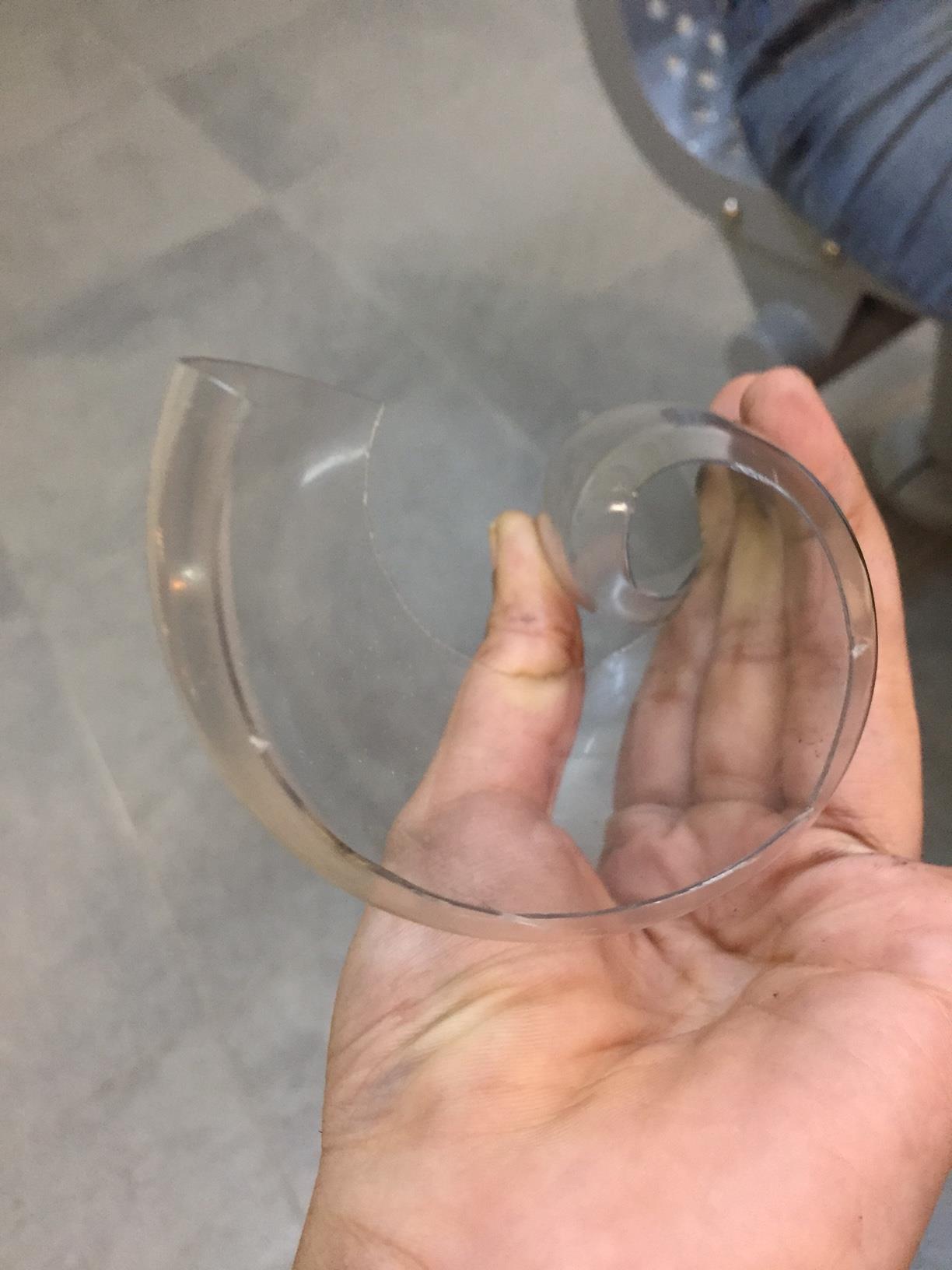
 The idea you suggested for surprise was to play with the shapes,Since you pointed out i tend to create patterns for my other strips.I tried thinking along these lines and felt what i came with was very flat in terms of tone.I dipped cups into ink and forcefully to create circlular marks and the bottom of the chinese ink bottle to create rectangular shapes.I realised that the ink i was using was too thick so it was not splattering that much,so i tested out inks at different dilution levels.From here i thought i could base the idea of surprise using different tones of ink. The rings splattered too messily which was too distracting, so i wanted to concentrate on keeping most of the rings very clean and uniform.I created a pattern with the circles to have a few focal points instead, as i wanted to show more of a person being “Startled” .Originally the circles were spaced randomly,hence,there was a lack of focus.I thought creating a few focal points would give the appropriate degree of the idea of distraction.
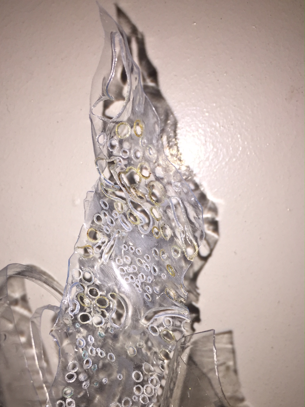
 Same goes for Joy.I repeated the print over and over with the mark making tool i made at different wavelengths,or how much they overlapped which determines how the linesintertwined.The slightly more intertwined lines looked more harmonious to me as they flow very nicely together and fills up the negative space a little more making the contrast between the background and the ink itself not too stark. The idea of different sized,soft,wavy lines it is i wanted it to look soothing so i avoided sudden harsh peaks.I also wanted a mixture of dark and light tones as the entire idea of different types of lines and tones blending together very smoothly made me happy.