The following is an A5 booklet that documents the process of creating my project THICC TINGS. The contents of this booklet will be adapted into an artist book that will accompany my video installation.


The following is an A5 booklet that documents the process of creating my project THICC TINGS. The contents of this booklet will be adapted into an artist book that will accompany my video installation.
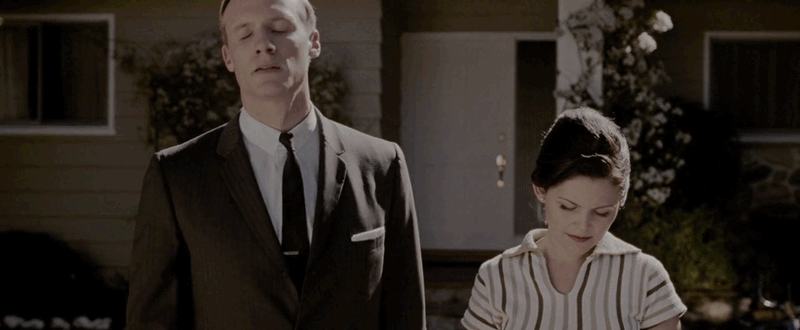
For the third exercise for this class, we were tasked to create a storyboard that explored traditional film framings and the 16:9 film resolution. I decided to create a fictitious and no-holds-barred short narrative on a guy with an interesting fetish –
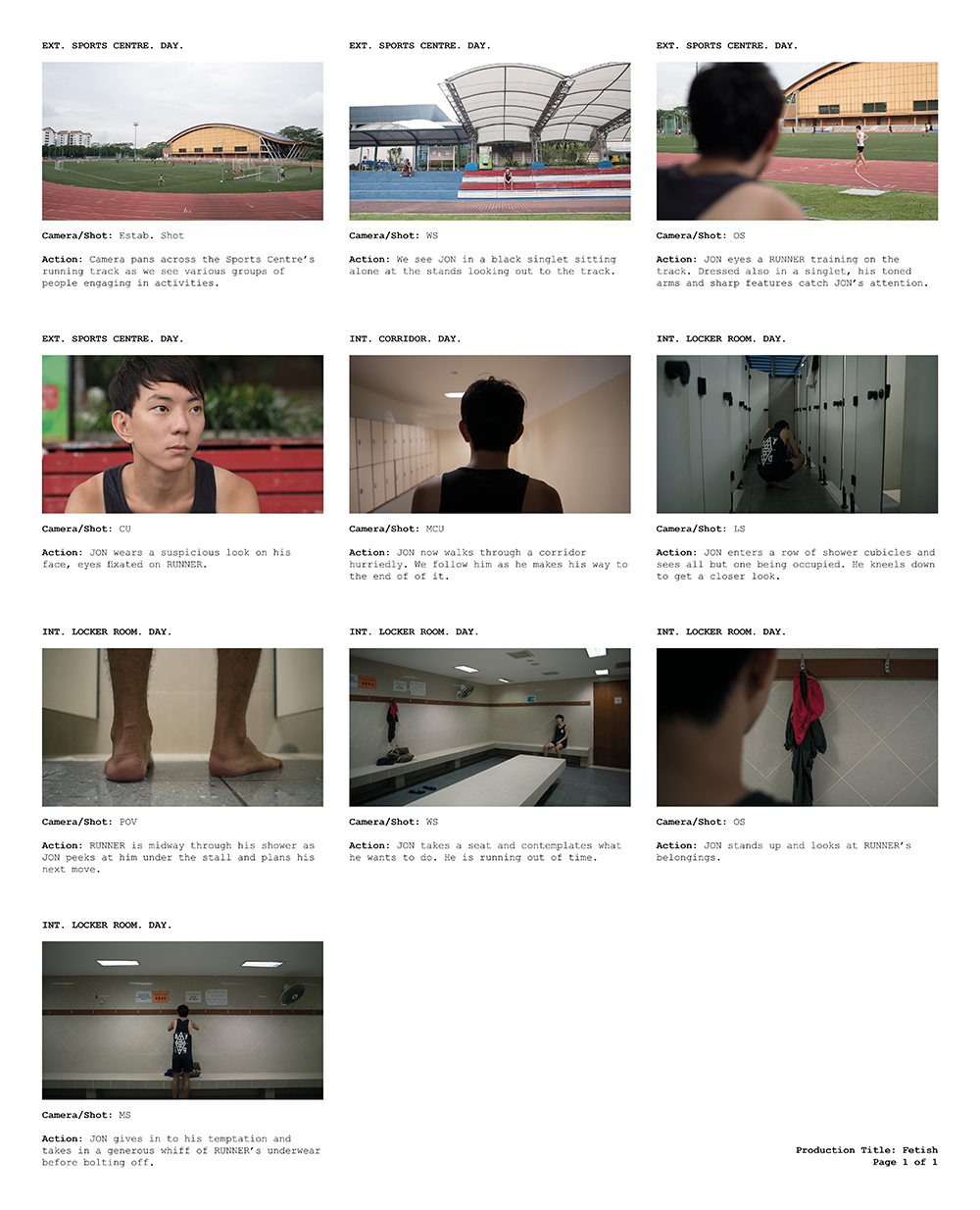
I am satisfied with what I managed to come up with. Although the weather has been rainy and cloudy the past week, I’m glad I managed to find a short window of time to shoot when the sun was still out at the SRC. All in all, it was an interesting assignment and a great learning experience.
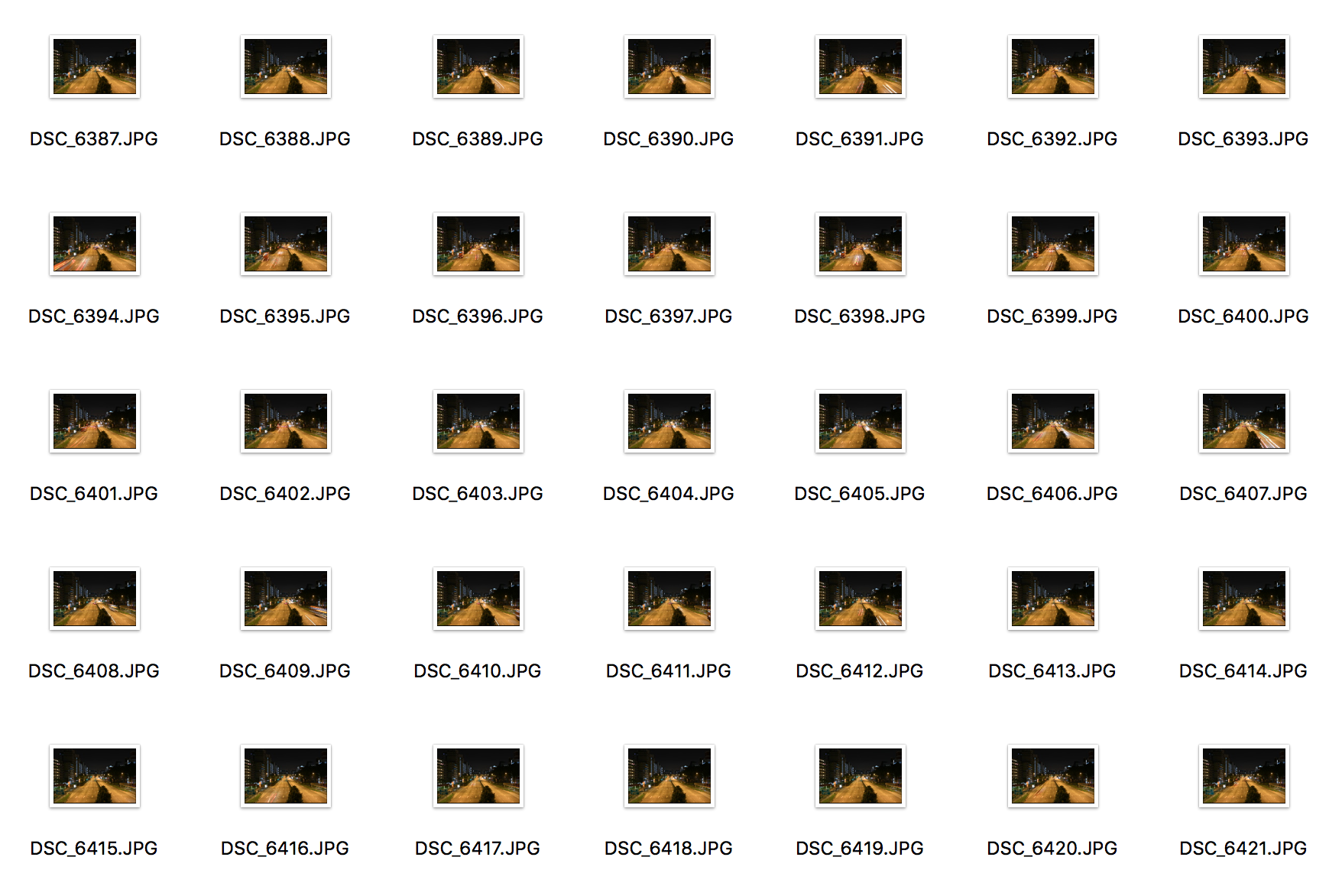
For our second assignment, we were tasked to create a timelapse as part of an exploration of time. Timelapse photography and videography had always been something I was intrigued by but I never got the chance to learn more about it or try it firsthand. As such, I was very excited about this assignment.
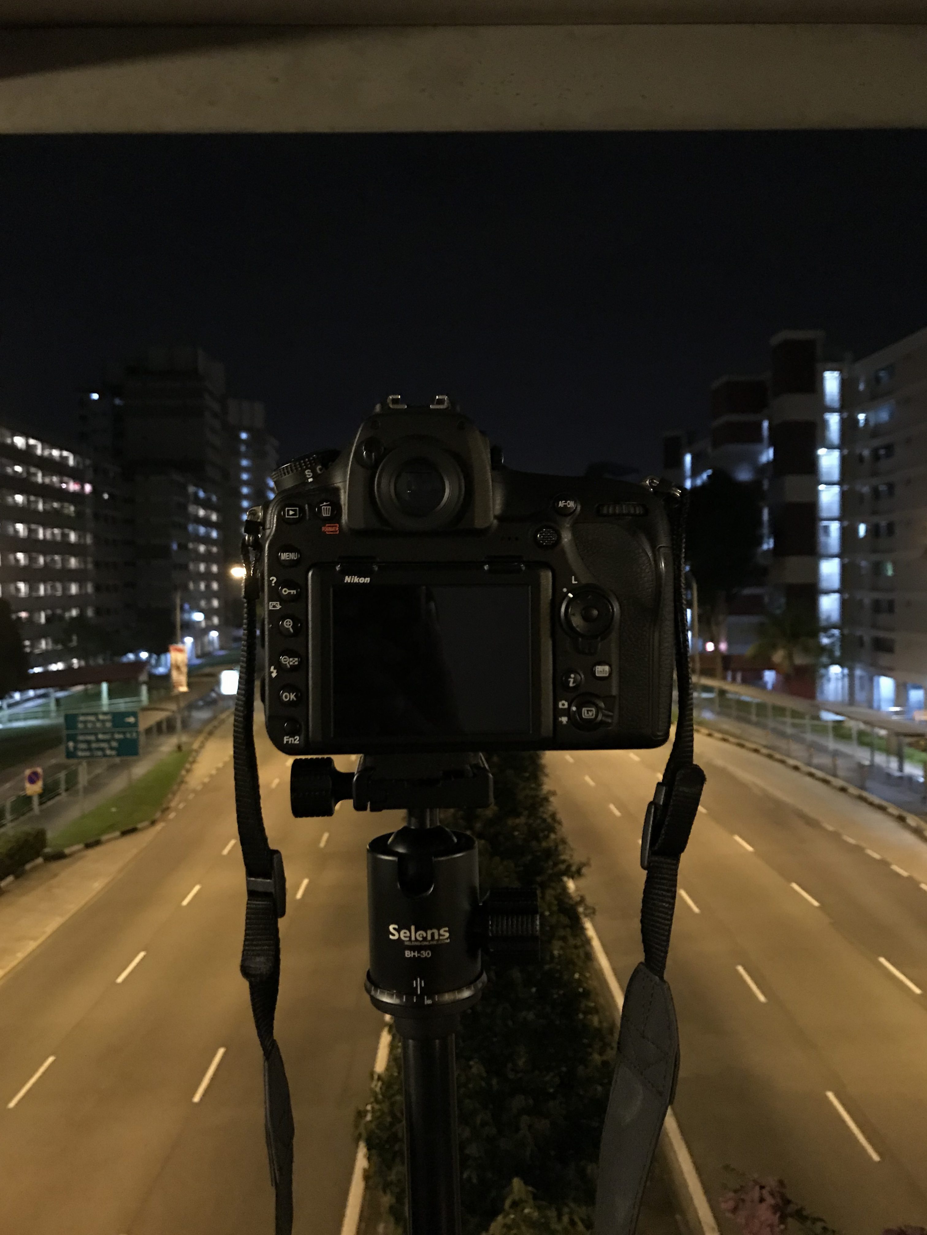
With my camera and tripod in hand, I proceeded to the overhead bridge just outside NTU to take a timelapse of the cars on the road. I had previously shot here for an exercise for DP2001 and thus knew that the vantage point from this bridge was fairly good.
I decided to try two different methods to make my timelapse video. For the first, I took a 15-minute long video and sped the footage up in Premiere Pro.
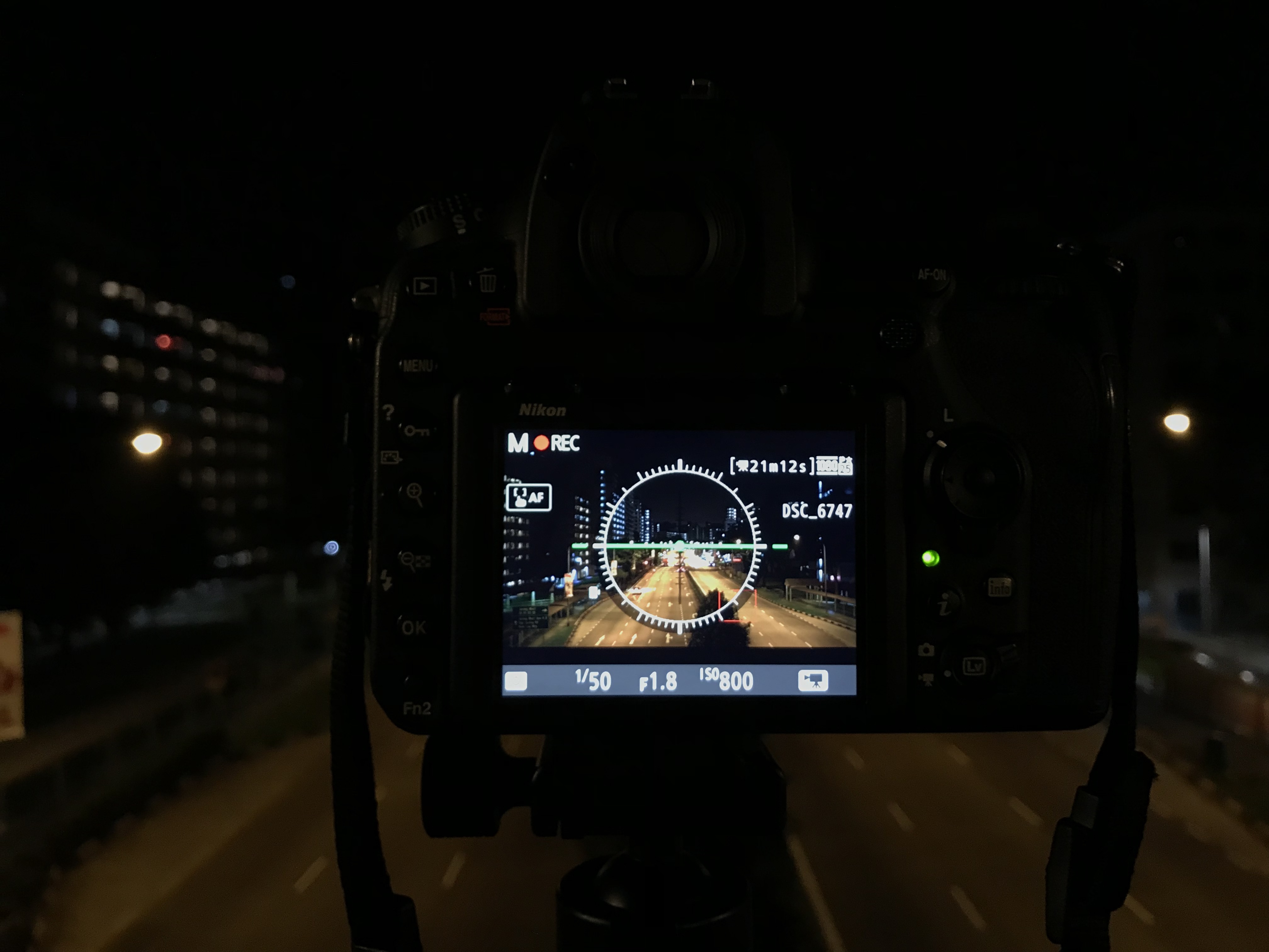
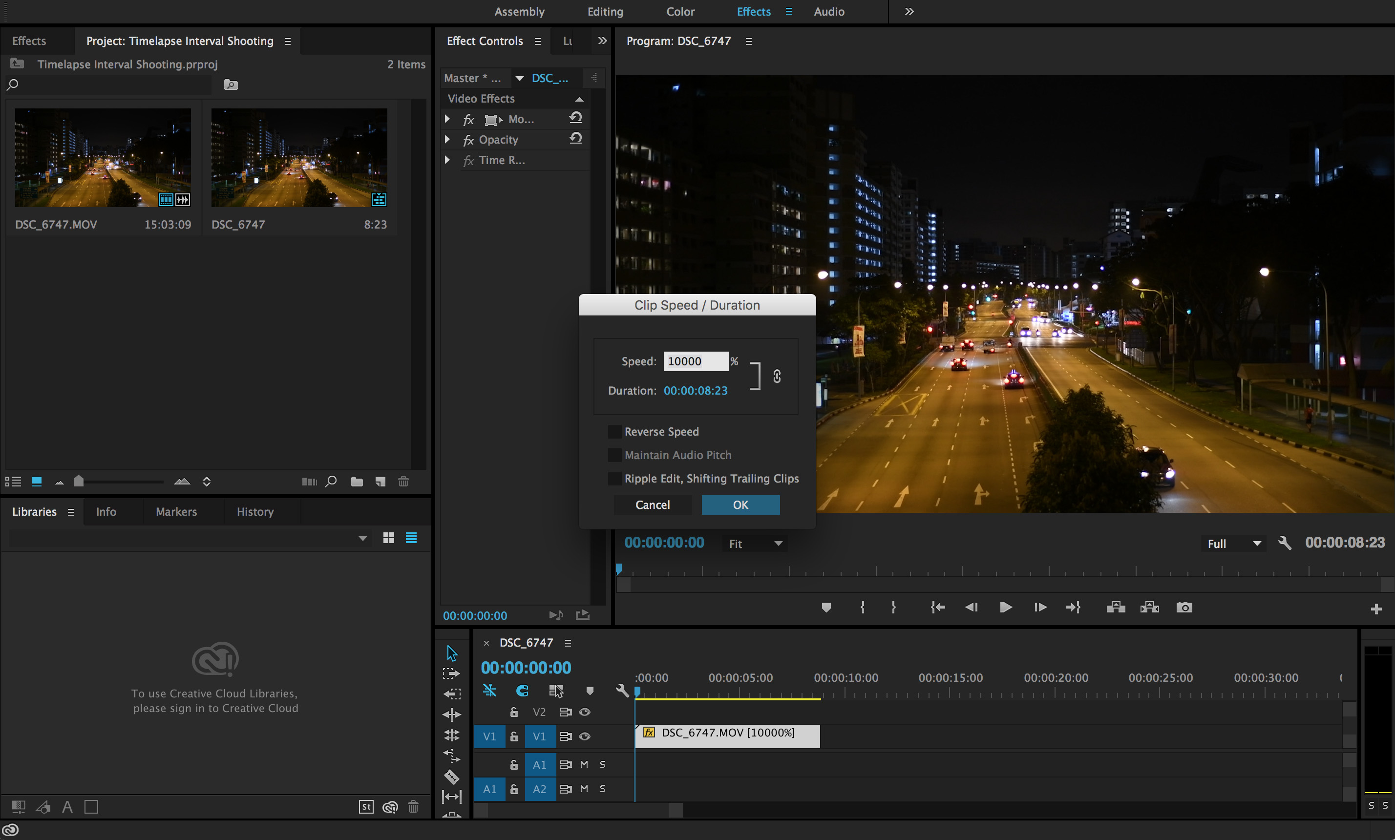
Over on Premiere Pro, I increased the speed of the video to the maximum of 10,000%. The downside of shooting using the video function of my DSLR were that I had to keep my shutter speed to a comfortable 1/50 in order to prevent any slowing down of frames. To combat the dark exposure, I had to crank up my ISO to 800 and even so, the blacks in my footage were still crushed and created a rather flat image.
Decent but not the look I was going for. The light trails were also missing which defeated the purpose of shooting a timelapse at night.
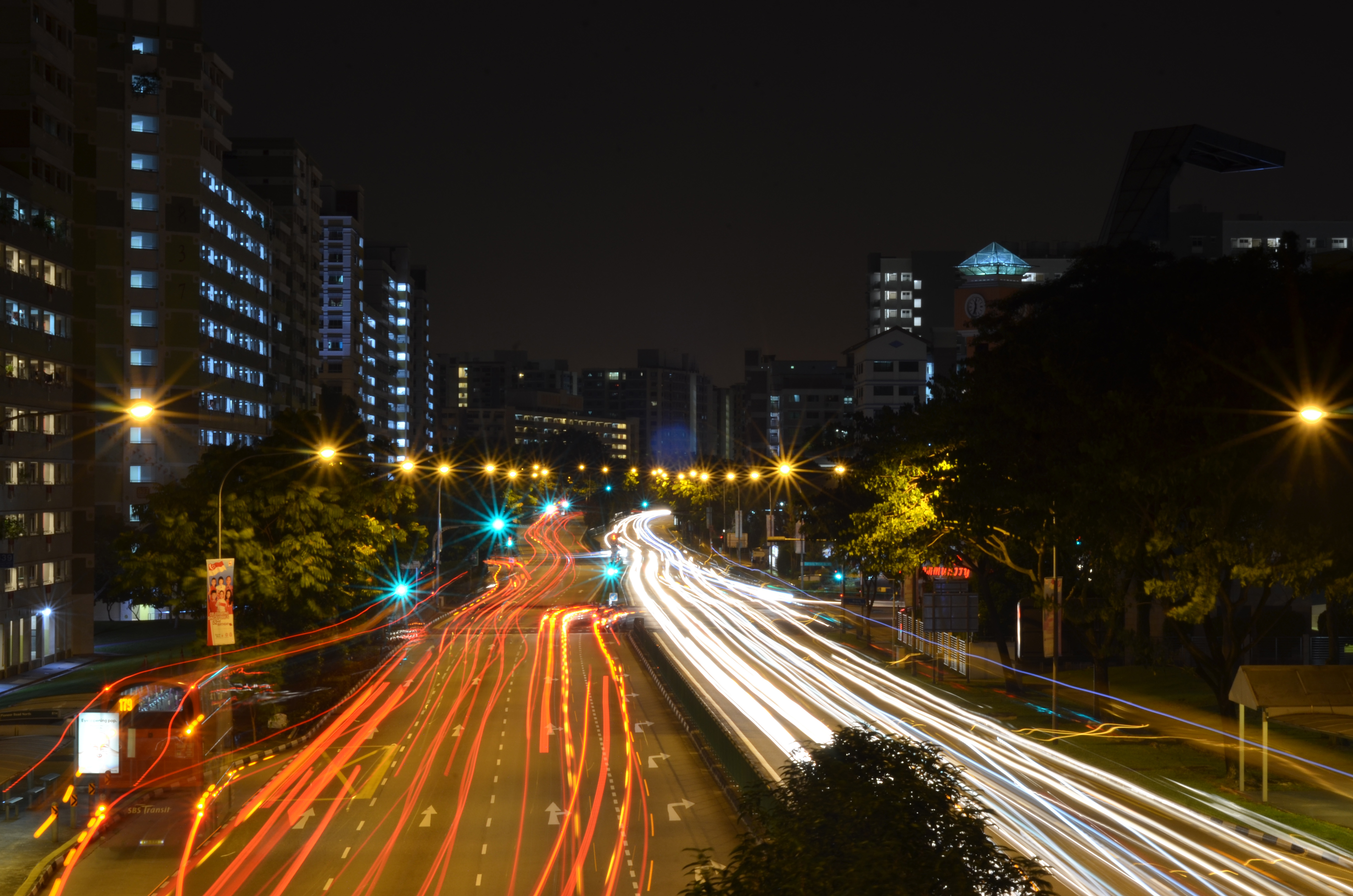
The next method required some research before I headed out to shoot and with the new information ready, I proceeded to embark on my first interval timelapse photography experience. With more leeway now to exposure settings, I was able to set my camera to a 2-second exposure to capture just enough light trail details. I also preset my interval settings to shoot 375 photos.
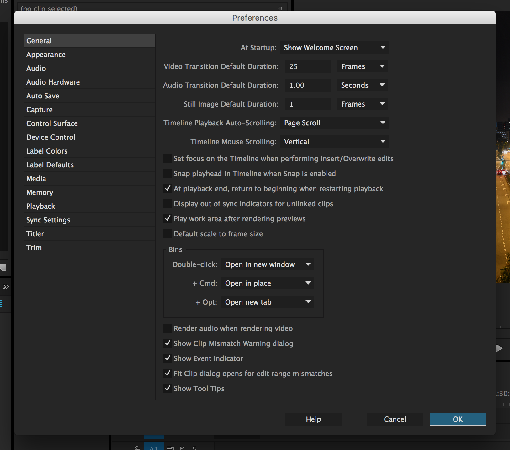
The key to getting a smooth motion in Premiere Pro was setting the ‘Still Image Default Duration’ to 1 frame.
And with that, this was the result I got
With this method, the benefits were a more fine-tuned exposure setting that retained a higher dynamic range. The photos could be shot on a low ISO, slower shutter speed, and open aperture and as such did not compromise on overall image quality. The blurring of movement also fully translated the idea of a timelapse and did not make the cars look so static as compared to the first video.
In conclusion, I am very happy with the outcome of my video and can finally understand and see how this method of making a moving image is both interesting and visually appealing. I am also glad I took the time to explore a feature of my camera that I had never used prior. The possibilities are endless and I would very much like to continue working with interval photography.
For the first exercise of this class, I decided to try my hand at making a cinemagraph. During the first lesson, I had successfully created a simple sequence using a clip from the movie A Single Man.
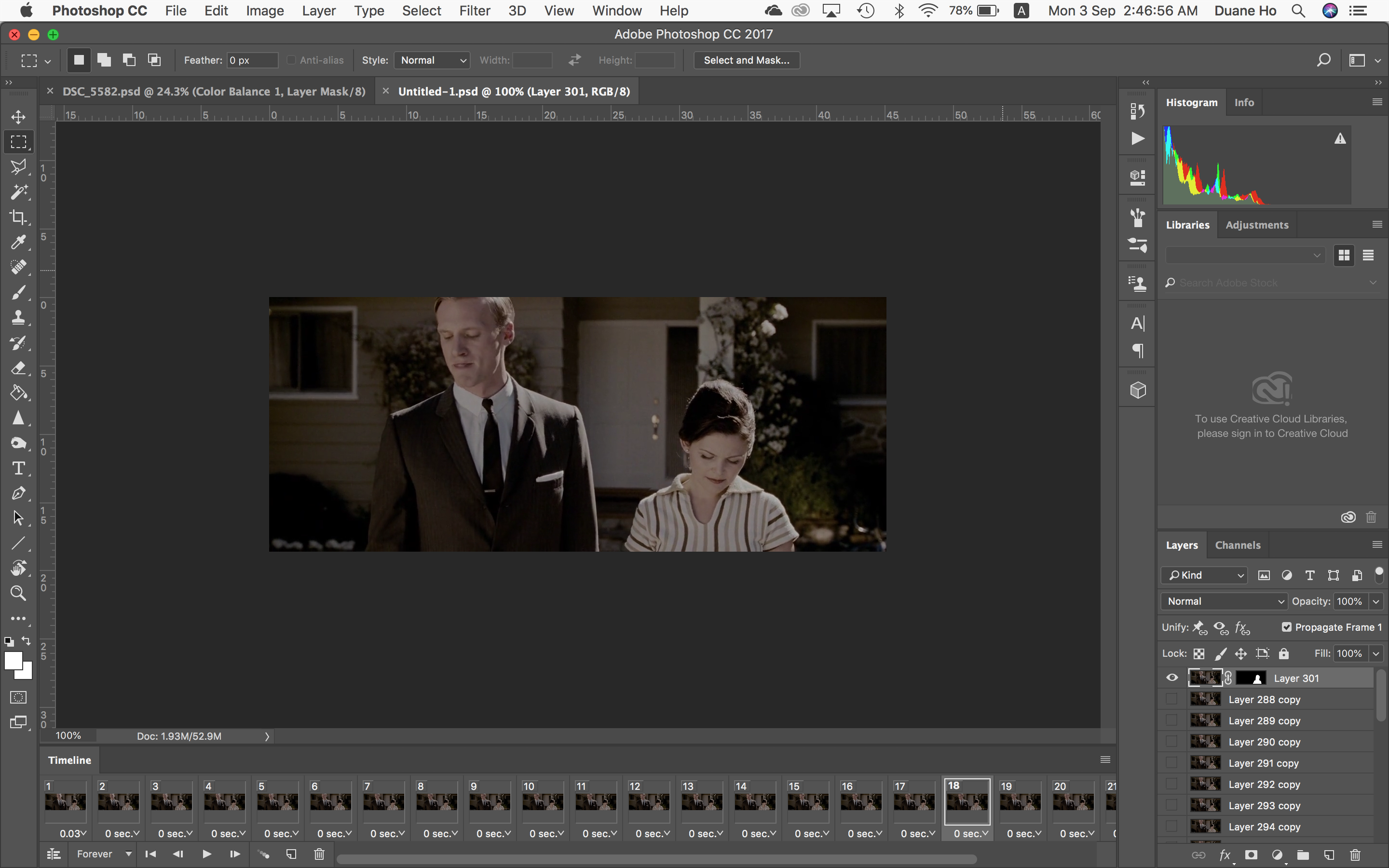
By creating a simple mask, I was able to isolate movement to only a single part of the image. After the first export, I realized that my GIF was a tad ‘jerky’ because, after the last frame, the sequence immediately jumped back to the first.
As such, I decided to ‘loop’ the GIF by adding reverse frames such that the action became seamless:
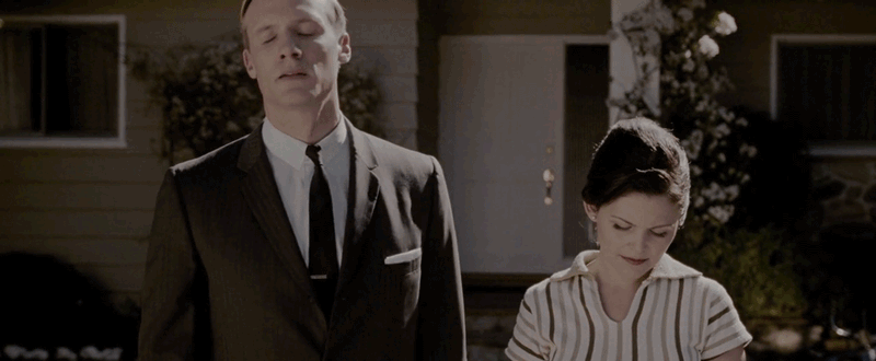
Taking what I had learned from the first class, I decided to make another GIF, this time using my own video footage. I wanted my next cinemagraph to be more subtle and contain much less movement but still draw the viewer in. Initially, I began by importing a whole sequence as frames into Photoshop. This resulted in many frames just for the simple movement of my subject blinking her eyes.
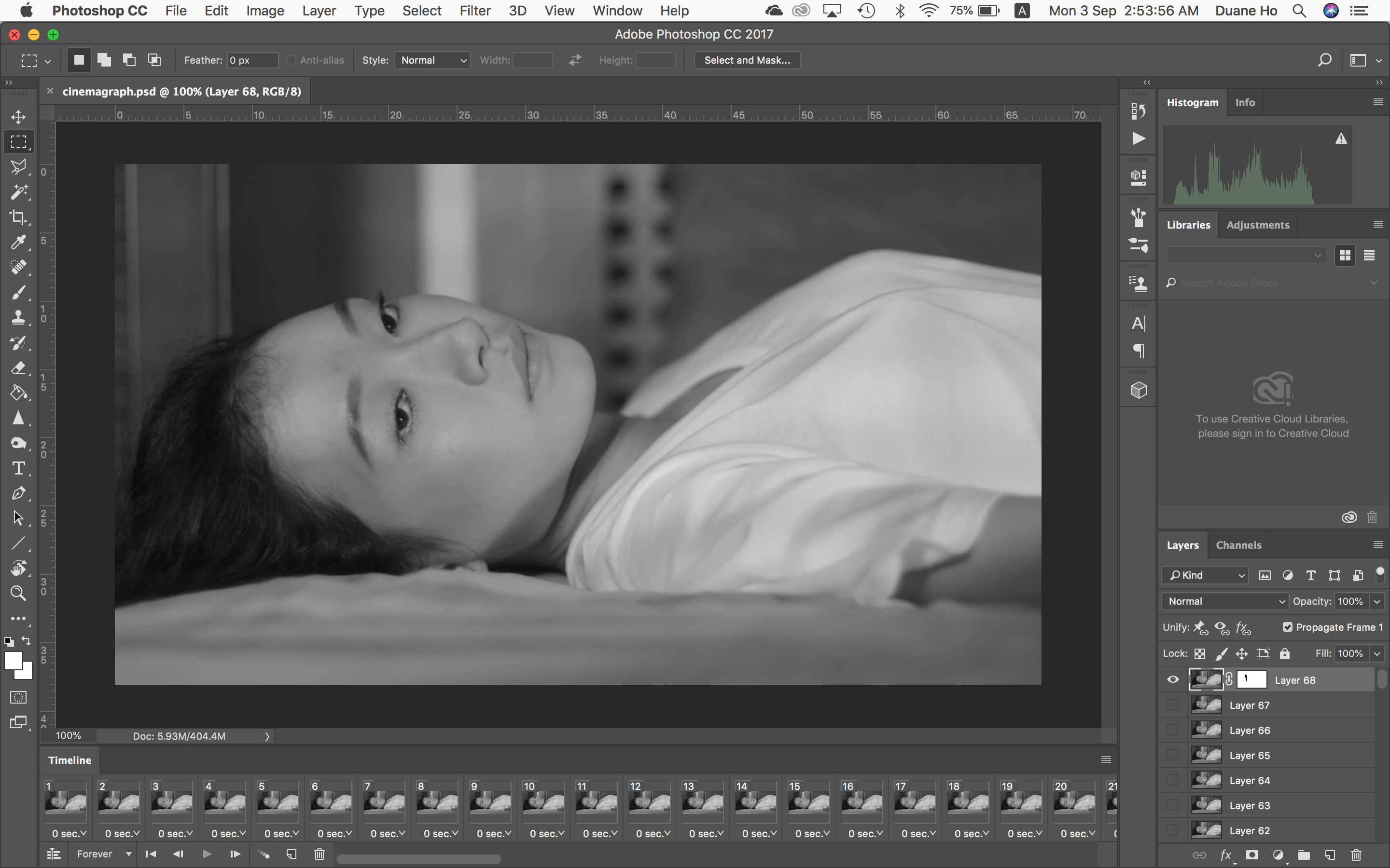
After showing this in class, Prof Elke reminded me that since there was no movement at the beginning of the sequence, I could just use one frame and increase its duration. This would make the whole GIF much cleaner and also reduce unnecessary file sizes.
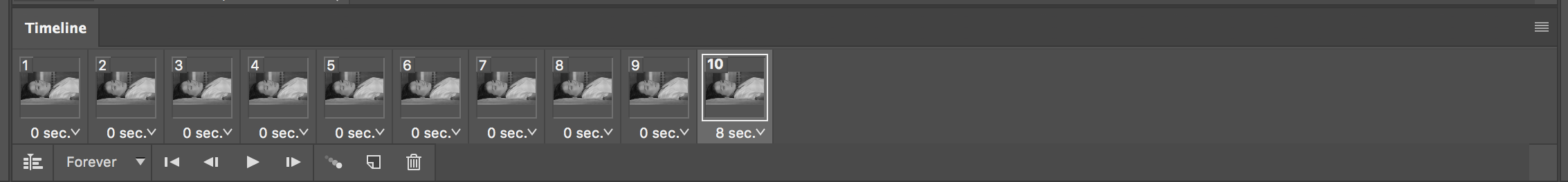
Breaking up the sequence with an 8-second pause, I was able to loop the GIF and make the pacing somewhat believable as well:
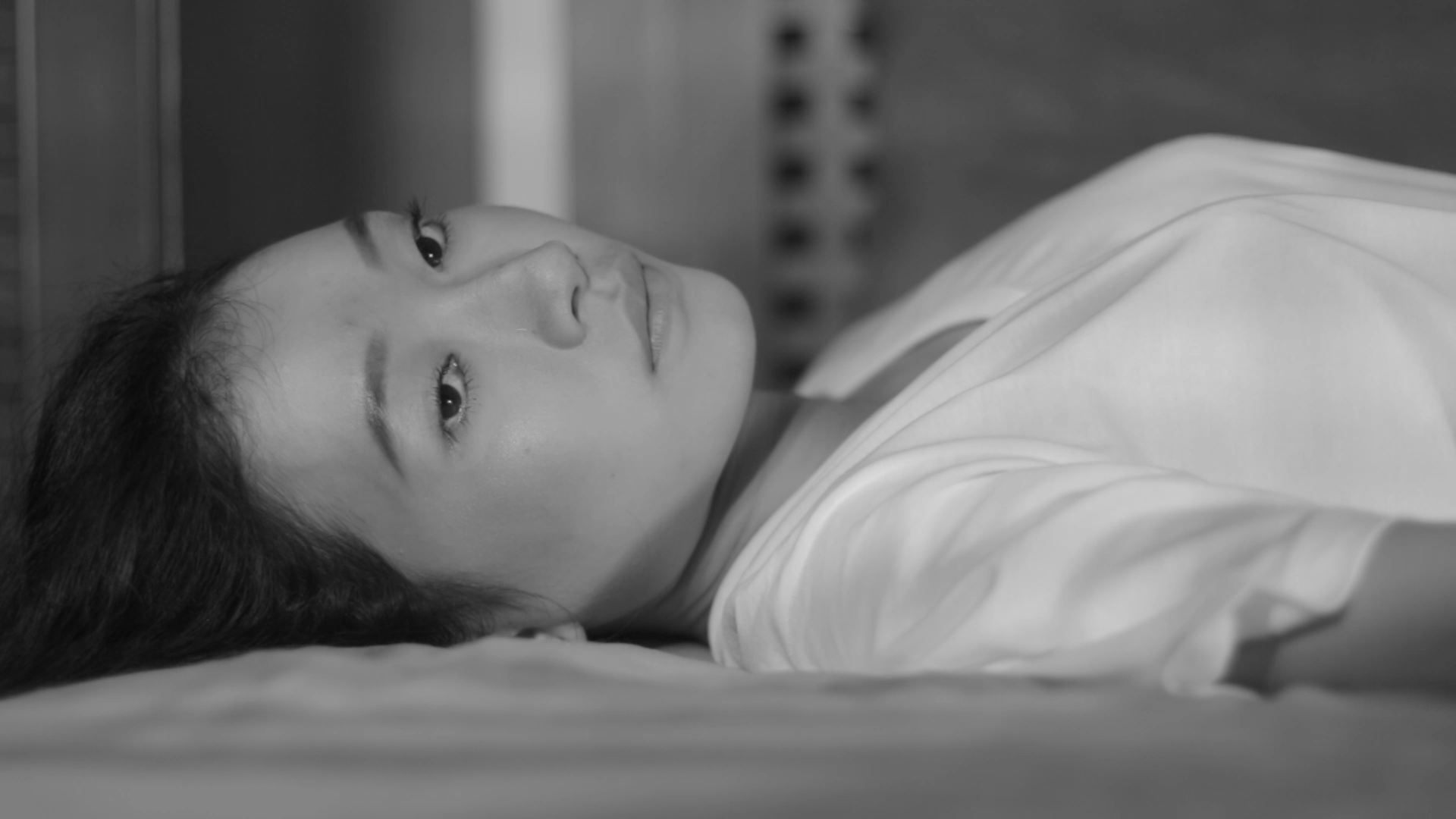
In conclusion for this exercise, I experienced firsthand how moving image can create an interesting response as compared to a still image. In the example above, the simple blink of an eye added life into what would have been a static shot. In the original project, this girl was the protagonist and she spent her days waiting for her husband to come home and yearned for his attention. This feeling and emotion was thus amplified by taking this shot from the film and deliberately making viewers wait for something to ‘happen’.
The Process
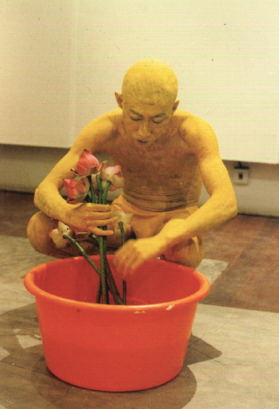
My personal experience with body dysmorphic disorder has always been something I wanted to talk about but never dared to. It is also something so prevalent in today’s society (even more so in the gay community) and despite the current body-positivity movements, there is still a lot to be done in terms of acceptance.
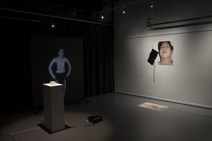
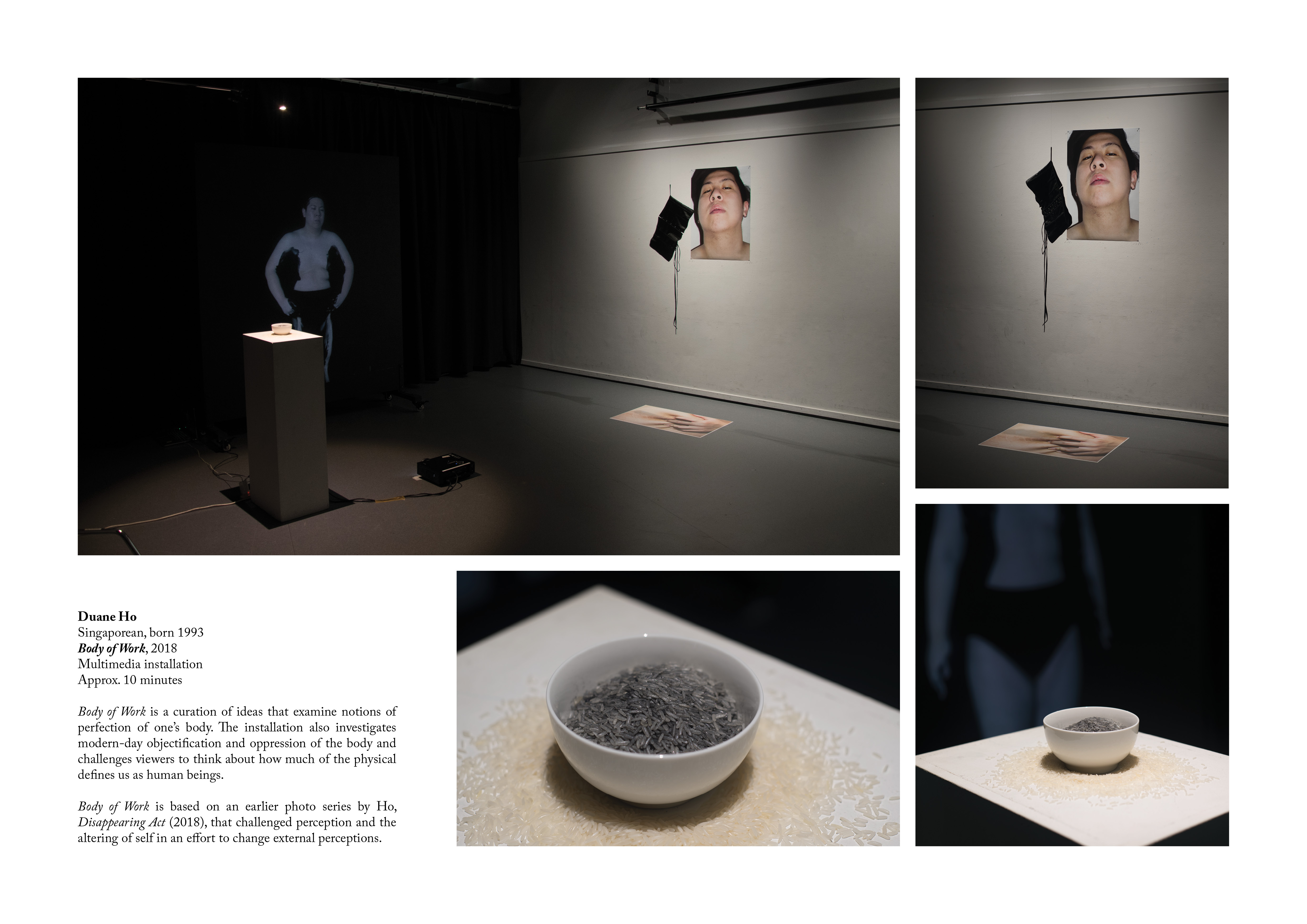
Stemming from photo series titled Disappearing Act, I wanted to create a video that served as a performance and that could be projected in a variety of spaces and on various mediums. For this installation, Body of Work, I chose to screen it almost life-size and surround it with objects and photos that supported the message and idea of the video.
Bowl – The bowl in this installation represents the perfect form. So white and glazed that it goes against my final form when painted completely black. Bowls also carry connotations of femininity.
Rice – Rice is a form of sustenance and is the staple food in the Asian context. When placed beside the video, rice then becomes the source of black paint, transforming it into something that bears ideas of something toxic and the culprit of the destruction of my body.
Corset – The corset is a symbol of the idealism of the female body and its perfect form. It, however, holds so much meaning with regards to oppression and the objectification of the body. The way I contort my body to form a new silhouette holds a similarity to the way the corset is meant to shape.
Self-portraits – I wanted to present myself in the purest form. Clean from any physical or cosmetic alterations. My face and abdomen, therefore, serve as a reflection of my gaze in the video. It also suggests how one of the driving forces for this piece stems from something internal.
Artist Reference
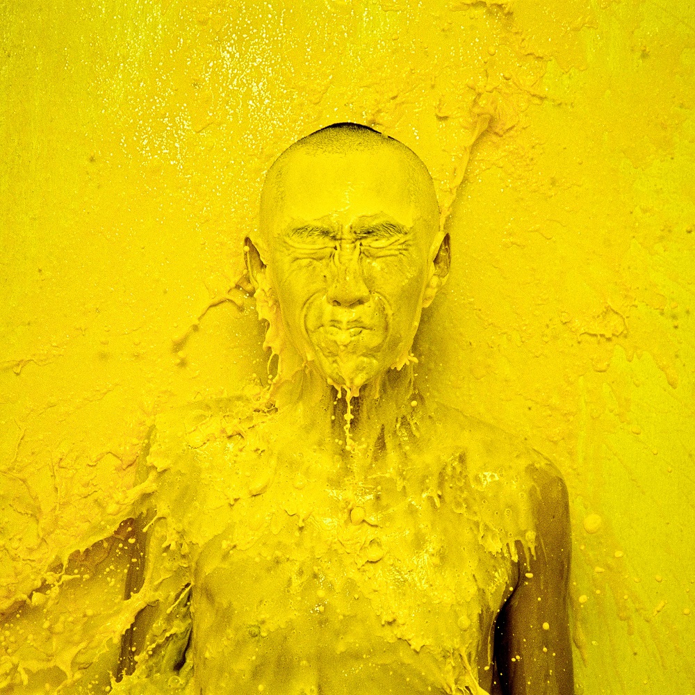
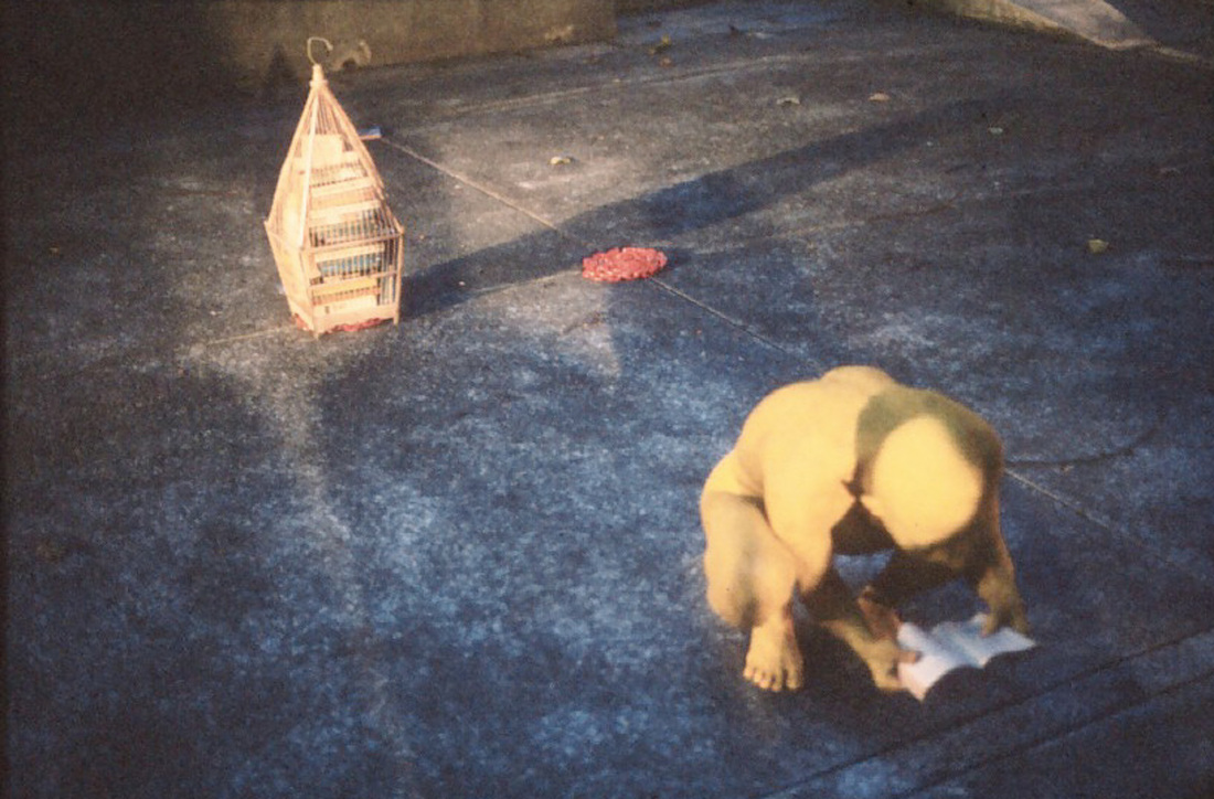
I looked to performance artist Lee Wen when thinking about how I wanted to create my installation. Best known for his works Yellow Man and Journey of a Yellow Man where he covers his body with bright yellow paint as an expression of his ethnic identity and citizen of Singapore. Paint and colour are symbols that I resonate with due to their transformative abilities and strong visual language and metaphorical representations.
I also looked at his installation setups and props used during his performances. He is someone that is sensitive when it comes to using symbolism to illustrate his messages and I was drawn to his use of everyday objects that were both aesthetically pleasing and full of meaning.
Introduction
Through primary research, I discovered that Singaporeans are aware of the issue of hypermasculinity with 52.9% of respondents stating that it may be a problem. The aim of The Purple Cloud Project is to, therefore, educate and inform target audiences on the existence and impact of hypermasculinity and eradicate hypermasculine discrimination and behavior in today’s society. The secondary aim of this project is to redefine what it means to be masculine.
I hope to highlight hypermasculinity as a problem by engaging in open conversations with participants, allowing them to gain perspectives from each other and form a community of voices.
Design Artefact 1:
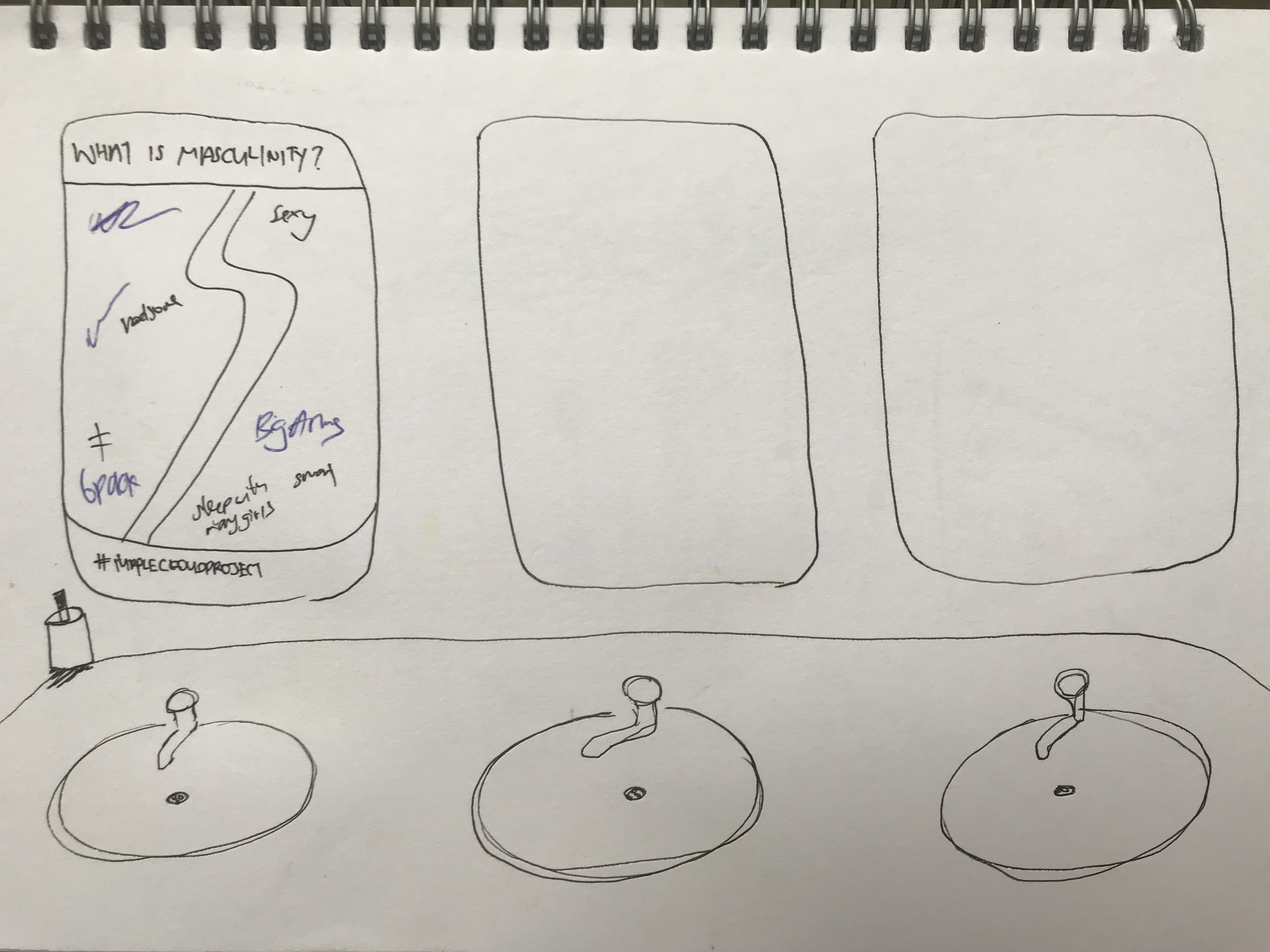
I started my thought process for my logo by doing some quick sketches. I wanted there to be an obvious cloud form but also integrate something personal like hands, a heart or even the male sex symbol.
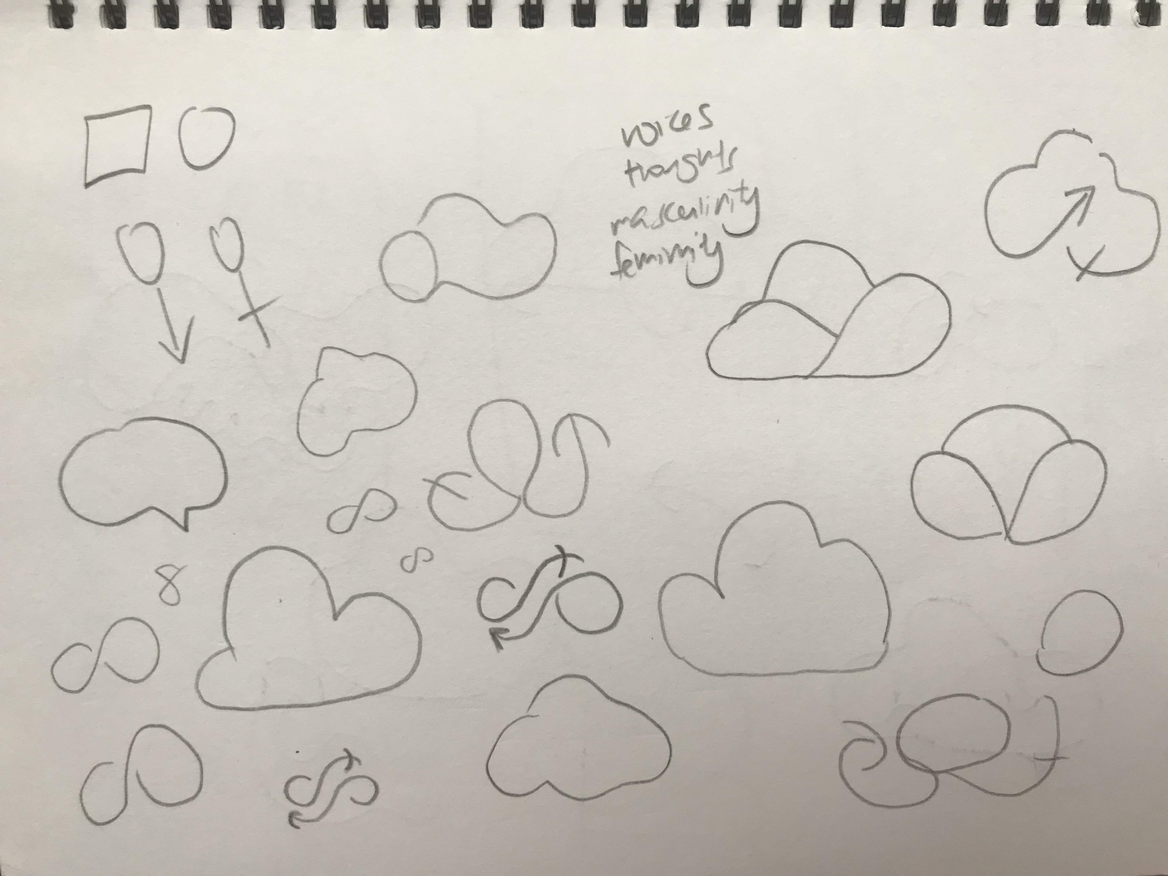
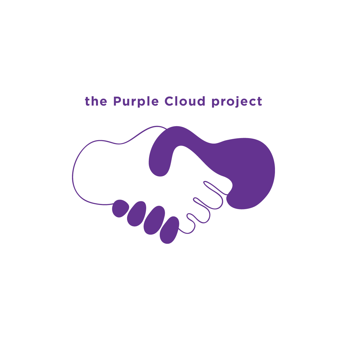
Clouds are something that has been used in logo forms and corporate branding so there was a challenge in creating something fresh. I also decided to incorporate a speech bubble in my form because it suggested the idea of a conversation which was in line with the objectives of my campaign.
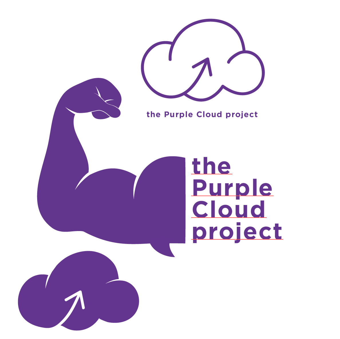
Visualising a muscular arm as a cloud but this seemed to perpetuate the existing stereotype of what masculinity is about. Also the use of arrows to suggest restarting or reviewing the concept of masculinity.
Hands forming a cloud. The cloud didn’t look like one so I scrapped this idea.
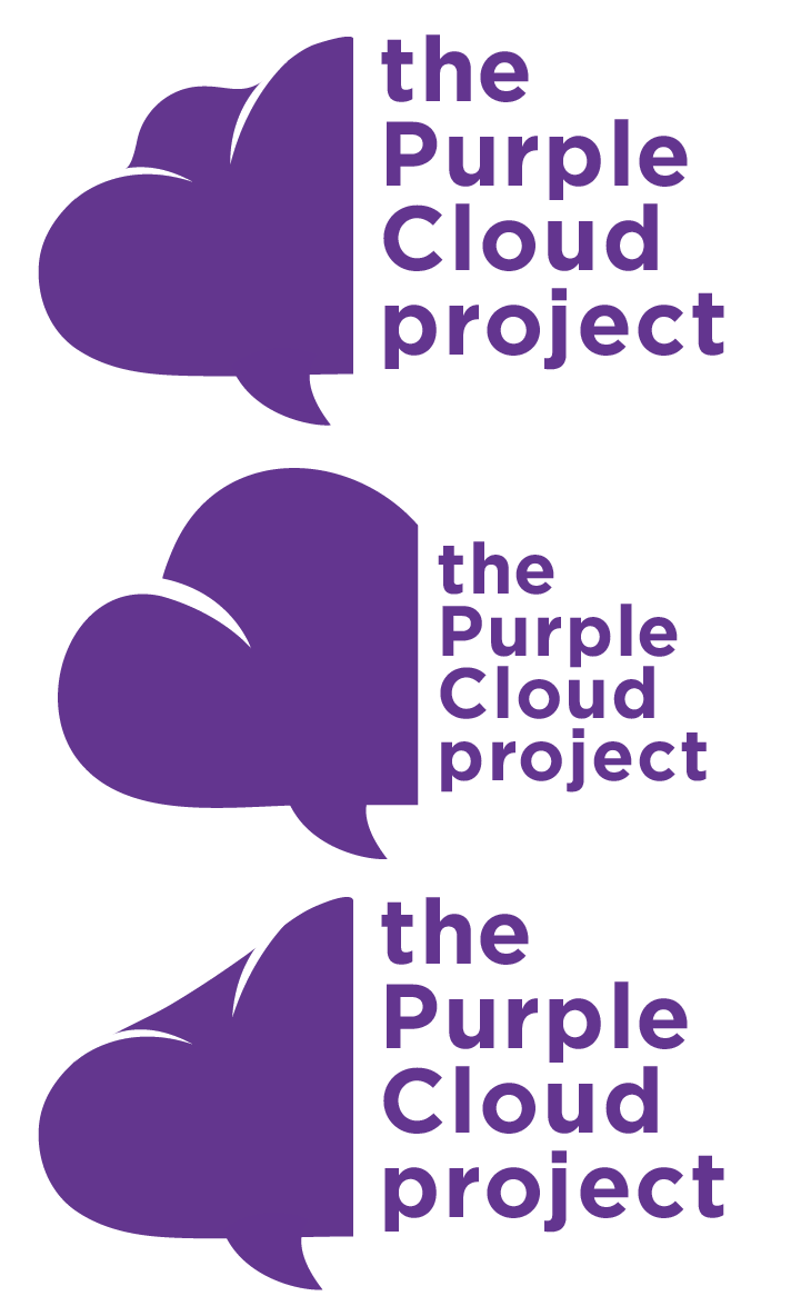
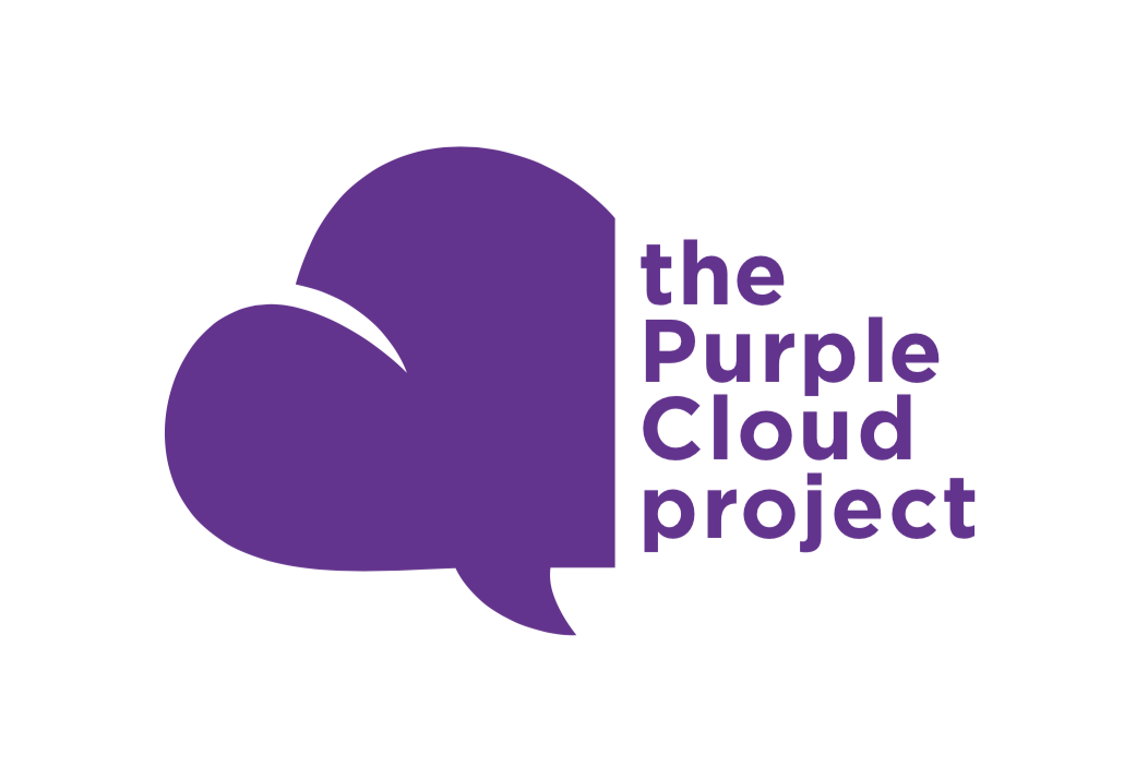
The final three iterations using the cloud to also form a heart which I felt perfectly tied into the reason for running this campaign – a matter of the heart. After multiple consultations, I finally simplified the logo’s form paying close attention to detail and how it looked when up or downscaled.
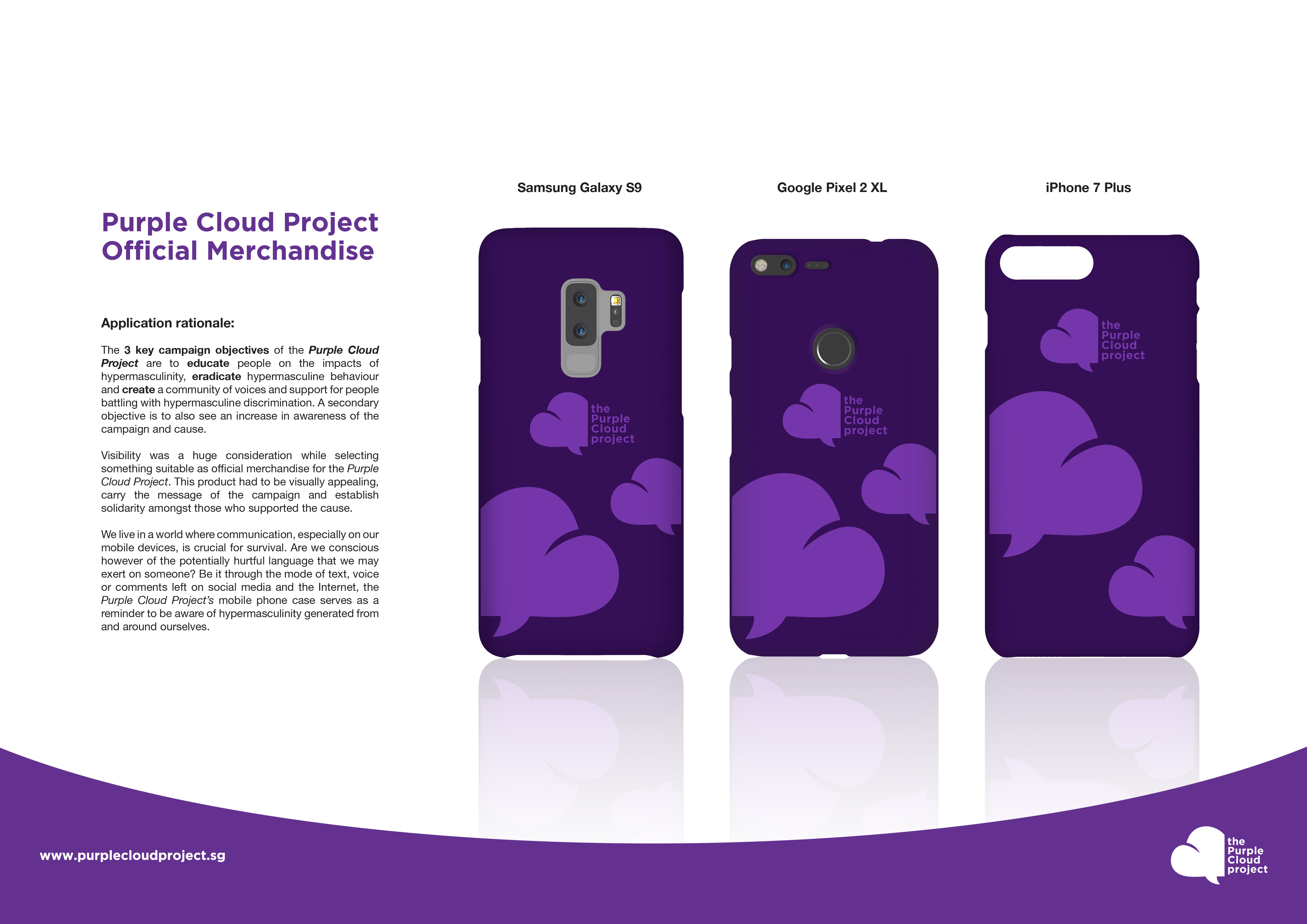
Moving on to the application of the logo. I wanted to place it on something that would be taken around and used in public so awareness would be raised. I went through options like mugs, tote bags, t-shirts, and pins but decided on creating a mobile phone case. Conversation nowadays is done a lot on the phone. Texting, calling and even social media and as such, I felt the phone would be a perfect form to place my logo on. It would incite solidarity and also be a visual reminder to be conscious of the hypermasculine things we may say.
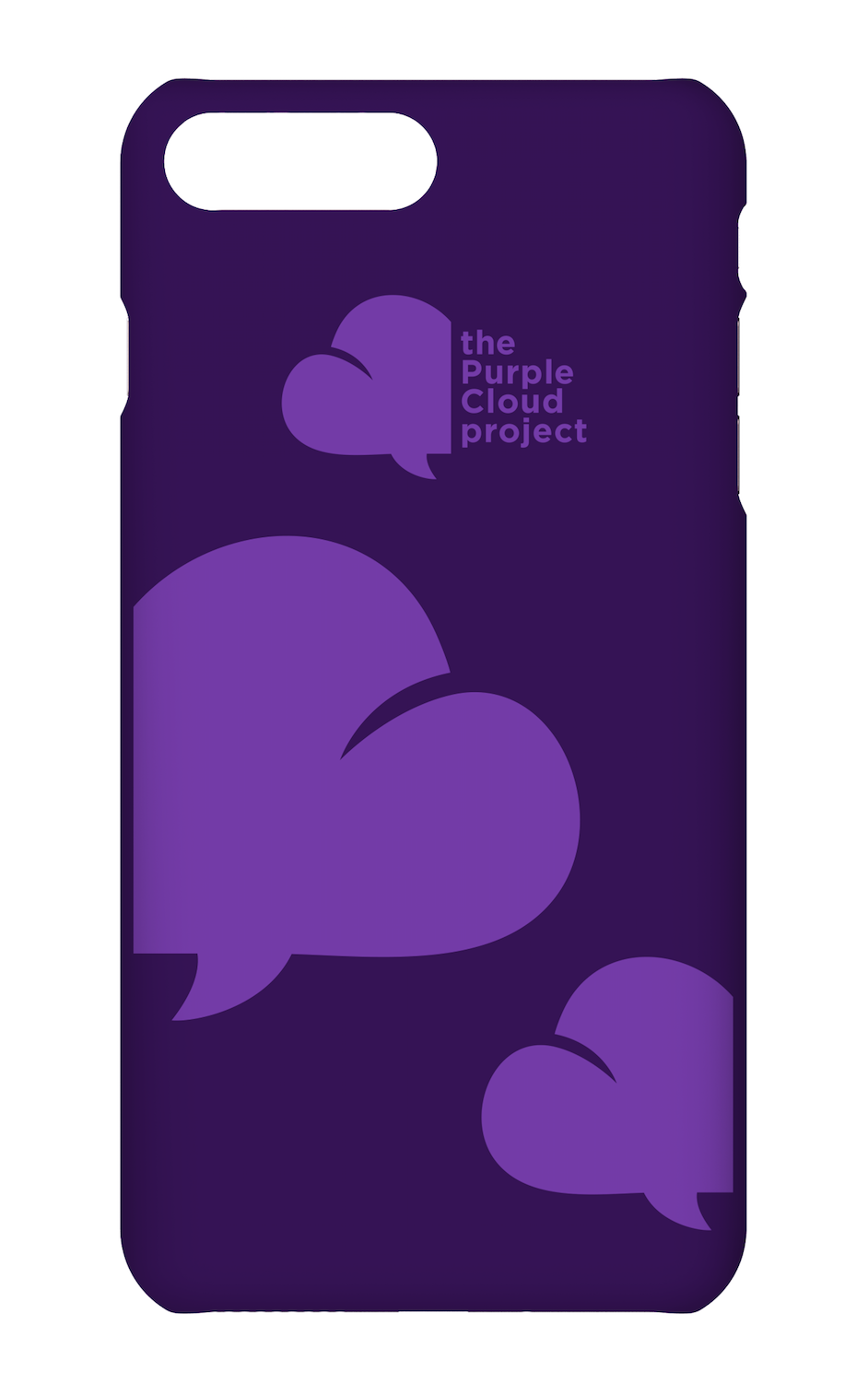
CLICK HERE for the final outcome.
Design Artefact 2:
Moving forward, I wanted to think of a strategy to create awareness for the Purple Cloud Project. This would be the first step towards spreading the message and since it would be the campaign’s debut, it had to be impactful.
It all began with a sketch. I wanted to invite the idea of how one cannot understand masculinity nor define himself as a unique individual if we continue bombarding media and men all around us with stereotypes and ideal versions of masculinity.
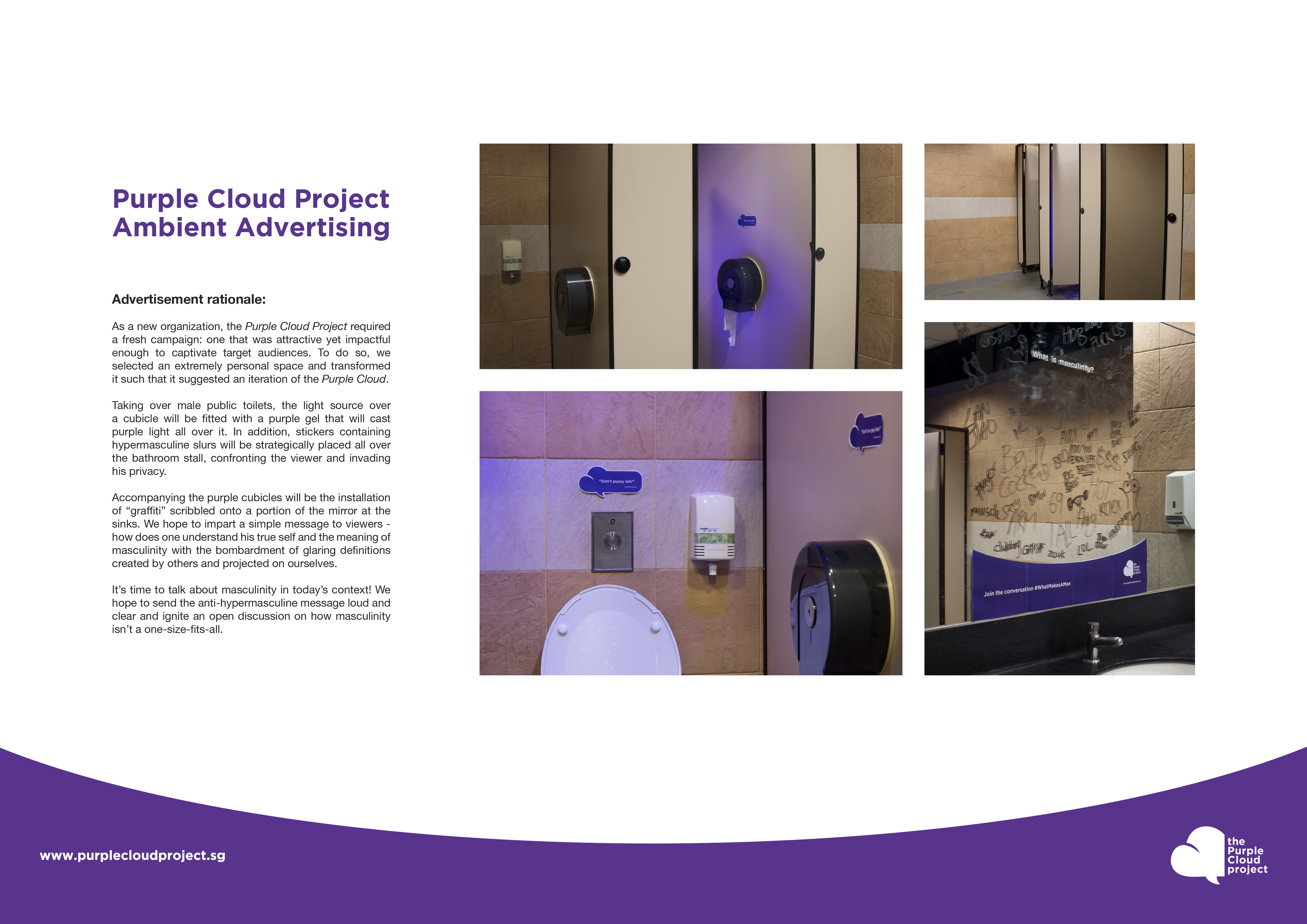
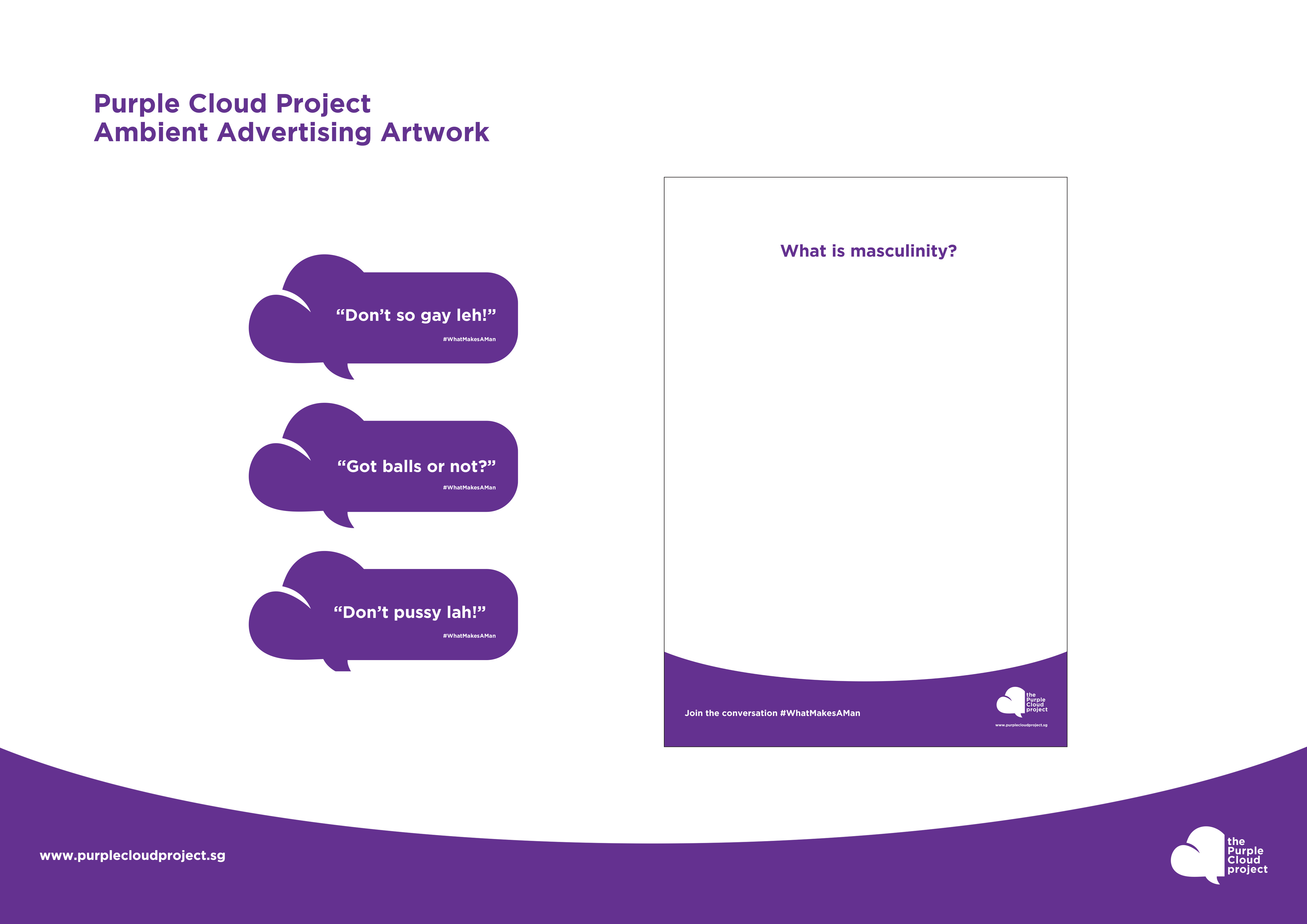
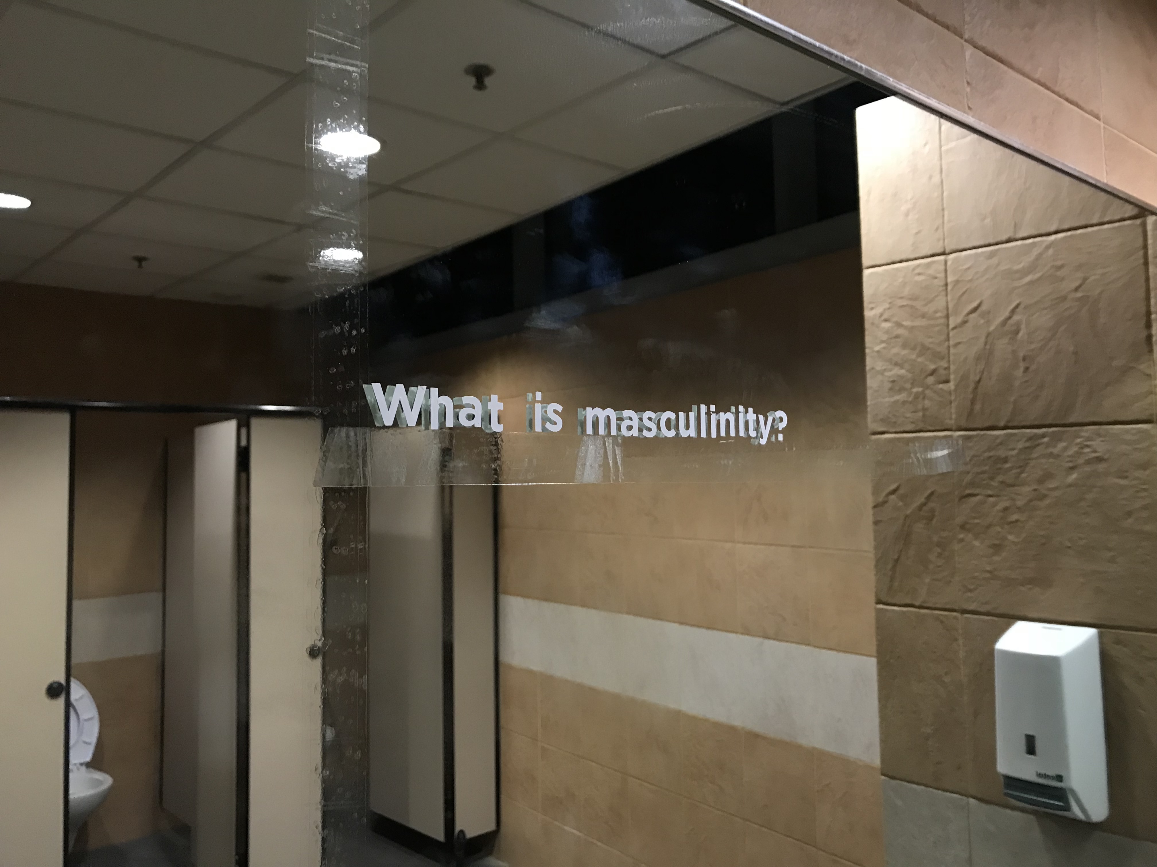
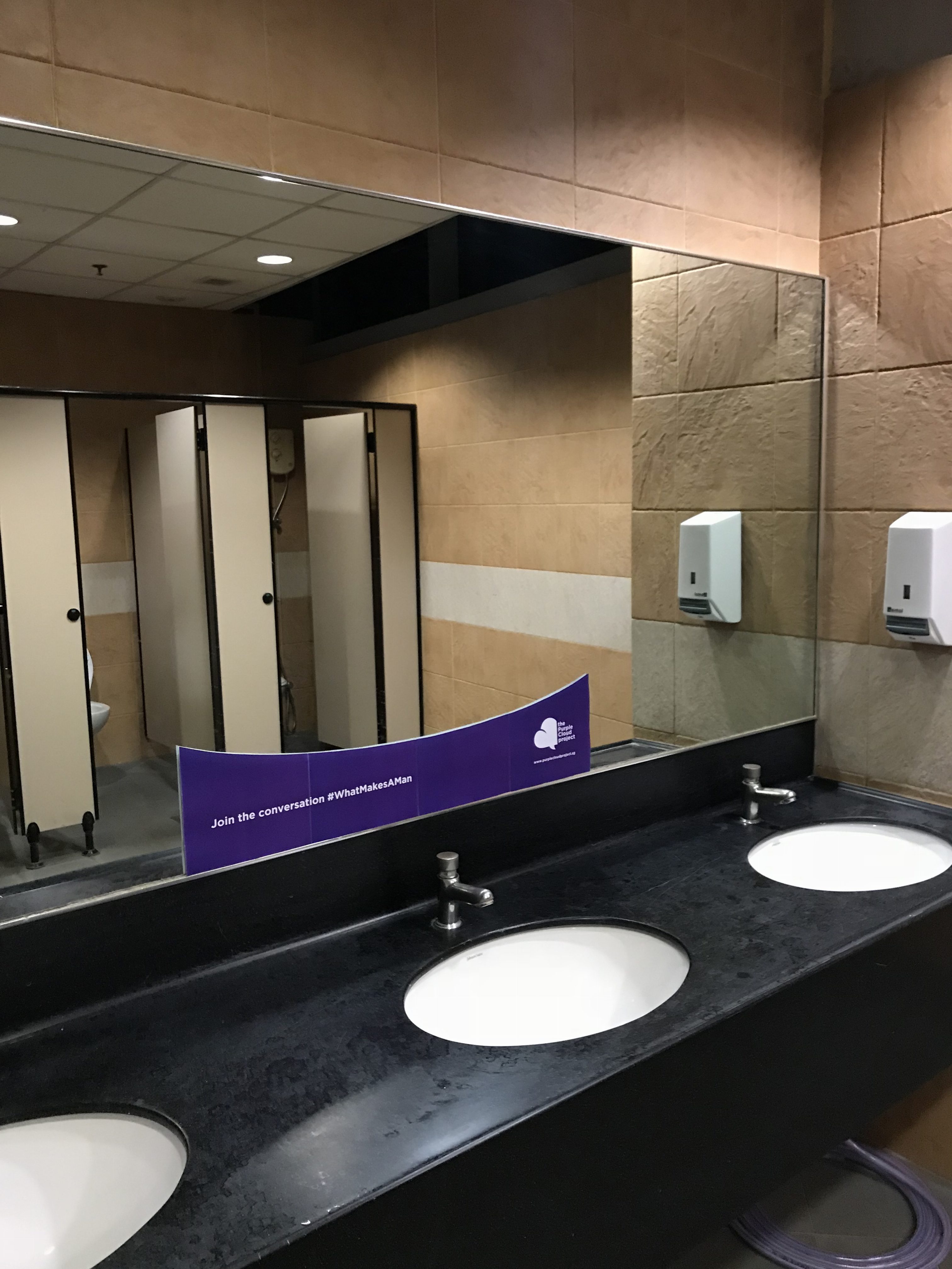
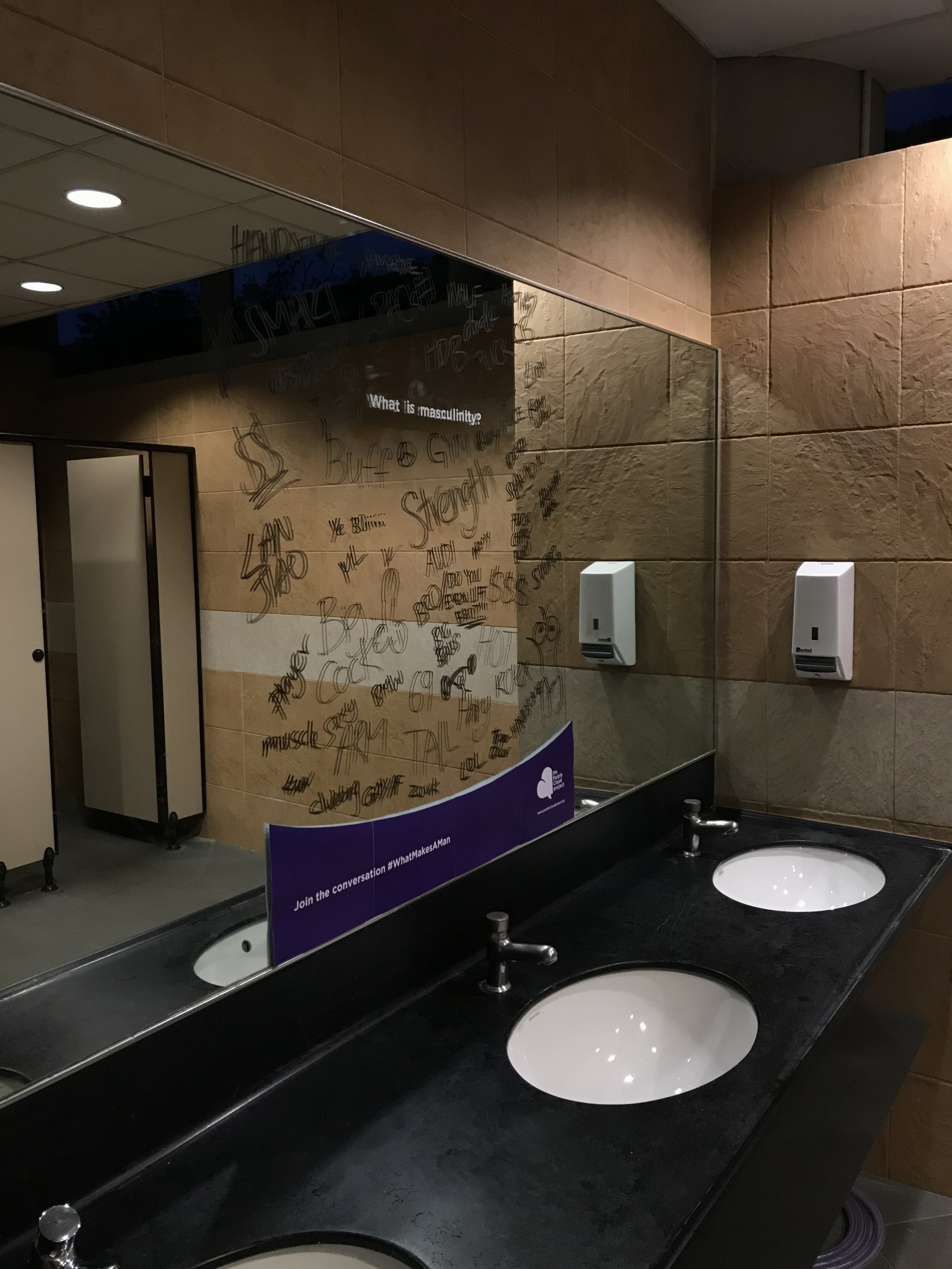
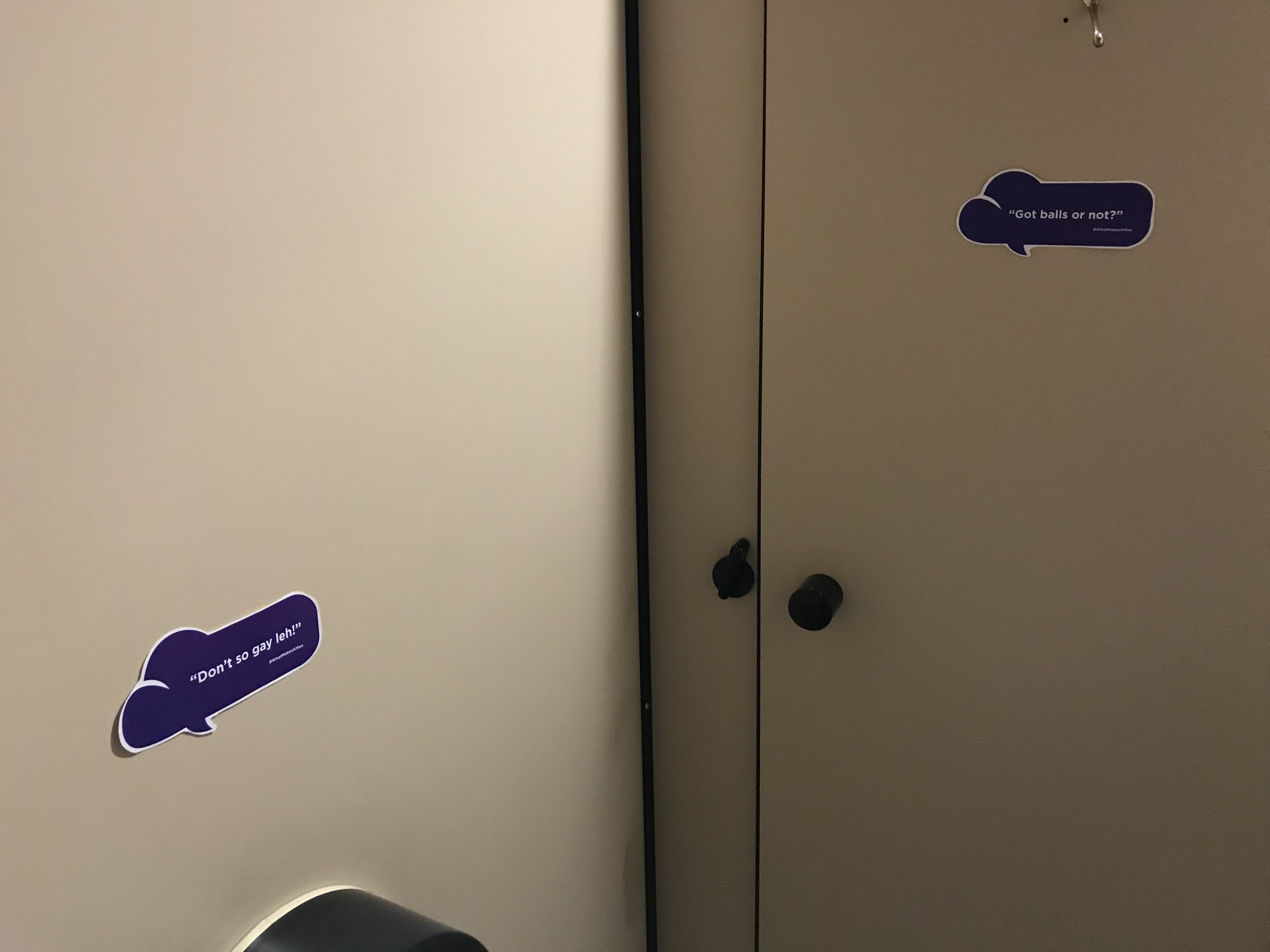
A mirror is something that reflects our image and I wanted to disrupt it by filling it up with ideas of what masculinity is currently portrayed as. These definitions were as honest and raw as possible, as gathered from the survey I conducted. I also decided to fill one cubicle with hypermasculine slurs on stickers and also flood it with purple light to suggest that this personal space was now the ‘purple cloud’ inviting you to think about this matter and join the conversation.
Setting up the space was a challenging task as I wanted to transfer text on the mirror. This took a lot of time and patience. I also decided to create a mirror decal to tie in with the Purple Cloud’s branding.
CLICK HERE for the final outcome.
Reflections
All in all, I thoroughly enjoyed VC2 and how the projects were a build-up relating to each other. I also felt it was a good idea that we were allowed to pick a cause we resonated with as this really made me push myself to think of the best solution the problem I highlighted. I am also glad Michael guided me in a good direction with regards to Artefact 2 and made me think of how I could approach it in a different method as opposed to something very corporate or over-done. I also appreciated the idea of how playing with scale could make a huge difference in how the message is perceived. In a nutshell, LESS IS MORE! Looking forward to see what the next VC mod has in store!

(Click images to enlarge)
The end of the semester and DG9005 has arrived so soon and I can’t believe I’ll be bidding this module goodbye very soon! The past few weeks have been really fun and eye-opening and I have no regrets signing up for this module at the start of the sem.
When it came down to picking a song I wanted to do for Presentation 2, I decided to do one of my all-time favourites, At Last, a slow and jazzy ballad by Etta James. I first fell in love with this song when it was covered by Beyoncé when she sang it at Barack Obama’s inauguration. The song has also been covered by many other artistes including Christina Aguilera and Jessie J.
I practiced the song many times leading up to Presentation Day, mostly with my close friends recording me so I could firstly play it back and hear what I was doing right or wrong and also get their feedback on my vocal arrangement.
Unfortunately, about 4 days prior to the performance, I fell really ill and had a horrible cough and throat. I loaded up on Four Legs cooling water, grass jelly drinks and refrained from spicy or oily food and recovered just enough to make it through the song (thank God!) on the day itself.
Not my best (and I’ll explain why later) but here goes:
Self-evaluation:
First off, I felt that there was an overall shortness of breath in some parts (including the opening note) and my voice was a little shaky. Not gonna make excuses and blame the phlegm but I guess a learning point here would really to ensure to take in a sufficient amount of air and really control that diaphragm to ensure a steady release.
I also felt that although I had spent a significant amount of time warming up prior to the performance, it wasn’t enough and my high notes got a little ‘shouty‘ especially at 1:34 and 1:52.
What I did like about my performance were the falsetto notes at the end and I guess the biggest positive point was that I genuinely had fun performing on that stage.
It’s a pity that DG9005 has come to an end but the lessons and tips / techniques that have been taught to us by Leona will always come in handy whenever I get to perform again. Super proud of everyone in Dulce for excelling and improving greatly!