
For our vernacular type assignment we were asked to go to a specific location and capture a quote that embodied the location. The quote I picked was “COOLER THAN YOU” and I chose Haji Lane as I feel that it’s a place where a lot of hipsters hang out at and they all have a similar mindset. Around the area are boutique / blog shops and cute cafés and to me they epitomise the cool lifestyle.
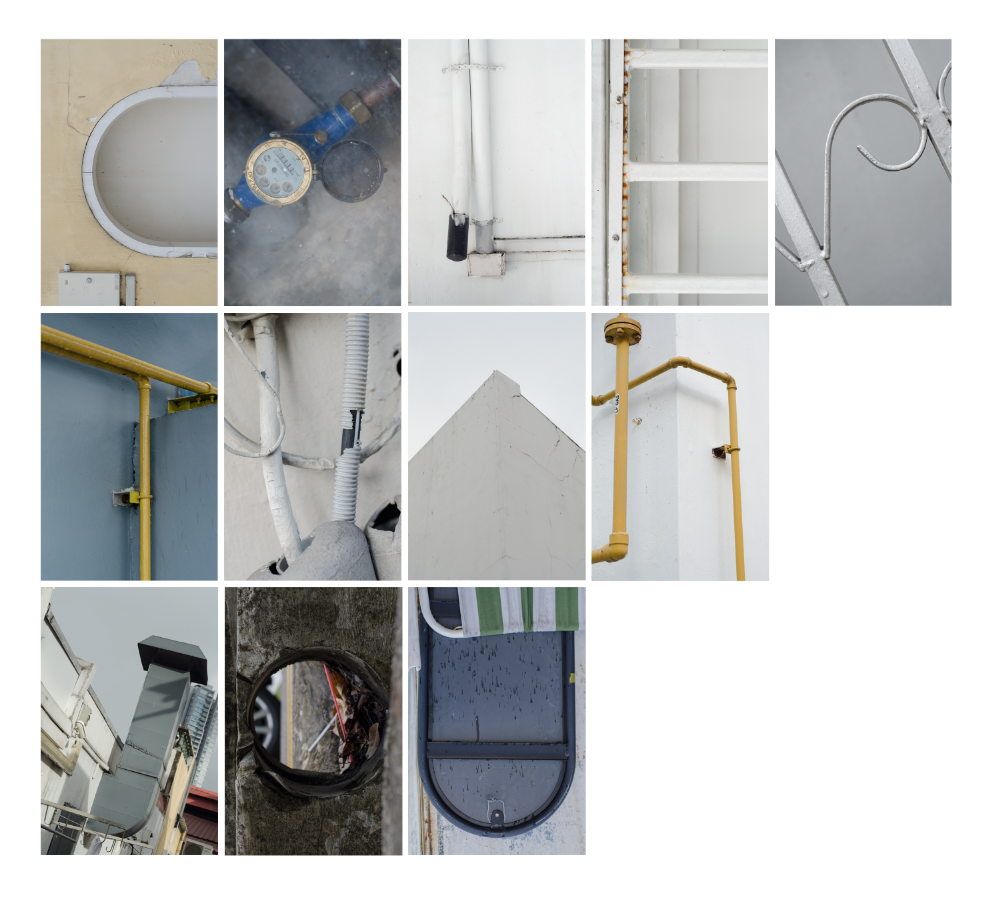
Upon reaching Haji Lane I noticed a back alley that had many elements like pipes, electrical wires and a variety of grills and gates. I immediately got inspired and starting seeing all the alphabets I needed to find. I was also happy that I found the location as back alleys are somewhere hipsters love taking photos at to get that vintage deconstructed look. Having everything from one location all shot on one day also ensured I got a consistent and cohesive look to my final piece.
Below are my first drafts to find a layout I liked:
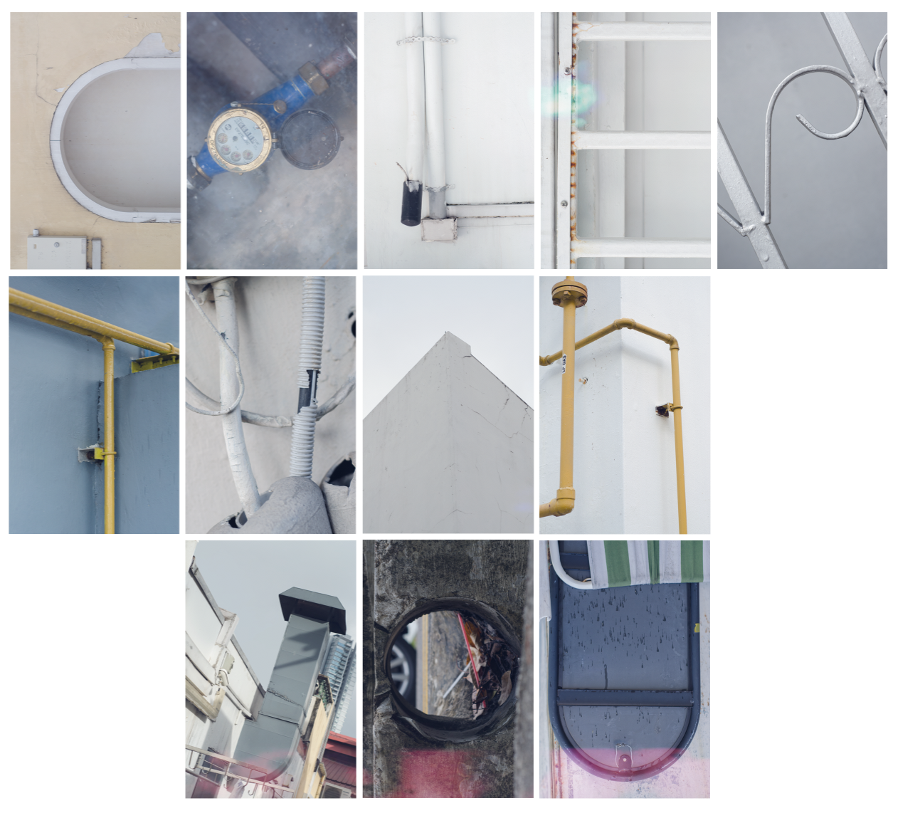
I added on a filter to create that film camera look complete with a light leak to push the concept and theme further.
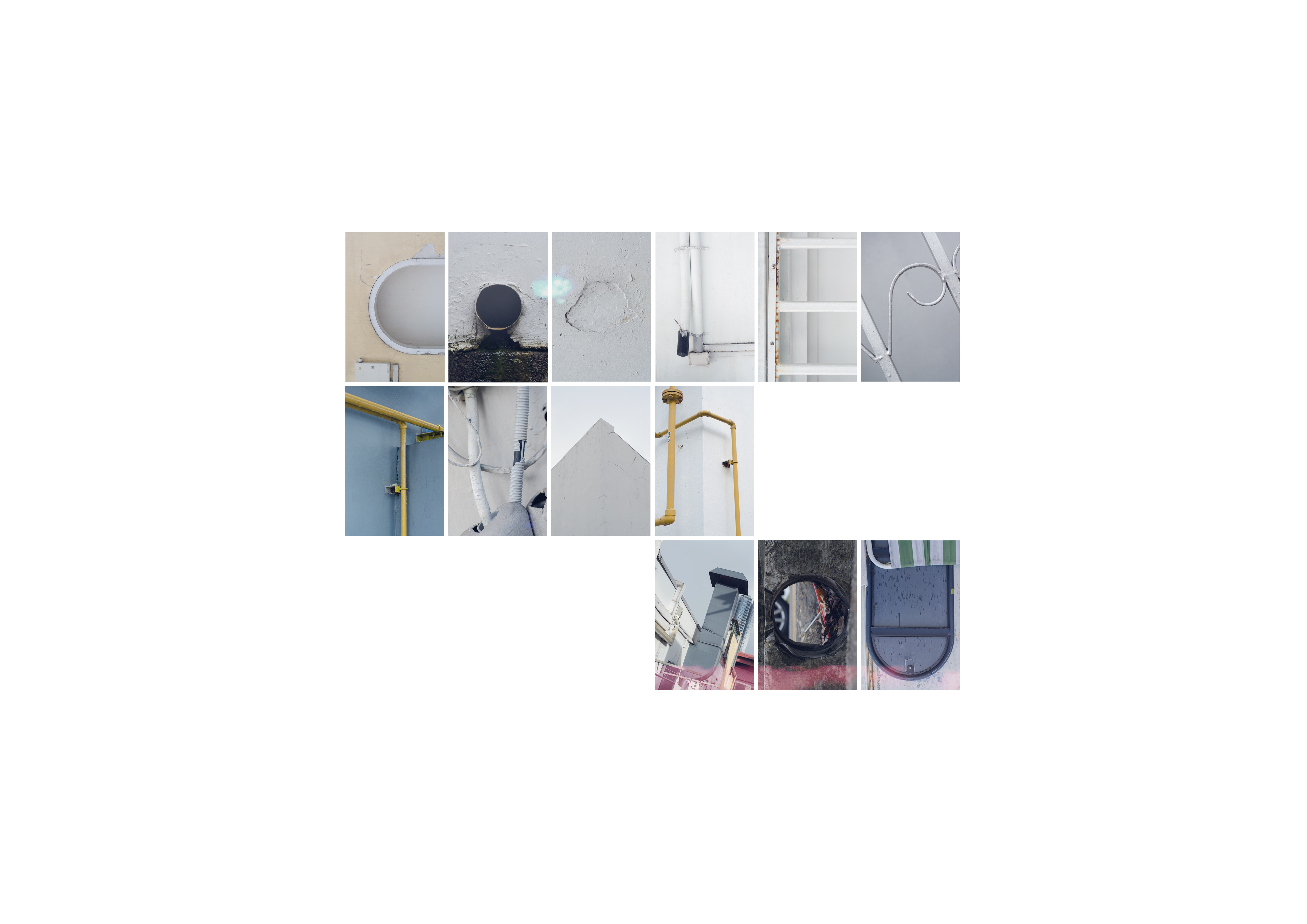
After coming up with my first draft, Shirley did comment that some of the letters werent clear enough especially the ‘Y’ in ‘YOU’. Most of the other letters required a tighter crop so viewers would not be distracted by whatever was around.
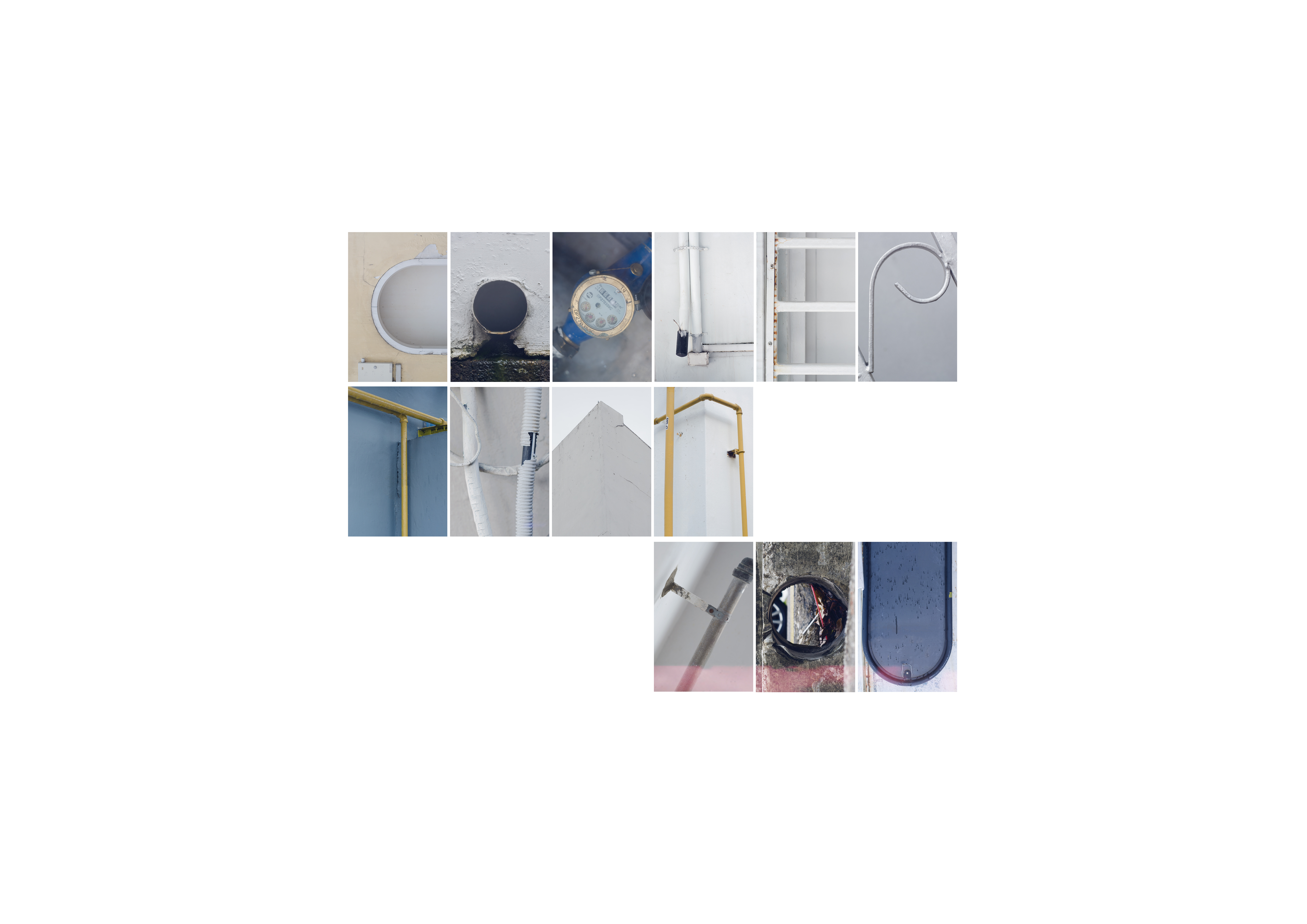
After re-shooting and making my necessary edits, here is my final layout:
All in all, I feel this exercise was an interesting and fun one and the type and words each of us discovered were really unique as no one sees the same thing in the same way.
Stay tuned for my Organic Type process post 🙂