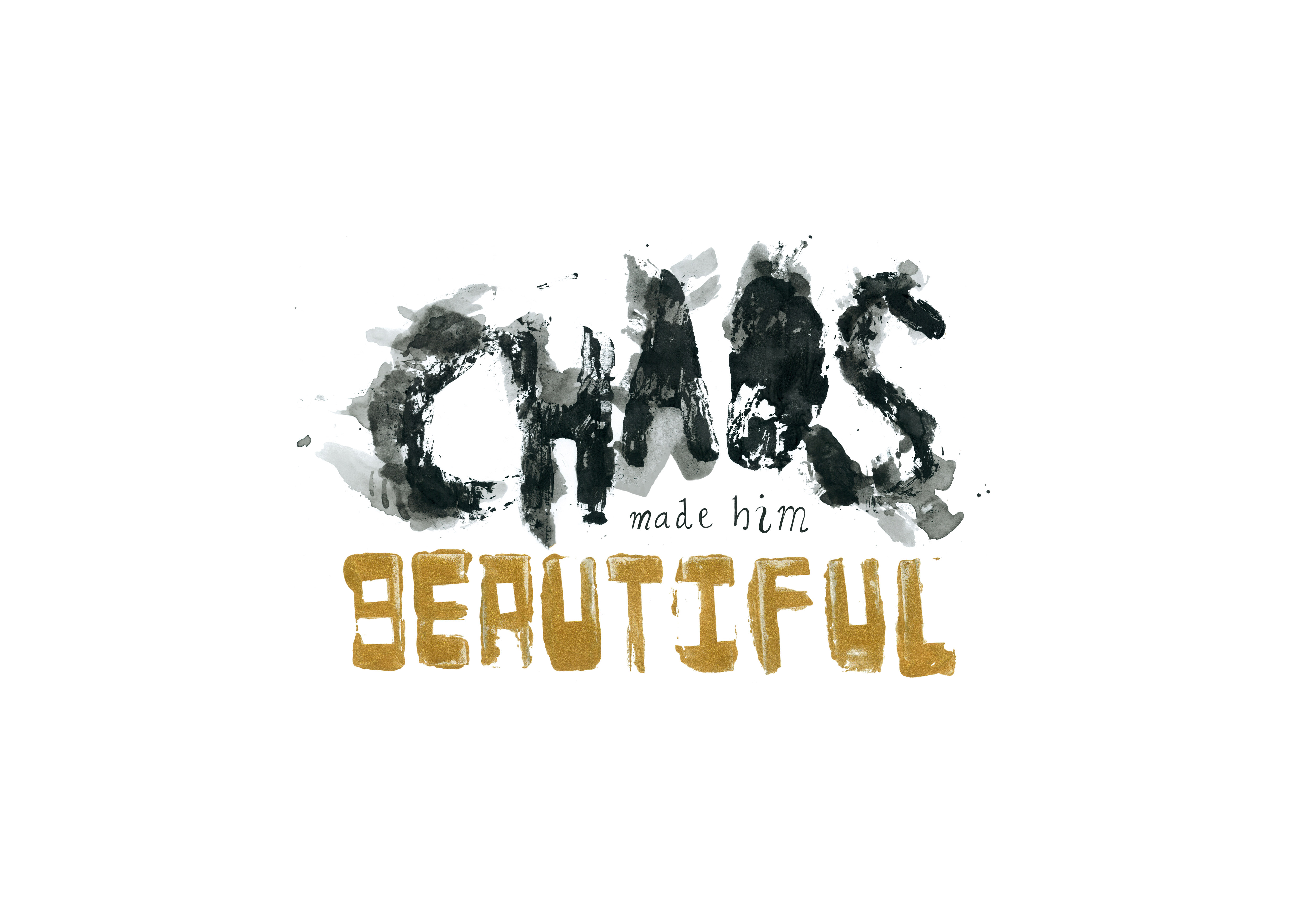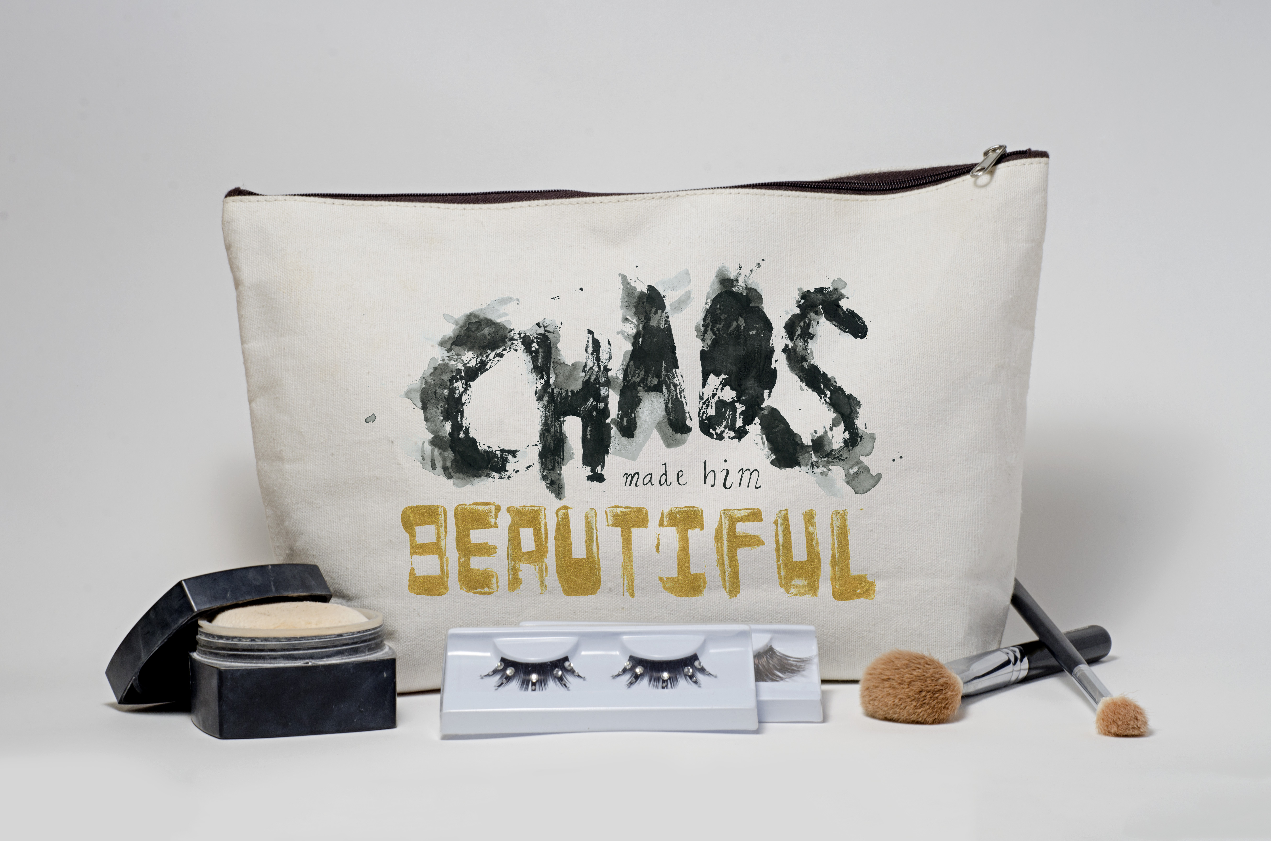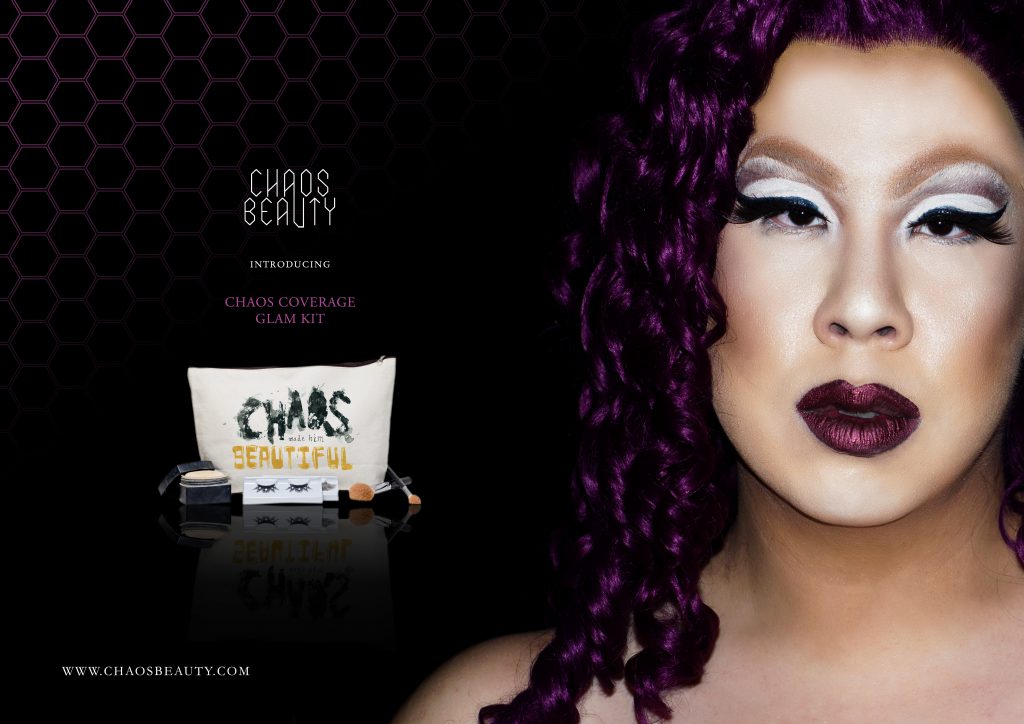
For the first part of our third project for Typography I, we were tasked to create image using type. I first began by trying to make human faces:
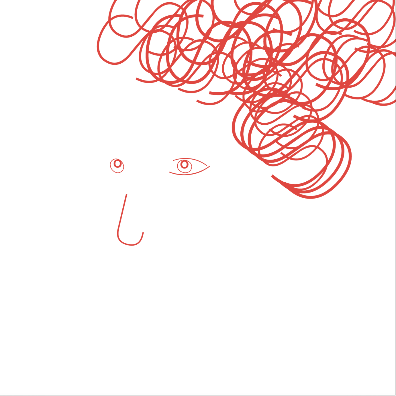
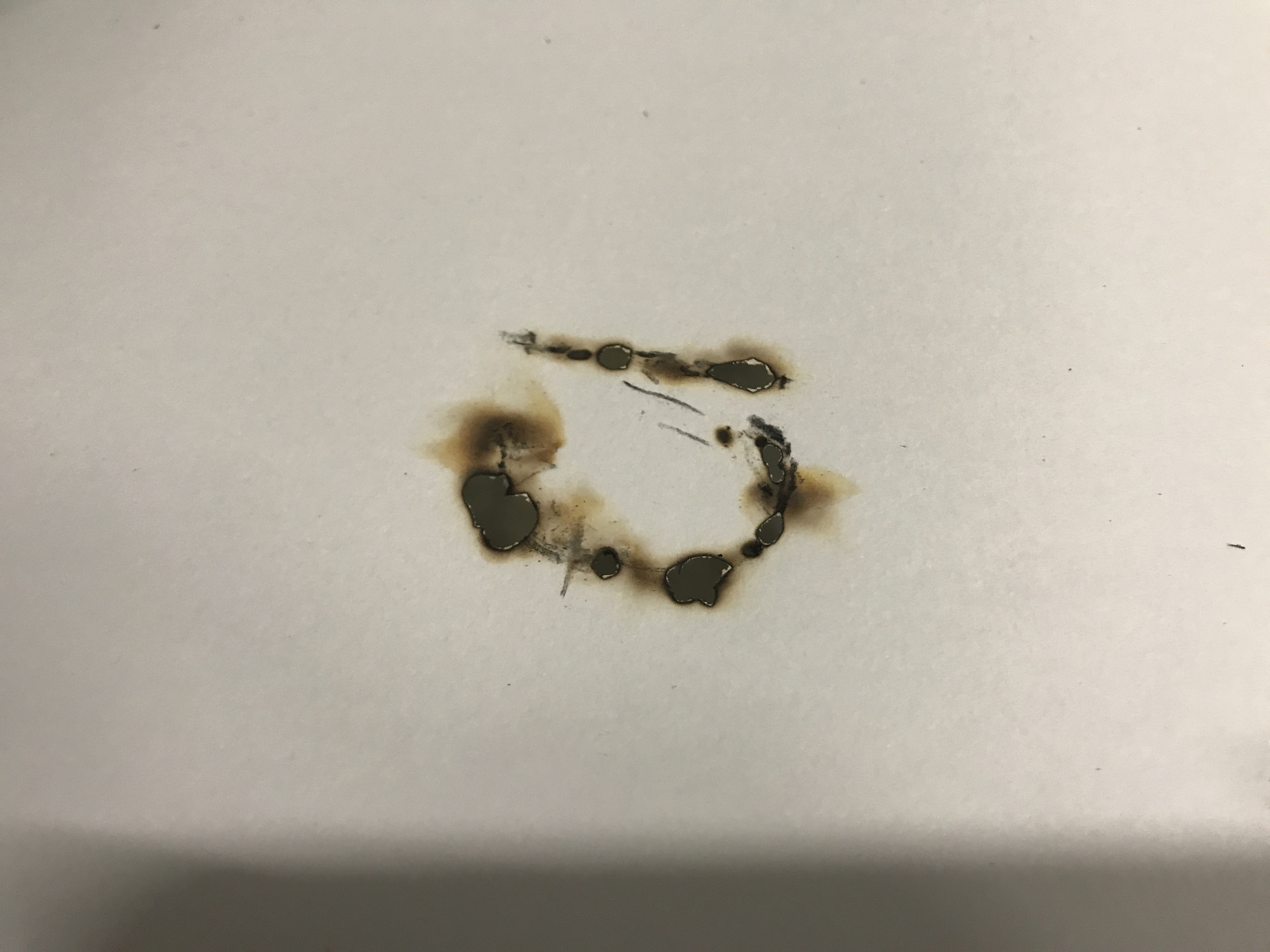
After doing this for abit, I realised that it was indeed difficult to successfully create a human face because of the large amount of shapes and contours of a face that form it. I was not satisfied and tried creating other objects:
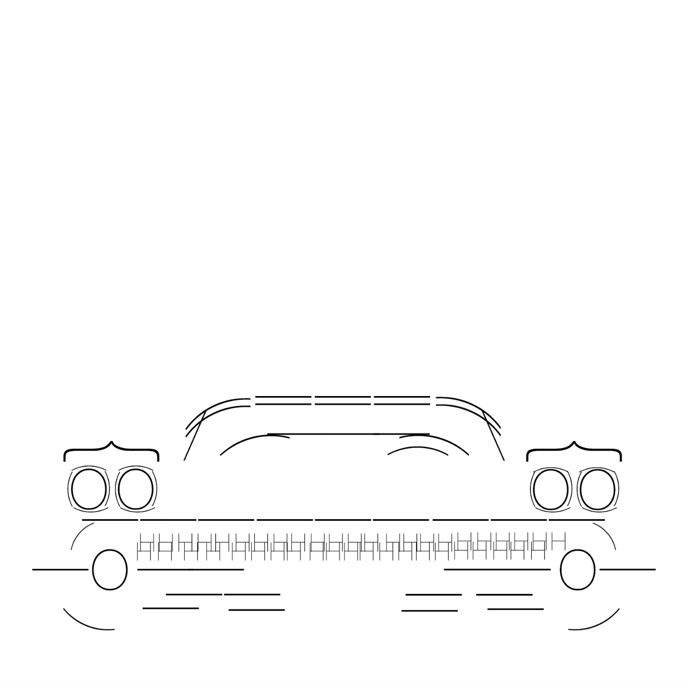
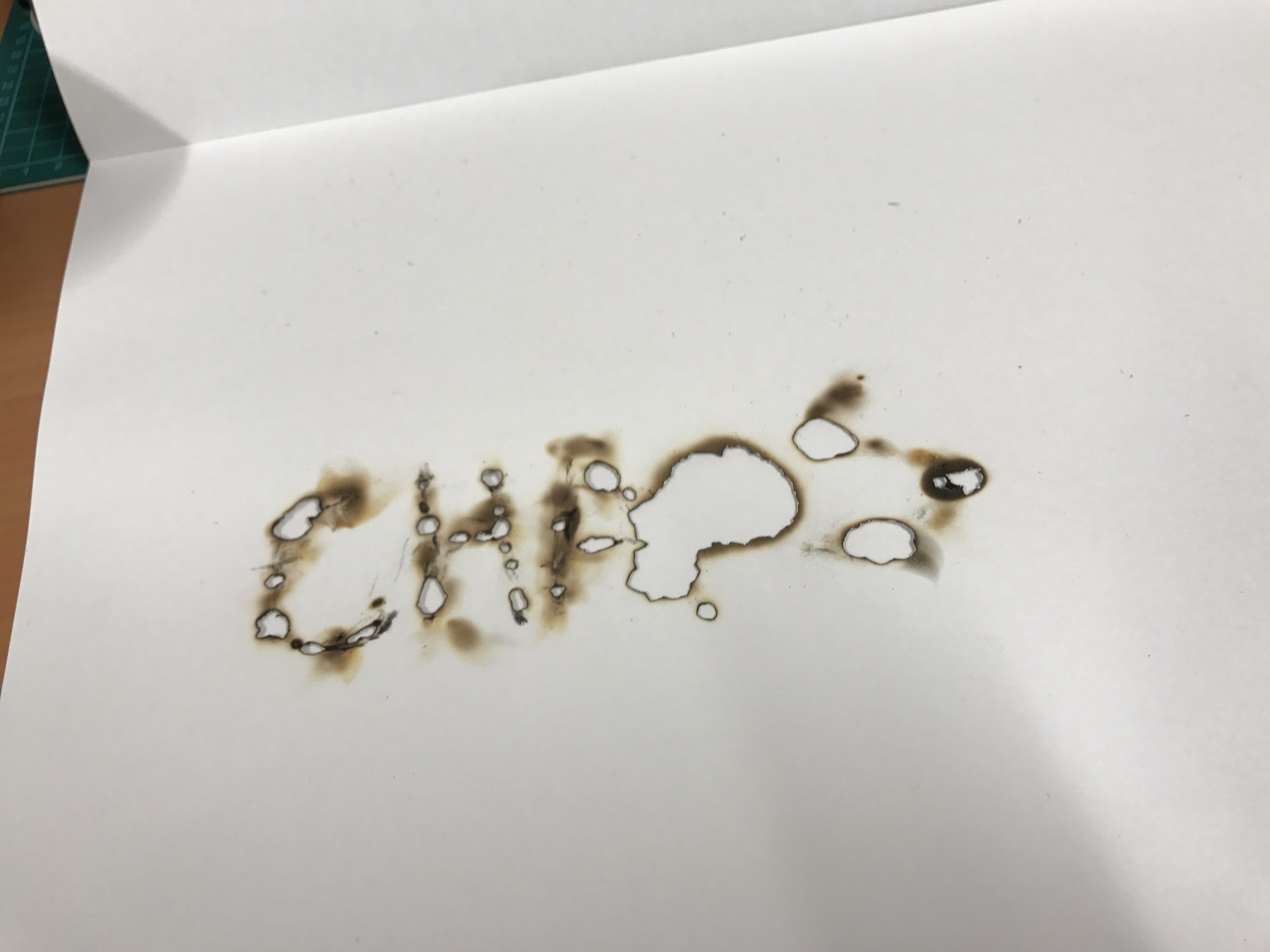
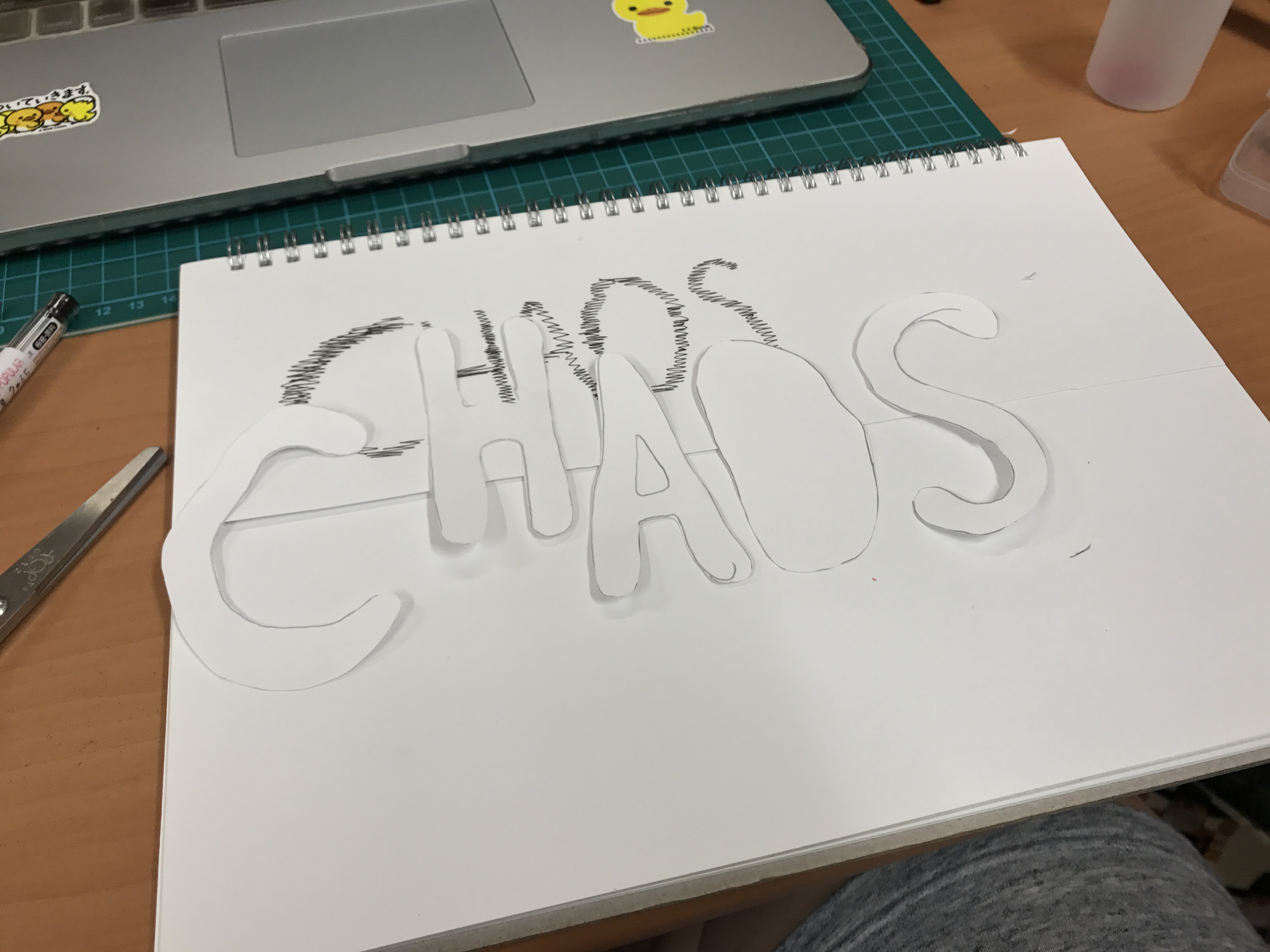
This was supposed to be a car that wasn’t completed. I was unispired and did not find this rendering successful as well. Finally I decided to work on cartoons. Made with compound lines and shapes, they would make the perfect candidate for a typography image:
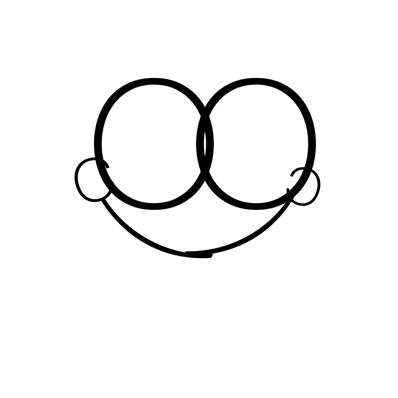
And after a few hours, these were my final results that I was very pleased with:
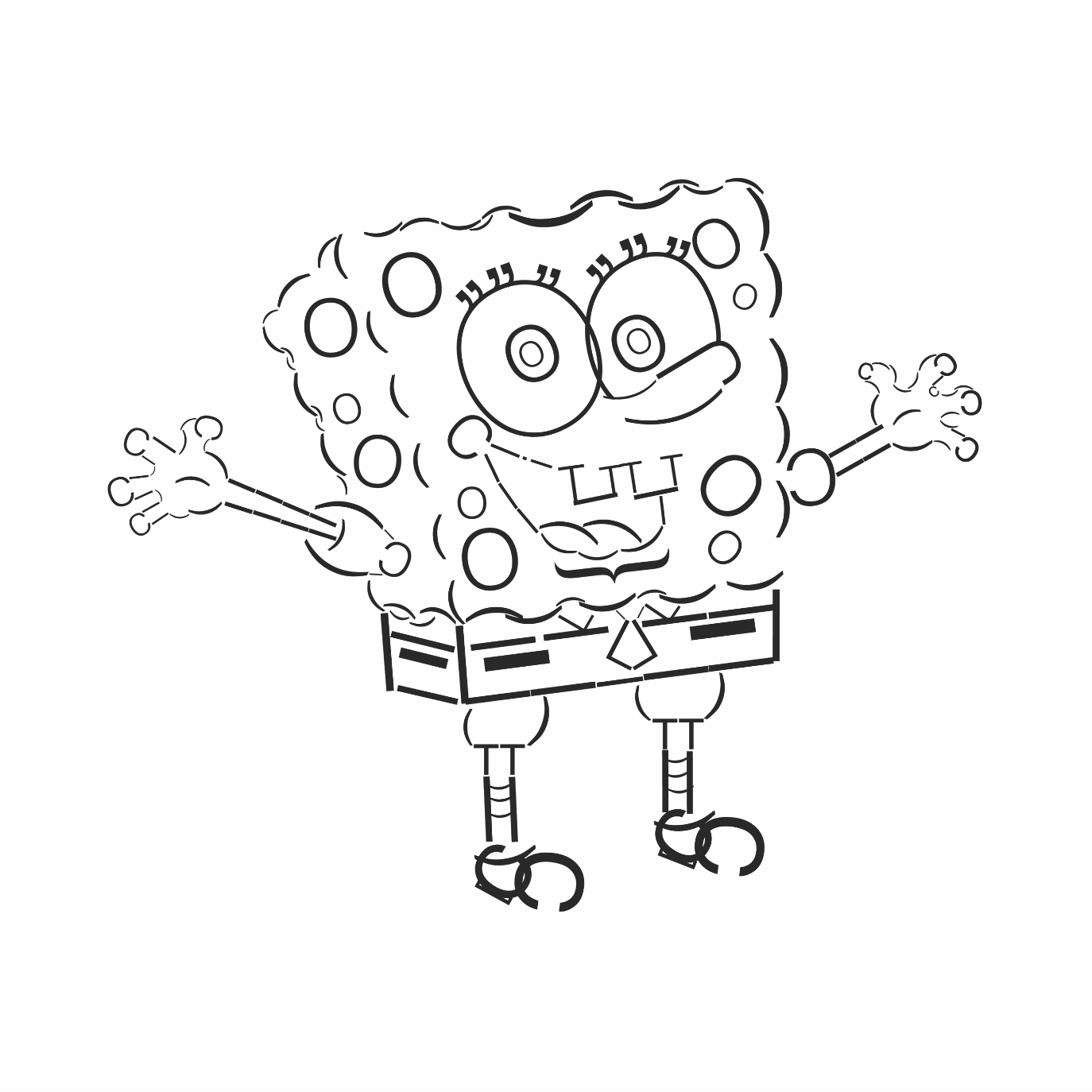
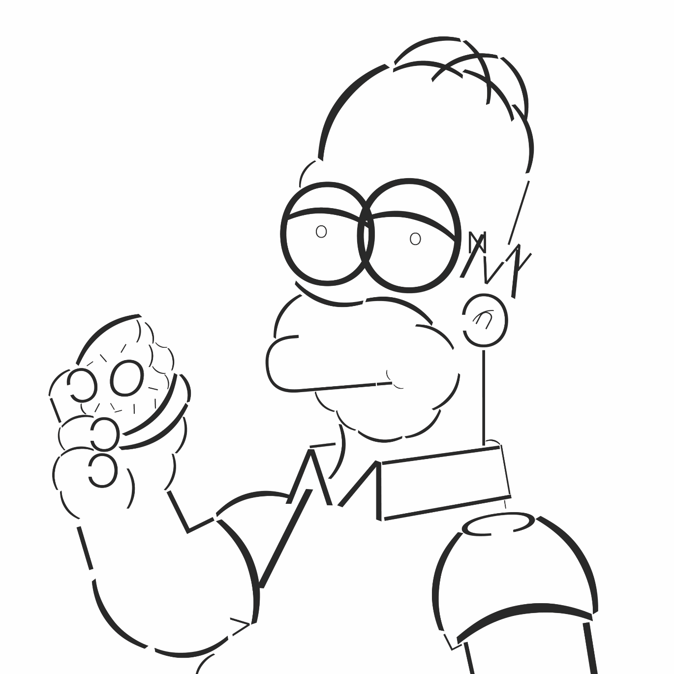
These were made using broken up parts of the font Helvetica Neue. I used a variety of weights to accentuate certain features of the image. Examples would be Spongebob’s pockets and Homer Simpson’s eyes.
The next part of the project required us to make a pattern using type. At first I began with serif fonts and did not completely understand how I should go about approaching this assignment. I was simply placing letters and not allowing them to truly create a pattern:
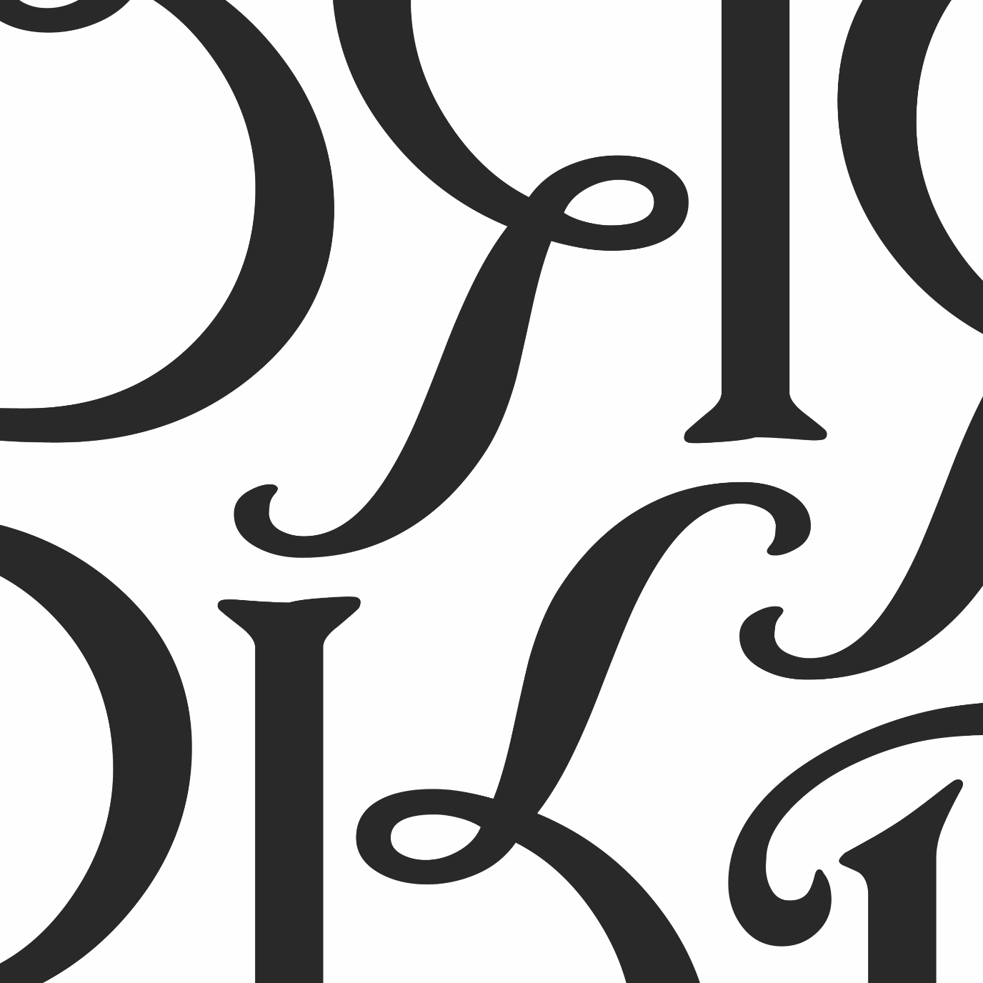
After doing more research, I gained the courage to break the grid and create more dynamic patterns. One thing I also discovered was that I much preferred sans serif fonts with fixed heights and widths because I’m someone who still appreciates a sense of order and neatness. These next patters were made without over-thinking form:
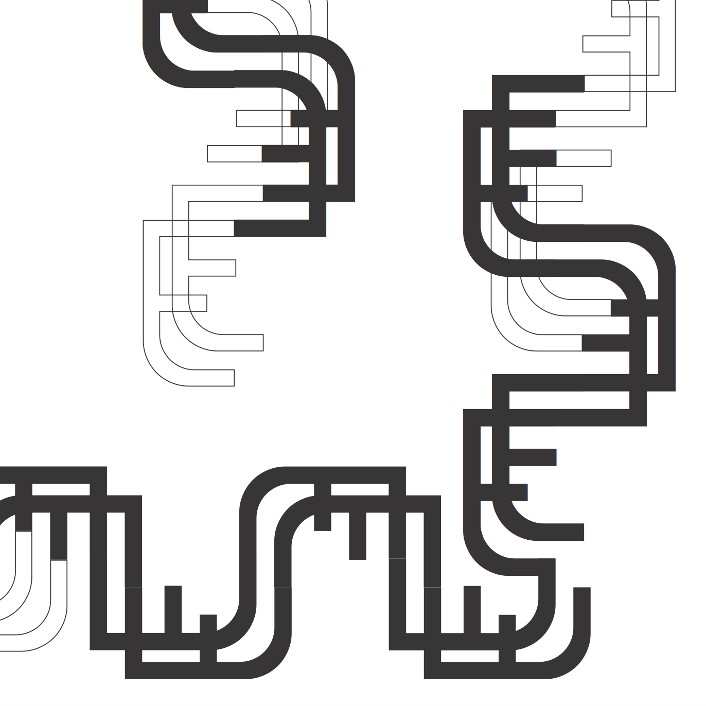
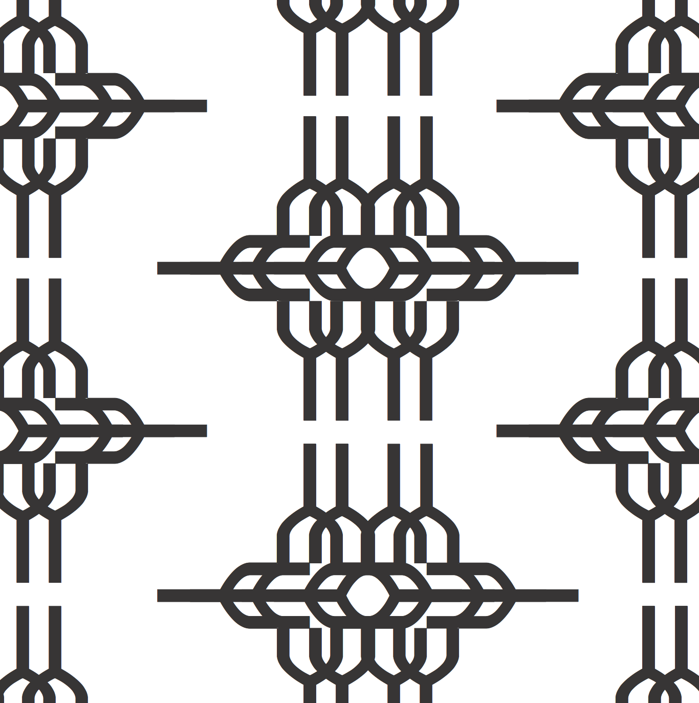
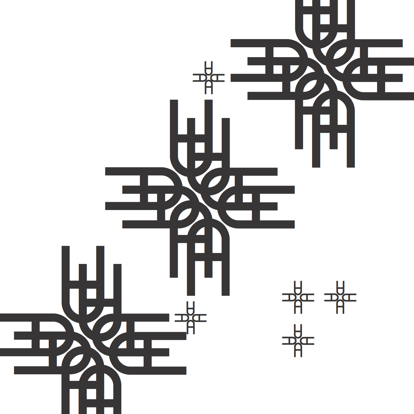
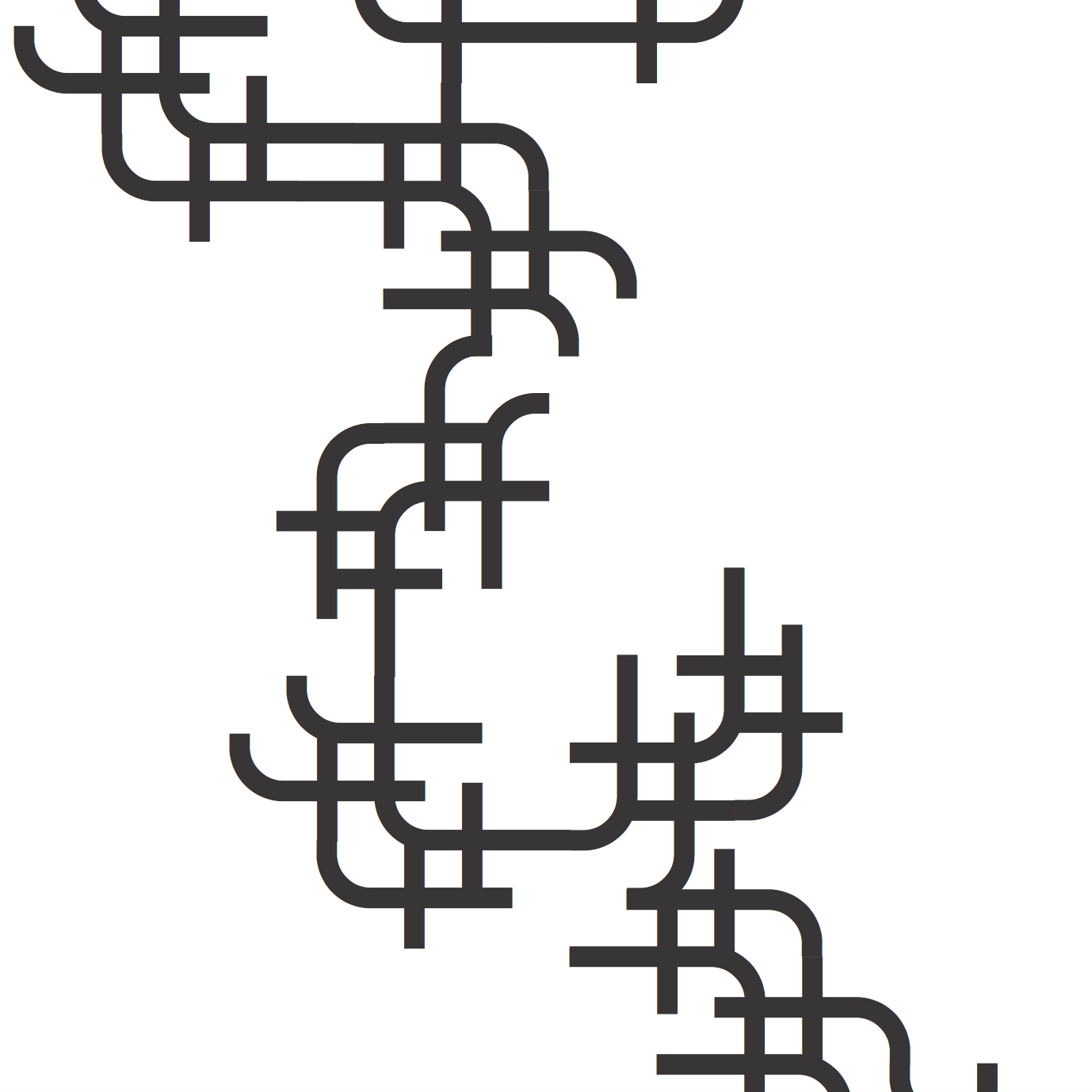
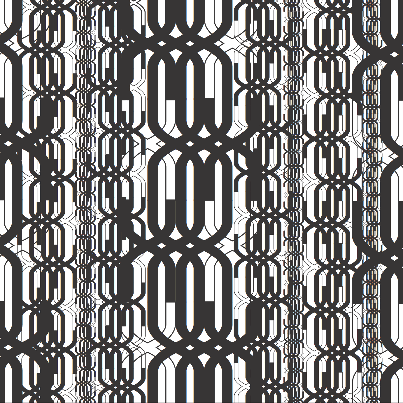
The main feedback I got after consulting with Shirley was that I was too fixated on repetition and I should pay attention to possible creating depth and rhythm by making use of density. I reworked some of my patterns and these were the final 2 I came up with:
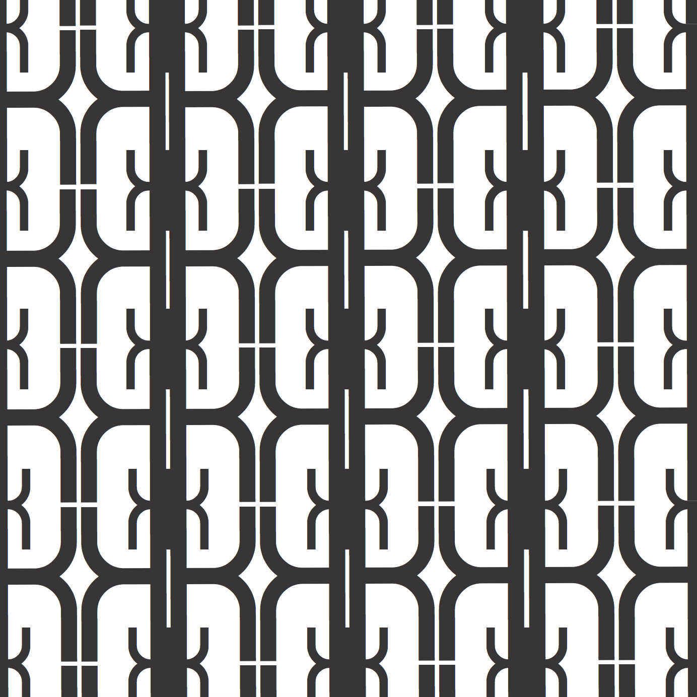
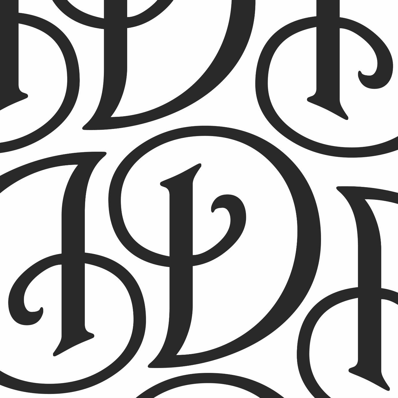
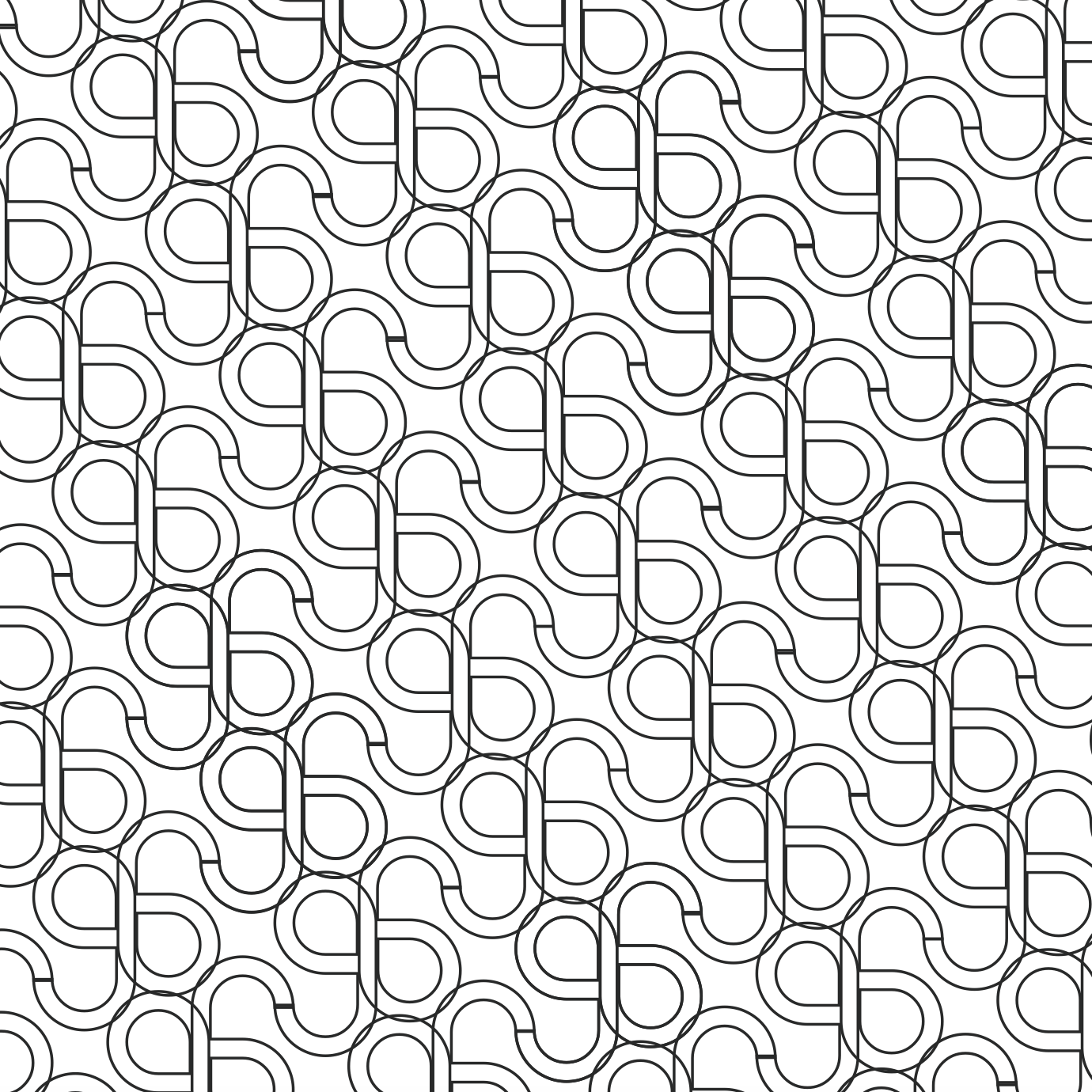
The first one made use of the letter ‘K’ from the font family Modum Regular. This pattern made use of repetition but still was interesting because in it were rounded edges, straight edges, line work and overall still had some rhythm to it. I was inspired by the retro wallpapers and window grills / gates.
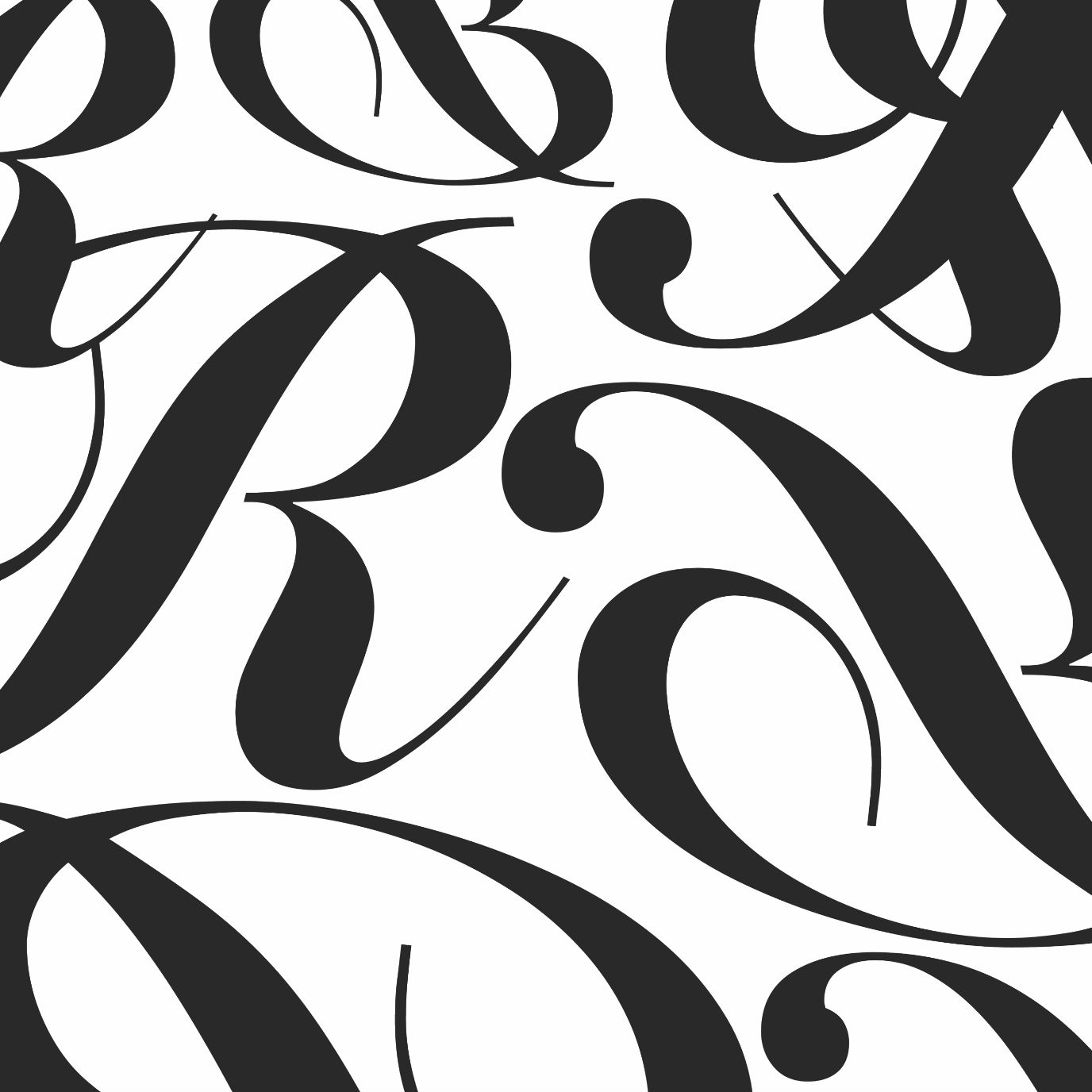
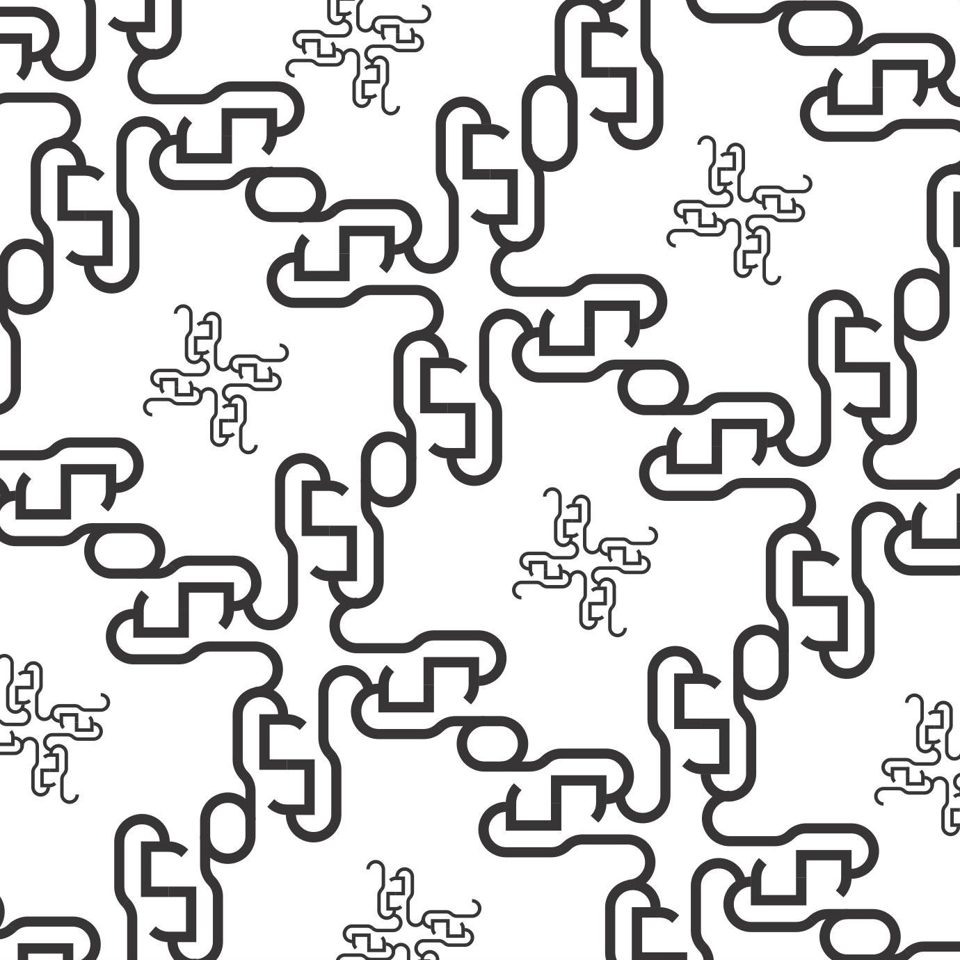
My next pattern was made using ‘X’ of the same font. By playing with density and scale, I was able to create more depth and texture and this reminded me of snakeskin leather. My classmates saw more of a matrix digital effect which was apparent too.
On a whole, I was happy with my patterns and was happy I managed to break my own ruled and think outside the box (no pun intended).
The final part of the assignment was creating emotion using type. Using the word ‘HELLO’, we had to conjure up 4 emotions. I first approached this part of the assignment trying to use one emotion and creating multiple versions of it. This resulted in a very forced exploration for the emotion ‘SEDUCTIVE”:
After these attempts, I realized that maybe the best way was to reverse engineer. This first method made me feel very restricted and I was not working creatively. I thus went ahead with creating layouts first and tagging the emotion onto them later. These were my explorations:
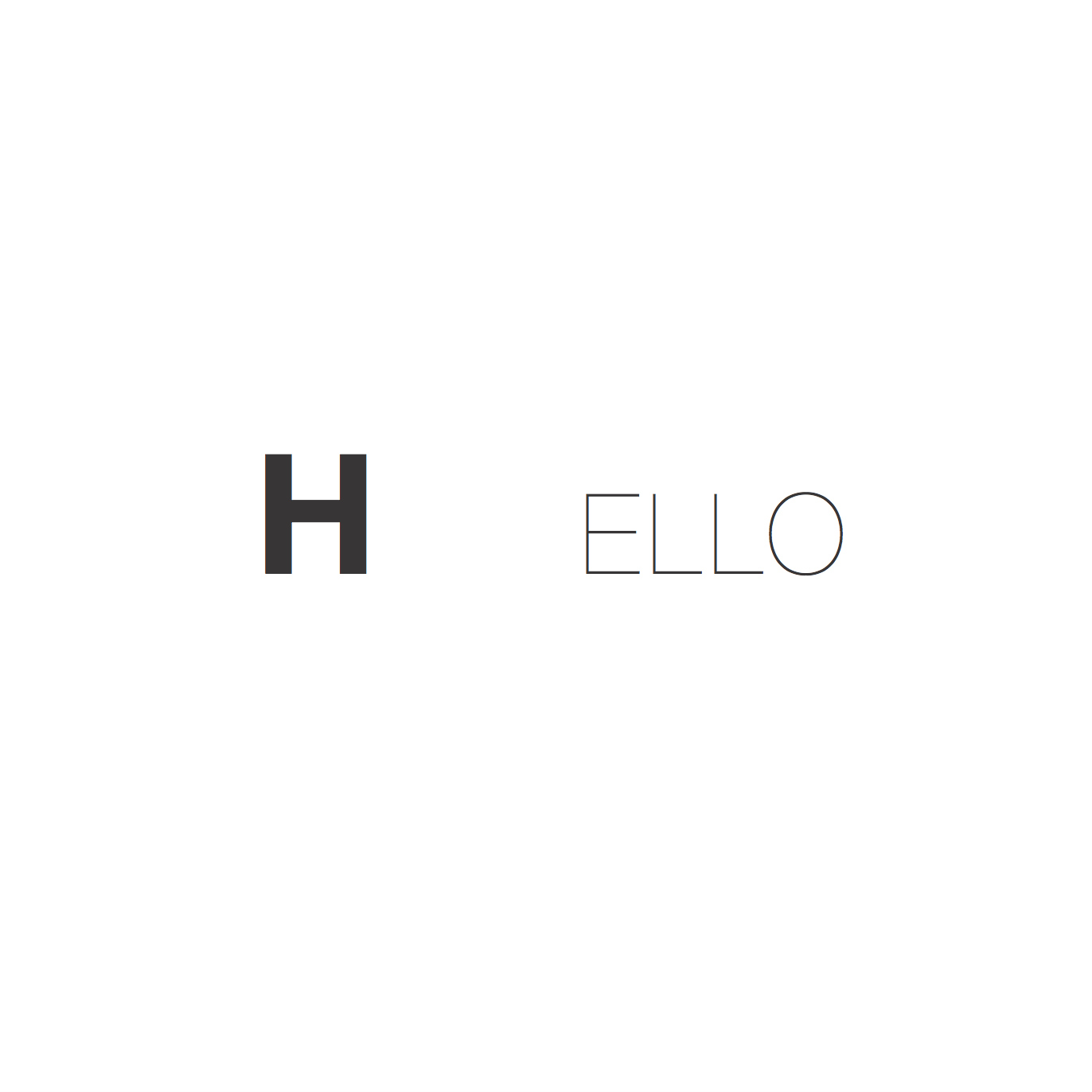
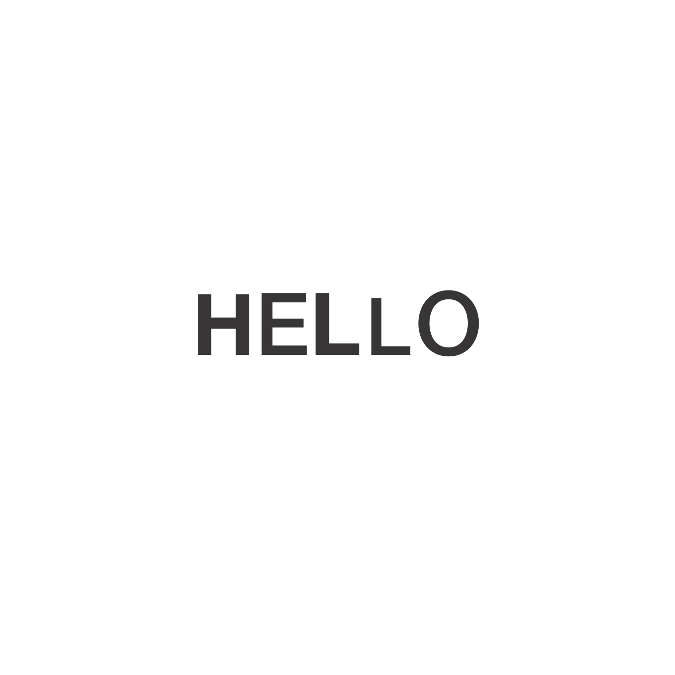
This was indeed better for me to create without overthinking and stunting the creative process. I decided to stick to Helvetica Neue for all of my emotion pieces because it was such a diverse font with many weights.
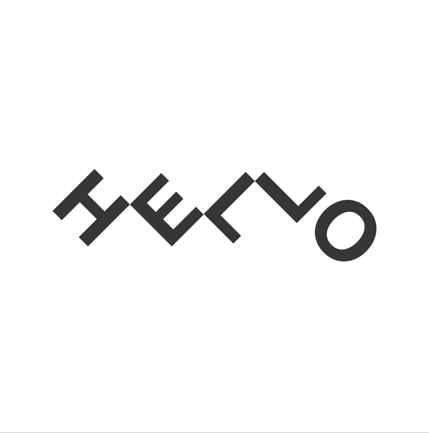
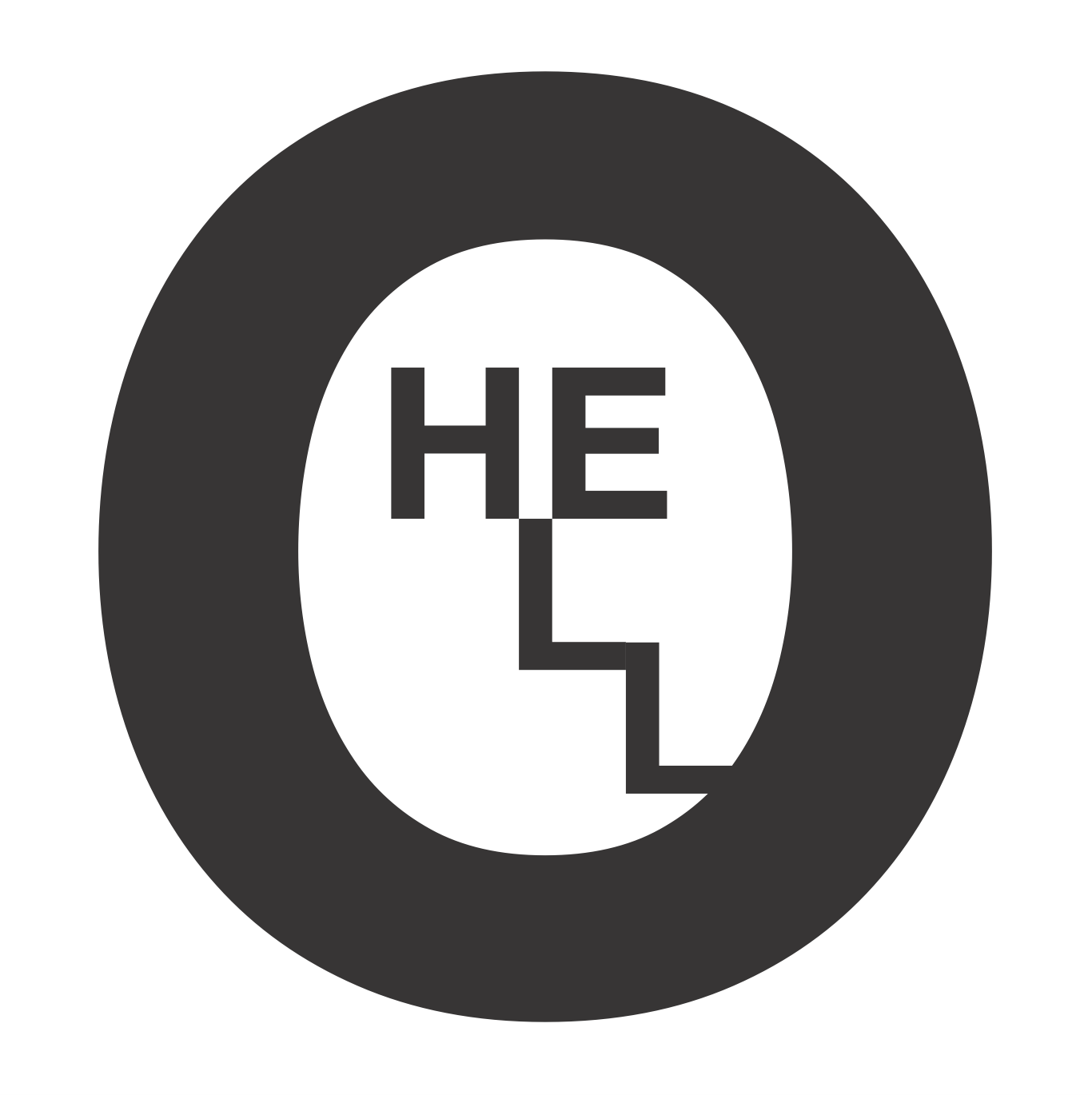
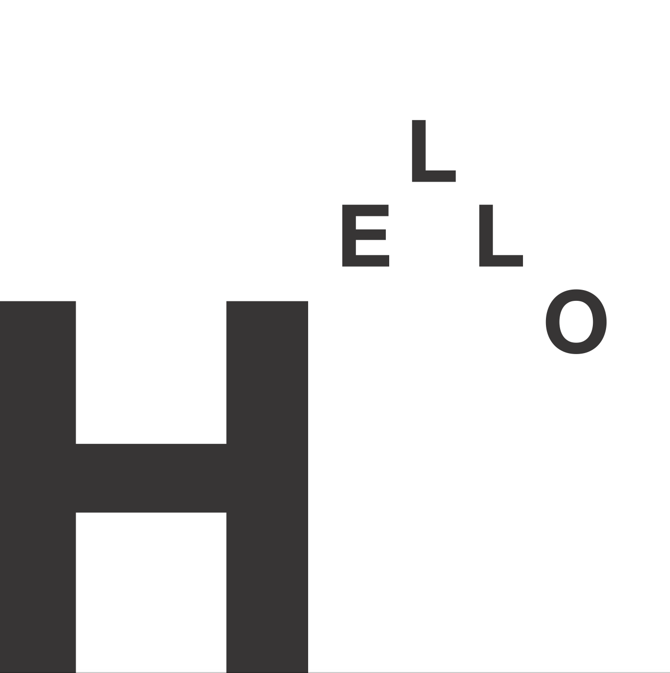
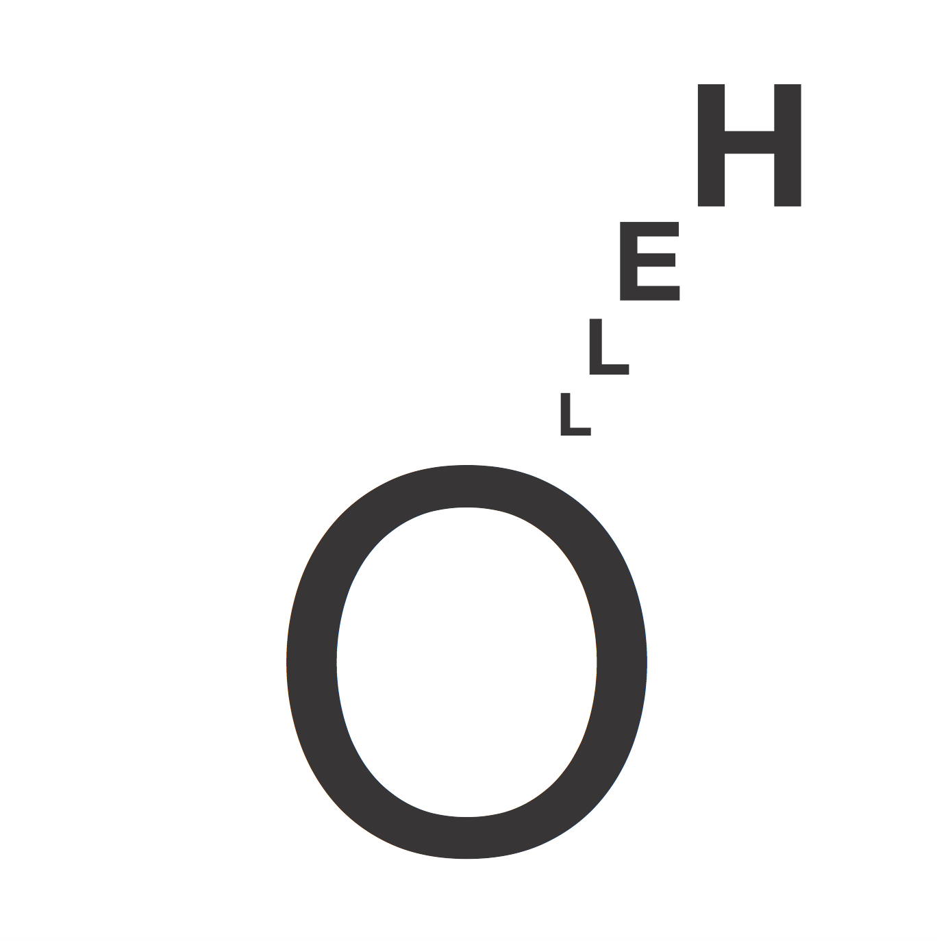
Finally after consultation, I came up with my four emotions that I went with:
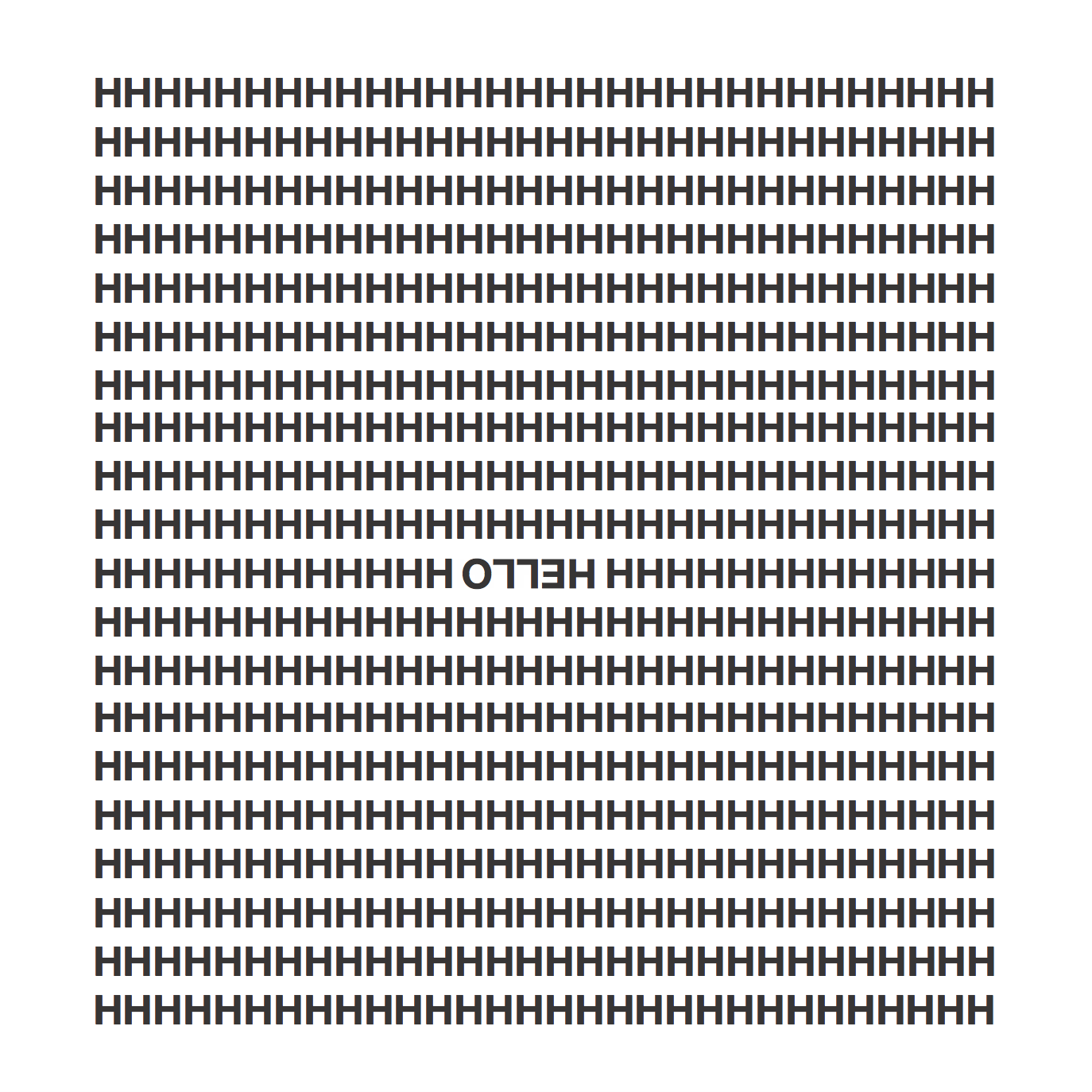
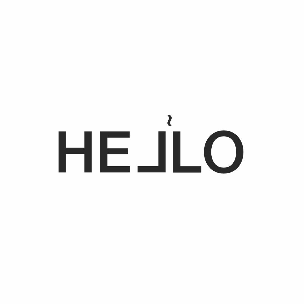
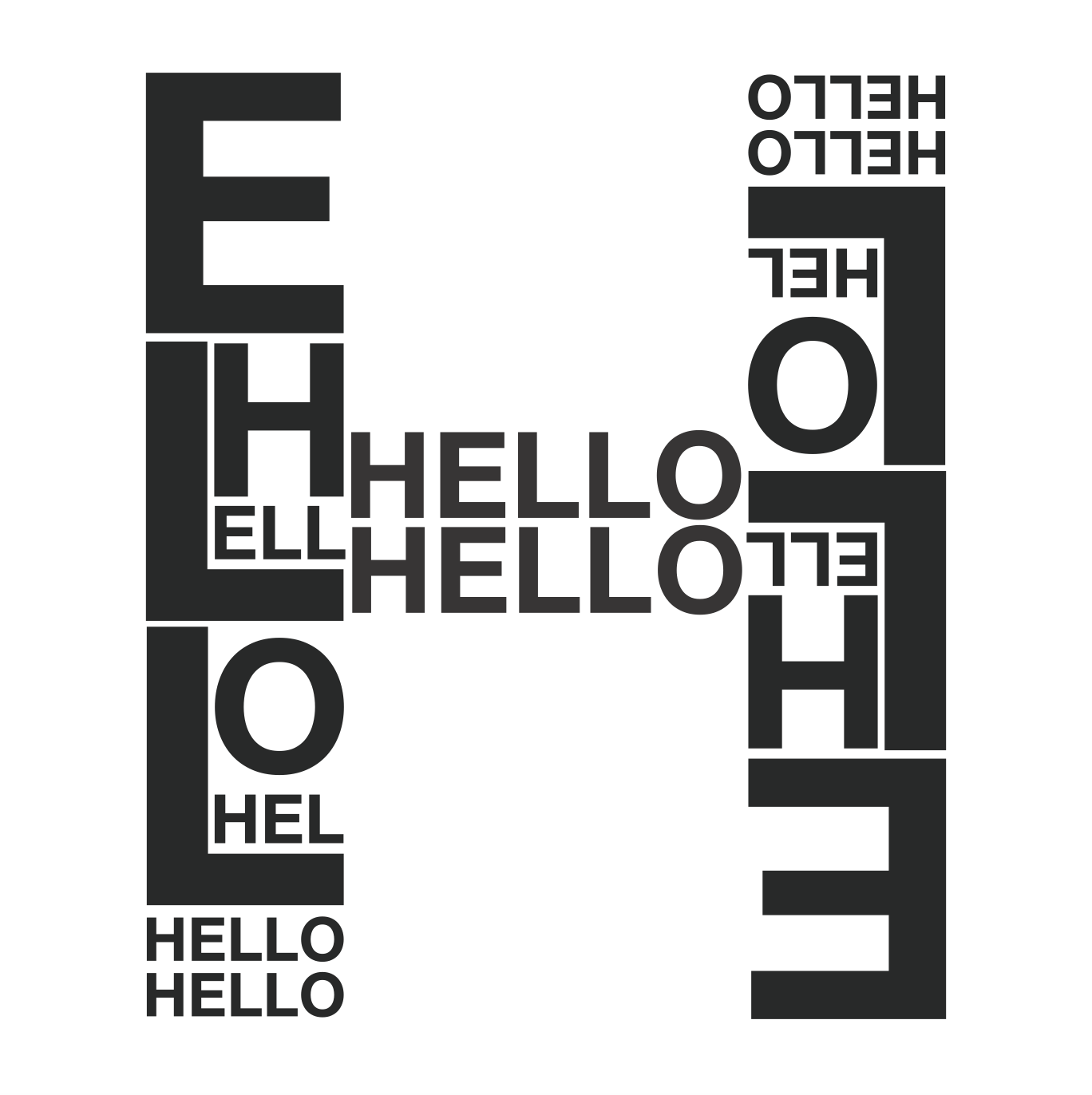
CONFUSED
I see confusion as seeing double and not knowing where to look. I liked that with this effect, your eyes really do get confused until you realise you’re supposed to read a ‘hello’ that’s upside down.
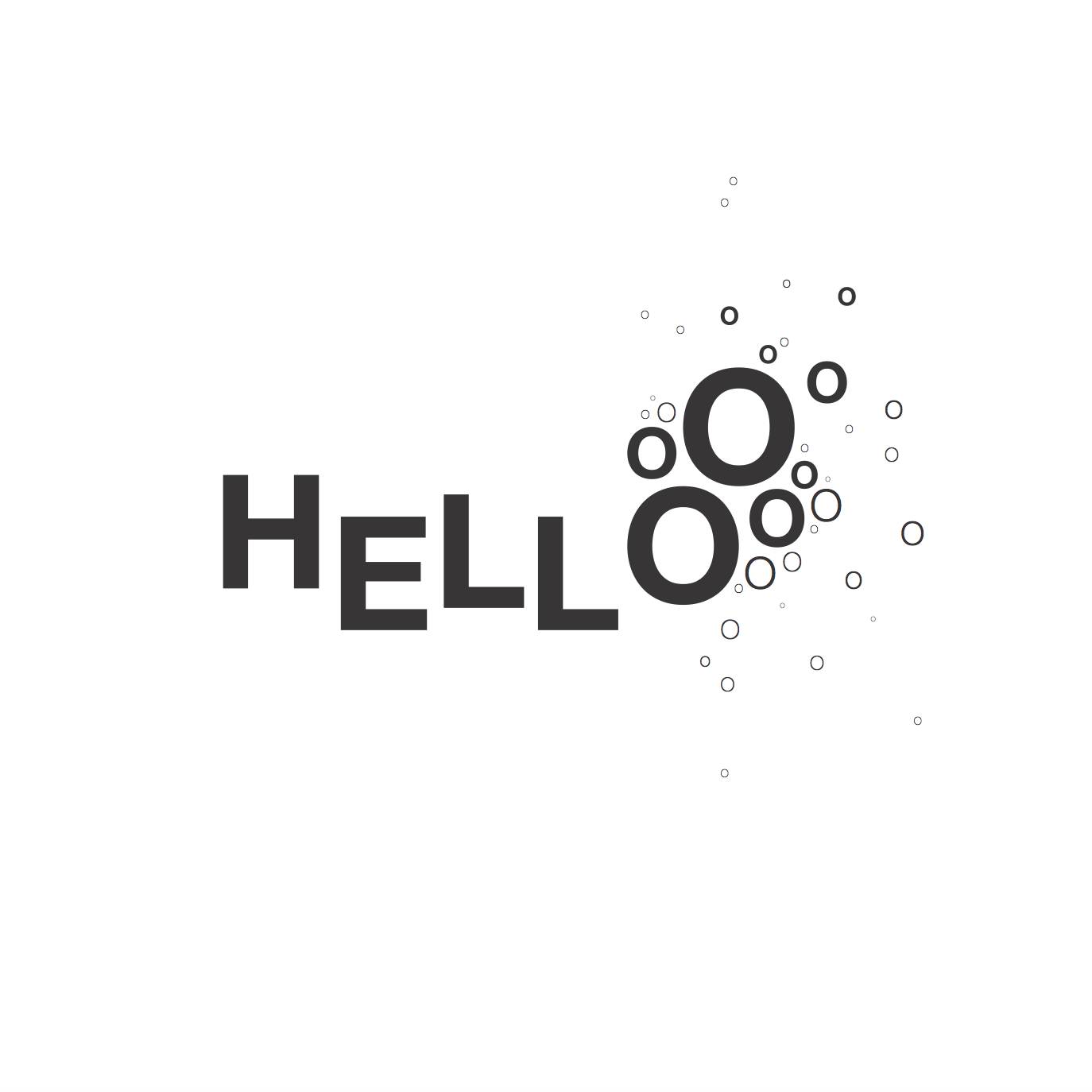
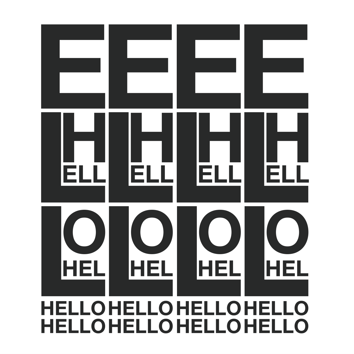
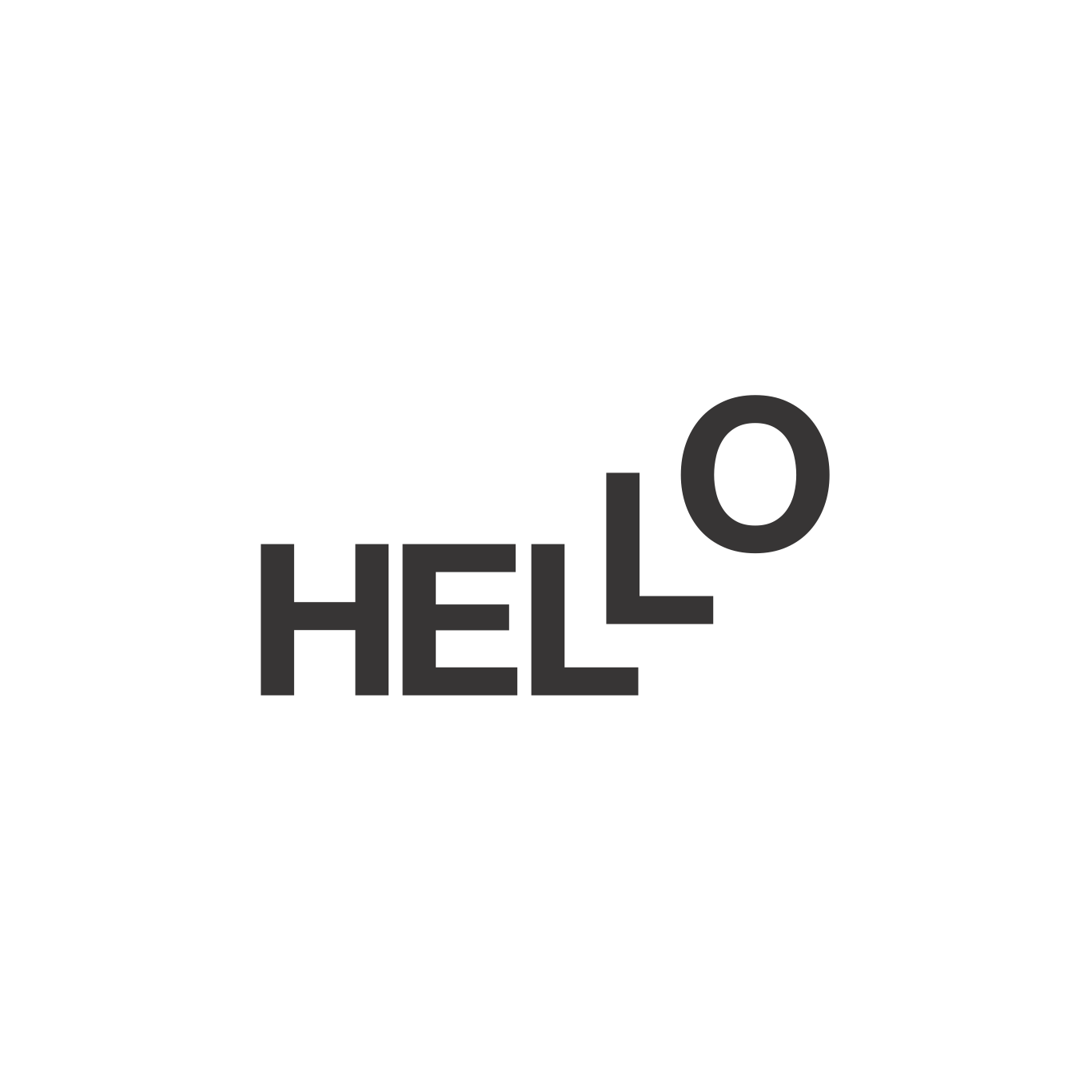
EXCITED
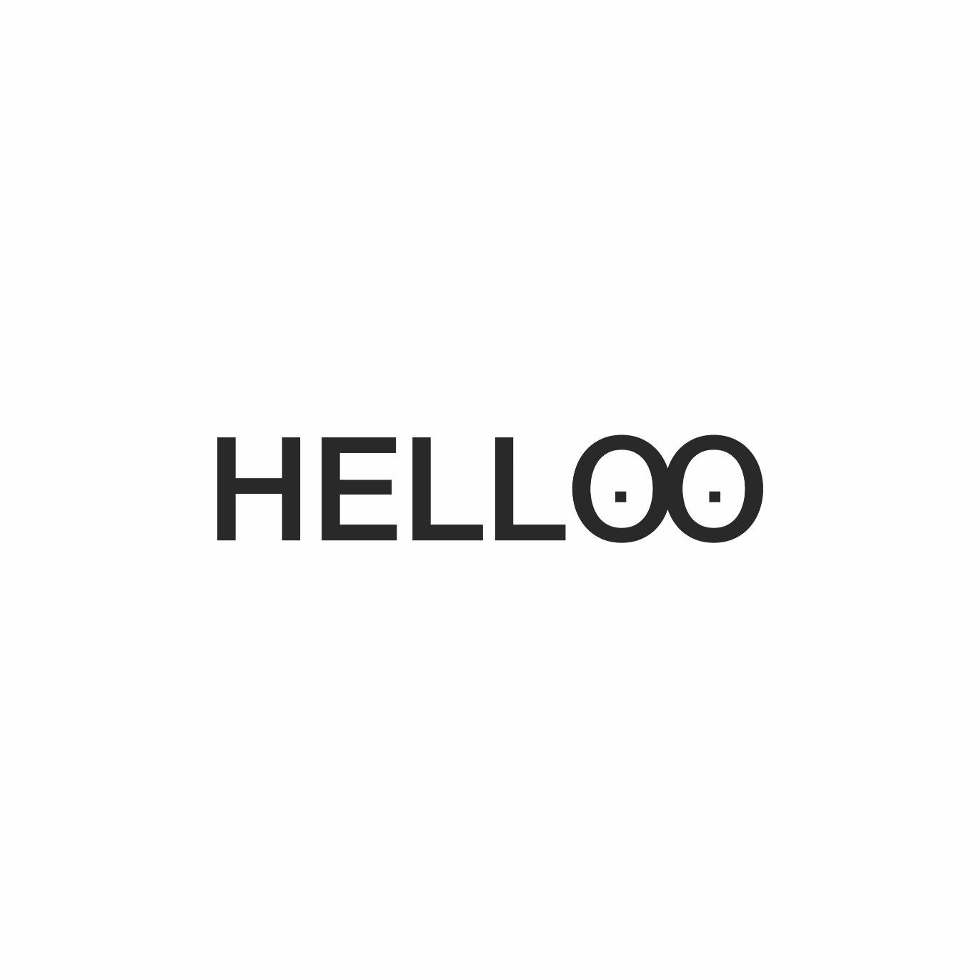
I view excitement as an uncontrollable amount of emotions which explains the floating letters followed by a huge burst of excitement. Varying the weights of the ‘O’s’, I created a bubble/water droplet effect.
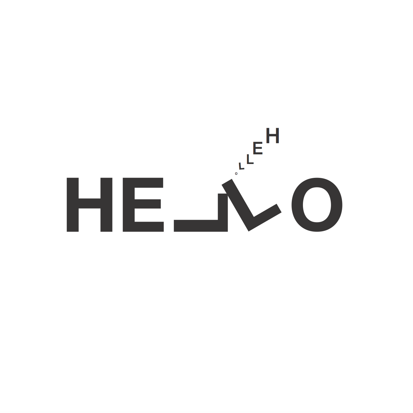
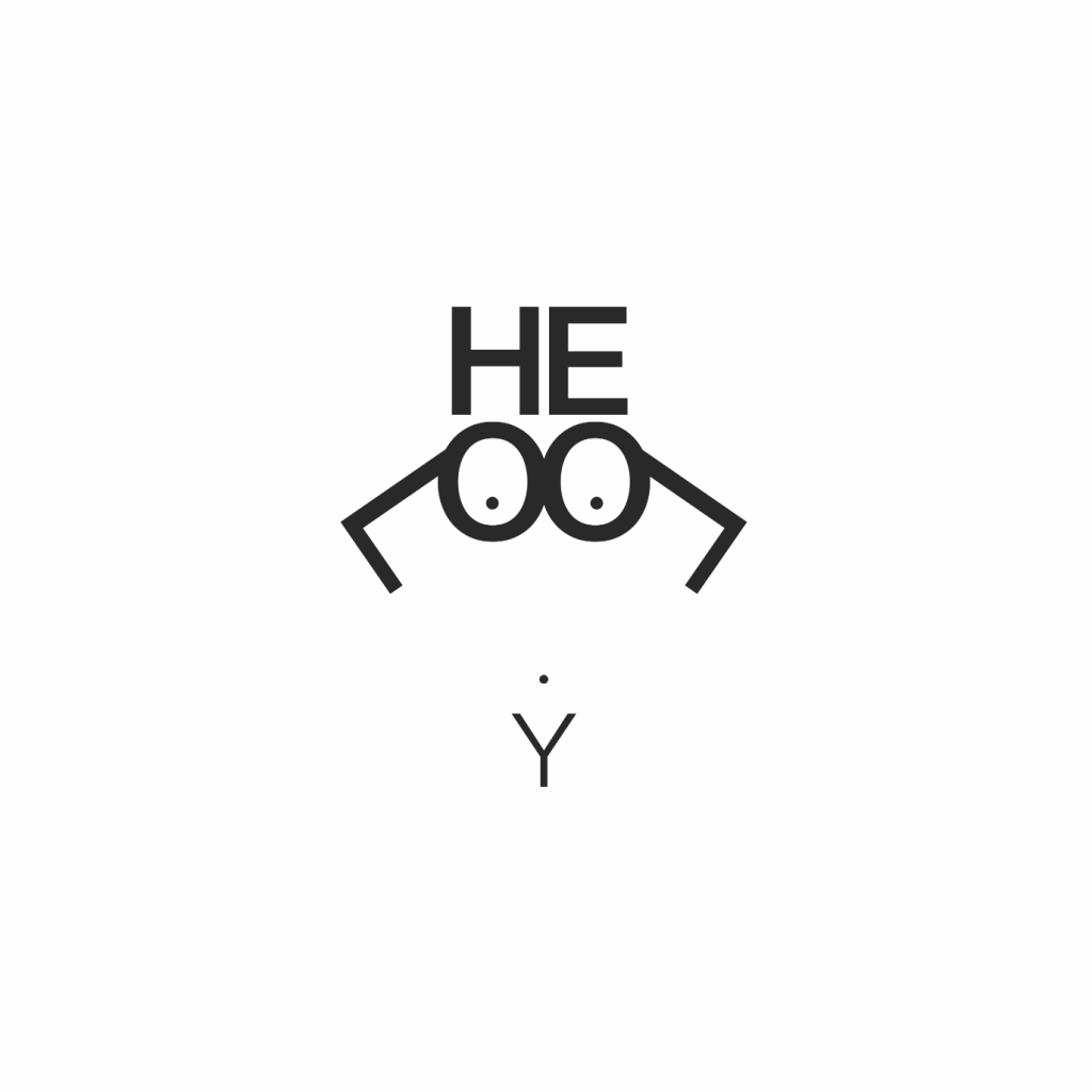
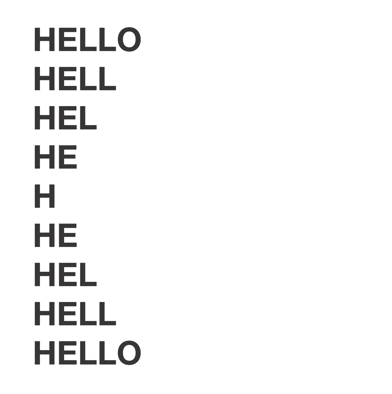
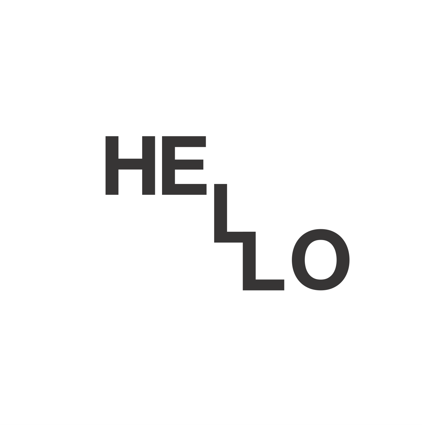
BORED
I see boredom as being so dismal to the point of falling asleep. To show this I made one ‘L’ lie down and the other lean on it in slumber. I also incorporated my other idea from above of making snoring icons using another ‘hello’ form.
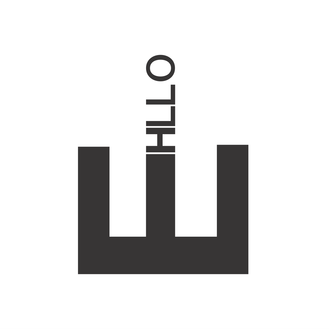
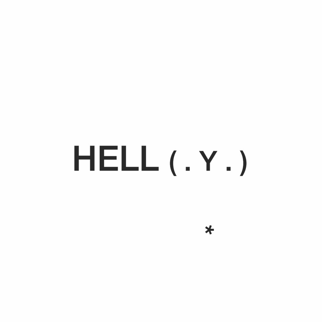
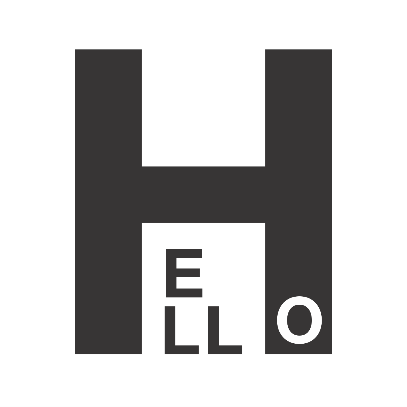
ANGRY
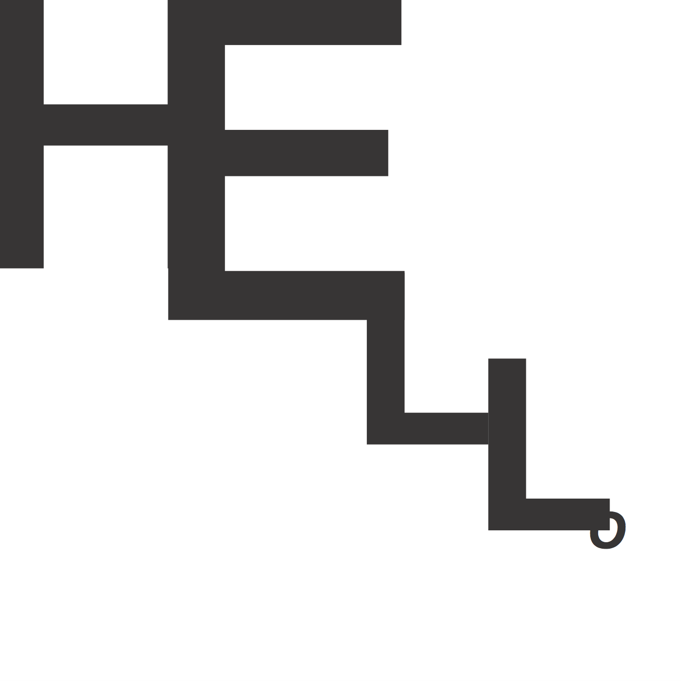
This final piece was a fun one. I was playing around on Illustrator when suddenly this imagery become so clear – a middle finger. I tagged ‘angry’ into this piece because it was such a physical representation of the word.
Reflections
As usual, this project was difficult for me at first because I was unsure at many points where exactly to begin. The key to this project was ti simply let go and let everything come naturally paying less attention to order. All in all, it was an interesting assignment that once again demonstrated the endless possibilities of type that go beyond just conveying information in the form of text.