Category Archives: Foundation 2D 1 – G2

2D Project 2: Forrest Gump

P.S. This post was privately drafted really early, which is why the posting date is
on the 9th of October... sealed


In this post you will find:

  • Final compositions
  • Silkscreen process

––

FINAL COMPOSITIONS

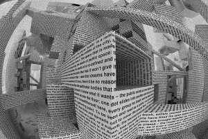
After compiling an entire list of quotes, I decided on using quotes that would have close to no proper meaning when they stand alone, and give them meaning myself. By doing so, it becomes easier for my interpretation of the quote to not be limited by my understanding of it in context of the movie. 

The four quotes that I decided on are from space movies (for no particular reason other than the fact that I really enjoyed these space movies). They are, in order of when I did the compositions:

  1. “This is space. It does not cooperate.” – The Martians 2015
  2. “Murph, I love you. Forever.” – Interstellar 2014
  3. “Gravity can cross the dimensions, including time.” – Interstellar 2014
  4. “It has been seven days since I ran out of ketchup.” – The Martians 2015

While I brainstormed on the concepts that I wanted to bring across through my compositions, I then decided on two things – to use animal symbolisms across all my compositions, to bring out individual concepts in each one. This is so that I would be able to explore varying concepts through this project without limitation, while still tying them all back together as one series.

Here are my final four compositions:

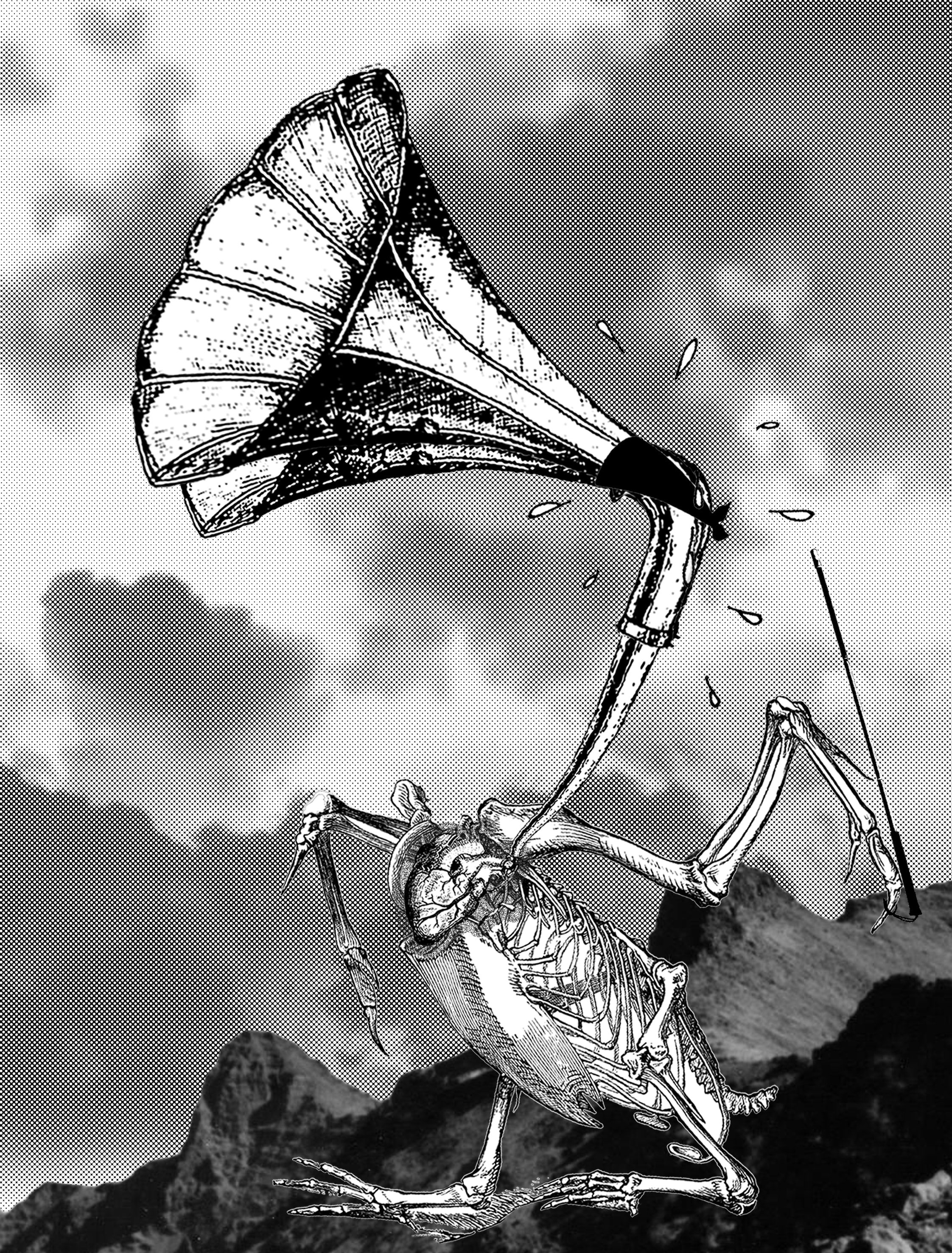
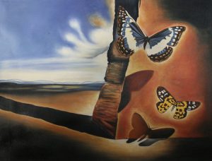
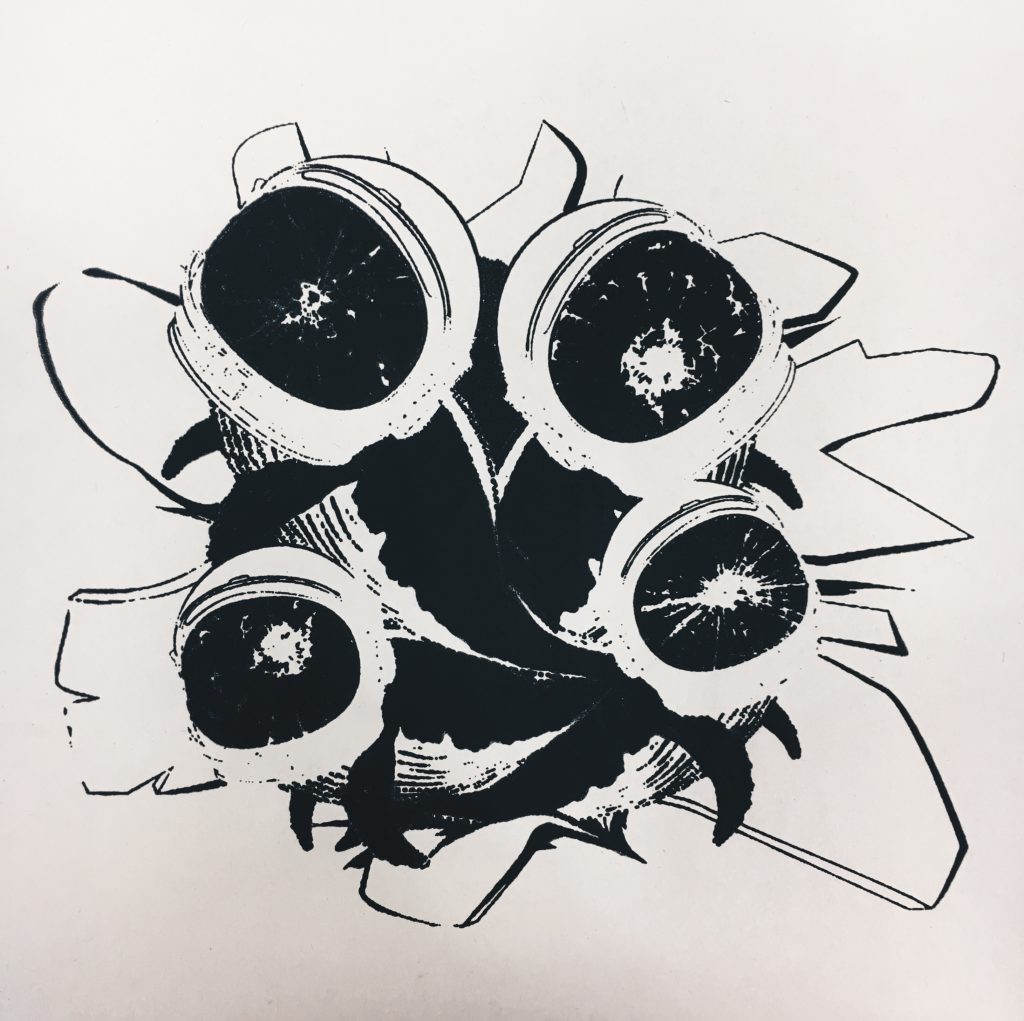
  1. “This is space. It does not cooperate.” – The Martians, 2015

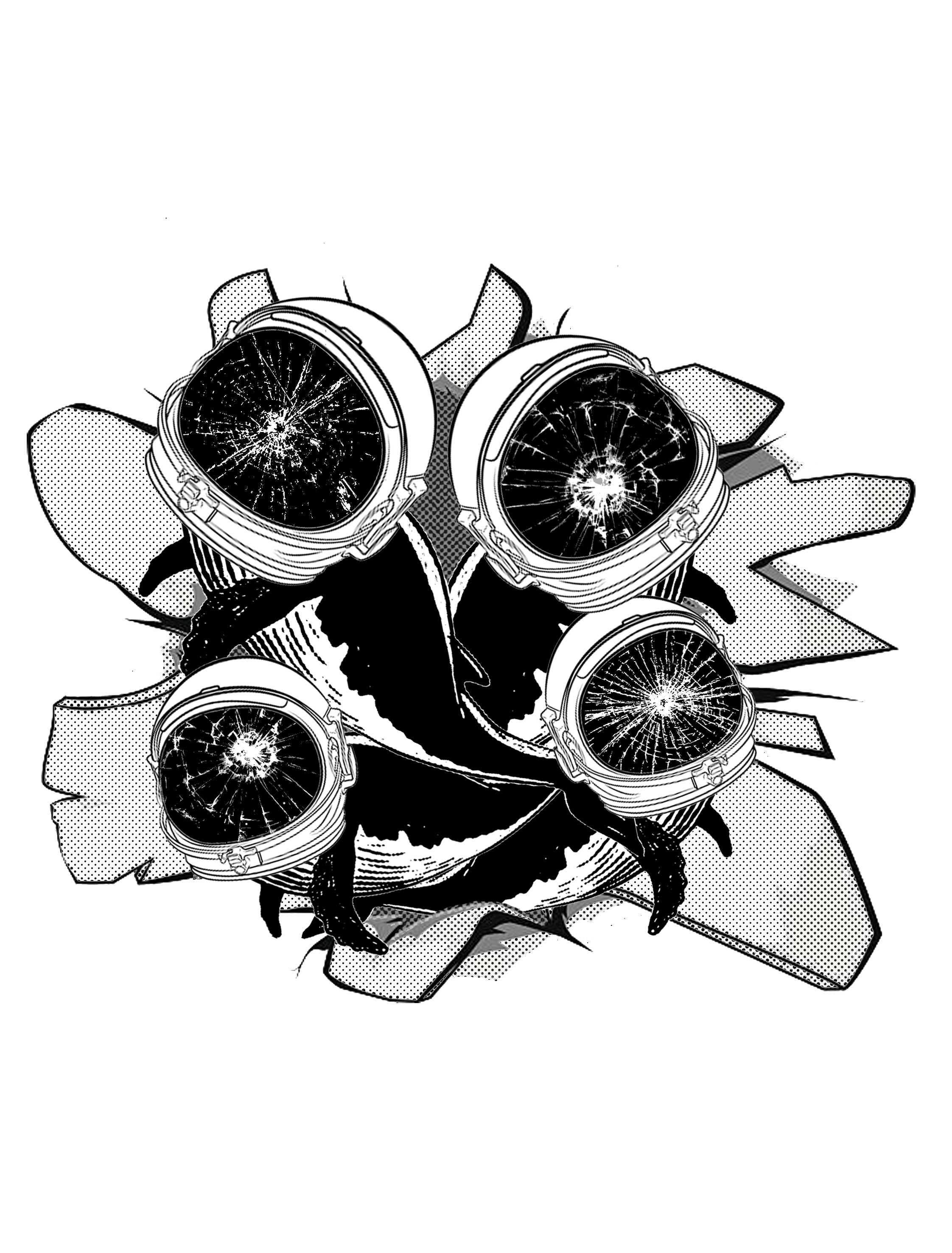
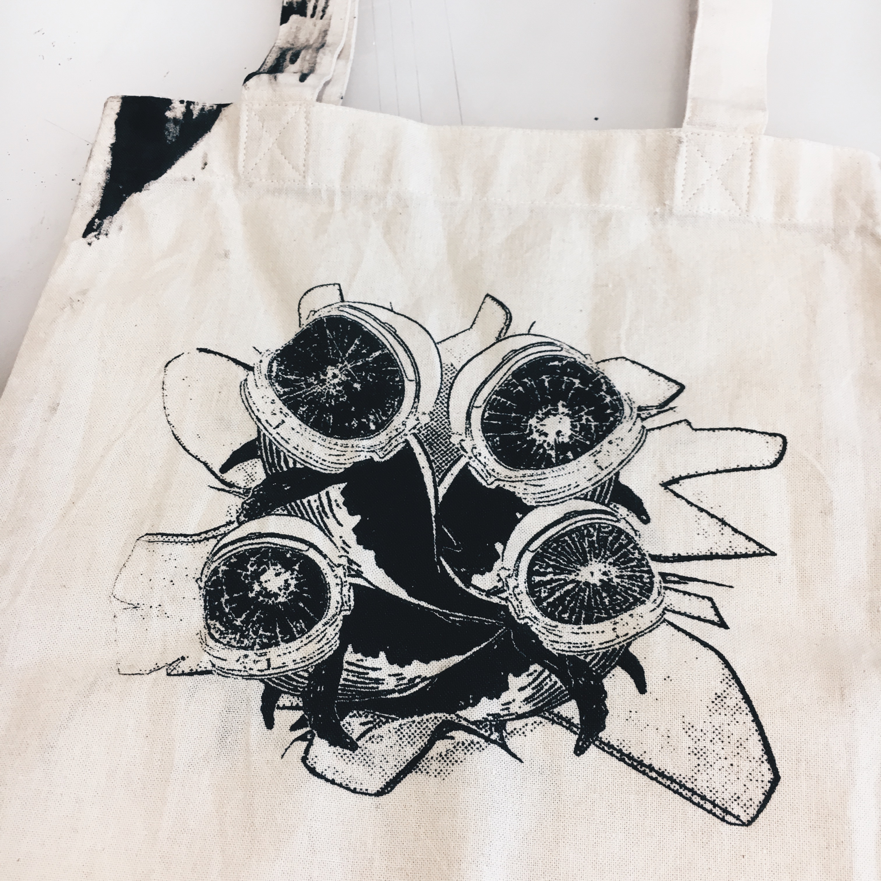
Reading this quote without context, the first concept that came to mind was the idea of claustrophobia, where the lack of physical space causes fear in beings, therefore being ‘uncooperative’. From here, I decided to use whales in the composition, knowing that whales are humongous animals that live in wide spaces (i.e. open ocean) and would suffer in small spaces. In short, the final concept I decided with was the idea of suffocation in confined spaces.

To present the idea of breaking free from a small space, I put a cluster of whales appearing to burst out of a hole into a larger space, seen by how the whales are heading in outward directions, showing that there is freedom in choice of direction.

I decided to put astronaut helmets on the whales, with the original idea that the whales are suffocating with their heads wrapped up, while tying the composition back to the movie at the same time. However, seeing that the whales looked more comfortable than suffocating in the helmets, I then tried to wrap plastic bags around their heads to imitate the idea of sea turtles choking on them, which didn’t work out so well. Hence, I then came up with the idea of using cracks on the helmets to show the pressure put on the whales when they were trapped in the small space.

Playing with the double idea of space where space can also refer to outer-space, the astronaut helmets on the escaping whales also give the idea that the whales are escaping from a confined, physical space, to outer-space which literally has a LOT of space. Space-ception.

Finally, I decided not to put anything in the background that would essentially show the border of the composition. This was to play with the physical print space itself, to show that the whales are breaking out into indefinite space (apart from the end of the A4 paper, which I cannot avoid).

2. “Murph, I love you. Forever.” – Interstellar, 2014

This composition was a result of 14 different ones (shown during consults), that I shall not include in this post because it would probably make it 50 times longer…

Murph is the name of the character in Interstellar, standing from Murphy’s Law.

Theoretically, Murphy’s Law means that ‘whatever can happen, will happen’. However, I decided to follow the more commonly known negative connotation that whatever bad thing can happen, will happen. This is so that I can play on the concept where one’s love will still prosper despite every bad happening.

So, the animal to represent love, is the swan. Swans are known to love deeply, the myth being that they only have one partner in courtship, and may suffer from heartbreak and possibly die when their mate passes. They even present love visually, when two of their heads join together, forming a heart.

There is also another myth that swans will sing when they are dying, which is what I brought forth in my composition.

To illustrate how things are going bad for the swan, I used sweat to show the lack of water which swans cannot survive without, as well as a skeleton body to show how the swan is dying.

The large horn (in comparison to the body) connected to the full heart (despite the skeletal body) is to bring across the idea that the swan is singing from its full heart to its loudest ability, despite all these circumstances. I then placed the swan on a mountain, using the sky to make it clear that it is high above the ground, to show how the swan is singing high up from the mountains – therefore singing very, very loudly.

To carry the idea that love is blind, hooked onto the swan’s wing is a blind cane turned into a orchestra/ choir conductor’s baton, to dramatise the loudness of the singing even further. The swan is then blindfolded, literally to say that the swan is blind, but still declaring its love.

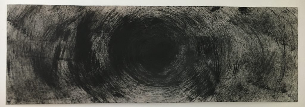
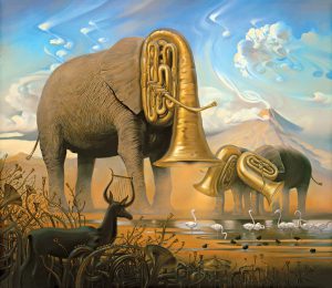
3.”Gravity can cross the dimensions, including time.” – Interstellar, 2014

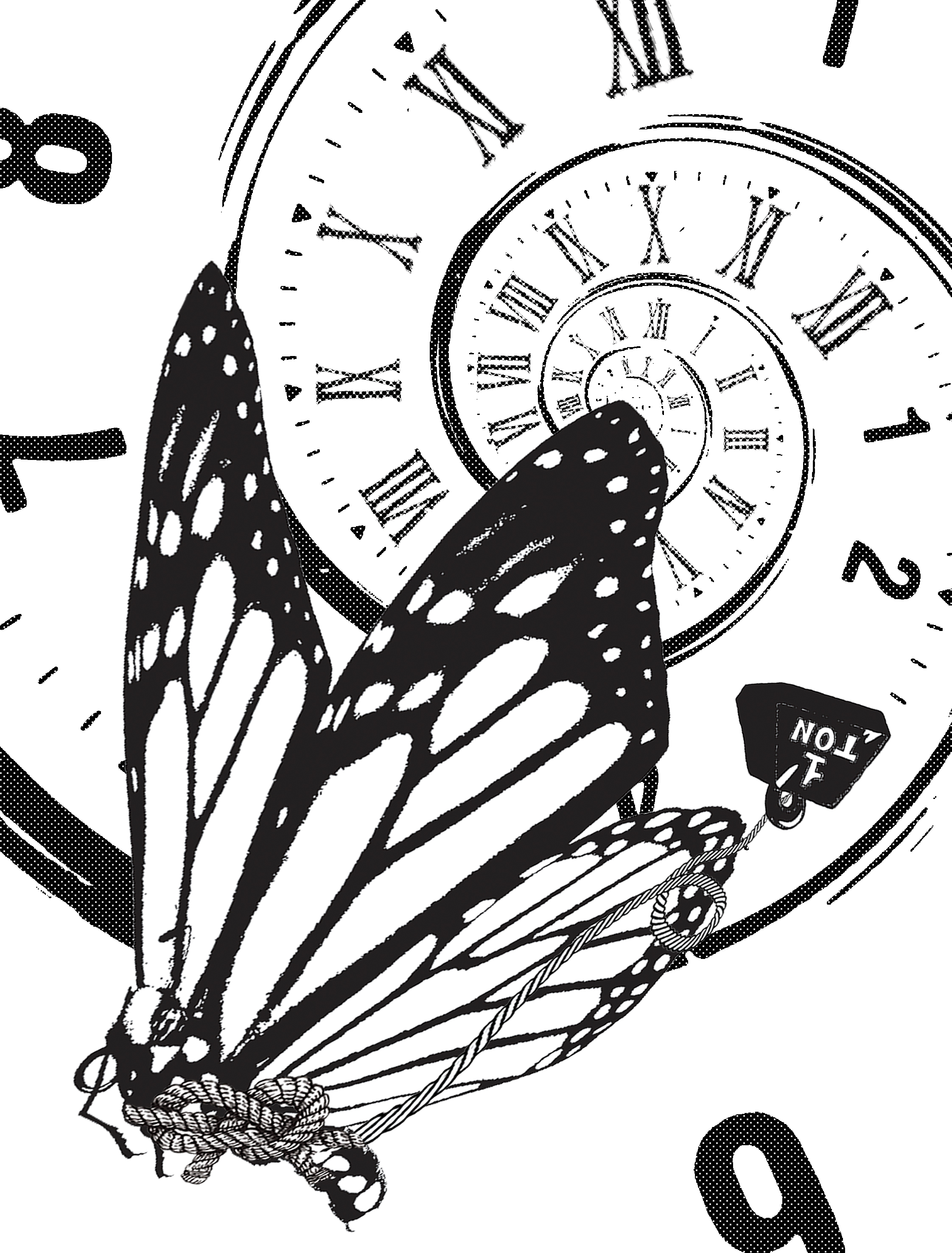
Initially, I wanted to use an elephant to represent gravity, since it is widely known as one of the biggest and heaviest mammals.

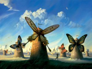
However, coming up with the concept of freedom for this composition, I decided to use the opposite instead – an extremely light-weighted butterfly. So, scrap the elephant.

The idea is the contradiction of the weight. While the 1 ton weight, representing gravity, is the thing that is allowing the butterfly to cross the dimensions, the butterfly is instead being freed by this weight instead of being held down.

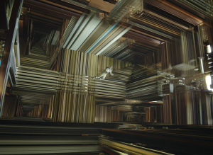
As I searched for inspirations on how to represent dimensions, I came across many visuals of warped, illusionistic backgrounds consisting of 3D features, like so:

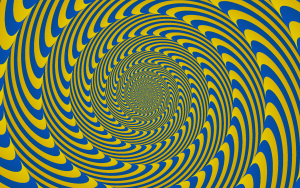
Drawing inspiration from these images, I decided to make a 3D-like spiral where it gets blurry in the centre, to show how the butterfly is flying through it and out towards the viewer.

To include the idea of travelling through time, I originally tried floating numbers around the entire composition. However, seeing that the numbers became a distraction from the butterfly, I decided to make the spiral dimension become a clock that goes from roman numerals to modern, to show how the butterfly is travelling from the past to present/future.

4. “It has been seven days since I ran out of ketchup.” – The Martians, 2015

Being my last composition, I decided to go crazy with the concept. I struggle to put the meaning behind it into words, so forgive me if it gets confusing!

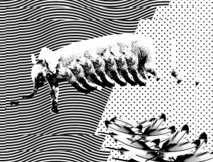
Originally, I wanted to make a composition so literal out of the quote that it would no longer be realistic – using a Cheetah as the fastest running animal, running across a calendar over a week without its legs, with a trail of fading ketchup behind it to show how it’s literally “running out of ketchup”.

Then, I wanted to add a concept. The original concept was poverty, since the quote suggests a lack of food. When I think of poverty, the first thing that comes to mind is this photograph that went viral in 1993, after which the photographer committed suicide out of guilt:

Hence, I added a vulture’s claw and changed the running Cheetah to a dying one, to represent the sight of a vulture waiting for its prey to die. To make things surreal, the vulture is pouring out the contents of the ketchup bottle, which in turn represents the blood of the dying Cheetah.

Normally, a vulture preys on smaller, weaker animals, rather than strong animals. Hence, from this, along with the idea that the ketchup represents blood, came the next concept that even the strongest ones will eventually run out of blood, and die. 

To break it down for easier understanding, here are the symbolisms:

  • Long road:
    In place of using a clock/numbers to represent time (‘7 days’) as I already did in another composition. The cheetah has run so far, and has come a long way.
    To emphasise the distance and make a bit of a 3D effect, I played with the halftones, where the further the road gets, the more blurry it gets.
  • Dying cheetah:
    The fastest running/ strongest animal in its family, coming to its end.
  • Empty ketchup bottles:
    The cheetah has gone through all this blood, and has only so much left to survive, hence dying. Also to make it clearer that the bigger bottle is ketchup, since the label is being covered by the claw.
  • Vulture pouring ketchup:
    The vulture is emptying the last of the cheetah’s blood, hence waiting for it to die. The claw marks on the cheetah is to make a relation between the vulture as the predator and the cheetah as the prey, tying it back to the concept of poverty.

So here, in the final composition, is a concept out of a concept out of a concept that I hope you managed to grasp.

––

After completing my compositions, I realised that my compositions draw many similarities to that of Salvador Dali’s surrealistic works, such that he also often uses animals as symbols. More specifically, I realised that he also used a trumpet horn to replace an elephant’s head and butterflies in many of his compositions… What can I say? Great minds think alike. Just kidding.


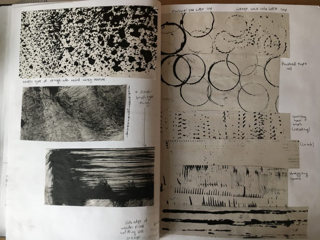
SILKSCREENING PROCESS

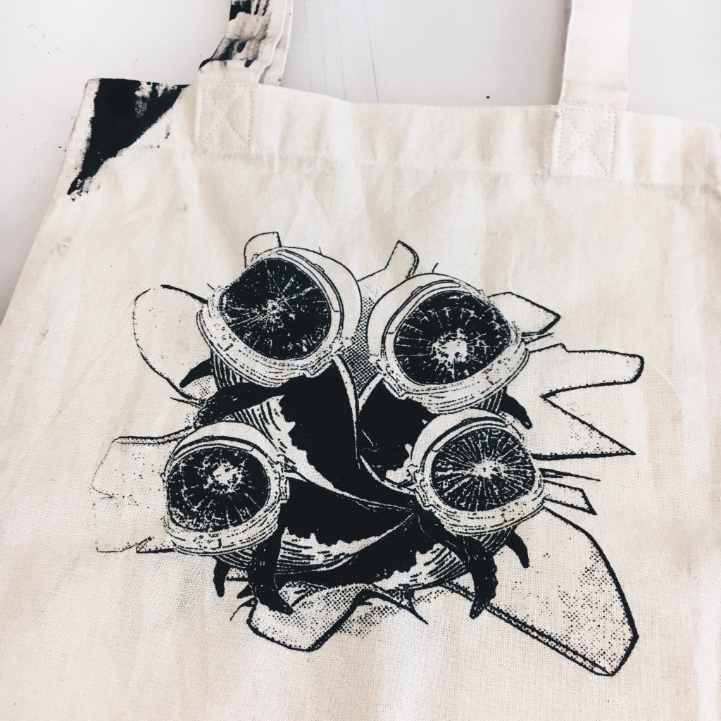
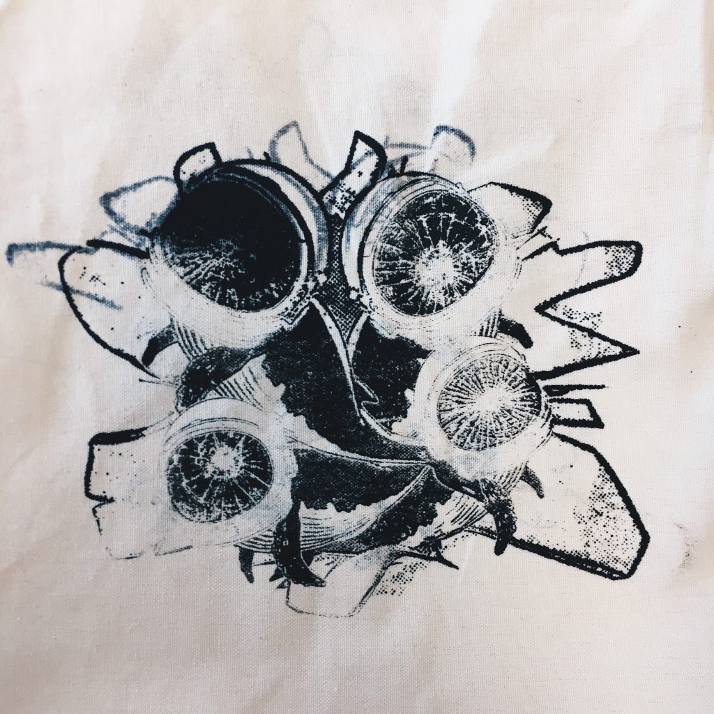
The composition that made it to the tote bag is the one with the whales, since it was the first one I started and finished on. Here’s the final tote print:


The First Attempt

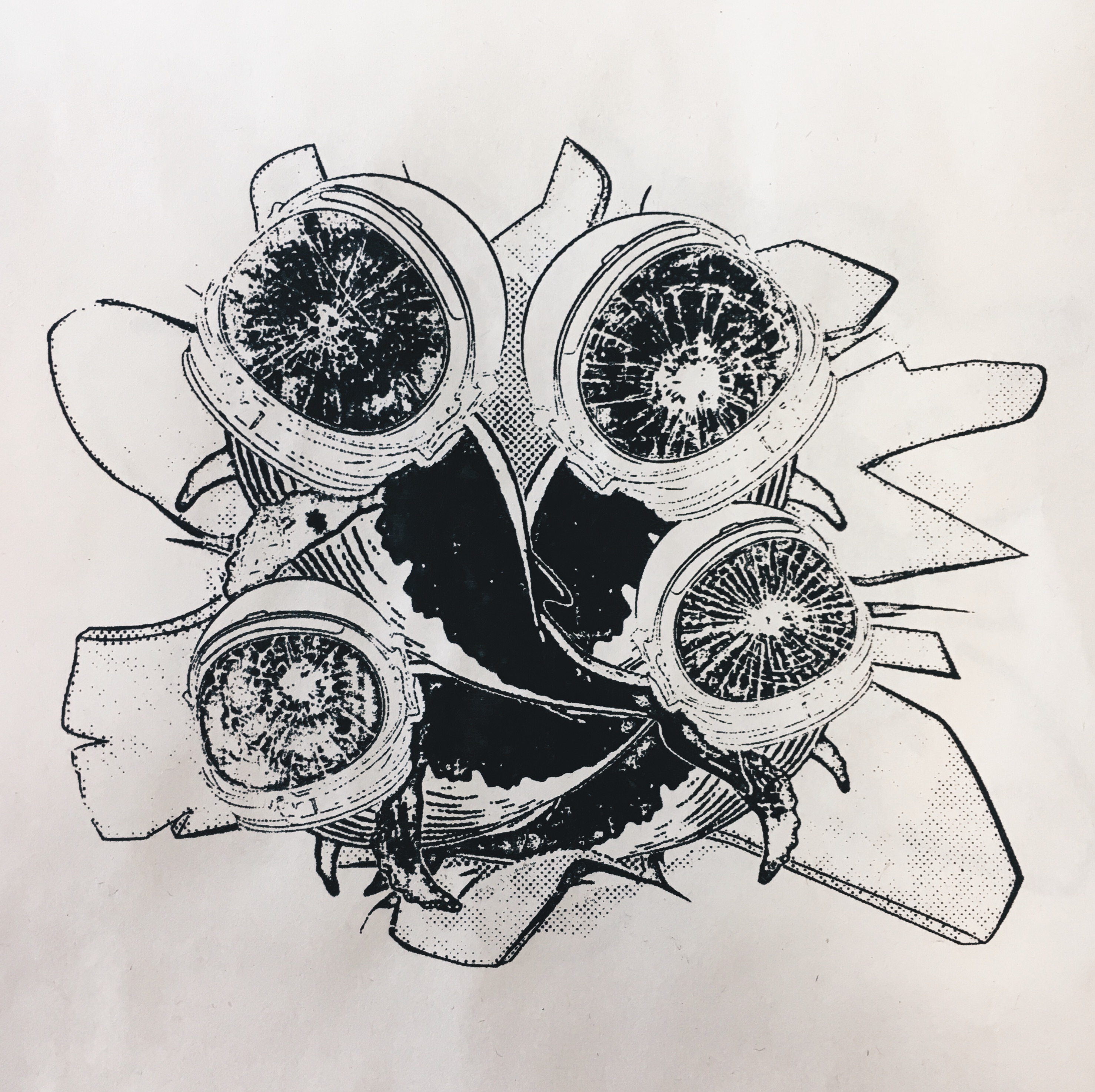
Bringing my print into the dark room for the first time, I didn’t know what to expect. This was what came out of it:

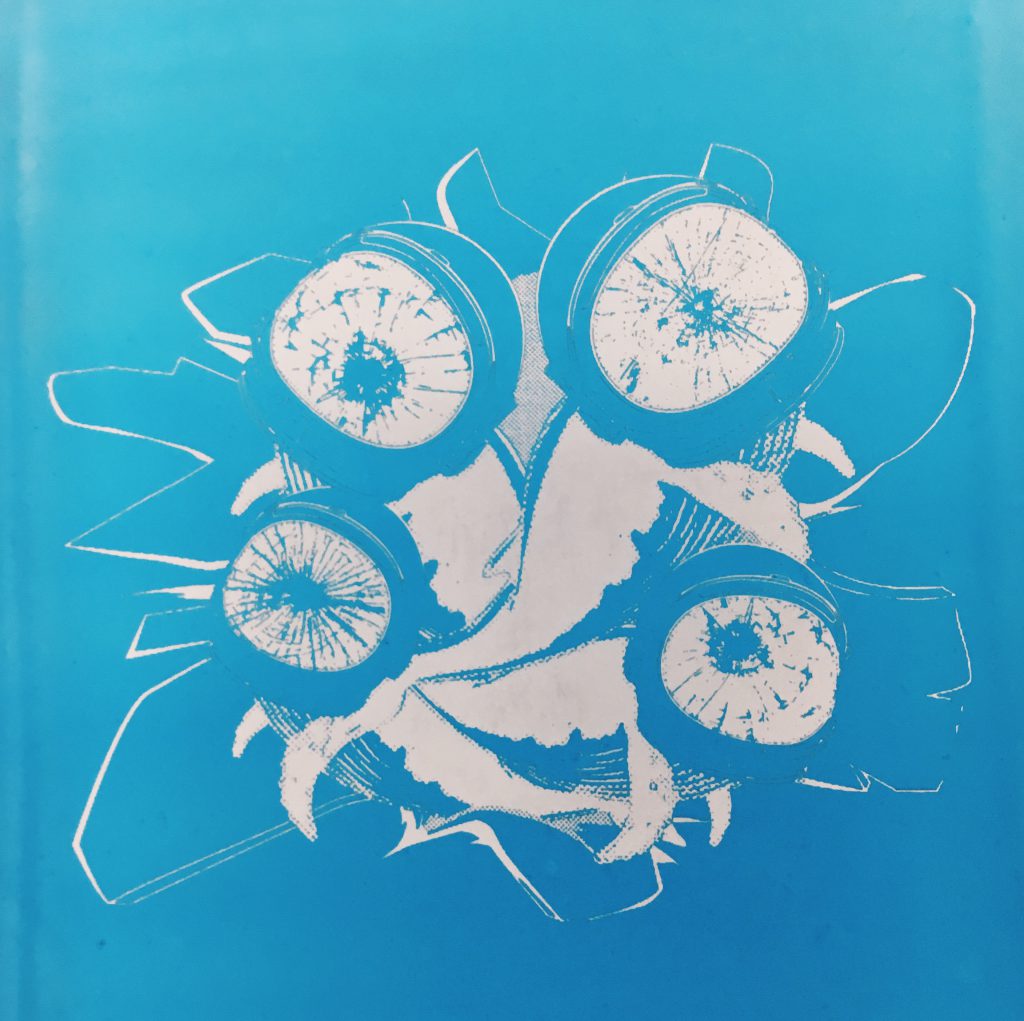
It was only after my first attempt at exposing and silkscreening that I realised I had made a very, fine-detailed composition. As a result, the fine details such as the lines defining the helmet as well as the cracks on the helmet didn’t come out so well after exposure, no matter how much I tried to wash it down.

From there, I went home, thickened the lines, added halftones to the background for some dimension, re-printed my transparency and headed back to the lab. Instead of exposing my screen for 18 seconds, I did it at 21 seconds in hopes for a better detailed print.

From my first attempt at silkscreening, I learnt a few things:

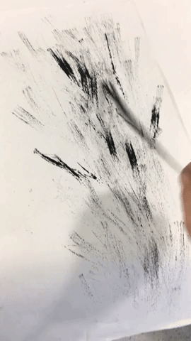
  • Make sure your screen is completely DRY before silkscreening it with ink, because it will smudge (unfortunately, I don’t have a picture of this failed attempt).
  • What you think is dry may not be dry. Let it dry for as long as you can.

The Second Attempt

I exposed my screen to ‘perfection’ on a Monday, testing the silkscreen on both paper and canvas. However, I only returned to silkscreen the final product the following week. I did so because I did not want to risk screening a wet screen, no matter how minimally wet it was. I also refrained from washing my screen in the midst of the process, so I had to hope that I could get the perfect print before clogging up the screen with too much ink.

From my second attempt at silkscreening, I learnt a few things:

ON PAPER

  • Keep an eye out for detail when washing the screen
  • Don’t use too much ink/ overdo the squeegee

ON CANVAS

  • Make sure to apply E Q U A L pressure throughout the entire swipe of the squeegee
  • What you think is equal may not be equal. Pray for the best.


Keeping an eye out for detail:

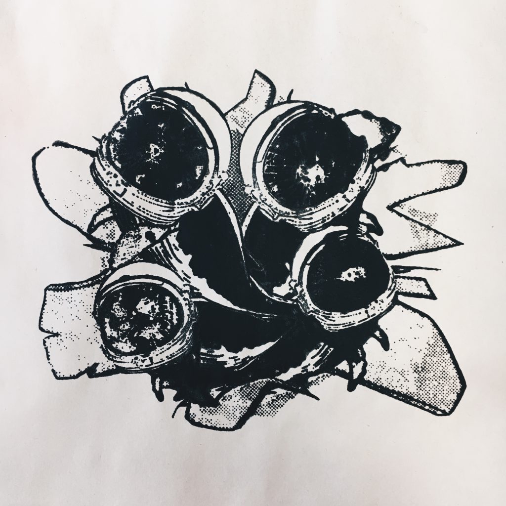
First silkscreen on paper:

I had a heart attack, thinking that I had exposed the screen for too long, causing the details to be destroyed. Then I realised I just didn’t wash my screen properly… Haha. What I didn’t realise was that it takes a much longer time to wash off the blue ink when the screen has been exposed for a longer time (I spent a significantly longer time at the sink compared to the first attempt, despite the minor changes in design).

After washing the screen some more, I tried printing it again:

Nope. Still not washed enough! The helmet and its cracks are almost there, but what took me awhile to realise was missing were… THE FINS!!! Where are my poor whales’ fins? However, in this print, I really liked how the lines turned out where there’s not too much or too little ink, and neither were they smudged.


Don’t use too much ink:

What I also felt worked better for me was to use LESS ink, possibly because I tend to apply a lot of pressure on the squeegee. This was what happened when I used too much ink/ overdid the squeegee:

On paper:

On tote:

What I got from here was the idea to drain out the excess ink I put on the screen by silkscreening it repeatedly on paper, until I get my desired inked print, then do it on the tote bag with just slightly more pressure.

After re-washing my screen to get my desired details, I left the screen to dry for a week.


The Third Attempt

From all my previous notes-to-self, I came into the studio, ready to print my bag perfectly.

Step 1) Achieve desired amount of ink by repeatedly screening on paper, until the perfect print.

Step 2) Move the screen to the tote bag, and pray for the best.

And as desired, my very first tote print of the day came out as perfect as it could get.

But I guess we can’t always get what we want, because an inked spatula dropped on the corner of my bag right after I printed it. Murphy’s Law, yay!

Because I was so upset with the spatula dropping on the bag, I tried to print it several more times on my spare tote, but the prints got progressively worse, possibly because the holes were clogged.

This was the final attempt before I decided that things weren’t going to get any better and I should just stick to the original printed tote:

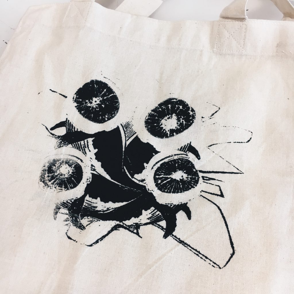
The stain adds a personal touch to my tote bag, I guess. A stain that will always be there to remind me of the last lesson I learnt from this silkscreening journey:

BE CAREFUL. 

Overall, I really enjoyed exploring these wild ideas out of single quotations as well as from using images that do not belong to me. This project of exploring surrealism and dadaism gave me a chance to expand my pea-sized brain of creativity, given that there were barely any limitations apart from technicality. As I’ve always been more into Illustrator, it was challenging but fun to finally give Photoshop a shot at design, and it also felt weird but nice to play around with vectors in the software. It was also exciting to learn how to silkscreen as well, and now I regret not doing my print on a larger tote bag. But I just might go get another bag for the final screen before we beta strip it. tongue-out

My Line is Emo: Final

In this post you will find:
1) Final
2) Experimentation Process
3) Reflection

1) FINAL: Dion’s 5-Month Emotional Roller Coaster Ride

After much consideration, the context I chose to base my project on was about the emotional rollercoaster ride that I experienced through the 5 month holiday I had prior to starting university.

During my brainstorm, I noted down in chronological order the most prominent emotions I felt during different times of the holiday starting from when I ended my final year polytechnic internship in February. This was the outcome:

That being said, as the project only required 6 final strips, I chose the 6 emotions I thought were the most impactful and were the most varied:

Stress, relief, courageous, ecstatic, grief and nostalgic.

Here are the final strips that I chose to showcase, of which I will be explaining why I chose these particular emotions as well as how and why I decided to mark-make them this way. Why I chose these emotions might be quite a grandmother’s story but I’ll try to keep it short.

Overall, I was not particularly inspired by any artist in the sense that I wanted to follow their style or replicate their works, but rather it was through Julie Mehretu‘s work that kept the idea of layers in my mind. (View artists’ research here). This really helped me along the way as adding layers helped to portray how I wanted to show the emotions better such as by creating depth, as well as helping to show different kinds of ‘physical feelings’ within one emotion, whenever I was having a creative block.

1. STRESSED

Reason for emotion:
As my polytechnic life was coming to an end, I was stressed over choosing a degree and whether or not I would be able to make it into any local universities. Ending my internship late February, I then had to finish my final internship report for school which would have determined my final GPA by a big difference, as well as complete my ADM application at the same time.

Reason for mark-making:
Materials used: Cotton buds, ink roller corner/edge, scalpel, masking tape

Overall, I wanted the strip to show a sense of darkness, uncontrolled pressure and messiness to show how a lot of things are going on (both physically and mentally) when one is under stress. To do so, I used cotton buds covered in ink (at different percentages) to roll all around the paper, creating different pressures and thickness of ink with the composition of the cotton bud. This was originally the end of my idea for the strip, but I felt that it was too cliché and boring. Hence, I added on… layers!

Next, I added on to the mess by using the edge of the roller to add hard, pressured stripes in random directions. After that I decided to use a scalpel to make scratches on only the right side of the strip so as to show that I am actually right-handed, and there was a lot of stress due to my lack of skill in drawing needed for my ADM application (I originally did it all over then decided against it. Not to mention, I did it while pretending I was stressed and actually ripped the paper twice). Finally, I used a small piece of masking tape to make tears in random places, to simulate the effect when I tend to erase my artwork too hard out of stress and frustration and accidentally tear the paper.

2. RELIEF

Reason for emotion:
I literally flew off to Taiwan with a group of friends the day after I submitted my ADM application. A huge weight was lifted off my shoulders having finished my 3 years in polytechnic and applying for university. It really felt like FREEDOM.

Reason for mark-making:
Materials used:
3 levels of Chinese ink concentration: Concentrated, diluted, and even more diluted

For this strip, I wanted to show the effect of weight being lifted off one’s shoulders, or how one is no longer being weighed down. Originally, I wanted to use my shoes to show how I’m no longer weighed down, but of course… I did not want to stain my shoes. It would have also been too literal for my liking.

I first dipped the full bottom edge of the strip into concentrated ink to get the dark part, showing the weight. I then pressed the rest of the bottom half in diluted ink, letting the paper absorb the watery ink like chromatography in Chemistry which gave the illusion of the ink fading upwards, and lastly, I dipped only parts of the top in the most diluted ink. I only pressed parts of the top in ink so that some parts would be left blank, to show how the weight is fading away completely.

3. COURAGEOUS

Reason for emotion:
In Taiwan, despite not having experience or training, I plucked up all the courage I had in myself and joined an international dance battle. During the auditions, there were hundreds of people from all over the world watching with only three people dancing at one time. Sure did take me a lot of courage to push myself out there…

Reason for mark-making:
Materials used:

Brush-thing as pictured, a strip of masking tape

The idea that I had was ‘throwing myself into the fire’, because that is what I always do when I want to see what I’m capable of in the worst situations, in this case, being unprepared for an international dance battle of over 400 people from all over the world. So, I taped masking tape across the centre of the strip and used a brush to create messy motions to represent ‘chaos’, which somewhat also looks like fire, over the masking tape. This created the idea that even when I know that chaos is up ahead (looking at the line from left to right), I will still gather up the courage and persevere through.

The messiness of the clear line created by the masking tape was unintentional, and I actually had a more clean-cut version of this piece. However, I decided to use the messy one instead as I realised that it goes to show how even when you’re courageous and you brave through unfavourable situations, it is not all the time that your best comes out of you. Let’s just say that my battle audition round didn’t go so well… But I still had the courage to persevere anyway.

To add on, only after I finished the line did I realise that it actually resembles Sol LeWitt’s “Scribbles” a little bit. His art piece was a very pleasant, neat looking line made out of messy scribbles, while mine is a straight line piercing through the mess. I guess I was subconsciously inspired by Sol LeWitt while doing my project tongue-out

Originally, I did experiment with the idea of using actual fire to burn the paper. However, I decided against using it as it did not depict the kind of chaos that I would be afraid of going through, as much as using the scrub did. Furthermore, there already seemed to be a handful of people who were using fire as one of their materials, and I just felt the desire to explore other options of materials.

4. ECSTATIC

Reason for emotion:
Simply saying, I met one of my dance idols in Taiwan 🙂

Reason for mark-making:
Materials used:

A yellow ball (P.S. yellow because it’s my favourite colour and it makes me happy. Suits the emotion of the line!)
A textured sponge as pictured

In this strip I wanted to show the different ways that one/different people can experience the same emotion. When people think of ‘esctatic’, the thought that comes will usually be something very hyper and excited, with fast motions. However, in that moment when I met my idol, I felt more tingly inside hence the dotty effect created by dabbing the sponge with little ink, along with the bubbles of joy created by pressing the ball onto the paper (a bit cliché, but I have to admit it was really how I felt).

It was this piece that the technique of ‘layers’ from Julie Mehretu really helped me. I originally only played with the ball marks (without the intention of it being ecstatic), leaving the whole thing very boring since there’s only one type of texture, despite there being layers of ball marks. With Julie’s work in mind, I managed to think of layering something else on top of the ball marks to show that there are several ways that one can physically feel just one emotion.

5. GRIEF

Reason for emotion:
Unfortunately, things took a turn halfway through my holidays when my uncle passed away. On top of that, my sister also moved to work in Hong Kong permanently.

Reason for mark-making:
Materials used: Crushed paper

When you grief over somebody, you feel like a part of you is missing, thus why I only mark-maked one part of the entire strip. You also feel like you are being crushed inside, explaining the usage of crushed paper texture. Originally, I was actually going to flip the strip horizontally so that the crushed print would be on the left, to show where the heart is. However, I realised that the print will actually be facing the audience during presentation, so it is actually on the left from its perspective.

For this line, I did not feel the need to excessively layer textures, because I felt that this one use of crushed paper in one spot allowed the image to speak the thousand words of the story behind it.

6. NOSTALGIC

Reason for emotion:
As the start of my journey in ADM got closer, I couldn’t believe that I was already going to university. I still felt (and feel) like a child. So of course, I thought a lot about how I’ve come so far.

Reason for mark-making:
Materials used:

Comb’s teeth, thumb/fingers, smooth sponge
(P.S. the entire comb is covered in ink because I used different parts of it for experiment)

The dots, made by dabbing the comb’s teeth in lines, represent memories. Some memories in our minds are stronger, hence the thicker and darker dots. Then there are the ones that are fading away, thus the lighter dots/ blank spots and of course, there are the memories that are not as pleasant, thus the rough parts with exploding strokes made by dragging the comb out in different directions after dotting the teeth. The thumb prints represent the different people who have made marks in my life, the pressure indicating the significance of them. I used a sponge with little ink on its surface to dab all over the paper, just to give the piece a sort of fading, grainy (noisy) background texture for the nostalgic effect instead of just having a blank canvas.


Some comments received from peers:

  • The story really helped everyone live through my holidays as I went through my lines
  • Good exploration of materials. In the future, I can show a picture or bring the object used if I don’t have a name for it
  • Good reference to artists
  • A lot of thought went through each emotion and how I want to portray each one through the various ways of mark-making
  • Nice use of layers
  • Have pointers for future presentations so I don’t forget to mention things (I’m sorry, I forget everything when I’m nervous)
  • Some explanations were more in depth while some were more touch-and-go
    (A/N: As explained for grief, I felt that the simplicity of it allowed it to speak)
  • Poetic delivery
  • Nice subtle delivery of messages (e.g. the messiness of the courageous line)
  • “The grief placement on the left was MINDBLOWING!!!”


2) EXPERIMENTATION PROCESS

When we were first assigned this project, I had no idea what direction it was that I wanted to head towards (i.e. context). Hence, for the first few sessions I had in the studio, all I was doing was aimlessly exploring different types of textures and mark-making without the thought of what emotion I wanted to portray through them. Hence, what I did was to observe the marks I made with the different objects and see if I could see any emotions through them, similar to how I observed the artists’ works while doing artists’ research.

Below are some of the random mark-makings I tried with different objects and several of the emotional observations I made. A lot of my interpretations of my mark-making attempts did however, come to me on the spot while I was making my lines, so those stated below are only those that I managed to observe DURING experimentation:


This is a little strand-thing that fell off my broom. I really liked the texture of the print made from the second roll of the linoleum. However, I decided against exploring this texture further as the idea that it gave me was a surge of dark energy to match the negative connotation of lust, which was not an emotion that fit in with my final decided concept.

I also tried smacking the little piece of broom on paper:


Object used: Cotton buds


I observed that the use of rolling the cotton buds did show a feeling of frustration with the thickness and pressure. Frustration is one of the feelings I feel when I’m stressed, hence why I decided to use this mark-making method as the base for my final stress line.

Left to right:
Dragging cotton buds, dabbing cotton buds, dragging styrofoam, dabbing styrofoam


Object used:


A sponge

Top left to right:
Dabbing the textured side, dragging the textured side

Bottom:
Dabbing the smooth side

Left to right:
Dabbing the edge of a paper tag, dragging the paper tag

Left top to bottom:
Using the weirdly-textured sponge as pictured above in the final showcase to
dab, drag in circular motions and drag in a straight line

Right top to bottom:
Different bottle caps, rolling a curling brush, dabbing a comb’s teeth, dragging the comb’s teeth and dabbing the long edge of the comb

Object used: The yellow ball as mentioned in the final showcase
Used to: Roll around, pressed hard, pressed soft

After realising that while aimlessly experimenting textures was going to help in letting me decide which textures I could potentially use for my final lines, it was not efficient enough in terms of getting to my final pieces. Hence, I decided to pen out some ideas for a whole variety of emotions. However, at this point, I still had not decided on a concept thus it still wasted a lot of my time in exploring ideas for emotions that I was not going to use. Furthermore, it was difficult thinking of line designs when the pen only allowed lines and not textures of different objects.

Brain vomit of my interpretation of the emotions:

I also looked up Google definitions of emotions and added my own interpretations of them:

After doing so, I then translated these definitions and interpretations into lines, so as to explore the ways I can later on choose to drag, dab, etc. my objects once I have chosen my context and emotions.

Finally, after consultation, I was able to come up with my concept of following the emotions through my holidays, and I was then able to focus on choosing which textures that I have explored that could help me portray my interpretations of the emotions. While I did waste a good amount of time exploring textures and emotions that I ended up not using, the experimentation did help make it easier for me to decide how I want to portray my final emotions.

And that was how I eventually managed to come up with my final 6 lines! tongue-out

Originally, I was also thinking of using ‘fear’ as one of my emotions, as while I was deciding on my choice of degree, I became fearful of what the future has prepared for me. I felt lost for the fact that I was unsure of what I wanted to do, hence I had the idea of falling down into an abyss. Alternatively, I also thought of it as depression, where one mentally spirals down a pit of darkness. But of course, my holidays weren’t too bad so I didn’t choose that as an emotion.

However, after attempting my idea, I decided against using this in my final showcase as the idea felt too literal and obvious. Furthermore, the emotion of fear would have also given my final 6 choices less variation.


3) REFLECTION

Overall, I am very happy with what I have managed to showcase to the class. This is because at the start of the project, I was one of the few who stood there staring at everyone making amazing prints, while my prints were just….. un-aesthetically meaningless. I’m glad I managed to step out to randomly experiment with objects which eventually led me to finding my direction of the project.

I feel that I could have taken a step further to explore various paper textures other than newsprint, as it could have helped me bring my portrayal of the emotions to the next level. While I did think about exploring paper textures and felt that it was not necessary, I now feel that there would have been no harm trying (apart from possibly wasting more time than I already did).

To add on, I also hope that in the future, I will be more sought out with my project direction from the beginning. This will allow me to make good use of the time that I have to complete the project, so that I wouldn’t have to panic and rush towards the end (P.S. I didn’t have to rush that much, it’s just that I really did waste a lot of time).

I also hope to be less nervous in the future so I don’t forget my points while presenting. frown

And that’s the end of Project 1 – My Line is Emo!
Now… Run, Forrest, Run!

My Line is Emo: Artists Research

While researching on artists for project 1, I decided to focus on what I could observe and take away from the artists works (in terms of what emotions they are trying to portray and how) so as to get inspiration on how I can portray the emotions that I will be showing in my project.Overall, what I have realised is that in the end, depending on one’s perspective, a single piece of artwork can portray more than one emotion, and even contradicting emotions to different people.

ED MOSES

‘Always agitated’ and a ‘compulsive worker/creator’

  • Quality of line: thick, pressured – anger, frustration, rage, torment
  • Work housekeeping: smudged – he doesn’t care for it to be clean, neat, perfect. However, the use of straight, parallel, perpendicular lines suggest otherwise, where everything is geometrical and systematic hence ‘perfect’. These straight lines are not observed in all his works, so maybe the former observation overlies the latter.
  • Mostly black & white, or one extra colour
  • Light and dark contrast

SOL LEWITT “SCRIBBLES”

This I found interesting, as despite using a messy technique of scribbling, Sol Lewitt’s scribble artworks all turn out to be somewhat pleasing to look at, being very very neat.

Possible emotions observed:

  • Love – love is not easy (scribbles, mess), but it is definitely something that always feels worth it (pleasing, neat) in the end.
  • Contentment
  • Optimisim – bad things may turn good
  • Surprise – you wouldn’t expect such a neat outcome from scribbles
  • Confusion (?)
  • Vision

HILMA AF KLINT


Works are always colourful, bright – happiness, joy, good feelings.
Works are made out of mostly curves and odd shapes, rarely straight lines, showing that it is not systematic and geometrical, hence showing that she is not controlled, a feeling of freedom.

EMMA KUNZ

Personally, Emma Kunz’s artworks make me feel more uneasy than not.
Despite the use of complimentary colours, the excessive use of straight lines (making everything very congested) to create geometric shapes and sometimes even ‘circles’ that kind of become hexagons (not observed above) gives me a feeling of being extremely controlled and claustrophobic where there is no freedom at all.

However, from another perspective, this feeling of being controlled systematically may bring along the feeling of assurance instead.

Also, it was interesting to find out that Emma Kunz used graph paper to do up her works during class by my classmates. Explains why it makes me uneasy… haven’t touched math in a long time.

AGNES MARTIN

On the other hand, while Agnes Martin also uses straight lines and grids (not observed above) most of the time, her work makes me feel more free and light as compared to Emma Kunz’s.

This is possibly because of Agnes’ use of complimentary pastel colours, and that her designs are kept very minimal, unlike Emma Kunz’s that seem like a lot is going on.

It was nice to find out that Agnes’ work was inspired by Taoism, leaving me to wonder if there is anything else that can inspire me for my project. hmm…

JULIE MEHRETU

Lines are everywhere, thick, thin, curved, straight, pressured, smudged, splattered, layers on layers, thin repetitive lines that look like scratches (right).

Mix of black & white and colours, sometimes the colours look like a ‘burst’ out from the black.

One can say that the messiness of the whole thing shows negative feelings like frustration, but another can also say that the messiness is freedom as there is no controlled system and you are allowed to do whatever you want. The burst of colour from the blacks seem to back this up, showing the element of surprise.