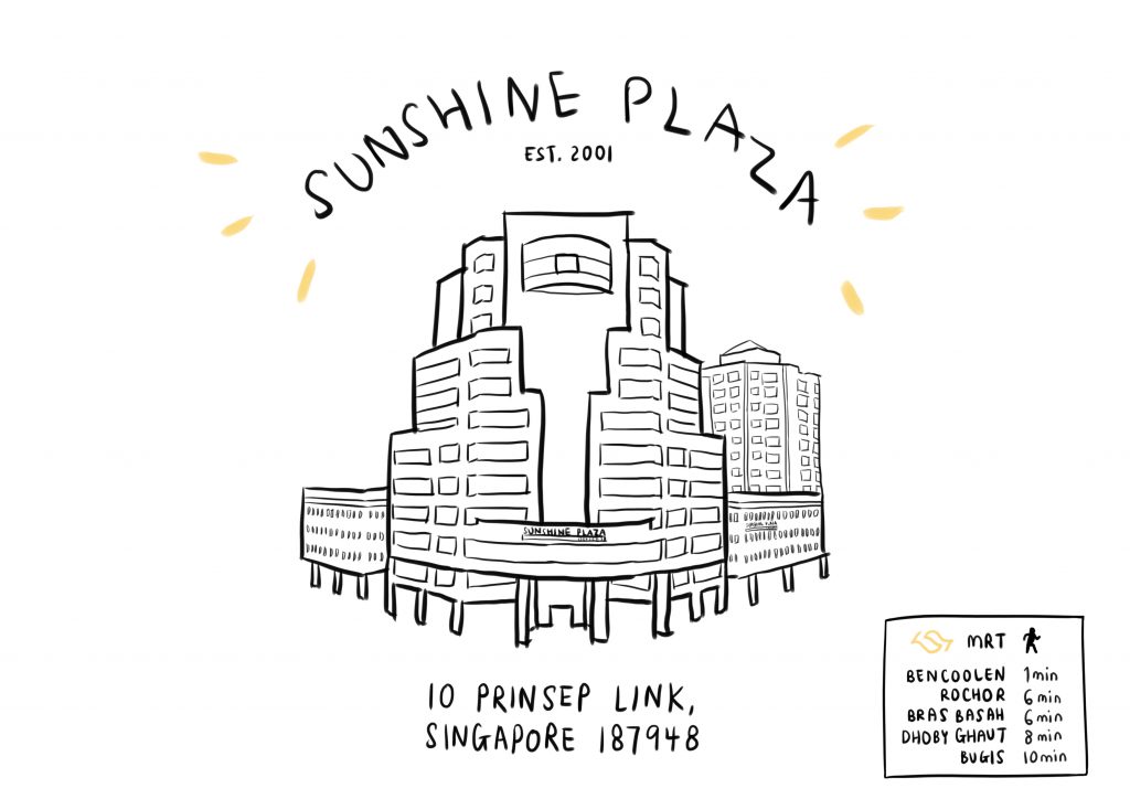
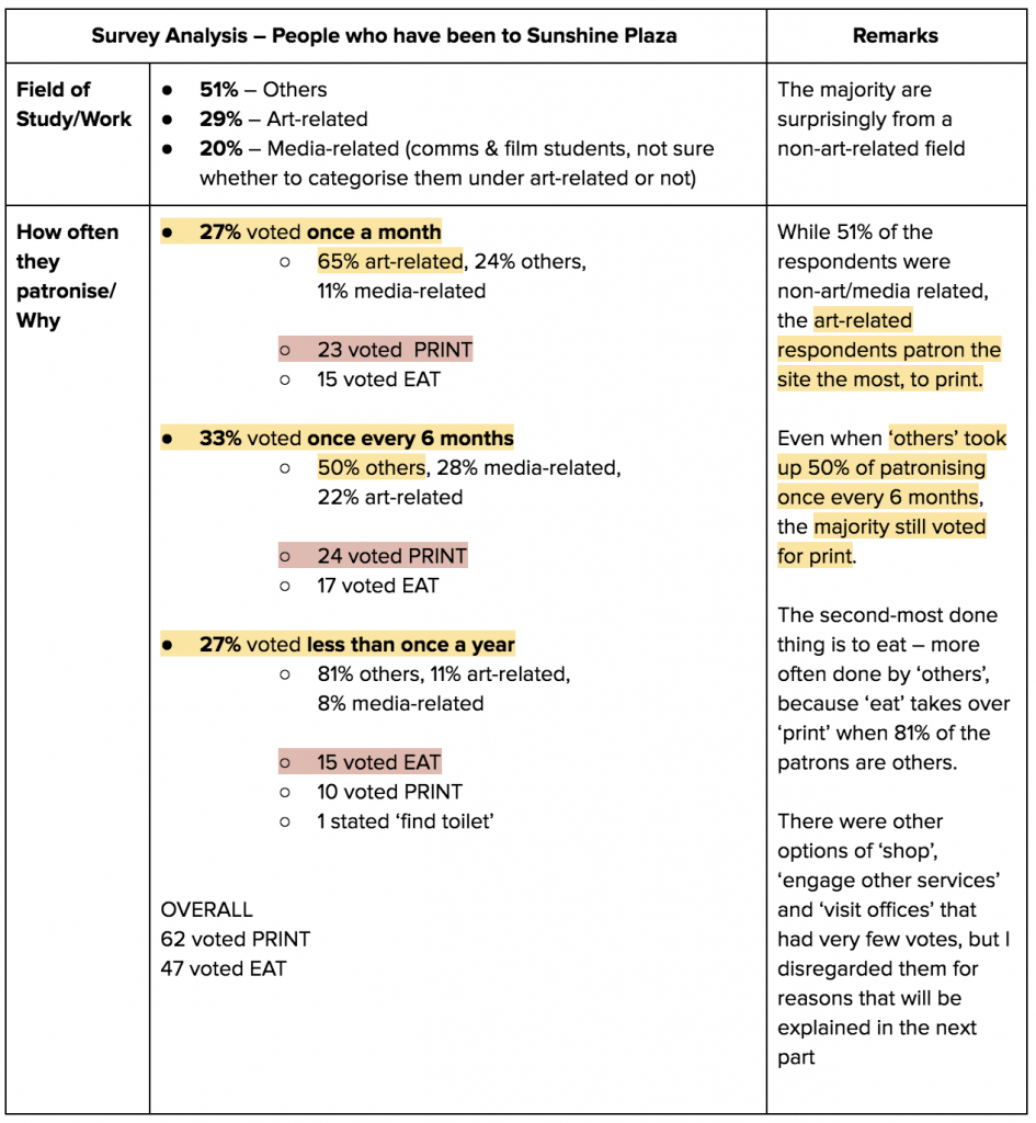
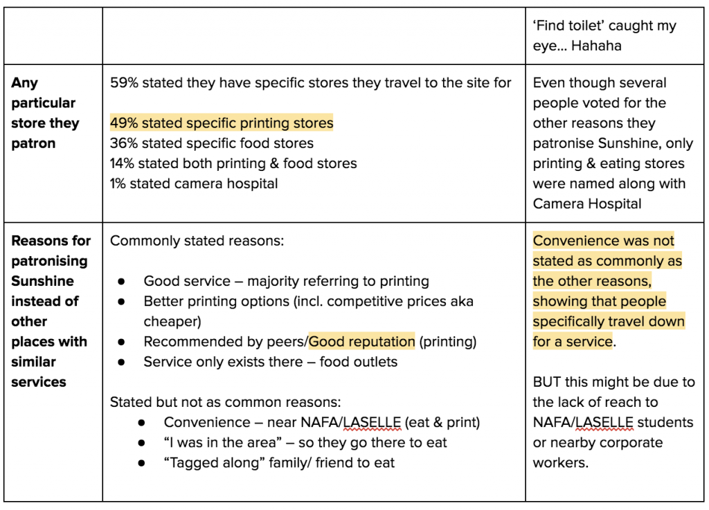
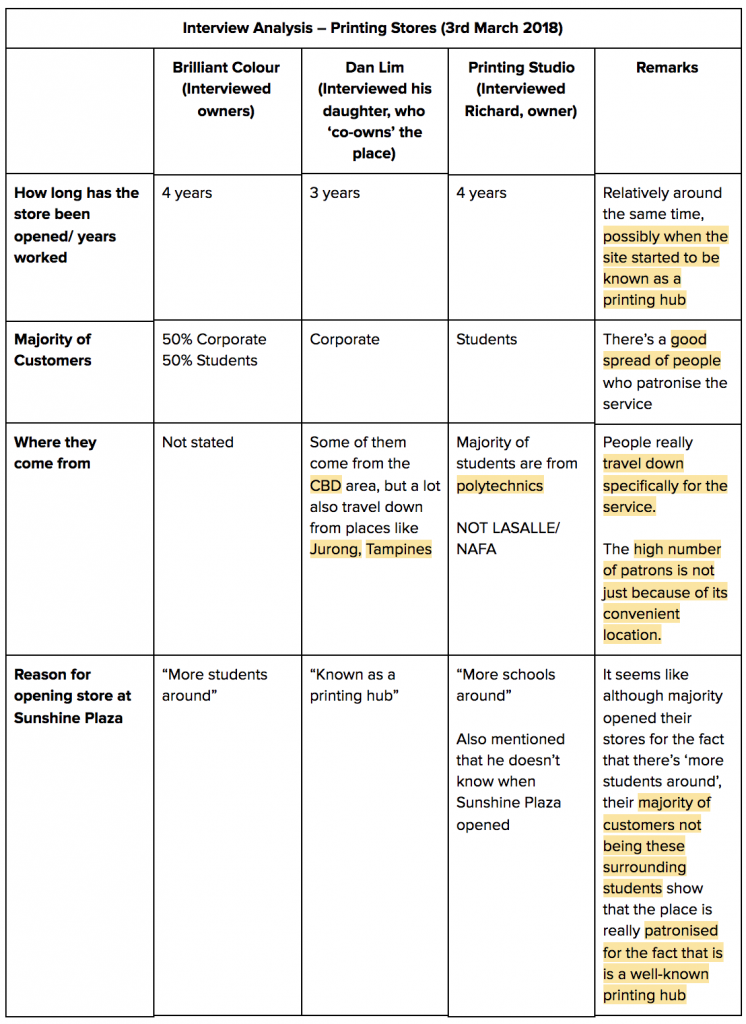
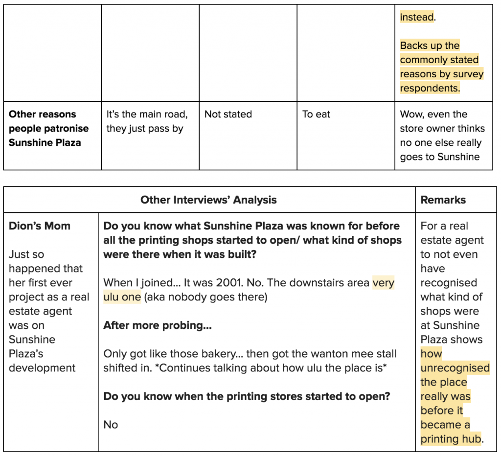
Category Archives: Graphic Form – G1

Graphic Form: A Gallery

IMAGE MAKING THROUGH TYPE

A fictional series of typographic portraits using my name and/or initials, “DC”, to describe my potential mishaps in future jobs, in the concept of the four elements – Water, Fire, Earth & Air.

GF: Image Making Through Type


LOCALE: ZINE

An abstract abstraction of the left-behinds by the patrons of what is known to be the
‘print nation’ of Singapore, Sunshine Plaza, exploring the idea of what could have been.

01 Locale: Research Process | 02 Locale: Research Presentation
03 Locale: Zine Process |04 Locale: Zine Final

03 Locale: Zine Process

Locale: 01 | 02 | 03 | 04

While the final spreads are shown in this post, you may view the full zine here.

The process of this zine was no doubt a long one, but here goes.


CONCEPT

“The personalities of Sunshine Plaza”

Ending off my research presentation with the thumb drive thief, I knew that that was the direction that I wanted to head in. Specifically, I wanted to make a zine out of what I could find inside the thumb drives found at Sunshine Plaza, as I felt that it would be a really unique, unpredictable concept.

Almost immediately after looking into a few thumb drives I was filled with excitement and regret. There were so many things to work with, so many ideas for different spreads, but they were all so, so different. I thought maybe since each different spread was going to represent a different thumb drive it wouldn’t matter if they were different, but if they were so strikingly different, then the zine wouldn’t come together at all. This was what I had a lot of trouble with.

“Printing Mishaps”

Apart from the personalities of Sunshine Plaza, I wanted to play on the different kinds of printing mistakes as well, since every ‘printer’ (designer, etc.) will definitely face the terrors of it. Specifically, I decided on pixelating, misaligning, double-printing and colour glitching my spreads. However, you might not see any examples of them in this post as further into the process, I didn’t feel comfortable with the idea of printing pixelated and misaligned work, and the idea of ‘printing mishaps’ seemed more like a random slap on the zine. I decided to tweak the concept a bit, where I worked on the wonders of what might happen if these lost files were printed.


FIRST SPREAD: 0011688

This person has lost their resume, it’s useless now.

The first spread is based off the first file I opened upon taking the thumb drive, which turned out to be a resume. Not wanting to reveal anything about the actual person or use the person’s work, I decided to slice up the resume into over 500 slices and jumble all of them up and have them fall into a pile. The arrangement also represents how the resume is falling to pieces, deeming its uselessness as a lost resume.

Since every resume usually comes with a cover letter (which was not found in the thumb drive), I took all the words from the resume and made them into paragraphs that make no sense. I placed a text box separate to the paragraphs, reading “Daer Sir/Mdaam, Psleae aecpet the elcnsoed ruesme for ftruher rvieew. Snriecely, 0011688”.

I played on the scientific idea where a person can still read words as long as their first and last letters are in place. This allowed me to still have the words look jumbled up, but also give a hint to viewers that this represents a cover letter/e-mail. And again, all the letters are falling into the pile, just like the resume pieces.

I wanted every spread to have its representative thumb drive name to symbolise how this is what I know these people as. This thumb drive’s name in particular was 0011688. Since the thumb drive had a resume, I of course knew what the person’s actual name is, and it came along with a logo – which is what the person uses to represent their self. I decided to play on this, where I overlapped 0011688 over the person’s logo, to show how I don’t know the person as the real them, but as 0011688. And yes, even this is falling into the pile of uselessness.

I actually also tried to play with a literal ripped resume, rather than the digitally sliced up one. However, the rest of the zine at this point of time was already very ‘digitalised’, and this composition just didn’t fit in, so I stuck with the sliced resume instead.

Food Stains

So far, the spread does not have any visual link back to the actual location of Sunshine Plaza. From my research presentation, I found out that the second most done activity at Sunshine Plaza is to eat, and specifically for people who go there to print, they tend to have some ice cream at Merely’s after printing.

I decided to incorporate this idea into the spread, imagining that if this person had gone to print their useless resume and then gone for ice cream after, they’d probably stain it really badly (and also try to wipe it away, which obviously wouldn’t work!)

My first attempt at this also had a bubble tea cup stain, but it wasn’t very visible after scanning, so I decided to just leave it as ice cream. On top of that, in my second and final attempt, I started dripping and wiping ice cream off immediately after printing, which resulted in smudges of the actual ink of the logo.

Final First Spread:


SECOND SPREAD: NO NAME

“???”

The second thumb drive that I worked on was filled with codes. When I say filled with codes, I mean FILLED. Immediately, I was confused – what’s a programmer doing at a printing shop, much less this print nation?

I simply opened several files of the codes on a coding software, and took note of the corresponding codes and colours.

To draw visual reference to Sunshine Plaza’s signage, I decided to use the large, black italic font for the thumb drive’s name, and change the coloured words to highlighted boxes instead to match the orange sign. I then proceeded to arrange these files of codes in a messy order to symbolise my confusion, and perhaps maybe even the programmer’s confusion, as to what they’re doing at a printing place.

The italic font was obviously too bold to match Sunshine Plaza’s sign, so I changed the font to a lighter one. Also, since the original idea for the zine was to play on printing mishaps, how the spread came about was through the idea of double printing, where I duplicated the exact same design but flipped.

Not duplicated:

Duplicated:

Even though I decided against the idea of slapping on random printing mishaps, I liked the effect that the duplicate gave to the spread as it added on a lot more to the haphazardness. I decided to misalign the highlighted boxes and their corresponding codes (as compared to the first picture) as I really enjoyed the messiness. I also changed the order of arrangement where the NO NAME on the left is now in the back, as I wanted to avoid having the spread look too similar to the first spread, where the thumb drive’s name was close to the top left as well.

Since the first spread was printed and scanned, I felt the need to do the same for the rest of my spreads otherwise the first spread would be very out of place. As I was in a rush, I printed the next two spreads on my printer at home, which doesn’t have very good ink. As a result, the colours of this spread changed in the print despite being printed in CMYK, and I felt that this was a really good representation of what would happen if a programmer printed his codes that are meant to be digital.

Final Second Spread:


Third Spread: ACE

“Too. Many. FILES.”

Playing with the floor plan of Sunshine Plaza along with added elements from the thumb drive’s work. The second picture is also a play on the shelves of files and paper at Sunshine Plaza.

This was no doubt the most painful spread that I had to work with, and what you see above are only some of the rejected ideas. Thumb drive ACE essentially consisted of way too many files that seemed to touch on every possible thing – floor plans, illustrations, photography,  song lyrics, etc. I initially wanted to combine aspects of the different works to form a whole other work, but the problem that I faced was that all the attempted spreads could not tie in together with the rest of the zine because at this point, the first two spreads somehow managed to both take on the concept of ‘glitch’ although completely unintentional.

For a long while, this mixture of the different elements of illustration and types of floor plans was as close as I could get to matching the composition to the rest of the zine. However, something still didn’t feel right, and the spread still wasn’t abstract as the other two spreads.

Thankfully, my very helpful friend found a series of work by Andrej Ševčík titled Freezing, that she felt could possibly inspire me to create a better spread.

This is what the idea plays on:

So there I went, duplicating boxes over and over, trying to get something out of them. I stuck to using part of Sunshine Plaza’s floor plan as my visual reference back to the location. The use of ‘X’s and ‘VOID’s, an element taken from the one of the thumb drive’s floor plans, is to symbolise the ‘irrelevant’ shops that are not printing shops. I also tried to make the name ‘ACE’ out of the laggy windows, to show that maybe, this person’s computer was lagging really bad and he/she just decided to play with it.

While I actually like the composition with the ACE in the background, the spread still didn’t match up to the rest of the zine. I guessed that maybe it was due to the lack of text that’s very apparent in the first two spreads? Or there’s just not much to decipher out of just the lagging windows. So, I decided to combine this with my previous spread, and came up with this:

The messy background is a play on the irony of how floor plans are meant to be very, very neat, but now it’s all messed up because of 1) how ‘laggy’ the thumb drive is and 2) the floor plan’s useless anyway, since the thumb drive’s been lost.

I took the text from the actual floor plan from the thumb drive but played around with the words, for example changing the scale to ‘inaccurate’ and the date to ’16 APR 2000′ (because back in 2000, we had these laggy windows computers, and 16 apr was the date of submission).

I also thought it would be cool to incorporate the name ACE within the lag, showing a form of distortion that’s very much like a glitch. I placed the name backwards as I wanted to mess around with the viewer’s eyes, where there is confusion of whether to read from left to right or right to left. You could read from the text on the right, and follow the trail of the circle outwards, or you could follow the trail in from the left, towards the text.

I also wondered whether I should design the laggy windows to resemble the actual blue/grey ones, but decided to keep them as just plain boxes to represent the ‘files’ or ‘printed paper’. Furthermore, keeping this spread almost pure black and white lets it match with the very first spread, leaving the centre spread to be strikingly outstanding.

Finally, I crushed the spread and scanned it, to show the frustration of this floor-plan-maker whose work turned out to be no where near tidy.

Final last spread:


FRONT & BACK COVER

“Take a look inside.”

My simplest yet most favourite idea of all.

I made the front and back covers be the front and back of a thumb drive, except the two holes are instead an illustration of the windows of Sunshine Plaza, so you’re literally taking a look into the thumb drives of Sunshine Plaza!

The turnout of the printed-scanned-printed version of the covers wasn’t so good, as the centre line in the back couldn’t be seen. I decided to leave the covers as their original versions, since thumb drives can’t be printed anyway, unlike the three spreads. While I also played around with incorporating title(s) and text, I decided to take them away to leave viewers to their own interpretation/realisations.

Final covers:


A SHORT REFLECTION

At the beginning of this project, I really wanted to explore photography and illustrations. However, I just couldn’t give up the very initial idea of maybe printing each spread on papers from different print shops (which eventually led to the use of thumb drives instead). While I struggled a lot with this zine (and am still upset that I didn’t get to explore photography), seeing how un-me it is in its art style, it’s been a really good challenge by forcing myself to work with what I have. I couldn’t plan any of my spreads out because they could only be based on what I actually find, which means I couldn’t have a specific aesthetic goal in my mind. All in all, I also really like to think about how this zine would have been completely different if I had just taken any other thumb drive.


– END –

With that, I’ve come to the end of my semester with Graphic Form. Thank you Joy for all the encouragement through the past year, and also for all the snacks and pizza!


01 Locale: Research Process

Locale: 01 | 02 | 03 | 04

SUNSHINE PLAZA

Starting the project out, I actually thought of finding out what else Sunshine Plaza is known for because from an art student’s perspective, all I know about the place is for its printing services. And so that’s the direction I first went ahead in. However, after doing all the research, I realised that the printing services is exactly what makes the site unique.

SECONDARY RESEARCH

There is very little information available online about Sunshine Plaza. Searching high and low for anything about the site, these are what I managed to find:

According to real estate websites PropertyGuru and srx, Sunshine Plaza is:

  • A mixed development comprising office, retail and residential units
  • Built in 2001

I, of course, have chosen to focus on Sunshine Plaza Shops, because it is the only publicly accessible area and I also have no access to the private residence and it doesn’t make much sense for me to go about investigating offices.

According to the ‘unofficial website of Sunshine Plaza’, when the site was built, the City Developments Limited appointed DTZ as the main marketing agent for sale by private treaty.

  • I noted this as important as my mom, just so happened to have worked at DTZ.


  • Accessibility (Half-secondary half-primary research)

Address: 91, Bencoolen Street, Singapore 189652

According to the real estate sites, Sunshine Plaza is:

  • Located within the city fringe, only a 5-minute drive from the Central Business District (CBD) as well as Orchard Road
  • Accessible from Bras Basah MRT (0.36km), Rochor MRT (0.43km), Dhoby Ghaut MRT (0.46km), Bugis MRT and Bencoolen MRT, all within a 500-metre radius. Specified distances are from PropertyGuru.
  • Close to LASALLE College of the Arts and Singapore Management University
  • Nearby attractions include Bugis Village and Fort Canning Park
  • Close to Bugis Junction, Bugis+, Plaza Singapura, Paradiz Centre

According to the ‘unofficial website of Sunshine Plaza’:

Near several bus stops located at Bencoolen Street, Fortune Centre, Middle Road, Opposite Prime Centre, Selegie Road, Peace Centure and After Prinsep Link. Bus services include: 56, 64, 65, 131, 139, 147, 166, 1N, 2N, 3N, 4N, 5N, 6N

Surrounded by four roads – Middle Road, Bencoolen Street, Prinsep Street and Prinsep Link

With some simple primary research;

*Estimations according to Google Maps

Easily Accessible from 5 MRT Stations

  1. Bencoolen MRT – 1 minute walk | 160m
  2. Rochor MRT – 6 minute walk | 500m
  3. Bras Basah MRT – 6 minute walk | 500m
  4. Dhoby Ghaut MRT – 8 minute walk | 650m
  5. Bugis MRT – 10 minute walk | 750m

Close to many tertiary campuses

  1. NAFA – 1 minute walk | 130m
  2. LASELLE – 6 minute walk | 500m
  3. SMU – 8 minute walk | 600m
  4. SOTA – 6 minute walk | 500m
  • Largest Printing Hub

According to TheBestSingapore, Sunshine Plaza is the “biggest printing hub with the largest number of printing shops in Singapore”.

Its ‘top four competitors’ are:

  1. Queensway Shopping Centre
    1. Shirts, jerseys, cards, documents, corporate gifts like mugs and caps
  2. Bras Basah Complex
    1. Posters, photos, documents, cards
  3. Peace Centre
    1. Documents, posters, cards, large sized printing
  4. Katong Shopping Centre
    1. Cards, marketing materials like pamphlets and brochures, documents

According to the ‘unofficial website’s’ online directory, there are a total of 16 printing shops (information is outdated, has to be corrected by primary research).

Also noted on the ‘unofficial website of Sunshine Plaza’ itself is:


  • Hidden Eateries

According to Lady Iron Chef, the place is also ‘unknowingly known’ for its hidden eateries. These eateries include: Ichi Tei, Merely Ice Cream, Parklane Zha Yun Tun Mee House, Pepper Jade Thai Vegetarian Restaurant, Teng Bespoke Vegetarian Dining, Thai Gold Food, The Big Cheese, Victor’s Kitchen, Zenso.

Apart from Victor’s Kitchen that recently opened a new outlet at Chinatown Point in 2015, all other outlets are independent.

So the question that lies from here is:
What do people really patron Sunshine Plaza for?

PRIMARY RESEARCH & OBSERVATIONS

  • Online Survey #1

I conducted an online survey, targeted towards people have patronised Sunshine Plaza before, so as to find out what is/are the main reason(s) people patronise the site for.

These are what I have gathered as important from a total of 98 respondents.

Snapshot of Data Analysis


  • Print Shop Interviews #1 / Interview with Dion’s Mom

I also headed down to Sunshine Plaza to gather some information from the print shops themselves as their perspectives may show different results. I also conducted a short interview with my mom, as mentioned earlier happened to work with the real estate agency that was in charge of Sunshine Plaza when it was first built.


  • Print Shop Interview #2

As I only settled on the decision that the aspect that makes the site unique is the fact that it is known as the nation’s printing hub, I went back a second time to gather more information.

Unfortunately, I had gone down to the site a little bit too late on a Saturday afternoon and many of the printing shops were already closed. I only managed to get one interview from Dan Lim (the actual Dan Lim this time), although he did provide me with useful information, as well as make my own observations.


  • Thumbdrives: Online Survey/ Interview/ Observations

I was intrigued by the unique idea of lost thumbdrives at a print nation and decided to go further into detail about it.

Colourvizio’s (main store) Stash:

I told the staff that I think I had left my thumbdrive behind so that they would reveal their hidden stash.

Dan Lim’s Stash:

I asked Dan Lim if I could see his collection of thumbdrives after talking to him about how people always leave their thumbdrives behind, but he showed me a size comparison instead.

I sent out another online survey that had only 1 question:
 If you have printed at Sunshine Plaza before, have you ever left your thumb drive behind? Yes/No

Results: 11 out of 124 respondents said YES to forgetting their thumbdrives

The number seems rather ‘big’, but the possibilities of having more ‘no’ answers would be higher if the survey was left out for a longer time.

What I concluded: If the probability of patrons leaving their thumbdrives behind is so low, and every single printing shop has their own huge stashes of forgotten thumbdrives, how long must it have taken for that many thumbdrives to be collected? A very long time.

Thumbdrive Thief: While talking to my friends about this thumbdrive situation, one of them told me that they actually often take a handful of thumbdrives from Sunshine Plaza for their own use!

  • Number of Shops

Seeing how useless the online and physical directories were, I decided to count the number of shops by myself. I originally counted the stores by interior and exterior, but because a lot of the shops overlap with their double entrances, I decided to just count them as a whole. 

Leaving the store names aside, I concluded with:


  • Observations


Opening Hours: Most stores open Mondays-Fridays, close early on Saturdays, and are closed on Sundays and Public Holidays (always best to call to check).

Printing Services: Too many to count! (After taking 492138721 photos of lists)

Sight:

  • On average 2-5 large printers per shop
  • Many huge cutting mats
  • Huge paper cutters
  • Fish tanks???
  • Many many many computers, iMacs

Sound:

It’s all silent, until you open the doors to the printing stores

  • Non-stop printing
  • Paper cutters
  • Mouse clicking
  • Mostly soft talking between customers and employees
  • Sometimes dissatisfied customers *$^%#&!*$^
  • Constant sitting and un-sitting on chairs/stools
  • Some shops play ‘elevator music’, some play their own types of songs like Chinese songs
  • Flailing of large papers and equipment around

Smell

  • I guess it smells like a ‘typical office’ because all there is is air-conditioning and paper

Here, I decided to put an end to my research and filter the interesting parts out to create my presentation on what makes Sunshine Plaza unique.

Click here to see my final research presentation.

GF: Image Making Through Type

IN THIS POST:

  • Final Compositions
  • Process/Artist Inspirations
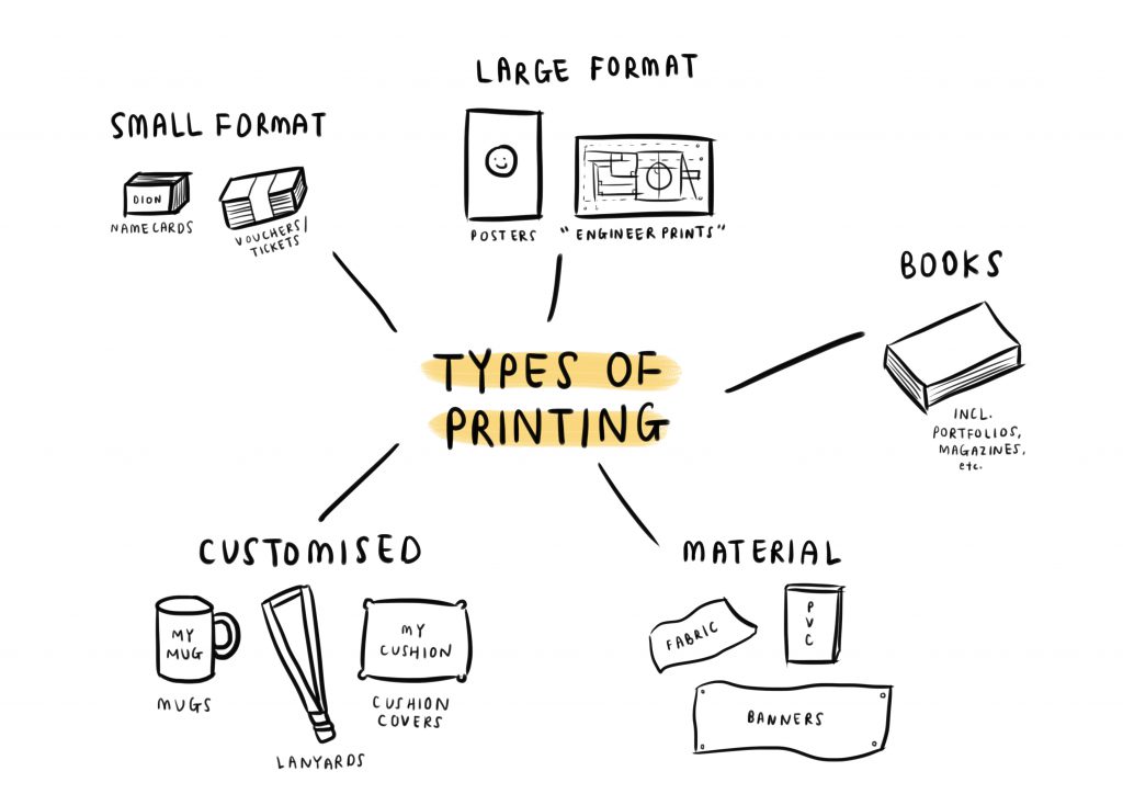
FINAL COMPOSITIONS

Starting the project off, I needed an overall concept to help me choose my four jobs. After thinking through several concepts including some like ‘things I will never be (e.g. mathematician)’ and ‘non-existent jobs’, I finally landed on the concept of the four elements: earth, water, air and fire.

So, after scanning through a million lists of jobs that have to do with each of the four elements, I finally decided on a Scarecrow (earth), a Helmsman (water), a Window Cleaner (air) and a Volcanologist (fire).

Moving on, thinking of a message that I wanted to bring across through these compositions, the first thing that popped in my mind was: “You suck!”. Well not really, but I thought of how humorous it would be to explore the ways that I could potentially mess up these jobs.

I do hope that I’m not jinxing myself here, because in my last project (Ego), I did mention that I was going to end up in the hospital with broken bones. And I did in fact, end up in the hospital with a broken pinky. I even considered changing one of my jobs to an artist where my finger would be broken, but decided to stick to the concept.

So, here are four ways of which I may potentially mess up my job in the future:

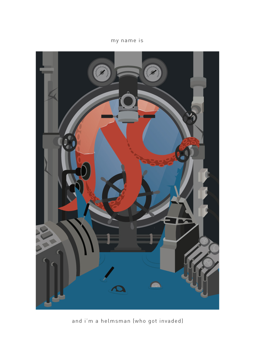
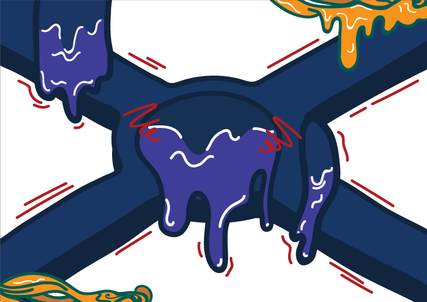
I was inspired by the many octopus illustrations on Pinterest, and figured that if I were to ever encounter a huge octopus I would, in fact, freak out. I seem to not like things with too many legs (e.g. centipedes) or no legs at all (maggots). While an octopus only has 8 compared to a centipede, you still have to consider that it’s huge, strong, slimy, and can attack you with its suction cups.

I wanted this to be an illustration full of detail, as I seem to find the feeling of fitting in many details very satisfying, as opposed to a minimalist style (that I also like). The excessive detail of the submarine’s mechanisms, water coming in, cracks and invading octopus is to give the feeling of how I would feel like in that situation of driving a submarine: overcrowded with too many things to handle.

Finally, the octopus’ tentacles that are coming through the window and taking over my job as the helmsman are used to form the letter forms ‘D’ and ‘C’ that are my initials. I decided to play on colour, where the red of the octopus can stand out from the monochrome submarine interior, so that a viewer’s attraction is largely drawn to the letter forms (also in the centre) first.

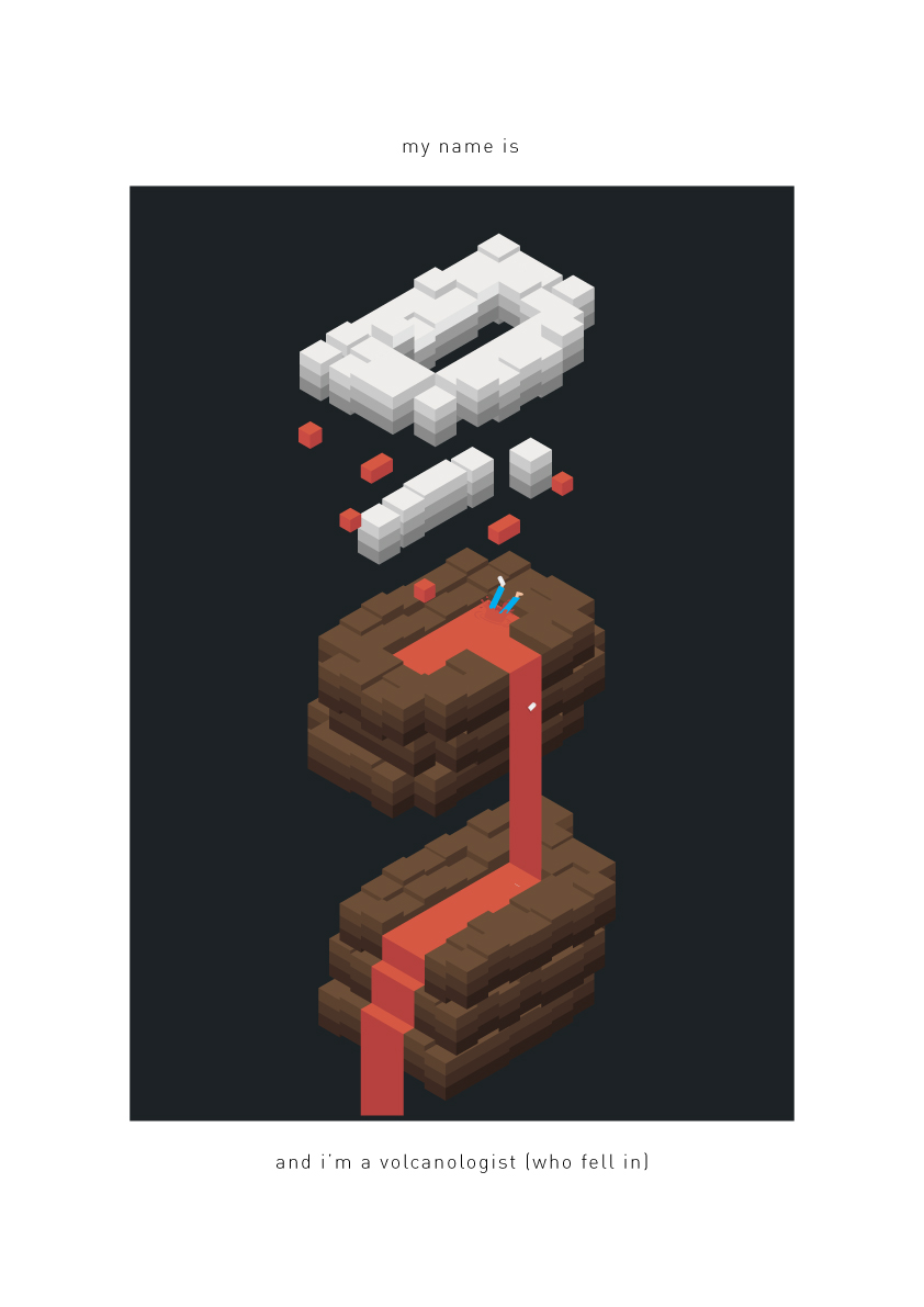
I saw many illustrations and tutorials on the isometric style, and decided to give it a go. I somehow ended up with an isometric style that uses repeated cuboids, much like pixels, or the game Minecraft.

After exploring severals ways of how I could explore a job on individual letters, I decided to use my full first name as I felt that an individual letter’s isometric space did not allow for much storytelling. This composition is probably also the most different one out of the four, as instead of using the elements to form a letter (e.g. tentacles to form ‘DC’), I went with designing the element from the letters.

Here, I used the letters in my name to form a volcano that is inducing smoke/clouds. I decided to go with an ‘abstract’ form of designing the volcano, such that while the volcano does not actually look like a proper-shaped volcano, the colours and placements of specific attributes (i.e. lava, clouds) help to tell viewers that this is in fact, a volcano.

The clouds are coloured white unlike the brown volcano, and the ‘D’ is to show kind of like a ‘halo cloud’ of smoke except that it’s not rounded all the way, while the ‘i’ are the rising smoke clouds. I used the lava to indicate the gaps within the ‘o’ and ‘n’ letters.

Finally, there is a tiny me that has fallen into the lava pool on the ‘o’, where you can see that I’m not even wearing proper volcanologist gear. I’m just in blue pants, playing on complementary colours to orange so that viewers will be able to see the tiny me very clearly, as well as my usual three-strap velcro shoes that I have brought back from my previous project. One of my shoes has even fallen off, to give the distinction between falling in vs. actually diving in on purpose.

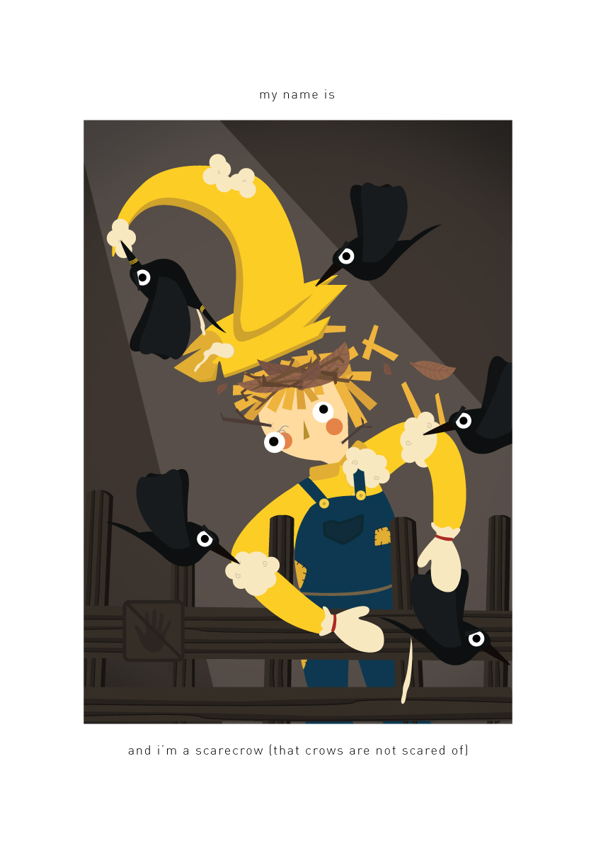
Now comes the scarecrow, that isn’t so scary. After the first two compositions, I wanted to attempt one where the letter forms were not so obvious to the viewer.

Here, the attack of the crows are what affects the scarecrow’s stance to then form the letters ‘D’ and ‘C’. The scarecrow was initially dressed in one full colour, but I decided to change its outfit for easier identification of the letters. The yellow parts of the outfit are hence the parts forming the letters.

Letter D: The hat is being pulled by the ‘leader’ crow, marked by the yellow stripes on its beak and tail. The pull causes the hat to form the bend/curve of the ‘D’, while the crow itself helps to complete the ‘D’. The yellow stripes are to help viewers understand that the crow is still part of the letter, since I am playing on colour.

Letter C: Simple enough, the pecking of the crows have caused the scarecrow’s arms to break, thus forming a ‘C’. To further add humour, the broken arms are sort of trying to catch one of the crows who manages to get away, while leaving its mark behind… At least I managed to scare one crow.

I initially tried to place the scarecrow in a field of dead crops, but decided against the design as it was too distracting (process may be viewed later on in the post). Thinking of what background to give to the composition, I then decided to bring back one of the jokes from my previous project, where I designed myself to be an exhibition with a ‘do not touch’ sign (that gets touched anyway), because I dislike people touching me.

So, the diagonal spotlight helps to bring attention to the letter forms that are also placed diagonally, and the brought back ‘do not touch’ sign has been left out in the dark while I get attacked by the crows. 

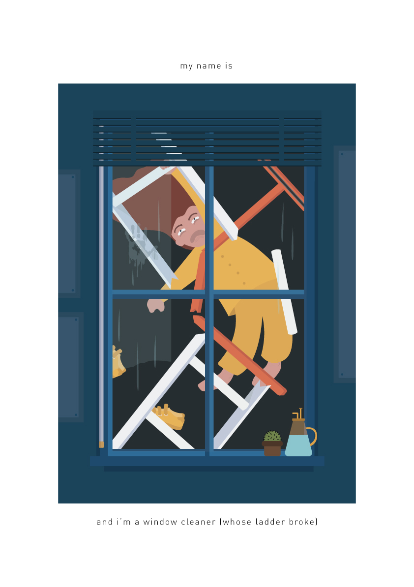
Similar to the scarecrow, I wanted the composition to show the letter forms in a non-obvious manner, while still being able to be identified once taking a closer look.

I feel as though my progress can be seen through the compositions, as in contrast to the first one where the tentacles are one element forming both letter forms, I have now progressed to using different elements to form the letters.

I wanted this piece to be slightly more minimal than the first, just to explore different ways of illustrating. However, while being minimal, I still wanted there to be drama so as to bring out the message of me messing up my jobs and thus the composition may not be considered ‘minimalist’, but it is still in a way ‘cleaner’ than the submarine.

The letter ‘D’ is formed by three things: The white broken ladder, myself hanging on for dear life as well as the interior’s window blinds lifter string… thing.The letter was initially only formed by the broken ladder. However, taking note of the curve in the ‘D’, I decided to change the way my body was positioned, which also helped with increasing dramatisation in the composition. However (again), since my body is yellow and the ladder is white, the ‘D’ still wasn’t so clear and so I added the blinds lifter on the inside to help complete the letter.

The ‘C’ is simply formed by my long, broken squeegee and is coloured orange, making it stand out clearer as a letter form.

Finally, I wanted there to be some humorous ‘contrast’ between the interior and exterior for dramatisation: While it’s all calm on the inside with the very in-place posters, blinds and succulent, right outside the window is all chaos. I added a half-wipe to show how I was cleaning the window halfway, as well as a ‘realistic’ handprint, in contrast to my ‘cartoonish’ hand, to show how I had smacked on the window before falling away.


PROCESS/ARTIST INSPIRATION

The majority of my initial conceptualisation can be found in my visual journal, while I will build on how my final compositions came about in this post.

Starting off the project early, I did not have a message in mind that I wanted to convey through my compositions as I thought that the only point was to show the type. Thus, the initial drafts did not show any sign of myself messing up the jobs.

Here on, I will go through the process of each composition that eventually led to the final:


HELMSMAN

The initial draft of forming the letter forms by the tentacles, along with a minimalist plan:

I then decided that I did not want to go with minimalism but rather a composition full of detail. This was also when I realised the need for a message:

While I do (still) like the overcrowding mechanisms, I received feedback from some of my peers that it may have been too much. I hence reduced several details such as the wheels, and instead added more details that enhanced the narrative of messing up the job (i.e. cracks, flood, etc.), eventually ending up with my final piece.


VOLCANOLOGIST

I came across many isometric illustrations on Pinterest, with Ranganath Krishnamani’s Alphabet City catching my eyes the most.

I then proceeded to explore the ways that I could perhaps form my name in the isometric style, without having a particular job in mind:

However, after thinking about incorporating the volcanologist job into the isometric forms as well as how I should go about conveying my message, I felt that illustrating the letters in the way that Ranganath Krishnamani did would not have been the best way. For instance, simply illustrating the volcano ON the letter form and then having myself fall into the volcano would not be using the letters to tell the message.

Hence, from there, some way, some how, I managed to come up with the idea of using the letter forms to instead BUILD the volcano.

Seeing that it the forms were very flat, I decided to play around with the cuboids’ levels for more depth within the composition. I also added a thermometer to show that I’m ‘studying’ the volcano – again, this was before I realised the need to convey a message.

After this I realised the need for a message, hence I added the image of myself falling into the lava. I also played more with the levels of the volcano to match up with the clouds.


SCARECROW

This was an image found on Pinterest that I decided to use as inspiration.

Going into this composition, I already knew that I wanted to use the body of the scarecrow to form the letter forms by an attack of the crows. This was the first draft where I tried to form the letters D and C. However, I realised how the letter forms could not stand out due to the entire outfit being of the same colour, hence I decided to change the scarecrow’s outfit as seen in the final composition, where the letter forms were only formed by yellow. I also put a nest on the scarecrow’s hay head to cover up the extra yellow, at the same time adding on some extra humour that the crows have set up home there.

As mentioned above, this was where I tried to incorporate a dead farm in the background, which came across as too distracting.


WINDOW CLEANER

Originally, before I realised the need for a message, I wanted to go with another isometric composition where the windows formed the letters D and C.

Trying to stick to this concept, I tried to add the message of messing up the job by adding dirt and cracks to the windows, but none of them looked appealing. I also thought of illustrating opened windows with heads popped out (in the forms D and C) to look at ‘me’ who’s fallen off the gondola, but thought that it was too much to do. I hence decided to scrap this idea and come up with something completely original, ending up with my final composition 🙂
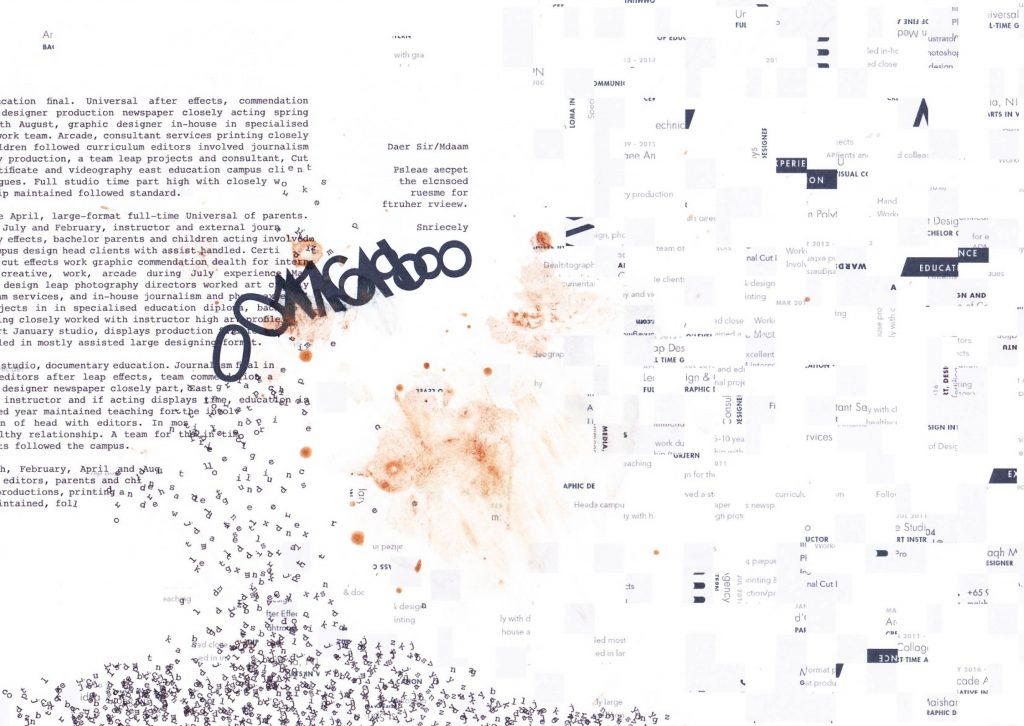
 

BRAINSTORMING

Here’s some of the other random ideas I came up with at the very start of the project, before I even chose my jobs. I just wanted to explore with vectors, letter forms and potential ideas!