Category Archives: Research

Typography: Typographer of the Week – Neville Brody

NEVILLE BRODY

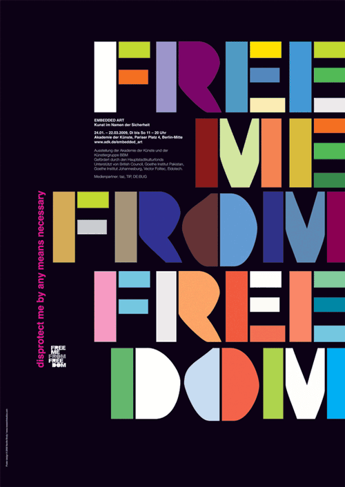
The most outstanding characteristic of Neville Brody would be his bravery in being adventurous, not allowing the opinions of others, even those of higher authority such as having his works be “condemned as uncommercial” by his teachers as well as almost getting expelled from college, to restrict his exploration of “new boundaries in graphic” design.

Brody sets himself as an inspiring figure, reminding us that while “safe and tested economic strategies” will always be, well, safe and tested, experimentation will always be needed for things to consistently evolve. And who knows, the results of your experimentation could lead to what becomes the next “safe and tested economic strategy”, seeing that “his experimental and challenging artwork gave new meaning to visual language.” 🙂

Additionally, I also like that Brody took inspiration from his surroundings (maybe not literally), such as the era of punk rock that heavily influenced his work and motivation. I tend to appreciate art (no matter their form) a lot more when they are instilled with meaning from the artist’s life and/or passions, hence this reading was a great reminder of how I may take inspiration from what’s going on in my own life at the moment to influence my work.

STYLE INSPIRATION

Neville Brody

Unlike Massimo Vignelli who focuses on improving on a “signature” style with every new piece of work, I’ve noticed that Brody explores a very wide range of dynamic styles. I’m not sure which method of approach would work better for me, but Brody reminds me that while I am unsure of what my “style” is, I should never be afraid of playing around.

Typography: Typographer of the Week – Massimo Vignelli

This has by far been one of my favourite reads on a figure as I felt that that although on a different topic, I could relate personally to some of Vignelli’s beliefs, which helped me understand him better in context.

The most significant aspect of Vignelli, to me, is definitely his belief in the power of knowledge behind what one produces. Here are some extracts that really stood out to me:

“It is not a matter of style or taste. It is a matter of quality and non-quality.”

“The difference is knowledge. Knowledge shows.”

“How do you define “quality?”: Things that are done with knowledge.”

“There is no absolute reality. Only one’s interpretation of that reality. Therefore, my solution is my interpretation of the problem filtered through my culture, my education, my understanding, my sensibility.”

What I’ve gathered from Vignelli’s words is that designers today have become so focused on pure “aesthetics” that many have forgotten about the power of knowledge in their works. He also strongly believes in communicating himself through his works, as he said himself, “I’m not interested in change for the sake of change or novelty. I’m only interested in a projection of intelligence that comes through refinement.”

This reading resonated with me on a personal level, as his words spoke to me in relation to my passion for dance. Yes, I dance. Specifically, I’m into “street” dance (simply: freestyle, you dance with your friends at parties – not like Singapore’s EDM clubs, and you also go for dance battles), and not those choreography style classes that you see a lot of videos of on YouTube nowadays.

Since entering the world of street dance, I’ve always been reminded not to butcher what “dance” is – you could be making nice “moves” and receiving oohs and aahs from everyone around in a studio, but what is dance if you don’t do it with the knowledge and soul of where it came from? Simply putting it, “dance” today has become so commercially understood by society thanks to the never-ending cinematically shot videos of studio classes, where good dancing = making nice-looking moves and hitting beats. The pure authenticity of what dance really means, where it came from, its strong culture, has been lost, and that is what many pioneers of the art shake their heads for today, just like how Vignelli does at many of today’s designs that he believes hold no knowledge. I repeat his words, “It is not a matter of style or taste. It is a matter of quality and non-quality.”

Here’s one of the pioneers of a dance style called Popping, whom Vignelli reminded me a lot of during my read, although this guy’s definitely a lot more… harsh. Also don’t get me wrong, I’m not even super crazy about this guy, and neither do I do popping, but he is a respectable figure in dance’s history.


I’ve probably done a really poor job of explaining how Vignelli’s words has resonated with me, and you might not even understand what I was trying to say about the dance thing (because I myself took at least 2 years trying to understand it), but I hope at least something (I don’t know what, but at least something) came across… haha.


Typography: Type Speaks (1948)

The fact that type had existed way before computers did has never crossed my mind before, hence Type Speaks has definitely gotten me intrigued (mind-blown, really) with how the art used to be constructed and appreciated.

Prior to this video, I struggled to grasp the concept of why proportions of characters for certain types are adjusted for better viewing purposes, as mentioned during class presentations. However, with the video showing the actual transitions of the minute character adjustments between different point sizes and the differences they make, I now understand better why adjustments have to be made for a more pleasant appearance.

It is no doubt that today’s generation has been spoiled by digitisation that has made everything become much more convenient and therefore easier for things to be taken for granted – even outside of design context. However, it cannot be denied that while the smallest of details and efforts in the creation of type have become overlooked, digitisation has also made available much more room for exploration, where new precision details observed have instead become things like…

“this letter’s one pixel too left”

“no, now it’s too much to the right”

“no”

Image result for pepe laughing meme

It is already painful enough to print a feature magazine 500 times only to find never-ending typos, or, for instance, accidental design mess-ups in kernings of titles. No way would I ever want to be casting actual moulds for individual characters and checking precisions for each and every cast!

Typography: Typographer of the Week – Jan Tschihold

JAN TSCHIHOLD

Reading about the life that Jan Tschihold dedicated to typography and graphic design has got me feeling all inspired, yet 100% worthless at the same time. How could one have devoted that much of his life to one passion? Thank God for him that his efforts had obviously paid off, seeing his impression left upon the world up till this day.

FROM BAUHAUS

Perhaps what inspires me the most about Tschihold is his boldness when he came about a change of style after visiting that Bauhaus exhibition in 1924. Despite being so completely new to this experimentation of modernist type, he dove right in to producing works the direct opposite of what he believed in not too long ago. The fact that he persevered years without fear for his beliefs to become recognised and eventually made himself known through both appreciation AND hatred for going against the norm, shows the sort of confidence that any artist should have – although it could turn out overbearingly arrogant.

THE SECRET CANON

The next thing that really caught my attention was Tschihold’s method of approach towards creating a perfect page: Tschihold’s Secret Canon. Who would have thought, apart from the simple rules like rule of thirds and golden ratio, that so much math could be involved with graphic design? I would also have never imagined there being so much specific calculation involved in creating ‘aesthetic’ calculating up to fractions of 1/15, etc. Having been exposed to both news, feature and interactive magazine design back in polytechnic, Tschihold’s approach to perfect layouts has no doubt opened my mind to understand that there are always ways of doing things that you would never think of. 

Jan Tschihold is unquestionably someone to be respected for the impact that he has had on the world of typography/graphic design today. It’s interesting to see how SO much thought and process has gone through (like, years) what we have now come to see as very apparent ‘aesthetic’.


Typography: Type in the Wild

TYPE IN THE WILD: JURONG POINT

Unfortunately all cooped up in Pulau NTU, the best place that I could get to within the week was Jurong Point Mall. Albeit just a shopping mall, it was interesting to see the distinguishable levels of ‘professionalism’ in type design between the logos/signages/posters of established and non-established brands.

Generally, it is observable how more established brands have cleaner typography in their signages, even with the use of different font classifications and types within one sign. From what I’ve observed, good signages/typography come with proper combinations of different types of font styles, such as combining serif with sans serif, heavy weights vs light weights, uppercase with lowercase, and so on. I’ve seen that it is not a must for ALL of these rules to be applied at the same time, where different combinations can work together as well, as I will “explain” through these pictures.

Observed: Double sans serif face, uppercase vs. lowercase, heavy weight vs. light weight, large pt size vs. small pt size

Observed:
Serif vs. sans serif face, double uppercase, large pt size vs. small pt size

Other observations:

FUJIFILM takes on a simple, uppercase sans serif font.

ESPIRIT plays on font ‘design’ on a simple, uppercase sans serif font and adjusted kerning.

POPEYES combines a playful, lowercase serif font with a clean, uppercase sans serif font

Here are some bad typography examples that show how those observed “rules” are not always foolproof.

You would think a combination of serif and sans serif would mean you could probably also put cursive and a ‘sans serif’ Chinese font together, but no.

Same for these posters that just don’t work, for obvious poor choices in font styles and arrangement in design, even outside of typography.