Category Archives: Final Project

03 Applied Illustration — Final

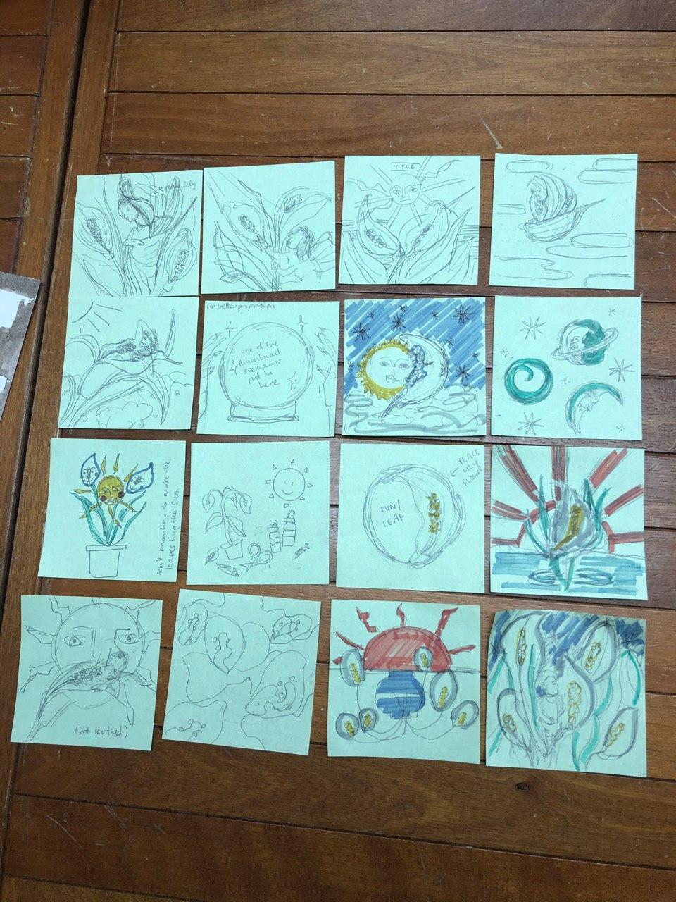
Links to Process (1) | (2) | (3)

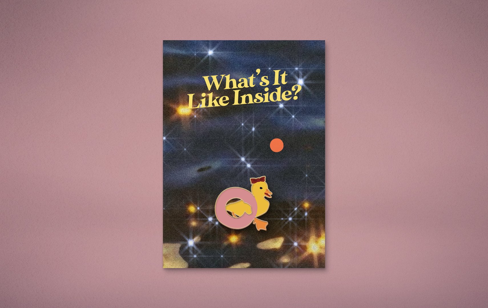
What’s It Like Inside?

What’s It Like Inside: An Animal Party is an event where animals from ‘around the world’ gather to find out what it’s like inside, indoors, inspired by our world’s current situation. The event will be streamed live on Instagram, on the 20th of April, 2020, at 1PM (no it won’t).

On a grander scale of things, the event is to inspire and remind people to ask each other “what’s it like inside?”, in a time where we are all confined to our homes, our minds, and our feelings.
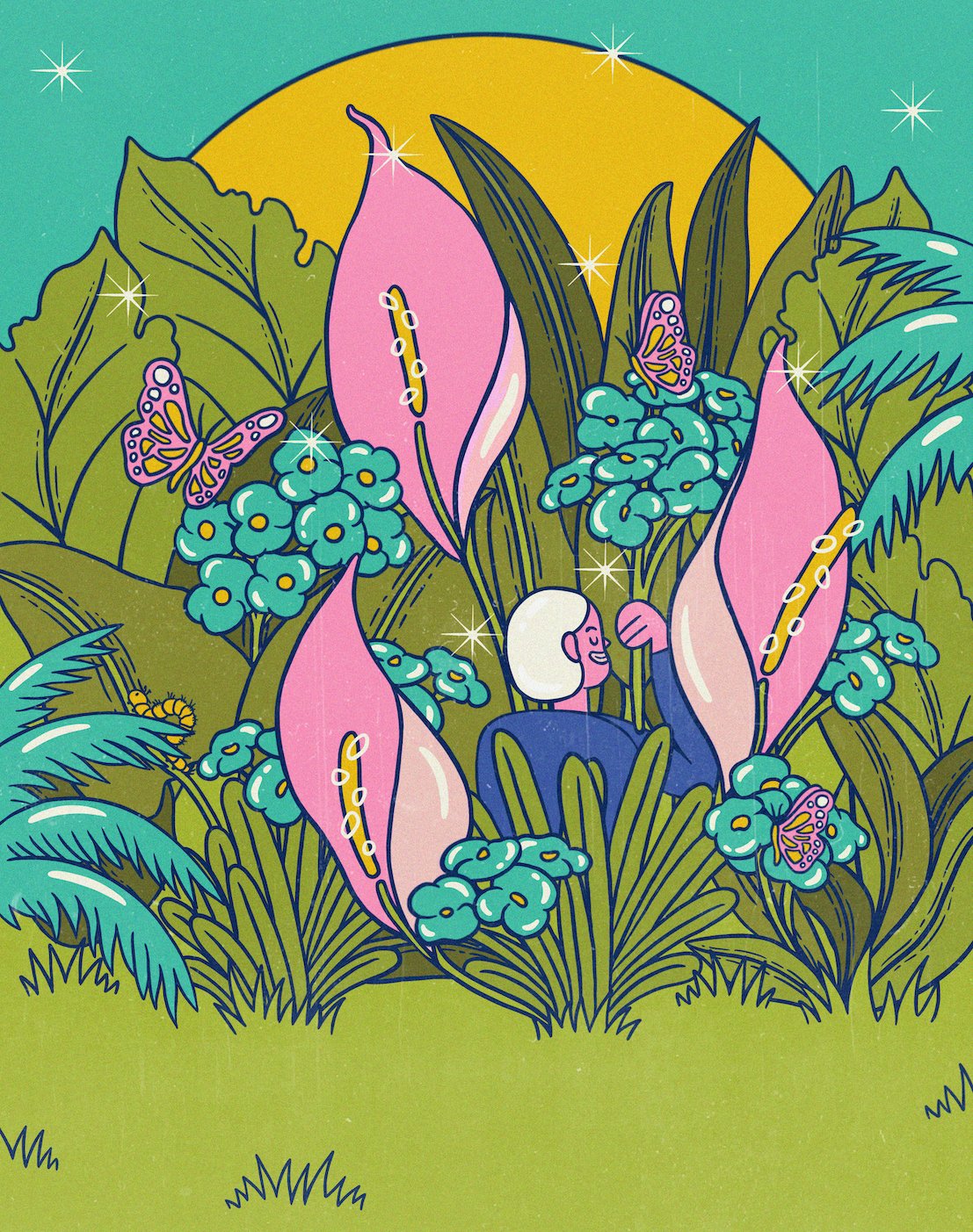
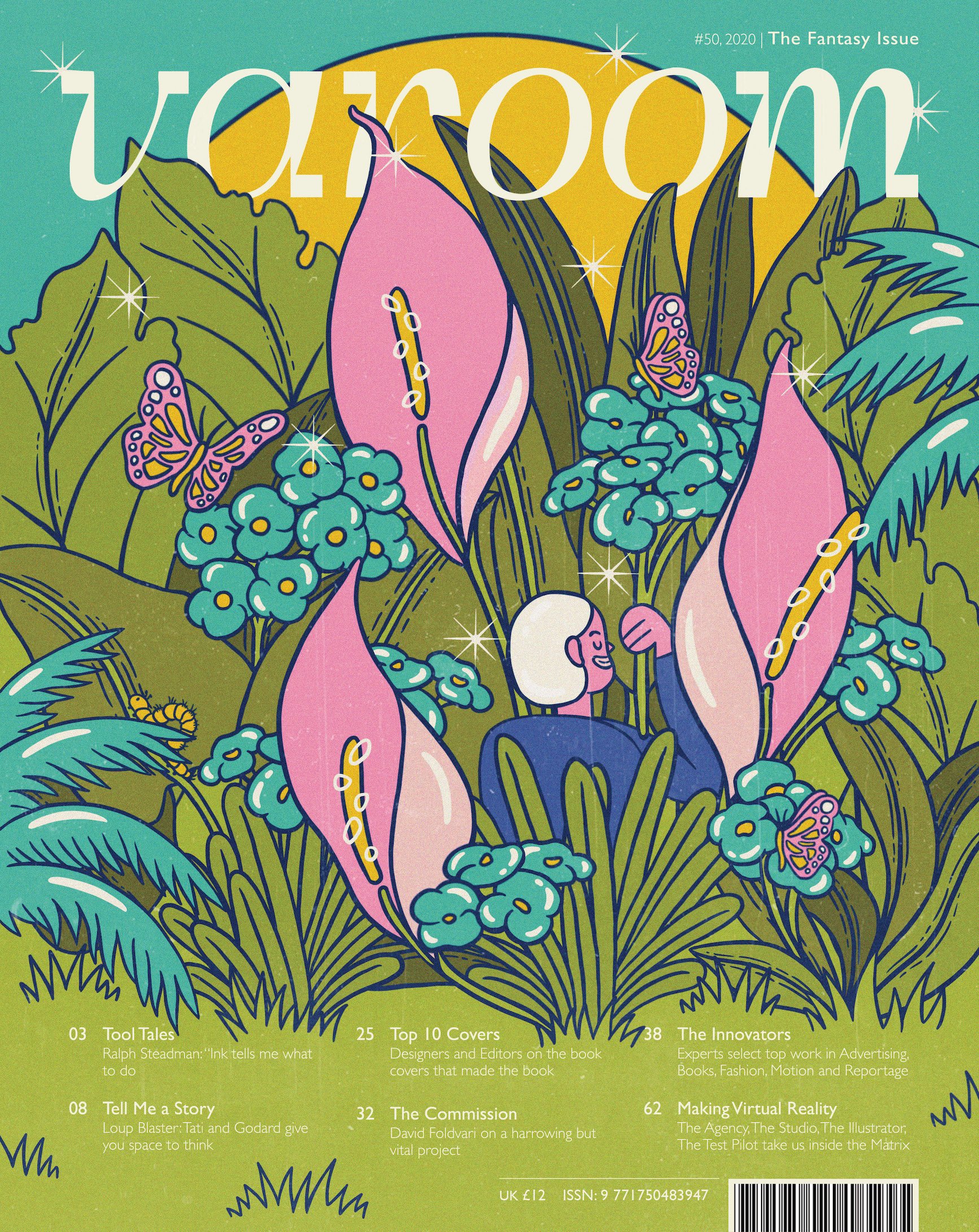
 

Animated Trailer

(P.S. Rendering really messed with the colours, and after consulting three film/animation experts and Google, this was the closest I could get it to be like what it’s supposed to be!)


Animated Instagram Stories

Because it’s covid season. Who needs physical posters?
(P.S. Same rendering issue, ugh!!!)

(Definitely looks a lot more pink-toned than what it’s supposed to be- orangey)

(Yes I’m aware it looks like he’s surfing in the sky. I left it like that on purpose, because fun.)
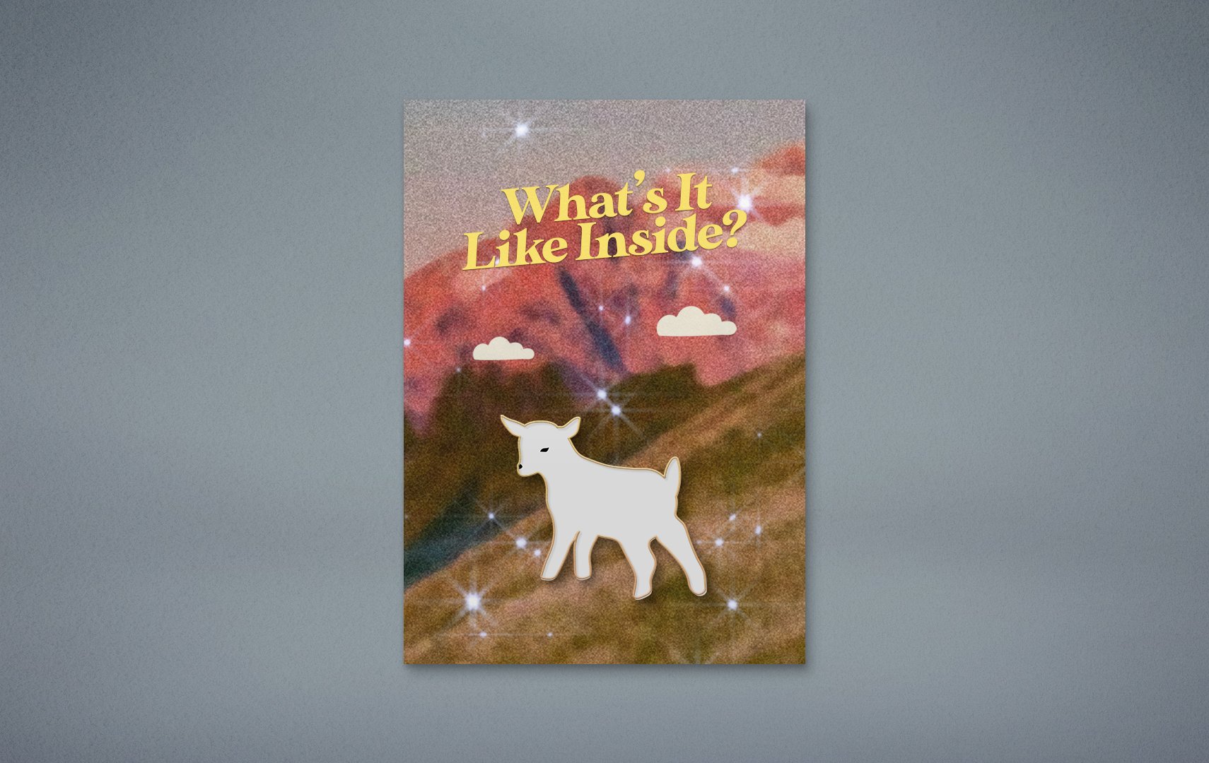
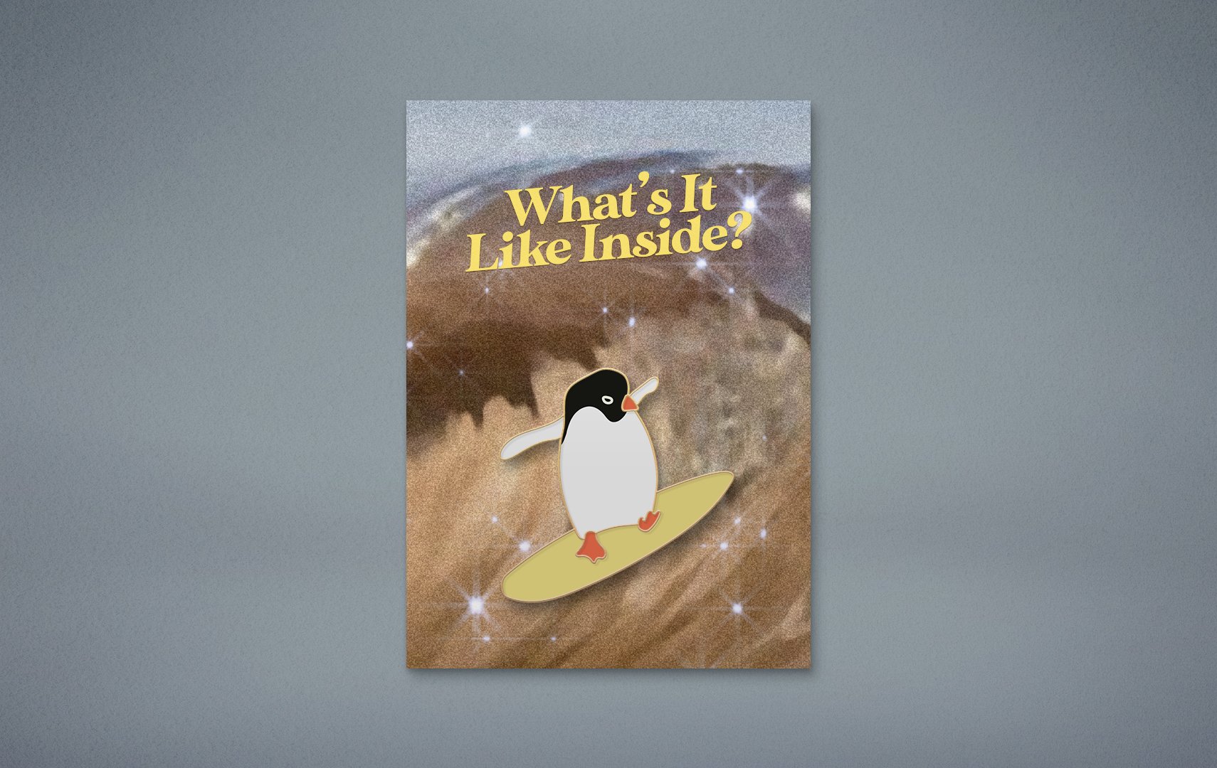
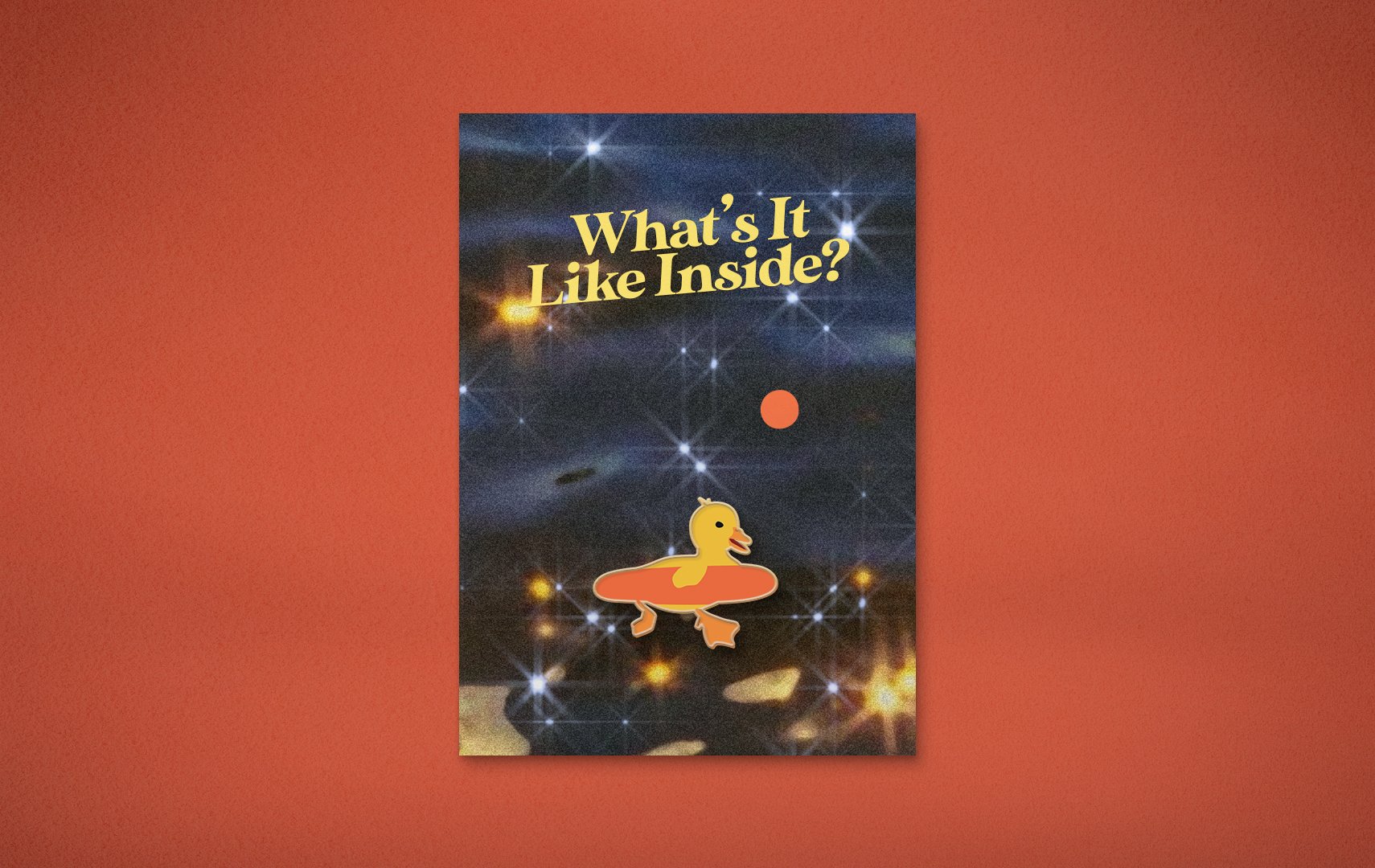
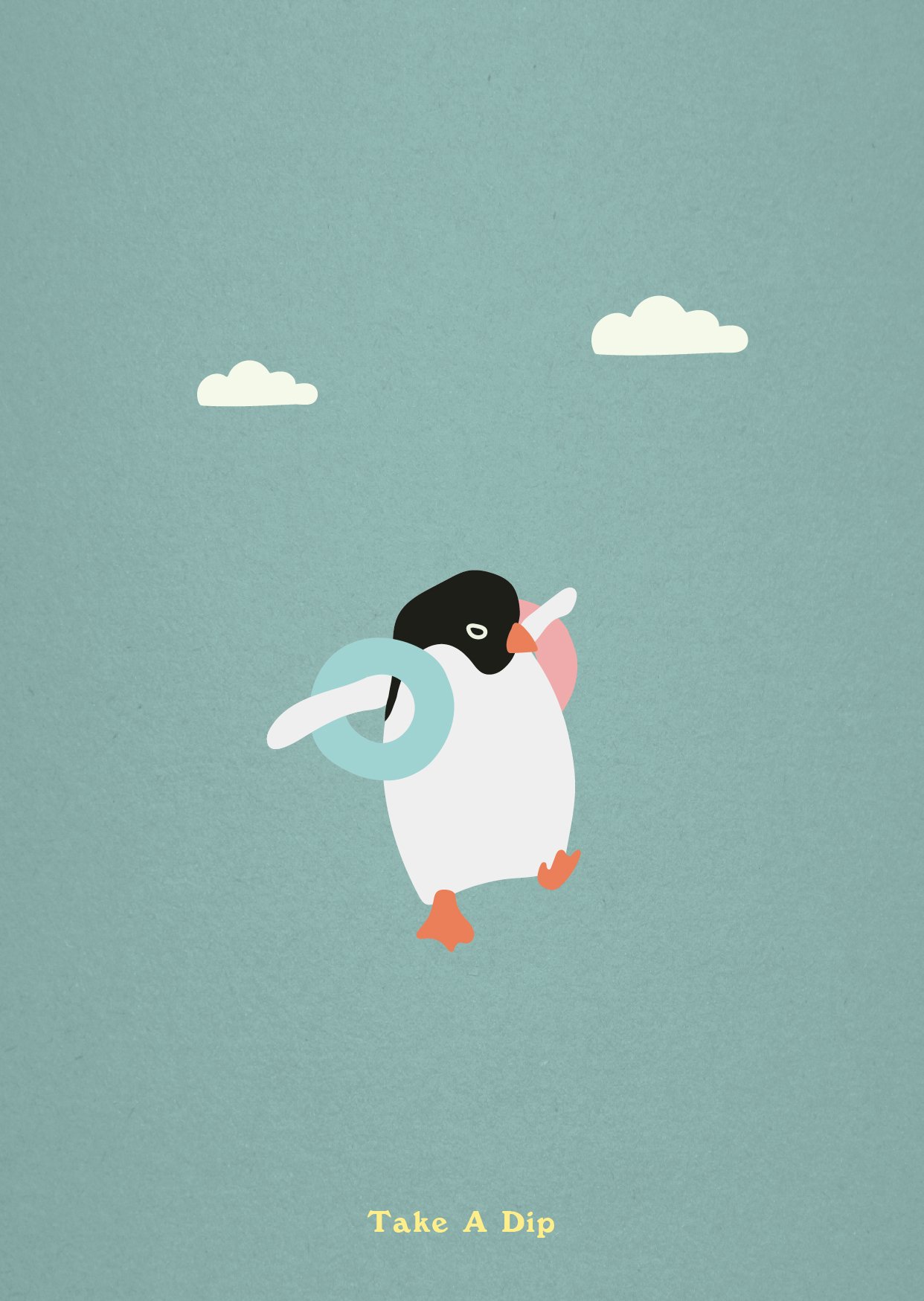
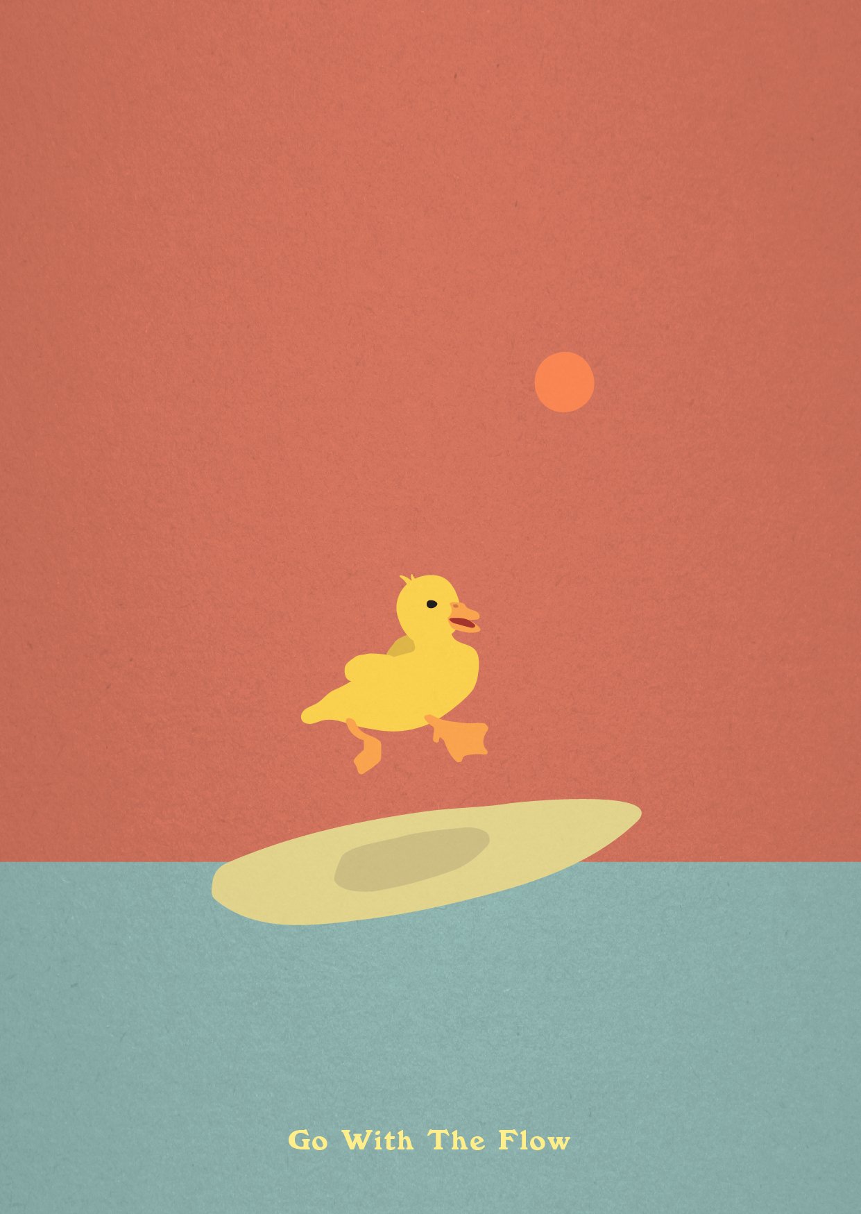
 

Postcards

To be sold on the corresponding e-shop, “www.whatsitlikeinside.com”.

For people to buy and write to their families, lovers, friends, enemies, to ask them about how they’re doing, and what it’s like (being) inside.

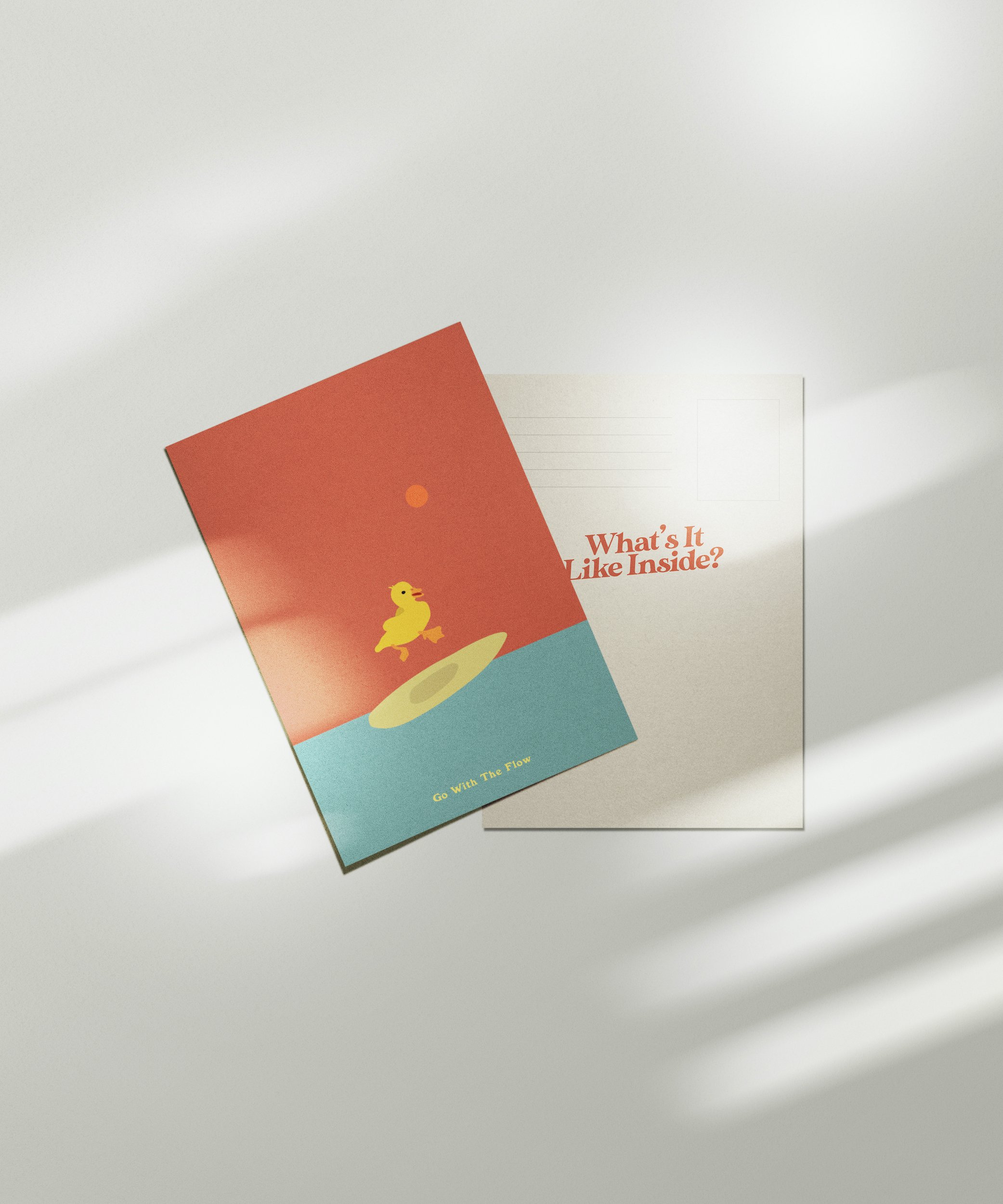
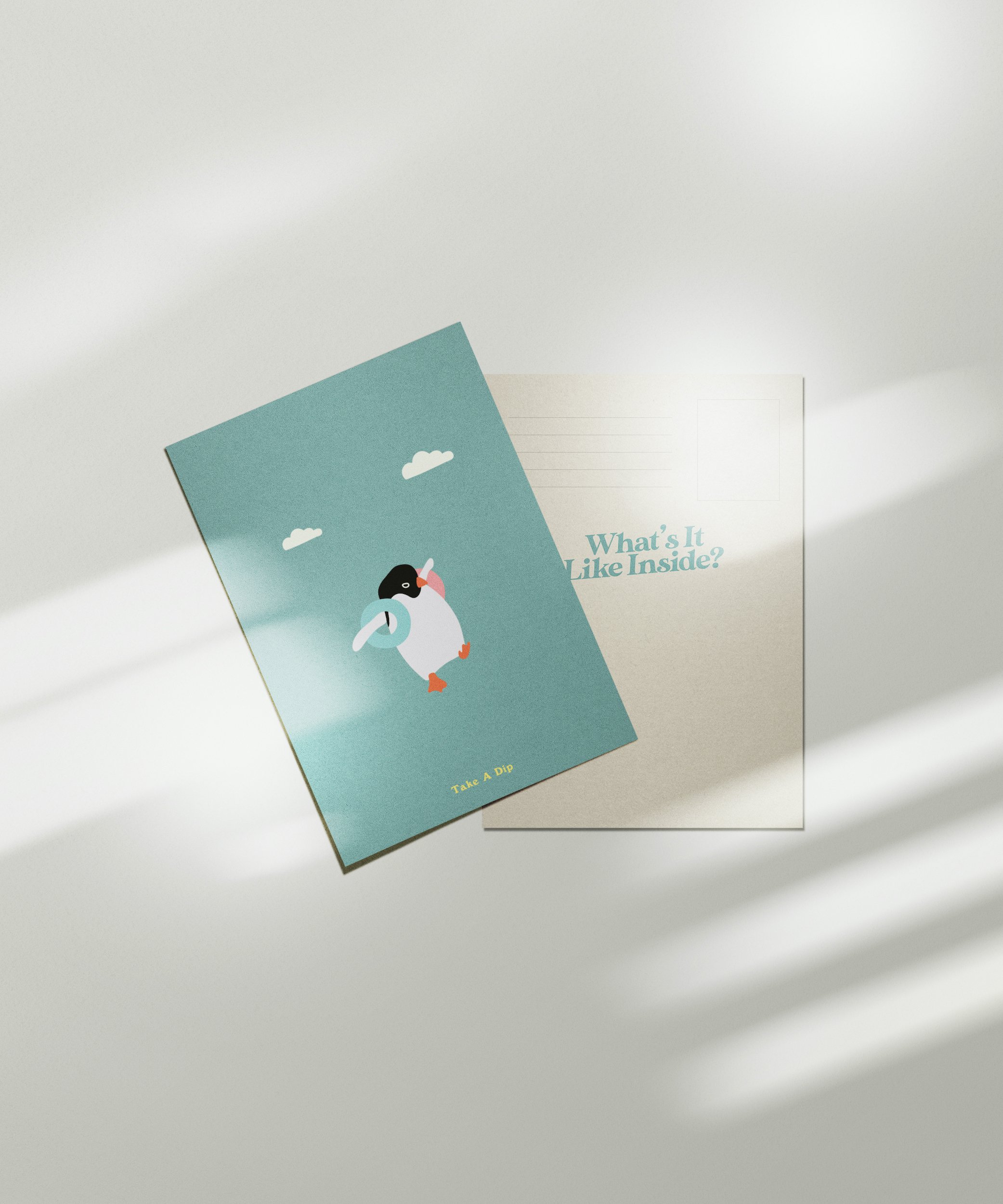
The quotes, while accompanying the illustrations, are also to give people a few little tips to survive the quarantine. Listen to the birds! Stay calm and ride the waves. Take a dip! In the shower, in the bath tub, in a pool if you’re allowed or if you have one in your backyard!
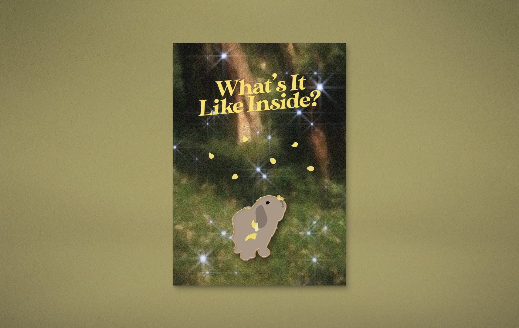
Enamel Pins

Also on the e-shop, “www.whatsitlikeinside.com”.

A little souvenir, for all the humans that couldn’t make it to party. You can also gift it to a friend or yourself, if you’re feeling nice.

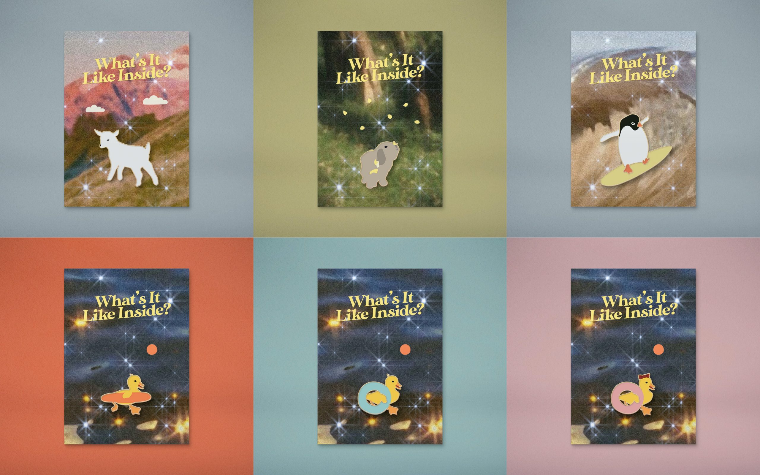
Here’s a collage, but I uploaded all of them in full size because shiok.

02 Varoom — Final

FROM THE BEGINNING —

Theme and Idea

My illustration for the theme of fantasy revolves simply around the story of my mother who has been trying very hard, and failing, to propagate Peace Lilies at home as they always burn into crisps under our extra hot Singapore sun.

The fantasy will consist of nothing deep, just:

PEACE LILIES WILL GROW! UNDER! THE! HOT! SUN!

USER PERSONA, THUMBNAILS & MOOD BOARDS:

(View post)


TWO DETAILED SKETCHES:

(View post)


MOVING TOWARDS THE FINAL:

COMPOSITION

I illustrated each plant individually and played around with tens of thousands of arrangements to see which ones worked best. I faced an issue with figuring out where the plants could sprout from, because starting them from above the text would look odd, but starting them from the bottom of the page would interfere with text legibility. So I tried adding pots, and then a flat ground. I eventually realised I could use patches of grass to cover up the stems.


CLEANING UP

I re-illustrated each and every element because all my sketches had been resized to the point of… myopia. Downside of not using vectors. (I did at some point convert all my lines to vectors but it didn’t feel right!)

FAUNA TO THE FLORA

I added fauna to the flora, although only subtle-ly to balance out the composition. I tried adding a hanging chimpanzee from the “a”, and also a giant dragonfly, because my mom loves those long-arms-chimpanzee toys and dragonflies, but they were fighting for attention with the lilies hence I decided with small creatures (though that is actually one giant butterfly if you compare it to the character). Amidst all my trial and errors and hundreds of layers I also have no idea where the monkey and dragonfly have gone, hence they are not pictured. 🙁

COLOUR PALETTES

I played around with different colour palettes. I personally prefer the dark green-orange palette, but the blue-pink one tied in with the theme of fantasy the most.


CHARACTER

I tried different characters/positions and chose the one I felt fit best. I also tried making the character hold a ‘leaf umbrella’ (pictured in the latest gif above) like in Totoro, but that didn’t work as well as holding flowers.


DETAILS

Added details — “shadows” and highlights, grass patches, bling blings.


INTO THE COVER

I transferred the illustration from Procreate to Photoshop and adjusted the hues again. I added noise and texture, changed the colour of the masthead to match the highlights and layered it with the leaves. I initially thought of fiddling the leaves through the letters, but felt that it would also fight for too much attention with the rest of the illustration that is already very detailed.  Adjusting the hues and textures were for aesthetic, to give the illustration more warmth, and the slight ruggedness for a ‘vintage’ feel like its been well used/made by hand, much like how gardening (more like turning house plants into a forest) requires a lot of handy work and love.


FINAL ILLUSTRATION:


Google Drive Folder HERE