Category Archives: Process

03 Applied Illustration — Process (3)

Just a few more updates:


  • Penguin’s surfboard colour

The penguin’s composition was by far the simplest, yet gave me the most pain in the a**. Colours are painful. It was tough to pick a colour for the surfboard because I needed it to match the penguin’s feet, stand out from the penguin’s background, but also from the orange float duck and its feet because I had plans that it was going to steal the surfboard in another collateral.

I also removed the little waves from the previous draft video, because I didn’t like them. Watching the penguin flip is enough!


  • Lamb’s Accessories

At some point I realised the lamb was the only animal without an “accessory” attached to it, which gave it a lack of colour as an ‘identity’ when it came to compositions for the other collaterals. So I started dressing it up. I even tried giving him (yes, now he’s a him) socks.

Eventually I decided against all these, because heck it, lamby boi is a clean plain white boi with floating grass and flowers and clouds!


  • Duck Tails In The Float

Feedback was to have the blue and pink float ducks’ tails “inside” the float. I tried it, but no! Doesn’t make sense, and I didn’t like how it looked anyway. They’re holding the floats by their side with their wing. They’re not in the float!

It was an instant undo and I have no evidence of this.


  • Finalised Concept

Geeeeez, you would think I should’ve had this done weeks ago.

I initially thought of the whole thing as a campaign, rather than an event, but then I realised the brief called for it to be an event for a client, so… It’s an event in a campaign, sort of, kind of.

Many of my ideas came as ‘jokes’ about the current quarantine situation with Covid, but eventually while the event is still inspired by the situation, I decided against having the tone of the project be a joke.

What’s It Like Inside: An Animal Party is an event where animals from 
‘around the world’ gather to find out what it’s like inside, indoors, 
inspired by our world’s current situation. The event will be streamed 
live on Instagram, on the 20th of April, 2020, at 1PM.

On a grander scale of things, the event is to inspire and remind people 
to ask each other “what’s it like inside?”, in a time where we are all 
confined to our homes, our minds, and our feelings.


03 Applied Illustration — Process (2)

Greetings, from day (I wasn’t even counting) of circuit breaker.

I have good news and bad news.
The good news is, I’m still really enjoying this project.
The bad news is, I still have no idea where it’s headed, and it’s due in a week.

WEEELLLL I have a little bit of an idea, that’s better than before… but it’s still not concrete. I’ve swear I’ve been thinking A LOT about it. I went to bed at 5AM last night thinking about it and jumped out of bed at 12PM literally still thinking about it. And it gave me an actual headache before I could even get to brushing my teeth.

I feel like it’s been hard trying to get creative while stuck at home, which is quite odd to say. My logic is — the times I get my best ideas are during my free times away from life, so like poop time and shower time, but now every time is ‘free’ time and my brain has essentially lost its grasp on the concept of time. Anyway…

Progress

I’ve done a lot of work, but progress looks minimal overall because all the work was done on the motion graphics collateral. I went forward and backtracked a couple of times with a few ideas.

I expanded on the animal illustrations wherever needed, so that more could go on with each scene. I struggled a lot with colours — because the backgrounds don’t follow a colour scheme, I needed colours that could pop on each background individually, yet still look coherent to the rest of the illustrations.

I put a hat on the penguin at some point.

I’m even a layer namer now, because I’ll do anything for a sense of routine and order during this period of time.

Animal Zooming / Animal Conferencing

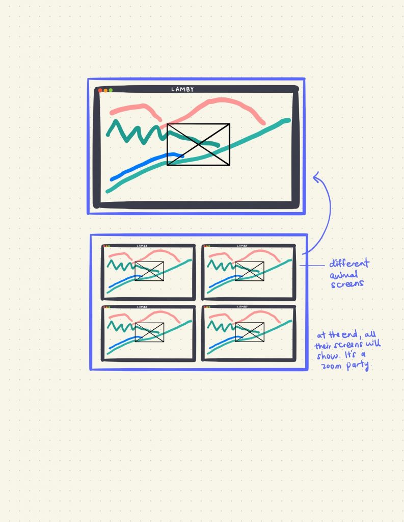
Based off the idea of this event being “a virtual tour of these animals while we’re all stuck inside”, I had the idea of turning this into an Animal Zooming or Animal Conferencing thing, a parody on Zoom and the Nintendo Switch Animal Crossing craze amidst quarantine. They’re zooming around the world, they’re zooming on Zoom! So I did this, and even though it’s cute, I decided against the idea because I didn’t want to turn the project into a “joke”.

While doing this, I was wondering, why the heck should the animals have to be partying on zoom, when nothing’s stopping them from partying in real life? So, I finally figured out where the animals were headed:

Spotted in Quarantine

I thought about making this into some sort of documentary/film about what the animals were doing while the world was asleep (in quarantine).

I’ve not yet eliminated this idea, but I’m close to doing so because I can’t yet imagine how the other collaterals will be, because I don’t want to put this film border on everything. Though, I can still imagine this to just be the trailer and everything else will be promotional/merchandise. I also feel like the border isn’t necessary, but it would make the “spotted” idea come across more clearly.

Motion Graphics Trailer

(Ignore the opening)
I’ll still have to make an opening which will involve the title of the event that will be illustrated across all/most of the collaterals. Details are still to come for the ending.


Trying to Figure Out What This Project Is

If it's a movie about what the animals were doing while the world was on lockdown:

Motion Graphics Trailer (with release date)
Movie Poster (with release date)
Enamel Pins (merchandise)

Instagram Posts (?) (like how some Netflix shows have their own pages)
Premiere Photo Taking Wall (?)
Premiere Invitation Cards (?)
Phone Covers (merchandise) (?)
If it's a quarantine party that only animals were invited to:

Motion Graphics Trailer (more like 'event coverage')
Enamel Pins (because you didn't get to go)
Phone Covers (because you didn't get to go)
Photo Book (because you didn't get to go, so take a look at what went down)
Invitation Card (that you didn't receive)


Title Inspiration:


Enamel Pins

Pins to be sold on an e-shop as merchandise. The title will go on top, and I might give them names and put them at the bottom.

In Conclusion

This is probably the worst way one should go about planning and creating a project. At this point my brain has turned into mush, but I trust that all will be well… I hope.  🤞

03 Applied Illustration — Process (1)

Greetings, from day -1 of circuit breaker.

I’d already begun self-isolating from awhile ago, and now I’m already bored before the official start of lockdown and am on the verge of piercing my own ears!!!! Help.


First E-mail Consult

Inspired by the Instagram account @mignonettetakespictures that posts some of the most aesthetic, CUTEST small animals, I decided to base my final project on cute animals.

I had various ideas that were based on reality, like renting a pet for a day (kind of like dog-sitting), having a day care centre, a see-but-no-touch exhibition that’s pretty much like a zoo, and struggled to come up with something that really HIT it for me. I also really worried about people abusing these babies.

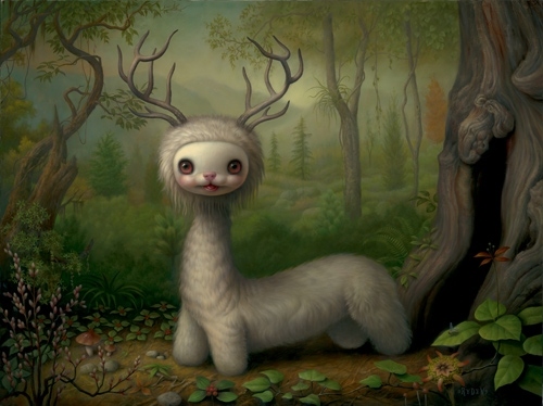
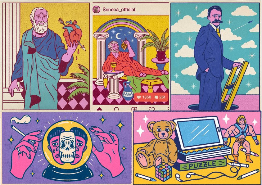
Lisa suggested that I try going out of reality and not have logistics run this project, and even referred me to these works below that honestly scared (still do) me (insert laughing emoji here). Thank you for the references Lisa, but I kind of want to stick to doing something cute and innocent hahahaha. Not trying to ruin anyone’s perceptions of cute fluffy animals!

Roby Dwi Antono, lowbrow art, pop surrealism antlers, art, cute and digital illustration

Somewhere along the way I had the idea of having a Grand Mansion that had different unrealistic rooms, like one room would be a never-ending field for a baby lamb, one would be a room full of mirrors for a narcissistic cat, etc. It’s kind of like minecraft where people build crazy mansions, and it’s also kind of like The Chronicles of Narnia. However I ended up not going with that idea… because, well, I let the project run its course.


Progress

Inspired by Lolita Chiong, a very, very, very talented local artist who’s struggling to finance herself for CalArts 2024, I wanted to try mixing image backgrounds with illustrations. (You can see the reference from the thumbnails, but do give these a watch when you have the time!)

View this post on Instagram

Full lovebird documentary film in my bio!!

A post shared by 🦜 (@lolita_chiong) on


So here’s the process of first attempt. I honestly laughed so hard at my very first attempt at mimicking Lolita’s simple use of shapes and black outlines. The cat looked like Doge?!?!?!?!

While it’s easier for the illustration to stand out with outlines, after playing around with different stroke widths, I decided against it as the style just wasn’t doing it for me.


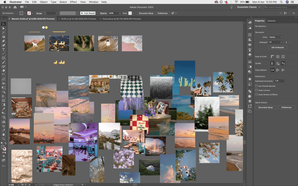
I dove into the world of Pinterest and created a huge board with all the potential images I could use for my animals. While picking out images, I thought about whether I wanted the animals to be placed in a realistic scenario (e.g. field for lamb), if I wanted them to be extracted from reality , or if I even just wanted an aesthetic background that could suggest a scenario but not actually show it (e.g. just water ripples, plants). I went through 1001 images and eventually decided not to fixate on just one, that it could be “realistic” but also out of reality, and it could also just portray a sort of mood that is coherent to the rest.

A few questions that helped me imagine scenarios:
If this animal could have it better, what would it be like? (their reality, but enhanced)
If this animal was in an alternate reality, what would it be like?


Something else I also considered was whether I wanted to place the animals within human civilisation, or just a ‘human’ environment (like in a house, at a picnic, etc.). I tried putting the penguin in roller skates at one point, in a roller disco/ those retro diners with checkered floors where the servers skate. The background images were all bad so I didn’t go with it, but I also eventually decided to keep the backgrounds to nature for coherence, hence I don’t think I will be using the house cat.

(Trust me, I spent a LONG time finding the best backgrounds for these lovelies).


At first I did not mind the background images to be of low quality, inspired by Lolita’s works, however the images were turning out to be on wayyy different levels of quality, so I had to do something to make them the same. I brought my backgrounds to Photoshop and applied the same Dust and Scratches+10 and Noise+15 effect to all of them. The blur effect that the dust and scratches gave the images also allowed my illustrations to eventually pop out more.


Postcards

Now, where is this project headed, you suppose? I’m not so sure myself. I believe I’ve drifted away from the idea of the mansion because I’d have to imply that these scenarios are through the doors of a mansion somewhere. At some point I thought the mansion could be “tourist attraction” that people could come to, and would literally be visiting several attractions at a time, and could walk away with postcards. So I have postcards, with little inspirational “movie” captions relating to either the scene or the animal.

Right now it seems like I’m creating a sort of grand tour to visit these cute animals “around the world”, and the overall art direction is a feel-good aesthetic. The only problem I have with “around the world” is that the ducks aren’t placed in a proper scenario.

Here’s me playing around with compositions:

(I tried making the animals big, but nah.)

So, now I’m at this point, where I’m deciding whether to have the animals directly interact with their scenarios. For example the penguin is on a surfboard on a wave (interacting), but the duck has a whole sun to itself, the lambs with clouds flowers and grass. I’m currently leaning towards letting it be a mix, as long as the overall look is coherent. Actually, maybe if I just added little waves around the penguin then it would all be matched up…!

I also decided to have them all centred rather than have them interact with the background too much, for reasons I’m struggling to put into words, but I really just quite like it like that.


Motion Graphics

And,,,, the reason why I expanded on the illustrations of each animal was so that I could create a little motion graphics video for the project, where each animal would have their own set of… assets. Here’s what I have so far:

(PS I forgot to cut the video length before uploading. You can stop after the animals are gone. Also ignore the beginning! Not sure what to put there yet.)

So far only the penguin has slightly more excitement to its animation (it FLIPPED! for heck’s sake! wow!), and I’m working on thinking of what I could do with the rest. I really went with the flow with this, and the animals zooming in and out like “ayyy”, “bye bye!” really does make it look like we’re going from place to place. So it’s really turning into a tour kind of thing like I mentioned earlier!

For the opening I’m imagining there to be a zooming-in, spinning, retro title, or a spam of travel-esque vehicle images following the beat of the BGM. This video could be a promotional video of sorts.

I’m no character animator, in fact I’ve barely ever animated anything in my life, so I’m not looking to do anything super drastic… like… MOVE THE HEAD OF THE LAMB TO EAT THE GRASS? How in the world!


Remaining Assets, Moving On

For the remaining assets I’m still exploring my options. Right now I’m thinking of enamel pins, tote bags and whatever, but I’m really trying to think of what I could make that would not just be planting the same illustration on different products.

Moving on to my next step, I know I have to solidify my idea of what this ‘event’ actually is so that I can better tie everything together.


That’s all.

Sorry (am I really…?) for being long-winded. I just really want to show everything!

Thanks for reading 🙂

02 Varoom — Two Detailed Sketches

Concept & Thumbnails

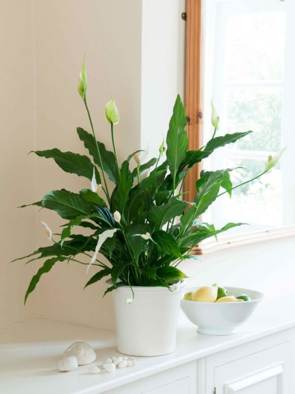
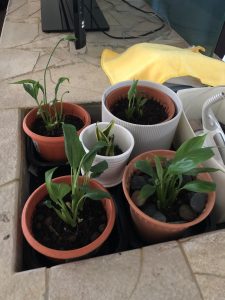
Me Mom’s Fantasy: In a world where Peace Lilies would grow in this hot sun.

Here’s an expectation vs. reality of my mom’s journey in propagating them:
(This is a new batch so they’re not all burnt to a crisp yet)

Image result for peace lily aesthetic


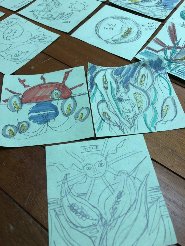
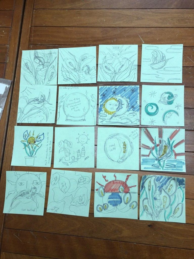
Refreshin’ your memory on the three selected thumbnails to work on:


Detailed Sketch #1

The first sketch is a combination of the first and third thumbnail, with the concept of the ‘dead’ flowers rising up towards the sun, but in the composition of the third tarot card thumbnail.

However, instead of Peace Lilies, I worked with a flower called the Lily of the Valley instead because I found it only fitting to flip this flower that actually grows downwards, upright.

Image result for lily of the valley


Detailed Sketch #2

The second sketch is based on the second thumbnail, of a figure in a giant Peace Lily forest. It’s currently Alice because I needed a reference figure… but I’ll change her appearance if I do end up working on this sketch.

I added another plant called the Euphorbia milii/ Christ plant, which is another species that my mom has actually been able to grow very well. It’s just to add a little variety to the composition.

I haven’t figured out how the composition will be placed, whether it’ll be boxed in the centre, whether there’ll be an imaginary box boxing it in (plants just cut off before hitting the text), or whether it’ll be incorporated into the entire cover.


Image result for christ plantImage result for euphorbia milii

02 — Varoom: User Persona, Mood Boards & Thumbnails

THEME

fantasy
/ˈfantəsi,ˈfantəzi/

the faculty or activity of imagining impossible or improbable things.

activism
/ˈaktɪvɪz(ə)m/
the policy or action of using vigorous campaigning to bring about political or social change.

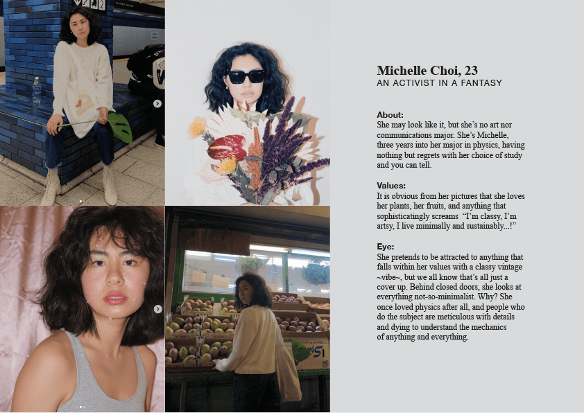
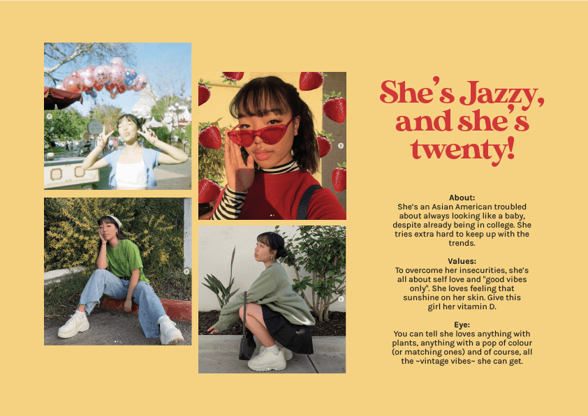
For the reason that I just feel like drawing plants for this project, I was torn between doing fantasy and activism because while I wanted to do a fantasy, plants are very easily associated with topics of sustainability. I then thought, why not create an activist’s fantasy? Or… not so much an activist but just an avid plant potter.


USER PERSONA…S

With my indecisiveness, I created two user personas. Thankfully I made a decision in the end, going with the second one (Jazzy).


*I’m sorry about the orphan

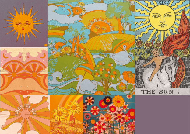
MOOD BOARDS

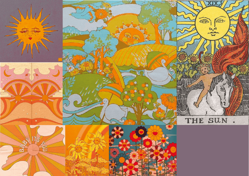
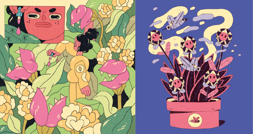
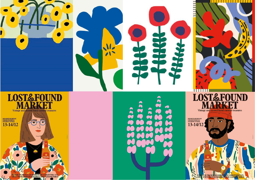
Again, being indecisive, I created a few mood boards to see which styles would be more fitting for my ideas. After going through my thumbnail sketches, I am most likely going with a tarot card style with a hint of Alice in Wonderland surrealism.

However, I still plan to take inspirations in different parts of the first three mood boards, like colour scheme from the first, art style from the second, and composition from the third. Please don’t @ me if I change my mind.

THUMBNAIL SKETCHES

The general concept that runs across most if not all my thumbnails is simply the story of my mother who has been trying very hard and failing to propagate some Peace Lily plants, because they keep burning in this Singapore weather. Her fantasy would hence be a world where Peace Lilies would grow in this hot sun.

These were the three selected thumbnails to work on. The first one had the strongest concept, while the other two were more visually appealing.

First:
If you look at the potted Peace Lily upright, it would show that the flowers are dying, but as a whole image with the pot upside down, the dead flowers are actually rising up towards the sun.

Second:
A small figure in a giant Peace Lily forest.

Third:
A sun. And thriving Peace Lilies.

01 — Inanimate Portraits (Process & Final)

01 — MYSELF

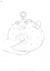
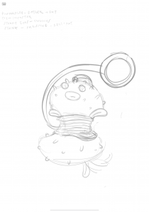
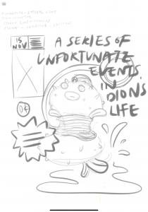
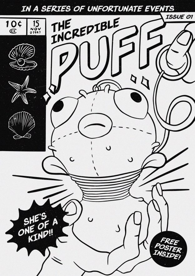
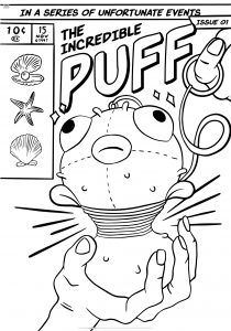
Here, is I, represented by a comic book cover of a toy pufferfish in discomfort.
My self portrait illustrates a good number of negative traits and insecurities I have about myself. It is illustrated comically, because on the surface I tend to give people the impression of being very ‘happy go lucky’ or… just… being a comical person. (This definitely doesn’t come across in class hahahahaha).

Pufferfish:
A bottler (of emotions), exploding
Body dysmorphia (fat)

A toy, not a real fish:
Imposter syndrome! I’m not real.

Bulging eyes, thick lips:
Bulging eyes because the fish is exploding, but I also do have larger eyes and fuller lips than the average Singaporean Chinese. Heh

Rope/finger pulling hoop:
Society/whoever/whatever’s pressure on me
A belt/corset, squishing my fats

Rounded puffer spikes:
I’ve had several people tell me that their first impressions of me were that I seem to be unapproachable, but once they got to know me, I’m quite… harmless.

Comic book cover:
Teri’s interview with me turned into a life-storytelling session where I just went on and on and on about my very visual/graphic stories. Hence I am a comic book, not a storybook, not an auto-biography.

10 cents:
My worth

15 Nov 1997:
My birthday

Free Poster Inside!:
Because who doesn’t want to just be famous and have ~no problems~ other than worrying about looking bad on a poster that people hang up in their rooms! Not me!

Pearl, sea star, pretty shell:
Everything that I want to be. A pretty shiny star.

Sparkles around eyes:
Either: I’m so beat up I’m seeing stars, or to symbolise my tendency of envying others.

Hand holding puffer:
Either: This poor, poor, puffer, is so obviously beat up but is still being presented as perfectly alright! Yeah! This is fine! I am fine! Or: Sometimes I just want to be held, ya kno…

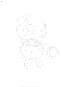
ILLUSTRATION PROCESS (Click to enlarge)

I pretty much have all the negative traits/insecurities about myself etched in my mind, so it was easy to head straight into ideating and sketching those ideas out. I believe I was scrolling through Behance for an art style inspiration, when I came across an image of a pufferfish and it just felt… perfect. Like when you come across an item of clothing at a store and you just know you have to get it.

An idea I played with was with a pufferfish sitting in Cinderella’s glass shoe, symbolising my imposter syndrome. If the shoe fits, I sits. Another would also be having a hand squish the fish instead of a rope/string. I also tried out different looks for the puffer.
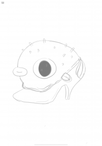
Image result for if it fits i sits meme

For consultation, the main feedback that I got was just to make the pufferfish look like it was exploding more by making the head bigger. I did make the head bigger, and I also thought of adding fat rolls to the puff, but I didn’t want the illustration to be overdramatic/ too obvious (with the fat rolls).
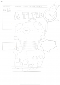
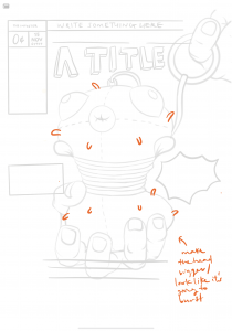
I moved the illustration back and forth through Procreate and Adobe Illustrator to vectorise, add text, and re-adjust the composition.
 

02 — TERI THE GALAXY
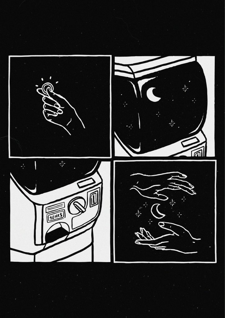
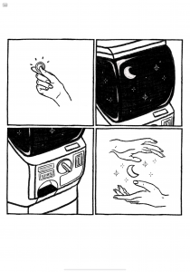
Here is Teri, in a grid.

I asked Teri a million questions rather than just three, so I won’t bother with a whole transcript. I also went through several stages of interpreting her to end up with the elements that I have, hence I’ll go through the relevant information I’d received and referred to whilst interrogating Teri about her life.

SHORT EXPLANATION:

“I would definitely rather save to spend on travel and invest on new experiences than to spend on other things” — Teri, 2020

  • Teri would rather spend on experiences than things.
  • Teri’s significant events both had to do with seeing the world, and making her feel small (in a good way) (travelling to NYC by herself from Canada, and climbing a >3000m high “stupid ass mountain” aka Mount Kerinci in Indonesia).
  • Teri “cannot commit” to pen. Must go in with pencil first.
  • Teri is very difficult to put together. I had to ask her a million questions, and every response I got would not be what I was expecting haaa. In a sense she’s a little hard to predict.
  • Teri is a very private person. She does not have any posts or stories on her Instagram.
  • Teri is Singaporean, but grew up in Hong Kong.

So,

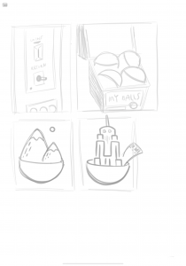
Square 1: Money in hand
Teri has money!

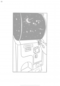
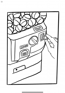
Square 2: Vending machine of a galaxy
The galaxy represents how Teri likes to see the world, likes experiences that make her feel small, and also how I really don’t know much about Teri much like how we don’t know a lot about space. The galaxy represents how Teri would rather spend her money on an experience that makes her feel all those ways rather than on capsules (objects).

Square 3: Vending machine coin/ receiving slot
Teri puts her HK$ money in, and receives something random from the machine!
Other than representing Teri’s expenditure, the machine also represents the part about not being able to predict her.

Square 4: Galaxy in hands
Teri’s Got The Galaxy

And finally, everything is in a grid because: Teri has nothing on her Instagram, and these are the bits and pieces of what I can make up of her.

ILLUSTRATION/ IDEA PROCESS

A significant event

While I made Teri explain the whole scenario of her travelling solo for the first time (in general) from Canada to New York all by herself, what really caught my attention were the last three words that she used to describe her takeaway from the experience.

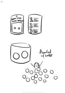
Grow some balls

From then on I knew I wanted to illustrate something with growing balls, because that was the most visual, metaphorical item she had given me. I didn’t want it to be rated balls though, because Teri is quite the innocent (or at least on the surface).

From then on I just kept thinking of what other ways I could represent balls. I randomly thought of a gum ball machine, then a vending machine of capsules. Perfecto!

I played around with different ideas like illustrating her experiences in the capsules, turning the capsules into takoyaki (one of the foods she likes), or showing a collection of her balls (because I had asked her how many balls she had before her experiences, now, and how many she would like to have by the end of her lifetime – the answer was 3, 6, 10).
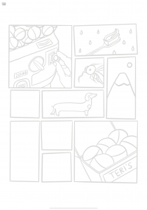
Then I thought about illustrating a random grid of all the random things I know about her, because I got frustrated that everything I knew about her was all over the place. For example, she brushes her teeth in the shower, she’s insecure about the scars on her legs from excessive mosquito bites, the dachshund is her favourite dog breed of all.
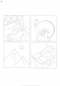
Then I felt like everything was too random, and the one with the vending capsule machine had a whole story in its own square, so I expanded on that, and tada!
 

A FEW WORDS

It’s been a fun first mini project. I took this course up because I’ve been wanting to pick up illustration for the longest time but have never gotten around to practicing it. Then I thought about giving up on that idea, but then my mom got me an iPad (thanks mom) and I felt the pressure of making full use of it… so here I am. Now I have something to force me to learn the skill and it’s been fun. The last time I illustrated anything was in vectors and in my first year.

Also this assignment made me realise how much I don’t know Teri at all, even though I’ve known her for 2.5 years. What fake friends we are!